Marketing Data Transformation: How to Organize Unstructured Marketing Data?
You’re creating a quarterly marketing report and pulling data from several marketing data sources. But the data comes in unorganized. Do you really need sessions from 60 countries? Why not show just tier-1 countries where most conversions come from? Why scrolling through a long list of landing pages when grouping them by sections can reveal a trend faster?
What problems do marketers face working with unstructured data? (And how marketing data transformation helps)
Marketing data transformation use cases
Unify names of metrics and dimensions
Example 1: Map dimensions by unifying names
Example 2: Simplify long campaign names
Example 3: Shorten and unify field names that are confusing to the end reader
Example 4: Translate your displayed metrics and dimensions globally
Blending cross-channel data
Example 1: Blend marketing data sources in one group for quick access
Example 2: Aggregate campaign data inside one table
Example 3: Aggregate results from sources that belong to the same channel
Example 4: Create a custom cross-source calculation
Aggregate metrics and dimensions from blended data sources
Example 1: Group multiple countries into regional dimensions or tiers
Example 2: Classify and group conversion events
Example 3: Group multiple campaigns data as a new dimension
Example 4: Categorize and group landing page names
The easiest way to organize data — Whatagraph
One marketing data platform to manage all your data
Conclusion
What you need are clean and consistent reports and dashboards that actually help you discover insights quickly. This is where marketing data transformation enters the game.
What is marketing data transformation?
Marketers collect massive amounts of data, which is often scattered or unstructured. Data transformation techniques help organize and clean this data to make it more suitable for analysis and decision-making. Marketing data transformation includes techniques like data blending, mapping, and aggregation.
By transforming unstructured marketing data, marketers can identify hidden patterns and improve data quality. Organized data, in return, helps marketers uncover insights and track campaign performance more easily. These insights can be used to optimize campaigns and demonstrate ROI to clients and, in turn, improve their retention.
What problems do marketers face working with unstructured data? (And how marketing data transformation helps)
Marketing data points gathered from different sources are often incompatible, preventing marketers from identifying trends and grasping the whole picture of their performance.
Let’s take a look at some of the challenges marketers face:
Different naming conventions make reporting difficult
Different advertising platforms name dimensions and metrics like age, date, gender, etc., differently. So, for example, you can have “Country” on Google Ads and “Location” on Facebook Ads for the same dimension. Or have the date 2024-01 or 202401, depending on the channel. These differences prevent marketers from blending cross-channel metrics into a unified view, as each dimension is displayed separately.
Clients get confused by missing value fields
The data from connected marketing platforms might contain missing values or inconsistencies. Something like “not set” under the page path from GA4 could be considered a missing value. Such fields confuse readers, which can be solved by replacing those with more reader-friendly wording. Transformation allows us to filter out irrelevant or inconsistent values.
It’s difficult to compare cross-channel data in multiple tables
When you have Facebook Ads, Google Ads, and Amazon Ads, it’s much more reader-friendly to display the PPC metrics from all three channels in one table. Transformation can help marketers visualize data from various sources in one widget by blending several data sources into one data source.
Large or complex datasets are hard to read
Some datasets are just too large or complex to comprehend, which slows down data analysis. Take, for example, GA4 country dimensions. You can easily have 200+ countries listed in a table. You need a way to split the countries into custom dimension groups by tiers, regions, etc. Creating blends or custom dimensions simplifies your data and makes it more manageable for visualization and decision-making.
The API access token runs out before the end of the month
Let’s say you are creating a 20-page Google Analytics report. Using a single GA4 source will time out your API access token. However, if you simplify the customer data and group it through blends or custom dimensions, you won’t need so many API requests. Instead of 5 tables, you’ll be querying one.
Marketing data transformation use cases
Now, we will explore different use cases for data transformation in marketing that help teams manage unstructured data and draw actionable insights that help shape data-driven business decisions.
We’ll start our list of marketing data transformation examples from simpler ones, such as:
Unify names of metrics and dimensions
Data mapping on the source or channel level allows you to give standardized names to cross-channel dimensions and metrics. This marketing data transformation is useful when different integrations have dimensions or metrics that give the same value but are named differently.
Apart from unifying the names of metrics and dimensions, you can use the transformation to:
Categorize campaigns into the specific part of the funnel, e.g., engagement
Aggregate results from clients' campaigns, ads, or ad sets by a specific keyword
Make tables and widgets easier to read
Create categories for specific countries and see results for them
Globally translate metrics for your entire team
Help users in agencies with less report-creating experience find the metrics they need quickly, as these will be named consistently
Here are a few examples of marketing data mapping:
Example 1: Map dimensions by unifying names
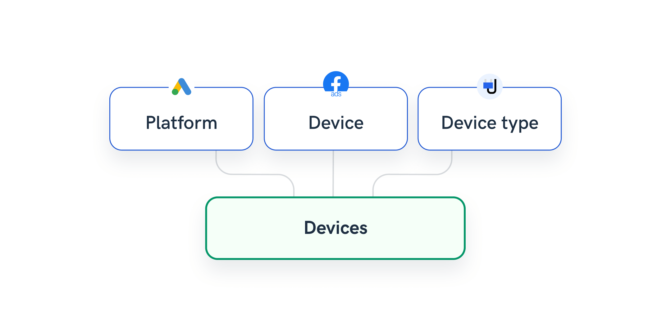
Your client is running Facebook Ads and Google Ads, and you want to present the impressions by device.
Whatagraph allows you to easily unify different naming conventions like “Platform/Device/Device Type” into a single dimension e.g., “Device” or “Mobile/Mobile App/MOBILE” to a more convenient “Mobile” across different sources or channels.
As a result, you have more consistent information in your reports.
Example 2: Simplify long campaign names
Situation: You’re tracking campaigns for your client, but tables within your report have long dimension names or are overwhelmed by many values.
With Whatagraph, you can simply create new dimension names for your campaigns on a source or channel level using conditions.
Again, your reports become much neater and easier to understand to the end-reader.
Example 3: Shorten and unify field names that are confusing to the end reader
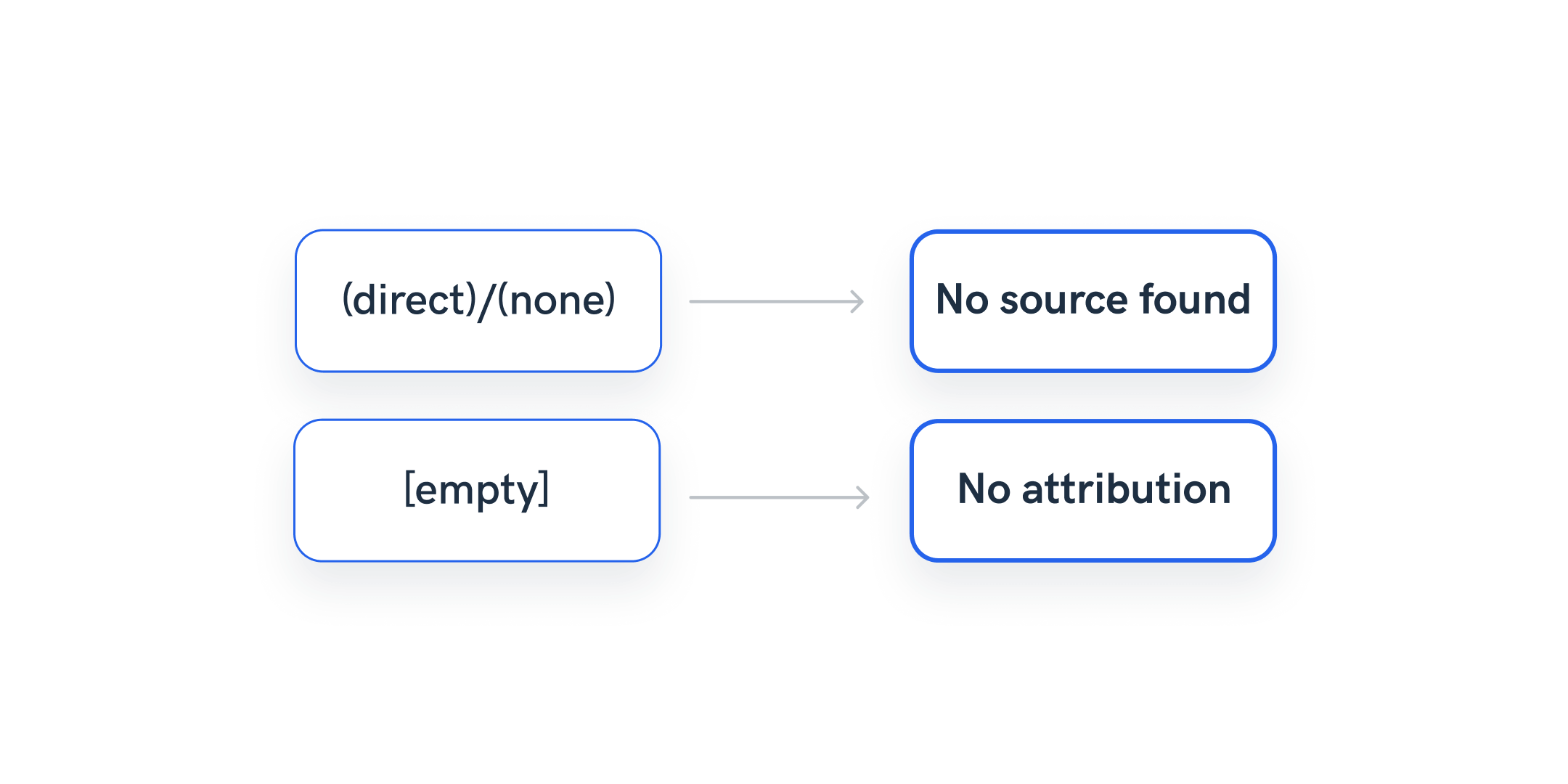
API endpoints are often difficult to understand. Whatagraph report tables may sometimes display [blank] or [empty] outputs as those values come directly from the API.
However, Whatagraph allows you to set up a rule and easily change those fields into something that would make more sense to clients as end-readers of the report.
Example 4: Translate your displayed metrics and dimensions globally
An agency regularly provides reports in their native language and struggles to translate every data point coming from the APIs. A large number of saved, pre-made widgets can solve the problem, but whenever clients add a source or have a different reporting need, they need to start from scratch.
Whatagraph has a quicker and more scalable solution. Create a condition rule on a channel or source level to replace standard English metric and dimension names with their native language counterparts. This way, you can translate a bunch of metrics and dimensions at once, which also makes it easier for team members to use them in the future.
Blending cross-channel data
Blending is a data transformation process of combining or merging data from sources to create a unified and comprehensive dataset.
The process of blending combines datasets that have related but distinct dimensions or metrics, helping marketers compare information from various sources seamlessly.
Whatagraph allows non-technical users to blend marketing data in a user-friendly, no-coding way. You can effortlessly execute blends on large volumes of data to match and consolidate relevant data points.
This allows you to create comprehensive visualizations that can reveal correlations, patterns, or trends across disparate datasets. As a result, you can gain a complete understanding of a certain segment of your marketing data.
Here are a few examples of marketing data blending:
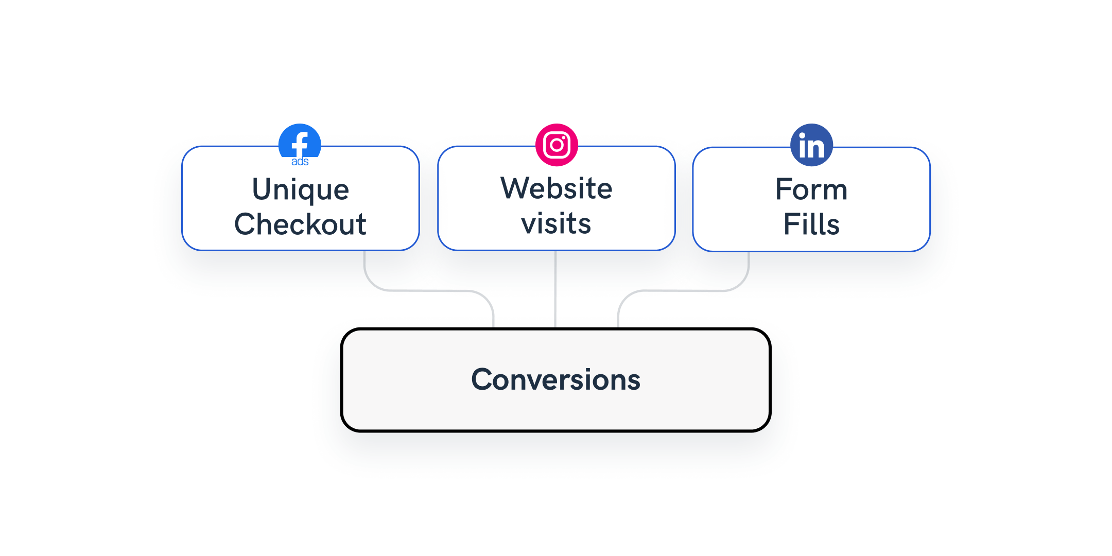
Example 1: Blend marketing data sources in one group for quick access
Let’s say that one of your clients uses Facebook Page, Instagram, and LinkedIn.
You can create a data blend with all three sources. Selecting “Date” as the join key, and include only those metrics in the blend that are relevant for the client.
When you connect the blend to a report, the client will easily spot only the selected metrics from the three sources.
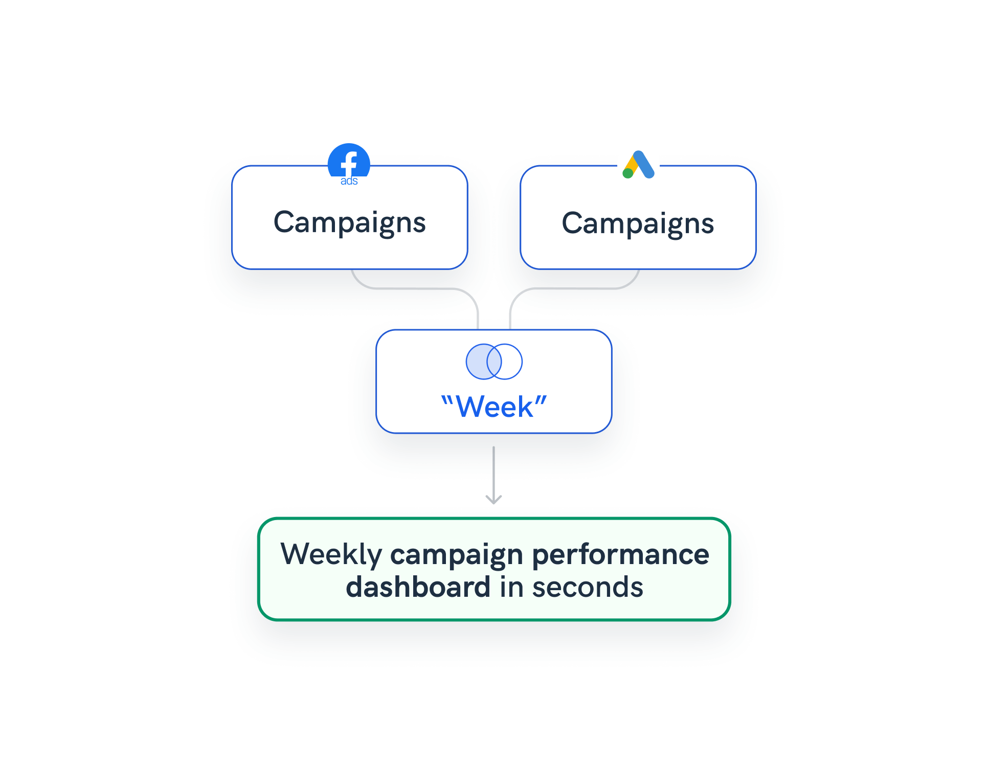
Example 2: Aggregate campaign data inside one table
In this scenario, your client uses Facebook Ads and Google Ads, with the same naming conventions for both sources.
You can create a data blend with both data sources and select “Week” as the join key.
When you connect the blend to the report, your clients can see the aggregated campaign results for each week.
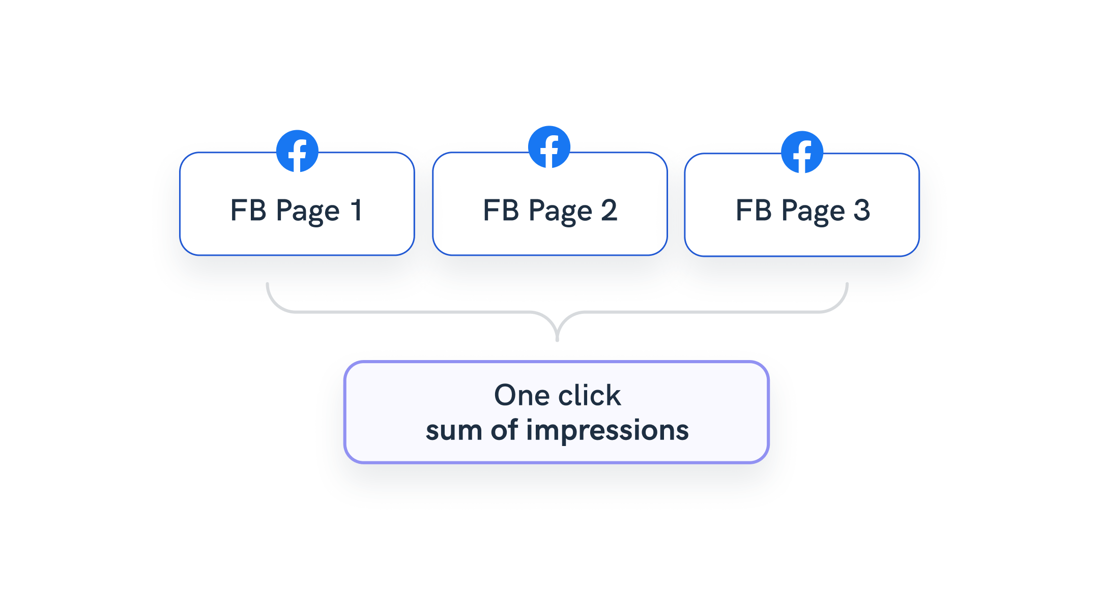
Example 3: Aggregate results from sources that belong to the same channel
Your client runs three Facebook Pages, and they want to aggregate their results.
Whatagraph allows you to easily create a data blend with all three sources with Full Outer join and choose “Date” as the join key.
The only thing that remains is to connect the blend to a report and select the “Sum of [metric]” for any repeating metrics in the blend.
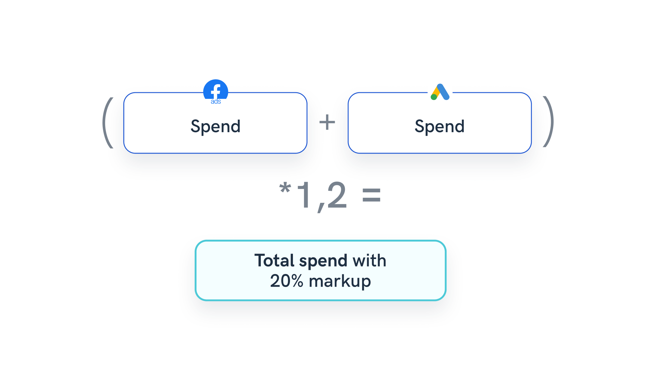
Example 4: Create a custom cross-source calculation
Let’s go back to the client from Example 2 who uses Facebook Ads and Google Ads, and you want to calculate the cost of individual impressions for both sources + add an agency markup.
You can easily create a new metric, “Total cost with markup”.
Select “Formula” as a rule type and select the source data blend you want to use. You’ll use the same blend you created in Example 2 (Facebook Ads + Google Ads).
Select the metric A — “Amount Spent” from Facebook Ads and the metric B — “Cost” from Google Ads and enter the formula A+B*1.2, where 1.2 is the agency markup.
Set the value type to “Currency”, the increase logic to “Negative”, and create the metric.
Finally, you can visualize the data in a table by selecting “Date” as the dimension and picking all three metrics.
Aggregate metrics and dimensions from blended data sources
Data blends that have metrics that match multiple sources will automatically suggest potential aggregations that are available, e.g. “Spend“ from Google Ads and “Spend” from Facebook Ads.
These are available from Whatagraphs’ transformation metric creation interface and directly when creating a new widget with blended sources.
But how does this actually help?
This type of data transformation saves a lot of time for users who are adding the same metric a lot of times and reusing it inside the report. Whatagraph suggests possible aggregate options.
And if you update the formula or blend in any way, the aggregate will automatically adjust inside any report using it. For example, if you have to delete one source from the blend.
Let’s consider a few examples of marketing data aggregation:
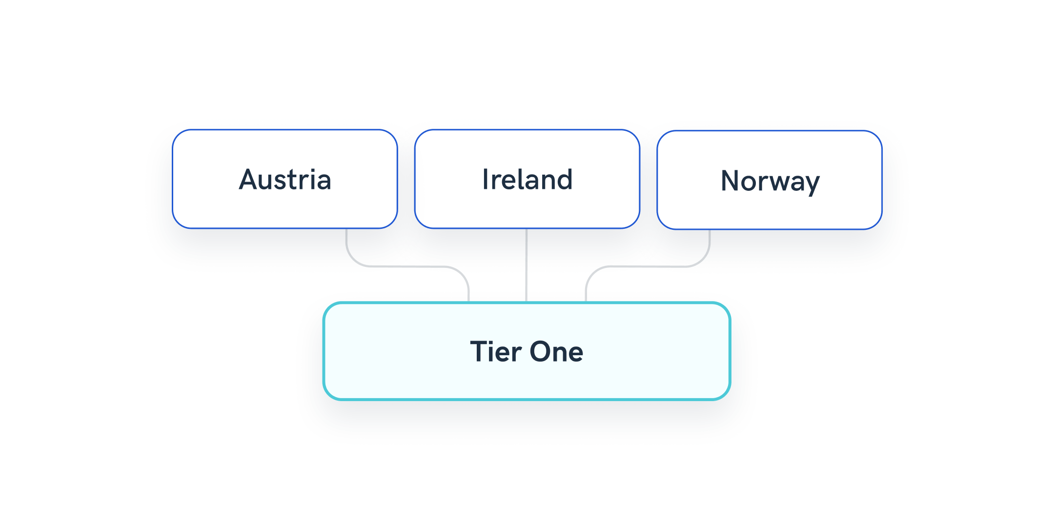
Example 1: Group multiple countries into regional dimensions or tiers
Your client is interested in tracking conversions or other user actions by regions or country tiers specific to their business.
With Whatagraph, your job is easy. Just set up a condition rule on the channel or source level and include the countries into a regional dimension you create.
Example 2: Classify and group conversion events
An agency serves a portfolio of global clients, and what they see as a conversion or goal often varies, depending on the channel. So, the account managers must standardize metrics names for individual clients based on integration.
Using Whatagraph’s Organize feature, account managers can easily create rules on the source level for each individual client, depending on their definition of a conversion. They can effortlessly replicate the process for each individual channel and change the metric names to be consistent.
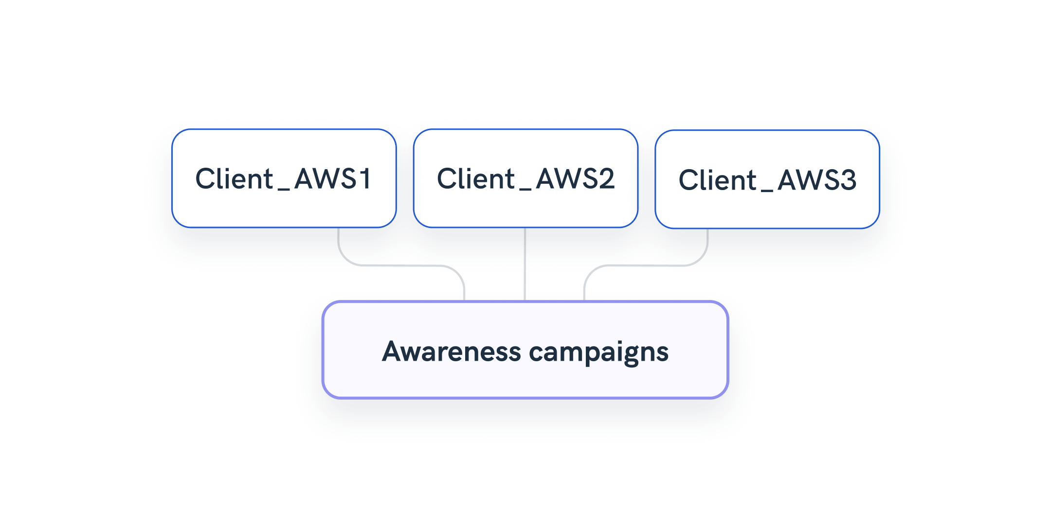
Example 3: Group multiple campaigns data as a new dimension
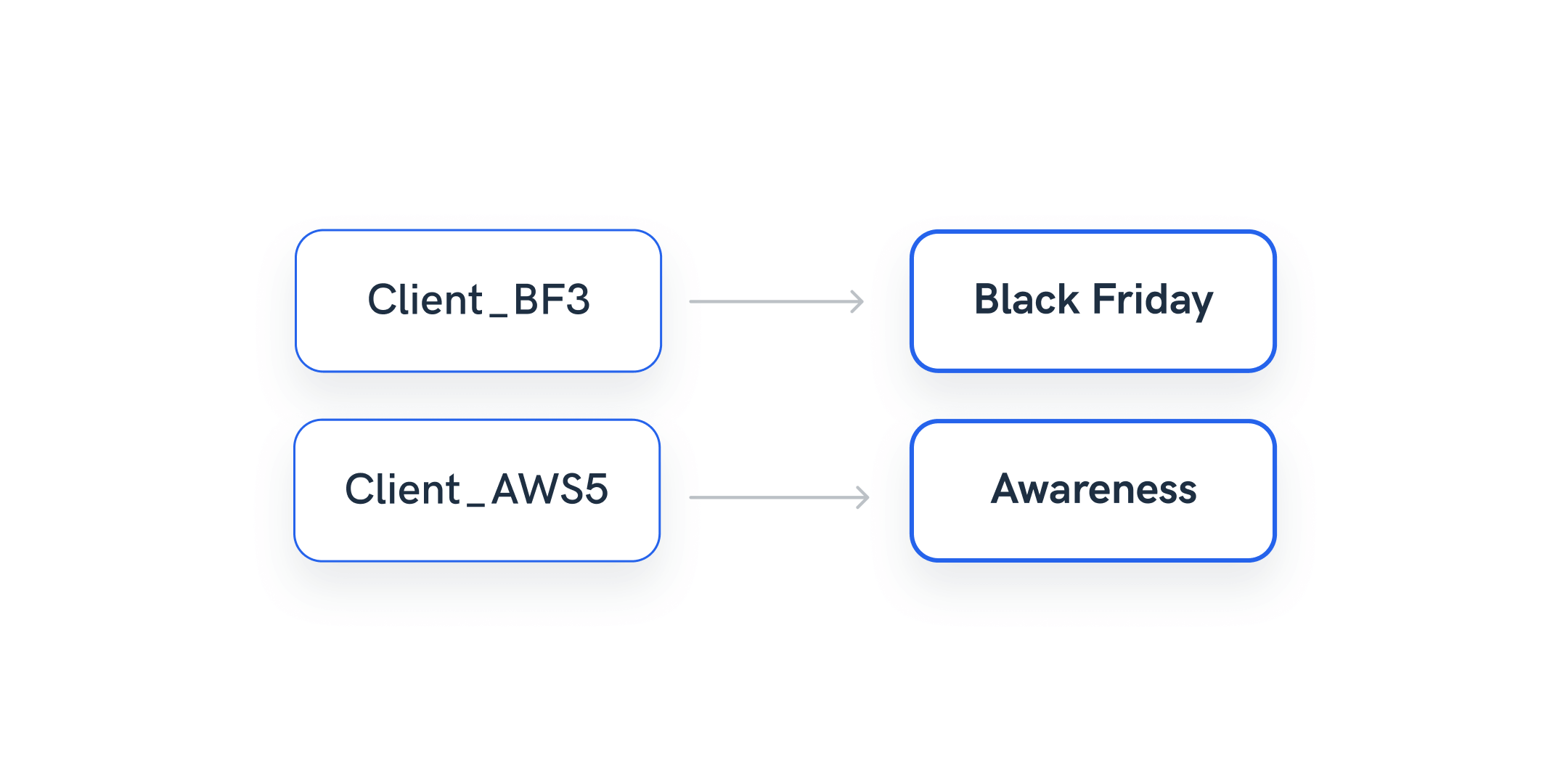
A freelance data analyst is regularly hired by businesses and agencies to help with visualizing client marketing data from complex datasets. One common request is to attribute marketing efforts to specific funnel stages.
The agency has the naming convention for their campaigns, ad sets, and ads, and they want to streamline the information within the reports, not to overload the end reader.
The analyst can spend time creating custom columns in Google Sheets or CSV, attributing specific keywords to the correct part of the funnel, OR they can use Whatagraph’s elegant solution.
Using the Organize feature, the analyst can create a set of rules to attribute keywords in campaign names to different stages in the funnel, such as Awareness, Conversion, etc.
The newly created dimension shows what part of the funnel each campaign or ad set belongs to, making the report easier to read. In addition, the simple transformation saves time and allows account managers to rely less on data analysts for data maintenance tasks.
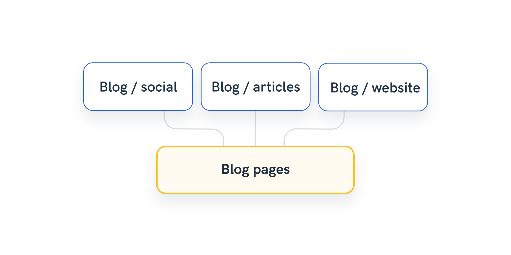
Example 4: Categorize and group landing page names
In a similar way, account managers can use Whatagraph to transform data by creating a new dimension that would group all pages with a specific keyword in the URL.
Simply set the rule on a source or channel level that ensures that each landing page containing e.g., “blog” is automatically attributed to a new dimension “Blog” that you create on the same spot.
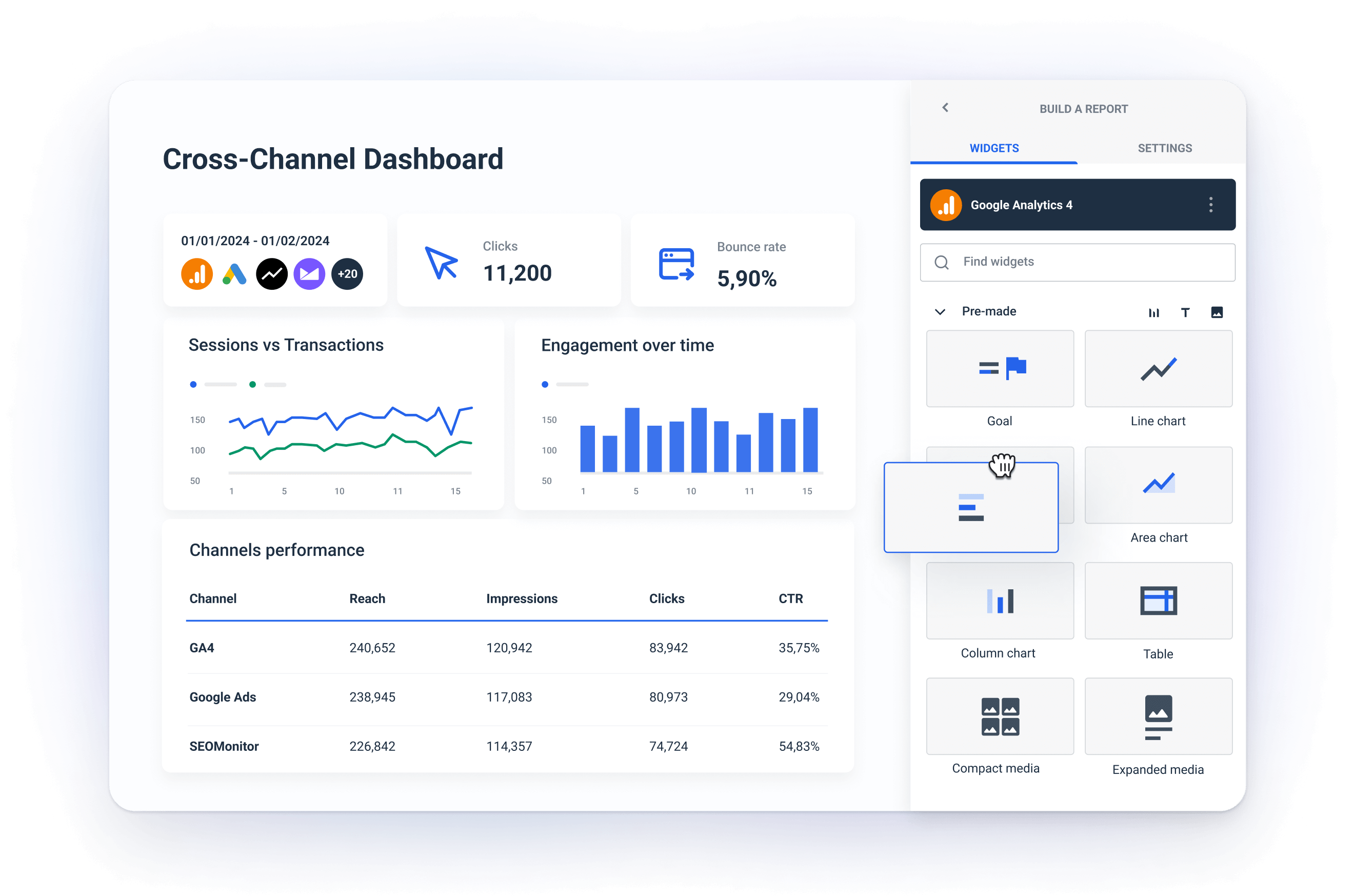
The easiest way to organize data — Whatagraph
Whatagraph is a marketing data platform to connect, organize, visualize, and share all your data. It can replace multiple complex tools with one easy-to-use platform that covers the entire data journey.
The Organize step is essential in this process, as it allows non-technical staff like account executives to run different data transformation tasks in an intuitive, no-code way.
Using Whatagraph, marketers can easily:
Standardize outputs from different sources across reports and dashboards
Unify internal dimension and metric naming conventions
Group campaigns together or combine data from multiple countries in one tier
Display the total performance of multiple landing pages
Blend cross-channel data and create new cross-channel metrics
Summarize data from multiple pages
Aggregate campaign data and add agency markup
Replace confusing outputs from marketing sources into something more understandable
— Together with many more benefits of data transformation that make working with marketing data fast and manageable for teams who don’t want to hire a data specialist.
Don’t splurge on a complex data transformation tool that you need a Python or SQL data expert to use and an equally complex business intelligence tool to visualize the transformed data.
Empower your marketing team to transform marketing data with no hassle.
One marketing data platform to manage all your data
It's not a rare case that marketers use multiple tools to manage their data. This means having a data pipeline to gather data from disparate sources, a data transformation tool to organize the data, and another data visualization tool to present the cleansed data to the end-readers.
However, the “fragmented data stack” approach has several pitfalls.
The demand for technical expertise may pose a barrier, especially for smaller agencies. The integration challenges can result in long implementation times that delay realizing actionable insights.
Maintaining a fragmented marketing data stack may also require training, integration, and ongoing maintenance costs. These hidden costs work against the very benefits the tools claim to provide. Also, the cost of using multiple specialized tools can easily increase, straining the budgets of smaller marketing teams.
On the other hand,
As an all-in-one platform, Whatagraph is an excellent solution for marketing agencies and in-house teams that want to turn siloed and unstructured data into presentation-ready reports and dashboards at scale without technical expertise.
Fully managed connectors allow users to quickly and reliably integrate more than 45 digital marketing sources like social media, PPC, website analytics, SEO, email marketing, e-commerce, and CRM platforms.
To connect any other source, you can use a Custom API, Google Sheets, or Google BigQuery data warehouse.
Any data blend, calculation, new dimension, or metrics you create through the Organize feature you can readily use in visualizations.
Whatagraph allows you to create stunning and insightful data visualizations in a few clicks and tell the story in a way stakeholders and clients can easily understand. We have 50+ report and dashboard templates, and you can save almost anything you create yourself as a template.
In addition to effortless connecting, organizing, and visualizing your marketing data, sharing is another step where Whatagraph can save you many hours to focus on what matters.
Whatagraph lets you automate insight sharing through scheduled emails with reports attached or live links for near real-time access.
Conclusion
Marketing agencies and in-house teams increasingly deal with big data that comes unorganized from scattered marketing sources.
To present the insights and digestible form for end users,
To extract valuable insights from large or complex data sets and
To conveniently present cross-channel data, you need marketing data transformation.
Until recently, this meant buying a complex data transformation tool and hiring an external data engineer to sort things out.
Now, marketers have a no-code solution that makes blending, aggregating, and renaming connected data much faster, easier, and ready for visualization and sharing.
Published on Feb 05 2024
WRITTEN BY
Nikola Gemes
Nikola is a content marketer at Whatagraph with extensive writing experience in SaaS and tech niches. With a background in content management apps and composable architectures, it's his job to educate readers about the latest developments in the world of marketing data, data warehousing, headless architectures, and federated content platforms.