


What is a KPI reporting tool?
A marketing KPI reporting tool helps agencies and teams collect, organize, and present performance data from multiple channels in one place. Instead of manually stitching numbers together from Google Ads, Meta Ads, and LinkedIn - you get one report that tells the full story across every channel.
For agencies managing multiple clients, the cost of doing this manually adds up fast. UpTick Marketing was spending 60 hours per month just building reports. With average agency billing rates close to $200/hour, that's roughly $12,000 a month in billable time spent on reporting - not strategy, not client work, just pulling and formatting numbers.
After switching to Whatagraph, UpTick cut their reporting time down to 10-20 hours per month - saving 40 hours that went straight back into building better campaigns for their clients.
A good marketing tool for reporting KPIs takes care of the heavy lifting:
- Connects directly to each marketing channel (Google Ads, Meta, LinkedIn, TikTok, GA4, and more)
- Standardizes metrics so you can compare performance across platforms without mismatched KPIs
- Visualizes business data in a way that clients actually understand, not just raw numbers in a table
- Let's you brand and customize reports with your agency's logos, colors, and the specific KPIs your clients care about
With Whatagraph IQ, you take this even further. Instead of building marketing KPI dashboards from scratch or dragging widgets around manually, you can:
- Ask AI to generate a full KPI report instantly, complete with charts, graphs, tabs, and layouts
- Use IQ Themes to automatically apply client branding from a single logo upload
- Get plain-language performance summaries written by AI directly inside the report
- Chat with IQ to get instant answers about any metric, without digging through the data yourself
Whatagraph has also launched an MCP that lets you connect your data to Claude or ChatGPT and analyze your data there.
The hours we're saving with Whatagraph are just pure profit. We now have time to focus on more strategic things that help both our agency and our clients grow. - Lars Maat, Co-Founder at Maatwerk Online
What is the best KPI reporting tool?
Not all marketing KPI reporting tools are built the same. Some require a technical team to set up, while others look great but fall apart the moment you try to blend data across channels.
To help you pick the right one, below is a breakdown of the five best options. For a more detailed comparison, check out our full guide to the best dashboard reporting tools.
1. Whatagraph - Best KPI reporting software for marketing agencies and teams
Whatagraph is built for marketers, not data engineers or BI teams.
Instead of stitching together broken connectors or rebuilding spreadsheet templates, you get one platform that connects, cleans, visualizes, and shares all your marketing KPI data - without any technical overhead.
Here's what makes Whatagraph the right fit for KPI reporting:
- 60+ fully managed native integrations across paid, organic, social, email, CRM, and e-commerce platforms
- Cross-channel data blending that combines metrics from multiple platforms into a single, unified KPI view
- Whatagraph IQ: a suite of AI features that builds full reports, applies client branding, writes performance summaries, and answers data questions instantly
- Whatagraph MCP: connect and organize data in Whatagraph and analyze the normalized data with Claude or ChatGPT via Whatagraph's MCP. You'll always get accurate answers because it's based on accurate data.
- Custom KPIs and data blends: build the exact metrics you need, without formulas or SQL
- Automated delivery via email, Slack, live link, PDF, CSV, BigQuery, or Looker Studio
Start free with Whatagraph today.
2. SimpleKPI - Best lightweight KPI tracking software
SimpleKPI is a lightweight KPI tracking tool designed for small businesses that want a clean, no-fuss way to monitor a handful of metrics. It's easy to set up and doesn't require technical knowledge to get going.
With SimpleKPI, you can:
- Track KPIs manually or via a small set of data integrations
- Build simple dashboards and share them with your team
- Set targets and monitor progress against strategic goals
SimpleKPI works well for basic KPI monitoring for small startups, but it has very limited native integrations and lacks the cross-channel data blending that marketing agencies need. Plus, it's not built for multi-client reporting or client-facing deliverables.
3. Klipfolio - Best for data teams that need a metric catalog
Klipfolio is a data analytics tool with two distinct products: PowerMetrics for centralizing metrics across an organization, and Klips for building visualization dashboards and reports. It's best suited for larger teams with dedicated data resources.
With Klipfolio, you can:
- Connect to 130+ integrations, including data warehouses, SQL databases, and marketing platforms
- Build a curated metric catalog that non-technical teams can pull from
- Create custom dashboards and scheduled reports with data blending and custom dimensions
Klipfolio is powerful for complex data management tasks, but it comes with a steep learning curve, and Klips need to be configured in a separate environment outside the dashboard itself.
4. Databox - Best for real-time KPI dashboards and goal monitoring
Databox is a KPI dashboard platform that makes it easy to monitor business performance across multiple channels and make data-driven decisions. It's a solid choice for teams that want quick, at-a-glance visibility rather than in-depth client reporting.
With Databox, you can:
- Connect to 100+ data sources and build interactive KPI dashboards
- Set goals and track progress against benchmarks in real time
- Get automated alerts when key metrics hit or miss targets
Databox’s main use case is for internal KPI tracking and reporting, but wasn't designed for agency-scale client reporting. Users regularly flag broken connectors and limited white-labeling options.
5. Looker Studio - Best free option for Google-native reporting
Looker Studio is a free KPI software tool that works well for teams reporting primarily on Google Ads, GA4, and Search Console data. It has a large template library and a flexible drag-and-drop interface.
With Looker Studio, you can:
- Connect to 21 native Google integrations at no cost
- Build custom dashboards with a wide range of chart types and visual options
- Share live reports with clients, stakeholders, or other decision-makers
Looker Studio becomes unreliable at scale. Performance slows significantly with large datasets, and third-party connectors (required for non-Google platforms) often break.
How do I automate KPI reporting with Whatagraph’s KPI reporting software
Marketing KPI reporting doesn't have to mean logging into five platforms, exporting CSVs, and spending hours reformatting data.
With the right tool for KPI reporting, such as Whatagraph, you can go from raw data to a client-ready report in under 30 minutes. Here's how the process works.
Step 1: Connect your marketing data
Start by connecting your marketing channels through Whatagraph's plug-and-play integrations.
From your workspace, select a platform like Google Ads, Meta, or LinkedIn, authenticate with your login, and the data starts flowing.
No developers, no third-party connectors, no manual Excel exports.
You can also pull in data from e-commerce platforms, SEO tools, email platforms, and custom sources via Google Sheets or API connections.
Whatagraph supports 55+ integrations in total, including:
- PPC: Google Ads, Meta Ads, LinkedIn Ads, Microsoft Ads, Pinterest Ads
- Social: Instagram, TikTok, YouTube, Facebook
- E-commerce: Shopify, BigCommerce, Magento
- SEO and Analytics: GA4, Semrush, Ahrefs, SE Ranking, Google Search Console
- Email: Mailchimp, ActiveCampaign, Constant Contact
All integrations are fully managed, with an average uptime of 99.95% over the past six months. If anything goes wrong, engineers are alerted immediately.
Step 2: Organize and standardize your data
Once your channels are connected, the next step is making the data clean and consistent. Different platforms name things differently, use different attribution models, and measure the same metric in different ways.
If you're reporting across channels for multiple clients, that inconsistency compounds fast.
With Whatagraph, you can:
- Blend data from multiple sources into a single cross-channel view
- Standardize campaign naming and metric labels across platforms and client accounts
- Filter by channel, device, audience, or custom segment
- Organize by client, account manager, or region using tags and folders
With Whatagraph IQ Dimensions, you can skip the manual setup entirely and just describe what you need.
- Ask AI to create blended metrics, such as "Total Paid Spend" across Meta, Google, and LinkedIn, and it builds it.
- Build custom metrics on the fly. Want ROAS across channels? Or a funnel KPI like Add-to-Cart conversions? IQ generates them instantly, without formulas or coding.
- Group messy campaign names like "FB_UK_Q1_Retargeting" and "MetaUK-Retarg-Q1" into a single clean dimension
- Normalize any dimension at scale. Group campaigns by objective, products by category, or audiences by segment. IQ makes sense of inconsistent data and turns it into actionable insights.
Step 3: Build automated KPI reports for clients
With your data connected and organized, building the actual report is where Whatagraph IQ saves the most time.
Instead of manually dragging and dropping widgets, simply describe what you need and let AI build it:
- Generate a complete KPI report from a single prompt - with charts, tabs, KPIs, and layout in seconds
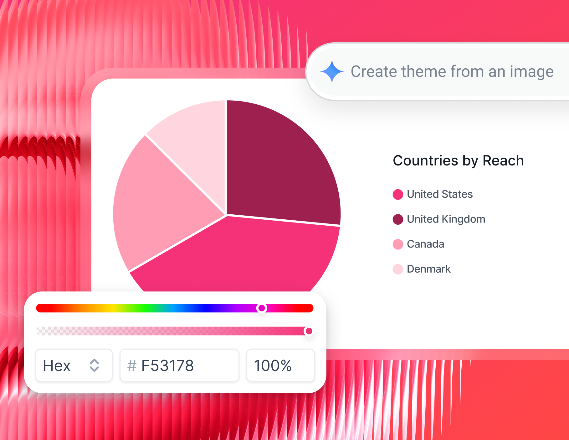
- Style reports from a single screenshot or by uploading a client logo. IQ Themes applies matching fonts, colors, and icons automatically
- Ask IQ to add a specific tab - like "a Google Ads performance tab focused on CPA and conversion rate" - and it builds it correctly, with the right filters and metrics
As André Cardoso, Marketing Manager at Wise Pirates, says:
The AI Widget Creator is awesome at creating simple widgets, like number of impressions in Meta, number of impressions in Google Ads, the average CPC, average CPM, and so on.
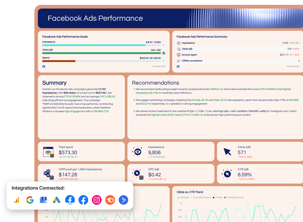
Here’s an example of a KPI reporting template created with Whatagraph.
When building KPI reports, one of the biggest mistakes agencies make is trying to include everything. As Elizabeth Greene, Co-Founder of Junglr, puts it:
A dashboard with 27 million different metrics is often unhelpful or confusing. What I've focused on instead is identifying the few core KPIs that help us quickly spot when something is going wrong in an account - because we want to catch negative trends as early as possible.
Start with goal pacing, top-line KPIs, and the business metrics that directly tie to what the client cares about. For full control, Whatagraph’s drag-and-drop canvas is always available. You can:
- Change widget labels, sizes, icons, and layout
- Apply custom formulas to any metric
- Match color schemes to client or agency branding
- Set reporting periods, currencies, and visibility per section
- Insert, rearrange, or remove rows, columns, and headers
Step 4: Create internal dashboards to monitor performance
Client-facing reports are only half the picture. Your team also needs a way to monitor performance across all campaigns and clients without opening individual dashboards one by one.
Whatagraph's Overviews feature gives you exactly that: a single internal view where you can track KPIs across your entire client portfolio.
With Overviews, you can:
- Track the right KPIs across all campaigns and clients in one place
- Flag accounts that are trending below target or hitting spend caps
- Monitor account manager performance at a glance
- Set business goals and get Slack or email alerts when metrics shift
- Slice by channel, client, region, or account manager
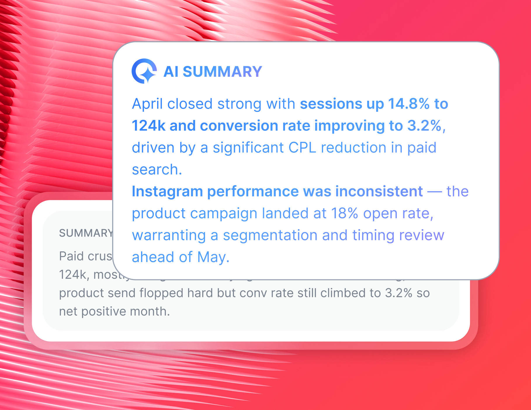
Step 5: Use AI to write summaries and answer performance questions
Sending a report packed with charts but no context is a common mistake in client reporting. This leaves clients confused, not confident.
Martin Sandgaard, Co-Founder of AdsToGo, puts it directly:
Reporting with human input is 1000x more valuable than an auto-scheduled report. Context and action plans matter more than the numbers, and most clients don't open or understand reports without that context.
That's exactly where Whatagraph IQ Summaries and IQ Chat come in. They don't replace the human judgment in your reporting - they give your team a faster starting point for adding that context.
With IQ Summaries, you can:
1. Generate a plain-language performance summary for any report tab, based on the actual data on the page - no hallucinations
2. Choose from short or long format, and from summary types including highlights, recommendations, issues, and wins
3. Edit the output before sending so your team's voice and analysis stay front and center
With IQ Chat, your team can ask questions about campaign data in plain language and get instant answers to questions, such as:
- "Which campaigns had the highest CPA last month?"
- "How did Meta spend compare to Google this week?"
You can also turn IQ Chat on for clients, so they can explore their own data and ask questions directly without needing to book a call.
The result is fewer follow-up emails and faster answers for clients. Here’s the proof from one happy customer:
Whatagraph’s AI cuts down the time our customers have to analyze reports. Say I send a report to a customer, but they don’t really understand it, they can just ask a question, and Whatagraph spits out answers to them right away. - Danielle Roberts, Director of Implementation and Support at Rentable
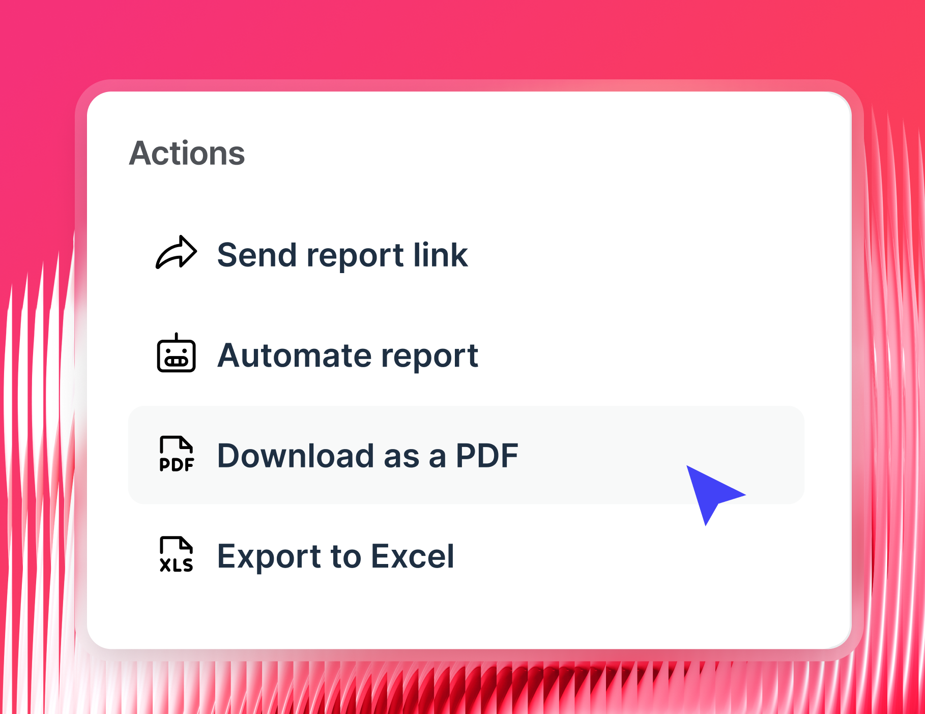
Step 6: Share the report
Once your KPI report is ready, Whatagraph gives you several ways to get it in front of the right people:
- Automated email or Slack delivery: schedule recurring reports to go out (weekly, monthly, or quarterly)
- Live links: share a real-time report that updates automatically, with no login required for the client
- PDF or CSV exports: useful for archives, offline reviews, or attaching to monthly summaries
- White-label delivery: send reports from your own custom domain
3 success stories of agencies using Whatagraph’s KPI reporting solution
If you want to know what it actually looks like to fix your KPI reporting process - here are three agencies that did it, and what changed when they did.
1. Peak Seven: 63 hours saved per month on reporting
Challenges
Peak Seven was managing 25 clients and over 100 ad campaigns using Looker Studio, Funnel, and Supermetrics. The data rarely came through cleanly. Connections broke, numbers didn't match source platforms, and Kim was spending more time verifying data than actually acting on it. A single report took her up to 40 hours to build from scratch.
"Looker Studio was slow and always breaking. The data wouldn't pull through, or it would pull through incorrectly. It was frustrating, time-consuming, and a constant guessing game," said Kim Strickland, Digital Marketing Specialist at Peak Seven.
Solution
Kim migrated the agency to Whatagraph in a matter of hours. She built a master template that could be cloned and refreshed for each client rather than rebuilt from nothing every time. Custom formulas let her combine data from multiple platforms in a single view, without double-counting or inconsistencies.
Results
- 63 hours saved per month on reporting
- Report build time dropped from 4 hours to 1.5 hours per report
- $9,450 saved per month on client reporting costs
- Stronger client relationships and improved retention rates
2. UpTick Marketing: Reporting time cut from 60 hours to 10-20 hours per month
Challenges
UpTick Marketing’s reporting setup - a patchwork of an old reporting tool and internal spreadsheets - couldn't keep up. Cross-channel reporting was a manual job, and as the number of channels and clients grew, building a single report took hours of stitching data together from different places.
"Whatagraph replaced our old reporting tool and the internal spreadsheets we were using," said Matt Spivak, Marketing Consultant at UpTick Marketing.
Solution
UpTick connected 13 marketing channels directly into Whatagraph and replaced their entire reporting stack with one platform. Cross-channel data started flowing into unified reports automatically, and the team stopped spending half their time on data preparation and started spending it on analysis and strategy.
Results
- Monthly reporting time cut from 60 hours down to 10-20 hours
- 40 hours saved every month
- Clients started receiving more polished, visually clear reports
- The team now enjoys building reports, which speeds the process up further
3. Maatwerk Online: 100 hours saved per month on reporting
Challenges
Maatwerk Online, one of the most respected agencies in the Netherlands, was running Supermetrics and Looker Studio to report across 100+ clients. Dashboards loaded slowly, connectors broke at the worst possible moments, and reports were packed with metrics that no one actually opened. The bigger the client list grew, the worse the reliability got.
"Looker Studio was really slow. We used Supermetrics to connect our channels, but sometimes they would just break. Tables didn't load when you tried to refresh the dashboard. It was really annoying," said Lars Maat, Co-Founder at Maatwerk Online.
Solution
The team rebuilt their entire reporting process around Whatagraph and created four core dashboard templates covering eCommerce, Lead Gen, Branding, and B2B. Every client gets a fully branded live dashboard with a goal bar showing targets and where performance sits against them.
When Whatagraph IQ launched, the sales team started using AI to build widgets on the fly and answer client questions mid-meeting without having to dig through dashboards manually.
Results
- 100 hours saved per month on reporting
- €4,000 saved per year by cutting Supermetrics entirely
- 100% of the Whatagraph subscription cost recovered through client licensing fees
“When we share a report, and it’s fully branded—our colors, fonts, logo, and the client’s logo—it looks professional. And for clients, this gives them the feeling of ‘These guys know what they’re doing.’ That really matters.” - Lars Maat, Co-Founder at Maatwerk Online