What is interactive data visualization?
Interactive data visualization is the use of modern data analysis software to produce visual representations of data that users can explore and manipulate directly within the visualization. These direct interactions help users uncover underlying insights that lead to more accurate decision-making.
5 benefits of interactive data visualizations
Interactive data visualization allows you to explore data in ways not possible with static visualizations. The interactive approach is ideal for analyzing large amounts of data with complex data stories, as it helps identify, isolate, and visualize information for longer periods.
The most significant benefits of interactive visualization allow you to:
1. Find correlations more efficiently
Displaying data on a single dashboard can help you find different connections behind the performance. For example, show if sales are higher because of a better online presence, a recent paid advertising campaign, or whether there is a correlation between a few recent negative reviews and a drop in sales. Any decisions or new strategies you wish to implement must be data-driven and have a solid foundation.
2. Identify trends that might not be apparent in static visualizations
Humans are good at categorizing things or recognizing patterns our brains are wired to do so. By curating performance dashboards, you have a much better chance of spotting trends and figuring out which of your strategies have been more effective, as well as other factors that impact your success.
3. Simplify complex data
Interactive data visualization aims to convey insights, which leads to business intelligence. It's easier to tell a story and share your findings when you can understand them better. Moreover, a lot of tools allow you to drill down into large data sets and generate reports on interactive data that could then be used to create easy-to-digest content.
4. Provide a more immersive experience through data storytelling
The audience is more likely to understand a data story when you present its development over time in a clear, linear way. Interactive visualization tools allow you to tell a visual data story in which users can zoom in and out, highlight relevant information, filter, combine metrics, and change other parameters to present multiple data points.
5. Quickly reaction to change
As mentioned earlier, you process information faster when it is visualized. This means you can notice issues or gaps in performance quickly and act on those findings. It also gives investors, board members, and other stakeholders a better situation overview.
Why is interactive data visualization important?
Even though static data visualization is beneficial, there are instances where having an interactive feature is necessary or irreplaceable for that matter.
Gives additional context
First of all, interactive visualizations allow you to ask follow-up questions. This means that you can add more/other factors to the existing report, which could be useful for better contextualizing the results. When looking at customer engagement data, you can also add details like age groups, gender, locations, or other attributes that could help you define your core audience.
Brings more granularity to metrics
Another advantage of interactive visualizations is the ability to select and closely examine a metric or point of interest. This allows you to explore specific data points in-depth and understand why they are the way they are. This granularity can help you develop specific solutions, such as — changing a keyword phrase, changing the price of an item, stopping advertising on a specific site, etc.
The idea of interactivity allows you to create a sub-report for each of the key points of interest in your general report. This will enable companies that have a complex reporting structure and multiple departments to combine all of the separate reports into a single report while maintaining the level of detail that each report contains.
Interactive data visualization examples
Brilliant examples of interactive data visualizations always stick to one’s mind. Unlike static .pdf reports and infographics, these dynamic visualizations rely on JavaScript and Python to make data “come to life” and allow viewers to interact with it. Here are a few projects to get you inspired.
How the US generates its electric power
Climate change is always one of the central themes at the G20 Summit. As a result of those public discussions, more and more people are interested in how the planet’s power resources are managed and generated.
Since electricity is expected to replace carbon-intensive technologies like oil and coil, electricity production is often in the spotlight.
We start our list of examples with an impressive interactive map of electricity sources in the USA.
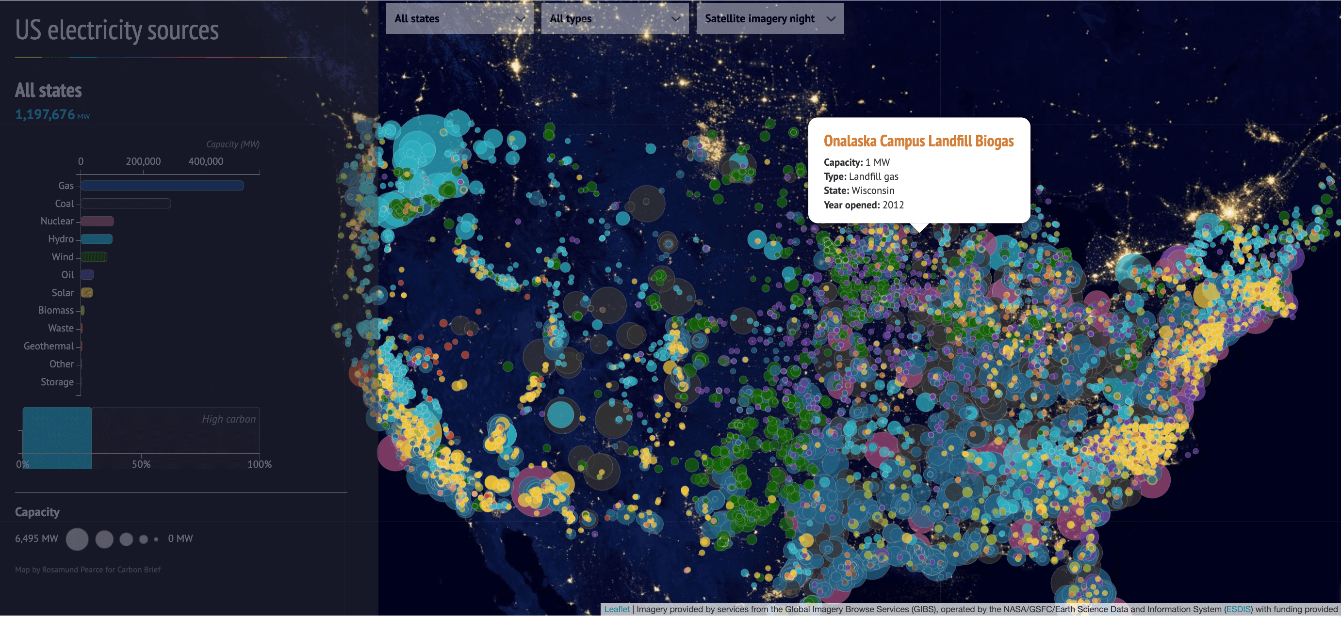
Created by the climate change website Carbon Brief, the map shows how much electricity each source produces. Hover a cursor over it, and a cloud pops up with details like installed power, the type (gas, hydro, onshore or offshore wind, solar, nuclear, etc.), and the opening year.
You can also filter the map to show only high- or low-carbon sources.
Such an interactive chart aims to inform the public about the state of electricity production and raise awareness for more sustainable choices.
Interactive data breach bubble chart
The increasing occurrence of data breaches urges businesses and consumers to be more cautious about how and where they use their data and how to protect it. An IBM report found out that in 2023 alone, the cost of a global data breach was $4.45 million, which is a 15% increase over three years.
The following example was created to raise data security awareness and motivate companies and citizens to protect their data.
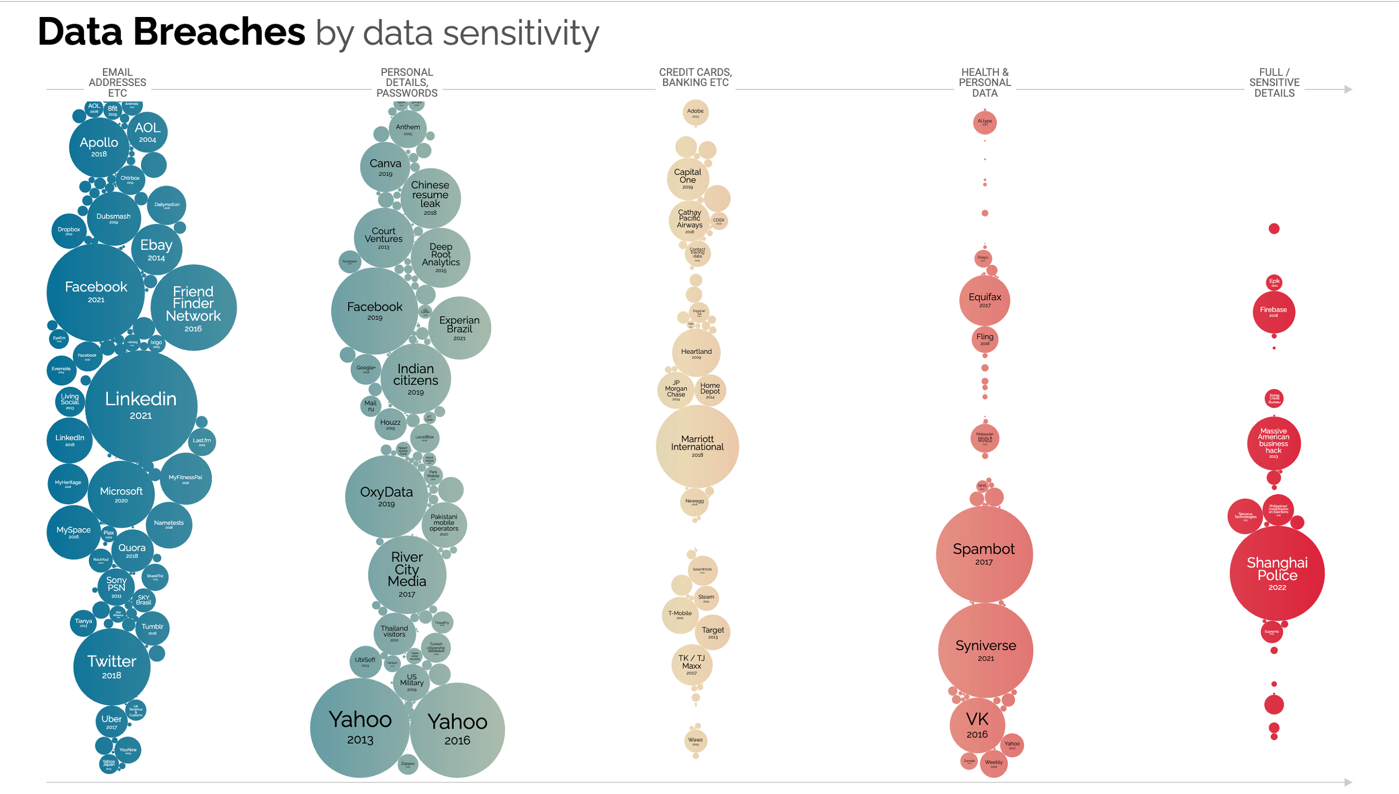
British data journalist, writer, and information designer David McCandless and his team from Information Is Beautiful gathered records about the world’s most significant data breach and visualized the results in an interactive bubble chart. Each bubble is sized according to the severity of the breach.
You can hover over each bubble and see brief details of the breach, like whether it was due to a cyber attack or careless behavior by the organization.
No matter how fun this chart is to use, it’s a scary reminder of how important it is to share sensitive information responsibly.
Real-time Internet usage card chart
The way people use the Internet is an integral part of every marketing data analytics that wants to learn the behavior of a particular target audience.
But if we talk about the global Internet use every moment, hour, day, the numbers are challenging even to comprehend.
To shed more light on how we use our favorite digital resource, Betfy created an interactive card chart that tells you how popular online services are used every second.
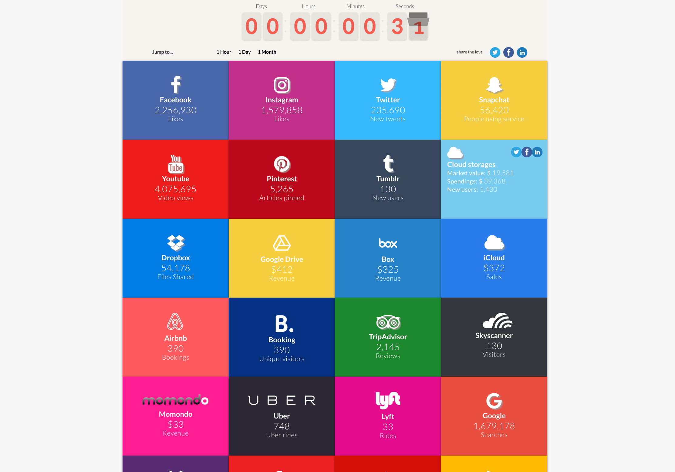
The chart covers different social media platforms and popular websites like TripAdvisor, Uber, and AirBnB, but the data presented is not happening live. What you see is a compilation of vast amounts of data sources broken down by the second to get an idea of what is happening on the Internet as we speak.
Interactive visualization of exponential COVID-19 spread
Let’s hope that the worst is behind us, but the sudden and rapid spread of coronavirus not only brought the world to a halt but also left many researchers and health providers in the dark due to the unknown nature of the illness.
To shed more light on the seriousness of the situation, different organizations created data systems to keep the public informed on the infection spread worldwide.
Many of these data systems are difficult to understand and explore, but one example stands above the others. Computer science professor Wade Fagen-Ulmschneider created DIVOC-91, an interactive visualization of the global COVID-19 spread that is easy to explore.
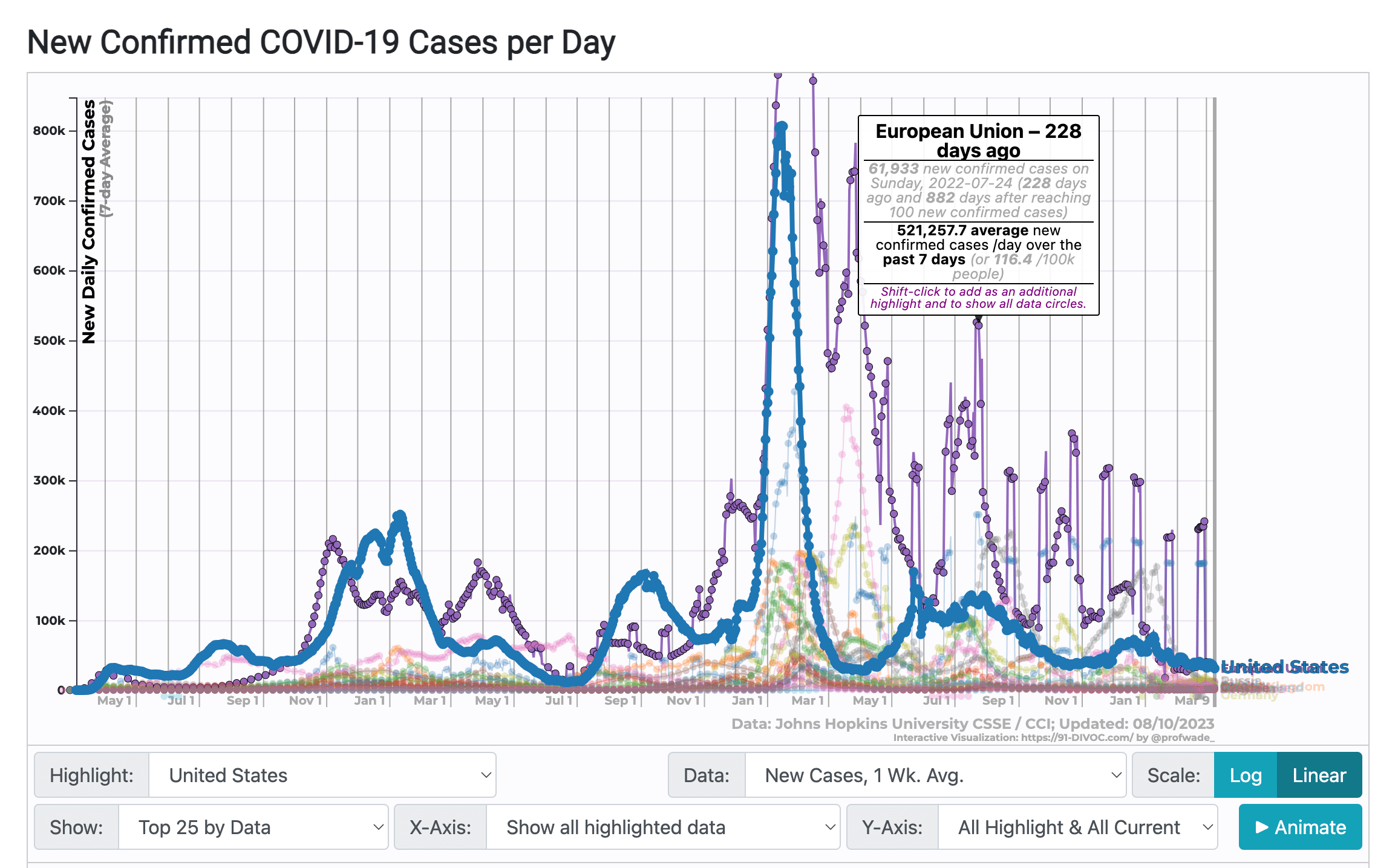
You can filter the chart by multiple factors, such as different countries, time, and scale, as well as include variables like vaccinations, total deaths, etc.
A specially useful feature allowed users to hover over any data point to see what’s behind it. Viewers could animate the whole chart to see the information update automatically and generate a report with the selected parameters.
DIVOC-91 is an outstanding example of how vast amounts of data can be presented in a way that is engaging, innovative, and easy to use.
Interactive data visualizations by role
The examples above show that interactive data visualizations are useful for raising awareness on global issues, such as climate change, health, data security, etc. But how can individual teams or agencies use different types of data visualization to streamline their decision-making?
Let’s consider a few role-based use cases.
Product
Data is pivotal for product teams that strive to improve user experience by developing new product functionalities. Interactive data visualization is your most valuable ally in understanding which user behavior leads to positive outcomes. Get a holistic view of how users interact with your product by visualizing consumer data in interactive scatter plots or stacked bar charts.
Marketing
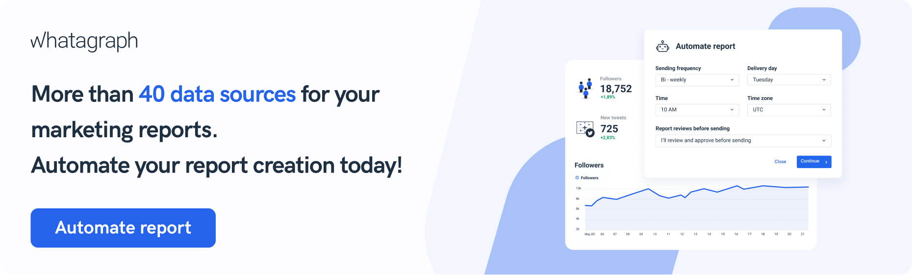
By tracking performance metrics, marketing agencies or teams in large companies can benefit from interactive dashboards. These advanced visualizations not only compile the most critical KPIs in one place but can also refresh in near real-time, so users always operate with fresh data.
Unlike static reports, you can apply different filters to dashboards to add more granularity to your data and discover the true causes of an unexpected surge or drop in your campaign performance.
Finance
There’s a strong argument about finance being the most data-driven department in any organization. In the past, teams struggled with Excel spreadsheets. Now, you can use interactive data visualization software to extract data from HubSpot, Oracle, or Salesforce and present your results as easy-to-digest dashboards.
Management
Performance monitoring is critical to any business's success, including tracking goals, planning the budget, saving costs, and improving efficiency. Each of these activities relies on tracking predefined metrics.
Apart from tracking important KPIs, an interactive data visualization tool allows managers to explore data from multiple angles and uncover underlying reasons behind the performance.
Start visualizing your data differently
If you feel like you’re falling behind with your current data visualization techniques, perhaps the answer lies in interactive data visualization.
And by this, I don’t mean employing a data science specialist and a developer to build you interactive visualizations from scratch.
I mean finding a data visualization platform you can use to quickly create data visualization designs for different purposes without writing a single line of code.
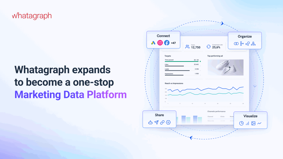
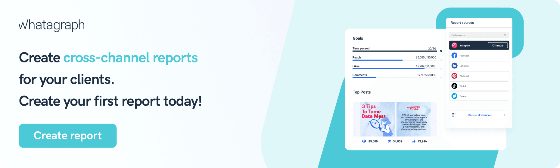
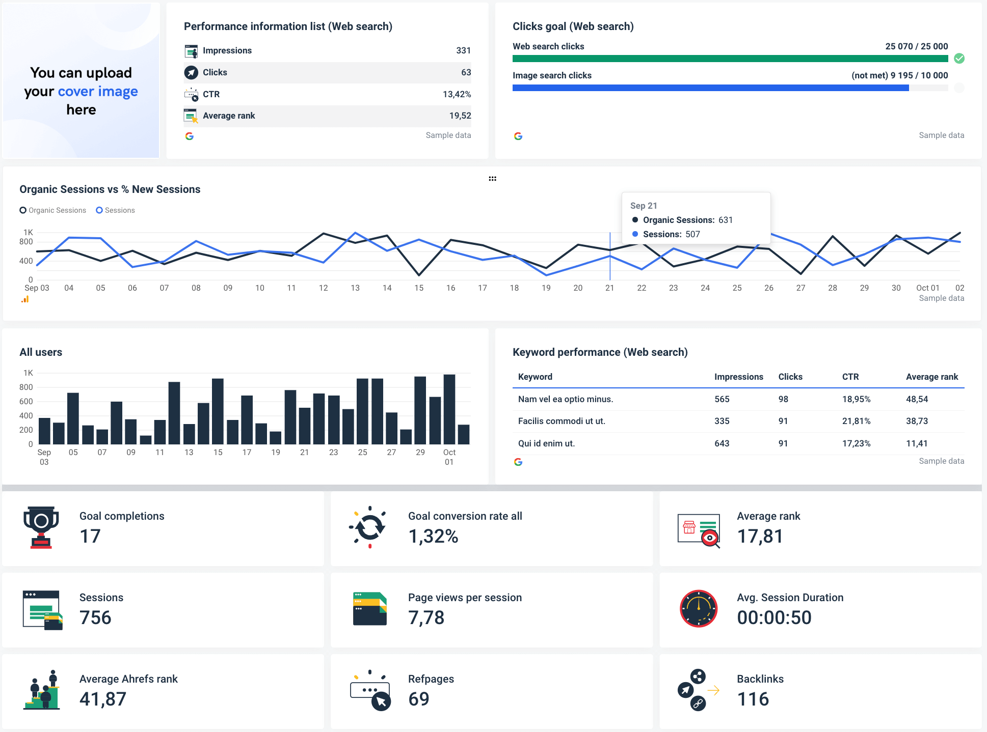
One such tool is Whatagraph — an intuitive, all-in-one platform for connecting, visualizing, and sharing marketing data.
Recommended for both technical and non-technical teams, it allows you to pull data from various popular marketing platforms and visualize it in engaging interactive dashboards.
Grab a dashboard from our library and drill down to previously hidden insights in your marketing data. Change each template to match your data needs, or create a dashboard from scratch in under 5 minutes using the interactive drag-and-drop visualization builder.
Request a free trial of Whatagraph and visualize your data for decision-makers faster than ever.
Wrapping up
Interactive data visualization should solve two problems: give the audience control over what aspect of data they see and let them narrow the data set to their situation.
Instead of reading generic all-in reports and trying to find information by comparing multiple graphs, viewers should be able to instantly sport the data points they need and gain intelligence without advanced data or tech skills.