Top 7 Data Visualization Tools for your Marketing Agency in 2025
Data visualization is not an option anymore — it’s a must. The only thing that remains is to choose a capable data visualization tool that meets your agency’s needs and lets you visualize and share your data insights with clients or stakeholders. Yet those tools all seem similar at first glance. Let’s clear out the smoke and briefly overview the most capable data visualization software today.

Oct 18 2023●7 min read


What is data visualization?
Data visualization is the process of representing data using common visualizations like graphs, charts, plots, infographics, and interactive animations. These visual representations can uncover deep relations between data and present data-driven insights in a way that’s easier to understand.
What are data visualization tools?
Data visualization tools are tools used to visualize data. These tools offer a user-friendly way to display data as charts, graphs, and other visualizations, which helps users identify trends, outliers, and patterns in their data.
Not all data visualization tools are made the same. Some can create simple pie charts and scatter plots, making them versatile for visualizing a broad range of data types.
Others allow you to create elaborate interactive data visualizations, which include animations, typically visualizing one or a few related data types that together explain a phenomenon. These tools have a higher learning curve.
Benefits of visualizing your data
Visualizing your data can significantly improve your data analysis and, as a result, enhance the effectiveness of your campaigns. Here are some data visualization benefits.
- Speeds up data interpretation
An advanced data visualization tool can do many things that text and plain numbers can’t. A popular myth perpetuated among marketers is that people interpret data 60,000 times faster in a visual format than in text. While the actual study is nowhere to be found, no one can deny that with good visualization in place, your team can reach conclusions much faster. When you present data in an easily digestible way, stakeholders are motivated to access it more frequently and base their decisions on it.
- Reveals trends and patterns
With the help of data visualization, you can quickly discover patterns and trends in your data that you’d otherwise miss. Visual representation helps you magnify details and identifies any outliers that you should take with caution.
Visualizing your data makes your team more likely to notice a shift in key performance metrics.
- Interprets large amounts of data
There’s hardly a better way to simplify big data than by visual means. What would you rather do: read through flat data and take notes or use a dedicated data visualization software and grasp the essence of large data sets in seconds?
Besides uncovering relations, trends, and patterns without necessarily considering every detail, faster interpretation leads to more streamlined decision-making.
- Improves communication
Data visualization simplifies communication both within and outside the team, as visual representations of data are universally easier to understand for all employees, regardless of their line of work. They are more engaging than textual reports and more suitable for further sharing across the organization.
7 best data visualization tools
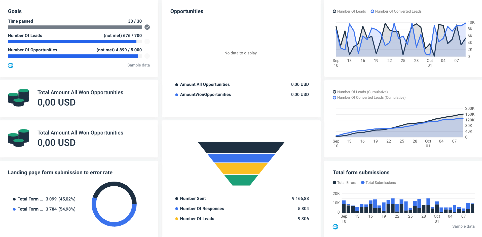
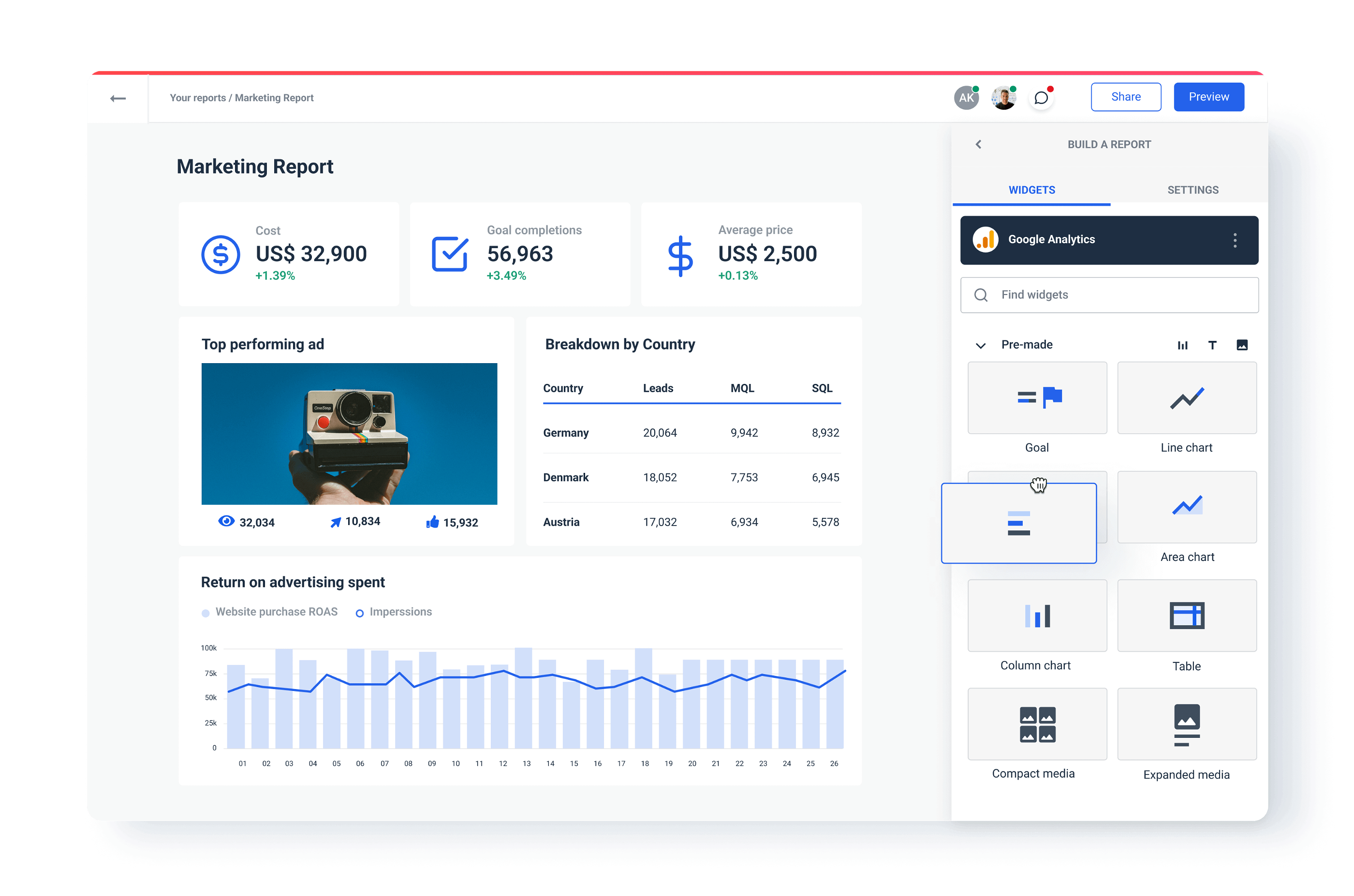
1. Whatagraph
Whatagraph is a marketing data platform for connecting, visualizing, and sharing marketing data through visual reports and dashboards. It’s an ideal visualization tool for marketing agencies and in-house marketing teams that regularly create a large number of reports, as it natively connects data from a variety of sources like Google Analytics 4, social media, SEO, email marketing, eCommerce, and CRM tools like HubSpot and Salesforce.
Features:
- Over 45 native integrations to popular marketing tools
- Custom API to connect any data source
- Ready-made report templates
- Google BigQuery as both source and destination
- Cross-channel reports and dashboards
- Intuitive user interface
- Automated report delivery through scheduled emails or live links
- No-code transfers to BigQuery
- Live chat customer support
Pros:
- Native integrations
- Drag-and-drop dashboard builder
- Easy cross-channel insights
- Unlimited number of dashboards
- Custom metrics
- Multi-source tables
- White-label functionality
- Transparent pricing plans
Cons:
- Yearly pricing might not suit all users
Pricing:
Whatagraph has pricing plans based on the number of users and data sources you plan to connect. Data transfers to BigQuery are offered at a flexible price and bulk discounts as an added service or standalone function.
Who is Whatagraph for?
Whatagraph has a broad user base that ranges from big-data companies to agencies looking to extract marketing metrics and create compelling marketing dashboards from multiple sources ranging from Google Sheets to LinkedIn to HubSpot.
Would you try Whatagraph for 7 days for free?
Request a free trial today and start using all our marketing data visualization features.
2. Tableau
Tableau is a cloud-based data visualization and reporting platform that allows users to connect to any data source and create interactive, shareable dashboards. In addition to different types of charts like bar charts, line graphs, and histograms, Tableau allows users to present their data through various maps.
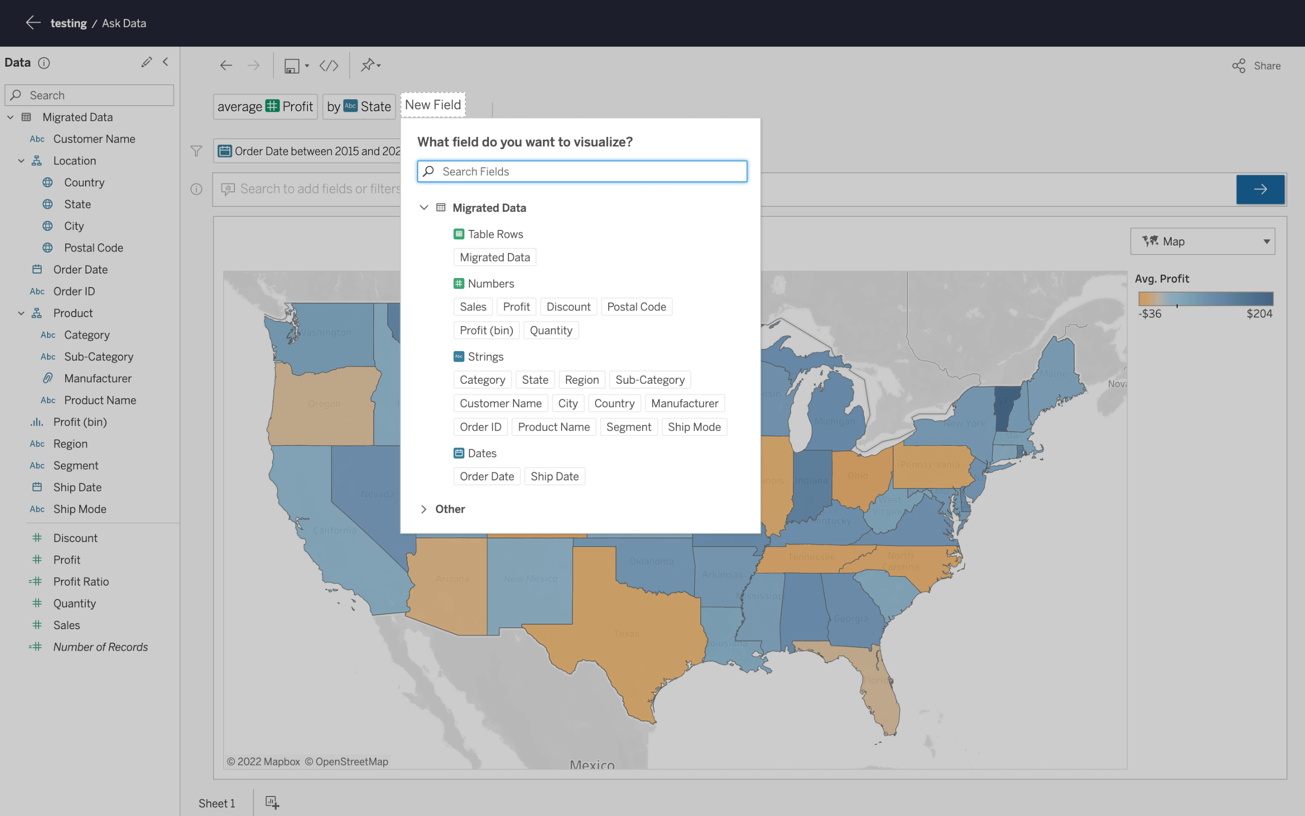
Available as a desktop app, server, hosted online version, and a free public option, Tableau supports hundreds of data import options, including CSV files.
On the output side, Tableau provides a variety of visualization types, including color-coded area heat maps that show geographical distribution in a way that is easy to comprehend.
Features:
- Able to easily clean and combine data
- Custom metrics
- Complex calculations with advanced analytics
- AI-driven predictive modeling for what-if analysis
- Real-time notifications via Slack channels
Pros:
- Simple to set up and use
- Easy connection to data sources
- Use of artificial intelligence and machine learning for granular insights
Cons:
- Can slow down when performing complex analyses
- No data retrieval and processing capabilities
Pricing:
- Tableau Viewer — $15/user/month
- Tableau Explorer — $42/user/month
- Tableau Creator* — $75/user/month
*Every Tableau deployment requires at least one Creator account.
Who is Tableau for?
Tableau is a good choice for data scientists and marketing agencies whose success depends on data-driven marketing campaigns and heavy analytics. With an extensive gallery of infographic types for inspiration, Tableau Public is a good option for those creating public-facing visualization, such as journalists or political analysts who love to quantify data visually.
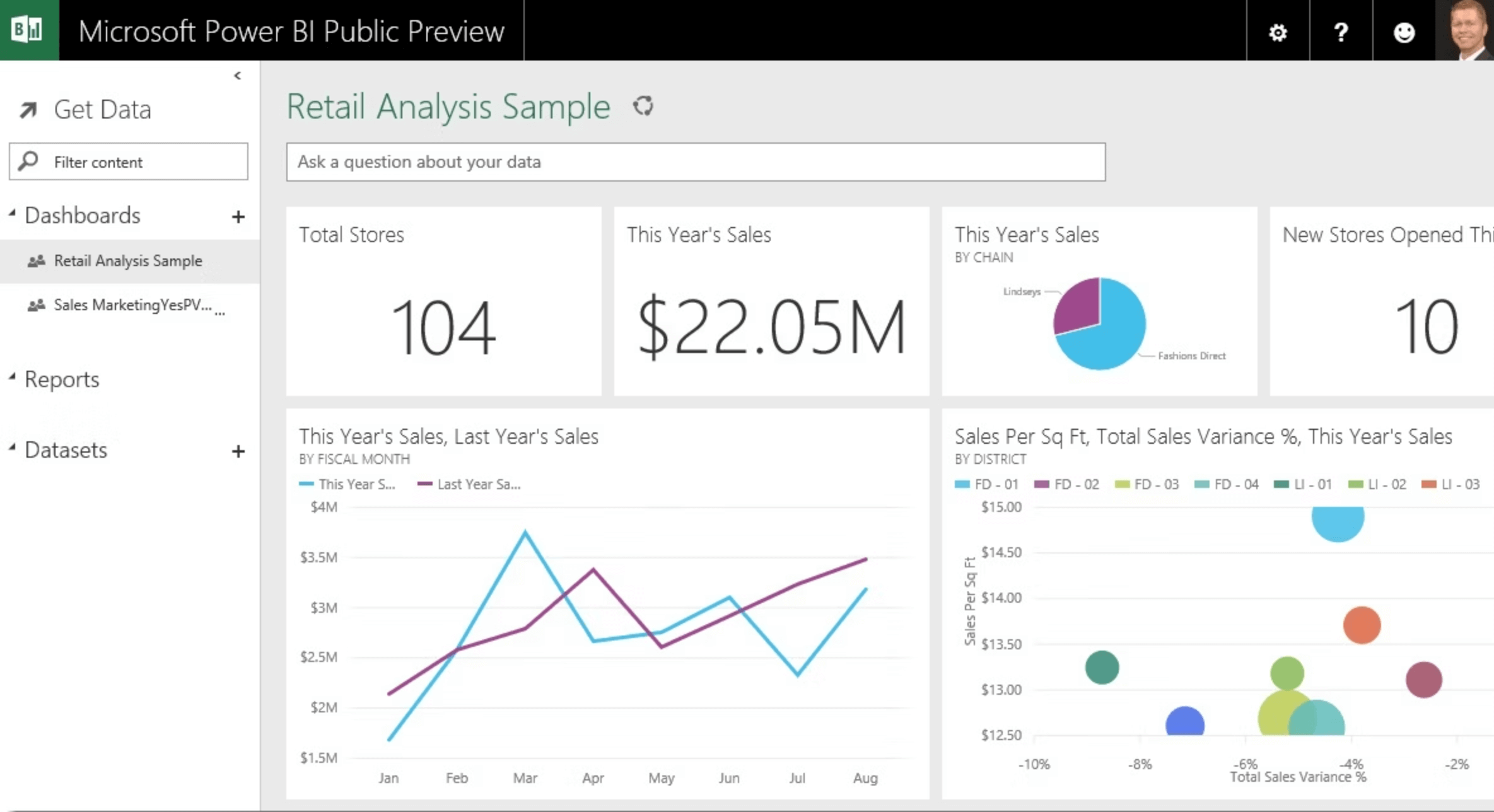
3. Microsoft Power BI
Power BI is Microsoft’s data visualization tool available as an on-premise or cloud solution. A well-rounded data analytics and visualization tool, Power BI integrates with various backend databases, including Adobe Analytics, Azure, Github, Microsoft Excel, Oracle, PostgreSQL, SQL Server, and Teradata, to deliver real-time insights for no-delay decision-making.
Features:
- A wide choice of visualization types
- Native integration with major databases
- Flexible visualization tiles
- Natural language Q&A box
- Office 356 App launcher
Pros:
- No need for specialized tech support
- Integrates easily with existing applications
- High-level security
- No speed and memory limitations
- Compatible with Microsoft stack
Cons:
- Limited data-sharing options
- No data cleansing option — must be done before visualizing
- Challenging to use for those who don’t master Excel
Pricing:
Power BI has five pricing plans:
- Free version — no report sharing option
- Power BI Pro — $10 per user/month
- Power BI Premium — $20 per user/month
- Power BI Premium (per capacity) — $262.80 per capacity/month
- Power BI Premium (+Microsoft Fabric) — $4,995 per capacity/month
Who is Power BI for?
Power BI is often associated with data analysts, data engineers, and other data science types. Actually, a wide range of business users can quickly learn the ropes and start using it to visualize their data. Indeed, the platform has an intuitive user interface so that non-technical users can easily create interactive charts, perform in-depth data analysis operations, and manipulate data to gain business intelligence.
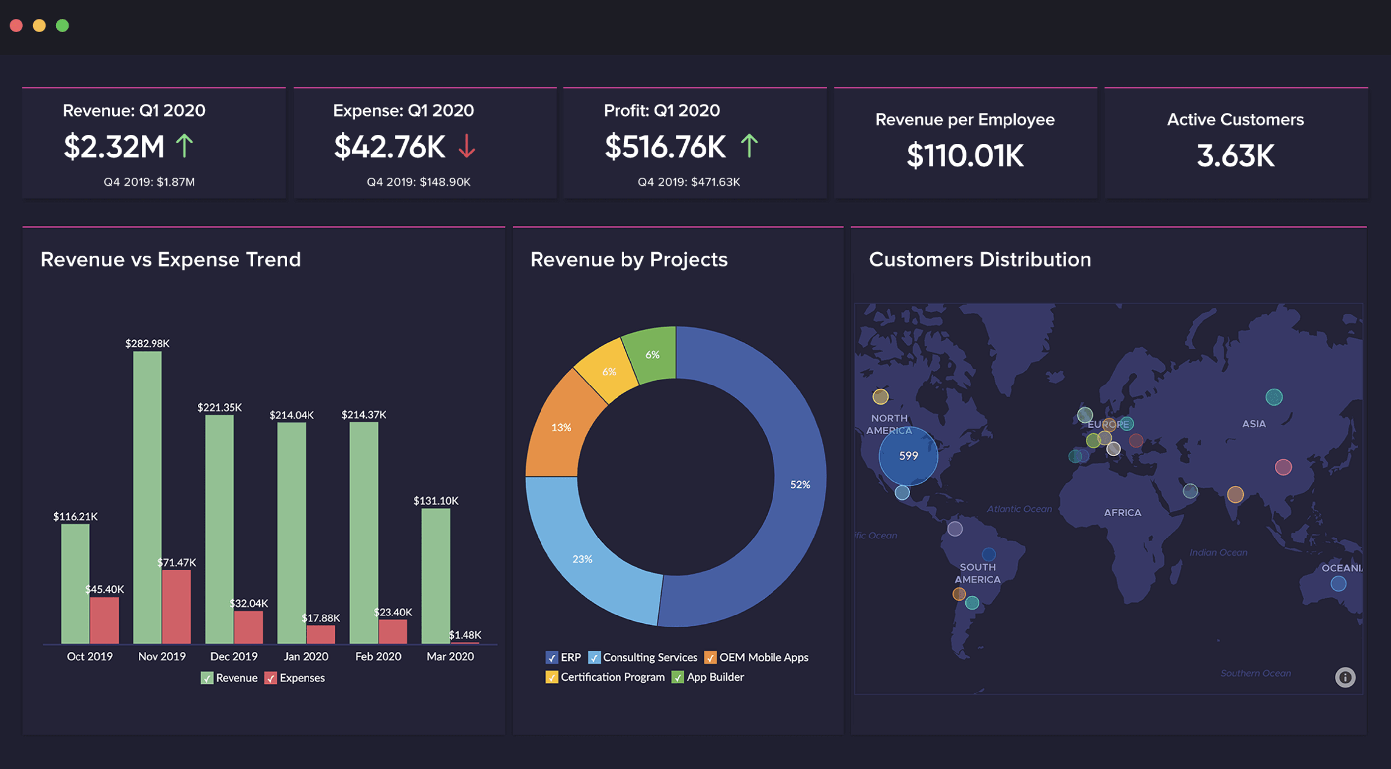
4. Zoho Analytics
Zoho Analytics is a data visualization tool designed specifically for professionals looking to visualize business intelligence. Zoho Analytics is ideal for visualizing sales, costs, marketing, revenues, and profit data, as well as pipelines through user-friendly dashboards.
Zoho is among the most popular self-service business dashboard platforms, allowing users to quickly create and share reports in minutes.
Features:
- Import and visualize data from over 250 sources
- Zoho DataPrep for self-service data preparation and data recycling
- Built-in dynamic visualization tool
- AI-powered data analysis
- Zoho Security protocol for increased data safety
Pros:
- Effortless report creation and editing
- Ease of use
- Email scheduling and report-sharing functionality
- Quick customer support
Cons:
- User training could be better
- Dashboards can get stuffy with large volumes of data
Pricing:
Zoho Analytics has five pricing plans based on the number of users and data rows, analytical capabilities, and customizations:
- Basic — €24 per 2 users/month
- Standard — €48 per 5 users/month
- Premium — €115 per 15 users/month
- Enterprise — €455 per 50 users/month
- Custom — send a quote for a custom pricing plan
Who is Zoho Analytics for?
Thanks to its wide gamut of pricing plans, Zoho Analytics is a good choice for small and medium businesses. Beginners might benefit from an affordable low-tier package, while enterprises can adopt one of the upper-pricing tiers, including advanced visualization and data features.
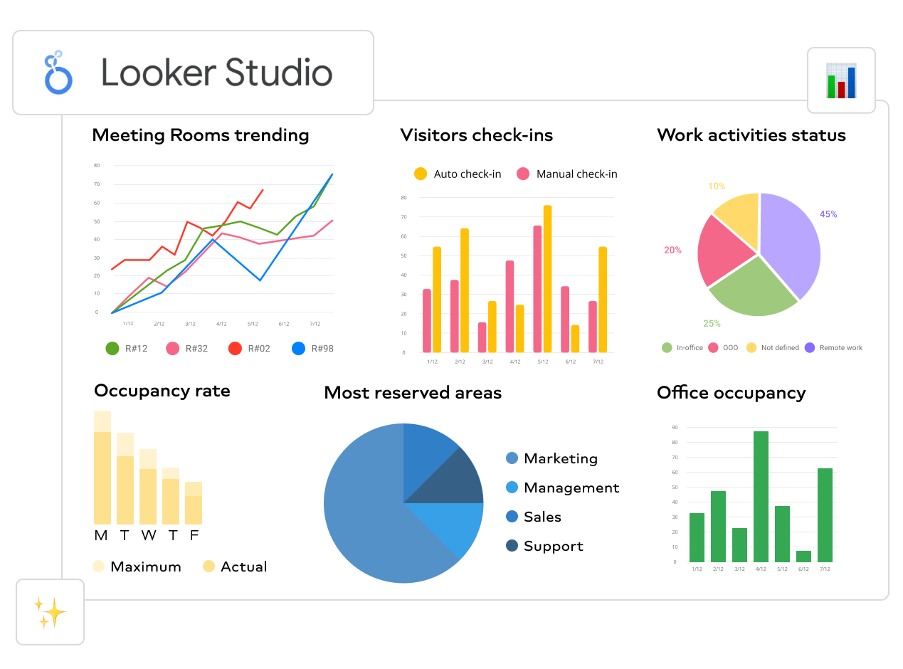
5. Looker Studio
Previously known as Google Data Studio, this data visualization tool is popular because it’s free to use and allows users to present data in various visualization formats.
You'll have no trouble using Looker Studio to visualize data as long as you rely on Google Analytics 4, Google Ads, Google Trends, and other data apps from Google’s stack.
However, the problem starts when you try to connect and visualize data from sources outside the Google platform. The free plan doesn’t cover those, so you must pay a monthly subscription and purchase 3rd party connectors, which can cause your Looker Studio to run slow.
Features:
- Easily connects with BigQuery, Snowflake, and more than 50 SQL sources
- Interactive reports and dashboards
- Mobile app
- Predictive analytics and data modeling
Pros:
- 360-degree overview of marketing performance
- Strong data modeling capabilities
- Development mode for testing codes
Cons:
- Natively connects only Google apps
- Limited visualization options
- Not scalable when processing large databases
- No multi-tenant capabilities
- Support is limited to tutorials
Pricing:
Looker Studio is free to use with Google products. Otherwise, a custom pricing applies. The quotes depend on the number of users and database connections and the size of your deployment.
Who is Looker Studio for?
Looker Studio is a good choice for businesses looking for a user-friendly data visualization tool that provides enough information through its visualizations. Startups and freelancers can also benefit from its free plan as long as they stay in the Google camp.
6. Datawrapper
Datawrapper started as a tool for adding interactive charts and maps to news stories that are easy to embed on news websites. The data sources in those cases are limited, with the primary method for copying and pasting data into the tool.
Once you import data, you can create any chart from the gallery with a single click. You can use visualization types, including column, line, chart, donut charts, scatter plots, choropleths, and maps.
The final visualization is something you would expect to see on news websites like the New York Times, Boston Globe, The Times, etc.
Features:
- Many customization options
- Open-source app
- Works both online or installed on the server
- 22 types of charts and maps available
- Interactive visualizations
Pros:
- Dedicated to data visualization at news websites
- Free plan great for startups and small agencies
- Built-in color blindness checker
- Visualization exports as PNG, SVG, and PDF
Cons:
- No integration with data sources
- Manual data input is prone to errors
- Paid plans are expensive
Pricing:
- Free — create and publish visualizations as PNG
- Custom — $599 per month
- Enterprise — quote-based plan for enterprises
Who is Datawrapper for?
Despite its high price tag, Datawrapper is a prime choice for news sites that need a dedicated data visualization tool for news-specific presentations.
7. Infogram
Infogram is a drag-and-drop visualization tool that allows people with no data or design experience to create compelling social media visualizations, marketing reports and dashboards, website infographics, etc.
Once you’re happy with your visualization, you can export it into PNG, JPG, GIF, PDF, and HTML formats. Infogram also has a WordPress plugin that makes it easy for WordPress users to embed visualizations into websites.
Features:
- Object animations
- Over 550 maps and 35 charts to choose from
- API for connecting data sources
- Team collaboration options & permissions
Pros:
- Drag-and-drop visualization builder
- Interactive charts
Cons:
- There are fewer native integrations than other tools on the list.
Pricing:
Infogram has tiered pricing with a free plan with basic visualization features.
- Basic — $0 get started and create up to 10 projects
- Pro — $19 per month, up to 100 projects, premium templates, download & share
- Business — $67 per month, Pro + customizations and white-labeling
- Team — $149 per month, Business + engagement analytics and real-time team collaboration.
- Enterprise — custom pricing for a branded subdomain, custom designs, and full enterprise pack.
How to choose the right data visualization tool?
Learning curve
Features and benefits for the user are one thing, but if the tool isn’t user-friendly, it doesn’t stand a chance against competitors. Choose a data visualization tool that requires minimum onboarding. However, it’s not only about mastering all the functions but also how the tool makes your job more manageable daily.
One platform that covers the whole journey
Always use a data visualization tool that allows you to connect, visualize, and share your marketing data within the same app. When your visualizations don’t depend on other tools to connect data, you get increased stability and speed, as the performance doesn’t rely on the performance of third-party software.
A one-platform visualization tool should support many native integrations, depending on the industry they’re specialized for, and also allow importing data via an API, data warehouse, or spreadsheets.
Bring cross-channel data together
A good data visualization tool should let you easily gain cross-channel insights by simply connecting the data sources you have to a single report or dashboard. But cross-channel visualization doesn’t end there.
Whatagraph, for example, allows you to use custom formulas to blend existing metrics from multiple sources or create new metrics that original platforms don’t provide. This helps users get through several data layers and visualize precisely the information they need.
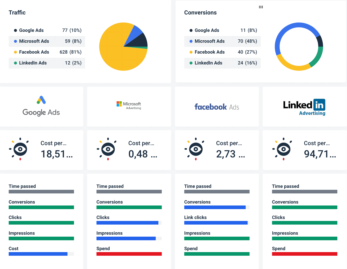
Another handy cross-channel feature is the multi-source tables. In Whatagraph, multi-source tables are available as pre-made widgets that you can add to any report to compare metrics from comparable sources, like paid advertising or social media platforms.
Data transformation
Imagine having one platform with the ability to transform data before you visualize it, allowing you to perform custom calculations, apply rules, and create new metrics and dimensions on the source level, which saves a lot of time if you handle large volumes of data.
This means you can easily unify data naming across channels, such as country, gender, age, device, and other dimensions, which are often named differently on different platforms.
This way, you prevent inconsistencies when blending data or creating custom formulas.
Cost vs. value
Finally, there’s the consideration of price versus value. The higher price tag doesn’t automatically disqualify the tool. However, you should know what you’re getting for the high dollar value. If you’re ready to pay more, ensure you have live chat support, premium visualization, and sharing features, and overall better value for your business.
Wrapping up
With such a variety of quality data visualization tools, it’s become increasingly challenging to determine which one to use. But the rule of thumb is to first look for the ease of use and whether the tool’s features match your business needs.
Published on Oct 18 2023
WRITTEN BY
Nikola GemesNikola is a content marketer at Whatagraph with extensive writing experience in SaaS and tech niches. With a background in content management apps and composable architectures, it's his job to educate readers about the latest developments in the world of marketing data, data warehousing, headless architectures, and federated content platforms.