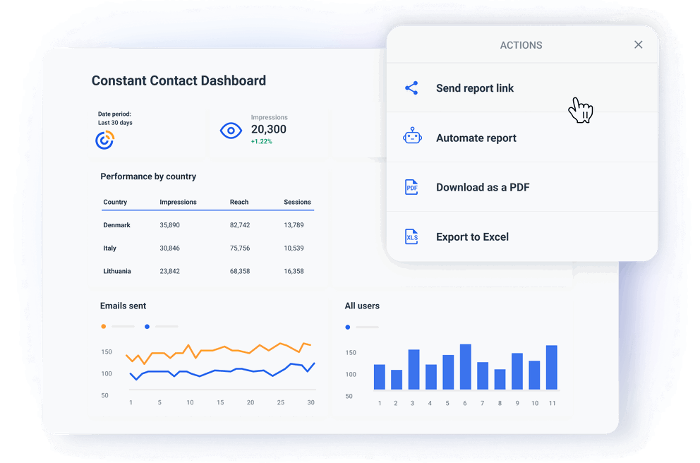
How to Build a Constant Contact Dashboard in 6 Steps
A dedicated Constant Contact analytics dashboard can help you:
- Visualize campaign metrics in real time.
- Generate automated, shareable reports for clients.
- Combine Constant Contact data with other marketing or sales data for broader insights.
As a result, you would be able to:
✅ Offer clients a streamlined view of their Constant Contact campaign performance. No manual data wrangling.
✅ Achieve faster and more precise decision-making thanks to real-time insights.
✅ Save time and reduce repetitive tasks with automated reporting.
✅ Show your clients professional, branded reports that highlight marketing value.
But how do you get from clunky spreadsheets to an organized and automated dashboard?
Here’s a quick guide.
1. Choose a Constant Contact reporting software
First, you need to select a reporting platform that allows you to connect Constant Contact as a source and build dashboards.
Here are some great options to consider:
- Whatagraph — best overall, group dashboard editing, direct integrations, data blending, performance monitoring, custom metrics, great customer support.
- Looker Studio — free, but needs third-party connectors for every non-Google source. It takes some time to learn. Non-existent customer support.
- AgencyAnalytics — easy to use and has a huge library of dashboard templates. However, it can be unstable when processing large datasets. Limited dashboard options.
- Databox — good dashboard tool for small businesses. Has unique features like industry benchmarking and performance alerts. Yet users often complain that it’s difficult to use and prone to long service outages.
- ReportGarden — simple and clean dashboard design with the ability to create different visualizations. Lacks data transformation options and custom API so you can't connect data outside the integrations.
We don’t give us credit if it is undeserved, but Whatagraph is probably the most stable and customizable dashboard reporting tool you’ll find.
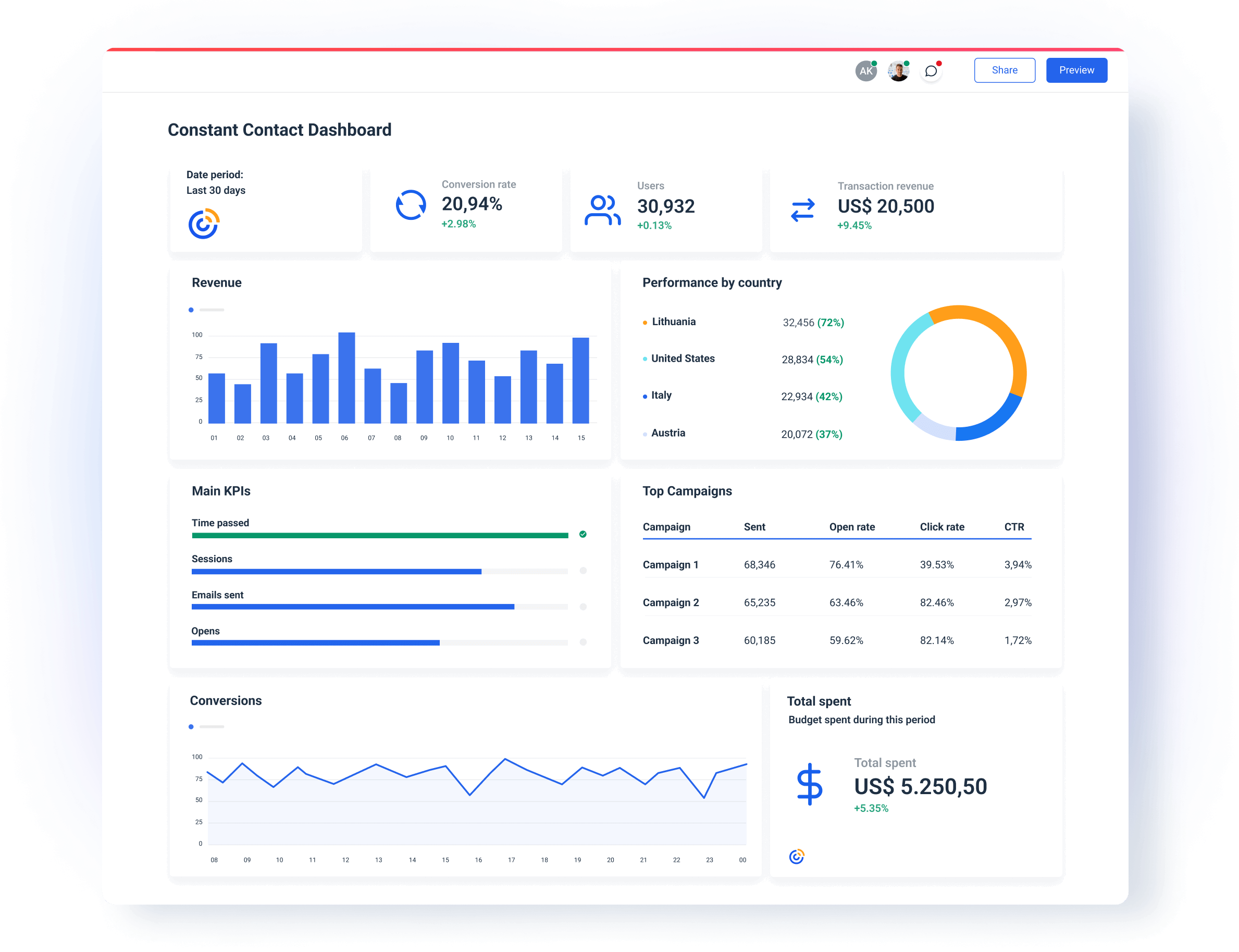
But how can we know that?
Let’s take a look at some of the reasons that make Whatagraph an ideal tool for Constant Contact reporting.
✅ Stable and fully managed data connectors
Whatagraph effectively eliminates all your manual data struggles. Just connect your Constant Contact account and your data is there — whenever you need it.
All our integrations are fully-managed by our team of engineers. This means the connections are much less likely to break off than if you use a third-party connector.
As a result:
- There’s nothing to reconnect or update on your side.
- Your reports load instantly and show the right metrics without last-minute surprises.
- System outages (if any) are quickly resolved by our Product engineers, who are on-call 24/7.
✅ Fast actionable insights
You’ve connected your Constant Contact account, but actionable insights are still buried under a heap of data.
Now, you need to sift through all that data and pinpoint the reasons for high or low points in your campaign.
This is where our Organize feature comes in.
You can use it to make sense out of scattered data by creating:
- Custom metrics: to unify and change the names of different metrics permanently in your report or create a new metric using a simple formula.
- Custom dimensions: to unify names of different cross-channel dimensions and group data points from different sources.
- Data blending: Great for combining different sources together into one unified data source for getting quicker insights and keeping your dashboard neat.
- Source groups: Group 100s of scattered data sources into a unified group in seconds.
- Custom tags: Add custom tags to your data and filter it by client, business type, location, Account Manager, etc.
- Overview: Visualize your key metrics in one view and easily spot performance trends.
All these features are 100% code-free and can help you cut through the clutter and uncover hidden actionable insights.
✅ Saves time reporting & eliminates repetitive actions
Whatagraph allows you to link hundreds of dashboards or reports to one “master template” and edit them all just by making changes to the master template.
But you can still edit widgets and images in specific reports without affecting the template.
Just how cool is that?
Also, in Whatagraph you can create one dashboard and that can also double as a report. It all depends whether you decide to share it via a live link or schedule automated emails.
In that case, a screenshot of the current metrics is taken and sent as a PDF report to a pre-set list of addresses.
Building your first Constant Contact report is as easy as A-B-C. You can either:
- Start from a blank page and use our drag-and-drop widgets to add metrics to the dashboard.
- Use our ready-made Constant Contact report template.
Just connect your CC account to the template and customize it for your clients.
This brings us to the next point.
✅ Professional, sleek, and custom-branded reports
Whatagraph has everything you need to deliver a professional experience with every Constant Contact analytics dashboard you share with your clients.
You can:
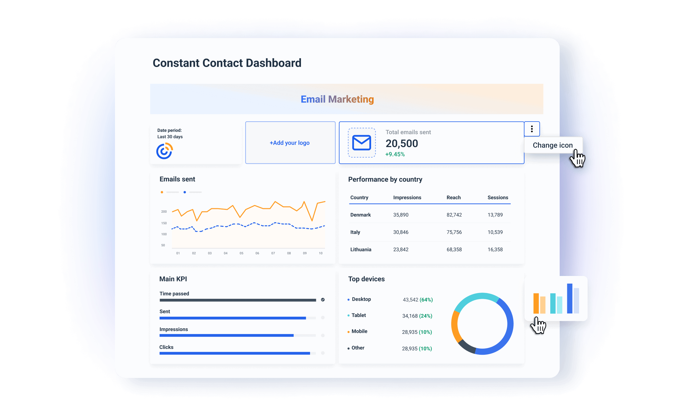
- Upload your logo or your client’s logo.
- Create custom color schemes.
- Add footer and header texts.
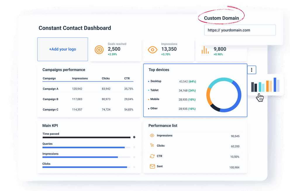
- Create custom domains to host and share your reports.
- Change the icons and colors of your widgets.
2. Customize your Constant Contact Dashboard
When you share a custom-branded dashboard with your clients, you’re showing that:
✅ You’re a professional agency.
✅ You’re ready to go the extra steps to meet the unique needs of your clients.
Here are some of the best practices:
- Customize branding elements: Replace the dashboard provider’s logo with yours or your client’s. Use the brand colors throughout the dashboard. In Whatagraph, you can even customize the color of chart fields.
- Create branded templates: With Whatagraph, you can save almost anything you create as a custom template. Prepare standardized Constant Contact dashboard templates for each client that keep the same layout, branding, and structure.
- Tailor metrics to client goals: What works for one client may not work for another. In Whatagraph, you can highlight specific metrics that matter most to your client.
- Simplify data display: Clients appreciate clear, easy-to-understand visuals. Avoid overwhelming them with unnecessary metrics or complex data.
Tom Jauncey, CEO of Nautilus Marketing says that a report should be:
- Clear
- Concise
- Actionable
“Start with the wins, explain what’s driving results, and then outline the next steps. Tailor the report to each client’s goals—they don’t all care about the same metrics, so focus on what matters to them.”
Jauncey's advice is spot on. That is why Whatagraph dashboards are so easy to tailor to the needs of different clients.
If you can show real progress right away and explain it in familiar terms, your clients will consider you more of a partner than a service provider.
3. Provide actionable insights
Clients who don’t have marketing knowledge will probably need extra explanations apart from the dashboard you send them.
You often need to explain how everything ties in with their business goals.
You can set a separate meeting after each reporting period OR you can include the actionable insights right there in your Constant Contact report.
For example, you can add:
- Contextual insights: Whatagraph’s text widget makes it very easy to add annotations or summaries right next to a graph or table, so you can explain to your client what is happening there and why.
- Recommendations: Where appropriate, offer actionable insights or next steps based on data. For example, if the search volume for specific keywords has decreased, suggest optimizing landing pages with additional keywords.
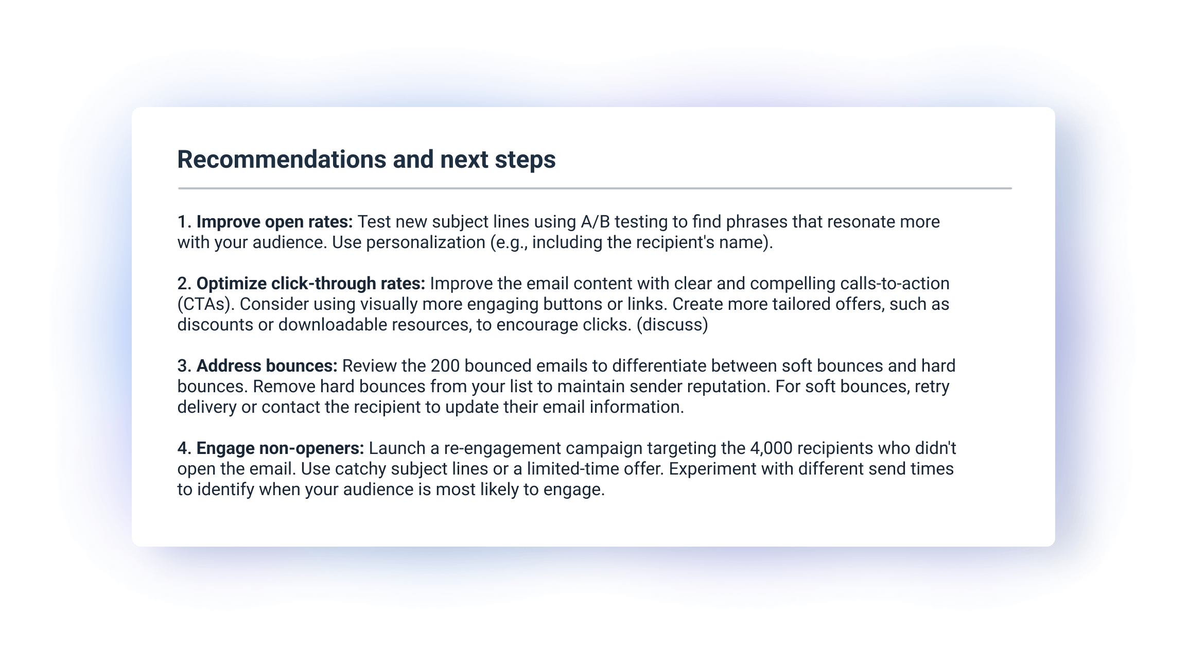
With comments and recommendations, your dashboard becomes a valuable decision-making tool.
Jauncey reveals an extra tip:
“We also send a personalised loom recording to those clients who can't jump on a call to go over data making it super easy for them to access data.”
But with Whatagraph, there’s no need to create a video. You can stick text widgets with comments throughout the dashboard, and offer the next steps at the end.
4. Make the dashboard user-friendly
We often hear this from agencies who are switching from our competitors to us — clients don’t read their reports.
In other words, if the dashboard is not easy to read, your clients may stop checking it out.
And as a result feel less involved in the marketing efforts — which may lead to the lack of trust and eventual churn.
We’ve heard a lot of stories like that.
Luckily, Whatagraph has everything you need to avoid that and build a dashboard to the highest UX standard:
- Clear navigation: You can organize metrics logically and use simple menus or tabs to separate different sections, such as the executive summary, traffic, acquisition, SEO, etc.
- Data visualization: Present complex data in a simple way with our charts, graphs, and value widgets. Your clients can hover over specific fields to uncover more info.
- Mobile-friendly design: Make sure your dashboard looks good and works well on mobile phones. Many clients may check reports on the go, so the mobile experience should be just as effective as the desktop version.
If clients can use the presented data more easily, they’re more likely to appreciate the value your agency delivers.
5. Add more sources to your dashboard
If you are also running a PPC campaign and optimizing clients' pages for Google search, why not present those results right next to email marketing data?
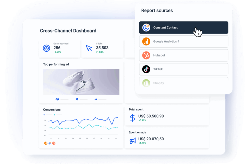
In Whatagraph, you can easily add more digital marketing sources to your dashboard. This way, you can show clients the big picture of their performance without having them check out several dashboards or reports.
For example, you can combine the Constant Contact data with:
- Google Analytics and social media platforms: This way you can track email campaign data together with website traffic and engagement from organic and social media.
- PPC apps: For clients running campaigns on several channels, include performance data from Google Ads, Facebook Ads, etc.
- CRM or sales data: So the clients can track the direct impact of your emailing efforts on their business.
A cross-channel dashboard provides a bird's-eye view of performance. This allows clients to see how different channels contribute to their business goals.
6. Regularly update and maintain your dashboards
As your clients’ needs evolve, make sure to update the dashboards with the latest features and insights. This shows your clients that you're keeping pace with the latest trends and developments.
- Add new metrics: If your client starts a new marketing campaign or focuses on a new goal, update their dashboard to reflect these changes.
- Keep the data accurate: The integrations and data sources should work correctly and deliver accurate results. (You won’t have this issue with Whatagraph)
- Ask for feedback: Client feedback helps you never lose their needs out of sight. Ask about what they want to see added or changed in the dashboard.
Regular dashboard updates show your client that you’re proactive about providing the best possible reporting experience.
How Should You Structure Your Constant Contact Dashboard?
An organized dashboard helps clients see the value of your services through the story of data. Here's how to structure a client-friendly Constant Contact dashboard:
#1 Executive summary
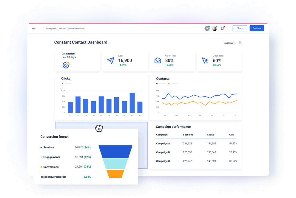
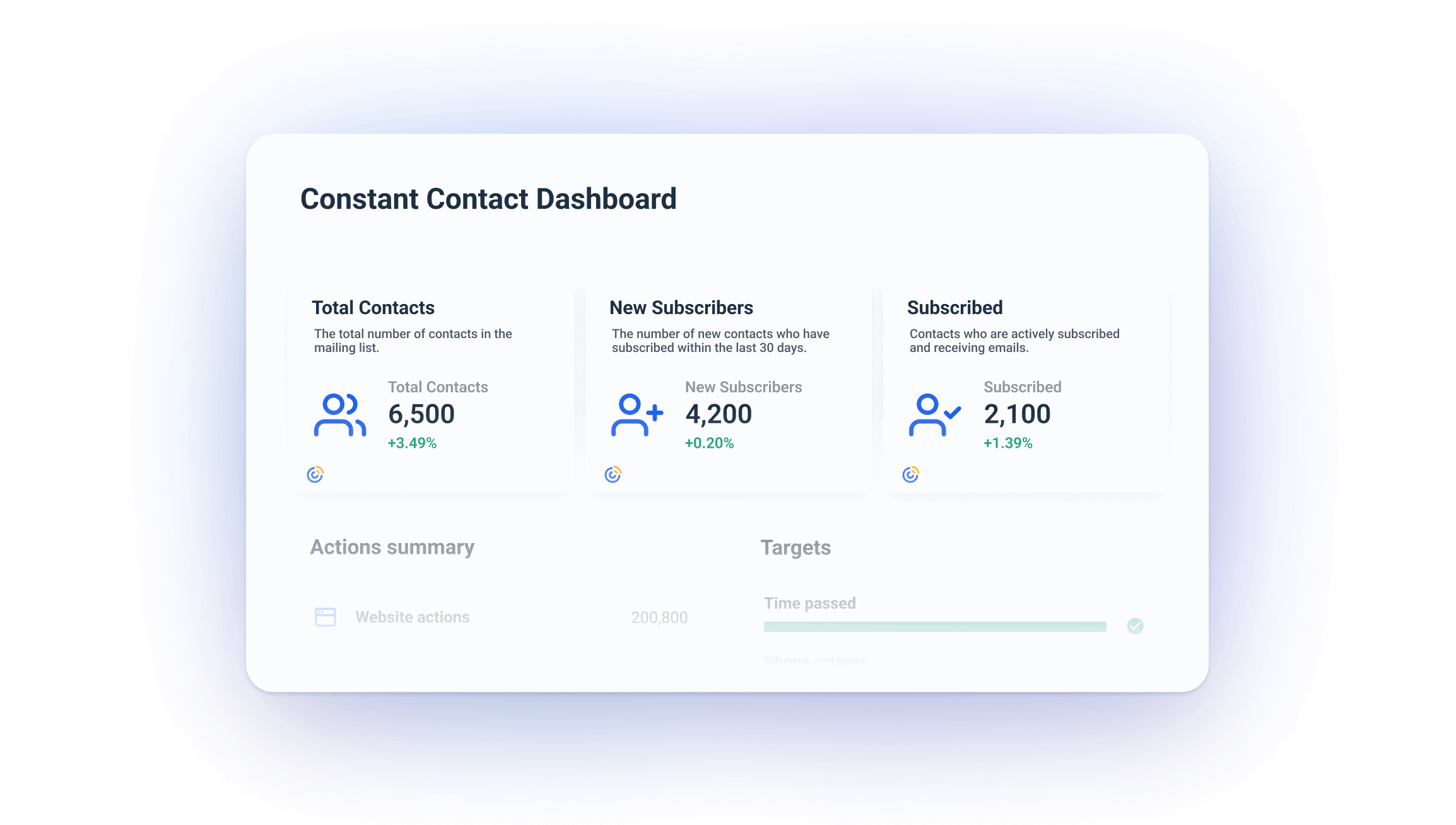
Easily created in Whatagraph with single-value widgets, this section gives you a high-level snapshot of email audience growth. This way clients can immediately see the health of their email list. This summary helps set benchmarks for tracking future campaigns.
#2 Contacts progress bar charts
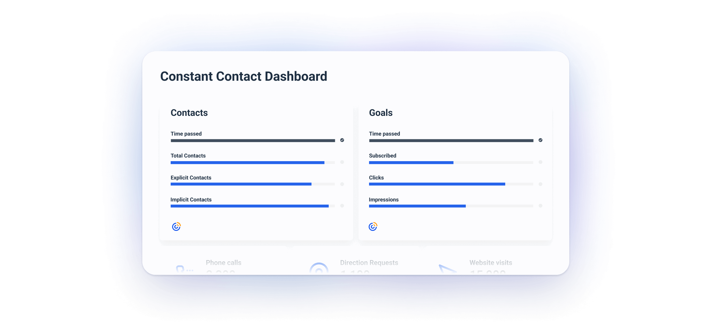
Built with Whatagraph’s Goals widgets, these charts show the progress in getting explicit (opted-in) and implicit (possibly imported or inferred) contacts. Clients can use it to prioritize communication to already engaged audiences.
#3 Contact and campaign summary tables
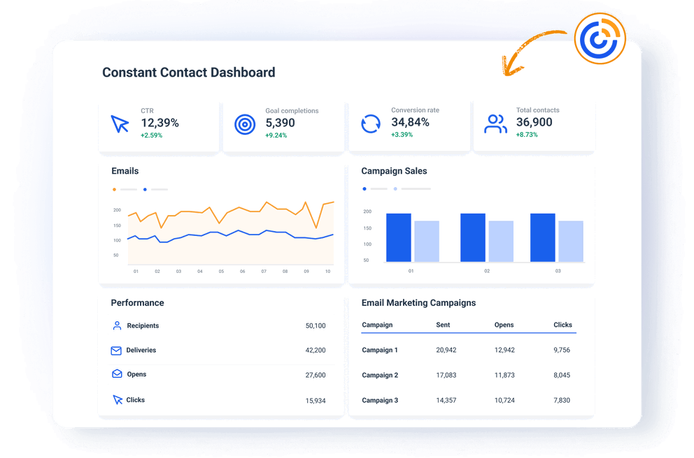
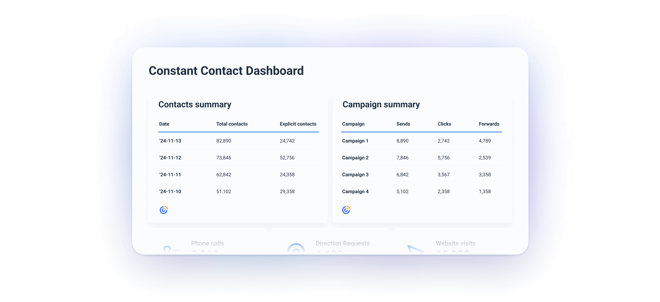
This table tracks how your contact list has evolved over time. It can help you spot spikes or patterns from specific campaigns or seasonal efforts.
You can use it to identify periods in which the number of subscribers has grown or dropped. Then, you can use this information to fine-tune your acquisition or retention strategies.
The campaign summary table helps clients compare key metrics across campaigns. This way, they can identify what is hitting the right spot, and what needs improvement.
It also reveals underperforming campaigns — those with high bounce or non-open rates — so you can take action immediately.
#4 Email summary and subscriber funnel
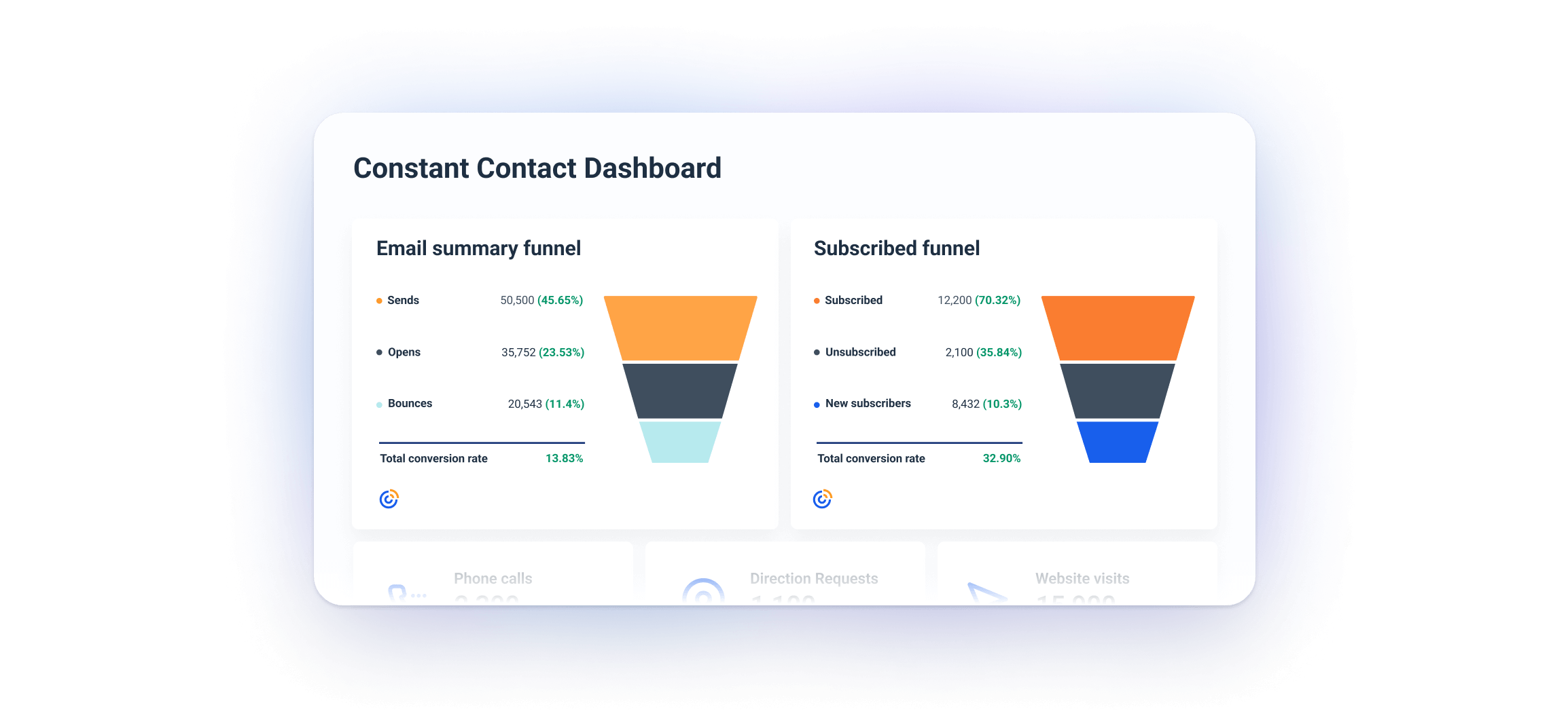
This section clearly shows the progression of audience interactions with your campaigns, from delivery to engagement. It helps you pinpoint issues like invalid email addresses or technical errors that affect deliverability.
On a larger scale, this funnel offers an intuitive view of the campaign's effectiveness. This way your clients can easily see where they are losing engagement.
The subscriber funnel reveals your audience churn so you can take action and reverse unsubscribe trends.
New subscribers show you the impact of recent acquisition strategies, such as lead magnets or promotions.
Which Metrics Should You Add to Your Dashboard?
The metrics you will use on your dashboard often depend on the client's needs and the agreement you reach in the onboarding phase. These can then change over time. However, these 12 are an excellent way to start:
- Total Contacts: This metric represents the total number of individuals in your email list. It helps gauge the overall size of your audience and track growth or drop over time.
- New Subscribers (Last 30 Days): Tracks how many new contacts have been added recently. It shows how well your lead generation efforts (such as sign-up forms or campaigns) are performing.
- Subscribed: Shows the number of active subscribers who are currently opted-in to receive your emails. It helps assess the health and engagement of your list.
- Unsubscribed: The number of contacts who have opted out of your emails. High unsubscribe rates could signal issues with content relevance, frequency, or audience targeting.
- Explicit Contacts: The number of contacts who have explicitly opted in to receive emails from you, usually through a sign-up form. These are highly valuable as they’re most likely to be engaged and compliant with regulations like GDPR.
- Implicit Contacts: Refers to contacts who were added without an explicit opt-in, such as through offline events or third-party data. These may have lower engagement and could present compliance risks.
- Sends: The total number of emails sent. This is a good measure of the scope of your campaign. You can use it to calculate delivery rates and engagement percentages.
- Opens: Tracks how many recipients opened your email. It’s one of the first signs of the effectiveness of your subject lines and overall interest in your content.
- Clicks: Measures the number of recipients who clicked on links in your email. It shows how engaging your content is and helps assess conversion potential.
- Forwards: Shows how many times your email has been forwarded. High forward rates mean your content is shareable and valuable to your audience.
- Bounces: The number of mails that couldn’t be delivered. Bounces are split into soft bounces (temporary issues) and hard bounces (permanent issues, such as invalid email addresses). Monitoring bounces helps maintain list hygiene.
- Non-opens: Tracks the number of recipients who didn’t open the email. High non-open rates could indicate issues with email relevance, timing, or subject lines.
