


TL:DR
Databox is a sleek dashboard tool designed for quick KPI snapshots and mobile-first reporting—but it struggles with connector stability, customization, and scaling for client-heavy agencies.
Who it’s best for:
Smaller agencies focused on basic KPI dashboards, internal team monitoring, or executives needing mobile-first views. Not ideal for high-volume client reporting or heavy customization needs.
Key features at a glance:
| Feature | Databox |
| Integrations | ~120+ native integrations |
| Stable connections | Frequent re-auth errors, fragile connectors |
| Ease of use | Very easy for simple dashboards |
| Data blending | Possible, but limited to basic metrics and cumbersome for complex joins |
| Internal dashboards | Supported (great mobile app and TV display) |
| Customizable reports | Limited; stuck to grids, minimal styling |
| Report sharing & automation | Live share links, PDF exports, scheduled email reports |
| Security | TLS 1.2+, AES-256 encryption, GDPR compliant, SSO on Premium |
Pros ✅
- Easy to set up dashboards fast
- Mobile-first and TV screen support
- Live interactive dashboards
- Free-forever plan for small teams
- AI summaries (on Growth plan+)
Cons ❌
- Fragile connectors cause frequent issues
- Templates and metrics prone to breaking
- Limited customization and design control
- Expensive once you scale data sources
- Support slow unless you’re on Premium
Why You Can Trust This Review: Our Process Explained
At Whatagraph, we live and breathe marketing data every day. And we genuinely care about finding you a marketing reporting tool that’s going to make your life easier—not harder.
This is why we went through lengths to give you this review. Here’s what we did:
- Fact-checked against live docs: Pricing, feature limits, and security claims are captured straight from the vendor’s public pages.
- Hands-on sandboxing: We open a brand-new workspace, wire up the usual marketing stack (GA4, HubSpot, Shopify, a sample SQL table, etc.), then build multiple dashboards and reports from scratch.
- Tracked real-world user discussions: Recent, verified G2 and Capterra reviews, public forum threads, and help-center discussions are scanned for recurring themes—things that crop up more than once end up on our radar.
- Timed the help desk: We file an ordinary “how-do-I” ticket, then clock how long it takes to get a human, actionable answer.
- Scored against agency must-haves: Finally, we grade the tool on integration breadth and stability, customization and white-labelling depth, automation reliability, everyday usability, and the quality of customer support.
Consider this your data-backed litmus test; whichever way you lean, you’ll be leaning on solid ground.
Databox Pricing
Databox keeps its price ladder tidy: five tiers, each stacking more speed, history, and bells and whistles.
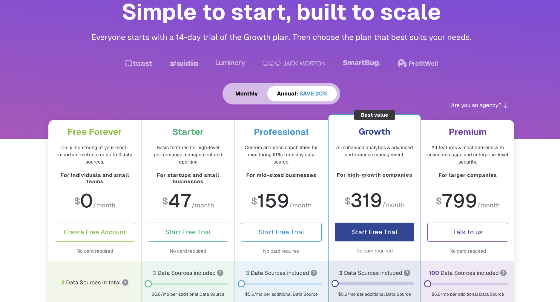 Heads up: See how data sources only climb to 100 in the most expensive tier? So, if you’re a small or medium-sized agency, you’ll likely feel a mid-tier sticker shock. Sticking with Starter or Pro but adding, say, 15 sources balloons the bill past $120/month, while you’re still limited to a 4-hour or hourly refresh.
| Plan | Base Price (Billed Annually) | Data Sources Included | Users | Sync Frequency | What’s Included |
| Free Forever | $0/month | 3 | 3 | Daily |
|
| Starter | $47/month | 3 | 5 | Every 4 hours |
|
| Professional | $159/month | 3 | Unlimited | Hourly |
|
| Growth | $359/month | 3 | Unlimited | Hourly |
|
| Premium | $799/month | 100 | Unlimited | Hourly |
|
What does Databox’s pricing mean for your budget?
- Connectors, not seats, drive cost: After Free/Starter, users are unlimited—your bill scales with data sources, not headcount.
- Extra connectors add up quickly: Each one is $5.60/month. Needing just five more on Starter already boosts the cost by 60%.
- The AI capabilities start at the Growth tier: If automated summaries and forecasts are must-haves, factor in $319+ as your new floor.
- Premium only pays off at scale: It’s the economical pick once you cross roughly 90 data sources or require a 15-minute sync for mission-critical metrics.
Databox offers exclusive benefits for marketing and consulting firms: unlimited client workspaces in one portal, reusable branded templates, optional white-label add-on, and discounted per-source pricing.
Plus, a free agency sandbox so you can demo it all risk-free.
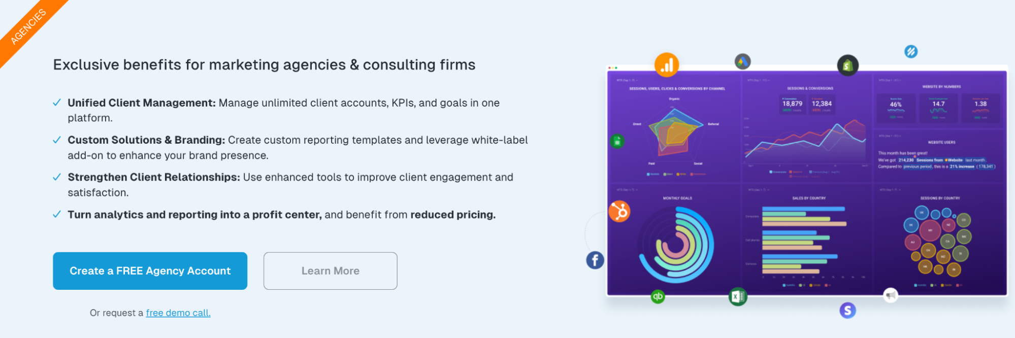 However, that sandbox still caps you at three daily-sync connectors and leaves full white-labeling (and faster support) behind a paywall. So budget accordingly if you decide to move beyond the test drive.
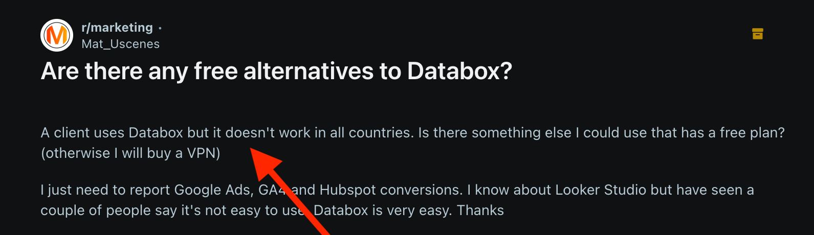
IMPORTANT: Another thing you’d want to ask the sales team before shelling out money is if Databox works in your—and your clients’—countries.
According to Redditor Mat_Uscenes from about 11 months ago, Databox “doesn’t work in all countries.”
Real User Reviews: What are Customers Saying About Databox?
There’s an interesting trend in almost all the recent user reviews across G2, Capterra, and community threads I trawled: for every positive feature, users include a “but…” Even the five-star ones.
Basically, every bright spot comes with a shadow. This signals that there’s friction that seasoned users feel compelled to tag a caution along with the compliment.
This Reddit comment captures the “yes, but” format perfectly:
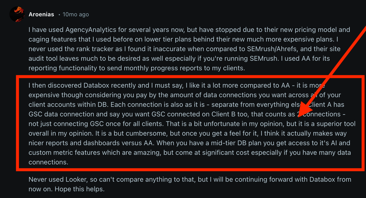
“Each connection is also as it is - separate from everything else…
That is a bit unfortunate in my opinion, but it is a superior tool overall in my opinion.It is a bit cumbersome, but once you get a feel for it, I think it actually makes way nicer reports and dashboards versus AA.
When you have a mid-tier DB plan you get access to it's AI and custom metric features which are amazing, but come at significant cost especially if you have many data connections.”
 Let’s break this down further.
Databox pros: What users love
✅ Setup is fast, almost fun
New users rave about getting a live dashboard in under an hour. Robert R. on G2 calls it the best “data visualization tool”:
Databox makes it simple to interact with data in ways you never thought possible. I can easily sync it to my Google Analytics, Hubspot, Adwords, LinkedIn, and other tools to get a precise view of marketing attribution and follow the data to discover holes in strategy. I love this tool. It was easy to implement.
But once the honeymoon ends, they note a learning curve for deeper tweaks and wish for more flexible layout controls.
Robert says: “The interface has a learning curve for new users, but once you adapt to the tool, it saves you a ton of time.”
✅ Integrations pull everything into one pane of glass
Reviewers love piping GA4, HubSpot, and half-a-dozen ad channels into one screen.
I like best that Databox provides all of your sales metrics in one place combined with multiple data sources. So you can have all your business to business sales combined. It’s very easy user friendly. It really tracks the performance of your company.
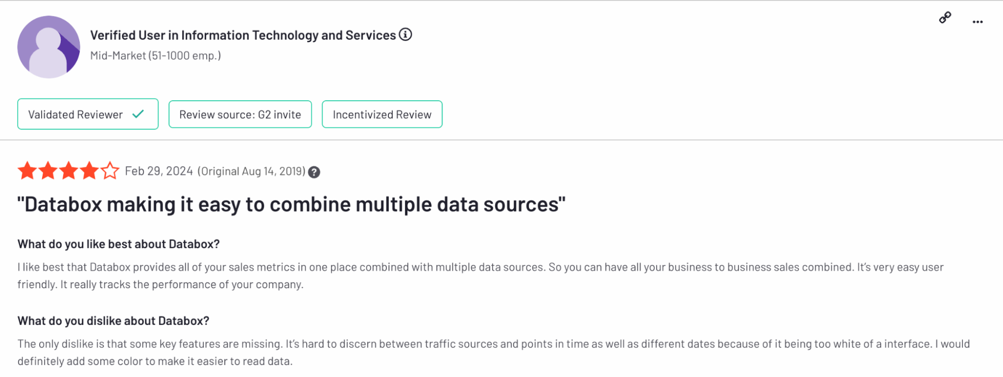 But the same user adds a design caveat:
It’s hard to discern between traffic sources and points in time… because of it being too white of an interface. I would definitely add some color to make it easier to read data.
Note: Databox has since added colour-control options that tackle the “too white” complaint.
✅ Templates + live data save real time
A third G2 reviewer gushes about how the platform looks and feels right out of the box:
Ease of use, breadth of data sources, voluminous templates, very easy on the eyes and brain, and truly interactive/fresh data, including in Reports (which are live-dashboard-based presentations).
But the same reviewer notes that this polish occasionally slips:
Occasionally bugs and throughput issues/lag when editing custom metrics, but more than offset by their R&D into resolutions and new features.
Databox cons: Where users hit a wall
⚠️ Templates and metrics break under client pressure
Long-term agency users complain that widgets stop pulling data or default to the wrong Facebook/Instagram account, sometimes for weeks. If you need iron-clad, reusable templates, tools like Whatagraph (or even Looker Studio) get name-checked as sturdier alternatives.
One of the most recent, detailed, and flag-worthy Databox reviews comes from Guy M. on G2:
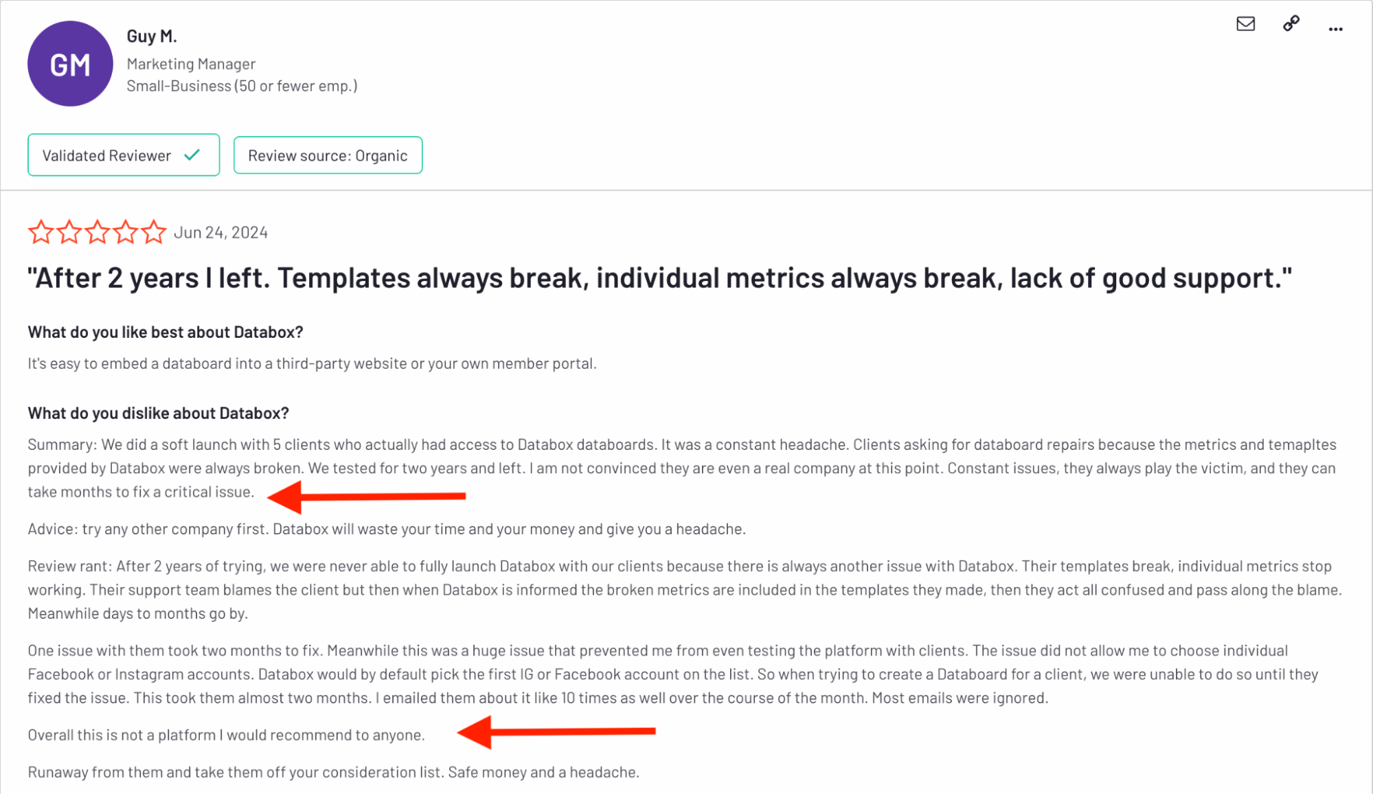 Guy M. spent two full years trying to run client reporting on Databox. His detailed post captures three pain points that also surface in other reviews:
- “Clients asking for databoard repairs because the metrics and templates provided by Databox were always broken.”
Your report is only as good as the metrics shown on it. If they’re wrong or broken, you risk losing your clients’ trust.
Plus, broken metrics and templates mean you need to waste more time and energy fixing them which isn’t something you should experience with an “automated” reporting tool.
- “One issue… prevented me from even testing the platform with clients… This took them almost two months [to fix].”
Agile agencies need issues solved in days, not quarters. If fast and friendly support is a priority, every Whatagraph plan comes with a dedicated Customer Success Manager who is your go-to person for anything you may need.
- “Their support team blames the client… days to months go by… Most emails were ignored.”
A slow or defensive help desk turns small glitches into client-facing fire drills.
Guy’s bottom line for Databox:
Run away from them and take them off your consideration list. Save money and a headache.
He does, however, concede one genuine perk: “It’s easy to embed a databoard into a third-party website or your own member portal.”
⚠️ Good UI, painful price
Users like Patrick J. on Capterra like the interface but say value disappears once you add extra connectors or bump into plan limits. Several note they switched—or persuaded peers to switch—to cheaper platforms after the first renewal.
Overpriced / Clunky / Terrible Customer Service. …So many better options out there than Databox.
⚠️ Customer support has lost its shine
From once-stellar to “radio silence” is the recurring story: unanswered chats for a day (or more) and slow fixes when connectors misbehave.
Alan M. on G2 says:
Formerly they were the best out there…currently sitting on a query I made 24 hours ago …and this has been a familiar pattern over the last few months.
Agencies that live on deadlines flag this as a deal-breaker, especially when Databox alternatives like Whatagraph are specifically praised for fast, responsive, and warm customer support.
Feature Deep Dive #1: Databox Integrations
Stable integrations are the lifeblood of accurate, holistic reports. Does Databox hold up on that front? Let’s take a look.
How many out-of-the-box integrations are there?
Databox offers 120+ out-of-the-box integrations, which is much more than what most other marketing reporting tools out there offer.
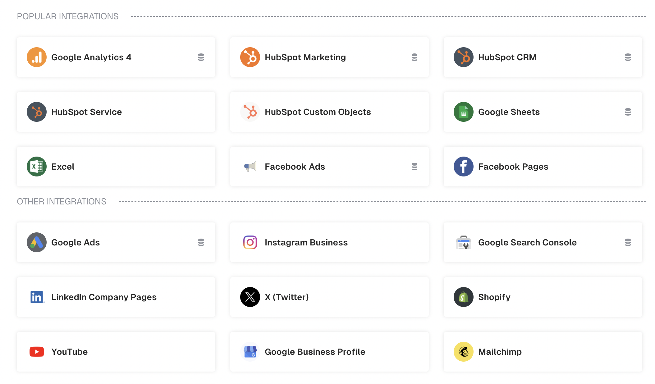
However, more niche integrations, like SE Ranking for SEO and AppsFlyer, are not available. (But they are available on Whatagraph.)
Can you connect custom APIs or upload offline data?
Yes. Beyond the 120+ native connectors (GA4, HubSpot, Shopify, Meta Ads, Stripe, Xero, etc.), Databox gives you three DIY routes:
- REST API/Push API: Send any JSON payload—great for product-usage events, warehouse tables, or revenue data living outside mainstream apps. SDKs in Python, JS, PHP, etc., speed up the plumbing. This is more suitable if you have an in-house developer or team.
- Google Sheets/Excel: Map columns to metrics, auto-refresh on sheet update. Handy for one-off survey results or monthly P&L numbers without writing code.
- CSV uploads: Good for once-a-month offline numbers, but they won’t auto-sync.
If you plan on going deep into Databox for Developers, there’s a wrinkle I found in the r/databox subreddit:
The official Python SDK won’t install, and even raw requests calls never surface as metrics. Docs are “bare-bones,” and user Tambre14 couldn’t find an engineer to help.
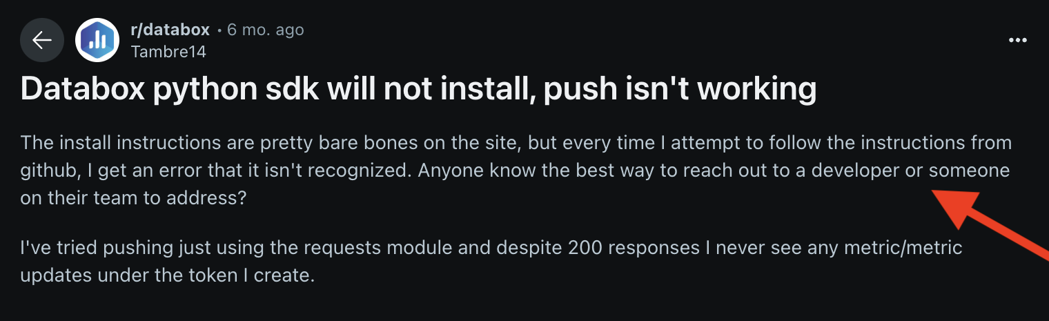 If you rely on this route, be ready for DIY troubleshooting; community support is thin, and the vendor team may be slow to step in.
Agencies without in-house developers might find a spreadsheet connector—or a platform like Whatagraph that doesn’t require code for custom data—safer.
How reliable are these connections day-to-day?
Agencies juggling dozens of Meta or LinkedIn ad accounts report periodic “reauth needed” pop-ups—a token expires, charts go blank, and someone has to reconnect the account.
When a connector breaks, all the metrics and templates using that connector also break, forcing manual repairs—one reason reviewers like Guy M. walked away after two years of client headaches.

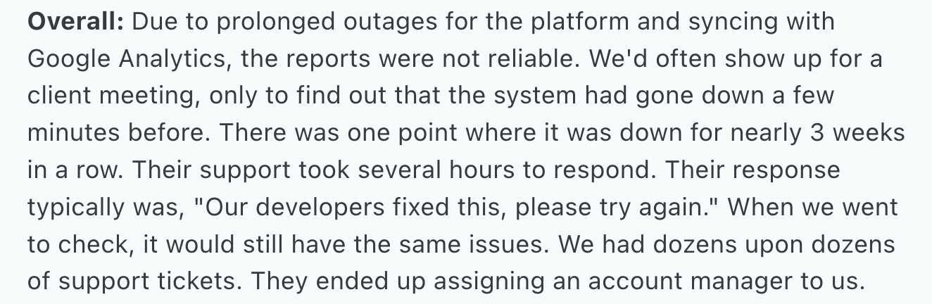
The entire Databox platform seems to be unstable, making reports unreliable. One customer on Capterra said “there was a point where the platform was down for nearly 3 weeks in a row”.
That’s eternity in reporting time. You simply cannot afford to wait for 3 days, let alone 3 weeks, to get an accurate report—and your clients can’t either.
 Meanwhile, Whatagraph runs on reliability. Our native integrations are regularly maintained by our Engineering team, so they stay stable and seamless.
Here's proof from a happy customer:
We don’t have any connection issues on Whatagraph at all. We just connected the platforms once, and that was it. It's also very quick when loading the data.
But what’s even better — we have an SOS alert that will wake up our engineers (even if it’s 3 am where they are) to act on system outages, if there are any.
Our engineers (literally) sleep with their laptop, so you can sleep soundly knowing your reports will be there the next day.
Databox’s connector breadth is still a win, but the custom-data path isn’t plug-and-play. Factor in extra developer time (or a fallback tool) if your reporting hinges on the Push API or SDKs.
Feature Deep Dive #2: Databox Ease of Use
“Ease of use” is about how many steps it takes to go from blank slate to live dashboard, how quickly you can onboard a new teammate, and whether you can tweak a report without calling in IT.
So what does “easy” really look like when you’re building, editing, and sharing dashboards all day? Let’s unpack Databox in this area.
Are there ready-to-use templates and drag-and-drop features?
Databox sells itself on “DIY dashboards in minutes.”
Databox comes stocked with hundreds of pre-built dashboards and slide-style report templates—everything from Google Ads and Shopify to executive KPI overviews.
You simply pick a layout, drag in your metrics, and voilà! A polished board with zero coding.
 The drag-and-drop designer lets you add or resize charts, change visualization types, and color-code numbers by clicking a floating toolbar.
But these templates live on a fixed grid, so if you want free-form layouts or precise pixel tweaks, you’ll bump into the edges fast.
Is everything housed in one reporting environment?
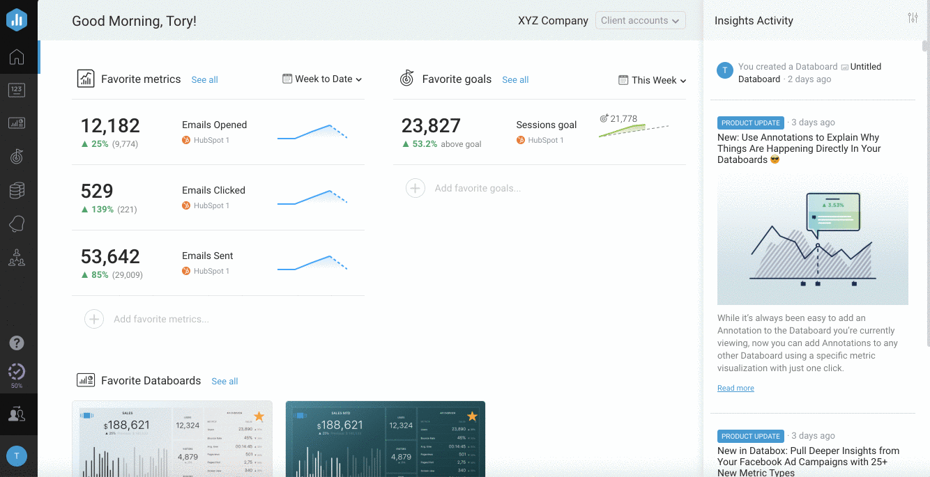
On the left rail, you’ll find Databoards, Reports, Goals, Alerts, and Benchmarks—all under one roof.
Beyond full-fledged dashboards and slide reports, Databox offers “Scorecards”: compact, single-metric cards you pin to a high-level view or mobile home screen.
Once you learn the sidebar, you’ve learned the whole app. No context-switching or hidden sub-apps.
But as a new user, I did find that some actions are more of an “Easter-egg hunt”: for example, cloning a board or editing goals. The consistent UI is powerful, but it hides less-used functions in nested menus.
How easy and fast is editing dozens of reports?
You can clone a client dashboard in seconds—just swap in the new data sources and you're good to go.
This makes it easy for agencies to build one report template and reuse it across multiple clients.
But here’s the catch: there’s no true master template. If you make changes to a chart later, you’ll have to update each individual dashboard manually.
That’s fine for a few clients, but gets tedious fast when you're managing 10, 20, or more.
In Whatagraph, you build one master report template (complete with widgets, layouts, branding, etc.) and then “link” every client report back to that master.
From then on, any change you make to the master—whether it’s swapping a chart, adjusting a date filter, or tweaking your brand colors—automatically flows through to every single linked report.
But in Databox, you clone a dashboard or report and then each clone is independent. If you later adjust a KPI widget or change a color, you have to go into each copy and make the same edit over and over.
Whatagraph’s linked templates feature side steps that repetitive work. One edit, thousands of reports stay in sync. See how:
Databox nails the “zero-to-dashboard” promise with drag-and-drop templates and a single, unified UI. But bulk tweaks and free-form layouts still demand extra manual work.
Feature Deep Dive #3: Data Organization, Filtering, and Blending
Connecting all your tools is just step one. The real work comes when you need to decide what to see, how to slice it, and whether you can merge data from different sources without chaos.
Let’s look at how Databox organizes your metrics, applies filters, and blends data—and where it hits its limits.
Can you blend data easily or create custom metrics and dimensions?
You can create custom metrics on Databox using a tool called “Metric Builder”.
It lets you stitch together data from multiple sources—think CAC = Ad Spend ÷ New Customers across your ad platforms and CRM. You can also define custom dimensions (e.g., “lead source”) and apply basic arithmetic or date logic.
But while the Metric Builder is powerful in some ways, it’s not a free-for-all.
For most data sources, Databox only lets you choose one dimension per custom metric. That means if you want to analyze performance by both channel and device, you’ll need to create separate metrics for each. (Google sources like GA4 are a rare exception—you can use multiple dimensions there.)
The workaround is to:
- Build your base metric (e.g., Sessions by Campaign).
- Duplicate it.
- Swap the dimension (now it’s Sessions by Country).
- Save and repeat for every other slice.
Databox technically supports blended data via “Calculated metrics”. You can take metrics from multiple platforms and combine them into a single formula (like Total Ad Spend from Facebook + Google + LinkedIn). This works well for basic aggregations.
But it doesn’t offer true data model-level blending. You can’t join multiple sources on a shared dimension like “Campaign Name” or “Lead ID” and then slice results by performance, conversions, or channel. If you're used to data joins, pivot tables, or lookups, this might feel limiting.
These two features are great, if your data needs are simple. But once you start juggling multiple platforms, dimensions, and clients, the limitations add up quickly.
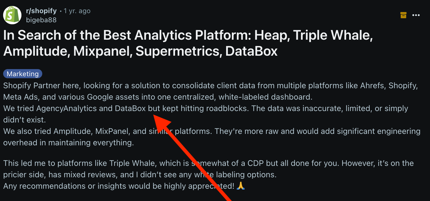
In fact, a Reddit poster in r/shopify flags their frustration with Databox for the limitations in data blending and transformation:
“We tried AgencyAnalytics and DataBox but kept hitting roadblocks. The data was inaccurate, limited, or simply didn’t exist.”
Hidde O. on Capterra also warns that Databox is “very expensive for a dashboard full of wrong KPIs.”
They add:
“The most simple calculations are wrong too often...I can not rely on the data and have to still manually calculate.”
If you want accurate marketing data for better decisions, Whatagraph delivers. You can create unlimited data blends, custom metrics, and custom dimensions on ALL our pricing plans, and for all your data sources. (Yep, including a reliable Shopify integration.)
Unlike Databox, which restricts you to one dimension per custom metric (unless you’re using Google tools), Whatagraph lets you go further with true cross-platform unification—thanks to our Organize feature.
With Organize, you can:
- Create your own custom dimensions across different platforms (e.g. unify device names from Facebook Ads and Google Ads).
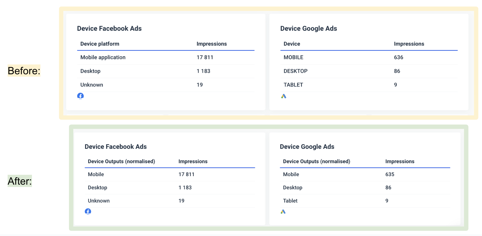
- Apply transformation rules using either:
- Name unification (standardizing inconsistent field names), or
- Conditions (e.g. different campaigns have one name “Retargeting” – combine them).
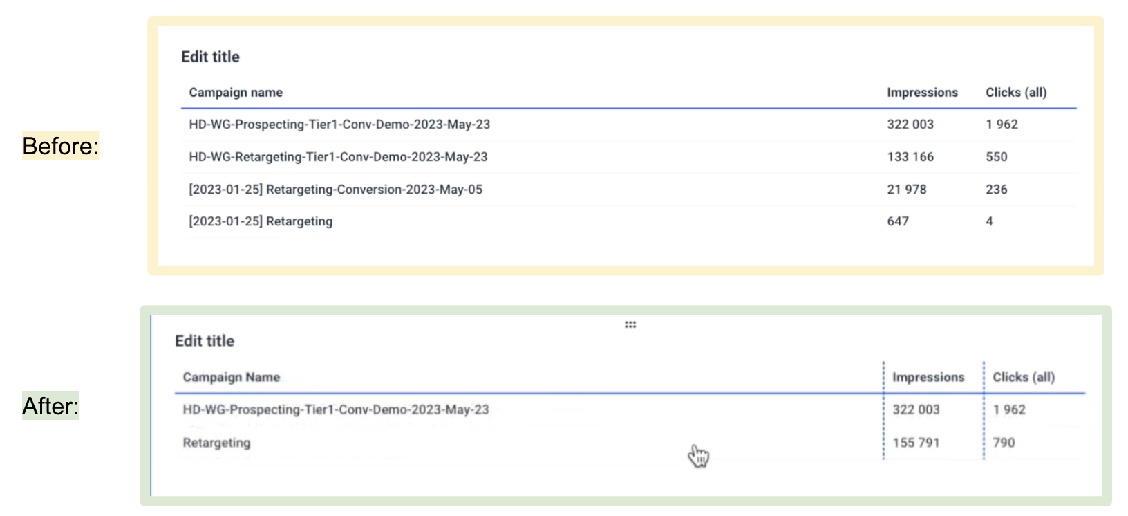
- Use these new dimensions across all reports, not just within a single data source.
This means you can finally get consistent naming and segmentation across your data, without needing workarounds or manual edits.
You can find more use-cases of custom dimensions, metrics, and blends here:
And while Databox lets you simulate blending with formulas like "Facebook Ads Cost + Google Ads Cost = Total Ad Spend," you can’t join sources on shared fields like Campaign Name or Date.
Whatagraph, on the other hand, supports true data blending. You can:
- Select multiple data sources.
- Choose shared join keys like Date or Campaign ID.
- Use full outer joins to create comprehensive, multi-source datasets.
- Add those blended views directly into your widgets—without having to screenshot anything or duplicate metrics manually.
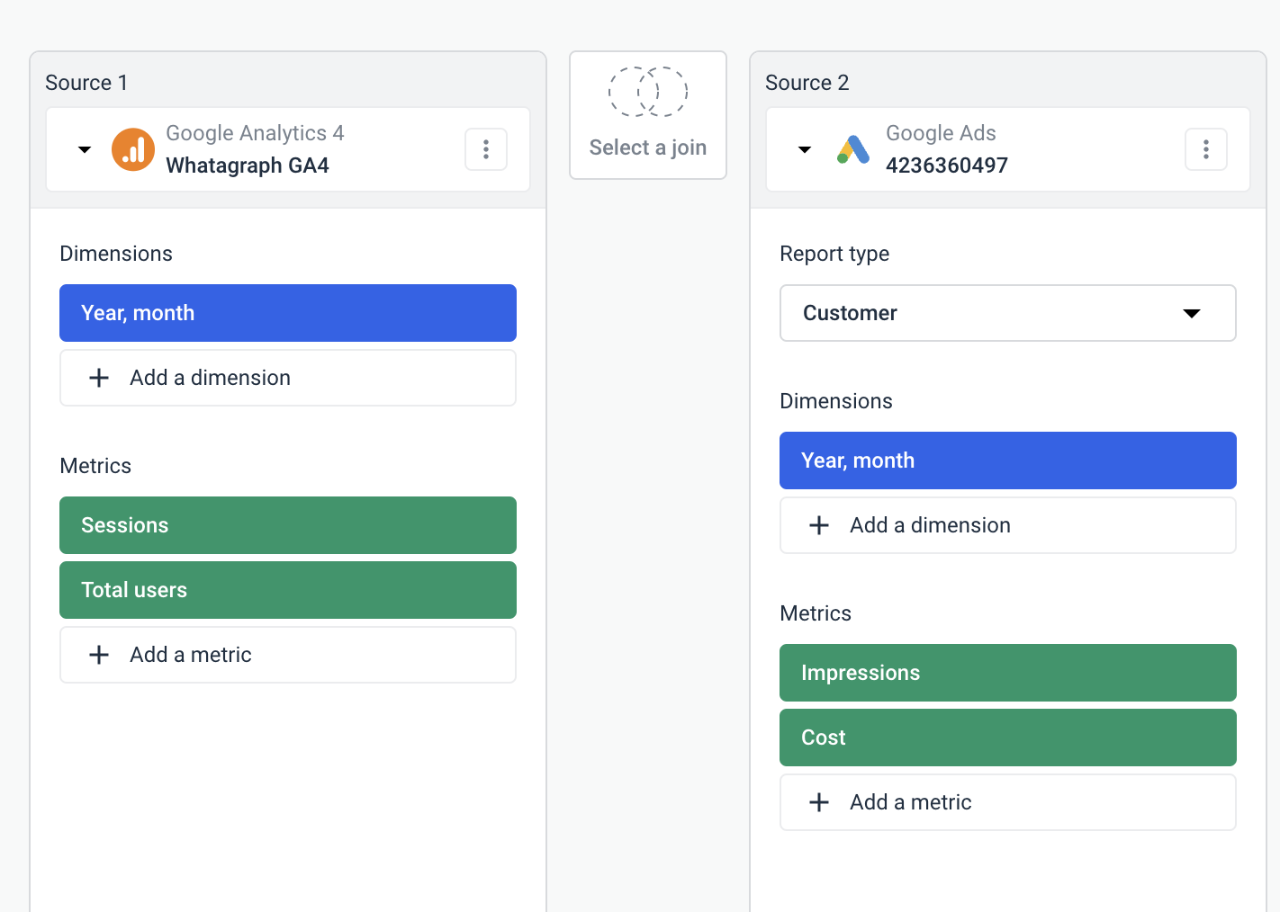 So if you're tracking campaigns that run across Meta, Google, and TikTok, you can build a single performance overview with unified dimensions and KPIs, all joined and aligned.
The best part? You can create these custom blends, metrics, and dimensions all inside of your report — you don’t even need to go into a separate workspace to set them up.
Also, on Databox, if you're managing 15 Google Ads accounts, you need to build (or duplicate) metrics and widgets 15 times.
In Whatagraph, you can just create a Source Group.
This lets you:
- Combine multiple data accounts under one metric (e.g. all your Google Ads clients into a “Google Ads Aggregate”).
- Avoid manually duplicating reports or formulas.
- Apply transformations and filters across the group all at once.
Say you’re running ad campaigns on Google Ads, LinkedIn Ads, and Facebook Ads. And you want to see the total ad spend on all three channels.
On Whatagraph, you can simply create a single “Source Group” that combines all three in literal seconds, and show the total ad spend in your report:
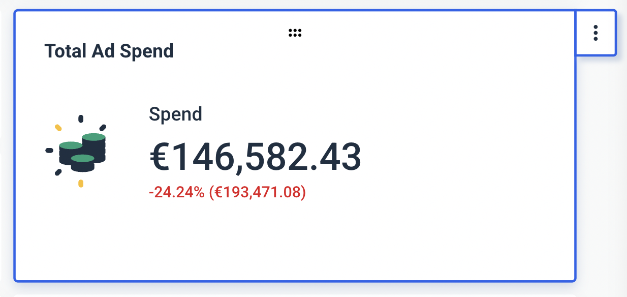
(See this widget? You can fully customize it…like writing the title and descriptions, changing the icons, changing the currency, and more.)
Find out more about Source Groups in this video:
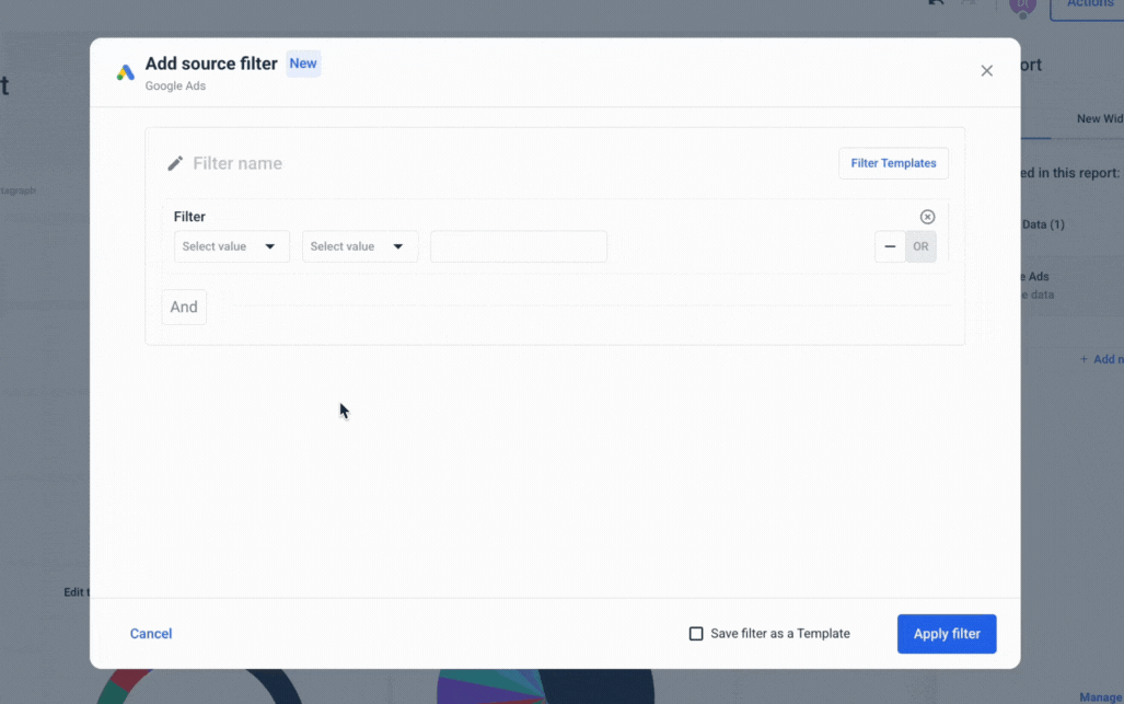
What kind of filtering can you do in Databox?
According to their documentation, Databox puts filtering power in two places—at build time and per widget:
- Dimensional Metrics at build time: When you drag a metric onto your canvas, you can choose one dimension to slice by campaign, country, ad, device—you name it. That selection locks in your Databoard view.
- Widget-level filters: On any chart or scorecard, you can further filter by date range, channel, or even a custom dimension you defined in the Metric Builder.
But here’s the catch: Once your board is live, you can’t swap that chosen dimension on the fly.
Say you build a “Top 5 campaigns” view. Viewers can’t flip it to “Top 5 countries” without you updating the dashboard. Databox does let you request dynamic dimension switching, but for now, it remains a design-time setting only.
So in practice, you get solid per-widget and overall time filtering, plus one locked-in dimension per board. Just don’t expect real-time pivoting until they unlock that feature…
We seem to have hit a wall with Databox’s functionality for business intelligence.
Whatagraph gives you and your audience full control: any viewer can swap dimensions or metrics on the fly from the Data drawer, and source-level filters let you apply a single filter across the entire report in one click:
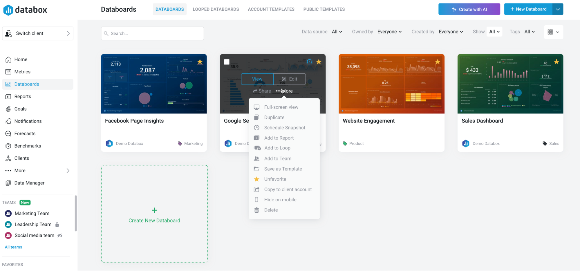
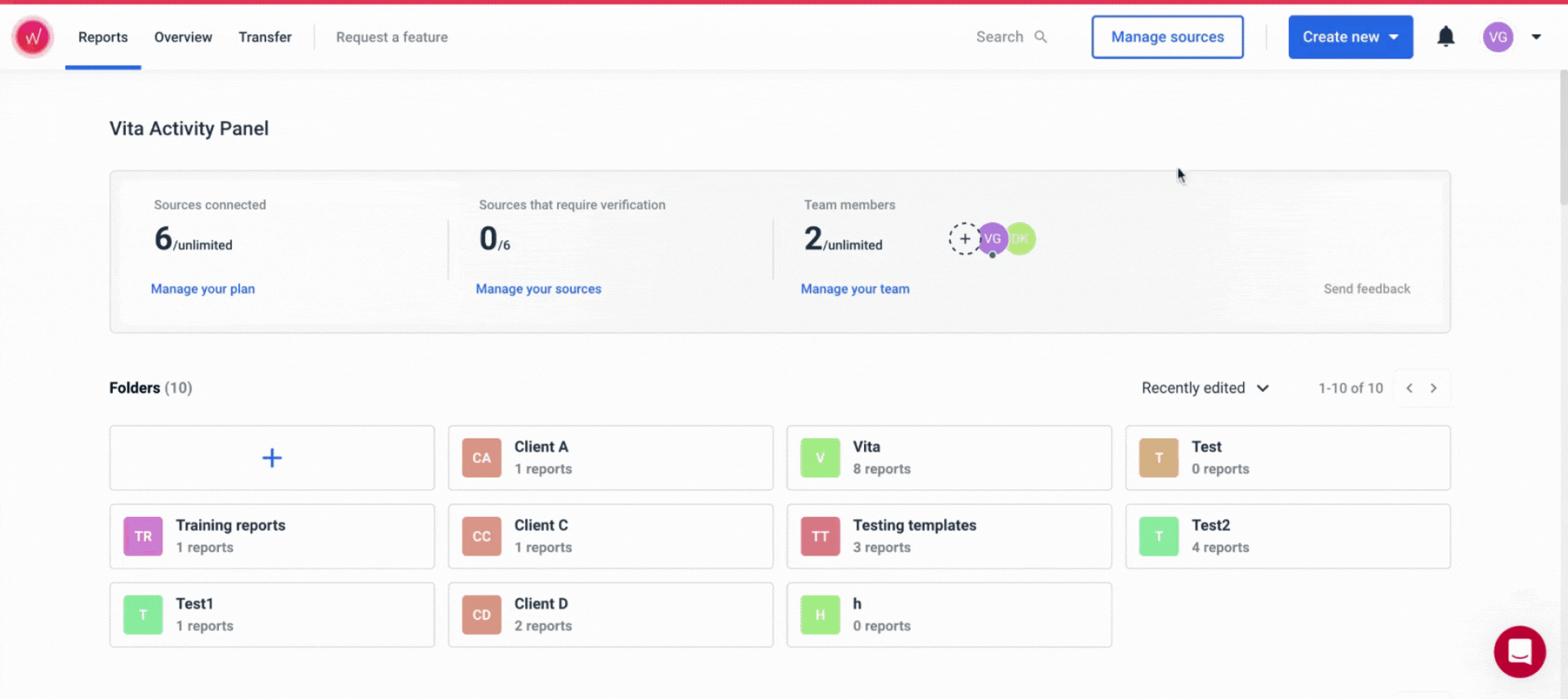
How can you manage clients on Databox?
Databox structures agencies around client accounts.
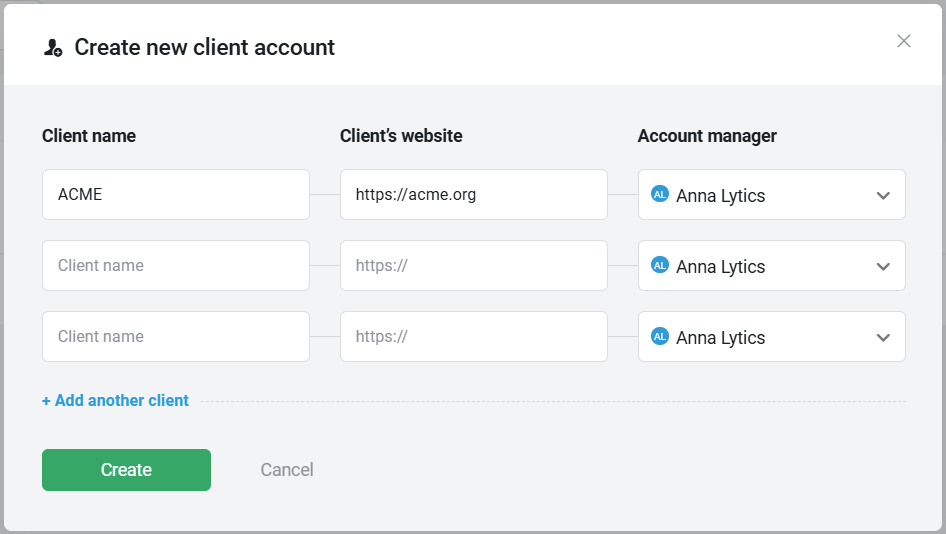
Each one is a siloed workspace you spin up under your main agency login. Here’s the lowdown:
- Agencies can create as many client workspaces as needed, with no cap on the number of accounts, which is pretty neat.
- Agency Admins and Account Managers inherit full control in each client account. You can toggle on Client User access, invite client stakeholders as Viewers, and even trial higher-tier features for 14 days without charging their card.
- Embed live dashboards via iframe, generate branded share links, or let clients log into their standalone portal—complete with your logo, custom domain, and mobile/TV app access.
- Every client workspace is independent. Date filters, dimension picks, and layout tweaks must be applied per account. Bulk edits across dozens of clients still require manual work or external tooling.
Heads up: Data sources connect at the client-account level, not agency level. If you hook GA4 or Facebook Ads into five client accounts, that counts as five paid connectors unless you’re on Premium.
Let’s pause here for a minute.
When Monday morning hits and you need to tweak a date filter or logo across twenty client dashboards, do you really want to click into twenty separate workspaces?
With Whatagraph’s linked templates and global filters, a single change syncs across all your reports in one shot, slashing hours of manual updates each week.
What does this look like in action?
- Folder-based reports: Organize by client, campaign, or any category. No separate accounts needed; all reports live under one agency umbrella.
- Live links and custom domain: Share dynamic, interactive reports that clients can explore (including adjusting date ranges) under your brand, no add-on required.
- Overview and source filters: Use the Overview feature to monitor all clients in one dashboard, and apply filters across every report instantly.
- Unlimited data sources: Connect as many tools or client profiles as you like at no extra cost.
As far as client management goes, another Databox feature bears mentioning.
See that blue “Subscribe Client” button?
Basically, each client workspace piggy-backs on your main agency subscription—using up your connectors, seats, and refresh cycles.
If you “Subscribe Client,” you’ll move that client onto their own paid Databox plan (so their data usage stops counting against your agency quota), and—because you’re a registered Solutions Partner—you’ll earn a 30% commission on that new subscription.
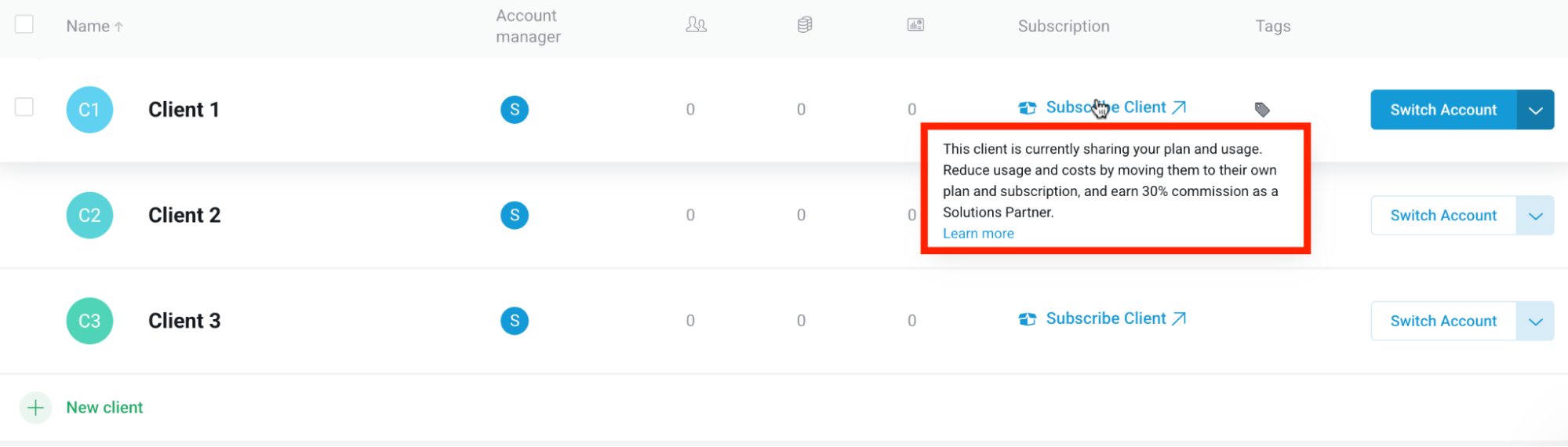 Now, this is a good incentive for you to offload your costs, but what does it mean for your client’s user experience?
Splitting each client onto its own plan fragments your reporting ecosystem—and their billing.
You risk:
- Losing one-click cross-client dashboards (each subscription lives in its own silo).
- Adding administrative overhead (setting up, tracking, and reconciling multiple invoices).
- Increasing client friction when asking them to sign up—and pay—for a separate account.
Databox gives you unlimited, branded client dashboards for clear account separation—but every new connector and dashboard tweak has to be done workspace by workspace, adding manual work and extra connector fees.
Feature Deep Dive #4: Databox Reports and Dashboards
Customizable dashboards and reports let you spotlight the metrics that matter, align every chart to your brand, and deliver insights in the exact format your team needs.
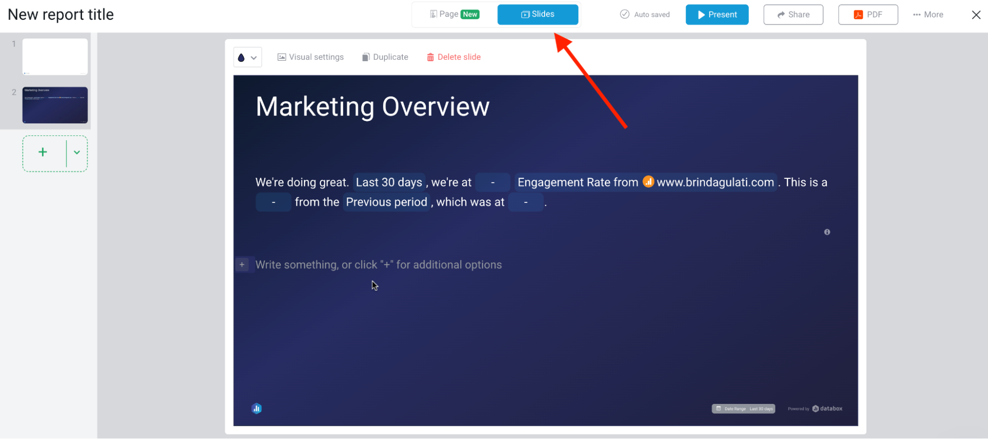
How are reports built (templates vs. custom)?
Databox offers two main report styles:
- Slide-deck templates: Pre-configured presentation layouts (think “Marketing Overview,” “Sales Performance,” etc.) that you drop your live widgets into. Each slide remains interactive in the web view—hover over a chart to see details—even though it looks and feels like a deck.
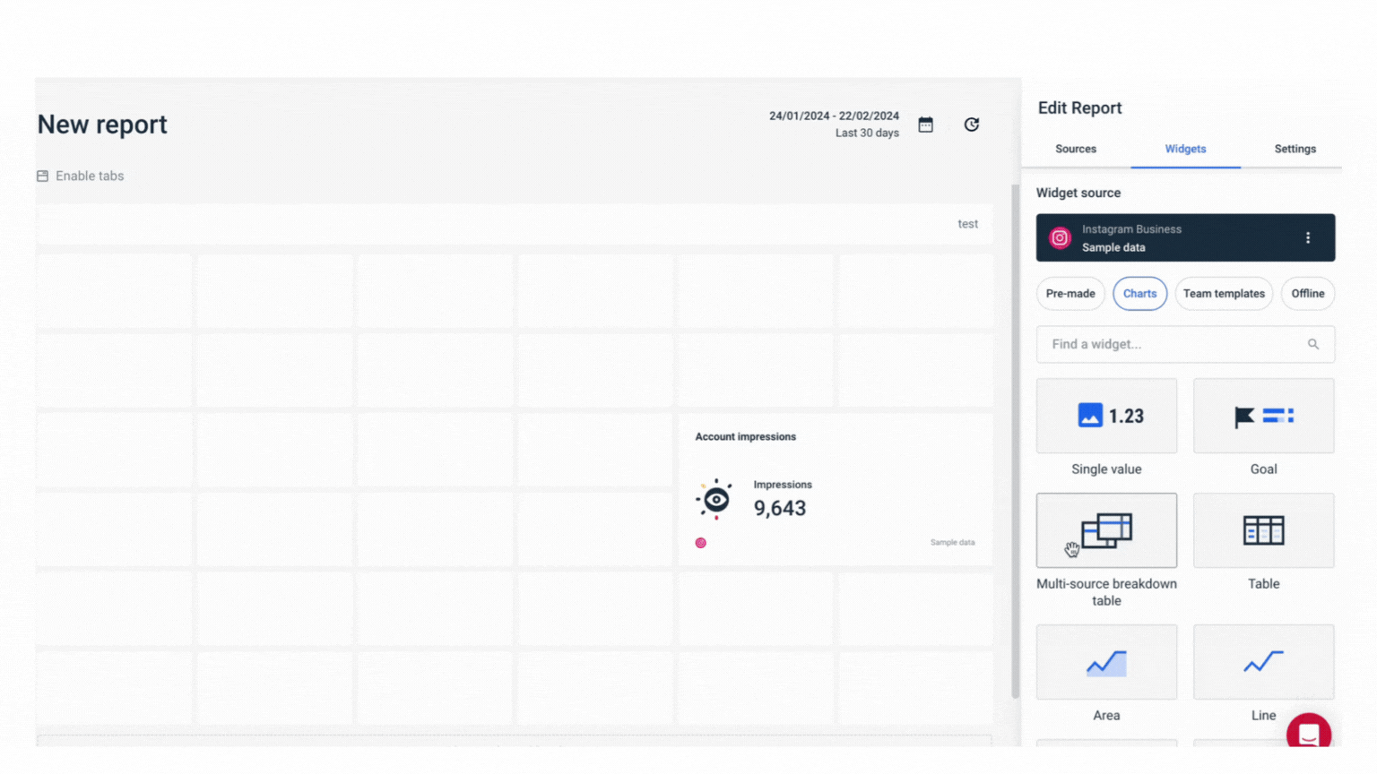
- Blank-canvas reports (beta): A more flexible, pageless format where you can stack cards, charts, and text blocks without the strict slide boundaries. This is still evolving, but it gives you a taste of free-form report design.
I test-drove both.
First up: the slide decks make me feel like I’m trapped in Microsoft PowerPoint. Now, this may very well be a personal preference, but I find the user experience limited in what it can offer: I wish it were more intuitive.
And I know that’s a vague request, but compared to Whatagraph, here’s what I mean:
- You snap to a grid instead of freely stretching or overlapping elements. And if you want to reorder slides, you’re forced into a vertical thumbnail list with no drag-and-drop preview.
- Whatagraph renders edits on the fly. Move a slider, change a filter, and see the live result instantly. Databox often needs a manual “refresh” or drag handle reposition before you spot layout issues.
- In Whatagraph, you click directly on the canvas, start typing, or hit “/” to pull up charts, text, or images. No tiny plus menus hiding in a corner.
Next up is the new “Page” format. Databox has recently rolled this out, and there are some bugs to sort through.
I can’t help but feel like I’m once again trapped in Microsoft's ecosystem—this time, Word.
- Elements still snap to an invisible grid, so you can’t overlap or freely position items.
- These are my “early adopter” report bugs: occasional layout shifts, widgets disappearing until you refresh, and autosave hiccups.
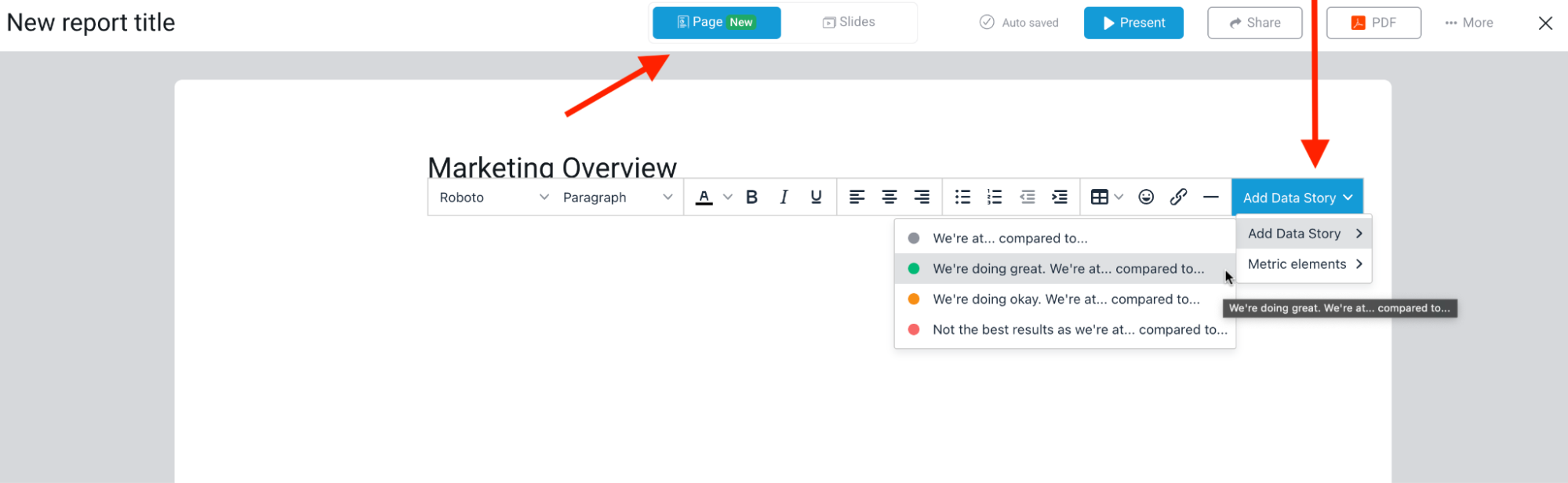
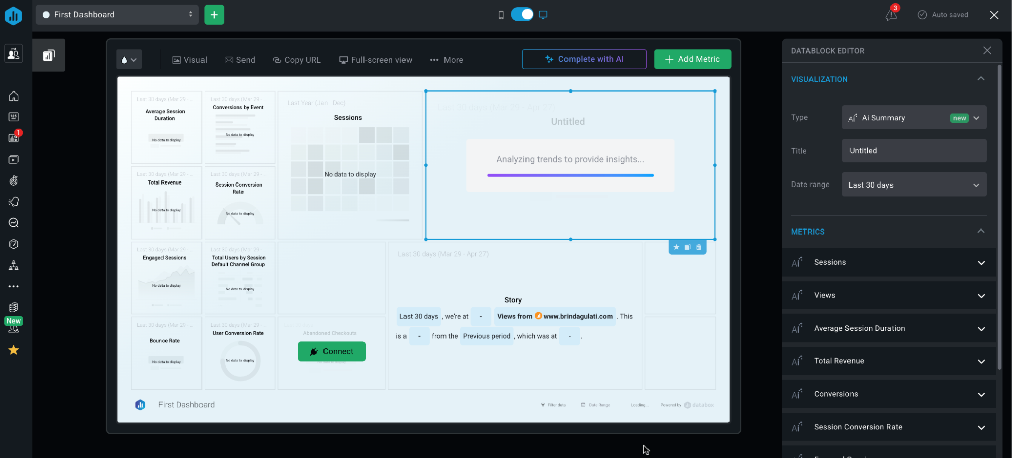
I do, however, like the “Add Data Story” option that has color-coded options for auto-filling the status based on the metric performance.
When I say I want to use an “intuitive” reporting tool, I use Whatagraph as my North Star because:
- You just click on the blank canvas and pick “Chart,” “Metric,” or “Text.” No hidden menus.
- Drag a widget to any spot, resize it however you like, and even layer widgets on top of each other.
- The settings panel stays open on the right. Change your data, filters, or colors and see updates instantly.
Try the difference for yourself and your team today.
What can you actually customize?
With Databox’s paid white-label add-on, you can swap logos, host dashboards on your own domain, and send branded emails.
But it’s an extra cost, only applies a single theme across each dashboard (no per-widget styling), and demands DNS/email setup and maintenance.
Here are some other things you can customize:
- Chart types and sizing: Swap bar, line, pie, funnel, or scorecard widgets and drag to reshape.
- Grid and spacing: Adjust the number of columns and row heights. But widgets still snap to the grid.
- Text blocks and annotations: Insert rich-text blocks alongside charts for context or commentary.
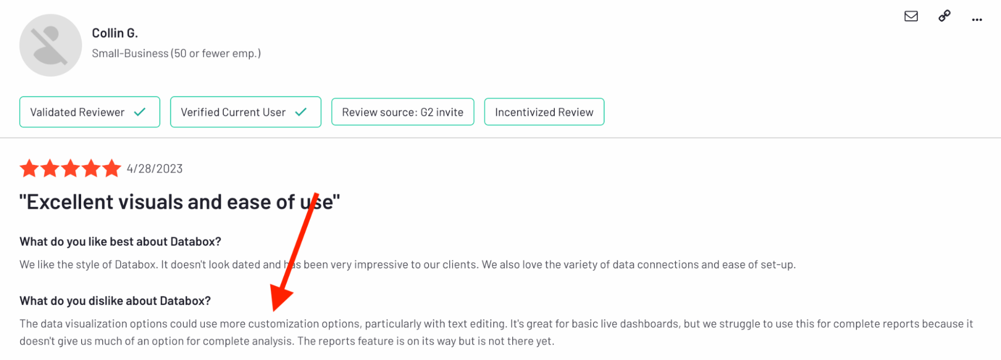
This is a verified review by Collin G. from April 2023 on G2:
“The data visualization options could use more customization options, particularly with text editing. It's great for basic live dashboards, but we struggle to use this for complete reports because it doesn't give us much of an option for complete analysis.”
Another one from Capterra, also from 2023:
“Negative points are the complexity of configuring the indicators, the lack of text formatting options and the limitation of the free plan.”
These reviews, dated two years ago, would be considered quite old in the software world. So, I decided to take the exact pain points around customization and put Databox to the test.
Does the software stack up better in 2026?
- Those “too white” and “zero text options” complaints have largely been addressed. Databox introduced Dark Mode, so that takes care of the previously “hard to read” data.
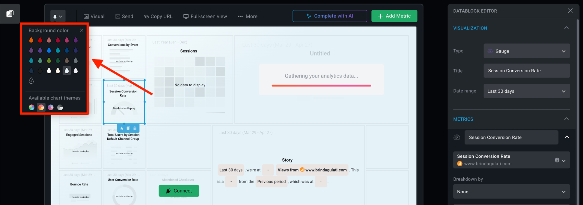
- But Databox’s styling controls still live at the dashboard level, not per widget, and there’s no way to save or upload your own chart palettes.
- You’re also limited to the four built-in color schemes. Want your brand gradient or a purpose-built palette for a client? You can’t save it. You’d need to manually recolor each chart every time.
If you don't want a ceiling on your customization, a tool like Whatagraph might be a better option for you.
We let you define and save custom themes—and even style widgets independently—so you can apply your exact brand colours or emphasize specific data points at a glance.
You get full branding control at the global, report, and widget levels. Plus, custom domains and email templates out of the box—so every report is instantly on-brand without DNS hacks or add-on costs.
Are the dashboards interactive or static displays on Databox?
In the web and mobile apps, Databox dashboards are fully interactive: you can hover over charts for tooltips, click data points to drill into underlying numbers, and use the date picker or widget filters without leaving the board.
Heads up: Static exports are locked down—reports in inboxes or on shared drives can’t be interacted with, potentially leading to version mismatches if your live or real-time data moves on.
What are your sharing options (and how automated/efficient are they)?
Databox lets you distribute your dashboards and reports in five main ways—each with its own level of automation and flexibility:
- Create internal (login-required) or public URLs, lock them down with passwords or IP restrictions. Live dashboards update automatically—but you have to push the link yourself.
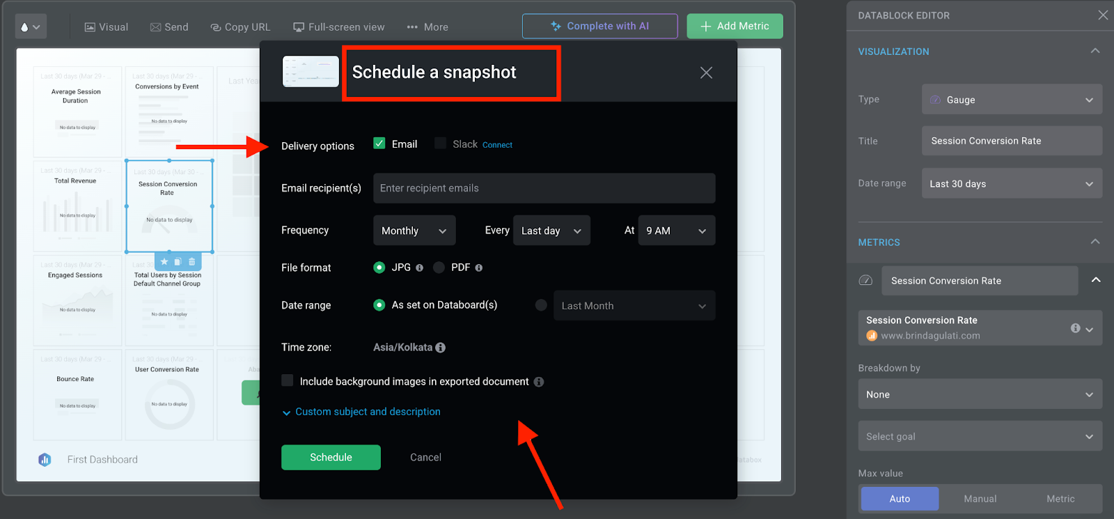
- Send JPG or PDF snapshots on any cadence (daily, weekly, monthly) or drop them into Slack channels. Once set up, they fire on autopilot—though recipients can’t drill into the data.
- Define KPI thresholds and let Databox ping your team via email or Slack the moment something needs attention. Great for real-time guardrails, with zero manual monitoring.
- Embed a live dashboard iframe in your intranet or client portal. Or stream full-screen to an office TV.
- Pull your dashboard data programmatically in JSON or CSV. Build custom workflows or push data into other tools on your own schedule.
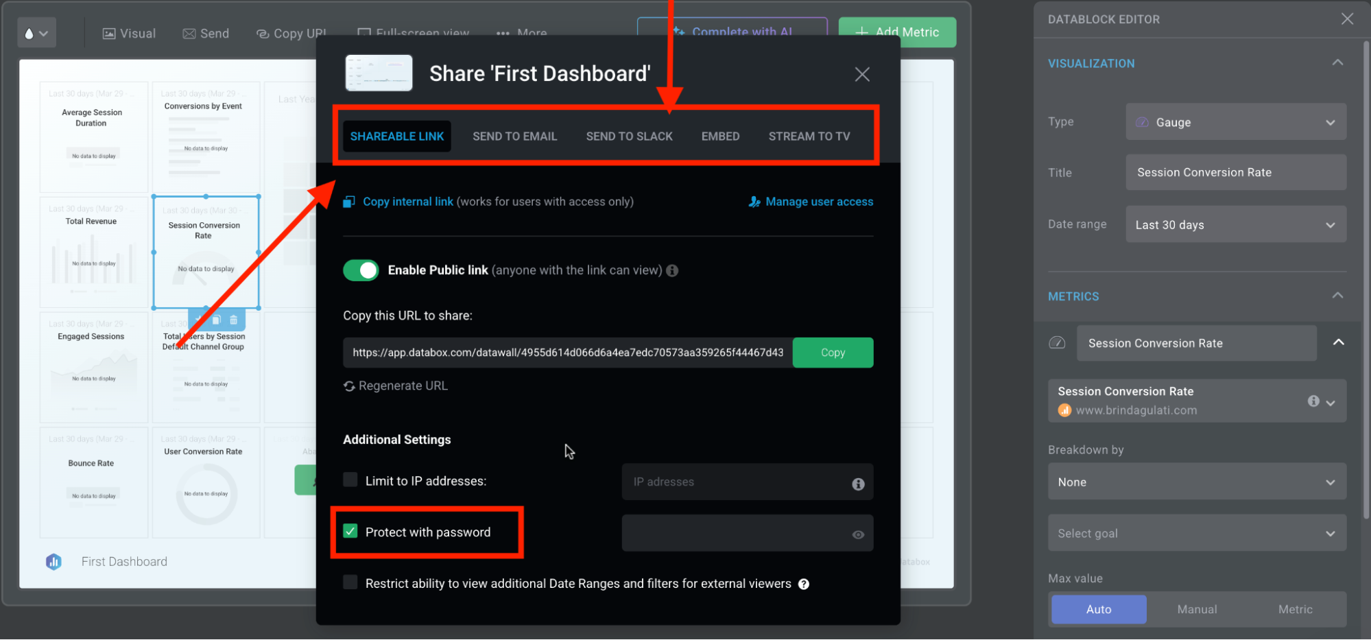
There’s a healthy mix of hands-free recurring reports, interactive and static options, and set-and-forget embeds.
The Slack export is a particularly great feature to keep everyone looped in within the communication channels they prefer.
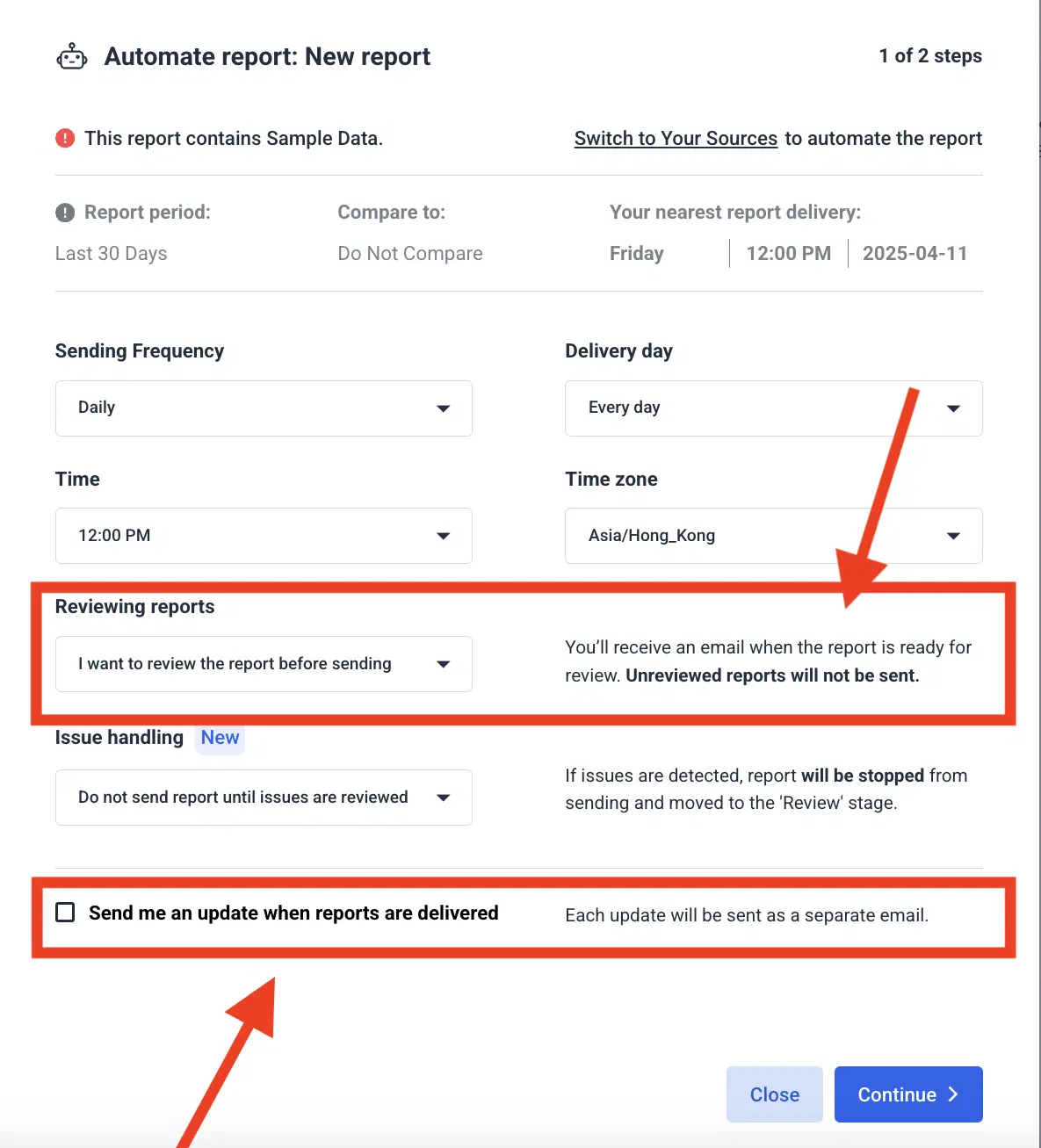
While we don’t (yet!) stream to TV or post snapshots to Slack, our automation suite gives you full end-to-end control over every delivery:
- Pre-send review: Hold each report for your sign-off—if you don’t approve it, it never lands in your client’s inbox.
- Error pausing: Automatically detect missing or malformed data and pause the send-out until you’ve addressed the issue.
- Delivery confirmations: Opt in for a “report sent” notification so you know exactly when reports hit inboxes.
What about AI features for insights?
Databox’s Generative AI Performance Summaries let you auto-generate plain-language commentary and recommendations right alongside your metrics, goals, and dashboards.
But, you only get access if you’re on the Growth or Premium plan.
Also, there are quota limits, as per their documentation updated on March 14th, 2025.
For example, Agency accounts get 6,000 summaries monthly, 800 summaries daily per account, and 100 summaries daily per user.
Hitting your daily limit? Wait until 12 AM UTC for the counter to reset.
Hitting your monthly cap? You’ll be blocked until day 1 of the next month.
At Whatagraph, we know innovation isn't optional and shouldn’t be locked behind premium paywalls. ALL our plans come with our latest AI features, including the AI chatbot and AI-generated summaries in text widgets.
The great thing about our AI chatbot is its ability to talk to you—to not just summarize, but to pull relevant data, results, and key metrics you would’ve otherwise been digging for in 10 different reports.
Databox delivers live, interactive slide-decks and pageless reports in minutes—complete with embeds, scheduled exports, and AI summaries on Growth/Premium—but you’re boxed into grid layouts, limited styling, and static PDFs unless you upgrade or hack around its add-ons.
Feature Deep Dive #5: Databox Security
Databox takes security seriously.
How do they approach data encryption?
Databox encrypts all in-transit data with TLS 1.2+ and protects everything at rest using AES-256 on AWS servers. Their microservices run in isolated Docker hosts within AWS VPCs, and each instance enforces host-level firewalls and intrusion-detection systems.
But note that their “pursuit of SOC 2 certification is being evaluated for 2025.”
Are they covering GDPR basics?
Yes.
Databox provides a Data Processing Addendum with EU Standard Contractual Clauses, supports user rights (access, correction, deletion), and stores data only in GDPR-compliant AWS data centers. Daily encrypted backups and a strict seven-to-30-day retention policy ensure you can fulfill data-subject requests.
Can you control who sees what (role-based access)?
You get three built-in roles—Admin, Editor, Viewer—plus widget-level locks on key metrics.
Two-factor authentication is available on all paid plans, and detailed activity logs track user actions and login history. Critical credentials are stored in encrypted vaults, with access granted on a need-to-know basis.
What about single sign-on (SSO)?
Databox supports Google and Microsoft SSO across all paid tiers. For SAML-based enterprise identity providers, you’ll need the Premium plan or the Advanced Security add-on.
Databox delivers enterprise-grade security—TLS/AES-256 encryption, GDPR-compliant hosting, granular role controls, and SSO options—though some advanced identity and logging features require higher-tier plans or add-ons.
Feature Deep Dive #6: Databox Customer Support
Even the sleekest dashboard hits a wall if you can’t get help when things go sideways. So, how consistent, helpful, and fast is Databox’s support in real-world use? Let’s dig into the details.
Is there a dedicated Customer Success Manager (CSM)?
Yes—but only if you’re on Growth or Premium, you’re assigned a CSM who helps onboard your team, reviews your KPIs, and offers strategic check-ins. Lower tiers rely on self-service resources and group support channels.
If you’re a Whatagraph customer, you’re guaranteed a dedicated Customer Success Manager on EVERY plan.
Our customer service is why users like Patrick Cronin LOVE us:
…they not only take continuous feedback and add new features based on it but one time they went way above and beyond for our agency and completely re-worked their API so we could get some specific valuable data in our reports. Don't think I've ever seen a software willing to go so above and beyond…
Is there quick live chat?
Yes. And they seemed to have stepped up their game, too. I put in a simple “how-do-I” request, and was put in touch with a real person in under a minute.
However, as soon as you mention upgrading to a paid plan, the focus seems to shift entirely from helping the user to selling the upgrade. I had to repeatedly say no before the representative backed down and actually helped me.
This experience does seem to resonate with some users who left Databox for this exact sales aggression.
A user on G2 says:
“they sent me an email as my subscription payment method was declined due to a new card. The link in the email presented me with a box to enter my credit card details which I entered the new one and entered it.
Then about 5 minutes later I recived a bill for $6,900 Australian dollars for a year! I never had a yearly subscription and they changed it without my concent in a very misleading and infact fraudulent way, without showing me.”
Granted, this review is from 2023, but the thread of once-good customer service seems to linger…
“The team had been helpful in the past.”
What are the other ways to get help?
- Help Center and academy: Extensive how-tos, video tutorials, and best-practice guides.
- Support tickets: Email-based case system for bugs or deep troubleshooting.
- Databox Community: Peer chat for tips, and you can submit your own questions too!
What are real users saying about their experience?
The consensus isn’t pretty.
Praise for the support team is few and far between, with the majority mentions of their customer support speckled with phrases such as “unresponsive,” “pass along the blame,” “fraudulent,” and “dishonest.”
A negative review here and there isn’t cause for alarm for any business, really. But as a decision maker, it’s important for you to pay attention to recurring themes.
“I emailed them about it like 10 times as well over the course of the month. Most emails were ignored.” — Guy M. on G2
“I'm not sure what has happened with the customer support team at Databox but they are fairly unresponsive these days.” — Alan M. on G2
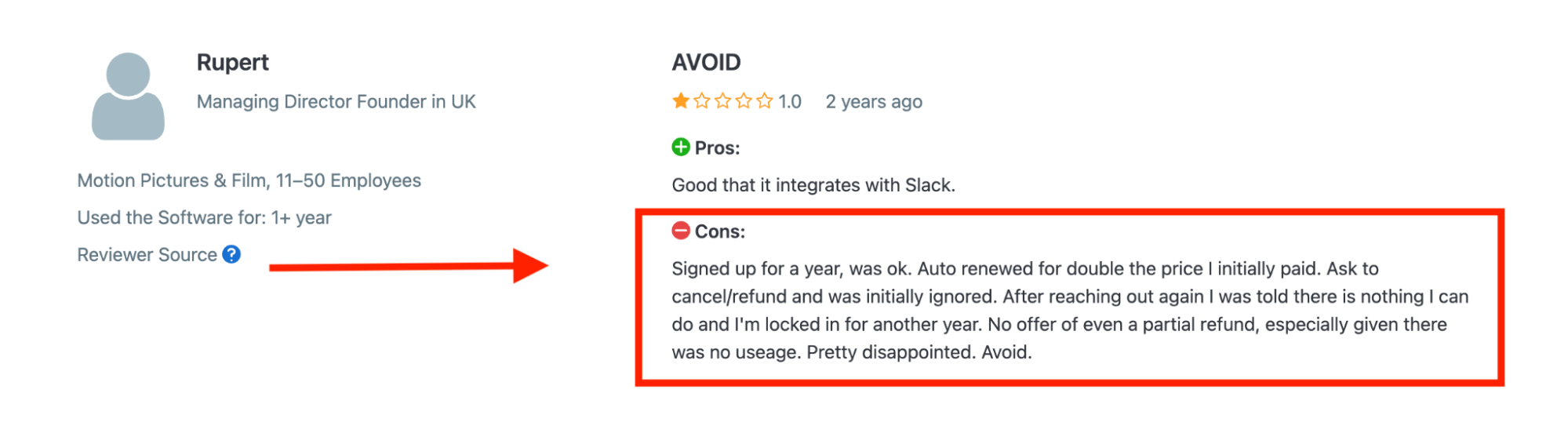
“Ask to cancel/refund and was initially ignored. After reaching out again I was told there is nothing I can do and I'm locked in for another year. No offer of even a partial refund, especially given there was no useage. Pretty disappointed.” — Rupert on Software Advice
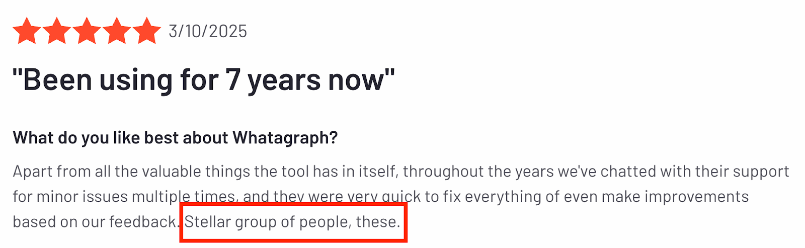
Compare this to the reviews about Whatagraph’s customer support, and you can notice a huge difference. One customer who’s been with us for 7 years called us a “stellar group of people” — we’re pretty proud of this.
And this quote from Kim Strickland, Digital Marketing Specialist at Peak Seven agency, sums up how “stellar” our customer support is:
I've joked about this often—with Whatagraph, we're not paying for a reporting system. We're paying for customer support. There's a level of dedication from the Whatagraph team that you don't often experience anywhere else.
(Read how Kim saved 63 hours on reporting per month here.)
Databox reserves dedicated CSMs and near-instant chat for Growth/Premium plans, while lower tiers face upsell-heavy reps, slow or ignored tickets, and even billing headaches—making support hit-or-miss.
Want to see a deeper comparison between Whatagraph and Databox? Check out our Databox alternatives guide.
Final Verdict: When to Use Databox and When to Switch
Choose Databox if…
- You’re a small team or solo operator on a budget: The Free Forever and Starter plans (from $0–$47/month) let you stand up to three data sources with minimal spend.
- Mobile-first, interactive dashboards matter most: If you need executives to check live KPIs on their phones or TVs, Databox’s native app and embeddable iframes deliver without extra setup.
- You can tolerate occasional connector hiccups: Standard support and self-serve docs cover most issues, and slower response times don’t derail your internal reporting cadence.
Choose Whatagraph if…
- You’re an agency juggling dozens of clients: Unlimited, folder-based reports and linked templates mean one update syncs across every client dashboard—no more 20 separate workspaces or connector fees per account.
- Brand control and deep customization drive value: From per-widget styling and custom chart themes to multi-level white-labeling and custom domains, you get full design freedom on every plan—no add-ons required.
- Responsive, human support is non-negotiable: Every Whatagraph customer—regardless of plan—enjoys a dedicated Customer Success Manager, live chat, and priority ticketing, keeping client projects on track.
- You need AI insights without surprise quotas: Our AI summaries and chatbot live in every plan, so you never hit hidden daily or monthly caps on narrative reports.
Book a call with us today and experience unlimited connectors, fully branded dashboards, and 24/7 expert support in action.