11 Best Databox Alternatives in 2026: Reviews & Pricing
Databox is a great data analytics tool, but users say the platform can be clunky and unreliable, with poor customer support that takes weeks to reply to emails.
To help you find the best Databox alternative, we did three things:
- Spoke with our customers who previously used Databox.
- Scoured online reviews and community forums for the best alternatives.
- Consulted our data engineers for technical details of each alternative.
Full disclosure—one of these tools is ours. But that’s because we genuinely believe Whatagraph can ease the pains you're facing with Databox.
But we’re also not here to bash our competitors. We researched them thoroughly (and even tried them out) so you can really understand what they’re great at and if they’re best for you.
By the end of the article, we hope you’ll find a Databox alternative that fits your needs—whether it’s us or not.

Jun 24 2026●10 min read


We scoured G2, Capterra, and other review websites and these are the most common reasons why you might look for a Databox alternative:
❌ Clunky interface with a steep learning curve: Databox gets compared favorably to other tools once you're inside it, but getting there is the problem. Reviewers on Capterra consistently describe the interface as "clunky and difficult to use," and the dashboard builder has enough UI friction (elements that only move after hovering over a specific crosshair, for example) that setup takes longer than it should.
❌ Templates and widgets break often: One agency owner on Capterra ran a soft launch with five clients, spent two years dealing with constant template breaks and metrics that stopped working, and ultimately left the platform. On G2, the same story: "After 2 years I left. Templates always break, individual metrics always break, lack of good support." When a client-facing databoard breaks mid-month, you're waiting on Databox's support team while your client is staring at wrong numbers.
❌ AI features locked behind expensive plans with hard caps: Databox's AI Performance Summaries are only available on Growth or Premium plans, with quota limits of 6,000 summaries monthly and 800 per day for Agency accounts. Hit your daily cap and you wait until midnight UTC. Hit your monthly cap and you're blocked until next month.
❌ System outages: Databox users suffer from prolonged and frequent platform outages, some lasting up to 3 weeks. Even when the platform works, client-facing reports and metrics break very often, causing frustration.
❌ Inaccurate data: Due to these system outages and unstable integrations, users say their reports often show incorrect data. Others say simple calculations were “wrong too often” and that they had to manually calculate metrics. This is dangerous if you're an agency as inaccurate data can cost you your client’s trust (and their business).
❌ Poor customer support: 90% of Capterra and G2 reviews complain about Databox's “terrible support and customer service”. Emails are ignored and critical issues take months to fix.
---
Sounds like a lot? That’s what we’re here for.
In this article, we’ll take you through 11 best Databox alternatives that are easier to use, more stable, and come with great customer support.
11 Best Databox Alternatives and Competitors in 2026
In a nutshell, here are the 11 best Databox alternatives we’ll review in this article:
| Tool | Best for | Pricing |
| Whatagraph | Agencies needing a stable, governed data layer with AI reporting | Free forever; paid from $229/mo |
| Klipfolio | Large data teams needing centralized metric governance | Free; paid from $120/mo |
| Tableau | Enterprise teams needing deep BI and predictive analytics | From $15/user/mo |
| Looker Studio | Freelancers and Google-centric teams on a budget | Free; Pro at $9/user/mo |
| Geckoboard | Teams needing live KPIs on office or remote dashboards | From $119/mo |
| DashThis | Small agencies needing fast, template-based reports | From $44/mo |
| Grow | Mid-to-large teams needing built-in ETL and data storage | Custom pricing only |
| NinjaCat | Large agencies needing a warehouse-centric, AI-driven platform | From ~$1,500/mo |
| Cyfe | Boutique SEO agencies on a tight budget | From $29/mo |
| Improvado | Enterprise data teams needing volume-based ETL and governance | Custom pricing only |
| Tapclicks | Large agencies needing a full marketing operations platform | Custom pricing only |
Let’s dive into each of these tools.
1. Whatagraph
Best for: Mid-size marketing agencies and multi-location businesses that want one governed data foundation and reporting for their cross-channel marketing data
If you're leaving Databox because widgets and templates keep breaking, the data doesn't add up, or you're hitting a wall every time you need to report across multiple client accounts, Whatagraph is built for exactly that gap.
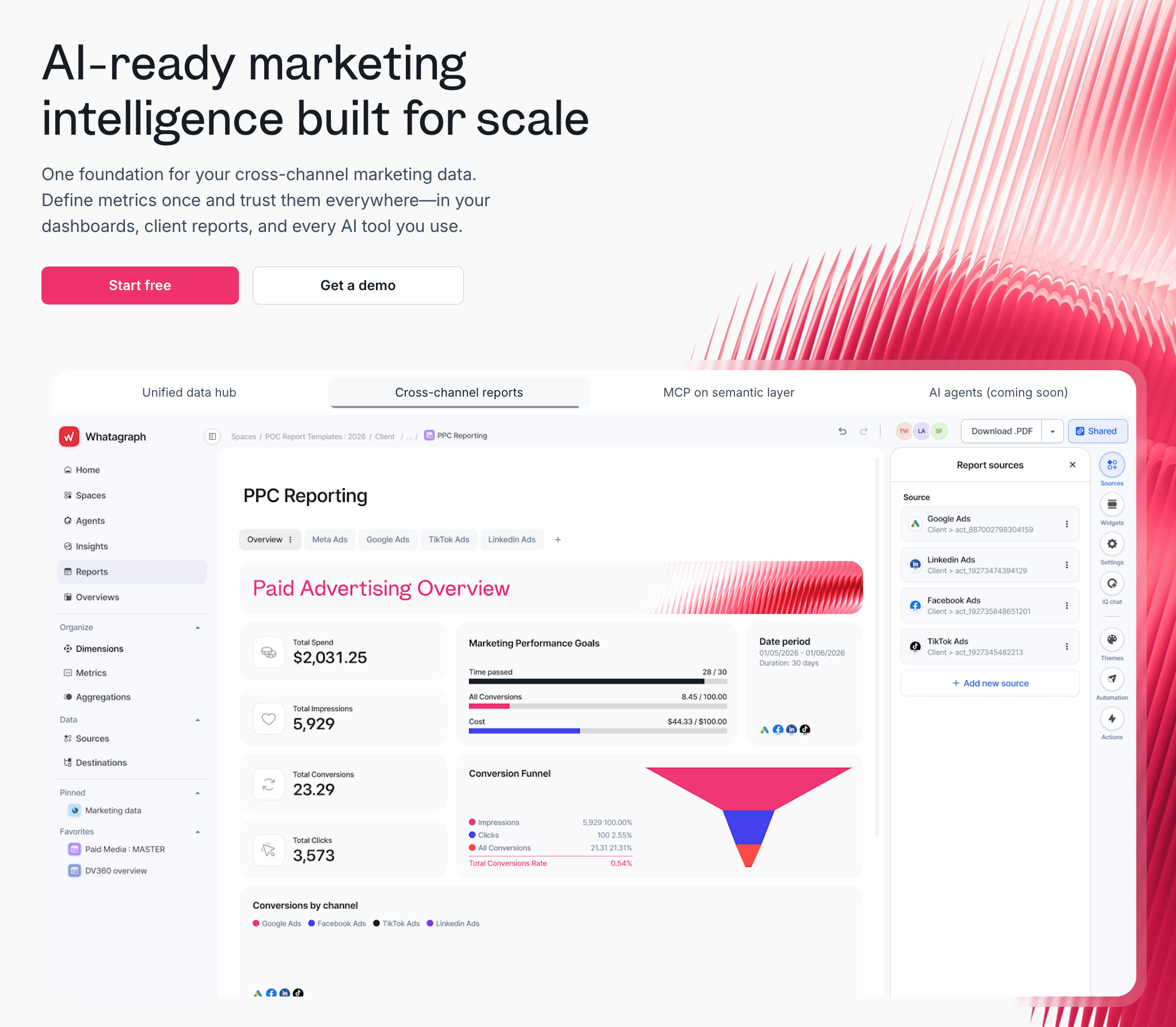
Whatagraph is a marketing intelligence platform with one governed data foundation that powers your client reports, internal dashboards, and your favorite AI tools - all from the same business logic and definitions you set up.
Here's what that looks like in practice:
1. Bring all your cross-channel marketing data into one governed data hub
Whatagraph connects to 60+ native integrations across paid media, SEO, social, analytics, CRM, ecommerce, and email.
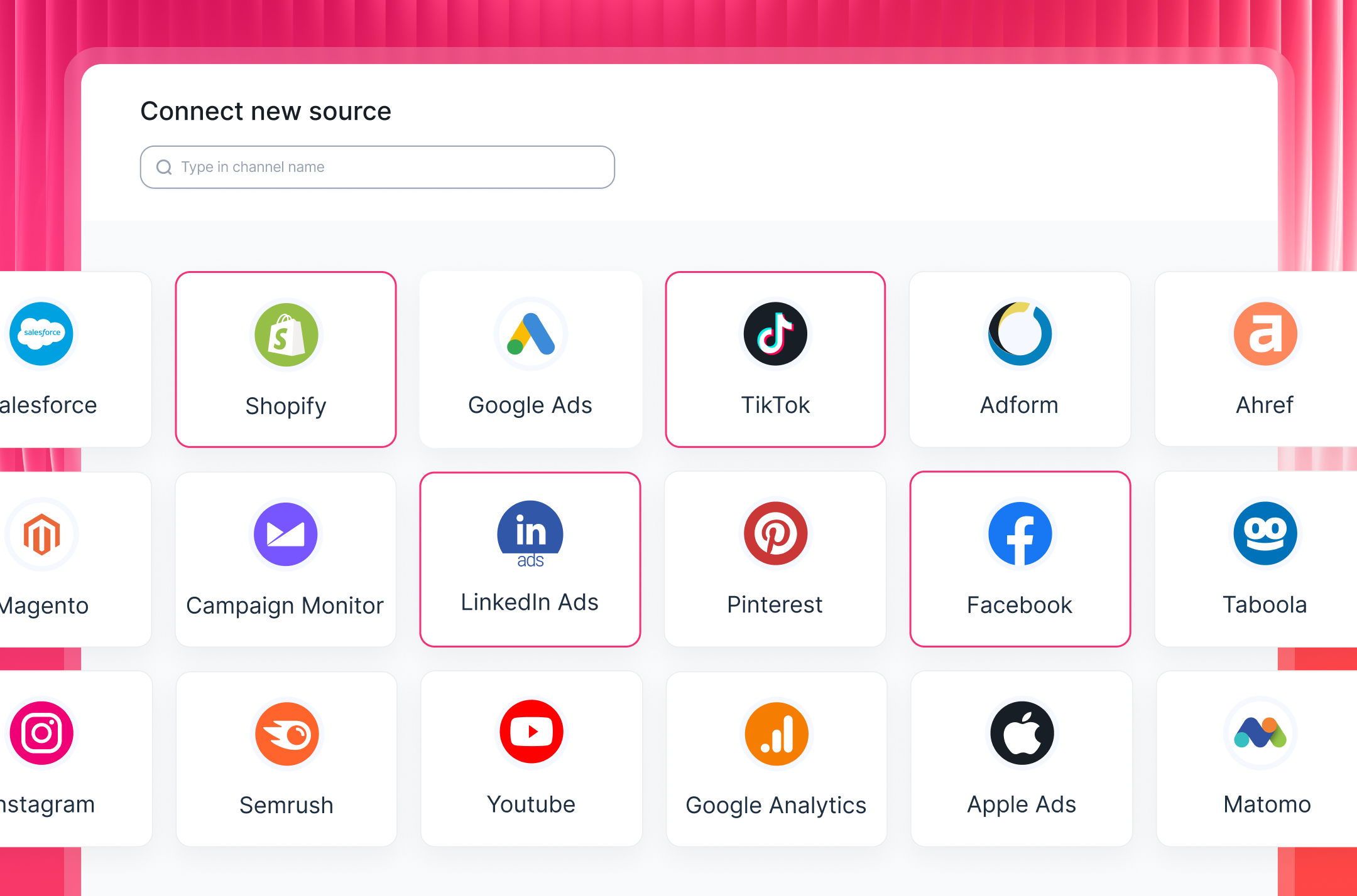
Unlike tools that route data through third-party pipelines, Whatagraph manages every integration in-house. If something breaks, our product team fixes it - not a middleware vendor you have no visibility into. Connectors are self-healing: bugs are patched by Whatagraph's engineers before most users notice them.
This means you don’t need to babysit connectors or spend hours (or days) waiting to hear back from customer support. Plus, your clients won’t see broken connectors or widgets.
In fact, this is the biggest advantage Linda van Baal, Online Marketing Consultant at YourFellow saw when they switched to Whatagraph. She says:
Whatagraph saves me at least half a day a week and it's so much easier and faster than Funnel and Looker Studio. But the biggest advantage is that all our data is now in one tool—everyone knows where to find everything because it’s in one place.
2. Define your metrics once and trust them everywhere
If you're running campaigns across Google Ads, Meta, LinkedIn, and more, you know how much time goes into making those numbers agree with each other.
Every platform uses different naming conventions, different conversion definitions, different ways of counting a conversion. And usually you'd spend more time reconciling them (or there's no easy way to reconcile them) on your reporting tool.
Whatagraph's Data Hub lets you define what things mean once - then that definition carries through every report, every client, every channel.
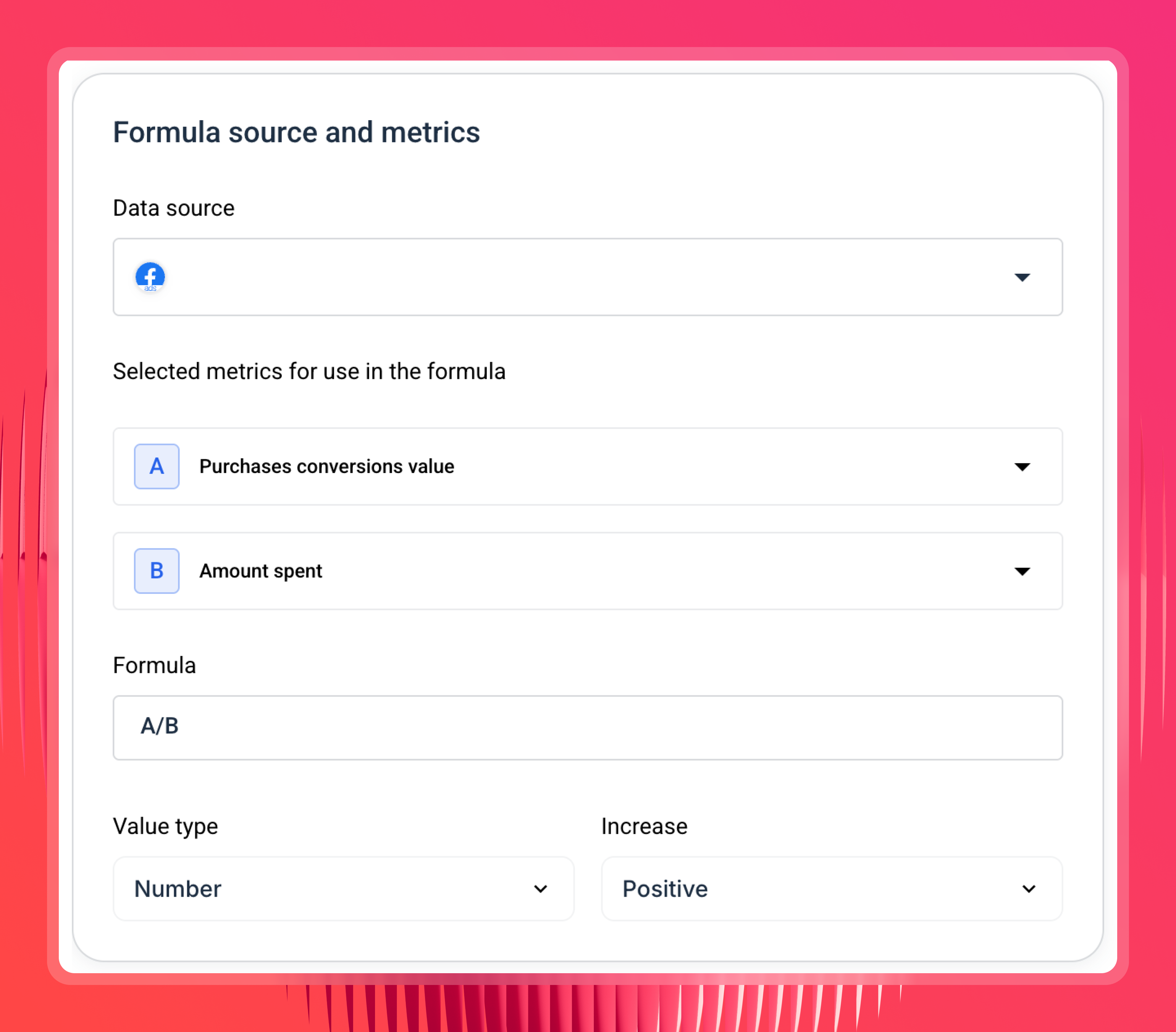
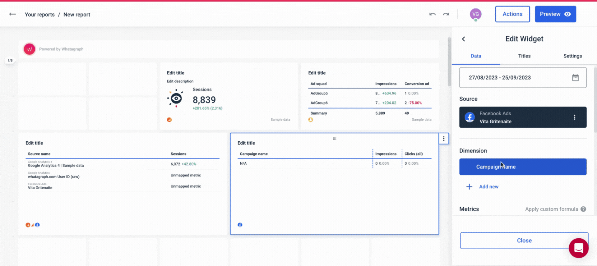
You can use Source Groups to combine multiple ad accounts (e.g. Google Ads) into one aggregated source, and to combine similar data from different channels like “Total Ad Spend” from all your PPC channels.
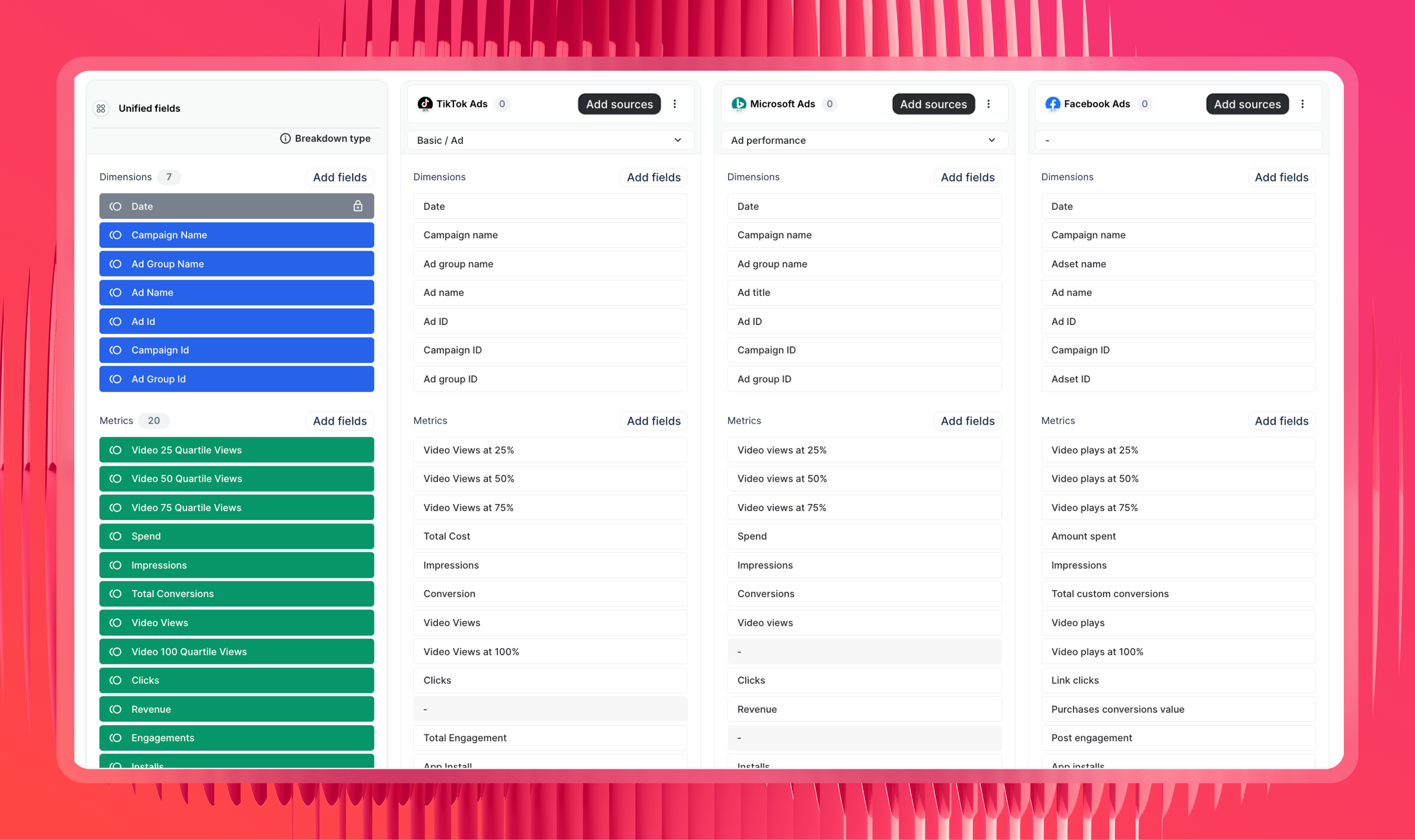
Custom metrics let you build cross-channel KPIs from a simple formula builder - for example, ROAS, cost per lead, LinkedIn frequency, whatever you name it. You can then add these custom metrics easily to your reports.
 You can also rename the name of the metrics easily on your reports. Drew Cove, Senior SEO Manager at DigitalParc, puts it simply:
We use Whatagraph for all our client's reports. The ability to title metrics differently is important to us because we often report the same metrics to different clients and just need to call them differently because many clients have internal terminology that is very different from one another.
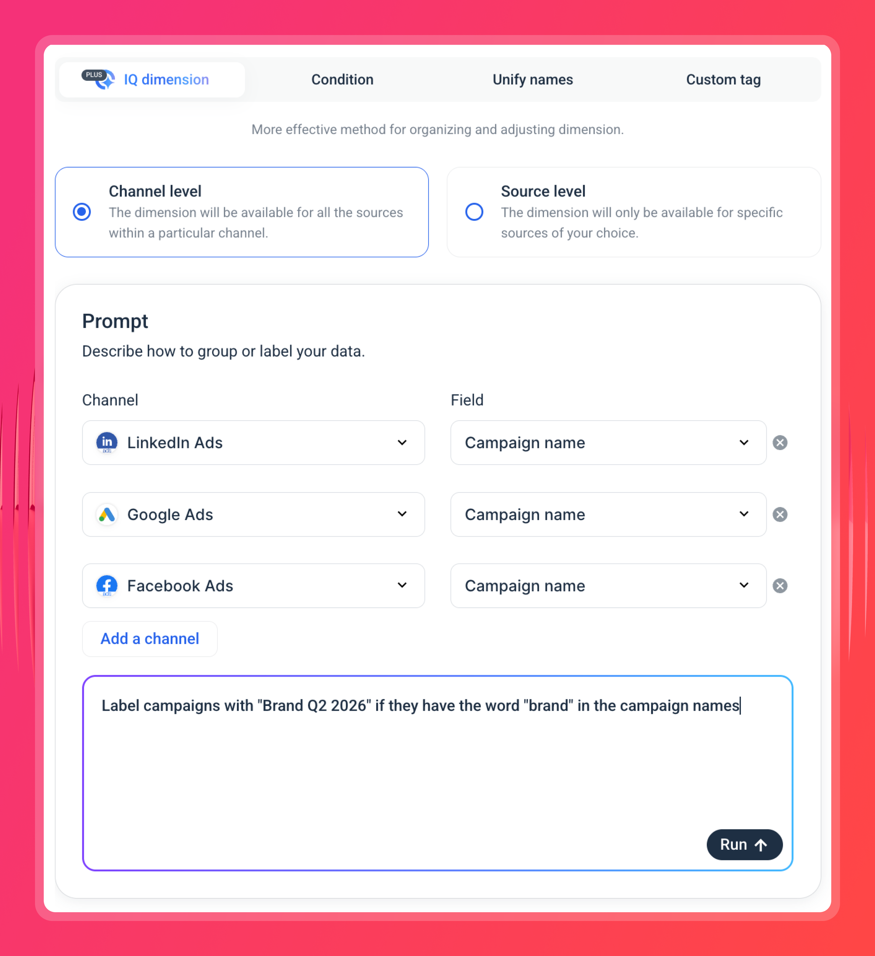
Custom dimensions standardize how data is categorized across channels, so campaign types, regions, or audience segments are labeled the same way regardless of what the source platform calls them.
If you need a new dimension built quickly, Whatagraph IQ generates one from a text prompt - choose your channels and describe what you need, and you’ll get a custom dimension in seconds.
3. Scale reporting without scaling your team
Agencies spend too much time building reports from scratch, and that problem compounds with every new client.
With Whatagraph, you build a report template once - one for lead gen clients, one for ecommerce, one for paid media for example - and reuse it every time a new client comes in.
Then you link those reports to one master template. Add a new tab, update a metric, change a widget layout - every linked report updates automatically. You make the change once, it goes everywhere.
Maatwerk Online, a 41-person Dutch agency managing over 100 clients, saves more than 100 hours a month with this approach. This is the time that the agency now has to focus on optimizing campaigns, strengthening relationships with clients, and even onboarding new ones.
Co-Founder Lars Maat says:
Whatagraph is saving so much time and energy for our marketing specialists. We now have more time to focus on strategic things that help both our agency and our clients grow.
Even better - with Whatagraph IQ, you can ask AI to build a report for you from scratch. Choose your channels, type a prompt, and it generates a complete report from your connected data.
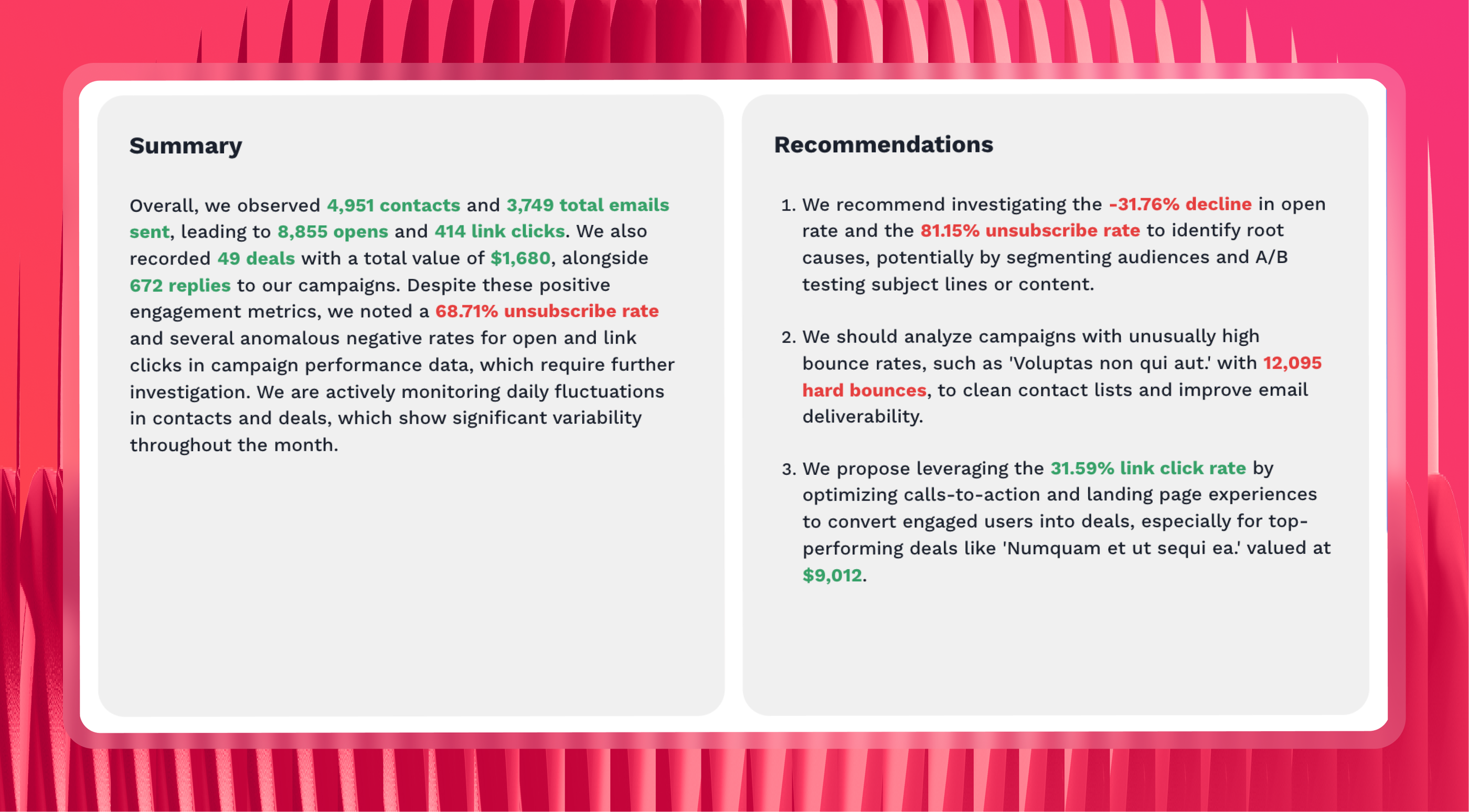
Need a performance summary inside the report? IQ writes it automatically - no hallucinations, because it's pulling from your actual data, not making it up.
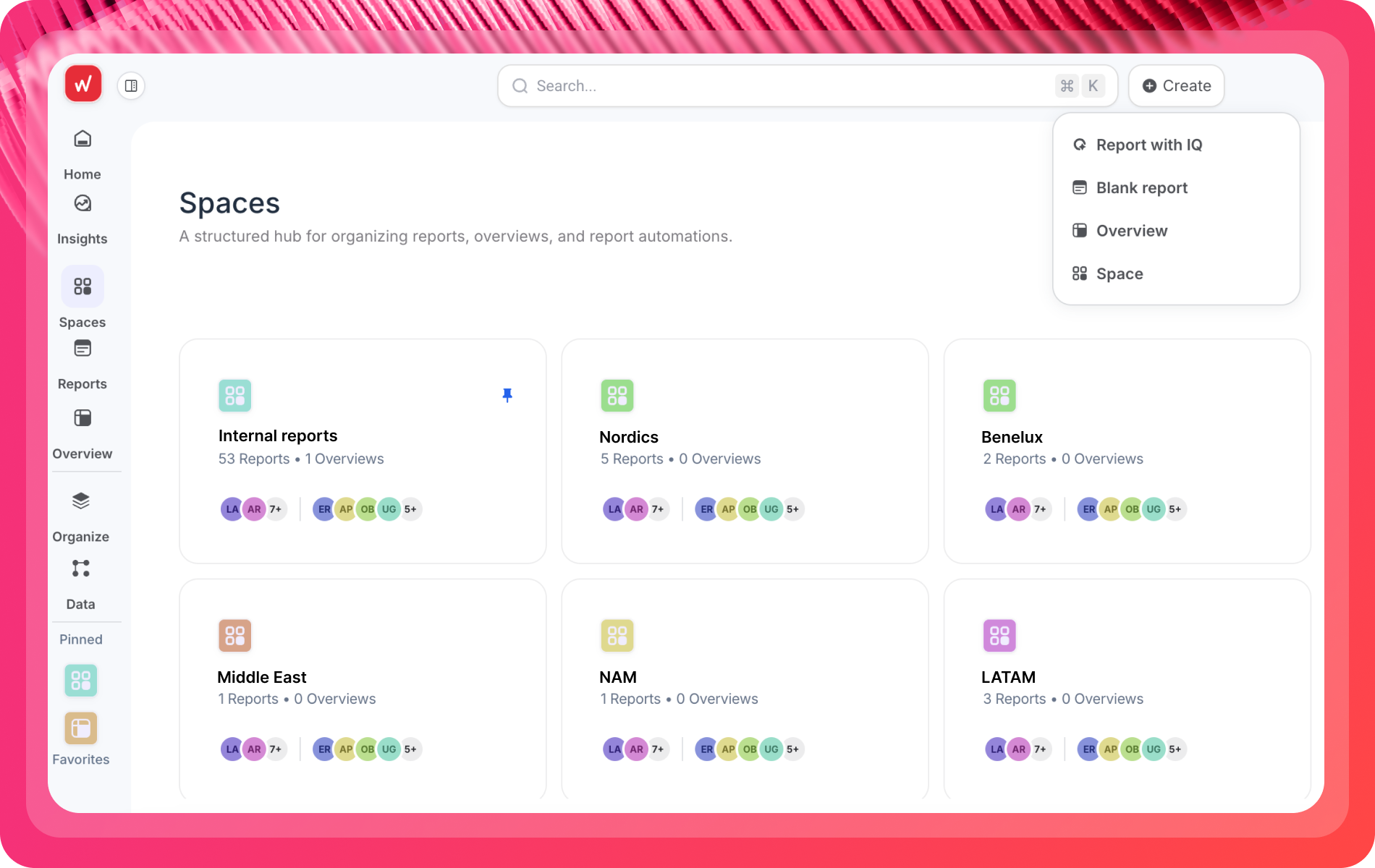
Have dozens of clients or locations? Easily consolidate all your connected data sources and reports inside a dedicated folder for each client, Account Manager, location, or whatever makes sense for your business.
Another key feature that ex-Databox users love about Whatagraph is our Source Filter.
Previously, you’d have to apply the same filter widget by widget—painful if you’ve got 20 Facebook widgets in one report.
Now, with Whatagraph’s Source Filter, you apply the filter once at the source level, and it updates across every widget instantly. That means less time clicking around, and more time actually analyzing your data.
4. Send reports, answer questions, and query your data - all from the same foundation
Once you've defined your data and built your templates, that same foundation powers every output your team needs.
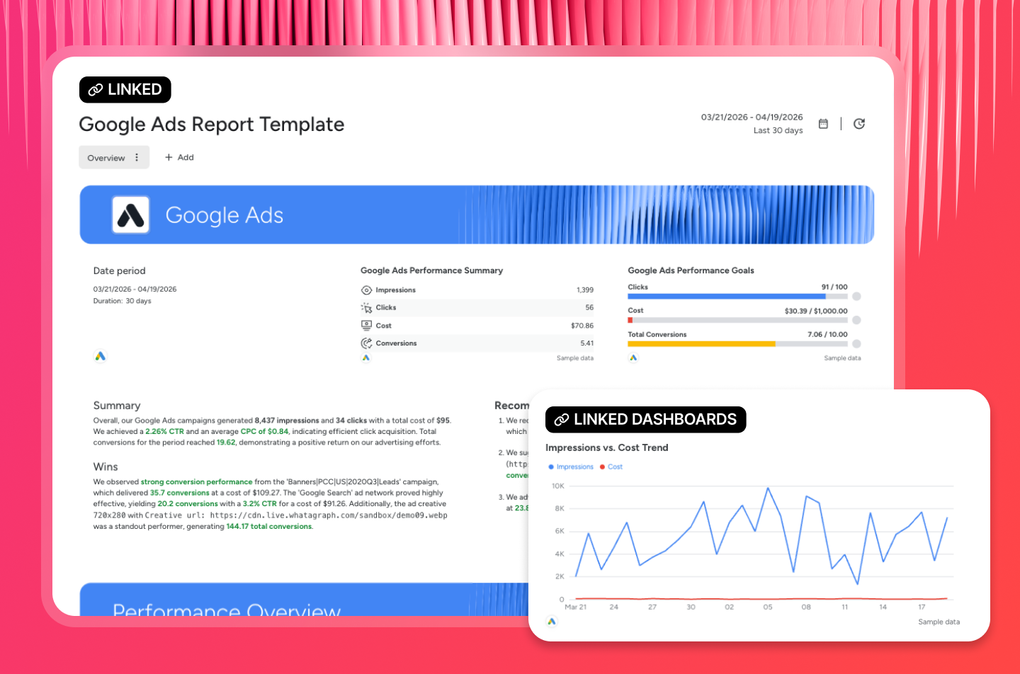
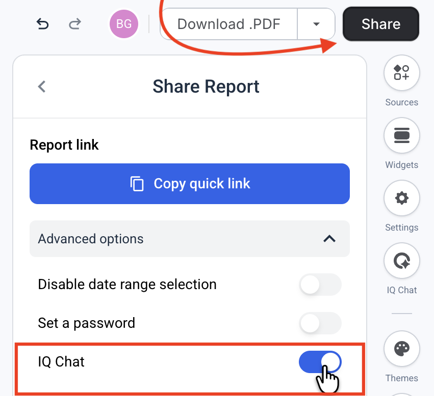
Client reports go out as white-labeled live links with a custom domain, password protection, and optional IQ Chat - so clients can ask questions about their own data without emailing your team.
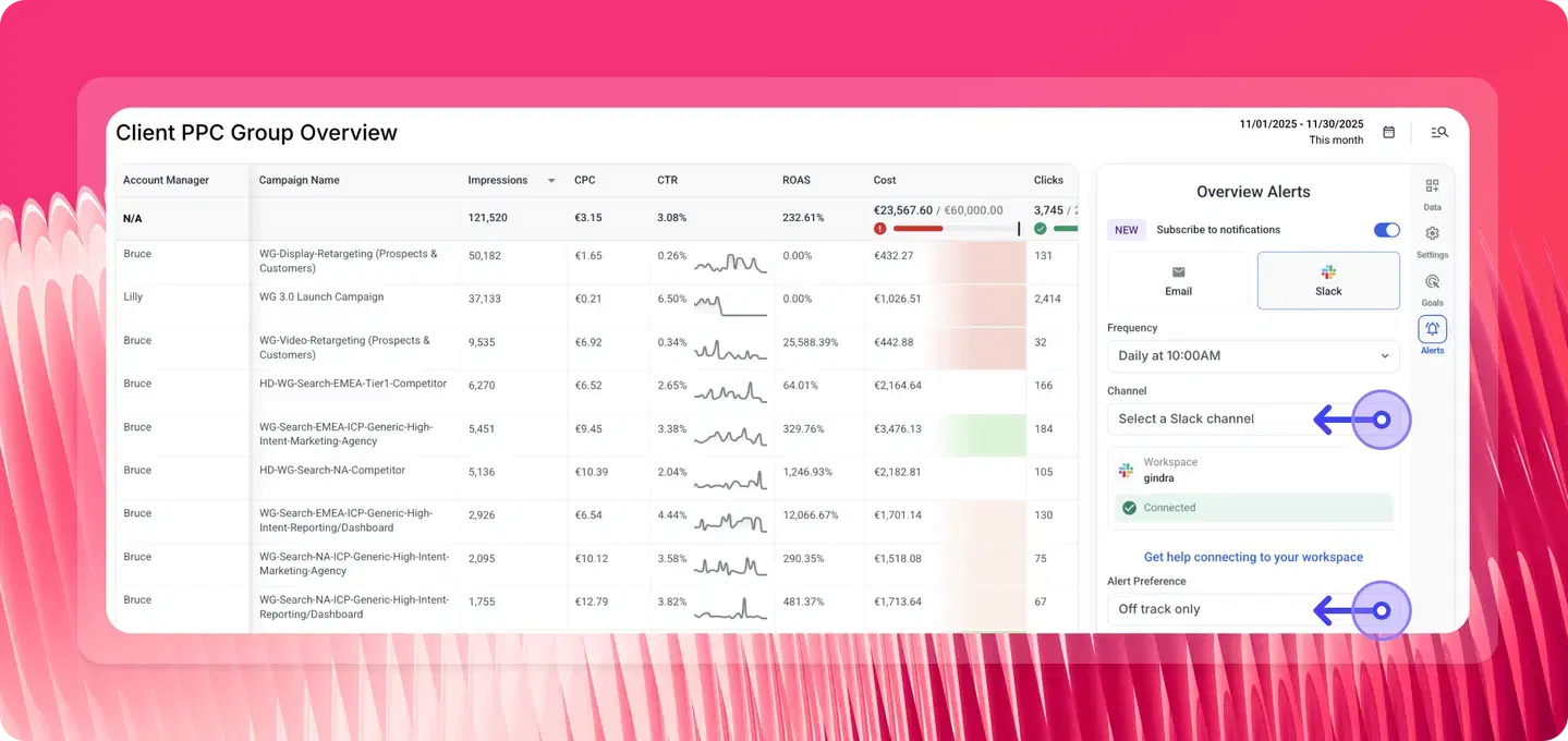
Performance Overviews give teams a filterable view across the entire client book, sliced by account manager, region, or client tier. Goals and alerts notify you via Slack or email when something goes off-track mid-month, not at the end of the month when there's nothing left to do.
Whatagraph also connects to Claude, ChatGPT, and any MCP-compatible AI tool via Whatagraph MCP. Ask your AI assistant: "Which clients are pacing behind on spend this month?" and it answers from your actual governed data - not a raw API call stitching numbers together on the fly.

Whatagraph's MCP sits on top of a governed semantic layer, so the number your AI returns is the same number in your client report. Setup takes five minutes, no code required.
5. Fast and friendly customer support
Using a marketing analytics tool can be overwhelming. There are times you just need some (or a lot) of help from a product expert to get the platform up and running the way you want it to.
At Whatagraph, customer success is our lifeblood, and our customers appreciate that.
Kim Strickland, Digital Marketing Specialist at Peak Seven says:
I've joked about this often—with Whatagraph, we're not paying for a reporting system. We're paying for customer support. There's a level of dedication from the Whatagraph team that you don't often experience anywhere else.
And Stef Oosterik, Quality Manager at Dtch. Digitals said in 9 out of 10 cases, issues get resolved within a day.
The support team is very responsive. This makes it easy for us to give feedback, think of solutions, and get the right data visible for clients quickly.
For teams that need more tailored guidance, dedicated Customer Success Managers (CSMs) are available on advanced plans. CSMs work with you on migrations, onboarding, and building reporting workflows that scale.
Convinced Whatagraph is the right Databox alternative for you? Start free today.
Key Features
- 60+ stable native integrations across paid ads, social, SEO, email, and more
- Custom integrations via API, Google Sheets, or BigQuery
- Whatagraph IQ – AI-powered reporting tools
- Whatagraph MCP connector for Claude or ChatGPT
- Custom metrics, dimensions, and data blends
- Performance monitoring overview
- Library of pre-made dashboard and report templates
- Linked reports for easier editing
- Spaces – organize reports with descriptions, colors, and better team alignment
- Custom branding and white labeling
- Automated report sharing via email or live dashboard links
- Exports: PDF, Excel, CSV, or transfer directly to BigQuery/Looker Studio
Whatagraph Reviews from Real Users
Whatagraph Reviews from Real Users
"It's easy to use and intuitive. I enjoy how things aren't hidden in menus, and the AI reporting is very on point." (Source)
"I love how I can set up automated reports that look great and are client-ready. No more fiddling with spreadsheets or wasting time building slides." (Source)
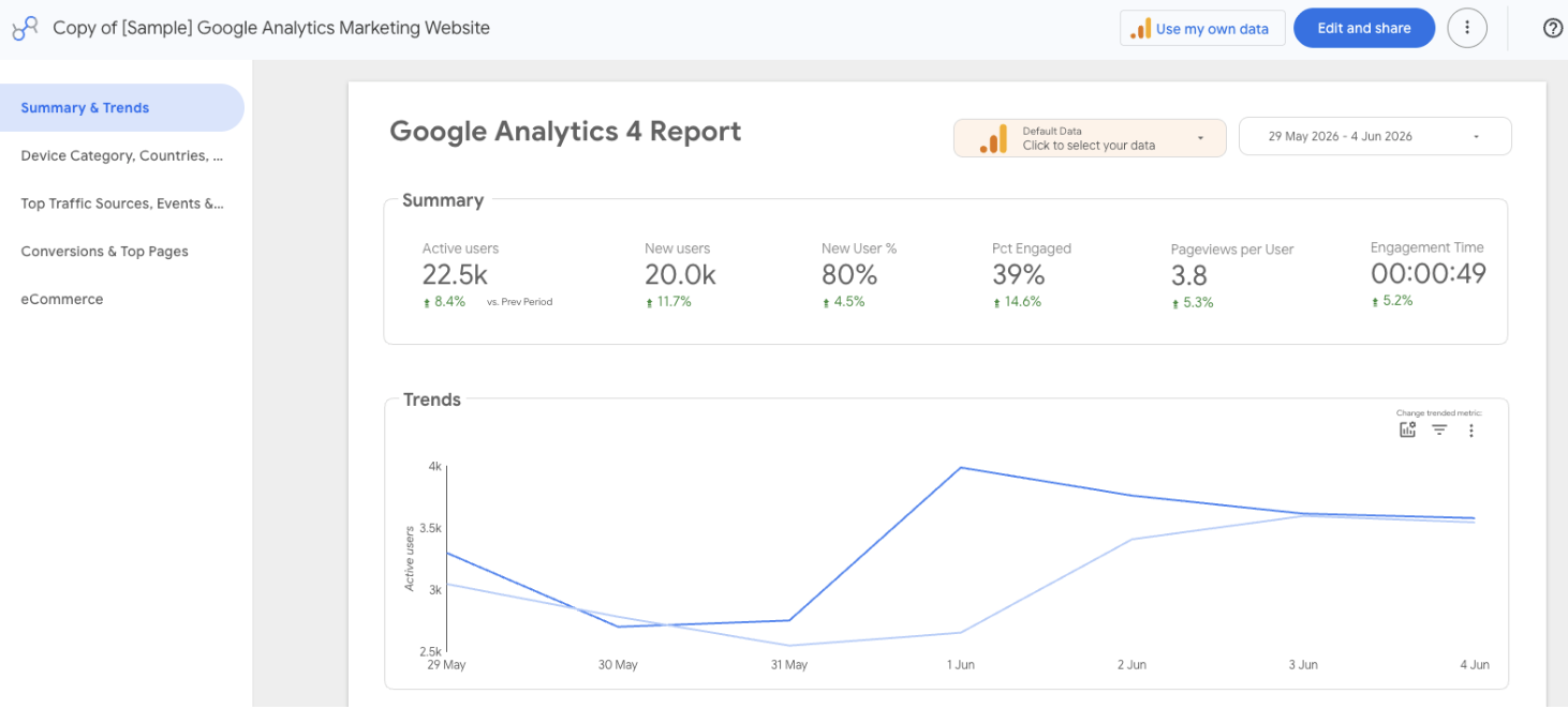
"The edit section of each widget is easy to update, from changing colors to adding logos and images from the different platforms we use, like GA4." (Source)
Whatagraph pricing
Whatagraph's pricing scales with how much data you actually use rather than how many people are on your team, and every plan includes unlimited users and unlimited reports. Check the pricing page for a full breakdown by plan.
2. Klipfolio
Best for: Large data teams at companies and large agencies that need centralized governance.
Klipfolio is a hybrid of a data analytics platform and a traditional business intelligence tool, and remains one of the most powerful Databox alternatives because it governs data through two core products:
- PowerMetrics: This is a centralized metric catalog; unlike Databox, where metrics are often built on a per-dashboard basis, PowerMetrics allows your data team to define a "certified" metric (like LTV or CAC) once. Every department then uses that same standardized calculation for their reports.
- Klips: These are the highly customizable blank canvas dashboards. With over 130 native integrations and a solid REST/URL connector, Klips can pull data from proprietary or obscure sources that Databox simply doesn't support.
In 2026, AI Insights expanded across both products. Goal tracking flags when targets are at risk, anomaly detection explains what caused a metric to shift in plain English, and forecast modeling generates forward-looking projections from historical trends.
PowerMetrics also added an MCP Server in beta, connecting Claude or ChatGPT to the governed metric catalog rather than raw connector data, closer to a governed approach than most competitors offer.
Key Features
- 130+ integrations, including warehouses, SQL databases, and file-sharing services
- PowerMetrics governed metric catalog
- AI Insights: goal tracking, anomaly detection, forecast modeling
- PowerMetrics MCP Server (Beta)
- Custom metrics, dimensions, and data blending
- Scheduled reports with PDF and CSV export
Klipfolio Reviews from Real Users
"It's super easy to pick up, connects smoothly with lots of data sources, the dashboards get used all the time (daily or a few times a week)." (Source)
"It's very intuitive, and the UI is clean. The integration capabilities are nice." (Source)
"Every time I contact support, I get the impression that I am bothering them. I will not be renewing this platform because I do not feel valued as a customer." (Source)
Klipfolio Pricing
Klipfolio’s pricing has stabilized into four main tiers (billed annually):
- Base ($120/month, billed annually): 3 dashboards, 130+ integrations, 4-hour data refresh, unlimited users
- Grow ($190/month): 10 dashboards, 1-hour refresh
- Team ($310/month): 20 dashboards, 15-minute refresh, SSO
- Team+ (~$600/month): 40+ dashboards, priority support, custom onboarding
But these top-ups and add-ons can significantly raise your overall costs:
- Extra dashboards: $8/month (billed annually)
- Warm-up data refresh: $39/month (billed annually)
- Near-real-time data refresh queue: $139/month (billed annually)
- Custom domain: $69/month (billed annually)
3. Tableau
Best for: Large enterprise data teams that need complex multi-source modeling and predictive analytics.
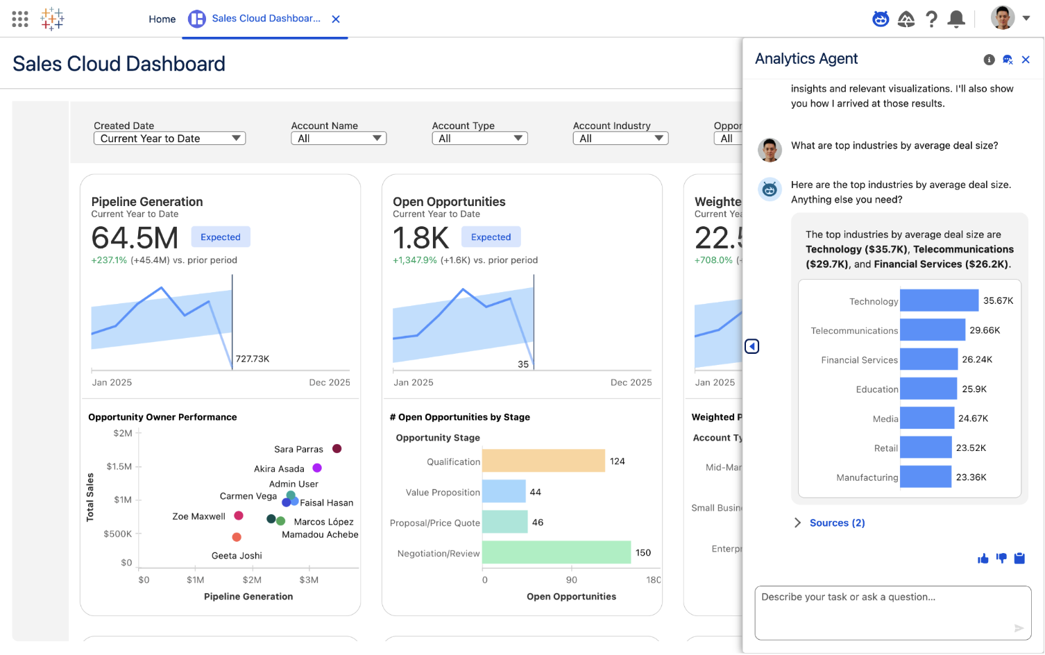
Tableau remains the market leader for heavy-duty business intelligence—while Databox excels at quick-glance marketing KPIs, Tableau is built to handle millions of rows across diverse departments.
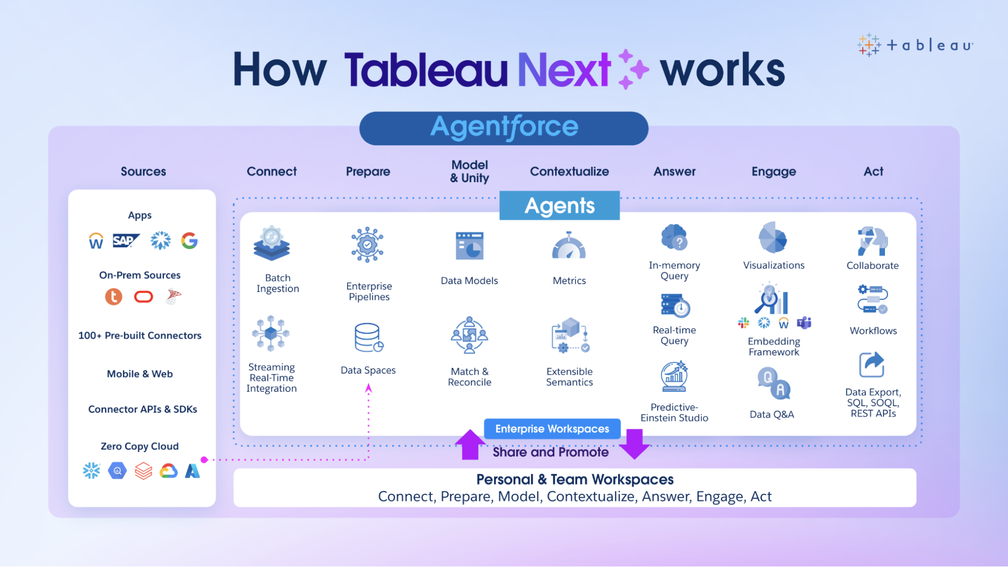
The biggest shift for 2026 is Tableau Next. Unlike Databox’s static alerts, Tableau now uses AI Agents to autonomously monitor data and generate semantic models from raw workspaces.
For a powerful data analysis tool, Tableau is still easy to use with a drag-and-drop interface and visual query builder. You can generate insights quickly and share them with stakeholders through reports.
While Databox is sunsetting its Benchmark Groups in April 2026, Tableau has doubled down on Tableau Pulse to provide a personalized newsfeed of your most critical metrics directly in Slack, Teams, or email.
You can perform complex data analysis, uncover trends, and identify opportunities for optimization using features such as trend lines, forecasting, and clustering.
What’s more? Tableau boasts quite a large and active user community called “Tableau Community Forums” with a wealth of resources, forums, and online training materials to help you learn the platform and troubleshoot issues.
You can also purchase “Success Plans” that come with personalized training and support.
However, Tableau is (a lot) more expensive than Databox as it’s mainly for enterprises.
Key Features
- 90+ integrations, including databases and cloud platforms
- Tableau Pulse with Pace to Goal insight
- Tableau Agent: natural language calculations and visualizations (Tableau Next only)
- Auto-generated semantic models (Beta, Tableau Next)
- Drag-and-drop dashboard interface
- Trend lines, forecasting, and clustering
Tableau Reviews from Real Users
"It connects to a wide range of sources (databases, Excel, cloud platforms), which is great in complex enterprise environments." (Source)
"It helps me turn raw Excel data into clear, attractive visuals, including charts, maps, graphs, and dashboards." (Source)
"The other part of the story is that the pricing feels a bit on the higher side, especially for the small teams." (Source)
Tableau pricing
Tableau runs a higher bill than most tools on the list because it charges per-user, including a fee just for people to view the reports.
- Tableau ($15/user/month, billed annually): browser-based web authoring, Tableau Desktop, Prep Builder, Tableau Pulse
- Tableau Enterprise (from $35/user/month): everything in Tableau, plus advanced management and data management
- Tableau Cloud+ (contact sales): everything in Enterprise, plus Tableau Agent, Premier Success, 50 sites
- Tableau+ Bundle (contact sales): everything in Cloud+, plus Tableau Next agentic analytics
4. Looker Studio (a.k.a. Google Data Studio)
Best for: Freelancers and boutique agencies who want a budget-friendly, Google-native reporting hub.
Looker Studio is often the first alternative marketers turn to when Databox’s pricing becomes prohibitive.
For Google Ads, GA4, and Search Console, Looker Studio is significantly more reliable than third-party platforms. Many ex-Databox users we’ve talked to move to Looker because native Google connectors rarely "break" compared to the API middleware used by other tools.
Once your data sources are connected, you can use Looker’s drag-and-drop report editor to ad:
- Charts, line bars, pie charts, geo maps, area and bubble graphs, data tables, pivot tables
- Filters and date range controls
- Links and clickable images
- Custom text and images
- Custom styles and color themes
You can then invite teams or clients to view or edit your reports, or send them links in scheduled emails.
The biggest 2026 update fixes one of the platform's longest-standing complaints: cross-data source filtering.
A single filter control can now filter charts pulling from different data sources simultaneously, so a report combining Google Analytics and Google Sheets data finally needs just one date picker instead of two. Gemini conversational analytics also rolled out on the Pro plan, letting you ask natural-language questions and get help building calculated field formulas.
Once you move beyond Google's own platforms, the cracks show. Pulling in Meta, TikTok, or LinkedIn data requires paying for third-party "Partner Connectors," which can run $20 to $350+ a month depending on data volume, so the "free" tool often isn't free in practice for multi-platform marketing teams.
Key Features
- 21 native Google connectors (free), 1,000+ partner connectors (paid)
- Cross-data source filtering across multiple sources
- Gemini conversational analytics
- Code Interpreter for Python analysis
- Drag-and-drop report builder
- Mobile app
Looker Studio Reviews from Real Users
"I use it for marketing reporting, and it's difficult, but it's free and works." (Source)
"For small to mid-sized marketing clients, Looker Studio is our choice for visualization. We use it with Supermetrics to pull data where needed." (Source)
"Onboarding new users isn't easy because there are too many fields (in our case), but I think it is a common issue with these tools." (Source)
Looker Studio pricing
- Free version: Unlimited reports, Google connectors only.
- Looker Studio Pro at $9 per user, per month: This gives you access to organizational ownership, Team Workspaces, Gemini AI, and priority support.
While the platform can be free, your total monthly bill might be higher than Databox once you add non-Google data.
To pull data from Meta Ads, TikTok, or LinkedIn, you must pay for third-party "Partner Connectors" like Supermetrics or Windsor.ai. In 2026, these can cost anywhere from $30 to $500+/month, depending on your data volume.
5. Geckoboard
Best for: Medium to large businesses in customer service, sales, and ecommerce that need high-visibility office or remote dashboards.
Geckoboard is designed to solve data silos by making key metrics unmissable - unlike Databox, which is often used for deep-dive analysis, Geckoboard is built for live monitoring. If a metric drops below a threshold, your entire team sees it in real time.
Geckoboard’s killer feature over Databox is its TV-first architecture:
- TV dashboards: Optimized for wall-mounted screens with high-contrast themes and rotating dashboard loops.
- KPI notifications: You can set success or warning indicators. So if your Shopify sales hit a specific goal or your Zendesk queue gets too long, Geckoboard sends an automated alert to Slack or Microsoft Teams within 60 seconds of the data change.
- Mobile-friendly: While it's great for TVs, the 2026 mobile app has been redesigned to offer scorecard views for managers who need to check KPIs between meetings.
In 2026, Geckoboard shipped its first new visualization type in years: stacked column charts, which show a total value and its breakdown in one widget instead of two. March 2026 also brought Custom Dashboard Templates, the closest thing Geckoboard has to linked templates, letting you build a dashboard once and generate synced copies, though this currently only works for Zendesk, Aircall, and HubSpot data.
The tradeoff is depth. Unlike Whatagraph, you can't create custom data blends, metrics, or dimensions on Geckoboard, and adding each widget means a manual click-through process, choosing the metric, customizing it, repeating, rather than a true drag-and-drop builder.
Key Features
- 90+ integrations across customer service, sales, finance, and ecommerce
- Stacked column charts (new April 2026)
- Custom Dashboard Templates (Zendesk, Aircall, HubSpot)
- KPI notifications via Slack and Microsoft Teams
- TV dashboards with automated rotation
- Mobile-friendly dashboards
Geckoboard Reviews from Real Users
"There was a PipeDrive report I wanted to use on our office Geckoboard, but I couldn't find a way to upload it." (Source)
"Quality of output design, the tables are striking, it's also very easy to set up." (Source)
"Used Geckoboard before and found it quite poor UX wise; janky, poor variety in visualisation among a host of UX issues." (Source)
Geckoboard pricing
As of May 2026, Geckoboard has updated its pricing to reflect its new feature set. Note that they no longer offer a Free Forever plan for new sign-ups.
- Essentials ($119/month): 3+ dashboards, unlimited viewers, all 90+ integrations, real-time data, Slack/Teams/email snapshots
- Performance ($399/month): 25 dashboards, 5 screens, custom templates, real-time alerts, drilldowns, custom themes
- Enterprise (custom): everything in Performance, plus SSO, audit logs, dedicated support manager
6. DashThis
Best for: Small businesses and freelancers who need automated, professional marketing reports.
DashThis is a streamlined marketing reporting tool that connects to 30+ marketing platforms and visualizes KPIs on automated dashboards. While Databox asks you to build widgets from scratch, DashThis gives you the Lego blocks already assembled.
If you don’t see a built-in integration you need, you can also upload your own data using a nifty CSV file or a Google sheet.
Once your data is connected, you can visualize it using three key dashboards:
- Periodic dashboards: These are dashboards based on specific time periods and cadence, like daily, weekly, monthly, semi-annually, and annually.
- Campaign dashboards: These dashboards are used to isolate and highlight a specific campaign for a custom date range.
- Rolling dashboards: These dashboards show trends of metrics for three different date ranges.
These dashboards are also pre-made, meaning you can quickly get started rather than spending hours building dashboards like on Databox.
DashThis now includes an AI Insights layer that automatically analyzes your dashboards and generates narrative insights.
The most recent update closes a real gap: Calculated Widgets now let you build custom metrics by combining values from different integrations with simple math, like blended ROAS from Google Ads and Meta in one number.
AI Insights also ships free on every plan, automatically generating plain-language commentary as new data arrives.
Key Features
- 30+ native integrations, including newly added Reddit Ads
- Calculated Widgets for blended, cross-platform metrics
- AI Insights (free) and AI Insights Pro add-on (Chat Mode, Dashboard Context)
- White-label reporting on Professional plans and above
- Pre-built periodic, campaign, and rolling dashboards
- Report sharing via email, URL, or PDF
DashThis Reviews from Real Users
"The integrations for Google Ads, Google Analytics, LinkedIn Ads, and Meta Ads are helpful." (Source)
"The dashboards are clean and easy to understand, providing our clients with the insights they need." (Source)
"Unfortunately, a subscription became a little pricey for me; I found I wasn't using the tool enough to warrant the cost." (Source)
DashThis pricing
As of June 2026, DashThis offers three pricing plans, plus an optional add-on:
- Individual ($44/month, billed annually): 3 dashboards, 15 sources, AI Insights, preset templates
- Professional ($139/month): 10 dashboards, 40 sources, custom domain, white-labeled dashboards
- Business ($279/month): 25 dashboards, 100 sources, dedicated customer success specialist
- AI Insights Pro add-on: $15/month annually, adds Chat Mode and Dashboard Context
Starting on March 30th, 2026, DashThis updated its pricing model so that plan tiers reflect both the number of data sources you connect AND the number of dashboards included. This means you’ll pay based on the volume of sources you bring in as well as dashboard capacity, rather than solely on dashboard count or flat tier pricing.
7. Grow
Best for: Mid-to-large agencies and enterprises that need to clean, store, and visualize data in one single tool.
For organizations that find Databox’s lack of a data warehouse or ETL engine limiting, Grow (now an Epicor company) is the heavy-duty alternative.
You can connect to 100+ data sources through native integrations, including popular CRM platforms, marketing analytics tools, databases, and accounting software.
Then, you can prepare and cleanse your data using either noSQL or SQL transformations. This includes custom calculations, data blends, and advanced data filters.
New for this year, the Grow AI predictive engine analyzes your historical data to generate performance forecasts for up to 100 different metrics.
Plus, Grow stores your data automatically on its platform so you don’t need to ship it to a third-party data warehouse.
You can create three types of dashboards on Grow:
- Dynamic dashboards which display data based on who is logged into the account.
- Dashboard Blueprints which are pre-built, single data source dashboards
- Custom and sandbox dashboards which shows blended data sources and metrics
But Grow dashboards are designed for internal operations and deep-dive analysis. If you want client-ready one-page reports for a C-Suite that just wants to see three numbers, Whatagraph or DashThis may be a better fit.
You can then share them through emails, shareable URLs, Slack, TV-mode, or tables of raw and transformed data.
The key advantage of Grow over Databox is its reliability. The platform uses APIs to import data seamlessly from data sources, and it continually refreshes the data so your metrics are up-to-date and reliable.
However, Grow is more suitable for internal data storage and monitoring rather than for external reports. Their dashboards are very nitty-gritty which can overwhelm clients or the C-Suite.
Key Features
- 150+ native integrations spanning CRM, marketing, and accounting tools
- Built-in data storage and warehousing
- Smart Builder with Smart Assumptions
- Natural language data interaction
- Dashboard shows/hides rules by viewer role
- SQL or no-code data transformations
Grow Reviews from Real Users
"I use Grow.com primarily for real-time updates of important metrics, which takes our metrics out of spreadsheets and allows us to update them in real-time instead of once a month." (Source)
"This is a very helpful reporting tool, and I really appreciate the scheduled email feature." (Source)
"Some types of charts are not easy to build, and can be complex when wanting to slice the data multiple ways." (Source)
Grow pricing
Grow BI doesn't publish self-serve pricing. All plans are custom quotes through Epicor's sales team, based on data volume, user count, and feature needs.
8. NinjaCat
Best for: Large marketing agencies and brands with dedicated data operations teams who need a warehouse-centric approach.
NinjaCat has shifted from a pure visualization tool into a full AI agent platform built on top of a managed marketing data cloud. It connects through 100+ native connectors, plus custom and AI-assisted connectors, and stores your data in a managed warehouse or ships it to Snowflake, BigQuery, or Amazon S3.
The headline 2026 launch is a Snowflake Connected App, letting enterprise customers run NinjaCat's entire AI agent platform natively inside their own Snowflake environment with zero-copy architecture, meaning data never has to leave Snowflake.
NinjaCat also expanded its AI Agent Showcase to 100+ pre-built marketing agents covering tasks like negative keyword discovery, search-term mining, and rank tracking, plus MCP Server support that lets Claude or ChatGPT connect to NinjaCat's governed marketing data directly.
The report builder still looks and feels like a design tool, which can be confusing if you don't have a design background. NinjaCat also doesn't offer self-serve pricing, so every contract goes through sales.
Key Features
- 100+ native connectors, plus custom and AI-assisted connectors
- Snowflake Connected App (zero-copy architecture)
- AI Agent Showcase: 100+ pre-built marketing agents
- MCP Server support for Claude and ChatGPT
- No-code transformations and calculations
- White-label reporting options
NinjaCat Reviews from Real Users
"Reports were easy to read, when or if they generated correctly." (Source)
"NinjaCat has a lot of connectors that are able to bring in data from countless platforms." (Source)
"The platform is straightforward to use and simple to navigate." (Source)
NinjaCat pricing
NinjaCat remains a premium enterprise solution and does not offer a self-serve entry-level tier. Agencies typically start at $1,500/month based on third-party data.
9. Cyfe
Best for: Boutique SEO agencies and freelancers who need a permanent, low-cost monitor for search rankings and multi-channel web data.
Cyfe is a business dashboard app that helps you easily monitor your business data from one place and make better decisions.
You can pull data from 100+ integrations, including social media, email, SEO, and sales and finance tools. You can also bring in custom data via CSV, Google Sheets, SQL, private URL, or push API.
To build visualizations, you can start from their dashboard templates or pre-built widgets. The platform also comes with “Embedded Analytics” where you can take an entire dashboard or a widget and embed it into emails, webpages, or applications.
The honest read for 2026: Cyfe is in maintenance mode. There have been no meaningful product updates in 2025 or 2026, its G2 profile is unclaimed, and both the X (Twitter) and Recurly integrations have been deprecated without replacement, with reviewers noting Cyfe has confirmed the product is "low on their priorities."
It's not a tool to evaluate based on an active roadmap. It's an affordable, functional option that does what it does, but isn't keeping pace with the market.
Key Features
- 100+ integrations, including custom data via CSV, Sheets, SQL, or push API
- Built-in keyword ranking tool (Google, Yahoo, Bing)
- Embedded analytics for emails, webpages, or applications
- 15-language interface support
- TV Mode and public URLs on all plans
- Custom logo, themes, and SSL domain support
Cyfe Reviews from Real Users
"Very basic data sources work okay." (Source)
"They keep deprecating widgets, i.e., Twitter and Recurly, to name just two. Meanwhile, no new integrations appear. They admit this product is low on their priorities." (Source)
"I had a LONG relationship with Cyfe (over 4 years), but recently I cannot even get a response from their support." (Source)
Cyfe pricing
Cyfe’s previous $19/month entry-level plan has been replaced by the $29/month Starter plan. Now they offer five pricing tiers:
- Starter ($29/month): 2 dashboards, 1 user
- Standard ($39/month): 5 dashboards, 2 users
- Pro ($65/month): 10 dashboards, 5 users
- Premier ($119/month): 20 dashboards, unlimited users
- Agency ($190+/month): 100 dashboards, 15 users, 10 clients, full white-label
10. Improvado
Best for: Data teams and marketing operations at large companies that need a unified source of truth across hundreds of channels.
Improvado is an end-to-end data pipeline platform that gathers data from 500+ marketing platforms, MarTech tools, and CRMs, harmonizes it into a unified dataset, and ships it to a warehouse, BI tool, or spreadsheet. An AI-assisted naming convention engine audits and standardizes campaign names based on your taxonomy rules automatically.
Improvado made a real shift in 2026 toward becoming a fuller BI platform, not just an ETL tool. MCP is also now available, connecting Claude, Cursor, or Gemini to 500+ connectors and over 46,000 unified metrics through one secure OAuth setup.
That said, Improvado still requires real technical investment. Implementation takes around two months, and while dashboards have improved, most enterprise teams still pair Improvado with a separate BI tool like Tableau or Looker for client-facing visualization.
This makes it a fit for enterprises with dedicated data resources, but likely overkill for smaller agencies.
Key Features
- 500+ pre-built connectors, 46,000+ unified metrics
- Improvado MCP for Claude, Cursor, and Gemini
- Custom Connector Builder via AI Agent chat
- Custom HTML widgets and per-widget SQL
- AI-assisted campaign naming governance
- Fully managed data storage
Improvado Reviews from Real Users
"We mostly used the Extract & Load features, and they were super easy to set up new data connections and monitor the quality." (Source)
"Unable to truly gather insights from the dashboards provided." (Source)
"We have had a couple of changes in CSM in a year, which makes things a little difficult, but the support staff has been very helpful!" (Source)
Improvado pricing
Improvado doesn't publish fixed pricing.
Plans are structured as Growth, Advanced, and Enterprise tiers based on annual data row volume (up to 200M / 600M / 1B+ rows), with entry pricing estimated at $3,000-5,000/month based on third-party sources.
On G2, aggregated public data tells us that:
- Time to implement: ~2 months
- Average ROI timeline: 15 months
- Perceived cost: $$$ (mid-tier)
11. TapClicks
Best for: Large media companies and omnichannel agencies that need to manage the entire marketing lifecycle.
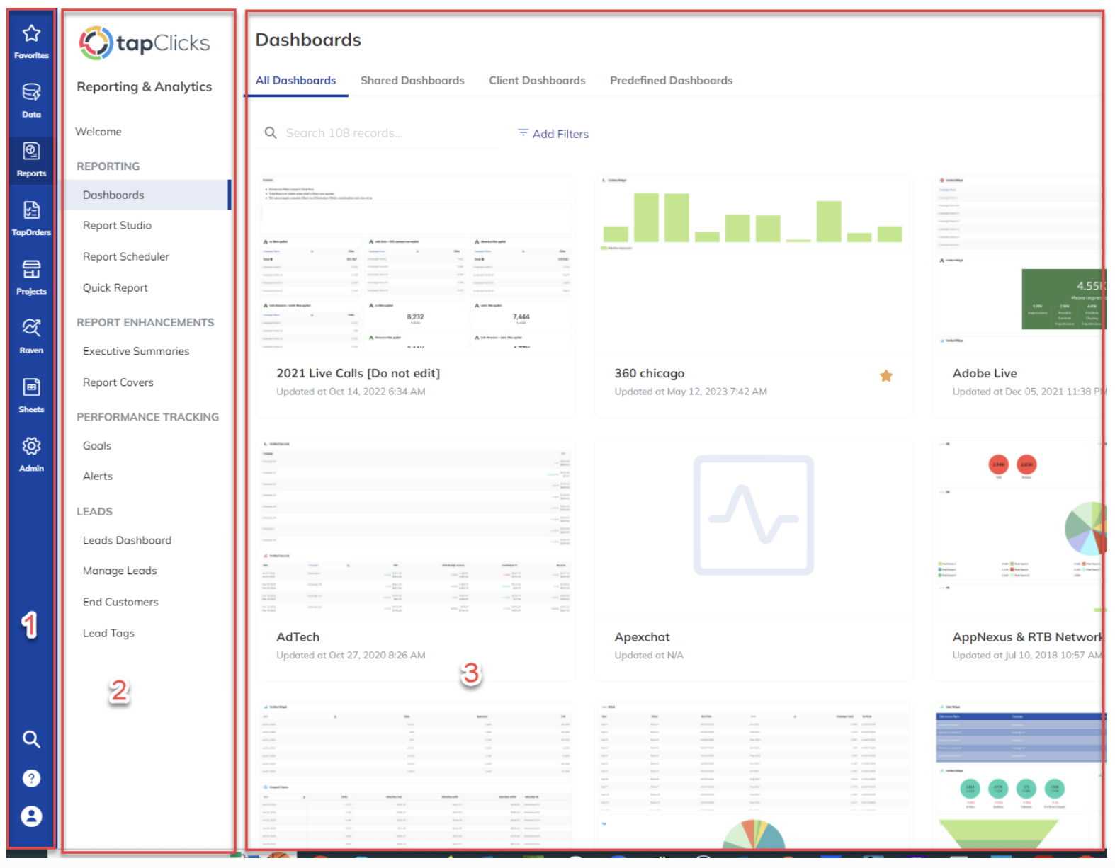
For agencies that find Databox’s lack of operational workflow and order management limiting, TapClicks is the high-performance alternative.
While Databox is primarily a visualization tool, TapClicks unifies eight distinct products into a single ecosystem to eliminate tool-hopping:
- TapData: TapData is a standalone ETL/ELT tool that handles the heavy lifting of extracting, transforming, and loading marketing data from over 250 native connectors and 10,000+ via marketplace.
- SmartAnalytics (Formerly TapAnalytics): The visualization layer for real-time exploration.
- SmartReports (Formerly TapReports): This module manages the distribution of reports across entire client portfolios. Now, this includes the SmartEmail feature, which automatically sends text-based performance summaries directly to executive inboxes.
- SmartSuite (formerly TapInsights): The AI Intelligence hub uses machine learning and AI Agents to proactively scan your data for trends and anomalies.
- TapOrders: TapOrders allows your sales team to enter client objectives, budgets, and flight dates at the point of sale.
- TapWorkflow: Once an order is placed in tapOrders, tapWorkflow automatically routes tasks to your creative or ad ops teams based on your agency’s specific business processes.
- TapSEO (formerly Raven Tools): A full platform for site audits, backlink analysis, keyword rank tracking, and link-building management.
- TapSpy: Powered by the acquisition of iSpionage, tapSpy provides a window into your competitors' strategies.
The 2026 AI expansion is significant: a new tapAI layer now connects AI Agents, SmartReports, SmartStory, and SmartSuite under one umbrella.
SmartStory, which reached general availability in January 2026, automatically generates branded presentations and narrative summaries for client meetings. A redesigned dashboard experience also rolled out in February 2026 with faster performance and simplified styling, though the older "Classic" interface is still available during the transition.
The persistent issue is reliability. Trying to be everything to everyone means things get buggy: users report connections dropping mid-campaign and data showing up inaccurately, even with a dedicated Customer Success Manager guiding onboarding for months.
Key Features
- 250+ integrations, plus 10,000+ via marketplace
- tapAI: unified AI layer across the platform
- SmartStory: AI-generated client presentations
- SmartReports: SmartSlides and SmartEmail automation
- TapSEO and TapSpy for organic and competitive intelligence
- New Dashboard Experience (2026 redesign)
TapClicks Reviews from Real Users
"The dashboards are really great for our clients, and there's a lot of flexibility in the metrics we see." (Source)
"This is a very useful and good product. It's also so easy to use." (Source)
"Some of the visualization options are limited." (Source)
TapClicks Pricing
TapClicks doesn't list fixed pricing on its live pricing page. The platform uses a custom quote model, with market estimates suggesting Basic plans start around $599/month, scaling to $1,500+/month for enterprise tiers.
Which Databox alternative is right for you?
- If you're a mid-size agency managing 20+ clients across multiple channels - choose Whatagraph. One governed data foundation, linked templates that update across all client reports at once, and AI reporting built in from the start.
- If you need fast, affordable client reports without a steep learning curve - choose DashThis for small agencies and freelancers, or Looker Studio if your clients are primarily on Google's ecosystem.
- If you need live KPIs on office screens or real-time team dashboards - choose Geckoboard for TV-first monitoring, or Cyfe if you're on a tight budget and don't need active product development.
- If your priority is metric governance and data consistency across teams - choose Klipfolio for mid-size data teams, or Grow if you also need built-in ETL and data storage without a separate warehouse.
- If you're running a large agency or enterprise with dedicated data operations - choose NinjaCat for a warehouse-native AI platform, Improvado for 500+ source ETL at scale, or TapClicks if you need workflow and order management alongside reporting.
- If you need enterprise-grade BI with predictive analytics and complex modeling - choose Tableau. Nothing else on this list comes close for that use case, and the price reflects it.
Published on Oct 28 2024
WRITTEN BY
YamonYamon is a Senior Content Marketing Manager at Whatagraph. With an eye for detail and a knack for always considering context, audience, and business goals to guide the narrative, she's on a mission to create genuinely helpful content for marketers. When she’s not working, she’s hiking, meditating, or practicing yoga.