AgencyAnalytics Dashboard: All You Need to Know
AgencyAnalytics is a popular agency reporting tool, but how does its dashboards look, and are they easy to use?
In this article, I’ll walk you through AgencyAnalytics’ dashboard, show how it works, what it’s good for, and its limitations for growing agencies.

Apr 28 2025●10 min read


We love that AgencyAnalytics' dashboards are clean, sleek, and easy to understand. They're also fairly easy to build, thanks to ready-made templates and widgets.
But if you want advanced data transformations like custom dimensions, unlimited blends, and flexible filtering, you'll run into roadblocks on AgencyAnalytics. User reviews on G2 and Capterra also mention that integrations break often and reports show inaccurate data.
In this article, we'll go through everything you need to know about AgencyAnalytics' dashboards including:
- How AgencyAnalytics' reporting dashboards work
- The strengths and limitations of AgencyAnalytics’ dashboard
- 3 AgencyAnalytics report examples & use cases
- What limitations you'll run into
AgencyAnalytics Dashboard Overview: 5 Key Things to Know
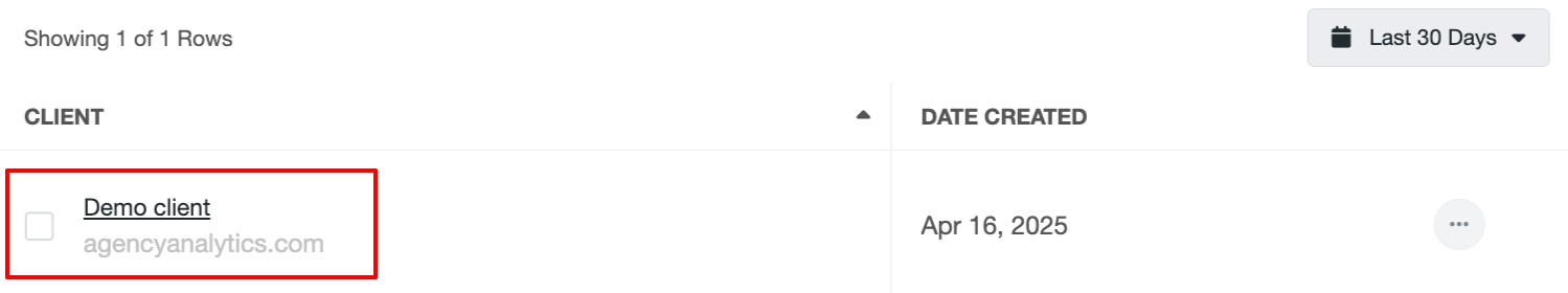
Before I go into detail about AgencyAnalytics’ dashboards, here is a screenshot of the main dashboard view: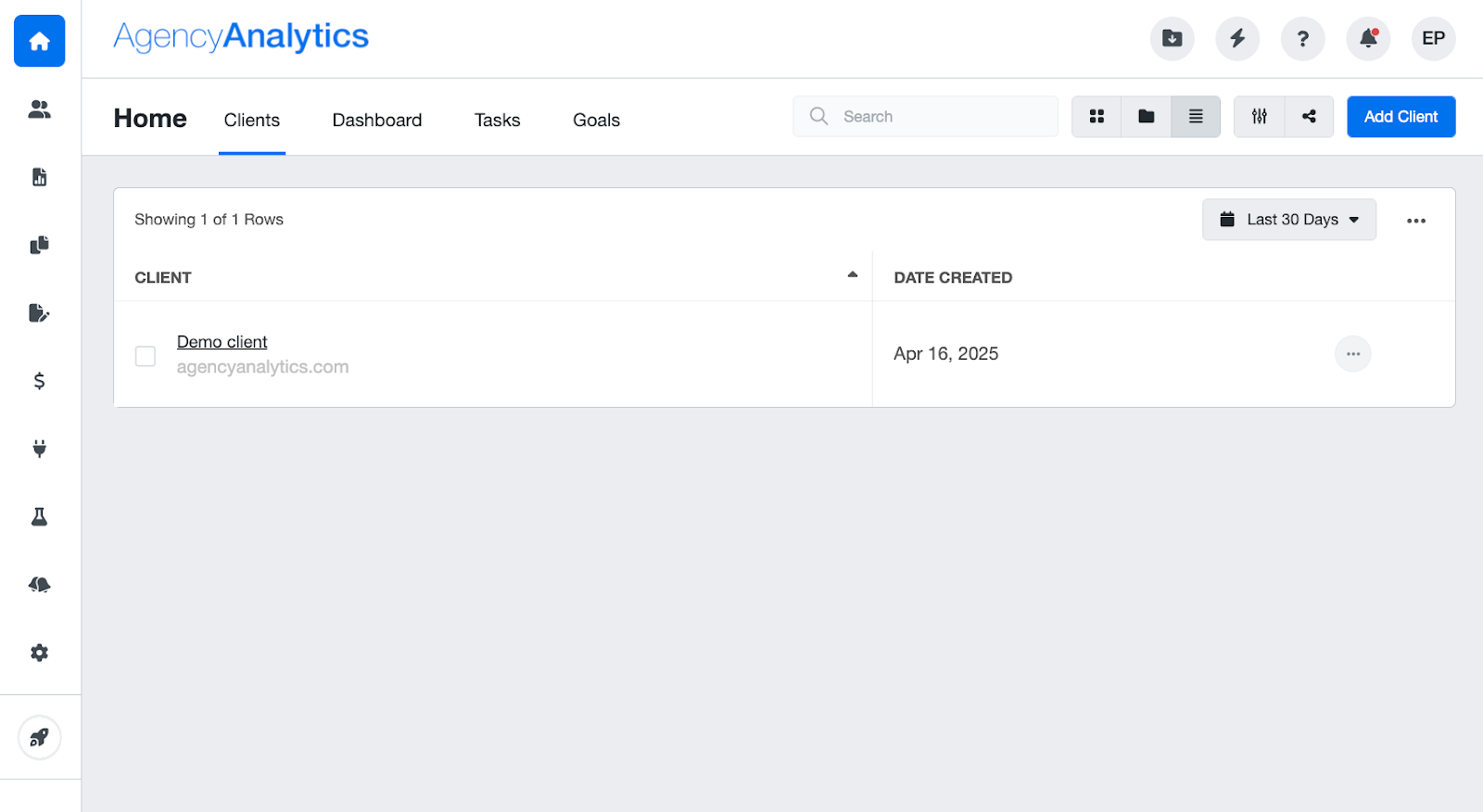 From the main dashboard view, users can add new clients and see a list of the current ones.
By clicking on the client’s name, you can access client-specific reports and dashboards.
Creating AgencyAnalytics Custom Dashboards
The main concept you should understand about AgencyAnalytics’ reporting dashboards is that you need to build two different components:
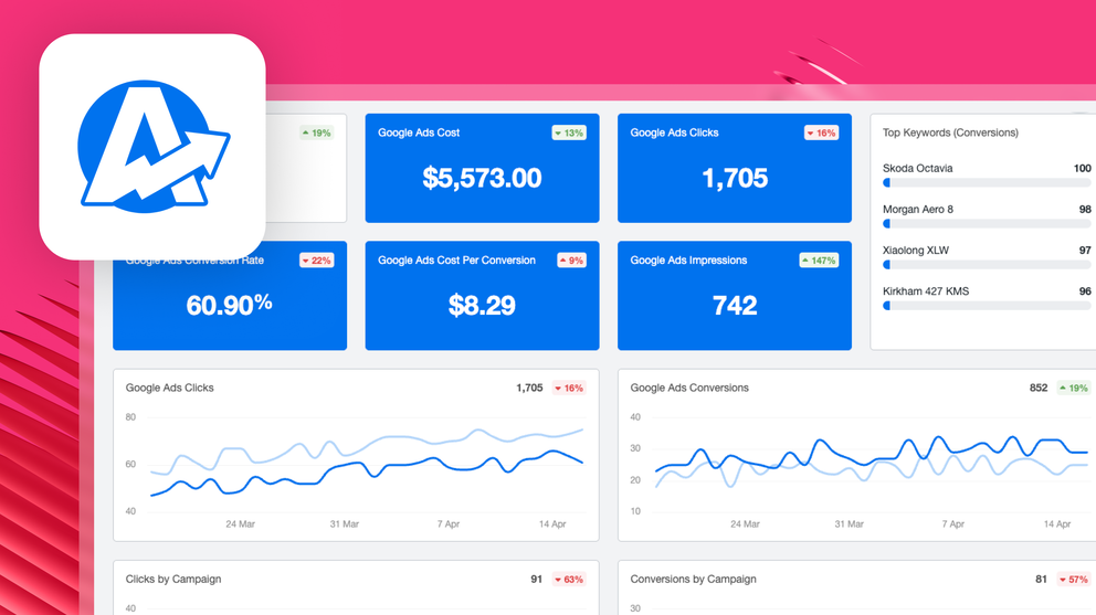
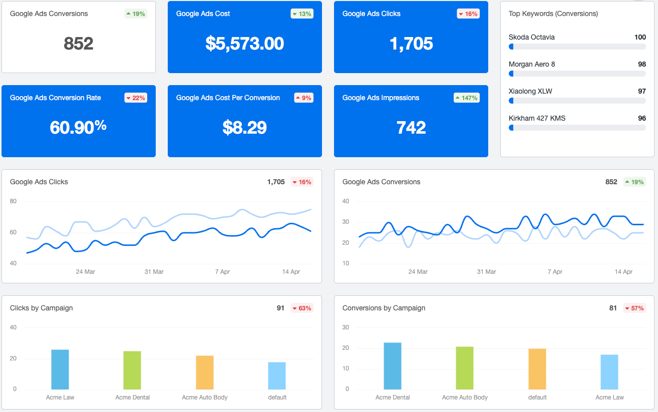
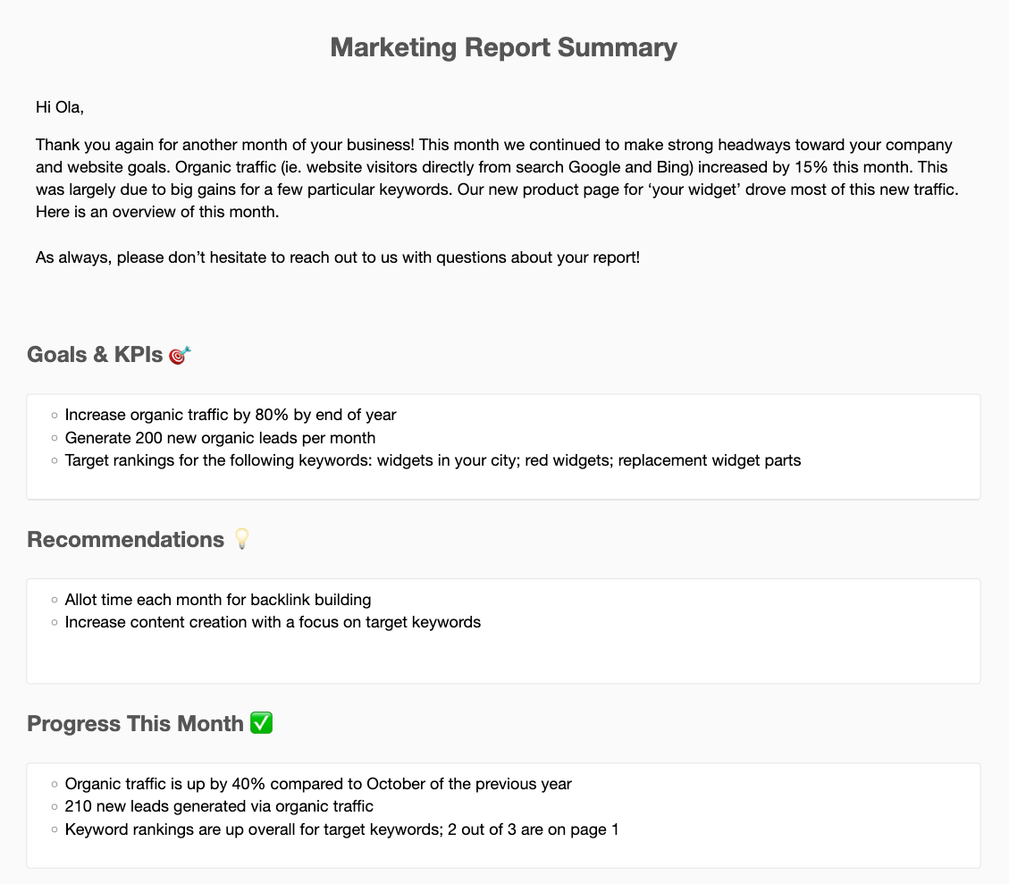
1. Dashboards - You can create dashboards to show clients an overview of key metrics. The dashboards are visual and have minimal text. Here is one example:
 Dashboards can be created at three levels, including account-level, campaign-specific, and staff-only.
2. Reports - You can generate reports that show your clients their campaign performance in detail. Here is one example:
 My initial impression was that it’s a bit confusing that the admin dashboard is split between reports and dashboards since they serve similar purposes.
The confusion between the two seems to be a typical customer experience, as one G2 user said:

On Whatagraph, for instance, you create one report and it doubles-down as a dashboard. You can white label this report easily, and download it as PDFs, share live links, or send automated emails to clients.
We also offer pre-built templates to create your first reports, making the process much easier and faster.
For your Account Managers or team, you can also create an internal monitoring dashboard, called “Overview”, where you can monitor all your KPIs for all clients and campaigns in one place.
This helps you know exactly which campaigns are performing well, which aren’t, and what action to take.
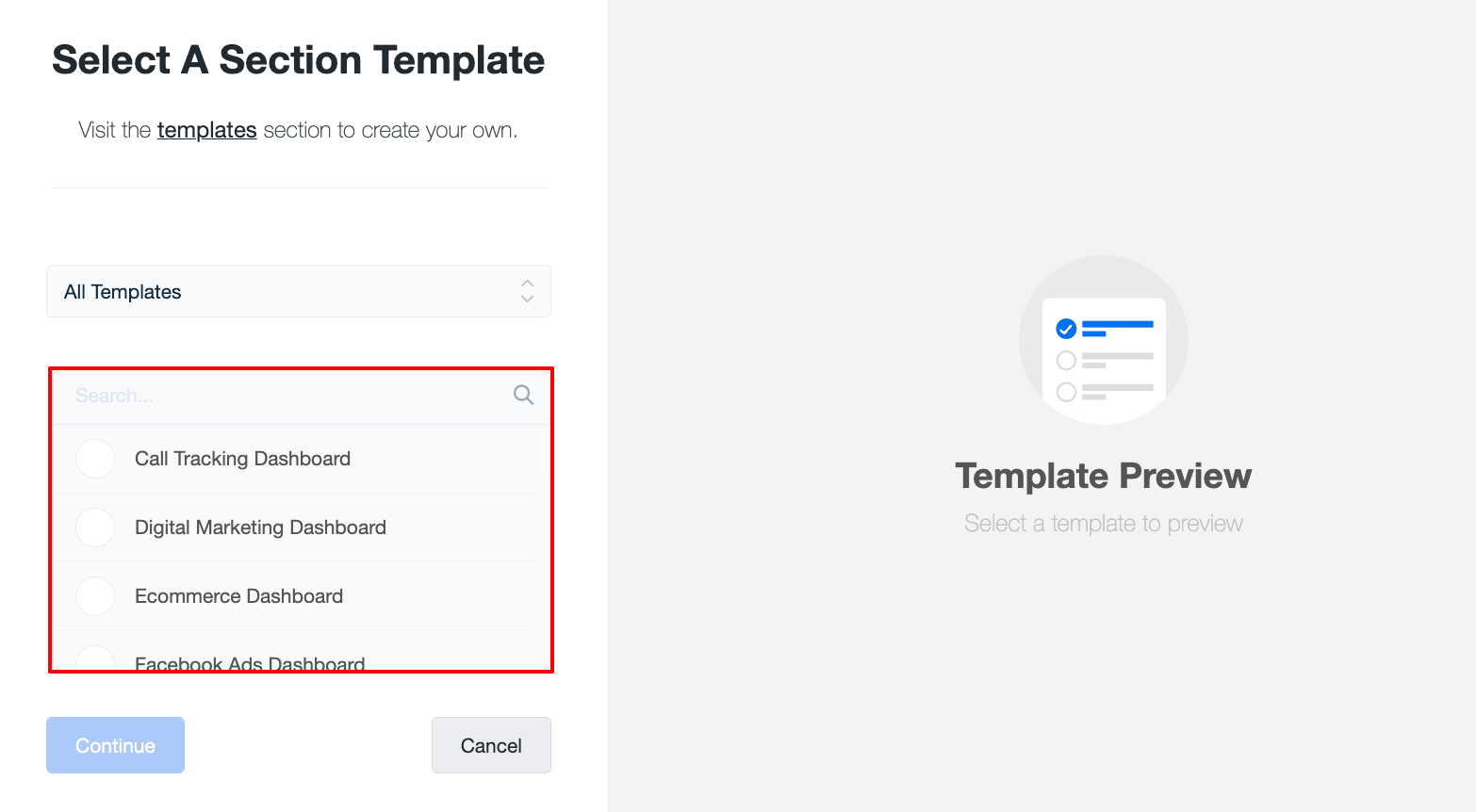
 If you’re looking to create Agency Analytics custom dashboards, there are three ways:
- From blank
- From a template
- From an existing, cloned section
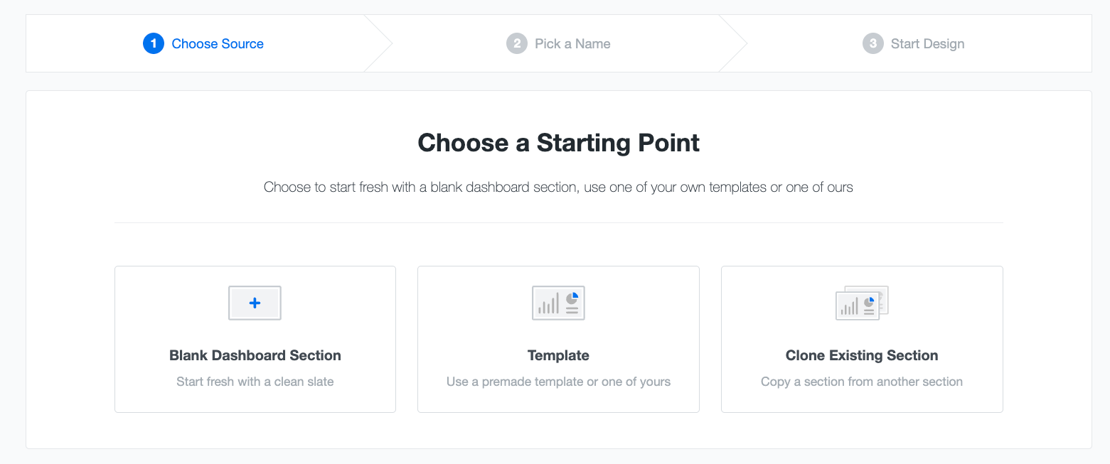
If you start from a blank, your dashboard will appear entirely empty, and you can fill it out by dragging widgets there.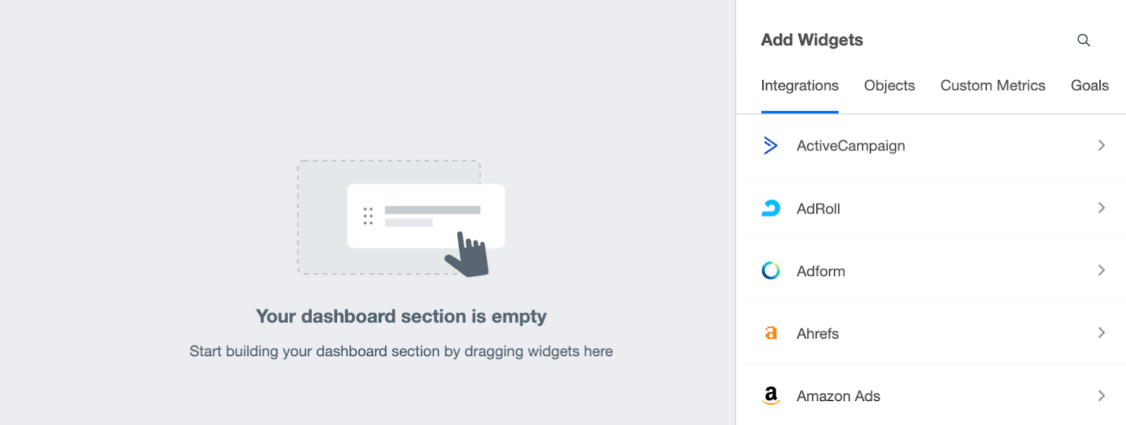
If you start from a template, you can select one of AgencyAnalytics’ pre-built templates (or one you have crafted yourself).
The pre-built dashboard templates are divided into different types:
Alternatively, if you want to create reports, you have four different starting points:
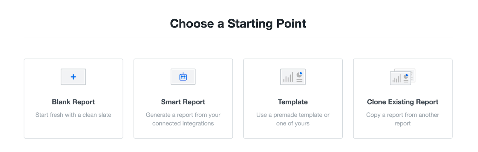
Like with dashboards, AgencyAnalytics report templates can give you a good starting point.
These pre-built templates can also be further customized to your liking.
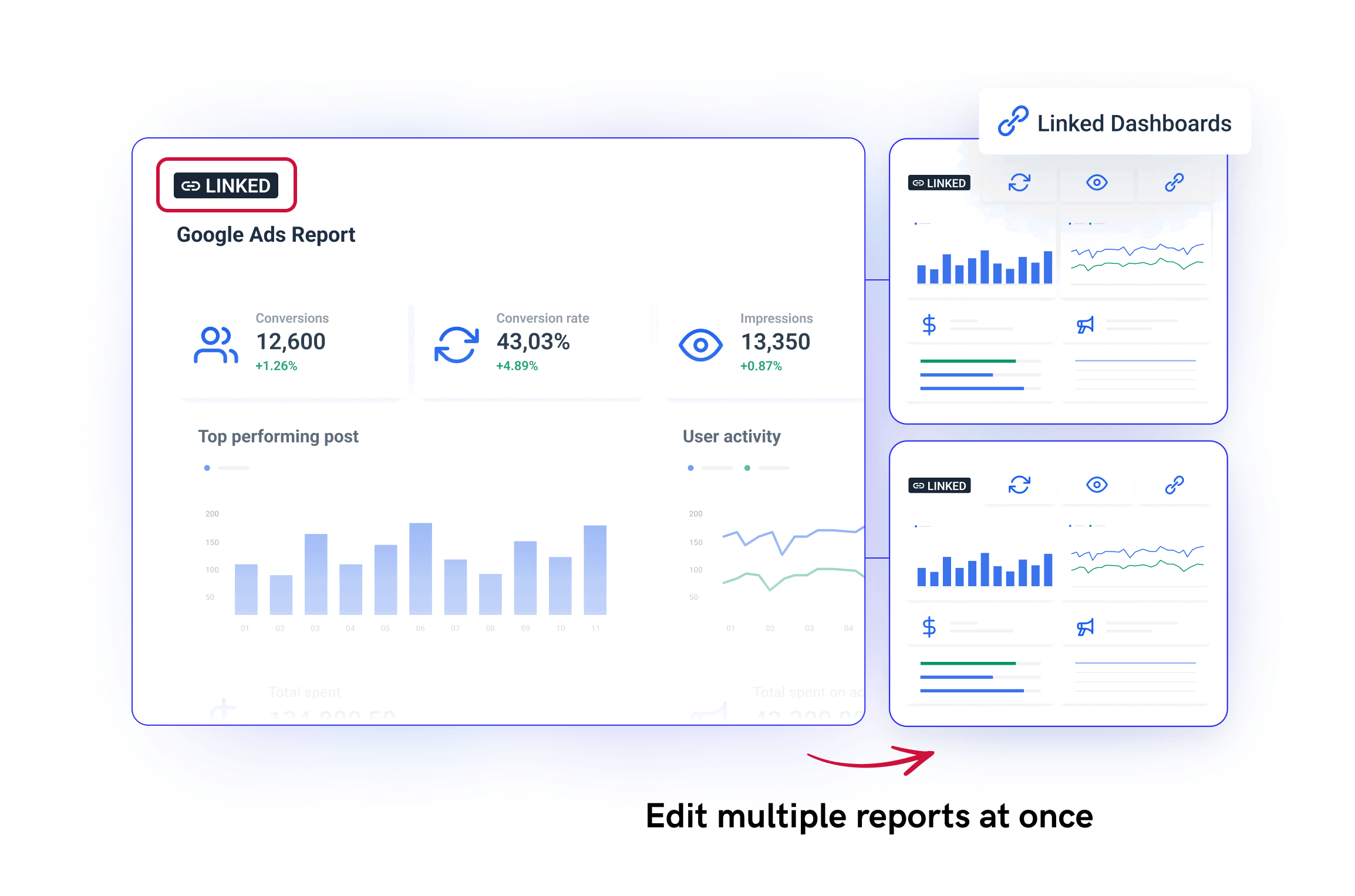
One thing to note though is that if you need to edit these dashboards or reports, you'll need to edit each individually—which can be time-consuming. Bulk editing is also only available on the most expensive plan, but even then it's very limited.
To help you save time (and headaches), Whatagraph has a feature called “Linked reports” — where you can edit your “Master” template once, and the changes will sync automatically across all your linked reports. This is available on all our pricing plans.
Say you have 10 reports, and you want to add a new image to each of them.
You don’t need to go in and out of each one individually—you can just add that image to the “Master” report, and it will be added to all your 10 reports in (literal) seconds.
Adding Metrics and Widgets to Dashboards
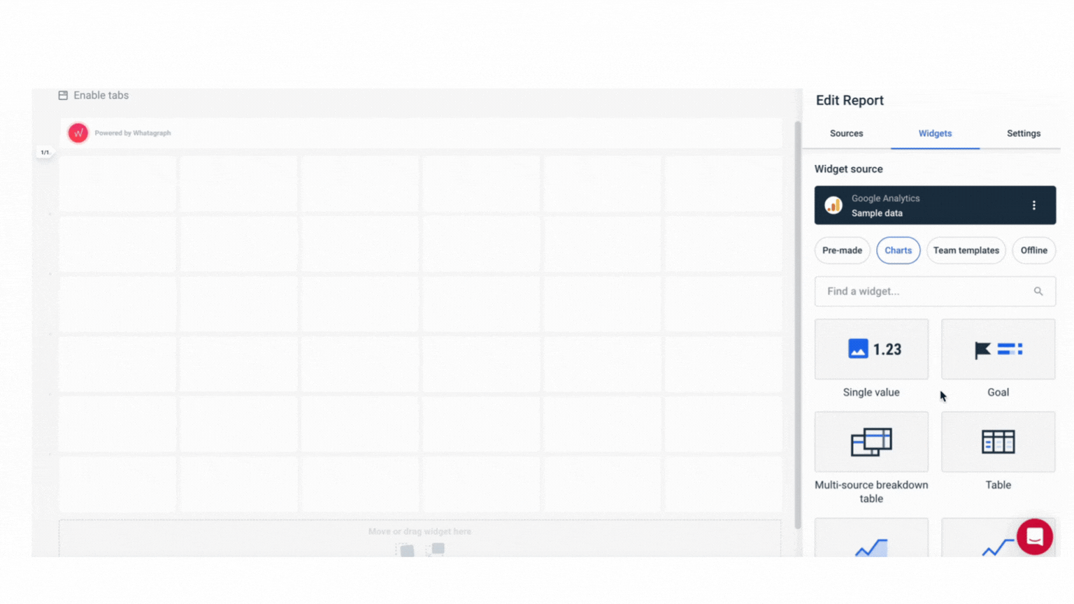
AgencyAnalytics lets you add different types of widgets to showcase metrics (CPC, CTR, conversions, bounce rate, etc).
When I created my dashboard, I was able to find the widgets from the right side tab within the editor:
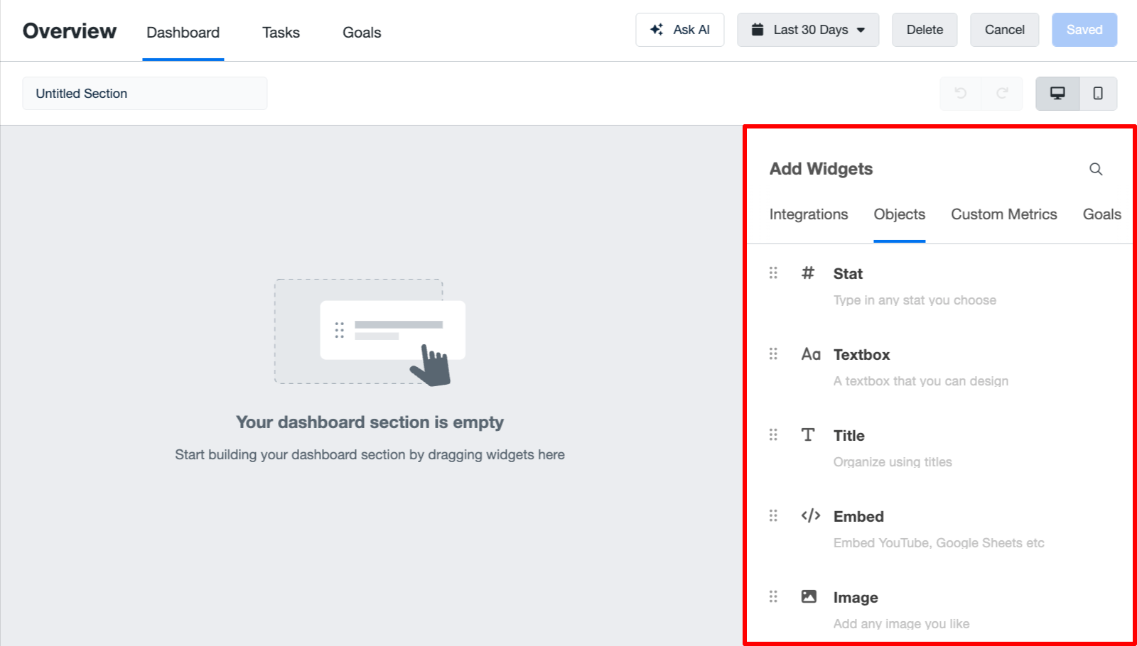
This tab contains widgets, such as image embeds, charts and graphs, textboxes, custom metrics, and goals.
For example, I clicked on the “Integrations” tab and added different “Facebook Ads” widgets to the dashboard:
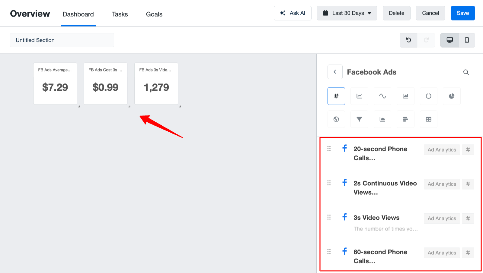
I was able to display the marketing data through different graphs, such as line charts, pie charts, and funnel charts.
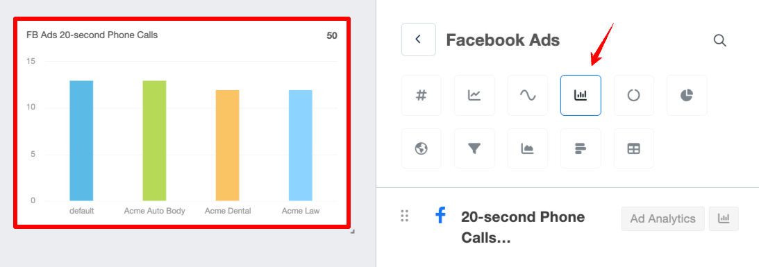
The right side tab gives further options for editing the widget, such as its title, chart type, data range, etc.
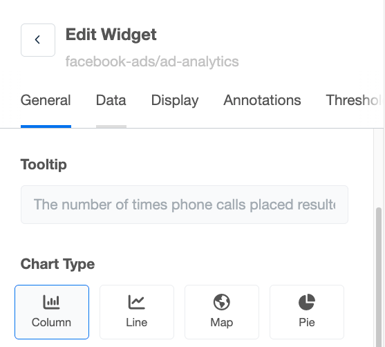
In the “Data” tab, you can modify the integrations and connect the right account to the dashboard:
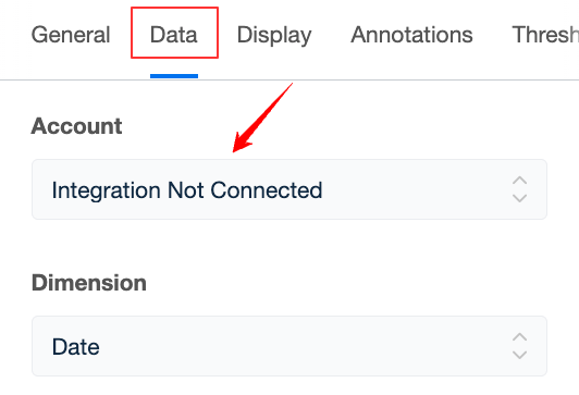
And, as long as the integrations work, the charts update with the right data.
To be honest, I found the widgets on AgencyAnalytics a bit clunky and “unstructured” as there are no rows or columns on the dashboard canvas.
In contrast, on Whatagraph, you can drag-and-drop it easily onto a canvas with grids. These widgets also come with different images so it’s easier for you to find what you need.
You can also resize the widgets however you want—horizontally and vertically—and add new rows anywhere you want on the canvas.
You can also fully customize each widget on Whatagraph:
- Change or remove icons
- Rename the metric
- Apply custom formulas (e.g. data blends)
- Adjust date ranges
- Change currency displays
- Add or hide footers
- Customize the colors
Want full control? You can create custom widgets from scratch on Whatagraph and save them as “templates” to re-use them the next time. (This is not available on AgencyAnalytics.)
Organizing Your Data on AgencyAnalytics Dashboards
It's not enough that you have your data on dashboards. You need to be able to organize and slice and dice them anyway you want so your dashboards will show the most holistic view of marketing performance.
On AgencyAnalytics, there are two key things you can do:
- Create custom metrics, which is combining data from multiple sources into one metric like “Total Ad Spend”
- Aggregate data, where you can view and compare performance across multiple integrations and clients from one table
But note that these two are only available on the more expensive pricing plans, like “Agency” and “Agency Pro”.
Also, you won’t be able to aggregate data from ALL your data sources. It’s only available for:
- Facebook Ads
- Google Analytics 4
- Google Ads
- Google Business Profile
- Google Search Console
- LinkedIn Ads
- Microsoft Ads
- X (Twitter) Ads
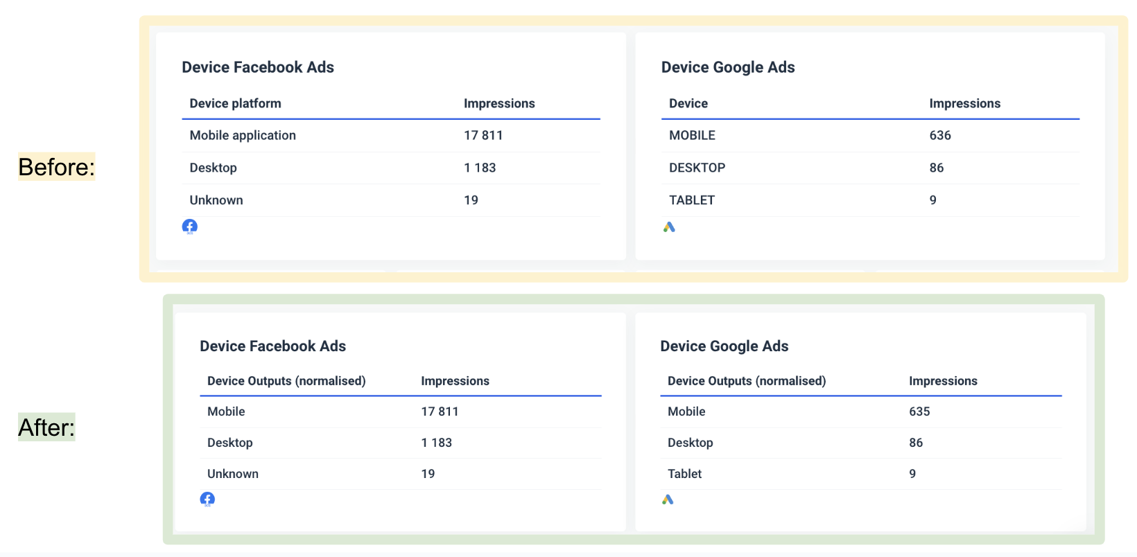
If you want to be able to aggregate data from all your data sources, Whatagraph is the better option. You can create unlimited data blends, custom metrics, and custom dimensions on ALL our pricing plans.
It only takes seconds to create them too. Here's what each is good for:
- Data blends: Great for combining different sources together into one unified data source. Helps keep your reports neat and tidy.
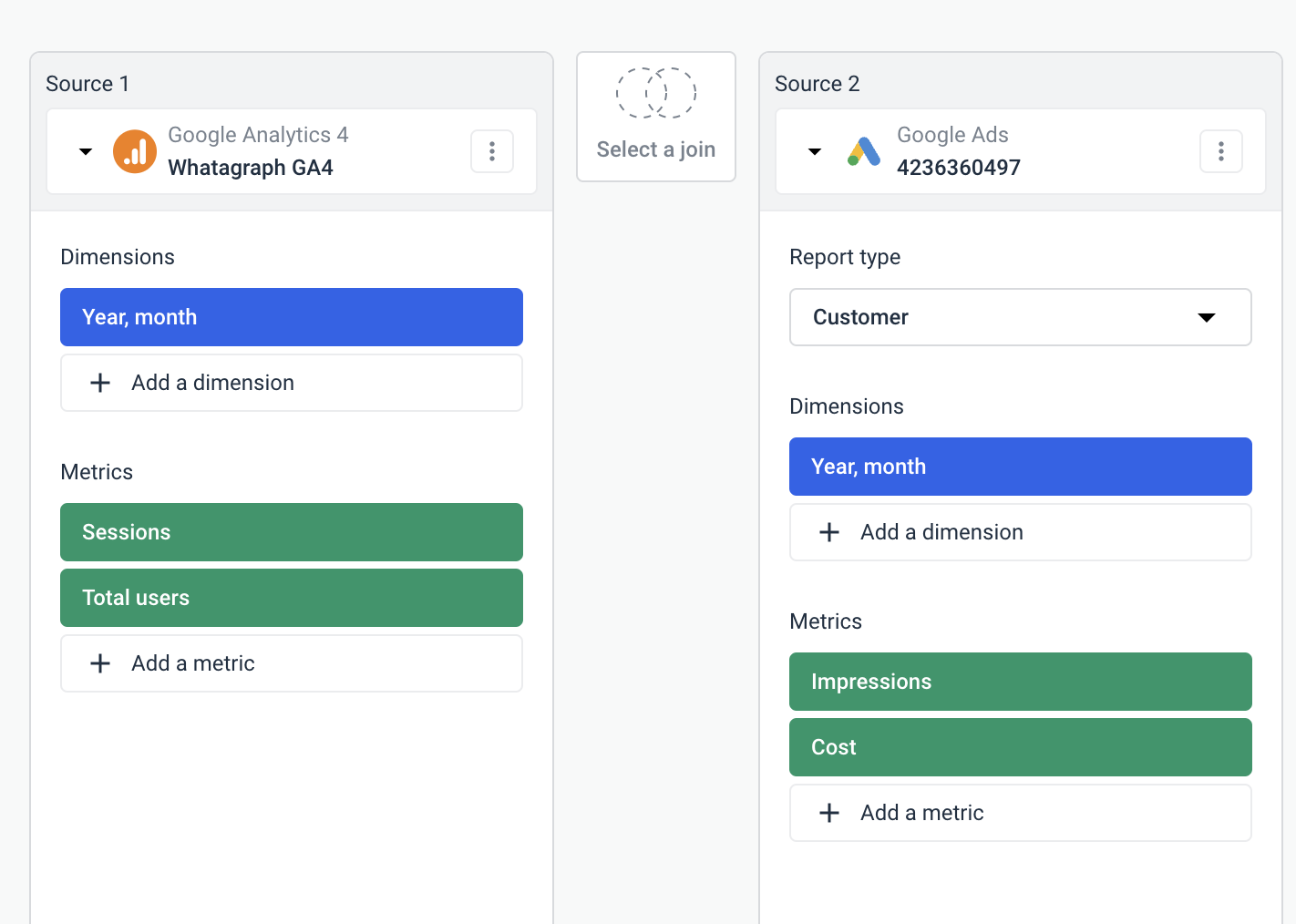
- Custom dimensions: Great for unifying names of various cross-channel dimensions and grouping data points from various integrations.
- Custom metrics: Great for unifying and changing names permanently for various metrics.
The best part is you can create all these natively inside of your report on Whatagraph. You don’t need to waste time going back and forth from one workspace to another.
You can explore more use cases of custom metrics and dimensions here:
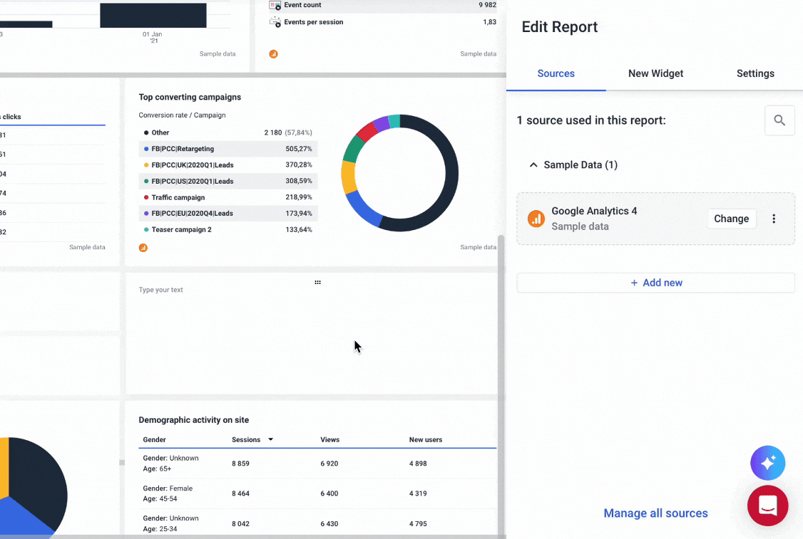
In terms of filtering, AgencyAnalytics gives you a decent range of options, but the depth and flexibility can vary depending on the integration you're working with.
On the AgencyAnalytics dashboard editor, I first had a hard time spotting the filter tab, but found it in the “Settings” slide-out:
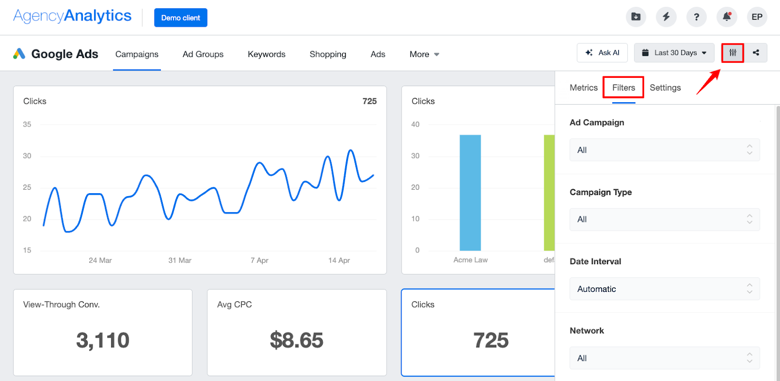
From this tab, you can filter by ad campaign, campaign type, date internal, network, status, and more.
It’s also possible to filter by specific metrics: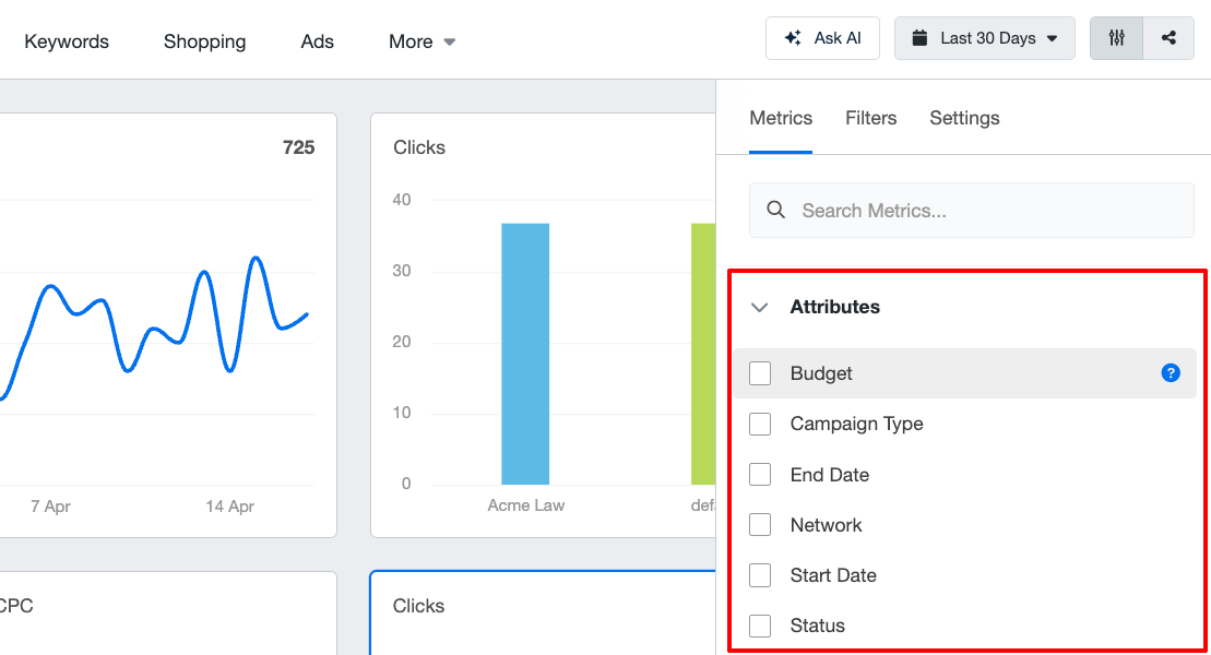 These filters can be layered, so you’re not limited to just one at a time. Once applied, your dashboard updates in real time to reflect the new criteria.
But here’s the catch: filters don’t persist when you switch sections or reopen dashboards. Each time you return, they reset to a default unfiltered view, which can be annoying if you're tracking specific segments regularly.
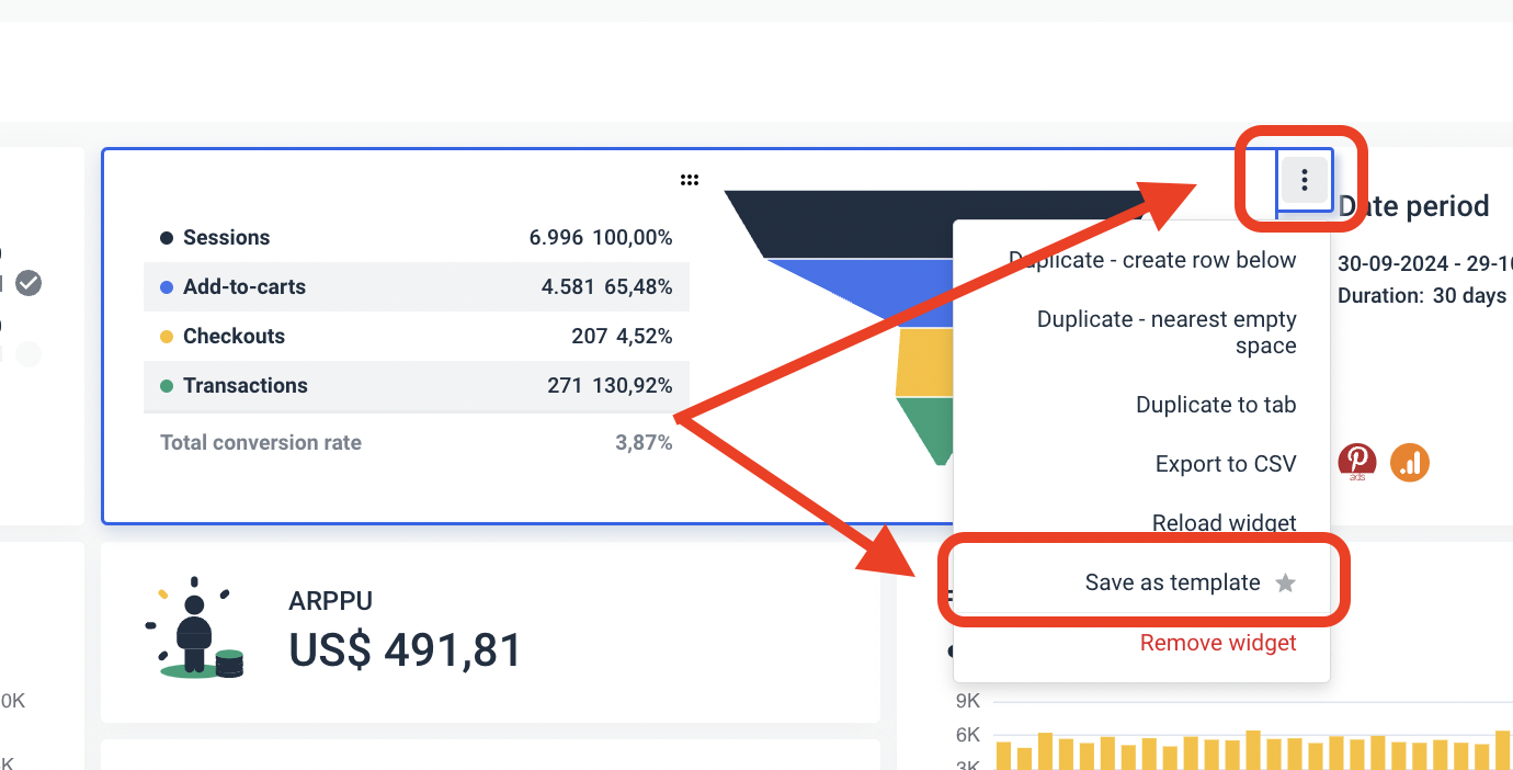
To save a filtered view, you’ll need to manually add it to a report using the “Add to Report” option. This captures your widget as is, filters included, and makes it part of your automated report layout.
But the most important thing is you can only apply filters per widget or per integration. For instance, if you had a report with 20 Facebook widgets, you’d need to go through each of them to apply the same filter.
This is time-consuming and not sustainable if you have dozens of clients and reports.
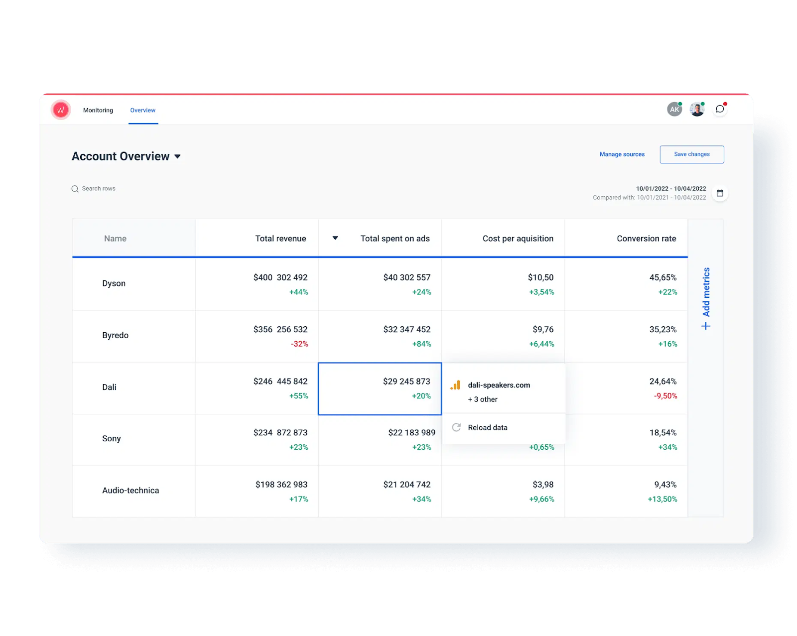
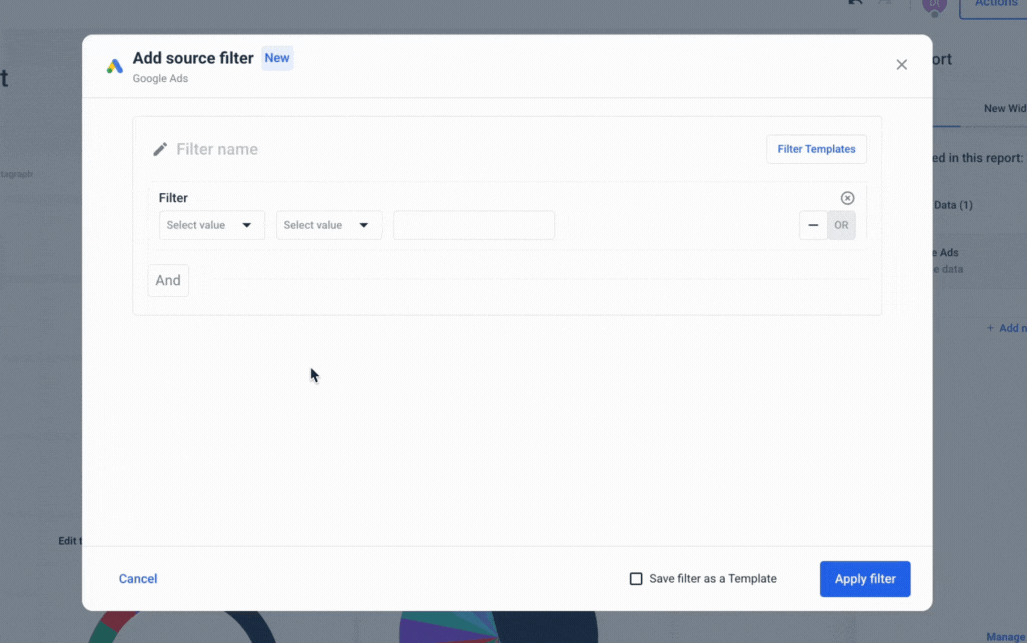
This is why at Whatagraph, we built a “Source Filter” which lets you create filters for entire reports, instead of creating them per widget or integration.
In the above scenario, with Whatagraph's Source Filter, you can simply go to the Facebook source that’s connected to the 20 widgets, apply the filter to the source, and it will be applied to all widgets immediately.
This saves so much more time and hassle, and you’ll be able to slice and dice your data any way you want. Here's how the Source Filter works:
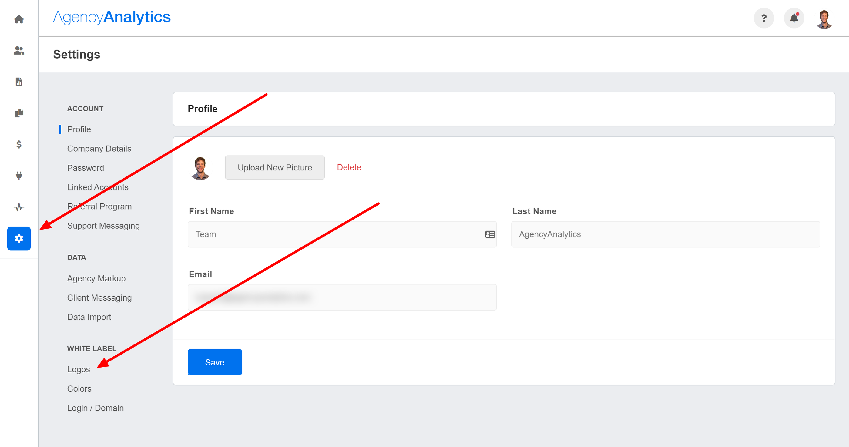
Whitelabeling the Dashboard Design
AgencyAnalytics offers simple tools for customizing your dashboard design.
You can add and customize title headers, add images to textboxes, clone widgets, and enable a presentation mode.
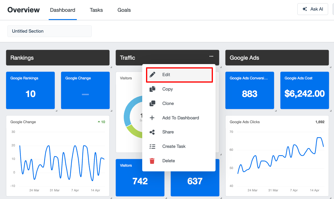
Doing these simple changes was intuitive, in my opinion. For example, I could switch the heading by clicking on “Edit” within the editor:
From the settings, it’s also possible to white-label your reports. You can:
- Add report and icon logos
- Change interface and widget colors
- Create your own login URL
However, it's important to note here again that full white-labeling features (like custom URLs) are only available on the more expensive pricing plans.
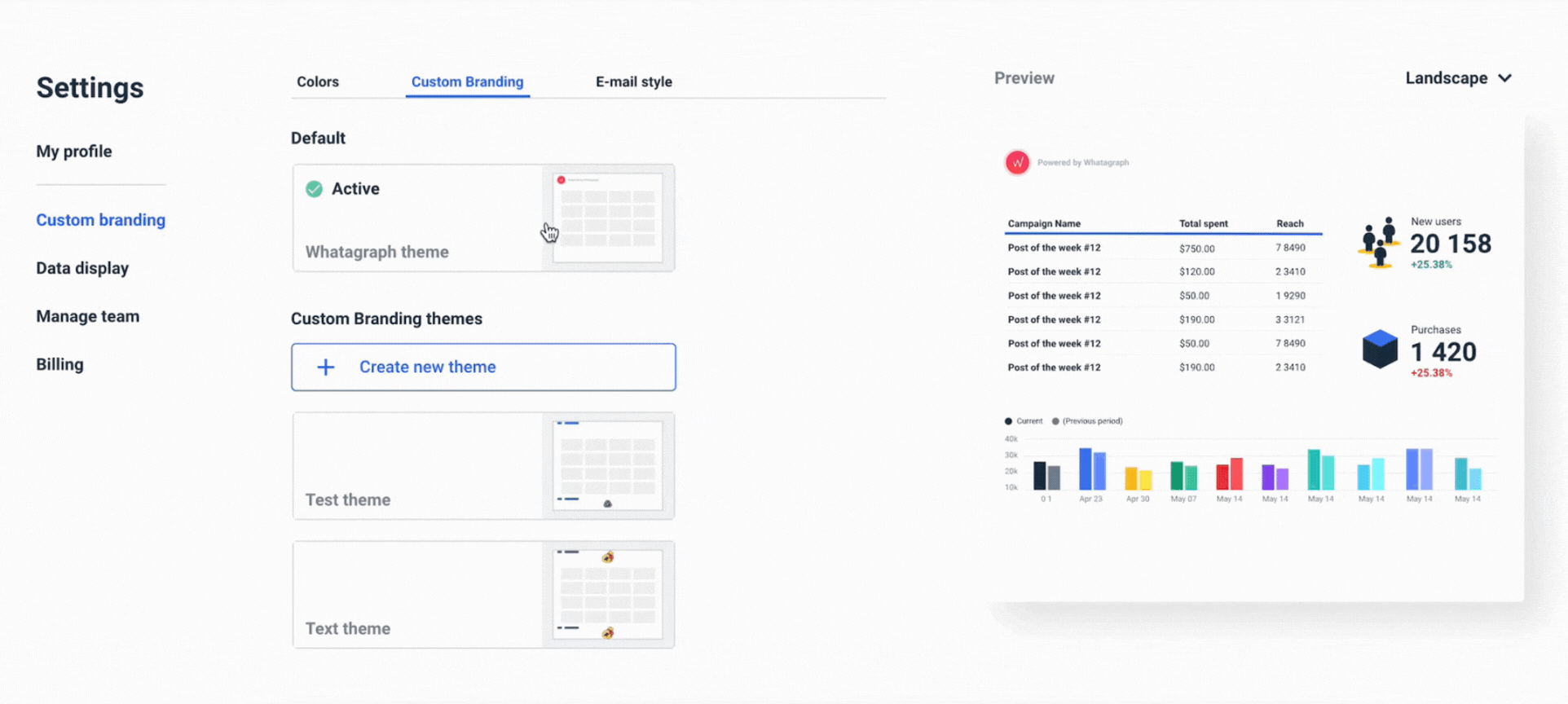
The process is similar on Whatagraph. You can customize your dashboards in two ways:
- From the settings menu – good if you want a global theme to apply to all reports
- Inside of your reports – good if you want a custom theme for just one report (or if you forgot to go to settings)
Here’s how it works:
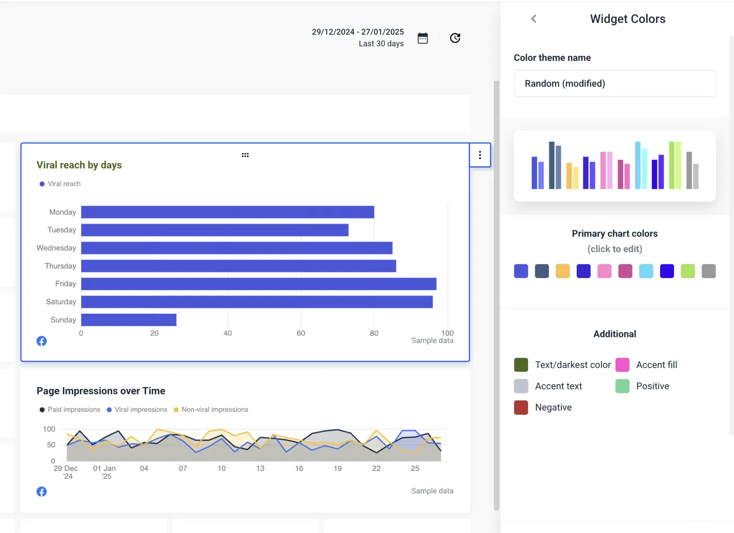
On Whatagraph, you can:
- Create new branding themes (colors, logos, the likes)
- Choose from pre-set color schemes or create your own
- Upload logos
- Add header and footer text
Plus, you can customize the automated report emails by:
- Adding logos
- Writing your own heading, body, button, and footer texts
- Writing your own subject lines
- Changing the colors of the texts and buttons
- Setting a custom email address to send your reports from
Sharing & Collaboration Options
When it comes to sharing your dashboards and reports with clients, AgencyAnalytics offers you three different options:
- Download a PDF
- Send it via email
- Share a link
I was able to find these sharing options from the drag-and-drop editor:
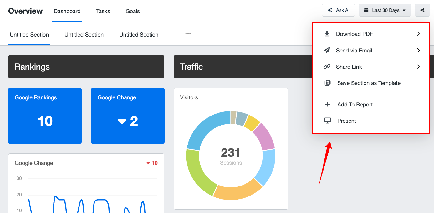 It’s also possible to turn a dashboard or report into a presentation mode, which simply turns your screen into a full-screen view.
If you need to take your reporting further, like pushing raw data into external tools, AgencyAnalytics doesn't support it.
With Whatagraph, you can share your reports through the same methods, but also have the option to:
- Protect the report link with a password
- Look over the automated report before it’s sent to clients / execs
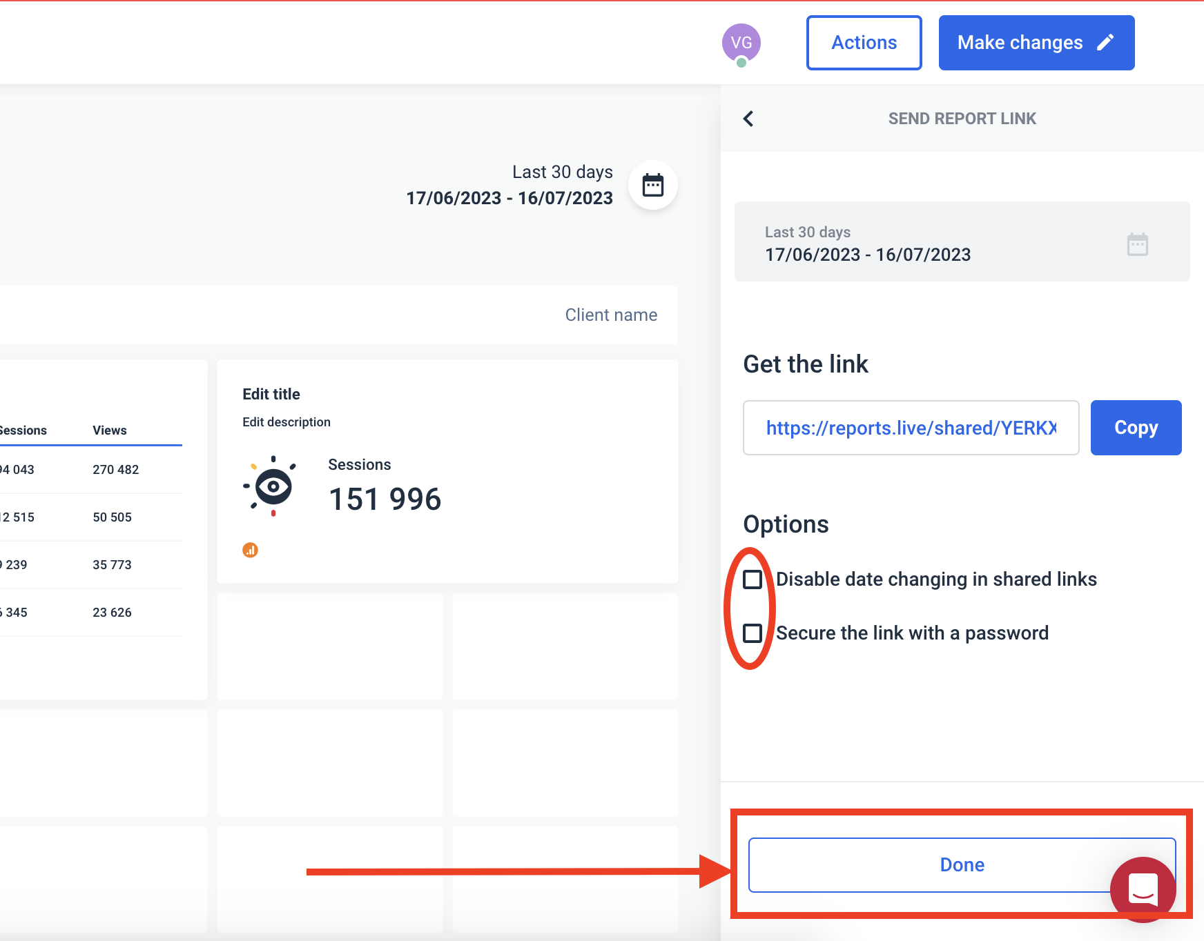
If that’s not enough, you can also transfer your data to BigQuery for further analysis, or to Looker Studio to create reports there as well.
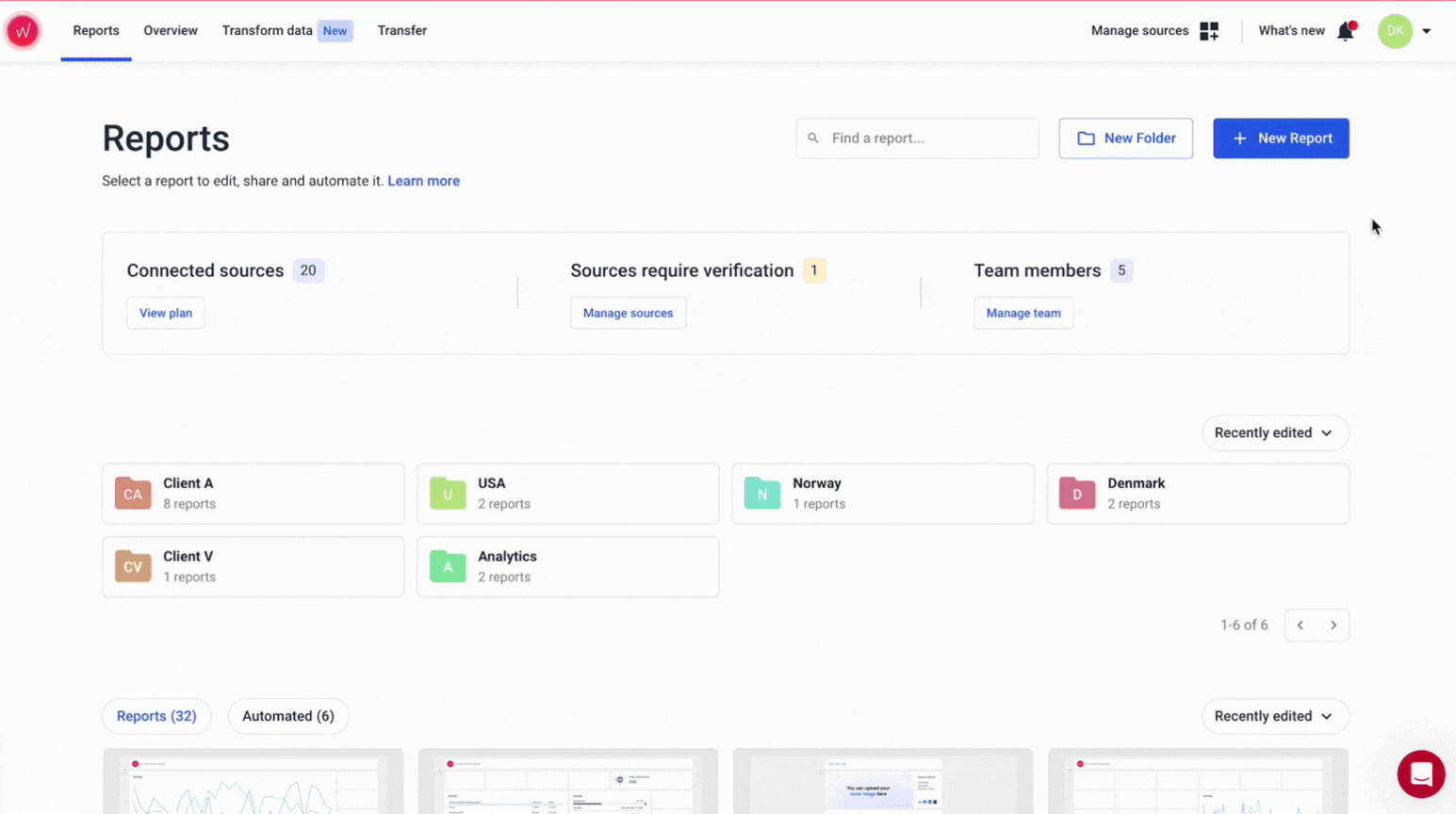
3 AgencyAnalytics Dashboard Examples and Templates
Want to see what AgencyAnalytics templates actually look like?
We cherry-picked three AgencyAnalytics template examples—for PPC, SEO, and social media.
1. PPC Dashboard Template
This dashboard is designed for paid media managers who need a quick, visual overview of performance across multiple ad platforms like Google Ads, Microsoft Ads, Facebook, Instagram, and LinkedIn.
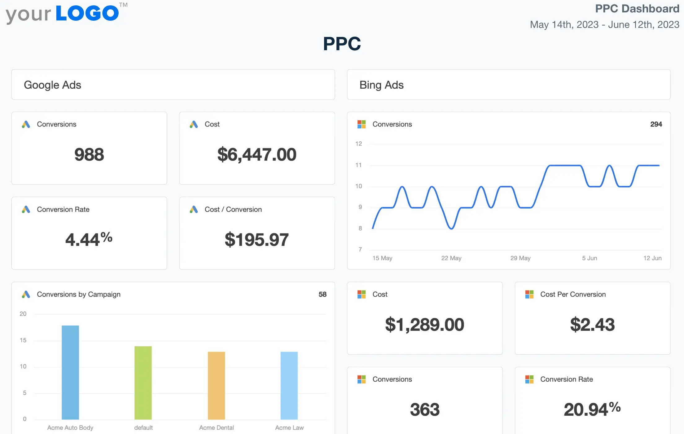 What’s good:
- Cross-channel snapshot: The layout gives you a high-level view of all your PPC platforms in one place—great for quick check-ins or client updates.
- Essential metrics covered: Clicks, CTR, conversions, cost, and CPC are front and center, so you’re not hunting for the basics.
- Visual trends: Time-series charts for most metrics make it easy to spot spikes, drops, or anomalies at a glance.
What could be better:
- No custom dimensions or segmentation: You can’t break down performance by campaign type, geography, or audience segment without customizing every widget manually.
- Cluttered layout: With so many widgets on one page, it can feel overwhelming. There’s little flexibility in layout or visual hierarchy.
No blending between platforms: You can’t see a combined “Total Ad Spend” across platforms or unified conversion metrics unless you build that manually—and even then, only on the Pro plan.
TL:DR: Good for quick cross-platform reporting, but if you need deeper insight, blended metrics, or custom segmentation, you’ll hit a ceiling fast.
2. SEO Dashboard Template
This dashboard is tailored for SEO managers and digital marketing specialists who need a unified view of organic performance, rankings, site health, and backlinks across platforms like Google Analytics, Google Search Console, and Bing.
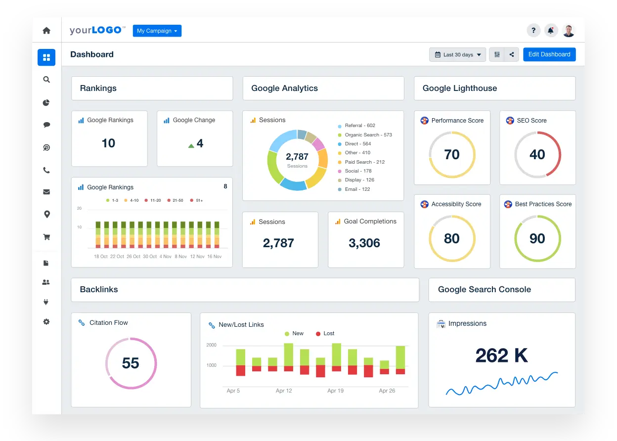 What’s good:
- Comprehensive view: It pulls together rankings, domain authority, backlinks, search console data, and site health—all in one place.
- Local and global SEO coverage: Includes Google and Bing rankings as well as local pack data, which is helpful for location-based SEO tracking.
- Visual site audits: With performance, SEO, accessibility, and best practices scores, it's easy to get a quick sense of how a website is doing technically.
What could be better:
- No keyword grouping or tagging: You get raw keyword data, but you can’t segment or group it (e.g., brand vs. non-brand), which limits insight.
- Static layout with limited interactivity: You can’t drill down into specific rankings or filter keywords by intent or topic—everything’s surface level.
- Clunky data integration: Some widgets (like domain authority) rely on deprecated or third-party metrics that may not update consistently.
TL:DR: Good for high-level SEO overviews, but if you need segmented keyword insights, automated audits, or more flexible reporting, this dashboard falls short.
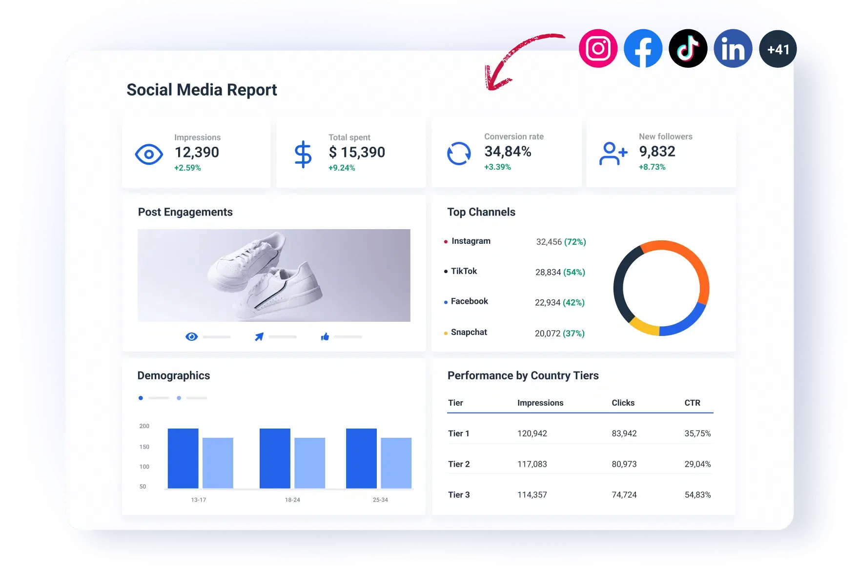
3. Social Media Dashboard Template
This dashboard is built for social media managers and content teams tracking performance across multiple organic social channels—including Facebook, Instagram, LinkedIn, YouTube, TikTok, and Pinterest.
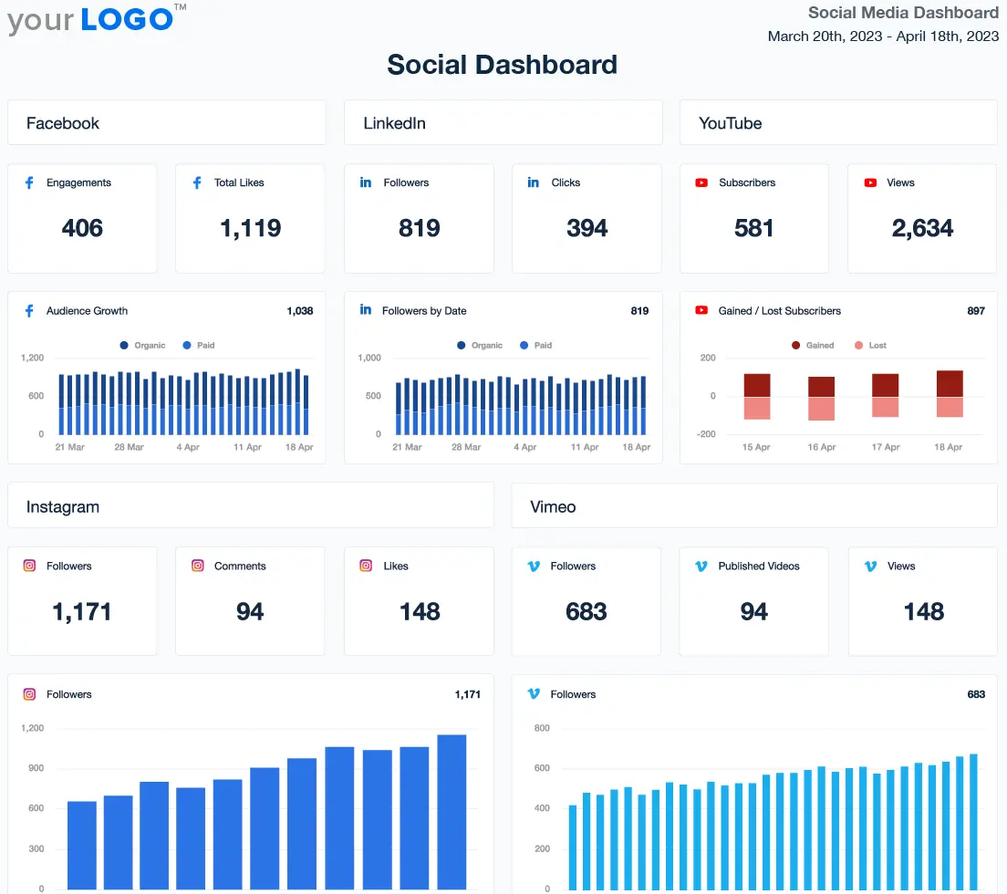 What’s good:
- Multi-channel visibility: It pulls in social performance data from a wide range of platforms, giving you a centralized view of followers, likes, engagement, and post-level metrics.
- Post-level breakdowns: You get detailed tables showing post reach, likes, comments, and even video durations—handy for content audits or client reporting.
- Google Analytics overlay: It starts with GA4 (social) metrics, tying organic sessions and revenue to social activity, which helps show business impact.
What could be better:
- Deprecated metrics everywhere: Several widgets show outdated or broken metrics (e.g., follower counts or platform-deprecated stats), making parts of the dashboard unreliable.
- Lack of customization: You can’t group posts by campaign, filter by engagement type, or compare across platforms in a meaningful way.
- No cross-platform insights: Each platform sits in its own silo—there’s no way to blend or benchmark performance across networks like “Top Performing Content This Week.”
TL:DR: Useful for a high-level overview of social performance, but it needs cleanup, better metric health, and more intelligent grouping to be truly actionable.
Where AgencyAnalytics Dashboards Fall Short
After looking over AgencyAnalytics' dashboard myself, I believe it has strengths, such as the ability to generate basic reports.
However, it also has notable shortcomings, which are deal-breakers for many marketing agencies.
1. Customization is clunky and outdated
AgencyAnalytics has a drag-and-drop editor for building dashboards and reports, but many users describe it as outdated and clunky.
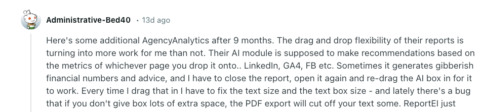
One Reddit user specifically said, “The drag and drop flexibility of their reports is turning into more work for me than not.”
Another reviewer called the setup process “repetitive” as setting up new campaigns requires manual work each time.
What I believe this is referring to is the lack of bulk editing and master templates.
If you want to change a widget or layout across dashboards, you have to do it manually—one by one.
Bulk editing is available on the most expensive AgencyAnalytics pricing plan, but even then, it is highly limited.
Whatagraph solves this by letting you build reusable linked templates across clients. Simply edit once, update everywhere.
You also get full visual control—drag-and-drop widgets, custom branding, icon libraries, color themes, and more.
2. Widget library is too limited
AgencyAnalytics reporting tool offers basic scorecards, charts, and tables—but doesn’t support advanced widgets or visual variety.
There is no way to use icon-based data displays or customize how metrics are shown.
I’d argue these are a few of the reasons reviewers say “AgencyAnalytics only supports basic reporting metrics and isn’t very customizable.”
Unlike AgencyAnalytics, Whatagraph offers dozens of widget types—from bar and pie charts to pivot tables and KPIs.
From the icon library, you can choose from hundreds of options:
![]()
Alternatively, you can add goal tracking, conditional formatting, and even text summaries for storytelling.
3. Integrations disconnect frequently
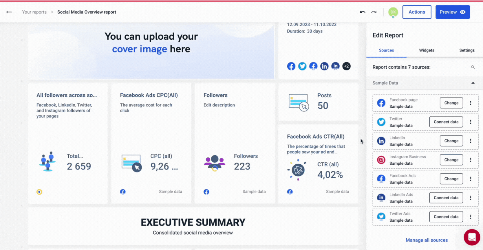
From AgencyAnalytics’ dashboard, you can connect integrations to bring client data for reports:
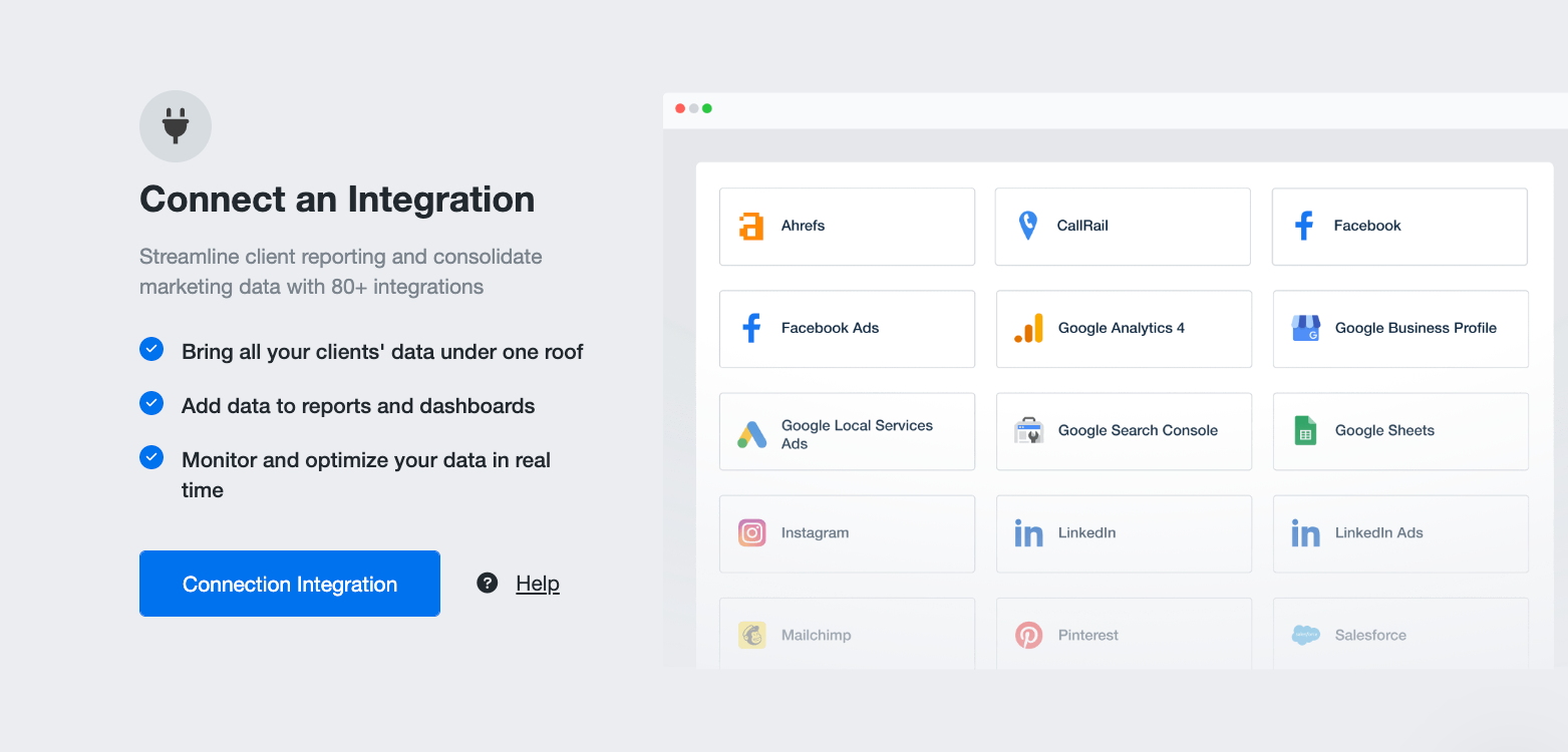
The issue is that AgencyAnalytics users have reported that the data connectors break frequently, and the data can take 2-3 days to pull through.
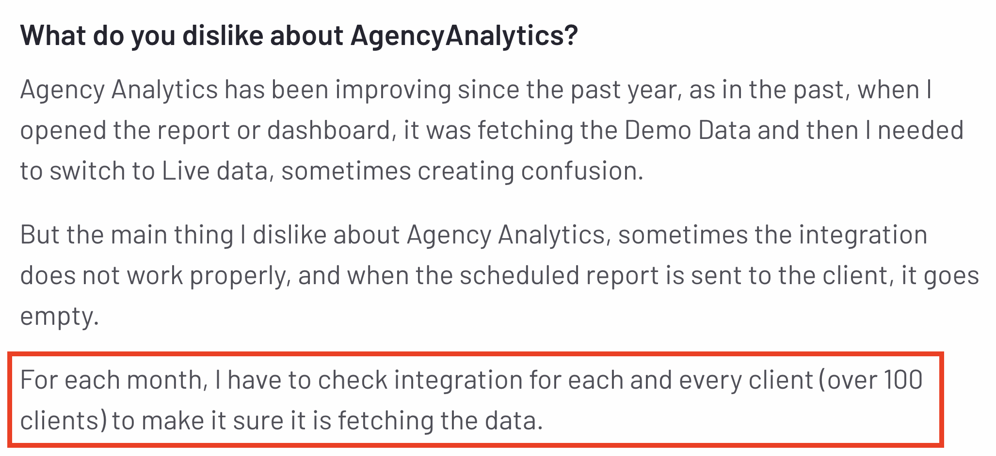
This comes at a cost because clients miss out on key information. One G2 user said they have to “recheck integrations for over 100 clients each month” to see that the data is correct:
 The slow data refresh is a real drawback, as alternatives, like Whatagraph, offer a consistent 30-minute data refreshes across all your data sources and channels.
Also, according to our customers, our integrations are stable and fast. Here's what one of them said:
We don’t have any connection issues on Whatagraph at all. We just connected the platforms once, and that was it. Whatagraph is very, very quick when loading the data.
4. No advanced data blending or filtering
As I reviewed the AgencyAnalytics dashboard, I noticed limited capabilities for merging data from multiple marketing platforms (e.g., Google Ads) and social media channels (e.g., LinkedIn or Facebook).
For example, it was not possible to group Facebook accounts, segment by campaign, or build cross-channel views.
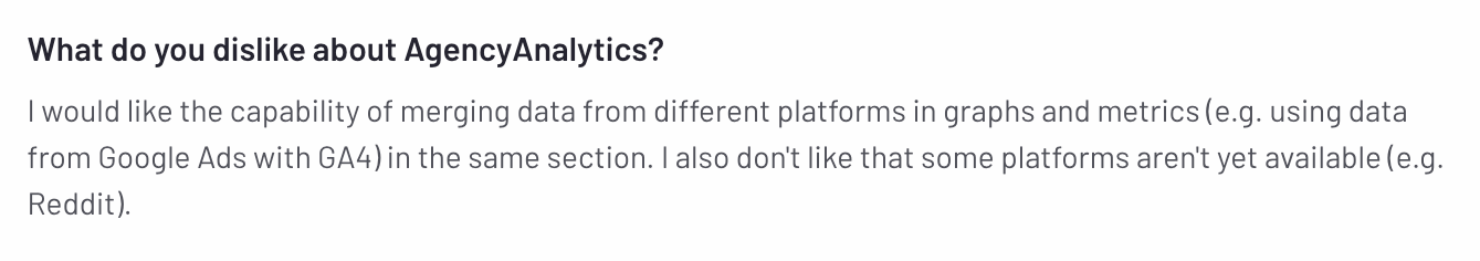
One G2 user shared this same frustration and commented:
Comparatively, Whatagraph is built for cross-channel marketing reporting.
You can blend metrics across platforms (with no limits), standardize dimensions, and create custom tags by client, campaign, region, or account manager.
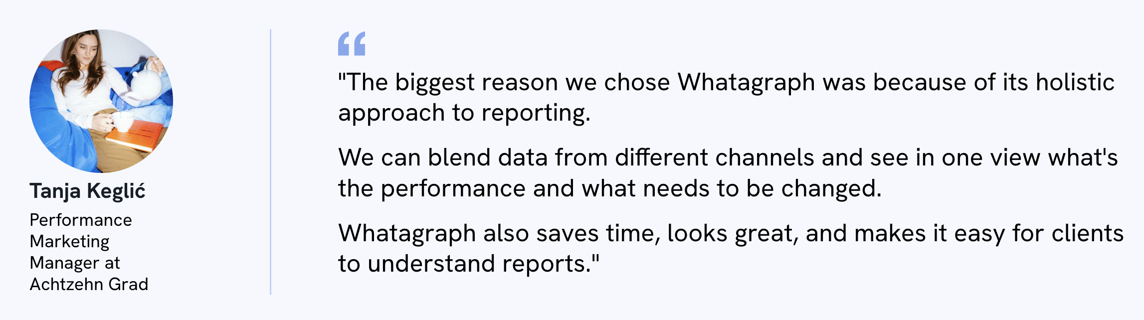
As Tanja Keglić, Performance Marketing Manager at Achtzehn Grad, and our power user puts it:
5. AI reporting isn’t working as users want
AgencyAnalytics has two AI features on its platform, designed to help users create reports more quickly.
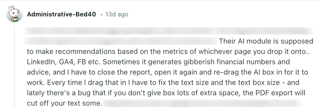
The AI summaries provide a quick overview of specific sections in your report, and I was able to find it from the Objects tab: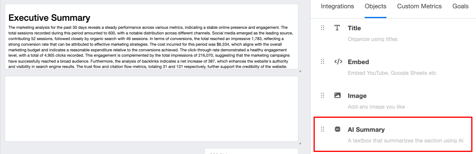 While I think these AI features sound useful in theory, users say they’re generating random numbers and advice, and there are bugs. One Reddit user said this specifically:
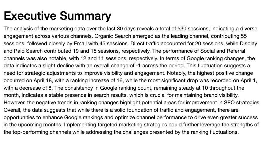
You can also see here that the generated summary text is extremely long and clunky:
At Whatagraph, we give you full flexibility over how you want your performance summaries to be like.
You can adjust three key things:
- Style: Do you want the AI to write summaries, wins, recommendations, or issues?
- Format: Do you want a long or short summary?
- Language: Do you want it to be in English, Dutch, German, French, Portuguese, or Spanish?
Plus, once the summaries are generated, you can still fully edit them to fit your brand tone and voice.
Plus, because these performance summaries are based on native, stable integrations with the source platforms and data sources, your summaries are always accurate.
Whatagraph also offers an AI chatbot where you can ask any questions about your connected data or campaigns — just like talking to your personal data expert or ChatGPT.
For example, you can ask “What was the total ad spend last month?” and it’ll give you succinct answers in seconds.
Want to see Whatagraph can do for you? Talk to our team today.
Published on Apr 28 2025
WRITTEN BY
Elmeri PalokangasElmeri is a content strategist and writer helping SaaS firms scale up with long and short-form content. He has written dozens of SEO- and conversion-optimized blog articles for SaaS brands like Atera, Cognism, Scribe, Drip, QuickMail, Time Doctor, and TechnologyAdvice. When he's not working, he's off exploring Switzerland's stunning mountains.