We tested the 11 Best AgencyAnalytics Alternatives in 2026
AgencyAnalytics is a great marketing reporting tool, but users say the platform can be unstable, rigid, and limited.
As of 2026, we've also heard multiple complaints around AgencyAnalytics' StackAdapt connector issues and pricing jumps.
To help you find the best AgencyAnalytics alternative, I did three things:
- Spoke with our customers who previously used AgencyAnalytics.
- Scoured online reviews and community forums to find the best alternatives.
- Tested each tool.

May 21 2026●10 min read


Full disclosure: one of these tools is ours. But that’s because we genuinely believe Whatagraph reduces the pains of AgencyAnalytics.
But we’re also not here to bash our competitors. We researched them thoroughly (and even tried them out) so you can really understand what they’re great at and if they’re best for you.
By the end of the article, we hope you’ll find an AgencyAnalytics alternative that fits your needs, whether it’s us or not.
11 best AgencyAnalytics alternatives and competitors in 2026
In a nutshell, here are the 11 best AgencyAnalytics alternatives I’ll review in this article:
- Whatagraph
- Klipfolio
- Tableau
- Looker Studio
- Geckoboard
- DashThis
- Grow
- NinjaCat
- Cyfe
- Databox
- Tapclicks
Tool | Best for | Pricing |
| Whatagraph | Mid-size agencies and multi-location operators that need a governed data foundation, AI reporting, and scale without adding headcount | Free plan available; from $229/mo (billed annually) |
| Geckoboard | Teams that need live KPI dashboards on office TVs or shared links | From $119/mo (billed annually) |
| Klipfolio | Data teams that need formula-level control and centralized metric governance | From $120/mo (billed annually) |
| Tableau | Enterprise data teams with complex, multi-source analytics and visualization needs | From $15/user/mo (billed annually) |
| Looker Studio | Freelancers and Google-centric marketing teams on a tight budget | Free; Pro at $9/user/project/mo |
| DashThis | Small agencies and freelancers who need fast, template-based client reports | From $44/mo (billed annually) |
| Grow | Operations and data teams that need a no-code BI platform with built-in data storage | Custom, contact sales |
| NinjaCat | Large agencies and enterprise brands with dedicated data teams | From ~$1,500/mo (enterprise contracts) |
| Cyfe | Small businesses and boutique agencies needing an affordable all-in-one monitoring hub | From $29/mo |
| Databox | Mid-sized marketing teams that want AI-assisted analysis, goal tracking, and benchmarking | Free plan available; from $79/mo agency / $159/mo business (billed annually) |
| TapClicks | Large agencies needing a full marketing operations platform beyond just reporting | Custom, from ~$599/mo |
Let’s dive into each of these tools.
What to look for in an AgencyAnalytics alternative
Before you evaluate tools, it helps to know what actually matters at agency scale. Here are the five criteria that separate good reporting platforms from great ones.
1. Connector stability
A reporting tool is only as reliable as its integrations. If your data sources, Google Ads, Meta, LinkedIn, TikTok, HubSpot, and CRM platforms, disconnect without warning, you're spending time debugging instead of reporting. Look for fully managed connectors with high uptime and a team that fixes integration issues directly, not through a third-party data pipeline like Supermetrics.
2. Data organization capabilities
Cross-channel reporting means nothing if you can't blend data sources, create custom metrics, and define what your KPIs actually mean. The ability to build custom dimensions, aggregations, and formulas separates platforms built for real marketing data from platforms built for simple dashboards.
3. AI-powered reporting
SurveyMonkey reports that 88% of marketers use AI in their daily operations as of 2025. The best alternatives now offer AI features that go beyond chatbots: automated report generation from prompts, performance summaries that write themselves, anomaly detection, and workflows that connect your reporting tool to Claude or ChatGPT via MCP.
4. Scalable client reporting
For agencies managing dozens of clients, linked templates are non-negotiable. Edit one master report and changes cascade across every client report instantly. Without that, every design update means opening 50 dashboards individually.
5. White-label and sharing options
Clients should see your brand, not the tool's. Custom domain, branded report URLs, client-facing filters, scheduled PDF and email delivery, and live link sharing are table stakes. Data warehouse exports to BigQuery or Snowflake are increasingly important for agencies with data-mature clients.
Here are 11 tools that fit these criteria.
1. Whatagraph
Best for: Mid-size marketing agencies and multi-location operators running dozens of locations who need marketing teams to self-serve data without a data team
If you’re switching from AgencyAnalytics because sources kept disconnecting, reports felt rigid, or pricing jumped without warning, Whatagraph is built for exactly that problem.
Whatagraph is a marketing intelligence platform built for agencies reporting at scale. Everything runs on one governed data foundation: you define each metric once, and the same numbers power your client reports, dashboards, and AI tools.
Here's how it works:
1. Connect: Plug into 60+ marketing platforms via fully managed native connectors.
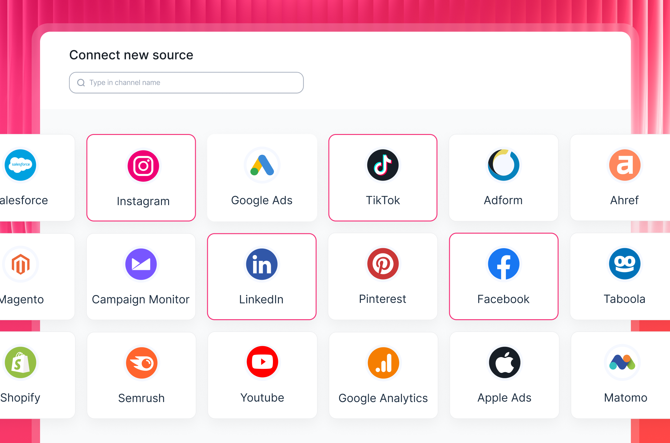
Unlike AgencyAnalytics, where users report sources disconnecting due to bandwidth issues and platforms like TikTok and X causing data discrepancies, Whatagraph's integrations are maintained by our Product engineers, so bugs get resolved without a third-party company involved.
Whatagraph has averaged 99.95% uptime over the past six months, and even reports with heavy widgets and multiple tabs load in under 10 seconds.
Tanja Keglić, Performance Marketing Manager at Achtzehn Grad agency says:
We don’t have any connection issues on Whatagraph at all. We just connected the platforms once, and that was it. Whatagraph is very, very quick when loading the data.
2. Organize and normalize your data: Build custom blends, metrics, and dimensions, or let Whatagraph IQ generate them from a single prompt. Define your metrics, blends, custom dimensions, and aggregation rules once, and they propagate to every report, dashboard, and downstream system automatically.
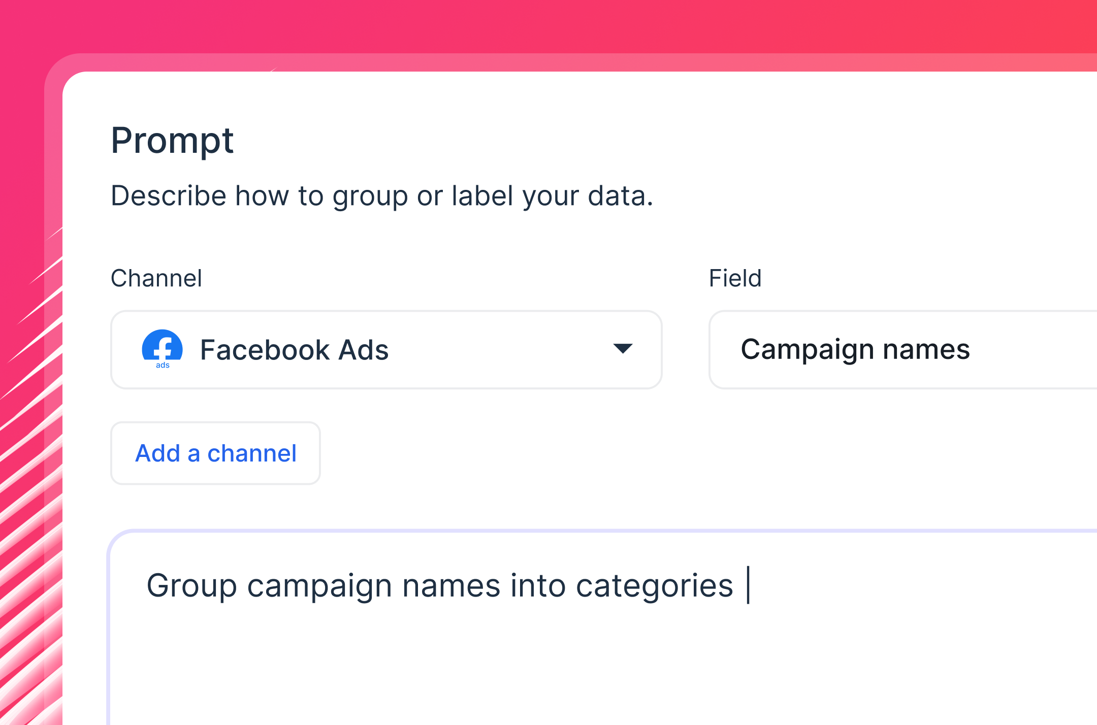
Whatagraph’s Source Filter is worth calling out specifically: instead of applying the same filter to 20 individual widgets, you apply it once at the source level and it cascades to every widget instantly.
3. Analyze your data with Claude or ChatGPT through Whatagraph MCP: Whatagraph MCP connects Claude or ChatGPT directly to your governed data layer. Your custom metrics, blends, dimensions, and cross-channel definitions are already built in.
Ask "what's blended ROAS across all clients this month?" and the answer matches what's in your client reports, because it comes from the same place. The number your AI assistant gives you on Monday means the same thing it means on Friday. See how to connect here.

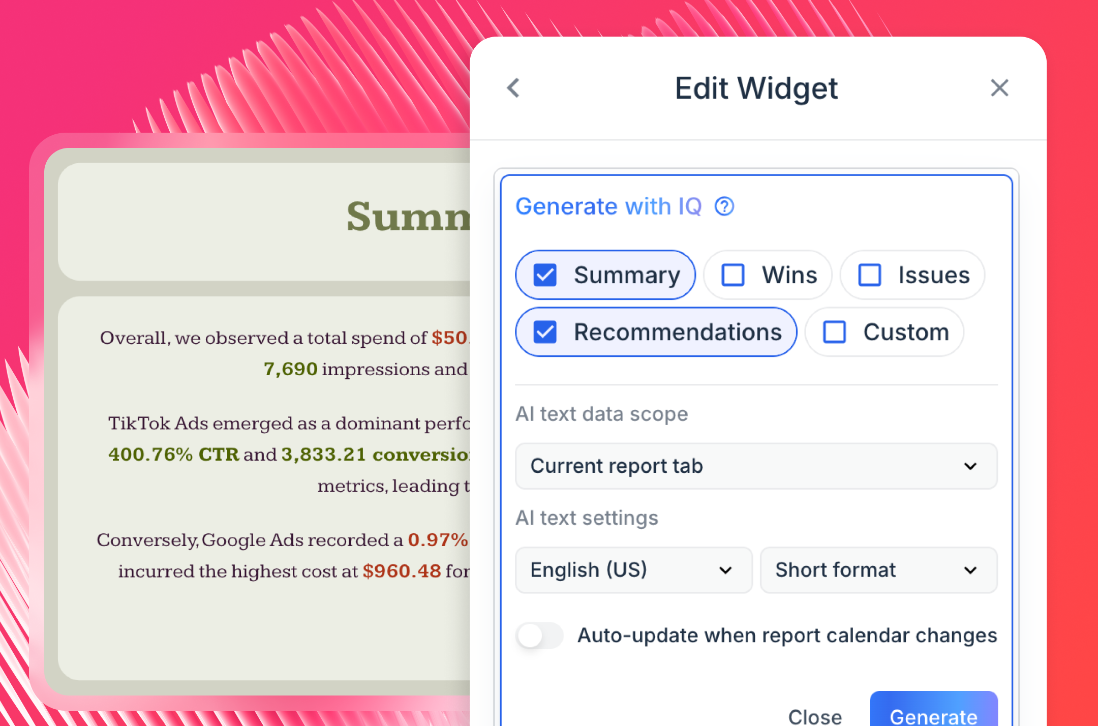
4. Report with AI: Fire off a text prompt and Whatagraph IQ builds a complete, branded report in seconds. Or use 80+ pre-made report templates if you prefer more control. Try it out here:
IQ also writes performance summaries directly inside your reports: choose from Summary, Wins, Recommendations, Issues, or a custom prompt, and IQ reads your marketing data and writes the insights. You can still edit everything with your own business context.
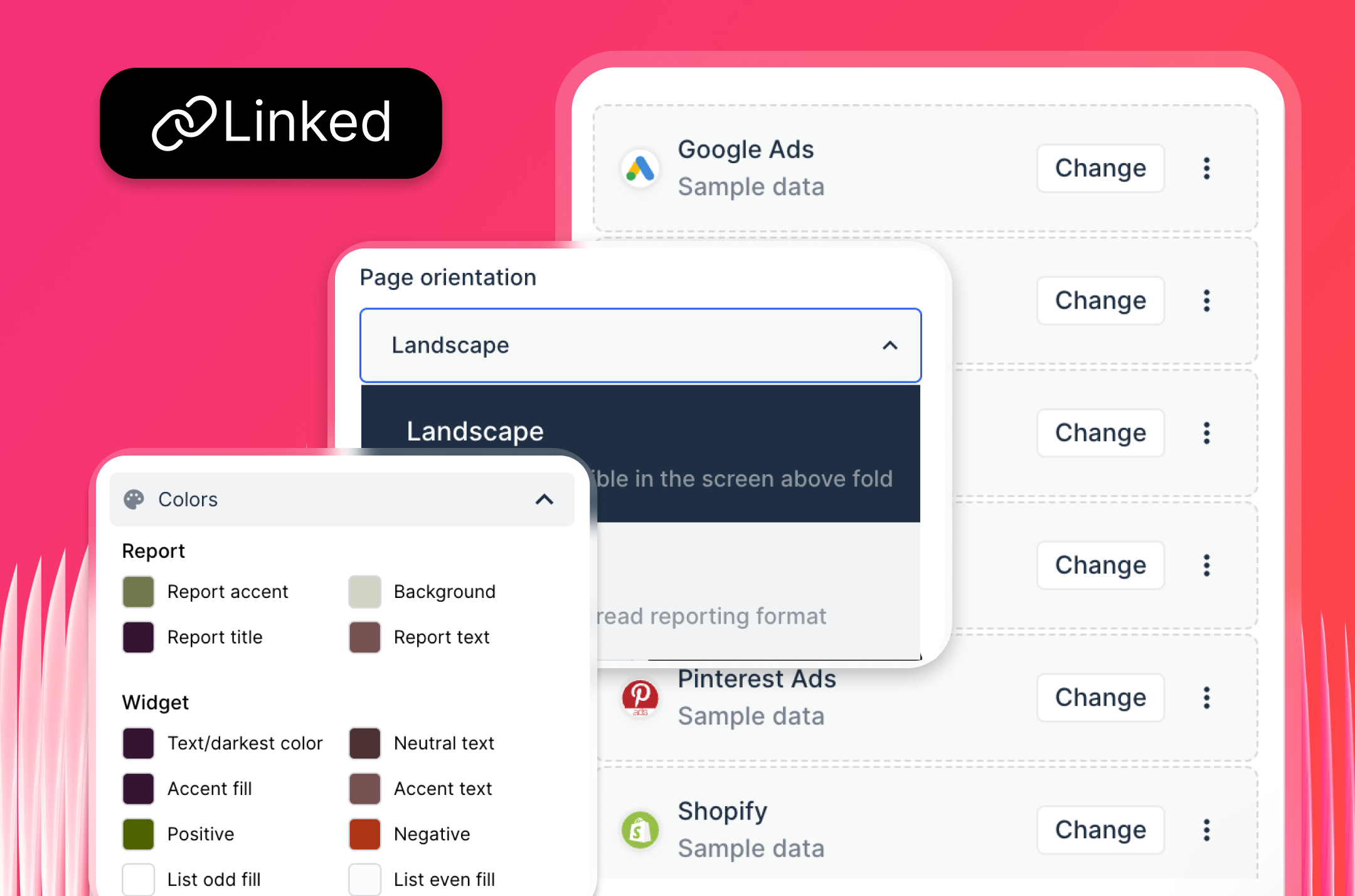
5. Customize instantly: Upload a client's logo or brand screenshot and IQ pulls the color palette automatically. Reports live on your own custom domain. Clients never see Whatagraph branding.
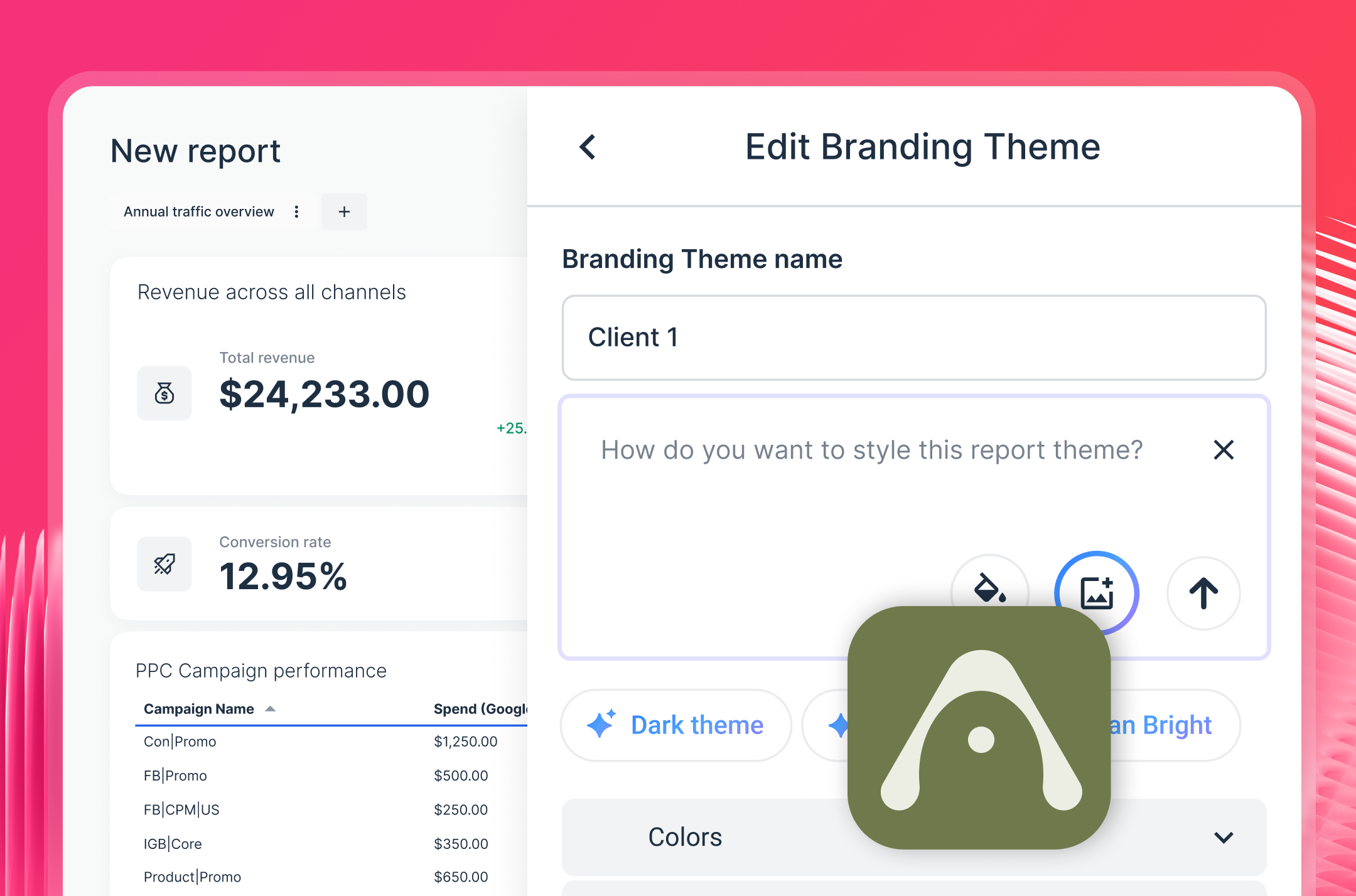
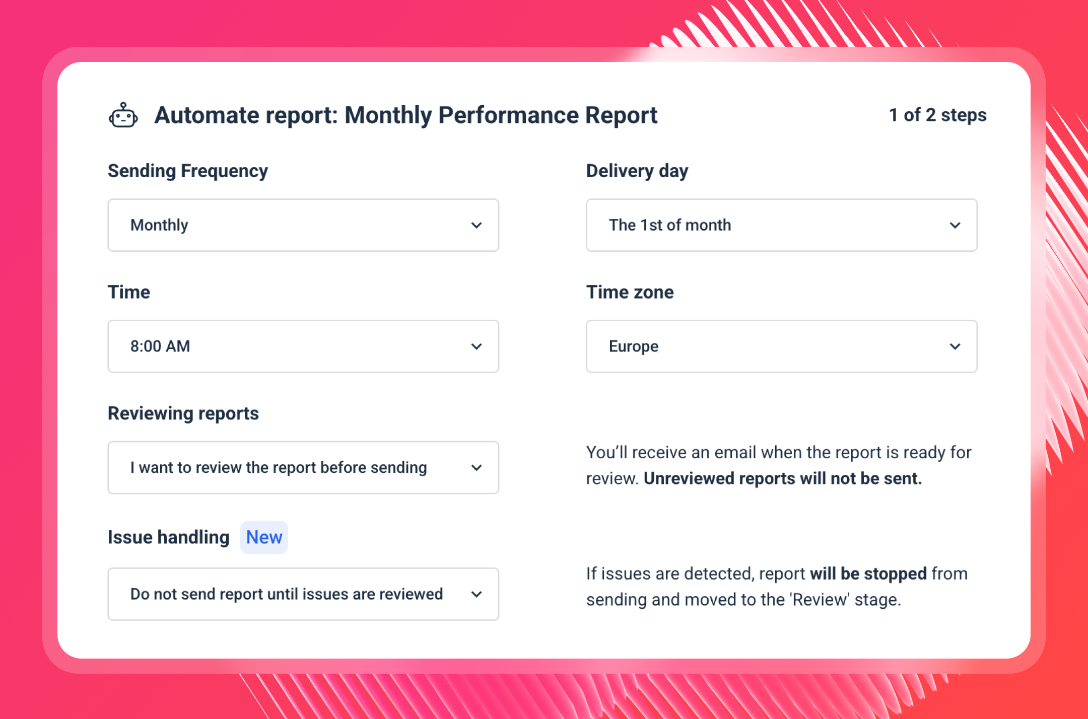
6. Automate reporting: Set scheduled reports on autopilot. Send live links, PDFs, or scheduled emails. Export to Google Sheets, Excel, and CSV. Or sync data directly to BigQuery and Looker Studio. Every report can be automated to arrive in a client's inbox without anyone touching it.
7. Scale without adding headcount: Manage dozens of clients with Spaces, Overviews, and client-facing filters. With Custom Tags, label sources by region, account manager, or industry and pull up "all Tier 1 accounts" or "accounts managed by John" in one view.
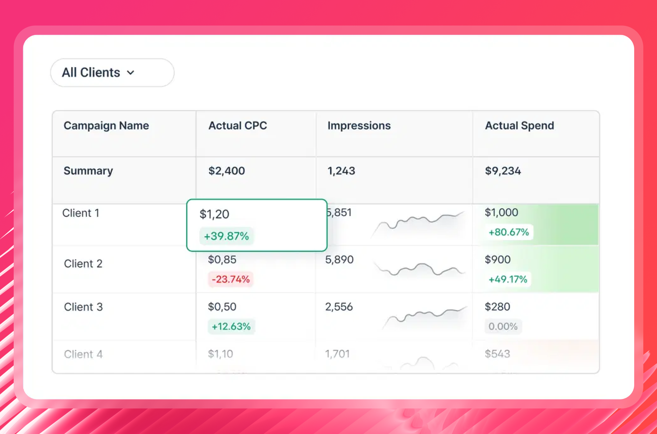
With linked templates, edit one master report and changes cascade across every client report at once. That's the functionality agencies growing past 20 clients need most.
Thanks to these powerful AI features and an easy-to-use interface, agencies like Maatwerk Online are saving 100 hours a month on reporting. Here’s what Lars Maat, Co-Founder, says:
Whatagraph’s AI saves time and energy for our marketing specialists. And the hours we’re saving is just pure profit. We now have the time to focus on more strategic things that help both our agency and our clients grow.
Pro tip: If you're frustrated with StackAdapt connector issues on AgencyAnalytics, Whatagraph’s direct StackAdapt integration is designed to be "self-healing," meaning they automatically adjust to platform updates without breaking your reports.
Start free with Whatagraph today.
Whatagraph Reviews from Real Users
“To me, Whatagraph is like the Tesla or Mercedes of digital analytics tools, their clean and simple way to present complex marketing data. I highly recommend it to anyone working with marketing analytics who values efficiency and clarity in their reporting.” (Source)
“Whatagraph has a simple user interface that is easy to navigate even for those who don't have analytical skills.” (Source)
“What I like best about Whatagraph is having the ability to create reports fast and easy. No more spreadsheets to do reports, they have a great variety of templates.” (Source)
Whatagraph pricing 2026
Whatagraph's pricing scales with your agency. Check out our pricing page for the most updated information.
2. Geckoboard
Best for: Small to large businesses in customer service, sales, and operations that need live KPI visibility on office TVs or shared links.
Geckoboard is built around one core use case: getting live data onto a screen your whole team can see. It connects to 90+ data sources, lets you build dashboards with a drag-and-drop interface, and pairs directly with a Smart TV or PC stick for wall display. For remote or hybrid marketing teams, dashboards share via links, email snapshots, or automatic Slack and Microsoft Teams updates.
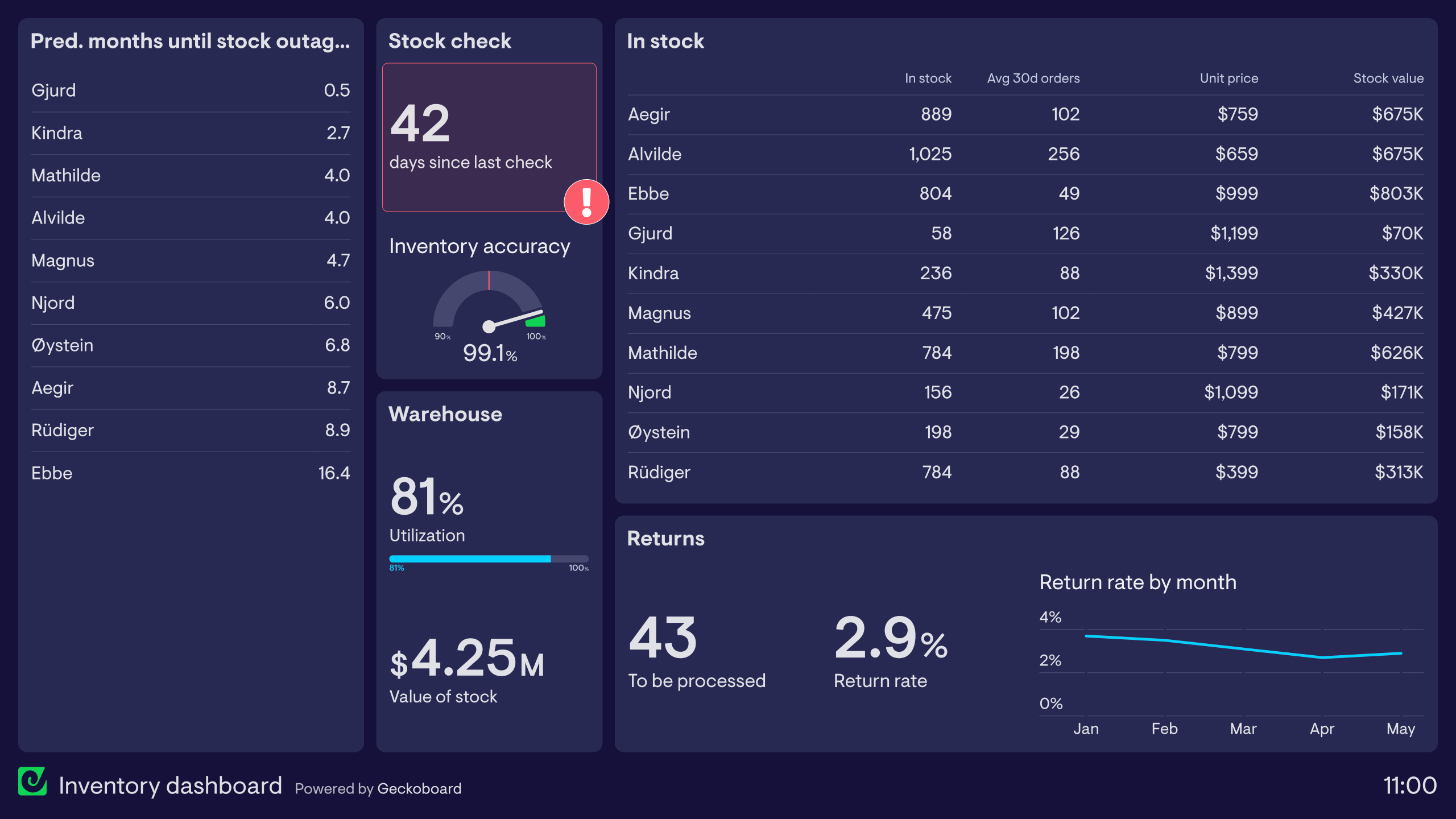
The platform targets operations and customer service teams more than marketing agencies. In April 2026, Geckoboard shipped stacked column charts, the first new visualization type in several years, which lets you show total values and their breakdown in a single widget without building two separate charts.
KPI notifications are a standout feature: when a metric crosses a threshold, Geckoboard pushes an alert via Slack. For office teams that live on TV dashboards, this is genuinely useful. Dashboards refresh as frequently as every minute on higher plans.
I tried out the free Trial and it was pretty easy to get started. All you needed to do was connect your data sources and choose the widgets you’d like to visualize.
 But one downside is that you can’t drag-and-drop widgets onto your dashboards. You’ll need to:
- Click on “Add widget”
- Choose the metric you want to visualize
- Customize that widget
Then, repeat this process again for every metric you want to create. This creates unnecessary back and forth between the dashboard and the widget builder, and can be time-consuming.
A cool feature I like about Geckoboard is its “KPI notifications” which sends notifications when KPIs trend up or down via Slack.
Compared to AgencyAnalytics, Geckoboard has more data sources (90+) and is more reliable and stable.
However, unlike Whatagraph, you won’t be able to create custom data blends, metrics, and dimensions on Geckoboard. This can be a deal breaker if you’re a large company and you need to organize your scattered data to create easy to read and impactful reports.
Key features:
- 90+ integrations including Google Analytics, HubSpot, Salesforce, and Zendesk
- Drag-and-drop dashboard builder
- KPI notifications via Slack when a metric crosses a threshold
- TV dashboards with automated rotation
- Email and Slack snapshots
- Stacked column charts (new April 2026)
- Mobile dashboards
Geckoboard Reviews from Real Users
“I love how simple it is to use. That you can connect data from so many different sources in an easy way.” (Source)
“Connecting the dashboard with the Tv works like a charm.” (Source)
“Geckoboard could use more features and options for customization. Compared to other tools like Power BI or Tableau, Geckoboard didn't have as many advanced tools for analyzing data or changing how things looked. I wished I could make more complicated charts and do special calculations.” (Source)
Geckoboard pricing 2026
- Essentials: $119/month: 3+ dashboards, 1+ editors, unlimited viewers, all 90+ integrations, real-time data, Slack/Teams/email snapshots, TV screens, dashboard loops, mobile access. Add-ons: extra dashboards $24/each, editors $20/each, screens $20/each, custom themes $40 extra.
- Performance: $399/month: 25 dashboards, 3 editors, 5 screens, unlimited viewers, everything in Essentials plus custom templates, real-time metric alerts, drilldowns, view source data, custom metrics from custom fields, folders, dashboard ownership and verification, custom themes, onboarding assistance, under 1-hour support response.
- Enterprise: Custom pricing: everything in Performance plus SSO, user management API, audit logs, Power BI and Looker Studio connectors (coming soon), dedicated support manager, full onboarding and training, dashboard consultancy.
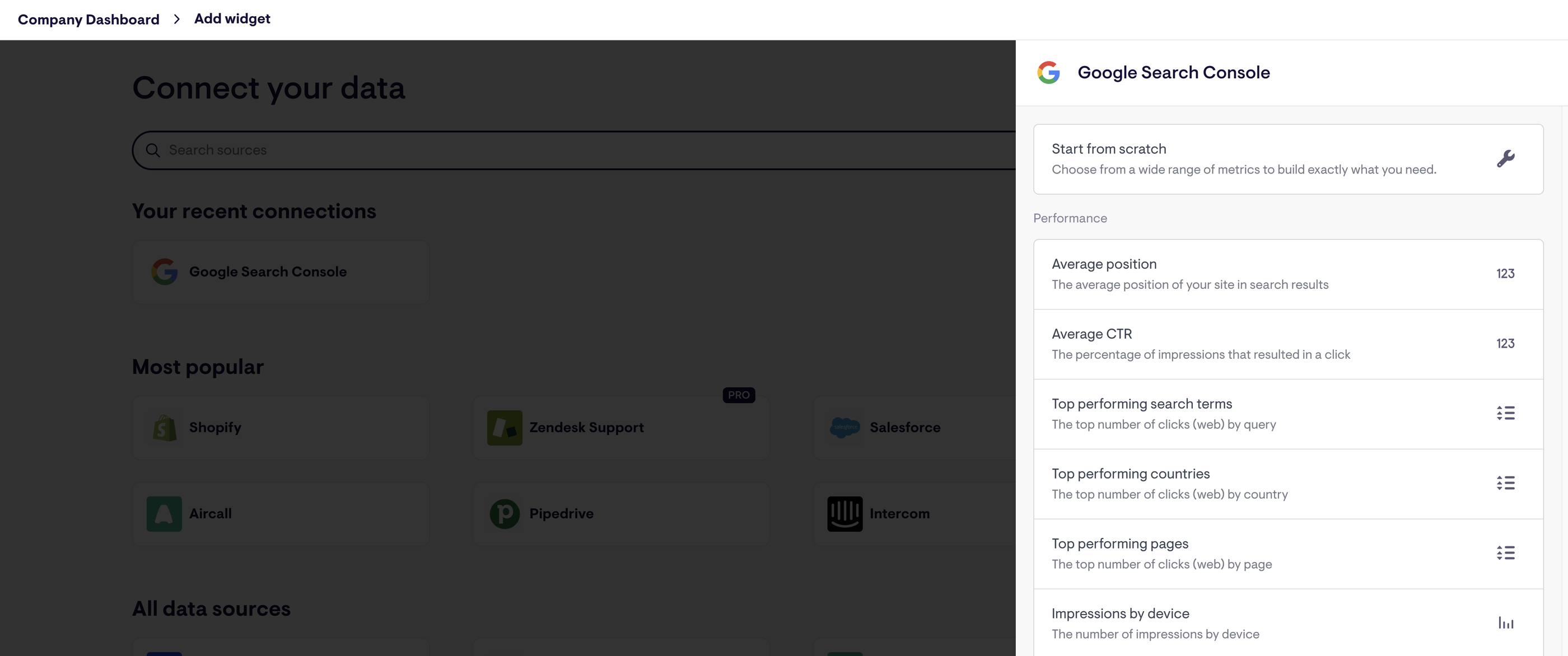
3. Klipfolio
Best for: Data teams at agencies and companies that need formula-level control, centralized metric governance, and highly customizable dashboards.
Klipfolio is a data analytics and a business intelligence tool in one. It offers two key products:
- PowerMetrics: This is their "Metric Warehouse" solution that allows data teams to centralize and standardize metrics (like LTV or CAC) so that every department uses the same definition. In 2026, it now features AI Insights that automatically flag trend anomalies.
- Klips: These are traditional, highly customizable dashboards. Klips now supports over 130 native integrations, plus a solid REST/URL connector for proprietary data.
Klipfolio’s primary edge over AgencyAnalytics is its governance and Metric Catalog. Rather than just pulling data into a chart, you can:
- Create a curated list of metrics that are "certified" by your data team.
- Enable non-technical users to build their own reports using only these certified metrics, preventing data silos.
- Store data in Klipfolio's own warehouse or connect directly to your Snowflake or BigQuery semantic layer.
All this is designed to speed up decision-making and reduce ad hoc requests to data teams - if you have a dedicated data team in the first place.
Again, as we mentioned earlier, AgencyAnalytics doesn’t come with this kind of granular data organization features.
Getting started with Klipfolio was easy. I created a Trial account and got access to my first dashboard.
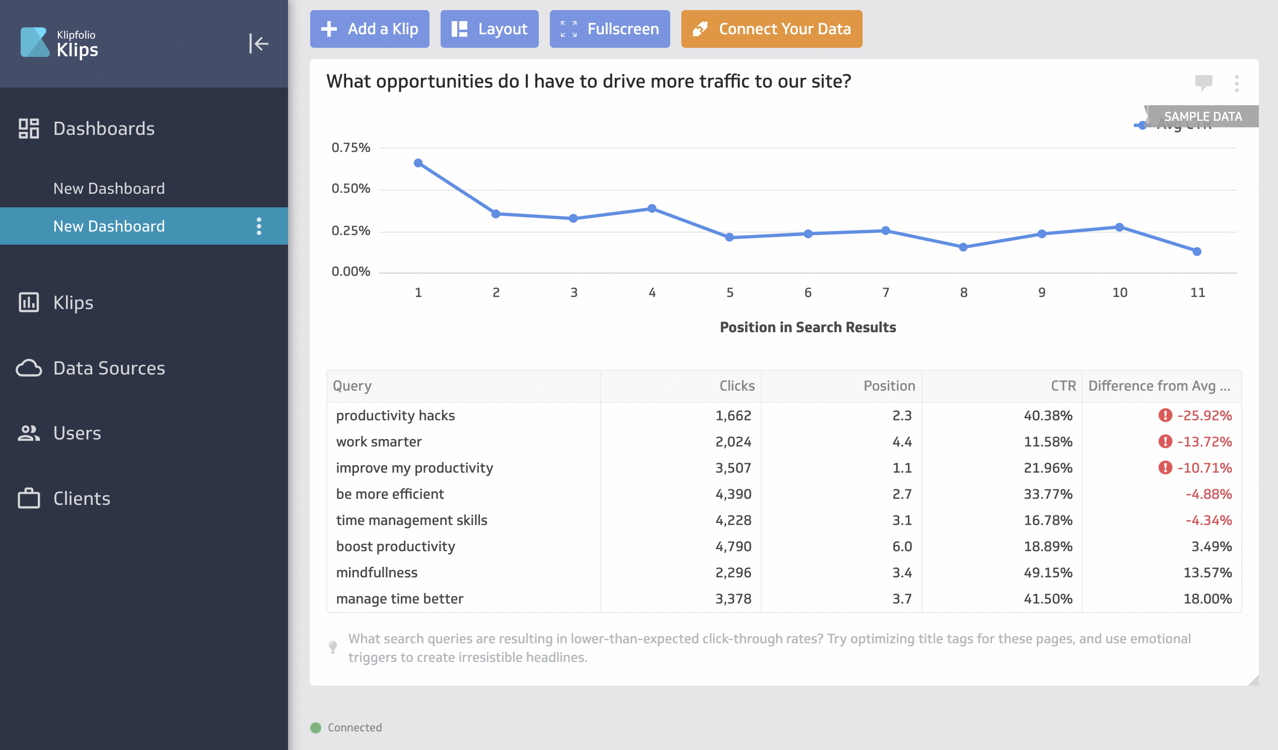
But this is where things got complicated. To visualize your data, you’ll first need to create a “Klip”, which is in a different tab from the dashboard.
There are some pre-made Klips like the below screenshot, but for the most part, you’ll need to build a custom one.  And while they’ve improved the interface in 2026 with "Instant Klips," advanced customization still requires a back-and-forth workflow that can take 5 to 30 minutes per widget.
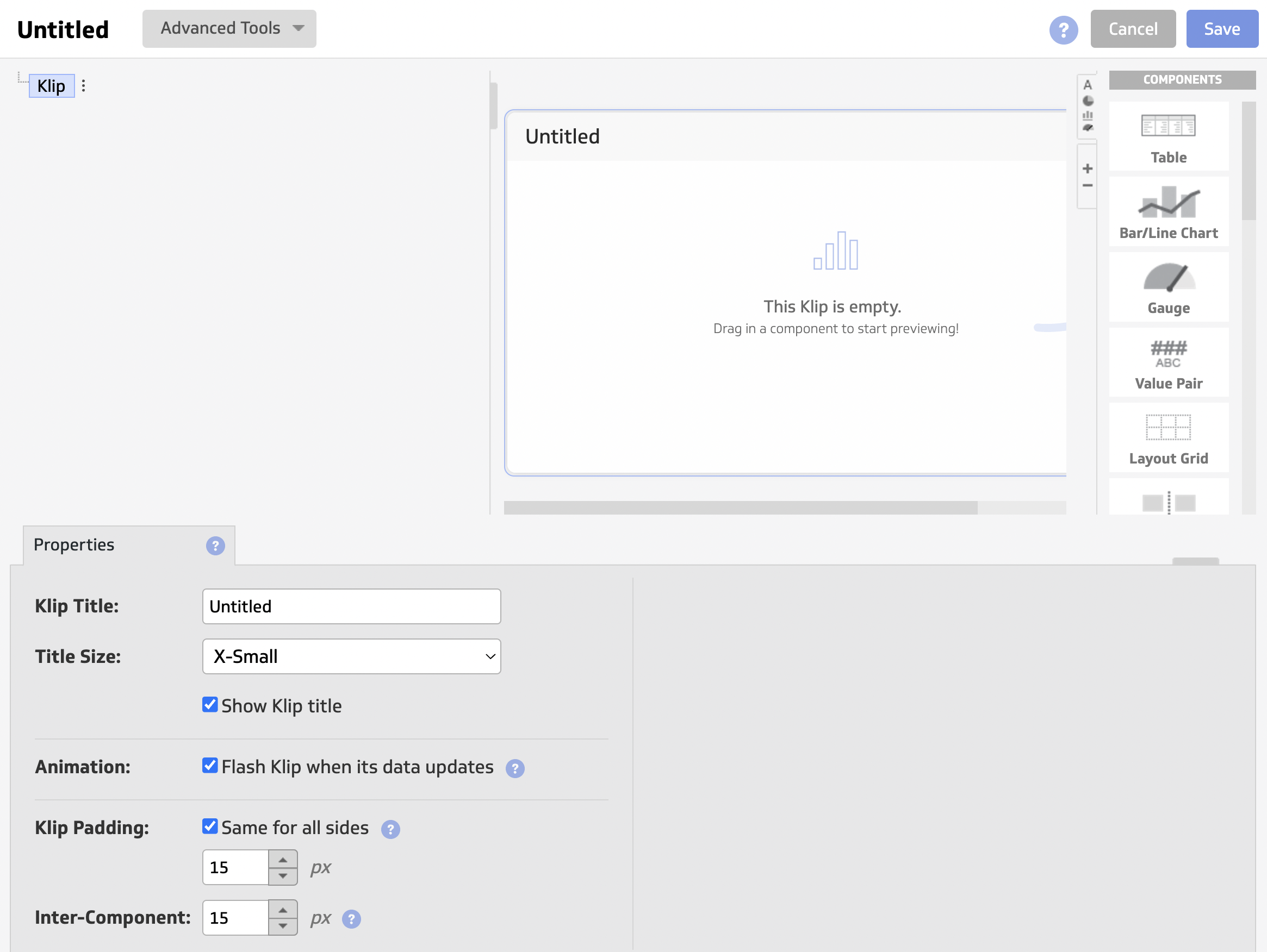
Once you’re done, then you can add this custom Klip onto your dashboard.
On Whatagraph, you can create custom widgets natively within your dashboard in seconds. You don’t need to go back and forth from one tab to another—you can simply drag and drop the widgets onto your dashboard.
Key features:
- 130+ integrations including SQL databases, data warehouses, Google Ads, HubSpot, Salesforce CRM, and Google Sheets
- Data blending and aggregations
- Custom metrics and dimensions
- AI Insights with anomaly detection, goal tracking, and forecasting
- Scheduled reports with PDF and CSV exports
- Google Sheets connectivity
- Unlimited users on all plans
Klipfolio reviews from real users
“What I really like about Klipfolio is that it’s super easy to pick up, connects smoothly with lots of data sources, the dashboards get used all the time.” (Source)
“Their customer service is terrible. I was told they were working on a solution more than 6 months ago and have not received a single update. Every time I contact support I get the impression that I am bothering them. I will not be renewing this platform because I do not feel valued as a customer.” (Source)
“It doens't have as many chart options like Power bi or Data Studio. It's good only for light data analysis.” (Source)
Klipfolio pricing 2026
- Base: $120/month: 3 dashboards, 130+ integrations, 4-hour data refresh
- Grow: $190/month: 10 dashboards, 1-hour refresh
- Team: $310/month: 20 dashboards, 15-minute refresh, SSO
- Team+: $600/month: 40 dashboards, up-to-the-minute refresh, priority support, custom onboarding
Add-ons worth knowing: extra dashboards at $8/month each; near-real-time refresh queue and performance tuning available as separate paid add-ons.
3. Tableau
Best for: Enterprise data teams with complex, multi-source analytics needs and dedicated BI headcount.
If you’re looking for an enterprise-level business intelligence solution, Tableau is a great choice. It’s a data analysis and a visualization tool in one.
In 2026, they have three key improvements:
- Tableau Pulse: This is the biggest shift in recent years—instead of users having to dig through dashboards, Pulse proactively sends personalized KPI "digests" to Slack, Teams, or email. It uses AI to explain why a metric moved (e.g., "Your CPC increased because of a surge in weekend traffic").
- Tableau Agent (formerly Einstein Copilot): Salesforce has rebranded Einstein's capabilities into Tableau Agent. This is a conversational assistant that lets you build complex calculations, pivot tables, and even entire visualizations using natural language prompts.
- Tableau+ Tier: Launched for the highest-level enterprise needs, this tier includes advanced AI capabilities which automatically generates semantic models from raw data.
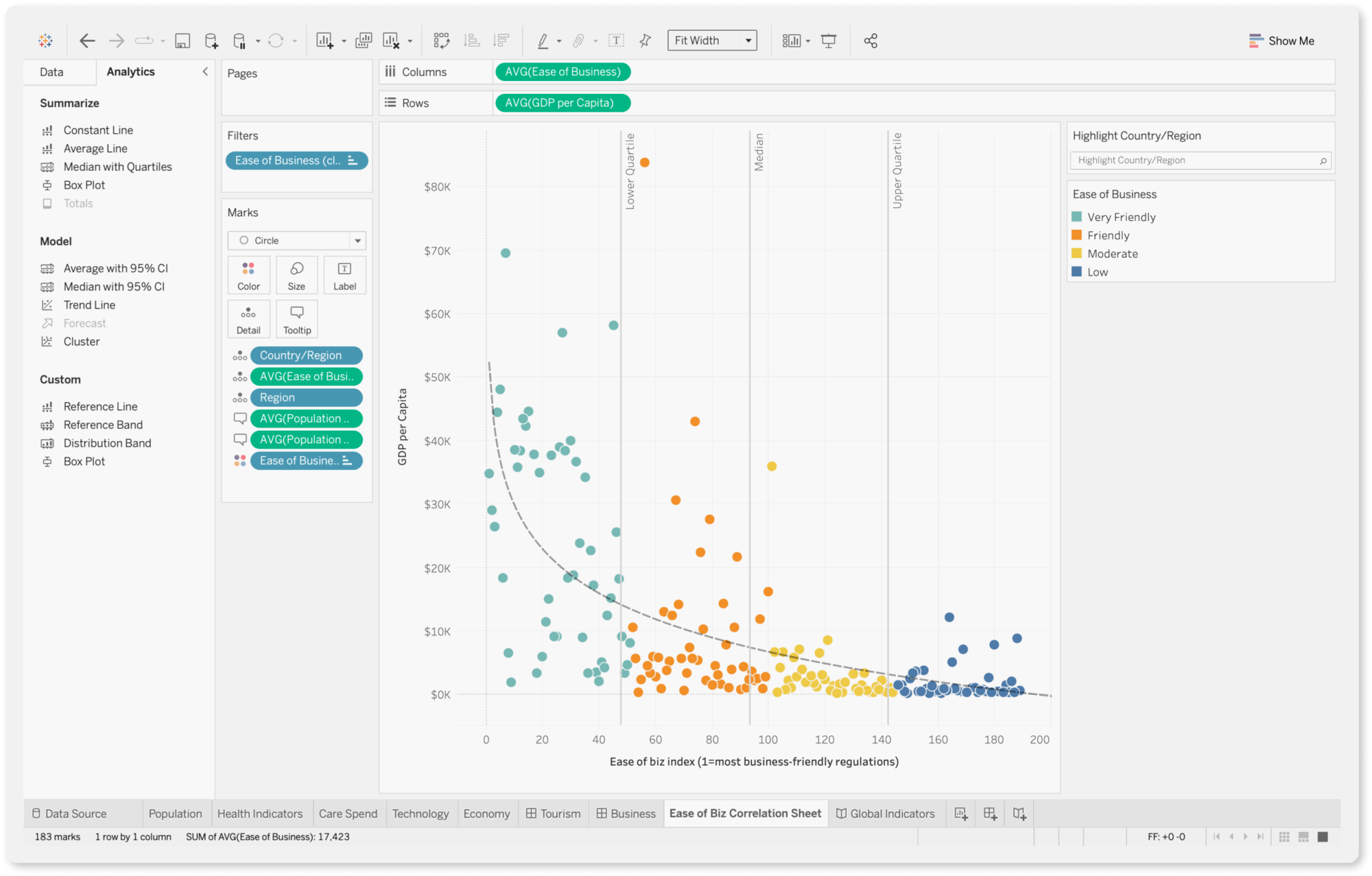
For a powerful data analysis tool, Tableau is still easy to use with a drag-and-drop interface and visual query builder. You can generate insights quickly and share them with stakeholders through reports.
You can perform complex data analysis, uncover trends, and identify opportunities for optimization using features such as trend lines, forecasting, and clustering. These are granular things that you can’t do on AgencyAnalytics.
If you need help, you can go to Tableau community forums and ask your questions. A current Tableau user or a moderator will answer you. You can also purchase “Success Plans” that come with personalized training and support.
Unlike Whatagraph or AgencyAnalytics, Tableau has a steep learning curve. While basic drag-and-drop is intuitive, mastering "Level of Detail" (LOD) expressions or complex data blending requires dedicated training.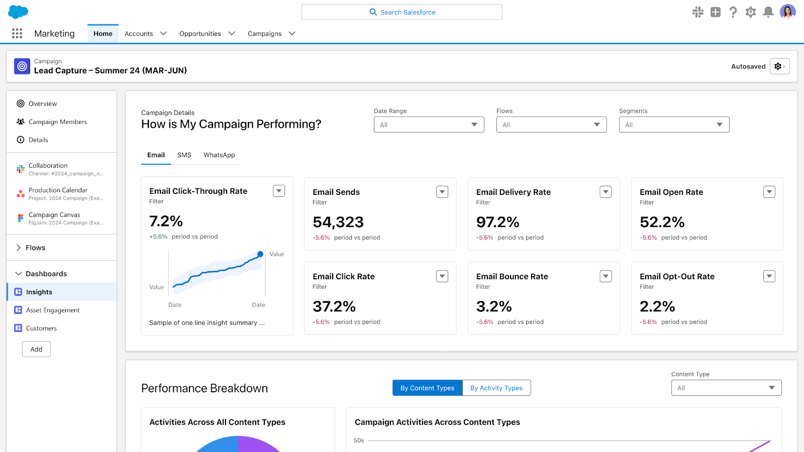 However, Tableau is (a lot) more expensive than AgencyAnalytics as it’s mainly for enterprises.
Key features:
- 90+ connectors including Google Analytics, Salesforce CRM, and data warehouses
- Tableau Agent - natural language analytics, now generally available
- Tableau Pulse - proactive KPI digests to Slack, Teams, and email
- Auto-generated semantic models
- AI-powered color palettes
- Radial charts and advanced visualizations
- Trend lines and forecasting
- Snowflake and BigQuery connectivity
Tableau reviews from real users:
“Tableau creates beautiful, professional-looking graphs, maps, and dashboards that are easy to understand and present.” (Source)
“Software is very complex and sophisticated.” (Source)
“The licensing cost adds up quickly as more users need access, and it requires a good amount of system resources, so performance slows with large datasets.” (Source)
Tableau pricing 2026
Billed annually per user:
- Tableau: $15/user/month: browser-based web authoring, Tableau Desktop and Prep Builder, Tableau Pulse
- Tableau Enterprise: from $35/user/month: everything in Tableau, plus advanced management and data management
- Tableau Cloud+: contact sales: everything in Tableau Enterprise, plus Tableau Agent in Tableau Cloud and Pulse, Premier Success, 50 sites, and Release Preview access
- Tableau+ Bundle: contact sales: everything in Tableau Cloud+, plus Tableau Next (agentic analytics)
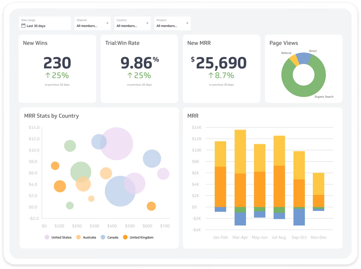
4. Looker Studio (a.k.a. Google Data Studio)
Best for: Freelancers, boutique agencies, and Google-centric marketing teams working with modest budgets.
Google’s free reporting tool, Looker Studio, is a popular choice among marketers.
Looker Studio comes with 21 native integrations with Google-based platforms like Google Ads, DV 360, Google Sheets, and Google Analytics. You can also connect to BigQuery, MySQL, and Microsoft SQL servers on Looker.
In 2026, Looker Studio has three major upgrades:
- The biggest update this year is the integration of Gemini. Pro users can now use conversational analytics to ask questions; Gemini can interpret natural-language prompts to help build calculated field formulas, reducing the manual effort required to write complex expressions.
- There is now a dedicated Looker mobile app (for iOS and Android). While free users can view reports in a mobile browser, the app provides a much smoother, native experience for Pro users to access their dashboards on the go.
- A new Pro feature allows you to export your live dashboard widgets directly into a Google Slides presentation with a single click.
 Compared to AgencyAnalytics, you can create very detailed and customized dashboards on Looker Studio, depending on how well you know the platform. But Looker Studio can be slow, clunky, and doesn’t come with customer support (unless you buy the Pro plan).
Plus, while Looker Studio supports data blending, it’s report-specific. Unlike Whatagraph, which allows you to create a master metric once and use it everywhere, Looker Studio requires you to rebuild complex blends for every new report.
Key features:
- 21 native Google connectors (free) and 1,000+ partner connectors (paid)
- Drag-and-drop report builder
- Gemini conversational analytics (Pro)
- Code Interpreter for advanced Python analysis (Pro)
- Google Slides export (Pro)
- Google Sheets and Excel import
- Cross data source filtering
- Mobile app (Pro)
- Deeply embedded in the Google Cloud and BigQuery ecosystem
Looker Studio reviews from real users
“What I like best about Looker Studio is how flexible it is for turning data into visuals.” (Source)
“Sometimes it gets really slow and lags when multiple data sources are connected.” (Source)
“Looker Studio is weak when it comes to integrating data from third-party tools outside the Google ecosystem, such as Bing or Yandex.” (Source)
Looker Studio pricing 2026
- Free: Core reporting and dashboard builder, all native Google connectors, unlimited users
- Looker Studio Pro: $9/user/project/month: up to 200 scheduled PDF reports, mobile app, Gemini AI, organizational ownership and governance
But even if you use the free version, you’ll likely encounter these two costs:
- Partner Connectors: If you need to pull data from Meta Ads, TikTok, or LinkedIn, you’ll need a third-party connector (e.g., Supermetrics or Power My Analytics). In 2026, these range from $25 to $400+/mo depending on your data volume.
- BigQuery Usage: If you store your data in BigQuery to speed up slow reports, you pay for data storage and "query costs" (usually a few dollars a month for small-to-mid agencies).
Read more: Your Guide to Looker Studio Connectors: Types, How-to & Issues
6. DashThis
Best for: Small agencies, freelancers, and in-house marketing teams who need fast, template-based client reporting without a heavy setup.
DashThis is a simple marketing reporting tool that connects to 34+ marketing platforms and visualizes KPIs on dashboards.
If you don’t see a built-in integration you need, you can also upload your own data using a nifty CSV file or a Google sheet.
Once your data is connected, you can visualize it using three key dashboards:
- Periodic dashboards: These are dashboards based on specific time periods and cadence, like daily, weekly, monthly, semi-annually, and annually.
- Campaign dashboards: These dashboards are used to isolate and highlight a specific campaign for a custom date range.
- Rolling dashboards: These dashboards show trends of metrics for three different date ranges.
These dashboards are also pre-made, meaning you can quickly get started.
On the more pricier plans, you’ll get a dedicated product specialist assigned to you who will help you set up your dashboards.
However, DashThis is more suitable as a reporting tool rather than a data analytics platform. There are very few options to customize or organize your data on DashThis.
You can only “merge” widgets together in DashThis; you can’t blend data sources to the full extent or create advanced metrics and dimensions. On Whatagraph, you can easily organize your data any way you’d like using simple workflows.
The platform now includes AI Insights: automatic plain-language analysis of your marketing performance that updates as new data comes in, surfacing trends, anomalies, and key takeaways inside your reports.
You can also chat with your dashboards to ask questions about specific metrics. Reddit Ads and Pinterest Ads integrations were added in 2026, broadening the PPC and social media channel coverage.
In March 2026, DashThis made a significant pricing change: plans now include both a dashboard limit and a data source limit, not just dashboards. Each distinct connected account counts as one source, so an agency with 10 clients each using Google Ads, Meta, and GA4 is connecting 30 sources before adding any other channels. Factor that into your cost projections before signing up.
White-label reporting is available on the Professional plan and above: custom domain, branded colors, and your own email address for scheduled report delivery.
Key features:
- 30+ native integrations including Google Analytics, Google Ads, Meta, LinkedIn, TikTok, YouTube, HubSpot, and Ahrefs
- AI Insights with chat functionality (new 2026)
- 50+ preset report templates and 1,000+ widget templates
- White-label reporting on Professional plans and above
- Custom domain and branded email delivery
- Automated email, PDF, and live link sharing
- CSV custom data import
- Unlimited users on all plans
DashThis reviews from real users
“Very easy to use and visually appealing dashboard.” (Source)
“One downside is the pricing; it can be a bit steep for smaller teams. Also, some of the advanced features are a little tricky to set up without some prior knowledge.” (Source)
“The weakness of DashThis is that it requires knowledge of the other programs it's pulling information from. If someone on our team is unfamiliar with one of the programs that DashThis is presenting, it can lead to some reporting issues. So, it's more of a knowledge failing rather than a performance.” (Source)
DashThis pricing 2026
Billed annually, unlimited users and integrations on all plans:
- Individual: $44/month ($54/month billed monthly): 3 dashboards, 15 sources, AI Insights, preset templates, custom logo, drag-and-drop editor, automated email dispatch, link sharing, PDF export
- Professional: $139/month ($164/month billed monthly): 10 dashboards, 40 sources, everything in Individual plus custom colour themes, custom domain, custom email, white-labeled dashboards
- Business: $279/month ($324/month billed monthly): 25 dashboards, 100 sources, everything in Professional plus customer success specialist, personalized onboarding, priority support, 1-on-1 screen-sharing sessions
- Standard: $429/month ($499/month billed monthly): 50 dashboards, 200 sources, everything in Business
Add-on: AI Insights Pro at $15/month (billed annually) or $19/month - adds Chat Mode (ask questions about your data) and Dashboard Context (insights tailored to your goals and reporting style).
7. Grow
Best for: Data analysts and operations managers at medium to large enterprises who need a centralized single source of truth.
Grow is a no-code, full-stack business intelligence (BI) platform. Unlike simple reporting tools, Grow combines ETL (Extract, Transform, Load), data warehousing, and visualization into one unified environment.
You can now structure dashboards with flexible horizontal and vertical tabs, and set "Show/Hide" rules for specific panels based on the user viewing the report (e.g., a regional manager only sees their region’s data).
Launched in late 2025, the Smart Builder now uses "Smart Assumptions" to automatically identify keys and values in your data, significantly speeding up the initial charting process for 100+ native integrations.
Grow has also integrated natural language interaction, allowing users to ask questions in plain language and receive a narrative explanation based on the underlying transformed data.
Plus, Grow stores your data automatically on its platform so you don’t need to ship it to a third-party data warehouse.
You can create three types of dashboards on Grow:
- Dynamic dashboards which display data based on who is logged into the account.
- Dashboard Blueprints which are pre-built, single data source dashboards
- Custom & Sandbox dashboards which shows blended data sources and metrics
These dashboards also come with powerful filtering options based on date, number, or categorical logic.
You can then share them through emails, shareable URLs, Slack, TV-mode, or tables of raw and transformed data.
The key advantage of Grow over AgencyAnalytics is its reliability. The platform uses APIs to import data seamlessly from data sources, and it continually refreshes the data so your metrics are up-to-date and reliable.
However, Grow is more suitable for internal data storage and monitoring rather than for external reports. Their dashboards are very nitty-gritty which can overwhelm clients or the C-Suite.
Key Features
- 150+ native connectors including CRM platforms and Google Analytics
- Built-in data storage and warehousing
- No-code data transformation and pipelines
- Natural language data interaction (new 2026)
- Smart Builder with Smart Assumptions (new 2026)
- Customizable dashboards with show/hide rules by viewer role
- Real-time data updates
- Slack notifications, TV mode, and shareable URLs
- Snowflake and data warehouse connectivity
Grow Reviews from Real Users
“Ease of use, Its like power of data which can be used at various levels of our organisation and has best value in analytics.” (Source)
“The platform is great overall, but connecting and syncing data sources can sometimes take longer than expected. Handling large datasets or complex dashboards may slightly affect performance.” (Source)
“Large dataset makes the software have performance challenges, leading to timeouts.” (Source)
Grow Pricing
Grow (now an Epicor company) continues to hide its exact pricing behind a "Request a Quote" wall. They do not list flat-rate monthly plans for self-service sign-up.
8. NinjaCat
Best for: Large marketing agencies, media companies, and enterprise brands with dedicated data science teams that need agentic AI on top of a managed data platform.
NinjaCat has made a significant shift in 2026. It's positioning itself less as a reporting tool and more as an AI agent platform built on top of a managed marketing data cloud.
The headline update is the expansion of its AI Agents library: autonomous agents that don't just surface insights but chain together to execute workflows.
A typical chain looks like this: an anomaly detection agent spots a 40% CPC spike overnight, sends a structured Slack alert to the paid media team with affected accounts and severity, a second agent diagnoses the root cause (a competitor entered your top PPC keywords), and a third generates three response options. Detection, alert, diagnose, recommend.
The platform connects to 150+ pre-built connectors and stores your marketing data in a fully managed data warehouse. You can run no-code data transformations, create custom calculations, and export to Snowflake, BigQuery, Amazon S3, Tableau, or Looker Studio. The 2026 Report Studio has a new UI with a Sankey chart type, improved column filtering, and better navigation.
NinjaCat also handles SEO reporting, rank tracking, and backlink monitoring via its built-in SEO tools, making it one of the more complete platforms for agencies managing both PPC and organic search workflows.
Graphic designers will be familiar with this layout as it looks a lot like a popular design tool—Figma. However, if you’re a marketer without a design background, this can be quite confusing and overwhelming.
Key Features
- 150+ pre-built connectors
- Fully managed Data Cloud with built-in warehousing
- AI Agents for PPC hygiene, creative audits, anomaly detection, spend monitoring, and client communications
- ETL and semantic data modeling
- SEO tools with rank tracking and backlink monitoring
- White-label reporting
- Data export to Snowflake, BigQuery, and Amazon S3
- Report templates and interactive dashboards with new 2026 UI
NinjaCat Reviews from Real Users
“Sometimes Ninjacat can be a bit overwhelming with all of the features and solutions it has, but that is not really a bad thing.” (Source)
“The technology is sophisticated and can do a lot. Because of that, things can break down from time to time.” (Source)
“Making it easier to connect with various apps and configure the AI agent would help increase adoption.” (Source)
NinjaCat pricing 2026
NinjaCat operates on a custom contract model and does not offer a self-serve small business plan.
- Starting price: Market data indicates enterprise contracts typically start at $1,500 per month.
Pricing is "flat-rate" (no metered usage or token anxiety) and is typically based on the number of data sources, reporting volume, and AI Agent seats.
9. Cyfe
Best for: Boutique agencies and small business owners who need an affordable monitoring hub for office TVs.
Cyfe is a business dashboard app and reporting platform that helps you easily monitor your business data from one place and make better decisions.
A major focus for Cyfe in 2026 is its optimized TV Mode, which includes automated dashboard rotation and high-contrast themes specifically designed for wall-mounted monitors in agency offices.
You can pull data from 100+ integrations including social media, email, SEO, and sales and finance tools. You can also bring in custom data via .CSV, Google Sheets, SQL, private URL, or push API.
To build visualizations, you can start from their dashboard templates or pre-built widgets. The platform also comes with “Embedded Analytics” where you can take an entire dashboard or a widget and embed it to emails, webpages, or applications.
For SEO managers, Cyfe offers a built-in keyword ranking tool which allows you to automatically monitor website rankings across Yahoo, Google, and Bing. This is similar to AgencyAnalytics’ Rank Tracker tool.
Cyfe remains one of the few platforms with deep localization support, offering its interface in 15 languages including Turkish, French, and Japanese.
However, Cyfe does not come with any advanced data calculations or organization features, nor can you transfer data to warehouses or other destinations.
Key features:
- 100+ integrations including social media, SEO tools, Google Analytics, Google Ads, and CRM platforms
- Custom and pre-built widgets
- TV Mode with automated dashboard rotation
- Built-in rank tracking and backlink monitoring
- Embedded analytics (Premier plan)
- White-label reporting (Agency plan)
- Custom domain
- 15-language interface
- Custom data import via CSV, Google Sheets, SQL, and push API
Cyfe Reviews from Real Users
“Nice look and feel…Very basic data sources work okay.” (Source)
“no Customer Service- Email in and pray for answer (prayers left unanswered).” (Source)
“Support really sucks. This never used to be the case BTW.” (Source)
Cyfe pricing 2026
Monthly billing; 14-day free trial on all plans. All plans include unlimited history, TV Mode, public URLs, custom logo, custom themes, custom SSL domain, unlimited data exports, and embedded analytics:
- Starter: $29/month: 2 dashboards, 1 user
- Standard: $39/month: 5 dashboards, 2 users
- Pro: $65/month: 10 dashboards, 5 users
- Premier: $119/month: 20 dashboards, unlimited users, +$5 per additional dashboard
- Agency: $190+/month: 100 dashboards, 15 users, 10 clients (+$19 per additional client), 100% white-label, branded widgets, custom CSS, client management, sub-user invites, white-label reports
10. Databox
Best for: Mid-sized marketing teams and agencies that want AI-assisted analysis, goal tracking, benchmarking, and KPI dashboards.
Databox has moved upmarket in 2026.
The headline product news is Genie, Databox's conversational AI analyst: ask a plain-language business question, get a clear answer with visual context and explanation in seconds. No SQL required, no dashboard-building needed first.
Genie launched on Product Hunt in March 2026 and is available on the Growth plan and above. Custom Integrations also launched in May 2026, letting you connect any data source directly rather than waiting for a native connector to be built.
Databox also has MCP support.
You can connect it to Claude or ChatGPT to query your Databox marketing data from an AI assistant. As noted in the Whatagraph section, MCP is now table stakes across serious reporting tools.
The differentiation is what the MCP connects to: Databox's connects to Databox's internal data layer; Whatagraph's connects to a governed cross-channel foundation with custom blends and dimensions already built in.
The benchmark groups remain a standout differentiator for performance marketers: browse industry benchmarks to see whether your Google Ads CTR or Facebook Ads ROAS is above or below the industry average.
Forecast modeling, OKR tracking, and automated reporting with Slack and email notifications are also available on higher plans. A recent update addressed previous data blending limitations: you can now merge multiple datasets using formulas to create custom columns.
Key features:
- 120+ integrations including Google Analytics, Google Ads, Meta, LinkedIn, HubSpot, Salesforce CRM, and Google Sheets
- Genie AI analyst for conversational plain-language Q&A
- MCP support for Claude and ChatGPT
- Forecast modeling and OKR/goal tracking
- Industry benchmark groups
- Dataset merging with custom columns
- AI performance summaries
- Slack and email notifications and scheduled reports
- Excel and spreadsheet import
- Unlimited users on all paid plans
Databox Reviews from Real Users
“Pretty easy to follow your nose without prior experience with data.” (Source)
“After 2 years of trying, we were never able to fully launch Databox with our clients because there is always another issue with Databox.” (Source)
"the only thing that I would like Databox to improve is the speed." (Source)
Databox pricing 2026
Billed annually, unlimited users on all paid plans, 14-day free trial of Growth plan:
Databox has two pricing tracks: Plans for Businesses and Plans for Agencies.
Plans for Businesses:
- Free: 3 data sources, 1 dashboard, 3 users, 10 custom metrics, daily data sync, MCP
- Pro: $159/month: 3 data sources included ($5.60/mo per additional), unlimited dashboards, users, and custom metrics, hourly sync, AI Analyst, reports, goals, professional onboarding, Spreadsheets (Excel)
- Growth: $399/month: everything in Pro plus datasets, raw data export and drilldown, data prep (merge, filter, calculate), AI performance summaries, forecast modeling, anomaly detection, databases and data warehouse connections
- Premium: $799/month: 50 data sources included, everything in Growth plus add-ons bundled (white-labeling, OKRs, advanced security, 15-min sync, fiscal calendar, reporting specialist, priority support)
Plans for Agencies:
- Agency Starter: $79/month: 3 data sources ($2.40/mo per additional), 10 dashboards, 5 client accounts, unlimited users, hourly sync, scheduling and sharing, bulk operations, client performance overview
- Agency Pro: $159/month: 3 data sources ($2.40/mo per additional), unlimited dashboards and client accounts, AI Analyst, reports, goals, media creatives, remove branding from dashboards, professional onboarding, Spreadsheets (Excel)
- Agency Growth: $399/month: everything in Agency Pro plus AI performance summaries, anomaly detection, datasets, raw data export and drilldown, data prep, forecast modeling, databases and data warehouse connections
- Agency Premium: $799/month: 50 data sources, everything in Growth plus add-ons bundled
Available add-ons (billed annually): white-labeling $200/month; 15-min sync per source $14/month; dedicated reporting specialist $160/month; OKRs $160/month; advanced security management $80/month; fiscal calendar $40/month.
11. TapClicks
Best for: Medium to large agencies, media companies, and brands with dedicated data teams who need an all-in-one marketing operations platform beyond just reporting.
TapClicks describes itself as a Smart Marketing Cloud.
Think of it less as a reporting tool and more as an enterprise marketing operations system: eight distinct products unified under one platform covering data management, dashboards, analytics, SEO tools, competitive intelligence, and workflow automation.
In April 2026, TapClicks announced a major AI platform expansion:
- AI-powered widget creation that builds dashboard widgets from natural language prompts
- an AI Insights Agent that turns individual metric widgets into instant insights and recommendations
- a Build-Your-Own Agent feature for custom analysis workflows
SmartReports, launched in late 2025, now generates branded PowerPoint decks (SmartSlides) and AI-authored email summaries (SmartEmail) automatically on schedule. These replace the most manual parts of the client reporting workflow for digital marketing teams. A new Report Studio UI is rolling out across 2026, with a Sankey chart and improved navigation.
TapClicks connects to 250+ data sources, stores marketing data in a managed data warehouse, exports to Snowflake, BigQuery, and Tableau, and includes TapSEO (rank tracking and SEO audits), TapSpy (competitive intelligence for PPC and social media), and TapWorkflow (task and approval management) in the bundle.
For large agencies running complex multi-channel operations, that comprehensiveness has genuine value.
The persistent pain points remain. User reviews note that connections break regularly, data inaccuracies surface in reports, and the platform is difficult to use even with extended CSM support and onboarding.
The pricing model is complex: you budget for both a data plan and a reporting destination plan, and costs scale with client volume.
Key Features
- 250+ integrations
- TapData ETL and managed data warehouse
- SmartReports: AI-generated PowerPoint decks (SmartSlides) and email summaries (SmartEmail)
- AI Insights Agents and Build-Your-Own Agent
- SmartAnalytics dashboards with new 2026 Report Studio UI
- TapInsights for benchmarking and goal pacing
- TapSEO for rank tracking and SEO audits
- TapSpy for PPC and social media competitive intelligence
- TapWorkflow for task and approval management
- Data export to Snowflake, BigQuery, and Amazon S3
- White-label reporting and automated reporting workflows
TapClicks Reviews from Real Users
“This is a very useful and good product. It's also so easy to use.” (Source)
“I dislike TapClicks because the initial setup can be a bit overwhelming, and sometimes the data syncing isn't as smooth as I'd like.” (Source)
“Some of the visualization options are limited.” (Source)
TapClicks pricing
As of March 2026, TapClicks does not publicly list fixed prices for its main enterprise/agency plans on its official pricing page. Instead, it uses a contact-sales or quote-based model, where pricing depends on your use case, data needs, and feature requirements.
Published on Oct 31 2024
WRITTEN BY
YamonYamon is a Senior Content Marketing Manager at Whatagraph. With an eye for detail and a knack for always considering context, audience, and business goals to guide the narrative, she's on a mission to create genuinely helpful content for marketers. When she’s not working, she’s hiking, meditating, or practicing yoga.