Companies rely on Google BigQuery data warehouse to store and manage their business data. Once visualized, this data helps teams focus their actions on relevant issues. With a number of online data visualization tools, users are often confused as to which tool to use for BigQuery reports.
How to create a Google BigQuery report? — 3 easy steps
1. Connect your data sources
2. Transfer your data from your source to BigQuery
3. Visualize the data in a report
Conclusion
What is a Google BigQuery report?
Google BigQuery is a report based on the analytical power of BigQuery — a fully managed serverless data warehouse based on the Google Cloud Platform.
BigQuery allows users to run SQL queries on petabyte-sized datasets in just minutes. You can also upload huge datasets from various external sources for storage and analysis.
You can report on BigQuery data using third-party visualization tools such as Google Data Studio, Tableau, Looker Studio, or business intelligence platforms like Power BI.
These data visualization tools use their integrations to connect to a wide range of data sources.
These sources may be Google native ones, like BigQuery, Google Cloud Services, Google Surveys, etc., or commonly used ones, like Microsoft SQL Server, MySQL, PostgreSQL, CSV files, etc.
This makes sharing reports, datasets, queries, and spreadsheets easier with your manager or your clients.
Serverless insights: Thanks to the serverless architecture of BigQuery, you can scale analytics automatically and use BigQuery queries to get the highlights of the most critical insights quickly, without investing in in-house infrastructure.
Real-time analytics: BigQuery features high-speed streaming API, which helps in providing quick real-time analytics and helps teams tap into critical data when they need it.
Data transfer services: Transfer information from any external source, including Google Analytics, Google Sheets, YouTube, Amazon S3, and many more.
Separated compute and storage: The storage and compute are separated in BigQuery. This means you can create a data reporting system that scales to your business needs.
Public datasets: Draw from Google’s repository of more than 100 public datasets from a range of industries and academic institutions.
In today’s data-driven economy, it’s normal for businesses and organizations to produce vast amounts of digital data, which is difficult to manage daily.
Data visualization and reporting help teams understand their metrics properly through graphs and other visual formats.
How to create a Google BigQuery report? — 3 easy steps
1. Connect your data sources
Depending on the type of report you want to make, you’ll need data from different platforms, such as Google Ads, TikTok Ads, etc.
First, you need to determine which of these you want to use, and then you collect the data from dashboards in these tools.
For example, you want to create a report on a Google Ads campaign that you ran with several ad sets. Copying these manually to your report takes a lot of time, especially if that’s something you need to do every week.
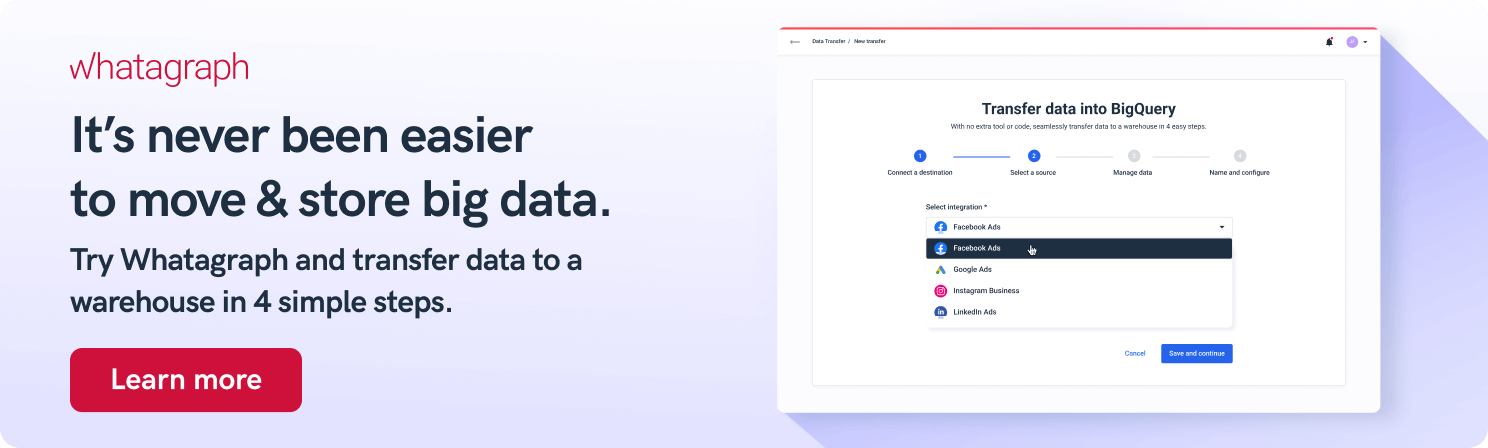
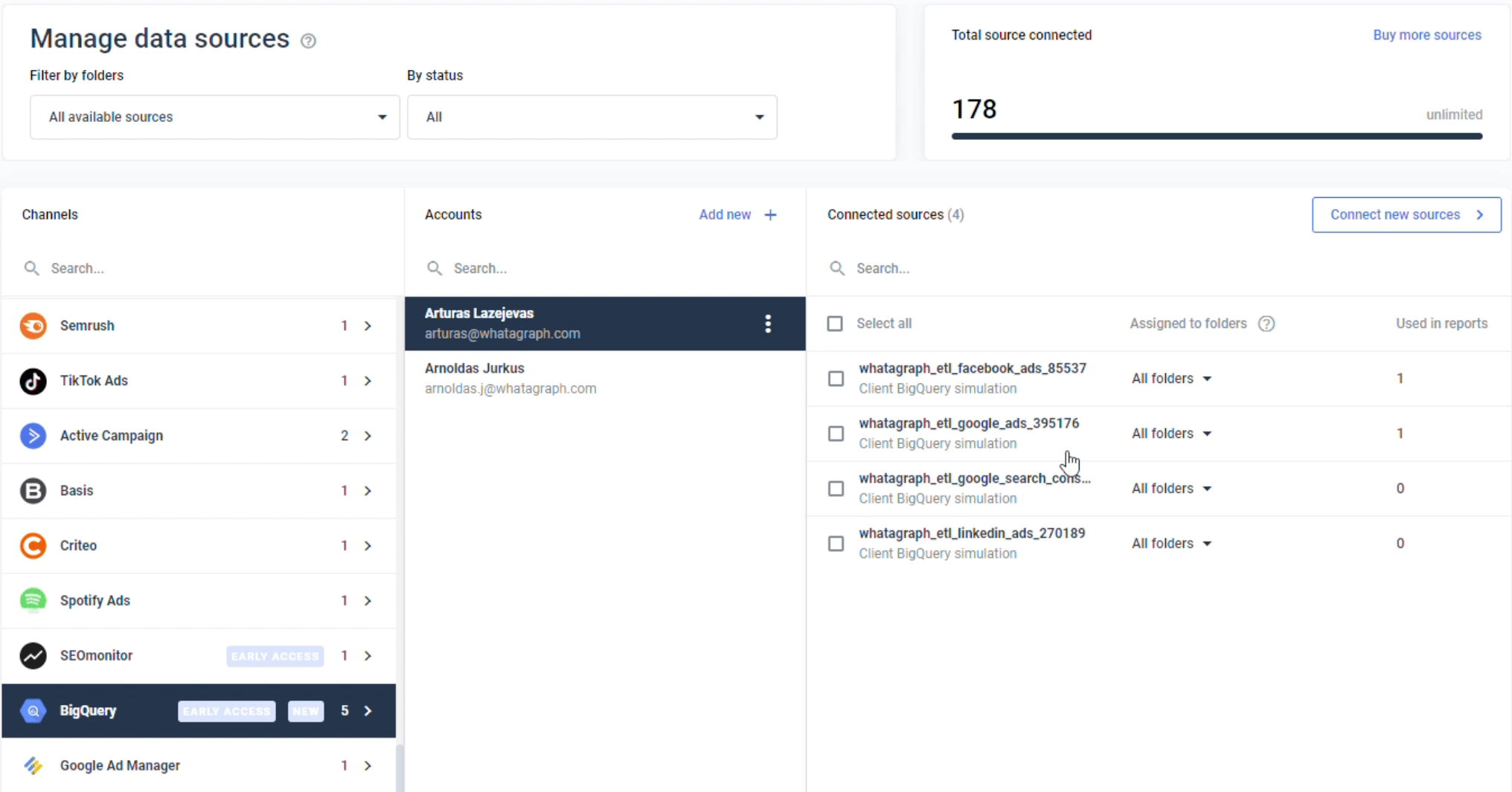
You can use Whatagraph instead. Connect your data sources once, and the data gets refreshed every time you need to create a report.
Maybe you need to create reports on multiple channels? One that combines data from different marketing platforms? Whatagraph allows you to connect them in one place instead of exporting and stitching data from Google Drive and Excel docs.
No code knowledge or data engineering is required.
Just connect your platforms once, and the data gets filled and updated automatically every time.
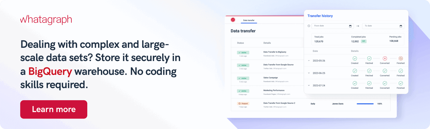
2. Transfer your data from your source to BigQuery
If you need to run complex analytical queries that go beyond simple aggregation and filtering, it makes sense to transfer your data to BigQuery for analysis and reporting. Actually, the “heavier” the BigQuery dataset, the more likely you are to gain valuable insights.
Manually transferring your data to BigQuery takes time, especially if you have hundreds of accounts and different user permissions and want to track metrics from multiple data sources.
Again, the Whatagraph here acts as a fully managed BigQuery connector that automates loading data from selected sources.
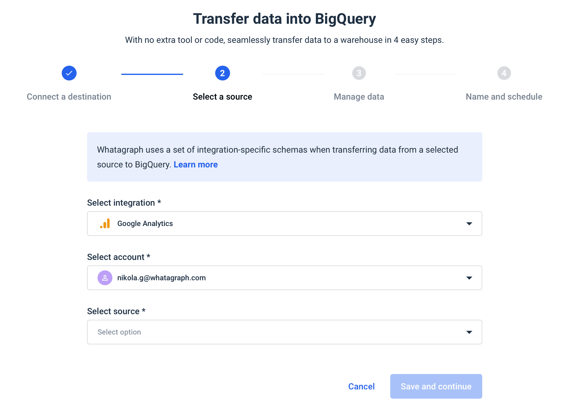
For example, start by transferring your Google Ads data to BigQuery:
1. Open Whatagraph and select the Data transfer tab. Click the Create new transfer button.
2. Enter the project ID and click Test connection. If the connection is successful, click Save and continue.
3. Select the integration from the dropdown. Click Google Ads.
4. Select an account and click Save and continue.
5. Choose the data points and dimensions you want to transfer and click Save and continue.
6. Name your transfer, select frequency, and click Create transfer.
And that’s it. Your Google Ads data is on its way to BigQuery.
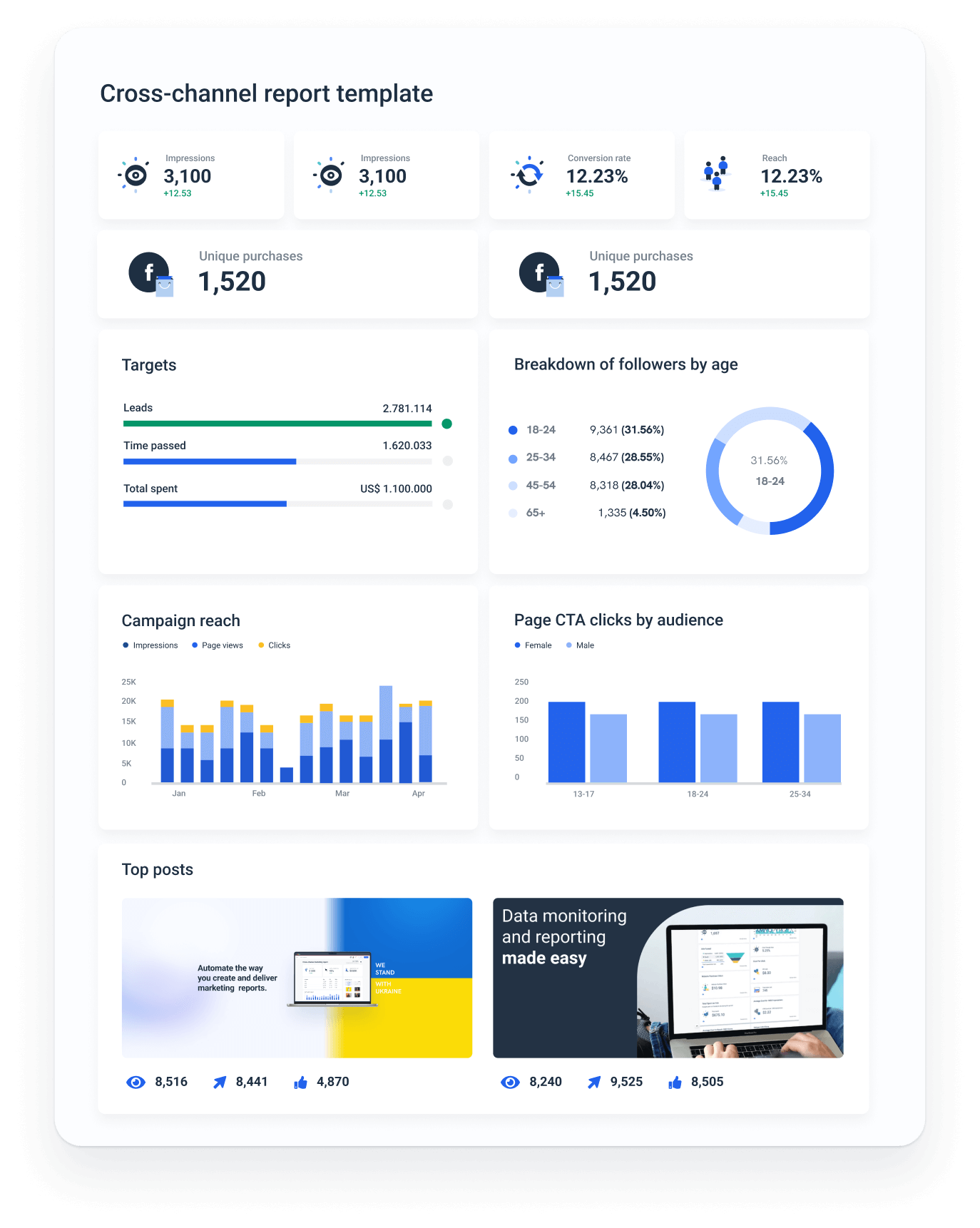
3. Visualize the data in a report
BigQuery is capable of analyzing large volumes of data using SQL. This is an excellent format for analysis, but the results are in tables which makes it challenging to present them.
To visualize your BigQuery data, you can use Whatagraph.
Whatagraph allows you to visualize any data that is available in your BigQuery account. This includes the data created by the Whatagraph transfer function and any other data source you may have.
To create a new report, select your BigQuery account and connect your sources.
Now you can drag and drop dimensions and metrics from your dataset to change and customize your report.
Once your report is created, the filter function at the top of your dashboard allows you to filter your dataset to show only a specific subset. You can drag fields into the filter as you’d drag them into your metrics or dimensions.
You can also change all the details you want, such as the placement of widgets, the colors of the design elements, your and your client’s logos, and much more.
You can white-label the report and remove the Whatagraph branding for the custom feel.
Conclusion
Google BigQuery reports allow you to tap into the analytic power of SQL queries and draw meaningful insights that move your business forward. To visualize BigQuery data, you need a third-party reporting tool like Whatagraph.
If you’re looking for an easy-to-use solution to connect data from various marketing sources, keep your marketing data safe, or want to visualize your BigQuery data, book a demo call and find out how Whatagraph can help.
Published on Jan 25 2023
WRITTEN BY
Nikola Gemes
Nikola is a content marketer at Whatagraph with extensive writing experience in SaaS and tech niches. With a background in content management apps and composable architectures, it's his job to educate readers about the latest developments in the world of marketing data, data warehousing, headless architectures, and federated content platforms.