
What is a Google Ads report template?
A Google Ads report template is a pre-built layout that pulls your campaign data into one structured, visual format - so you can track performance, spot what's working, and share clear results with clients or stakeholders.
For most agency teams, Google Ads reporting still looks like this:
❌ Log into the Google Ads account
❌ Export a CSV
❌ Paste it into a spreadsheet or Google Sheets
❌ Manually format the metrics and write a summary
❌ Repeat that process for every single client, every single reporting cycle
This process is slow, it's error-prone, and it eats hours that should go toward actual campaign optimization.
A well-built Google Ads report template gives agencies a repeatable way to:
- Track key Google Ads metrics like CPC, CTR, conversion rate, ROAS, and ad spend in one place
- Break down campaign performance by ad group, keyword, and landing page to see exactly where results come from
- Visualize trends over any date range without manually pulling Google Ads data every time
- Show clients the full picture - not just numbers, but what those numbers mean for their goals
- Share results through live dashboards, scheduled emails, or white-label PDFs
Most Google Ads reporting tools still make you do this manually - widget by widget, export by export.
Whatagraph IQ builds the full report for you, brands it to match your client, and writes the performance summaries automatically from your actual campaign data.
The hours saved are real. Maatwerk Online, one of the Netherlands' most established digital agencies, used to manage reporting across 100+ clients with a fragile stack of Supermetrics and Looker Studio. Dashboards were slow to load, connections broke without warning, and reports were bloated with metrics no one was using.
After switching to Whatagraph, they’re now saving 100+ hours every single month on reporting. In Lars Maat's words, Co-Founder at Maatwerk Online:
Whatagraph's AI saves time and energy for our marketing specialists. And the hours we're saving are just pure profit. We now have the time to focus on more strategic things that help both our agency and our clients grow.
What should be included in a Google Ads report template?
If you're building Google Ads reports for clients, your template needs to do more than surface metrics.
It needs to answer the question every client actually asks: Is my money delivering results?
We talked to Ameet Khabra, Founder of Hop Skip Media, and she breaks down the sections on a Google Ads client report template she has built on Whatagraph. Her take:
Most standard PPC report templates show traffic and cost data. This template is built around a different question: did the account generate qualified leads, at an acceptable cost, and can we trust the numbers? Those three things - results, efficiency, and data integrity - are what lead generation clients actually care about.
Here's how Ameet structures the template, section by section.
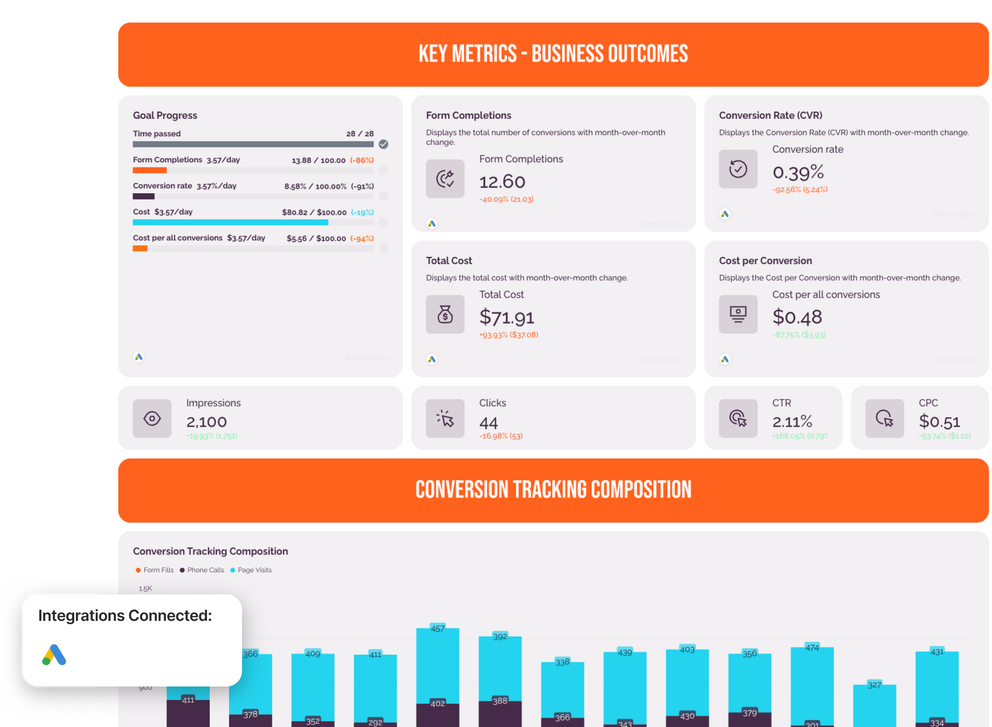
1. Key metrics: business outcomes and media health
The first thing a client sees when they open a report should immediately answer whether the campaigns are delivering results. Ameet splits this into two visual layers.
Business outcomes (shown first):
- Conversions - the total number of leads generated, displayed with month-over-month change and target tracking
- Conversion rate (CVR) - the percentage of clicks that turned into leads, so clients understand efficiency, not just volume
- Cost per conversion - how much each lead cost, which is what most clients actually care about
- Total cost - total ad spend for the period
Media health (shown after outcomes):
- Impressions - how many times ads were shown
- Clicks - how many people clicked through
- CTR - the ratio of clicks to impressions, useful for gauging ad relevance
- CPC - the average cost per click, a key signal for budget efficiency
Why separate them? Ameet is deliberate about this structure. Presenting delivery mechanics like CTR and CPC at the same visual weight as conversions causes clients to treat traffic as a success metric. Business outcomes come first.
Add a goal widget to show progress toward agreed targets - clicks, conversions, cost, or ROAS - for each client or campaign.
With Whatagraph IQ Summaries, you can also auto-generate performance summaries in 18 languages directly from your report data. No copying data into ChatGPT, no hallucinations - the AI reads the actual data sources in your report.
2. Conversion tracking composition
This section uses a stacked bar chart showing which conversion actions made up the total conversion count each month over the last 13 months:
- Form fills
- Phone calls
- Page visits
- Any other tracked conversion actions in the account
Google Ads conversion tracking is not standardized. Actions can be added, removed, or quietly changed without any notification.
A drop in conversions could mean performance declined - or it could mean a tracking action was simply turned off. Making those changes visible before analysis begins stops clients from drawing the wrong conclusion.
This is one of the most overlooked sections in most Google Ads report templates. Including it signals to clients that you're watching the data, not just the results.
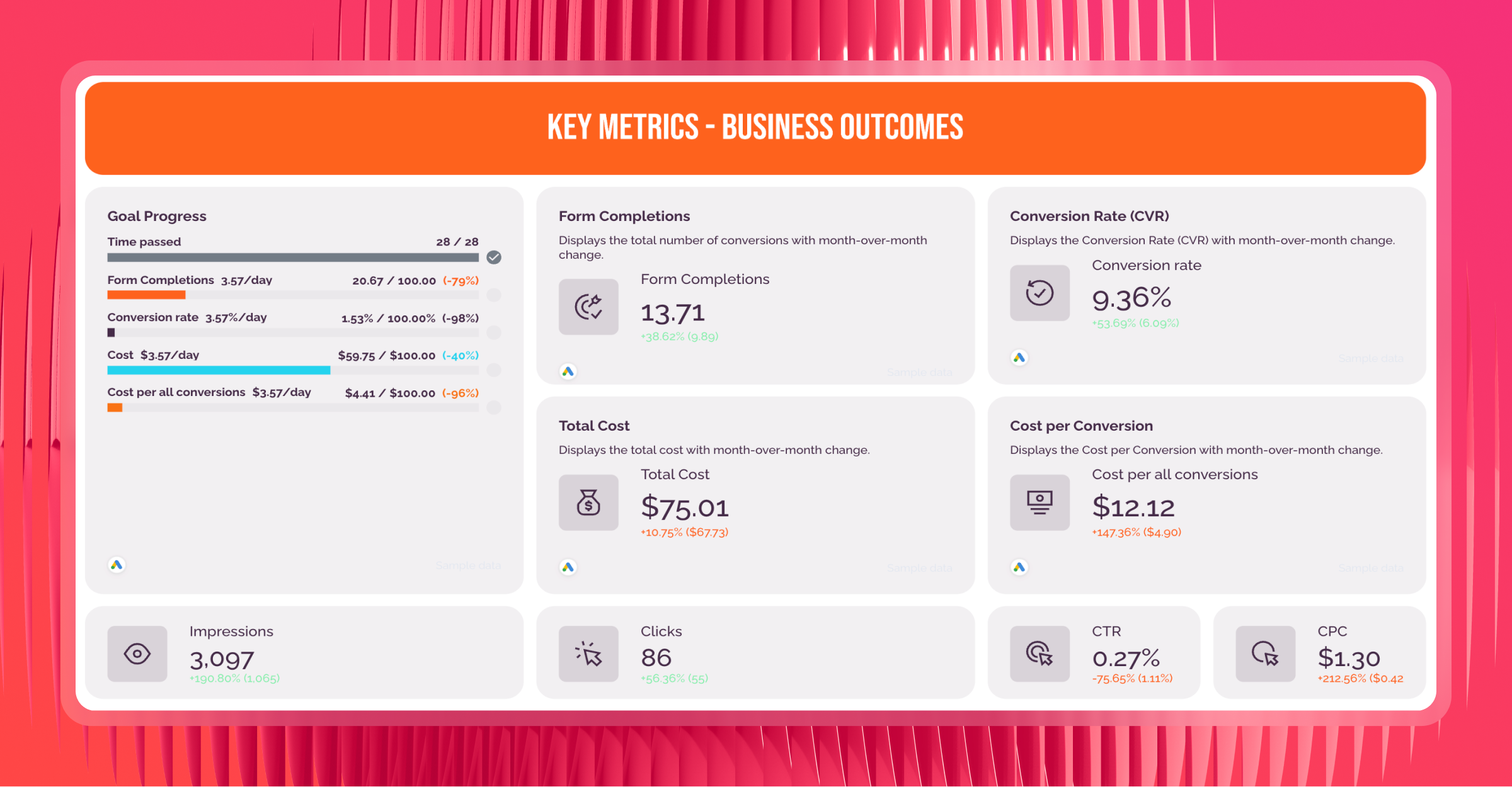
3. Performance by campaign
This section breaks down how each Google Ads campaign contributed to the overall lead total.
Show using a horizontal bar chart, sorted from highest to lowest conversion volume:
- Conversions per campaign - how many leads each campaign generated
- Conversion rate per campaign - the percentage of clicks that converted for each campaign
Why show both? Two campaigns with the same number of leads can tell completely different stories if one converted at 8% and the other at 1%. Volume alone misleads budget decisions. Showing conversion rate alongside volume gives clients - and account managers - the full picture before reallocating ad spend.
This view directly informs decisions about where to scale, where to pause, and where ad copy or landing pages need work.
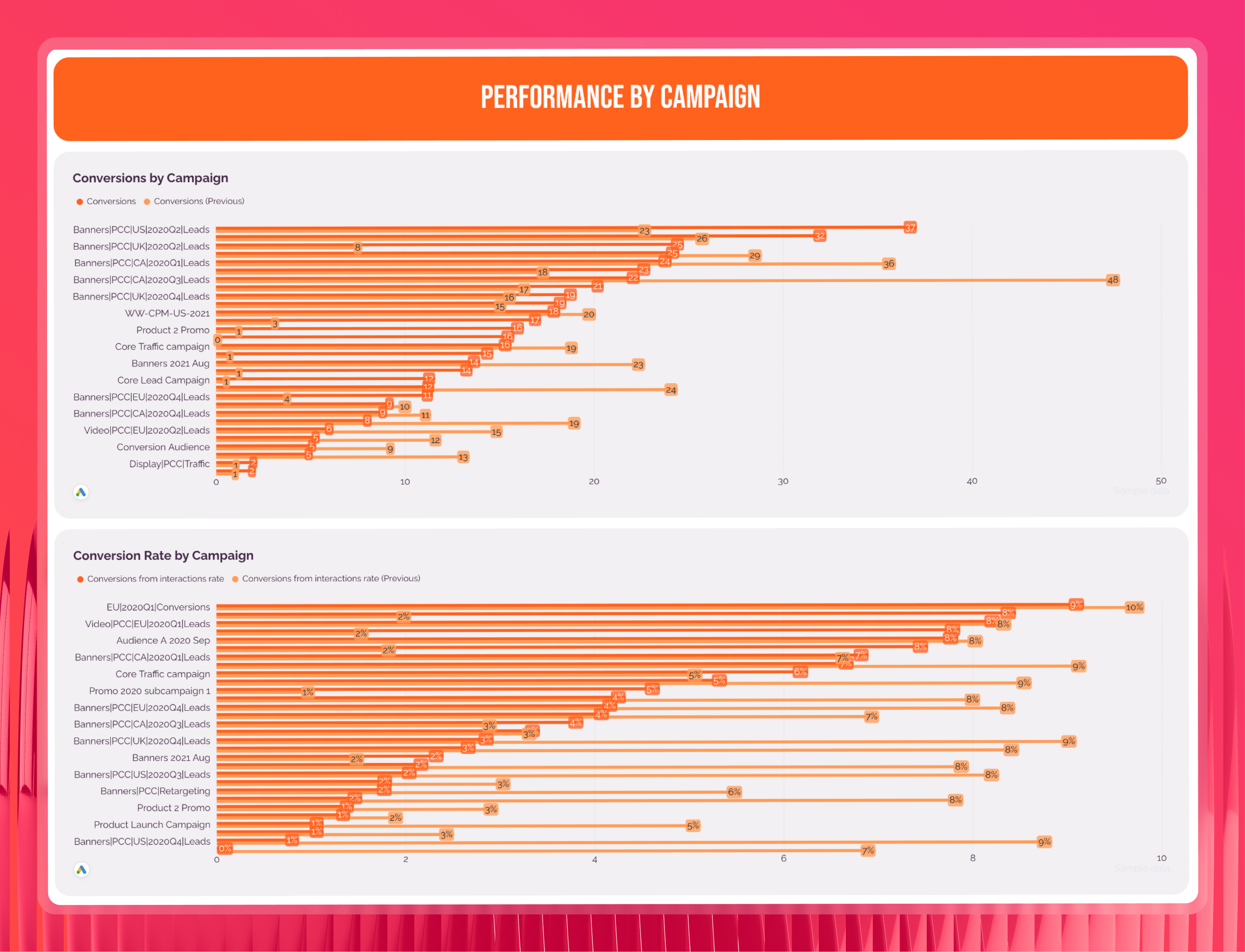
4. Keyword performance
This section surfaces the actual search queries that drove conversions, not just the keywords the account was bidding on.
Use a top 10 table showing:
- Search term - what people were actually searching when they converted
- Conversions - how many leads that search term generated
- Clicks - volume of traffic from that term
- CTR - how relevant the ad was to that query
- Cost per conversion - efficiency of that term, which drives keyword bidding decisions
Why search terms over keywords? The gap between what you bid on and what actually converts is where most wasted ad spend hides. This view is the foundation for negative keyword decisions, match type adjustments, and identifying high-intent queries worth building dedicated campaigns around.
5. Performance Max visibility
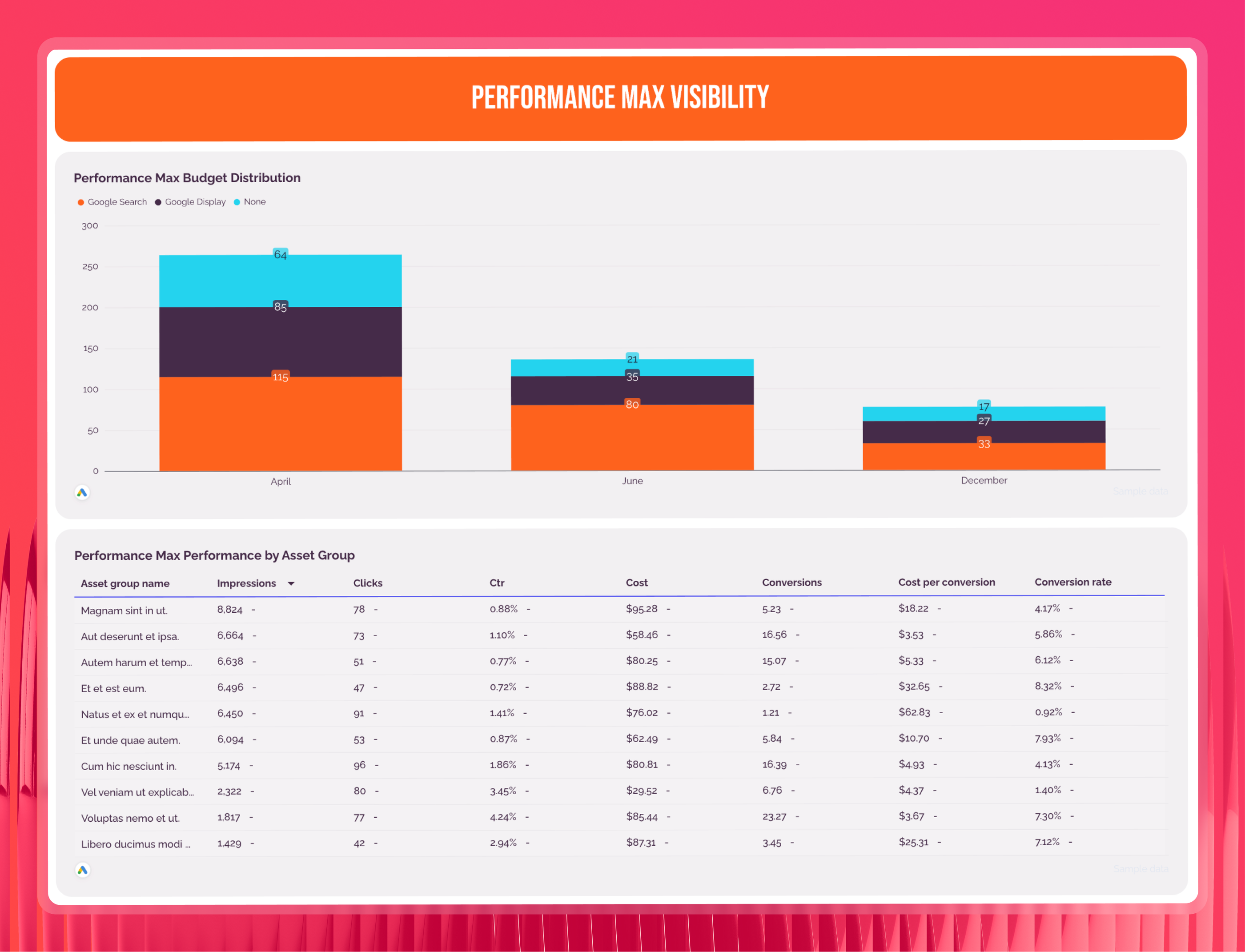
This section only appears when Performance Max campaigns are active in the account.
Show using a stacked bar chart and asset group breakdown:
- Channel split - how Performance Max is distributing spend across Search, Display, and YouTube each month
- Ad asset group performance - which asset combinations are generating conversions and at what cost
Performance Max campaigns run autonomously across multiple channels. Without visibility into where Google's algorithm is placing budget, it's impossible to know whether it's prioritizing placements that generate real leads - or optimizing for cheaper clicks that don't convert. This section keeps the algorithm accountable.
6. Key metrics by week
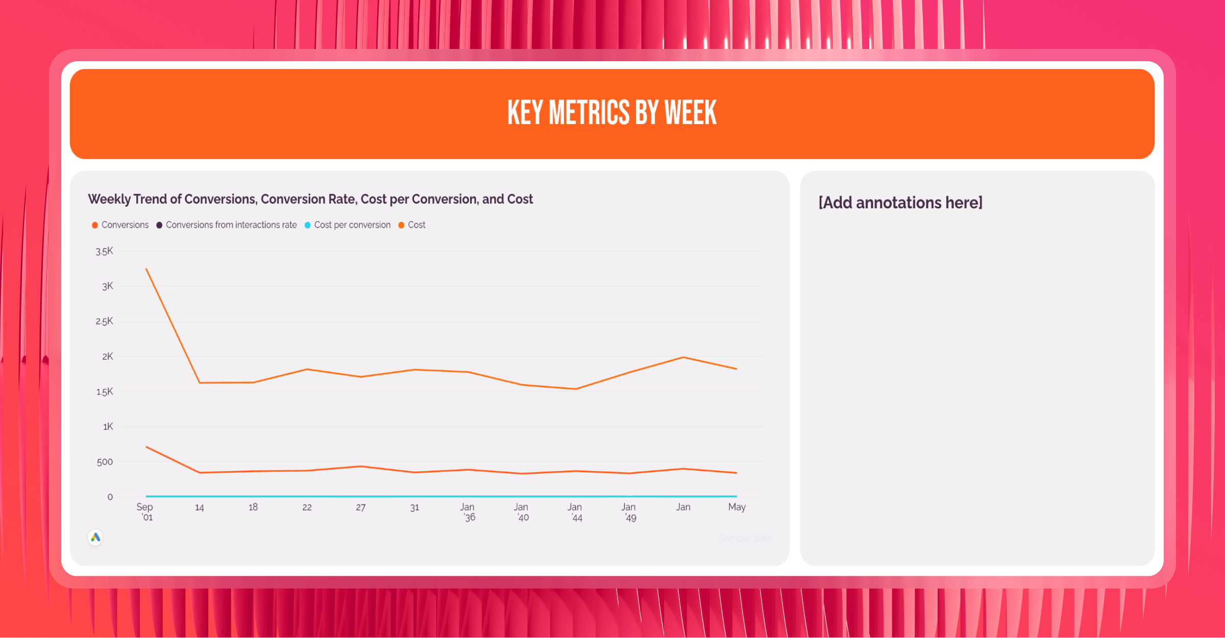
Monthly totals can hide what's really happening inside a campaign. This section plots performance week by week over the last 13 weeks.
Show as a line chart:
- Conversions per week - to spot when lead volume shifted
- Conversion rate per week - to see whether efficiency changed alongside volume
- Cost per conversion per week - to catch any cost increases before they compound
- Total cost per week - to flag budget pacing issues early
Ameet recommends showing the weekly view instead of daily, as daily data for lead gen campaigns has too much natural noise
Leads typically slow on weekends regardless of campaign health. Weekly data smooths that out so clients see genuine trends rather than reacting to a single slow Monday. Add analyst annotations to explain unusual weeks, such as budget changes, new landing pages, or seasonal shifts.
7. Audience insights
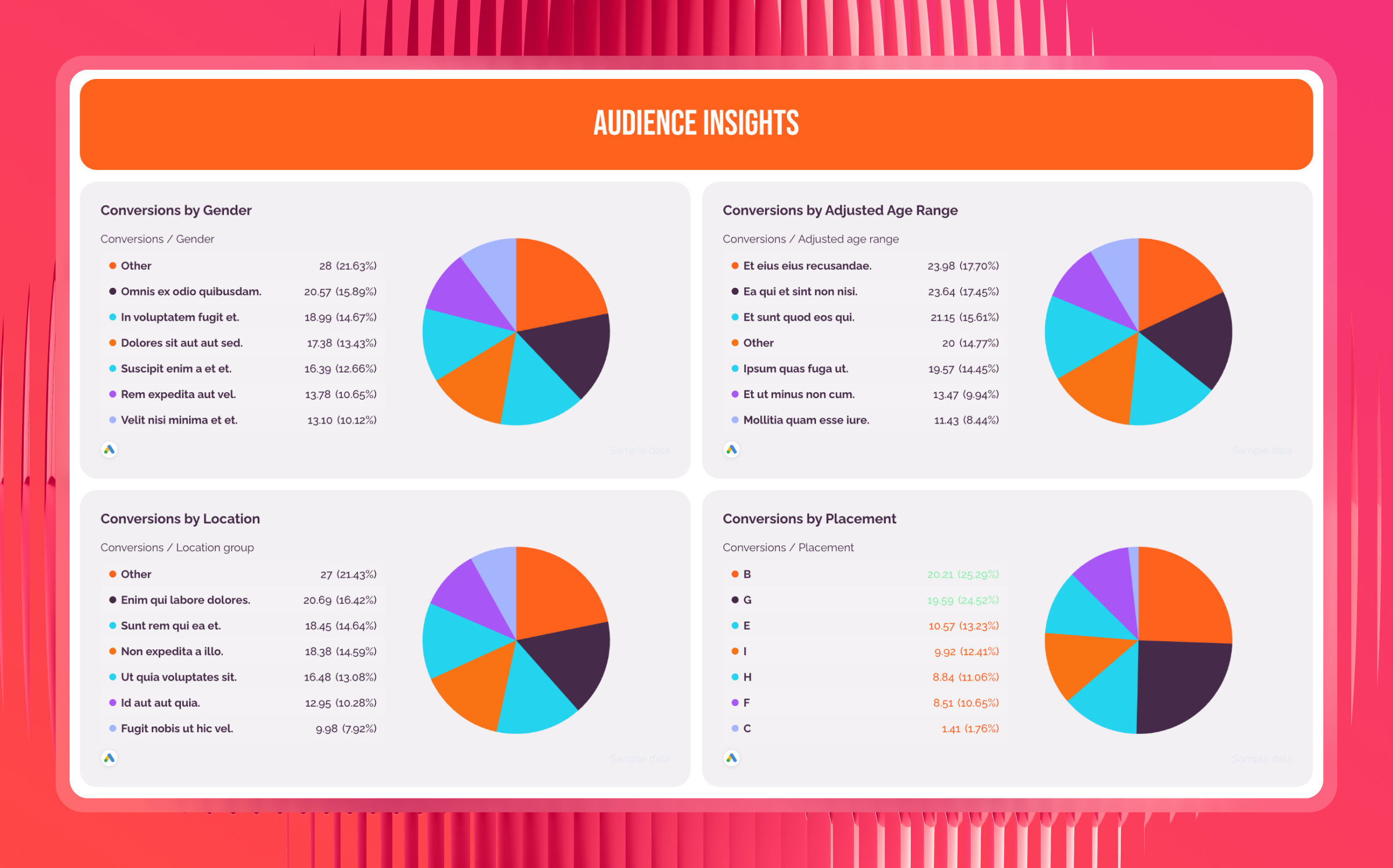
This section breaks down performance by who is converting - not just how many.
Show using bar charts or pie charts segmented by:
- Gender - which gender drives more conversions and at what cost per lead
- Age group - which age brackets convert most efficiently, to inform bid adjustments
- Location - which geographic areas generate the most leads, and which are consuming budget without results
- Placement - where the ad appeared when it drove a conversion
Demographic data directly informs where to increase bids and where to cut them. Two age groups might have the same number of conversions but very different costs per lead. This section makes those differences visible and actionable.
8. Overview and next steps
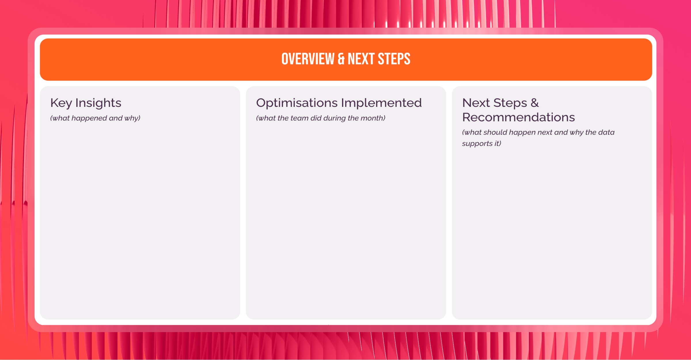
This is the section clients actually read. Everything else in the report builds toward it.
It covers three things:
- Key insights - what happened during the month and why, in plain language
- Optimizations implemented - what the account manager actually did during the reporting period
- Next steps and recommendations - what should happen next, backed by the data in the marketing report
This is the only section that requires analyst input. Everything else is automated. With Whatagraph IQ, you don't need to write it from scratch - ask AI to generate the performance summary based on the data on your report, choose the format and length, then edit for tone before sending. Since IQ reads directly from your report data, there are no hallucinations.
As Stephen Samuel, Founder of NexFusion, puts it:
The biggest mistake is dumping a spreadsheet of metrics with no context. Clients do not need to see every number, just the ones that matter. A simple fix is to create a one-page executive summary with three clear sections: what is working, what needs improvement, and the action plan for the next month.
Want to replicate this exact report structure? Grab the Google Ads report template co-created with Ameet and connect your data in minutes.
What are the key metrics to include in a Google Ads report template?
The metrics you track in a Google Ads report depend on your campaign goals. But across all account types, there are five core categories worth monitoring.
Here's a breakdown of what each covers and why it matters.
1. Business outcome metrics
These are the numbers clients open the report to see. Lead volume and cost efficiency come first - before any traffic or delivery data.
- Conversions - the total number of leads generated - the primary measure of whether Google Ads is working
- Conversion rate (CVR) - the percentage of clicks that turned into conversions
- Cost per conversion - how much each lead or sale costs; the metric most clients care about most
- Total cost - total ad spend for the period; gives context to every other metric and tracks whether you're on pace with the budget
2. Media health metrics
Media health metrics explain how the results were delivered.
- Impressions - how many times your ads were shown; useful for gauging overall reach
- Clicks - the number of users who clicked through
- Click-through rate (CTR) - the ratio of clicks to impressions; a signal of how relevant your ad copy is
- Cost per click (CPC) - the average amount paid per click; tracks auction competitiveness and flags rising costs
3. Campaign and keyword performance metrics
These tell you where results are actually coming from - and where budget is being wasted.
- Conversions by campaign - how many leads each Google Ads campaign generated; the starting point for any budget reallocation decision
- Conversion rate by campaign - the efficiency of each campaign
- Search term performance - the actual queries that drove conversions, not just the keywords you bid on
- Clicks, CTR, and cost per conversion by search term - the supporting metrics that tell you whether a search term is cost-efficient enough to scale
4. Audience insight metrics
These show who is converting - and who is consuming budget without results.
- Conversions by gender - breaks down cost per lead by gender; informs when one segment is consistently more efficient
- Conversions by age group - identifies which age brackets drive the most leads at the lowest cost; useful for narrowing targeting
- Conversions by location - shows which geographic areas are generating the most leads; directly informs geographic bid adjustments
- Conversions by placement - reveals where ads appeared when they drove a conversion
5. Weekly trend metrics
Monthly totals are useful for client reporting, but they can hide what's actually happening inside a campaign period.
- Conversions per week - spots when lead volume shifted, so you can connect the change to a specific action or external factor
- Conversion rate per week - tracks whether efficiency improved or declined alongside volume changes; a falling CVR with stable spend is an early warning sign
- Cost per conversion per week - catches cost creep before it compounds into a month-end problem
- Total cost per week - flags budget pacing issues early, particularly for accounts with monthly spend caps