8 Best Looker Studio Alternatives in 2026: Reviews & Pricing
Frustrated with Looker Studio? We get it.
We've talked to dozens of marketers who say Looker Studio “drives them insane” and honestly, we don’t blame them. Looker Studio is slow, clunky, and riddled with data inconsistencies and breakages.
In this article, we'll be sharing “insider” insights on what these marketers say about Looker Studio and what tools they consider when looking for an alternative.
You'll read:
- The shortcomings of Looker Studio
- 8 best Looker Studio alternatives
- Features, pricing, and reviews for each tool

Mar 03 2026●10 min read


Looker Studio gives you the illusion of being “easy to use” and “free” but the reality is quite different. Here are the biggest complaints we hear about Looker Studio from marketers:
❌ Hidden costs: While it’s true that Looker Studio is free for their 21 native integrations (which are Google-based platforms), you’ll need to buy 3rd party connectors if you want to connect to non-Google-based tools. The total cost can come down to 1000s of dollars a month if you’re a large agency.
And if you want necessary features like “automated report sharing” (which is free on Whatagraph), you’ll need to opt for Looker Studio Pro, which costs $9/user/project. Check out our Looker Studio pricing guide to learn more.
❌ Connection breakages: Looker Studio relies on third-party connectors to bring in data from non-Google platforms, and users online say they break very often. These connectors also have different refresh times and different levels of integration, which can lead to data inconsistencies in your reports. You can read more about Looker Studio connectors here.
❌ Slow: Looker Studio has a 6-minute limit on handling queries, which means reports with large volumes of data, widgets, and charts take a long time to load. This not only makes report editing a hassle for your team but also frustrates clients who need to review these reports.
❌ Difficult to use: Looker Studio’s report-building interface is clunky and confusing with different widgets and menu items that can be intimidating to first-time users. Many users online say it’s difficult to get all your data connected properly and create charts and graphs on Looker.
Most marketers we’ve talked to had to hire dedicated data engineers or an implementation agency to create and maintain reports.
❌ No AI insights: In Looker Studio, you need to summarize each report manually to unearth actionable insights and next steps.
❌ No customer support: Unless you pay more for Looker Studio Pro, you’re left to online discussion forums and Google’s unwieldy help documentation, which is often difficult for a non-technical person to understand.
—
Sounds like a lot? That’s what we’re here for.
In this article, we’ll take you through 8 best Looker Studio alternatives that are easier to use, faster, and more stable.
8 Best Looker Studio Alternatives in 2026
In a nutshell, here are the 8 best Looker Studio alternatives we’ll review in this article:
- Whatagraph
- Klipfolio
- DashThis
- Tableau
- Databox
- PowerBI
- AgencyAnalytics
- Geckoboard
Don’t want to read through walls of text? Here’s a summary table:
| Features |
|

|

|
|

|
|

|

|
|---|---|---|---|---|---|---|---|---|
| Ease of Use | Easy | Hard | Easy | Medium | Medium | Hard | Easy | Easy |
| No. of out-of-the-box Data Connectors | 55+ | 130+ | 34+ | 100+ | 100+ | 100+ | 80+ | 90+ |
| Custom API Access |
|
|
|
|
|
|
|
|
| Data Blending |
|
|
|
|
|
|
|
|
| Custom Metrics and Dimensions |
|
|
|
|
|
|
|
|
| Custom Reports and Dashboards |
|
|
|
|
|
|
|
|
| Campaign Overview and Monitoring |
|
|
|
|
|
|
|
|
| White-labeling |
|
|
|
|
|
|
|
|
| Data Update Frequency | Every 30 mins across all integrations and pricing plans | Depends on your pricing plan, from 4 hours to 30 minutes | Once a day or on-demand update | Default is every 12 hours but you can set custom frequencies | Depends on APIs and your pricing plan, from 1 to 24 hours | Depends on whether the data is imported or connected via DirectQuery/Live Connection, from 8 times a day to 1 second | Depends on APIs, but SEO rankings update every 24 hours | Depends on data source, from 1 to 60 minutes |
| Data Segmentation and Filtering |
|
|
Only for select data sources |
|
|
|
|
|
| Alerts and Notifications |
|
|
|
|
|
|
|
|
| Multi-Client Management |
|
|
|
? |
|
Limited |
|
|
| User Management | Admin, Manager, or Editor roles | Account Administrator, Klip Viewer, Klip Editor | Every user of the same account are considered "Admins" | Creator, Explorer, or Viewer roles | Administrator, Editor, User, or Viewer roles | Admin, Member, Contributor, or Viewer | Staff User or Client User | Admin and View Only roles |
| Automated Report Sharing |
|
|
|
|
|
|
|
|
| Data Export | PDF, XLS, CSV | Export dashboards as PDF or image files. Export only individual Klips as CSV | PDF only | PNG, PDF, CSV | PDF, JPG | Excel, CSV, PDF | PDF, CSV |
|
| AI Insights |
|
|
|
|
|
|
|
|
| Customer Support | Live chat, email, Help Center for all pricing plans | Email, Help Center | Email, Help Center for all pricing plans | Tableau community forum, Help Center, Email, Consulting services (for a fee) | Live chat, email, Help Center | Community forums, Microsoft Learn documentation, ticket-based support | Live chat, Email, Help center | Live chat, Email, Help Center |
| Dedicated Customer Success Manager |
|
|
|
? |
|
|
|
|
| Data Security and Compliance | ISO 27001, Enterprise SSO, GDPR compliant, AES-256 encryption, Two-factor authentication, AWS hosted servers | AWS hosted servers, 2048-bit RSA key access for servers, no passwords, SSL, RBAC | Encrypted URLs, Password protection, Restrict IP addresses, GDPR compliant | MFA, SSL/TLS encryption, ISO 27001, ISO 27012, ISO 27018, GDPR and CCPA compliant | ISO 27001, GDPR complaint, SSL encryption, passwords stored in virtual vault | AES-256 encryption, HTTPS/TLS 1.2, ISO/IEC 27001, 27017, 27018, multi-factor authentication (MFA) | MFA, Enterprise SSO | AWS hosted servers, HTTPS (128-bit TLS), RBAC, PCI DSS compliant |
|
Pricing
(with $$$ being the highest)
|
$$ | $$ | $ | $$$ | $ | $$ | $ | $ |
Let’s dive into each of these tools.
1. Whatagraph
Best for: Marketing agencies and in-house marketing teams that want AI-powered reporting with flexible prices.
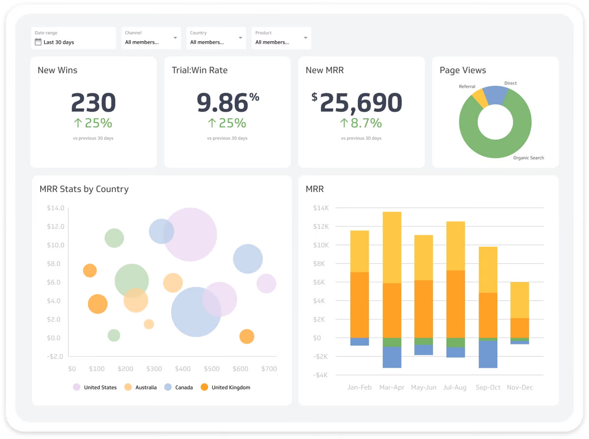
If you’re looking for an easier, faster, and more stable Looker Studio alternative, Whatagraph is the best choice.
Whatagraph is an easy-to-use marketing intelligence platform that automates the entire reporting workflow—from data connection and cleaning to cross-channel visualization and AI-driven insights—all without writing SQL or managing data pipelines.
Here’s how it works:
- Connect: Connect your cross-channel data with 55+ native integrations that pull directly from paid media, SEO, ecommerce, analytics, email, and CRM platforms, with no third-party connector layer to maintain.
- Organize: Automatically standardize naming across platforms, create custom formulas and reusable transformations, and blend metrics across channels to generate unified KPIs without manual clean-up.
- Go from prompt to report with Whatagraph IQ: Build a 10-page client report just by typing a sentence in natural language. The AI handles the structure, the metrics, and the layout in under 30 seconds.
- Customize: Apply brand styling automatically with Whatagraph IQ Theme by uploading a website screenshot or entering brand details. Logos, colors, and typography are applied across the report, and you can publish reports on a custom domain for a fully white-labeled experience.
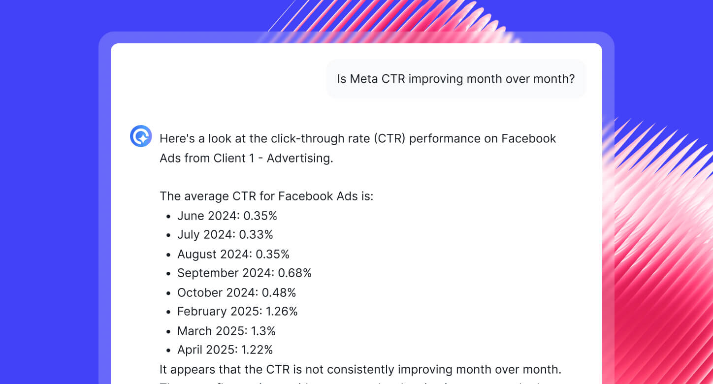
- Surface insights: IQ generates AI summaries based on performance trends, and IQ Chat allows you (and your clients) to ask plain-English questions directly inside your reports to explore the underlying data.
- Automate delivery: Schedule recurring reports, share live dashboard links, export to PDF, Excel, or CSV, or sync data to BigQuery and Looker Studio for additional analysis.
- Scale with client management tools: Use Spaces, linked templates, and client-level filters to manage multiple accounts efficiently. Update a template once, and changes roll out across all connected reports.
Kim Strickland, Digital Marketing Specialist at Peak Seven, was trapped in a setup using Looker Studio, Funnel, and Supermetrics.
Kim's first Looker report took 40 hours to build. She shared with us:
Looker Studio was slow and always breaking. The data wouldn’t pull through, or it would pull through incorrectly. It was frustrating, time-consuming, and a constant guessing game
She spent the majority of her time triple-checking filters and re-verifying connections rather than analyzing data. After testing platforms like TapClicks and Domo, Kim migrated to Whatagraph—and the entire migration took just two hours.
With a dedicated Customer Success Manager (the amazing Misha Johanna) guiding the way, she started with Whatagraph’s Smart Builder to spin up reports instantly. As she gained momentum, she took the wheel herself, designing custom dashboards that perfectly reflected Peak Seven’s brand.
A process that used to devour her entire week now takes less than an hour per report.
With Looker Studio, everything was muddled. But Whatagraph has opened up transparency and communication. Whatagraph is now our Bible—both for our clients and internal teams.
This is how you know you’ve outgrown Looker Studio.
As for AI features, Looker Studio’s new Gemini integration is brilliant if you know what to ask—it helps you write SQL code and Regex formulas.
But Whatagraph IQ is designed for the person who needs to get a report out before a 10:00 AM meeting. You don't write code; you use natural language prompts.
And thanks to these powerful AI features and an easy-to-use interface, agencies like Maatwerk Online are saving 100 hours a month on reporting. Here’s what Lars Maat, Co-Founder, says:
But how does Whatagraph compare against Looker Studio exactly? Let’s take a look:
Looker Studio vs. Whatagraph: Head-to-Head Comparison
Our Product team did extensive research on how Whatagraph compares against Looker Studio and you can find the full breakdown here.
In a nutshell, here are five key ways Whatagraph outperforms Looker:
1. Stable, fast, and all-in-one platform
Looker Studio relies on third-party connectors to pull data from channels and sources that are not in the Google ecosystem (e.g. Facebook Ads, Salesforce, Shopify).
Third-party connectors are unstable, finicky, and prone to data breakages and inconsistencies.
Looker Studio also comes with a 6-minute limit on handling queries, which means if your reports have large volumes of data or widgets, they’ll take up a long time to load.
In fact, slowness and connection breakages are the two biggest complaints we hear about Looker Studio. Here’s a review from G2.com:
Whatagraph eliminates these two pain points.
Our data integrations are fully-managed, which means they’re more seamless, stable, and reliable. And our Product engineers regularly maintain these integrations so there would be less breakages and outages.
Fully-managed integrations also mean if there are bugs, our Product team can resolve them quickly without having a third-party company involved.
In terms of speed, you can work with 10 sources and 100 widgets at the same time without slowing down the platform.
Our users love how seamless, stable, and fast the platform is. Tanja Keglić, Performance Marketing Manager at Achtzehn Grad, says:
We don’t have any connection issues on Whatagraph at all. We just connected the platforms once, and that was it. Whatagraph is also very, very quick when loading the data.
2. Easier to use
Looker Studio is slow, clunky, and incredibly difficult to use for non tech-savvy users, taking you anywhere from 1-3 hours to create a report from scratch.
Marketers we’ve talked to say they needed to hire a dedicated data engineer to create and edit Looker Studio reports. This means extra costs, and if the engineer leaves, you're left with complicated reports that are hard to manage.
Here’s what one user said on Capterra:
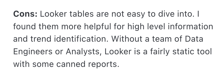
This is mainly due to Looker Studio’s clunky and confusing user interface. For instance, this is what a report “canvas” looks like as you start building one—I don’t know about you but this immediately overwhelmed me as a non-tech savvy person.
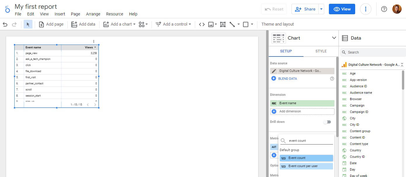
Source: Digital Culture Network
Looker Studio reports are also very static. You’ll need to go through complicated steps to resize widgets, graphs, and charts, or to add images and shapes.
All in all, this review really captures how difficult it is to create reports on Looker:

In contrast, we built Whatagraph so that any marketer—not just data engineers—can create professional, client-ready reports in seconds.
Thanks to Whatagraph IQ, you no longer have to manually drag widgets, tweak filters, or fight clunky layouts:
- IQ Report Creation – Just type what you need (“Build me a GA4 performance dashboard” or “Show ROAS by channel”) and Whatagraph instantly generates a full report. Need a specific chart? Ask, and IQ builds the exact visualization for you.
- IQ Summary – Get plain-language insights automatically written for you, instead of manually writing them.
- IQ Chat – Ask questions about your data in plain language and get instant answers right inside your report.
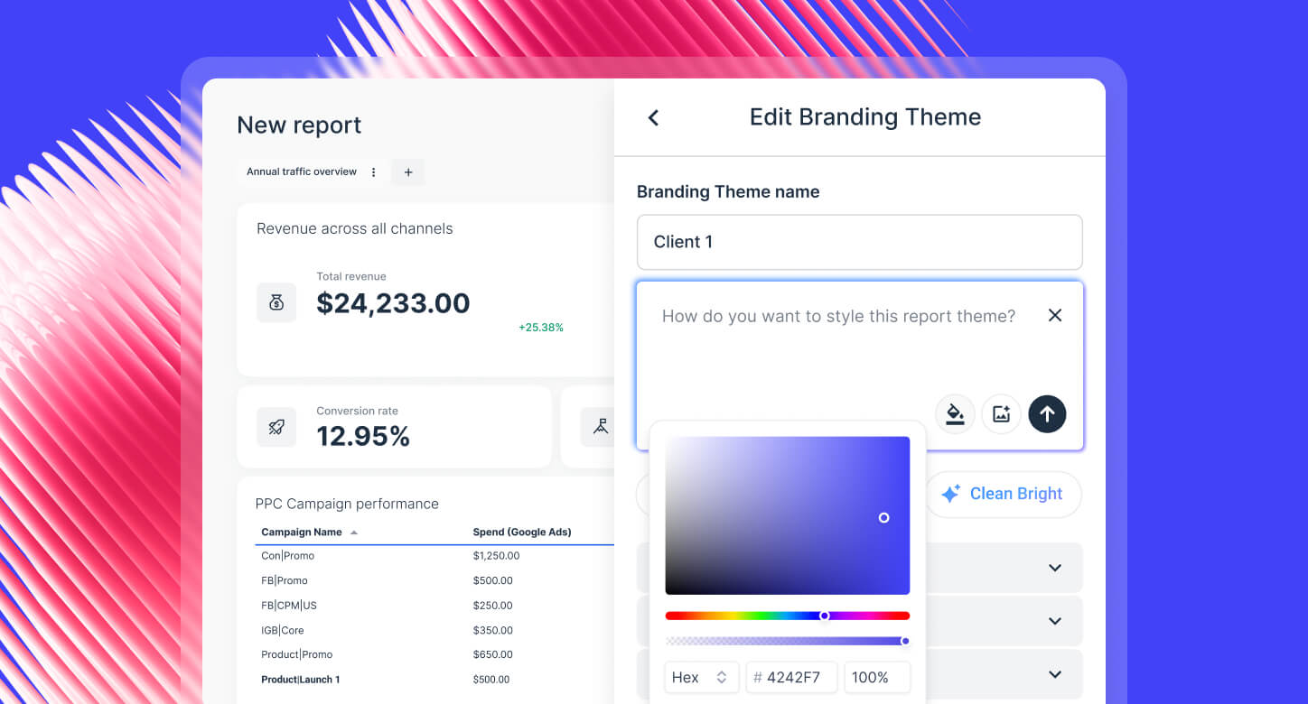
- IQ Themes – Brand your reports in seconds. Upload a logo or image and IQ generates a matching theme, complete with fonts and HEX codes.
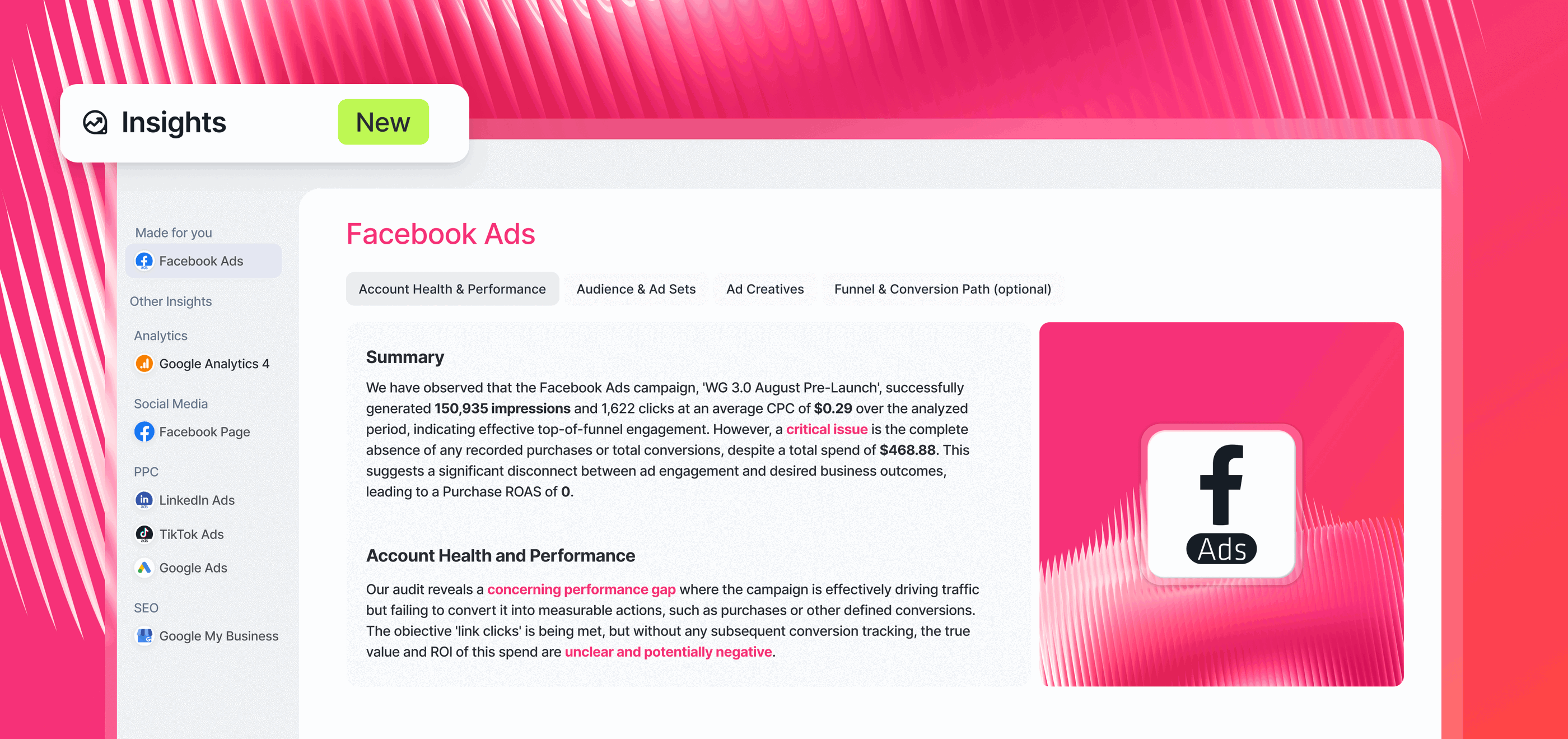
For teams that want immediate answers, the Insights Space provides out-of-the-box reports for key channels such as Facebook Ads. Each space highlights:
- Account health and performance
- Audience and ad sets
- Ad creatives and placements
- Funnel activity and conversion paths
These reports also feature AI-driven insights: summaries of performance, detected changes, and recommendations surfaced directly inside the dashboard.
 Compare this to Looker Studio, where every chart, filter, and style tweak is manual and time-consuming.
And the difference shows in the numbers:
- Agencies like Maatwerk Online save 100+ hours per month by automating reporting with Whatagraph.
- Wise Pirates scales reporting across 500+ reports and says Whatagraph is “perfect for marketing teams with limited technical knowledge.”
- Dtch. Digitals cut client churn by 50% after switching from Looker Studio, calling Whatagraph “much smoother”.
Get started with Whatagraph for free.
3. Powerful, but easy data organization features
If you’ve ever tried to organize data in Looker Studio, you know the pain:
❌ You’re limited to 5 data sources and 10 dimensions in a data blend.
❌ You can’t save and reuse custom metrics and blends in two different widgets without recreating them from scratch.
❌ Many actions are limited to the widget level, with no way to scale them.
What’s more, users online also complain about data breakages when creating blends, adding to the frustration.

With Whatagraph, there are no limits to:
- How many data sources you can blend together
- How many custom metrics and dimensions you can create
You can also save these custom blends, metrics, and dimensions and re-use them across all your reports and dashboards. No need to start from scratch.
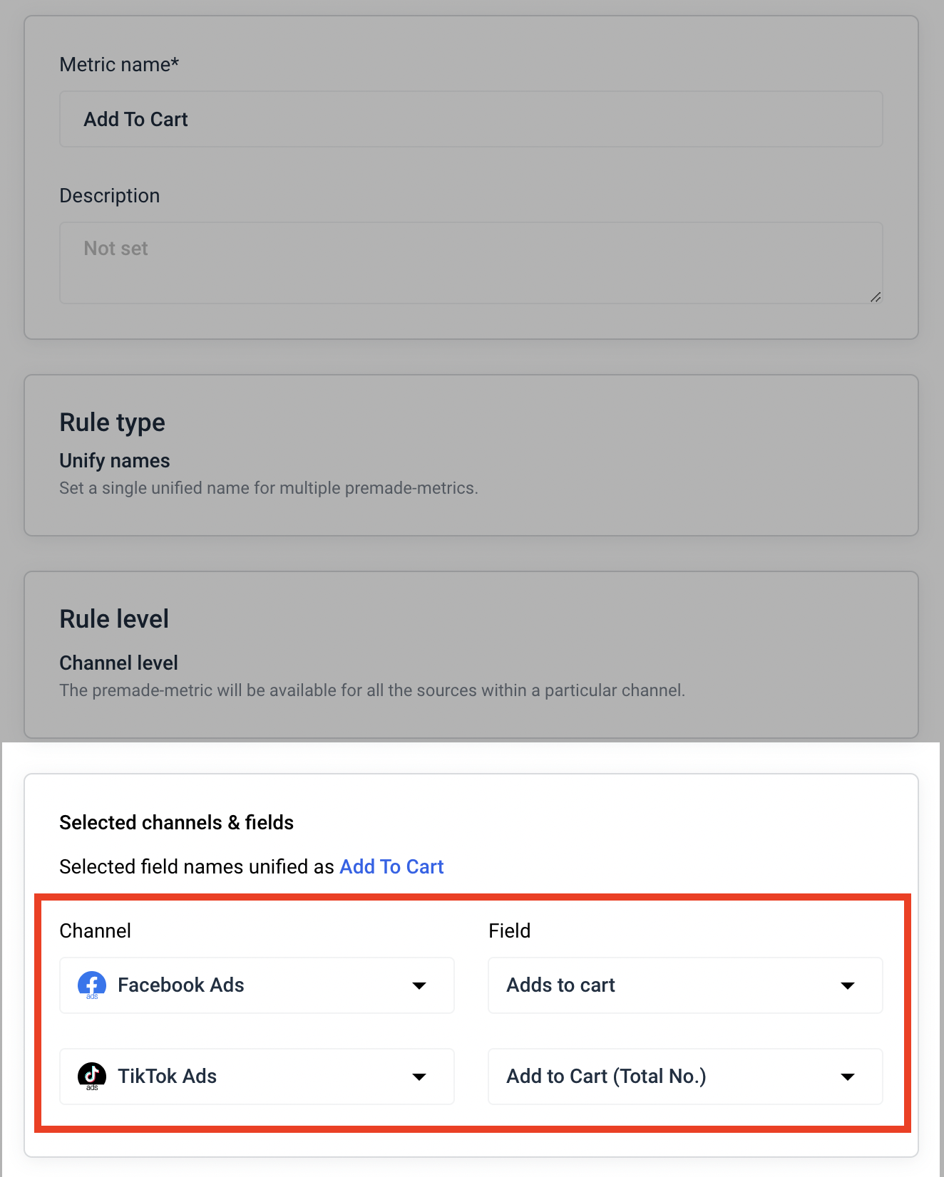
For instance, say you want to report on the total number of “Add to Cart” from both Facebook Ads and TikTok Ads. You can set up a custom metric on Whatagraph, like so:
And with IQ Dimensions (available on more advanced plans), you don’t even have to do the heavy lifting yourself. It will:
- Create custom blends automatically. Just describe what you need—like “combine all spend from Meta, TikTok, and Google Ads into one unified Paid Media metric”—and IQ builds the blend for you.
- Build custom metrics on the fly. Want ROAS across channels? Or a funnel KPI like Add-to-Cart conversions? IQ can generate them instantly, without formulas or coding.
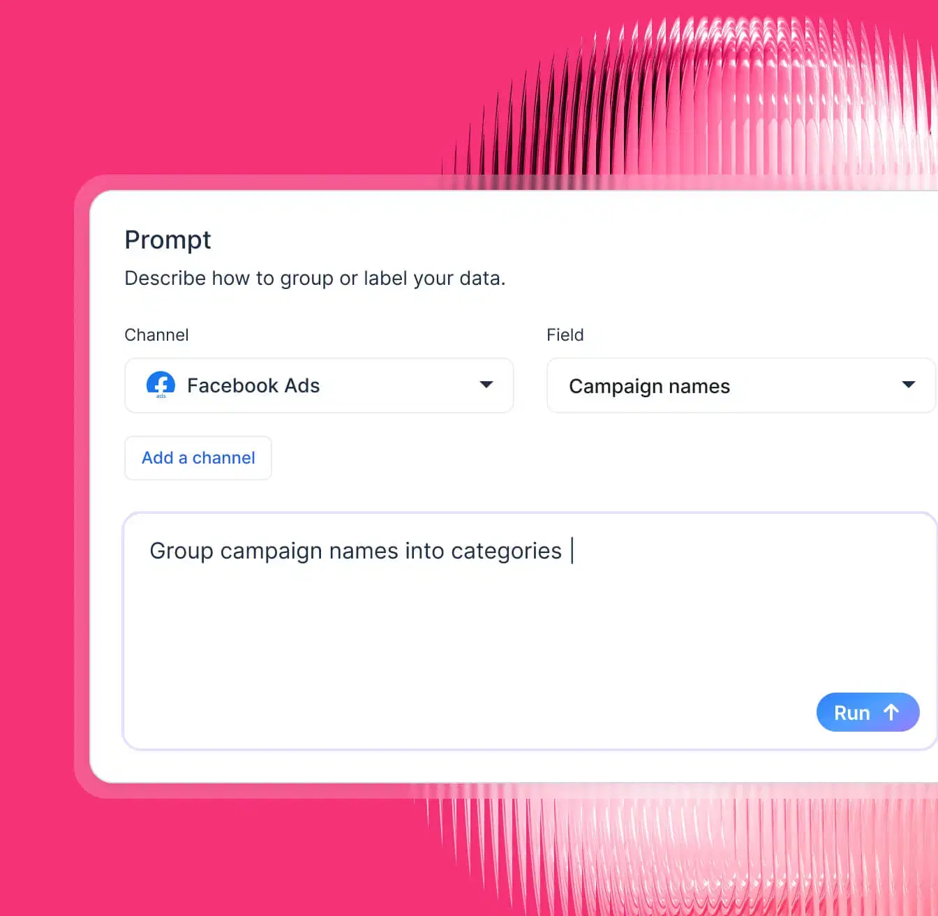
- Standardize messy data. For example, if you’ve got campaign names like “FB_US_SpringSale_23” and “MetaUSA_Spring23,” you can tell IQ: “Group by Campaign Type: Spring Sale”. IQ creates a brand-new dimension that neatly categorizes everything, and you can reuse it across reports.
- Normalize any dimension at scale. Group campaigns by objective, products by category, or reviews by language—whatever fits your reporting needs. IQ makes sense of inconsistent data and saves hours of manual clean-up.
Powerful and easy data organization on Whatagraph means:
✅ Your reports are easier to read, neat, and tidy.
✅ Your clients clearly see the value you’re delivering rather than being stuck interpreting data.
✅ You can analyze and compare performance any way you want, and use these insights to deliver better results for clients.
4. Easy white-labeling
Branding reports in Looker Studio is painful. You need to manually design every widget, chart, and header, and even then, you can’t save a report as a template.
That means every time you want consistent branding, colors, logos, fonts, you’re starting from scratch.
On Whatagraph, white-labeling is as easy as 1-2-3 (and actually fun).
Here’s how it works:
- Instant Brand Matching – Upload your client’s logo or an image (like a product shot or website screenshot), and IQ automatically generates a full theme: fonts, HEX colors, background styles, and even icon sets that match the brand identity.
- Prompt-Based Styling – Want something bold or seasonal? Just type it in (“Give this report a sleek fintech look” or “Make it a Halloween theme”), and IQ transforms the design instantly.
- Full Customization – After IQ builds your theme, you can fine-tune fonts, add additional brand colors, and adjust layouts as much as you like.
- Reusable Global Themes – Once you’ve nailed the look, save it as a Global Theme. Apply it to any future report in one click, across all clients and campaigns.
This means you’ll always get stunning, professional, and fully-branded reports your clients or execs will actually want to read.
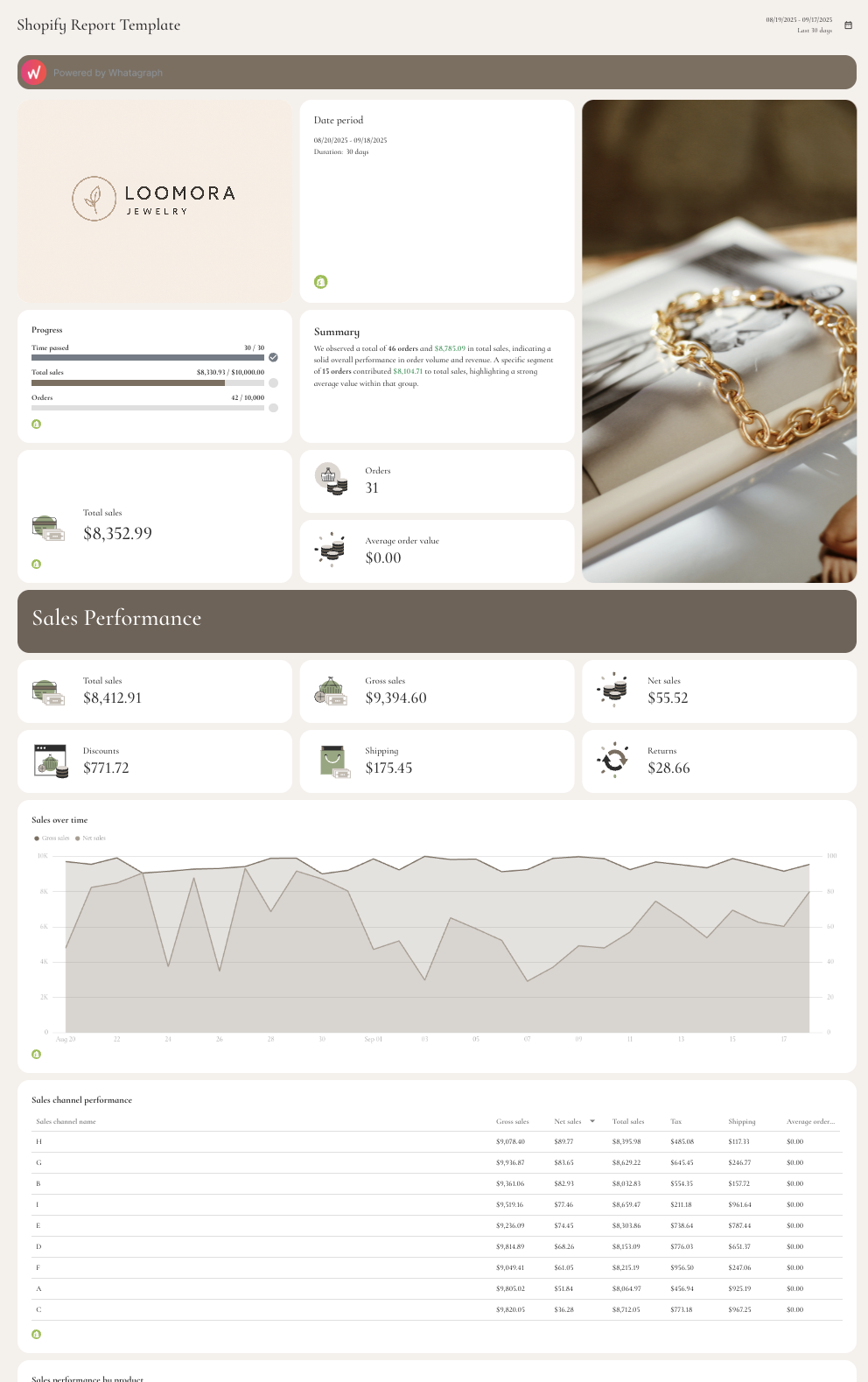
Here’s an example of a Shopify report template:
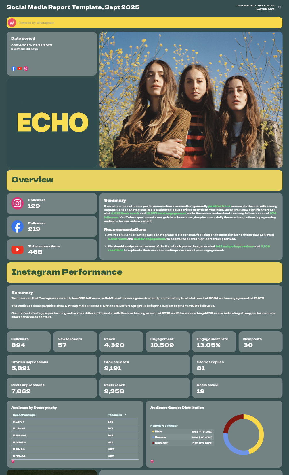
And here’s an example of a social media report template:
 When the time comes for sharing these reports, you can either:
- Send automated emails to specific people at specific times, days, and cadence. Customize the email subject lines, body copy, and even domains.
- Send instant live links to anyone.
- Download PDFs or Excel spreadsheets.
(To send automated emails on Looker Studio, you’ll need to pay for the Pro plan.)
5. Straightforward pricing with Customer Success and Support included
Looker Studio can look “free,” but the moment you need non-Google data you’ll need to buy third-party connectors (like Funnel or Supermetrics).
This can be anywhere from a few hundred dollars a month to a few thousand, depending on how many extra connectors you need, and how much each cost.
On top of this, Customer support is only included in the Looker Studio Pro plan which starts from $9/user/project.
All this means you need to deal with different invoices and third-party companies which can be very time-consuming and frustrating.
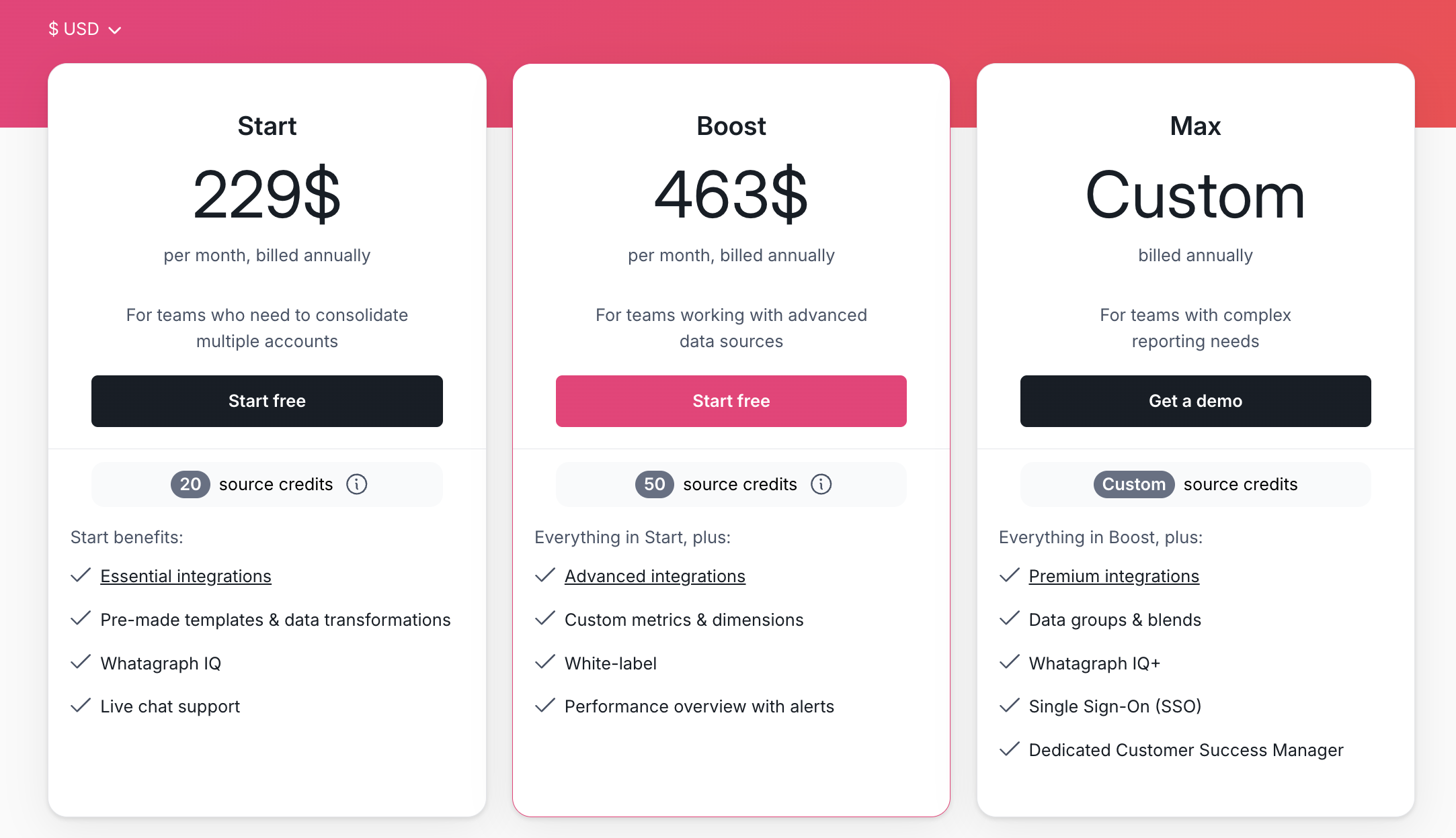
In comparison, Whatagraph’s pricing is straightforward. Here’s a breakdown:
- Forever-free – lets you get started at no cost, with 5 source credits, Whatagraph IQ basics, templates, and live chat support.
- Start ($229/mo billed annually) – includes 20 source credits and essential integrations
- Boost ($463/mo billed annually) – jumps up to 50 source credits, adds advanced integrations, custom metrics & dimensions, white-labeling, and performance overview with alerts
- Max (custom pricing) – for enterprise/complex teams, with custom source credits, premium integrations, data groups and blends, Whatagraph IQ+, SSO, and dedicated Customer Success Manager
Whatagraph Reviews from Real Users
“To me, Whatagraph is like the Tesla or Mercedes of digital analytics tools, their clean and simple way to present complex marketing data. I highly recommend it to anyone working with marketing analytics who values efficiency and clarity in their reporting.” (Source)
“Whatagraph has a simple user interface that is easy to navigate even for those who don't have analytical skills.” (Source)
“What I like best about Whatagraph is having the ability to create reports fast and easy. No more spreadsheets to do reports, they have a great variety of templates.” (Source)
2. Klipfolio
Best for: Large data teams and agencies that need a centralized metric warehouse.
Klipfolio is a data analytics and a business intelligence tool in one. It offers two key products:
- PowerMetrics: Suitable for data teams at large companies, this is a data analytics solution to centralize, standardize, and share accurate metrics throughout the organization. Non-data teams can then use these certified metrics for their dashboards and reporting needs.
- Klips: These are your regular data visualization dashboards and reports. Klips integrates with 130+ platforms and you can also use a Rest/URL option for custom integrations.
How Klipfolio is better than Looker Studio
- Easy to use: Klipfolio is known for its user-friendly interface and rapid deployment capabilities, making it easy for marketers and business users to create and share dashboards without extensive technical expertise. The platform offers pre-built dashboard templates, drag-and-drop functionality, and a library of pre-configured data connectors, enabling users to get started with their reporting quickly.
- Real-time data refresh: This BI platform supports real-time data refresh capabilities, enabling marketers to monitor key metrics and KPIs in real-time and make timely decisions based on up-to-date information.
- Customer support: Klipfolio has customer support to offer the best reporting practices and solve any bugs that occur. Looker Studio does not have any customer support.
- White-label options: Klipfolio enables agencies and in-house teams to create custom-branded dashboards for client reporting purposes, with white-labeling options available to showcase reports under their own branding.
- Flexible pricing plans: Klipfolio offers flexible pricing plans that cater to businesses of all sizes, with options for monthly subscriptions or pay-as-you-go pricing based on usage. The platform provides scalability and cost-effectiveness, allowing marketers to access advanced reporting features and capabilities without breaking the budget.
Where Looker Studio beats Klipfolio
- More integrations: To begin with, Klipfolio only has 300 integrations, whereas Looker Studio provides 600.
- Free with Google products: Secondly, Looker Studio can be free if the products provided by Google are used.
- More report templates: Lastly, Looker Studio provides 50+ templates. On the other hand Klipfolio - only 12.
Key Features
- 130+ integrations including warehouses, SQL databases, and file-sharing services
- Data blending, unifying, aggregating
- Custom metrics and dimensions
- AI insights
- Custom dashboards and reports
- Export dashboards as PDF or image files. Export only individual clips as CSV
- Scheduled reports
Klipfolio Reviews from Real Users
“if something breaks or you need help, the support, docs, and community jump in fast basically, you almost never feel stuck.” (Source)
“It doens't have as many chart options like Power bi or Data Studio. It's good only for light data analysis.” (Source)
“Every time I contact support I get the impression that I am bothering them. I will not be renewing this platform because I do not feel valued as a customer.” (Source)
Pros and Cons
Pros:
- Easy to use and set up
- Powerful data analytics and organization options
- AI insights to help make data-driven decisions
Cons:
- Expensive with important features only available as add-ons or in Enterprise plans
- Limited customization for dashboards and templates
- Unhelpful customer support
Klipfolio pricing
Klipfolio’s pricing has stabilized into four main tiers (billed annually):
- Base at ~$120/month: 130+ integrations, unlimited viewers, but limited to 3 dashboards.
- Grow at ~$190/month: Adds PDF reports and more frequent data refreshes (1 hour).
- Team at ~$310/month: 20 dashboards and 15-minute refresh intervals.
- Team+ at ~$600/month: 50+ dashboards, priority support, and custom domain options.
But these top-ups and add-ons can significantly raise your overall costs:
- Extra dashboards: $8/month (billed annually)
- Warm-up data refresh: $39/month (billed annually)
- Near-real-time data refresh queue: $139/month (billed annually)
- Custom domain: $69/month (billed annually)
3. DashThis
Best for: Small businesses and freelancers that need deep exploratory data analysis or self-service business intelligence.
DashThis is a simple marketing reporting tool that connects to 30+ marketing platforms and visualizes KPIs on dashboards.
If you don’t see a built-in integration you need, you can also upload your own data using a nifty CSV file or a Google sheet.
Once your data is connected, you can visualize it using three key dashboards:
- Periodic dashboards: These are dashboards based on specific time periods and cadence, like daily, weekly, monthly, semi-annually, and annually.
- Campaign dashboards: These dashboards are used to isolate and highlight a specific campaign for a custom date range.
- Rolling dashboards: These dashboards show trends of metrics for three different date ranges.
How DashThis is better than Looker Studio
- Easy multi-channel reporting: DashThis supports reporting across multiple marketing channels and platforms, allowing users to consolidate data from sources such as Google Analytics, Google Ads, Facebook Ads, LinkedIn Ads, and more into one unified dashboard. This enables marketers to gain a comprehensive view of their marketing performance and track cross-channel metrics in one place.
- White-labeling and client reporting features: DashThis provides features for client reporting and white labeling, allowing marketers to create custom-branded reports for their clients. Users can add their own logos, branding elements, and custom styling to reports, as well as schedule automated email delivery to clients, enhancing professionalism and client satisfaction.
- Customer support: DashThis offers dedicated customer support and training resources to assist users with setup, customization, and troubleshooting. Users can access help articles, video tutorials, and live chat support to get answers to their questions and resolve issues quickly, ensuring a smooth and seamless reporting experience. Unlike Looker Studio, which is entirely self-service, DashThis provides human support even on basic tiers.
Where Looker Studio wins
- More integrations: Firstly, DashThis has 30+ integrations, whereas Looker Studio provides 850+ through its partner connector ecosystem.
- Free with Google products: Secondly, Looker Studio can be free if the products provided by Google are used.
- More report templates: Looker Studio has an official Report Gallery where users can browse and submit reports/templates created by others. This includes both featured templates and community uploads, which collectively amount to many templates shared publicly. On the other hand, DashThis provides 37 out of the box.
Key Features
- 30+ integrations
- Custom data upload via CSV file or Google sheets
- Visualization dashboards
- Automatic data refreshes
- Upload client or band logos
- Create custom widgets, domains, color schemes, and email addresses
- Library of report templates
- Report sharing via email, URL, or PDF
DashThis Reviews from Real Users
“DashThis has made reviewing our analytics and other metrics an absolute breeze.” (Source)
“The amount of reporting metrics available could be better. Getting client's dashboard access to exactly what they need can be difficult sometimes.” (Source)
“One downside is the pricing; it can be a bit steep for smaller teams. Also, some of the advanced features are a little tricky to set up without some prior knowledge.” (Source)
Pros and Cons
Pros:
- Easy to use and set up
- Many templates and dashboard examples available
- Relatively inexpensive
Cons:
- Limited data organization and customization features
- Limited data integrations
- Basic-looking reports
DashThis pricing
The most significant shift for DashThis users, as of March 30, 2026, is that the platform officially moved away from its legacy unlimited data sources model. Your subscription is now capped by the number of active data sources you connect across your account.
DashThis offers four pricing plans, billed annually:
- Individual at $44/month: 3 dashboards, 15 sources, unlimited users.
- Professional at $139/month: 10 dashboards, 40 sources, custom domains.
- Business at $279/month: 25 dashboards, 100 sources, dedicated specialist.
- Standard at $429/month: 40+ dashboards, priority support, 1-on-1 sessions.
4. Tableau
Best for: Large enterprises that have moved beyond basic reporting and into the world of predictive modeling and metric governance.
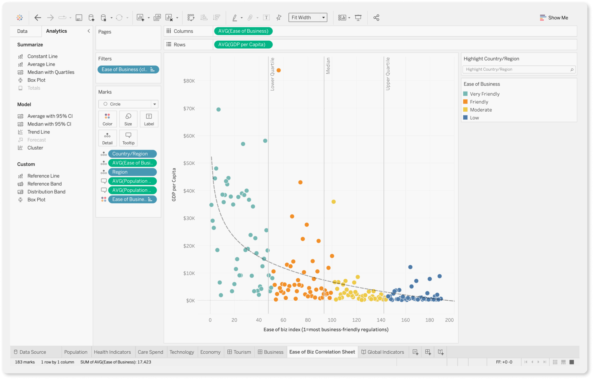
Tableau is an AI-powered business intelligence and marketing analytics tool. It offers business forecasts, analyzes strategies, and allows for data-driven decisions.
How Tableau is better than Looker Studio
- Ease of use: Tableau is known for its intuitive and user-friendly interface, which makes it easy for marketers to create interactive dashboards and reports without extensive technical expertise. The drag-and-drop interface and visual query builder simplify data analysis and visualization, allowing marketers to generate insights quickly and share them with stakeholders.
- Tableau Pulse: New for the 2026 ecosystem, Pulse delivers a "newsfeed" of your KPIs directly to your phone or Slack. The engine uses natural language to explain the why behind a spike or dip in performance, proactively flagging outliers before you even ask.
- Advanced analytics: The charting and data exploration features are more sophisticated than Looker Studio, as Tableau provides robust analytics capabilities, including support for advanced calculations, statistical functions, and predictive modeling. Marketers can perform complex data analysis, uncover trends, and identify opportunities for optimization using features such as trend lines, forecasting, and clustering.
- Community and customer support: Tableau has one of the largest and most active BI communities in the world, known as the DataFam. Users can access thousands of publicly shared dashboards on Tableau Public, active community forums, and official Salesforce support channels (on paid plans).
Where Looker Studio wins
- More integrations: Third-party ecosystem reporting suggests there are 20+ Google-provided connectors and over 850 partner connectors available in the broader Looker Studio connector gallery. This, in comparison to independent Tableau that supports over 100 native data sources across file types, databases, warehouses, and APIs.
- Easier to learn: G2 reviews say that Looker Studio is easier to understand and use than Tableau, which requires expert knowledge.
Key Features
- 90+ integrations
- Custom metrics and dimensions
- Data blending
- Drag-and-drop dashboard interface
- AI-powered insights
Tableau Reviews from Real Users
“You don’t need heavy coding skills. Just drag fields and Tableau instantly builds charts and dashboards.” (Source)
“It struggles with complex relationships, doesn’t have a codebase for metrics, and the cost is also higher.” (Source)
“The licensing cost adds up quickly as more users need access, and it requires a good amount of system resources, so performance slows with large datasets.” (Source)
Pros and Cons
Pros:
- Powerful data analytics and visualization
- Easy to use and implement
- Seamless data integrations
Cons:
- Can be expensive if you need advanced features
- Takes a lot of time to load for large datasets
- All the preprocessing of the data (data cleaning) has to be done beforehand. Data cleaning cannot be done in Tableau
Tableau pricing
Tableau charges per-user, including a fee just for people to view the reports. Here are the four plans it offers:
- Creator at $75/user/month: Power users who connect data and build dashboards.
- Explorer at $42/user/month: Business users who need to edit or explore existing data.
- Viewer at $15/user/month: Stakeholders who only need to see and filter dashboards.
- Tableau+ (premium enterprise bundle): Includes advanced AI capabilities (like Pulse premium and AI-assisted analytics), but pricing is custom/negotiated with Tableau sales, not a published flat rate.
5. Databox
Best for: Boutique agencies and small businesses that need at-a-glance KPI tracking and mobile access.
Databox is a data reporting and analytics platform for growing businesses.
You can integrate with 100+ software tools, and bring in custom data through Google Sheets or Excel. Then, you can visualize this data directly on Databox using pre-built metrics and templates.
How Databox is better than Looker Studio
- User-friendly interface: Databox offers a user-friendly interface and intuitive dashboard builder that make it easy for marketers to create, customize, and share dashboards without extensive technical expertise. The drag-and-drop interface, pre-built templates, and visual query builder streamline the reporting process, enabling marketers to quickly generate insights and communicate results effectively.
- AI-powered analysis features: Databox’s Genie and AI analytics features automatically generate performance summaries and identify anomalies based on your historical data, providing plain-language insights into why your numbers moved.
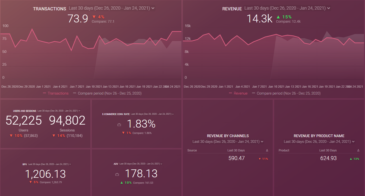
- Dedicated dashboard feature: Databox provides 140+ pre-built dashboard templates that cover the most common metrics for every department. Looker Studio, on the other hand, only allows users to create dashboards by resizing Reports canvas to a single page. You can easily share your dashboards via link, email, Slack, or even stream them to your TV.
- White-labeling options: Databox provides client reporting and white labeling features, allowing agencies and consultants to create custom-branded reports for their clients. Users can add their own logos, branding elements, and custom styling to reports and dashboards.
- AI features: Databox allows you to spot trends, growth opportunities and set more realistic goals for your clients using Metric Forecasts.
However, Databox users online say the platform is clunky and has an unappealing user interface. For instance, in the screenshot below, you’ll see that your data is visualized in a “box” format and the metrics look “squished” together and hard to read.
Where Databox loses to Looker Studio
- Fewer integrations: Databox offers access to 130+ integrations, whilst Looker Studio offers 850+.
- Limited trial: Second, both Databox and Looker Studio offer free trials. However, Databox’s free trial is extremely limited as you can only get access to 3 panels. With Looker Studio, you get access to all panels for free, for as long as you want.
- Complicated custom mapping: Last, users complain that it is fairly difficult to do custom mapping within Databox. Whereas with Looker Studio, this is is quite easy.
Key Features
- 100+ integrations
- Native visualization dashboards and reports
- Dashboard and report templates
- Slack, email, or in-app alerts
- KPI benchmark groups
Databox Reviews from Real Users
“The simplicity to creating valuable data and reporting visualisations that make your clients eyes light up on every call.” (Source)
“While it has the major business integrations and connections, it needs more connections to work in certain industries.” (Source)
"After 2 years of trying, we were never able to fully launch Databox with our clients because there is always another issue with Databox." (Source)
Pros and Cons
Pros:
- Easy to use
- Wide variety of integrations
- Interactive data
Cons:
- Slow customer support
- Bugs and lag issues
- Broken metrics and templates
Databox pricing
As of July 1, 2025, Databox no longer offers a free tier. Databox charges based on data sources (the number of specific accounts/properties you connect), while offering unlimited users on all plans.
- Professional at $159/month: 3 data sources, unlimited users and dashboards.
- Growth at $399/month: 3 data sources, AI performance summaries, benchmarks, and data merging.
- Premium at $799/month: 100 data sources, forecast modeling, dedicated analyst, and guided onboarding.
6. Power BI
Best for: Data-heavy enterprises and teams already using Microsoft 365.
Microsoft PowerBI is a business intelligence software suite that includes apps, services, and data connectors. It is a cloud-based solution that allows marketers to combine data from multiple sources into a single data set.
How PowerBI is better than Looker Studio
- Advanced visualization options: Power BI’s visualization engine is significantly more solid. While Looker Studio reports can feel Excel-like, Power BI offers a massive library of interactive charts, maps, and Power BI-certified custom visuals that allow for pixel-perfect design.
- Scalability and performance: Looker Studio often hits a 6-minute query limit on large datasets. Power BI’s in-memory processing engine (Hyper) handles millions of rows with ease. Plus, both tools offer automated data refreshes, though Power BI is more granular—offering up to 48 refreshes per day on Premium/PPU plans.
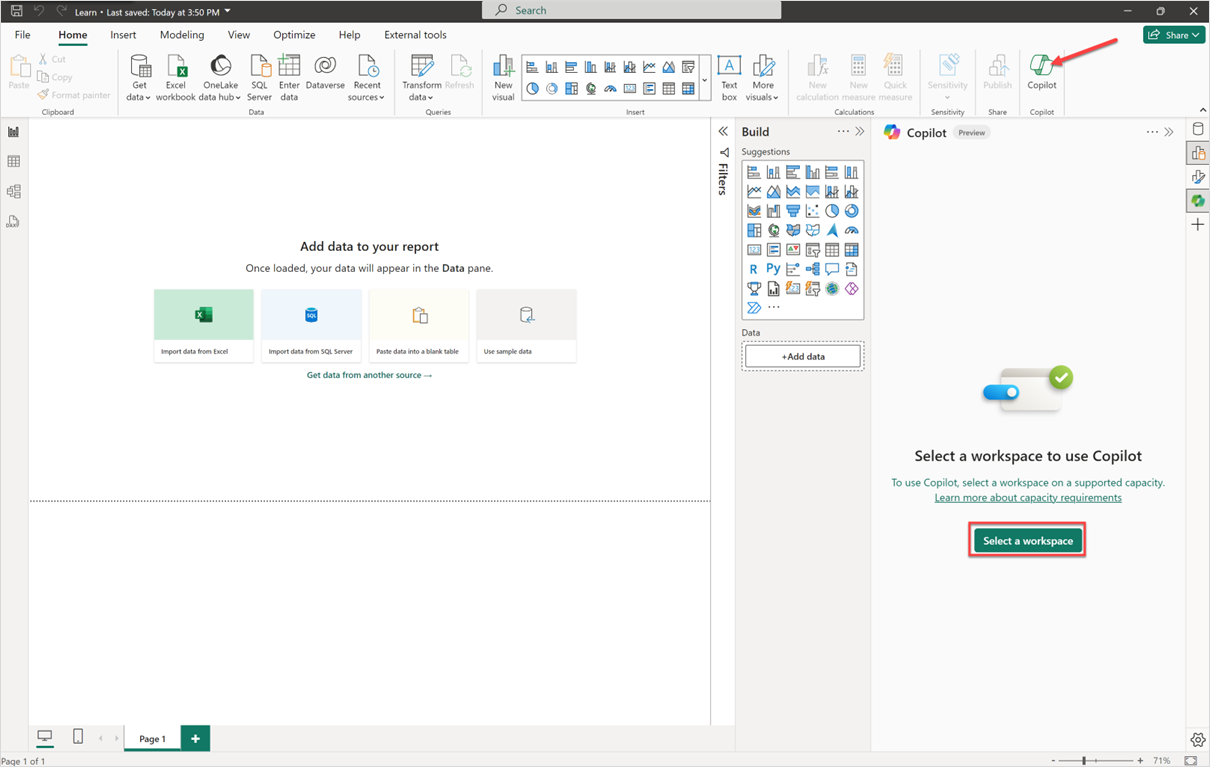
- Predictive AI (Copilot): In 2026, the legacy Q&A natural language tool is being deprecated in favor of Power BI Copilot. This allows you to build entire report pages, write DAX formulas, and get narrative summaries of your data simply by chatting with the tool.
- Deep Microsoft integration: If your team lives in Teams, Excel, and PowerPoint, Power BI is a no-brainer. You can embed live, interactive dashboards directly into a Teams channel or a PowerPoint presentation with a single click.
- Great customer service: PowerBI comes with a 24/7 customer support service help desk, which is helpful when bugs occur. On the other hand, there is no one at Google to answer your questions because there is no customer support for Data Studio as a product.
Where PowerBI loses to Looker Studio
- Cost for viewers: In Looker Studio, viewing is free. In Power BI, unless you are paying for Premium Capacity (which starts at ~$4,995/month), every single person who wants to view a report needs a $10/month Pro license.
- Even steeper learning curve: The second thing worth knowing is that according to GetApp reviews, Looker Studio is way easier to use than PowerBI. Apparently, it takes a long time to properly understand how to use the tool and it has a steep learning curve.
- Fewer sharing options: While the Power BI Desktop app is for local creation, sharing and collaboration require a paid Power BI Pro or Premium license. Unlike Looker Studio's simple anyone-with-the-link free sharing, Power BI requires users to be within your organization's tenant to view private reports securely.
Key Features
- 100+ integrations
- AI-powered insights and “Co-pilot”
- Data transformation and unification
- Native visualization dashboard and reports
- Shareable reports with other Microsoft services, including Teams, PowerPoint, Excel, and Power Platform
Power BI Reviews from Real Users
“Seamless integration with the Microsoft ecosystem (Excel, Azure, SQL), allowing for fast, intuitive, and interactive data visualization.” (Source)
“Some advanced features are hard to learn, especially DAX and data modeling.” (Source)
“I think automating updates could be made easier.” (Source)
Power BI pricing
Following the pricing updates effective April 2025, Power BI pricing for 2026 is as follows:
- Power BI Pro at $14/user/month: Small to mid-sized teams, included in Microsoft 365.
- Premium Per User at $24/user/month: Advanced AI, larger datasets, and 48 refreshes/day.
- Fabric (F2 Capacity) at $262/month: Entry-level cloud capacity. Requires Pro licenses for viewers.
- Fabric (F64 Capacity) at ~$5,000/month: Large enterprises, eliminates the need for Pro licenses for viewers.
7. AgencyAnalytics
Best for: Small to mid-sized marketing agencies that need an all-in-one portal for reporting, task management, and built-in SEO tools.
AgencyAnalytics has officially transitioned from a simple dashboard tool to a fully-managed client portal that allows you to manage team workflows and communicate directly with clients within the platform.
How AgencyAnalytics is better than Looker Studio
- SEO analytics options: AgencyAnalytics functions as a standalone SEO tracking tool, offering keyword rank tracking, backlink monitoring, and site audits natively. In Looker Studio, you would need multiple expensive third-party connectors just to see where your client ranks on Google.
- Pre-built templates and dashboards: This alternative to Looker Studio offers a wide range of pre-built report templates and dashboards tailored to different marketing channels and platforms, including SEO, PPC, social media, email marketing, and more. These pre-built templates can save time and effort for marketing agencies by providing ready-made reports that can be customized to meet client needs. Moreover, AgencyAnalytics provides 350+ templates. That’s more than 300 extra compared to what Looker Studio offers.
- Client communication and collaboration features: Instead of sending a static PDF, you give clients their own white-label client portal. Clients can log in to a custom domain to see live data, review tasks, and even message their account manager.
- AI report writing: New for 2026, the Ask AI & AI Summary features proactively scan your client data to write natural-language summaries.
How AgencyAnalytics is worse than Looker Studio
- Not so intuitive: According to G2 reviews, current AgencyAnalytics users are dissatisfied with how unintuitive the tool is. Especially when looking for metrics to include in reports. Some of the namings are odd and unusual, making it difficult for them to find metrics quickly. The same problem was not discovered among Looker Studio users.
- No custom metrics: Moreover, depending on the metrics you need to track, not all tools will have all of them. However, some of the tools allow you to create and customize metrics. If you have this requirement, keep in mind that AgencyAnalytics does not offer this feature, whereas Looker Studio does.
Key Features
- 80+ integrations
- Ready-made report templates
- White-labeling
- Client and staff management
- SEO tools
- AI insights
AgencyAnalytics Reviews from Real Users
“The basic filtering available for charts and tables is lacking, as I can't filter by conversion names, keywords, etc. Having a filter similar to Looker Studio would help.” (Source)
“I love using AgencyAnalytics for managing SEO projects, especially with its numerous integrations that make producing regular reports and monitoring rankings so straightforward.” (Source)
“I do not like that report links have to be regenerated every time a change is made, rather than staying live and up-to-date.” (Source)
Pros and Cons
Pros:
- Easy to set up and use
- A wide library of ready-made report templates
- Cost-effective
Cons:
- Buggy
- Lack of advanced data calculations and organization features
- Limited integrations
AgencyAnalytics pricing
AgencyAnalytics pricing is tied directly to the number of clients you select using the slider. The base pricing includes a set number of clients, and each additional client costs $20/month.
As of March 2026, with the slider set to 10 clients, here’s what you can expect to pay:
- Freelancer: $159/month (includes 10 clients)
- Agency: $179/month (includes 10 clients)
- Agency Pro: $349/month (includes 15 clients)
- Enterprise: Custom pricing (contact sales)
8. Geckoboard
Best for: Medium to large businesses in customer service, sales, and ecommerce that need glanceable data for office displays.
Last but not least, we have Geckoboard: an easy to use dashboard building tool to be mounted on an office wall or kept open in a dedicated tab. It’s for the team that needs to know right now if support ticket wait times are spiking or if a flash sale is breaking records.
With it, you can connect to 90 data sources, design your dashboard, and share the dashboard with your team members or the C-Suite.
Geckoboard’s main advantage over DashThis is its wider variety of data sources (90 vs. 35). You can connect to major marketing platforms, as well as CRM, Sales, Finance, and eCommerce tools. Some examples include Shopify, Stripe, Dixa, Intercom, and Pipedrive.
However, some of these integrations (like Safesforce and Zendesk) are only available on pricier “Pro” plans.
Once your data is connected, you can create three main types of dashboards:
- A blank dashboard (similar to Whatagraph’s)
- TV dashboards for internal presentations
- Mobile dashboards
- Snapshots and reports
How Geckoboard is better than Looker Studio
- TV-First design: This is Geckoboard’s superpower. The Send to TV feature allows you to manage remote office screens from your browser, and widgets are automatically optimized for readability from across a room
- Real-time snapshots: In 2026, Geckoboard upgraded its automation. You can now schedule multiple snapshots of the same dashboard to different Slack or Microsoft Teams channels throughout the day (e.g., a morning stand-up view and an afternoon handover).
- Focus on key metrics and KPIs: Geckoboard focuses on displaying key metrics and KPIs that are most relevant to marketers, enabling them to track performance across various marketing channels and campaigns. Geckoboard's dashboards provide at-a-glance visibility into important metrics, making it easy for marketers to monitor performance and make data-driven decisions.
- Real-time data visualization: Lastly, Geckoboard specializes in real-time data visualization, allowing marketers to monitor key performance indicators (KPIs) and metrics in real time. Geckoboard's dashboards provide live updates and visualizations that help marketers quickly identify trends, anomalies, and opportunities for optimization.
How Geckoboard is worse than Looker Studio
- Expensive: Geckoboard is a premium service. For smaller teams, the $44/month starting price can be harder to justify than Looker's free tier, especially as costs scale with the number of dashboards.
- Fewer integrations: Another thing we noticed was that Geckoboard doesn’t have enough integrations for the price they are paying. If you want to receive more value from your data reporting tool investments, Looker Studio may offer you more advantages.
Key Features
- 90+ integrations with Customer Service, Sales, Finance, and eCommerce channels
- Drag-and-drop dashboard builder
- KPI notifications
- Slack integration
- Automated email reports
- TV dashboards
- Mobile-friendly dashboards
- Dashboard examples for businesses
Geckoboard Reviews from Real Users
“I particularly appreciate the high level of flexibility when configuring and customizing dashboards.” (Source)
“It would be nice to see a couple of extra integrations added on over time (Front, CloudTalk) and be able to produce % a little easier.” (Source)
“I wish there more visualization options like pie charts or thermometer goal graphs.” (Source)
Pros and Cons
Pros:
- Easy to use and set up
- A wide variety of integrations
- Great customer service
Cons:
- Can be pricey if you want to add more dashboards
- Limited customization options for dashboards
- No advanced calculations, blends, and custom metrics and dimensions supported
Geckoboard Pricing
Geckoboard’s pricing is based on the number of dashboards. As of July 2025, Geckoboard sunset its Free Forever plan and now offers a 14-day free trial. The current tiers as of March 2026 are:
- Essential at $44/month: 1 dashboard, 1 user, 1 TV display.
- Pro at $87/month: 5 dashboards, 10 users, 3 TV displays and snapshots.
- Scale at $615/month: 50 dashboards, 100 users, unlimited TVs, and SSO.
Published on Sep 21 2022
WRITTEN BY
YamonYamon is a Senior Content Marketing Manager at Whatagraph. With an eye for detail and a knack for always considering context, audience, and business goals to guide the narrative, she's on a mission to create genuinely helpful content for marketers. When she’s not working, she’s hiking, meditating, or practicing yoga.