How to Make a Graph in Google Sheets?
Charts and graphs are very helpful when you are working with a lot of data. They turn abstract numbers into something that can be understood at a glance.

Oct 28 2019●5 min read


There are a lot of features that enable complex analysis, and presenting data in the form of charts or graphs is one of them. But, a lot of users want to know how to make a graph in Google Sheets?
In this article, you’ll learn how to make a bar graph in Google Sheets, how to customize it, its advantages, and get the idea for making other graphs or charts in Google Sheets.
Why Making a Bar Graph?
A lot of people make bar graphs or charts to visualize their data. The reason for that is because they are very easy to interpret and ideal means for communicating categorical ranking and comparison of different datasets.
How to Make a Bar Graph in Google Sheets
- First, create a table, you can create the table in two different ways horizontal or vertical. Do not add the units (e.g. g, ml) with numbers or it will generate an error when you make the graph. You will select the unit later.
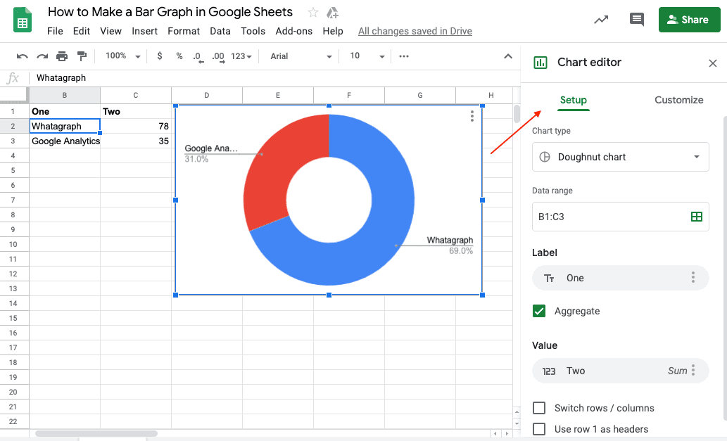
- Now select the data or cells you want to create the table with and click insert chart button. If you cannot find the insert chart button on your menu, click insert at the second row on your menu and then select the chart from the drop-down menu.
The chart and chart editor will appear, from there, you can select the type of graph you want to create, and customize your graph.
- You can change the chart style, make it 3D if you prefer that look.
- Change the graph title. You can also change the axes' title, either horizontal axis title or vertical. You can change the legend, the minimum and maximum value, horizontal and vertical axis’ size.
- If you prefer a grid in the background of your chart, add grid in the background.
How to Make a Line Graph in Google Sheets
Making a line graph in Google sheets is similar to making a graph on excel. Following are step by step instructions to create a line graph in Google sheets. Let's say you want to create a graph on time vs distance.
- Put all your data in time and distance columns.
- Put the values you want in the x-axis in the left-most column, and the values you want to add in the y-axis in the right columns.
- Select all the data, and click on the chart from the right side of the top menu. If you can’t find the chart icon, you can click insert and scroll down in the drop-down menu and click charts.
- The different kind of charts window will appear, click on chart types in the middle. There you will see different types of graphs from a scatter graph to the bar graph. Click on the line graph type; you can see the preview on the right side.
- Then you can click on the options you want to choose. For instance, if you want to select a column as a header and another column as a label.
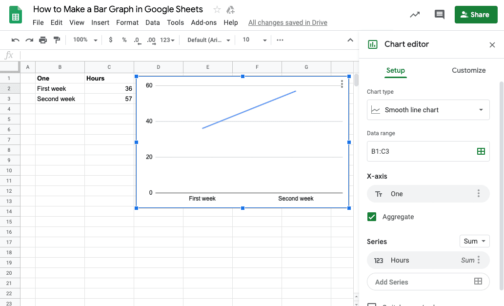

After that, click on the next button named customization.
- From there, first, you can write your graph title, change the size, font or color of the title.
- Then select the legend's position, you can put it at the right side, left or at the bottom.
- Moreover, you can also change the background color if you want something other than white.
- Next, you can edit the horizontal or vertical axis title.
- You can change the appearance of the lines, make them slanted.
- After that, you can select the minimum and maximum value.
- Plus you can change the number of the background grid lines, and you can also select a minor grid line to represent the half in numbers.
- Lastly, you can change your line thickness, line and point shape and size.
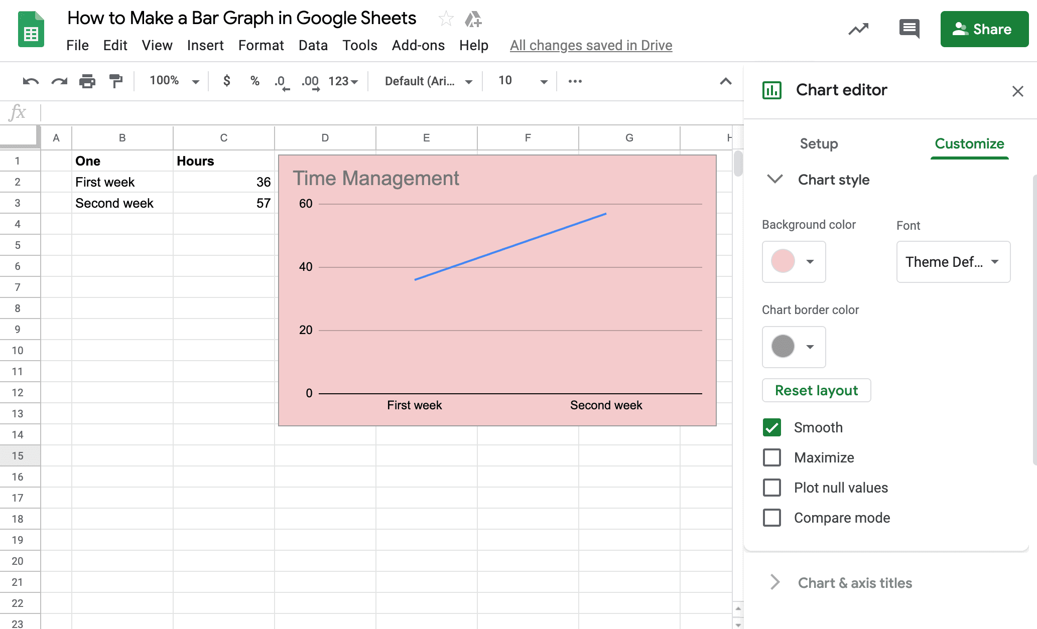
After you are satisfied with your graph, click insert graph at the bottom. Now you have your graph on sheet. You can change its size, click on the edit icon at the top-right side of the graph and edit the graph such as change the line color and thickness. You can also click on labels, or axis and edit, or change the minimum and maximum value. At last, click on the view only icon at the top of the edit icon.
How to Make a Graph on Google Docs
After you make your graph in Google sheets, you can see a drop-down icon on the top-right side of the graph. When you click the icon, a drop-down menu appears, select the copy graph option. Open your Google doc, and past the graph, the Google doc will give you two options, either paste the linked Google sheets graph or paste the unlinked graph.
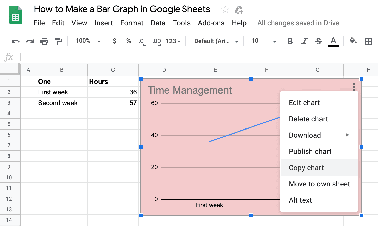
The difference between linked and unlinked graph is when you edit your graph on Google sheet, the linked graph will show an update button at the top-right side of the graph. When you click the update, the graph will change in your Google doc with the changes you make on Google sheets. The unlinked graph does not have this option, and you can not change it automatically with the Google sheets graph.
Now that you have learned all the charting tools, you can convey your message clearly and avoid clutter in the chart. If you are too busy to create a graph, you can turn your spreadsheets into beautiful reports using Whatagraph's Google Sheets Integration, an easy and quick way to create automated reports.

Published on Oct 28 2019
WRITTEN BY
Gintaras BaltusevičiusGintaras is an experienced marketing professional who is always eager to explore the most up-to-date issues in data marketing. Having worked as an SEO manager at several companies, he's a valuable addition to the Whatagraph writers' pool.