11 Best KPI Dashboard Examples & Free Templates
There are so many things to consider when building a KPI dashboard.
❓ How do you pull real-time data in from your platforms to the dashboard?
❓ Do you have to build an API yourself?
❓ Which metrics do you show?
❓ Which graphs do you use?
❓ How do you make sure stakeholders are actually reading *and* understanding the dashboards?
We’re here to help.
In this article, we’ll share 10 KPI dashboard examples based by actual marketers and executives on Whatagraph.

Mar 23 2026●11 min read


Each example shows you what metrics to include, how to structure your dashboard, and how to spot the KPIs that need action first.
We’ve also included KPI dashboard templates with each example that you can use right away for free (no credit card required).
With Whatagraph’s report templates, you won’t need to build APIs yourself, learn coding, or create dashboards from scratch.
We’ve got 60+ native integrations with all your favorite tools that pull in data and visualize key metrics in seconds on a perfectly white-labeled dashboard. Want to make your life even easier? Ask Whatagraph IQ (our AI), to create dashboards from scratch for you based on your connected data.
That being said, let’s get started.
11 Best KPI Dashboard Examples
We’ve divided the KPI dashboard examples into three sections:
- Marketing KPI dashboard examples
- CRM and Analytics KPI dashboard examples
- E-Commerce KPI dashboard examples
Let’s look into each of them.
H2: 5 Marketing KPI Dashboard Examples
Jump to the marketing KPI dashboard example you want to see:
- Marketing KPI dashboard
- Social media KPI dashboard
- LinkedIn Ads KPI dashboard
- SEO KPI dashboard
- YouTube KPI dashboard
1. Marketing KPI Dashboard Example
Use this example for free with your data
Who it’s for:
- Marketing managers who need a single view of performance across paid media and website analytics without jumping between platforms.
- Agency account managers who want a structured report that clearly explains performance changes to clients.
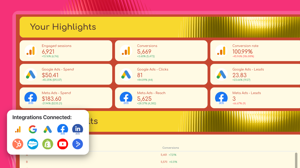
Channels connected: Google Analytics 4, Google Ads, Meta Ads (Facebook & Instagram)
This marketing KPI dashboard example is built as a multi-tab report that moves from high-level insights → KPI snapshot → deep channel analysis → time comparisons for lead generation campaigns.
The first tab of the marketing dashboard acts as your executive summary, while the rest of the dashboard breaks performance down by channel and time period (e.g. last month compared with year-over-year data).
Metrics to visualize and how to structure:
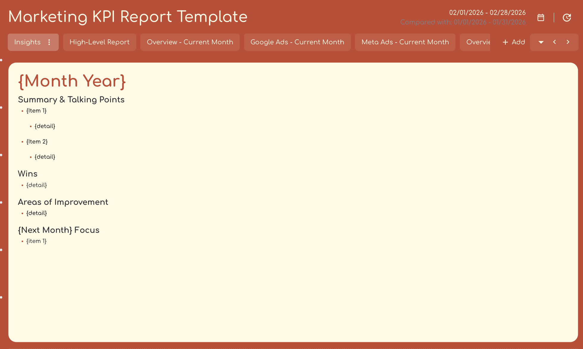
1️⃣ Insights Tab (Executive Layer)
This tab translates raw performance into clear takeaways.
Include:
- Summary of performance
- Key wins (e.g. increase in conversions or lower CPA)
- Key areas of improvement (e.g. drop in conversion rate or rising costs)
- Next steps to take in the next month
This is where stakeholders immediately understand what happened without having to even read through the rest of the report.
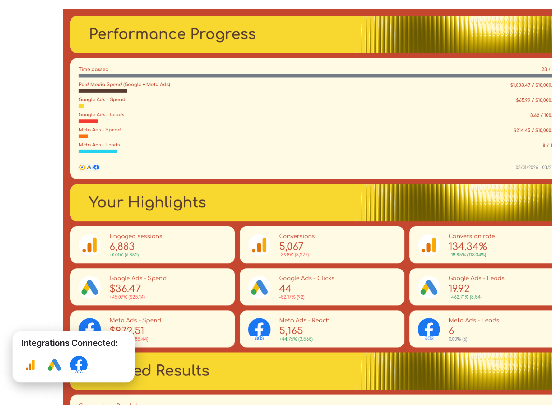
2️⃣ High-Level Report (Top KPIs + Trends)
This is your at-a-glance performance view.
Include:
- Conversions
- Conversion rate
- Spend
- Clicks
- Cost per conversion
- Trend charts across time
This tab is purely for scanning performance quickly and helps you spot the KPIs that need action first:
- Are we improving or declining?
- Are results trending up or down?
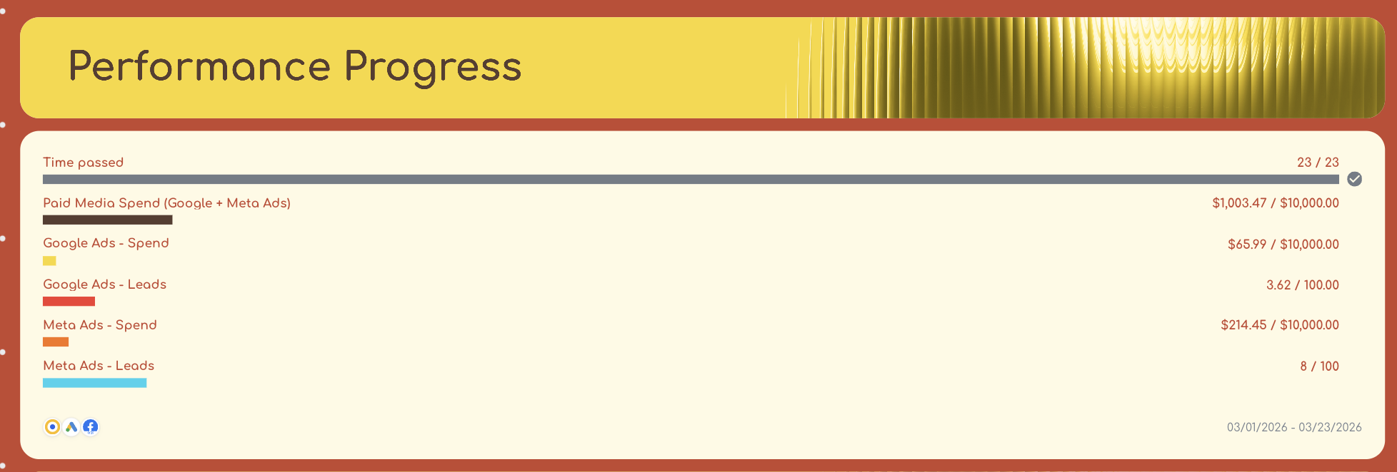
3️⃣ Overview – Current Month-to-Date
This is where performance starts to connect across channels.
Include:
- KPI progress bars (targets vs actuals)
- Core KPIs from GA4, Google Ads, and Meta Ads
- Traffic and conversion breakdowns
In our KPI dashboard example, we included:
- GA4 metrics like engaged sessions, conversions, and conversion rate
- Paid media performance across Google Ads and Meta Ads
- Breakdowns by source/medium, landing pages, location, and devices
This tab helps you:
- See which ad channels are performing best
- Understand what caused paid results to go down or up
- See what changed in organic traffic and visibility
- Put website and campaign performance side by side
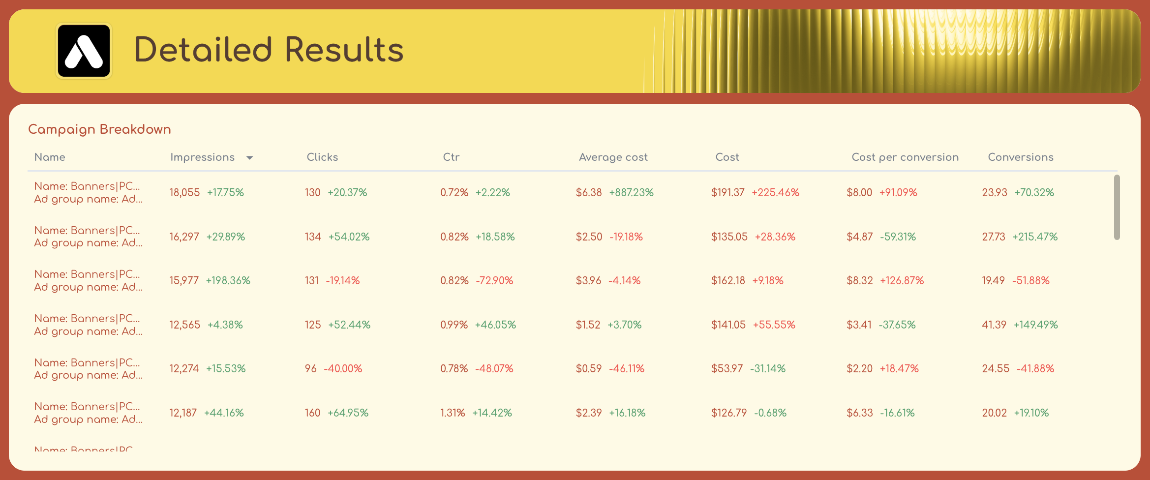
4️⃣ Google Ads Performance (MTD, YoY)
This tab is split into two clear layers:
Highlights section:
- Spend
- Clicks
- Conversions
- Cost per conversion
Detailed breakdowns:
- Campaign performance tables
- Search term performance
- Ad creative performance
This is where you diagnose performance:
- Which campaigns drive results
- Which keywords are inefficient
- What’s actually changing YoY
5️⃣ Meta Ads Performance (MTD, YoY)
Uses a 7-day attribution window and mirrors the Google Ads structure.
Top KPIs:
- Spend
- Reach
- Clicks
- Leads / conversions
- Cost per result
Breakdowns:
- Platform performance
- Campaign performance
- Ad creative performance
This lets you:
- Compare campaign efficiency
- Identify top-performing creatives
- Understand which audiences drive results
6️⃣ Overview – Last Month (YoY)
Same structure as the MTD overview, but showing last month’s data.
Include:
- KPI progress vs targets
- Cross-channel performance
- Traffic and conversion breakdowns
This gives you a more stable comparison than partial month data.
7️⃣ Google Ads + Meta Ads (Last Month, YoY)
Both channels repeat their structure with full-month data.
This is critical because it helps you:
- Validate trends seen in the current month
- Identify true performance shifts vs short-term fluctuations
Best practices:
✅ Start with an Executive Summary tab to show key insights right away and make informed decisions, faster.
✅ Use Whatagraph IQ Summary to turn this KPI dashboard into a short update for stakeholders in seconds without having to write it out manually. Choose from different content types:
- Summary
- Wins
- Issues
- Recommendations
- Or custom prompt
…and languages like Spanish, Danish, Dutch, Japanese, e.t.c.
Whatagraph IQ will read the data on a specific tab or the entire report and write out summaries and suggest next steps based on the dashboard. You can then go in and edit this text with more business context and your brand tone.
See how it works here:
✅ Use different “tabs” to show different channel performance and time periods.
✅ Report on both both month-to-date and last month data for a more holistic view of performance.
✅ Use goal widgets to show how key performance indicators are progressing and how close you are to reaching business goals.
✅ Include campaign, search term, platform, and creative-level breakdowns so stakeholders clearly understand what’s working and what’s not.
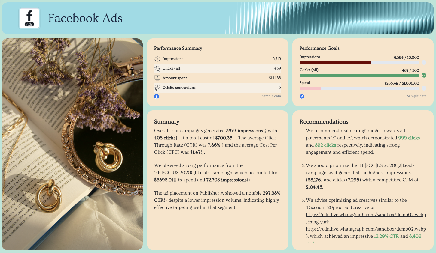
2. Social Media KPI Dashboard

Use this example for free with your data
This social media dashboard shows how your content performs across Instagram, Facebook, and YouTube in one place.
It starts with a cross-channel overview and recommendations, then breaks each platform into its own section with the right KPIs for that channel.
Metrics to visualize and how to structure:
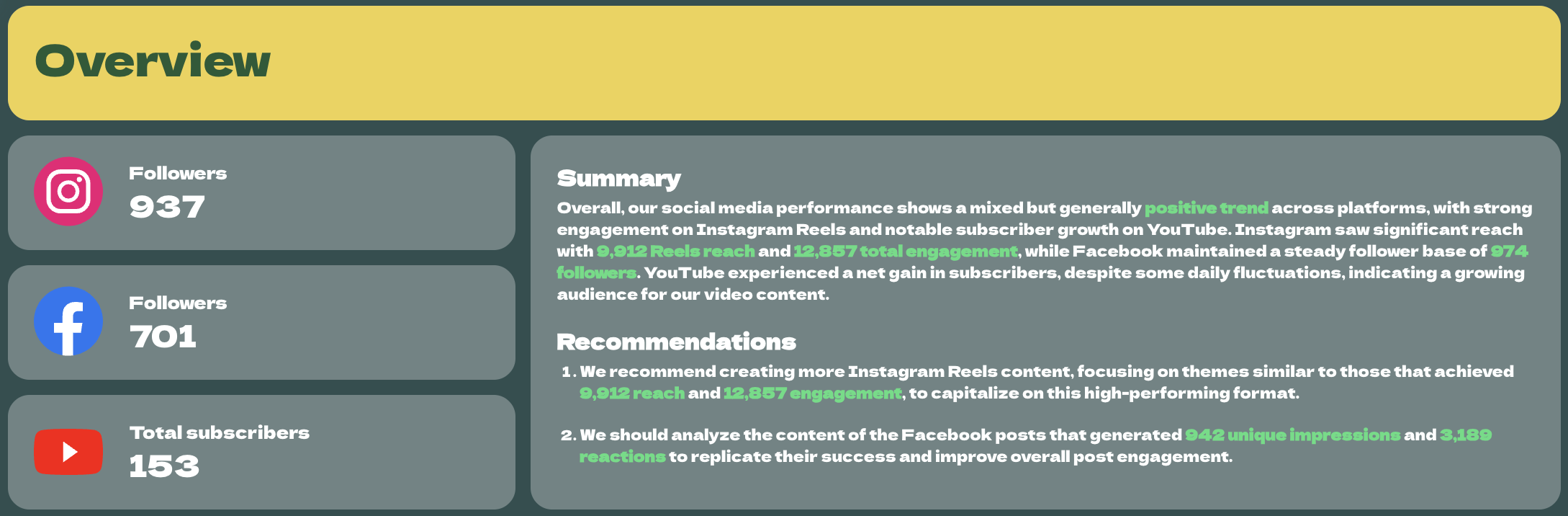
1️⃣ Overview Tab
This is your executive snapshot.
Include:
- Followers by platform
- Total subscribers
- Cross-channel reach and engagement
- AI summary and recommendations
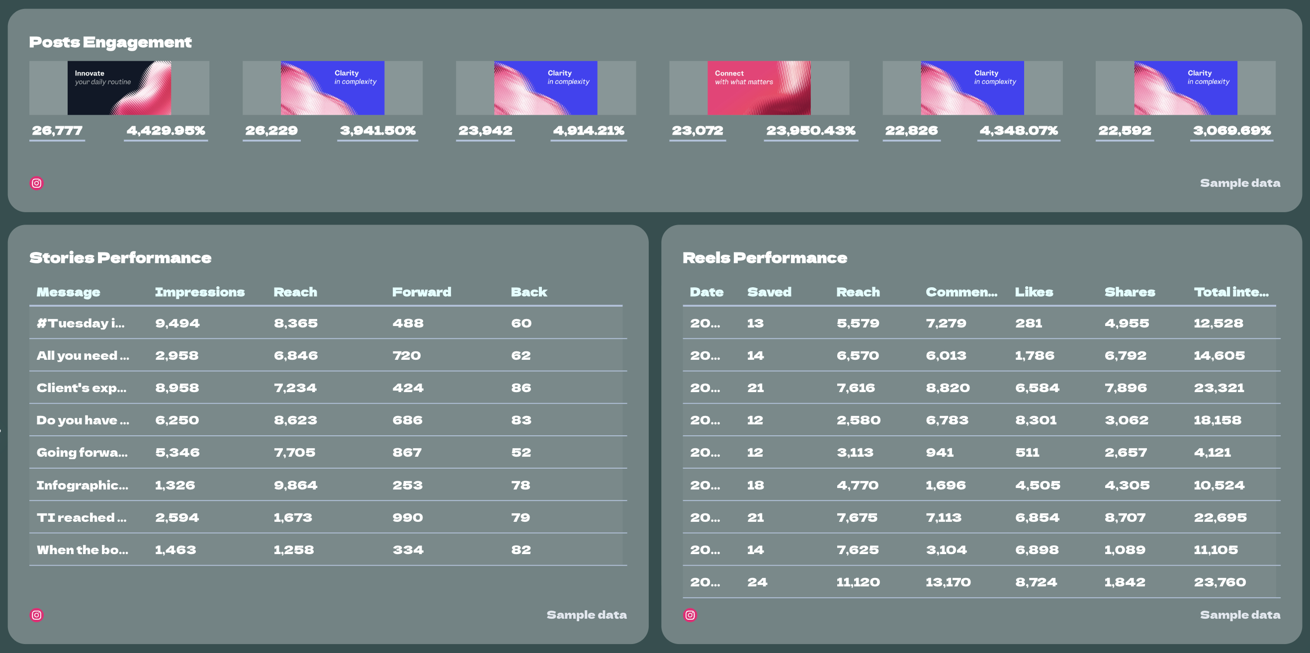
2️⃣ Instagram Performance
This is the deepest section of the dashboard and should be split by content type.
Include:
- Followers
- New followers
- Reach
- Engagement
- Reels reach
- Reels saved
- Stories impressions
- Stories reach
- Stories replies
- New posts
- Post engagements
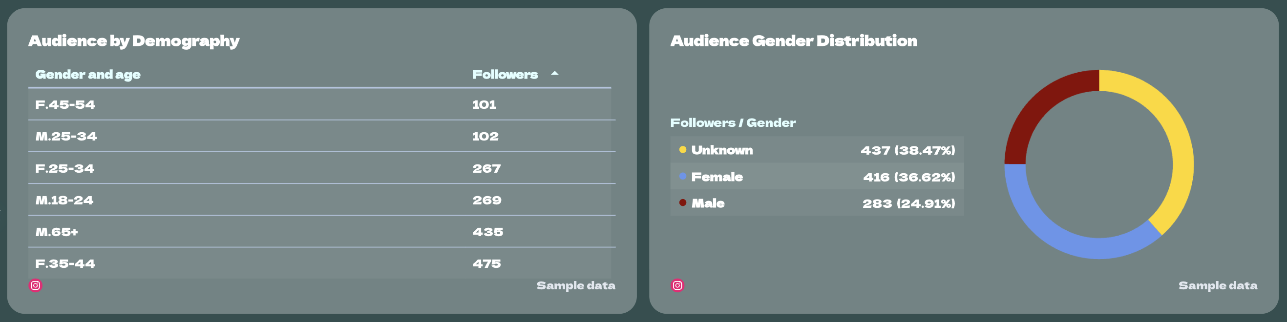
This example also includes audience demographics, a reach vs. new followers trend chart, stories performance, posts performance, audience gender distribution, and engagement breakdowns. That makes it easy to understand what caused engagement to fall and which content formats are actually driving results.
3️⃣ Instagram Content Breakdown
Break Instagram into separate blocks so you can compare formats clearly.
Include:
- Reels performance
- Stories performance
- Posts performance
- Likes
- Comments
- Shares
- Saves
- Forwards / backs for Stories
- Total interactions
4️⃣ Facebook Performance
Keep this section simpler and focused on page visibility and interaction.
Include:
- Followers
- Page likes
- Reach
- Impressions
- Post engagements
- Comments
- Shares
- Engagement rate
- CTA clicks
This example also includes a reach vs. followers trend chart, a post engagements over time chart, and a top-performing posts table. That gives you both the big-picture page trend and the specific posts worth learning from.
5️⃣ Top Facebook Posts
This should sit under the Facebook section.
Include:
- Post unique impressions
- Post clicks
- Post reactions
- Post comments
- Post shares
6️⃣ YouTube Performance
This section should focus on video consumption, retention, and subscriber movement.
Include:
- Total subscribers
- Views
- Estimated minutes watched
- Likes
- Dislikes
- Comments
- Shares
- Subscribers gained
- Subscribers lost
- Average view duration
- Average view percentage
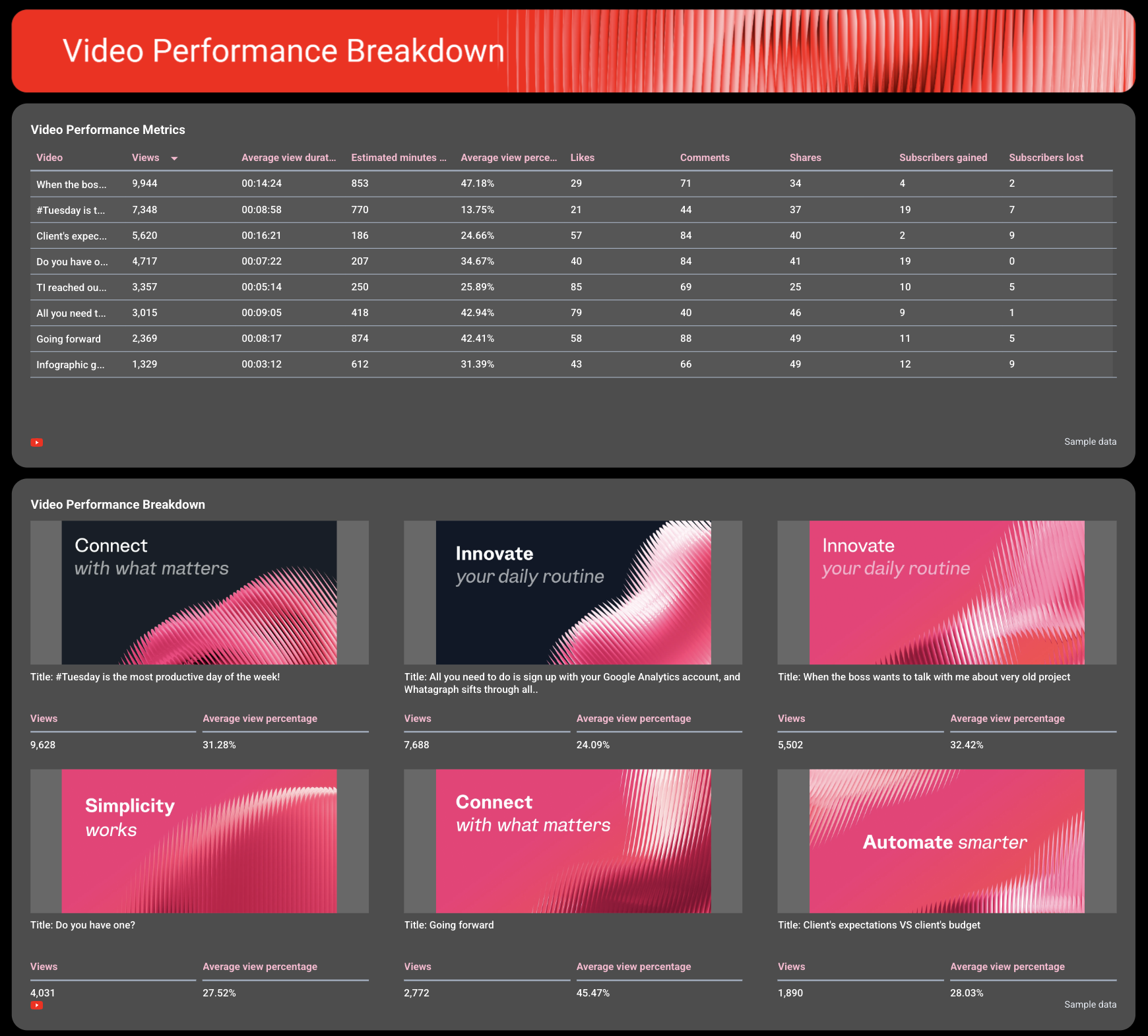
7️⃣ Video Performance by Video
This should sit at the bottom of the YouTube section.
Include:
- Video views
- Likes
- Dislikes
- Subscribers gained
- Subscribers lost
Best practices:
✅ Start with one cross-channel overview tab that shows audience size, growth, and a short summary with recommendations.
✅ Give each platform its own section to clearly see which social platforms are doing the best.
✅ Break Instagram down by format—Reels, Stories, and Posts—so you can see which type of content is actually doing the heavy lifting.
✅ Include audience demographics on Instagram to guide future content decisions around topic, format, and tone.
✅ Pair KPI cards with trend charts so you can see whether follower growth, reach, engagement, or retention are improving over time.
✅ Add custom images to make your report “pop” and more engaging for stakeholders.

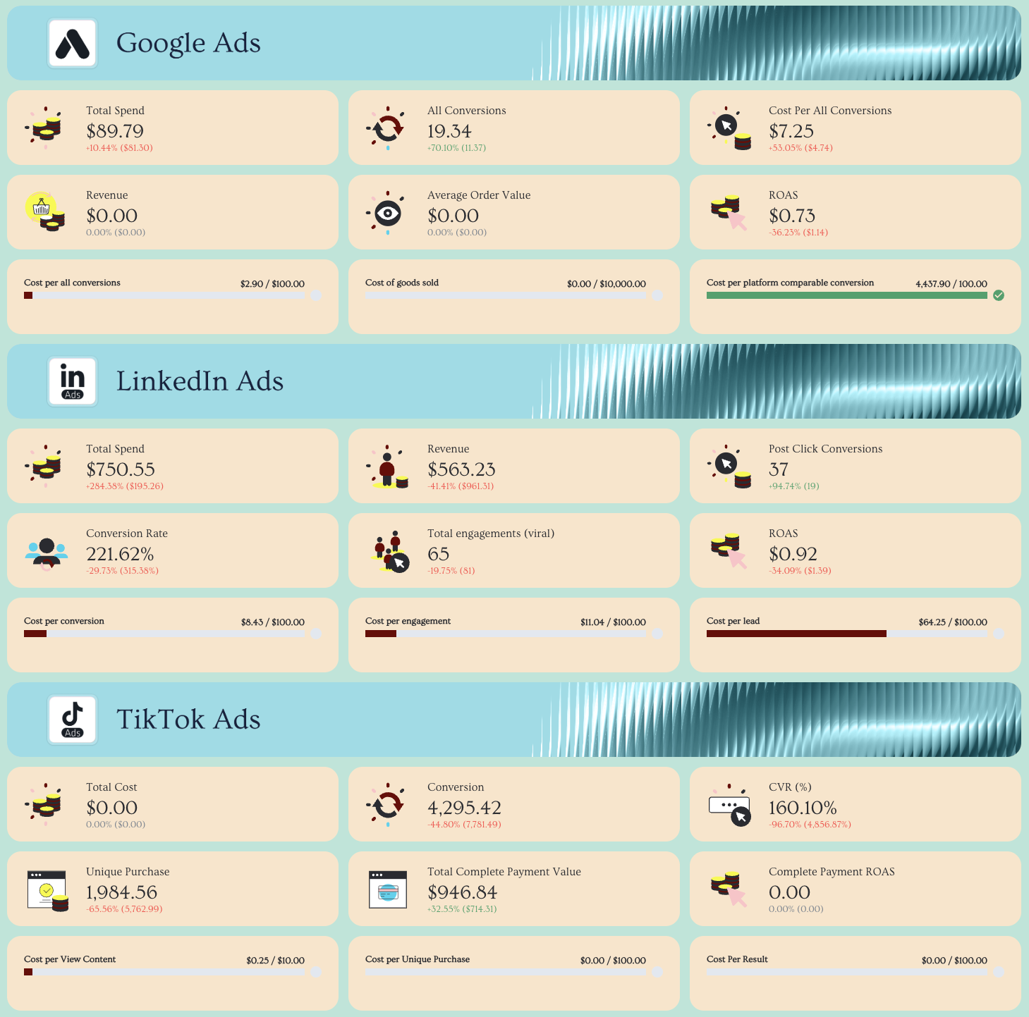
3. LinkedIn Ads KPI Dashboard Example
Use this example for free with your data
Who it’s for:
- B2B marketing teams running LinkedIn Ads who need to prove pipeline impact beyond last-click attribution.
- Demand generation managers who want to connect campaign performance to revenue and buying committee engagement.
Channels connected: LinkedIn Ads, CRM (for pipeline, leads, and attribution data)
This LinkedIn Ads dashboard shows how your campaigns influence pipeline—not just clicks or conversions.
We talked to Marc Woodland, CEO at Winbox, a leading LinkedIn Ads agency in the UK, to create this LinkedIn Ads KPI dashboard. He says:
The biggest challenge with LinkedIn ads isn’t the ads. It’s proving they worked.LinkedIn influences buying journeys in ways traditional attribution models can’t see, meaning marketers often under-credit the channel, even when it’s driving real demand.
At his agency, he uses a unique LinkedIn reporting framework to clearly tie reach and engagement metrics with pipeline. We structured this dashboard according to the reporting framework:
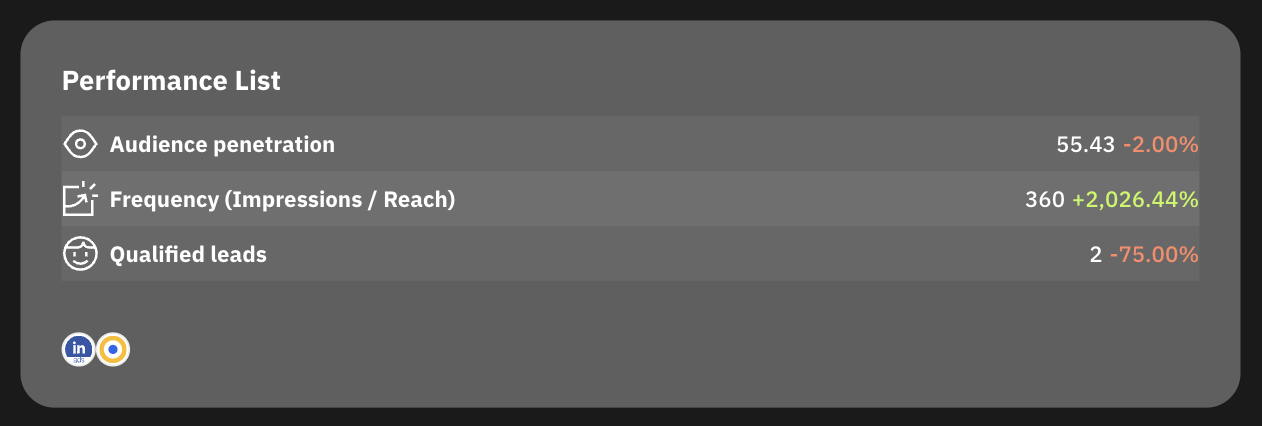
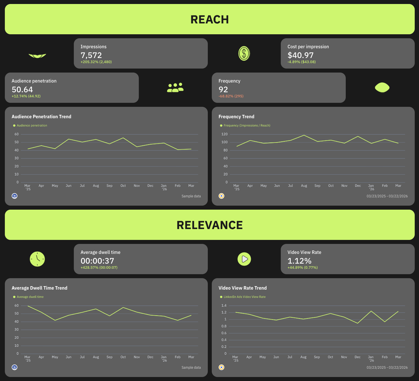
1️⃣ Reach - Are you showing up in front of your buying committee?
- Impressions
- CPM
- Frequency
- Audience penetration
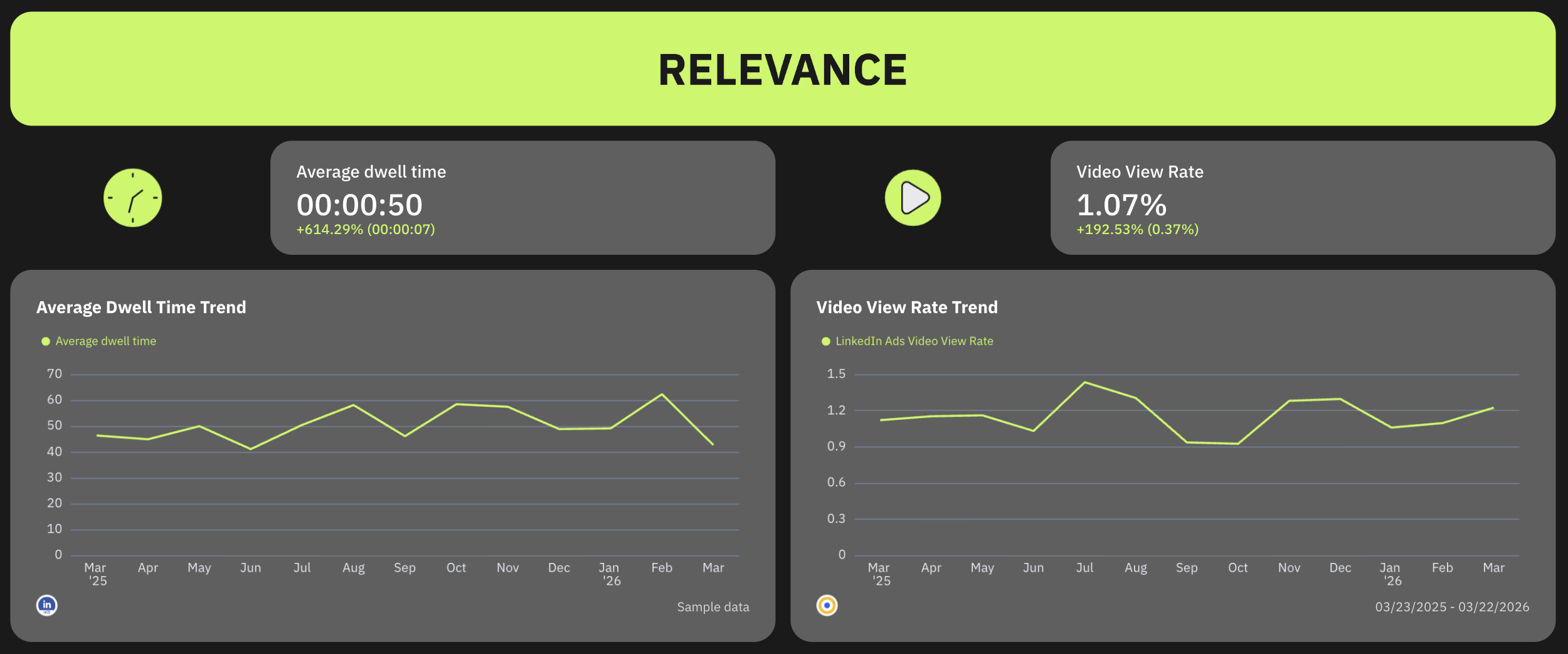
2️⃣ Relevance - Are they stopping to notice and consume your content?
- Dwell Time
- Video View Rate
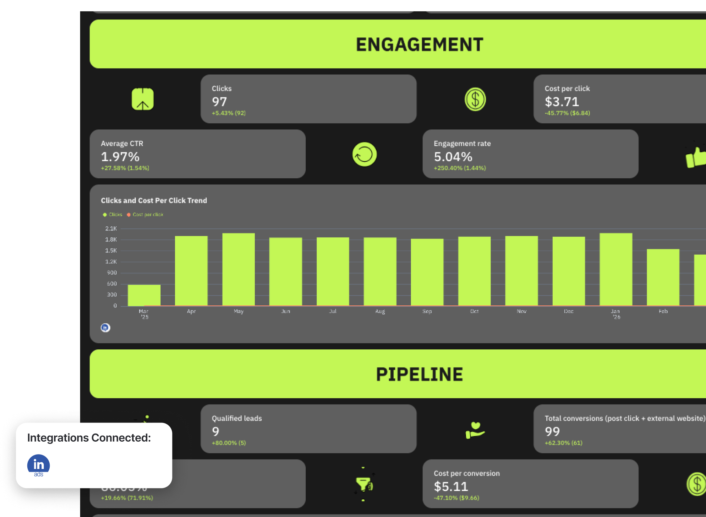
3️⃣ Engagement - Are they interacting in ways that signal intent?
- CTR
- Clicks
- Engagement Rate
- CPC
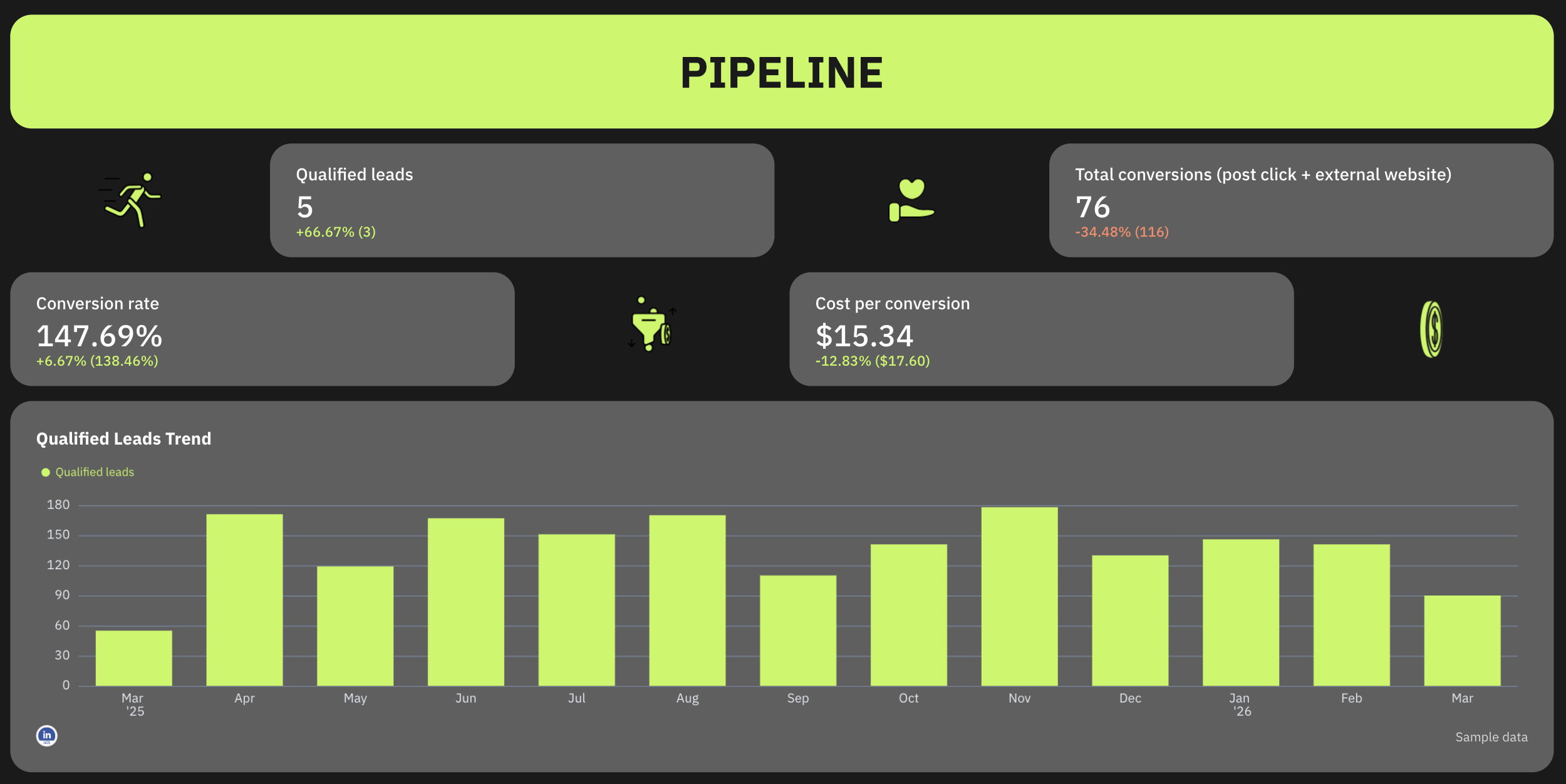
4️⃣ Pipeline influenced - Are the ads influencing new deals?
- Leads
- Conversions
- RAR Report
- Self-Reported attribution
- Manual attribution
This dashboard example also includes detailed campaign performance with campaign-level performance tables showing:
- Audience penetration per campaign
- Qualified leads per campaign
- Dwell time
- Engagement rate
- Cost per 1,000 impressions
- Conversions and conversion rate
This table helps you identify which campaigns are driving pipeline versus those that need optimization.
Another section important to highlight is also the ad creative performance. Include a carousel chart showing the ad creative images and these metrics for each:
- Audience penetration
- Qualified leads
- Conversions
This section highlights the creatives that are actually driving results, making it easier to scale winning ads.
Best practices:
✅ Structure your entire dashboard around key metrics throughout the funnel: Reach → Relevance → Engagement → Pipeline.
✅ Always include audience penetration and frequency to measure how well you’re reaching your buying committee.
✅ Use dwell time and video view rate to evaluate content quality, not just clicks.
✅ Pair engagement metrics with cost metrics (CTR + CPC) to balance performance and efficiency.
✅ Track pipeline using multiple attribution methods (RAR, self-reported, manual) to capture LinkedIn’s true impact.
✅ Add trend charts for every stage so you can see whether performance is improving over time.
✅ Add custom GIFs to keep reports engaging for stakeholders.
4. SEO KPI Dashboard Example
Use this example for free with your data
Who it’s for:
- SEO managers and specialists who need to track rankings, traffic, and conversions in one place.
- Marketing teams and agency account managers who want to connect SEO performance to revenue and business outcomes.
Channels connected: Google Search Console, Google Analytics 4, Semrush
This SEO KPI dashboard gives you a complete view of how your organic performance translates from visibility → traffic → conversions.
This example is structured into four clear sections—Summary, Organic Visibility, Organic Traffic, and Organic Conversions—so you can not only see what changed in organic traffic and visibility but also where conversions are coming from.
Metrics to visualize and how to structure:
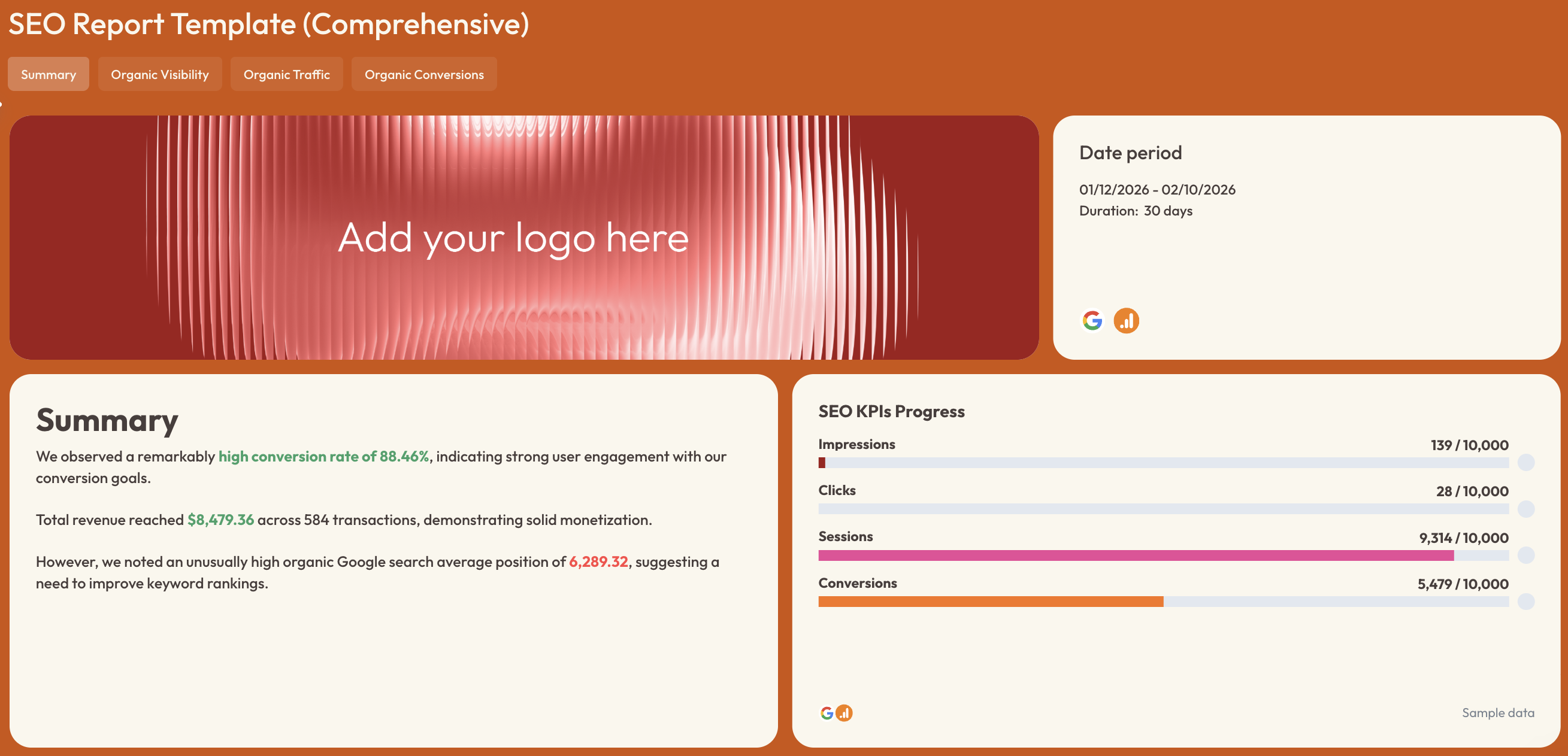
1️⃣ Summary
This is where you highlight the biggest SEO wins and issues.
Include:
- Sessions
- Total users
- New users
- Conversions
- Conversion rate
- Revenue
- Transactions
- Average purchase revenue
- SEO KPI progress (impressions, clicks, sessions, conversions vs targets)
2️⃣ Organic Visibility
This section focuses on how often your site appears in search results.
Include:
- Impressions
- Clicks
- CTR
- Average ranking position
- Impressions distribution (web, image, video search)
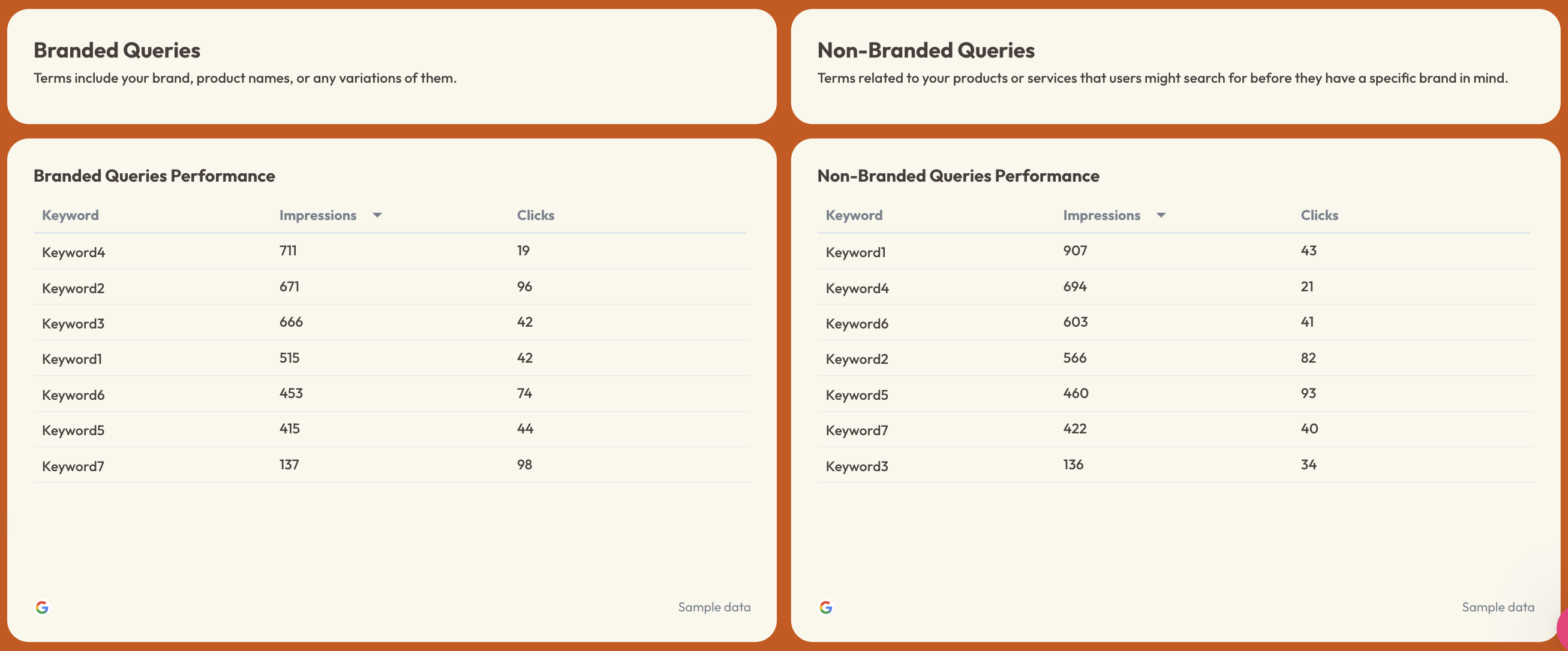
- Clicks distribution
- Branded vs non-branded queries
- Keyword performance tables
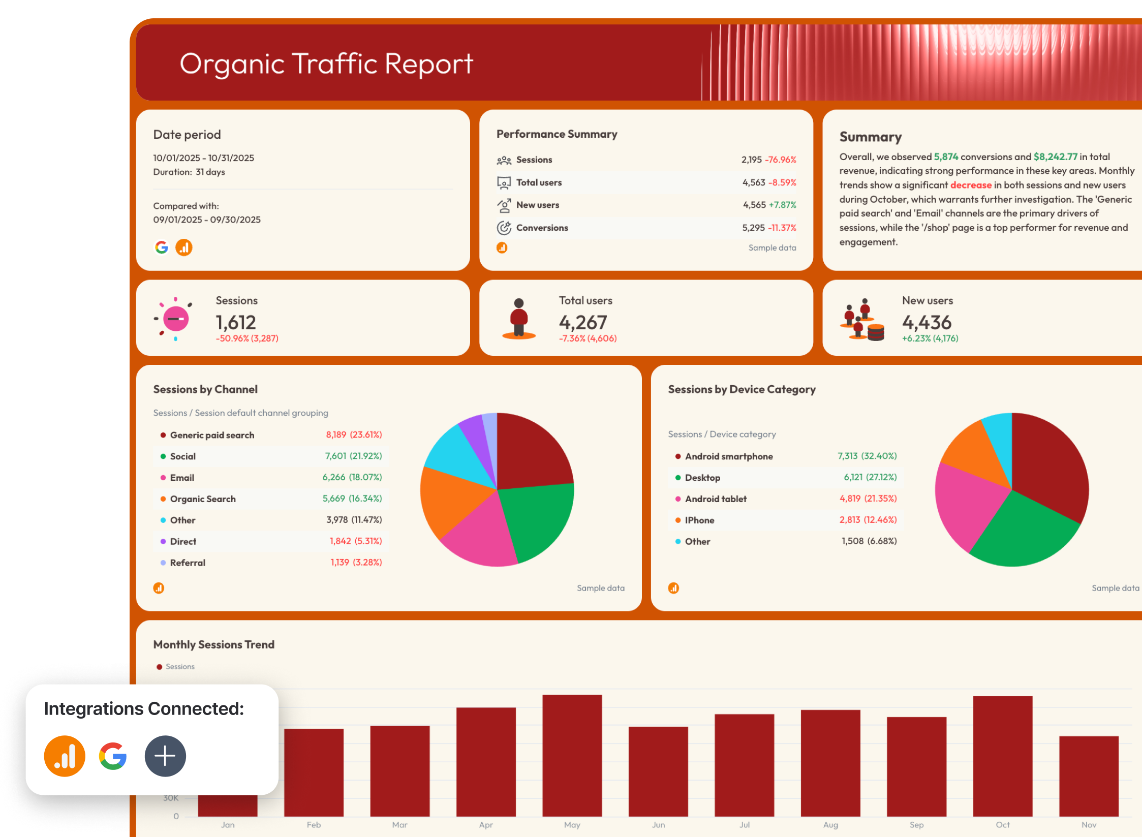
3️⃣ Organic Traffic
This section shows how visibility translates into actual website visits.
Include:
- Sessions
- Total users
- New users
- Sessions by channel
- Sessions by device
- Monthly sessions trend
- New users trend
- Page performance (sessions, users, engagement rate by page)
4️⃣ Organic Conversions
This is where SEO ties to business impact.
Include:
- Conversions
- Conversion rate
- Transactions
- Revenue
- Purchase revenue
- Revenue by device
- Revenue by source/medium
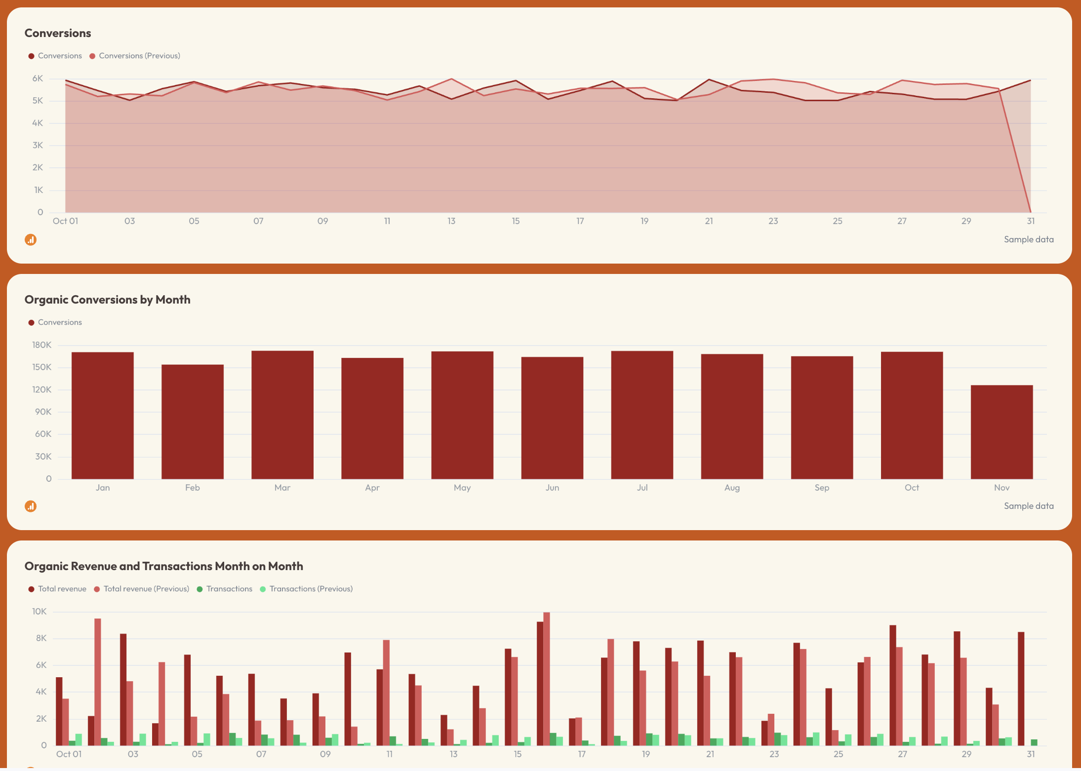
- Conversions over time
- Organic revenue and transactions trends
- Page-level conversion performance
- Traffic acquisition conversions
- Demographic and engagement conversions
Best practices:
✅ Structure your SEO dashboard in four stages: visibility → traffic → conversions, with a summary at the top for quick context and decision-making.
✅ Always include both Search Console (visibility) and GA4 (traffic + conversions) data in one place.
✅ Track branded vs non-branded queries separately to understand growth beyond your existing audience.
✅ Use trend charts for impressions, clicks, sessions, and conversions to spot performance changes over time.
✅ Break down traffic and conversions by page, device, and source to identify what’s actually driving results.
5. YouTube KPI Dashboard Example
Use this example for free with your data
Who it’s for:
- Content marketers, social media managers, and YouTube channel owners who need to track video performance and audience growth.
- Agencies and marketing teams managing YouTube as a core acquisition or brand channel.
Channels connected: YouTube Analytics
A YouTube KPI dashboard helps you understand how your content drives views, watch time, engagement, and revenue, all in one place.
Metrics to visualize and how to structure:
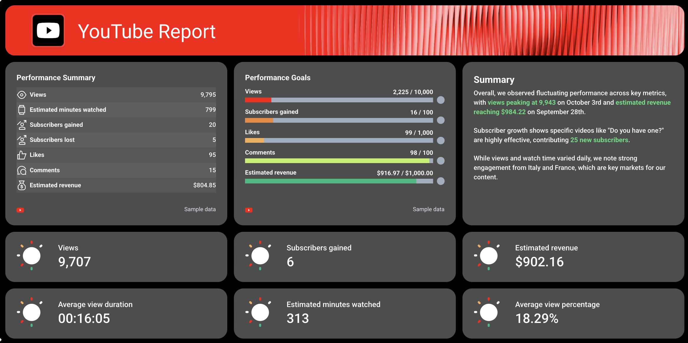
1️⃣ Performance Summary + Goals
This is your executive snapshot.
Include:
- Views
- Estimated minutes watched
- Subscribers gained
- Subscribers lost
- Likes
- Comments
- Estimated revenue
Also include KPI progress bars for:
- Views vs target
- Subscribers gained vs target
- Likes and comments vs target
- Revenue vs target
2️⃣ Key KPI Snapshot
This is your quick-glance performance layer.
Include:
- Views
- Subscribers gained
- Estimated revenue
- Average view duration
- Estimated minutes watched
- Average view percentage
These KPI cards give you an instant read on channel health without needing to scroll through charts.
3️⃣ Video Performance Breakdown
This is where you analyze individual video performance.
Include:
- Views per video
- Average view duration
- Estimated minutes watched
- Average view percentage
- Likes
- Comments
- Shares
- Subscribers gained and lost per video
4️⃣ Views & Watch Time Trends
This section shows how performance evolves over time.
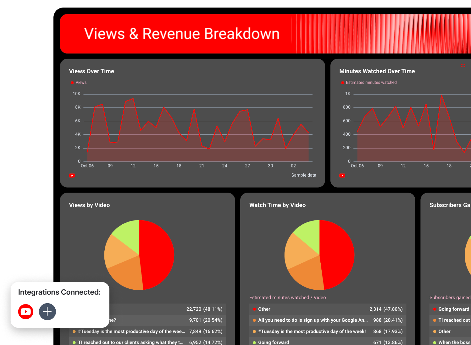
Include:
- Views over time
- Estimated minutes watched over time
These trend charts help you understand content momentum and identify spikes tied to specific uploads or campaigns.
5️⃣ Content Contribution Breakdown
This shows which videos drive the most impact.
Include:
- Views by video (distribution)
- Watch time by video
- Subscribers gained by video
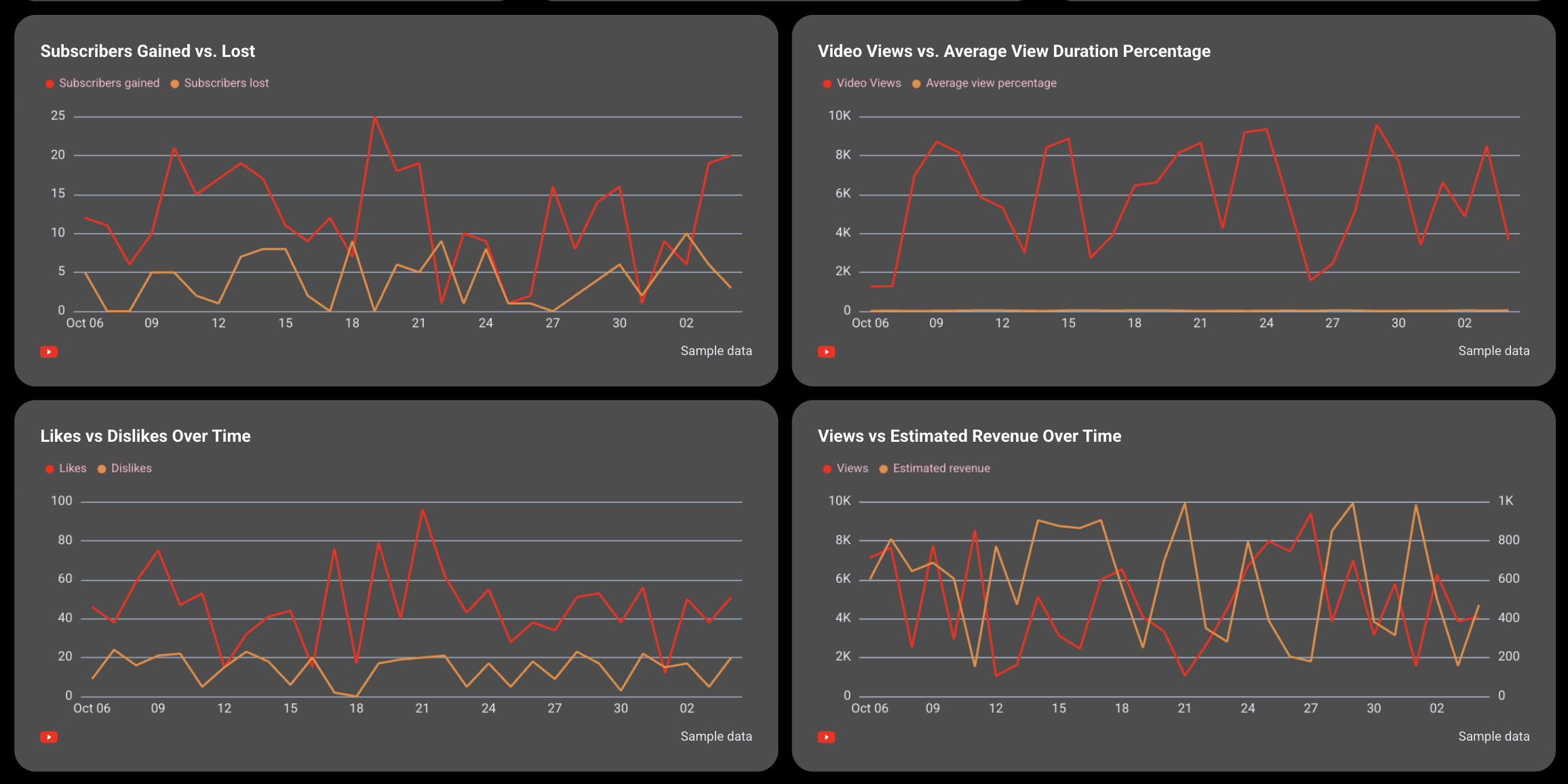
6️⃣ Subscriber Growth & Engagement Trends
This section focuses on audience growth and sentiment.
Include:
- Subscribers gained vs lost over time
- Likes vs dislikes over time
These data visualization charts help you understand whether your content is growing your audience and how viewers are reacting to it.
7️⃣ Performance Correlation (Views vs Engagement & Revenue)
This section connects performance metrics together.
Include:
- Views vs average view duration percentage
- Views vs estimated revenue
This helps you see whether higher views actually translate into better retention and monetization.
Best practices:
✅ Start with a combined performance summary + goals section so you can immediately see progress against targets.
✅ Always include a video-level breakdown to identify which content drives results.
✅ Track subscribers gained vs lost to measure channel growth, not just reach.
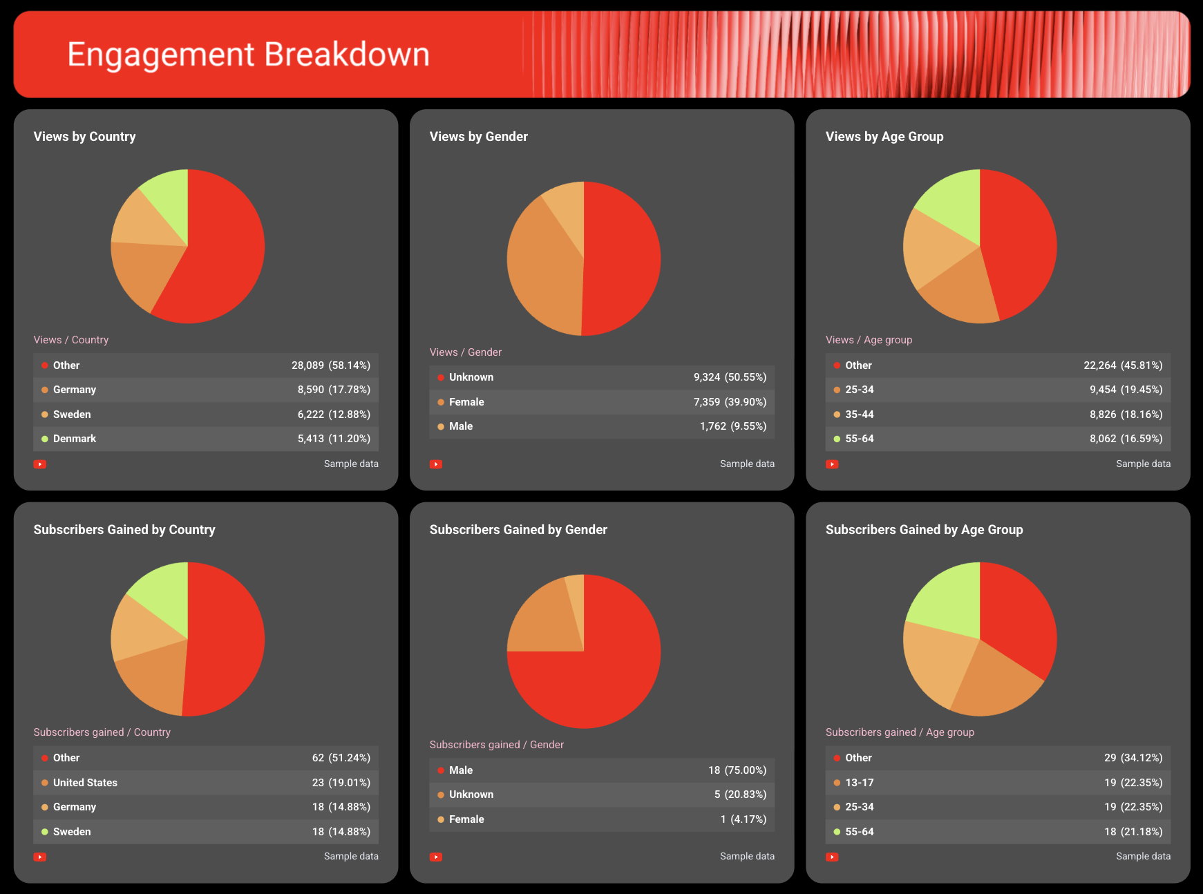
✅ Break down engagement by audience to understand who your top fans are and where they're from.
H2: 4 Analytics and CRM KPI Dashboard Examples
Jump to the analytics and CRM KPI dashboard example you want to see:
- Google Analytics KPI dashboard
- Hubspot KPI dashboard
- Salesforce KPI dashboard
- Email marketing KPI dashboard
6. Google Analytics KPI Dashboard
Use this example for free with your data
Who it’s for:
- Marketing teams and digital analysts who need to track website performance and conversion outcomes across channels.
- Performance marketers and agencies who want to connect traffic sources and campaigns directly to conversions and ROI.
Channels connected: Google Analytics 4
This Google Analytics KPI dashboard gives you a clear view of how your website and campaigns drive traffic, engagement, and conversions without having to figure out how to use GA4.
Metrics to visualize:
- Sessions
- Total users and New users
- Engaged sessions
- Engagement rate
- Conversions and Conversion rate
- Goal pacing (Conversions vs Target)
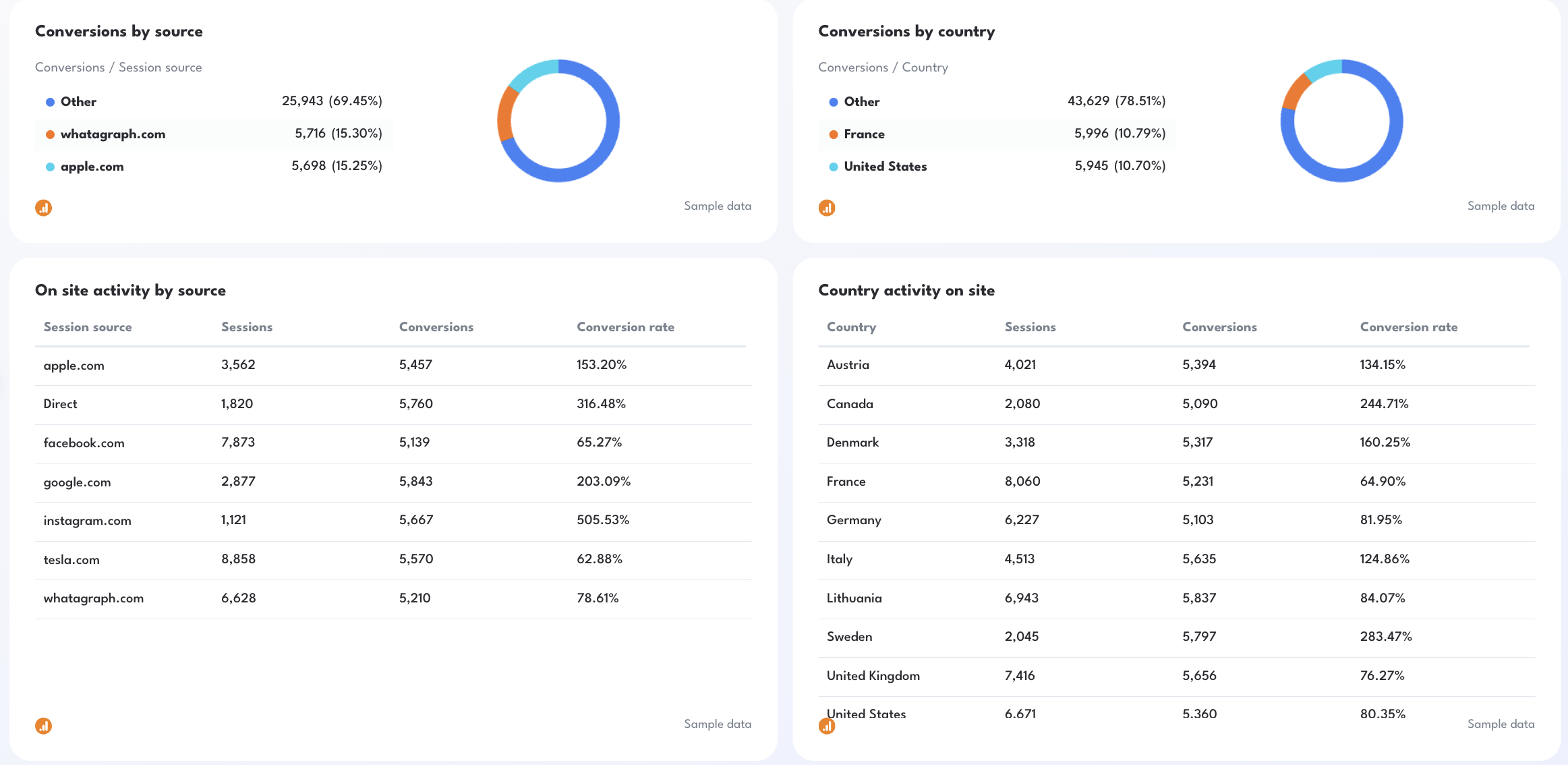
- Conversions by source
- Conversions by default channel grouping (Organic, Direct, Social, Email), campaign, and country
- On-site activity by source, campaign, and day
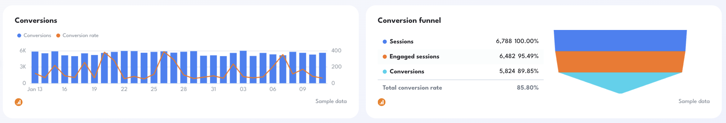
- Conversion funnel (Sessions → Engaged Sessions → Conversions)
Best practices:
✅ Start with a performance summary showing sessions, total users, engagement rate, conversions, and conversion rate.
✅ Add a goal pacing widget (Conversions vs Monthly Target) to keep reporting aligned with business objectives.
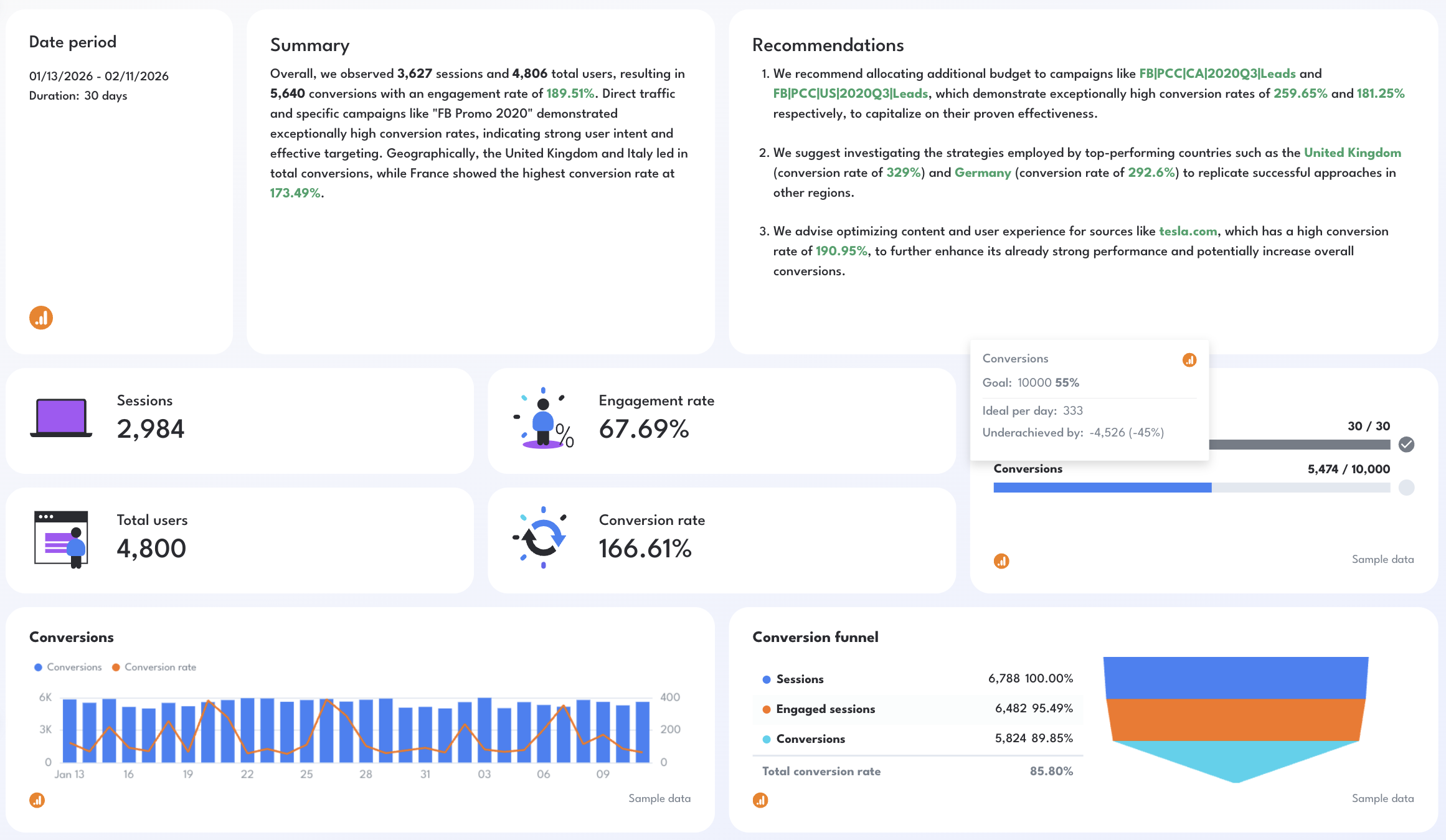
✅ Break down performance by source, country, and campaign to identify high-intent traffic.
✅ Use funnel visualization to quickly spot drop-offs between sessions and conversions.
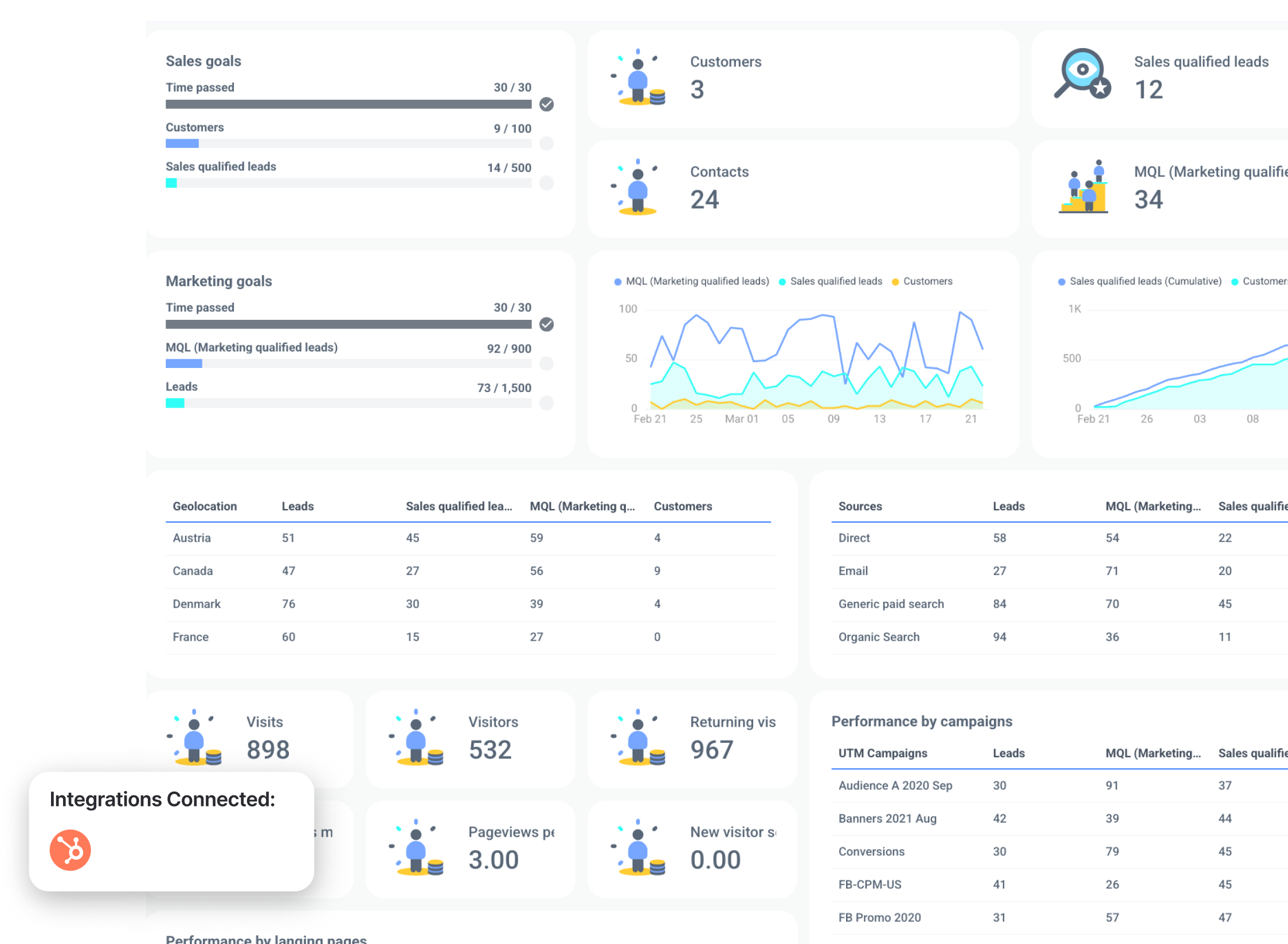
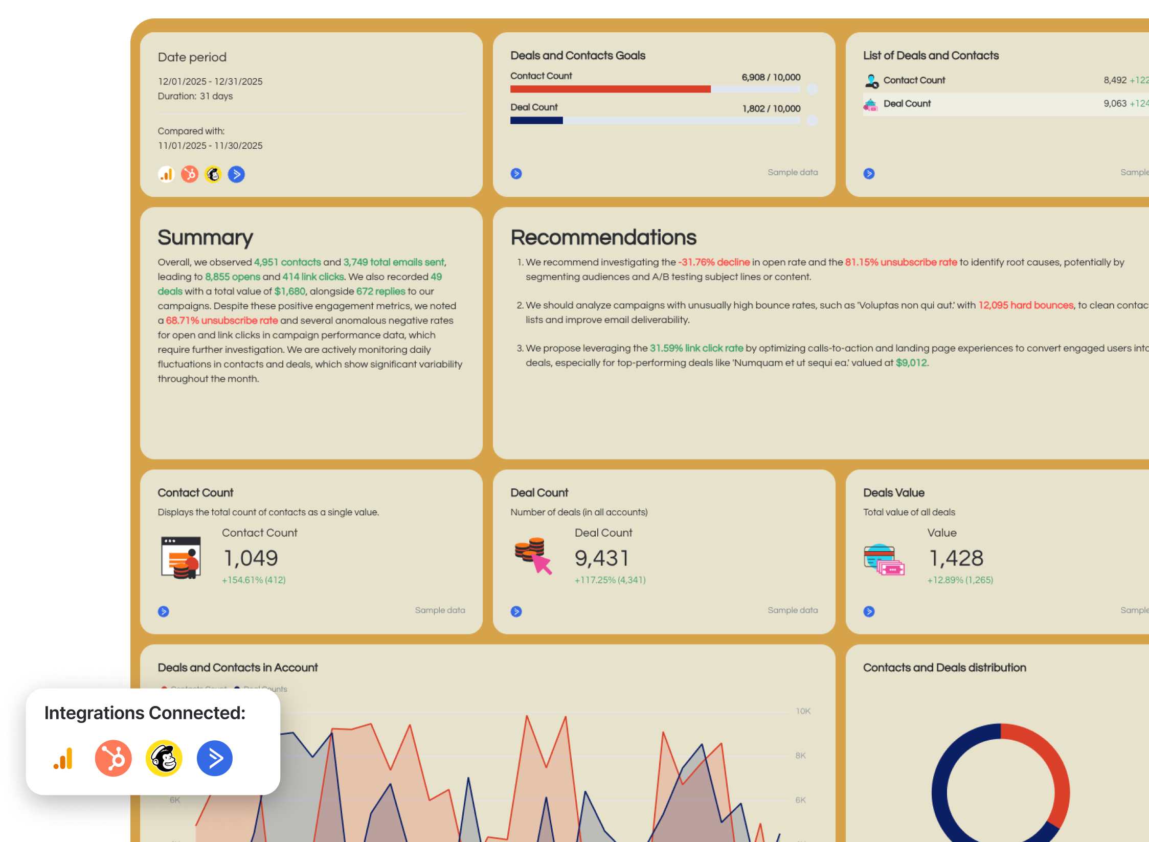
7. Hubspot KPI Dashboard Example
Use this example for free with your data
Who it’s for:
- Marketing and sales teams using HubSpot who need to track the full funnel from leads to customers.
- Inbound marketers and revenue teams who want to align campaign performance with pipeline and revenue outcomes.
Channels connected: Hubspot CRM
This HubSpot sales KPI dashboard gives you a full view of your inbound funnel, from traffic and leads to MQLs and SQLs, so you can clearly see how you’re getting new customers and what’s contributing revenue growth.
Metrics to visualize and how to structure:
- MQL (Marketing qualified leads)
- Sales qualified leads (SQL)
- Customers
- Contacts
- Leads
- Sales goals progress (customers, SQLs vs targets)
- Marketing goals progress (MQLs, leads vs targets)
- Leads over time
- SQLs and customers (cumulative growth)
- Visitors, visits, pageviews, returning visitors
- Leads by source (direct, email, paid search, organic)
- Leads by country (geolocation performance)
- Landing page performance (visitors, leads, MQLs, SQLs, customers)
- Campaign performance (leads, MQLs, SQLs, customers per campaign)
- Email marketing funnel (sent → delivered → opened → clicks → conversion rate)
- Email campaign performance (open rate, clicks, sent, delivered)
- Email engagement trends (sent, opened, clicks over time)
- Unsubscribe rate and spam rate
Best practices:
✅ Structure your dashboard around the full funnel: traffic → leads → MQL → SQL → customers.
✅ Include both marketing and sales goals to align teams around shared targets.
✅ Break down performance by source, campaign, and landing page to see what changed in pipeline and win rate.
✅ Use cumulative growth charts for SQLs and customers to track pipeline momentum.
✅ Include email funnel and campaign performance to understand nurture effectiveness.
✅ Highlight conversion rates at every stage to identify bottlenecks in the funnel.
✅ Keep everything in one view so marketing and sales teams work from a single source of truth.
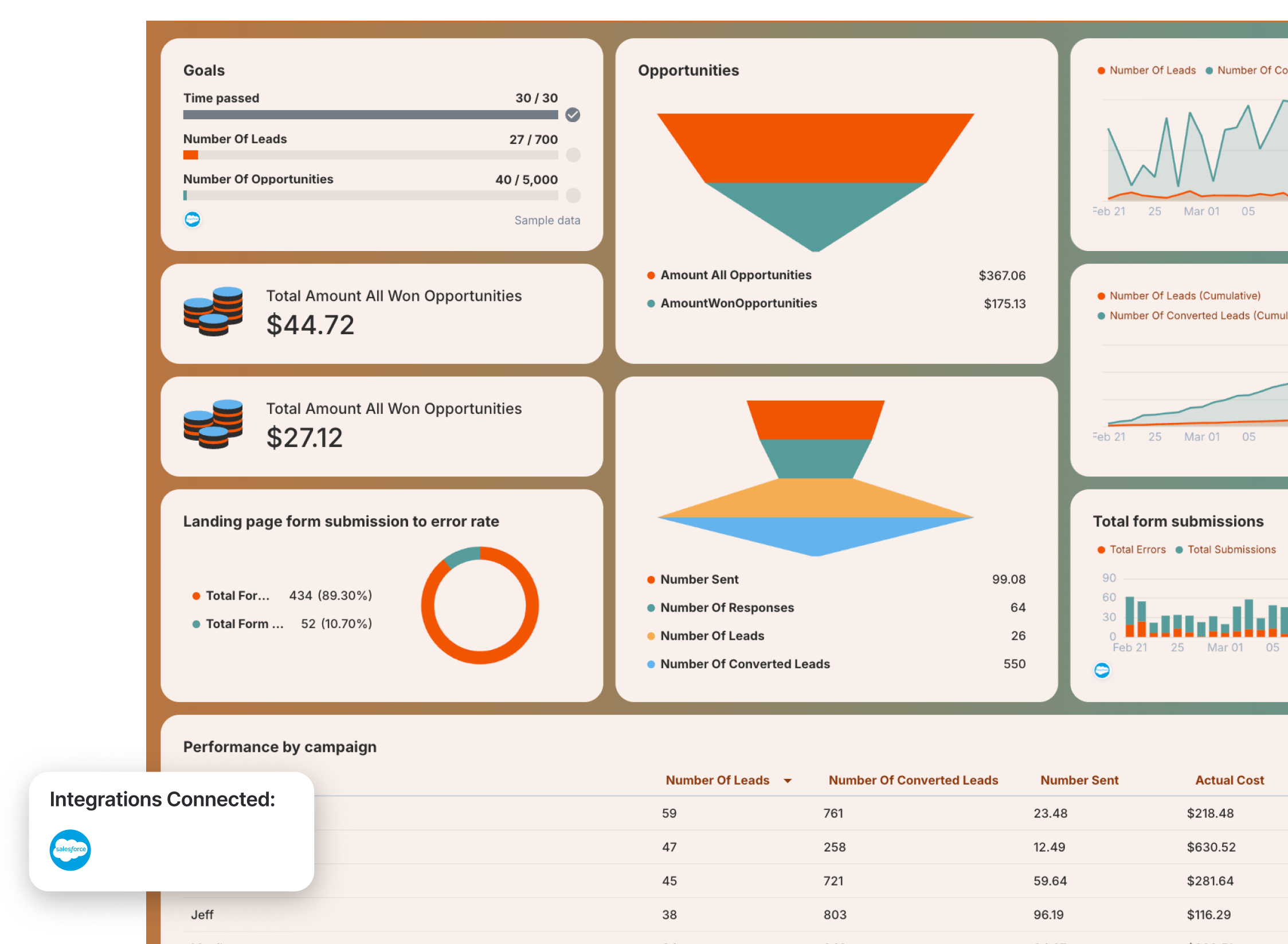
8. Salesforce KPI Dashboard Example
Use this example for free with your data
Who it’s for:
- Sales managers and revenue leaders who need visibility into pipeline health and deal performance.
- Sales teams and operations leaders who want to track lead conversion, opportunities, and revenue in one place.
Channels connected: Salesforce CRM
This Salesforce KPI dashboard gives you a clear view of your sales pipeline—from leads and opportunities to revenue—so you can track performance, forecast outcomes, and identify where deals are being won or lost.
Metrics to visualize and how to structure:
- Number of leads
- Number of opportunities
- Number of converted leads
- Leads vs converted leads over time
- Leads and conversions (cumulative growth)
- Total opportunity value
- Total won revenue
- Pipeline funnel (leads → responses → opportunities → conversions)
- Goal progress (leads and opportunities vs targets)
- Campaign performance (leads, conversions, send volume, cost)
- Campaign type performance
- Landing page form submissions vs errors
- Total form submissions over time
- Responses and outreach activity (number sent, number of responses)
Best practices:
✅ Structure your KPI dashboard Salesforce around the pipeline: leads → opportunities → revenue
✅ Include both volume metrics (leads, opportunities) and value metrics (pipeline value, won revenue)
✅ Use funnel visualizations to identify drop-offs between stages
✅ Track cumulative growth of leads and conversions to monitor pipeline momentum
✅ Drill down performance by campaign and campaign type to see what drives results
✅ Include goal tracking to measure progress against sales targets
✅ Monitor form submissions and errors to catch conversion issues early
9. Email Marketing KPI Dashboard Example
Use this example for free with your data
Who it’s for:
- Email marketers and lifecycle teams who need to track campaign performance and engagement.
- Revenue and growth teams who want to connect email activity to deals, conversions, and sales.
Channels connected: ActiveCampaign (for general email + deals tracking), Email platforms (Mailchimp, HubSpot, etc.), Ecommerce data (for revenue tracking)
This email marketing KPI dashboard shows how your campaigns drive engagement, conversions, and revenue, not just opens and clicks.
This example includes two views: a general email marketing dashboard (connected to ActiveCampaign with deal tracking) and an ecommerce email dashboard that ties campaigns directly to revenue and transactions.
Together, they give you a full picture from engagement → pipeline → revenue and helps you see what changed in email engagement and conversions.
Metrics to visualize and how to structure:
- Contacts
- Emails sent
- Opens
- Open rate
- Link clicks
- Click-through rate (CTR)
- Replies
- Unsubscribes
- Unsubscribe rate
- Deal count
- Deals value
- Contacts vs deals over time
- Email engagement funnel (sent → opens → clicks → conversions)
- Emails sent vs opens (trend)
- Opens vs link clicks (trend)
- Campaign performance (sends, opens, clicks, replies, conversions)
Ecommerce email metrics:
- Email revenue
- Transactions
- Ecommerce conversion rate
- Average order value (AOV)
- Sessions from email
- Product views
- Add-to-cart
- Revenue by campaign
- Revenue by channel (email vs other channels)
- Top-performing campaigns
- Top-performing products and categories
Best practices:
✅ Combine engagement metrics (opens, clicks) with revenue metrics (deals, transactions) in one dashboard.
✅ Include an email funnel to identify where performance drops (opens → clicks → conversions).
✅ Track deals and deal value when using tools like ActiveCampaign to connect email to pipeline.
✅ Break down performance by campaign to identify what drives results.
✅ Add ecommerce revenue tracking to understand the real impact of email campaigns.
H2: 2 E-Commerce KPI Dashboard Examples
Jump to the e-commere KPI dashboard examples you want to see:
Want more? Check out 7 e-commerce KPI dashboard examples.
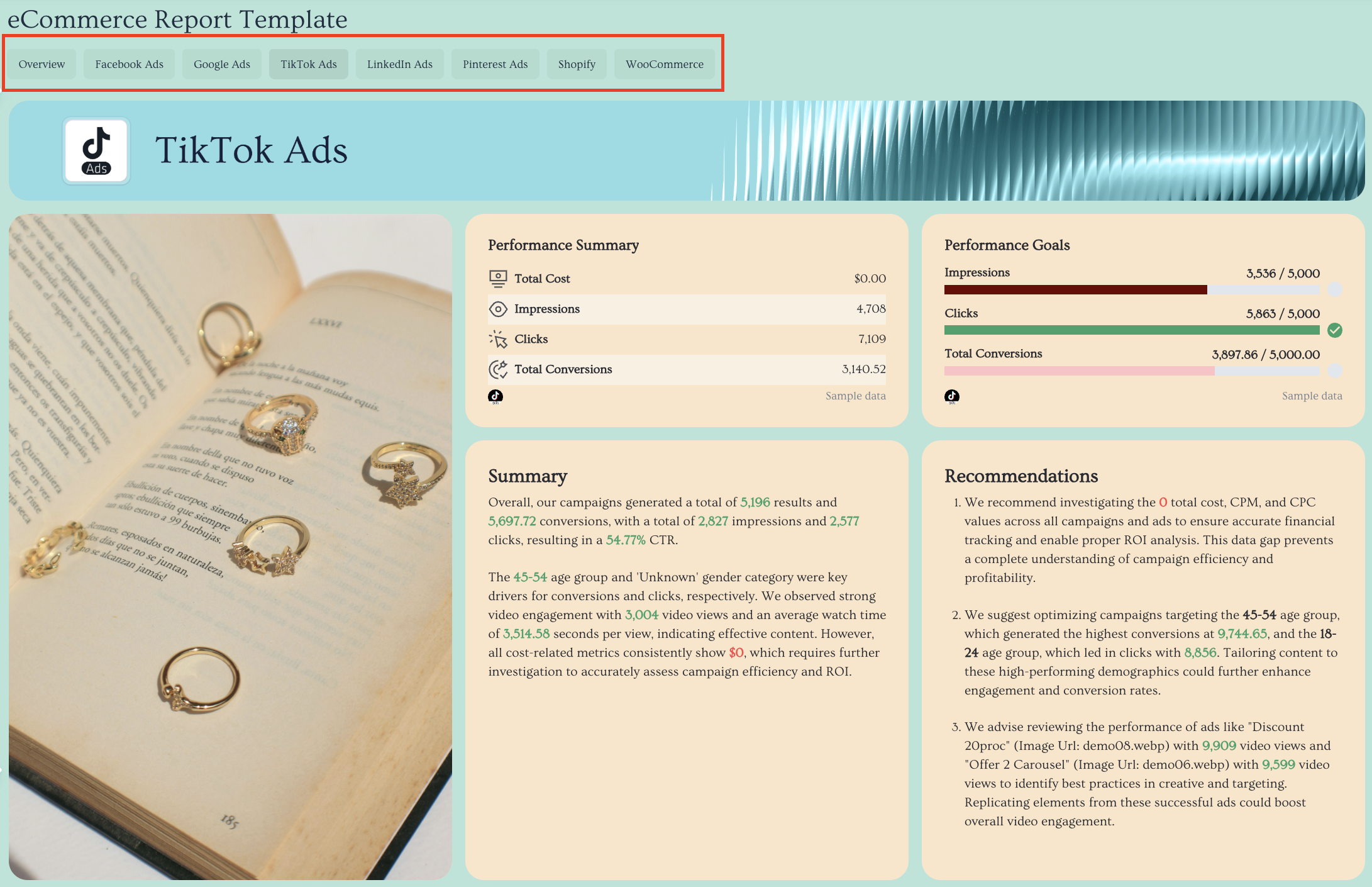
10. E-Commerce KPI Dashboard Example
Use this example for free with your data
Who it’s for:
- Ecommerce Managers who need a single source of truth across Meta, Google, TikTok, LinkedIn, Pinterest, and Shopify.
- Agency account managers who want one clean performance dashboard that proves cross-channel impact without juggling spreadsheets.
Channels connected:
- Meta (Facebook & Instagram Ads)
- Google Ads
- TikTok Ads
- LinkedIn Ads
- Pinterest Ads
- Shopify
- WooCommerce
This multichannel ecommerce dashboard example gives you a complete performance overview across all paid channels and your store data in one place. Instead of jumping between ad platforms and your ecommerce backend, it aggregates everything into one structured, decision-ready report.
The first tab acts as your executive-level “cover” overview, showing aggregated KPIs across channels—so stakeholders immediately understand what’s driving revenue, where ad spend is going, and how profitable your marketing efforts really are.
Metrics to include and how to structure:
1️⃣ Cover Tab (All Channels Overview)
This is your executive snapshot.
Include:
- Total revenue
- Total ad spend
- ROAS (blended across paid channels)
- Conversions
- Customer acquisition cost (CAC)
- Average order value (AOV)
- Conversion rate
- Total impressions & clicks
This tab aggregates performance from Facebook Ads, Google Ads, TikTok, and other paid channels into one view. It helps stakeholders understand what caused conversion performance to drop or surge.
Always show a KPI snapshot at the very top before diving into breakdowns. Stakeholders shouldn’t have to scroll to understand performance.
2️⃣ Meta (Facebook & Instagram Ads) Tab
Track:
- Spend
- ROAS
- Cost per purchase
- Purchases
- CTR
- CPC
- Conversion rate
- Campaign & ad performance breakdown
- Audience demographics
3️⃣ Google Ads Tab
Track:
- Spend
- Conversions
- ROAS
- CPC
- CTR
- Search vs Display breakdown
- Keyword performance
- Landing page performance
4️⃣ TikTok Ads Tab
Track:
- Spend
- Purchase ROAS
- Conversion rate
- Video views & engagement metrics
- Top-performing creatives
- Audience breakdown
5️⃣ Pinterest Ads
Track:
- Total spend
- Conversions
- Total conversions value
- ROAS
- Impressions
- Pin clicks
- Cost per click
6️⃣ Shopify (Store Performance) Tab
Track:
- Gross sales
- Net sales
- Total sales
- Orders
- AOV
- Refunds
- Discounts
- Shipping
- Product performance
- Sales by channel
Best practices:
✅ Keep all marketing channels in one place, organized by tabs within a single ecommerce dashboard to create a true single source of truth.
✅ Start with an aggregated “Cover” tab that helps stakeholders see what changed in revenue, conversion rate, and average order value right away.
✅ Structure every tab the same way: KPI summary row at the top → performance trend graphs → detailed campaign/ad/product breakdown tables.
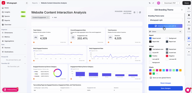
✅ White-label instantly with Whatagraph IQ Themes by uploading your brandbook or a screenshot—automatically apply brand fonts and colors across the entire report.
Here's how it works:
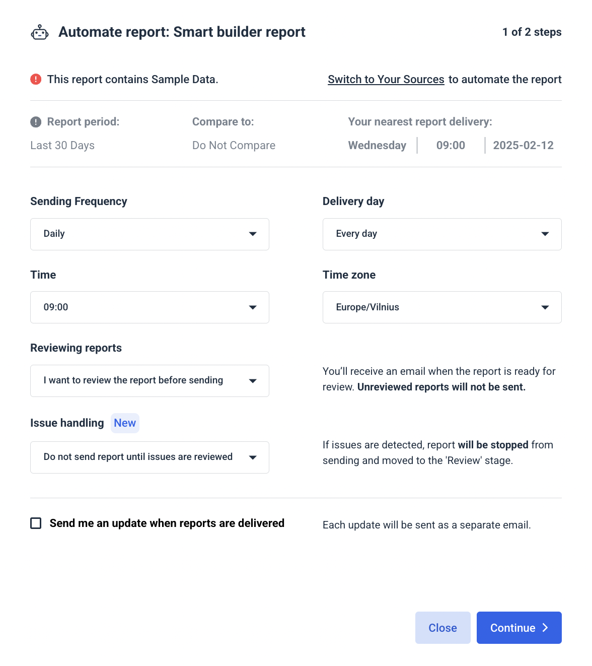
✅ Automate report delivery workflow on specific dates and frequencies (weekly for marketing teams, monthly for leadership, real-time links for clients) to eliminate manual exports and reporting chaos.
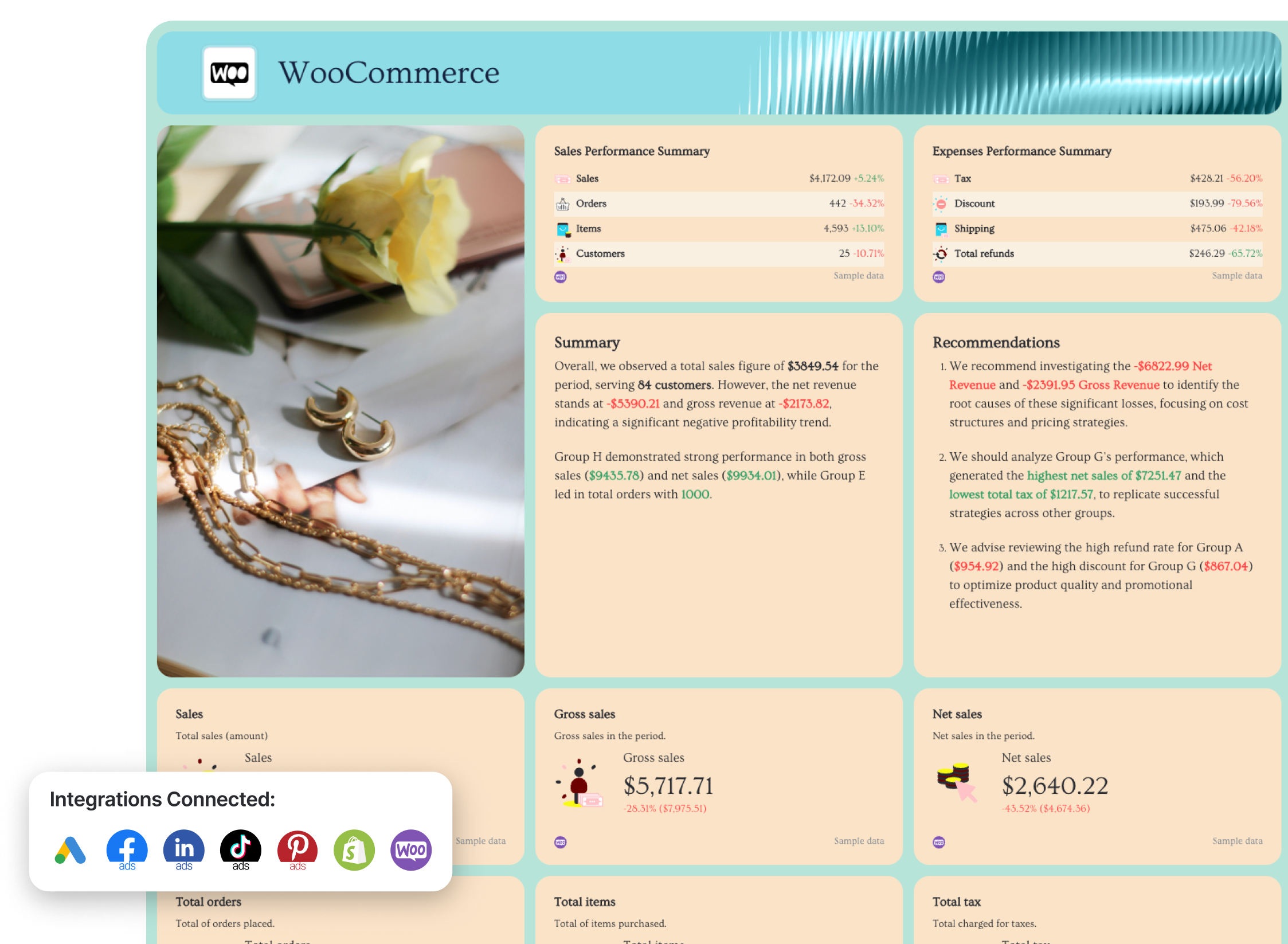
11. Shopify KPI Dashboard Example
Use this example for free with your data
Who it’s for:
- Ecommerce managers and Shopify store owners who need a clear view of sales performance and profitability.
- Marketing and operations teams who want to track how pricing, discounts, and returns impact revenue.
Channels connected: Shopify
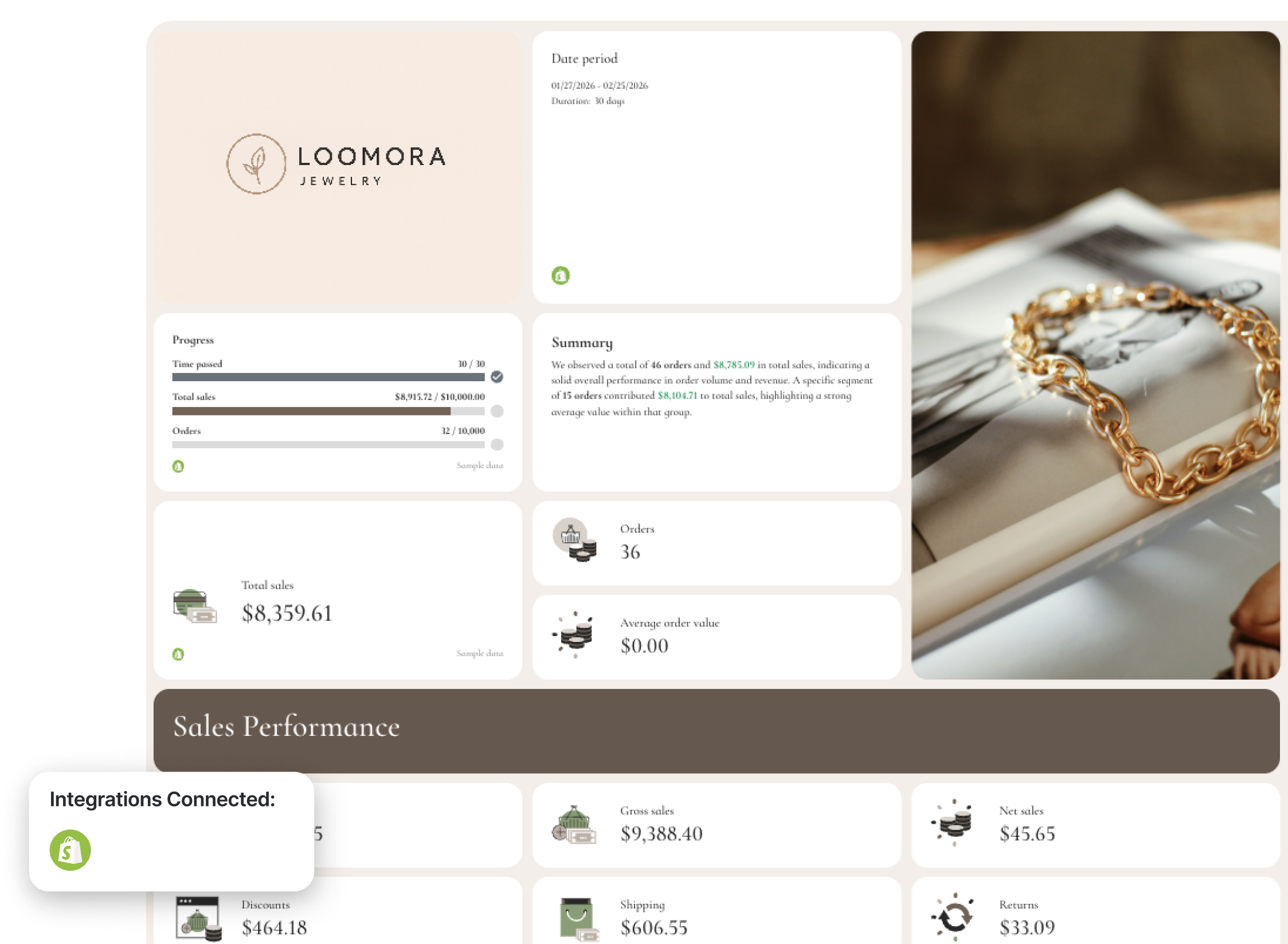
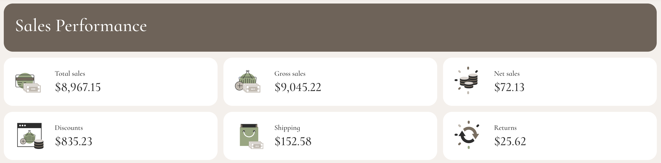
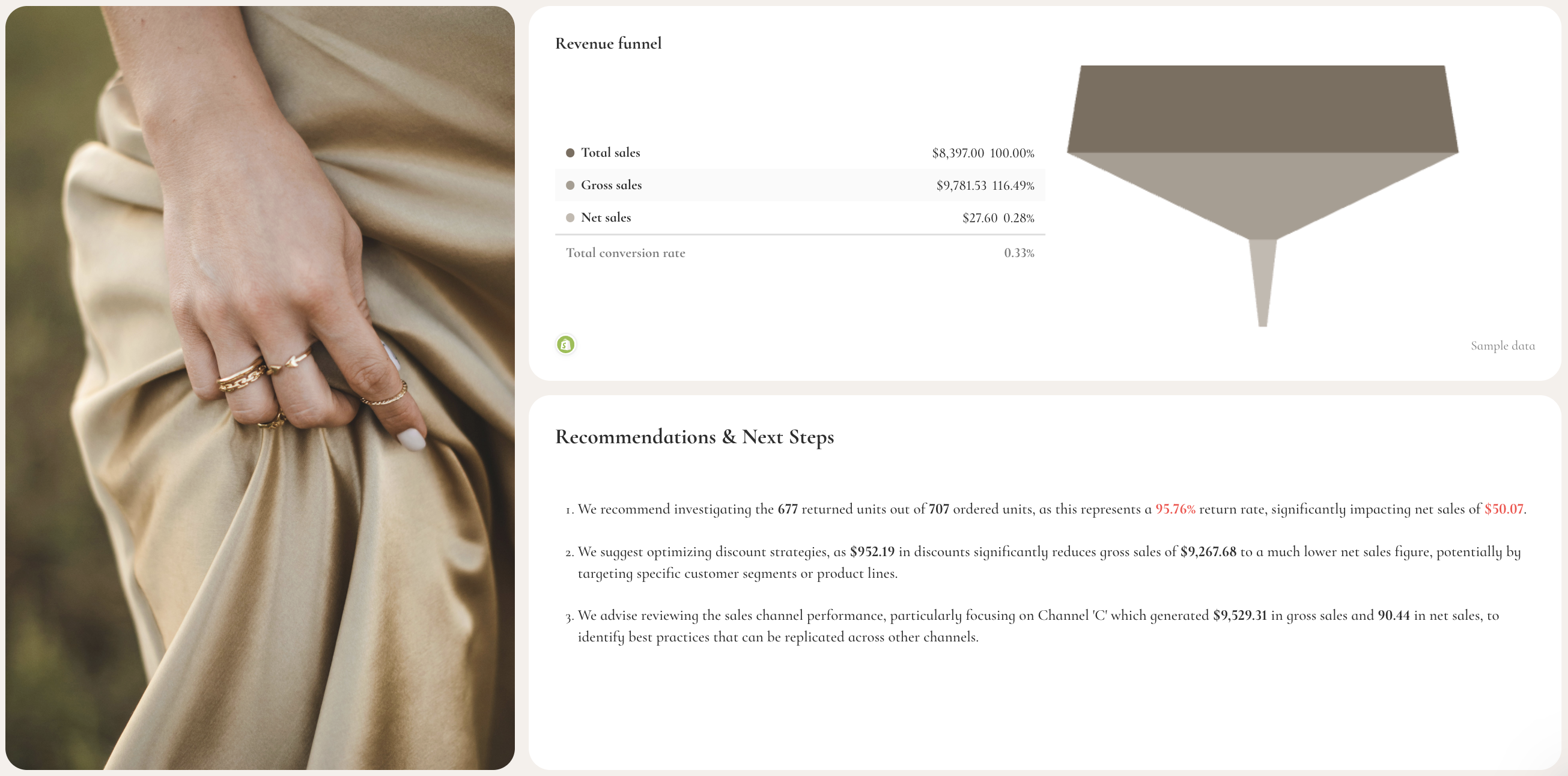
This Shopify KPI dashboard gives you a complete view of your store performance, from orders and revenue to returns, discounts, and profitability—so you can quickly understand what’s driving sales and what’s hurting profit margins.
This example combines high-level revenue tracking with detailed breakdowns by product, channel, and expenses, making it easy to connect store activity to actual business outcomes.
Metrics to visualize and how to structure:
- Total sales
- Gross sales
- Net sales
- Orders
- Average order value (AOV)
- Shipping revenue
- Discounts
- Returns
- Sales over time (gross vs net sales trends)
- Sales channel performance (gross sales, net sales, total sales, shipping, tax)
- Product performance (sales by product, AOV, revenue contribution)
- Ordered quantity vs returned quantity
- Average units per order
- Expenses (tax, shipping, discounts, returns)
- Revenue funnel (gross → net → total sales conversion)
- Goal progress (sales and orders vs targets)
Best practices:
✅ Track both gross and net sales to understand true profitability, not just revenue.
✅ Always include discounts and returns—they can significantly impact your bottom line.
✅ Break down performance by product and channel to identify your most profitable segments.
✅ Include a revenue funnel to visualize how gross sales turn into net revenue.
Want to build stunning KPI dashboards in seconds? Get started with Whatagraph for free.
Published on Mar 23 2026
WRITTEN BY
YamonYamon is a Senior Content Marketing Manager at Whatagraph. With an eye for detail and a knack for always considering context, audience, and business goals to guide the narrative, she's on a mission to create genuinely helpful content for marketers. When she’s not working, she’s hiking, meditating, or practicing yoga.