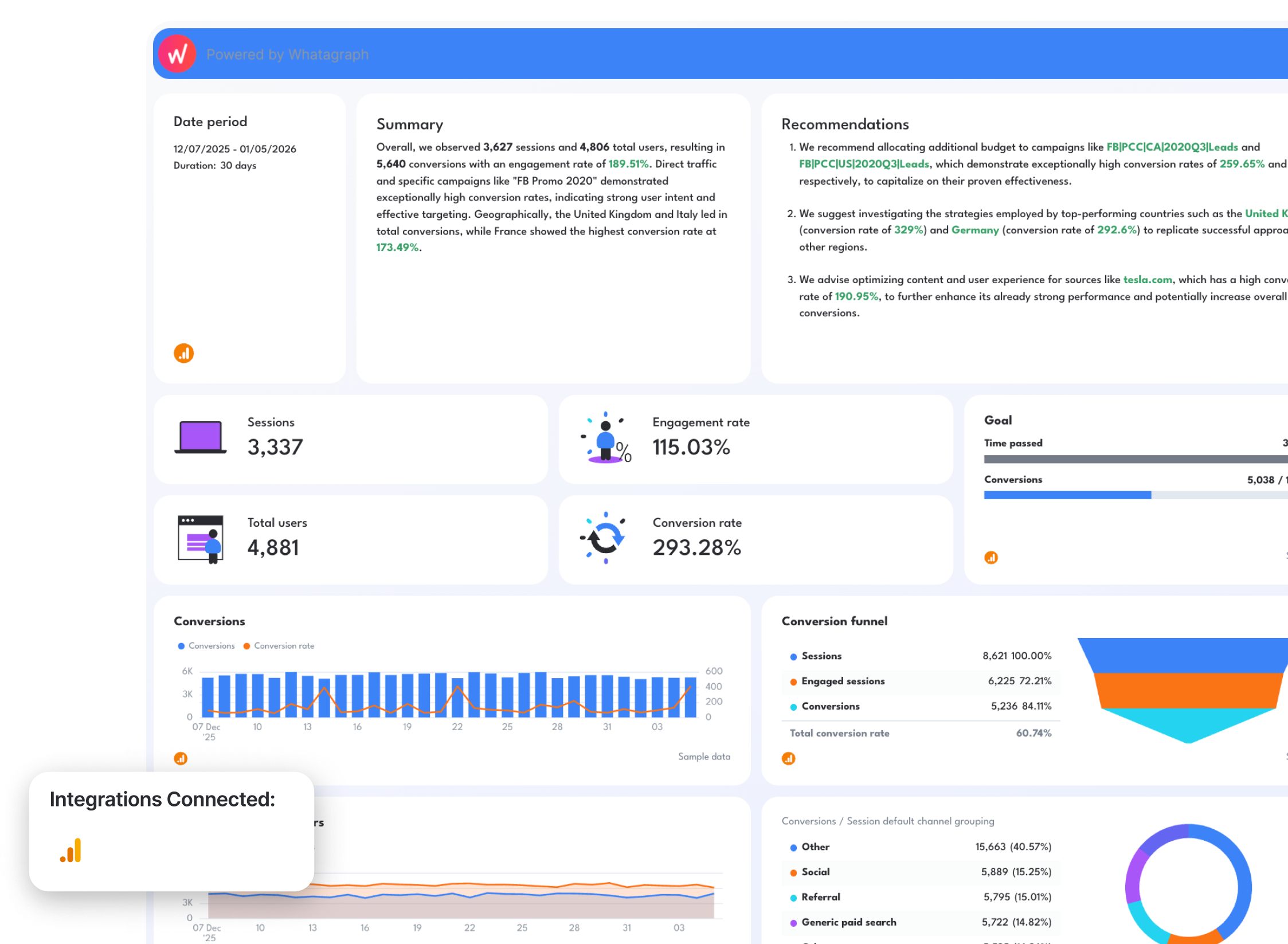
12 SEO Dashboard Examples & Free Templates in 2026
Putting together a useful SEO dashboard means juggling at least three or four data sources: Google Search Console, Google Analytics 4, Ahrefs, Semrush…and somehow turning all of it into something a client can understand in 30 seconds.

Apr 01 2026●12 min read


Most SEO dashboards either show too much (every metric from every tool, no hierarchy) or too little (a handful of vanity numbers that don't connect to business outcomes).
In this guide, you'll find real SEO reporting dashboard examples built on live templates, organized by 5 use cases:
- Performance tracking
- KPI pacing
- Ranking monitoring
- Analytics
- Client reporting
Each one shows exactly which metrics to include, which data sources to connect, and how to structure the view for the audience reading it.
Unlike static examples of SEO reports, these are live dashboards that update automatically when connected to your data sources via native, stable integrations.
This means you won't need to:
- Export data to a dozen spreadsheets, upload them to one main spreadsheet, and spend hours cleaning up data
- Use scripts, Chrome extensions, and a million other tools
- Build a nice-looking dashboard that clients will trust from scratch
With these dashboard examples, all your data will flow automatically into the dashboard, update every time you open one up, and you can just share the dashboard link with your clients right away.
1. SEO Performance Dashboard Examples
Jump to the SEO performance dashboard example you want to see:
Example 1: Comprehensive SEO Dashboard Example
Use this SEO dashboard template for free with your data
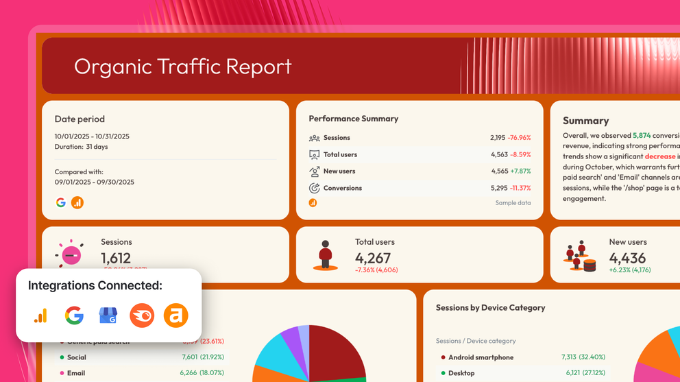
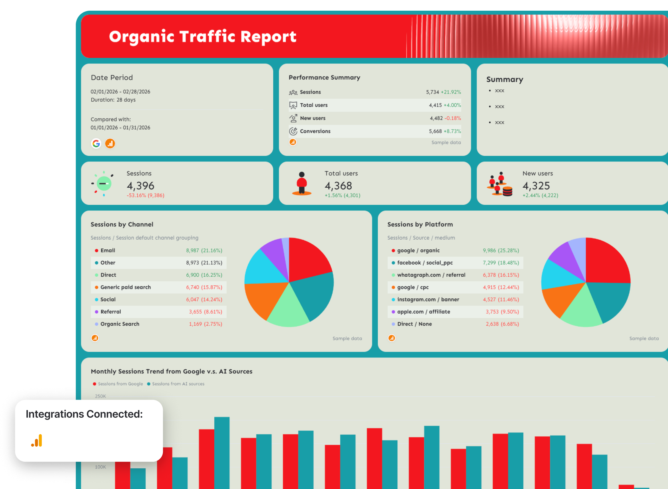
Who it's for: SEO managers and agency account managers who need a single client-ready report pulling organic performance data from both Google Analytics 4 and Google Search Console.
Channels connected: Google Analytics 4, Google Search Console
This SEO dashboard example does something most SEO dashboards don't — it separates the what from the so what.
The opening tab leads with an AI-written Wins, Issues, and Recommendations summary, so your clients see what changed in organic traffic and rankings right away.
The rest of the report is organized into three focused tabs: visibility (GSC), traffic (GA4), and conversions (GA4), each building a cleaner story than a single sprawling dashboard ever could.
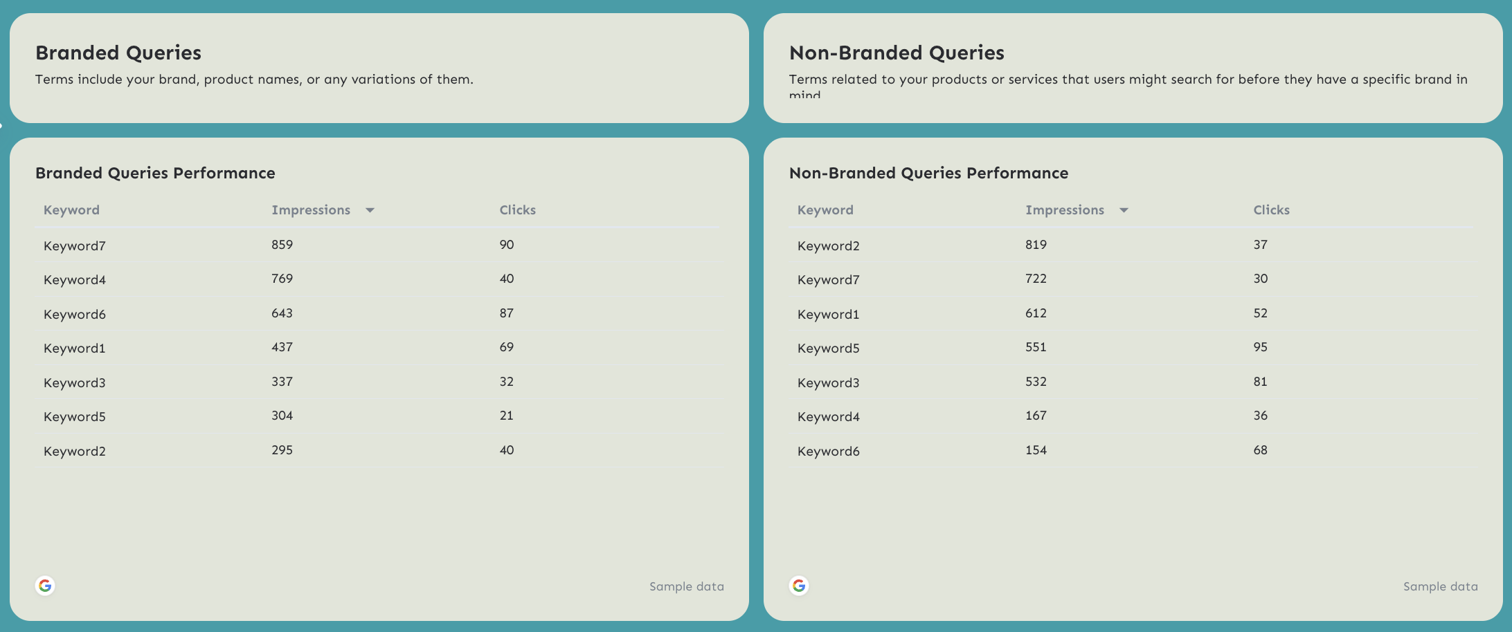
One standout feature: the branded vs. non-branded query split in the Organic Visibility tab. For agencies managing clients with strong brand awareness, separating branded impressions and clicks from non-branded ones is the difference between reporting real SEO progress and inflating results with traffic you didn't earn.
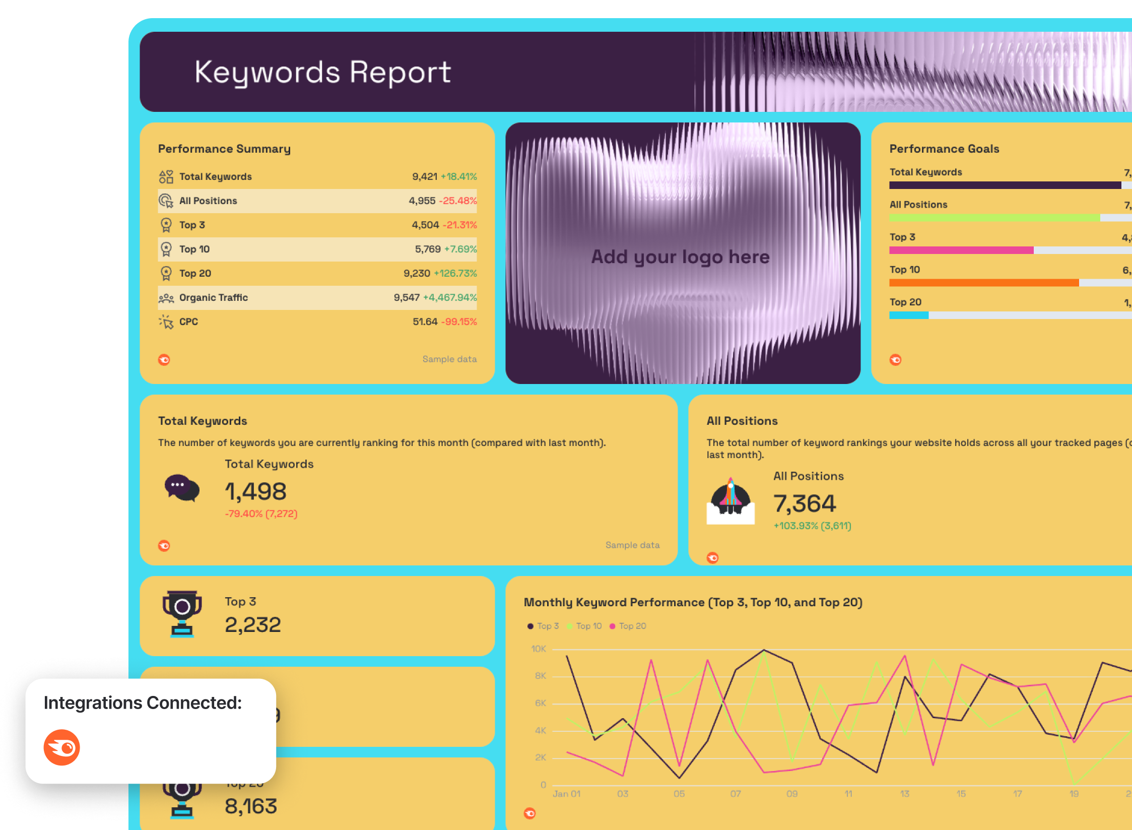
Metrics to visualize:
SEO KPIs Overview tab
- Impressions, Clicks, Sessions, Conversions — tracked against custom targets (progress bar format)
- Sessions, Total Users, New Users (with MoM comparison)
- Impressions, Clicks, Keywords ranking 1–10, Average Google Search Position
- Conversions, Conversion Rate, Total Revenue, Transactions, Average Purchase Revenue, Ecommerce Purchases
Organic Visibility tab (GSC)
- Impressions, Clicks, CTR, Average Rank — performance summary with period-over-period change
- Clicks and impressions trend line (current vs. previous period overlay)
- Impressions distribution by search type: web, image, video
- Clicks distribution by search type: web, image, video
- Impressions and clicks funnel (web search)
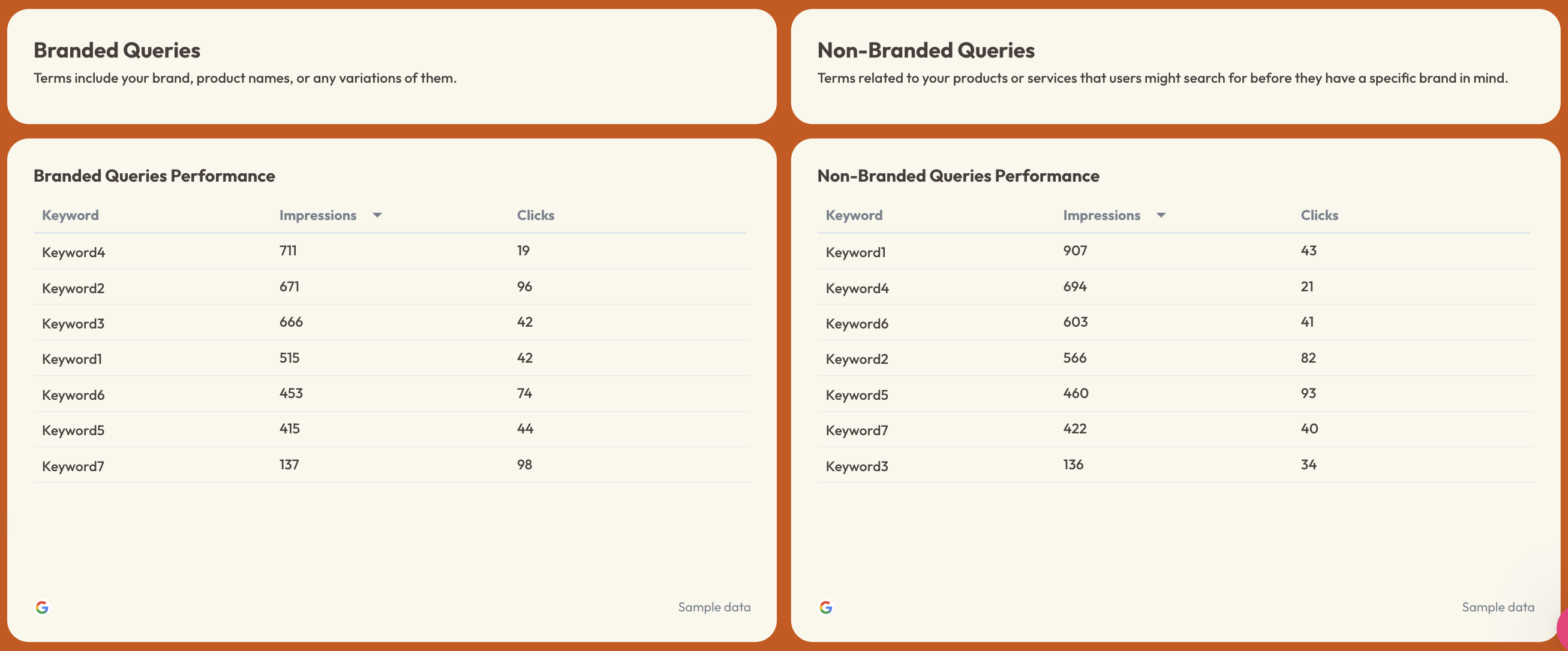
- Branded Queries Performance: keyword-level impressions and clicks
- Non-Branded Queries Performance: keyword-level impressions and clicks
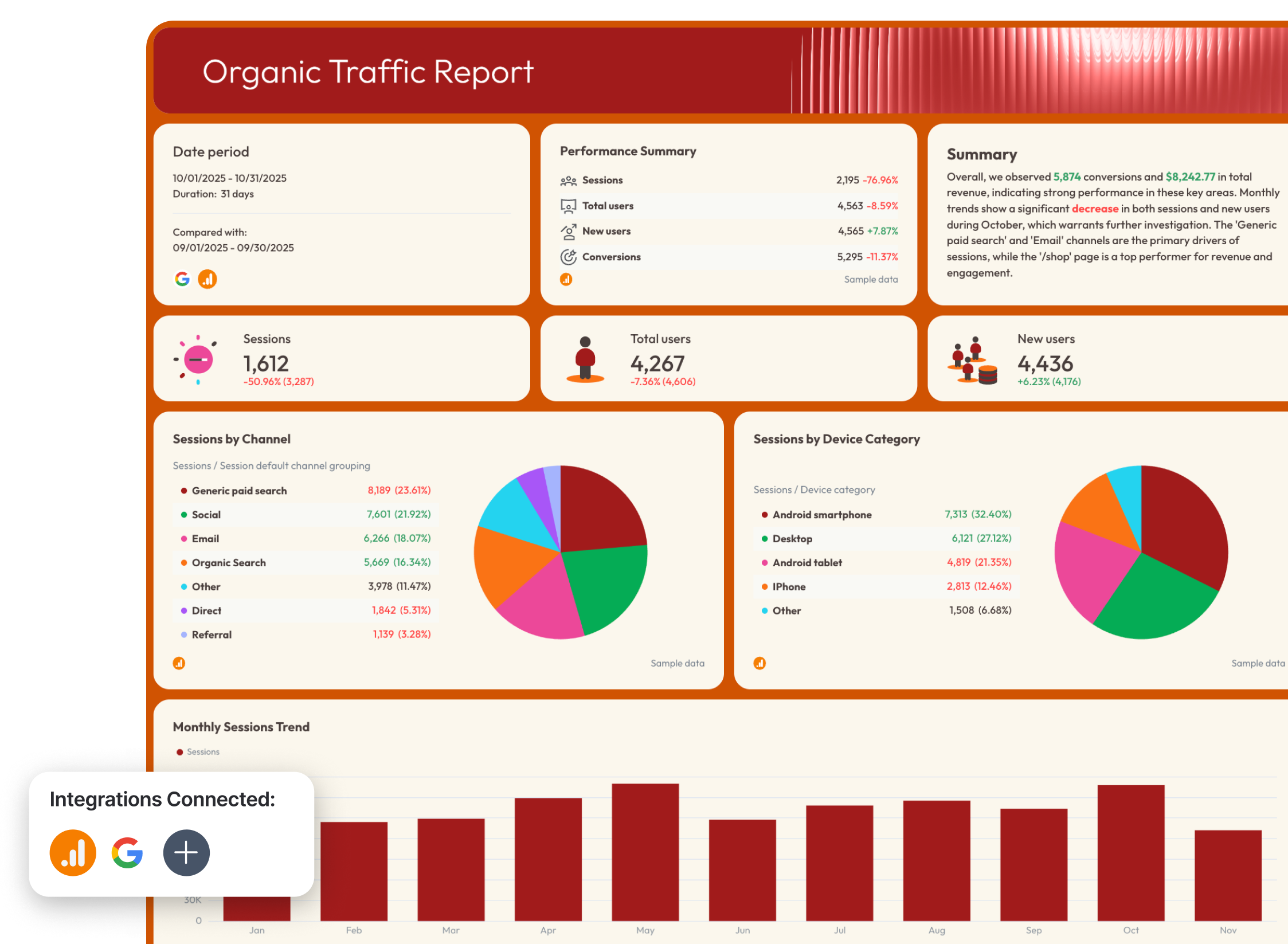
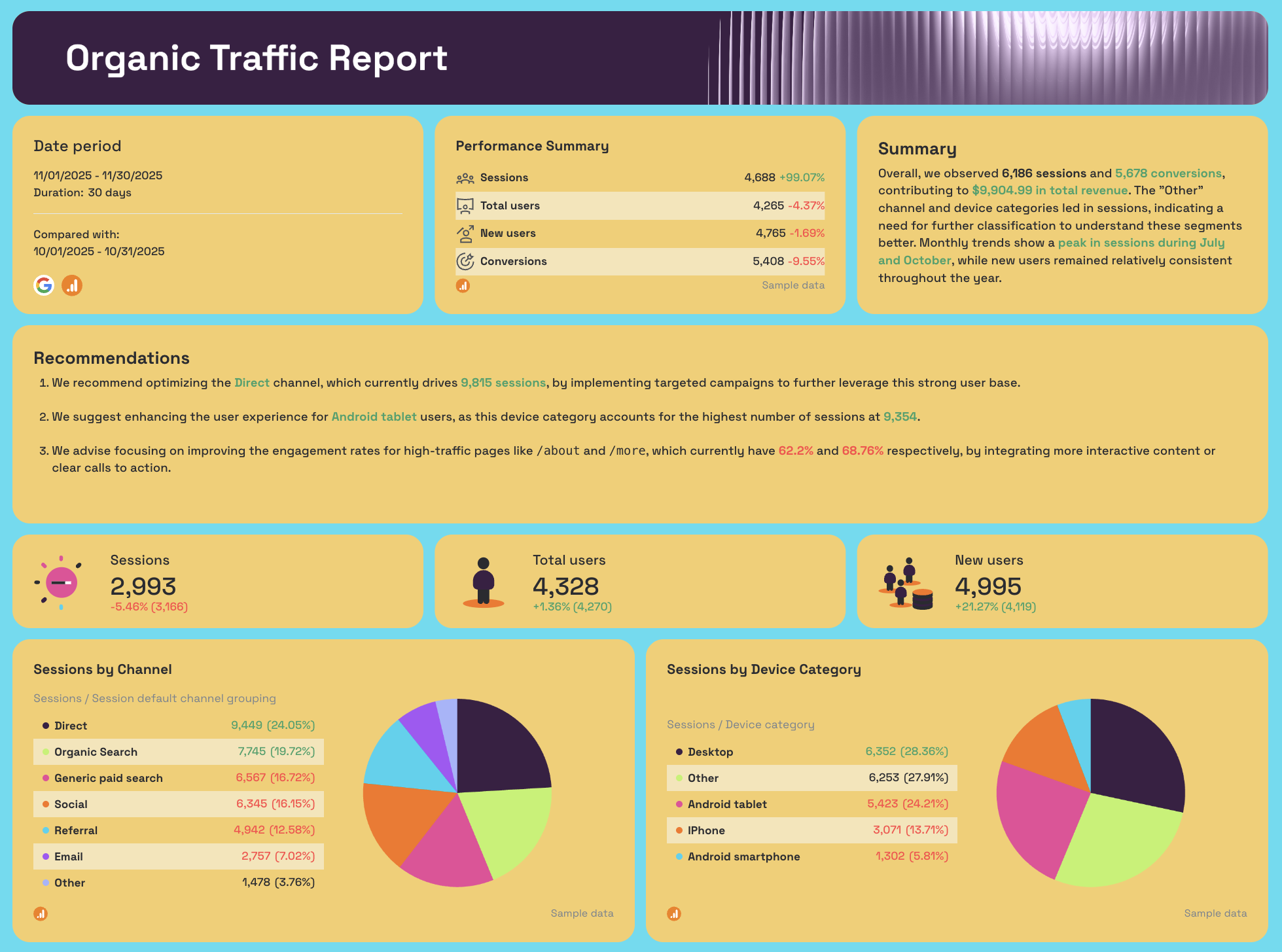
Organic Traffic tab (GA4)
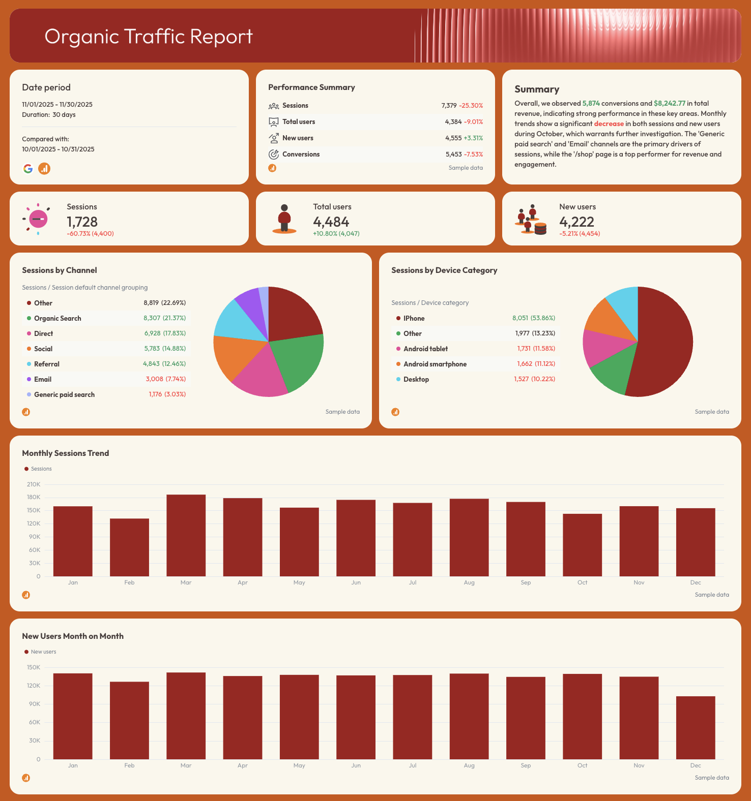
- Sessions, Total Users, New Users
- Sessions by Channel (organic search, direct, email, social, referral, paid)
- Sessions by Device Category
- Monthly Sessions Trend
- New Users Month on Month
- Page Performance: sessions, total users, new users, engagement rate by page path
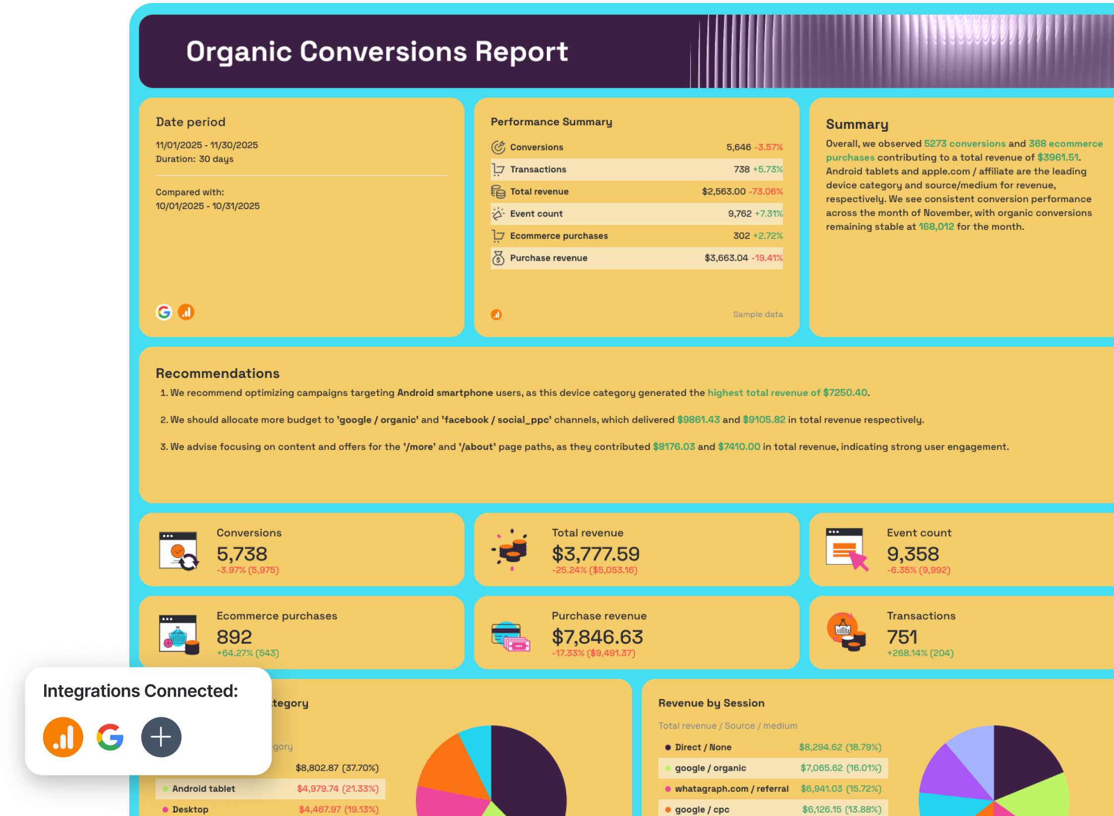
Organic Conversions tab (GA4)
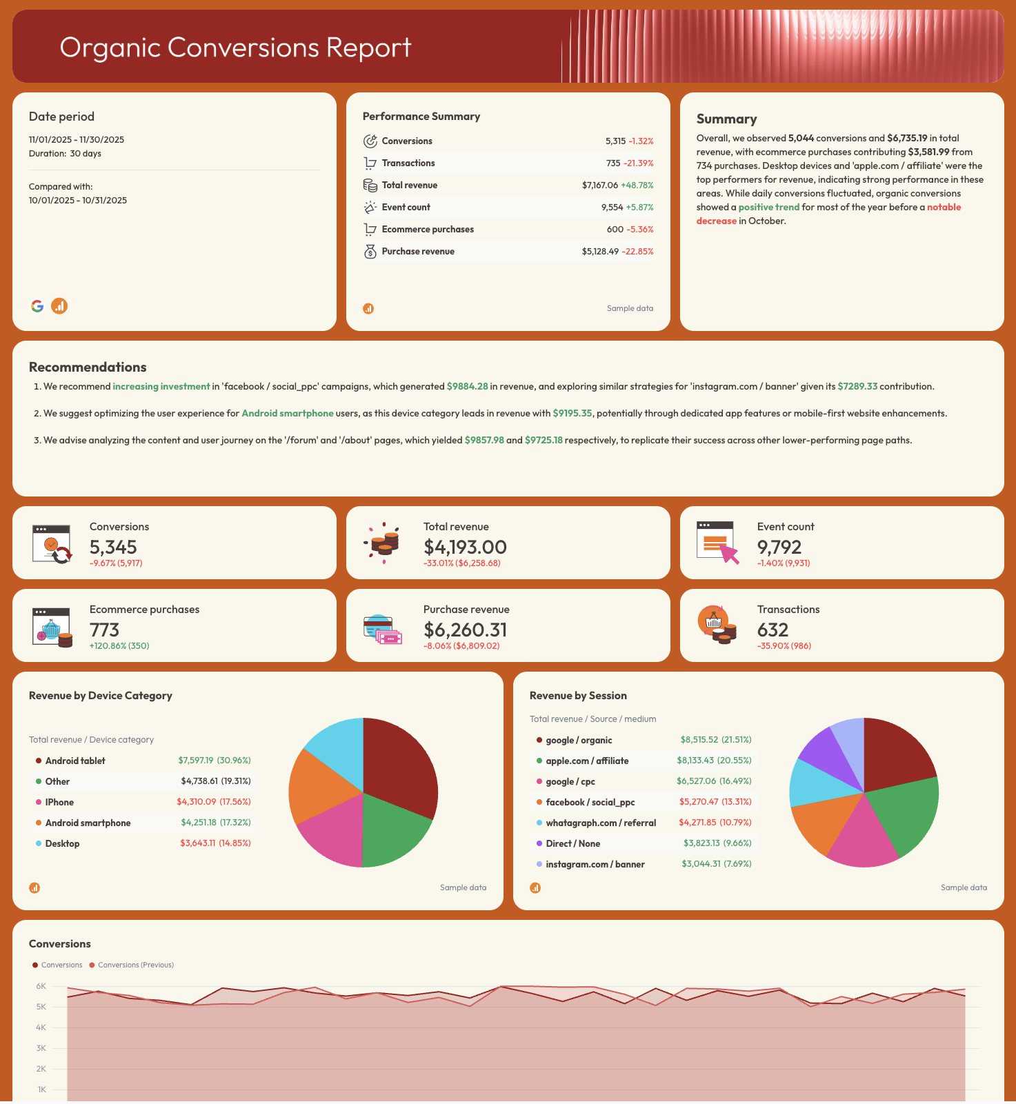
- Conversions, Total Revenue, Transactions, Event Count, Ecommerce Purchases, Purchase Revenue
- Revenue by Device Category
- Revenue by Session Source / Medium
- Conversions trend line
- Organic Conversions by Month
- Organic Revenue and Transactions Month on Month
- Page Paths Performance: conversions, transactions, revenue by URL
- Traffic Acquisition Conversions
- Demographics Conversions
- Engagement Conversions by content group and page title
Best practices:
✅ Separate your report into three tabs: Organic Visibility, Organic Traffic, and Organic Conversions - it keeps each stakeholder focused on the data that matters to them.
✅ Include a goal pacing widget for KPIs that matter to your clients to show how close you are to reaching goals mutually agreed upon
✅ Break down branded vs. non-branded queries separately - it's the only way to prove that organic growth is coming from new demand, not just brand recognition.
✅ Analyze revenue and conversions by page path, not just by channel - the Page Paths Performance table shows exactly which URLs are driving pipeline.
✅ Filter the Page Performance table to the top 5–10 pages by sessions.
✅ Get Whatagraph IQ Summary to write performance summary and recommendations on your behalf based on the data in your entire report. You can then edit this with more business context and to fit your brand tone. Here's how that works:
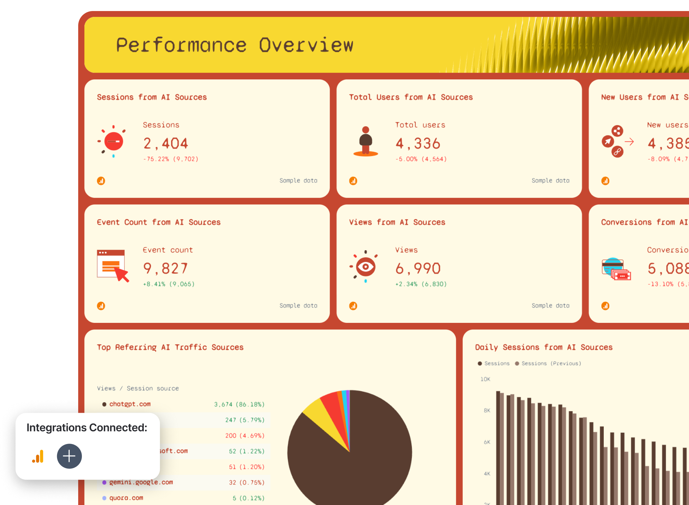
Example 2: GEO Performance Dashboard Example
Use this example for free with your data
Who it's for: SEO managers and digital marketing teams who need to track how much traffic, engagement, and revenue is coming from AI-powered search sources like ChatGPT, Perplexity, and Gemini - alongside traditional organic search.
Channels connected: Google Analytics 4
Ranking on Google is no longer the only game in town.
A growing share of your audience is finding websites through ChatGPT, Perplexity, Gemini, and other LLMs - and most SEO monitoring dashboards aren't built to show it.
This AI dashboard example separates AI-referred traffic (GEO) from traditional organic search (SEO) so you can see both channels clearly, compare them side by side, and make the case to clients that visibility in LLMs is now a metric worth tracking.
The standout section is the GEO vs. SEO comparison tab, which puts Sessions, Users, Views, Events, and Revenue from AI sources directly next to their organic search equivalents. It's the clearest way to show whether AI-referred traffic is growing, where it's landing, and whether it's converting.
Metrics to visualize:
Performance Summary tab
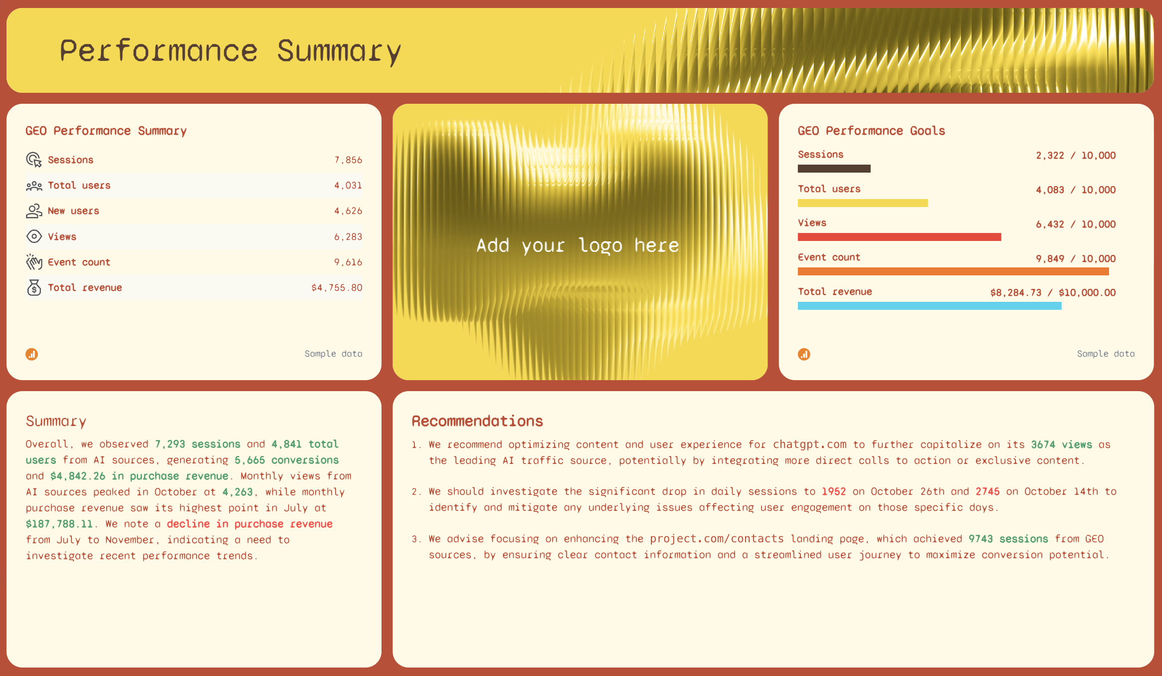
- SEO Performance Summary: Sessions, Total Users, New Users, Views, Event Count, Total Revenue
- GEO Performance Goals: pacing bars for Sessions, Total Users, Views, Event Count, Total Revenue
- AI-written Summary and Recommendations
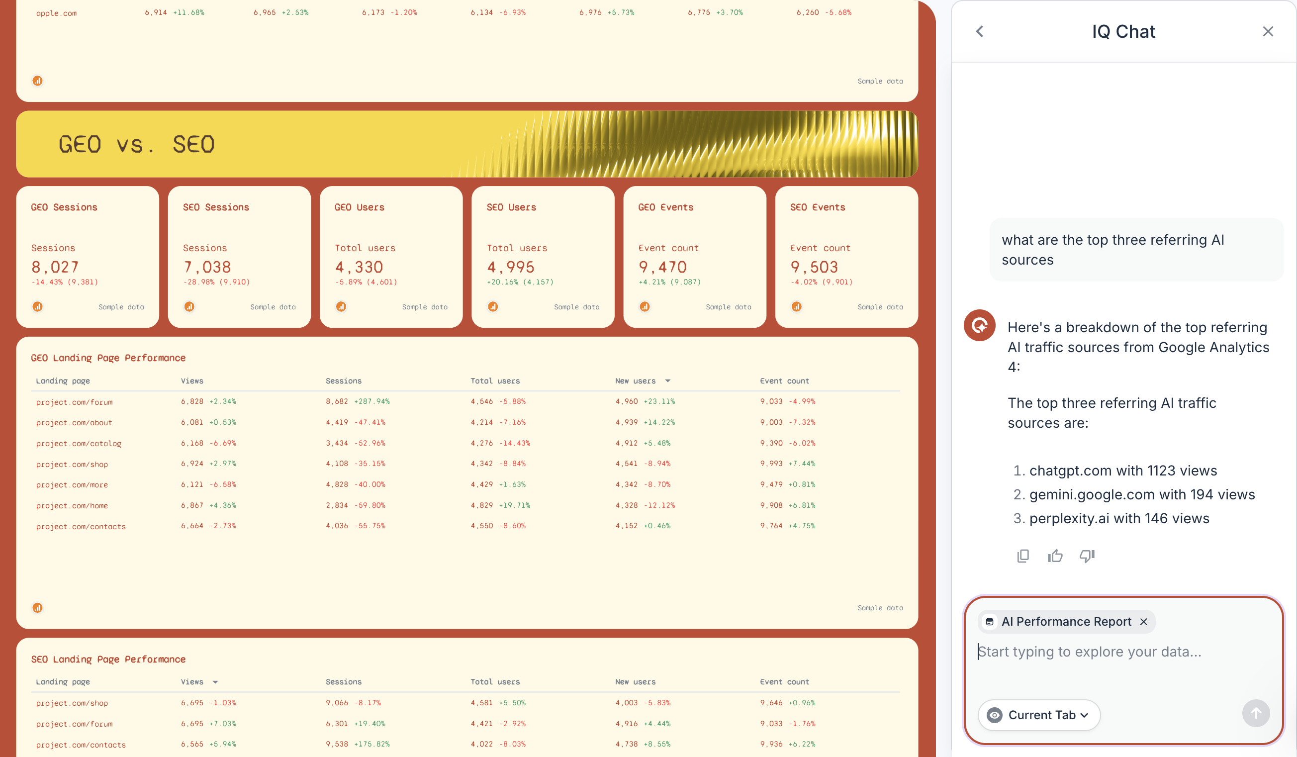
- Top Referring AI Traffic Sources: Views by source (chatgpt.com, perplexity.ai, gemini.google.com, claude.ai, copilot.com, etc.)
- Daily Sessions from AI Sources (current vs. previous period)
- Daily Views from AI Sources (current vs. previous period)
- Monthly Views from AI Sources (year-to-date bar chart)
- Events Per Session - last month vs. previous
- Events and Sessions Per User from AI Sources
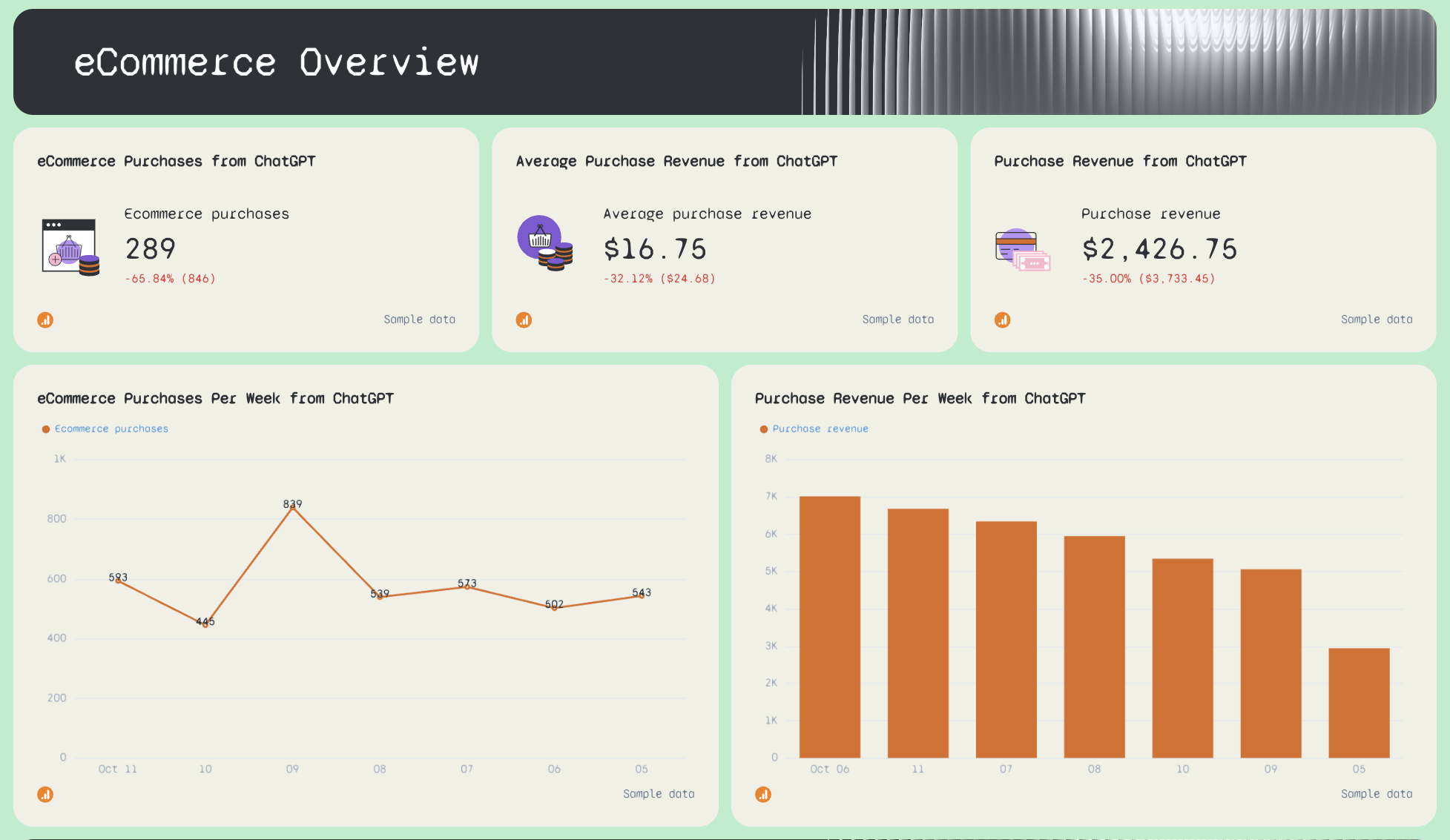
eCommerce Overview tab
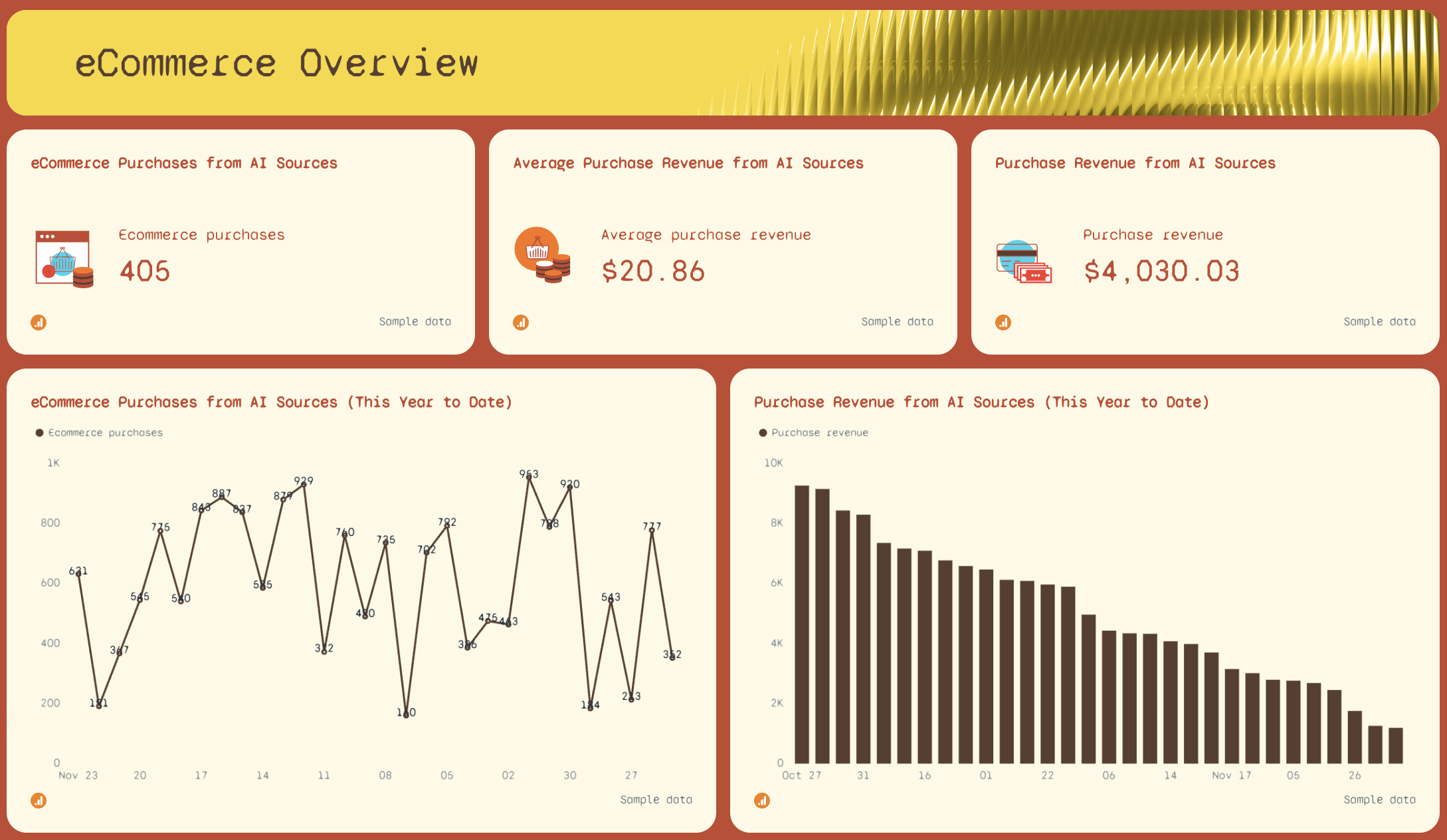
- eCommerce Purchases from AI Sources
- Average Purchase Revenue from AI Sources
- Purchase Revenue from AI Sources
- eCommerce Purchases from AI Sources (this year to date)
- Purchase Revenue from AI Sources (this year to date)
Session Breakdown tab
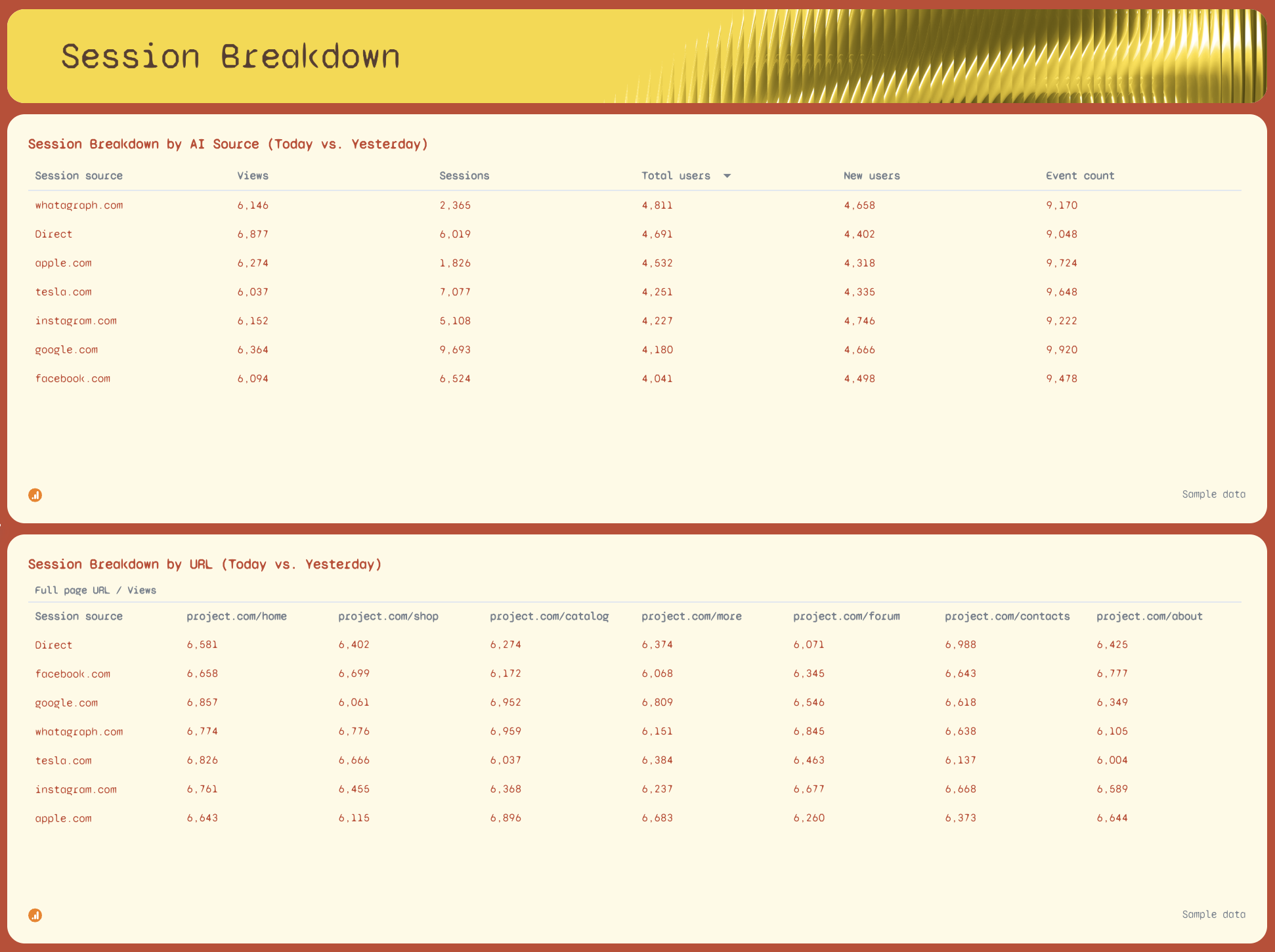
- Session Breakdown by AI Source (Today vs. Yesterday): Views, Sessions, Total Users, New Users, Event Count by referring domain
- Session Breakdown by URL (Today vs. Yesterday): performance by landing page across all AI sources
GEO vs. SEO tab
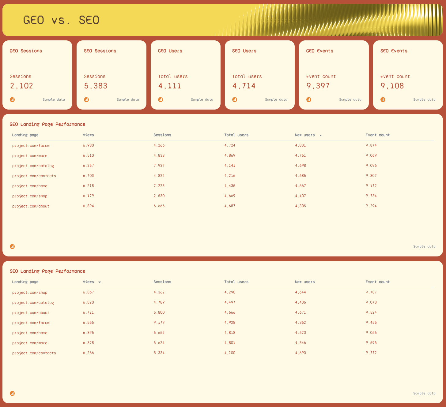
- GEO Sessions vs. SEO Sessions
- GEO Users vs. SEO Users
- GEO Views vs. SEO Views
- GEO Events vs. SEO Events
- SEO Landing Page Performance: Views, Sessions, Total Users, New Users, Event Count by URL
- GEO Landing Page Performance: Views, Sessions, Total Users, New Users, Event Count by URL
- GEO Performance Goals: Sessions, Total Users, Views, Event Count, Total Revenue vs. targets
Best practices:
✅ Use Whatagraph's source filter to isolate AI traffic - set the filter to regex and include chatgpt.com, perplexity.ai, gemini.google.com, claude.ai , and more to show only LLM-referred sessions and views on the dashboard.
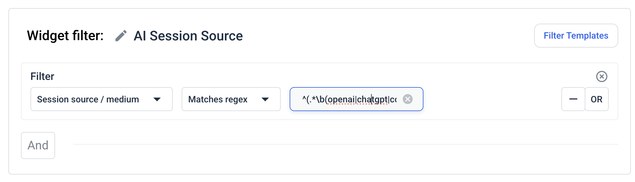 You can then save this filter as a template and re-use it the next time you create a report instead of starting from scratch again.

✅ Apply that same regex filter to your Sessions, Views, and Revenue widgets separately - this lets you show clients exactly how much pipeline is coming from AI sources vs. Google, with no manual calculation.
✅ Compare the GEO vs. SEO tab month over month for the past 365 days.
✅ Track GEO Landing Page Performance alongside SEO Landing Page Performance - the pages that rank well on Google and the pages that get cited by LLMs are often different, and that gap is a content opportunity.
✅ Set GEO Performance Goals targets conservatively in the first few months - AI-referred traffic baselines are still being established for most sites, and realistic targets are more useful to clients than aspirational ones.
✅ Add the Top Referring AI Traffic Sources widget to every client report, even if volumes are small - showing clients that you're tracking chatgpt.com and perplexity.ai signals that your agency is ahead of where most are on this.
✅ Need to give a quick answer to your client? Just ask Whatagraph IQ Chat and it'll return insights based on the data on your GEO report in seconds.
Example 3: Local SEO Reporting Dashboard Example
Use this example for free with your data
Who it's for: Local SEO specialists and agency account managers running monthly reporting for brick-and-mortar clients, multi-location businesses, or any brand where Google Business Profile visibility drives foot traffic and calls.
Channels connected: Google Business Profile
Most SEO performance dashboards ignore everything that happens before someone clicks to your website. This local SEO dashboard covers that gap.
It pulls directly from Google Business Profile to show how often a business appears in Search and Maps, what actions customers take after finding it, and how its review profile is trending over time - the metrics that actually determine whether local SEO is working.
The Summary tab leads with an AI-written overview and goal pacing bars for each key action type, so you can see at a glance whether Search Impressions, Website Actions, Phone Calls, and Driving Directions are on track against targets - before diving into the detail tabs.
Metrics to visualize:
Summary tab
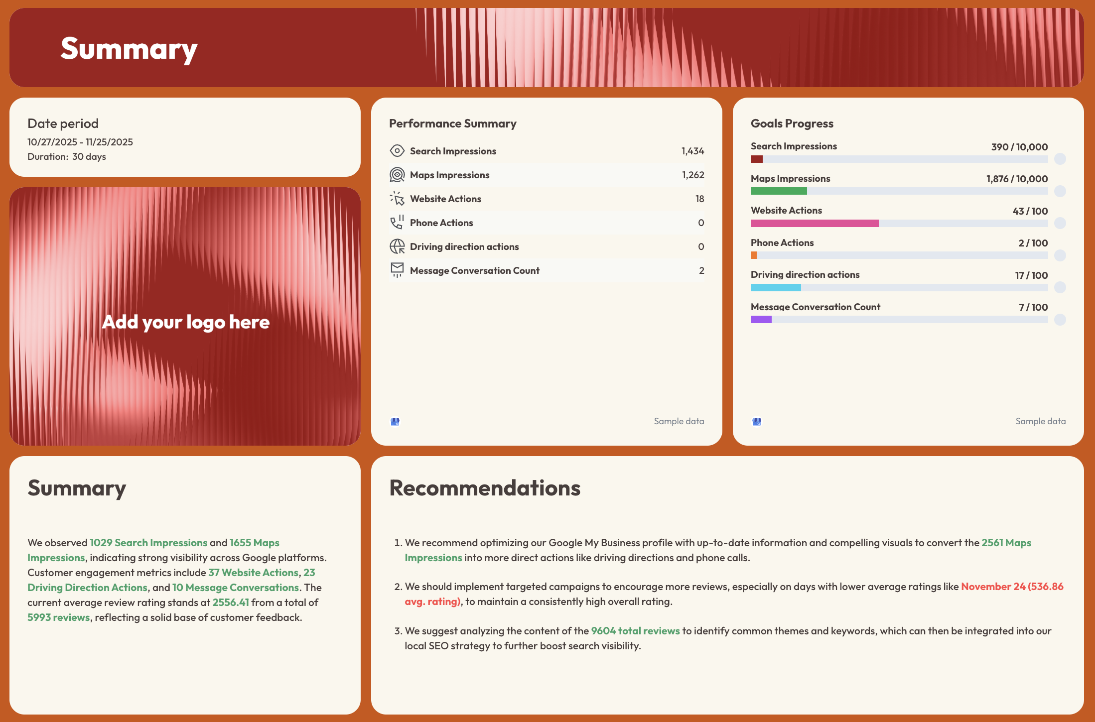
- Search Impressions, Maps Impressions, Website Actions, Phone Actions, Driving Direction Actions, Message Conversation Count - with period-over-period comparison
- Goals Progress: pacing bars for Search Impressions, Maps Impressions, Website Actions, Phone Actions, Driving Direction Actions, Message Conversation Count
- AI-written Summary and Recommendations
Reviews tab
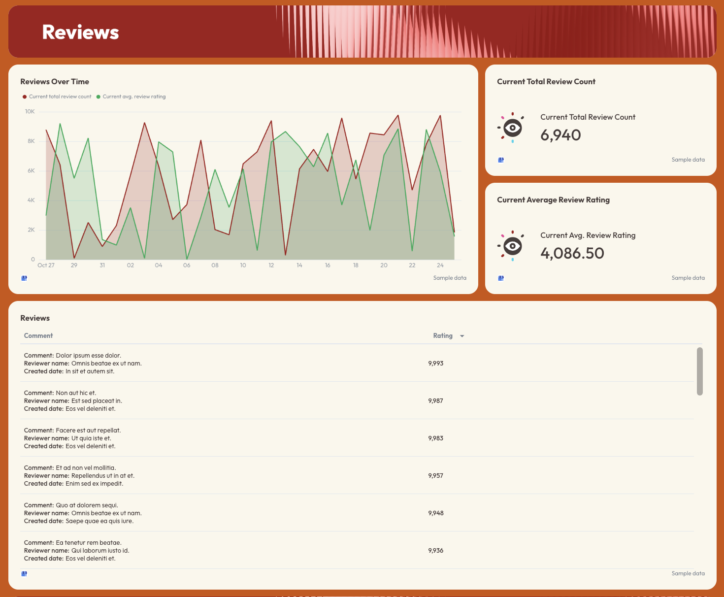
- Current Total Review Count
- Current Average Review Rating
- Reviews Over Time: dual-line trend chart (total review count + average rating)
- Reviews table: comment, reviewer name, date, rating
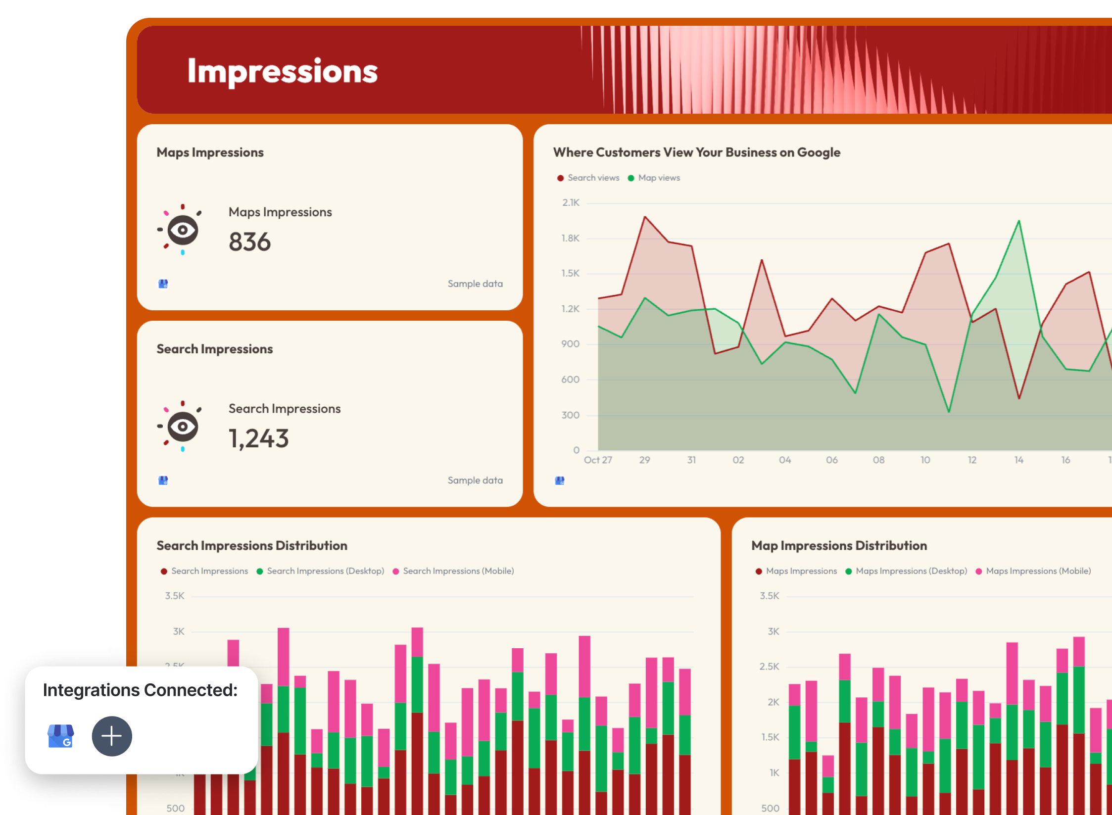
Impressions tab
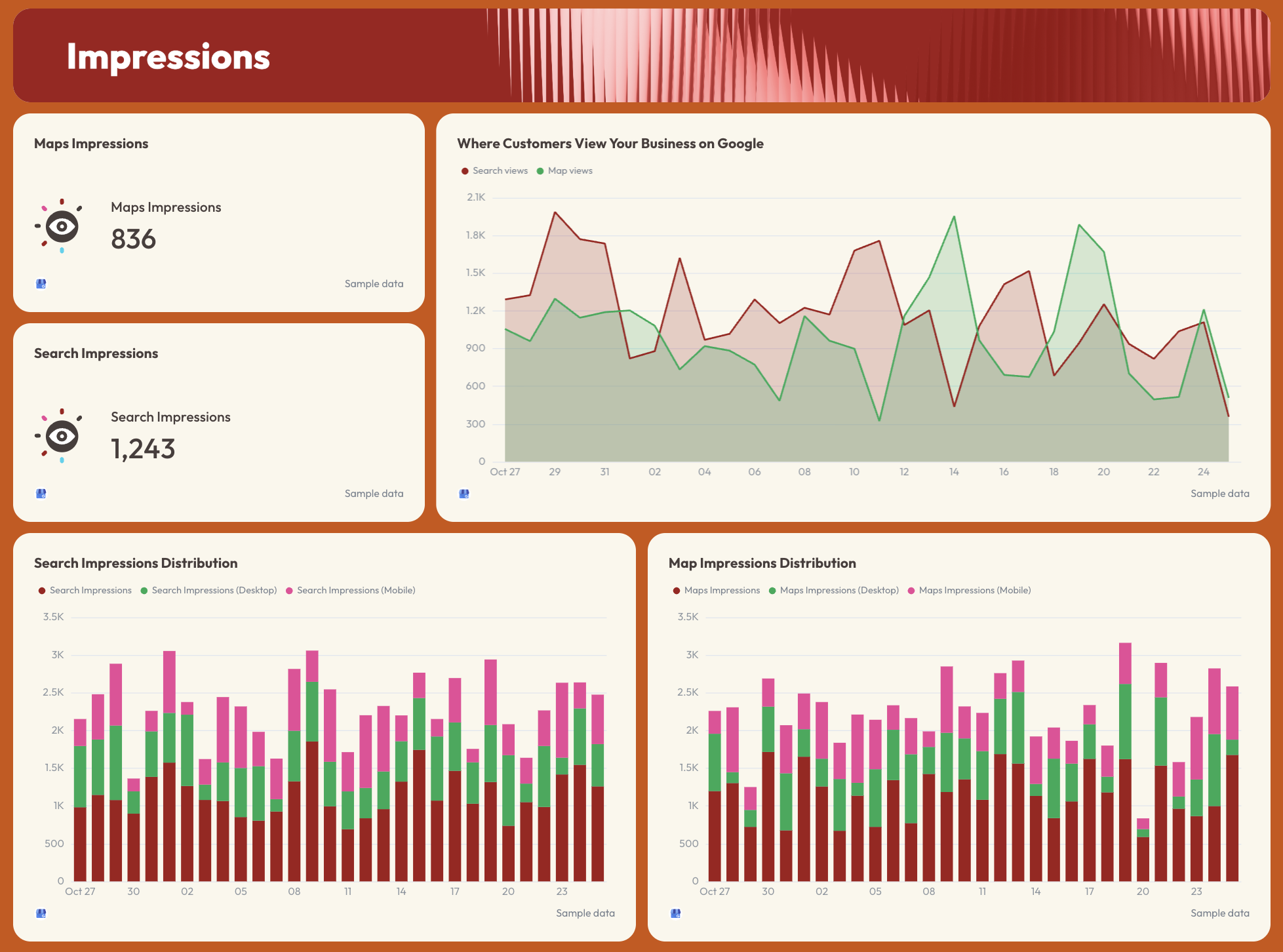
- Maps Impressions (total)
- Search Impressions (total)
- Where Customers View Your Business on Google: Search views vs. Map views trend line
- Search Impressions Distribution: total vs. desktop vs. mobile (bar chart)
- Map Impressions Distribution: total vs. desktop vs. mobile (bar chart)
Actions tab
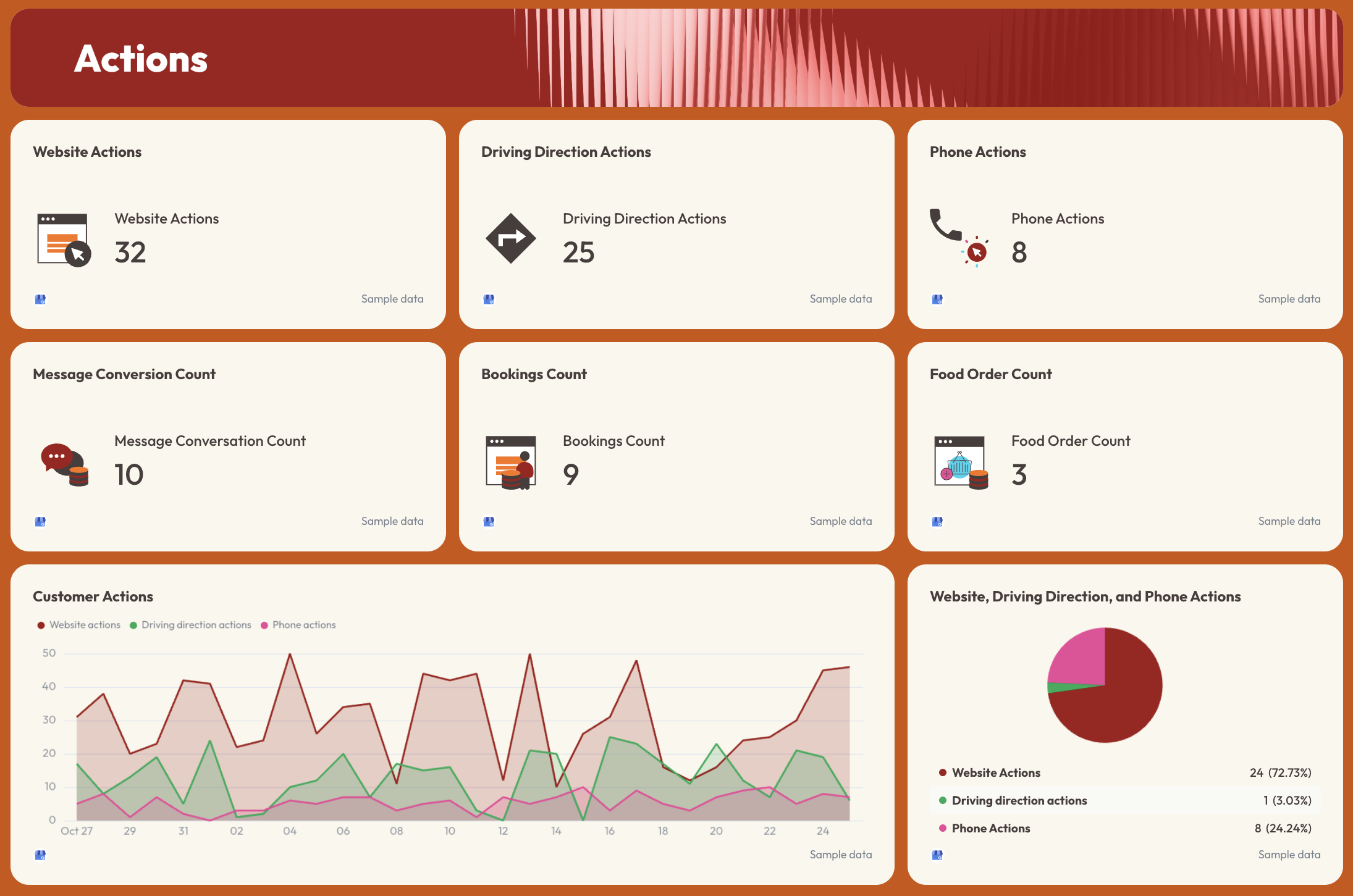
- Website Actions, Driving Direction Actions, Phone Actions, Message Conversation Count, Bookings Count, Food Order Count
- Customer Actions trend line: website, driving direction, and phone actions over time
- Website, Driving Direction, and Phone Actions breakdown (pie chart with % split)
Best practices:
✅ Set monthly targets for every action type in the Goals Progress section.
✅ Track Search Impressions and Maps Impressions separately - a drop in one but not the other usually points to a specific issue with either the website or the Business Profile listing.
✅ Break down impressions by desktop vs. mobile - local searches skew heavily mobile, and a gap there often signals a profile optimization issue.
✅ Monitor the Reviews Over Time chart alongside action metrics - rating drops and action drops tend to move together, and spotting that correlation early gives you something concrete to act on.
✅ Use the Customer Actions pie chart in client calls to show which conversion type is strongest - for some businesses it's calls, for others it's directions, and that split should inform where you focus next.
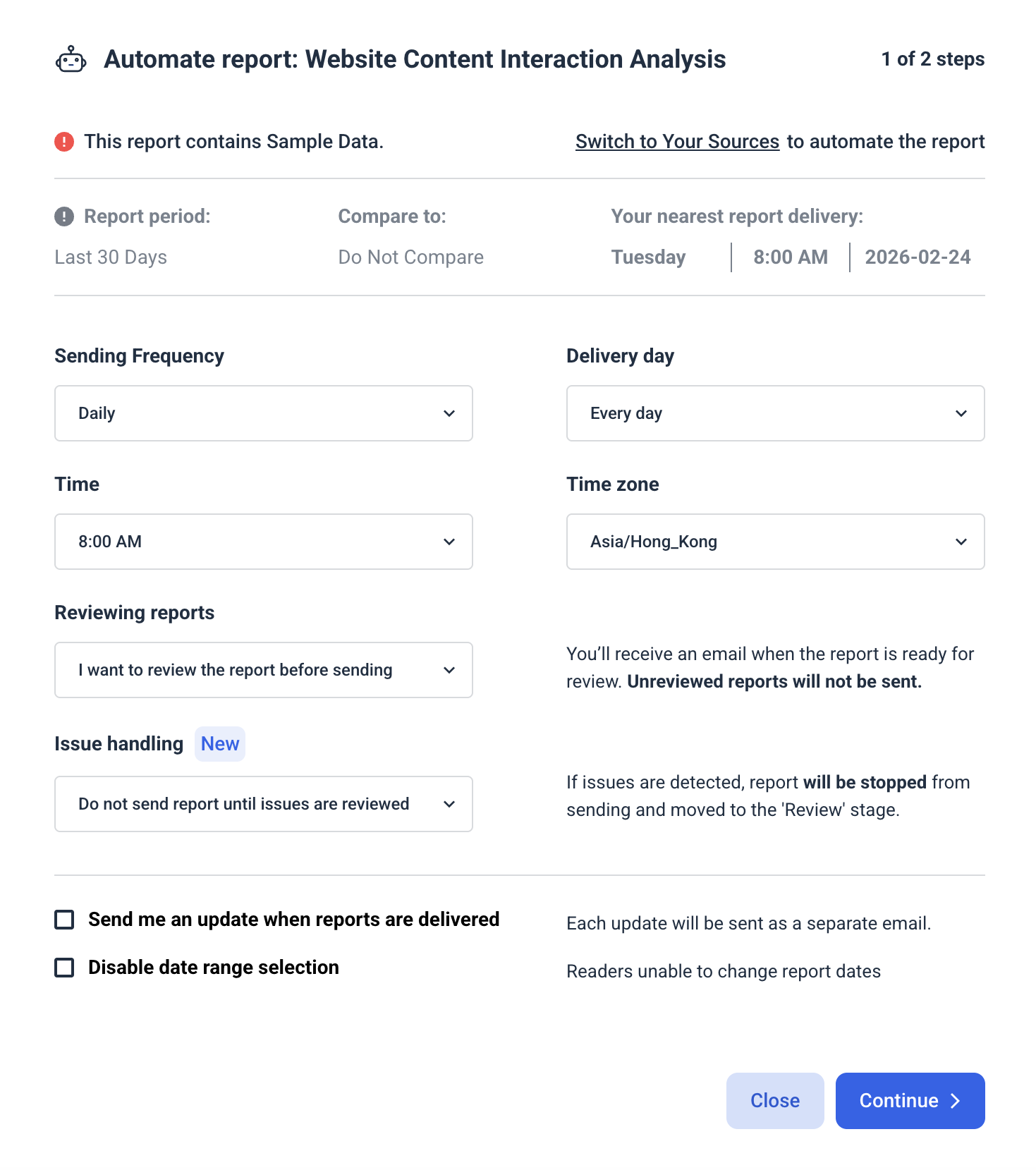
✅ Turn this into an automated SEO dashboard with Whatagraph. Set a specific day, time, and cadence for the report to go out to clients or stakeholders via Slack or email - automatically.
2. SEO KPI Dashboard Examples
Jump to the SEO KPI dashboard example you want to see:
- Organic traffic SEO KPI reporting dashboard
- Onsite SEO KPI report and dashboard
- ChatGPT KPI dashboard example
Example 4: Organic Traffic SEO KPI Dashboard Example
Use this SEO report template for free with your data
Who it's for: SEO managers and agency account managers who need to track organic traffic and conversion KPIs in a single view
Channels connected: Google Analytics 4, Google Search Console
Most SEO metrics dashboards stop at sessions and impressions.
This one goes further - it connects organic traffic data from GA4 with keyword-level visibility data from GSC, then layers in page-level conversion performance so you can see not just how much traffic SEO is driving, but which pages are turning that traffic into revenue.
Metrics to visualize:
Traffic Overview
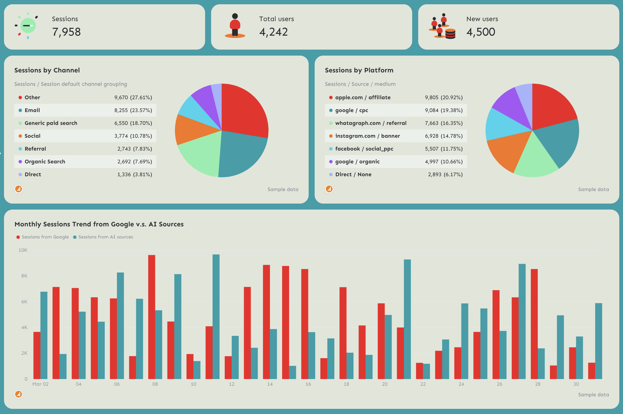
- Sessions, Total Users, New Users (individual KPI widgets with MoM change)
- Sessions by Channel: Email, Direct, Referral, Other, Paid Search, Social, Organic Search (pie chart)
- Sessions by Platform: breakdown by source/medium (pie chart)
- Monthly Sessions Trend from Google vs. AI Sources - 12-month dual bar chart
Conversions
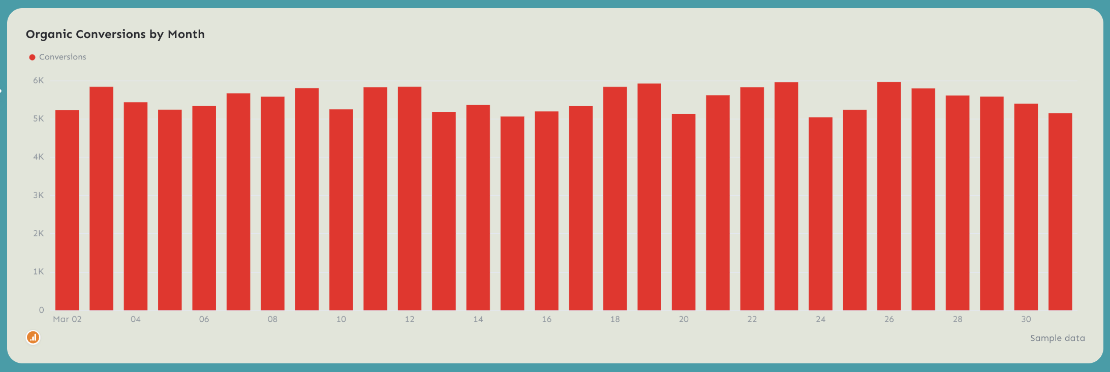
- Organic Conversions by Month - 12-month bar chart
Page Performance (GA4)
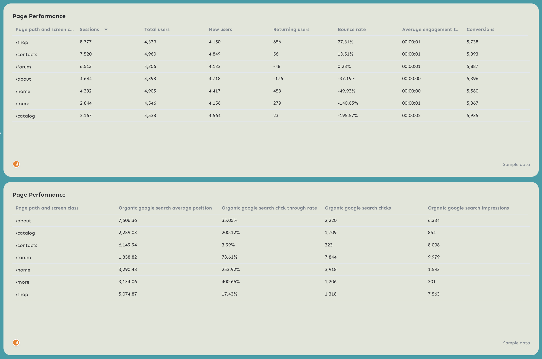
- Sessions, Total Users, New Users, Returning Users, Bounce Rate, Average Engagement Time, Conversions by page path
- Organic Google Search Average Position, CTR, Clicks, Impressions by page path
Keyword Performance
- Branded Queries Performance: Impressions and Clicks by keyword
- Non-Branded Queries Performance: Impressions and Clicks by keyword
Best practices:
✅ Use the Sessions by Channel breakdown to isolate organic search from other channels.
✅ Track traffic from Google vs. AI Sources trend chart every month to show how much of your traffic is coming from LLMs.
✅ Include both Page Performance tables (GA4 and GSC) in every report - the GA4 table shows what's converting, the GSC table shows what's ranking, and the gap between the two is usually where the biggest opportunities sit.
✅ Separate branded and non-branded queries every month - non-branded growth is the clearest signal that SEO is working independently of brand awareness.
✅ Set conversion targets at the page level, not just site-wide - the Page Performance table shows conversions by URL, which makes it easy to identify which landing pages are underperforming relative to their traffic.
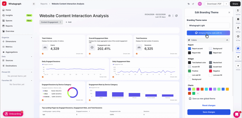
✅ Use Whatagraph IQ Theme to create a custom SEO dashboard with your brand colors and font in seconds. Just upload a screenshot or type in a prompt and IQ applies branding to your dashboard automatically. You can still fine-tune the fonts and colors manually later.
Read more: 11 best KPI dashboard examples
Example 5: Onsite SEO Dashboard Example
Use this example for free with your data
Who it's for: SEO managers and in-house digital teams who want to track how organic visitors behave on-site, which pages engage them, and where conversions are coming from by device, geography, and campaign
Channels connected: Google Analytics 4
Most SEO report dashboards answer "how much traffic are we getting?" This one answers the harder question: "what is that traffic actually doing once it lands?"
It tracks sessions, events, engagement rates, and conversions at the page level - broken down by device category, geography, campaign, and traffic source - so you can connect organic search performance to on-site behavior without switching between GA4 reports.
Metrics to visualize:
Summary tab
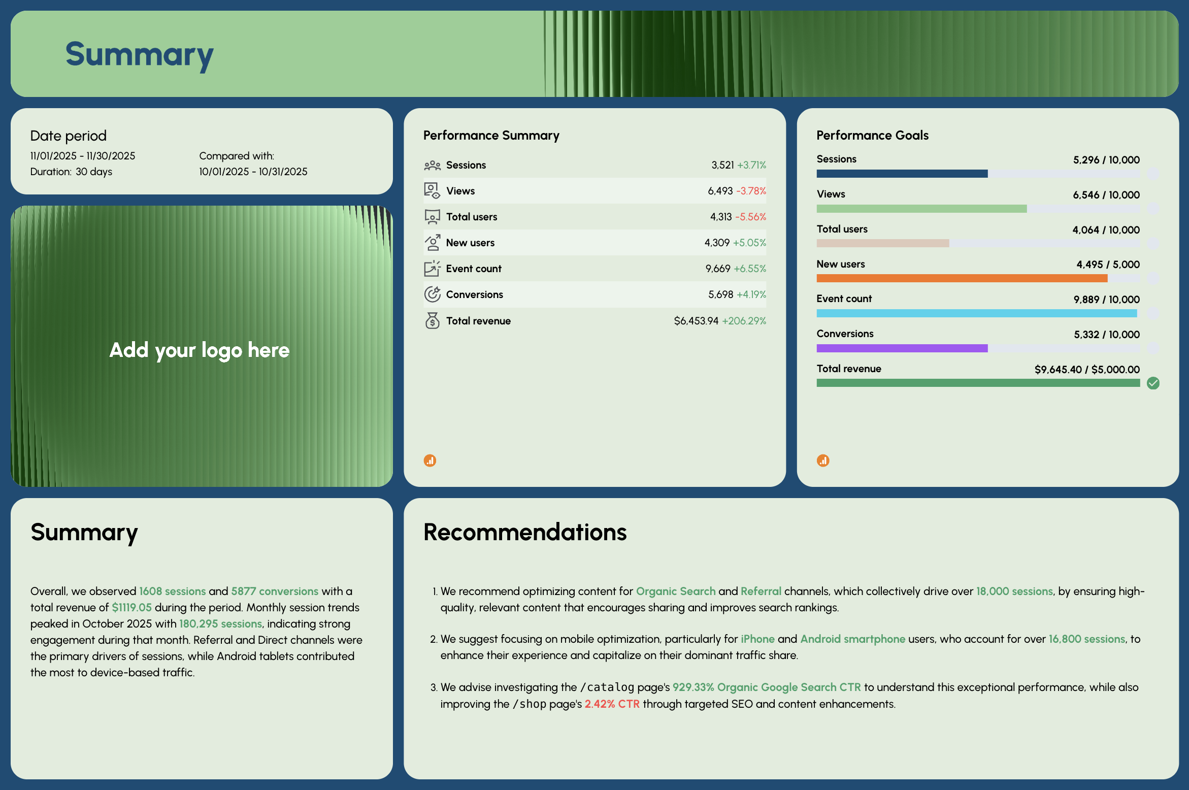
- Performance Summary: Sessions, Views, Total Users, New Users, Event Count, Conversions, Total Revenue - with period-over-period comparison
- Performance Goals: pacing bars for Sessions, Views, Total Users, New Users, Event Count, Conversions, Total Revenue
- AI-written Summary and Recommendations
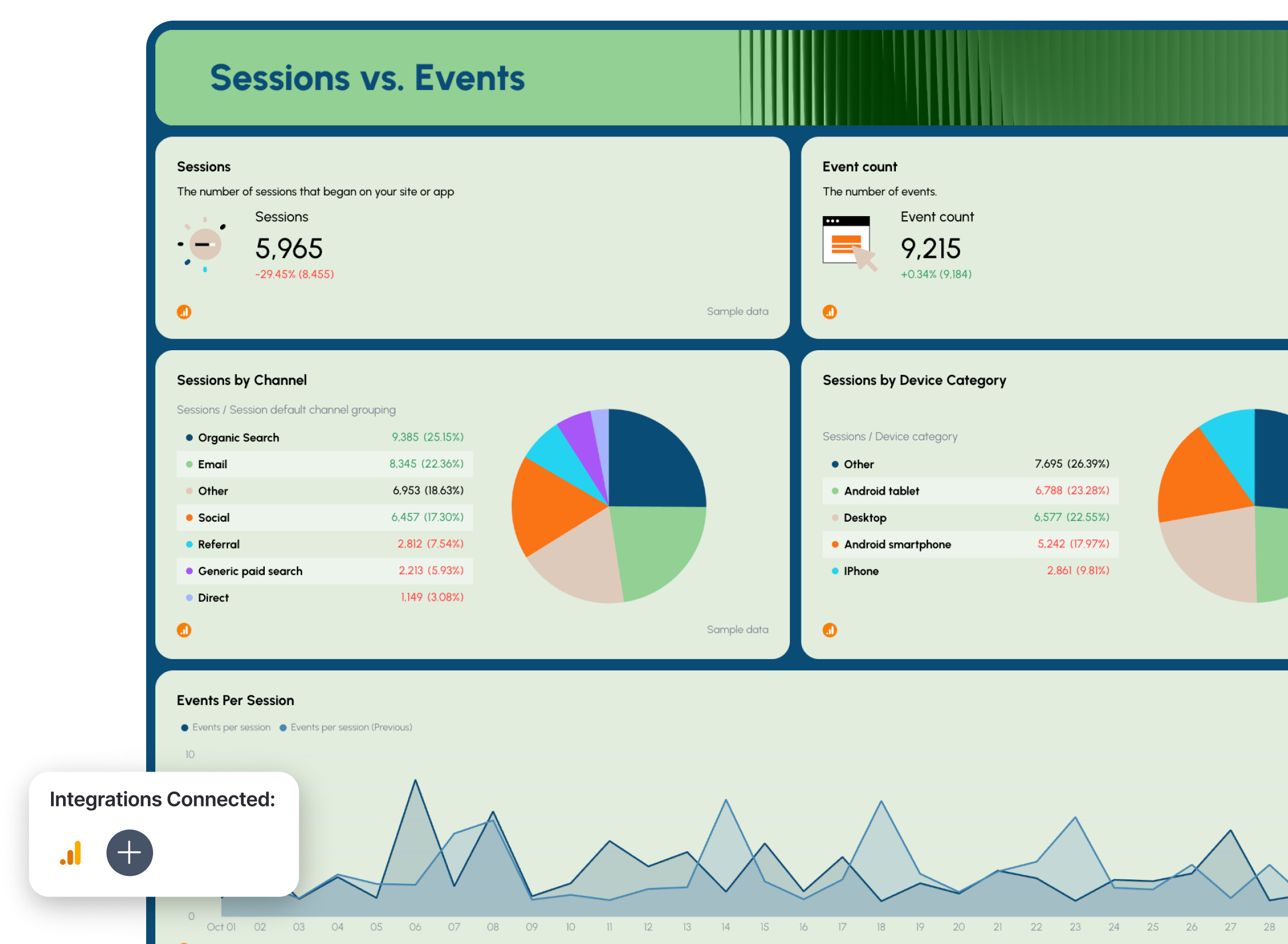
Sessions vs. Events tab
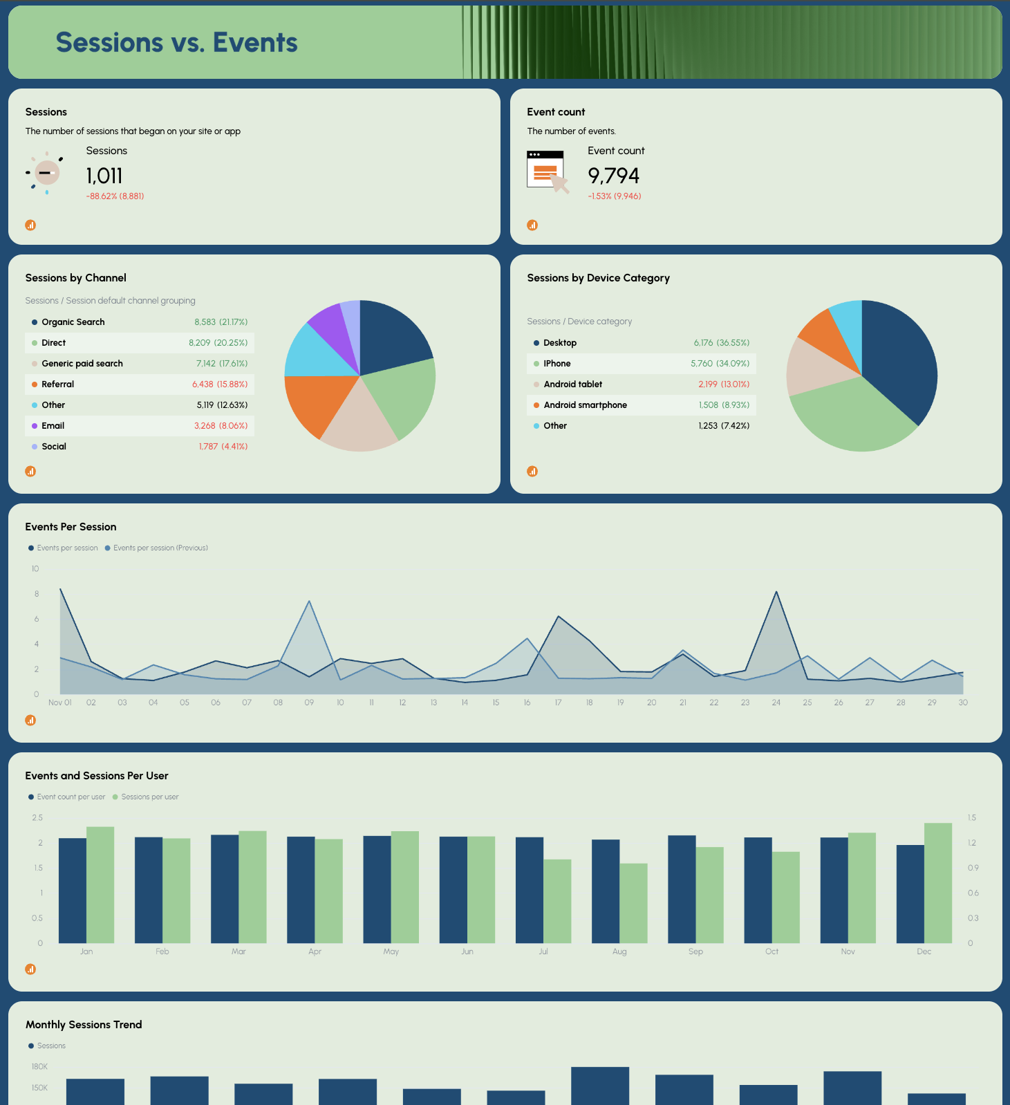
- Sessions, Event Count (KPI widgets with MoM change)
- Sessions by Channel: Referral, Other, Direct, Paid Search, Social, Organic Search, Email (pie chart)
- Sessions by Device Category (pie chart)
- Events Per Session - daily trend line (current vs. previous period)
- Events and Sessions Per User - monthly bar chart
- Monthly Sessions Trend
Total Users vs. New Users tab
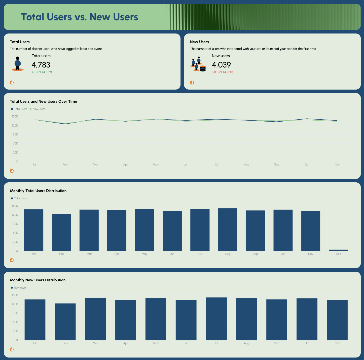
- Total Users, New Users (KPI widgets with MoM change)
- Total Users and New Users Over Time - trend line
- Monthly Total Users Distribution
- Monthly New Users Distribution
Page Performance tab
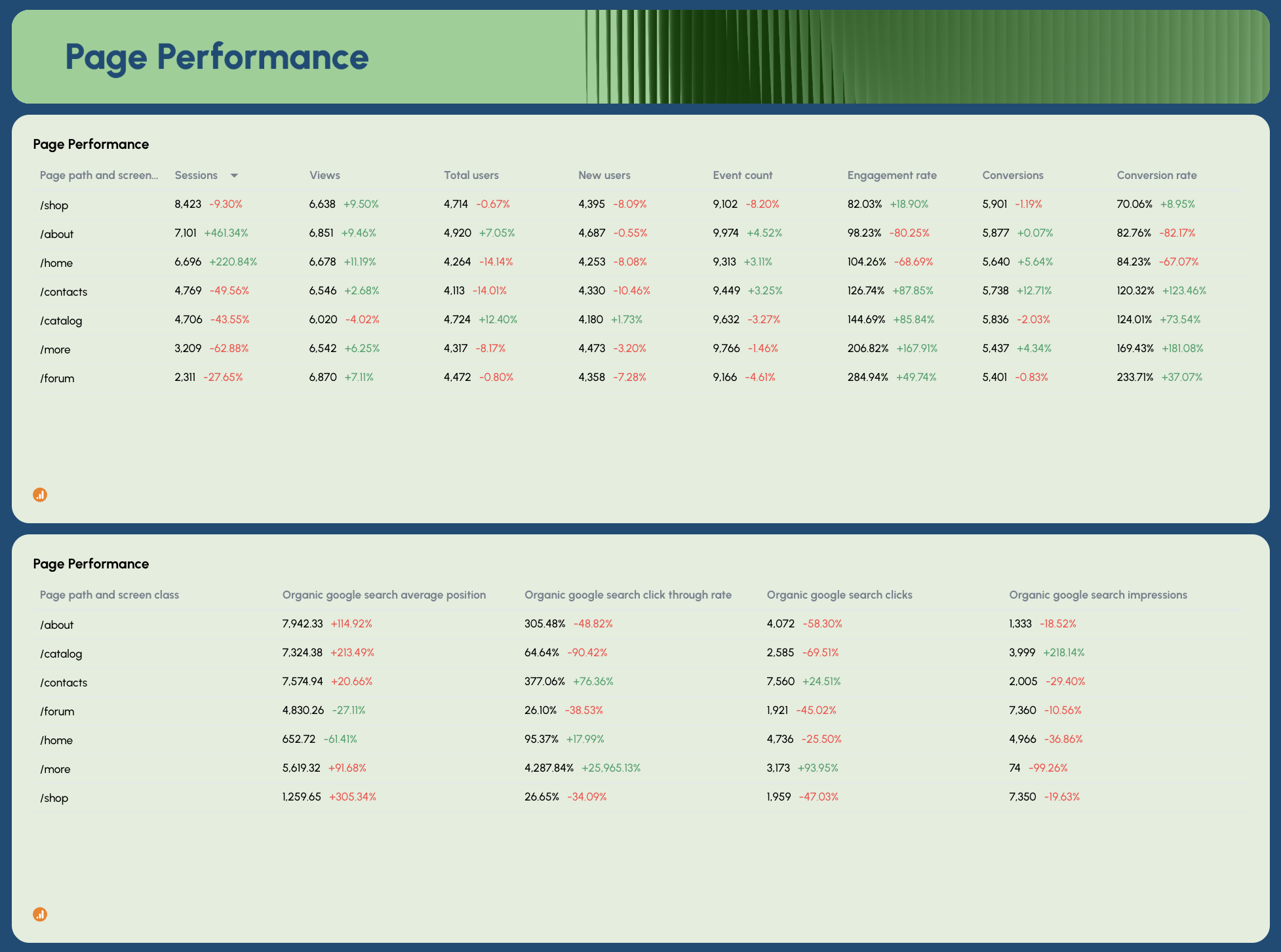
- Page Performance (GA4): Sessions, Views, Total Users, New Users, Event Count, Engagement Rate, Conversions, Conversion Rate by page path
- Page Performance (GSC): Organic Google Search Average Position, CTR, Clicks, Impressions by page path
Onsite Activity tab
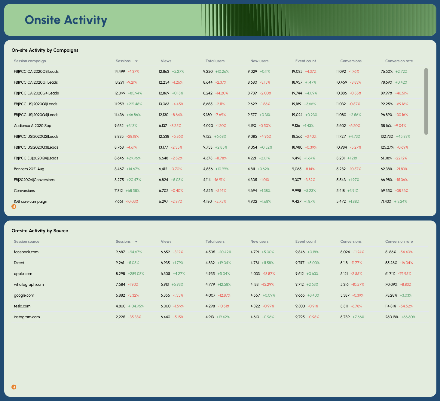
- On-site Activity by Campaigns: Sessions, Views, Total Users, New Users, Event Count, Conversions, Conversion Rate by campaign name
- On-site Activity by Source: Sessions, Views, Total Users, New Users, Event Count, Conversions, Conversion Rate by traffic source
Geography vs. Device tab
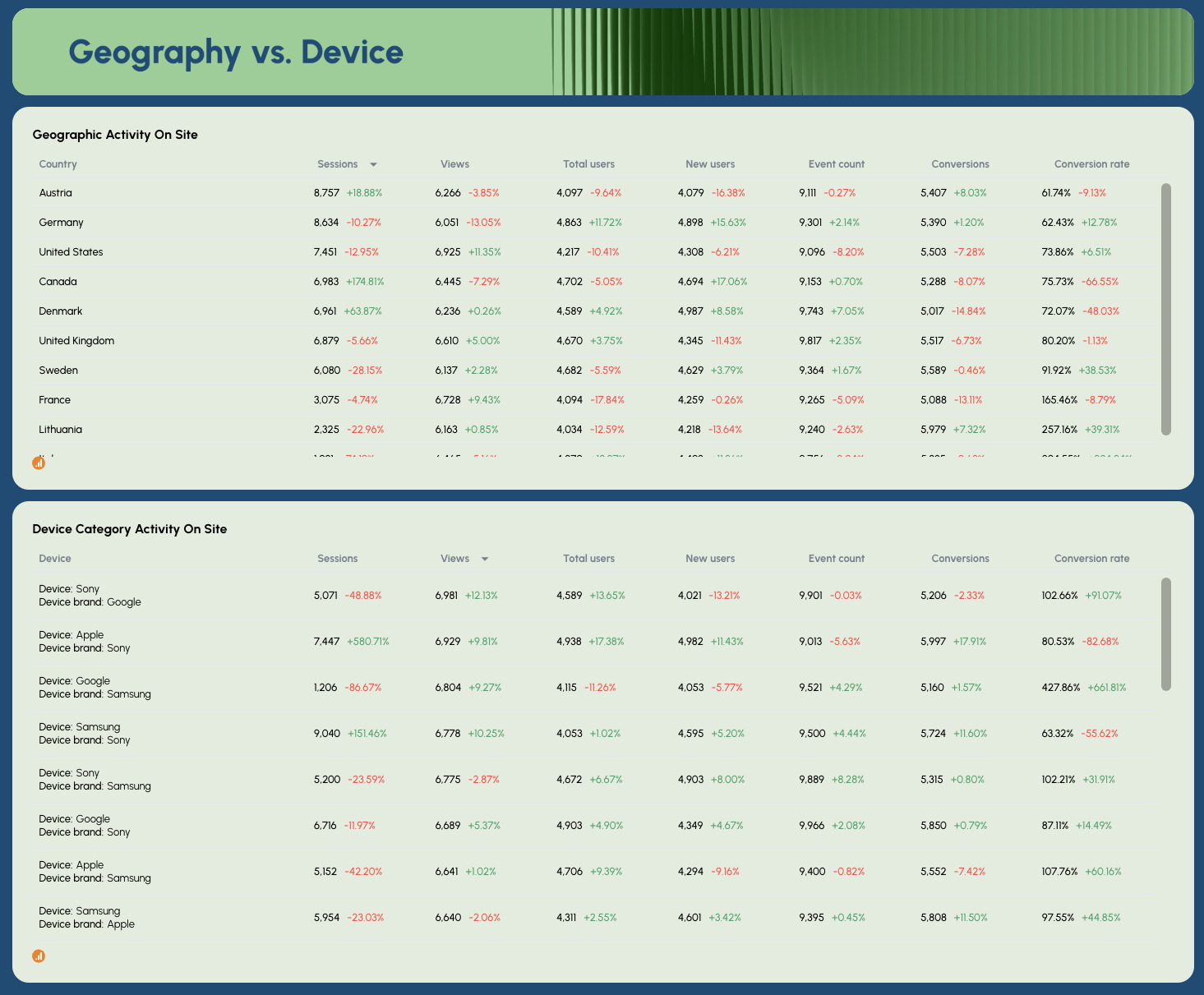
- Geographic Activity On Site: Sessions, Views, Total Users, New Users, Event Count, Conversions, Conversion Rate by country
- Device Category Activity On Site: Sessions, Views, Total Users, New Users, Event Count, Conversions, Conversion Rate by device and brand
Best practices:
✅ Cross-reference the Page Performance GA4 and GSC tables side by side - high impressions with low engagement rate on the same page usually signals a keyword-to-content mismatch worth fixing.
✅ Use the Geography vs. Device tab to prioritize technical SEO work - if a high-traffic country shows a significantly lower conversion rate, device or page speed issues are often the cause.
✅ Track Events Per Session alongside Sessions - a drop in sessions with stable events per session means your engaged users are still there, but you're losing top-of-funnel traffic.
✅ Filter the Onsite Activity by Source table to organic only before sharing with clients - campaign and referral data mixed in can confuse the SEO story you're trying to tell.
✅ Set Performance Goals for Conversions and Total Revenue, not just traffic metrics - it shifts the client conversation from "are we getting visitors" to "are those visitors doing anything valuable."
✅ Use the Monthly Sessions Trend alongside Monthly New Users Distribution to spot seasonality patterns - if new users spike but sessions don't follow, it often points to a landing page experience problem.
Example 6: ChatGPT SEO Dashboard Example
Use this example for free with your data
Who it's for: SEO managers and digital marketing teams who need a dedicated view of traffic, engagement, and revenue coming from a specific LLM source - whether that's ChatGPT, Perplexity, Claude, Gemini, or any other AI platform sending referral traffic.
Channels connected: Google Analytics 4
This ChatGPT dashboard is built around a single question most SEO dashboards still can't answer: how much is ChatGPT actually sending you, and what is that traffic doing?
It isolates sessions, users, views, conversions, and revenue from ChatGPT specifically - then puts them side by side with traditional organic search metrics in the GEO vs. SEO comparison section, so you always know how AI-referred traffic is growing relative to Google.
The template is set up as a weekly view by default, but the date range is fully adjustable - switch it to monthly, quarterly, or daily depending on what your reporting cadence requires. And because the dashboard connects live to GA4, every metric updates automatically each time you open it.
Want to track Perplexity instead of ChatGPT? Or Claude? Just adjust the source filter to the LLM you want to focus on and every widget on the dashboard updates instantly to reflect that source's traffic only.
Metrics to visualize:
Performance Summary tab
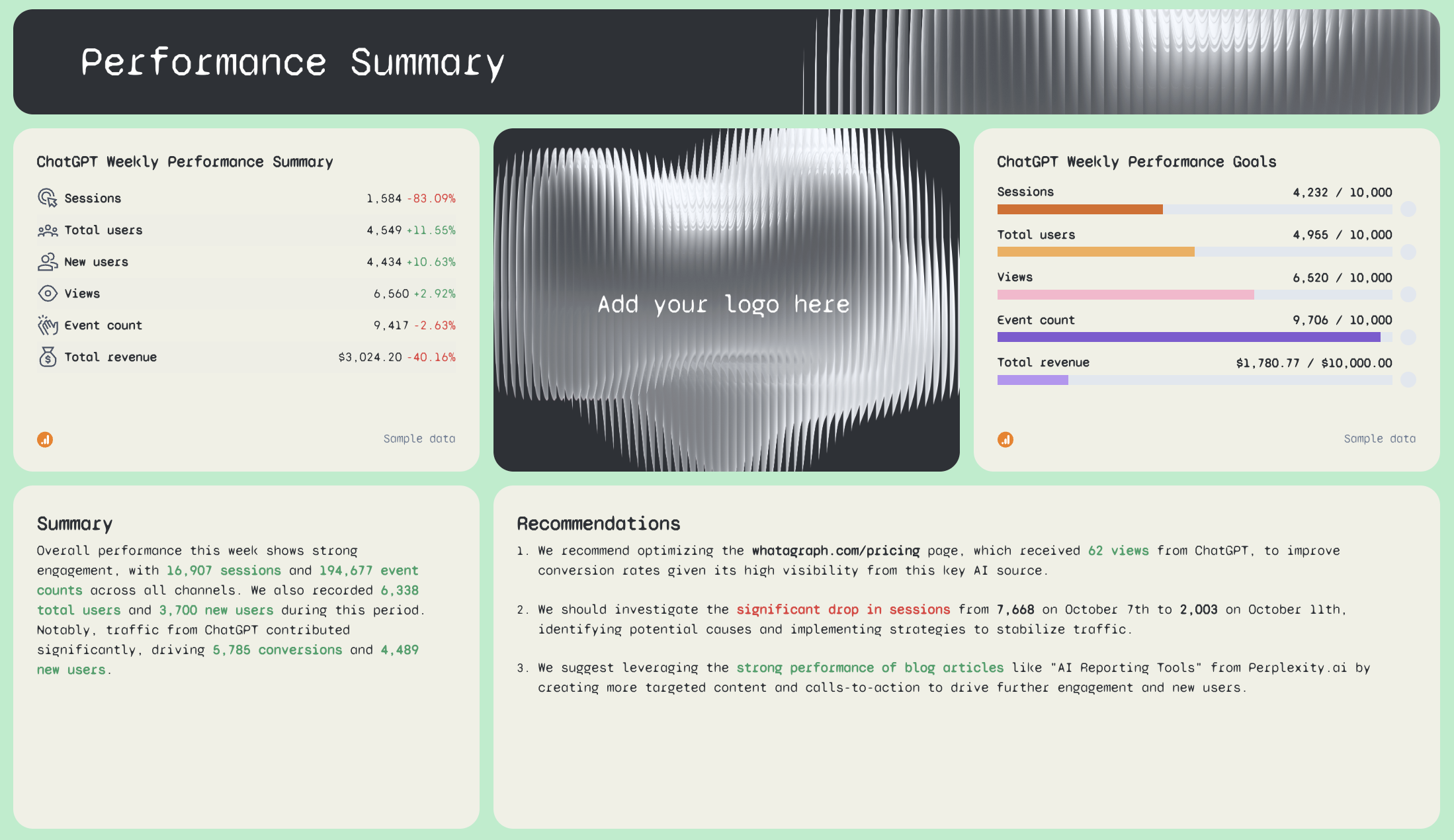
- ChatGPT Weekly Performance Summary: Sessions, Total Users, New Users, Views, Event Count, Total Revenue - with WoW comparison
- ChatGPT Weekly Performance Goals: pacing bars for Sessions, Total Users, Views, Event Count, Total Revenue
- AI-written Summary and Recommendations
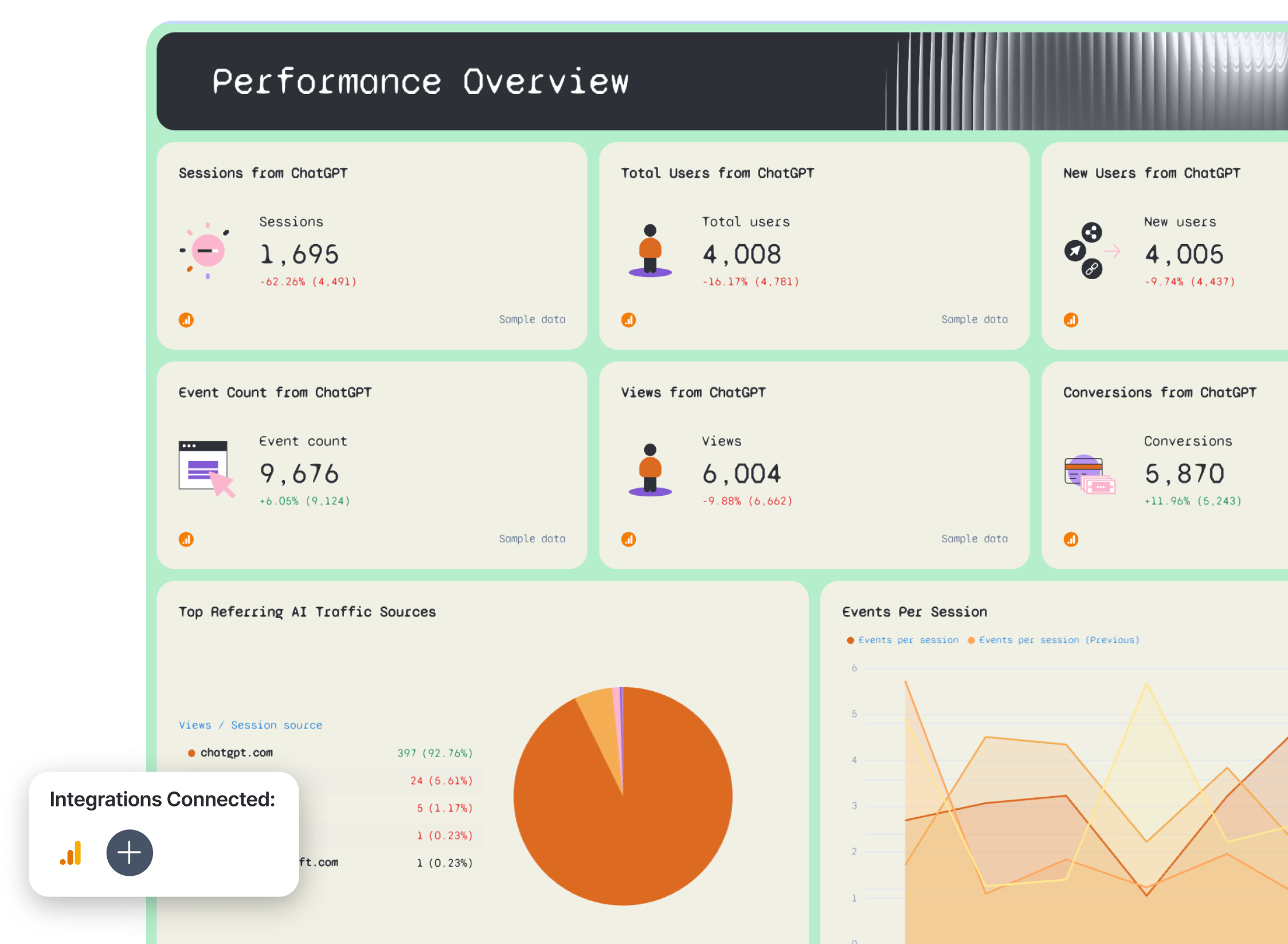
Performance Overview tab
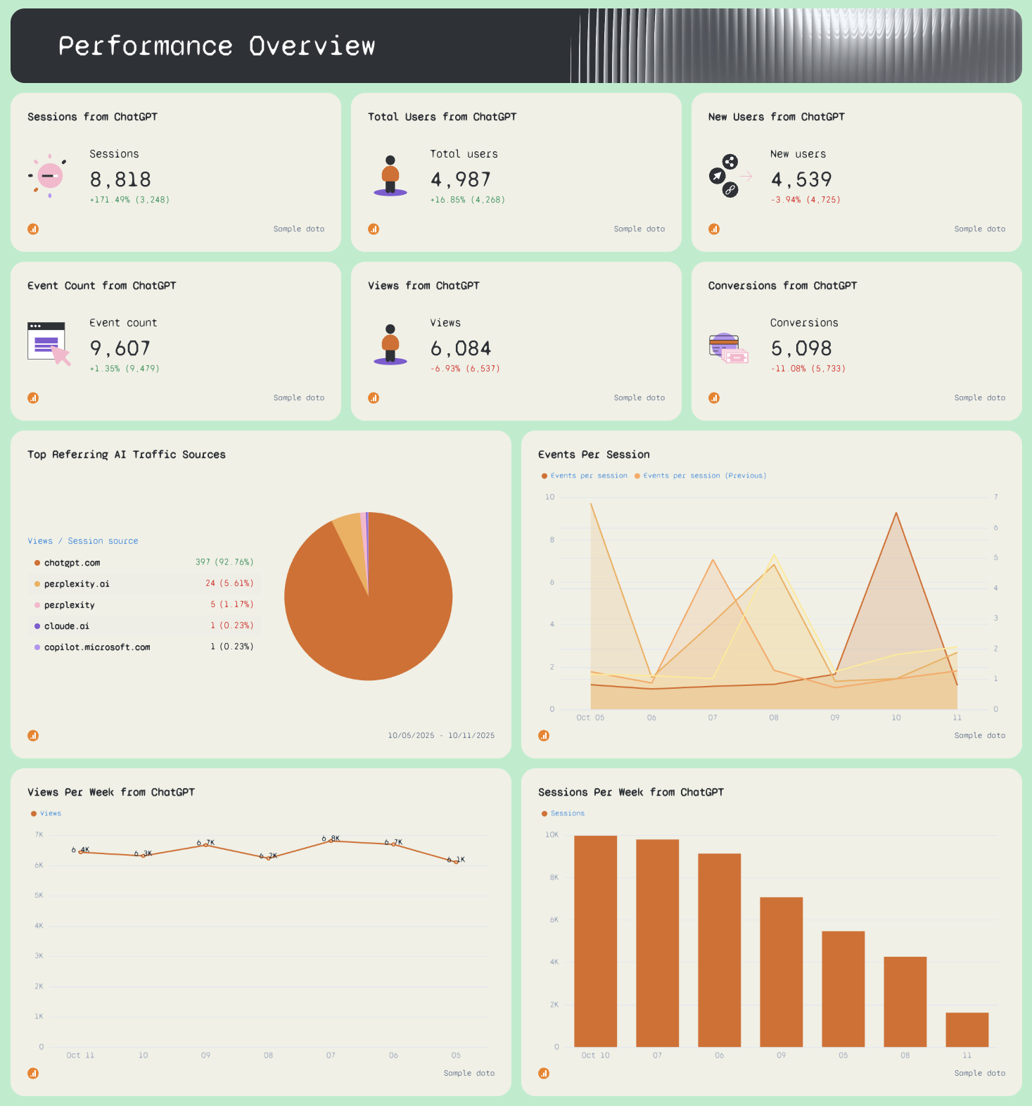
- Sessions from ChatGPT, Total Users from ChatGPT, New Users from ChatGPT
- Event Count from ChatGPT, Views from ChatGPT, Conversions from ChatGPT
- Top Referring AI Traffic Sources: Views by source (chatgpt.com, perplexity.ai, claude.ai, copilot.microsoft.com)
- Events Per Session - daily trend line (current vs. previous week)
- Views Per Week from ChatGPT - weekly bar chart
- Sessions Per Week from ChatGPT - weekly bar chart
eCommerce Overview tab
- eCommerce Purchases from ChatGPT
- Average Purchase Revenue from ChatGPT
- Purchase Revenue from ChatGPT
- eCommerce Purchases Per Week from ChatGPT
- Purchase Revenue Per Week from ChatGPT
Session Breakdown tab
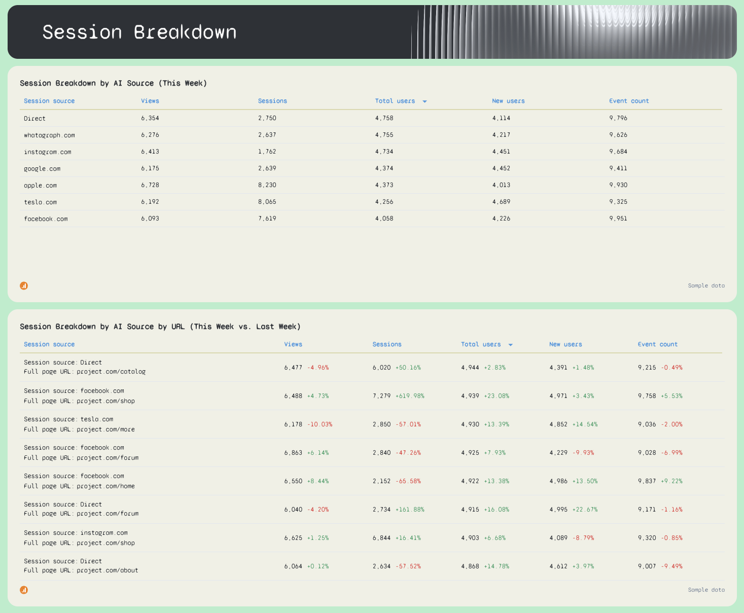
- Session Breakdown by AI Source (This Week): Views, Sessions, Total Users, New Users, Event Count by referring domain
- Session Breakdown by AI Source by URL (This Week vs. Last Week): performance by landing page and source combination
ChatGPT vs. Google tab
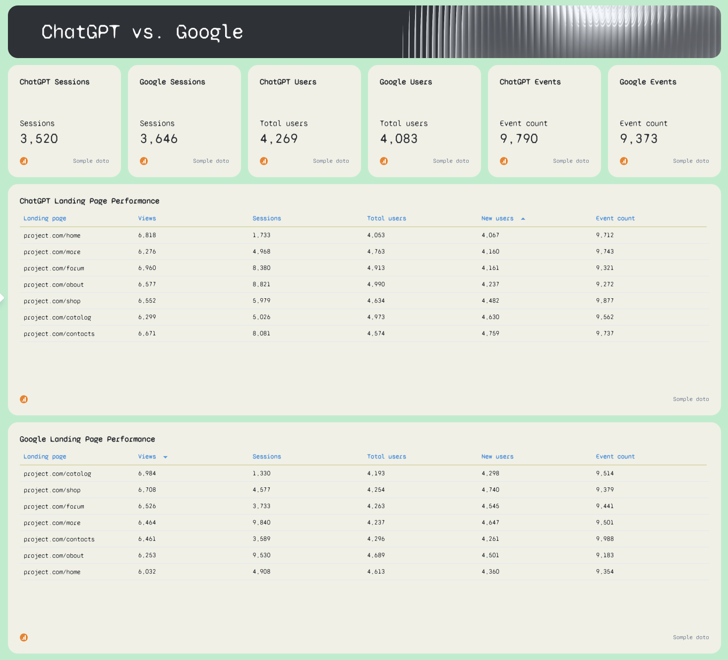
- ChatGPT Sessions vs. SEO Sessions
- ChatGPT Users vs. SEO Users
- ChatGPT Events vs. SEO Events
- ChatGPT Landing Page Performance: Views, Sessions, Total Users, New Users, Event Count by URL
- SEO Landing Page Performance: Views, Sessions, Total Users, New Users, Event Count by URL
Best practices:
✅ Use the source filter to switch between LLMs without rebuilding the dashboard - set it to perplexity.ai, claude.ai, or gemini.google.com and every widget updates to show that source's metrics only.
✅ Compare ChatGPT Landing Page Performance against SEO Landing Page Performance every week - the pages getting cited by ChatGPT and the pages ranking on Google are often completely different, and that gap is a content opportunity.
✅ Track the Top Referring AI Traffic Sources widget weekly - chatgpt.com typically dominates, but a spike in perplexity.ai or claude.ai traffic is an early signal that your content is being picked up by a new LLM.
✅ Set weekly Goals for Sessions and Total Revenue from ChatGPT before sharing with clients - without a target, a number like 3,583 sessions has no context.
✅ Use the eCommerce Purchases Per Week chart to connect LLM traffic to actual revenue - it's the fastest way to justify GEO optimization as a commercial priority, not just a vanity metric.
✅ Switch the date range to monthly for client reports and keep the weekly view for internal monitoring - weekly data is too granular for most clients but essential for spotting drops early.
3. SEO Ranking Dashboard Examples
Jump to the dashboard example you want to see:
Example 7: Comprehensive Keyword Ranking SEO Dashboard Example
Use this SEO ranking report template for free with your data
Who it's for: SEO managers and agency account managers who need to track keyword position movements, ranking distribution, and top-performing URLs - pulling data from both Ahrefs and Semrush in a single report.
Channels connected: Ahrefs, Semrush
Most keyword ranking dashboards show you a list of keywords and their positions.
This one shows you the full picture:
- how many keywords are sitting in each position bracket
- how that distribution is shifting month over month
- which URLs are driving the most traffic from organic search, and where the biggest ranking opportunities are hiding.
It’s also helpful to track and compare keyword positions before and after a site change, like a CMS migration.
Metrics to visualize:
Ahrefs Keyword Report tab
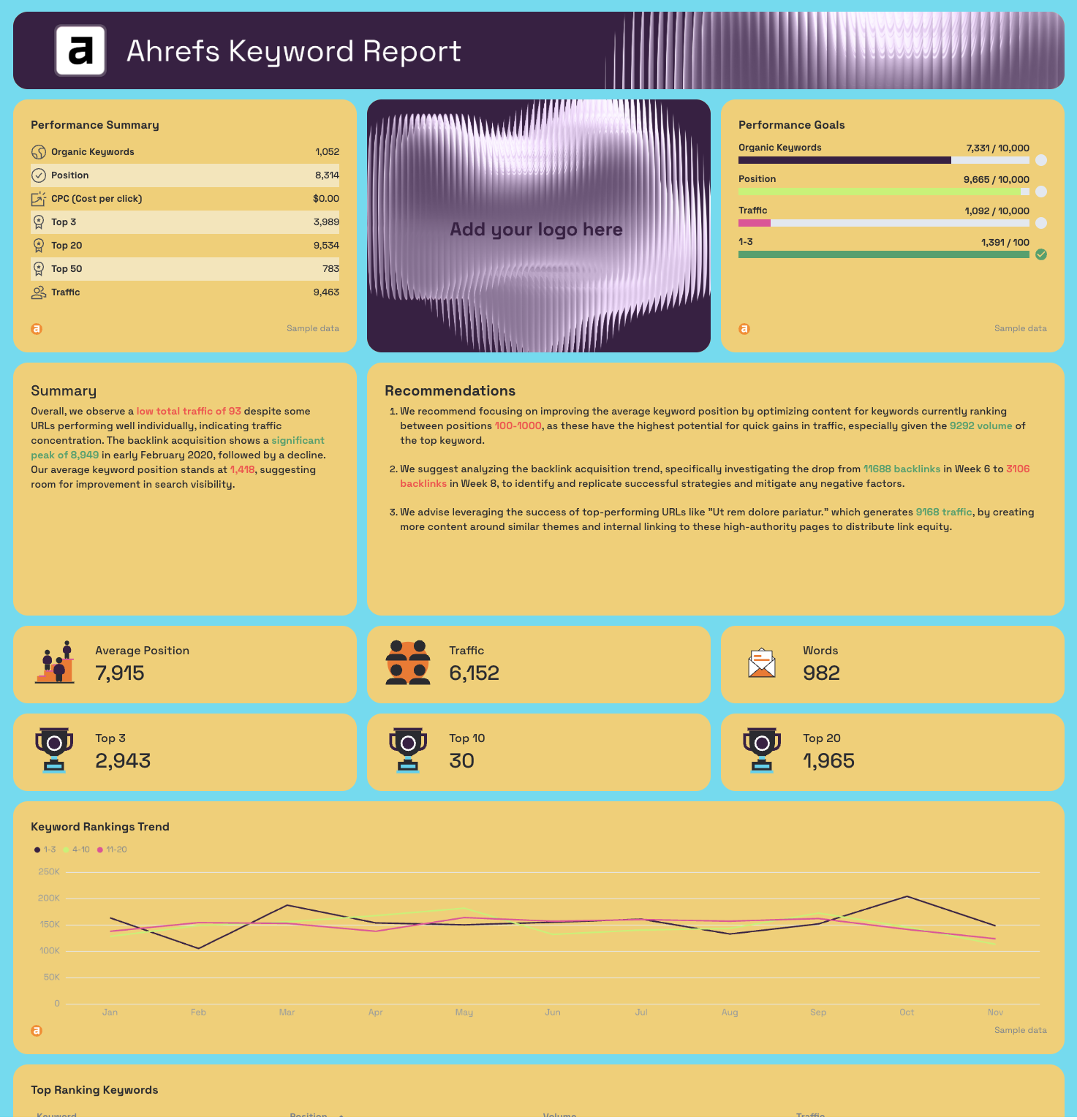
- Performance Summary: Organic Keywords, Position, CPC, Top 3, Top 20, Top 50, Traffic
- Performance Goals: pacing bars for Organic Keywords, Position, Traffic, 1-3 rankings
- AI-written Summary and Recommendations
- Average Position, Traffic, Words (KPI widgets)
- Top 3, Top 10, Top 20 (KPI widgets)
- Keyword Rankings Trend: positions 1-3, 4-10, 11-20 plotted as separate monthly trend lines
- Top Ranking Keywords: Keyword, Position, Volume, Traffic
- Top Performing URLs: Traffic, Keywords, Position, Referring Domains, Volume by URL
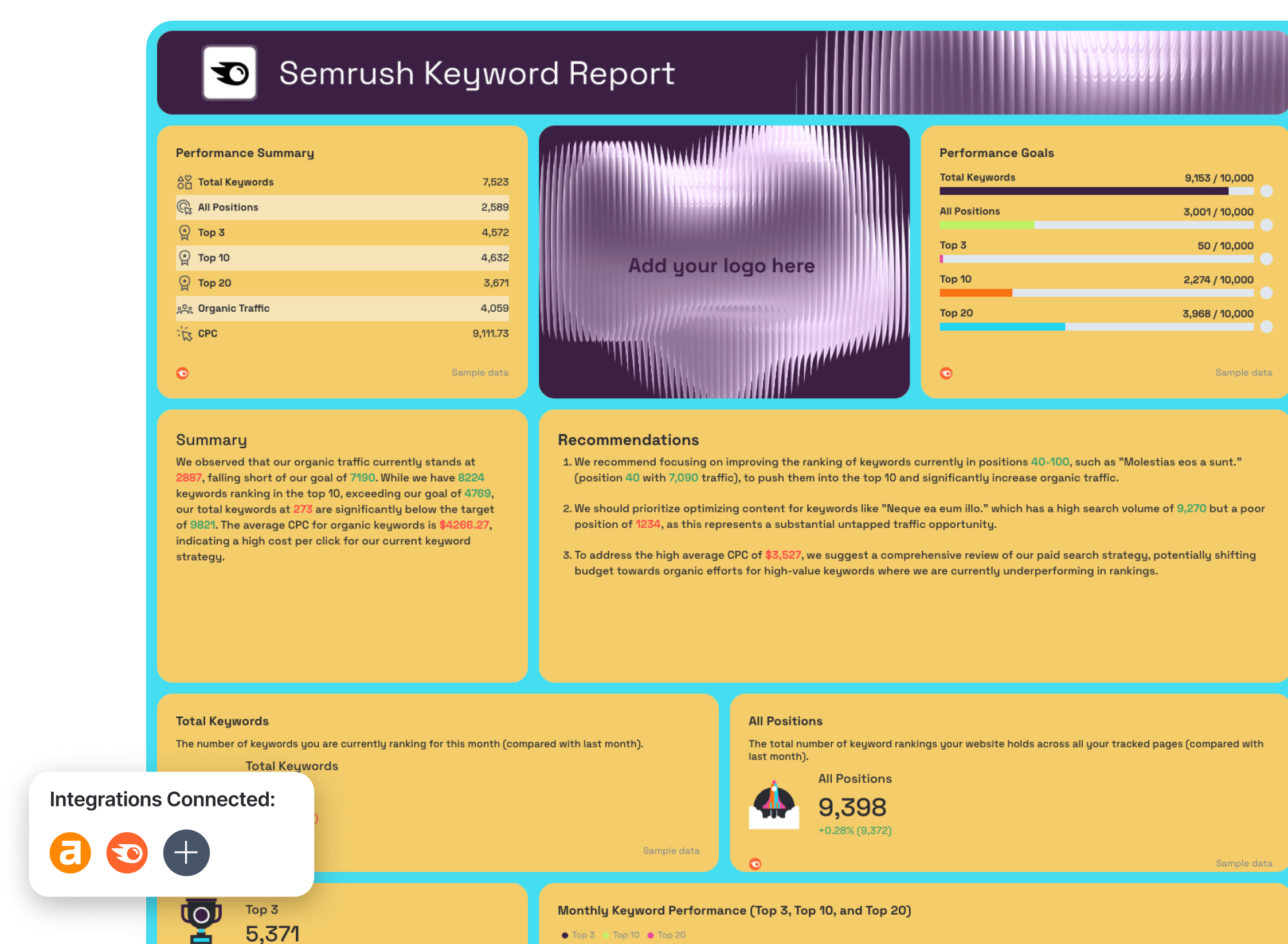
Semrush Keyword Report tab
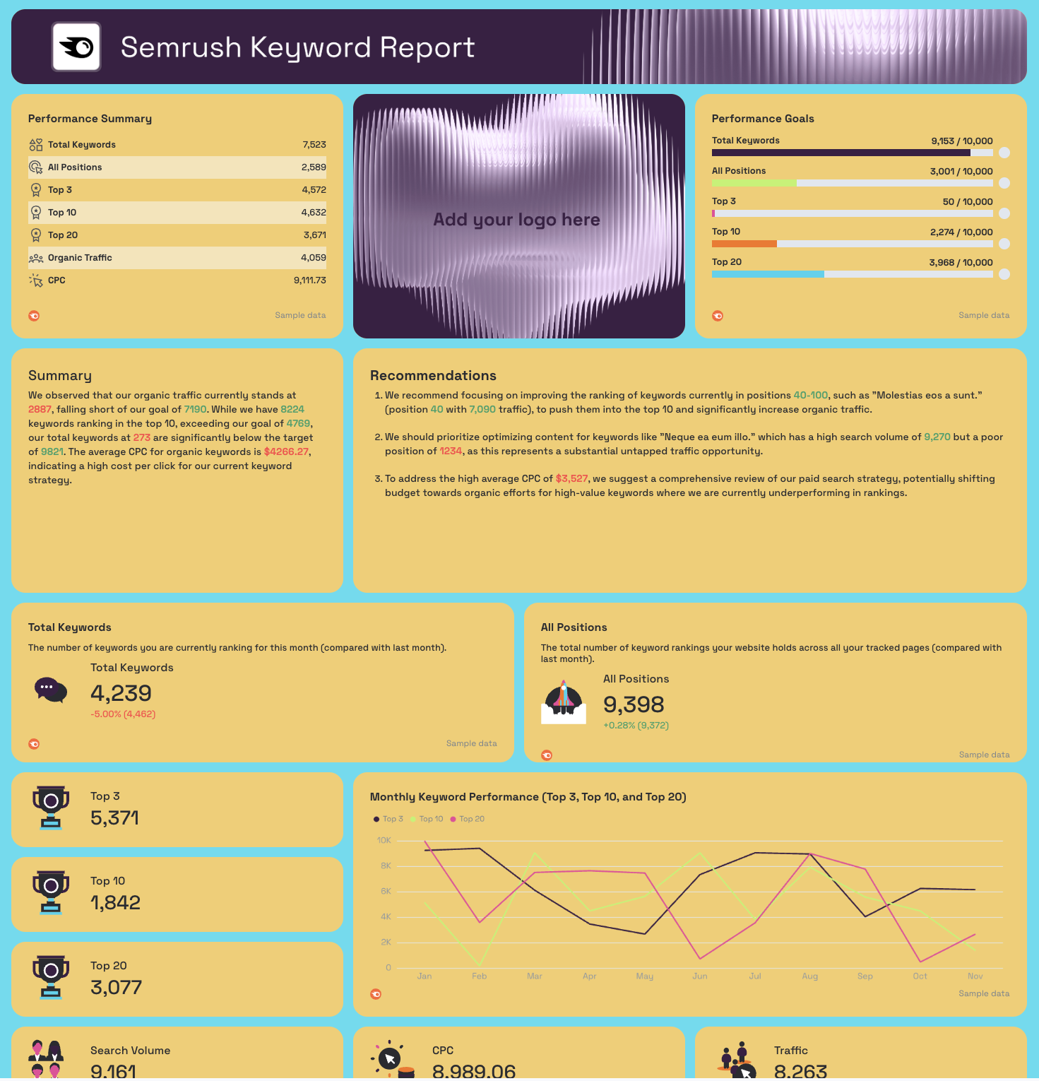
- Performance Summary: Total Keywords, All Positions, Top 3, Top 10, Top 20, Organic Traffic, CPC
- Performance Goals: pacing bars for Total Keywords, All Positions, Top 3, Top 10, Top 20
- Total Keywords, All Positions (KPI widgets with MoM change)
- Top 3, Top 10, Top 20 (KPI widgets)
- Search Volume, CPC, Traffic (KPI widgets)
- Monthly Total Keywords - trend line
- Monthly Keyword Positions - trend line
- Top 3 Keyword Position Trend - monthly line chart
- Top 10 Keyword Position Trend - monthly line chart
- Top 20 Keyword Position Trend - monthly line chart
- Monthly Keyword Performance (Top 3, Top 10, Top 20) - combined line chart
- Top Ranking Keywords: Keyword, Position, Search Volume, Keyword Difficulty, Traffic
- Top Ranking Keywords and Page URLs: Keyword, URL, Position, Traffic, Search Volume
Best practices:
✅ Use both Ahrefs and Semrush tabs in every ranking report - position data varies between tools, and showing clients both sources builds more trust than relying on one alone.
✅ Focus the client conversation on the Keyword Rankings Trend chart first - movement between position brackets (especially from 4-10 into 1-3) tells a clearer performance story than average position alone.
✅ Set Performance Goals for Top 3 and Top 10 rankings separately - total keyword count is a vanity metric, but rankings in the top 10 are what actually drive clicks.
✅ Sort the Top Performing URLs table by Traffic before sharing - it immediately shows which pages are doing the heavy lifting and which high-keyword-count pages aren't converting visibility into visits.
✅ Use the Top Ranking Keywords and Page URLs table in Semrush to spot keyword cannibalization - if the same keyword maps to multiple URLs at different positions, that's a consolidation opportunity.
✅ Cross-reference the Semrush Keyword Difficulty column against position data - keywords with high difficulty sitting outside the top 20 are deprioritization candidates, while low-difficulty keywords outside the top 3 are quick wins.
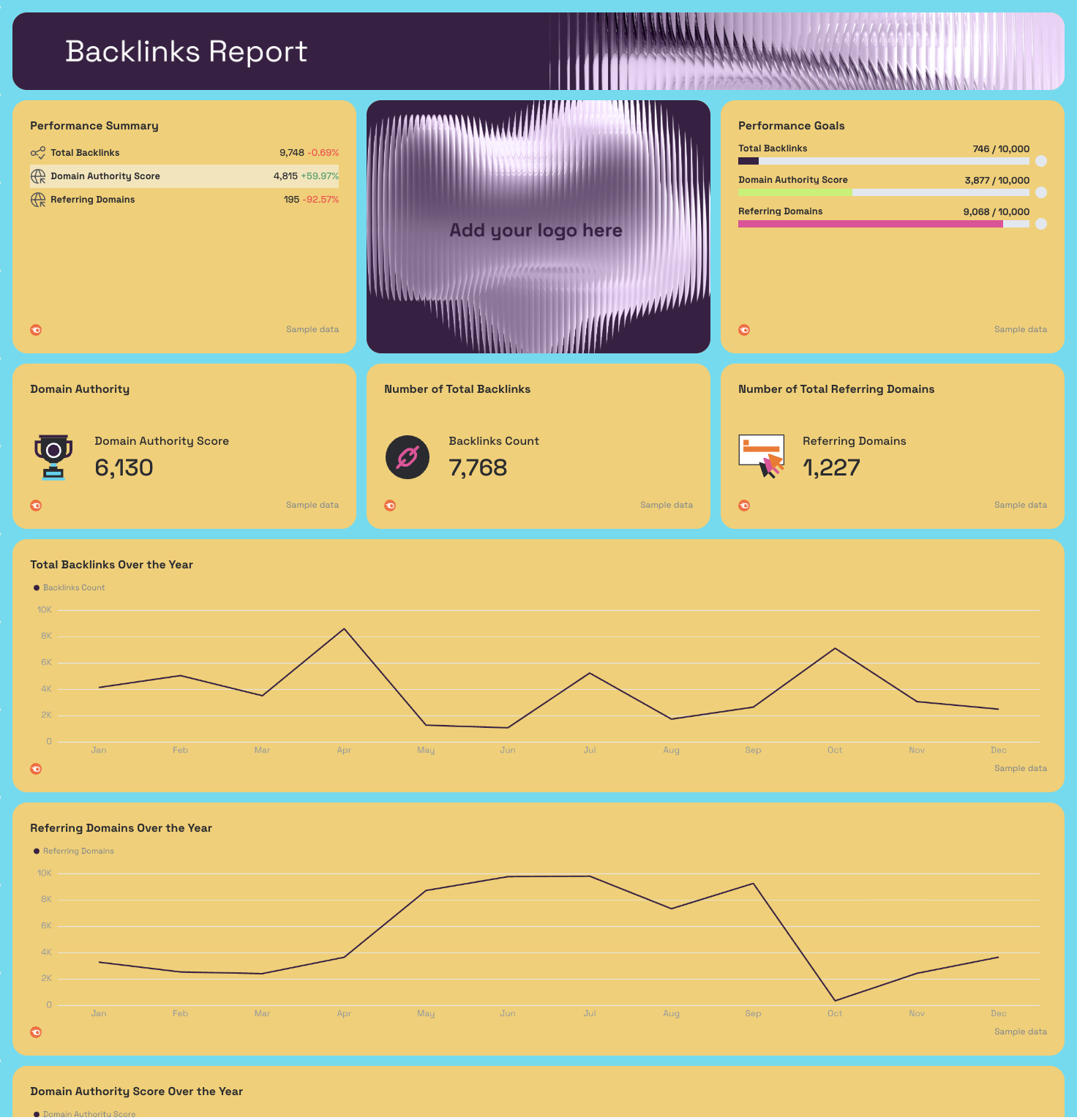
Example 8: Ahrefs SEO Ranking Dashboard Example
Use this example for free with your data
Who it's for: SEO managers and agency account managers who use Ahrefs as their primary ranking and backlink tool and need a client-ready dashboard that surfaces keyword position distribution, top-performing URLs, and domain authority growth in one view.
Channels connected: Ahrefs
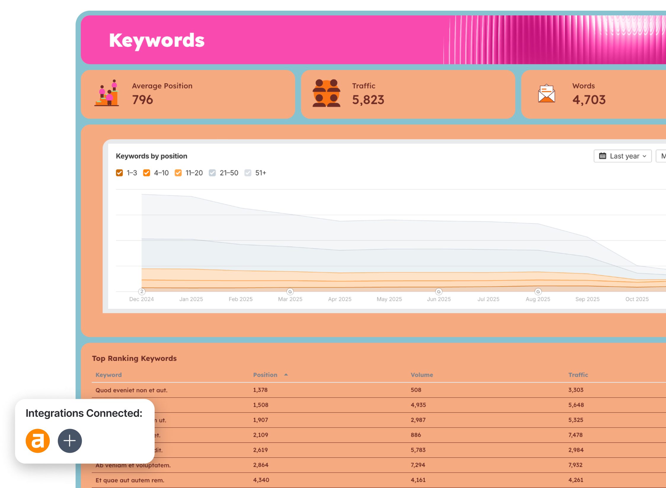
Ahrefs gives you more ranking and backlink data than most teams know what to do with.
This Ahrefs dashboard cuts through it - pulling the metrics that actually tell the story of whether organic visibility is improving, which keywords are driving traffic, and whether the link profile is growing in the right direction. Everything is organized into three focused tabs so the keyword conversation and the backlink conversation stay separate and neither gets buried.
The Keywords by Position chart is the centerpiece - it plots keyword distribution across five position brackets (1-3, 4-10, 11-20, 21-50, 51+) as stacked area trends over the past year. It's the single clearest way to show a client that rankings are compounding over time, not just fluctuating week to week.
Metrics to visualize:
Summary tab

- Performance Summary: Domain Rating (DR), Ahrefs Rank (AR), Backlinks, Organic Keywords, Traffic
- Performance Goals: pacing bars for Domain Rating, Ahrefs Rank, Backlinks, Organic Keywords, Traffic
- AI-written Summary and Recommendations
Keywords tab
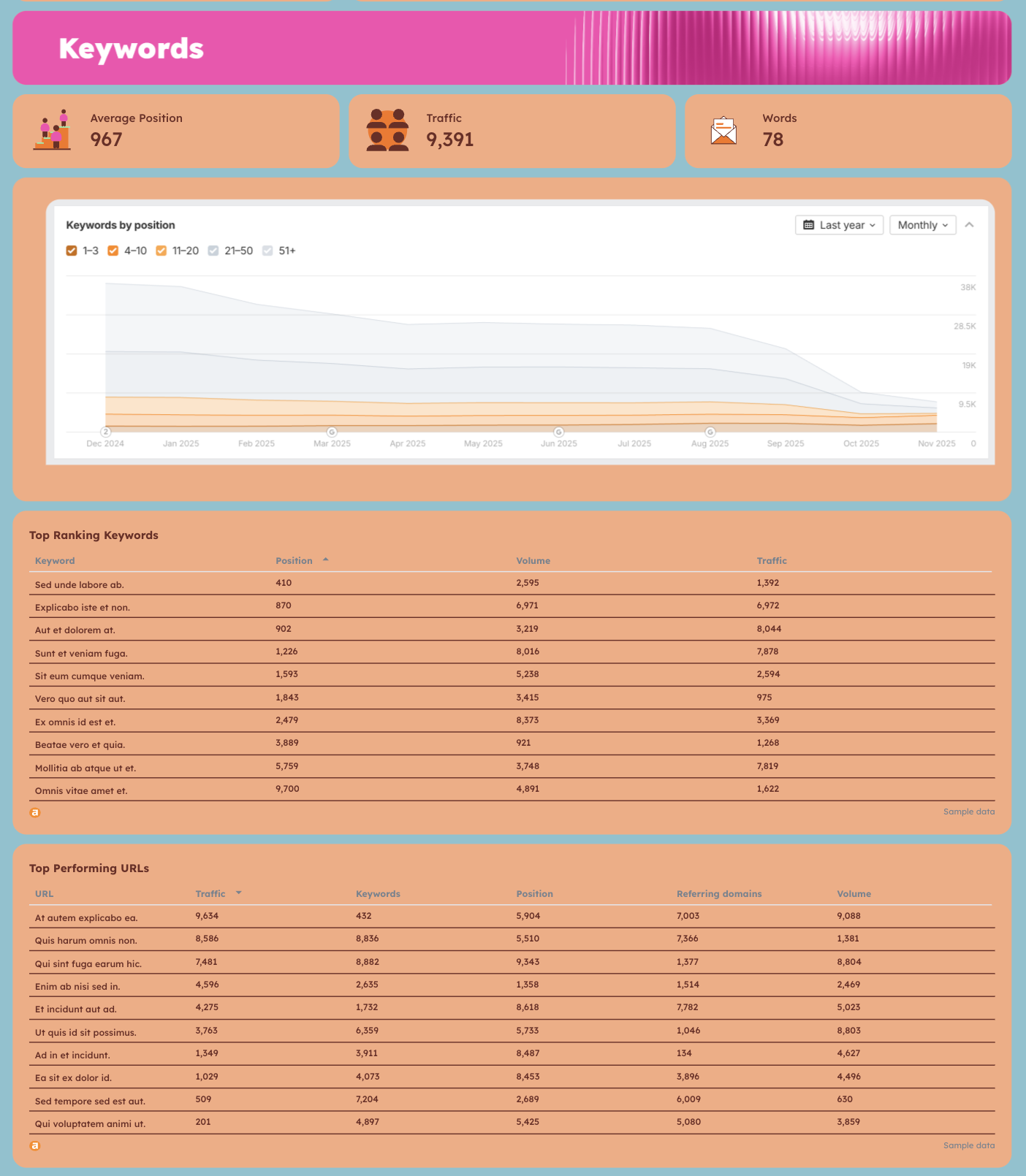
- Average Position, Traffic, Words (KPI widgets)
- Keywords by Position: stacked area chart plotting 1-3, 4-10, 11-20, 21-50, 51+ position brackets over 12 months
- Top Ranking Keywords: Keyword, Position, Volume, Traffic
- Top Performing URLs: Traffic, Keywords, Position, Referring Domains, Volume by URL
Backlinks tab
- Domain Rating (DR) with MoM change
- Backlinks with MoM change
- Referring Domains with MoM change
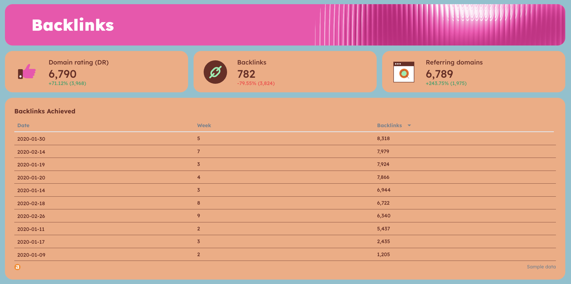
- Backlinks Achieved: Date, Week, Backlinks - historical acquisition table
Best practices:
✅ Use the Keywords by Position stacked area chart as your lead visual in client calls - watching the 1-3 and 4-10 bands grow over 12 months is more persuasive than any single month's position report.
✅ Track Referring Domains alongside Backlinks separately - a rising backlink count with flat or declining referring domains usually means you're getting repeat links from the same sources, which has limited SEO value.
✅ Sort the Top Performing URLs table by Traffic, not Keywords - a URL ranking for 500 keywords in positions 40-50 contributes less than one ranking for 20 keywords in the top 3.
✅ Set Performance Goals for Domain Rating and Organic Keywords before the engagement starts - having a baseline target makes month-over-month movement meaningful rather than directional.
✅ Use the Backlinks Achieved table to tie link building activity to specific weeks - if a campaign ran in February and backlinks spiked in that same period, the table makes that correlation visible to clients.
✅ Cross-reference Top Ranking Keywords against Top Performing URLs - keywords with high volume and strong positions that don't appear in the top URL table often signal a landing page optimization gap.
Example 9: Semrush SEO Ranking Dashboard Example
Use this example for free with your data
Who it's for: SEO managers and agency account managers who use Semrush as their primary SEO tool and need a single dashboard covering organic traffic, keyword rankings, and backlink profile - with organic vs. paid comparisons built in.
Channels connected: Semrush
Where most Semrush dashboards pull a single data type - rankings or traffic or backlinks - this dashboard covers all three in dedicated tabs, so you can move from "how is organic traffic performing against paid" to "which keywords are driving it" to "is the link profile supporting it" without leaving the report.
The organic vs. paid comparison built into the Traffic Report tab is particularly useful for agencies managing both SEO and PPC for the same client - it puts both channels in context and makes the case for organic investment directly against paid spend.
The Backlinks tab goes beyond total link count - it tracks Domain Authority, Referring Domains, and Total Backlinks as separate year-long trend lines, plus a full breakdown of new backlinks acquired by date with follow/nofollow splits and referring domain data. It's the level of detail that turns a link building update into a credible strategic conversation.
Metrics to visualize:
Traffic Report tab
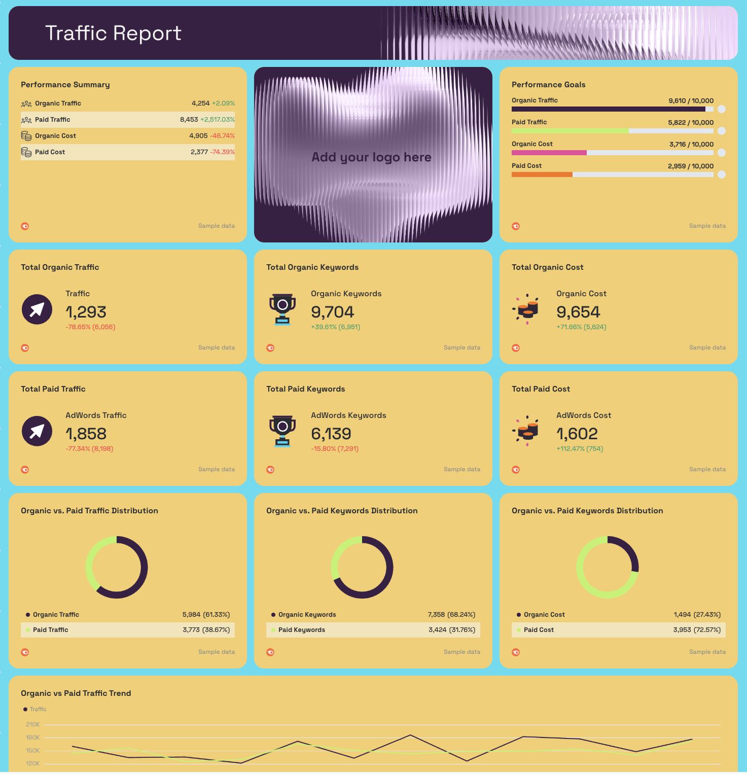
- Performance Summary: Organic Traffic, Paid Traffic, Organic Cost, Paid Cost - with MoM change
- Performance Goals: pacing bars for Organic Traffic, Paid Traffic, Organic Cost, Paid Cost
- AI-written Summary and Recommendations
- Total Organic Traffic, Total Organic Keywords, Total Organic Cost (KPI widgets)
- Total Paid Traffic, Total Paid Keywords, Total Paid Cost (KPI widgets)
- Organic vs. Paid Traffic Distribution (donut chart)
- Organic vs. Paid Keywords Distribution (donut chart)
- Organic vs. Paid Cost Distribution (donut chart)
- Organic vs. Paid Traffic Trend - 12-month line chart
- Organic vs. Paid Keywords Trend - 12-month line chart
- Organic vs. Paid Cost Trend - 12-month line chart
- Top 10 Organic Keywords by Traffic: Keyword, Traffic, Position, Search Volume
- Top 10 Paid Keywords by Traffic: Keyword, Traffic, Position, Search Volume
Keywords Report tab
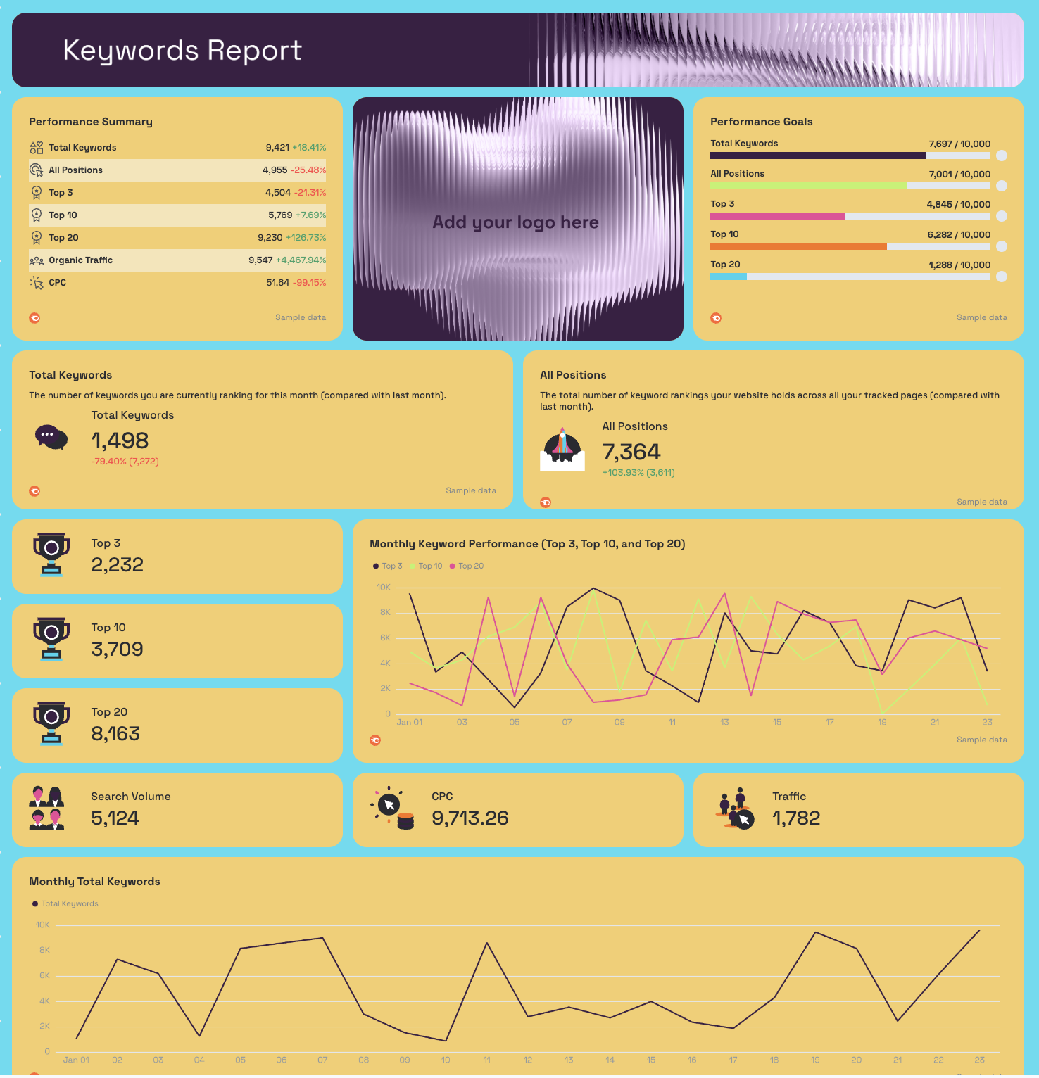
- Performance Summary: Total Keywords, All Positions, Top 3, Top 10, Top 20, Organic Traffic, CPC - with MoM change
- Performance Goals: pacing bars for Total Keywords, All Positions, Top 3, Top 10, Top 20
- Total Keywords, All Positions (KPI widgets with MoM change)
- Top 3, Top 10, Top 20, Search Volume, CPC, Traffic (KPI widgets)
- Monthly Total Keywords - trend line
- Monthly Keyword Positions - trend line
- Top 3 Keyword Position Trend - daily trend line
- Top 10 Keyword Position Trend - daily trend line
- Top 20 Keyword Position Trend - daily trend line
- Monthly Keyword Performance (Top 3, Top 10, Top 20) - combined line chart
- Top Ranking Keywords: Keyword, Position, Search Volume, Keyword Difficulty, Traffic
- Top Ranking Keywords and Page URLs: Keyword, URL, Position, Traffic, Search Volume
Backlinks Report tab
- Performance Summary: Total Backlinks, Domain Authority Score, Referring Domains - with MoM change
- Performance Goals: pacing bars for Total Backlinks, Domain Authority Score, Referring Domains
- Domain Authority Score, Backlinks Count, Referring Domains (KPI widgets)
- Total Backlinks Over the Year - annual trend line
- Referring Domains Over the Year - annual trend line
- Domain Authority Score Over the Year - annual trend line
- New Backlinks Acquired Last Month: Date, Total Backlinks, Follow Links, Nofollow Links, Referring URLs, Referring Domains
- Top Anchor Texts and Backlink Count: Anchor Text, Backlinks Count
Best practices:
✅ Use the Organic vs. Paid Traffic Trend chart to show clients the compounding value of SEO over time - paid traffic flatlines when spend stops, organic doesn't.
✅ Track Referring Domains separately from Total Backlinks - a growing backlink count from a flat referring domain base means you're getting repeat links from the same sites, which delivers diminishing SEO returns.
✅ Set Performance Goals for Domain Authority and Referring Domains at the start of every engagement - link building is slow, and goal pacing bars make incremental progress visible to clients who expect fast results.
✅ Use the Top Ranking Keywords and Page URLs table to spot keyword cannibalization - if the same keyword maps to multiple URLs at different positions, that's a page consolidation opportunity.
✅ Cross-reference the Organic Cost trend against Paid Cost - if organic cost equivalent is growing while paid cost stays flat, that's a concrete ROI argument for continuing to invest in SEO.
✅ Include the New Backlinks Acquired table in agency reporting - showing clients the exact dates and follow/nofollow splits of new links acquired ties your link building work directly to measurable outputs.
4. SEO Analytics Dashboard Examples
Jump to the dashboard example you want to see:
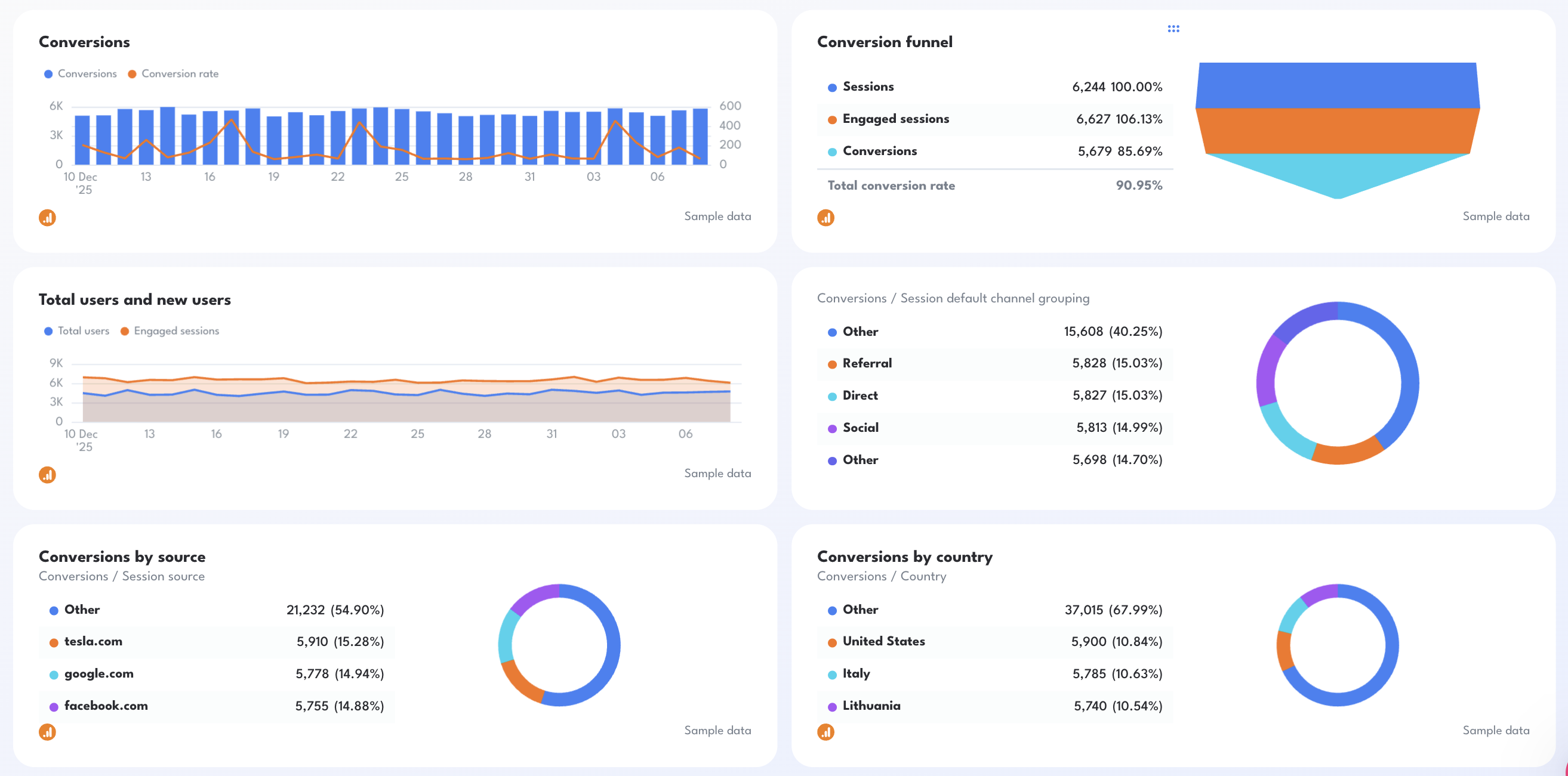
Example 10: Google Analytics SEO Dashboard Example
Use this example for free with your data
Who it's for: SEO managers, digital marketing managers, and agency account managers who need a Google Analytics SEO dashboard that goes beyond traffic - tracking conversions, engagement rates, and on-site behavior by source, country, and campaign in a single view.
Channels connected: Google Analytics 4
Most Google Analytics SEO dashboards stop at sessions and bounce rate. This one starts where those leave off. It centers the entire view on conversions - how many, from where, through which campaigns, and in which countries - so every metric on the dashboard connects back to a business outcome rather than a traffic number.
The Conversion Funnel widget is the section that tends to stop clients mid-sentence. It maps Sessions to Engaged Sessions to Conversions in a single visual, with percentage drop-off at each stage.
Pair that with the On Site Activity by Source table and you can immediately show which traffic sources are sending high-intent visitors and which are inflating session counts without converting.
Metrics to visualize:
Google Analytics SEO Report Overview
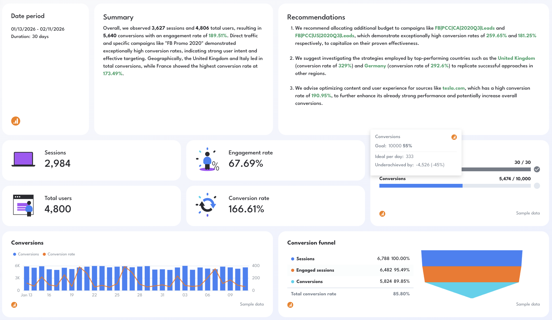
- Sessions, Total Users, Engagement Rate, Conversion Rate (KPI widgets)
- Goal: Time Passed, Conversions pacing bar
- AI-written Summary and Recommendations
Conversion Performance
- Conversions trend line + Conversion Rate overlay - daily chart
- Conversion Funnel: Sessions → Engaged Sessions → Conversions with % drop-off
- Total Users and New Users - daily trend line with engaged sessions overlay
Conversions by Segment
- Conversions by Source (donut chart): top referring sources + % share
- Conversions by Country (donut chart): top converting countries + % share
- Conversions by Channel: Email, Organic Search, Direct, Social (donut chart)
- Conversions by Campaign (donut chart): top converting campaigns + % share
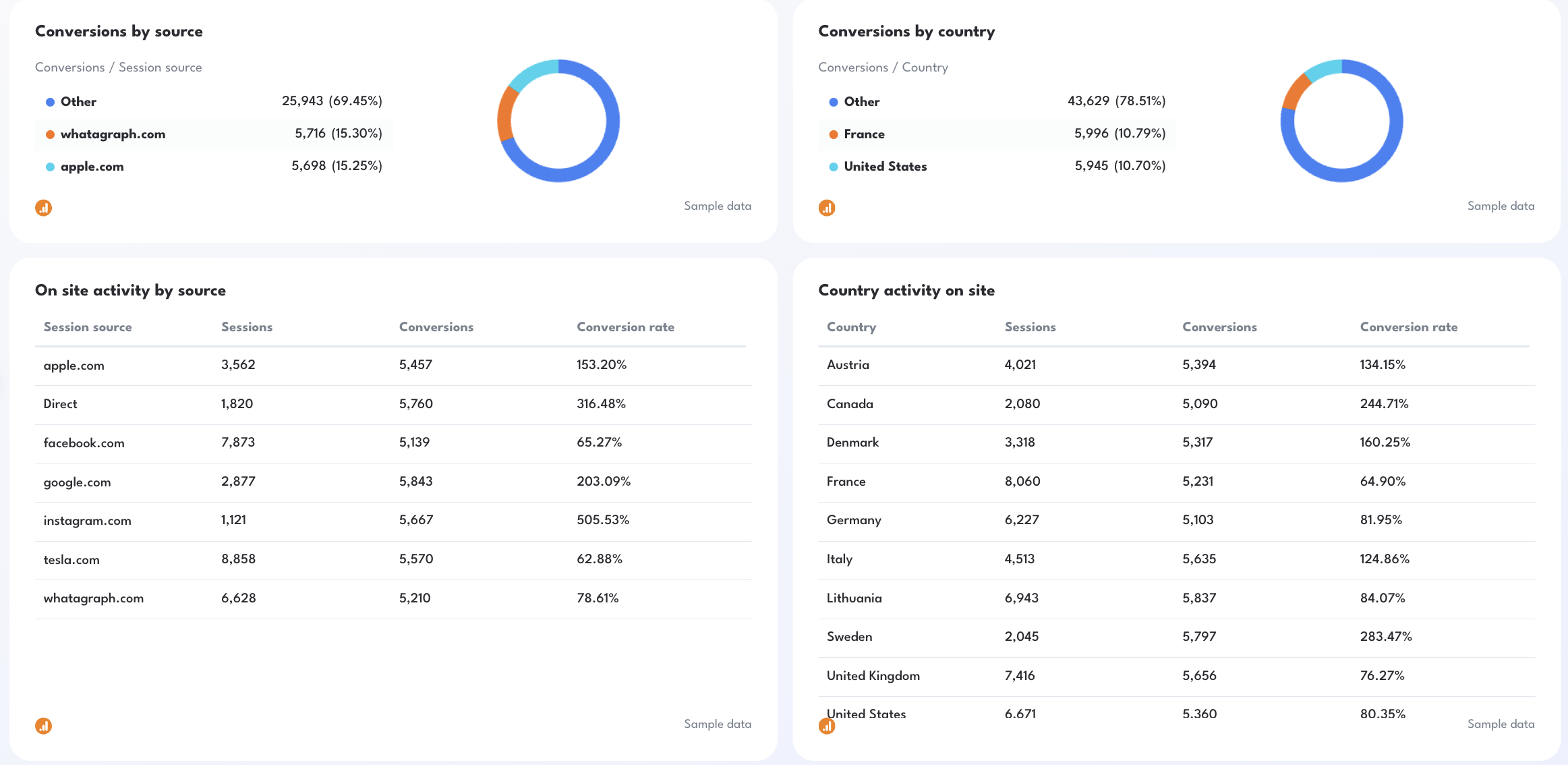
On Site Activity
- On Site Activity by Source: Sessions, Conversions, Conversion Rate by referring domain
- Country Activity on Site: Sessions, Conversions, Conversion Rate by country
- On Site Activity by Campaign: Sessions, Conversions, Conversion Rate by campaign name
- On Site Activity by Nth Day: Sessions, Conversions, Conversion Rate by day number in the reporting period
Best practices:
✅ Use the Conversion Funnel widget to open every client call - the gap between Sessions and Engaged Sessions tells you whether you have a traffic quality problem, and the gap between Engaged Sessions and Conversions tells you whether you have a landing page problem.
✅ Sort the Country Activity table by Conversion Rate, not Sessions - the countries sending the most traffic are rarely the ones converting best, and that gap is where international SEO strategy decisions get made.
✅ Use the On Site Activity by Nth Day table to spot engagement drop-off patterns - if conversion rate spikes on days 5 and 6 but craters on days 1 and 2, your landing pages may need stronger early-session calls to action.
✅ Filter On Site Activity by Source to organic and direct only before sharing with SEO clients - paid and social traffic mixed in dilutes the organic conversion story you're trying to tell.
✅ Set a Conversions goal in the pacing bar at the start of every reporting period - without a target, a number like 5,640 conversions has no context for whether SEO is performing or underperforming.
Example 11: SEO Analysis Dashboard Example
Use this example for free with your data
Who it's for: SEO managers and agency account managers who need a comprehensive dashboard pulling from GSC, GA4, Semrush, and Ahrefs simultaneously
Channels connected: Google Search Console, Google Analytics 4, Semrush, Ahrefs
This is the closest thing to a complete SEO audit in dashboard form.
Rather than focusing on one data source or one part of the funnel, it pulls GSC visibility data, GA4 conversion and behavior data, Semrush keyword and rank tracking, and Ahrefs domain authority and backlink data into three coordinated tabs.
You can also use this SEO analysis dashboard as a proactive engine to flag the SEO issues that need fixing this week or month.
Metrics to visualize:
Tab 1 - GSC + GA4 Performance Overview
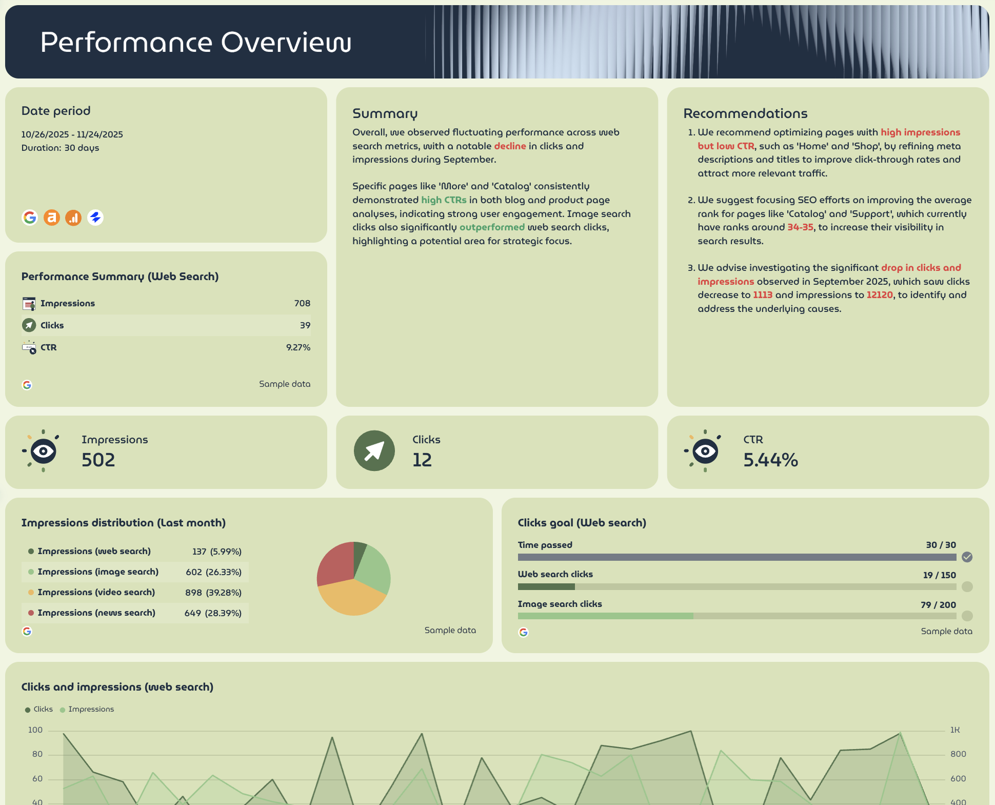
- Performance Summary (Web Search): Impressions, Clicks, CTR - with MoM change
- Impressions, Clicks, CTR (KPI widgets)
- Clicks Goal: pacing bars for Web Search Clicks, Image Search Clicks
- Impressions Distribution (Last Month): web search, image search, video search, news search (donut chart)
- Clicks and Impressions (Web Search) - 3-month trend line
- Sessions, Conversions, Total Revenue (KPI widgets with MoM change)
- Sessions/Conversions split (donut chart)
- Revenue Distribution: Total Revenue, Purchase Revenue, Item Revenue (donut chart)
- Conversions vs. Sessions Trend - daily line chart (current vs. previous period)
- Total Revenue Over Time - daily line chart (current vs. previous period)
- Blog Performance Metrics: Sessions, Views, Total Users, New Users, Conversions, Total Revenue by page path
- Keyword Performance Breakdown: Sessions, Views, Total Users, New Users, Conversions, Total Revenue by keyword
- Appendix: Demographic Activity on Site (gender + age breakdown), Geographic Activity on Site (by country), Device Category Activity on Site
Tab 3 - Ahrefs Performance Overview
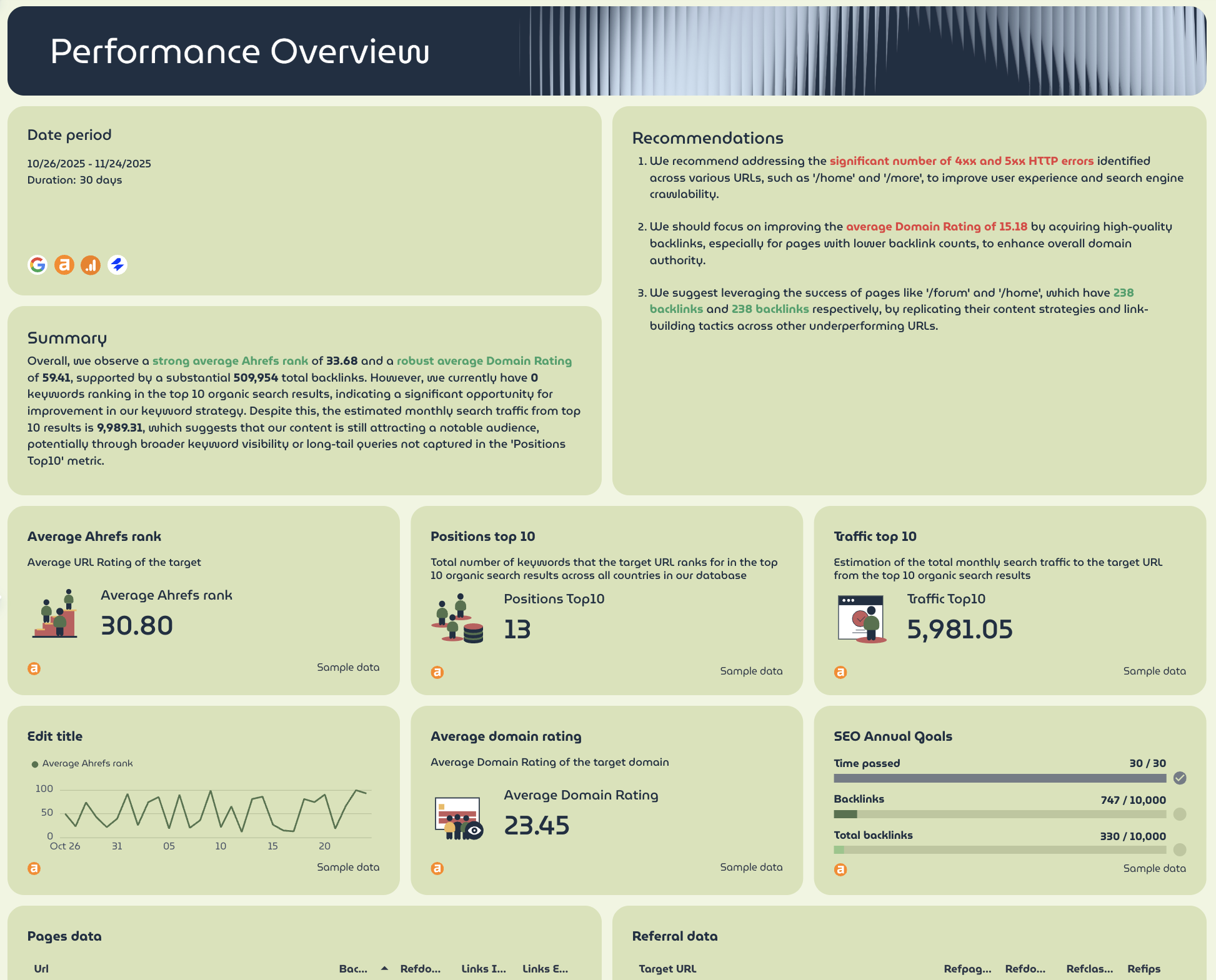
- Average Ahrefs Rank, Positions Top 10, Traffic Top 10 (KPI widgets with MoM change)
- Average Domain Rating (KPI widget)
- SEO Annual Goals: pacing bars for Backlinks, Total Backlinks
- Average Ahrefs Rank trend line (current vs. previous period)
- Pages Data: URL, HTTP Code, Backlinks, Referring Domains, Internal Links, External Links
- Referral Data: Target URL, Referring Pages, Referring Domains, Referring Classes, Referring IPs
Best practices:
✅ Use Tab 1 as the client-facing view and Tabs 2 and 3 as the internal strategy tabs - GSC and GA4 data tells the business story, Semrush and Ahrefs data tells the technical one.
✅ Cross-reference the Blog Performance Metrics table in Tab 1 against the Pages Data table in Tab 3 - pages with high sessions but low referring domains are your best candidates for a focused link building push.
✅ Track Visibility (%) Over Time in Tab 2 alongside Impressions in Tab 1 - if visibility is growing but impressions aren't following, your ranking gains may be concentrated in low-volume keywords.
✅ Use the Keyword Performance Breakdown table to connect specific keywords to revenue - it's the fastest way to show clients which search terms are generating actual pipeline, not just traffic.
✅ Set SEO Annual Goals for Backlinks and Domain Rating in Tab 3 at the start of every engagement - link building compounds slowly, and progress bars make incremental gains visible before clients get impatient.
✅ Monitor the Ads: Top vs. Bottom Over Time chart in Tab 2 alongside organic visibility - if paid ad density in top positions is increasing, that's often why organic CTR is dropping even when rankings hold.
5. SEO Client Dashboard Example for Agencies
Use this template for free with your data
Who it's for: Agency account managers and SEO consultants who need a polished SEO dashboard for clients that tells a clear performance story - without overwhelming non-technical stakeholders with raw data.
Channels connected: Google Analytics 4, Google Search Console
An SEO client dashboard is a different beast from an internal one.
Your team needs granularity - keyword-level data, device breakdowns, demographic segments.
Your client needs three things: is visibility growing, is traffic growing, and is SEO making us money.
This dashboard example answers those three questions and turns client SEO data into a clear monthly report.
Metrics to visualize:
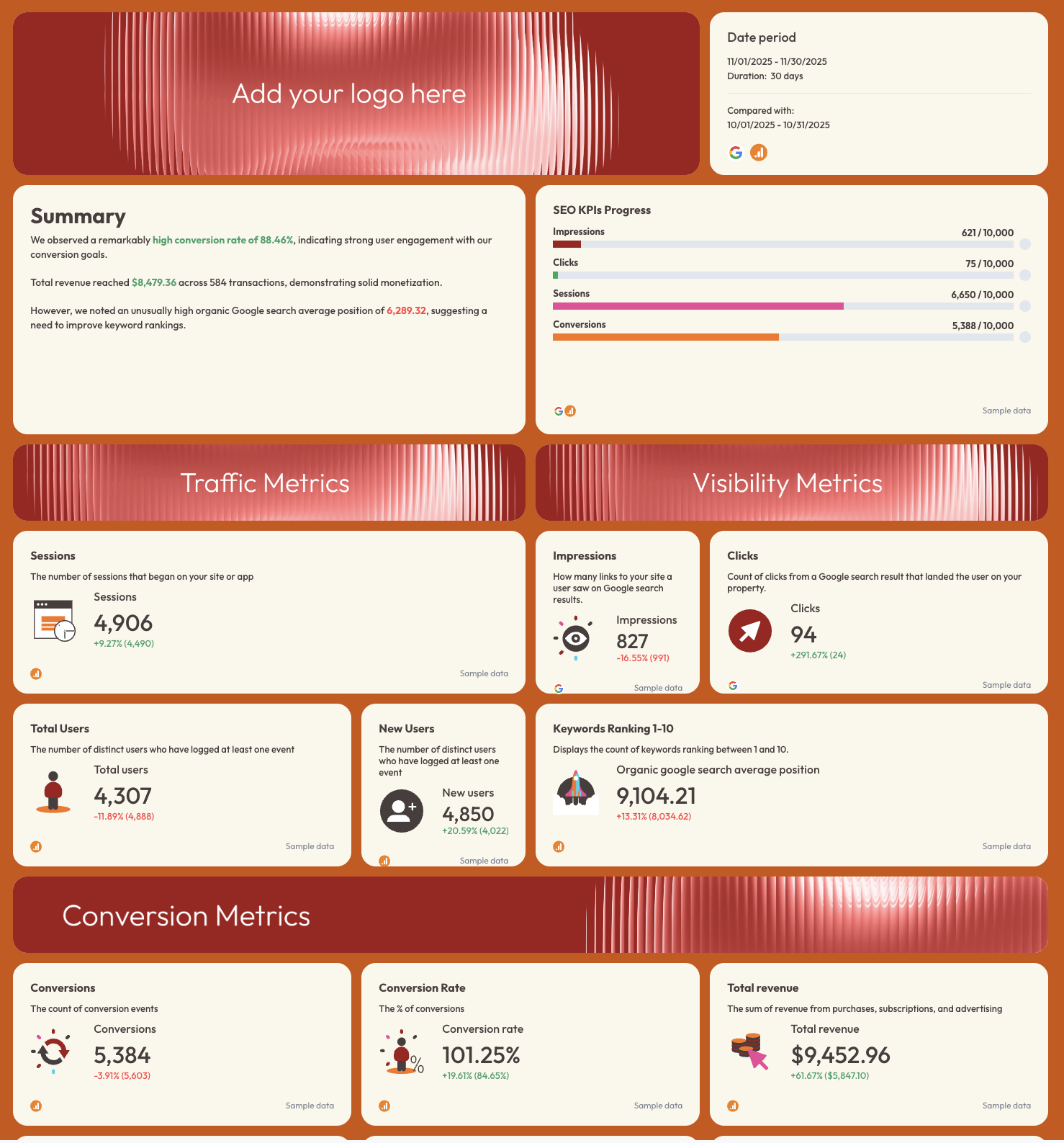
SEO KPIs Overview tab
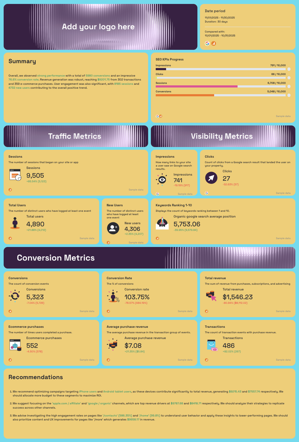
- AI-written Summary: Wins, Issues highlighted in context
- SEO KPIs Progress: pacing bars for Impressions, Clicks, Sessions, Conversions vs. targets
- Traffic Metrics: Sessions, Total Users, New Users - with MoM comparison
- Visibility Metrics: Impressions, Clicks, Keywords Ranking 1-10, Organic Google Search Average Position
- Conversion Metrics: Conversions, Conversion Rate, Total Revenue, Transactions, Average Purchase Revenue, Ecommerce Purchases
- AI-written Recommendations
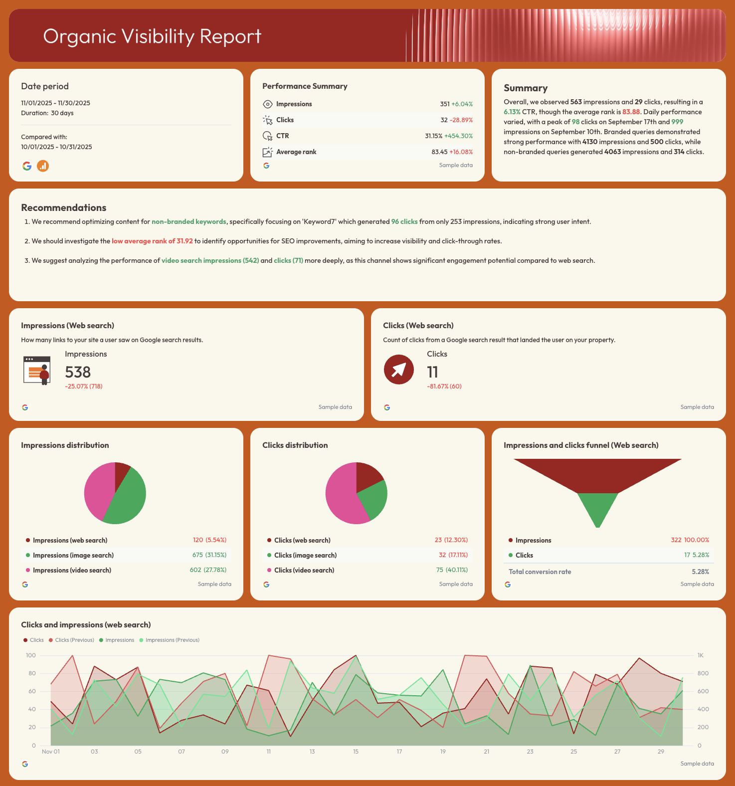
Organic Visibility Report tab (GSC)
- Performance Summary: Impressions, Clicks, CTR, Average Rank - with MoM change
- AI-written Summary and Recommendations
- Impressions (Web Search), Clicks (Web Search) - KPI widgets
- Impressions Distribution: web, image, video search (pie chart)
- Clicks Distribution: web, image, video search (pie chart)
- Impressions and Clicks Funnel (Web Search)
- Clicks and Impressions (Web Search) - daily trend line with previous period overlay
- Branded Queries Performance: keyword-level Impressions and Clicks
- Non-Branded Queries Performance: keyword-level Impressions and Clicks
Organic Traffic Report tab (GA4)
- Performance Summary: Sessions, Total Users, New Users, Conversions - with MoM change
- Sessions, Total Users, New Users - KPI widgets
- Sessions by Channel (pie chart)
- Sessions by Platform (pie chart)
- Monthly Sessions Trend - 3-month bar chart
- New Users Month on Month
- Page Performance: Sessions, Total Users, New Users, Engagement Rate by page path
Organic Conversions Report tab (GA4)
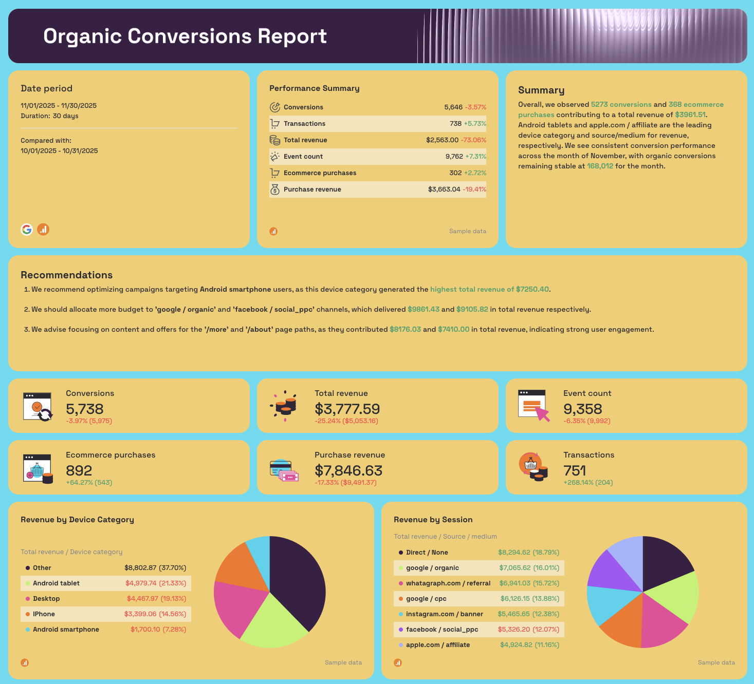
- Performance Summary: Conversions, Transactions, Total Revenue, Event Count, Ecommerce Purchases, Purchase Revenue
- Conversions, Total Revenue, Event Count, Ecommerce Purchases, Purchase Revenue, Transactions - KPI widgets
- Revenue by Device Category (pie chart)
- Revenue by Session Source/Medium: google/organic, facebook/social_ppc, instagram.com/banner, google/cpc, apple.com/affiliate, Direct (pie chart)
- Conversions trend line (current vs. previous period)
- Organic Conversions by Month - 3-month bar chart
- Organic Revenue and Transactions Month on Month - daily dual-axis chart
- Page Paths Performance: Conversions, Transactions, Total Revenue by URL
- Traffic Acquisition Conversions: by campaign, channel, source, medium
- Demographics Conversions: by city, country, region, age, gender
- Engagement Conversions: by content group, event name, page title
Best practices:
✅ Add your agency logo to the white label SEO dashboard placeholder before sharing - a branded report feels like a deliverable your agency built, not a tool you're reselling.
✅ Share via a live link rather than a PDF export - clients open it any time and always see current data, which cuts down the "can you send me an update?" requests between reporting cycles.
✅ Set SEO KPI targets in the progress bars at the start of every month - pacing bars answer the only question clients actually ask: are we on track?
✅ Use the Revenue by Session source breakdown to isolate google/organic revenue every month - it's the clearest single number for proving SEO ROI to a client who also runs paid campaigns.
✅ Keep the branded vs. non-branded query split in every client report - it shows that organic growth is coming from new demand, not just brand name searches recovering.
✅ Use the AI-written Summary as your call agenda - read the Wins first, address the Issues, then walk through the Recommendations so the client feels part of the strategy rather than just receiving a report.
✅ Filter Demographics Conversions and Traffic Acquisition tables before sharing - the full granularity is useful internally, but SEO client dashboards shared externally should lead with the story, not the raw data.
What Should an SEO Dashboard Include?
An SEO dashboard is a live reporting view that centralizes organic search data from multiple sources - rankings, traffic, visibility, and conversions - into a single place your team or client can read without switching between tools.
A search engine optimization dashboard centralizes all organic data in one place, but what that data looks like depends entirely on who's reading it.
An internal SEO dashboard for a specialist looks different from a client-facing one for an agency, which looks different again from an executive view for a head of growth.
That said, based on thousands of SEO dashboards created by SEO specialists on Whatagraph, these are the core areas you should include:
1. Visibility metrics
Impressions, average position, and click-through rate from Google Search Console. These tell you whether your pages are being seen in search results before anyone clicks. Without visibility data, you can't tell the difference between a traffic drop caused by ranking loss and one caused by CTR degradation.
2. Traffic metrics
This includes sessions, users, and new users from GA4, broken down by channel.
Organic search should be isolated from direct, paid, and referral traffic - otherwise you're measuring the wrong thing.
SEO dashboards that blend all channels together make it impossible to attribute performance accurately.
3. Conversion and revenue metrics
This includes conversions, conversion rate, transactions, and revenue attributed to organic search.
An SEO dashboard without conversion data is just a traffic report.
Connecting organic sessions to pipeline is what turns SEO from a visibility exercise into a revenue conversation.
4. Keyword and ranking data
This includes position tracking for target keywords, branded vs. non-branded query splits, and keyword-level impressions and clicks.
This is where most SEO reporting dashboards fall short - either because the data isn't connected or because branded and non-branded traffic gets lumped together, inflating results.
5. Goal pacing
This includes Progress bars tracking key SEO KPIs against monthly or quarterly targets - impressions, clicks, sessions, conversions.
Goal pacing is what separates an SEO reporting dashboard from a static snapshot. It answers the question clients actually ask: are we on track?
6. AI insights
This includes automated summaries, wins, issues, and recommendations generated directly from the data.
The best SEO dashboards don't just display numbers - they tell you what changed, why it matters, and what to do next.
On Whatagraph, you can do two things:
- IQ Summary: ask AI to write out performance summaries, next steps, and recommendations based on your actual connected data - no hallucinations, and no data breaches. You can still edit the text after.
- IQ Chat: ask AI any questions you want about your data (e.g. what are the top perfomring pages in terms of conversions?) and it'll give you succinct answers from your data
(We've also got so many more AI features planned - stayed tuned!)
Published on Apr 01 2026
WRITTEN BY
YamonYamon is a Senior Content Marketing Manager at Whatagraph. With an eye for detail and a knack for always considering context, audience, and business goals to guide the narrative, she's on a mission to create genuinely helpful content for marketers. When she’s not working, she’s hiking, meditating, or practicing yoga.