6 Best Web Analytics Dashboard Examples & Free Templates
If you’re building a web analytics dashboard, the hardest part isn’t collecting the data, it’s deciding what the dashboard should actually look like.
With hundreds of metrics available in dozens of tools like GA4, Search Console, Matomo, e.t.c, it’s easy to end up with cluttered dashboards that are hard to interpret and even harder to share with stakeholders.

Mar 13 2026●10 min read


To help you avoid that, we’ve compiled six practical web analytics dashboard examples used by marketing teams, analysts, and agencies on Whatagraph to track website performance.
Each example focuses on a specific use case so you can quickly find a layout that fits your reporting needs and adapt it for your own data.
6 Best Web Analytics Dashboard Examples
Jump to the website analytics dashboard examples you want to see:
- GA4 web analytics dashboard example
- Website performance dashboard example
- Website traffic dashboard example
- Matomo web analytics dashboard example
- Piwik Pro web analytics dashboard example
- Google My Business dashboard example
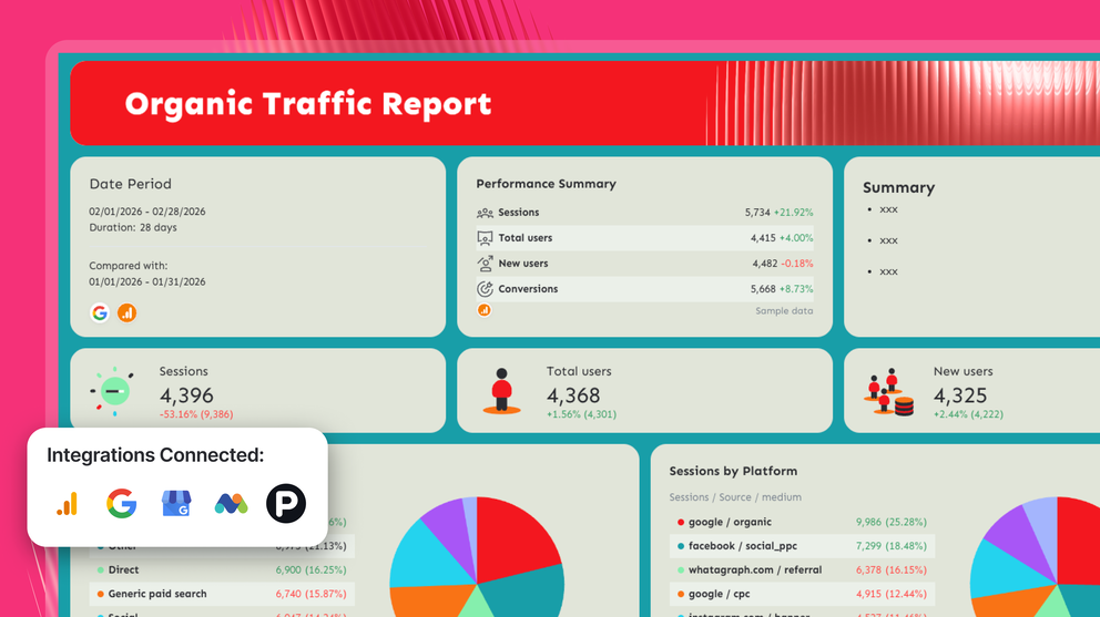
1. GA4 Web Analytics Dashboard Example
Use this GA4 dashboard template for free with your data
Who it’s for:
- Digital marketers and growth teams that want to monitor website traffic, engagement, and conversions.
- Marketing managers and agencies that need a clear performance overview they can quickly share with stakeholders without having to figure out how to use GA4
Data sources connected: Google Analytics 4 - but you can also connect PPC and social media channels like Google Ads, LinkedIn Ads, and more
This GA4 analytics dashboard gives you a structured overview of website traffic, engagement, and conversions in one place. Instead of navigating multiple GA4 reports, the dashboard organizes the most important website metrics into a single visual view.
Metrics to visualize and how to structure:
The best GA4 dashboard examples don’t overwhelm teams with dozens of metrics. Instead, they organize the most important website KPIs around the user journey—from traffic acquisition to engagement to conversions.
1️⃣ Executive Overview
This section of the Google Analytics dashboard example provides the high-level snapshot of website performance.
Include:
- Sessions
- Total users
- Engaged sessions
- Engagement rate
- Total conversions
- Conversion rate
- Date range comparison
This top section answers the most important questions first:
- Is website traffic increasing or declining?
- Are visitors engaging with the site?
- Are we generating conversions?
Always place this KPI snapshot at the very top so stakeholders can immediately understand performance without scrolling.
2️⃣ Traffic & Engagement Trends
Trend charts help teams monitor how traffic and engagement evolve over time.
Track:
- Total users vs engaged sessions over time
- Conversions trend
- Conversion rate trend
- Engagement rate trend
Trend graphs help teams spot anomalies in traffic, conversions, or engagement metrics and quickly investigate what caused a spike or drop in performance.
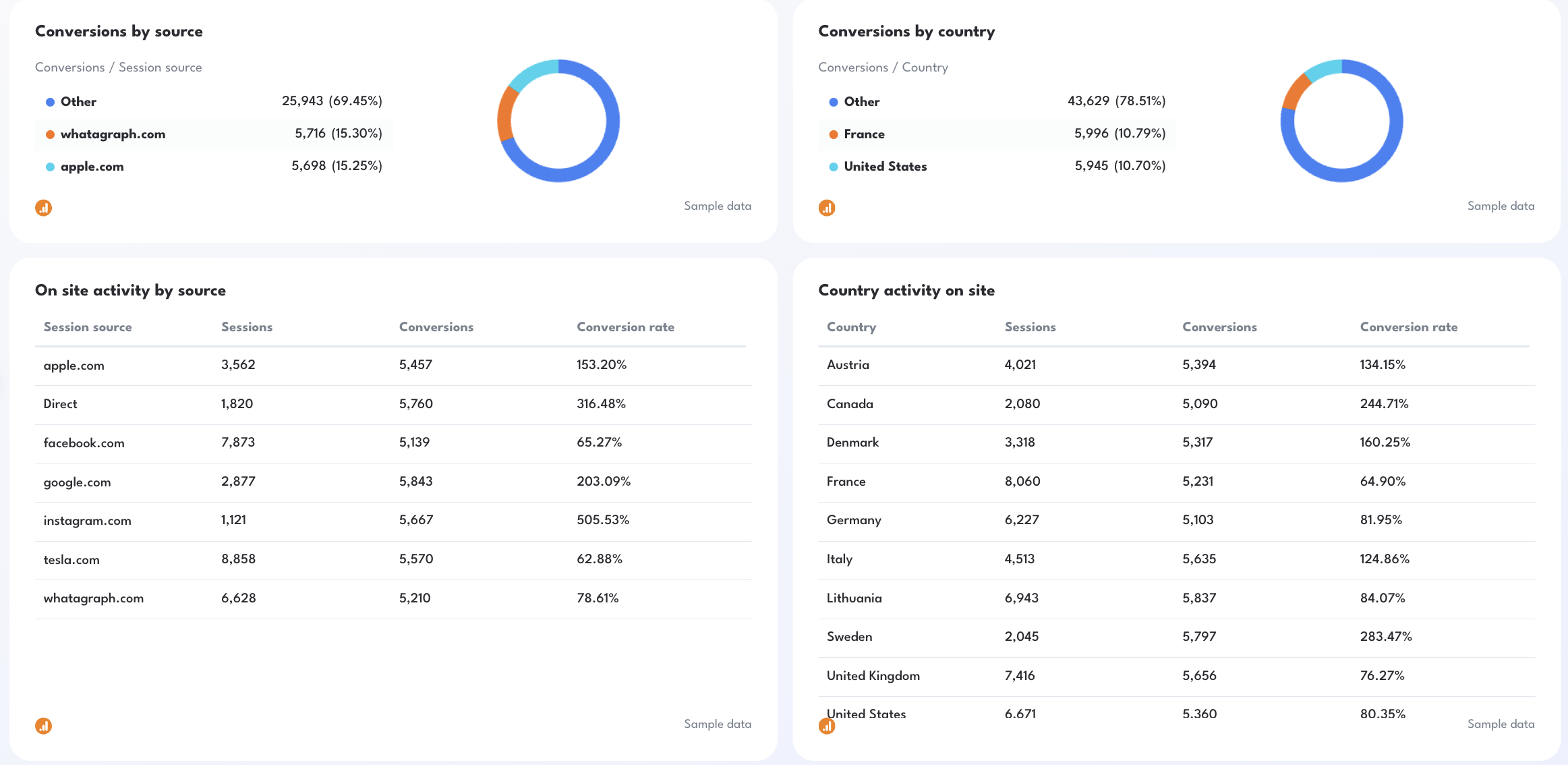
3️⃣ Acquisition & Traffic Sources
Understanding where visitors come from is critical for marketing teams.
Track:
- Sessions by source
- Conversions by source
- Conversion rate by source
- Traffic channel breakdown (Organic, Direct, Social, Email, Referral)
This section of the Google Analytics KPI dashboard helps marketers identify which channels drove the most conversions and which traffic sources generate the most valuable users.
4️⃣ Geographic Performance
Geographic insights help teams understand where traffic and conversions originate.
Track:
- Sessions by country
- Conversions by country
- Conversion rate by country
These insights help teams identify markets that generate strong engagement or conversion performance.
5️⃣ Conversion Funnel
Funnels visualize how users move through the site and where they drop off.
In your Google Analytics website KPI dashboard, track:
- Sessions
- Engaged sessions
- Conversions
- Funnel conversion rate
This section helps teams monitor funnel efficiency and diagnose performance issues if conversions suddenly decline.
Best practices:
✅ Start your GA4 web analytics dashboard with a KPI overview showing sessions, users, engagement rate, and conversions so stakeholders immediately understand overall performance.
✅ Structure the dashboard around the user journey: traffic acquisition → engagement → conversions.
✅ Use trend charts for traffic and conversions so teams can quickly compare week-over-week website performance (sessions, conversions, CVR).
✅ Use donut charts to break down conversions by source, country, or any other dimensions that matter to you / your client.
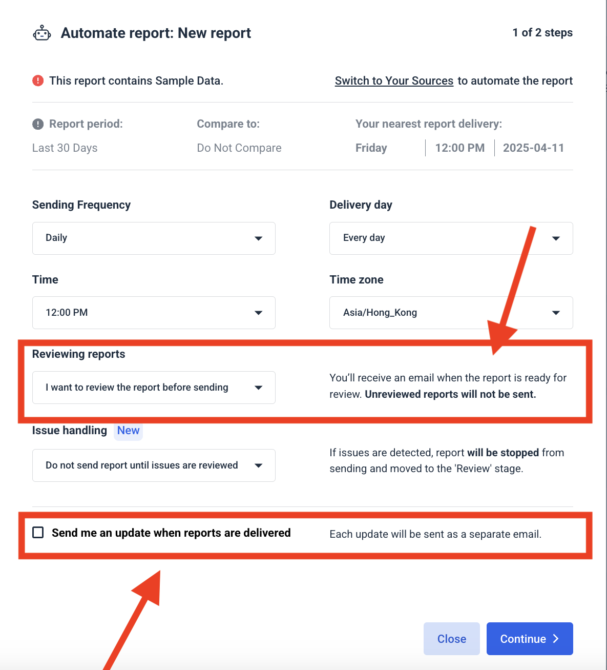
✅ Use Whatagraph IQ Summary to write an executive summary for this web analytics dashboard, highlighting wins, risks, and recommended next steps based on the data. Here’s how it works:
✅ Automate dashboard sharing with scheduled reports or live links so marketing teams and stakeholders always see the latest GA4 performance data.
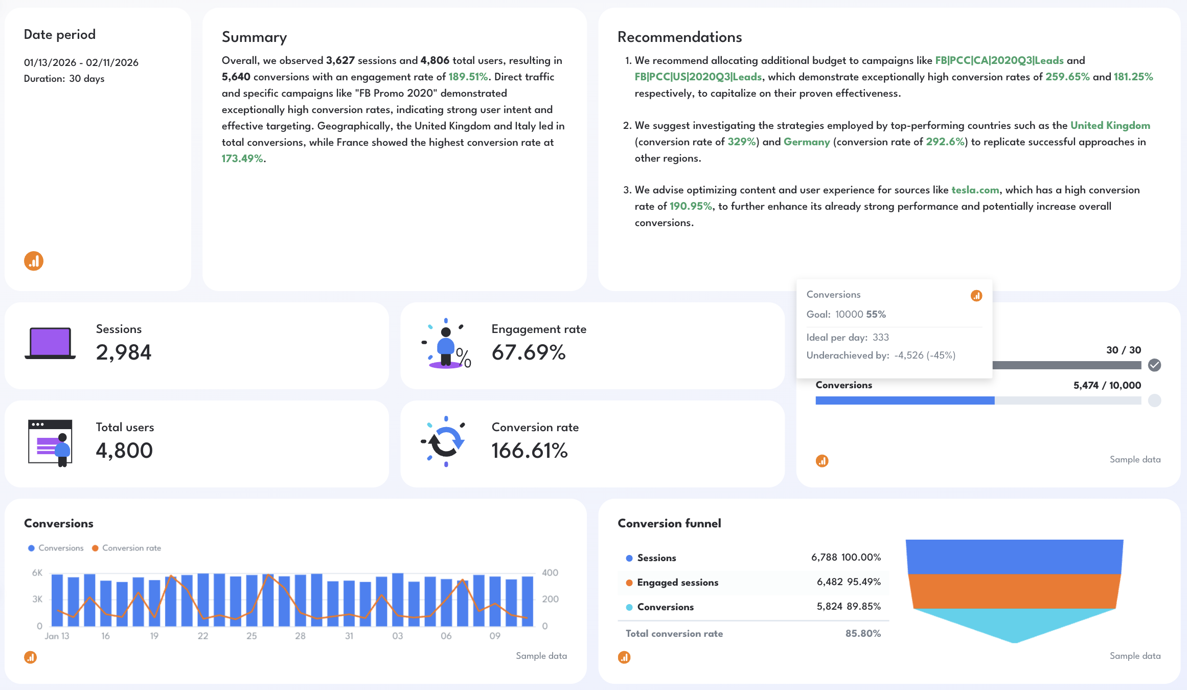
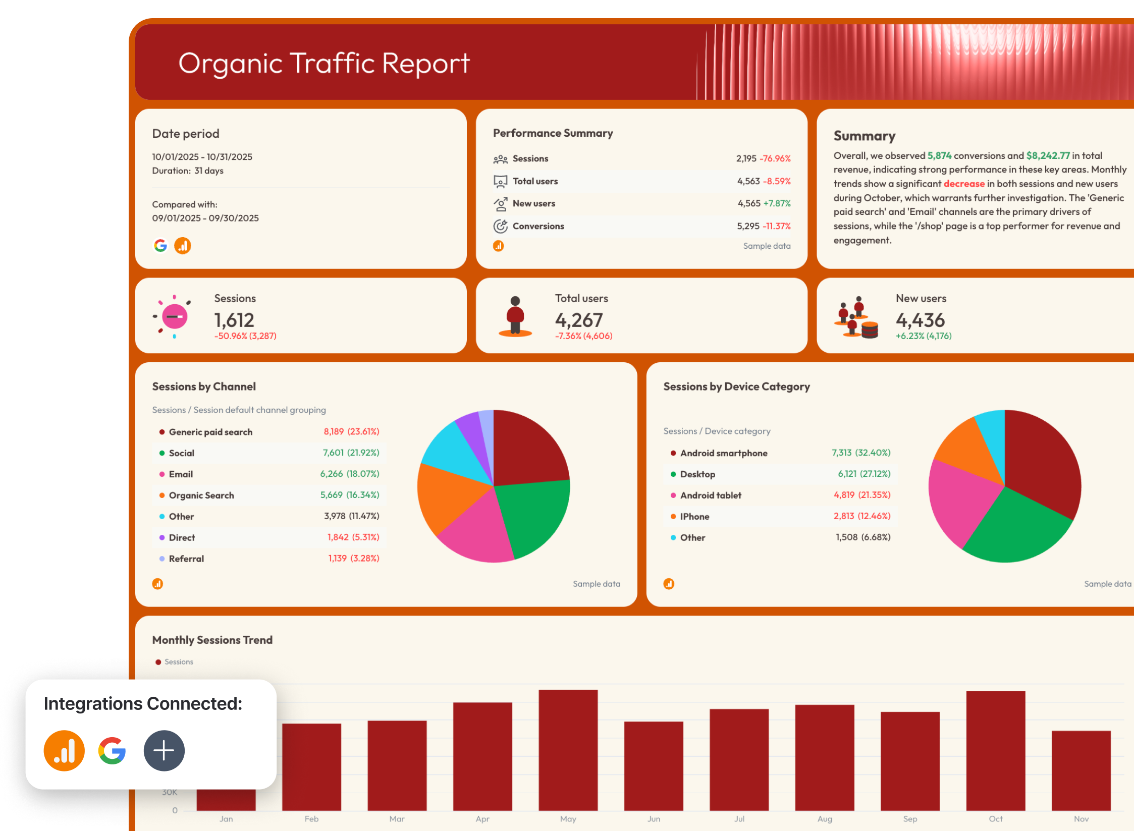
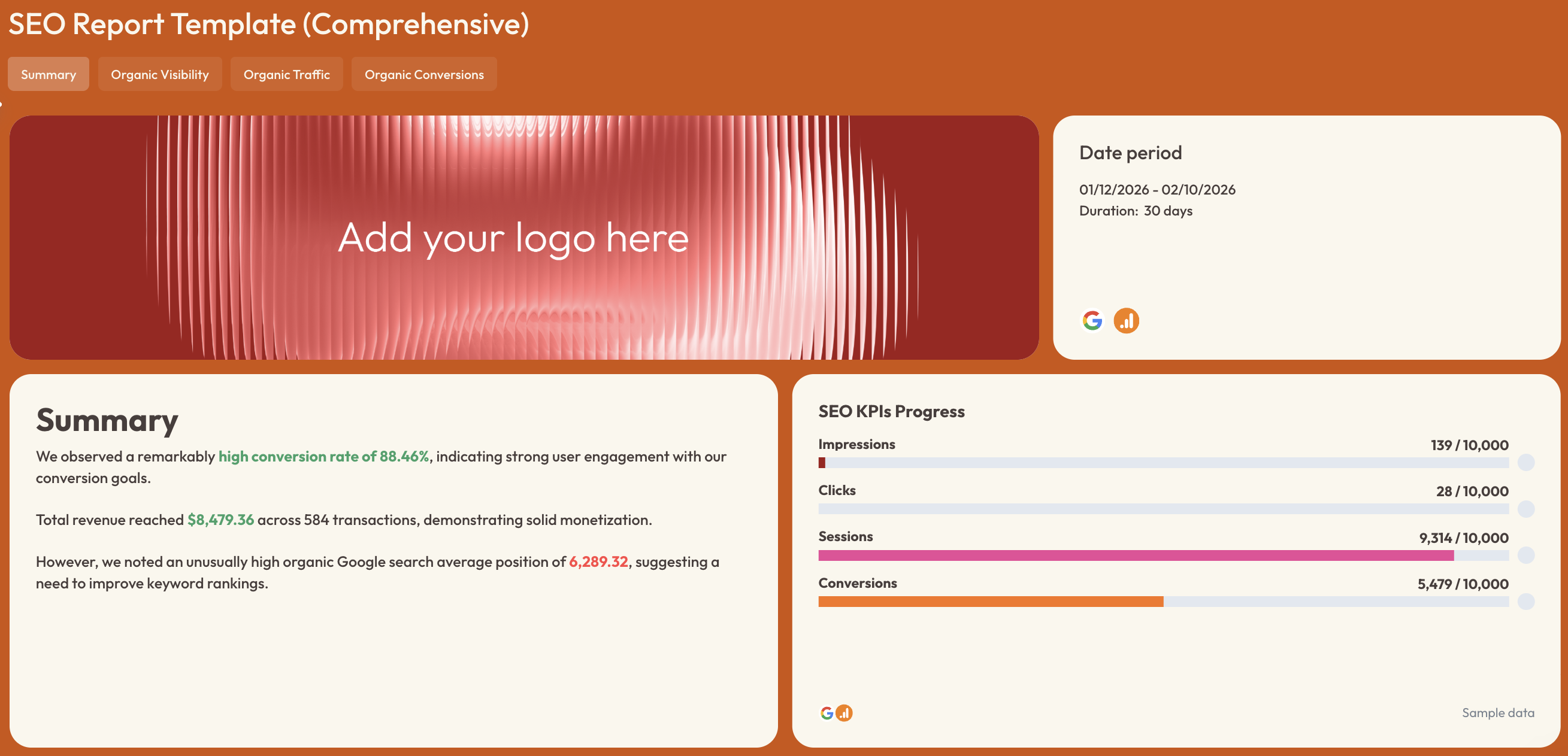
2. Website Performance Dashboard Example
Use this example for free with your data
Who it’s for:
- SEO specialists and content marketers who need to monitor organic search visibility, traffic, and conversions in one place.
- Marketing managers and agencies who want to understand how organic search performance impacts website traffic, engagement, and revenue.
Data sources connected: Google Analytics 4 (GA4), Google Search Console
This website performance dashboard combines search visibility, organic traffic, and conversion performance into one structured view. Instead of jumping between GA4 and Search Console reports, teams get a complete picture of how SEO performance translates into real website outcomes.
The dashboard is organized into four tabs—Summary, Organic Visibility, Organic Traffic, and Organic Conversions—so teams can move from high-level performance metrics to deeper diagnostic insights that explain what’s driving results and where improvements are needed.
Metrics to visualize and how to structure:
The most effective website metrics dashboard structures SEO performance around the search funnel: visibility → traffic → engagement → conversions.
1️⃣ Summary tab
This tab acts as the executive overview of the entire dashboard.
Include:
- Sessions
- Total users
- New users
- Ecommerce purchases
- Conversion rate
- Total revenue
- Transactions
- Average purchase revenue
This section gives stakeholders a quick snapshot of how website traffic and revenue are trending month over month.
Trend charts should show:
- Monthly sessions trend
- New users month-over-month comparison
- Conversion trends
Include a short performance summary highlighting wins, issues, and recommendations so teams can quickly understand the main performance story behind the numbers.
This tab should answer:
- Is website traffic growing or declining?
- Are we converting visitors effectively?
- Is website performance improving compared to the previous period?
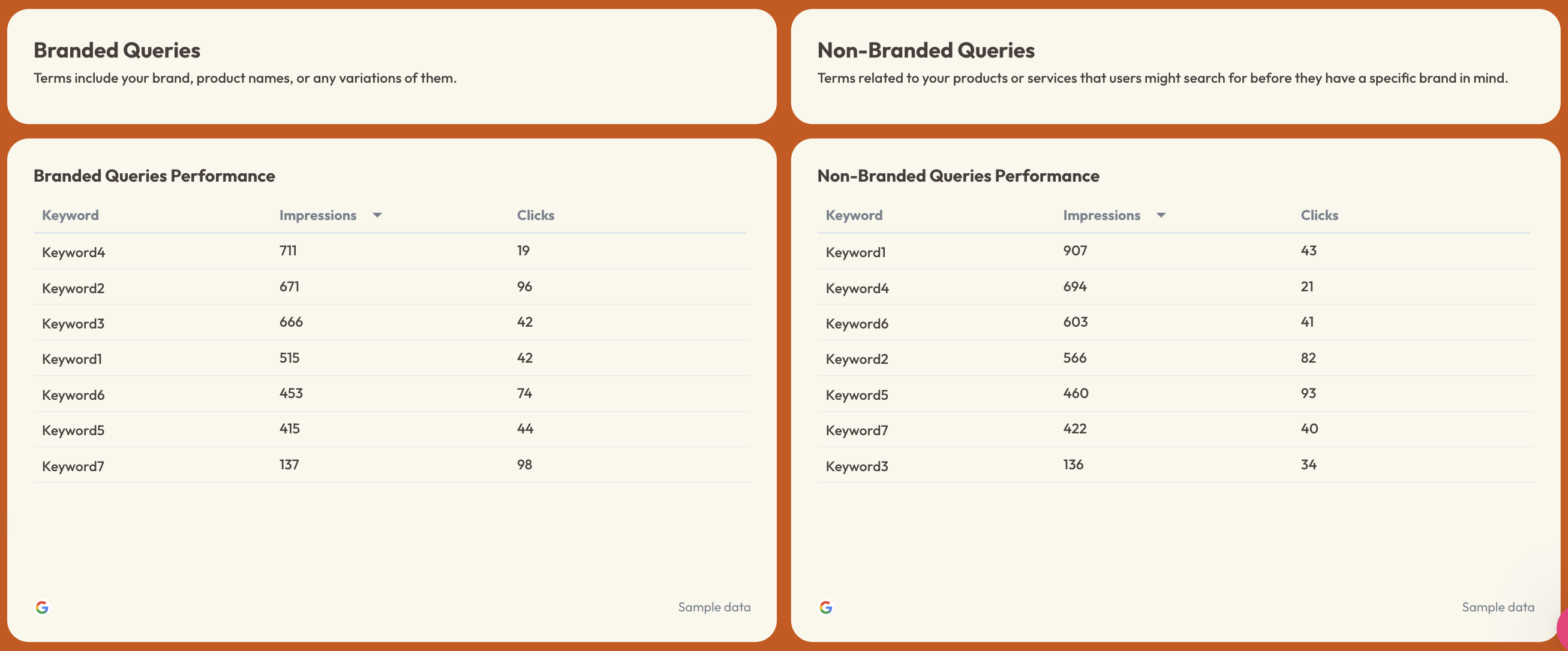
2️⃣ Organic visibility tab
This section focuses on how visible your website is in search engines.
Track:
- Impressions
- Clicks
- Click-through rate (CTR)
- Average ranking position
- Keyword rankings (top 1–10 positions)
Trend charts should show impressions and clicks over time to help teams monitor how search visibility changes.
Break down keyword performance into:
- Branded queries
- Non-branded queries
This helps teams diagnose SEO performance issues and explain why organic traffic dropped this month if rankings or impressions decline.
Funnel visualization can also show:
- Impressions
- Clicks
- Click-through rate
This makes it easy to understand how visibility translates into website visits.
3️⃣ Organic traffic tab
This tab focuses on how organic search traffic behaves once users reach the site.
Track:
- Total users
- Sessions
- Sessions by channel
- Sessions by device category
Include traffic distribution charts such as:
- Sessions by channel grouping
- Sessions by device (desktop, smartphone, tablet)
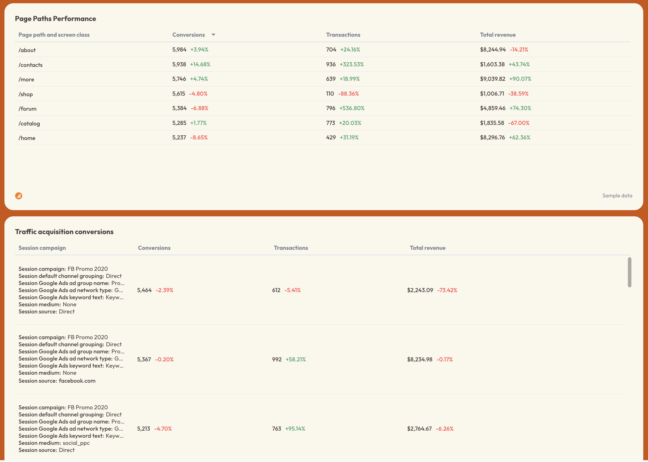
Page performance tables should show:
- Top landing pages
- Sessions
- Total users
- New users
- Engagement rate
This section helps teams find the top landing pages by conversions and conversion rate and identify which pages drive the most engagement.
4️⃣ Organic conversions tab
This section connects organic traffic performance with actual business outcomes.
Track:
- Conversions
- Transactions
- Total revenue
- Purchase revenue
- Event count
Revenue breakdown charts should include:
- Revenue by device category
- Revenue by traffic source
Additional insights should highlight:
- Organic conversions trends over time
- Revenue and transactions month-over-month
- Conversion performance by campaign or traffic source
This section helps teams explain why website conversion rate dropped by connecting traffic acquisition with actual purchase or conversion activity.
Page path performance tables can also show which pages generate the most revenue and conversions.
Best practices:
✅ Structure the dashboard in four logical stages: Summary → Organic Visibility → Organic Traffic → Organic Conversions to mirror the SEO performance funnel.
✅ Separate branded and non-branded keyword performance so teams can diagnose SEO visibility issues and uncover new growth opportunities.
✅ Add landing page performance tables to quickly identify which pages drive traffic, engagement, and conversions.
✅ Include conversion and revenue breakdowns by device and traffic source to connect SEO performance directly to business impact.
✅ Style your report in seconds with Whatagraph IQ Theme. Just upload a screenshot of your brandbook/website or write a custom prompt, and Whatagraph will automatically apply the colors to your report. You can still manually finetune the HEX codes and fonts after.
3. Website Traffic Dashboard Example
Use this example for free with your data
Who it’s for:
- SEO specialists, content marketers, and growth teams who want a clear view of where website traffic is coming from and how it evolves over time.
- Marketing managers and agencies that need a simple web traffic dashboard to monitor traffic sources, landing pages, and search demand without digging through multiple analytics tools.
Data sources connected: Google Analytics 4 (GA4), Google Search Console
This website traffic dashboard focuses specifically on traffic acquisition—where visitors come from, how search visibility translates into visits, and which pages generate the most traffic.
Instead of reviewing multiple GA4 and Search Console reports separately, the dashboard aggregates sessions, traffic sources, keyword performance, and landing page activity into one clear view.
This means you can quickly understand which channels drive traffic, how organic search is evolving, and whether new sources like AI search engines are starting to contribute meaningful visits.
Metrics to visualize and how to structure:
A strong traffic dashboard should answer one core question: Where is our website traffic coming from and why is it changing?
To do this effectively, structure the dashboard around three key areas: traffic trends, acquisition sources, and landing page performance.
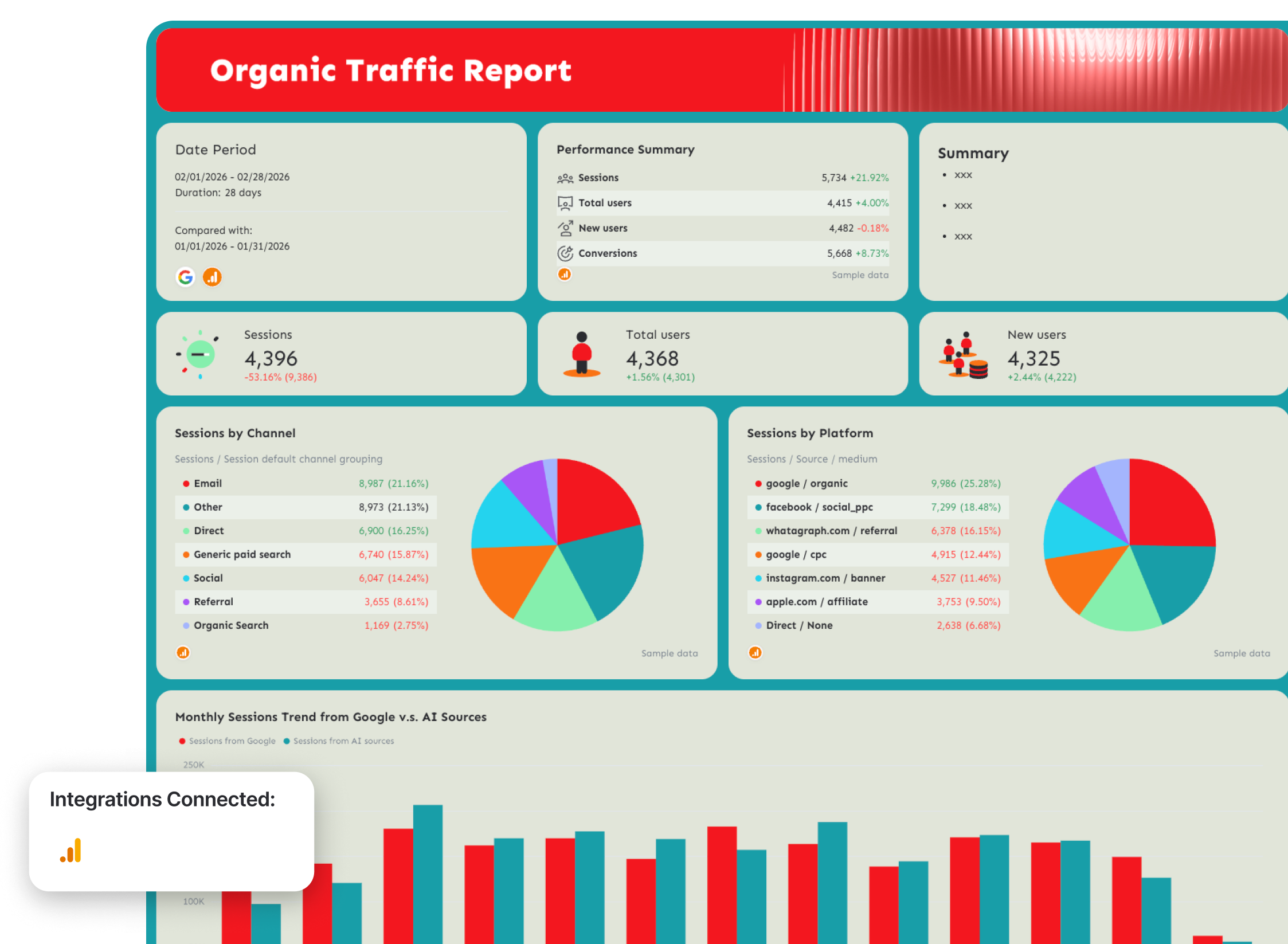
1️⃣ Traffic overview
Start with a top-level snapshot showing how website traffic is trending.
Include:
- Sessions
- Total users
- New users
- Sessions trend over time
- Month-over-month comparison
Trend charts should visualize how sessions evolve over time so teams can quickly spot anomalies in traffic or detect long-term growth patterns.
This section gives stakeholders a quick answer to:
- Is website traffic growing or declining?
- Are we attracting more new visitors?
- How does traffic compare with the previous period?
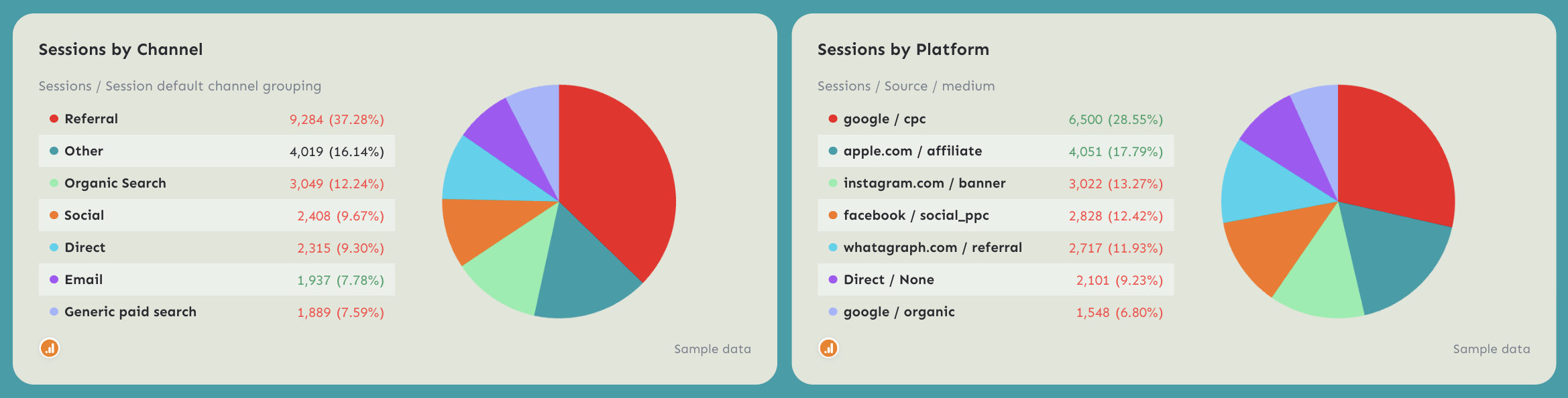
2️⃣ Traffic sources
Next, break down where traffic originates.
Track:
- Sessions by channel grouping
- Sessions by source / medium
- Traffic distribution by channel
Typical channel breakdown includes:
- Organic search
- Direct
- Referral
- Social
- Paid search
This section helps teams understand which acquisition channels contribute the most traffic and how marketing efforts influence overall website growth.
3️⃣ Search queries performance
Search demand plays a major role in organic traffic growth.
Track:
- Clicks
- Impressions
- CTR
- Average search position
Divide search queries into:
- Branded queries
- Non-branded queries
Branded searches reflect existing brand demand, while non-branded queries indicate how well your content captures new audiences searching for solutions.
This breakdown helps teams understand whether traffic growth comes from brand recognition or successful SEO content.
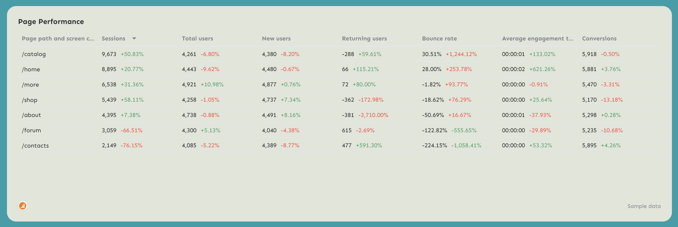
4️⃣ Landing page performance
Landing page performance shows how traffic distributes across your website.
Track:
- Sessions by landing page
- Total users
- New users
- Engagement rate
Page-level insights help identify which pages attract the most traffic and which content drives the most engagement.
Landing page tables also make it easy to monitor how new blog posts, product pages, or resource hubs contribute to traffic growth.
Best practices:
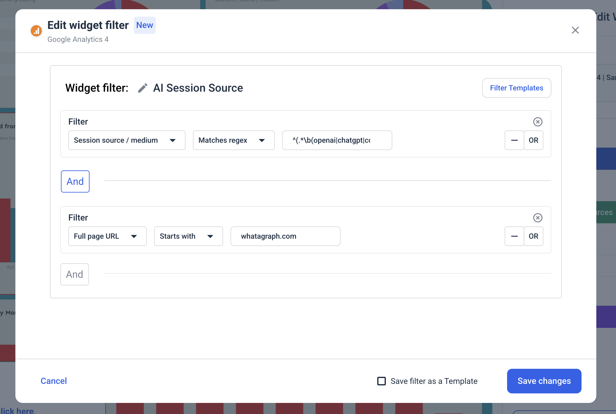
✅ Add a bar chart comparing sessions from Google vs. AI sources. This makes it easy to monitor the shift from traditional SEO traffic to emerging Generative Engine Optimization (GEO) traffic sources.
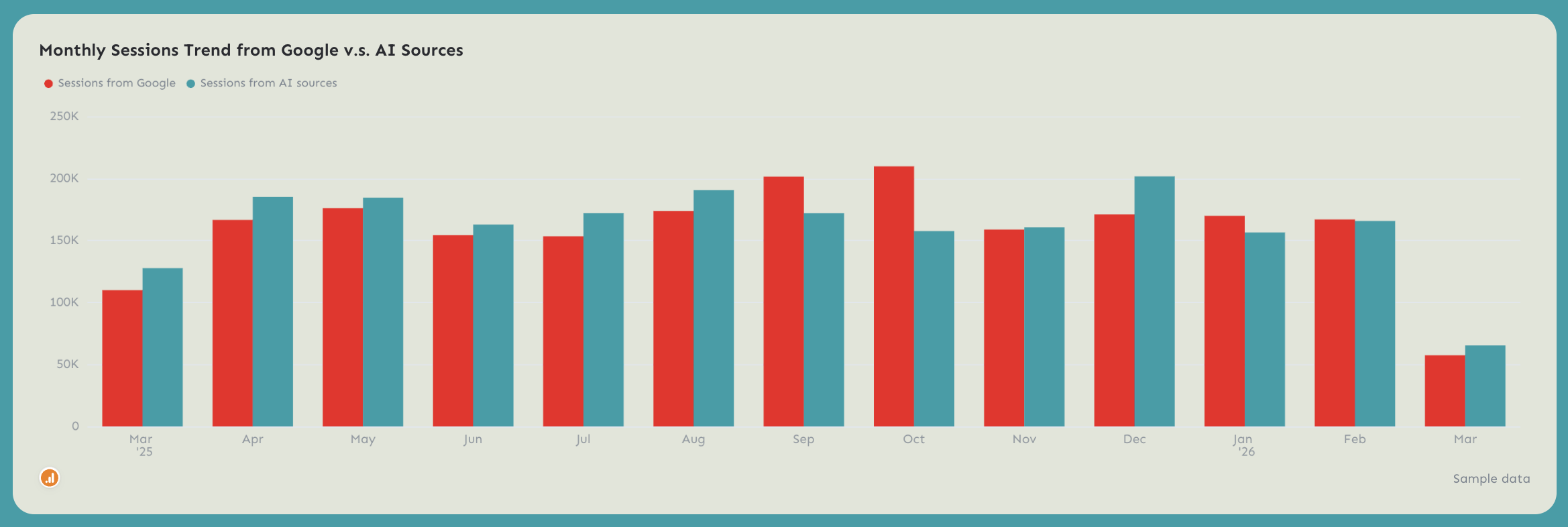
Traditional search traffic comes from platforms like Google, while GEO traffic comes from AI tools such as ChatGPT, Perplexity, Copilot, and other AI search engines. Tracking both helps you see whether your content is being discovered in AI-generated answers and how that traffic grows over time.
To create this comparison in Whatagraph, add filters to separate traffic sources:
Google traffic filter
Dimension: session source / medium
Condition: contains google
AI search traffic filter
Dimension: session source / medium
Condition: Matches regex
This comparison clearly shows whether your traffic from AI search engines is growing over time—which is exactly what you want if your content is optimized for the future of search.
✅ Break down sessions by channel, platform, or any other dimensions that make sense to you or your client.
✅ Add a page performance table that shows key metrics such as sessions, users, engagement rate, and conversions by landing page.
If possible, filter this table by content clusters (for example: blog articles, product pages). This helps teams quickly understand which types of content generate the most traffic.
4. Matomo Web Analytics Dashboard Example
Use this example for free with your data
Who it’s for:
- Privacy-focused organizations and marketing teams that use Matomo to monitor website performance while maintaining full control over user data.
- Product teams, analysts, and agencies that want a clear overview of website traffic, visitor behavior, and conversions without relying on third-party analytics platforms.
Data sources connected: Matomo Analytics
This Matomo analytics dashboard gives teams a complete view of website traffic, engagement, and conversions while keeping analytics data fully privacy-compliant.
Instead of navigating multiple Matomo reports, the dashboard aggregates visitor activity, referrer performance, and goal tracking into one structured view. Teams can quickly see how many people visit the site, how they find it, and how effectively the site converts visitors into meaningful actions.
Metrics to visualize and how to structure:
A strong Matomo dashboard should highlight visitor activity, traffic sources, and conversion performance so teams can quickly understand how users interact with the site.
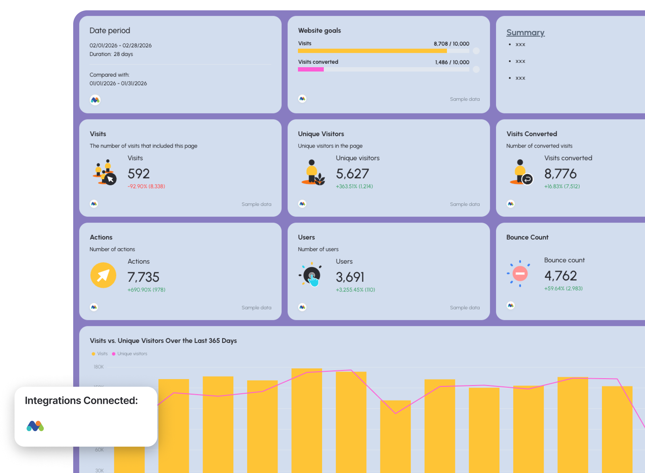
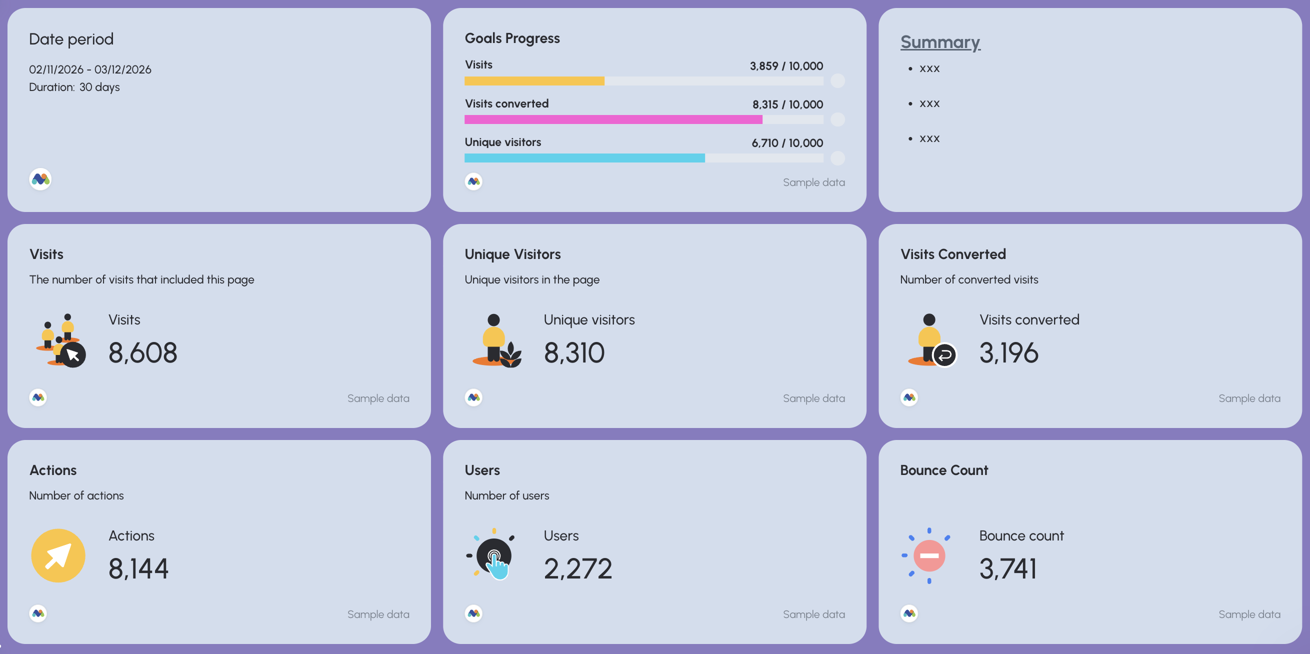
1️⃣ Performance overview
Start with a high-level snapshot of website activity.
Include:
- Visits
- Unique visitors
- Users
- Actions
- Visits converted
- Bounce count
These KPIs provide a quick overview of how users interact with the website and whether engagement is improving or declining.
A trend chart comparing visits vs. unique visitors over time helps teams quickly detect traffic growth, seasonal patterns, or sudden drops in activity.
Add a goal progress widget to monitor how close you are to reaching traffic or conversion targets.
For example:
- Visits goal progress
- Converted visits goal progress
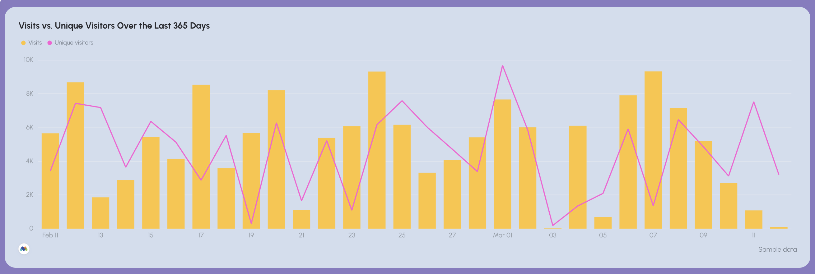
2️⃣ Visitor trends and engagement
This section helps teams understand long-term website activity.
Track:
- Visits trend over time
- Unique visitors trend
Time-series charts help teams monitor engagement patterns and quickly detect unusual spikes or drops in traffic.
Monitoring these trends makes it easier to identify marketing campaigns, content releases, or external events that impact visitor behavior.
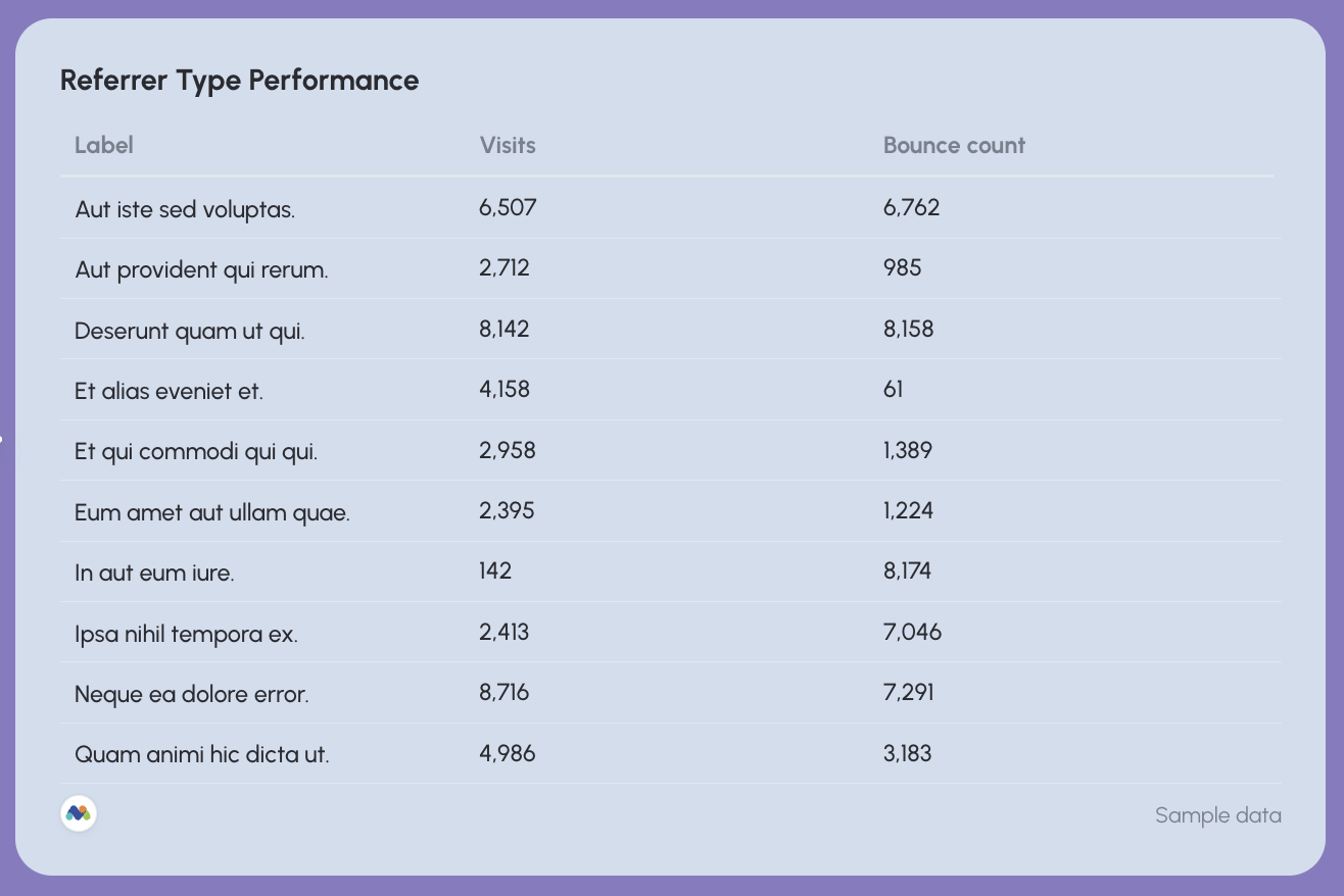
3️⃣ Referrer performance
Understanding where visitors come from is essential for optimizing acquisition strategies.
Track:
- Visits by referrer type
- Bounce count by referrer
This section helps teams identify which external platforms, campaigns, or referral websites drive the most traffic to the site.
Referrer performance tables make it easy to spot high-traffic sources and detect low-quality referrals that generate high bounce rates.
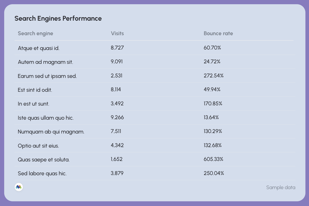
4️⃣ Search engine performance
Matomo also allows teams to monitor traffic coming from search engines.
Track:
- Visits from search engines
- Bounce rate by search engine
This section helps teams evaluate how search visibility translates into website traffic and engagement.
It also helps identify which search engines drive the most qualified visitors to the site.
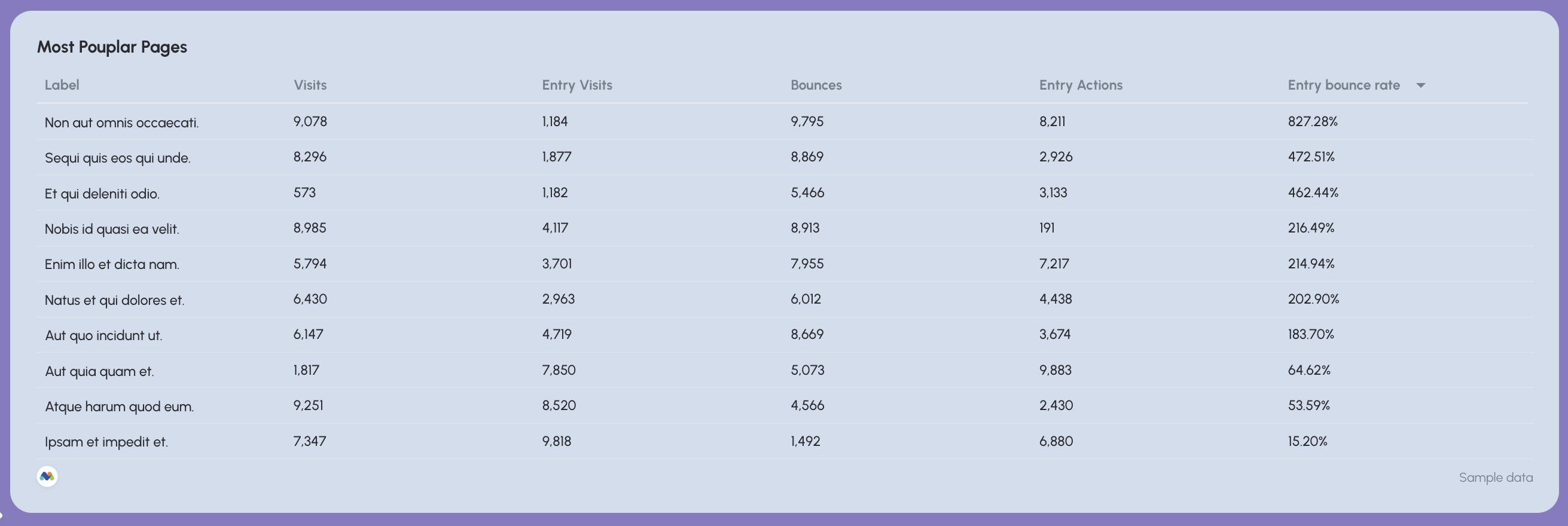
5️⃣ Most popular pages
This section highlights the pages that attract the most attention from visitors.
Track:
- Page URL
- Visits
- Entry visits
- Bounces
- Entry actions
A most popular pages table helps teams quickly identify which content drives the most traffic and engagement.
This insight is especially useful for:
- Identifying high-performing blog posts
- Finding product pages that attract strong traffic
- Discovering content that keeps users engaged
Teams can also use this data to prioritize optimization efforts—improving CTAs or internal links on pages that already attract significant traffic.
Best practices:
✅ Start the dashboard with a goal progress widget and a KPI overview showing visits, unique visitors, converted visits, and actions so stakeholders immediately understand overall website performance.
✅ Use trend charts to compare visits vs unique visitors over time, making it easy to identify traffic growth patterns or sudden drops.
✅ Add a detailed table for referrer type performance to quickly identify which external sources drive the most traffic and which produce high bounce rates.
✅ Track search engine performance separately to understand how organic discovery contributes to website visits.
✅ Show the most popular landing pages based on key metrics like visits, bounces, and entry action.
5. Piwik Pro Web Analytics Dashboard Example
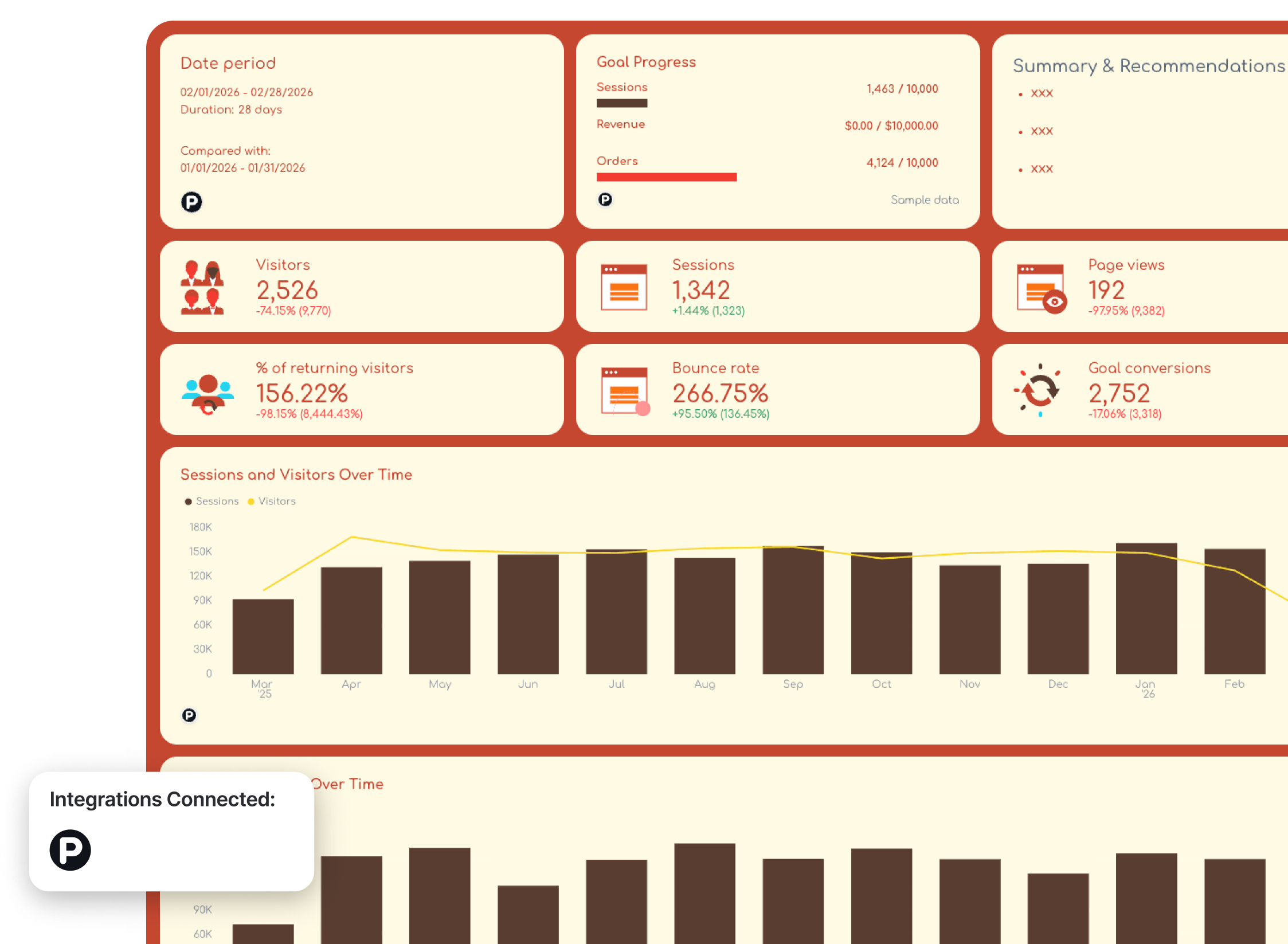
Use this example for free with your data
Who it’s for:
- Privacy-conscious organizations and analytics teams that use Piwik PRO to track website traffic, ecommerce performance, and customer behavior while maintaining strict data governance and compliance.
- Marketing teams and ecommerce managers who want one dashboard that connects traffic performance with revenue outcomes and deeper behavioral insights.
Data sources connected: Piwik PRO Analytics
This Piwik PRO dashboard provides a complete view of website traffic and ecommerce performance in one structured report.
Instead of switching between multiple analytics views, the Piwik Pro reporting dashboard first shows core traffic metrics and trends, then connects that activity to ecommerce revenue and detailed behavioral insights such as top-performing pages, products, campaigns, exit pages, and internal search queries.
This structure allows teams to move from high-level performance monitoring to granular diagnostics that explain exactly what drives engagement and revenue.
Metrics to visualize and how to structure:
A strong Piwik PRO dashboard should connect traffic activity with ecommerce outcomes, then drill down into granular behavioral insights that explain what users actually do on the website.
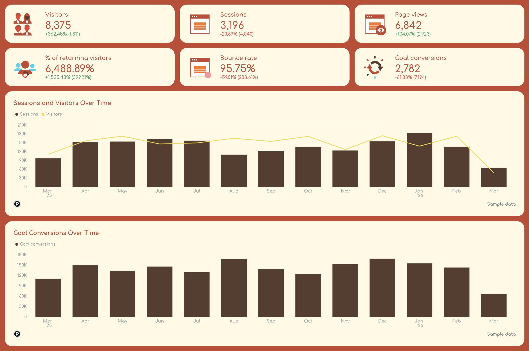
1️⃣ Traffic overview
Start with a snapshot of website traffic performance.
Include:
- Sessions
- Visitors
- Page views
- % of returning visitors
- Bounce rate
- Goal completions
Use line charts and bar graphs to visualize:
- Sessions over time
- Visitors over time
- Conversions over time
2️⃣ Ecommerce performance
Next, connect traffic activity to revenue.
Track:
- Total revenue
- Orders
- Custom metric: Average order value (AOV) = Total revenue / Total orders
In one trend chart, show:
- Revenue over time
- Orders trend
This section helps teams understand whether traffic growth actually translates into ecommerce revenue.
For example, rising sessions combined with declining revenue may indicate checkout friction or low-quality traffic.
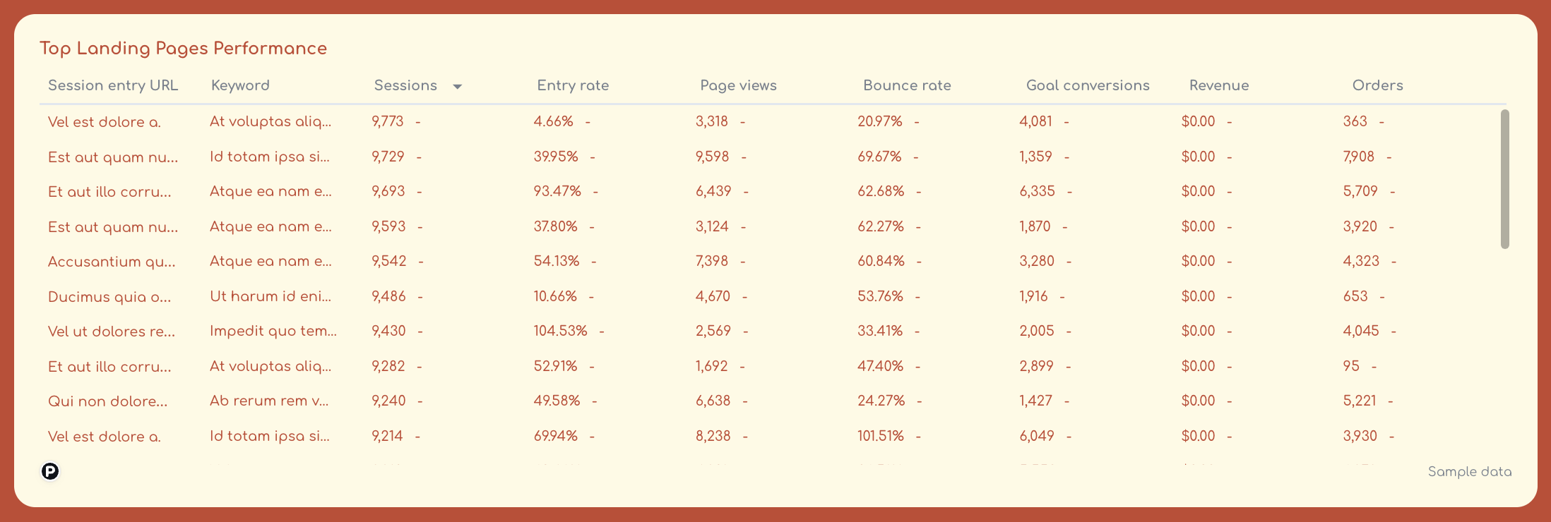
3️⃣ Top-performing pages
This section highlights which pages attract the most engagement and conversions.
Use one granular table to show:
- Session entry Page URL
- Keyword
And these metrics for each:
- Sessions
- Entry rate
- Page views
- Bounce rate
- Goal conversions
- Revenue
- Order
A top pages table helps teams quickly identify which content, product pages, or landing pages generate the most traffic and engagement.
These insights help prioritize optimization efforts on the pages that already attract the most visitors.
4️⃣ Top-performing products
For ecommerce businesses, product-level insights are essential.
Again, in one granular table, track
- Product name
- Product views
- Purchases
- Revenue
- Conversion rate
This table highlights which products generate the most revenue and which products attract traffic but fail to convert.
Teams can use this data to optimize product pages, pricing strategies, or promotional campaigns.
5️⃣ Top campaigns
Campaign-level performance shows how marketing efforts influence traffic and revenue.
Track:
- Campaign name
- Sessions
- Conversions
- Revenue
Campaign tables help teams identify which marketing campaigns generate the most valuable traffic and which ones require optimization.
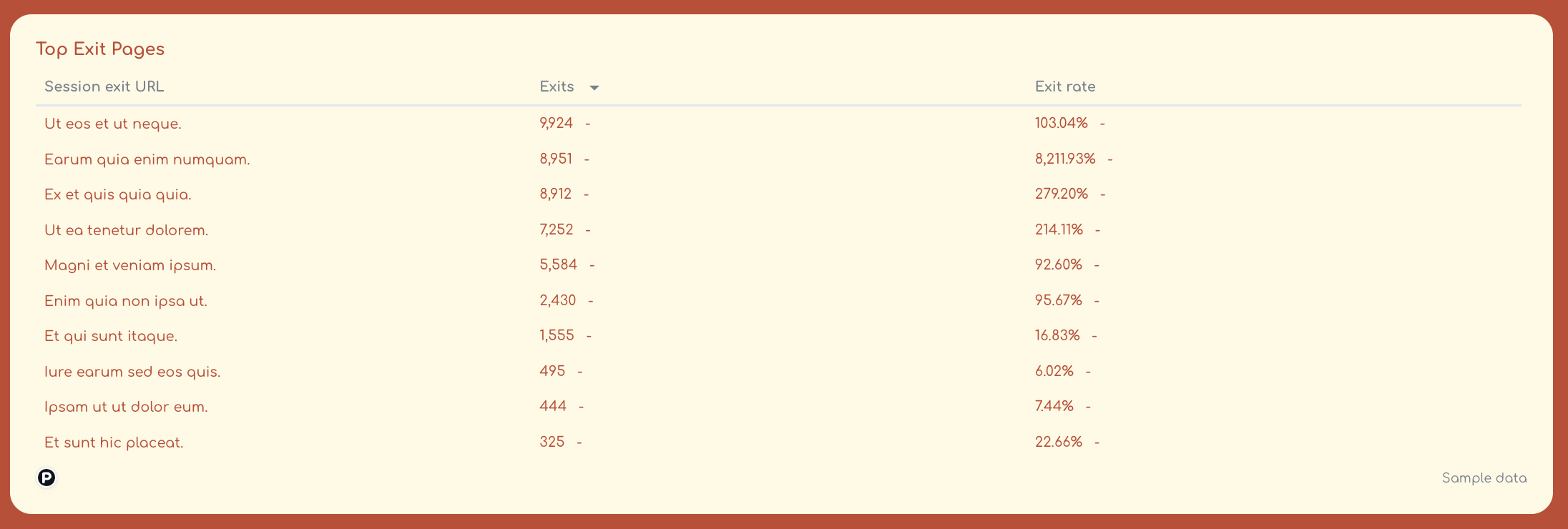
6️⃣ Exit pages
Exit page analysis helps identify where users leave the website.
Track:
- Page URL
- Exit rate
- Sessions
- Bounce rate
Pages with unusually high exit rates may indicate UX issues, poor navigation, or missing calls-to-action.
Monitoring exit pages helps teams identify friction points in the customer journey.
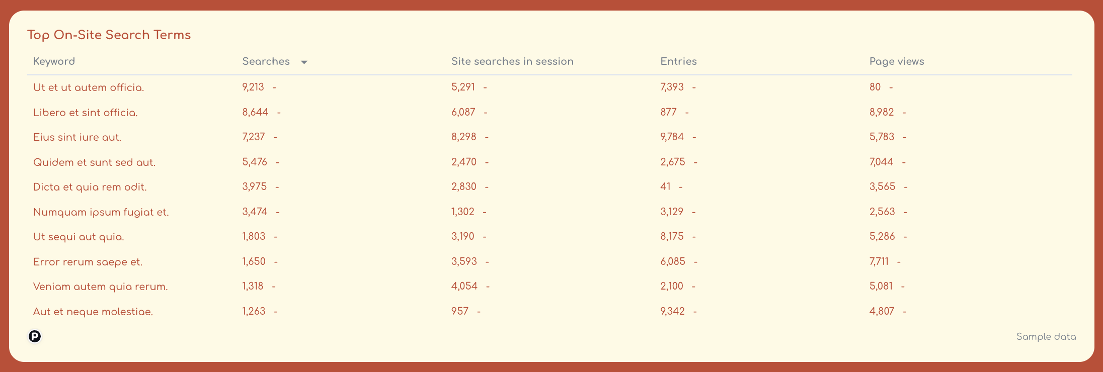
7️⃣ Internal search terms
Internal search data reveals what users are actively looking for on the website.
Track:
- Search term
- Search frequency
- Conversions after search
- Pages viewed after search
Best practices:
✅ Start the dashboard with traffic KPIs and trend charts so stakeholders can quickly understand website activity.
✅ Use pie charts or donut charts to break down traffic (sessions) by dimensions that matter to you or your clients, like:
- Channel
- Source/medium
- Country/city
- Browser
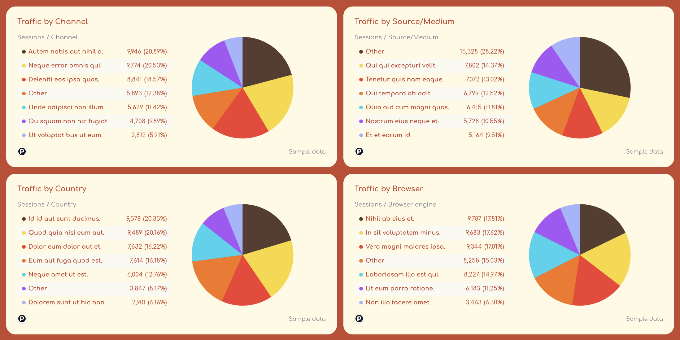
✅ Include granular tables for top pages, products, and campaigns so teams can diagnose what drives engagement and conversions.
✅ Monitor exit pages to quickly identify pages where users abandon the site.
✅ Track internal search terms to uncover user intent and discover content or product gaps.
6. Google My Business Web Analytics Dashboard Example
Use this example for free with your data
Who it’s for:
- Local SEO specialists, marketing teams, and franchise businesses that rely on Google Business Profile to attract nearby customers.
- Agencies managing local listings who need a clear view of local search visibility, customer interactions, and reputation performance across locations.
Data sources connected: Google Business Profile (Google My Business)
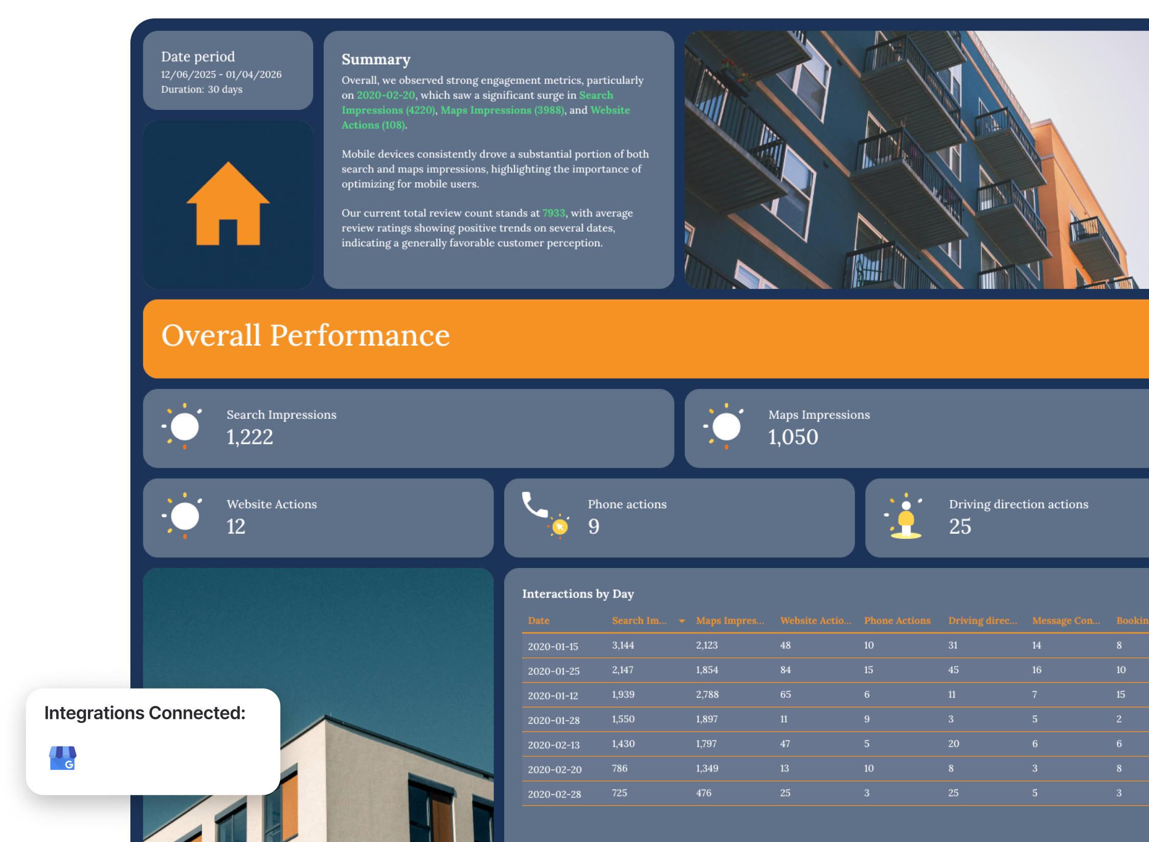
This Google My Business dashboard example focuses on how customers discover and interact with your business listing across Google Search and Google Maps.
Instead of checking multiple reports inside Google Business Profile, the dashboard aggregates impressions, actions, and review performance into one clear view. This helps teams quickly understand how visible their business is in local search and how users engage with the listing—from viewing directions to calling the business or visiting the website.
Metrics to visualize and how to structure:
A strong local visibility dashboard should show three things clearly: how often your listing appears in search, how users interact with it, and how your reputation evolves through reviews.
1️⃣ Overall performance overview
Start with a high-level snapshot of listing performance.
Include:
- Search impressions
- Maps impressions
- Website actions
- Phone actions
- Driving direction requests
- Messages
- Bookings
This section shows how users interact with your business listing and which types of actions drive engagement.
Daily interaction charts should visualize:
- Search impressions
- Maps impressions
- Website actions
These charts help teams quickly see spikes in visibility or engagement and identify which days generated the most customer activity.
2️⃣ Search and maps visibility
This section focuses on how visible your business is in Google Search and Google Maps.
Track:
- Search impressions over time
- Maps impressions over time
- Search impressions breakdown by day
- Maps impressions breakdown by day
These metrics help teams understand whether local visibility is increasing and whether customers are finding the business through Google search results or map listings.
3️⃣ Device performance
Local search behavior often differs between desktop and mobile users.
Track:
- Search impressions by device (desktop vs mobile)
- Maps impressions by device
Device breakdown charts reveal how customers interact with your listing across devices.
For most local businesses, mobile impressions dominate—so this data helps prioritize mobile optimization for websites and landing pages.
4️⃣ Review performance
Reviews play a major role in local SEO and customer trust.
Track:
- Current total review count
- Total review growth over time
- Average review rating
- Daily review activity
Monitoring review trends helps teams understand how customer perception evolves and whether reputation management efforts are working.
A table of recent reviews can also highlight customer feedback and recurring issues that may impact reputation.
Best practices:
✅ Start the dashboard with a visibility snapshot showing total search impressions, maps impressions, and key customer actions like website visits and phone calls.
✅ Track Search vs Maps impressions separately. This helps you understand whether customers discover your business through search queries or map browsing.
✅ Add device breakdown charts to monitor how mobile and desktop users discover your listing. Local searches often happen on mobile devices, so this insight helps prioritize mobile experience improvements.
✅ Include an interactions-by-day table to highlight spikes in engagement such as phone calls, direction requests, or website visits.
✅ Monitor review growth and rating trends to track brand reputation and identify periods where customer satisfaction improves or declines.
✅ Combine impressions and interaction metrics to see the full local funnel—from visibility in Google Search to real customer actions like calls, bookings, and directions.
What Should a Web Analytics Dashboard Include? (5 Key Things)
Based on the example dashboards for web analytics we’ve seen so far, here are the five key sections to add to your web analytics dashboard:
1. A Clear Executive Summary & Recommendations
Stakeholders don’t want to scroll through multiple tabs of charts and tables in their dashboards. They want to know immediately:
- Is website traffic growing?
- Are users engaging with our content?
- Are visitors converting into leads or revenue?
That’s why every business intelligence dashboard should start with a short executive summary—3–5 sentences highlighting key performance trends and insights.
This section quickly summarizes website traffic and conversions this month, identifies major shifts in traffic or engagement, and highlights what actions teams should take next.
But manually writing out these insights and recommendations can take some time.
On Whatagraph, you can use Whatagraph IQ to generate the first version of your performance summaries automatically based on your connected data. You can then tweak the summary with your own business context or insights.
Choose from multiple content types like Summary, Recommendations, Wins, Issues, or a custom prompt, and generate insights instantly in multiple languages.
2. Top-Line Website KPIs
After the summary, your marketing dashboard should show a high-level snapshot of website performance.
This top section should include the core metrics stakeholders care about most:
- Sessions
- Session duration
- Users or visitors
- Page views
- Engagement rate
- Conversion rate
- Total conversions
- Revenue (if applicable)
These KPIs give teams and stakeholders a quick overview of how the website is performing so they can make data-driven decisions, faster.
Amy Hebdon, Google Ads Conversion Expert and Founder at Paid Search Magic, explains this perfectly:
I generally move from high-level performance > trends > supporting detail, rather than leading with granular tables. Lead with the KPIs and metrics important to your stakeholders, and clear the clutter for everything else.
In most web analytics dashboards, these key performance indicators appear at the very top of the dashboard as a quick performance snapshot.
3. Traffic Trends and Acquisition Insights
Once stakeholders understand overall performance, the next step is to analyze where traffic is coming from and how it changes over time.
This section typically includes trend charts and acquisition breakdowns such as:
- Sessions over time
- Users vs returning visitors
- Traffic by channel (organic, referral, direct, social)
- Traffic by source / medium
- Traffic by device
- Traffic by country
Trend charts are especially important because they help teams:
- Spot anomalies in traffic, conversions, or engagement metrics
- Compare week-over-week or month-over-month performance
- Understand seasonal patterns or campaign impact
Modern dashboards also include comparisons between traditional search traffic and AI-driven search engines, helping teams monitor whether their content is gaining visibility in emerging generative search environments.
4. Granular Page, Campaign, and Content Performance
After the high-level view, dashboards should allow users to drill deeper into the content and pages that drive results.
Most web analytics dashboards include granular tables showing:
- Top landing pages by sessions or conversions
- Page performance metrics (engagement rate, bounce rate, conversions)
- Top campaign performance or traffic sources
- Product performance (for ecommerce sites)
These insights help teams quickly identify which content actually drives engagement and revenue.
For example, page performance tables make it easy to:
- Find the top landing pages by conversions and conversion rate
- Identify high-traffic pages that need conversion optimization
- Understand which content clusters (blog, product pages, guides) perform best
The goal is to move from traffic numbers to actionable insights about what content works.
5. Behavioral Insights and Optimization Opportunities
The final section of a strong marketing performance dashboard should help teams understand how users behave on the website and what should be optimized next.
This typically includes behavioral and diagnostic insights such as:
- Exit pages with high drop-off rates
- Internal site search queries
- Conversion funnels
- Goal progress toward traffic or revenue targets
For example, analyzing top exit pages can reveal friction points in the user journey, while internal search terms often highlight content gaps or product demand.
The purpose of this section is simple: when stakeholders finish reviewing the dashboard, they should clearly understand:
- What happened
- Why it happened
- What the team should do next
Amy Hebdon summarizes it well:
Reports should be designed intentionally for the stakeholders, and should include invisible CTAs for what the reader should think, feel or do next based on the data.
In summary, the best web analytics dashboards are the ones that:
✅ clearly tie numbers back to business goals
✅ speed up decision-making and help make informed decisions
✅ show stakeholders just how much impact you’re driving
Published on Mar 13 2026
WRITTEN BY
YamonYamon is a Senior Content Marketing Manager at Whatagraph. With an eye for detail and a knack for always considering context, audience, and business goals to guide the narrative, she's on a mission to create genuinely helpful content for marketers. When she’s not working, she’s hiking, meditating, or practicing yoga.