7 Effective E-Commerce Dashboard Examples & Free Templates
You've crushed it this month. Your ads are doing well, generating more sales and profit than ever.
But then comes the final boss: building an e-Commerce dashboard.
Where do you start?
Which metrics do you show so stakeholders know exactly how much more profit you contributed?
How do you structure the dashboard so readers can easily understand performance in seconds?

Mar 04 2026●7 min read


We’re here to make your life easier.
In this guide, we’ll show you 7 effective e-commerce dashboard examples built to visualize and explain performance to your stakeholders in seconds.
We’ll also share free templates that you can use right away with your data.
Whether you’re an ecommerce manager trying to centralize reporting or an agency proving ROI to clients, these ecommerce dashboard examples will help you:
- Connect marketing spend to real revenue
- Spot drops in conversion rate or margin instantly
- Track profit, not just sales and orders
- Present performance clearly in under five seconds
7 E-Commerce Dashboard Examples (+ Free Templates)
Jump to the E-Commerce dashboard example you want to see:
- Cross-channel e-commerce dashboard example
- Shopify dashboard example with Google Ads
- Shopify sales dashboard example
- WooCommerce dashboard example with Google Ads, Facebook Ads, and Klaviyo
- BigCommerce dashboard example
- Pinterest Ads dashboard example
- Amazon Ads dashboard example
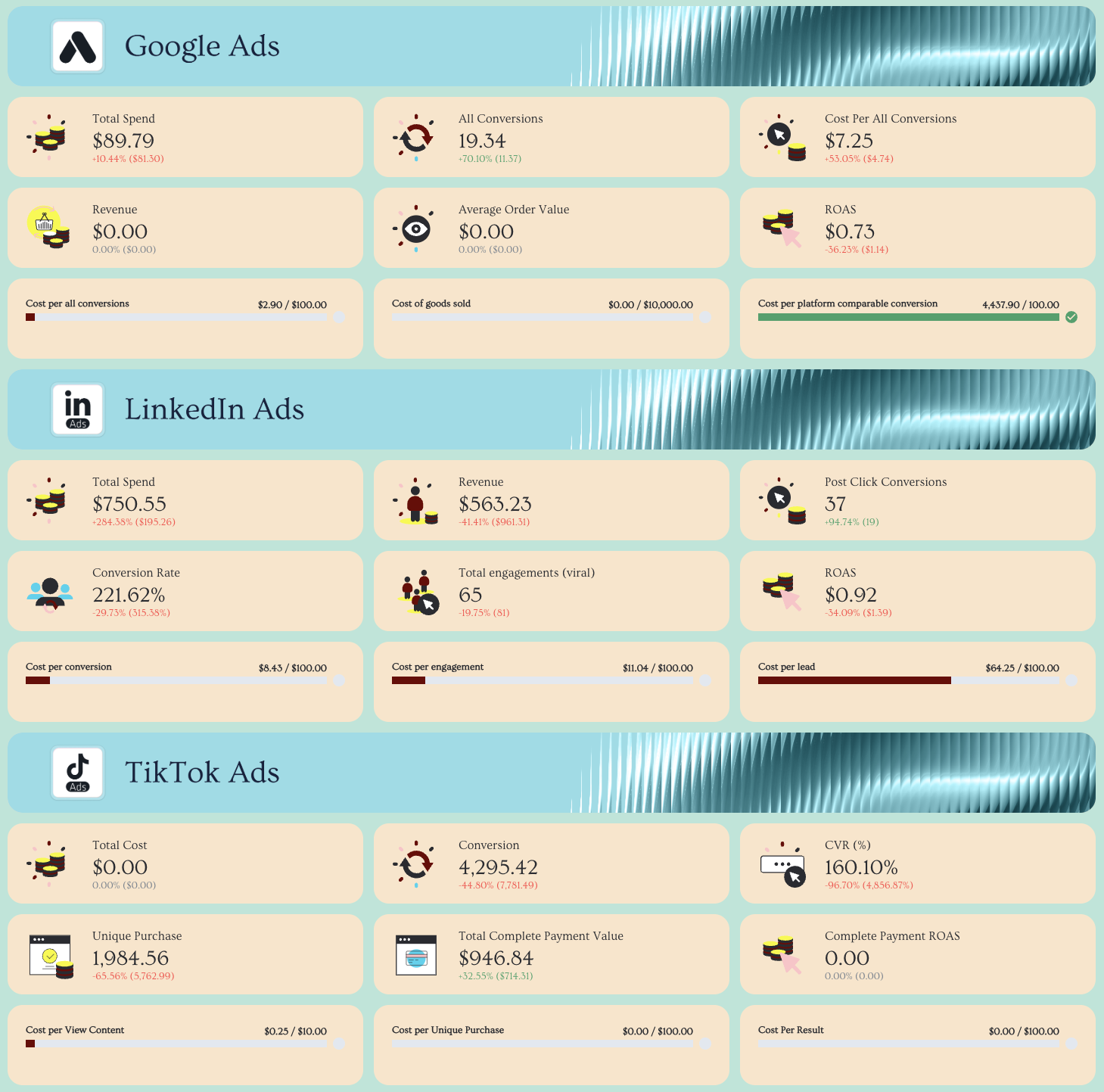
1. Cross-channel E-Commerce Analytics Dashboard Example
Who it’s for:
- Ecommerce Managers who need a single source of truth across Meta, Google, TikTok, LinkedIn, Pinterest, and Shopify.
- Agency account managers who want one clean performance dashboard that proves cross-channel impact without juggling spreadsheets.
Channels connected:
- Meta (Facebook & Instagram Ads)
- Google Ads
- TikTok Ads
- LinkedIn Ads
- Pinterest Ads
- Shopify
- WooCommerce
This multichannel ecommerce dashboard example gives you a complete performance overview across all paid channels and your store data in one place. Instead of jumping between ad platforms and your ecommerce backend, it aggregates everything into one structured, decision-ready report.
The first tab acts as your executive-level “cover” overview, showing aggregated KPIs across channels—so stakeholders immediately understand what’s driving revenue, where ad spend is going, and how profitable your marketing efforts really are.
How to use this analytics ecommerce dashboard:
What metrics should an ecommerce dashboard include?
The key to a high-performing ecommerce dashboard isn’t more metrics—it’s the right key performance indicators in the right place.
1️⃣ Cover Tab (All Channels Overview)
This is your executive snapshot.
Include:
- Total revenue
- Total ad spend
- ROAS (blended across paid channels)
- Conversions
- Customer acquisition cost (CAC)
- Average order value (AOV)
- Conversion rate
- Total impressions & clicks
This tab aggregates performance from Facebook Ads, Google Ads, TikTok, and other paid channels into one view. It answers:
- Are we profitable?
- Are we scaling efficiently?
- Is revenue growing faster than ad spend?
Always show a KPI snapshot at the very top before diving into breakdowns. Stakeholders shouldn’t have to scroll to understand performance.
2️⃣ Meta (Facebook & Instagram Ads) Tab
Track:
- Spend
- ROAS
- Cost per purchase
- Purchases
- CTR
- CPC
- Conversion rate
- Campaign & ad performance breakdown
- Audience demographics
3️⃣ Google Ads Tab
Track:
- Spend
- Conversions
- ROAS
- CPC
- CTR
- Search vs Display breakdown
- Keyword performance
- Landing page performance
4️⃣ TikTok Ads Tab
Track:
- Spend
- Purchase ROAS
- Conversion rate
- Video views & engagement metrics
- Top-performing creatives
- Audience breakdown
5️⃣ Pinterest Ads
Track:
- Total spend
- Conversions
- Total conversions value
- ROAS
- Impressions
- Pin clicks
- Cost per click
6️⃣ Shopify (Store Performance) Tab
Track:
- Gross sales
- Net sales
- Total sales
- Orders
- AOV
- Refunds
- Discounts
- Shipping
- Product performance
- Sales by channel
Best practices for building ecommerce dashboards analytics:
✅ Keep all marketing channels in one place—organized by tabs within a single ecommerce dashboard to create a true single source of truth.
✅ Start with an aggregated “Cover” tab that shows total revenue, total ad spend, blended ROAS, conversions, CAC, and AOV for instant executive clarity.
✅ Structure every tab the same way: KPI summary row at the top → performance trend graphs → detailed campaign/ad/product breakdown tables.
✅ White-label instantly with Whatagraph IQ Themes by uploading your brandbook or a screenshot—automatically apply brand fonts and colors across the entire report. Add custom images to the report.
✅ Use Whatagraph IQ Summary to auto-generate data-backed performance commentary, including wins, risks, recommendations, and custom insights—then refine with business context.
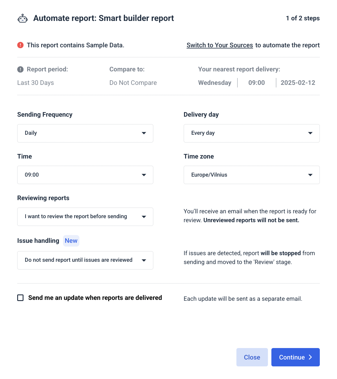
✅ Automate report delivery on specific dates and frequencies (weekly for marketing teams, monthly for leadership, real-time links for clients) to eliminate manual exports and reporting chaos.
See more: 9 cross-channel digital marketing report templates
2. Shopify Dashboard Examples #1 - Shopify Dashboard with Google Ads
Who it’s for:
- Ecommerce brands running Google Ads and wanting to understand how ads lead to more revenue and profit
- Agencies managing paid search for ecommerce clients who need to prove profit impact
- Founders who want to see exactly how much money Google Ads is making (or losing)
Channels connected: Shopify, Google Ads
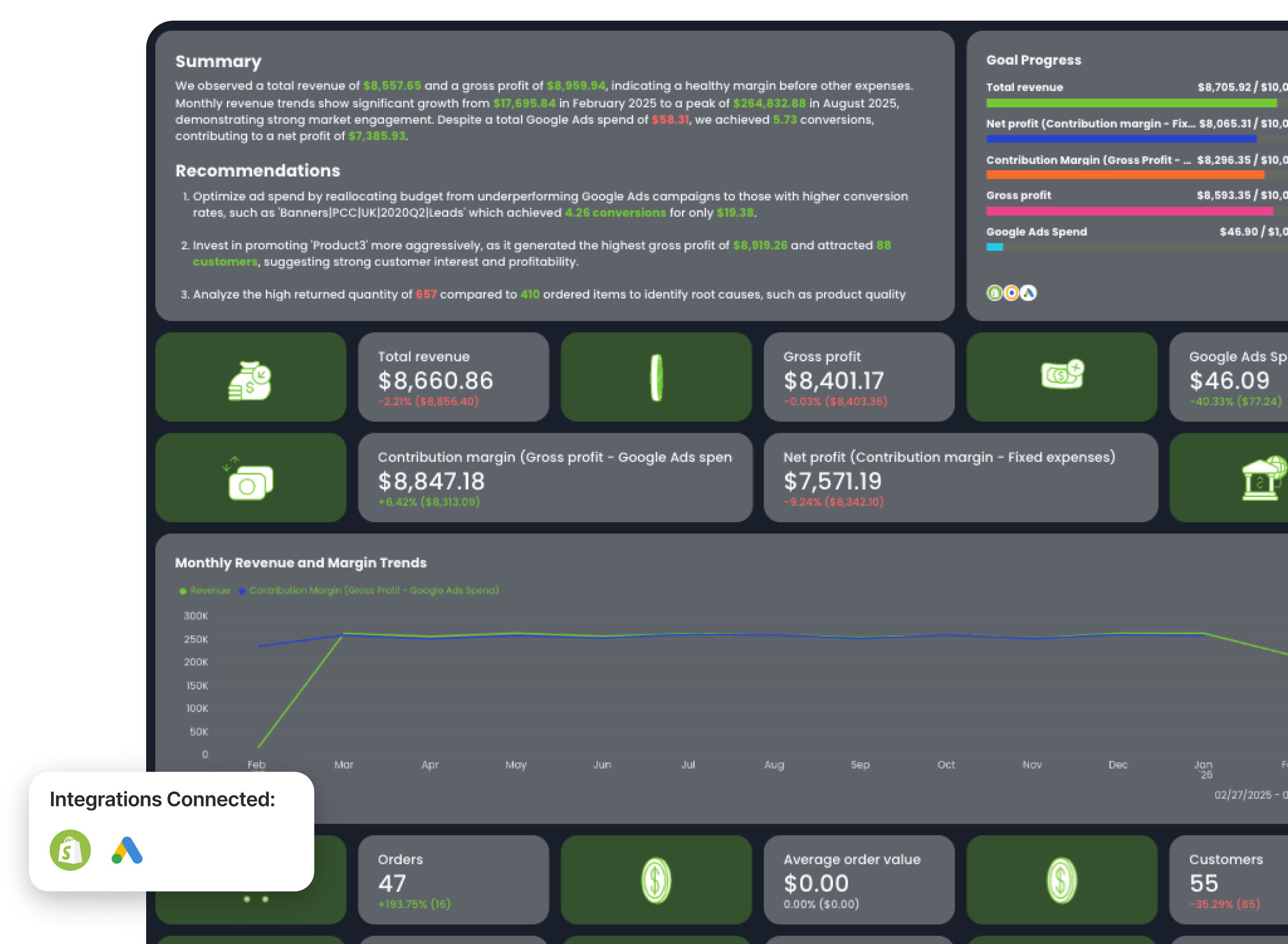
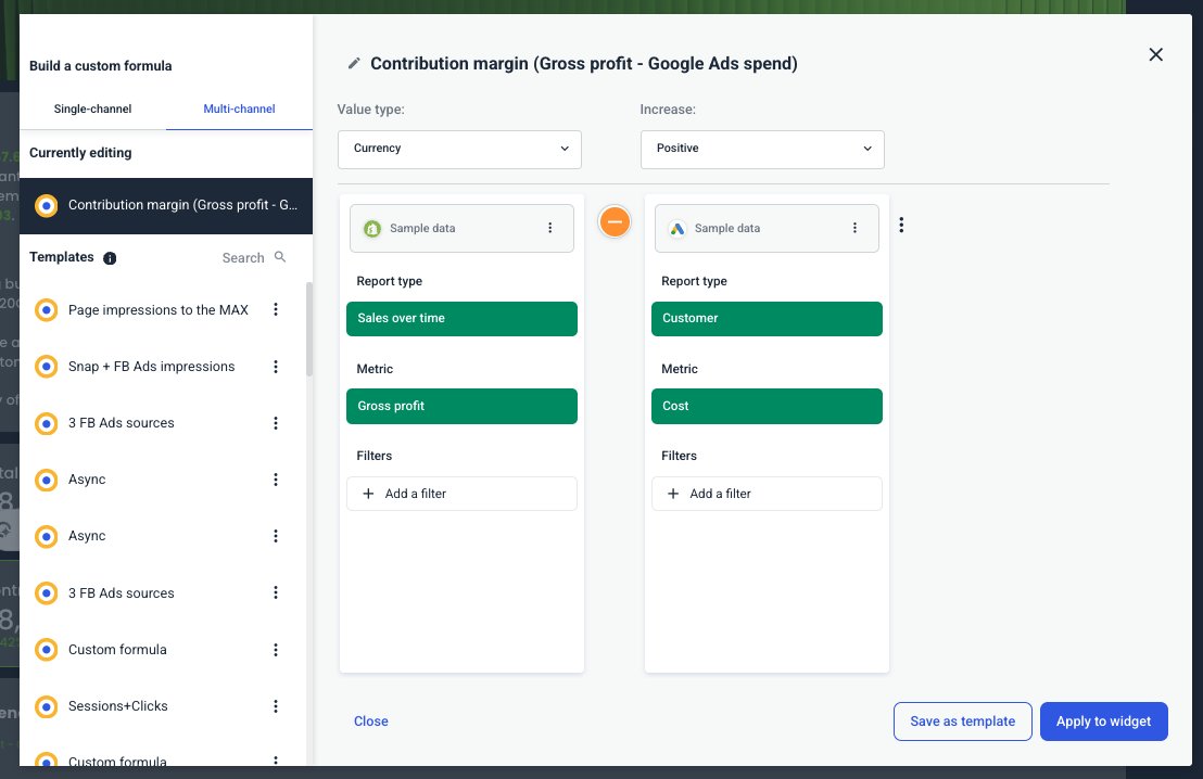
This Shopify and Google Ads dashboard example connects store performance data from Shopify (total sales, gross profit, orders, customers, ordered quantity, returned quantity, refunds) with Google Ads spend and conversions.
Instead of reporting on revenue and ad spend separately, it calculates what actually matters:
- Contribution margin = Gross profit − Google Ads spend
- Net profit = Contribution margin − Fixed expenses (e.g., wages)
- ROAS = Total revenue ÷ Google Ads spend
- POAS (Profit on Ad Spend) = Gross profit ÷ Google Ads spend
This shows how much more sales and profit your ads are contributing towards, and how much more revenue your client is getting even after spending on ads.
How to use:
Key metrics to visualize and how to structure:
The structure in this Shopify e-commerce business dashboard example follows a profitability-first approach:
- Executive profitability snapshot
- Revenue & margin trends
- Store performance metrics
- Product-level profitability
- Google Ads campaign profitability
- Top-performing ads
Here’s how it’s structured.
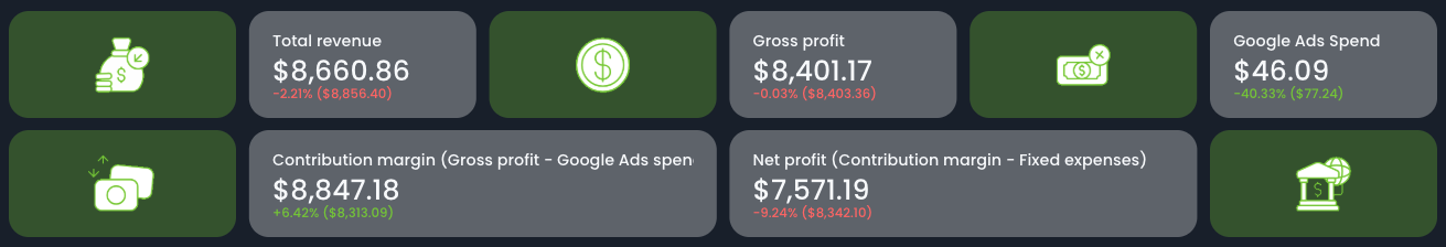
1️⃣ Executive Snapshot (Profit-Focused KPIs)
Start with KPI cards:
- Total revenue
- Gross profit
- Google Ads spend
- Contribution margin (Gross profit − Ad spend)
- Net profit (Contribution margin − Fixed expenses)
This section answers:
- Is Google Ads driving profitable growth?
- How much profit remains after ad spend?
- Are fixed expenses eating into margins?
2️⃣ Revenue & Margin Trends
Include a trend graph showing:
- Revenue
- Contribution margin
- Net profit
This makes it easy to see:
- When profitability spikes
- When ad spend reduces margin
- How seasonality affects profit, not just revenue
3️⃣ Store-Level Performance (Shopify Data)
Pull in:
- Orders
- Customers
- Ordered quantity
- Returned quantity
- Refunds
- Average order value
4️⃣ Top Products by Revenue, Gross Profit & Net Profit
Break down products by:
- Revenue
- Gross profit
- Net profit
- Customers
- Orders
- Average order value
This table shows:
- Which products are most profitable
- Which products generate revenue but weak margin
- Where to allocate more ad budget
Scaling ads without product-level profitability insight is risky. This section removes the guesswork.
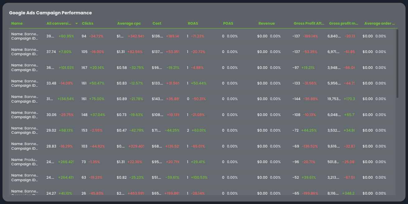
5️⃣ Google Ads Campaign Profitability Table
For each Google Ads campaign, include:
- Conversions
- Clicks
- Average CPC
- Cost
- Revenue
- Gross profit after ad spend
- Gross profit margin
- Average order value
- ROAS
- POAS
This allows you to answer:
- Which campaigns are revenue-positive but profit-negative?
- Which campaigns generate strong POAS?
- Where should budget be increased or cut?
ROAS alone can be misleading. POAS tells you whether the campaign actually generates profit.
6️⃣ Top Performing Google Ads (Creative View)
Include a carousel-style section showing:
- Clicks
- Average CPC
- Conversions
- POAS
This makes creative performance directly tied to profit—not just engagement.
If a creative has high clicks but low POAS? It attracts traffic but not profitable traffic.
Best practices for a Shopify + Google Ads dashboard:
✅ Always show contribution margin (Gross profit - Google Ads spend) and net profit alongside revenue and ad spend—profitability must be visible at a glance.
✅ Track both ROAS (revenue efficiency) and POAS (profit efficiency). Revenue growth without profit growth is not sustainable.
✅ Break down profitability at the campaign level—not just account level—to guide smarter budget reallocation.
✅ Use product-level profit breakdowns to identify which SKUs deserve more ad investment.
✅ Create custom profitability metrics easily in Whatagraph:
- Choose your data sources (Shopify + Google Ads)
- Select the metrics you want
- Apply a mathematical function (e.g., minus for contribution margin, divide for ROAS or POAS)
- Save the custom formula as a reusable template
This means you can calculate Contribution Margin, Net Profit, ROAS, and POAS once—and reuse them across all client dashboards without rebuilding from scratch.
3. Shopify Dashboard Examples #2 - Shopify Sales Dashboard
Who it’s for:
- Ecommerce managers who need full visibility into Shopify store performance
- Founders and leadership teams reviewing weekly or monthly revenue
- Agencies reporting on store results beyond ad metrics
Channels connected: Shopify (native integration)
This Shopify analytics dashboard example focuses on what actually matters for an online store: revenue, orders, profitability, and product performance. It connects gross sales, net sales, returns, discounts, and shipping costs in one structured view so you can see where revenue is growing—and where it’s leaking.
Unlike a generic store view, this template ties together operational data and performance insights, making it ideal for both internal optimization and stakeholder reporting.
How to use this Shopify ecommerce sales dashboard:
Metrics to visualize in the Shopify reporting dashboard:
The layout in the Shopify dashboard analytics example follows a clean structure:
- Performance snapshot
- Sales performance overview
- Sales over time
- Sales channel breakdown
- Product performance
- Revenue funnel
- Recommendations
Here’s how to structure it for maximum clarity.
1️⃣ Executive Snapshot (Top Section)
Start with KPI cards at the very top:
- Total sales
- Orders
- Progress vs goal
- Date range
- Average order value (AOV)
This gives stakeholders instant context before diving deeper.
If you're presenting this weekly or monthly to leadership, this becomes your Shopify reporting dashboard view—clear, fast, decision-ready.
2️⃣ Sales Performance Overview
Track:
- Gross sales
- Net sales
- Total sales
- Shipping revenue
- Discounts
- Returns
- Tax
This is where profitability becomes visible.
3️⃣ Sales Over Time
Include:
- Gross sales trend line
- Net sales trend line
- Orders over time
Trend visualization helps you identify:
- Seasonal spikes
- Revenue drops
- Promotion impact
- Inventory or campaign effects
This is where Shopify dashboard analytics becomes powerful—you’re not just seeing totals, you’re seeing momentum.
4️⃣ Sales Channel Performance
Break down:
- Gross sales by channel
- Net sales by channel
- Total sales
- Shipping
- Tax
- Average order value per channel
This reveals:
- Which sales channels drive real revenue
- Which channels have high discount dependency
- Where shipping or tax impacts margin
It’s especially useful for brands selling across multiple storefronts or marketplaces.
5️⃣ Product Performance
Track:
- Gross sales by product
- Net sales by product
- Total sales
- Shipping contribution
- Average order value per product
6️⃣ Orders & Revenue Funnel
Include:
- Ordered quantity
- Returned quantity
- Average units ordered
- Revenue funnel visualization (Gross → Net → Total sales)
- Total conversion rate
This makes your Shopify analytics dashboard actionable—not just descriptive. You see exactly where value is lost between gross revenue and net revenue.
Best practices for a Shopify dashboard:
✅ Start with high-level KPI cards (total sales, orders, AOV) before diving into breakdowns.
✅ Always compare gross sales vs net sales to identify revenue leakage from returns and discounts.
✅ Include a sales-over-time graph to visualize growth trends and promotion impact.
✅ Break down performance by sales channel to uncover margin differences.
✅ Highlight product-level performance to guide inventory and merchandising decisions.
✅ Connect with Google Ads / Facebook Ads / Pinterest Ads to show ad spend, conversions, and revenue from your PPC marketing campaigns.
See more: 7 PPC reporting examples
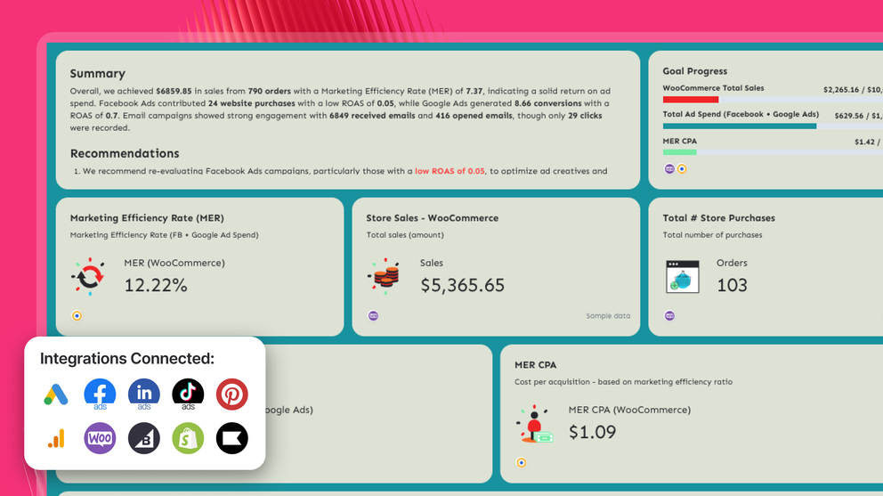
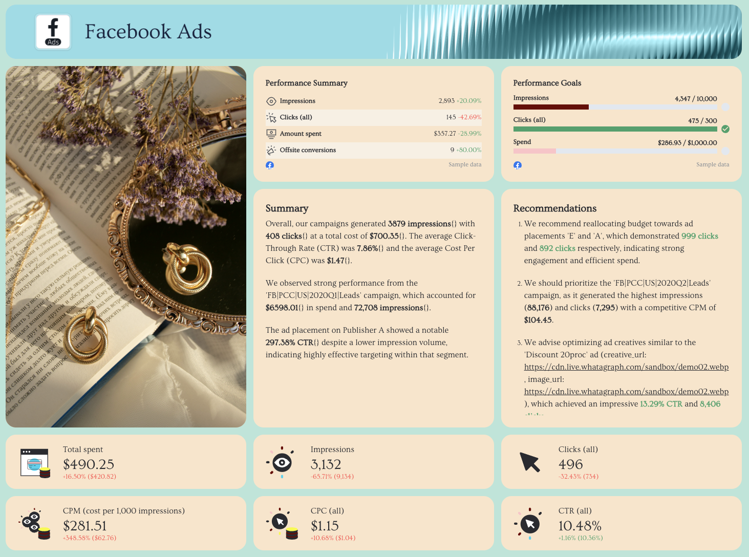
4. WooCommerce Dashboard Example (with Google Ads, Facebook Ads, and Klaviyo)
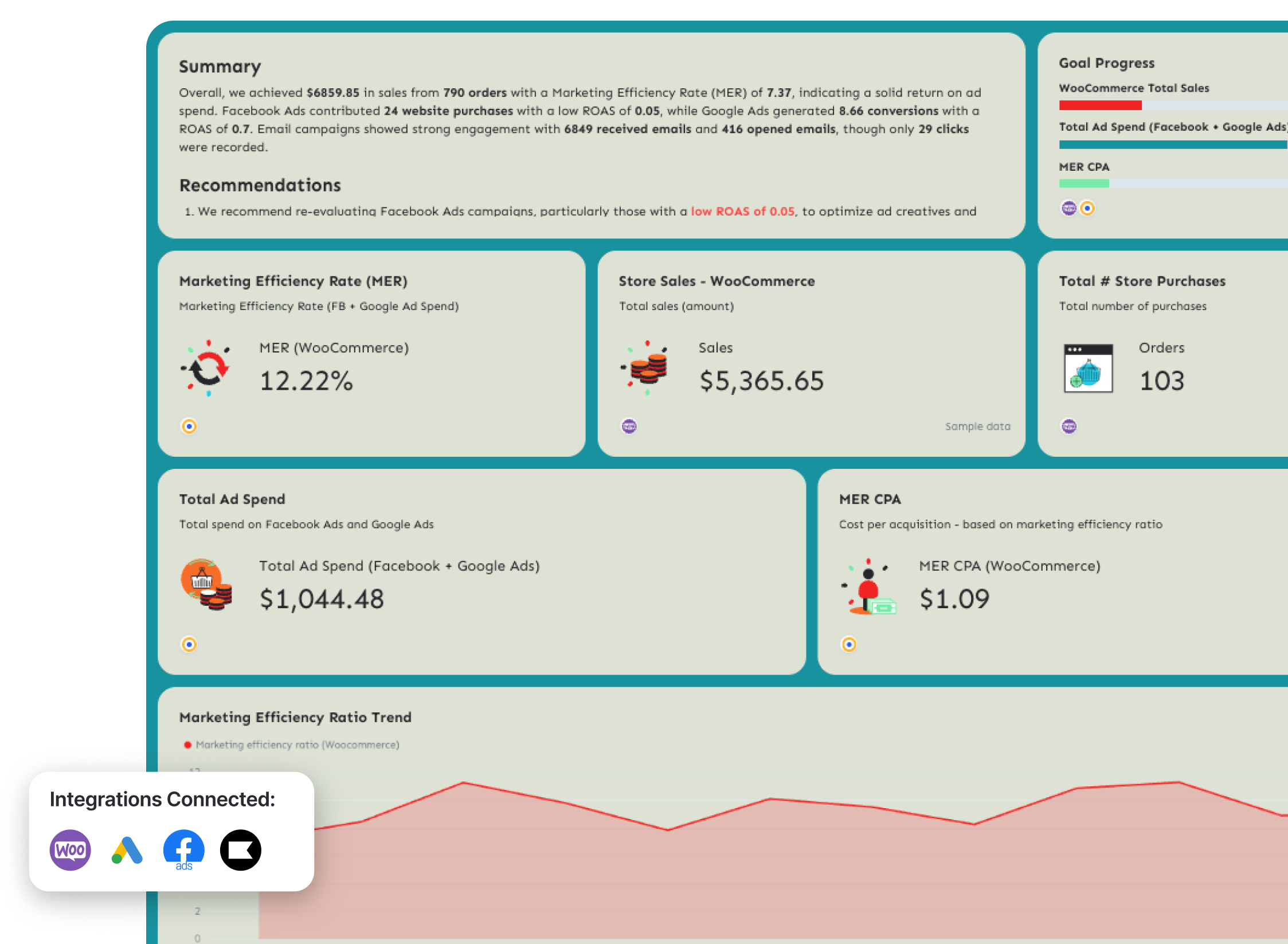
Who it’s for:
- Ecommerce brands running WooCommerce with Google Ads and Facebook Ads
- Agencies managing full-funnel ecommerce growth (paid + owned channels)
- Marketing teams that want to measure efficiency—not just traffic
Channels connected: WooCommerce, Google Ads, Facebook Ads, Klaviyo (Email + SMS)
This full-funnel WooCommerce analytics dashboard connects store revenue with paid media performance and lifecycle marketing—so you can see exactly how marketing drives sales.
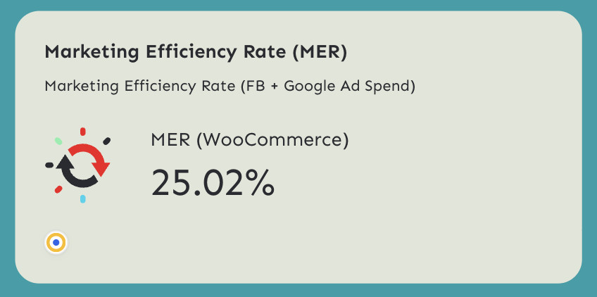
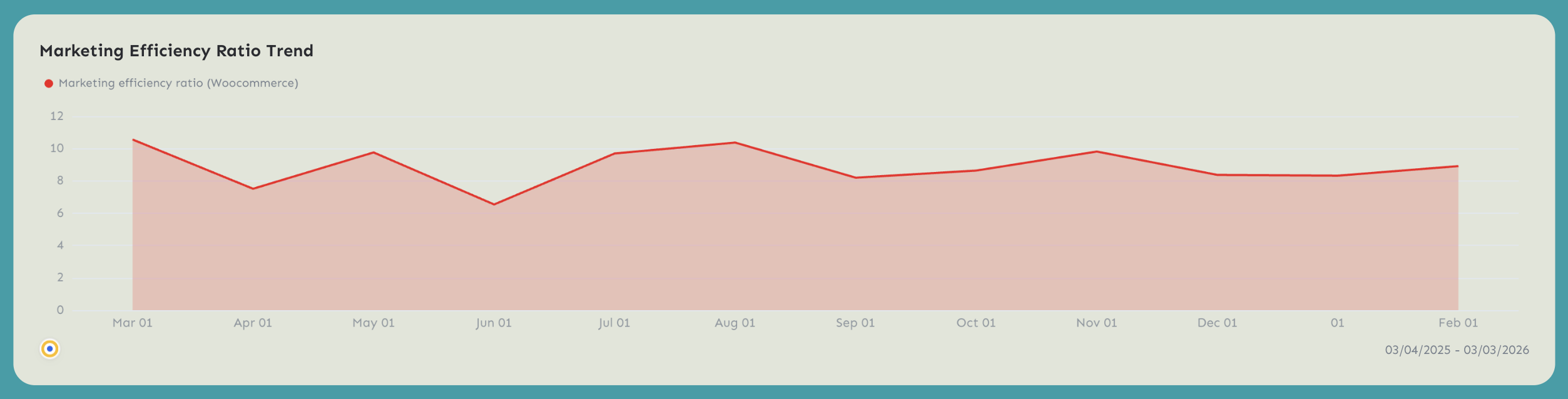
The most important metric in this template is Marketing Efficiency Rate (MER)—because it shows how much revenue your client is generating compared to how much they’re spending on Google Ads and Facebook Ads.
How to use this WooCommerce reporting dashboard:
Metrics to visualize and how to structure:
The structure in the example follows a true full-funnel approach:
- Marketing efficiency overview
- WooCommerce store performance
- Facebook Ads performance
- Google Ads performance
- Klaviyo email & SMS funnels
Here’s how to structure each section.
1️⃣ Marketing Efficiency Overview (Top Section)
Start with:
- WooCommerce total sales
- Orders
- Total ad spend (Facebook + Google)
- Custom metric: Marketing Efficiency Rate (MER) = WooCommerce Sales ÷ (Facebook Ads Total Spend + Google Ads Cost)
- Custom metric: MER CPA = (Facebook Ads Total Spend + Google Ads Cost) ÷ WooCommerce Orders
- MER trend over time
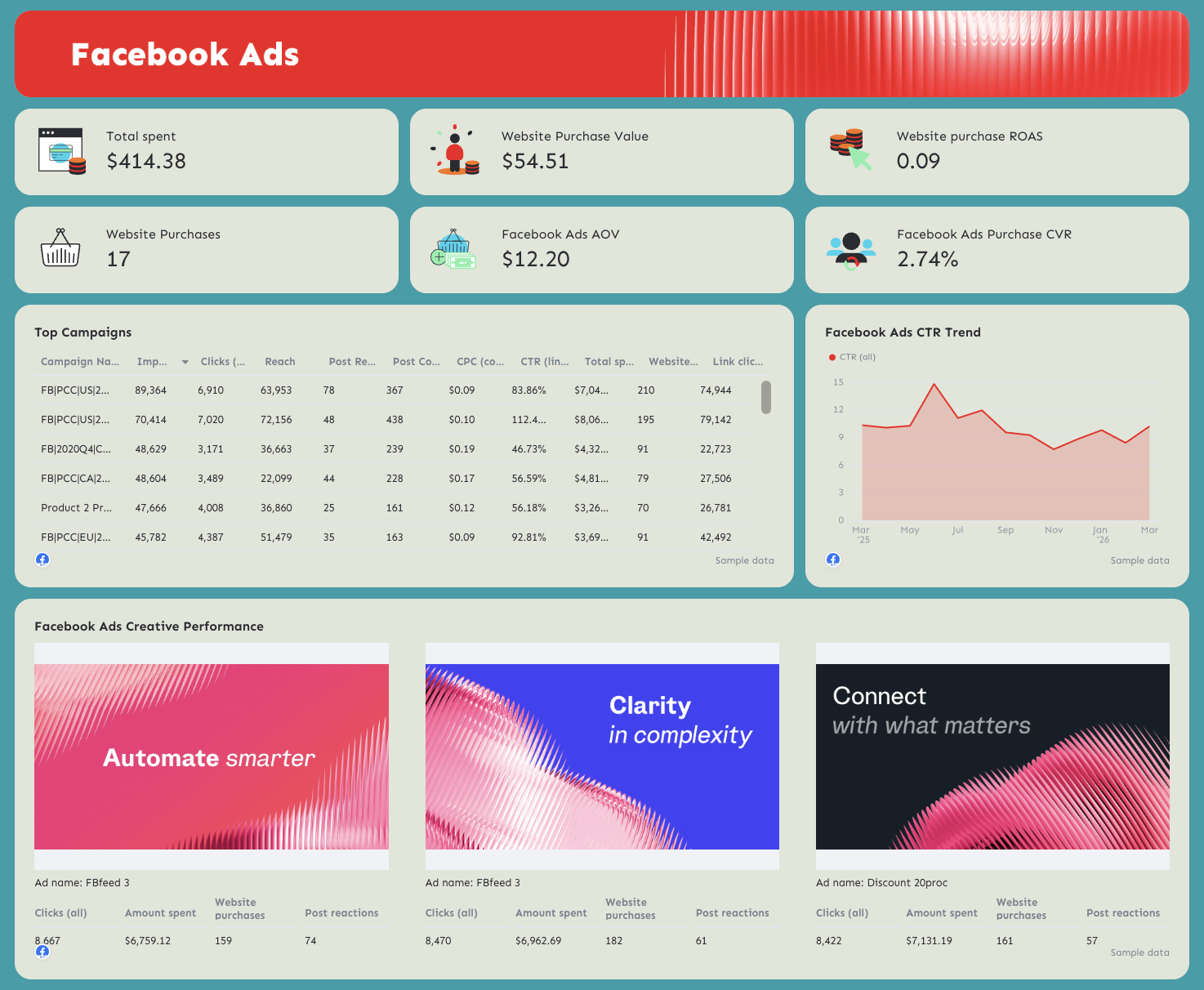
3️⃣ Facebook Ads Performance
Include:
- Total spend
- Website purchases
- Website purchase value
- ROAS
- CTR trend
- Custom metric: Average order value (AOV) = Website purchase value ÷ Website purchases
- Purchase conversion rate = Website purchases ÷ Landing page views
- Ad creative performance
4️⃣ Google Ads Performance
Include:
- Total spend
- Conversions
- Conversion value
- ROAS
- CPA
- Purchase CVR
- Custom metric: Google Ads ROAS = Conversion value ÷ Cost
- Custom metric: Google Ads Purchase CVR (%) = Conversions ÷ Clicks
- Custom metric: Google Ads CPA = Cost ÷ Conversions
- Custom metric: Google Ads AOV = Conversion value ÷ Conversions
- AOV trend
- Campaign breakdown
- Creative performance
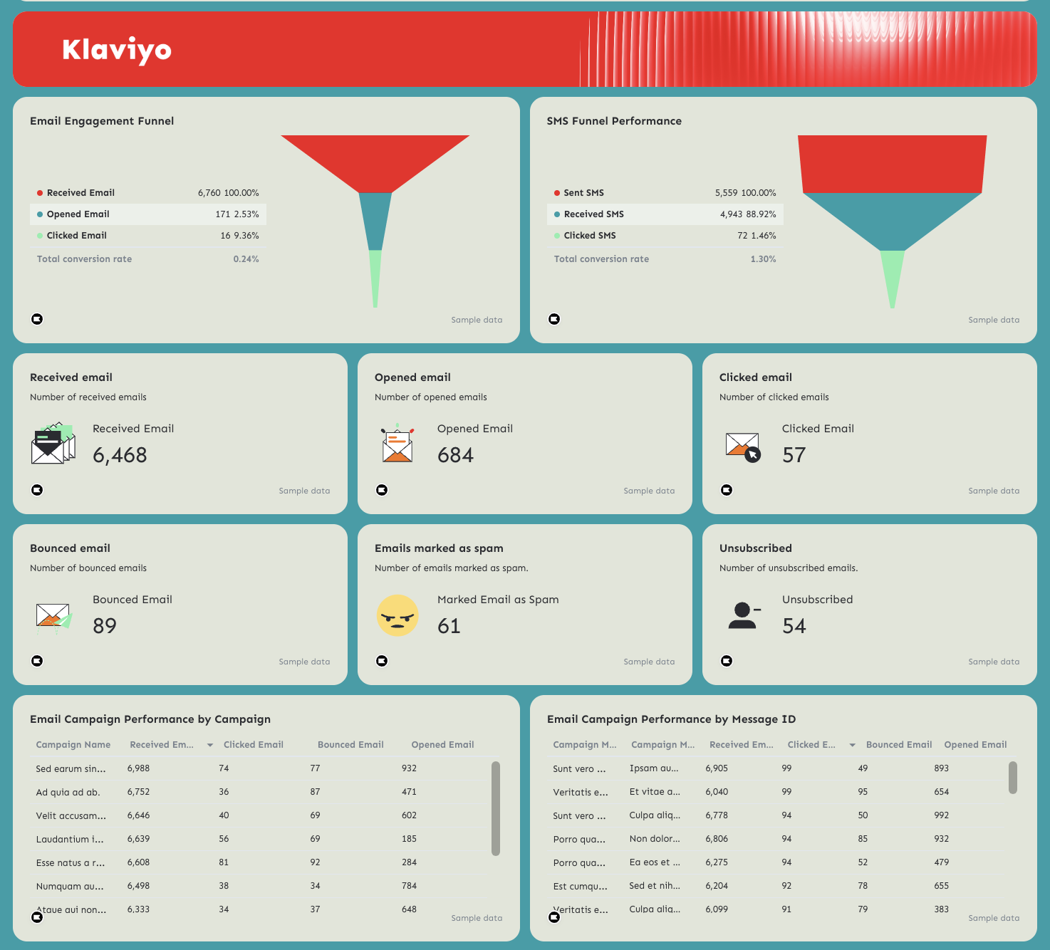
5️⃣ Klaviyo Email & SMS Funnel
Include:
Email Engagement Funnel
- Received emails
- Opened emails
- Clicked emails
- Total conversion rate
This reveals drop-offs between delivery → open → click → conversion.
SMS Funnel Performance
- Sent SMS
- Received SMS
- Clicked SMS
- Total conversion rate
This shows how effectively SMS drives action.
Also include:
- Bounced emails
- Emails marked as spam
- Unsubscribes
These metrics protect deliverability and long-term performance.
Best practices for a full-funnel WooCommerce dashboard
✅ Always start with MER and MER CPA at the very top—this frames performance around efficiency, not vanity metrics.
✅ Track MER trend over time to show marketing's efficiency over time.
✅ Break down each PPC channel (e.g. Facebook Ads) with the key metrics, campaign performance, and top performing ads.
✅ Pair paid performance with Klaviyo email & SMS funnels to show how retention supports acquisition.
5. Bigcommerce Dashboard Example
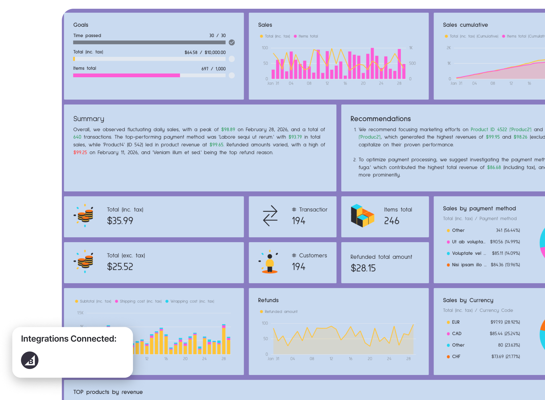
This BigCommerce analytics dashboard example gives you a complete view of store performance—from daily sales trends to payment methods, refunds, top products, and geographic breakdowns.
Instead of digging through backend reports, everything is structured into one clean, decision-ready BigCommerce analytics dashboard that surfaces revenue drivers and operational risks.
Metrics to visualize
The example structure follows a clear hierarchy:
- Executive summary + goals
- Sales trends (daily + cumulative)
- Revenue breakdowns (payment method, currency)
- Product performance
- Order status & payment status
- Geographic breakdown
- Refund analysis
Here’s how to structure each section.
1️⃣ Executive Snapshot
Start with KPI cards:
- Total sales (inc. tax)
- Total sales (exc. tax)
- Number of transactions
- Items total
- Total customers
- Refunded total amount
This allows stakeholders to immediately see store health before diving deeper.
2️⃣ Sales Trends (Daily + Cumulative)
Include:
- Daily sales graph
- Cumulative sales graph
- Items sold over time
Trend visualization helps you spot:
- Sales spikes
- Promotion impact
- Slow periods
- Seasonality
3️⃣ Revenue Breakdown
Break down revenue by:
- Payment method
- Currency
- Subtotal vs shipping vs wrapping vs refunds
This section answers:
- Which payment methods drive the most revenue?
- Are shipping or wrapping costs affecting margins?
- How much revenue is lost to refunds?
4️⃣ Top Products by Revenue
Include a detailed table with:
- Product ID
- Product name
- Total (exc. tax)
- Total (inc. tax)
- Product quantity
- Refunded quantity
- Refund amount
This reveals:
- Which products generate the most revenue
- Which products have high refund rates
- Where to focus marketing or merchandising
5️⃣ Orders by Status & Payment Status
Break down:
- Enabled vs disabled orders
- Subtotals (inc. and exc. tax)
- Total amounts
- Discount amount
- Coupon discount
This helps detect:
- Operational issues
- Payment processing inefficiencies
- Discount dependency
6️⃣ Geographic Performance
Include:
- Orders by shipping country
- Orders by billing country
- Revenue by country
- Currency performance
This shows:
- Strong international markets
- Currency distribution
- Expansion opportunities
7️⃣ Refund Analysis
Break down refunds by:
- Refund reason
- Order/user ID
- Total refunded amount
- Shipping/billing country costs
Refund tracking is critical for protecting margin. A spike in specific refund reasons can signal product quality, fulfillment, or customer expectation issues.
Best practices for a BigCommerce dashboard:
✅ Always include both daily and cumulative sales trends for full context.
✅ Track refunds alongside sales to understand true net performance.
✅ Highlight top products by revenue and refunded quantity to identify margin risks.
✅ Include geographic and currency breakdowns to analyze international marketing effectiveness.
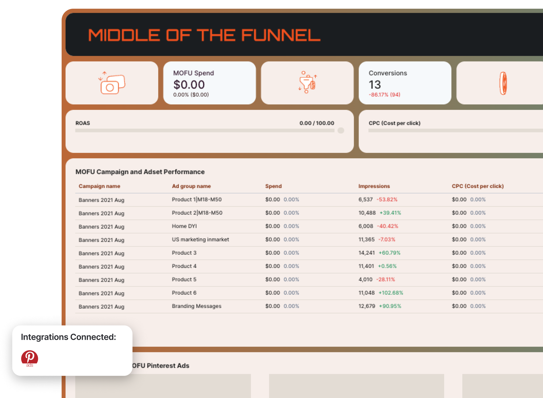
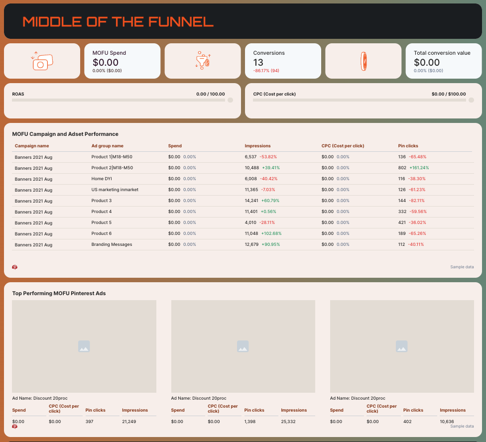
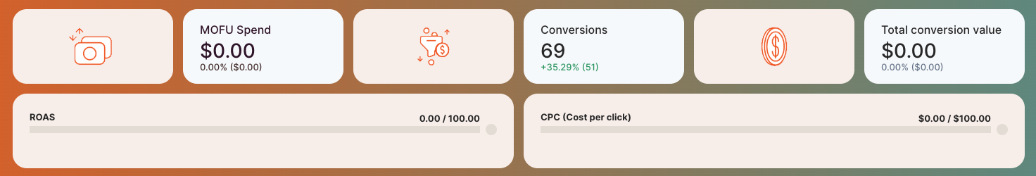
6. Pinterest Ads Dashboard Example
Who it’s for:
- Ecommerce brands using Pinterest to drive product discovery and conversions
- Agencies managing Pinterest Ads campaigns across multiple funnel stages
Channels connected: Pinterest Ads (native integration)
This Pinterest Ads ecommerce marketing dashboard is built around a full-funnel structure—Top of Funnel (TOFU), Middle of Funnel (MOFU), and Bottom of Funnel (BOFU)—so you can clearly see how Pinterest contributes at every stage of the customer journey.
Instead of treating Pinterest like just a traffic channel, this template connects awareness, consideration, and conversion performance in one structured view.
How to use:
Metrics to visualize (broken down by funnel stage):
The structure of this Pinterest Ads dashboard example follows a clean performance hierarchy:
- Executive Performance Summary
- TOFU metrics
- MOFU metrics
- BOFU metrics
- Campaign & creative breakdowns per stage
Here’s how to use each section effectively.
1️⃣ Performance Summary (Executive Snapshot)
At the top of the report, include:
- Total conversion value
- Total conversions
- ROAS (Checkout)
- Total spend
- CPC
- High-level summary & recommendations
This section gives stakeholders instant clarity. Before diving into funnel breakdowns, they should understand:
- Is Pinterest profitable?
- Are conversions increasing?
- Is spend aligned with results?
2️⃣ Top of Funnel (TOFU)
This section focuses on awareness and traffic generation.
Track:
- TOFU spend
- Impressions
- Pin clicks
- CPM
- CPC
- CTR
- Campaign & ad set performance
TOFU answers:
- Are we generating enough reach?
- Are creatives driving engagement?
- Is traffic cost-efficient?
Include a “Top Performing TOFU Ads” section to spotlight the highest-engagement creatives.
3️⃣ Middle of Funnel (MOFU)
This is where intent starts forming.
Track:
- MOFU spend
- Conversions
- Total conversion value
- CPC
- ROAS
- Campaign-level breakdown
MOFU answers:
- Are we turning traffic into meaningful actions?
- Which audiences are moving closer to purchase?
- Which creatives deserve budget scaling?
Highlight top-performing MOFU ads to identify what’s warming up audiences effectively.
4️⃣ Bottom of Funnel (BOFU)
This is where revenue happens.
Track:
- BOFU spend
- Conversions
- Total conversion value
- ROAS
- CPC
- Campaign-level performance
BOFU answers:
- Are we closing efficiently?
- Which retargeting audiences convert best?
- Where should we reallocate budget?
Include a “Top Performing BOFU Ads” section to clearly see which creatives drive purchases—not just clicks.
Best practices for a Pinterest Ads dashboard:
✅ Structure the report by funnel stage (TOFU → MOFU → BOFU) so performance is easy to interpret and optimize.
✅ Filter your data by dimensions (e.g. Campaign name) to visualize TOFU, MOFU, BOFU metrics accurately.
✅ Separate awareness metrics (impressions, pin clicks, CPM) from revenue metrics (conversion value, ROAS) to avoid mixing intent stages.
✅ Add GIFs to your dashboard to make it more engaging and easy to scan.

✅ Add goal widgets to show how you’re tracking towards mutually agreed goals with your clients or stakeholders.
7. Amazon Ads Dashboard Example
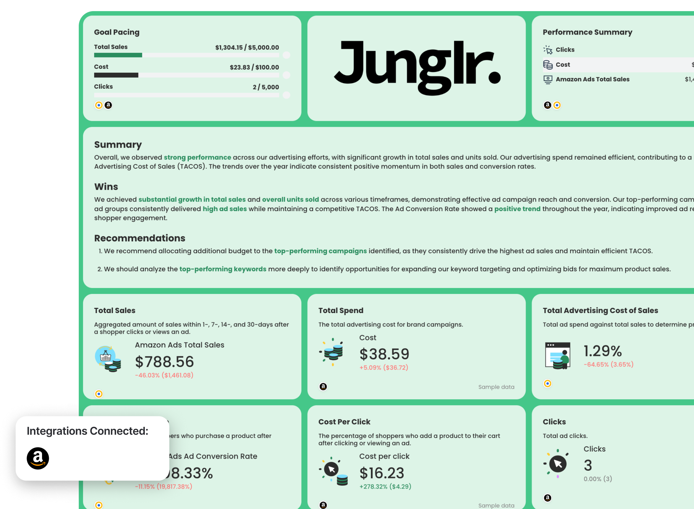
Who it’s for:
- Brands selling on Amazon running Sponsored Products, Sponsored Brands, or Sponsored Display
- Agencies managing Amazon advertising accounts
- Ecommerce teams optimizing TACoS and profitability
Channels connected: Amazon Ads (native integration)
This Amazon Ads report template gives you a full profitability view—from total sales and spend down to campaigns, ad groups, keywords, and ASIN-level performance.
Instead of just tracking clicks and cost, this template focuses on sales attribution windows (1, 7, 14, 30 days), TACoS, and conversion efficiency—so you can optimize profit, not just traffic.
Metrics to visualize:
The Amazon Ads dashboard example follows this hierarchy:
- Executive performance summary
- Core profitability metrics
- Campaign breakdown
- Ad group breakdown
- Keyword performance
- Product/ASIN performance
- Sales vs cost trend
Here’s how to structure each section.
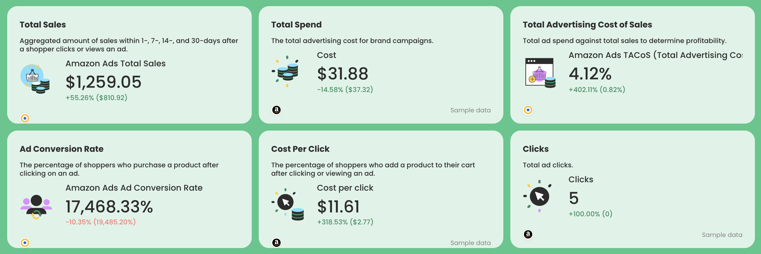
1️⃣ Core Sales and Profitability Metrics
Include:
- Amazon Ads Total Sales (1-, 7-, 14-, 30-day attribution)
- Total Spend
- TACoS = Ad Spend ÷ Total Sales
- CPC
- Ad Conversion Rate
TACoS is especially important for Amazon sellers. It shows how much of total revenue is consumed by advertising.
If TACoS drops while sales increase → efficiency improves.
If TACoS rises without sales growth → profitability risk.
2️⃣ Campaign Performance Breakdown
Include a granular table showing these metrics for each Amazon Ads campaign:
- Clicks
- Cost
- Sales within 1 day
- Sales within 7 days
- Sales within 14 days
- Sales within 30 days
This helps you:
- Identify high-performing campaigns
- Reallocate budget from low-performing ones
- Understand short vs long attribution windows
3️⃣ Ad Group Performance
Break down by ad group:
- Clicks
- Cost
- Sales (1/7/14/30 days)
This gives more granular control over bidding and targeting.
If a campaign performs well but one ad group underperforms, this section makes it obvious.
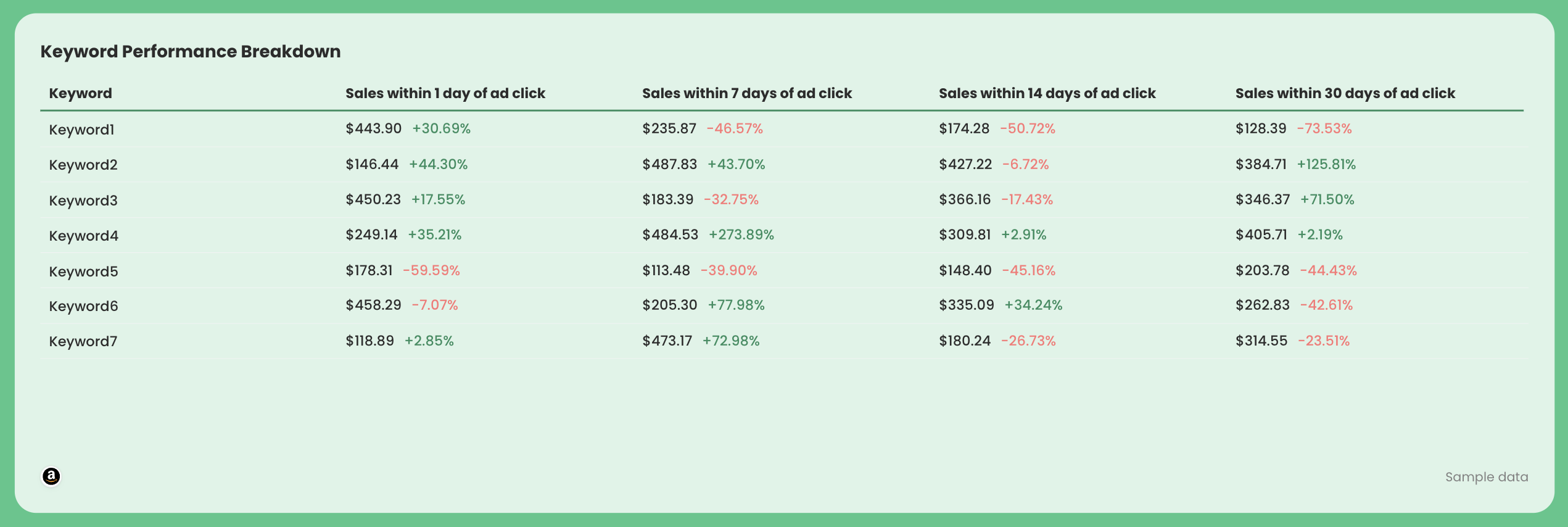
4️⃣ Keyword Performance Breakdown
Include a granular table showing:
- Keyword
- Sales within 1 day
- Sales within 7 days
- Sales within 14 days
- Sales within 30 days
This helps you:
- Pause wasteful keywords
- Increase bids on profitable search terms
- Identify long-tail winners
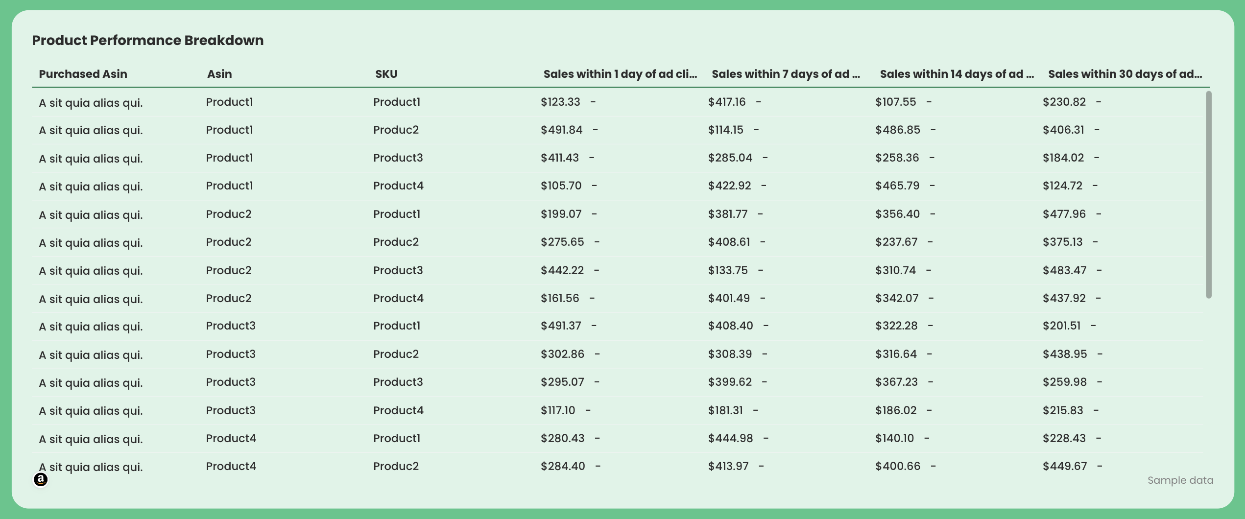
5️⃣ Product / ASIN Performance
Break down by:
- Purchased ASIN
- SKU
- Sales (1/7/14/30 days)
This shows:
- Which products ads are actually driving revenue for
- Which ASINs deserve more budget
- Which products convert poorly
6️⃣ Sales vs Cost Trend
Include a time-series graph comparing:
- Sales (by attribution window)
- Cost
This visual makes it easy to spot:
- Scaling periods
- Efficiency drops
- Seasonal performance shifts
The template includes a yearly trend visualization for this purpose
Best practices for an Amazon Ads dashboard:
✅ Always show TACoS alongside total sales and spend and ad conversion rate.
✅ Break down product performance by ASIN and SKU and sales within 1, 7, 14, and 30 days.
✅ Show keyword performance breakdown to see which keywords are bringing in more sales.
Published on Mar 04 2026
WRITTEN BY
YamonYamon is a Senior Content Marketing Manager at Whatagraph. With an eye for detail and a knack for always considering context, audience, and business goals to guide the narrative, she's on a mission to create genuinely helpful content for marketers. When she’s not working, she’s hiking, meditating, or practicing yoga.