The Importance of Using a Sales Graph - 8 Examples
If data is visually represented, it helps us to understand it better, easier, and more quickly. No matter if we’re highlighting a trend or comparing sales figures, a report or presentation is much clearer if we use sales graphs or charts.

Apr 17 2020●4 min read


Sales Graph and Chart
Generally, readers have difficulty understanding and compering more than two sales figures conveyed in a text. On the other hand, conveying the sales data in a visual image is more concise and effective. That’s why sales teams often use sales graphs or charts to present data and highlight trends and patterns.
By presenting clients or teams digestible visual data, we help them improve their overall performance, which, in turn, increases revenue. Using the right sales graph or chart helps us reach out to prospect at the right moment, thus boosting conversions in the process.
Try the Whatagraph Sales Reporting tool which may help you to track and report data at the right time to make the right decisions. 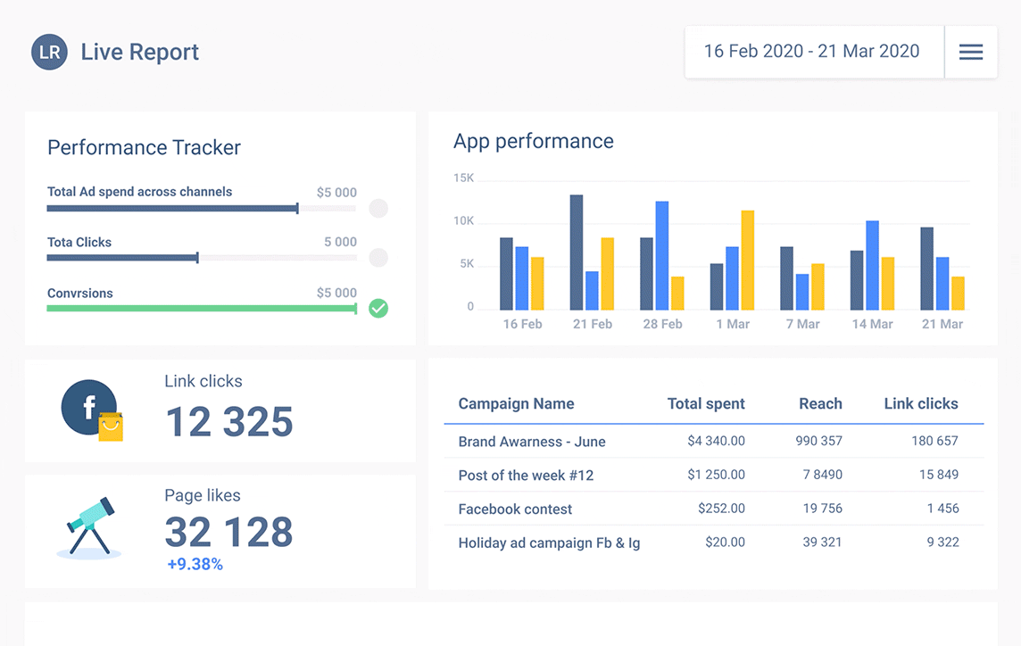
Whether we’re using sales graphs, charts, Gantt, sales chart templates, or any other form of a visual dashboard to analyze relevant data, we’ll not only meet but even exceed our targets. They will help us improve our business, making it more adaptable, informed, and economical. All these things contribute to a booming business.
What Is a Sales Chart?
It is a column chart showing how sales vary within a specific time frame. The products are presented on one axis and the total sales are presented on the other. There are many different versions that include other dimensions such as months or regions.
The best sales charts simplify the information we have instead of presenting everything and confusing the reader. Once we identify the most important information, we simplify it, sequence it into a story, and visualize it in a clear and concise chart.
How to Create a Sales Chart?
The first step to creating a sales chart is defining the plot area that will include the sales data. The area is enclosed by two axes, an x-axis at the bottom, and the y-axis at the left side of the chart.
The x-axis contains the known value or data/time categories, for example, dates, and the y-axis contains the measured value or counts, frequencies, and percentages, for example, sales revenue. The numerical scale y-axis is divided by tick marks or numbers.
The title of the graph summarizes chart data, whereas axis labels tell what is represented on each axis. There’s also a legend that describes the chart’s elements in written form. Check this informative piece prepared by Preply, if you ever wondered how to properly describe bar charts, and line graphs in appropriate business English.
8 Examples of Sales Charts
The type of sales chart we’ll use depends on the content we want to convey. Here are some of the best sales graphs and charts for optimal business results.
1.Sales Performance
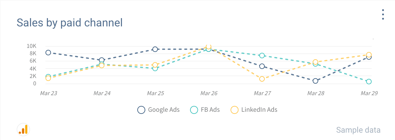
The sales growth graph shows a broad overview of sales performance. It presents many useful sales KPIs, such as the number of new customers this year, the revenue each of them drives, the cost spent on acquiring each customer or even product level actions.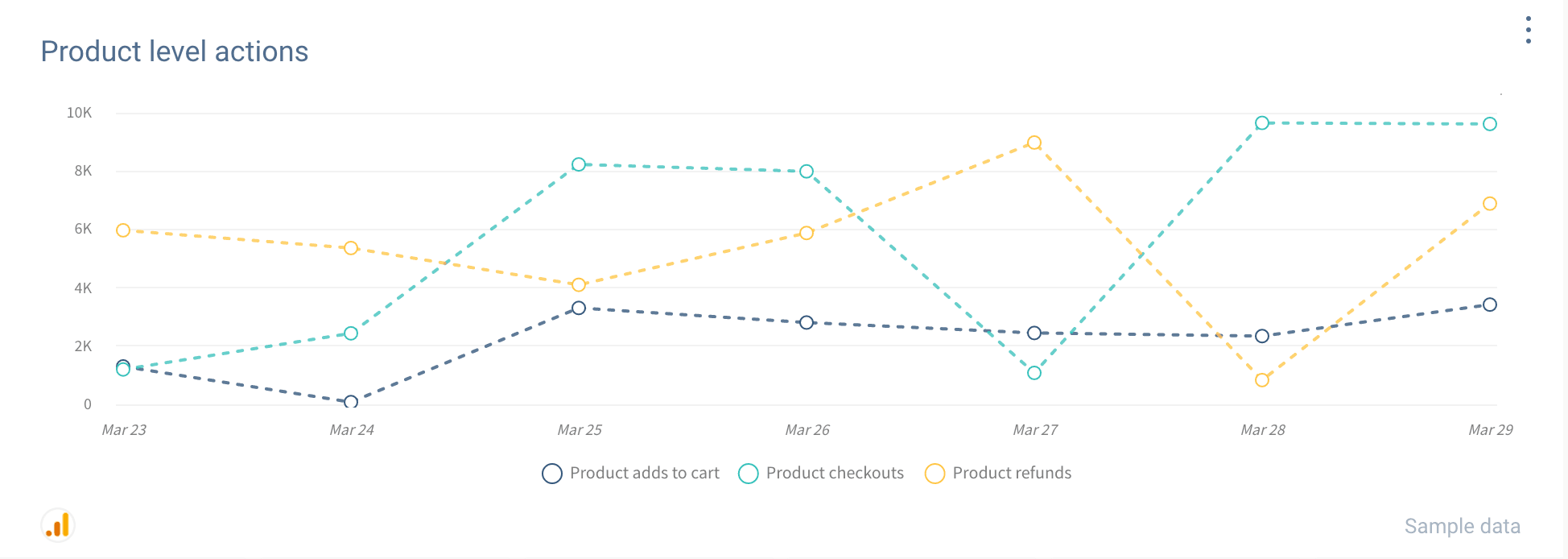
2.Sales Target (Actual vs. Forecasted Revenue)
This type of sales chart focuses on sales targets. Every successful team and business sets goals and keeps track of whether they are achieved. If you don’t know what your exact goals are, it’s even harder to achieve them.
3.Customer Acquisition Cost
This is one of the crucial sales KPIs you should monitor. Monitoring your customer lifetime value and how much it costs to acquire a new customer can tell you valuable information about your business. The lower the customer acquisition cost, the better.
But, if you have a higher customer lifetime value than your competitors, you may get ahead of them by affording a higher customer acquisition cost.
This sales chart shows the trends in your customer acquisition cost over time. If you didn’t embrace a higher customer acquisition cost, the sales graph could warn you about a rising trend.
4.Average Revenue Per Unit
With this sales graph, you can compare the customer acquisition cost with the revenue from each customer. This is very useful as it can show you whether you’re profitable.
5.Sales Cycle
With this sales graph, you can find out the average time an account takes to get through your sales funnel. It allows you to see your top sales managers or representatives based on their closing rates.
Generally, you’d like to see shorter sales cycles. However, don’t forget to see the size of the deals they are closing, as well as monitor the customer lifetime value of those customers.
Take these things into consideration when assessing the success of each sales representative or manager.
6.Sales Conversion
This sales graph presents sales conversion rates in detail. Sales-based businesses can increase revenue by increasing the size of the closed deals, the number of targeted leads, customer retention rates, or conversion rates of existing leads.
This example of a sales graph allows you to keep track of the effectiveness of your team when it comes to converting leads to opportunities and opportunities to closed deals.
Also, it allows you to see the number of leads you’re contacting and the number of people that get to each stage of the sales funnel. This graph shows you where you need to pay more attention, invest more, and get a higher return on investment.
7.Sales Growth Between Periods
This example of a sales chart is perfect for accelerated business growth and those who are focused on getting higher and higher sales numbers each quarter. It compares sales revenue to previous periods, even for each sales manager/representative.
8.Revenue & Sales Interactive Management Overview
This sales graph shows revenue and sales in a specific time frame, such as a monthly view. You can see sales revenue for each day, week, or month, thus figuring out the best time for your next marketing campaign. This, in turn, will help you boost your sales even more.
Conclusion
A sales graph presents insights into sales data more clearly so that we can understand it better and more quickly. With digestible visual data, we can help improve the overall performance of our teams and boost revenue.
Published on Apr 17 2020
WRITTEN BY
Gintaras BaltusevičiusGintaras is an experienced marketing professional who is always eager to explore the most up-to-date issues in data marketing. Having worked as an SEO manager at several companies, he's a valuable addition to the Whatagraph writers' pool.