Understanding Twitter Data Visualization
Owing to the advent of big data, people have access to an extensive range of data. But merely leveraging the data is not essential; instead, brands should know how to visualize it to their benefits. Data visualization is a process that helps companies assess the raw data and present them in a streamlined, informative, and appealing manner.

Sep 22 2020 ● 8 min read
Twitter is a broad platform, with over 300 million active monthly users. Merely data is not enough to get their attention. The way it is analyzed, interpreted, and presented plays an equally important role. And properly leveraging Twitter Analytics can be highly lucrative. How? Let’s find out.
What is Data Visualization?
Data visualization is referred to as the graphical representation of data and information. By leveraging visual elements such as maps, charts, and graphs, data visualization tools offer an accessible way to identify and understand trends, patterns, and outliers in data. In the Big Data sphere, data visualization tools and technologies are essential to assess the massive amount of information and make data-centric information.
Types of Data Visualization
Here is the list:
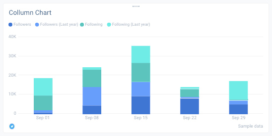
1. Column Chart
It is one of the standard tools for data visualization. A column is a simple and time-saving way of showing comparison among different data sets. A column chart comes with data labels along the X-axis with values or measured metrics presented on the Y-axis. The use of colors can accentuate key data points to track changes.
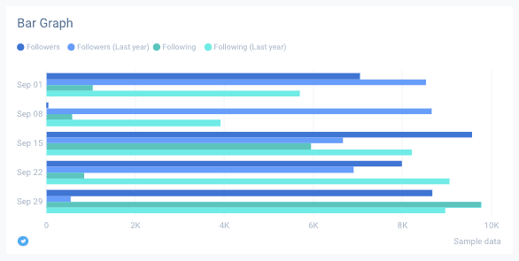
2. Bar Graph
People often use bar graphs and a column chart in the same way. Bar graphs are ideal for working with more comprehensive labels displaying negative numbers and comparing more than ten items.
3. Line Graph
It is another standard type of chart that is popular in visualization. It is designed to display changes, progresses, or trends that occur over time.
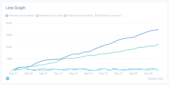
Line graphs work well when the data is continuous instead of being one with starts and stops. Similar to column charts, it also works on X-axis and Y-axis. Ensure to use solid lines and do not plot over four lines as they can become distracting.
4. Pie Chart
A pie chart shows one static number, which is divided into categories that include its portions. It is used to represent numerical amounts in different percentages, and when summed up, they all add up to 100%.
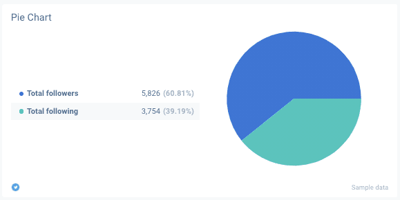
Digital marketers often use pie charts to breakdown marketing expenditures, customer device usage, customer demographics, online traffic sources, etc. It is ideal when analyzing different data points and looking at similarities between the other sets. It allows us to quickly determine outliers and gain a better understanding of overall data distribution.
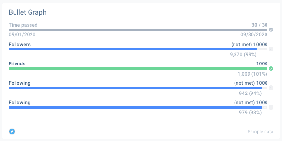
5. Bullet Graph
A bullet graph helps in visually tracking the progress. Similar to the bar graph, these include different visual elements. One primary measure in the bullet graph is compared against additional measurements to determine a deeper understanding and connection.
6. Bubble Chart
It showcases distribution or relationships. In this, the data points are represented in the form of bubbles. The size of the data set can vary based on the value.
7. Mekko Chart
This chart is mainly famous in the data analysis domain. It is an abbreviation for the Marimekko chart and has a layout similar to a stacked bar graph.
But instead of tracking time progression, X-axis in Mekko measures another dimension of the data sets. This allows comparison of values, the composition of each deal, and assessment of data distribution.
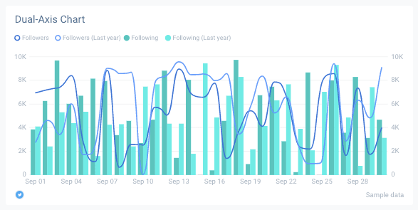
8. Dual-Axis Chart
Generally, visualization charts use one X-axis and Y-axis; this chart comes with a shared X-axis and two Y-axis. A Dual-axis chart combines the features of a line chart and column chart. It allows us to show the relationship between various variables and works well when working with three sets of data (one continuous and two grouped by category).
Why Invest in Twitter Data Visualizations?
Storytelling is where data visualization and social media cross paths. In fact, over the last two years, 90% of the data is generated solely for media networking. There are multiple ways in which marketers can benefit as Tweets Analyzer. Here is why investing in Twitter data visualization and creating great Twitter reports might be a good idea.
1. Enhanced Analytics
It helps marketers analyze reports, strategies, interests, etc. Harnessing this analysis, they can focus on areas that need more attention to generate the desired results.
2. Prompt Action
The human brain grasps visual data more quickly as opposed to table reports. Data visualization strategies allow marketers to highlight critical information, thereby encouraging necessary action.
3. Identification of Errors
Visualizing data assists in the timely identification of errors in the existing data. If the data suggests the wrong action, you can identify it sooner and remove it from the analysis.
4. Determining Patterns
Twitter collects a massive amount of data daily. And when the collected data is visualized correctly, it provides opportunities to identify significant patterns.
It enables marketers to understand the relationship between different data and derive more meaning out of it. Identifying these patterns and deriving valuable insights is vital for marketers to achieve their objectives.mm
5. Seamless Socializing
It is the data visualization that determines how your content gets reflected on the news feeds. And when your content is presented in a streamlined and easy to understand format, it allows you to build a better connection with the audience.
6. Staying Trendy
Using the latest trends, the right way is one of the most significant factors that make a social media marketing strategy successful. Data visualization allows marketers to identify the latest trends. This way, they can curate content based on it and keep the audience engaged.
Best Ways to Implement Visualization of Twitter Data
Twitter data visualization is all about telling a story while providing relevant information. This process should start with the end goal in mind. The following is the list of some crucial strategies that will make Twitter Analytics easier and efficient:
1. Select the Right Graphs and Charts
When it comes to data visualization, there is no one size fit approach. The focus should be to select the right format for visualization that will be able to depict the story and answer the questions generated by the data while staying relevant to the main objective. Combining charts can be helpful to marketers. This way, they can see the bigger picture and gain better insights to drive action.
Following is the list of some of the standard formats for Twitter data visualizations:
● Bar charts: They are useful when comparing categories with one measure. A bar chart is especially useful when one data needs to be split into different types.
● Line graphs: They connect different data points, displaying them as one constant evolution. A line graph offers an easy way to visualize changes in a single value against another.
● Bullet charts: They display progress against a particular goal by evaluating measures.
● Pie charts: These are primarily used to add information to other forms of visualizations.
● Maps: These are used for visualizing questions that are centered on location or facilitating geographical exploration.
● Histograms: These can identify the data clusters and effectively compare categories.
2. Add Clear Color Cues
Color is an essential part of Twitter Analytics. However, they should be used in a balanced and straightforward manner. Use colors to accentuate and highlight specific information.
Marketers must use intuitive colors that make sense to the audience so that they can quickly process the information. It will better to show consistency across different values or highlight contrasts within the data.
3. Use Size to Visualize Values
Size can help in highlighting important information and include contextual clues. Sizes are significant aspects to denote scaled values. And size can be adjusted based on the amount of the data. This approach also works while working with maps.
When there are different data points in the same size, they blend, making them difficult to differentiate apart. Marking values in different sizes and adding colors can make it easier for the audience to understand the depiction.
4. Keep the Layout Patterns Predictable
As mentioned above, humans are more drawn to visual indicators that tell us information at a single glance. We seek patterns, and when they don’t make sense, it becomes difficult to comprehend the visualization we are trying to convey.
Whether it is sequential, numeric, or alphabetical, it is crucial to ensure that the format makes sense to the audience. And if there are multiple formats, there should be a clear and conclusive connection between them all.
5. Including Shapes and Designs
Context helps in deciphering information at first glance rather than having to sit and scrutinizing it. Shapes and designs relevant to the subject matter can help in telling a story. Shapes and designs, when used right, can make the visualization more exciting and intuitive.
6. Careful Application of Text
At times when visuals do not give enough information, adding texts becomes essential. The kind of book and the amount of text can enhance the overall visualization.
When there is too much text or when they are not properly organized, it can be highly distracting for the audience. Each text should convey important information and complement sizes, charts, colors, and designs.
Best Tools for Visualizing Twitter Data
Following is the list of best tools available in the market:
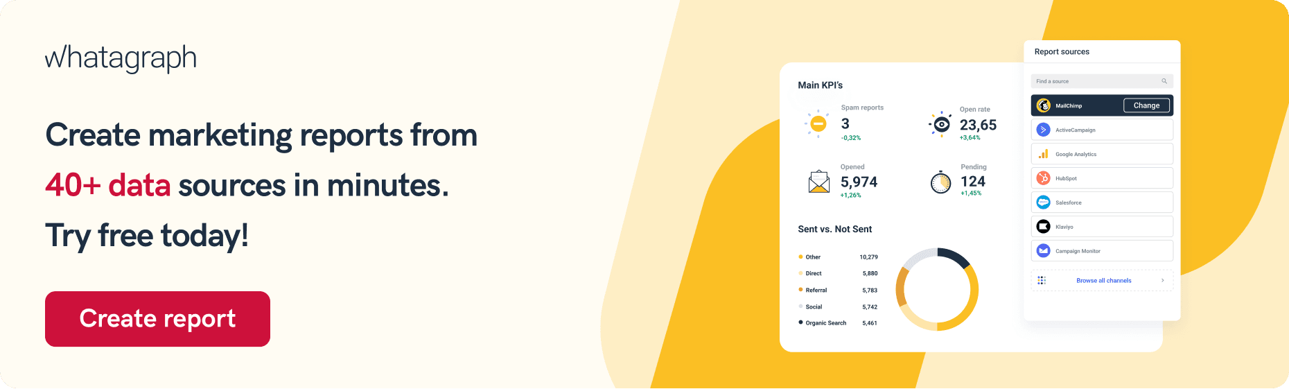
1. Whatagraph
It is a popular automated visual marketing tool with a fully managed Twitter integration. It enables marketers to create reports within a matter of minutes. It interprets that collected data and simplifies to make it more understandable and usable. Whatagraph offers automatically generating visual & simple to read Twitter analytics reports that will engage your clients and team.
2. Audiense
Audiense is a valuable tool that allows people to analyze and visualize networks in multiple ways. It leverages social data to help in understanding the target audience. The tools offer different filter options, thereby allowing the Twitter analysis free of a more specific group of audiences.
The valuable insights provided by Audiense can help in the understanding audience, make better marketing decisions, drive high performance, and improve relevancy.
3. TweepsMap
TweepsMap is another tool that analyzes and visualizes the Twitter Account network. It shows how the followers are distributed on the map with respect to the percentages. The tool also indicates inactive people who have not tweeted within the span of 3 to 6 months.
4. Foller.me
Foller.me is a free tool that allows people to analyze essential statistics about Twitter users. It has a good user interface. It explores topics, mentions, and hashtags.
5. Twitonomy
Twitonomy is a robust platform that offers a different method of analysis and visualization. Some of its features include tracking follower growth, detailed and comprehensive analytics, getting valuable insights, backup/export and analyze tweets, etc.
Final Thoughts
There is a need for Tweets data visualization because a visual overview of information makes it easier to determine trends and patterns that are going through multiple rows of spreadsheets. This is how the human brain functions.
Considering that the purpose of data analysis is to acquire insights, data becomes more valuable when it is visualized. It allows us to communicate complex data in a simple form. Effective data visualization is imperative for brands trying to gain more vital Twitter Analytics exposure.
Without proper visualization, essential information and message can be lost. Using the right type, strategy, and data visualization tool will allow companies to present their data in an easy to understand and transparent manner.
Published on Sep 22 2020
WRITTEN BY
Roberta AukstikalnyteRoberta is a content writer and editor who strives to share industry updates with her readers. Her professional background includes Public Relations and Customer Success.