6 Best AI Marketing Analytics Tools in 2026
The best AI marketing analytics tools in 2026 connect your marketing data, surface key metrics automatically, and let you ask plain-language questions about performance, all without hours of manual digging or a dedicated data analyst.
This list covers 6 tested AI marketing tools for performance marketers, marketing leaders, and agency teams who need faster, more trustworthy insights from their data.

Jun 15 2026●10 min read


Most marketers recognize the value of AI insights, with ActiveCampaign finding that AI tools save 13 hours a week on manual tasks, yet only 13% fully trust AI on its own (according to Ascend2’s 2025 data).
The best AI marketing analytics tools help by doing a few things really well:
✅ Bring all your marketing data into one governed layer through native, stable connectors you don't need to babysit
✅ Keep cross-channel metrics accurate and consistently defined, so a blended number means the same thing everywhere it shows up
✅ Let you analyze data conversationally, whether that's an AI chat inside the platform or MCP support that connects Claude or ChatGPT directly to your real metrics
✅ Support proactive monitoring rather than reactive, so issues are caught early instead of after the fact
✅ Make deeper analysis fast and self-serve, so both internal and external teams can explore questions and validate assumptions without waiting on a data analyst
In the sections below, we’ll break down the best AI marketing analytics tools - and how they stack up against what teams actually need.
6 Best AI Marketing Analytics Tools in 2026
Here are the best AI marketing analytics tools we’ll review in this article:
- Whatagraph
- AgencyAnalytics
- Klipfolio
- Databox
- NinjaCat
- TapClicks
Already using AI marketing analytics software and want to compare how it stands against the competitors’ features?
Here's a simple comparison table:
| Tool | Best for | Key AI features | Pricing |
| Whatagraph | Agencies and marketers needing a governed data layer with AI reporting and MCP | Whatagraph IQ (reports, summaries, chat), MCP for Claude and ChatGPT, anomaly detection | Free forever; paid from $229/mo |
| AgencyAnalytics | PPC and SEO agencies needing built-in rank tracking | Ask AI, AI Widget Summaries, MCP access for Claude, and ChatGPT | From $25/client/mo |
| Klipfolio | Large data teams needing centralized metric governance | PowerMetrics AI Insights, NLP query-to-visualization, MCP Server (Beta) | Free; paid from $120/mo |
| Databox | Boutique agencies and small businesses wanting conversational analysis | Genie AI Analyst, MCP support for Claude and ChatGPT, AI performance summaries | From $79/mo (agency); $159/mo (business) |
| NinjaCat | Agencies and brands with dedicated data teams needing agentic AI | AI Agents library (chained workflows), MCP Server, AI Insights Generator | Custom pricing only |
| TapClicks | Medium to large agencies needing a full marketing operations platform | AI widget creation, AI Insights Agent, Build-Your-Own Agent, SmartStory | From ~$599/mo |
1. Whatagraph
Most suitable for: Mid-size marketing agencies and multi-location operators who want one governed data foundation behind their reports, dashboards, and AI answers
Whatagraph is a marketing intelligence platform built around one governed data layer.
Define a metric, blend, or dimension once, and that same definition powers every dashboard, report, and AI conversation, so a blended number means the same thing whether it shows up in a client report or an answer from Claude.
Here's what that looks like in practice:
- Connect 60+ marketing channels: Bring data from 60+ marketing channels through native connectors you don't need to babysit. No third-party connectors or pipelines to maintain.
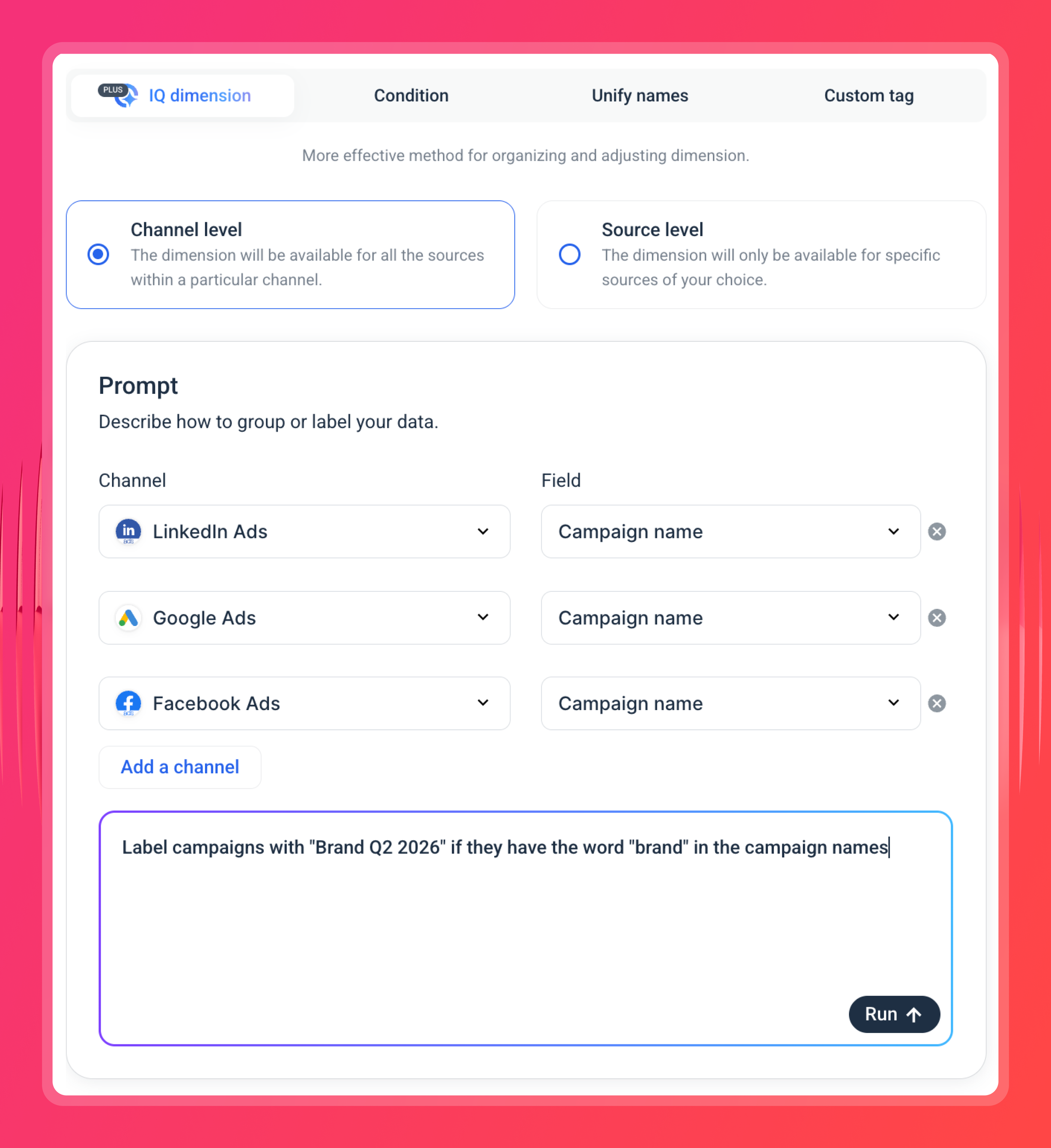
- Normalize and govern your data: Create custom metrics like Marketing Efficiency Ratio (MER) using a simple formula builder. Blend data from different channels (e.g. Google Ads + GA4). Define new dimensions using AI - just choose your channels or sources and describe what kind of dimensions you want to create.
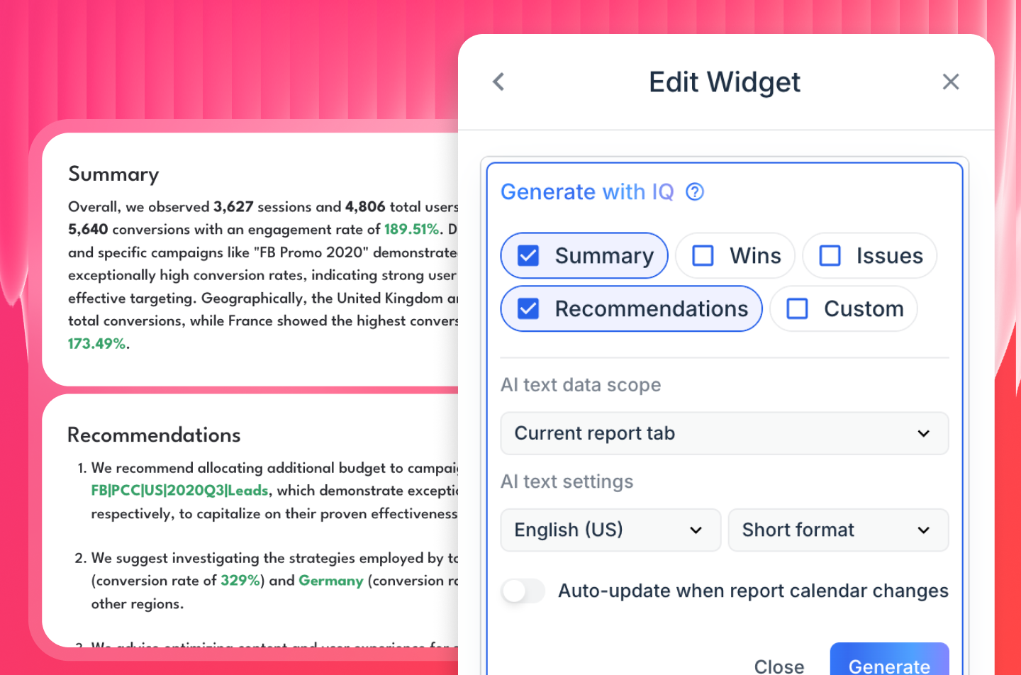
- Report fast: Use Whatagraph IQ to create and brand marketing reports in seconds using artificial intelligence. Let AI write the first draft of performance summaries based on the connected data in your report. Ask IQ Chat questions about your data and get back accurate answers.
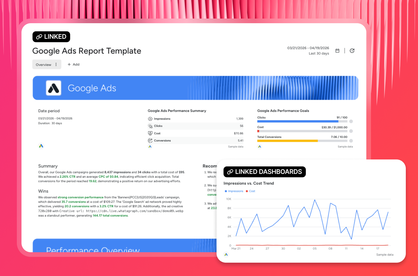
- Scale without extra headcount: Organize data sources and reports in folders - whether they're for each client, location, or Account Manager. Create and save reports as “team templates” and reuse them the next time you onboard a new client. Have one linked master template, edit it, and changes automatically cascade to all other reports linked to that template. Whatagraph was built for scale.
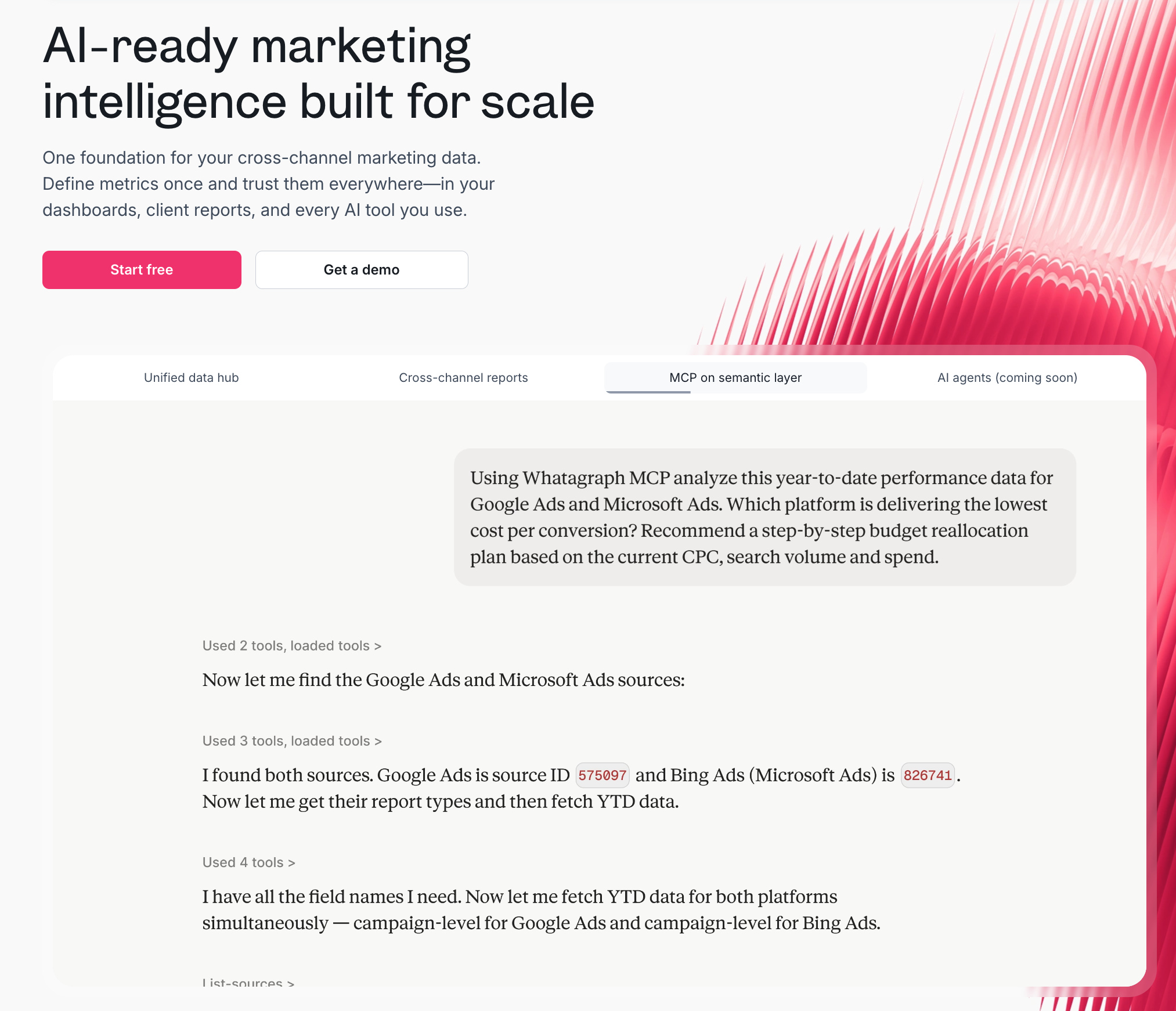
- MCP for Claude and ChatGPT: Whatagraph's MCP connects Claude or ChatGPT directly to the same governed data layer behind your reports, not raw, ungoverned data pulled straight from an API. Ask "what's blended ROAS across all clients this month?" through Claude, and the answer matches what's already in your client reports, because it's pulling from the same definition.

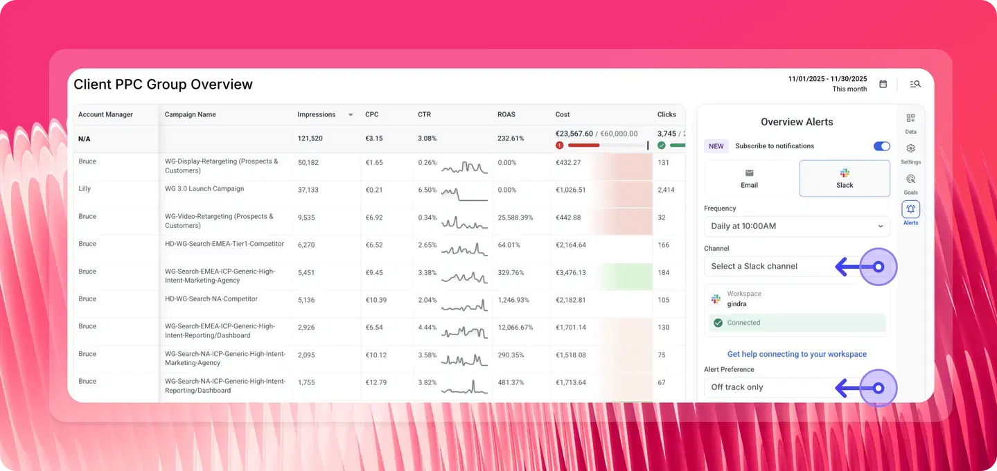
- Proactive monitoring with Overviews: build a single table-style view across clients, campaigns, or locations, set goals, and get Slack or email alerts the moment a metric needs attention, so issues are caught early instead of after the fact.
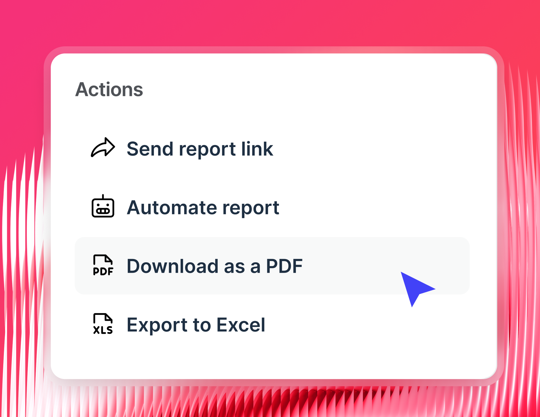
- Flexible sharing: send reports as live links, scheduled PDFs, or automated emails, or push data straight to a warehouse like BigQuery for teams that need it further downstream.
Because reporting is automated and accurate by default, teams can finally trust the data they analyze. That’s why agencies like Maatwerk Online save 100 hours a month—time they now spend on decisions, not data prep.
Lars Maat, Co-founder of Maatwerk Online, says:
Whatagraph’s AI saves time and energy for our marketing specialists. The hours we’re saving are just pure profit—we can now focus on more strategic work that helps our agency and our clients grow.
Try it free for 14 days with Whatagraph.
Whatagraph reviews from real users
"I use Whatagraph every month to show my client roster their marketing campaign metrics data. It solves a unified vision of all the campaigns we run with our clients; it's easy to understand and to connect platforms." (Source)
“The dashboards are clean, easy to build, and perfect for client reporting…I love how I can set up automated reports that look great and are client-ready. No more fiddling with spreadsheets or wasting time building slides.” (Source)
"It is extremely flexible, the visuals are beautiful (which is important for having clients be engaged in the reports)." (Source)
Pricing
Whatagraph's pricing scales with how much data you actually use rather than how many people are on your team, and every plan includes unlimited users and unlimited reports. Check the pricing page for a full breakdown by plan.
2. AgencyAnalytics
Most suitable for: PPC and SEO marketing agencies
AgencyAnalytics is a user-friendly reporting software, designed for small to mid-sized marketing agencies that need streamlined monitoring and reporting for their ad campaigns.
You can connect to 85+ data sources, including Google Analytics 4, Google Ads, Facebook, Instagram, Shopify, HubSpot and LinkedIn.
MCP access for Claude and ChatGPT is now bundled into the Core plan rather than sold as an upsell, so connecting an AI assistant to your client data costs nothing extra. The catch is what it connects to: queries run against individual client campaigns, keywords, and backlinks rather than one cross-client data layer, so an agency on 20 accounts is still asking account by account.
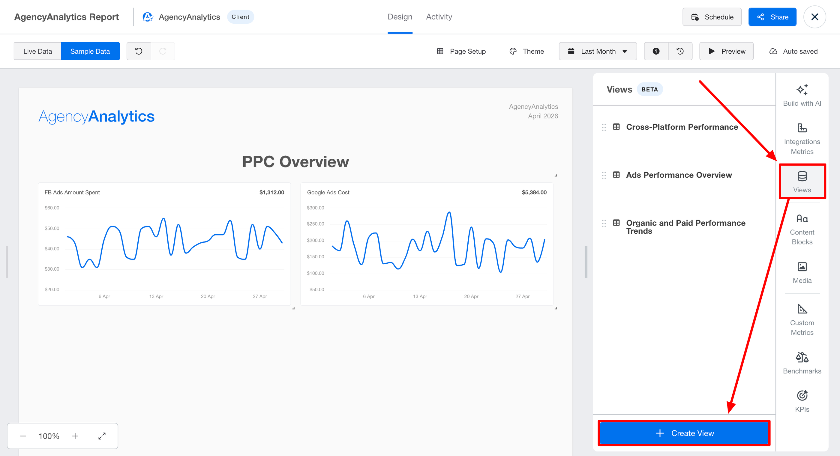
AgencyAnalytics also offers the Ask AI feature, which you can use to quickly examine the dashboard or report results in depth.
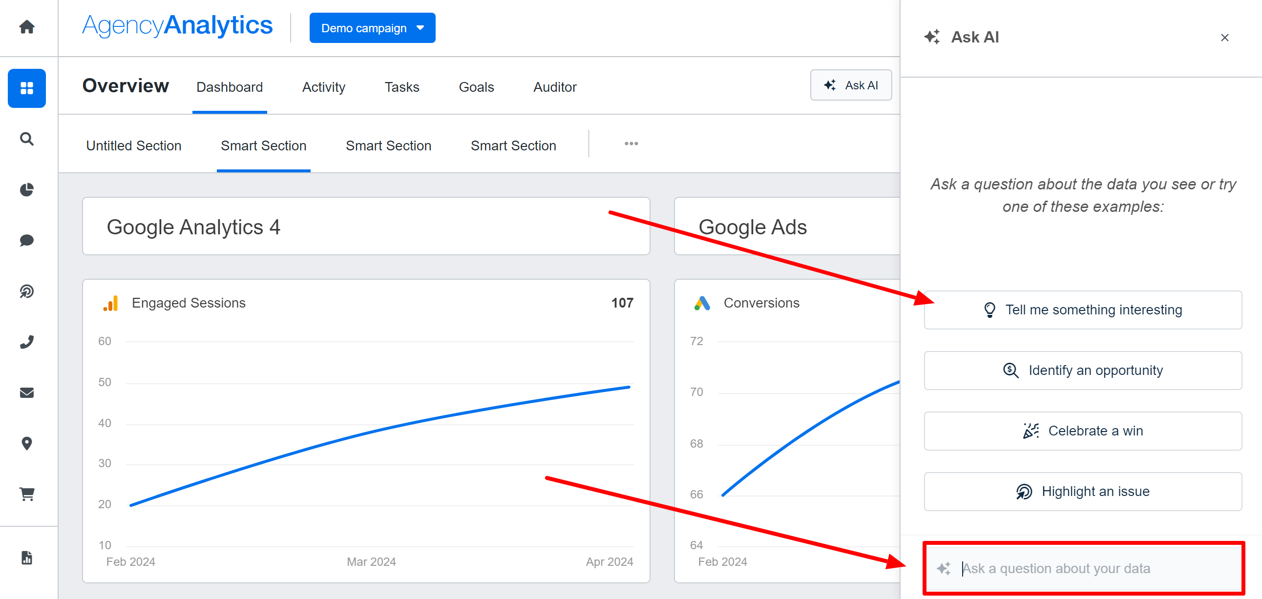
You can ask your own questions about the data on your dashboard or select one of the pre-made prompts.
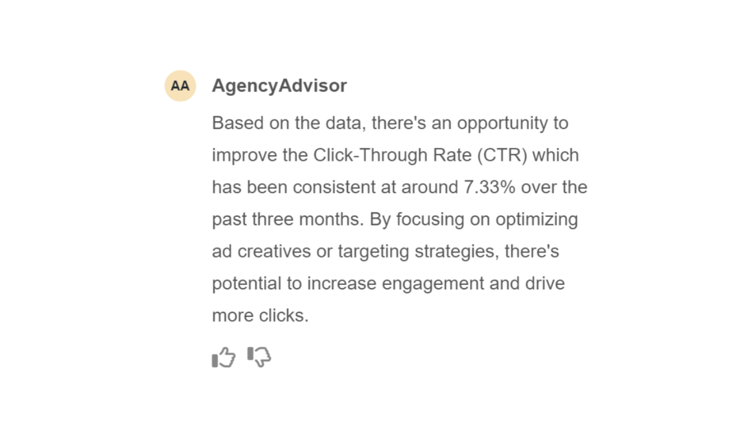
For example, if you select the “Identify an opportunity” prompt, it can uncover an area which could be improved to increase engagement.
A newer feature, Views, lets you build a cross-channel reporting table for a client by describing what you want in plain language inside the toolbar.
The difference from a governed data layer is that Views are built per report, so the same blended metric on five client reports means describing it five separate times.
(Source)
On the reporting side, AgencyAnalytics is easy to use, as you don’t need technical expertise to create decent-looking reports.
However, if you want to customize them any further than the basics, there’s a steep learning curve.
We’ve also heard multiple times that users wish for more flexibility in redesigning their visuals on AgencyAnalytics.
Another complaint is that the platform can be unstable, as sources can disconnect frequently due to “service bandwidth” issues.
This is especially evident with social media or proprietary software connections.
Key features:
- Direct integrations
- Ready-made templates
- White-label reports and branding
- User roles and collaboration
- MCP access for Claude and ChatGPT
- AI Widget Summaries and Ask AI insights
- Views: AI-built cross-channel reporting tables
AgencyAnalytics reviews from real users
"I most appreciate how easy it is to integrate with client channels, and the responsiveness of their customer support." (Source)
"AI feature is not yet there to make the most out of AA. Hopefully with time that will also be valuable." (Source)
"I was able to analyze multiple analytics (ads, website, etc) for our clients from one place." (Source)
Pricing
AgencyAnalytics offers two pricing plans as of June 2026:
- Core: $25/client/mo, or $20/client/mo billed annually.
- Enterprise: Custom pricing, starting at 25 clients.
AgencyAnalytics also offers a Rank Tracker add-on at $50/mo per 500 keywords for agencies that need built-in SEO rank tracking.
3. Klipfolio
Most suitable for: Large data teams at companies and large agencies
Klipfolio is a data analytics and business intelligence platform in one. It offers two key products:
- PowerMetrics: Designed for data teams at large companies, this is a data analytics tool to centralize, standardize, and share accurate metrics throughout the organization. Non-data teams can then use these certified metrics for their dashboards and reporting needs.
- Klips: These are your regular data visualization dashboards and reports. Klips integrates 130+ platforms, and you can also use the Rest/URL option for custom integrations.
With PowerMetrics, you can connect all your data sources and more:
- Create a curated metric catalogue for other business teams with access control and governance features.
- Run self-serve analysis and AI insights.
- Store data in one place—in your data warehouse, semantic layer, or in PowerMetrics itself.
- Share transformed and unified metrics with anyone in the organization.
These features help you speed up decision-making and reduce ad hoc requests to data teams.
That is if you have a dedicated data team in the first place.
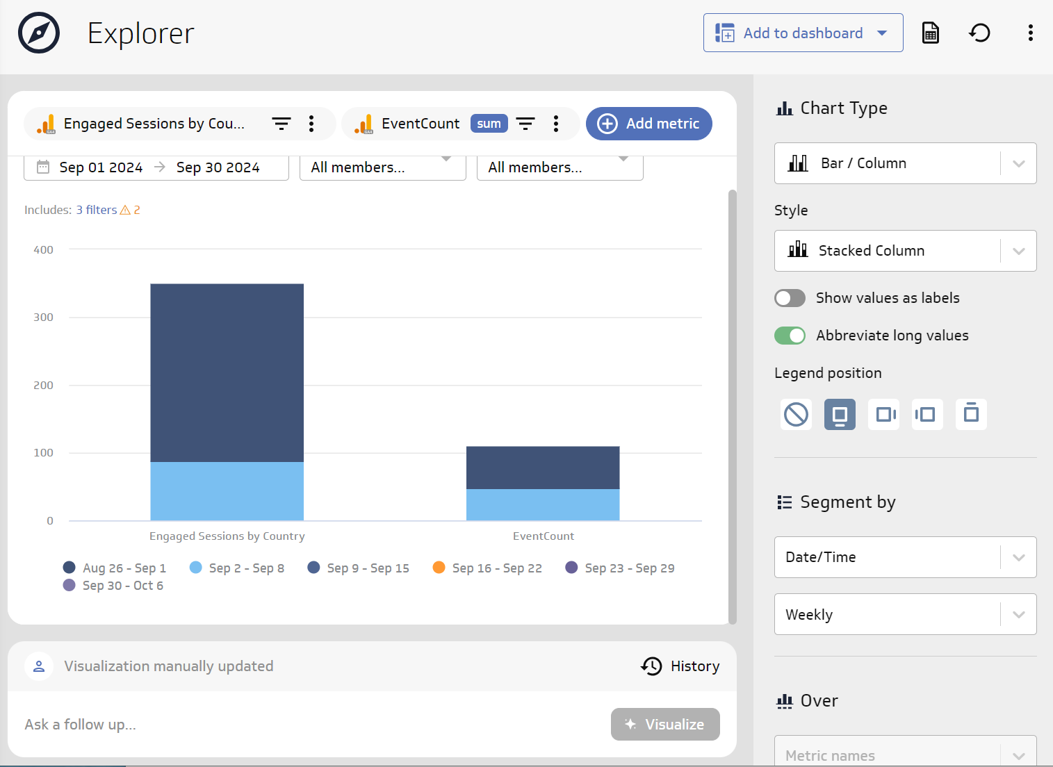
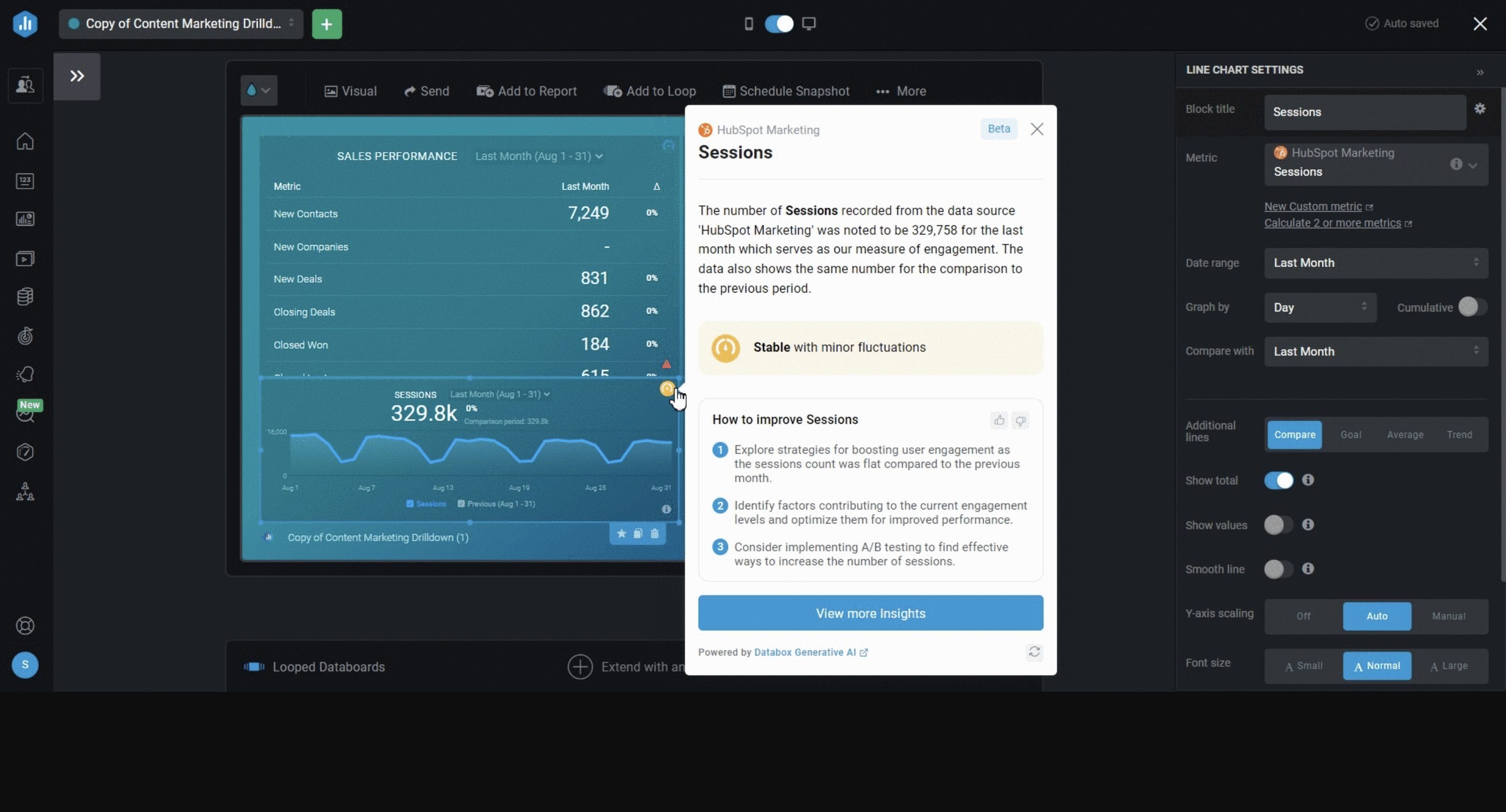
You can use PowerMetrics’ AI functionality to converse with your marketing data using natural language.
The natural language processing algorithm can interpret your questions and automatically create the visualizations you need.
When you discover something you want to share, you can save the visualization to a dashboard for easy access.
Getting started with Klipfolio is easy. Once you create a Trial account, you get access to your first dashboard.
But this is where things get complicated. To visualize your data, you’ll first need to create a “Klip”, which is in a different tab from the dashboard.
There are some pre-made Klips but for the most part, you’ll need to build a custom one.
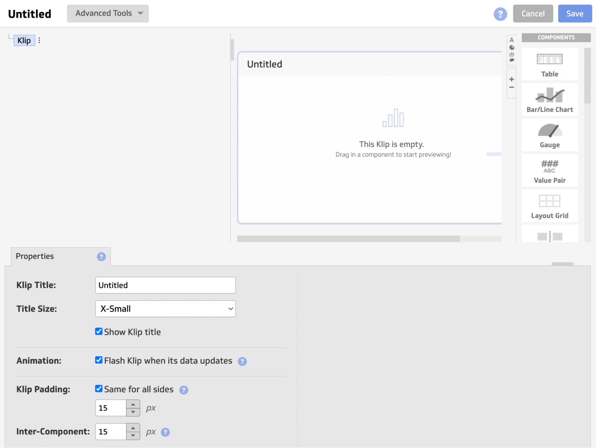
The interface to create a custom Klip can be confusing and clunky (although there is an interactive tour).
It can take you anywhere from 5 to 30 minutes to build a Klip, depending on how complex you want it to be.
Key features
- 130+ integrations, including warehouses, SQL databases, and file-sharing services
- Data blending, unifying, aggregating
- Custom metrics and dimensions
- AI insights: goal tracking, forecasting, anomaly detection (PowerMetrics only)
- MCP Server in beta for Claude and ChatGPT (PowerMetrics only)
- Custom dashboards and reports
- Export dashboards as PDF or image files. Export only individual clips as CSV
- Scheduled reports
Klipfolio reviews from real users
"It was not very user-friendly, considering you need to code just to create widgets and visualizations." (Source)
"What I really like about Klipfolio is that it's super easy to pick up, connects smoothly with lots of data sources, the dashboards get used all the time (daily or a few times a week)." (Source)
"Seeing all of the pertinent data at a glance is really helpful." (Source)
Pricing
Klipfolio offers separate pricing tracks for Klips business and agency plans, billed annually as of May 2026:
Klips business:
- Base: $120/month for 3 dashboards and a 4-hour refresh
- Grow: $190/month for 10 dashboards and 1-hour refresh
- Team: $310/month for 20 dashboards, 15-minute refresh, and SSO
- Team+: $600/month for 40 dashboards, up-to-the-minute refresh, and priority support
Klips agency:
- Agency Starter: $160/month for 5 dashboards and 5 clients
- Agency Lite: $240/month for 15 dashboards and 15 clients
- Agency Pro: $440/month for 30 dashboards and 30 clients
- Agency Premier: $900/month for 80 dashboards and 80 clients
All Klips plans include unlimited users, and a 14-day free trial is available. PowerMetrics, where the AI features live, is priced and purchased separately.
4. Databox
Most suitable for: Boutique agencies and small businesses
Databox is a data reporting and analytics platform for growing businesses.
You can integrate with 100+ marketing tools and connect custom data through Google Sheets or Excel. Then, you can visualize this data directly on Databox using pre-built metrics and templates.
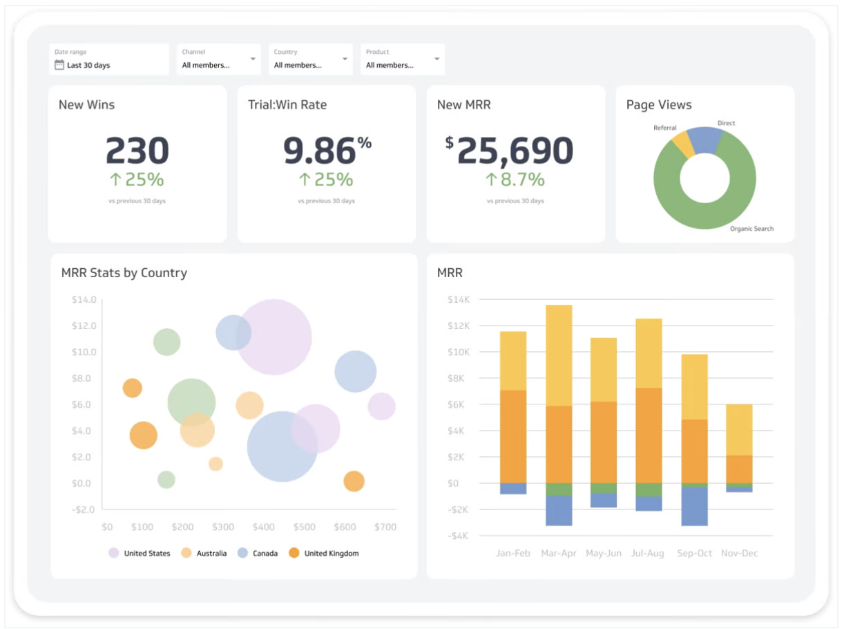
Once you log in to Databox, you’ll see an overview of your key metrics and performance summaries created by generative AI.
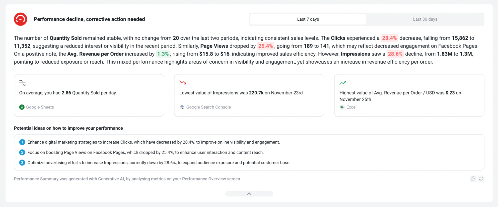
You can use generative AI performance summaries to get personalized recommendations for your metrics, goals, and Databoards.
For example, to get the AI summary for a specific Datablock, hover over the Databoard and click “Edit”.
This will open the Databoard in the Designer. Click on the “Performance Indicator” icon in the top right corner of the Datablock.
This will open the performance summary for that specific Datablock.
In 2026, the AI layer got a real upgrade with Genie, Databox's conversational AI analyst. Instead of just summarizing a widget, you can ask Genie a plain-language business question and get a clear visual answer with an explanation, no dashboard-building or SQL required. Genie is available from the Growth plan and up.
These AI insights help you understand performance at a glance.
However, things get complicated when you actually start to build your own dashboard.
You’ll need to manually configure three separate components:
- Metrics: individual metric widgets
- Databoards: live data dashboards (mostly for internal teams)
- Reports: PowerPoint slides style reports (mostly for clients or C-Suite)
For example, within a Databoard, you’ll need to manually customize each widget, e.g. a line chart.
And if you want reports, you’ll need to create a separate “Slide presentation” and manually configure the design all over again.
Databox’s reports are also not linked, which means you’ll need to edit them one by one rather than in batch.
All of these can add hours to reporting.
Databox users online also say their integrations break often and there are frequent data outages.
In addition, there’ve been multiple reports of Databox running very slow.
Key features
- 100+ integrations
- Genie AI Analyst for conversational, plain-language insights
- MCP support for Claude and ChatGPT
- Native visualization dashboards and reports
- Dashboard and report templates
- Slack, email, or in-app alerts
- KPI benchmark groups
Databox reviews from real users
"The free plan now includes less databoards. So, we've had to make accounts for each of our clients instead of have all of our clients on an agency account." (Source)
"Its ease of use, combined with broad database integrations, accelerates adoption." (Source)
"I like that Databox helps with sending automatic reports to clients, which means I don't have to manually send them." (Source)
Pricing
Databox runs two separate pricing tracks as of May 2026, both billed annually:
Business:
- Free Forever: 3 data sources, 1 dashboard, 3 users, 10 custom metrics, daily sync, MCP access.
- Pro: $159/month for 3 data sources, unlimited dashboards, users, and custom metrics, hourly sync, AI Analyst, reports, and goals.
- Growth: $399/month for everything in Pro plus datasets, raw data export, AI performance summaries, predictive analytics and forecast modeling, and anomaly detection.
- Premium: $799/month for 50 data sources included, plus add-ons bundled (white-labeling, OKRs, advanced security, 15-min sync).
Agency:
- Agency Starter: $79/month for 3 data sources, 10 dashboards, 5 client accounts, and hourly sync.
- Agency Pro: $159/month for unlimited dashboards and client accounts, plus AI Analyst and goals.
- Agency Growth: $399/month for everything in Agency Pro plus AI performance summaries, anomaly detection, and forecast modeling.
- Agency Premium: $799/month for 50 data sources, plus all add-ons bundled in.
Databox also offers paid add-ons like white-labeling ($200/month) and a dedicated reporting specialist ($160/month).
5. NinjaCat
Most suitable for: Marketing agencies and brands with dedicated data scientists
NinjaCat is an end-to-end platform for connecting to your data sources, cleaning the data, visualizing it, and shipping it to destinations.
You can integrate with 150+ pre-built connectors, including CRM, search engine advertising, web analytics, e-commerce, email marketing, and project management tools. Your data lands in NinjaCat's fully managed Data Cloud, which runs on Snowflake, so pipelines, ETL, and semantic modeling are handled for you.
As far as artificial intelligence and machine learning options are concerned, NinjaCat has expanded its offerings:
1. AI Agents: A full library of pre-built, task-specific agents organized in a browsable AI Agent Showcase. Categories include negative keyword discovery, budget pacing, creative auditing, SEO rank summaries, client renewal alerts, and more.
For example, the Campaign Performance Monitoring Agent uses predictive modeling to monitor ad spend in real-time, alerting you to overspending and inefficiencies to protect your budget."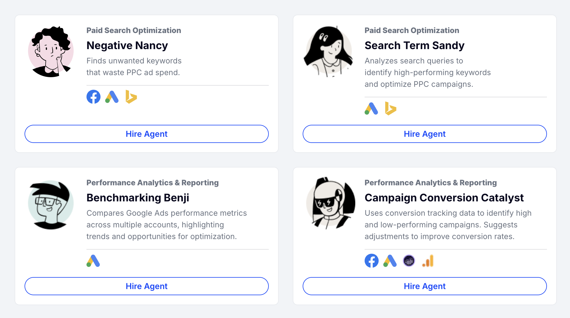
2. MCP Server support: Claude, ChatGPT, and other AI tools can connect to NinjaCat's Data Cloud, set up through the Agent Builder. NinjaCat frames this less as a chat interface and more as a way for AI agents to execute marketing workflows directly.
3. Generative Data Apps: Describe the dashboard, report, or app you want in plain English, and AI builds it, with the underlying SQL and transformation logic visible if you want to check or edit it.
NinjaCat also launched a Snowflake Connected App in late 2025, letting enterprise customers run NinjaCat's full AI agent platform inside their own Snowflake environment with a zero-copy architecture, meaning the data never leaves Snowflake.
When it comes to creating reports, you can start from a blank template (that looks like a “canvas”) and add and adjust metric widgets as needed.
A newer Report Studio UI is rolling out in 2026 with a Sankey chart option for funnel and budget visualization.
Key features
- 150+ pre-built connectors
- Fully managed Data Cloud running on Snowflake
- AI Agents library with chainable, task-specific automations
- MCP Server support for Claude, ChatGPT, and other AI assistants
- Generative Data Apps built from natural-language prompts
- No-code transformations and calculations
- Data transfer to BI tools and data warehouses (Snowflake, BigQuery, Redshift, S3)
- White-label options
- White-glove setup and service
NinjaCat reviews from real users
"I like the ability to seamlessly connect to multiple data sources that include GA4, Google Ads, Meta Insights, Yext, and more to a dashboard and monthly reports." (Source)
"Incredibly easy UA to navigate. Also, the customer service personnel are incredibly helpful." (Source)
"Reports were easy to read, when or if they generated correctly." (Source)
Pricing
NinjaCat doesn't offer fixed pricing plans, and no information is available on its website.
Based on market data, enterprise contracts typically start around $1,500/month and scale up depending on the number of data sources, reporting volume, and AI Agent seats you need.
6. TapClicks
Most suitable for: Medium to large companies with PPC and SEO campaigns
 TapClicks is not your regular digital marketing platform - it’s eight different products bundled into one. Here’s a quick breakdown of what each component does:
- TapData – Move your data between platforms, create custom data blends, and format it however you need.
- TapReports / SmartReports – Build custom dashboards and automate reporting for clients. Includes SmartSlides for auto-generated branded PowerPoint decks and SmartEmail for AI-written email summaries.
- TapAnalytics – Spot market trends and opportunities from your data to improve decision-making.
- TapInsights / AI Insights Agents – Get AI-powered recommendations to optimize campaigns, now embeddable directly inside Report Studio with one click, rather than dashboards only.
- TapOrders – Marketing automation for client orders, CRM imports, and online forms, ideal for eCommerce businesses.
- TapWorkflow – Streamline task management and workflows to boost efficiency.
- Raven by TapClicks – Run SEO audits, keyword research, and rank tracking.
This might sound impressive, but according to user reviews, TapClicks tries to do everything but struggles to excel at any one thing.
We’ve heard complaints like frequent connection failures, inaccurate reporting, and a steep learning curve - even with months of onboarding support.
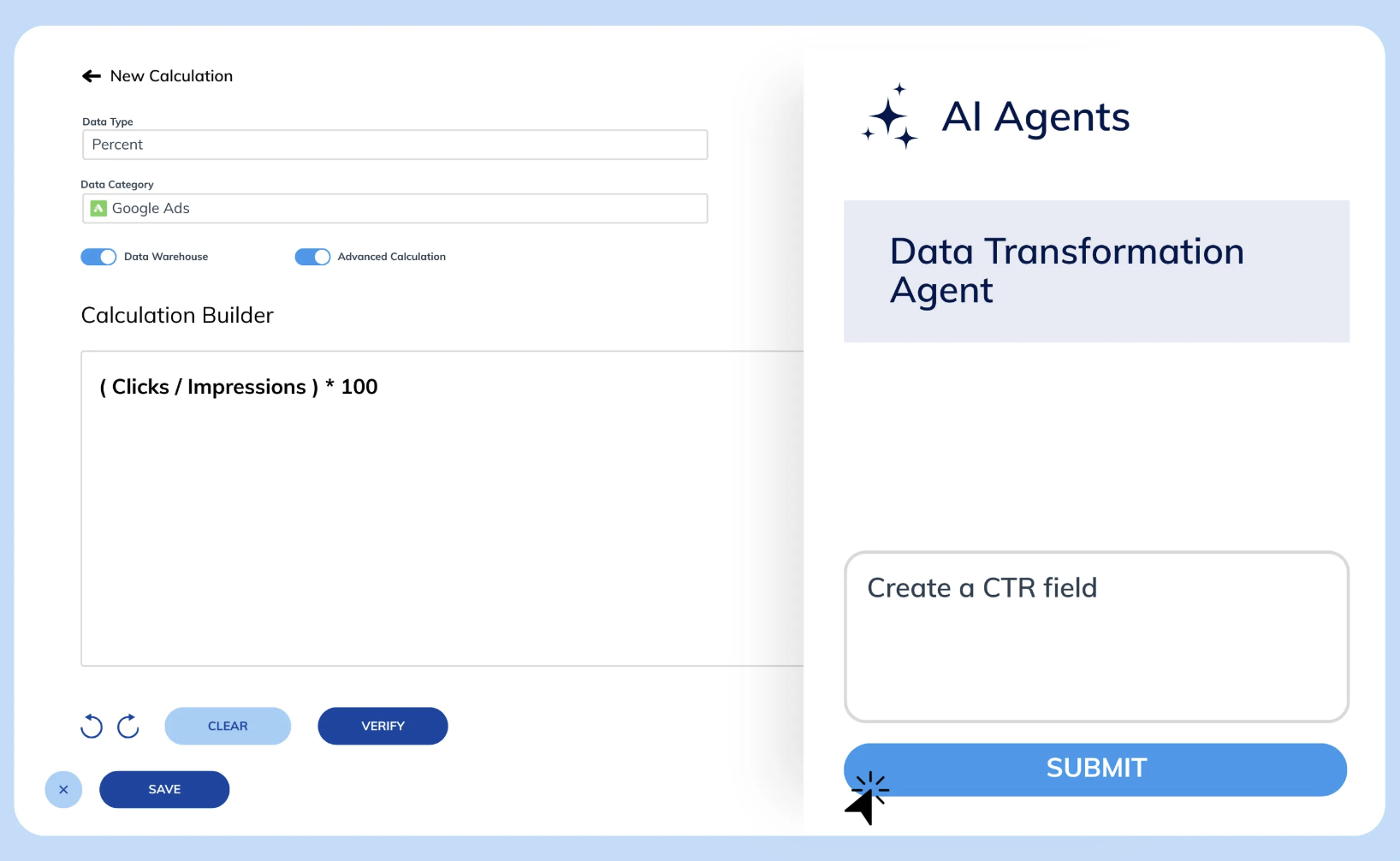
On the AI front, TapClicks has expanded a lot since last year. The AI Operator Agent, launched in 2026, lets you describe a widget, calculation, or even a custom connector in plain language and have the platform build it, no technical expertise required.
 All of this AI tooling now sits under one umbrella brand, SmartSuite, which bundles AI Insights Agents, SmartEmail, SmartReports, and SmartAnalytics. It also includes SmartStory, TapClicks' tool for auto-generating branded presentations and narrative decks for client and leadership meetings.
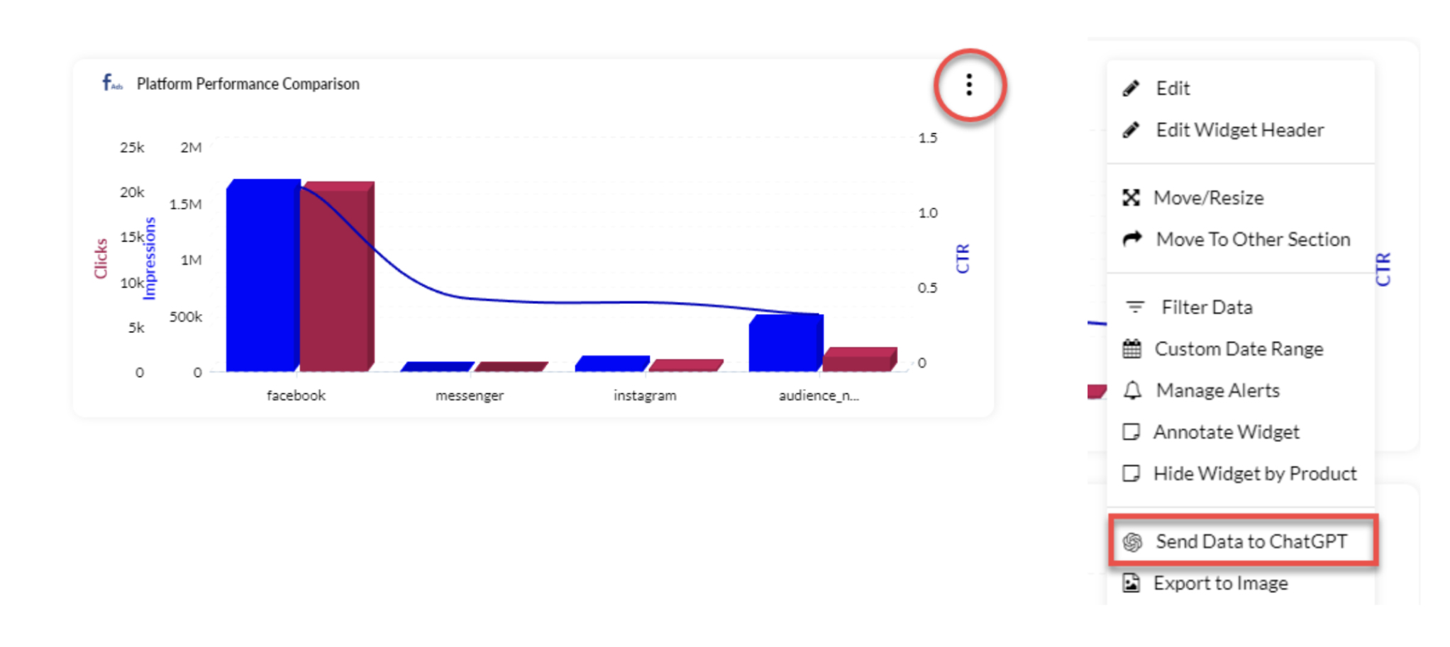
You can also use ChatGPT in two separate ways on TapClicks:
- Add a ChatGPT chatbot widget to dashboards: This widget displays the ChatGPT interface and responds to your prompts the same way the ChatGPT website does.
- Send widget data to ChatGPT: ChatGPT automatically generates a detailed summary you can add to your executive summary.
Key features
- Wide variety of integrations (their website doesn't say exactly how many)
- AI Operator Agent for building widgets, calculations, and connectors from natural language
- SmartSuite: bundled AI Insights Agents, SmartReports, SmartEmail, SmartStory
- Advanced data calculations
- Data Exporter to send data to data warehouses, databases, and data visualization tools
- AI-powered insights, including sentiment analysis on campaign and creative performance
- Interactive dashboards
- Report automation
TapClicks reviews from real users
"The dashboards are really great for our clients, and there's a lot of flexibility in the metrics we see." (Source)
"This is a very useful and good product. It's also so easy to use." (Source)
"Some of the visualization options are limited." (Source)
Pricing
TapClicks' pricing can be confusing, as you'll need to build your own package, and the company doesn't publish self-serve rates.
Based on market data, you start by choosing your data package:
- TapDataLite: ~$599/month for 64 connectors (Basic bundle, typically includes 10 clients)
- TapData+: ~$999/month for 250+ connectors (Pro bundle)
- Enterprise: $1,500+/month for everything in Pro plus dedicated support and custom data volume
Then, you choose your data destination package on top, such as TapReports for report automation, TapAnalytics for custom channels, or TapInsights for AI-generated executive summaries and configurable alerts.
Treat these figures as estimates rather than list prices, since you'll need to talk to their sales team for an actual quote based on your client volume.
Which AI marketing analytics tool is right for you?
That depends on your company type and needs. Here’s a breakdown:
- If you're a mid-size agency that needs governed data behind your reports, dashboards, and AI answers - choose Whatagraph. One data layer powers everything: client reports, performance overviews, and MCP queries to Claude or ChatGPT all pull from the same definitions.
- If you're a small to mid-size PPC or SEO agency that needs fast client reports with built-in rank tracking - choose AgencyAnalytics. MCP is included on the Core plan, and the setup is straightforward enough that you don't need a data team to run it.
- If your priority is centralized metric governance across a large organization - choose Klipfolio. PowerMetrics lets your data team certify metrics once and enforce them across every department and dashboard.
- If you're a boutique agency or small business that needs conversational AI analysis without complex setup - choose Databox. Genie handles plain-language questions well, though AI features are locked behind Growth plans and come with daily caps.
- If you're running a large agency with a dedicated data ops team and need agentic AI on top of a warehouse-native platform - choose NinjaCat for Snowflake-native architecture and pre-built AI agents, or TapClicks if you also need workflow management, order management, and SEO tooling under one roof.
Published on Feb 06 2025
WRITTEN BY
Nikola GemesNikola is a content marketer at Whatagraph with extensive writing experience in SaaS and tech niches. With a background in content management apps and composable architectures, it's his job to educate readers about the latest developments in the world of marketing data, data warehousing, headless architectures, and federated content platforms.