Marketing Data Visualization - A Complete Guide With Examples and Tool Recommendations
We use marketing data in various visual forms — infographics, bars, charts, and graphs. But what is gained by visualizing data and how to do it properly?

Dec 23 2020●7 min read


What is marketing data visualization?
Marketing data visualization is the process of creating visual representations of raw data collected by marketing tools, making it easier to understand the information behind that data. To visualize marketing data, you can use charts, graphs, tables, and interactive dashboard software.
Why is marketing data visualization important?
Marketing data visualization is important because once visualized, marketing data is much easier to analyze for insights that can help with decision-making.
Visualizing marketing data allows you to turn numbers into data-driven conclusions and transform metrics into decisions. You can visualize different categories of marketing data, such as website analytics, social media, paid advertising, email marketing, video marketing data, etc.
Raw marketing data exported from a tool like Google Analytics 4 into spreadsheets doesn’t point in any direction, especially in the case of large data sets.
If you share such a report with stakeholders, they won’t get any smarter about whether the metrics are good or bad for your marketing strategy.
Marketing data visualization solves this issue by graphically showing trends and patterns in data, making it easier to spot whether the changes are beneficial.
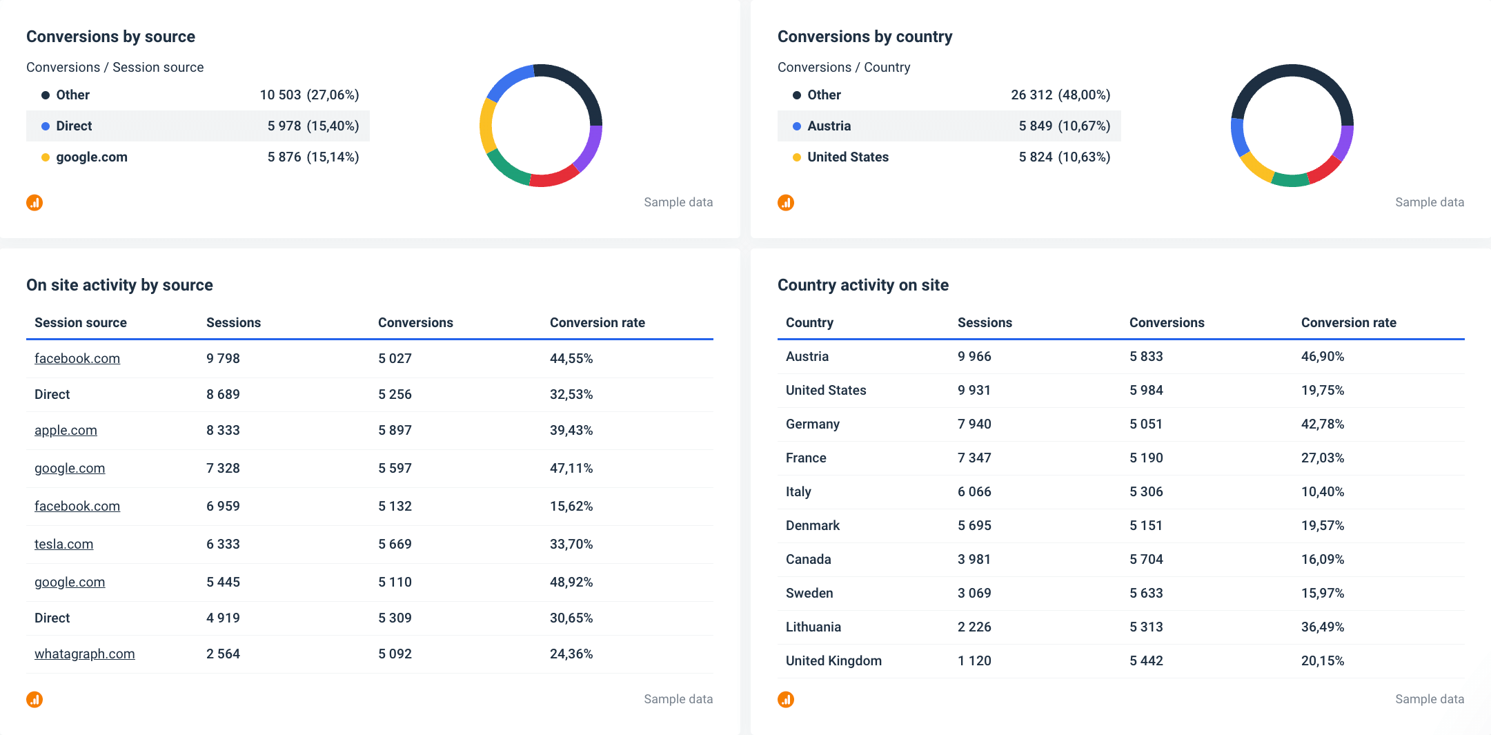
This example from a report created in Whatagraph shows that even a table can help you present Google Analytics 4 data clearly and understandably.
Benefits of marketing data visualization
Among the benefits of marketing data visualization, the most important are:
Executive decision-making
Marketing data visualization helps managers and key stakeholders interpret data. It enables faster data analysis and lets decision-makers see the whole picture. For example, by identifying trends and patterns, the management can gain insights to help them stay ahead of the competition.
Stronger employee engagement
Marketing teams can use data visualization to communicate their digital marketing campaigns’ results to other departments. If the entire company can visualize marketing data together, they can develop shared goals and plans. In addition, you can use visual analytics to measure goals and progress and boost team motivation, for example, by working together to increase the opportunities created in ACV in one quarter.
Streamlined customer service
Marketing data visualization helps customer teams identify customer needs by displaying them in tables or charts. Using visualization and analytics tools, you can spot gaps in your customer service, improve the product or processes, and reduce operational inefficiencies.
Types of marketing data visualization
While bar charts and pie charts are most often associated with visual marketing reporting, there are many other visual elements that you can use. The most important thing here is to pair the correct visualization with the right information sets.
Here are some of the most useful types of data visualization you can use to report on your marketing efforts:
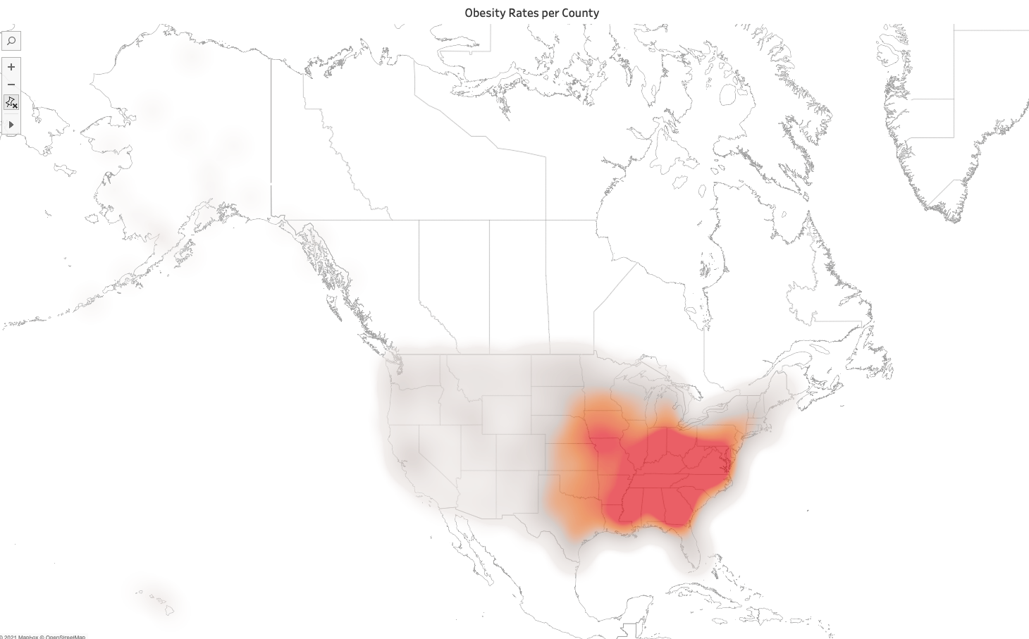
Area map: A type of geospatial visualization that shows specific values mapped over a country, state, county, or any other geographic entity. The two common types of area maps are choropleths — filled maps that use color shading to denote specific values within geographical borders, and isopleths — which don’t rely on defined areas but follow value contours regardless of borders.
Bar chart: Numerical values represented as pillars with values compared to each other. The length of the bar stands for the value of each variable.
Box-and-whisker plot: This type of chart shows the distribution of data points across a selected measure. It includes outliers, the median, the mode, and the box that shows where 50% of your data points fall.
Bubble chart: This is a variation of a scatter plot in which data points are replaced with bubbles of different sizes. For example, you can use it to determine a correlation between three variables without using 3D visuals. This makes them a good choice for visualizing SEO data like keyword rankings.
Bullet graph: In this type of graph, a bar marked with extra encodings shows progress towards a goal or performance against the reference line. Each bar represents one measure, with multiple bars providing additional content. It is ideal for compact dashboards as they provide more information in a smaller space than meters and gauges
Gantt chart: Used in projects to visualize time duration for events or activities, this chart is ideal for highlighting interdependencies between the tasks in the workflow.
Heat map: A geospatial visualization with different colors for specific data values. Colors can be used for different effects, e.g., different intensities of a single color to highlight rank or diverging colors to show a range from negative to positive values.
Highlight table: Like heat maps, these visualizations use color but display data in a text table. The color helps users identify the most critical numbers inside a value range, while different rows and columns represent different dimensions.
Histogram: A type of chart that shows the number of occurrences between a range of values on an axis. Histograms may look like bar charts, but each bar is an interval of metric values. Together, they represent a frequency distribution that shows how often something occurs.
Infographics: A combination of visual elements and words that represent data. Often contains charts or diagrams, with commentaries explaining the data points, leading to conclusions, or recommending further actions.
Line chart: Also known as a line graph, connects data points and lines to measure change over defined values. Great for exposing trends as it can easily include positive and negative values. Still, if you use too many lines, it’s easy to confuse one for another, so a maximum of 5 lines is recommended.
Pie chart: As its name suggests, a pie chart uses a circle to represent a whole, with slices representing specific categories that make it complete. This chart type is ideal for comparing relationships between different dimensions within a particular context.
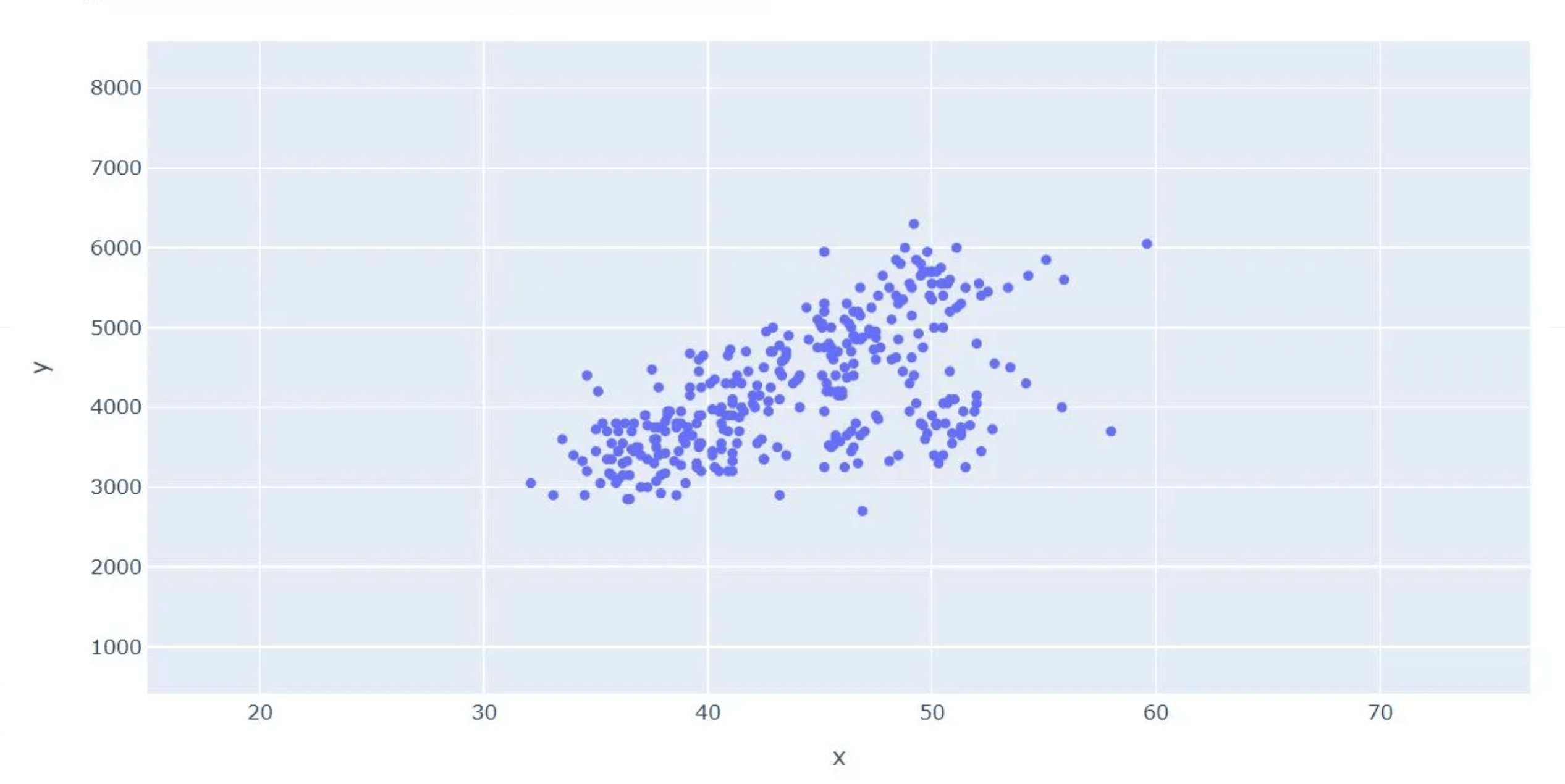
Scatter plot: Similar to a line chart, data points here are represented on an x/y axis, but they are not joined. You can use it to highlight data correlation, positive and negative relationships, show data spread and outliers, etc. However, like with line charts, having too many data points can make the chart difficult to interpret.
Treemap: A treemap consists of nested squares for different categories ordered in a “tree” hierarchy. Different colors can represent dimensions, such as categories, or measures, such as KPIs. The largest square or “box” shows the largest part of the whole, while the smallest box shows the smallest part.
Marketing data visualization examples
When mentioning data visualization in marketing analysis, the first thing that comes to mind is a type of chart or graph.
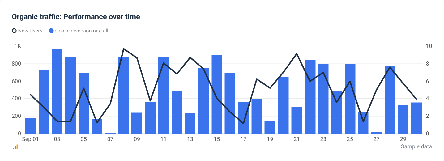
For example, this graph shows the performance of organic traffic over time, which is one of the most important KPIs in content marketing.
However, data visualization goes beyond graphs and charts. A table allows you to grasp valuable insights from complex data without actually having to visualize it.
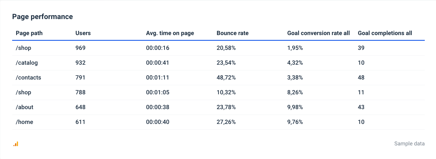
This table in Whatagraph shows page performance metrics such as the number of users, average time on the page, goal conversion rate, and bounce rate.
Such a presentation helps marketers identify the page that brings in the most conversions and, when tracked monthly, also compares the performance of individual pages over time.
However, a data visualization dashboard is the most advanced way to present your marketing data visually. Dashboards can contain multiple metrics in different forms and even let you filter or group data.
Here’s an example of PPC data visualized in a dashboard created in Whatagraph:
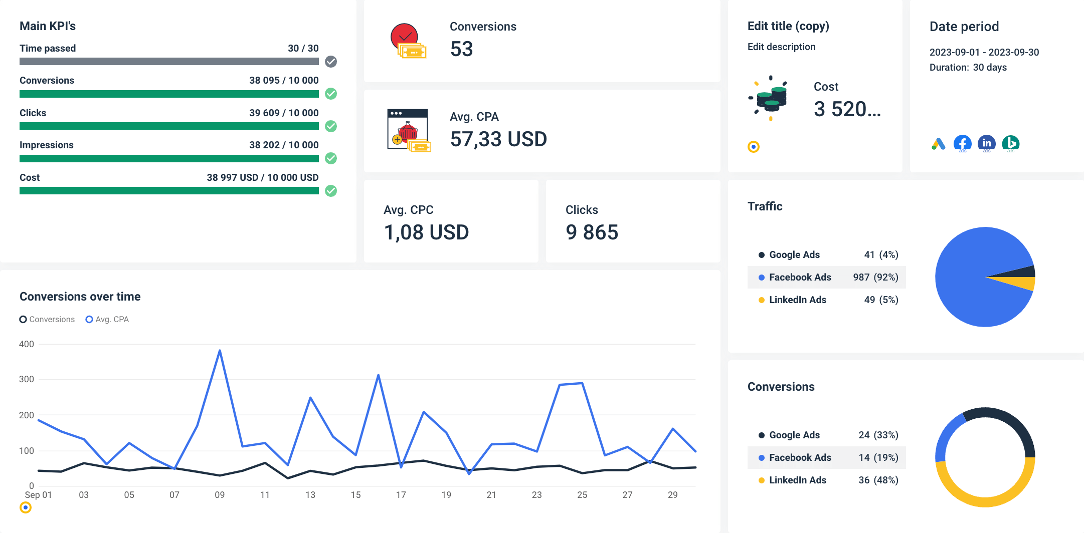
This dashboard uses interactive visualizations for different metrics aimed at helping users understand the changes in marketing data:
- The main KPIs are presented with bar charts that visualize goal completions,
- Total conversions over time are shown in a multi-source line graph that combines data from several paid ads platforms,
- The traffic and conversion percentages are conveniently represented by pie charts,
- Other numerical metrics are displayed as single-value widgets.
But the best thing about using marketing dashboards like Whatagraph is that the values are updated in near real time, so you always work with fresh data.
Marketing data visualization tools
PowerPoint and Excel are a thing of the past, at least when visualizing marketing data. Why would you struggle with individual graphs, editing, and adjusting tables when you can use a dedicated data analytics and visualization tool that does it all? Here’s our pick of the popular marketing data visualization tools.
Whatagraph
As an all-in-one platform to connect, visualize, and share marketing data, Whatagraph is a prime data visualization solution that handles the entire data collection, visualization, and sharing process under one roof.
You can pull data from over 45 marketing platforms and visualize it on detailed dashboards and reports using a variety of visualization types. Whatagraph has native integrations with popular social media platforms like Facebook, Instagram, X (Twitter), and LinkedIn, email marketing tools like Mailchimp and Campaign Monitor, CRMs like HubSpot and Salesforce, and different SEO and paid ads platforms.
The best part is that you can report on 25 of these data sources even with the basic pricing plan.
If your marketing tool is not among the native integrations, you can still connect your data using a Custom API, Google Sheets, or BigQuery data warehouse.
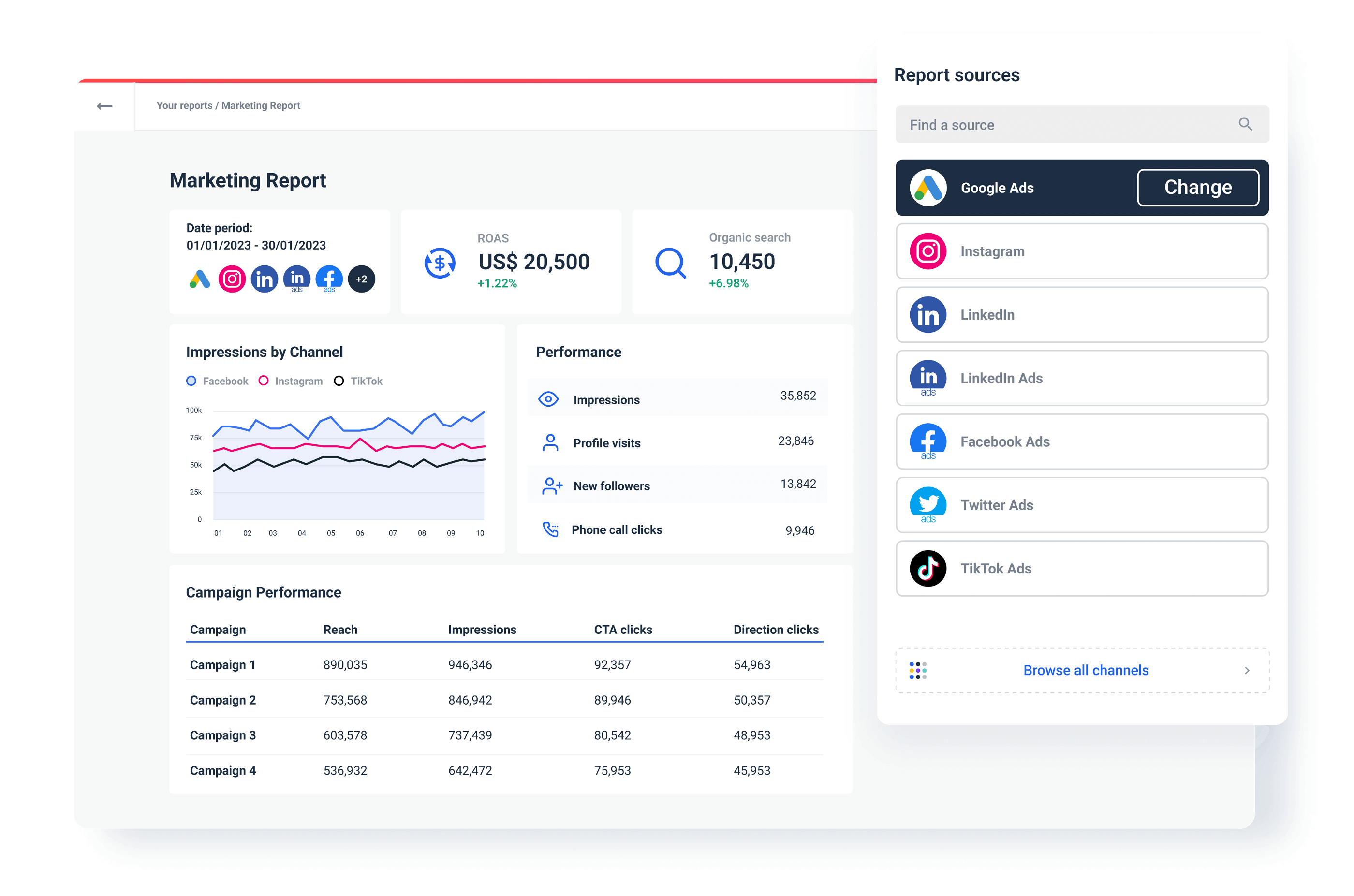
If you don’t know how to create your visual report, pick one of the pre-made report or dashboard templates from the Whatagraph library.
If you know exactly what kind of marketing report you want, use our intuitive builder to create a report or dashboard from scratch. Connect the sources and drag and drop everything you need to a blank page.
Once you visualize your data, Whatagraph allows you to share your report in several ways.
For example, you can create an email template, set the recipients, time of delivery, and frequency, and put the whole thing on autopilot. Also, you can share a live link to a report or dashboard so the recipients can check data as it updates.
Looker Studio
Once known as Google Data Studio, this data visualization tool is popular mainly because it’s free to use and supports various visualization types.
Looker Studio can transform massive data sets from essential data sources and apps into aesthetically pleasing data reports. Because of this, small teams and freelancers often consider it a cost-effective alternative to Tableau — another data visualization tool that has a wide application in industries beyond marketing.
Indeed, Looker Studio works like a charm for visualizing data from marketing tools that belong to the Google platform. For other apps, you need to purchase 3rd party connectors, which can slow Looker Studio down and make it more dependent on other vendors.
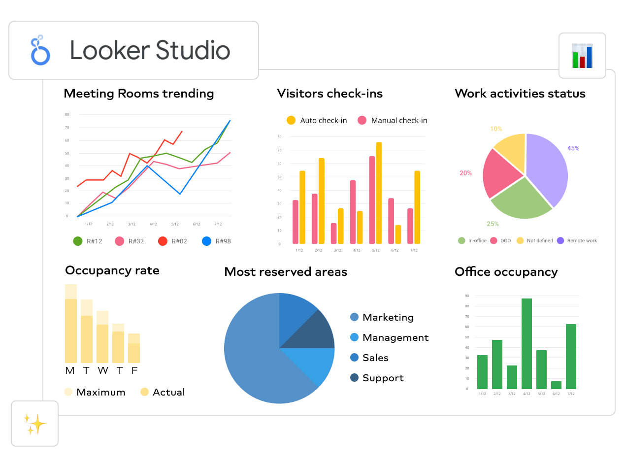
They say the best things in life are free, but I’m sure they didn’t mean Looker Studio. As a free cloud-based tool, Looker Studio lacks many of the advanced Whatagraph features.
For example, the interface could be more intuitive and easier to learn. Apart from Google’s extensive Help and Support pages, you’re pretty much on your own. Whatagraph, on the other hand, has live chat support so that you can remove every blockage in a matter of minutes.
Also, Looker Studio doesn’t let you bulk edit and save multiple templates, as Whatagraph does. This feature saves time, especially for agencies or enterprises with elaborate reporting processes.
Finally, if you need to visualize cross-channel marketing data, you can do it more easily in Whatagraph.
Power BI
Microsoft Power BI is a business intelligence and data visualization platform that allows you to create interactive dashboards and reports. Power BI is ideal for users who need to perform deep analytics, combine data from multiple sources, and predict outcomes by identifying real-time trends.
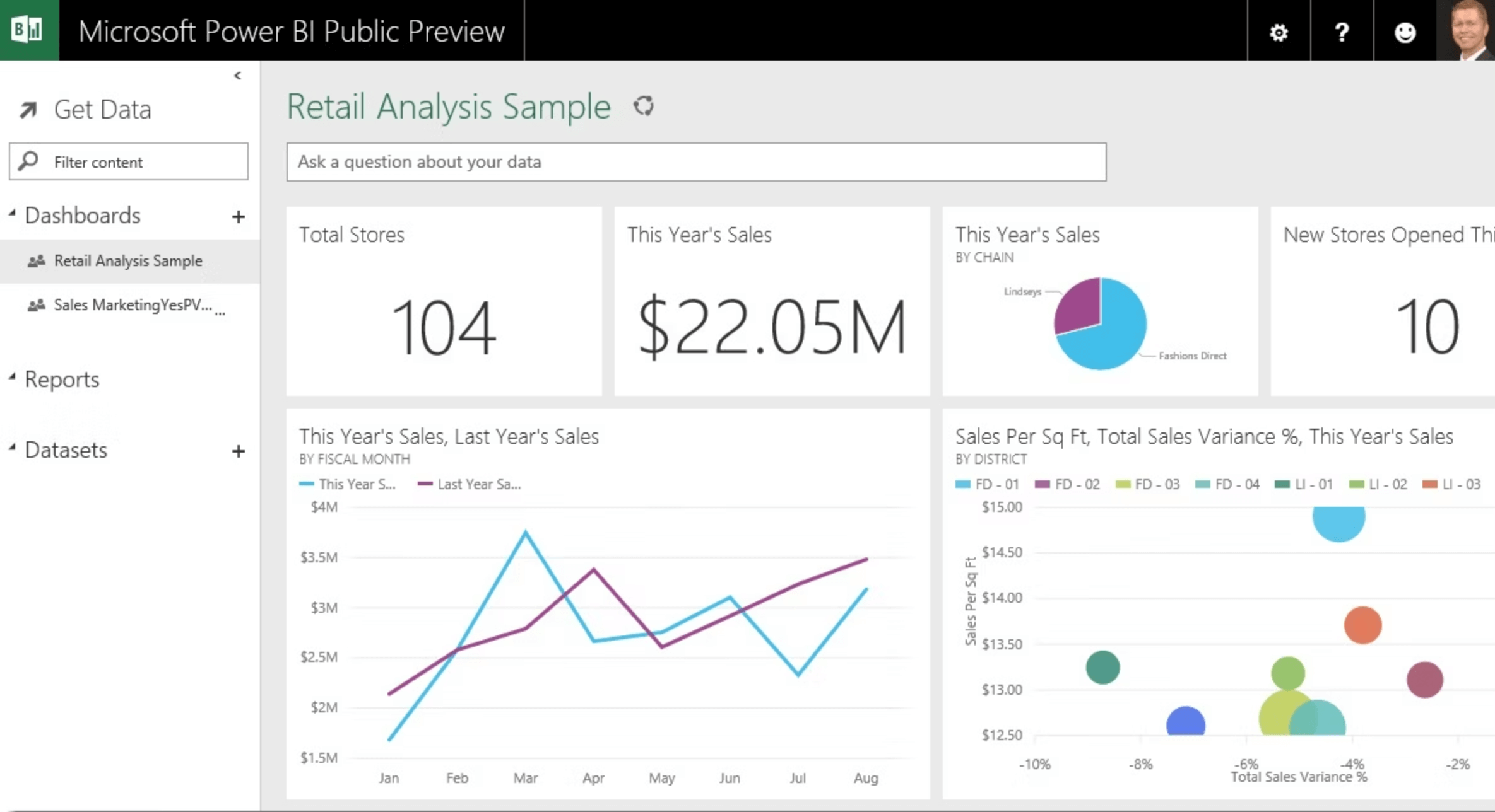
Power BI has exceptional Excel integration, allowing you to visualize large quantities of data that Excel cannot open. In addition to that, Power BI enables users to integrate data from various databases such as CSV, XML, JSON, SQL Servers, and cloud-based sources like Azure and Salesforce.
Thanks to the dashboard sharing features, Power BI allows users to share their insights with others, making collaborating on data analysis projects easier.
On the downside, Power BI has limited customization options – even changing fonts in your report requires completing several steps. It’s more of an all-around data visualization tool for in-house teams, so marketing agencies may find it lacking some features needed to create truly unique visualizations and reports for their clients.
Wrapping up
Visualizing marketing data is essential for decision-making. A chart with a clear distribution or a graph with a trendline going down will point to a problem much faster than an array of raw numbers.
Are you going to decide the right thing every time? Probably not. However, you will back your decisions with an advanced dashboard that visualizes data from the marketing platforms you use.
Of course, this only counts if you use an advanced data visualization platform like Whatagraph.
Check out our case studies page to learn more about how others use Whatagraph to streamline their reporting. There, you’ll find use cases for both agencies and large enterprises.
On the other hand, if you want to connect your sources and start visualizing your marketing data already, go ahead and request a free trial of Whatagraph.
Published on Dec 23 2020
WRITTEN BY
Vytautas PučkaVytautas is a marketing specialist with experience in Customer Service and Sales. As a data-driven professional, he is excited to have discussions with his readers and debate new and innovative ideas about marketing.