Why Do You Need a PPC Dashboard Template?
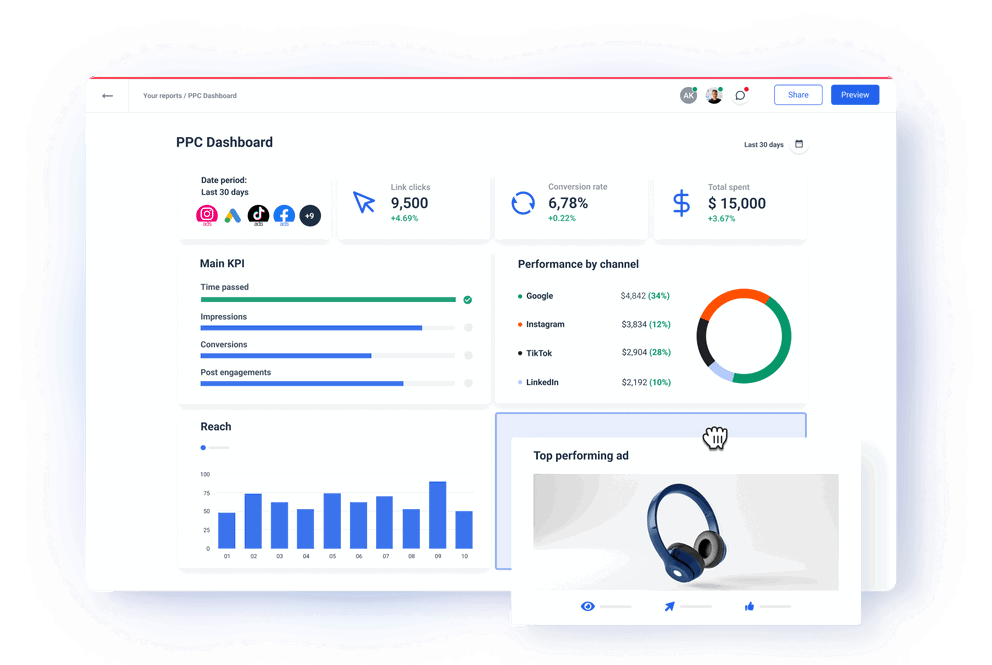
A PPC dashboard template can help you navigate multiple challenges of monitoring and reporting PPC performance across channels and clients.
Some of these challenges are:
Your data is scattered across PPC platforms
You probably run campaigns on several platforms, such as Google Ads, Facebook Ads, LinkedIn, etc., which makes it hard to keep track of all the data.
Each platform measures success a bit differently, so you can have different metrics coming from each one.
With data scattered across different dashboards, getting actionable insights from all sides takes a lot of time and effort.
And at the end of the day, without a single source of truth, you always risk missing key insights.
Reports take hours to create & customize
Both you and your clients need regular PPC reports, but creating them manually is not practical.
Even worse, they can show inconsistencies in the metrics you present to clients or management.
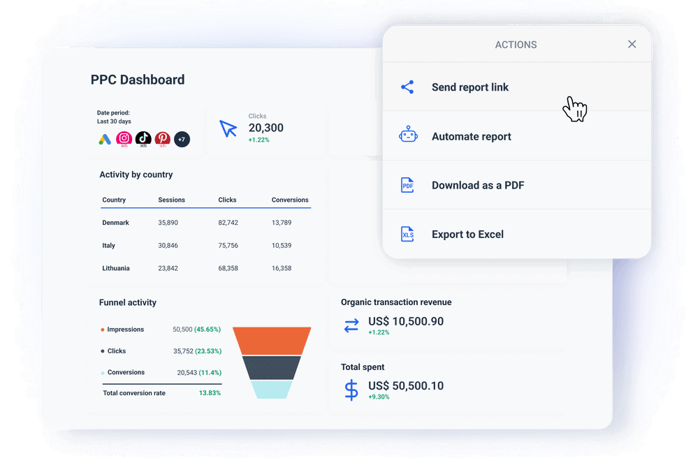
A streamlined auto-updating dashboard can save both your team’s resources and display timely and accurate data on all metrics you need across PPC platforms.
Every client has different preferences
When you need to scale your operations, you may find it challenging to create tailored reports for different clients while maintaining the quality of your reports.
In-house teams, on the other hand, need to report performance effectively to different departments or executives.
Each client or stakeholder may have different KPIs they prioritize, such as cost-per-click (CPC), conversion rates, or return on ad spend (ROAS).
In these cases, a one-size-fits-all solution doesn’t cut it.
“It’s pivotal that agencies don’t take a ‘one-size-fits-all’ approach to their service. While they can have some type of ‘template’ for how their processes work or a general list of what they can offer, every client should have a personalised approach. Failing to consider the individual needs and goals of clients can lead to dissatisfaction as well as lacklustre work that can tank your reputation and retention rate.”
Gareth Bull - Founder of Bulldog Digital Media
Hard to interpret all that data
The sheer volume of data makes it difficult to interpret trends and pinpoint what’s working and what needs improvement.
You could waste time analyzing unimportant data, which clouds the judgment and delays actionable insights.
If you try analyzing one by one source, you’ll struggle to get a cohesive view of overall performance.
You may also miss critical opportunities to optimize ads, as it’s hard to filter out insights from all the available data. This limits your ability to quickly turn around or adjust strategy to improve ROI.
Your users interact with ads on different devices or through different channels before converting. And since each platform attributes conversions differently, it can cause discrepancies in reports.
As a result, one channel may appear to be underperforming, while the true reason is the attribution gap. In the end, you may cut the budget for a channel that is actually contributing more than it appears.
Challenging to show ROI
Your customer can see a Google ad but convert through an organic search or social media.
PPC platforms often use last-click-attribution, which means they attribute the conversions to the last interaction, even if PPC has played a role in the customer journey.
As a result, clients may not see the full impact of their ad spend and misinterpret the success of their PPC campaigns.
Another challenge is that clients may not understand complex data. Not everyone is familiar with impressions, clicks, conversions, CTR, CPC, ROAS, and others.
If you don’t simplify the ROI reporting and tie it closely to the client’s goals, you can easily overflow them with data.
As a result, they may miss the true value of the campaign.
How to Choose a PPC Reporting Dashboard?
With the biggest PPC reporting challenges in mind, it’s easy to outline what to look for in a PPC report dashboard:
User-friendly UI
A dashboard that is too complicated to use or requires technical experience to set up or modify is bad investment.
Add a steep learning curve into the mix, and you’ll soon be looking for alternatives.
You need a PPC dashboard that you and everyone on your team can use and adapt for different clients’ needs without coding or design skills.
Whatagraph has everything you need to build a dashboard that your team and clients will have no trouble using:
- Clear navigation: You can organize metrics logically and use simple menus or tabs to separate different sections, such as the goals and conversions, traffic, channels, etc.
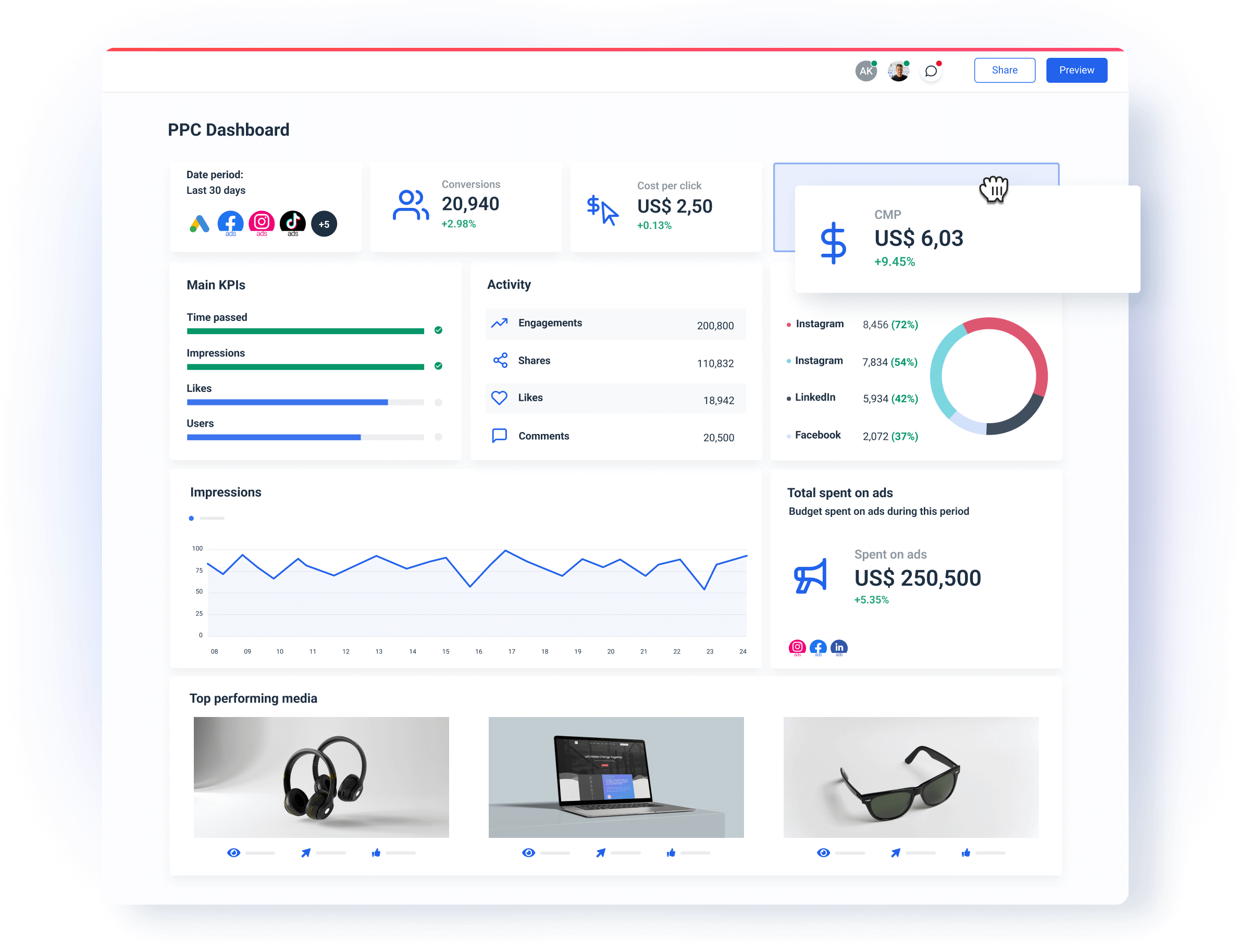
- Drag-and-drop widgets: Our charts, graphs, and other widgets present complex data in a simple way. Your clients can hover over specific fields to uncover more info.
- Mobile-friendly design: We make sure your dashboard looks good and works well on mobile phones.
Reliable data connections
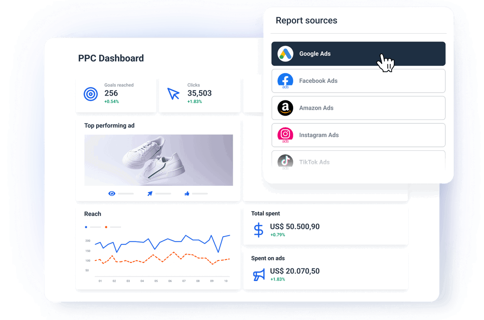
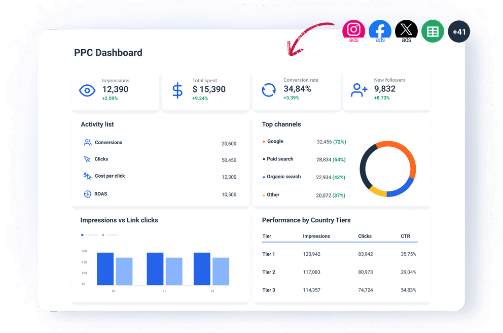
You need a PPC dashboard that can centralize data from multiple ad platforms into one interface. This way, you can easily monitor campaign performance without switching between tools.
However, not all dashboards are made the same. If you have ever used Looker Studio or another dashboard tool with third-party connectors, you know that they can perform differently from one another.
What does this mean?
They can sync at a different rate, or you may run into more technical issues that only engineers can debug, such as:
- API limitations and changes
- Data compatibility issues
- Rate limits
- Authentication problems
- Network and latency issues
On the other hand, all Whatagraph integrations are developed and managed in-house by our dedicated Engineering team. There’s nothing to set up on your side.
This means that they won’t break off in the middle of a client demo call or half an hour before the client’s internal meeting, making the report unusable until you resolve the problem.
You can also create a blend of different sources with custom metrics and dimensions. Add this blend as a source to your template — alongside any other “regular” data sources.
Customization
Different clients will be interested in different PPC KPIs or have a dashboard layout they prefer.
When a PPC dashboard template is easy to customize, you can quickly modify the dashboard for each client and track the KPIs that matter the most.
This way, the right information is always front and center, making your dashboard more relevant and engaging.
In Whatagraph, this is very easy to do using drag-and-drop metrics widgets. Once you connect your PPC sources, all metrics are available as single-value widgets, graphs, charts, or tables.
Anyone on your team can easily build reports without tagging an engineer to help organize the data and displays.
On the visual side, you can:
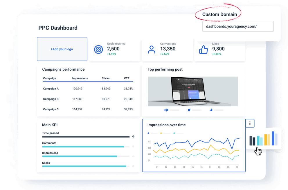
- Upload your logo or the client’s logo to the dashboard
- Create color schemes that match your or your client's brand colors
- Add text, headers, and footers
- Create more tabs to organize your dashboard into sections
In other words, you can do everything to create a professional white-label PPC dashboard on your own.
Actionable insights
Scattered data across PPC platforms and tools makes it difficult to identify patterns, assess performance, and uncover actionable insights.
In Whatagraph, you can easily build a PPC analytics dashboard that provides deep insights into campaign performance.
How?
Let’s start with grouping scattered data under one roof.
Imagine you have a huge client with 100s of data sources across regions, brands, and venues.
And they want to see how their PPC campaigns are performing by 5 specific metrics.
Not a nightmare anymore!
In Whatagraph you can easily combine similar data from different sources and channels in one unified Source Group.
From there you can create a dashboard with aggregated metrics instead of creating… many dashboards.
Just drag and drop the graphs, charts, or tables that you need, and they instantly come to life with the latest metrics.
You can go even deeper and organize your unified data sources by giving them custom tags.
This way you can break them down by client, channel, account manager, region, or whatever else you need to help you get insights faster
The best thing is you can do all this without switching from one platform to another.
In Whatagraoh you can create a single overview of all your clients, theur spend, and their PPC results.
Great way to compare performance and spot trends, e.g. Which channels are contributing the most to leads, etc.
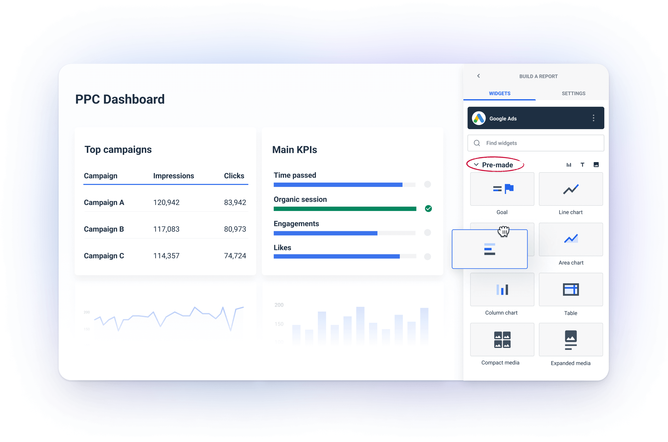
By moving the widgets around like building blocks; adding, and removing them as needed, you can quickly optimize every dashboard for specific clients and make it easy to understand complex data underneath.
Easy to show ROI
Your clients and stakeholders want to see clear evidence that their ad spend is driving meaningful results.
Yet, proving ROI and value from paid ads is not easy.
A PPC campaign dashboard template simplifies the process for you by presenting key performance (such as CPA, CTR, and ROAS) in a clear and visually appealing way.
(Psst. Whatagraph has a Goals widget that you can customize to show how your efforts bring you closer to your client’s goals)
Without any coding, you can blend all your PPC sources and get consolidated KPIs that prove the overall ROI or break the channels’ performance to see which one performs the best.
Dedicated customer support
No matter how easy a PPC dashboard to use, there might be times when you need help from a real person to get you through things.
At times like this, it’s good to know that you can contact your dashboard provider and get help quickly.
At Whatagraph, you can reach out to us via live chat on our website or email. And our amazing Customer Support team will get back to you within 34 seconds to 4 minutes, and resolve issues within 5 to 24 hours.
Rest assured that once you start using our PPC reporting dashboard, you’ll be assigned a personalized onboarding and a dedicated manager, who will be included in all pricing plans.
How to Build a PPC Dashboard?
Here is a breakdown of must-have sections you should include in every PPC dashboard.
Main KPIs & goals
These KPIs tie directly back to the goals of your PPC campaigns. It’s always best to define them upfront, while you’re onboarding the client.
This way everyone is on the same page about what matters the most.
For example, if you want to achieve 1,000 conversions at a CPA of $20, you can display that in your dashboard.
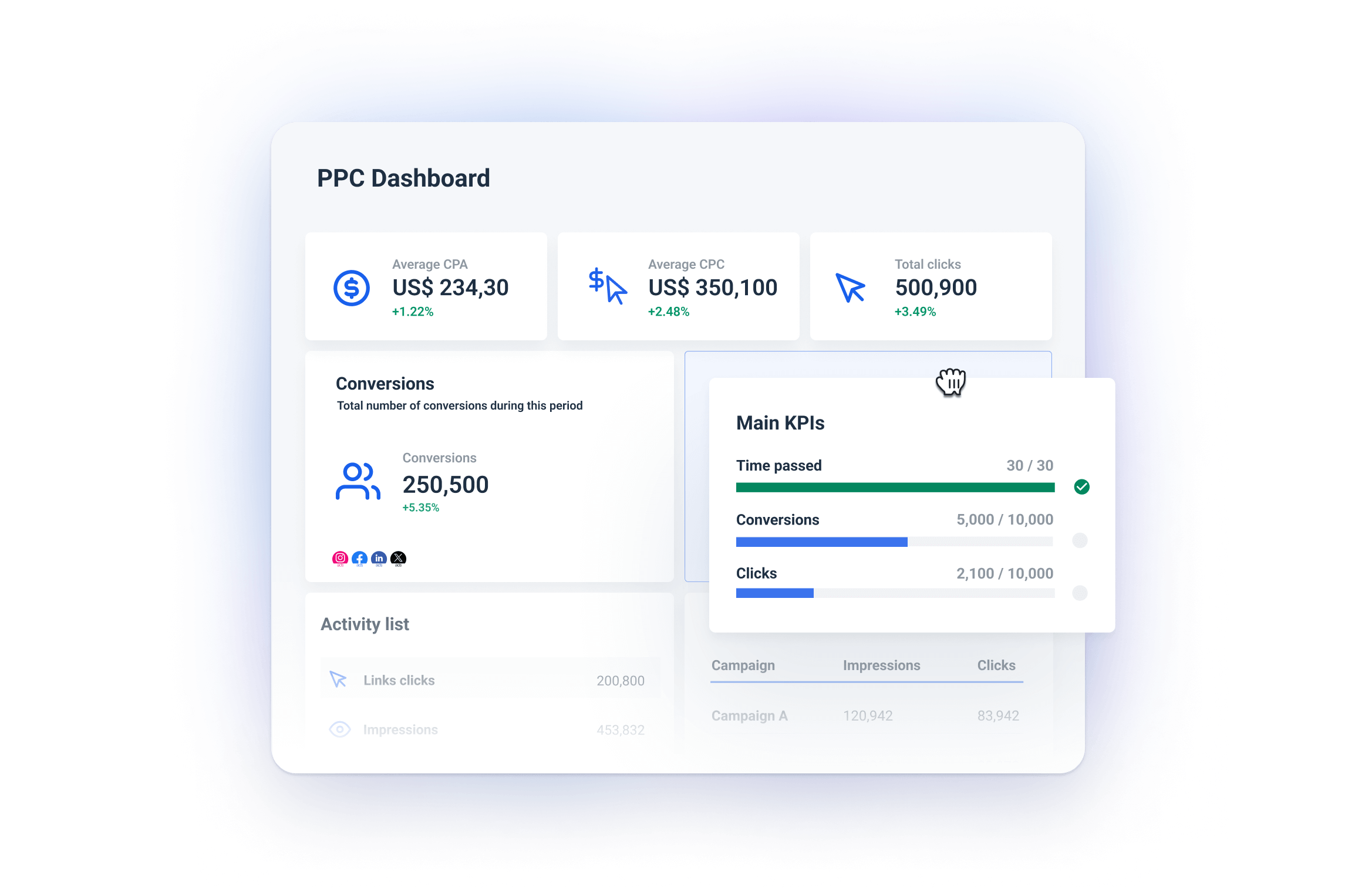
Best way to do it:
- Single-value widgets: In Whatagraph, you can add single-value widgets for each KPI to show real-time metrics such as Conversions, Average Cost Per Click (CPC), Clicks, Average Cost Per Acquisition (CPA), Return on Ad Spend (ROAS), etc.
For these widgets, Whatagraph automatically syncs the connected data, so your KPIs are up-to-date without manual intervention.
- Whatagraph’s Goals widget: Great for tracking how your campaign is progressing towards its targets. For example, set up a goal to reach 1,000 conversions and track how far along you are in achieving that.
Traffic & conversions
By tracking traffic and conversions, you can identify whether your ads are reaching the right audience and converting effectively.
It also helps you pinpoint performance bottlenecks, such as low conversion rates on high-traffic ads.
Best way to do it:
- Use time-based charts: Add line or bar charts to visualize traffic and conversion trends over time (daily, weekly, or monthly). This helps spot spikes or drops in performance, allowing you to quickly assess whether optimizations are needed.
For example, you might see a surge in traffic but low conversions, signaling potential issues with landing pages or ad targeting.
- Pie or donut charts: To monitor each platform’s share in traffic and conversions.
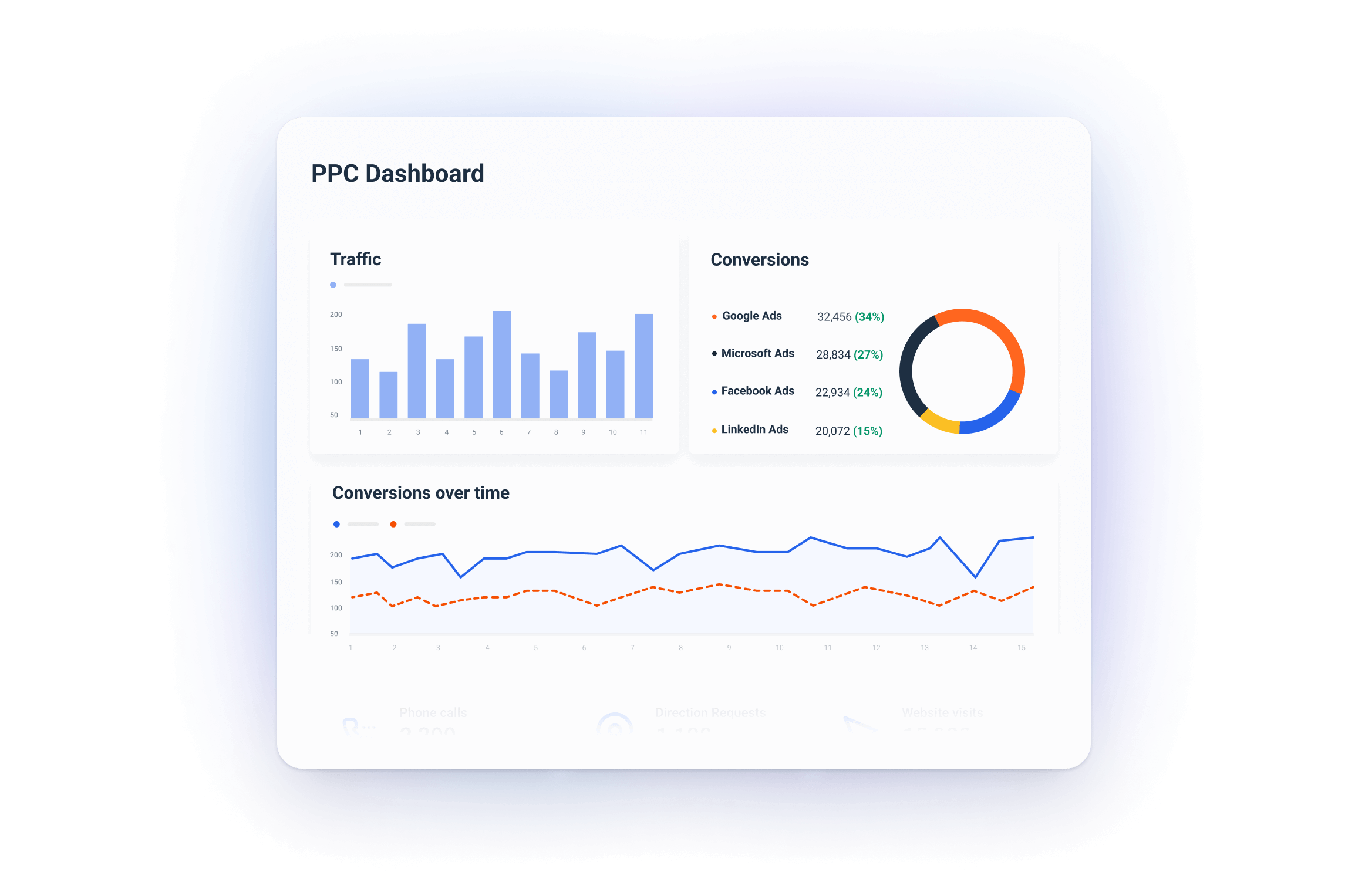
Pro tip:
Segment Conversions: If your client has multiple types of conversions (e.g., form fills, purchases, newsletter sign-ups), segment them in the dashboard to get more detailed insights on what’s driving the most value.
Channel split
When you understand which channels are driving the most value, you can distribute the budget more effectively and optimize campaigns based on performance.
A clear channel breakdown lets you compare performance across platforms and ensure you’re spending in the most efficient areas.
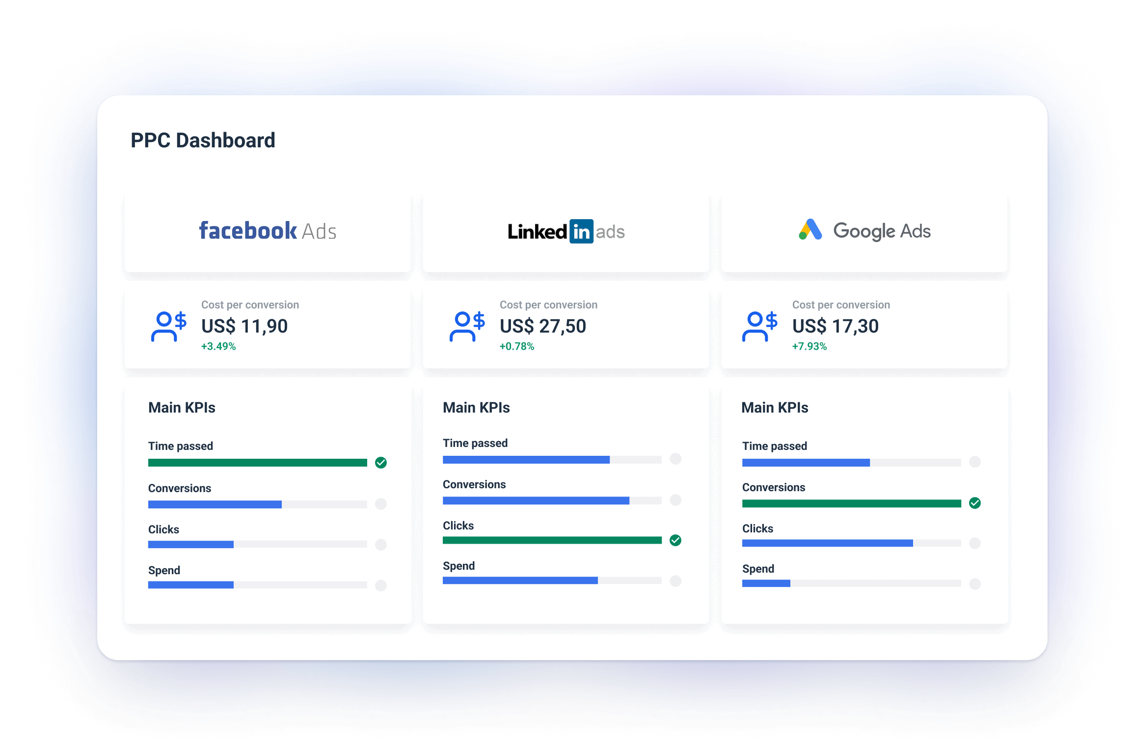
Best Way to Do It:
- Whatagraph’s pre-made Goals widget: Just as you did for main goals, you can add a widget with main metrics for each channel — Spend per Channel, Conversions per Channel, etc.
- Channel comparison charts: To analyze the channels further, you can use bar or pie charts to display the proportion of traffic, conversions, and ad spend for each platform.
For example, you can display a traffic breakdown by source to see whether Google Ads or Facebook Ads is driving more clicks.
Pro Tip:
Look for discrepancies: Use the channel split section to spot discrepancies between traffic and conversions. For instance, if a channel drives a lot of clicks but few conversions, it may be a sign of poor targeting or ad quality.
On the other hand, if a channel has a high conversion rate but low traffic, it might signal an opportunity to scale ad spend on that platform.
