9 Best AI Reporting Tools in 2026 to Save You Time
The best AI reporting tools in 2026 connect your marketing data, build reports on command, generate plain-language insights, and automate delivery - all without taking hours or requiring a data analyst.
This list covers 9 tested options across three categories: tools built for marketers, tools for freelancers and small teams, and enterprise-grade platforms.

May 07 2026●10 min read


According to ActiveCampaign, marketers using AI tools are saving an average of 13 hours per week on manual tasks. And our own customers, marketing agencies like Maatwerk Online, are saving even more - up to 100 hours a month on reporting.
But not all AI reporting tools are created equal though.
We spoke with agencies, eCommerce teams, and in-house marketers to understand what they actually need from an AI reporting tool in 2026:
✅ Reliable integrations: No more having to babysit connectors or contacting different support teams to fix them.
✅ Clean, unified data: AI is only as good as the data underneath it.
✅ AI that builds and styles your report: Gone are the days of building and styling reports manually - AI can take that off your plate.
✅ Actionable insights: Not just generic performance summaries, but also interactive chats where you can ask anything about your connected data and get back succinct, accurate insights.
✅ Internal performance monitoring: Clear views of all your campaigns, filterable by channel, client, account manager, or brand.
✅ True automation: Reports don't end after you create them. You need to automate how you send them as well.
If that sounds like the dream… good news.
We tested the best AI reporting tools and broke down exactly what each one can do - and what they can’t - so you can choose the one that actually saves you time instead of creating more work.
9 Best AI Reporting Tools in 2026
Here are the best AI reporting tools we’ll review in this article:
- Whatagraph
- Klipfolio
- NinjaCat
- Venngage
- Easy-Peasy.AI
- Piktochart
- Tableau
- Power BI
- Domo
We decided to divide these tools in 3 categories:
- The best AI reporting tools for marketers,
- The best AI report generators and,
- The best tools that use AI for reporting in large organizations.
Quick comparison: all 9 AI reporting tools at a glance
| Tool | Best for | Key AI features | Starting price | Free plan/trial |
| Whatagraph | Marketing agencies and performance marketers | IQ Report/Tab/Widget creation from prompts; IQ Chat (conversational data Q&A); IQ Summary (plain-language narratives); IQ Themes (AI branding from logo); Whatagraph MCP | $229/mo billed annually | Free forever plan |
| Klipfolio | Large data teams at companies and agencies | NLP-powered self-serve analytics; AI-generated visualizations from typed queries; formula-driven data modeling | $90/mo (Klips Base) | 14-day free trial |
| NinjaCat | Agencies and enterprise marketing teams with large data needs | AI Agents (paid search, campaign monitoring, creative auditing, ad ops); AI Insights Generator (auto narrative summaries in reports); AI Agent Builder for custom workflows | Custom (contact sales) | No |
| Venngage | Visual report creation for non-designers | AI Report Generator (prompt to design); AutoBrand (extracts colors/fonts from any URL); AI copy suggestions; AI icon and image generation; WCAG accessibility checks | Free; Premium $10/mo annual | Free plan |
| Piktochart | Small businesses and project managers | Pikto AI Studio: AI infographic/report generator from prompt or document upload; 6 AI image tools (Generator, Modifier, Upscaler, BG Remover, Restorer, Icon Generator); Google Sheets sync with auto-updating charts | Free; Pro $14/mo annual | Free plan |
| Easy-Peasy.AI | Creating simple text-based reports quickly | 200+ AI content templates; AI image/video generation (DALL-E 3, Midjourney); text-to-speech in 40+ languages; custom AI chatbots; GPT-5, Claude, Gemini model support | Free; Starter $8/mo | Free plan |
| Tableau | Data teams at large enterprises | Tableau Agent (conversational AI for viz creation, DAX, calc fields); Tableau Pulse (personalized AI metric monitoring with automated alerts, now bundled with Tableau Cloud); Tableau Next (agentic analytics platform with Agentforce integration); AI-assisted color palettes; dashboard narratives | $15/user/mo Viewer (Standard Cloud, billed annually) | 14-day free trial |
| Power BI | Business analysts in SMBs and Microsoft-ecosystem organizations | Copilot (DAX generation, report creation, narrative summaries from natural language prompts); Key Influencers; Anomaly Detection; Forecasting; Decomposition Tree; Sentiment Analysis; mobile Copilot on iOS/Android; Q&A retiring Dec 2026 in favor of Copilot | $14/user/mo Pro (billed annually, updated April 2025) | Free Desktop version |
| Domo | Tech-savvy data and marketing teams building agentic AI workflows | AI Chat (context-aware conversational data Q&A); AI Agent Builder (custom agent creation from natural language); AI Toolkits; Domo MCP Server (connects enterprise data to Claude, Gemini, ChatGPT); App Catalyst (build pro-code apps with natural language); Magic ETL with AI-guided data prep | Custom (contact sales) | 30-day free trial |
A few things worth noting before you pick:
- Whatagraph, Klipfolio, and NinjaCat connect to live marketing data sources and refresh automatically. Venngage, Piktochart, and Easy-Peasy.AI are design-first tools - you bring the data in manually (CSV or Google Sheets), and they help you present it.
- Tableau and Power BI are enterprise BI platforms. They're far more powerful than anything else on this list for complex data modeling, but they require technical skills, significant setup time, and substantially higher per-user costs at scale.
- Power BI is retiring its legacy Q&A visual in December 2026 and replacing it entirely with Copilot. If your team relies on Q&A, plan the migration now.
- NinjaCat and Domo don't publish pricing. Budget conversations happen with their sales teams.
- For marketing teams that need to connect data, automate reports, and share insights with clients - without hiring a data analyst - Whatagraph is the only tool on this list built specifically for that workflow.
That being said let's get into each tool.
Best AI Reporting Tools for Marketers
1. Whatagraph
Best for: Performance marketers at SMB and mid-market companies (11–500 employees) and marketing agencies that want fast, accurate, no-stress reporting
Whatagraph isn’t “another reporting tool.”
It’s the easiest AI-powered marketing intelligence platform you’ll ever use, built for marketers, not data scientists.
Here’s what you’ll get:
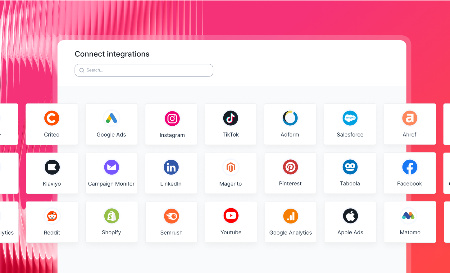
- 60+ integrations: connect with all your marketing platforms through native, stable connections that you don’t need to babysit
- Whatagraph IQ: create, style, and analyze full-on marketing reports with accurate AI that doesn’t hallucinate or leave room for data breaches
- Templates: get ready-made report templates that you can plug in your own account and instantly share with stakeholders
- Custom metrics, dimensions, and blends: unify dimensions, make custom calculations, blend metrics together (and more) through no-code workflows that only take seconds to set up
- Automation and sharing: schedule your reports to go out to specific emails on specific dates, times, and cadence – or just share a live link (password-protectable)
Whatagraph has also released an MCP that lets you analyze your data with Claude or ChatGPT in seconds.
Thanks to these smart features, Maatwerk Online is saving 100 hours a month on reporting. Hear it straight from Lars Maat, the co-founder:
Whatagraph’s AI saves time and energy for our marketing specialists. And the hours we’re saving is just pure profit. We now have the time to focus on more strategic things that help both our agency and our clients grow.
Want more proof of what makes Whatagraph the best AI reporting tool? Here are 5:
1. All your marketing data: connected, cleaned, and ready to use
Whatagraph has 60+ fully managed connectors across paid media, social, SEO, email, and ecommerce.
 This means:
- No need to pay for extra connectors
- No connectors breaking
- No inaccurate or delayed metrics
If something breaks (which it barely does), Whatagraph fixes it, not your team.
You can also:
- Blend data from multiple platforms
- Build custom metrics and dimensions
- Standardize naming across accounts
- Keep historical data in one place
With Whatagraph IQ+, you can even get AI to build custom dimensions for you. Just type in a prompt and we’ll automatically create the dimension for you.
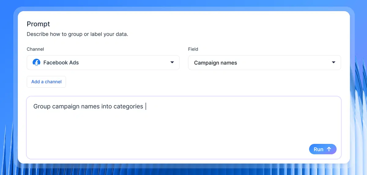
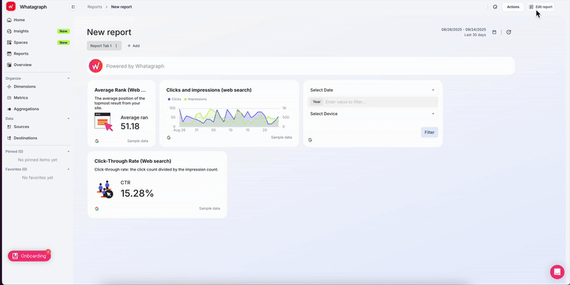
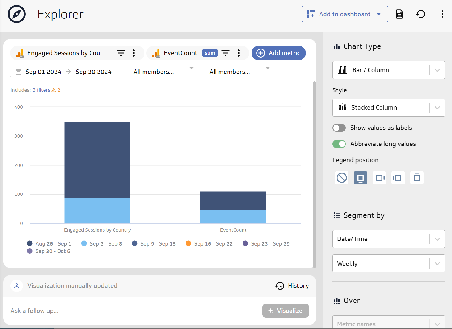
2. The fastest way to build a report, thanks to Whatagraph IQ
This is where Whatagraph separates itself from every other AI reporting tool.
With Whatagraph IQ Report Creation, you just need to prompt what you need and our AI generates:
- Full reports
- New tabs
- Custom widgets
Based on your data, in seconds.
If you need to edit a widget, again, just type in a prompt and we’ll edit the widget for you.
According to HubSpot's 2025 Marketing Report, marketers spend an average of 3.55 hours per week manually compiling and formatting reports. Whatagraph IQ cuts that to minutes - not by producing generic summaries, but by generating properly structured reports with the right KPIs, charts, and date ranges already applied.
Lars Maat, co-founder of Maatwerk Online, loves how much time and energy the AI report creation saves his team. Hear what he says:
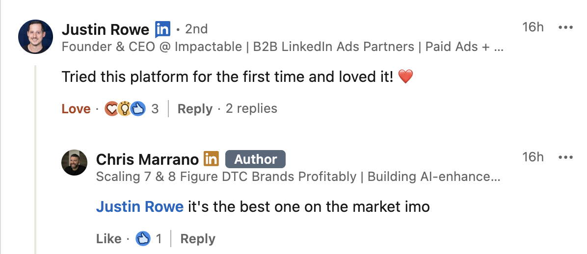
Marketers on LinkedIn are also buzzing about how much they love Whatagraph’s AI reporting tool:
Want to give Whatagraph for a spin? Try it free for 14 days.
Or want a more personalized walkthrough? Book a demo with our team.
3. Fully branded reports in seconds
You don’t need to style your reports manually on Whatagraph. All you need to do is upload a screenshot of a brandbook or website OR type in a prompt.
Whatagraph will automatically detect the fonts and colors in the screenshot and apply them to your report. You can still manually adjust the colors and fonts.
Agencies love this because they can spin up new client-ready dashboards instantly. For instance, Dtch. Digitals saw a 50% drop in churn after switching to Whatagraph from Looker Studio.
Stef Oosterik, Quality Manager at Dtch. Digitals, says:
Thanks to Whatagraph’s attractive visuals, clients can see the professionality behind our agency. Our churn rate is very, very low.
That's the compounding effect of professional-looking reports: clients trust what they see, they stay longer, and they refer more. Branding isn't just for looking pretty - it has a direct impact on retention.
4. Plain-language insights for clients (and internal stakeholders)
Tired of typing out performance summaries and recommendations manually?
You can get Whatagraph AI to do it for you based on the data on your report.
IQ Summary analyzes your raw data and generates clear, accurate explanations:
- What changed
- Why it changed
- Which KPIs need attention
- What to investigate next
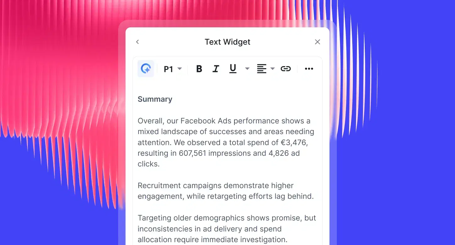
Janet Mesh, CEO and Co-Founder at Aimtal, puts it well:
One of the biggest mistakes that marketers make when creating reports is just adding screenshots of performance charts without any context or analysis.
IQ Summary solves exactly that problem. Instead of handing clients a wall of charts, you hand them a narrative they can act on. It's perfect for account managers who need a polished summary ready before a client call - without waiting on a data analyst or writing it themselves.
5. Instant answers to data questions with IQ Chat
IQ Chat lets you talk to your data the same way you talk to your team, no digging through dashboards or configuring filters.
Instead of hunting for the right metric, you just ask questions like:
- “Why did conversions drop last week?”
- “Which campaigns drove the best ROAS yesterday?”
- “What’s eating most of our budget?”
- “Show me how Meta CPM trended in the last 30 days.”
IQ Chat understands the context of your report (date range, filters, client, channels) and responds with:
- Clear, direct explanations
- The exact metrics that caused the change
- Suggested breakdowns to explore further
- Optional charts you can add to the report with one click
It’s perfect for performance marketers who don’t have time to play “find the KPI,” and for Account Managers who need fast answers before a client call, without waiting on a data analyst.
Hear what Lars Maat says about the IQ Chat:
6. Your entire reporting stack in one place
Whatagraph gives you everything you need for external reporting and internal performance monitoring:
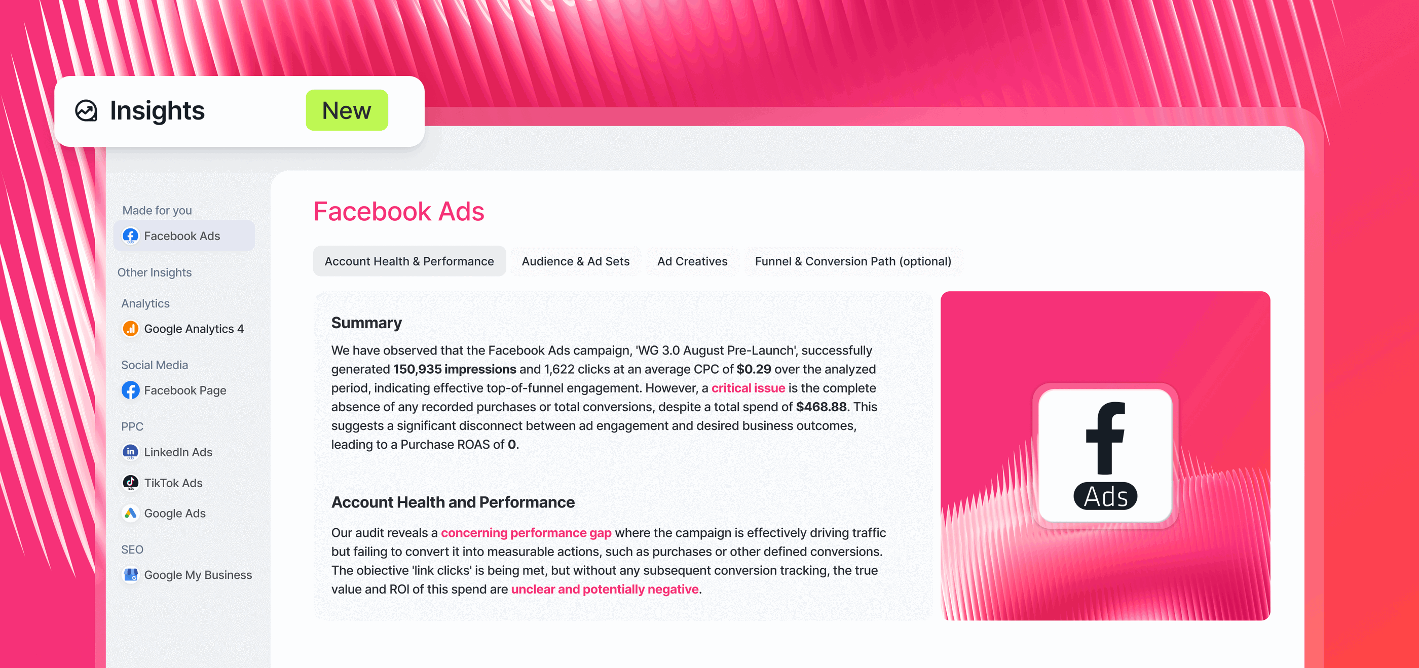
1. “Insights” space
Find key insights from all your connected channels (e.g. Facebook Ads) right away, powered by Whatagraph AI. This includes:
- Account health and performance
- Audience and ad sets
- Ad creatives
- Funnel and conversion path
2. Performance Overviews and Goals and Alerts
See all your campaigns and key metrics in one place. Tag and filter by Account Manager, client’s names, locations, or anything else that makes sense for your business.
Set goals and get notified when they’re off-track (or on-track) through Slack or email.
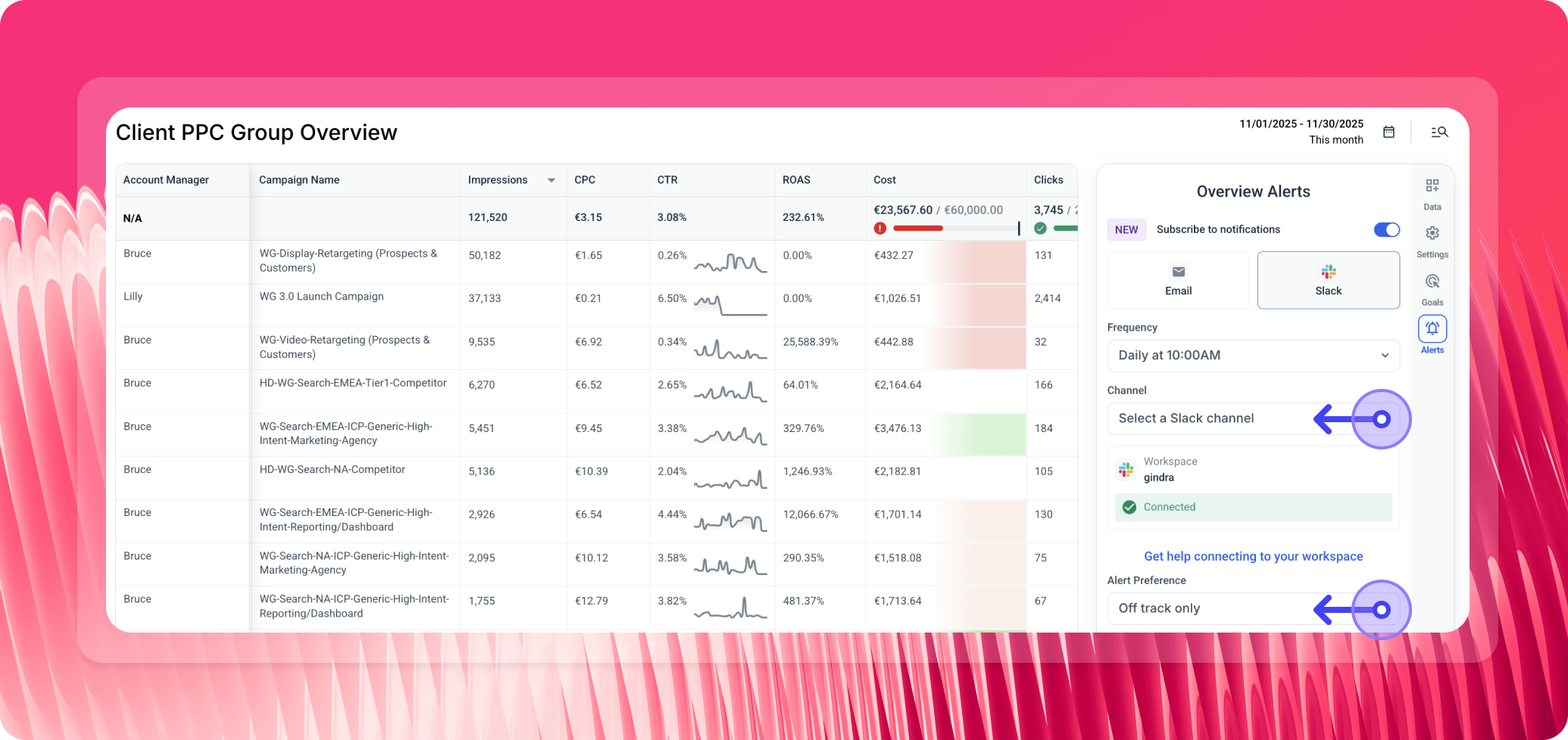 Teams like Peak Seven use Whatagraph as their “single source of truth” to keep teams aligned and clients in the loop without confusion, while saving 63 hours a month on reporting.
Kim Strickland, Digital Marketing Specialist, says:
Whatagraph is now our Bible—both for our clients and internal teams.
Whatagraph reviews from real users
"Apart from all the valuable things the tool has in itself, throughout the years we've chatted with their support for minor issues multiple times, and they were very quick to fix everything of even make improvements based on our feedback. Stellar group of people, these.” (Source)
“The dashboards are clean, easy to build, and perfect for client reporting…I love how I can set up automated reports that look great and are client-ready. No more fiddling with spreadsheets or wasting time building slides.” (Source)
“If I was starting a digital agency today, signing up with Whatagraph would be one of my first moves.” (Source)
Pros
- Easiest reporting setup on the market
- Clean, accurate, unified data
- AI-generated reports, tabs, widgets, and summaries
- Fully branded reports in seconds
- 60+ stable, fully managed integrations
- Unlimited users on every plan
- Best-in-class customer support
- Ideal for multi-client reporting and multi-brand performance monitoring
Cons
- Not a BI tool for deep SQL modeling
- Requires source credits (plans scale with data needs)
- Best value is for teams with recurring reporting workflows
Pricing
Here's Whatagraph’s pricing as of March 2026:
- Forever-free – lets you get started at no cost, with 5 source credits, Whatagraph IQ basics, templates, and live chat support.
- Start ($229/mo billed annually) – includes 20 source credits and essential integrations
- Boost ($463/mo billed annually) – jumps up to 50 source credits, adds advanced integrations, custom metrics & dimensions, white-labeling, and performance overview with alerts
- Max (custom pricing) – for enterprise/complex teams, with custom source credits, premium integrations, data groups and blends, Whatagraph IQ+, SSO, and dedicated Customer Success Manager
Get started with Whatagraph for free today.
2. Klipfolio
Best for: Large data teams at companies and large agencies
Klipfolio is a data analytics and business intelligence platform in one. It offers two key products:
- PowerMetrics: Designed for data teams at large companies, this is a data analytics tool to centralize, standardize, and share accurate metrics throughout the organization. Non-data teams can then use these certified metrics for their dashboards and reporting needs.
- Klips: Your regular data visualization dashboards and reports. Klips integrates 130+ platforms, and you can also use the Rest/URL option for custom integrations.
With PowerMetrics, you can create a curated metric catalog, run self-serve analysis with AI insights, store data where you want, and share insights across your organization without manual work.
With PowerMetrics' AI, interacting with your marketing data becomes as simple as asking a question. Thanks to natural language processing (NLP), you type a query and the system generates the visualizations you need.
Once you spot an important insight, you can save it to your dashboard for easy access and future analysis.
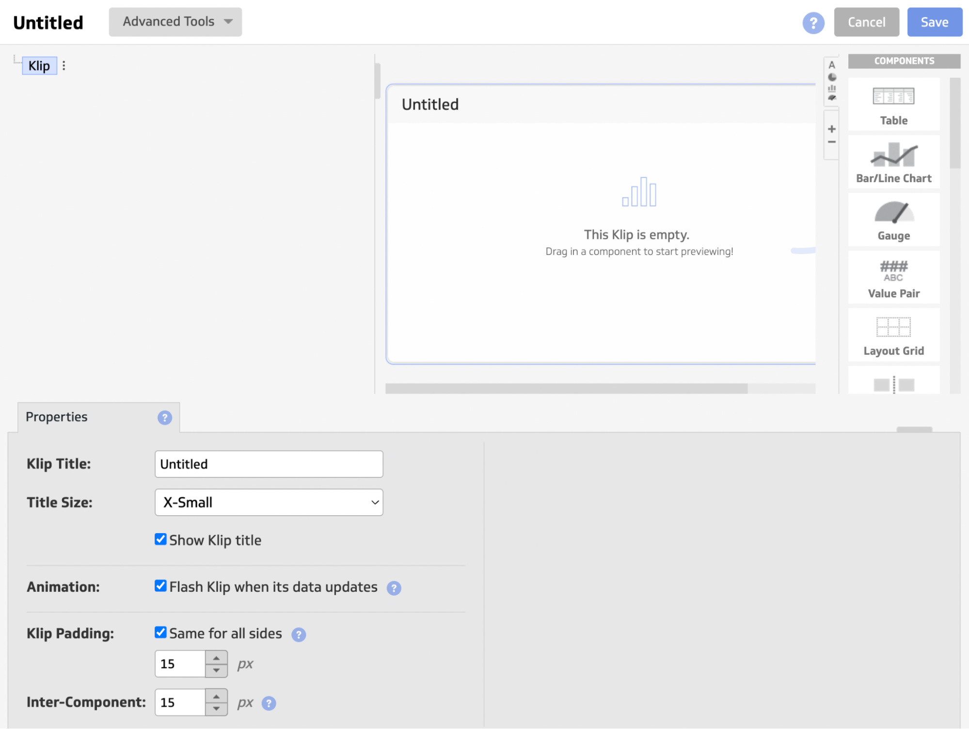
When you sign up for a Klipfolio trial, you get immediate access to your first dashboard. B
ut building visualizations requires creating individual "Klips" in a separate interface, which can feel clunky - expect to spend 5 to 30 minutes setting up a single Klip depending on complexity.
If you regularly report on complex business data and want a simpler, AI-driven approach, Klipfolio works well - provided you have a dedicated data team in place.
Key features:
- 130+ native integrations including Google Analytics, HubSpot, Salesforce, Facebook Ads, Xero, and SQL databases; REST/URL connector for any custom API source
- Excel-like formula editor for data transformation, cleaning, and custom calculations
- Dynamic data filtering and interactive dashboards with user-based personalization
- Data blending from multiple sources (requires technical setup)
- 30+ visualization types including bar charts, gauges, maps, and funnels
- White-labeling available as add-on (custom domain, CSS/JS theming, branded login)
- Scheduled email snapshots, PDF exports, and published dashboard links for sharing
- Mobile and TV display optimization
- PowerMetrics (separate product): NLP-based self-serve analytics with AI insights and metric catalog
Klipfolio reviews from real users
“I needed something to convert Google sheets into dashboards to monitor our maintenance logs. Klipfolio is an incredibly intuitive quick solution.” (Source)
“The platform can run a little slow sometimes, particularly when performing complex actions. With Klips, data sources are always fully refreshed when loading up a dashboard, which can drag down the performance when working with multiple data sources at the same time.” (Source)
“I really dislike their training style. It's costly, and you have to pay a lot for a support ninja to help you. If you're a small company, it can run up your bill fast.” (Source)
Pros:
- Easy to use and set up
- Powerful data analytics and organization options
- AI insights to help make data-driven decisions
Cons:
- Expensive with important features only available as add-ons or in Enterprise plans
- Limited customization for dashboards and templates
- Unhelpful customer support
Pricing(as of May 2026):
Klips business plans (billed annually):
- Base: $120/month (3 dashboards, 4hr data refresh)
- Grow: $190/month (10 dashboards, 1hr refresh)
- Team: $310/month (20 dashboards, 15-min refresh)
- Team+: $600/month (40 dashboards, up-to-the-minute refresh)
Klips agency plans (billed annually):
- Agency Starter: $160/month (5 dashboards, 5 clients)
- Agency Lite: $240/month (15 dashboards, 15 clients)
- Agency Pro: $440/month (30 dashboards, 30 clients)
- Agency Premier: $900/month (80 dashboards, 80 clients)
All plans include unlimited users. Add-ons available for extra dashboards and near-real-time refresh. 14-day free trial available.
3. NinjaCat
Best for: Marketing agencies and companies with dedicated data scientists
NinjaCat is an end-to-end platform for connecting to your data sources, cleaning the data, visualizing it, and shipping it to destinations.
You can connect data with 150+ pre-built integrations, including CRM, search engine advertising, web analytics, e-commerce, email marketing, call tracking, and project management tools. Data lands in NinjaCat's fully managed Data Cloud, which runs on Snowflake - so your pipelines, ETL, and semantic modeling are all handled for you.
NinjaCat also gives you the option to export your data to external warehouses (Snowflake, BigQuery, Redshift, Databricks) or BI tools like Tableau and Looker Studio.
When it comes to artificial intelligence, NinjaCat has moved well beyond summary widgets. The platform now ships a full suite of AI capabilities:
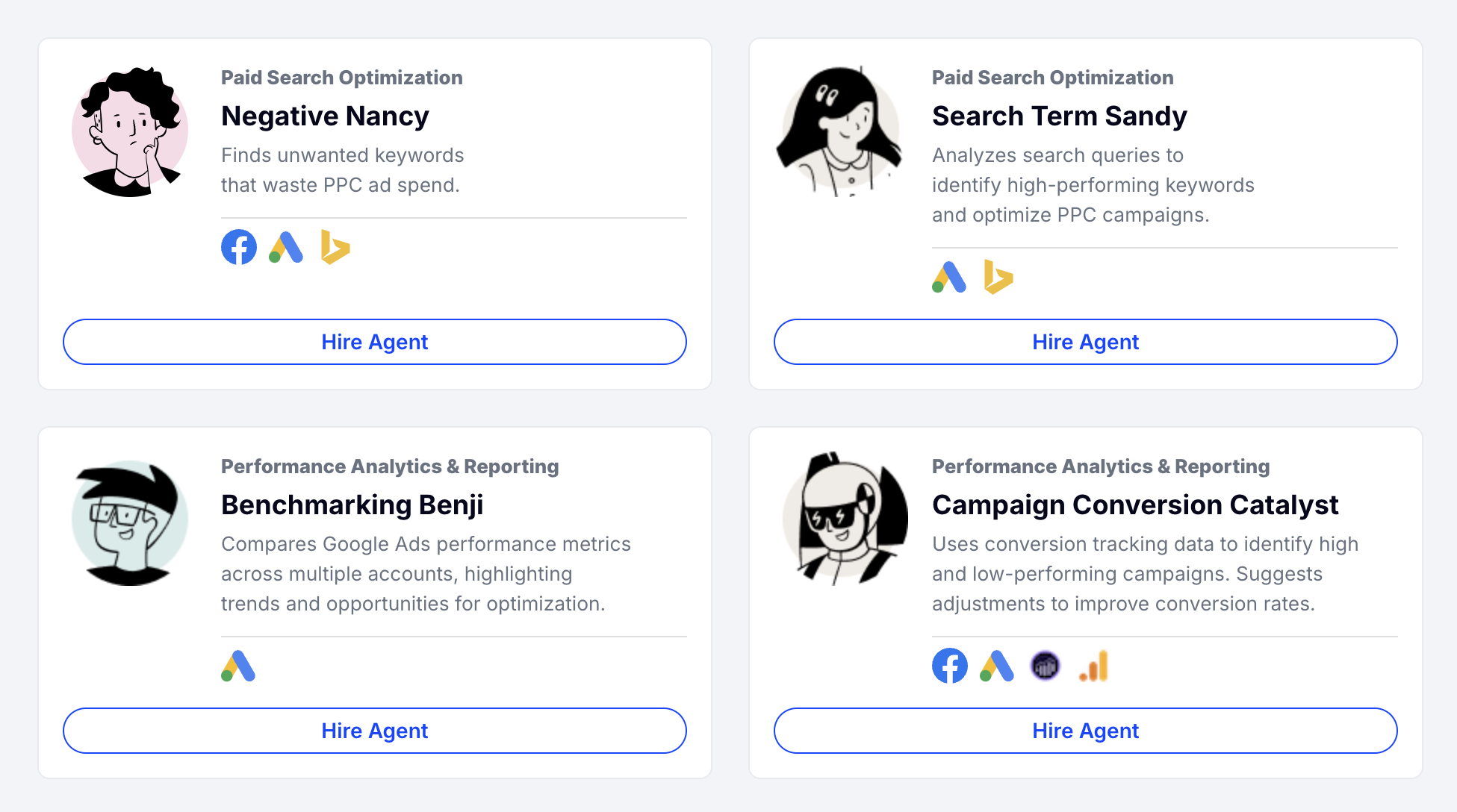
AI Agents: Pre-built task-specific agents that automate specific marketing operations.
The library includes agents for paid search (negative keyword discovery, budget pacing, search term mining), campaign performance monitoring (real-time ad spend alerts), creative auditing (QA for ad accuracy and compliance), SEO rank summaries, and client success workflows (renewal alerts, win highlight emails). You can also build custom agents without SQL using natural language prompts.
AI Insights Generator: An AI summary widget that auto-generates plain-language narrative summaries embedded directly into your report templates. It processes all major marketing data sources in NinjaCat - paid media, SEO, analytics - and turns performance metrics into client-ready narratives.
Report Template Builder: Auto-generates polished reports for thousands of clients from a single template, cutting the number of ad-hoc templates your team needs to manage.
Key features:
- 150+ pre-built marketing data connectors covering paid media, SEO, social, analytics, CRM, call tracking, and e-commerce
- Fully managed Data Cloud running on Snowflake - data pipelines, ETL, and semantic modeling included
- AI Agents: pre-built task-specific agents for paid search (negative keyword discovery, budget pacing), campaign monitoring, creative auditing, SEO rank summaries, and client success workflows (renewal alerts, win highlight emails); custom agents configurable without SQL
- AI Insights Generator: auto-generates narrative summaries embedded directly in report templates
- Report Template Builder: auto-generates reports for thousands of clients from a single template
- Budget and KPI monitoring dashboard with real-time alerts
- Data export to external warehouses (Snowflake, BigQuery, Redshift, Databricks) and BI tools (Tableau, Looker Studio)
- White-label options with white-glove setup and onboarding
NinjaCat reviews from real users
“NinjaCat helped us have a single pane of glass for all of our advertising channels in one place. Additionally, it has reduced the amount of time our team has had to put into our reporting decks.” (Source)
“NinjaCat can be finicky at times, so I struggle to use it as a live dashboard. I think it works stronger for me when I'm using a standard report during a set time frame that I can download.” (Source)
“When processing a large number of groups it can take a while. Users often run reports at the same time each month, however we are a large client with over a thousand reports that need run.” (Source)
Pros:
- Automated client reporting
- One platform for integration and visualization
- Multiple choice of destinations
- Custom branded reports
Cons:
- Separate workspaces to organize and visualize data
- Complex visualization builder
- Performance issues with reports
- No autosave in case of a crash
Pricing
NinjaCat doesn’t offer fixed pricing plans, and no information is available on its website.
Best AI Reporting Tools for Enterprises
If you'd prefer advanced AI reporting tools that offer deep data analysis, predictive insights, and real-time visualizations for your business, here are our top picks:
7. Tableau
Best for: Data teams at large enterprises
Tableau is a capable business intelligence tool that comes with an intuitive drag-and-drop interface you can use to quickly generate insights and share them as reports with stakeholders.
It supports advanced calculations, data blending, statistical functions, and predictive modeling.
You can analyze complex data in different ways to uncover trends and identify opportunities for optimization using trend lines, forecasting, and clustering.
In 2026, Tableau has significantly expanded its AI capabilities across four main pillars:
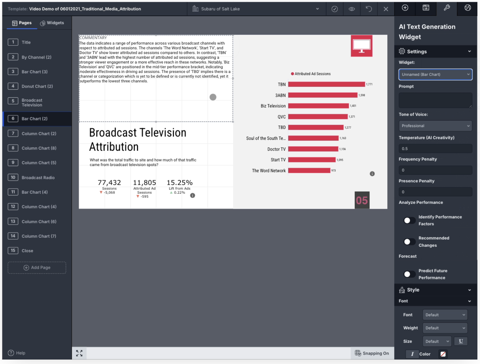
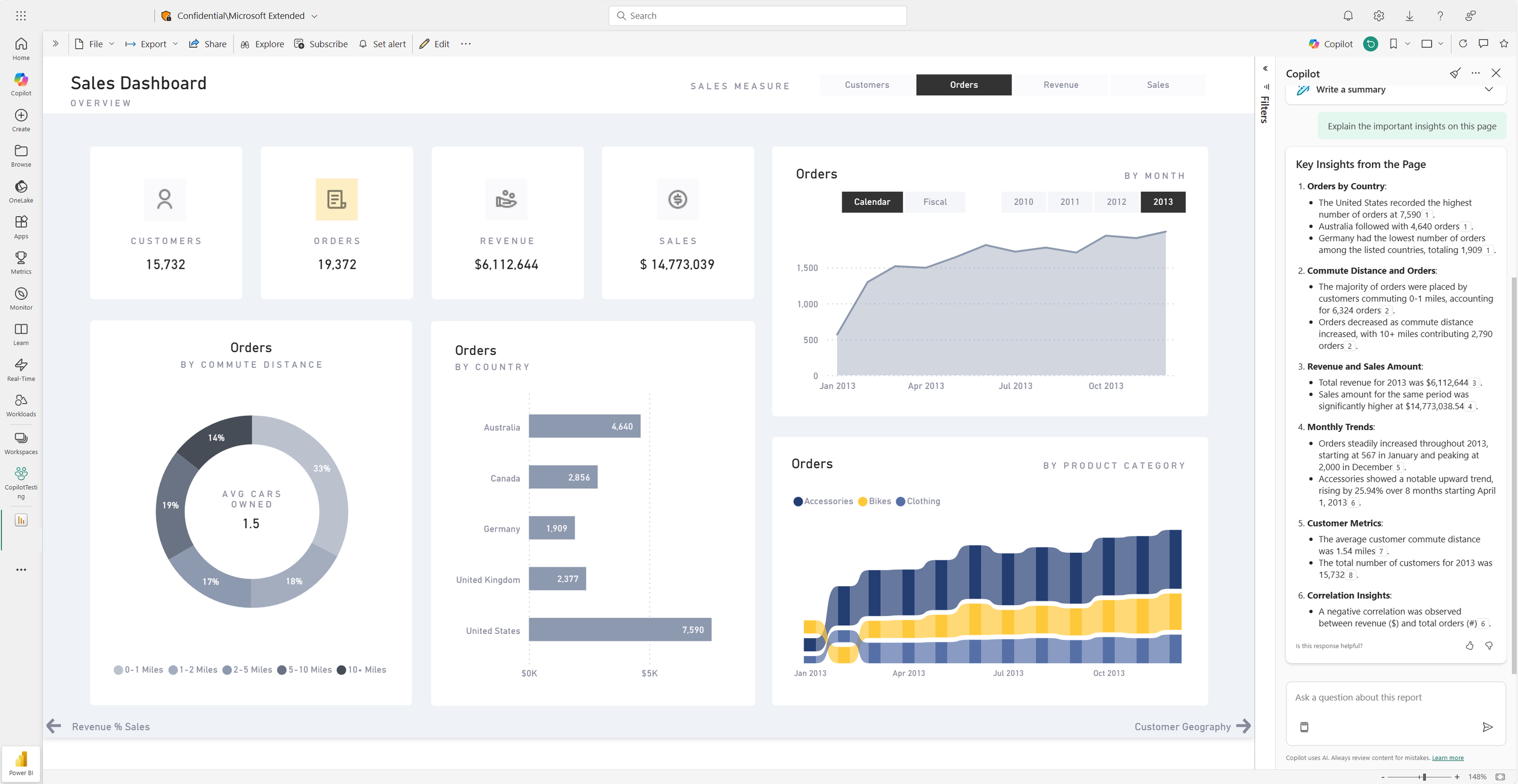
Tableau Agent: A conversational AI assistant built into Tableau Desktop, Prep, and Cloud Web Authoring. Describe a calculation or visualization in plain language and Tableau Agent builds it for you. It also auto-generates catalog descriptions for data sources, workbooks, and tables - and now delivers dashboard narratives that summarize key insights across an entire viz in plain language.
Tableau Pulse: Personalized, AI-powered metric monitoring now bundled with all Tableau Cloud editions. It automatically detects drivers, trends, contributors, and outliers for your KPIs, flags changes in natural language with visual explanations, tracks goal pacing (on-track vs. off-track), and delivers digests to Slack and email. Enhanced Q&A (available in Tableau+ bundle) adds free-form conversational questions directly from the Pulse homepage.
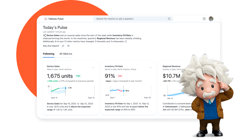
Tableau Next: Tableau's new agentic analytics platform, available in the Tableau+ bundle. It integrates natively with Salesforce Agentforce through three out-of-the-box analytics skills: Data Pro, Concierge, and Inspector. Built on Tableau Semantics - an AI-infused semantic layer that enriches agents with business context - and powered by Data 360 as the unified data layer.
Tableau App for Microsoft 365: Embed live Tableau dashboards and Pulse metrics directly into PowerPoint slides, Word documents, and Teams channels. Refresh with one click so your audience always sees current data.
If you have no prior experience with Tableau, you can purchase "Success Plans" that include personalized support and training.
Tableau also has a large and active user community - "Tableau Community Forums" - a solid resource for troubleshooting and eLearning.
Keep in mind: Tableau is an enterprise-grade tool that doesn't come cheap, and most advanced AI features are Cloud-first or require the Tableau+ bundle.
Key features:
- 100+ native connectors including Salesforce, SAP, Google Analytics, Snowflake, BigQuery, Redshift, SQL Server, Oracle, and cloud services
- Tableau Agent: conversational AI for creating visualizations, writing DAX/calculations, building Prep flows, and generating catalog descriptions using natural language
- Tableau Pulse: AI-powered personalized metric monitoring with automated plain-language summaries, trend detection, goal pacing, and anomaly alerts - now bundled with all Tableau Cloud editions
- Tableau Next (Tableau+ bundle): agentic analytics platform with Agentforce integration (Data Pro, Concierge, Inspector skills), AI semantic layer (Tableau Semantics), and enhanced Q&A
- Tableau App for Microsoft 365: embed live dashboards and Pulse metrics into PowerPoint slides, Word documents, and Teams channels with one-click refresh
- Advanced data blending, statistical functions, trend lines, forecasting, and clustering
- Enterprise-grade security including Einstein Trust Layer, RBAC, SOC 2 Type 2, MFA
- Large active community (Tableau Community Forums) and self-paced eLearning resources
Tableau reviews from real users
“My favorite aspect of Tableau is that it forces me to track my performance by metrics in a more straightforward way. These interactive dashboards let me see my performance at a glance, and identify trends or areas where I need to improve.” (Source)
“The drag-and-drop interface of Tableau is user-friendly especially for individuals lacking extensive technical knowledge.” (Source)
“Tableau can be costly, particularly for startups. Even with its flexibility, the licensing model still adds costly, especially when you extend usage across teams or a complete company.” (Source)
Pros
- Powerful data analytics and visualization
- Easy to use and implement
- Seamless data integrations
Cons
- Can be expensive if you need advanced features
- Takes a lot of time to load for large datasets
- All the preprocessing of the data (data cleaning) has to be done beforehand. Data cleaning cannot be done in Tableau
Pricing (as of May 2026 - Tableau Cloud Standard tier):
- Viewer: $15/user/month, billed annually
- Explorer: $42/user/month, billed annually
- Creator: $75/user/month, billed annually
Note: Enterprise tier pricing is significantly higher ($35/$70/$115 per user/month respectively) and includes advanced governance, Tableau Pulse, and enterprise security controls. A 14-day free trial is available.
8. Power BI
Best for: Business analysts in SMBs
Microsoft Power BI is a business intelligence software suite that includes apps, services, and data connectors. It's a cloud-based dashboard tool you can use to combine data from multiple sources into a single data set, creating engaging visualizations including interactive charts, graphs, maps, and custom visuals.
In 2026, Copilot has become the primary AI interface in Power BI. Microsoft is retiring the legacy Q&A visual in December 2026 and replacing it entirely with Copilot - which interprets questions more accurately and generates richer, more contextual analysis. If your team relies on Q&A visuals, migration planning should start now.
Copilot for Power BI: Generates DAX formulas, creates reports and visuals from natural language prompts, writes narrative summaries that update automatically when data refreshes, and answers questions in plain language. Available across Power BI Desktop, Service, mobile (iOS/Android), and embedded. Copilot requires Fabric capacity (from F2 at $262.80/month) or Premium Per User (PPU).
Beyond Copilot, Power BI retains its suite of built-in AI features:
Key Influencers: An AI algorithm that analyzes your data, classifies variables, and displays which factors most strongly drive a specific outcome.
Anomaly Detection: Automatically detects irregularities in time-series data with customized sensitivity settings, plus plain-language explanations through the insights pane.
Decomposition Tree: Breaks data across multiple analysis dimensions to surface root causes, trends, and patterns faster.
Forecasting with AI: Trend analysis and predictive modeling on time-series and cross-sourced data, identifying tendencies and correlations that can impact business outcomes.
Power BI is highly scalable and handles large volumes of data and complex analytics workloads.
You can connect to Microsoft products (Dynamics 365, Azure), databases (SQL Server, Oracle, MySQL), and cloud services (Google Analytics, Salesforce). Most users find Power BI works best within the broader Microsoft ecosystem.
Power BI Pro is included at no extra cost for organizations on Microsoft 365 E5 or Office 365 E5 - worth verifying before purchasing standalone licenses.
Key features:
- 100+ native connectors including Microsoft 365, Dynamics 365, Azure, Salesforce, Google Analytics, SQL Server, Oracle, and MySQL; REST API for custom sources; best-integrated with other Microsoft platforms
- Copilot: generates DAX formulas, creates reports and visuals, writes narrative summaries, and answers natural language questions; available in Desktop, Service, mobile (iOS/Android), and embedded; replaces legacy Q&A visual (retiring December 2026)
- Key Influencers: AI algorithm that identifies which variables drive a specific outcome
- Anomaly Detection: auto-detects irregularities in time-series data with plain-language explanations
- Decomposition Tree: breaks data across multiple dimensions to surface root causes
- Forecasting with AI: trend analysis and predictive modeling on time-series data
- Native sharing to Microsoft Teams, PowerPoint, Excel, and SharePoint
- Power BI Enhanced Report Format (PBIR): Git-compatible, code-friendly report format for DevOps workflows (default as of January 2026)
- Fabric integration for enterprise-scale semantic modeling, lakehouse architecture, and Direct Lake mode
Power BI reviews from real users
“For anyone already used to the Microsoft ecosystem, PowerBI delivers a combination of a user-friendly interface and powerful analytics.” (Source)
“Power bi has a eye catchy user interface and tons of customizing options.” (Source)
“The DAX (Data Analysis Expressions) which is used to creating complex calculations in Power Bi need a deep learning curve for the new users.” (Source)
Pros:
- Advanced AI features
- Wide choice of integrations
- Advanced data visualization options
- Real-time processing
Cons:
- Steep learning curve
- Needs additional configurations to connect non-Microsoft sources
- Creating complex reports requires technical knowledge
Pricing (updated April 2025 - current as of May 2026):
- Pro: $14/user/month (increased from $10 in April 2025)
- Premium Per User (PPU): $24/user/month (increased from $20 in April 2025)
- Microsoft Fabric capacity: Starting at $262.80/month (F2 SKU) for enterprise-scale deployments
Note: Power BI Pro is included at no extra cost for organizations on Microsoft 365 E5 or Office 365 E5. A 60-day free trial is available for Pro.
9. Domo
Best for: Data teams and tech-savvy marketing teams
Domo is a cloud-based AI and data products platform you can use to connect and prepare data, automate reporting, build intelligent agents, and deliver fast insights that fuel data-driven decisions.
In March 2026 at its Domopalooza conference (great name btw), Domo launched a major new AI orchestration framework that significantly expanded what the platform can do:
- AI Agent Builder: Create custom conversational agents and agentic workflows from natural language prompts, integrated directly with your governed enterprise data. No SQL required.
- AI Toolkits: Packaged capability bundles combining data sources, workflows, and business context instructions that define what an agent can do. Toolkits can be created by your team, provided by Domo for common use cases, or connected to external services.
- Domo MCP Server: A universal connector that extends Domo AI Toolkits and agents to external LLMs - including Claude, Gemini, and ChatGPT - via the Model Context Protocol standard. These external AI tools can then securely query governed Domo data and trigger interactive dashboard responses, not just text replies.
- App Catalyst: Build pro-code enterprise applications using natural language prompts. Provides the same simplicity as vibe coding but with enterprise-grade governance and security built in from the start.
- AI Chat: Context-aware conversational data Q&A grounded in the dataset or dashboard currently in view. Stores past sessions so you can reference previous conversations.
Key features:
- 1,000+ on-premise and cloud connectors including Salesforce, Google Analytics, Snowflake, Databricks, BigQuery, and AWS; real-time queries against cloud warehouses without data duplication
- AI Chat: context-aware conversational Q&A grounded in the dataset or dashboard currently in view; stores past sessions for reference
- AI Agent Builder (launched March 2026): create custom conversational agents and agentic workflows from natural language, integrated with governed enterprise data
- AI Toolkits: packaged capability bundles (data, workflows, instructions) that define what an agent can do; can be shared via Domo MCP Server
- Domo MCP Server (launched March 2026): connects Domo data and AI Toolkits to external LLMs including Claude, Gemini, and ChatGPT - enabling those models to query governed Domo data and trigger interactive dashboard responses
- App Catalyst: build pro-code enterprise applications using natural language prompts
- Magic ETL with AI-guided data prep: redesigned drag-and-drop ETL canvas with AI tiles for JSON connectors and row-level security support
- Native ML model deployment with Python, R, and Amazon SageMaker Autopilot
- Embedded analytics and mobile app with real-time data access
- PDF Report Builder for formatted executive reports (launched 2026)
Domo reviews from real users
“Domo provides options that cater to all data proficiency levels across the product offering, typically a pro full code level, code-less drag and drop function gui, and no code option for novices or very simple tasks.” (Source)
“You won't see much of the themes and creative visuals here. Only limited themes are there which can make almost all the dashboards/apps look similar.” (Source)
“Products have become more buggy since the introduction of app studio in April of 2024. Training is good for the core product but it is difficult to find education on new products/tools.” (Source)
Pros:
- Easy-to-use interface
- Real-time data access
- Wide choice of visualizations
- Large number of connectors
- Mobile access
Cons:
- Steep learning curve despite user-friendly user interface
- It might require some SQL knowledge
- Performance issues with large datasets
- Costly additional features
- Limited report scheduling options
- Potential downtime issues due to cloud-based infrastructure
Pricing (as of May 2026)
Domo has a free 30-day trial and three pricing plans, but pricing is not publicly available. You have to ask their sales team for a quote. Pricing is based on overall usage, data storage, data refresh rates, number of users, and volume of data queries.
Published on Feb 19 2025
WRITTEN BY
YamonYamon is a Senior Content Marketing Manager at Whatagraph. With an eye for detail and a knack for always considering context, audience, and business goals to guide the narrative, she's on a mission to create genuinely helpful content for marketers. When she’s not working, she’s hiking, meditating, or practicing yoga.