11 Best Klipfolio Alternatives in 2026: Reviews & Pricing
Klipfolio is a powerful data analytics tool, but it can be a pain to set up and use. You'll need to know SQL and basic coding to connect and organize your data.
In this article, we’ll take you through:
- The shortcomings of Klipfolio
- 11 best Klipfolio alternatives
- Reviews, pricing, and features of each tool

Jan 19 2026●10 min read


Based on feedback from ex-Klipfolio users and online reviews, here are the key issues with the platform:
❌ Difficult to build, implement, and maintain: While Klipfolio offers pre-built data connectors, you’ll need to work with SQL queries and codes to create custom connections and to organize your data.
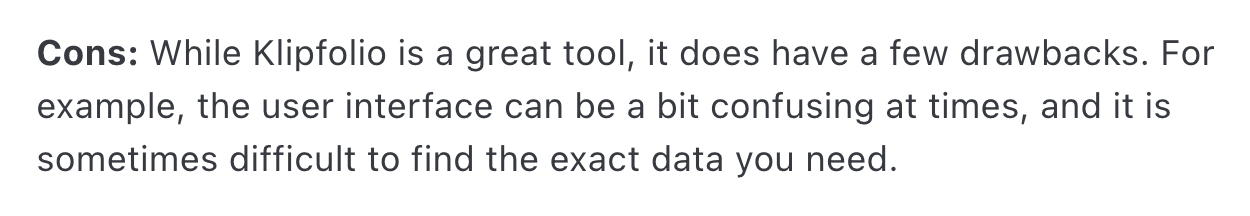
The interface is clunky and confusing, making it hard to find the data you need. Users say it takes formal training and trial and error to build dashboards properly, and that pre-built options are limited and subpar.
Many Klipfolio users end up having to hire a data scientist (or even a whole team) to build and maintain their dashboards, adding to the overall cost.
❌ Time-consuming: To create visualizations on Klipfolio, you’ll need to first create “Klips” (similar to widgets) and add them to your dashboard. Each “Klip” can take 10 minutes to an hour to create, and you need to repeat this for every widget. Overall, it can take you hours to create a full-blown dashboard on Klipfolio.
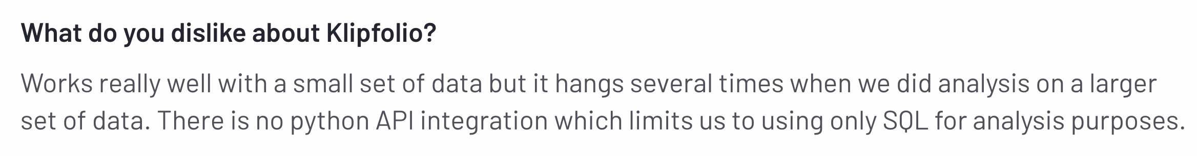
❌ Slow servers: Users say they encounter errors or timeouts when downloading reports as PDFs. Even simple reports with basic visualizations and no complex calculations take forever to load or will load without up-to-date data. Users also say Klipfolio “hangs” frequently when analyzing large data sets.
❌ Expensive: If you want full features like custom domains, single sign-on, and custom themes, you'll need to choose pricier plans: $420/month for 30 dashboards (custom themes not included) and $1025 for 80 dashboards.If you have 100+ clients, these options are still not enough.
Priority support and onboarding are only offered in the top-tier plan, and with additional implementation or data scientist fees, you can end up paying 1000s of dollars a month.
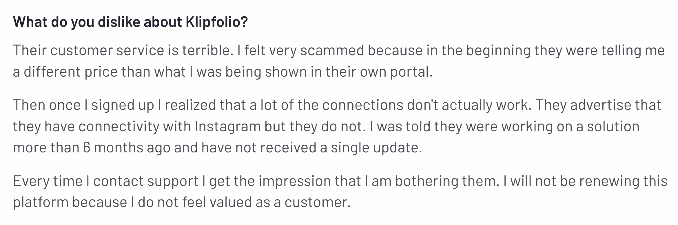
❌ Poor customer service: Frustrated users say Klipfolio’s customer service is “terrible” and they felt like they were being a bother to the support team whenever they contact them.
---
If you’re facing the same challenges, we’ve got your back.
In this article, we’ll take you through 11 best Klipfolio alternatives which are easier to use, more cost effective, and come with great customer support.
11 Best Klipfolio Alternatives and Competitors in 2026
In a nutshell, here are the 11 best Klipfolio alternatives we’ll review in this article:
- Whatagraph
- Geckoboard
- Tableau
- DashThis
- Grow.com
- NinjaCat
- Cyfe
- Databox
- TapClicks
- AgencyAnalytics
- Improvado
Let’s dive into each of these tools.
1. Whatagraph
Most suitable for: Marketing agencies and in-house teams that need scalable, accurate, and stunning reports without having to rely on data scientists
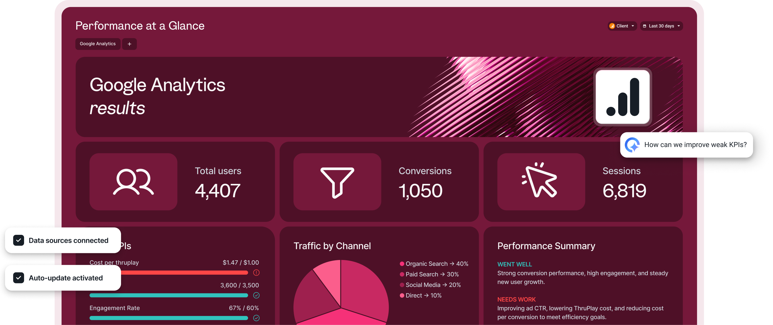
If you’re looking for an easier and more stable platform with excellent customer support Whatagraph is for you.
Whatagraph is an all-in-one data platform that makes it easy to connect, organize, visualize, and share your data in one place.
Unlike Klipfolio, you don’t need to have any coding skills or hire a data scientist to use Whatagraph. Anyone from your team, whether that’s an Account Manager or the CMO, can quickly log into Whatagraph and see insights right away.
In a nutshell, here’s how Whatagraph works:
- Connect to 55+ marketing platforms automatically via native, stable connectors that don’t break.
- Easily organize your data—create custom blends, metrics, and dimensions using no-code workflows or AI.
- Ask AI to create reports by just telling it what you want it to build. Or use drag-and-drop widgets or ready-made templates to build one from scratch.
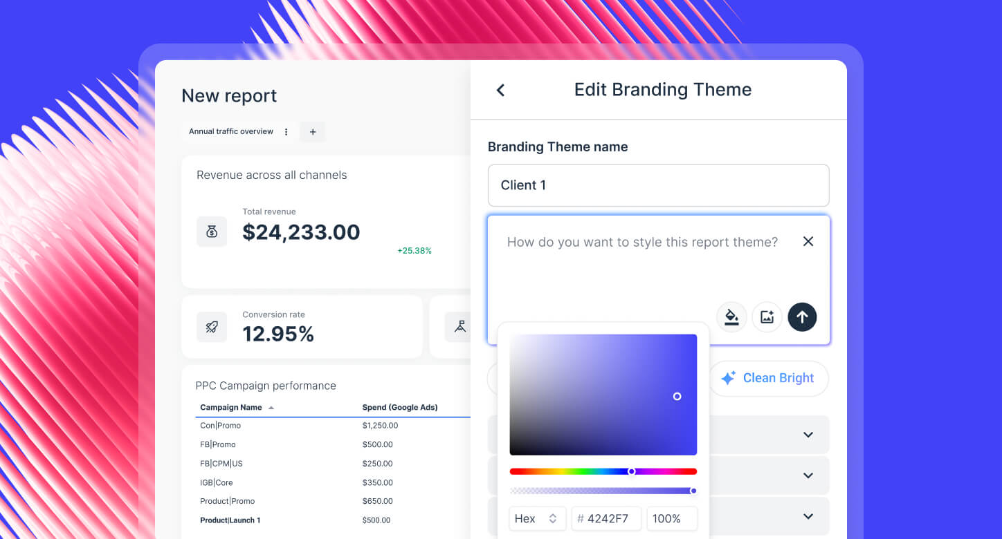
- Customize reports by just uploading a screenshot of your (or your client’s) brandbook or putting in a prompt. Host and share reports on your own domain.
- Get actionable insights instantly by just asking AI any questions about your connected data. Get it to write performance summaries directly in your reports in four different formats and 18 languages.
- Share reports as live links, PDFs, Excel spreadsheets, or automated emails. Transfer your data to BigQuery data warehouse or Looker Studio.
All this on one marketing data platform means:
✅ You can save up to 100 hours a month on analyzing data and creating reports.
✅ Your data is organized on one platform and you have a clear view of marketing performance.
✅ Your internal teams have a single source of truth to access insights and optimize campaigns.
✅ There are less chances of data inconsistencies and breakages.
✅ Your clients or the C-Suite clearly sees the value of your agency.
As Kim Strickland, Digital Marketing Specialist at Peak Seven and one of our power users, puts it:
Whatagraph has helped everyone on our team get on the same page about clients, what’s important, and how to talk to them. Our relationships with clients have been amazing, and we’ve even been able to retain them longer. It's now our Bible—both for our clients and internal teams.
But how does Whatagraph compare against Klipfolio exactly? Let’s take a look:
Klipfolio vs. Whatagraph: Head-to-Head Comparison
Our Product team did extensive research on how Whatagraph compares against Klipfolio and you can find the full breakdown here.
In a nutshell, here are five key ways Whatagraph outperforms Klipfolio:
1. Stable and fast platform
Klipfolio users say the platform “hangs” several times when they were working with large volumes of data.
 The platform also seems to have clunky integrations, with connections not working or dropping off often.
 Whatagraph eliminates these pain points.
Our integrations are fully-managed, which means they’re more seamless, stable, and reliable. And Product engineers regularly maintain them so there are less breakages.
In terms of speed, you can work with 10 sources and 100 widgets at the same time on Whatagraph without slowing down the platform.
Thanks to a recent update to Google Kubernetes Engine, even reports with heavy widgets, tabs, and charts take less than 10 seconds to load on Whatagraph.
And according to data from the past 6 months, Whatagraph has an average uptime of 99.95%.
We also have an emergency alert that will wake up all our Product engineers (even if it’s 3 am where they are) to quickly fix system outages, if there are any.
Whatagraph also comes with a consistent refresh-rate of 30 minutes on all plans. In contrast, the refresh-rate on Klipfolio depends on the plan—ranging from 4 hours to 30 minutes.
All of this means:
✅ The platform is stable and there are few inconsistencies or delays in the data.
✅ Bugs get resolved faster without needing to get a third-party company involved.
✅ Your reports load fast.
✅ Platform downtimes are very rare, and are quickly resolved by our Product engineers who are on call 24/7.
Our users love how seamless and stable connections are on Whatagraph. Here’s what Tanja Keglić, Performance Marketing Manager at Achtzehn Grad, says:
We don’t have any connection issues on Whatagraph at all. We just connected the platforms once, and that was it. Whatagraph is also very quick when loading the data.
2. Easier and faster to build visualizations
To create visualizations on Klipfolio, you’ll need to work with two different workspaces: “Klips” and “Dashboards”.
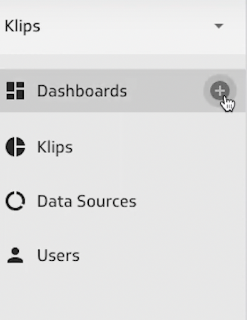
Klips are widgets that show your data. It can take anywhere from 10-60 minutes to create each Klip as you’ll need to:
- Import your data from spreadsheets, Google drive, or REST API
- Choose the data you want to visualize
- Organize and aggregate the data
- Configure widget settings
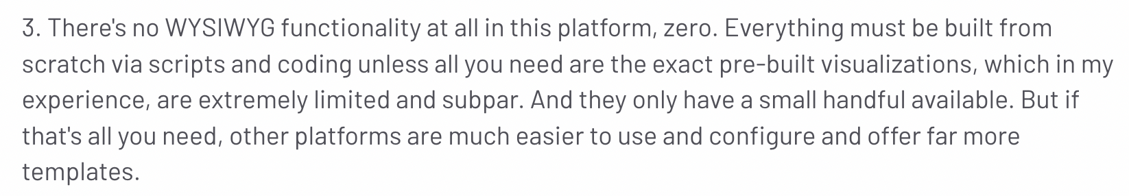
Users say the user interface to create Klips can be confusing and clunky, and that it’s difficult to find the exact data you need. For instance, if you want to upload your data from REST API, you’ll need to know how to read and configure API queries.
 Plus, you’ll need to repeat the entire process for every widget you want to visualize. Klipfolio does offer pre-made “Klips” but they’re limited, as this review puts it:
 Once you’re done creating these Klips, you’ll need to add them one by one onto your dashboard. This entire process can take up to 2 to 3 hours.
On Whatagraph 3.0, building a dashboard doesn’t feel like “work.”
With Whatagraph IQ, you can go from blank screen to fully branded, client-ready report in minutes—without juggling multiple editors, broken connectors, or hours of manual setup.
Here’s how it works:
- IQ Report Creation: Just type what you need (“Build me a GA4 + Meta Ads performance report”) and IQ creates the full report in one go. No need to piece together dozens of widgets manually.
- IQ Themes: Upload a logo or brand color, and IQ auto-styles the entire report. Fonts, HEX codes, icons, layouts—done in seconds.
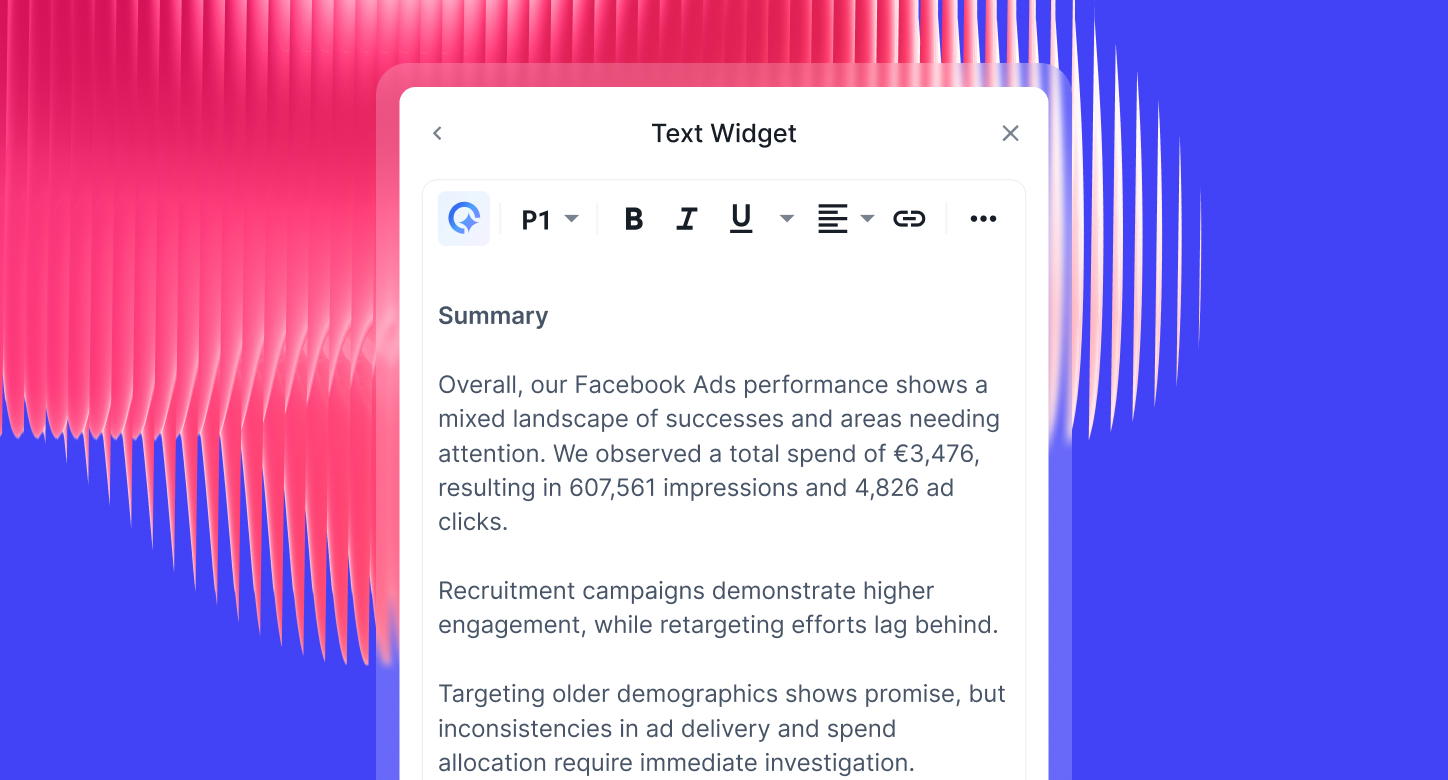
- IQ Summary: Instead of writing insights by hand, IQ generates plain-language takeaways based on the data (great for client updates or internal reviews).
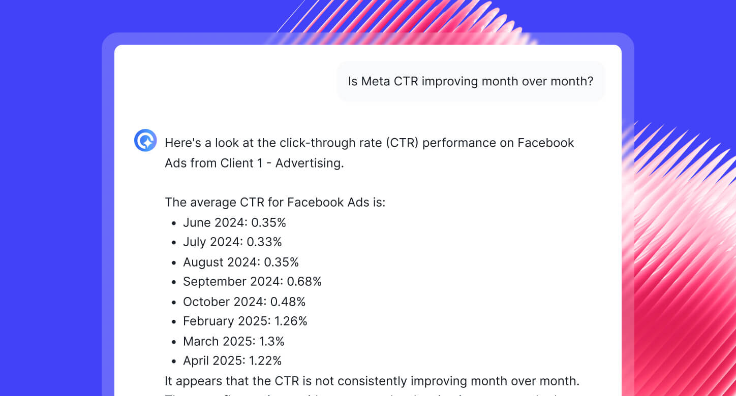
- IQ Chat: Ask questions in plain English: “Which campaign drove the most conversions this week?” Whatagraph gives instant answers with charts or numbers.
All this means reports that would take hours in Klipfolio are ready in minutes with Whatagraph.
And this is why agencies like Maatwerk Online are saving 100 hours a month on reporting, while Ampilio cut report creation time to just one hour per client.
Lars Maat, Co-Founder of Maatwerk Online says:
Whatagraph’s AI saves time and energy for our marketing specialists. And the hours we’re saving is just pure profit. We now have the time to focus on more strategic things that help both our agency and our clients grow.
Start free with Whatagraph today.
And if you don’t want to use AI? You still have the classic Whatagraph experience:
✅ Drag-and-drop pre-built widgets
✅ Ready-made report templates
✅ Custom formulas, blended data, and flexible styling options
And when the time comes for sharing your reports/dashboards, you can either:
- Send automated emails to specific people at specific times, days, and cadence. Customize the email subject lines, body copy, and even domains.
- Send instant live links to anyone.
- Download PDFs or Excel spreadsheets.
3. Powerful (but easy) data organization features
Customizable widgets are great, but what if you wanted to show custom metrics in these widgets?
On Whatagraph, you can easily create custom data blends, widgets, and dimensions through simple workflows that only take seconds to set up. Let’s look at each in more detail.
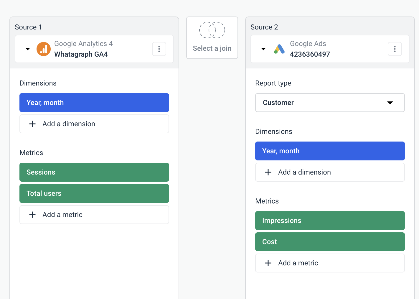
- Data blends
You can use data blends to add different sources together into one unified data source and visualize it as one on your report.
This not only keeps your reports tidy and easy to read, but also gives you a more comprehensive view of performance.
To create data blends, all you need to do is choose the source, dimensions, and metrics from different sources in these tables:
- Custom dimensions
Custom dimensions are great for unifying names of various cross-channel dimensions and grouping different data points from various integrations.
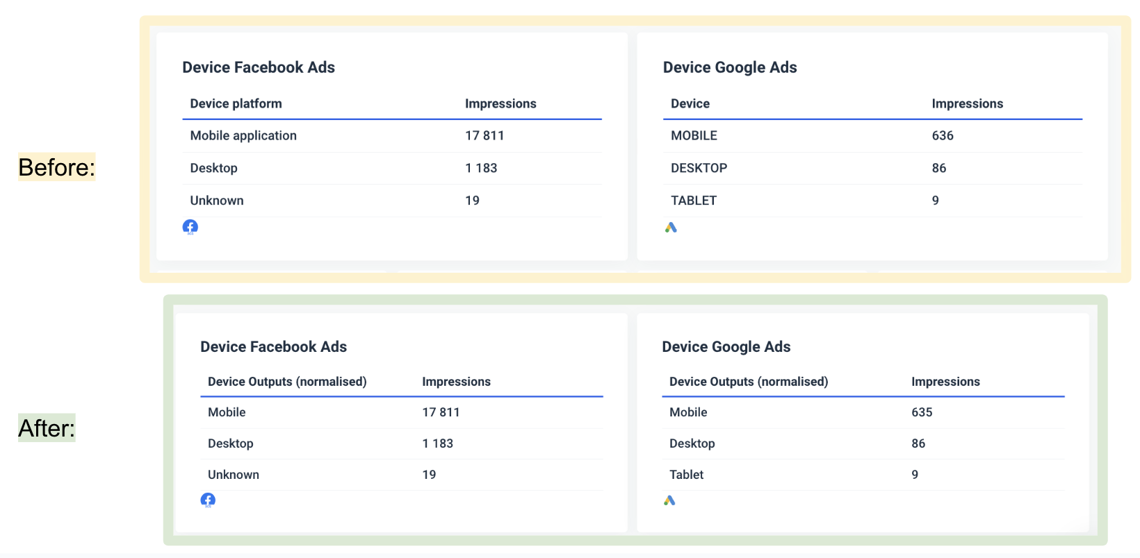
For instance, let’s say you want to standardize the dimensions for gender, age, and device on two different channels—Facebook Ads and Google Ads.
In the “Before” screenshot, we can see that the device platform was in fact inconsistent across the two channels, and additionally, the output itself from Google Ads was in all capital letters, making the two tables side by side less appealing.
You can standardize these dimensions using a simple 4-step workflow, and you’ll get two identical tables despite pulling numbers and dimensions from two totally different APIs.
- Custom metrics
Custom metrics are great for unifying , changing names permanently for various metrics, as well as creating complex or simple custom formulas that can be used in widgets and tables.
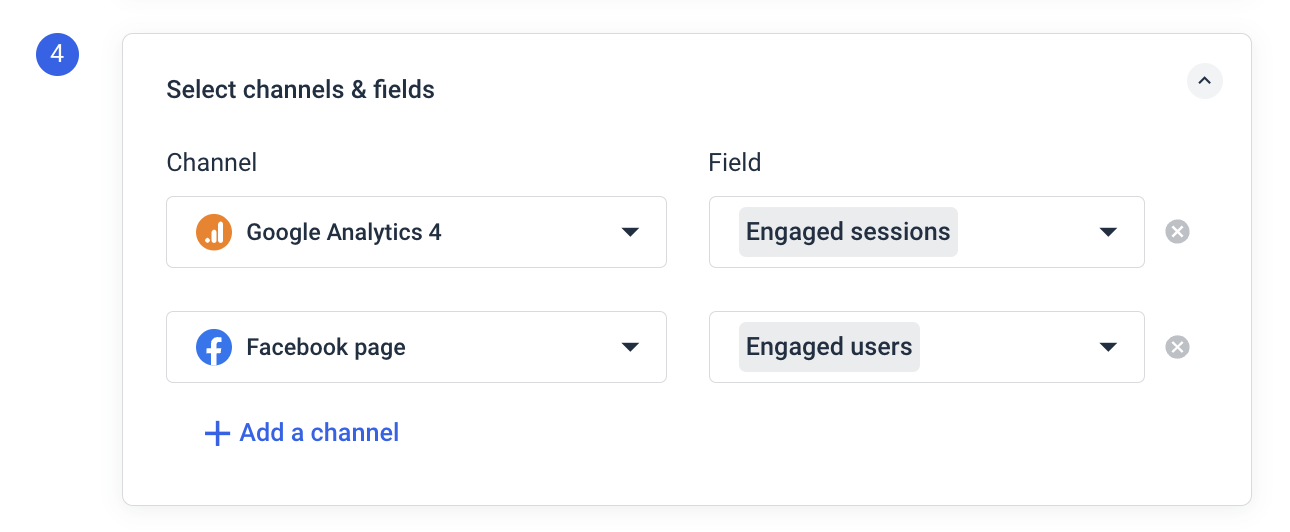
For instance, say you want to report on the total number of “Engaged Sessions” from both Google Analytics 4 and Facebook page. You can set up a custom metric on Whatagraph, like so:
 The best part is you can create all these natively inside of your report. This means you don’t need to waste time going back and forth from one workspace to another.
And with Whatagraph IQ Dimensions (available on more advanced plans), you don’t even have to do all this manually. You can just ask AI to:
- Create custom blends automatically. Just describe what you need—like “combine all spend from Meta, TikTok, and Google Ads into one unified Paid Media metric”—and IQ builds the blend for you.
- Build custom metrics on the fly. Want ROAS across channels? Or a funnel KPI like Add-to-Cart conversions? IQ can generate them instantly, without formulas or coding.
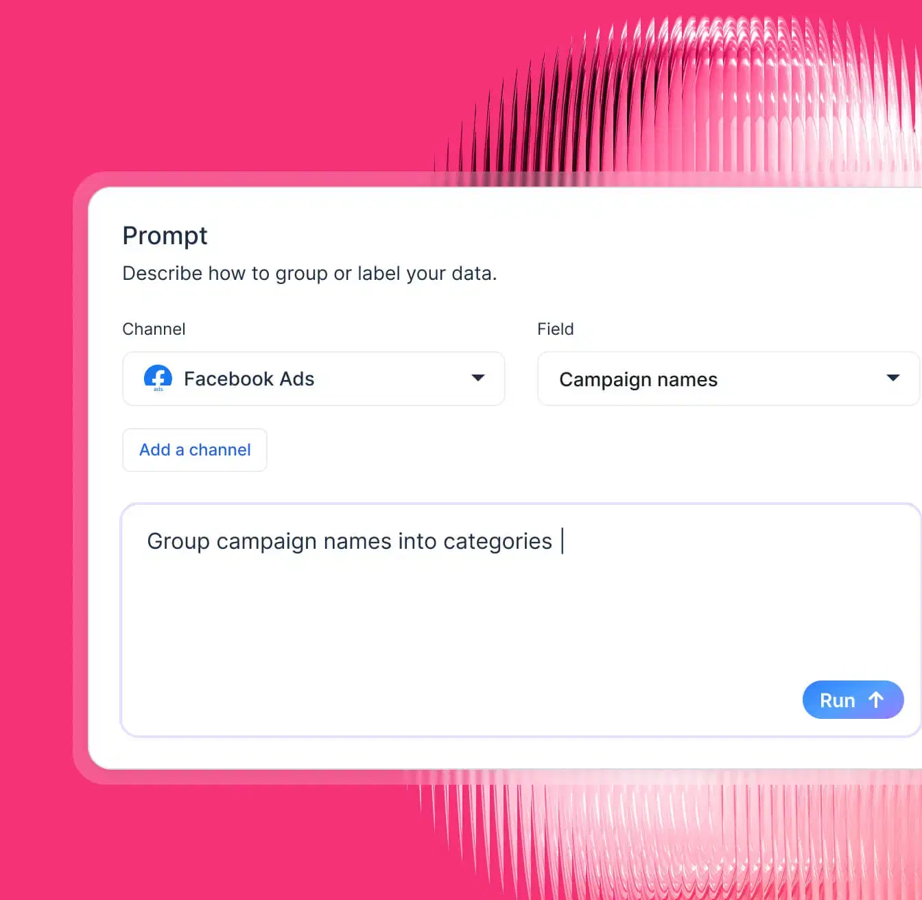
- Standardize messy data with IQ Dimensions. For example, if you’ve got campaign names like “FB_US_SpringSale_23” and “MetaUSA_Spring23,” you can tell IQ: “Group by Campaign Type: Spring Sale”. IQ creates a brand-new dimension that neatly categorizes everything, and you can reuse it across reports.
- Normalize any dimension at scale. Group campaigns by objective, products by category, or reviews by language—whatever fits your reporting needs. IQ makes sense of inconsistent data and saves hours of manual clean-up.
4. Straightfoward pricing with more value
Klipfolio’s pricing might look cheaper on the surface, but it quickly becomes restrictive as you scale. Even the most expensive plan “Premier” ($900/mo) only gives you 80 dashboards — which is nowhere near enough for large-scale agencies.
On top of that, essential features are hidden behind costly add-ons.
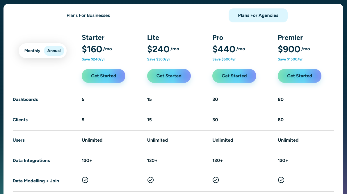
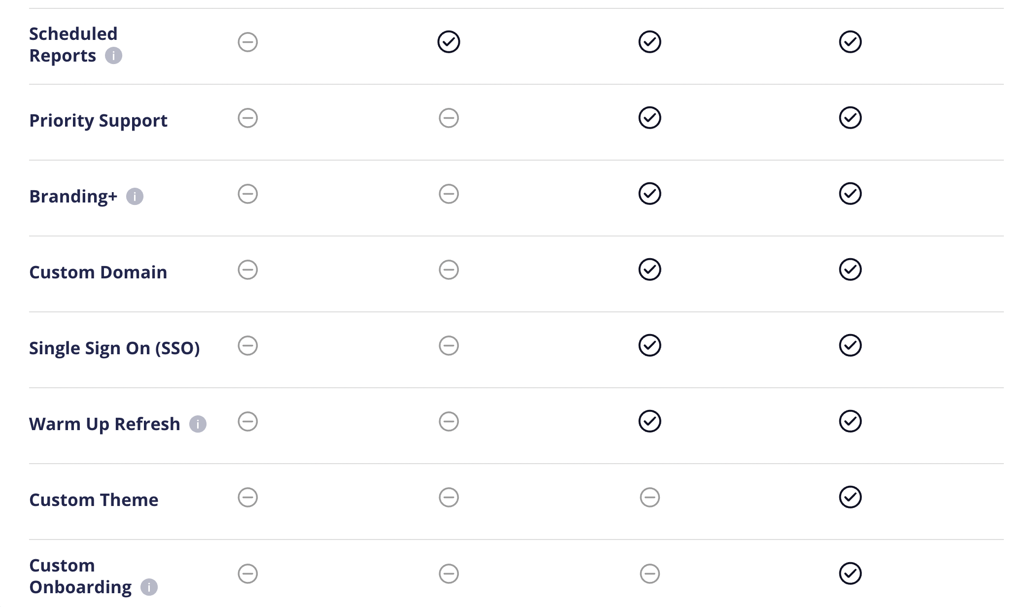
The cheaper plans also don’t come with:
❌ Scheduled reports
❌ White-labeling features
❌ Priority support
❌ Custom onboarding
❌ Single SSO
 And the more clients you add, the more dashboards you’ll need — which means your costs can skyrocket.
In contrast, Whatagraph’s pricing is built for agencies that want to grow without hitting a ceiling.
Instead of nickel-and-diming agencies for essentials, Whatagraph includes the tools you need to scale from day one, with AI automation to save time as you grow.
Convinced Whatagraph is the best Klipfolio alternative? Start free today.
Key Features
- 55+ stable native integrations across paid ads, social, SEO, email, and more
- Custom integrations via API, Google Sheets, or BigQuery
- Whatagraph IQ – AI-powered reporting tools
- Versatile drag-and-drop widgets for reports and dashboards
- Custom metrics, dimensions, and data blends
- Performance monitoring overview
- Library of pre-made dashboard and report templates
- Insights – automatic audits of connected data, anomaly detection, and recommendations
- Spaces – organize reports with descriptions, colors, and better team alignment
- Custom branding and white labeling
- Automated report sharing via email or live dashboard links
- Exports: PDF, Excel, CSV, or transfer directly to BigQuery/Looker Studio
Whatagraph Reviews from Real Users
“To me, Whatagraph is like the Tesla or Mercedes of digital analytics tools, their clean and simple way to present complex marketing data. I highly recommend it to anyone working with marketing analytics who values efficiency and clarity in their reporting.” (Source)
“Whatagraph has a simple user interface that is easy to navigate even for those who don't have analytical skills.” (Source)
“What I like best about Whatagraph is having the ability to create reports fast and easy. No more spreadsheets to do reports, they have a great variety of templates.” (Source)
Pros and Cons
Pros:
- All-in-one marketing performance monitoring and reporting solution
- Easy to use by anyone on your team
- Fast campaign performance and insights
- Stunning visual reports
- Makes results easy to interpret
- Excellent live chat customer support
Cons:
- Only one data warehouse available
Pricing
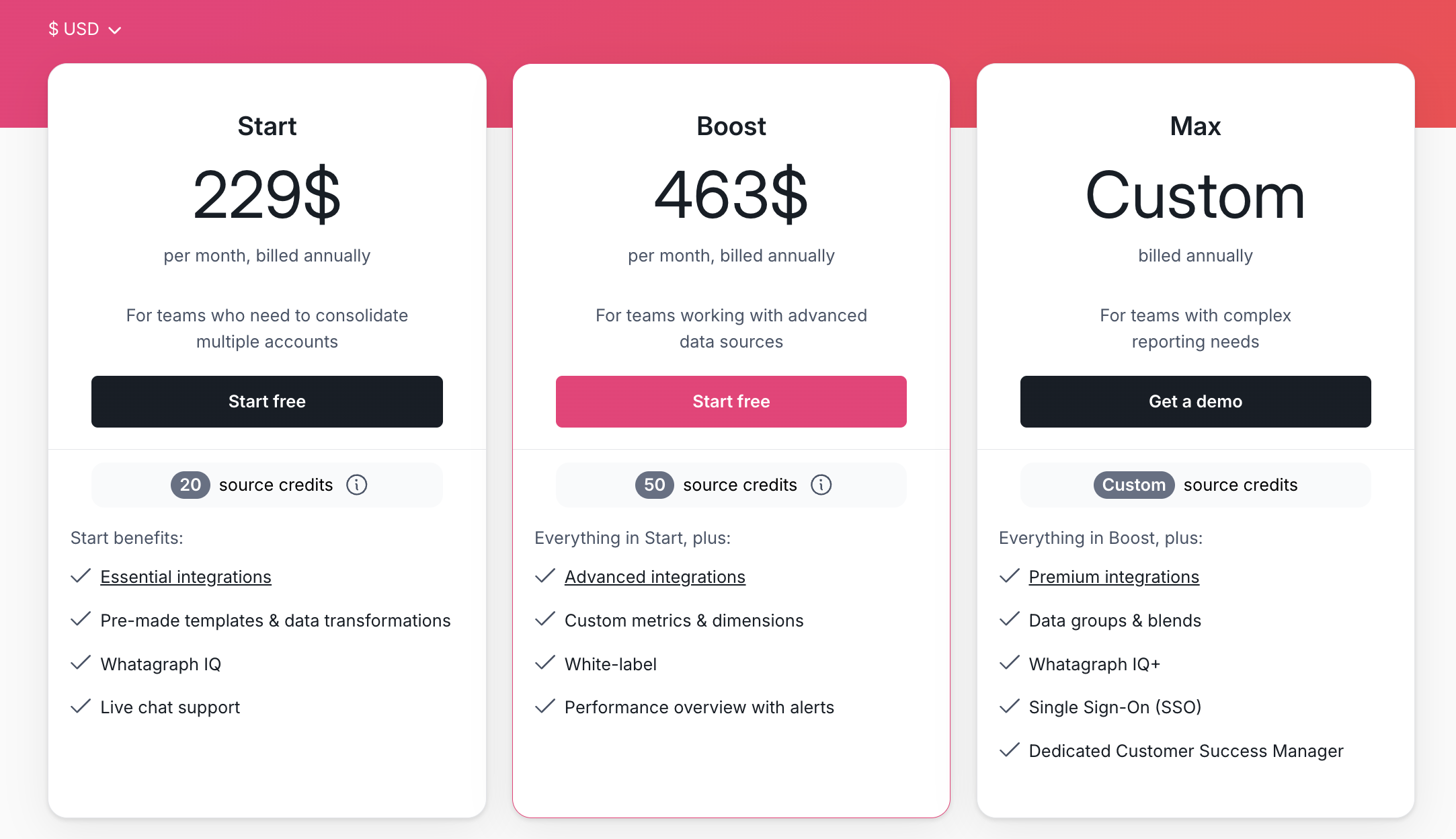
Whatagraph’s pricing is transparent and flexible, with plans based on source credits (how many platforms you connect and how much data you move) and the level of customization you need.
Here’s the breakdown:
- Forever-free – lets you get started at no cost, with 5 source credits, Whatagraph IQ basics, templates, and live chat support.
- Start ($229/mo billed annually) – includes 20 source credits and essential integrations
- Boost ($463/mo billed annually) – jumps up to 50 source credits, adds advanced integrations, custom metrics & dimensions, white-labeling, and performance overview with alerts
- Max (custom pricing) – for enterprise/complex teams, with custom source credits, premium integrations, data groups and blends, Whatagraph IQ+, SSO, and dedicated Customer Success Manager
2. Geckoboard
Most suitable for: Medium to large businesses in the Customer Service, Sales, and eCommerce sectors
Geckoboard is an easy to use dashboard software mostly targeting Customer Service, Sales, and eCommerce businesses.
With it, you can connect to 90 data sources, design your dashboard, and share the dashboard with your team members or the C-Suite.
Once your data is connected, you can create three main types of dashboards:
- A blank dashboard
- TV dashboards for internal presentations
- Mobile dashboards
- Snapshots and reports
A cool feature of Geckoboard is its “KPI notifications” which sends notifications when KPIs trend up or down via Slack.
Compared to Klipfolio, Geckoboard is easier to use—you can set it up and launch in minutes.
However, unlike Whatagraph, you won’t be able to create custom data blends, metrics, and dimensions on Geckoboard. This can be a deal breaker if you’re a large company and you need to organize your scattered data to create easy to read and impactful reports.
Key Features
- 90+ integrations with Customer Service, Sales, Finance, and eCommerce channels
- Drag-and-drop dashboard builder
- KPI notifications
- Slack integration
- Automated email reports
- TV dashboards
- Mobile-friendly dashboards
- Dashboard examples for businesses
Geckoboard Reviews from Real Users
“I love how simple it is to use. That you can connect data from so many different sources in an easy way.” (Source)
“Connecting the dashboard with the Tv works like a charm.” (Source)
“Geckoboard could use more features and options for customization. Compared to other tools like Power BI or Tableau, Geckoboard didn't have as many advanced tools for analyzing data or changing how things looked. I wished I could make more complicated charts and do special calculations.” (Source)
Pros and Cons
Pros:
- Easy to use and set up
- A wide variety of integrations
- Great customer service
Cons:
- Can be pricey if you want to add more dashboards
- Limited customization options for dashboards
- No advanced calculations, blends, and custom metrics and dimensions supported
Geckoboard Pricing
Geckoboard’s pricing is based on the number of dashboards. But unlike DashThis (which includes unlimited users), Geckoboard has limitations on the number of users.
As of October 2024, Geckoboard offers three pricing plans:
- Essential: $149/month for 5 dashboards, 3 users, 1 TV share, and core data sources
- Pro: $199/month for 5 dashboards, 10 users, 3 TV shares, and pro data sources
- Scale: $699/month for 30 dashboards, 25 users, 10 TV shares, pro data sources, and dedicated Support rep
3. Tableau
Most suitable for: Data teams at large enterprises
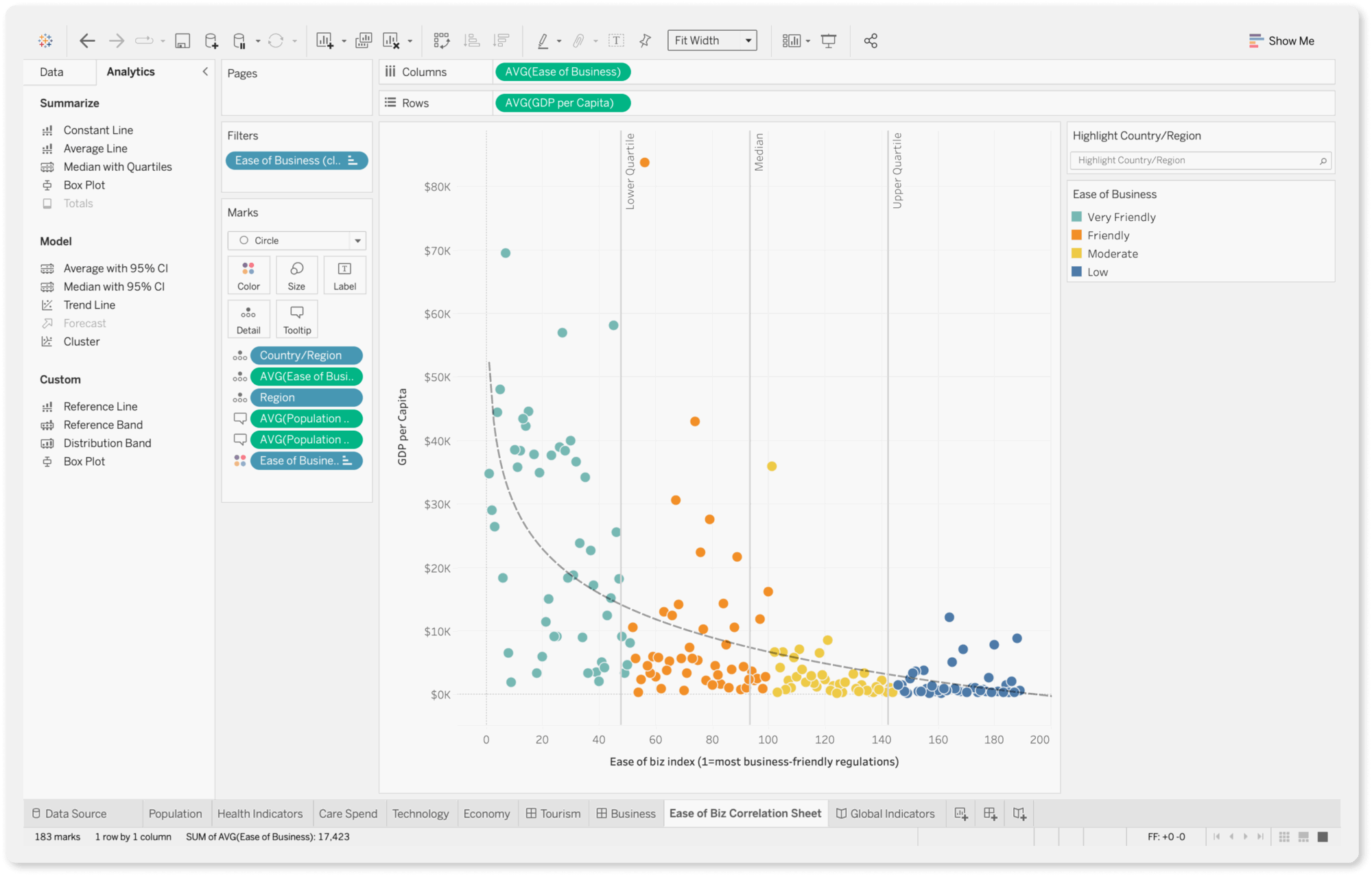
If you’re looking for an enterprise-level business intelligence tool, Tableau is a great choice. It’s a data analysis and a visualization tool in one.
For a powerful data analysis tool, Tableau is still easy to use with a drag-and-drop interface and visual query builder. You can generate insights quickly and share them with stakeholders through reports.
The charting and data exploration features are more sophisticated than Databox, as Tableau provides robust analytics capabilities, including support for advanced calculations, statistical functions, and predictive modeling.
You can perform complex data analysis, uncover trends, and identify opportunities for optimization using features such as trend lines, forecasting, and clustering.
What’s more, Tableau boasts quite a large and active user community called “Tableau Community Forums” with a wealth of resources, forums, and online training materials to help you learn the platform and troubleshoot issues.
Key Features
- 90+ integrations
- Custom metrics and dimensions
- Data blending
- Drag-and-drop dashboard interface
- AI-powered insights
Tableau Reviews from Real Users
“Tableau allows me to create my own structured data from a lot of unstructured data.” (Source)
Tableau has an uncanny ability to transform complex data into visually stunning and easily understandable representations.” (Source)
“Tableau can be costly, particularly for startups.” (Source)
Pros and Cons
Pros:
- Powerful data analytics and visualization
- Easy to use and implement
- Seamless data integrations
Cons:
- Can be expensive if you need advanced features
- Takes a lot of time to load for large datasets
- All the preprocessing of the data (data cleaning) has to be done beforehand. Data cleaning cannot be done in Tableau
Tableau Pricing
As of October 2024, Tableau offers three pricing plans:
- Viewer: $35/user/month, billed annually
- Explorer: $70/user/month, billed annually
- Creator: $115/user/month, billed annually
4. DashThis
Most suitable for: Small businesses and freelancers
DashThis is a simple marketing reporting tool that connects to 34+ marketing platforms and visualizes KPIs on dashboards.
If you don’t see a built-in integration you need, you can also upload your own data using a nifty CSV file or a Google sheet.
Once your data is connected, you can visualize it using three key dashboards:
- Periodic dashboards: These are dashboards based on specific time periods and cadence, like daily, weekly, monthly, semi-annually, and annually.
- Campaign dashboards: These dashboards are used to isolate and highlight a specific campaign for a custom date range.
- Rolling dashboards: These dashboards show trends of metrics for three different date ranges.
These dashboards are also pre-made, meaning you can quickly get started.
On the more pricier plans, you’ll get a dedicated product specialist assigned to you who will help you set up your dashboards.
However, DashThis is more suitable as a reporting tool rather than a data analytics platform. There are very few options to customize or organize your data on DashThis.
You can only “merge” widgets together in DashThis; you can’t blend data sources to the full extent or create advanced metrics and dimensions. On Whatagraph, you can easily organize your data any way you’d like using simple workflows.
Key Features
- 30+ integrations
- Custom data upload via CSV file or Google sheets
- Visualization dashboards
- Automatic data refreshes
- Upload client or band logos
- Create custom widgets, domains, color schemes, and email addresses
- Library of report templates
- Report sharing via email, URL, or PDF
DashThis Reviews from Real Users
“DashThis is super user friendly. I am someone who doesn't know too much about Data Dashboards, but this platform was super easy to use.” (Source)
“There are some limitations to what you can bring in and they don't yet offer custom calculations.” (Source)
“It is a little annoying to move things around in a dashboard. You have to move each individual widget to a new section rather than moving an entire section in a dashboard.” (Source)
Pros and Cons
Pros:
- Easy to use and set up
- Many templates and dashboard examples available
- Relatively inexpensive
Cons:
- Limited data organization and customization features
- Limited data integrations
- Basic-looking reports
DashThis Pricing
As of October 2024, DashThis offers four pricing plans:
- Individual: $49/mo or $42/mo, paid yearly. Includes 3 dashboards. No white-labeling features, personalized onboarding, or priority support.
- Professional: $149/mo or $127/mo, paid yearly. Includes 10 dashboards. No personalized onboarding or priority support.
- Business: $289/mo or $246/mo, paid yearly. Includes 25 dashboards, white-labeling, personalized onboarding, and priority support.
- Standard: $449/mo or $382/mo, paid yearly. Includes 50 dashboards, white-labeling, personalized onboarding, and priority support.
5. Grow.com
Most suitable for: Data analysts at medium to large enterprises
Grow is a no-code full-stack business intelligence platform that combines ETL, data warehousing, and visualizations on one platform.
You can connect to 75 data sources through native integrations, including popular CRM platforms, marketing analytics tools, databases, and accounting software.
Then, you can prepare and cleanse your data using either noSQL or SQL transformations. This includes custom calculations, data blends, and advanced data filters.
Plus, Grow stores your data automatically on its platform so you don’t need to ship it to a third-party data warehouse.
You can create three types of dashboards on Grow:
- Dynamic dashboards which display data based on who is logged into the account.
- Dashboard Blueprints which are pre-built, single data source dashboards
- Custom & Sandbox dashboards which shows blended data sources and metrics
These dashboards also come with powerful filtering options based on date, number, or categorical logic.
You can then share them through emails, shareable URLs, Slack, TV-mode, or tables of raw and transformed data.
The platform uses APIs to import data seamlessly from data sources, and it continually refreshes the data so your metrics are up-to-date and reliable.
The key advantage of Grow over Klipfolio is their 24/7 customer support via live chat. US-based customers can also call their hotline to get quick answers.
However, Grow is more suitable for internal data storage and monitoring rather than for external reports. Their dashboards are very nitty-gritty which can overwhelm clients or the C-Suite.
Key Features
- 75 native integrations
- Built-in data storage
- SQL or non-SQL based data transformations
- Customizable dashboards
- Advanced data analytics and predictive modeling
- Real-time data updates
Grow Reviews from Real Users
“As an analyst, I have recently started working on this tool and this is by far the best. It helps me to create powerful data visualisation as well as to gain insight from that data.” (Source)
“The interface could be better and overall user experience creates lag sometimes.” (Source)
“The back end seems quite complex to work so really need an IT expert to do the set up, but once it's working it's great for users.” (Source)
Pros and Cons
Pros:
- Inuitive, easy to use interface
- 24/7 customer support
- No-code data pipelines, storage, and visualizations
Cons:
- Occasional lags
- Expensive
- Slow performance when dealing with large volumes of data
Grow Pricing
Grow doesn’t share their pricing publicly.
6. NinjaCat
Most suitable for: Marketing agencies and brands with dedicated data scientists
NinjaCat is an end-to-end marketing dashboard for connecting to your data sources, cleaning the data, visualizing it, and shipping it to destinations.
You can integrate with 100+ pre-built connectors, ranking from CRM, search advertising, web analytics, and project management tools.
You can then simplify and harmonize your data with no-code transformations and custom calculations.
While Klipfolio is more of a visualization tool, NinjaCat is a data pipeline tool. You can store your data in a managed warehouse or ship it to destinations like Snowflake, BigQuery, or Tableau.
When it comes to creating reports, you can start from a blank template (that looks like a “canvas”) and add and adjust metric widgets as needed.
Graphic designers will be familiar with this layout as it looks a lot like a popular design tool—Figma. However, if you’re a marketer without a design background, this can be quite confusing and overwhelming.
Key Features
- 100+ pre-built connectors
- No-code transformations and calculations
- Data transfer to BI tools and data warehouses
- Easy ad spend and campaign performance monitoring
- White-label options
- White-glove setup and service
NinjaCat Reviews from Real Users
“I love how it pulls in our data across several different platforms into one cohesive report.” (Source)
“The support the NinjaCat provides is exceptional.” (Source)
“I found a lot of the functionality on Ninjacat to be really clunky, unfortunately things take a LONG time to process if you're adding more than one filter to a table.” (Source)
Pros:
- Automated client reporting
- One platform for integration and visualization
- Multiple choice of destinations
- Custom branded reports
Cons:
- Separate workspaces to organize and visualize data
- Complex visualization builder
- Performance issues with reports
- No autosave in case of a crash
NinjaCat Pricing
NinjaCat doesn’t offer fixed pricing plans, and no information is available on its website.
7. Cyfe
Most suitable for: Boutique SEO agencies
Cyfe is a business dashboard app and reporting platform that helps you easily monitor your business data from one place and make better decisions.
You can pull data from 100+ integrations including social media, email, SEO, and sales and finance tools. You can also bring in custom data via .CSV, Google Sheets, SQL, private URL, or push API.
To build visualizations, you can start from their dashboard templates or pre-built widgets. The platform also comes with “Embedded Analytics” where you can take an entire dashboard or a widget and embed it to emails, webpages, or applications.
For SEO managers, Cyfe offers a built-in keyword ranking tool which allows you to automatically monitor website rankings across Yahoo, Google, and Bing.
The unique thing about Cyfe is that it supports 15 languages, including Korean, Turkish, and French.
However, Cyfe does not come with any advanced data calculations or organization features, nor can you transfer data to warehouses or other destinations.
Key Features
- 100+ integrations
- A wide library of dashboard templates
- Embedded analytics
- Custom and pre-build widgets
- Built-in keyword tracking tool
Cyfe Reviews from Real Users
“It's very easy to create your dashboard and populate it with widgets from different data sources like social media, email marketing software, CRM, or just custom data in a spreadsheet.” (Source)
“The dashboards were very limited on customization and creating calculated fields.” (Source)
“Support really sucks. This never used to be the case BTW.” (Source)
Pros and Cons
Pros:
- Easy to use and set up
- Wide range of integrations
- Affordable price
Cons:
- Incorrect data on widgets
- Poor customer service
- Limited customization and data transformation features
Cyfe Pricing
As of October 2024, Cyfe offers five pricing plans:
- Starter: $19/month for 2 dashboards and 1 user
- Standard: $29/month for 5 dashboards and 2 users
- Pro: $49/month for 10 dashboards and 5 users
- Premier: $89/month for 20 dashboards and unlimited users
Agency: $150+/month for 100 dashboards, 15 users, 10 clients, and white-labeling features
8. Databox
Most suitable for: Boutique agencies and small businesses
Databox is a data reporting and analytics platform for growing businesses.
You can integrate with 100+ software tools, and bring in custom data through Google Sheets or Excel.
Then, you can visualize this data directly on Databox using pre-built metrics and templates.
A unique feature that Databox offers that Klipfolio doesn’t is the Benchmark Groups. You can browse industry benchmarks to gauge whether you’re doing well, better than others, or falling behind.
Databox also sends alerts through Slack, email, or app updates when performance trends up or down on your tracked metrics.
However, similar to Klipfolio, Databox users say the platform is clunky and has an unappealing user interface.
Databox’s reports are also not linked – which means you’ll need to edit them one by one rather than in batch. This can be very time-consuming if you need to tweak dozens of similar reports for clients. On Whatagraph, you can edit them in one-go, saving you massive time.
Key Features
- 100+ integrations
- Native visualization dashboards and reports
- Dashboard and report templates
- Slack, email, or in-app alerts
- KPI benchmark groups
Databox Reviews from Real Users
“Databox makes it simple to interact with data in ways you never thought possible.” (Source)
“I'm not sure what has happened with the customer support team at Databox but they are fairly unresponsive these days.” (Source)
"After 2 years I left. Templates always break, individual metrics always break, lack of good support." (Source)
Pros and Cons
Pros:
- Easy to use
- Wide variety of integrations
- Interactive data
Cons:
- Slow customer support
- Bugs and lag issues
- Broken metrics and templates
Databox Pricing
Databox offers five different pricing plans as of October 2024:
- Free: Limited to 3 users, data sources, and dashboards. No custom metrics, data calculations, or report automation available.
- Starter: $341/month for 50 data sources, 5 users, and unlimited dashboards.
- Professional: $451/month for 50 data sources, 15 users, and unlimited dashboards. Includes custom metrics and data calculations.
- Growth: $681/month for 50 data sources, and unlimited users and dashboards.
- Premium: $999/month for 100 data sources, and unlimited users and dashboards.
White-labeling and “guided onboarding” is also only available as an add-on on Databox ($250 and $500 per month respectively). In contrast, these are included in all of Whatagraph’s pricing plans.
9. TapClicks
Most suitable for: Medium to large companies with PPC and SEO campaigns
TapClicks is a unique digital marketing platform in the sense that it’s eight different products bundled into one. Here’s a breakdown of each of them:
- TapData: Extract, transform, and load your data from one platform to another. Create data blends and complex transformations to format your data how you need it.
- TapReports: Visualize, optimize, and share your data with clients in customizable dashboards and automated reports.
- TapAnalytics: Discover trends and opportunities from your data.
- TapInsights: Get AI-powered insights and recommendations to optimize your campaigns.
- TapOrders: Automate orders and enter client objectives and goals at the point of sale. Connect a CRM, import files and create online forms for any product. Best for eCommerce businesses.
- TapWorkflow: Automatically route tasks based on your business processes and streamline your fulfillment workflow. Best for project managers.
- Raven by TapClicks: Perform site audits, rank tracking, link-building, and keyword research with in-depth insights and analysis. Best for SEO managers.
- Competitive Intelligence: Get local SEM data intelligence to create better proposals and to win more clients.
This all sounds great but TapClicks does seem to be a bit of a “Jack of all trades, master of none”. Based on online reviews, their connections break constantly, the data on reports is inaccurate, and the platform is difficult to use (even with 6 months of support from a CSM).
Key Features
- Wide variety of integrations (their website doesn’t say exactly how many)
- Advanced data calculations
- Data Exporter to load data into data warehouses, databases, and data visualization tools
- Interactive dashboards
- AI-powered insights
- Report automation
TapClicks Reviews from Real Users
“What I like best about TapClicks is that it simplifies marketing data by pulling everything into one easy-to-use dashboard.” (Source)
“I dislike TapClicks because the initial setup can be a bit overwhelming, and sometimes the data syncing isn't as smooth as I'd like.” (Source)
“After months of calls and time invested, we still had inaccuracies in the data.” (Source)
Pros and Cons
Pros:
- Powerful data analytics
- Customizable and interactive dashboards
- Responsive customer support
Cons:
- Steep learning curve
- Data inaccuracies
- Connection issues and lags
TapClicks Pricing
TapClicks’ pricing can be confusing as you’ll need to build your own packages.
You start by choosing your data package:
- TapDataLite: $99/month for 64 connectors
- TapData+: $349/month for 250+ connectors
- TapData Max: $649/month for 250+ connectors and API access
Then, you choose your data destination:
- TapReports: $199/month
- TapAnalytics: $899/month
- TapInsights: $1399/month
- Third-party destinations: Custom pricing
All packages come with 10 clients and unlimited users.
Based on these pricing plans, the total cost of TapClicks can come down to 1000s of dollars a month if you want a complete data stack.
10. AgencyAnalytics
Most suitable for: SEO and content marketing agencies
AgencyAnalytics is a marketing reporting platform specifically for SEO and content marketing agencies.
You can connect to 80+ data sources, including major SEO platforms like Ahrefs, Backlink Monitor, and Semrush, as well as social channels like Facebook, Instagram, and LinkedIn.
It also comes with a suite of SEO tools like Rank Tracker, Site Auditor, and Backlink Manager, making it easy to monitor and report on your SEO performance. You can track rankings daily, monitor backlinks, and keep up with the competition.
AgencyAnalytics’ main advantage over Klipfolio is its ease of use. Even though AgencyAnalytics offers a lot of customization and white-labeling options, you can create a dashboard quickly thanks to their wide library of templates.
Another unique feature of AgencyAnalytics is their “Account dashboard” which allows you to visualize and monitor campaign performance for all your clients at a glance.
You can also manage clients and staff on the platform through granular user access and permissions.
However, users say the platform can be unstable with sources disconnecting frequently due to “service bandwidth” issues. AgencyAnalytics also doesn’t come with advanced data calculations and their dashboards are rigid and limited.
Key Features
- 80+ integrations
- Ready-made report templates
- White-labeling
- Client and staff management
- SEO tools
- AI insights
AgencyAnalytics Reviews from Real Users
“AgencyAnalytics helps me create quick, automated, and clean reports for our clients which saves me a ton of time.” (Source)
“It can sometimes be a little buggy and take time to load. Adding new integrations can sometimes be challenging because of this.” (Source)
“I would like the capability of merging data from different platforms in graphs and metrics (e.g. using data from Google Ads with GA4) in the same section. I also don't like that some platforms aren't yet available (e.g. Reddit).” (Source)
Pros and Cons
Pros:
- Easy to set up and use
- A wide library of ready-made report templates
- Cost-effective
Cons:
- Buggy
- Lack of advanced data calculations and organization features
- Limited integrations
Pricing
As of October 2024, AgencyAnalytics offers three plans:
- Freelancer: $79/month for 5 client campaigns
- Agency: $179/month for 10 client campaigns
- Custom: For established agencies with 50+ clients
11. Improvado
Most suitable for: Data teams and marketing teams at large companies
 Improvado is an end-to-end data pipeline platform that gathers data from marketing platforms, MarTech tools, and CRMs, transforms this data, and ships it to various destinations.
You can integrate with over 500 channels and harmonize and clean your data into an unified dataset.
You can then push this cleaned data to visualization tools, data warehouses, and spreadsheets, or keep your data in a fully-managed storage.
However, Improvado is an ETL tool (Extract, Transform, Load), which means you’ll need to move your data to a third-party tool like Looker Studio to visualize it.
Improvado’s uniqueness lies in its AI-powered “campaign governance” solution which automatically validates campaign targeting, naming conventions, brand safety, KPI pacing, and more. It also validates the consistency of your performance metrics and alerts you about any issues.
But because of the vast features available, it can take months to implement Improvado. This makes it a more suitable tool for enterprises who need a powerful data analytics platform, but it may be overkill for marketing agencies and small businesses.
Key Features
- 500+ integrations
- Fully-managed data storage
- Unlimited data destinations
- Pre-built dashboards
- AI-driven data transformations
- Marketing attribution
- AI-powered campaign governance
- AI-insights
Improvado Reviews from Real Users
“There are a lot of ETL tools and a growing amount of AI companies, but Improvado's customer relationships and willingness to go above and beyond really sets them apart.” (Source)
“The best aspect of Improvado is their extensive range of integrations across major social, search, and ad-server platforms.” (Source)
“Improvado can be expensive, particularly for smaller businesses or startups with limited budgets.” (Source)
Pros and Cons
Pros:
- Powerful data analytics
- AI-powered insights
- Helpful customer support
Cons:
- Can be expensive for small businesses and agencies
- Long implementation time
- Steep learning curve
Improvado Pricing
Improvado doesn’t share their pricing publicly but based on online reviews and blog articles, the total cost can be anywhere between $2,000-$5,000 per month.
Published on Nov 04 2024
WRITTEN BY
YamonYamon is a Senior Content Marketing Manager at Whatagraph. With an eye for detail and a knack for always considering context, audience, and business goals to guide the narrative, she's on a mission to create genuinely helpful content for marketers. When she’s not working, she’s hiking, meditating, or practicing yoga.