Top 5 Widgets for Marketing Data Visualization
Widgets to power up your marketing data? Yes, please! Learn more about what types of widgets you can add to your visual reports in our latest blog post.

Aug 23 2021 ● 6 min read

How important is marketing data? Or any data? In monetary terms, it’s getting pretty big. Globally, the big data market was valued at more than $193 billion in 2019 and is set to rise to $420+ billion by 2027. Why is that?
Reasons are many, but the important one for us is the rise in data-driven decision-making. Companies are increasingly relying on data to guide their next steps in business, and marketing is no exception. What’s more, speed is becoming a dominating factor. It's important to learn data visualization techniques.
How long does it take to make a marketing decision? I’d argue that it would take as long as it takes to compile a report with ALL data channels that affect the decision-making process.
Marketing data visualization is crucial to speed up these decisions. So how do you visualize data quickly? My answer - by picking the right presentation or data visualization dashboard.
Whatagraph has an extensive library of reports that are made up of widgets. These widgets showcase data in various ways, but some are better than others. With our ever-growing client base, we’ve taken the liberty of looking at the most popular widgets used for reporting marketing data. Here’s our TOP 5 for the best data visualization:
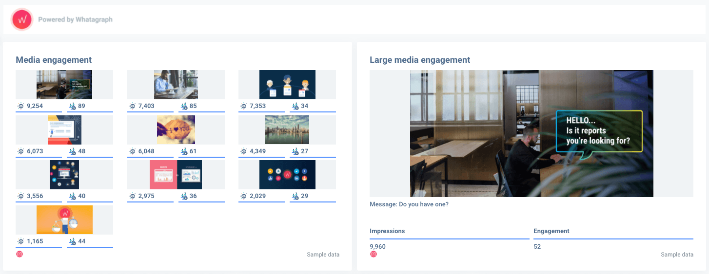
1. Media widgets
Our most popular widgets, hands down. Seeing the visual representation of which posts performed best leaves a lasting impression on all clients, especially on a visual medium such as Instagram.
- Media & Stories engagement in a single board;
- Thumbnails of each post to see what performs and what doesn’t;
- Drag & drop functionality for the number of thumbnails.
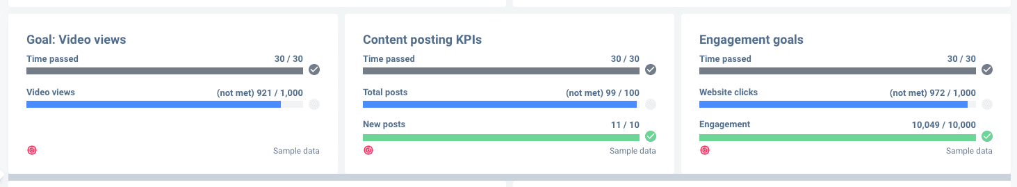
2. Goal widgets
Performance is key. That’s a given among our users who incorporate goal widgets in many reports. Goal widgets are incredibly universal and immediately provide an overview of performance and budget spend over time.
- Instant ROI overview;
- Universal use for all channels;
- Use externally, as well as internally, to track performance.
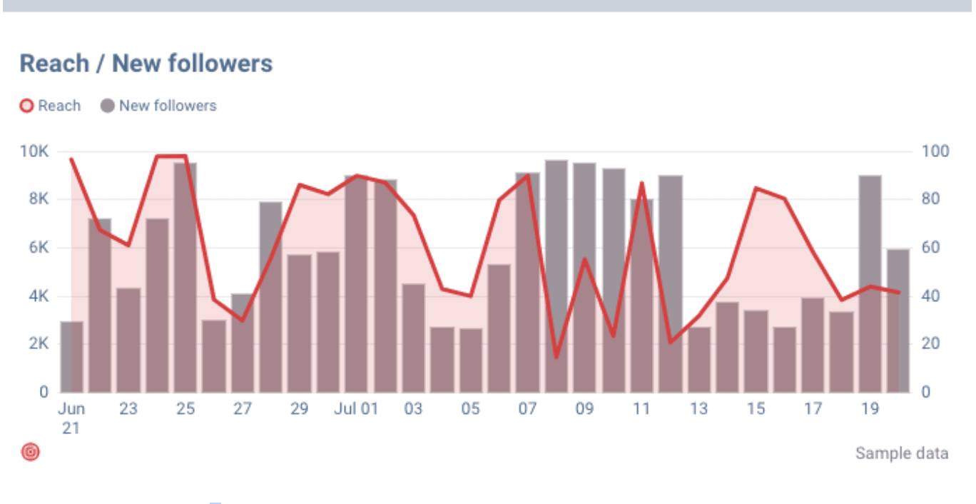
3. Chart widgets
This one is a bit of a surprise. The popularity of chart widgets is driven by the ability to see trends over time. Here we see how the reach interacts with new follower acquisition over time. Having this graph together with the media widget, you can really see which content works best!
- Short & long-term trend analysis;
- Compatible with other widgets;
- Universal use for all channels.
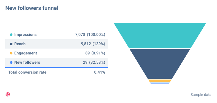
4. Funnel widgets
No visual data storytelling would be complete without a funnel graph. So it’s no wonder it made it on this list. Here we see the breakdown of the new followers funnel the Instagram account goes through.
- A clear picture of the user’s journey;
- Adjustable date range;
- In-depth data review.
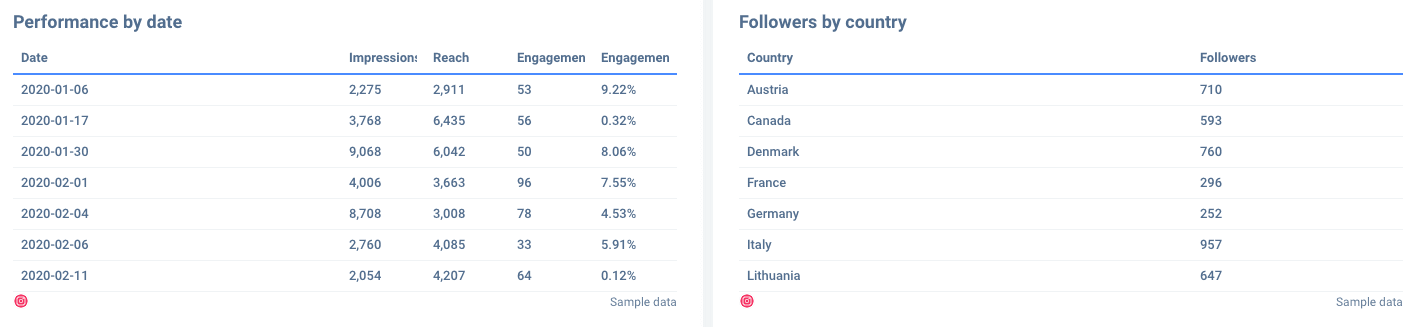
5. Table widgets
Some questions require more detailed answers. That’s what the table widget is for. Whether you’re presenting a monthly report or need a quick breakdown of your marketing actions, table widgets are the way to go.
- Flexible data input;
- Detailed analytics view;
- Universal use for every channel.
These widgets are the top choice among our users when it comes to visual reports.
Would you use any of these widgets? Make an informed decision by trying them out!
Published on Aug 23 2021
WRITTEN BY
Indrė Jankutė-CarmaciuIndrė is a copywriter at Whatagraph with extensive experience in search engine optimization and public relations. She holds a degree in International Relations, while her professional background includes different marketing and advertising niches. She manages to merge marketing strategy and public speaking while educating readers on how to automate their businesses.