How Can Statistics Be Misleading
Statistics has a lot of power. So much so that people and organizations based some of their most important decision on statistics. People say numbers do not lie, that might be true. However, sometimes, statistics can be misleading, and the same kind of data can show the opposite trend depending on how it is used.

Nov 28 2019●9 min read


Statistics are extensively used in studies, organizations, media, and politics. Most of the time, it is presented without the background information necessary for its correct interpretation.
Sometimes misleading data is presented with a deliberate intention to manipulate people and to prompt an agenda. Likewise, sometimes, it is due to carelessness or just the matter of not understanding the data properly.
It is vital to know the different types of ways statistics can be misused so that you can identify them and do not make decisions based on biased or incorrect data.
Bad Sampling
The data can be misleading due to the sampling method used to obtain data. For instance, the size and the type of sample used in any statistics play a significant role — many polls and questionnaires target certain audiences that provide specific answers, resulting in small and biased sample sizes.
There are many misleading statistics examples, particularly misleading graphs in the news are quite common.
Misleading Graphs
There are many ways to manipulate data, including but not limited to inappropriate use of descriptive statistics. Knowing about them will help you spot them. Following are some misleading stats examples.
Selective Data Display
This kind of data display can confuse and show the difference bigger than it is. You can identify misleading graphs in the media if you look at the numbers and see how much variation is in the numbers.
 | ||
| Image source:https://www.mediamatters.org/ |
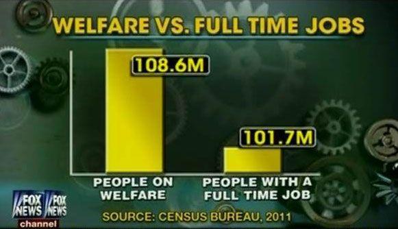
For example, the Fox News poll compared people on welfare and the number of people with jobs is a prime example of selective data display. It included all people on welfare from a house in which one or more people were on welfare regardless of other members of the family who were not on welfare.
To the contrary, only a person on full-time job was included in on job sample. The graph is not only an example of bad sampling but also exaggerated the difference. If you look closely, the scale of the graph starts at 100 million instead of zero. The data is presented in a way that shows the number of people on welfare four times more than the number of people with jobs. Learn more on how to use data visualization.
Omitting the Baseline
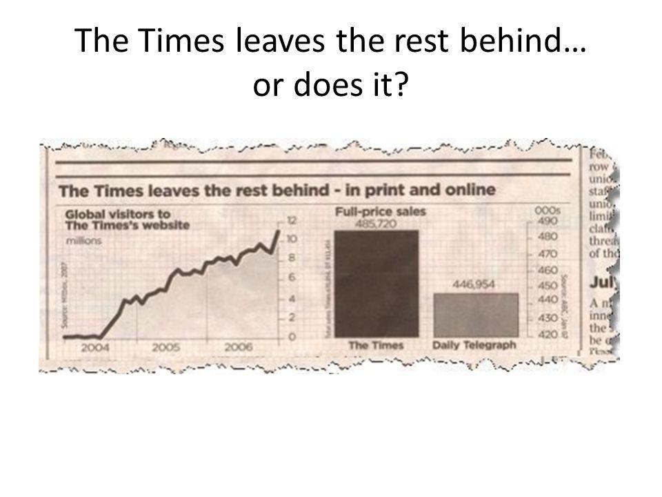
Another way you can identify a misleading graph is to check if the start-at-zero-rule has been followed. The New York Times in a graph showed that it makes twice as much sales as The Daily Telegraph. But if you look at the scale, you see the difference in sales is barely 10%.
 | ||
| Image source: University of Kentucky. |
Manipulating the Y-AXIS
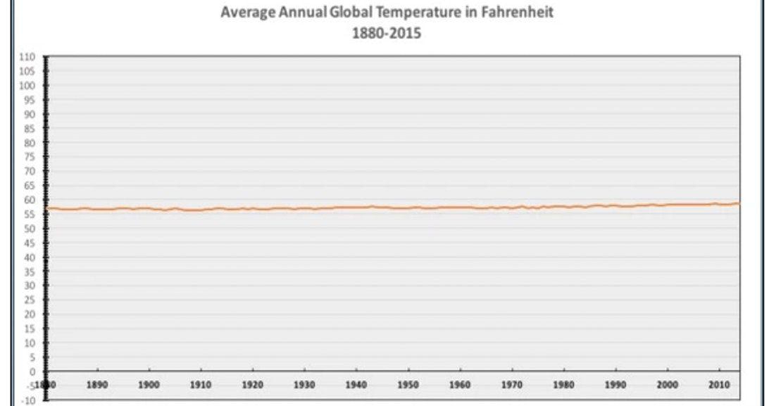
Y-Axis manipulation is also often used to change the perception of the real data.
This graph shows the temperatures from -10 degrees to 110 degrees. The flat line gives the idea that global warming is not a problem.
 | ||
| Image source: https://cornwallalliance.org/ |
Simpson’s Paradox
Simpson’s paradox is a phenomenon where data presents a trend when collected on different groups but reverse the trend when it is combined in one group.
One example of Simpson’s paradox appeared when UC Berkley was Sued for gender-bias in favor of male applicants. Apparently, in 1973, UC Berkeley’s graduate school admitted 44% of male applicants and 35 % of the female applicant.
While investigating, The school's statistician Peter Bickel looked at the data and found that only 2 out of 4 departments showed the statistically significant gender bias but in favor of women. The women applied to the departments that admitted a smaller percentage of applicants overall-this was the hidden variable that reversed the trend in the data as a whole.
Wherein the average suggested that the male applicants were admitted at a higher rate than females. But the data showed a different story when it was divided into departments.
Causation and Correlation
Often people confuse correlation with causation, but the correlation between the two variables does not imply causation. Therefore, make sure to understand the difference and look for a cause and effect relationship.
Correlation does not prove that the increase in one variable is the cause of the rise in the other. For instance, it could be a third variable actually responsible for both. Wherein, even after looking at the statistic tests with accurate numbers, you can still be farther from the truth.
A study published in Lancet Public Health showed that people who followed a low carbohydrate diet with animal-based protein and fat sources had a 4-year shorter life span than those who ate a moderate amount of carbohydrate diet.
The research that linked the low carb diet with a shorter life span is observational, and it does not show the cause and effect relationship. The study was only on the quantity of the food, and it did not factor a third variable, the quality of the food.
For instance, people were eating low carbs diet with low-quality food - such as unhealthy and processed fat which had little to no nutrition values. Therefore they were more likely to have health problems in the long run.
Prosecutor’s Fallacy
Prosecutor’s fallacy is a term used for the misconception of statistical reasoning. It is mostly used by a persecutor to argue against a defender during a criminal trial. Prosecutor’s fallacy, regardless of its name, can also be used by a defense lawyer to prove the innocence of their client.
The prosecutor’s fallacy is the P (A|B) is equal to the P (B|A), which is not valid. If you switch the given, the probability can change by a lot.
The case of Sally Clark is an example of a prosecutor’s fallacy. She had a son who died from SIDS, one year later she had another son who also died from SIDS. The prosecution argued that chances of one death from SIDS = 1 in 8534, so the chances of two death from SIDS = 1 in 73 million. Thereby, there was 1 in 73 million chance that Sally was innocent.
Among some other overlooked factors, based on this argument, Sally Clark was convicted. The prosecutor did not consider all of the other factors that could cause a child’s death. The statistician later showed that chances of Sally's innocence were two in three if the data was reversed to sudden unexpected deaths.
Conclusion
When looking at statistics, consider the source of data; whether its sampled or controlled experiment and find all the other factors that tie to the analysis. Look for all the tricks used in the distortion of the truth to deliberately direct others towards a preconceived target.
Make sure the data is accurate, and the truth is the highest priority whether you are a viewer or you are the one collecting, aggregating or dregging the data.
Published on Nov 28 2019
WRITTEN BY
Indrė Jankutė-CarmaciuIndrė is a copywriter at Whatagraph with extensive experience in search engine optimization and public relations. She holds a degree in International Relations, while her professional background includes different marketing and advertising niches. She manages to merge marketing strategy and public speaking while educating readers on how to automate their businesses.