7 Best Automated Reporting Tools: Features, Pros & Cons (2026)
Automated reporting tools help marketing agencies eliminate manual data collection, schedule recurring client reports, and centralize cross-channel performance data.
This guide compares 7 tools across ease of use, data blending, customization, automation, and multi-client management.

Jan 05 2026●9 min read


You’re here because:
- You waste 20 minutes every morning logging into seven different platforms.
- You've been apologizing for "slightly outdated" data in client meetings.
- You've done the math and realized hiring another analyst for every five new clients is not exactly feasible.
This problem of wasted time on data reporting isn’t new…
In 2015, Matt Umbro wrote about the "25% rule"—if you're burning more than 25% of your billable monthly hours on just reporting processes—you’re hemorrhaging productivity.
Fast-forward to 2025, marketers are still spending 4.1 hours analyzing data and creating reports every week—plus, 2.2 hours on data entry and cleansing.
For you, that ends right here.

Source: Reddit
We talked to agencies, small businesses, and large in-house teams about what they really want from an automated reporting tool:
✅ Ease of use: A user-friendly platform that anyone can master quickly.
✅ Automated reporting workflows: Schedule and send recurring reports to reduce manual reporting and cut down on errors.
✅ Customizable reports and dashboards: Repurpose any report for a new client—update the branding and adjust the KPIs to perfectly match their business goals.
✅ Data blending: Merge data from various data sources (e.g., Google Ads, Facebook, CRM) to see how everything fits together for better data-driven decisions in real time.
✅ Multi-client management: Essential for agencies handling 5+ clients—compartmentalize data and easily switch between accounts.
In just nine minutes, you’ll know which automated reporting tool is the right choice for you.
7 Best Automated Reporting Tools in 2026
Here's a snapshot of our top 7 choices for automated reporting software:
| Tool | Best for | Pricing |
| Whatagraph | Marketing agencies wanting AI-powered reporting and multi-client management | Free forever plan; Start $229/mo, Boost $463/mo, Max custom (billed annually) |
| DashThis | Freelancers and small teams needing simple, quick dashboards | From ~$33/mo Pricing scales by number of dashboards |
| Databox | Teams needing real-time KPI snapshots | Professional $159/mo, Growth $399/mo, Premium $799/mo (billed annually) |
| Tableau | Data-savvy teams needing deep enterprise-grade analytics | Contact sales Creator, Explorer, Viewer tiers available |
| Looker Studio | Teams heavily invested in the Google ecosystem | Free for basic use Paid tiers via Google Cloud; contact sales |
| Toucan | Product teams embedding analytics directly into SaaS applications | From ~€1,000/mo Standard, Enterprise, Embed plans |
| AgencyAnalytics | Smaller agencies wanting white-label SEO/PPC dashboards | Freelancer $159/mo, Agency $179/mo, Agency Pro $349/mo +$20/extra client; 10 clients included |
Let's get into each of them.
1. Whatagraph
Best for: Marketing agencies and teams who want an easy-to-use reporting tool with powerful AI features and flexible pricing
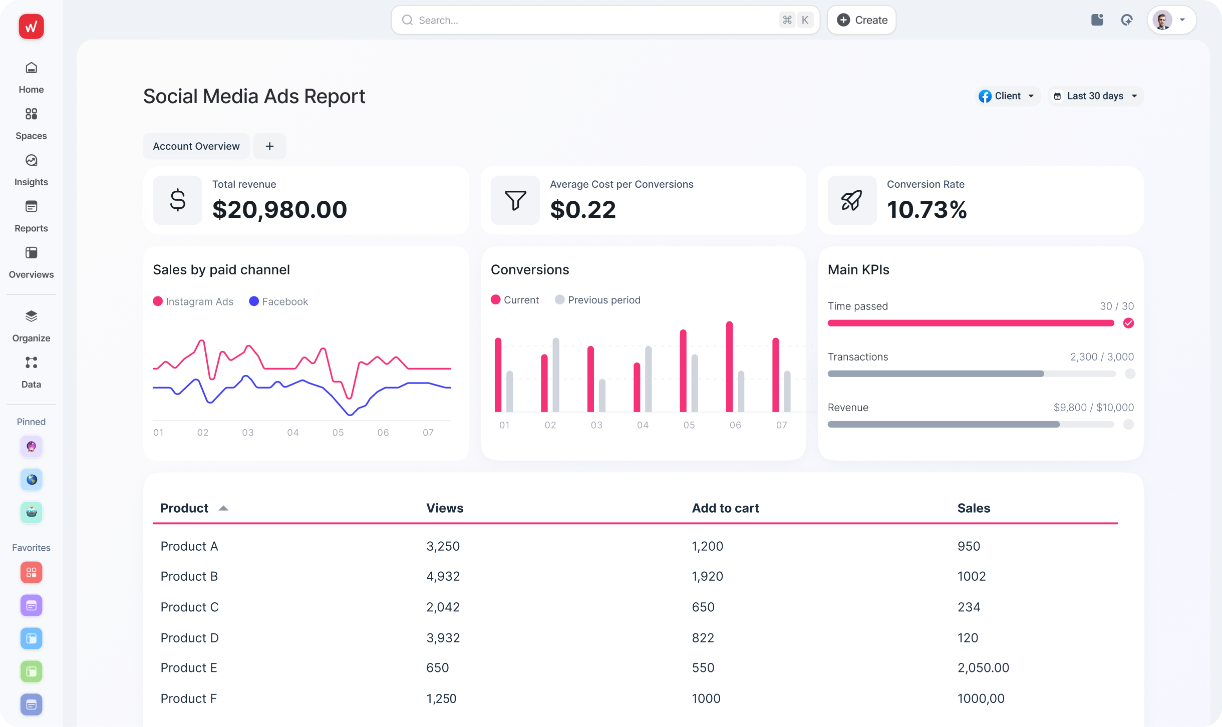
Whatagraph is an easy-to-use AI-powered marketing intelligence platform that turns complex marketing data into clear insights, instantly.
Marketers use Whatagraph to connect all their channels, centralize reporting, and share impactful results—without needing technical expertise.
In a nutshell, here’s how Whatagraph works:
- Connect to 55+ marketing platforms automatically via native, stable connectors that don’t break.
- Easily organize your data—create custom blends, metrics, and dimensions using no-code workflows or AI.
- Ask AI to create reports by just telling it what you want it to build. Or use drag-and-drop widgets or ready-made templates to build one from scratch.
- Customize reports by just uploading a screenshot of your (or your client’s) brandbook or putting in a prompt. Host and share reports on your own domain.
- Get actionable insights instantly by just asking AI any questions about your connected data. Get it to write performance summaries directly in your reports in four different formats and 18 languages.
- Share reports as live links, PDFs, Excel spreadsheets, or automated emails. Transfer your data to BigQuery data warehouse or Looker Studio.
But does it check all the boxes you’re looking for? Let’s take a look.
Feature #1: Ease of use
Unlike complex business intelligence tools made for data teams, Whatagraph is designed specifically for marketers.
Every feature matches how marketers think, work, and report—so you can focus on running campaigns, not building dashboards.
You won’t need to know SQL, understand database structures, or even use report templates to visualize your data.
With Whatagraph IQ, a set of AI features to create, analyze, and analyze reports in seconds, you can just sit back and relax and we’ll handle the heavy-lifting.
All you need to do is connect your sources, tell us what kind of report you want to build, and we’ll build it for you. (There are also example prompts available if you want something to get started with.)
Want to add or edit widgets? The same concept applies. Just type in a prompt and we’ll build it for you.
You can also ask AI to create separate tabs within the same report to visualize different channels, locations, or brands—so your readers don’t need to scroll through long reports.
 And yes, you can still get hands-on. Drag and drop a widget, resize it, and add blended metrics like “Total Ad Spend.”
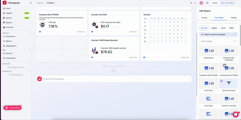
Or pick from 80+ ready-made templates if you’d rather not start from zero:
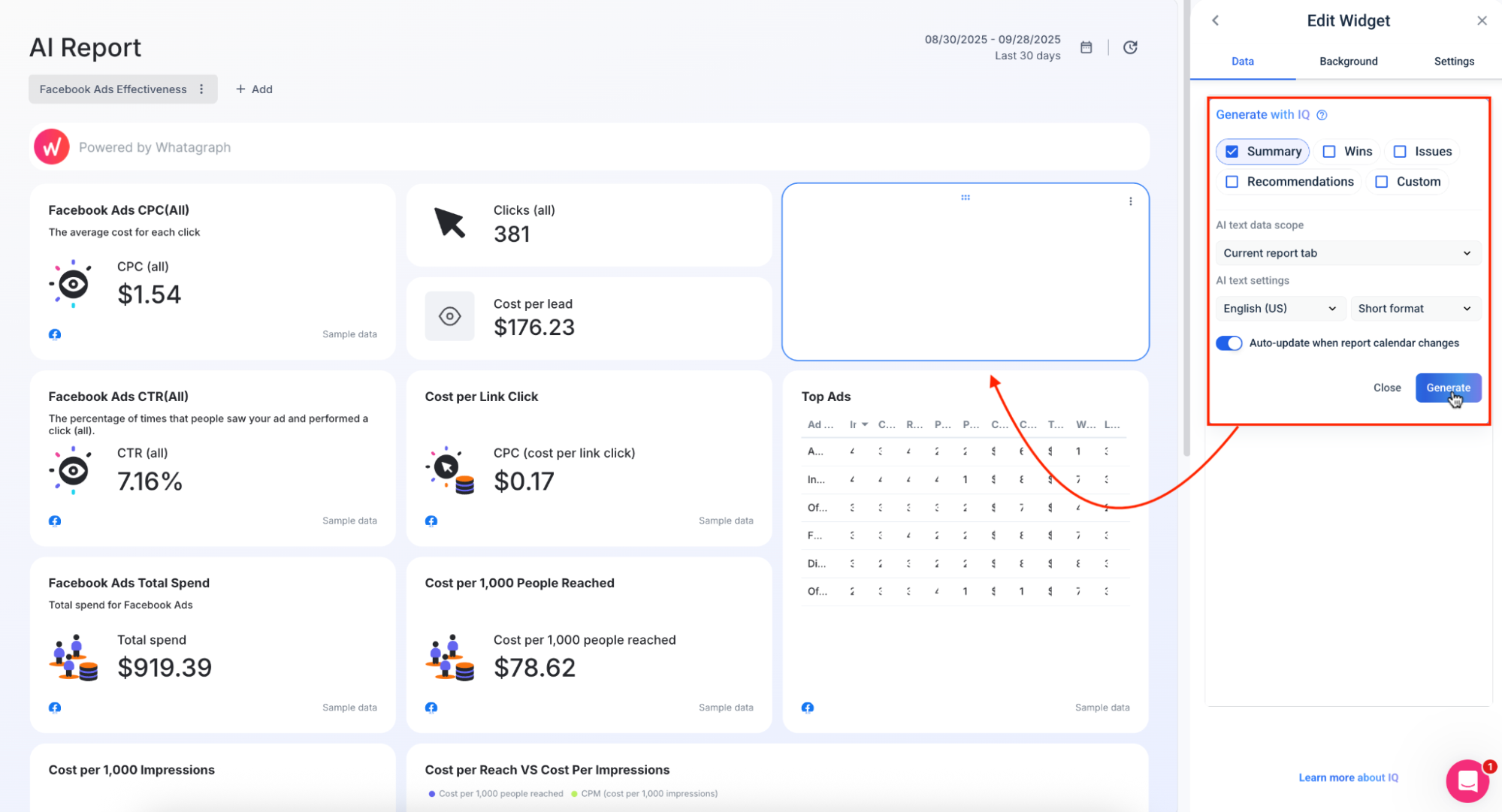
Want to add performance summaries to your reports? Previously, you’d need to write them manually. With Whatagraph, you can just ask AI to generate summaries for you directly in your report, based on your data.
Summaries are available in 18 languages and five formats—Summary, Wins, Recommendations, Issues, or Custom Prompt.
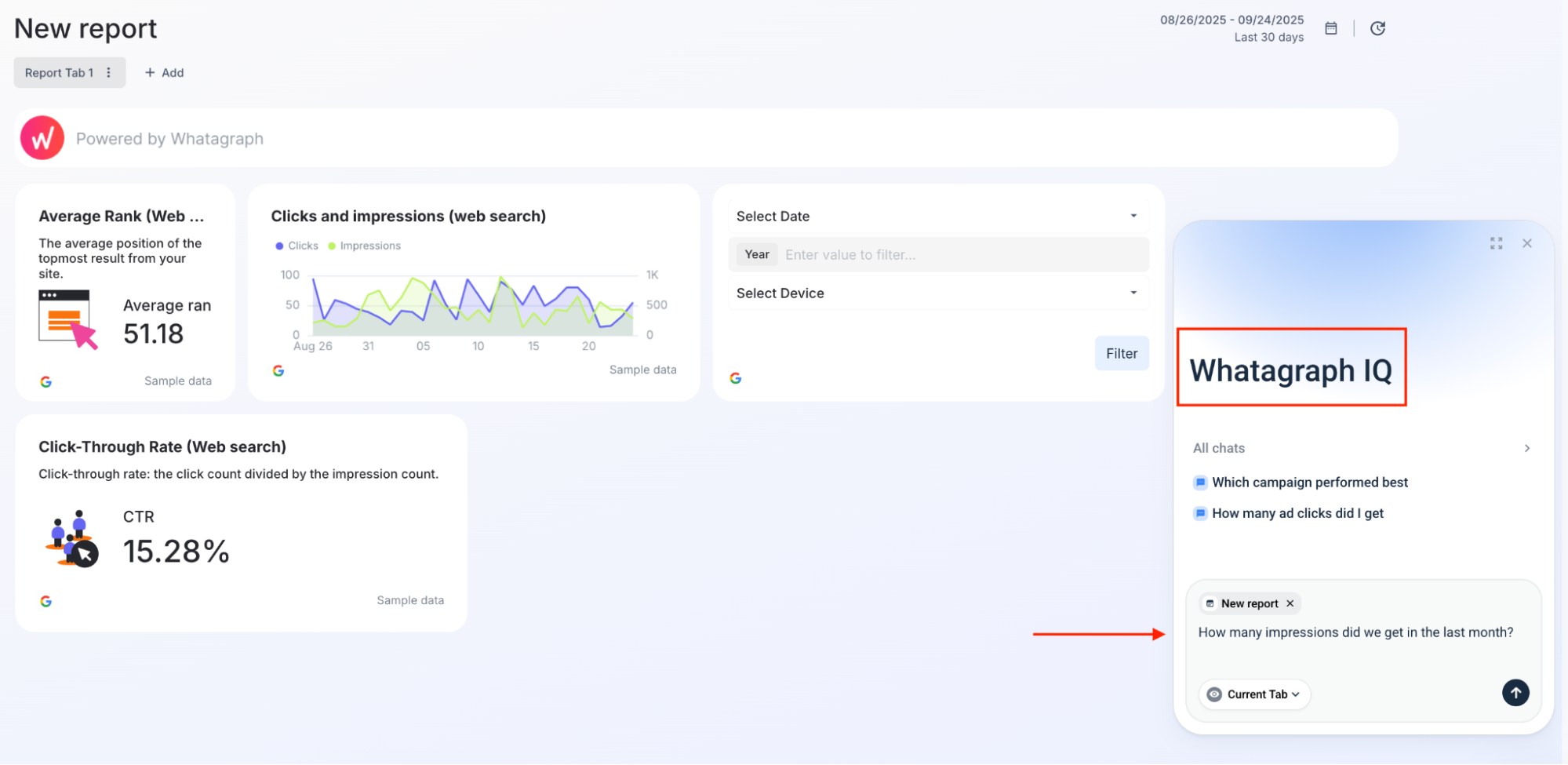
You can also chat with your data directly within the report to understand performance in seconds, instead of having to scroll through long reports.
Thanks to these AI features, Maatwerk Online is saving 100 a month on reporting with Whatagraph. Lars Maat, Co-founder, says:
Whatagraph’s AI saves time and energy for our marketing specialists. And the hours we’re saving is just pure profit. We now have the time to focus on more strategic things that help both our agency and our clients grow.
Feature #2: Data blending
We touched on this above, but we’re going to repeat it again because organizing your data before visualizing it is so important to keep your reports neat and tidy.
On Whatagraph, you can easily:
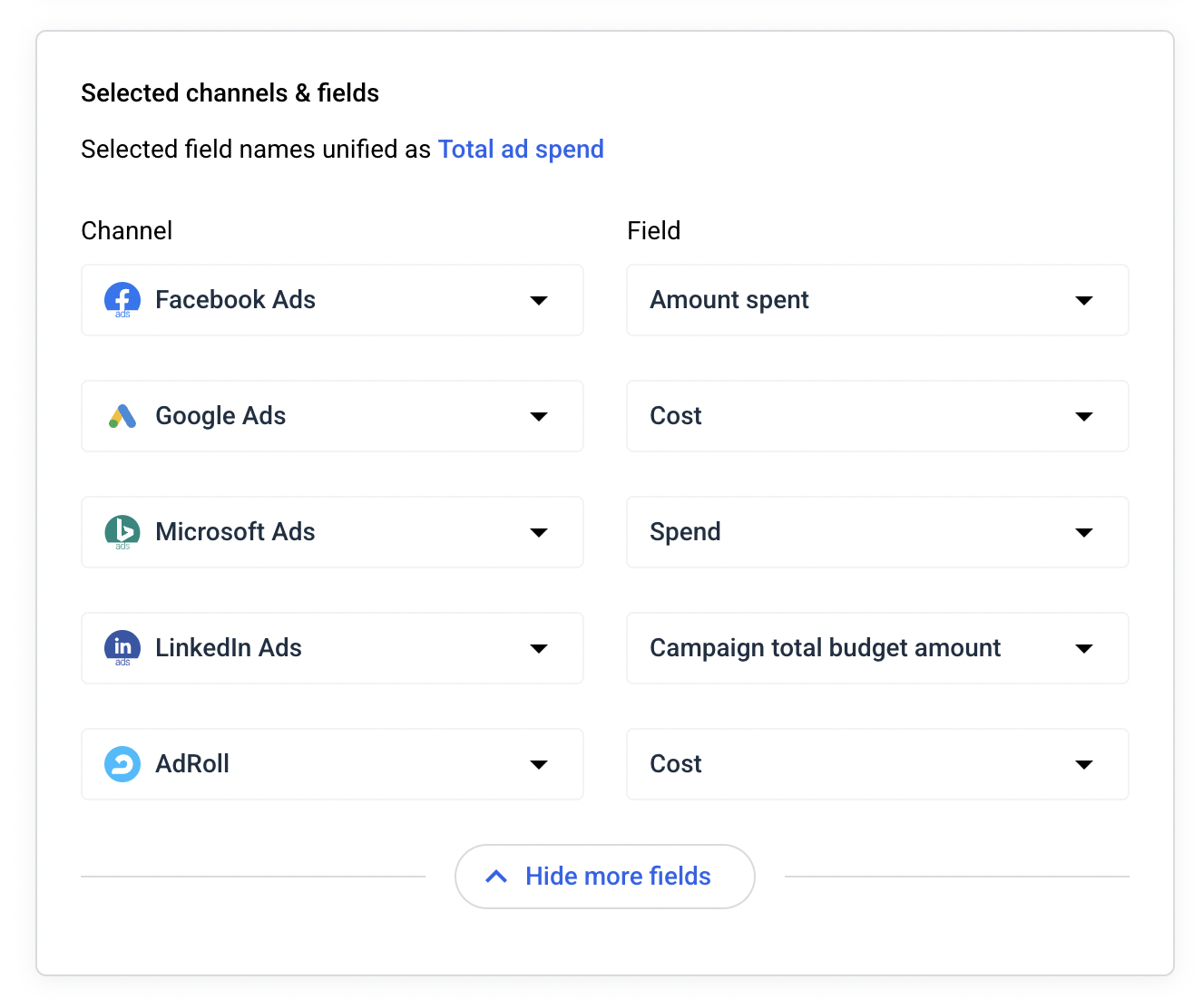
- Unify dimension names (e.g. gender, age, and device across Facebook Ads and Google Ads)
- Standardize campaign names (e.g. grouping all “Retargeting” campaigns into one)
- Grouping different countries into tiers (e.g. Tier 1 – United States, United Kingdom, Australia)
- Match metrics names (e.g. “Total ad spend” for all channels)
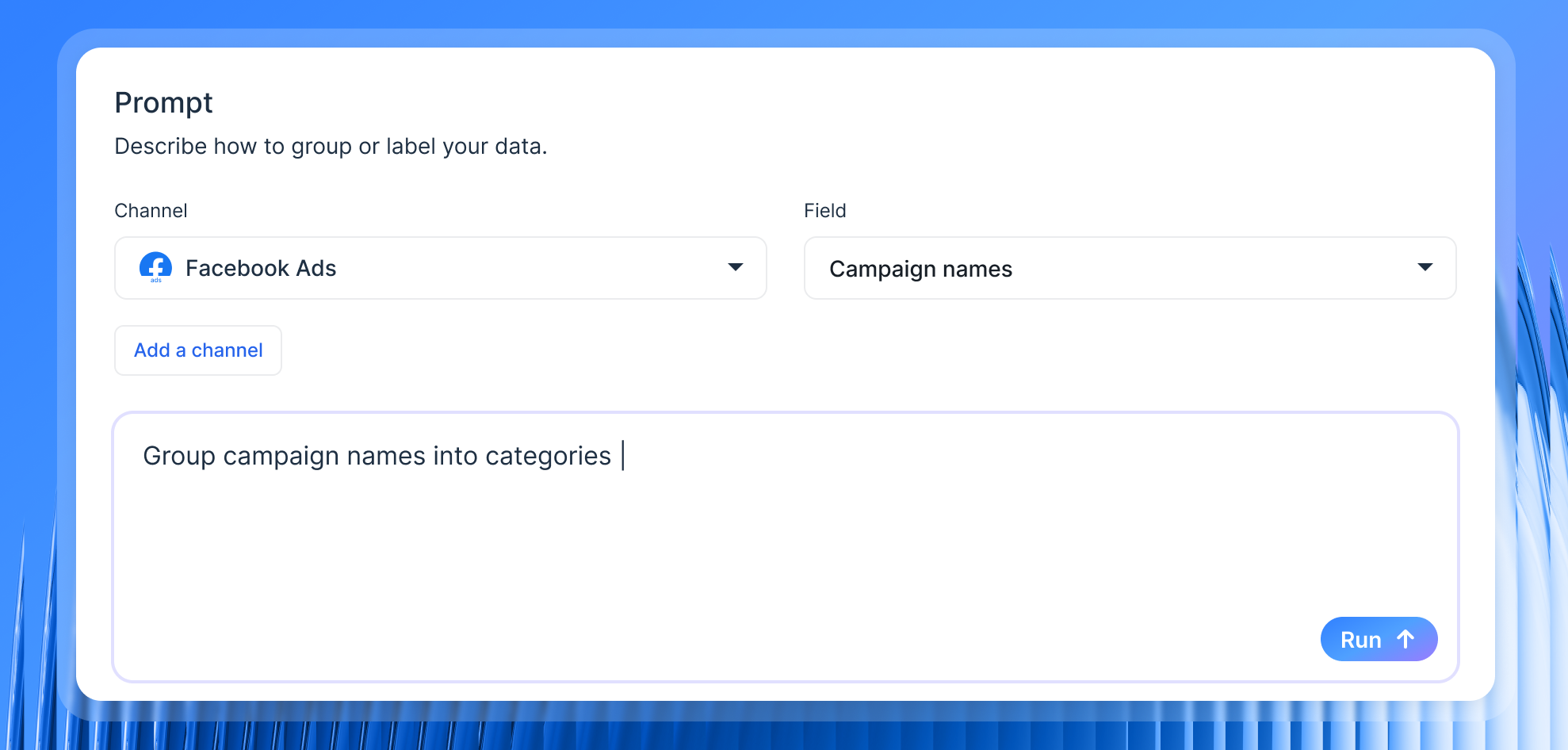
And on more advanced pricing plans, you'll get IQ Dimensions, which let you ask AI to:
- Create custom blends automatically. Just describe what you need—like “combine all spend from Meta, TikTok, and Google Ads into one unified Paid Media metric”—and IQ builds the blend for you.
- Build custom metrics on the fly. Want ROAS across channels? Or a funnel KPI like Add-to-Cart conversions? IQ can generate them instantly, without formulas or coding.
- Standardize messy data with IQ Dimensions. For example, if you’ve got campaign names like “FB_US_SpringSale_23” and “MetaUSA_Spring23,” you can tell IQ: “Group by Campaign Type: Spring Sale”. IQ creates a brand-new dimension that neatly categorizes everything, and you can reuse it across reports.
- Normalize any dimension at scale. Group campaigns by objective, products by category, or reviews by language—whatever fits your reporting needs. IQ makes sense of inconsistent data and saves hours of manual clean-up.
So what does that actually mean for you?
You stop treating each platform like a silo. Instead of toggling between Google Ads, Facebook Ads, and GA4, you can compare them side by side on the same timeline.
You can roll up Tier-1 countries into a single view.
You can unify campaign names so “Retargeting_US” and “US Retargeting” don’t show up as separate rows.
The result is a single, coherent dataset you can actually trust. And you save so much time on manually building these custom metrics, blends, and dimensions.
Feature #3: Customizable reports and dashboards
As sleek and interactive as Whatagraph’s reports are, wouldn’t it be even better if they looked exactly like you (or your client) wanted? You asked, we answered.
With Whatagraph, customization is king.
You can transform the default design into a fully white-labeled, client-facing masterpiece:
- Remove Whatagraph’s logo: Make it yours (or your client’s)—not ours.
- Choose a color scheme: Align every detail with your or your client’s brand identity.
- Specify the company name: Replace generic text with your own or your client’s name.
- Enter a new domain name: Keep your brand front and center with custom URLs.
- Customize the reply-to address: Make sure every communication feels personal.
- Assign team roles: Specify who’s responsible for the report to streamline project management.
And with Whatagraph IQ Theme, you don't have to do these manually. You can just upload a screenshot of your (or your client's) brandbook, or type in a prompt, and Whatagraph automatically detects the fonts and colors and applies them to your reports.
You can still manually fine-tune the style, and once you're satisfied, save it as “Global Themes” and re-use it across all your existing and new reports.
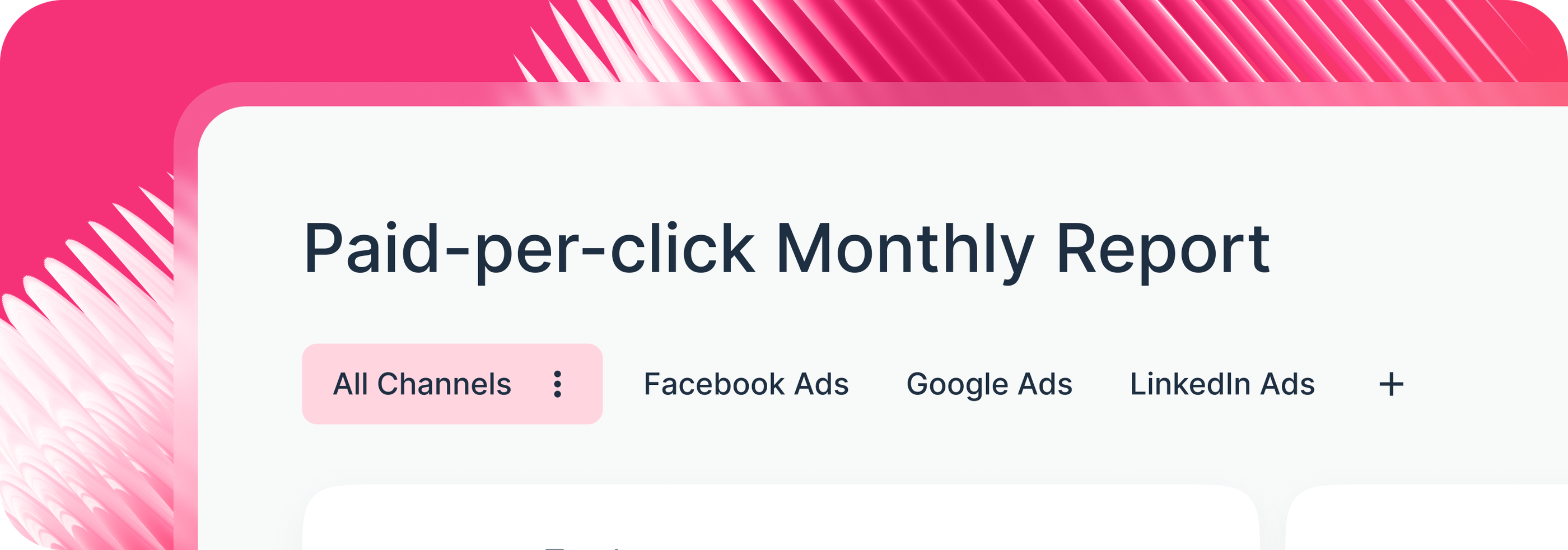
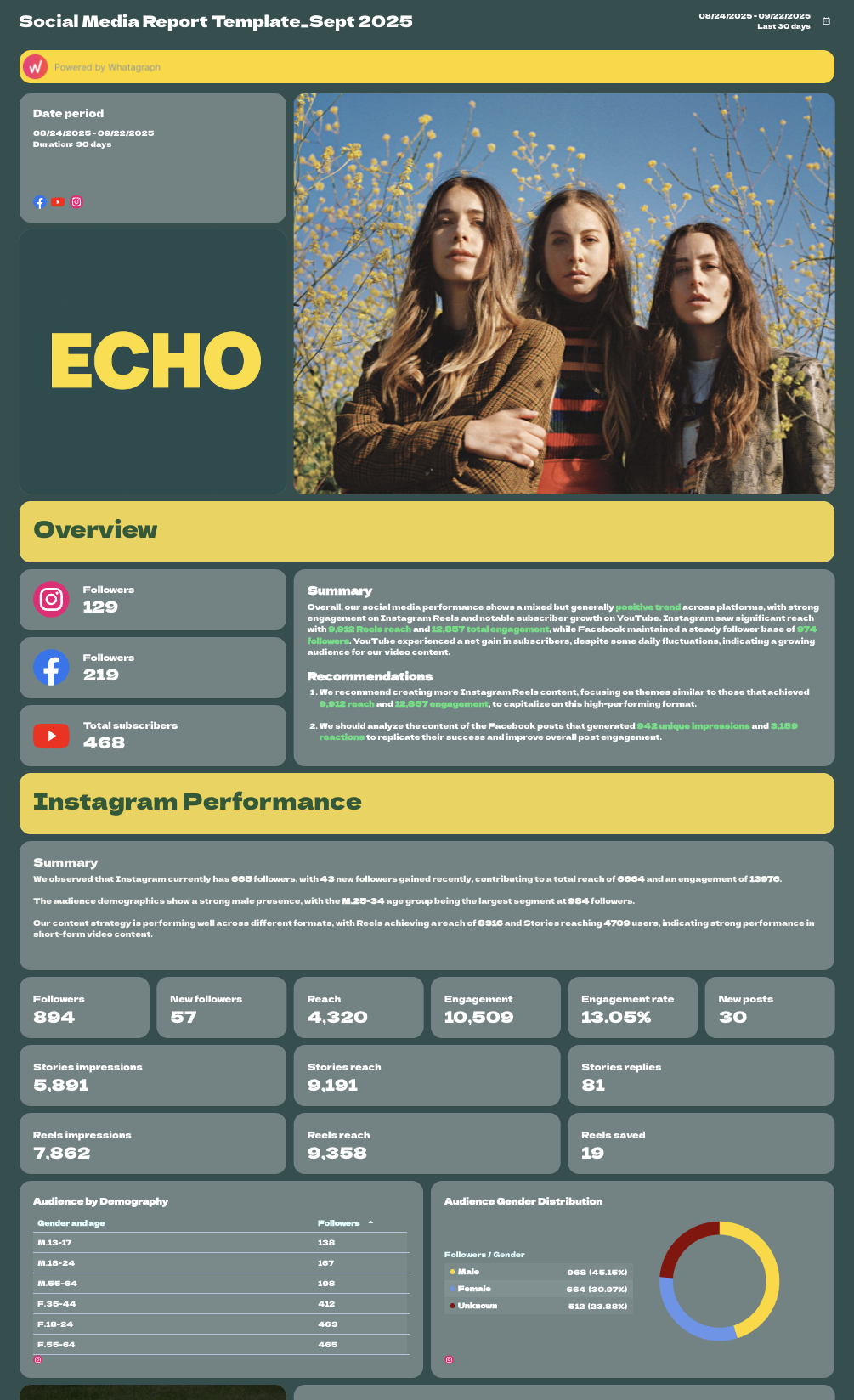
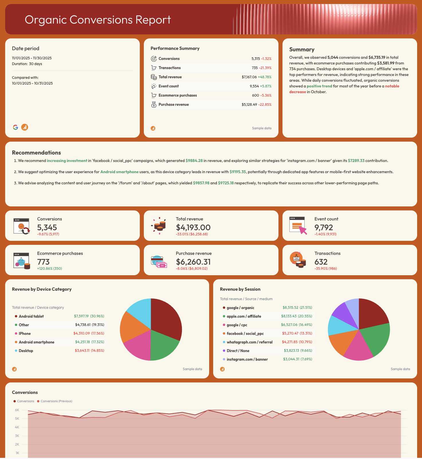
Take a look at some of the custom report examples below:
Like what you see? Start free with Whatagraph today.
Feature #4: Automated reporting workflows
What if your reporting practically ran itself? With Whatagraph, it does—while you still call the shots.
On Whatagraph, you can put report sharing on auto-pilot with scheduled emails. Simply:
- Customize the email: Choose color themes, upload logos, write header and body texts, and even host the email on your own domain.
- Choose the frequency and time: Select when you want these reports to go out and on which day the report would be sent (e.g. every Friday). You can also choose whether you want to review the report before sending or have it sent automatically without one.
- Enter the report recipient's email address: Put in the email of who will receive the reports, and you’re good to go!
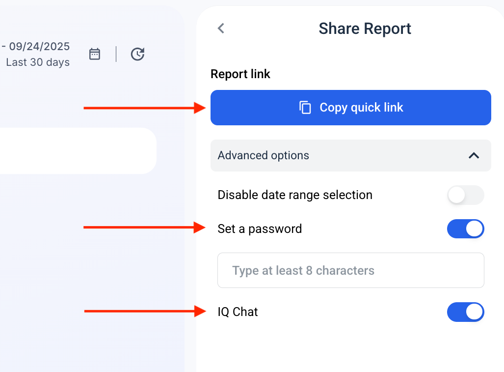
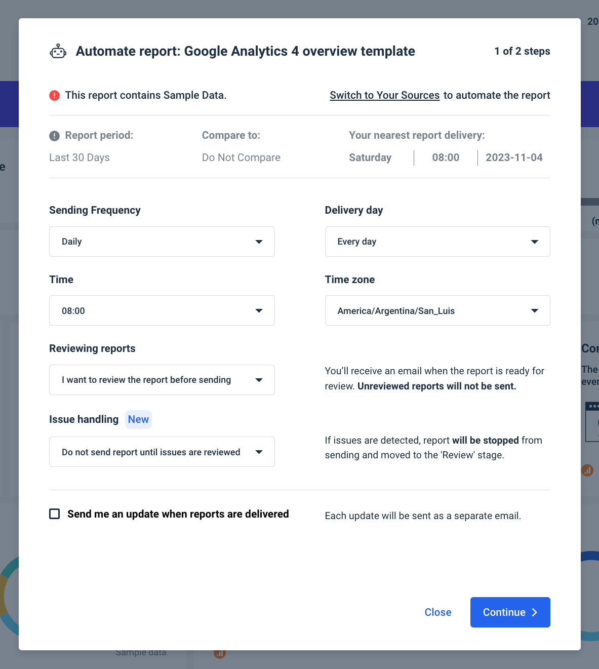 Apart from automated emails, you can also share reports via live links (always updated with fresh data), static PDFs, or Excel spreadsheets (only recommended for raw data and tables).
You also have the option to turn on IQ Chat for your clients or stakeholders, which lets them ask any questions about the reports and get back quick, accurate answers.
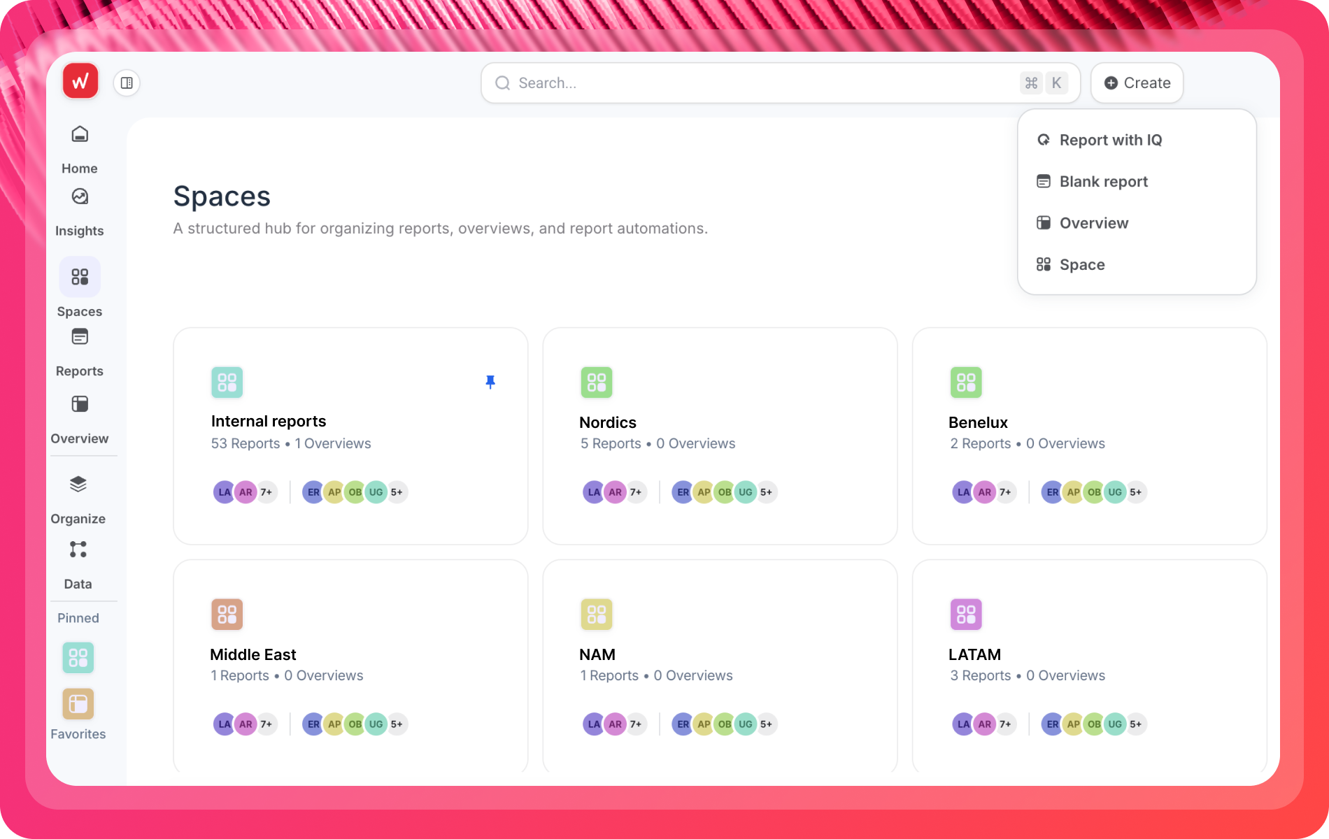
Feature #5: Multi-client management
Whatagraph is designed to help you manage dozens of clients with ease.
You get a dedicated hub called “Spaces” that bring everything related to a client or project together in one place:
- Data sources
- Report templates
- External-facing reports
- Internal performance monitoring dashboards (we call them “Overviews”)
With Spaces, you can not only store reports neatly, but also:
- Attach Overviews directly to a client space
- Create new reports, templates, or AI reports right inside a space
- Collapse or expand sections to keep navigation clean
- Favorite or pin specific Spaces for quicker access
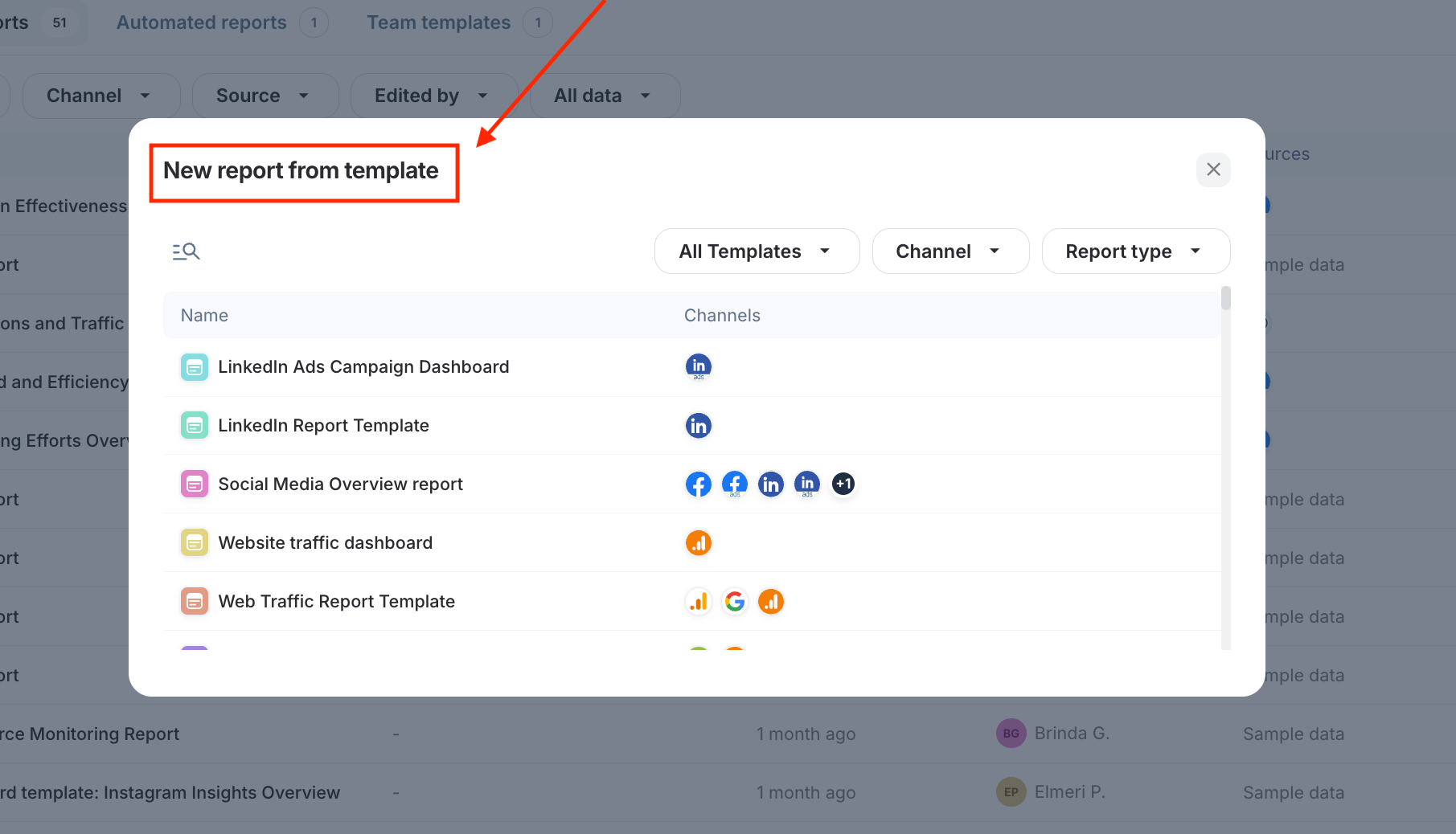
 If you have a client which has different branches or franchises, you'll love our linked template feature. Basically, you can just create one “Master” template with the structure, metrics, and widgets you want to see and duplicate that template to create a report for a different franchise.
This already saves you massive time, but let's go even deeper. If you need to edit the reports, instead of having to do it one by one, you can just edit the Master template and the changes will automatically be applied to all the linked reports.
These are the exact features that helped Peak Seven digital marketing agency save 63 hours a month on reporting. Read the full story here.
Whatagraph pros:
- Intuitive: Exceptionally easy to use—anyone on your team can jump right in.
- Comprehensive: An all-in-one solution for marketing performance monitoring and reporting.
- AI-powered: Whatagraph IQ generates reports, insights, and text summaries instantly, plus lets you (and your clients) chat with your data.
- Fast insights: Provides lightning-fast campaign insights to keep you ahead of the game with informed decisions.
- Visually stunning: Delivers dashboards and reports that make your data pop and are easy to interpret.
- Reliable: Boasts rock-solid uptime with 99.95% reliability.
- Flexible: Free forever plan for individuals, advanced tiers for scaling agencies.
Whatagraph cons:
- Free plan is limited: The forever free plan is great for testing, but fast-growing agencies will outgrow it quickly (advanced features like API access and complex automations are gated to higher tiers).
- Blending limits: Some API restrictions (e.g., YouTube) mean not all dimensions can be blended across sources.
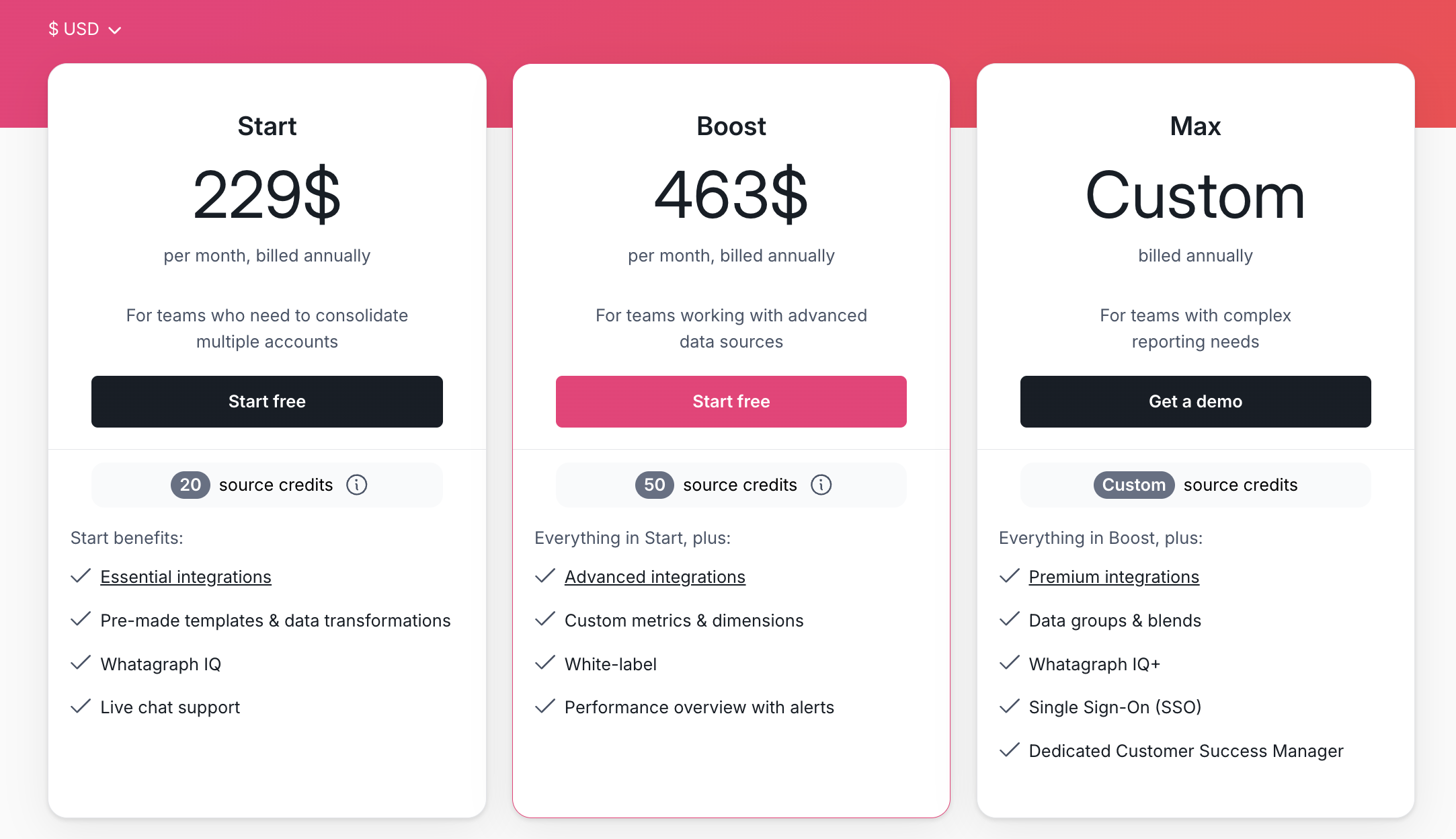
Whatagraph pricing:
Whatagraph offers a “Forever free” plan, making marketing intelligence accessible to freelancers and small teams who just need a handful of sources. From there, pricing (billed annually below) scales up for agencies that need more firepower:
- Forever-free – lets you get started at no cost, with 5 source credits, Whatagraph IQ basics, templates, and live chat support.
- Start ($229/mo billed annually) – includes 20 source credits and essential integrations
- Boost ($463/mo billed annually) – jumps up to 50 source credits, adds advanced integrations, custom metrics & dimensions, white-labeling, and performance overview with alerts
- Max (custom pricing) – for enterprise/complex teams, with custom source credits, premium integrations, data groups and blends, Whatagraph IQ+, SSO, and dedicated Customer Success Manager
What do real users say about Whatagraph?
Whatagraph may be “simple”—but it’s not “basic.”
- “To me, Whatagraph is like the Tesla or Mercedes of digital analytics tools, their clean and simple way to present complex marketing data. I highly recommend it to anyone working with marketing analytics who values efficiency and clarity in their reporting.” (Source)
- “I love the tool's simplicity, continuous enhancements, brand customization, and its ability to integrate multiple platforms, streamlining data analysis.” (Source)
- “Customer support is exceptionally fast and knowledgeable—every question is answered professionally within minutes.” (Source)
Start free with Whatagraph today.
1. DashThis
Best for: Teams or consultants who need bare-bones dashboards.
DashThis is a light, user-friendly data reporting tool that focuses on delivering easy-to-read dashboards for marketing campaigns—particularly paid ads and social media channels. Think of it as Power BI's free desktop version, but laser-focused on the metrics marketers actually care about.
Key features:
- Pre-built templates: Quickly create dashboards for Google Analytics, Facebook Ads, etc.
- Scheduling and email reports: Automate PDF or email sends to clients.
- Basic integrations: Connects with many popular ad networks, though some data might require manual importing.
- Simplicity first: A minimalistic approach to design.
DashThis pros:
- Quick setup: DashThis’s streamlined interface and templates help new users build a dashboard within minutes. No coding or advanced customization required.
- Time-saving automation: Once you’ve configured your basic metrics, you can schedule automated reports—saving hours on manual tasks.
- User-friendly: Beginners or smaller agencies often find DashThis less intimidating than more complex platforms.
DashThis cons:
- Limited data manipulation: If you need granular analysis—like eCommerce funnels, custom attribution, or in-depth PPC analytics—DashThis might feel restrictive—forcing you back into tedious manual reporting.
- Report customization restrictions: While report templates exist, teams with highly specific brand guidelines or advanced design needs may find DashThis’s template customization less flexible. This can be a pain if you’re dealing with blended data from Google Sheets or specialized PPC segmenting.
- Learning curve for complex reports: Building highly detailed or custom reports poses a learning curve. Balancing DashThis’s interface, plan limits, and your data complexity can take time.
DashThis pricing:
DashThis’s pricing depends on how many dashboards you need. For example, their “Individual” and “Professional” plans offer just 3 and 10 dashboards, respectively.
That might work for freelancers or small businesses, but if you’re an agency handling 5+ clients, you could run out of dashboards quickly—or face higher costs upgrading to bigger plans.
What do real users say about DashThis?
Most praise DashThis’s user-friendly interface for quick data visualization across multiple sources.
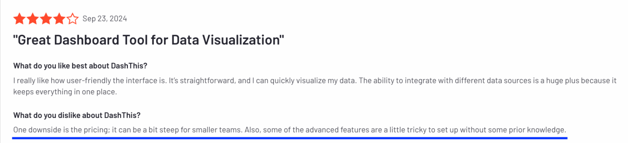
But many find the pricing steep for smaller teams, and advanced features can require a bit more know-how—like Mohammed S. on G2:
“One downside is the pricing; it can be a bit steep for smaller teams. Also, some of the advanced features are a little tricky to set up without prior knowledge.”
3. Databox
Best for: Teams that need real-time dashboards for quick snapshots.
Databox is designed to deliver live data updates via a drag-and-drop interface, making it appealing for basic reporting. But based on feedback from agencies, many users are still spending 15–30 hours a month on reporting tasks.
The culprit is Databox’s dashboards—they often don’t offer the flexibility needed for advanced data exploration, forcing teams to create separate slide decks with screenshots and custom graphs. No bueno.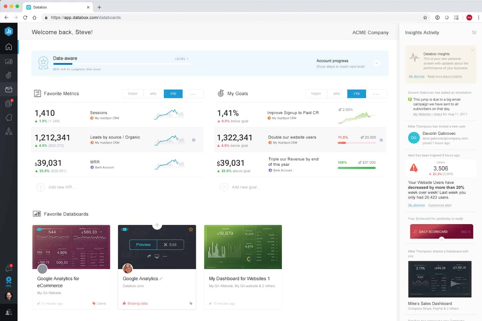
Key features:
- Live data updates: Near real-time refreshes across integrated channels.
- Pre-built dashboards and templates: Quick to launch but locked into a “slide-deck” style format.
- Textbox widget: A full-featured text editor that allows for embedding metrics, but its fixed landscape mode limits display options.
Databox pros:
- Real-time insights: Offers quick, live snapshots of key performance indicators.
- User-friendly interface: The drag-and-drop functionality makes it easy for teams to set up basic dashboards without heavy technical know-how.
- Quick deployment: Pre-built templates allow you to start monitoring essential metrics almost immediately.
Databox cons:
- Customization constraints: Limited flexibility means you might need to create additional slide decks or custom graphs outside of the platform to fully tailor reports.
- Inefficient workflow for complex reporting: For teams that need deep analysis, the process often becomes duplicative and time-consuming.
- Learning curve for advanced setups: Configuring more intricate reporting structures (like filtering top-level metrics or applying date range changes across clients) can be challenging.
- Performance issues: Some users note that the platform can feel “overwhelmed” when handling large or complex data sets, resulting in slower load times and a less interactive experience.
Side note: At Whatagraph, we make sure we're “always on” for you. Over the past six months, we've clocked an impressive 99.95% uptime—and we’re not about to let that slip.
If anything does go wrong, an emergency alert pings our product engineers (yes, even at 3 a.m.), so they can jump in and tackle the issue—pronto.
What does that mean for you?
- A stable platform with minimal data hiccups or delays.
- Faster bug fixes, handled in-house—no waiting around for a third party.
- Lightning-fast report loads, no matter when, where, or how you log in.
- Any downtime (which is rare) is quickly resolved by our on-call engineers, 24/7.
Databox pricing:
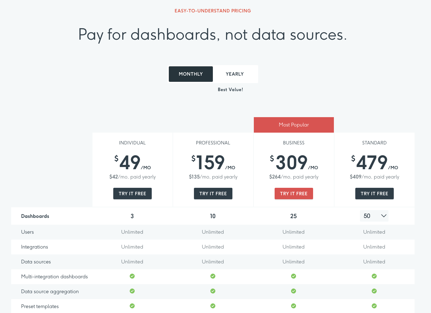
Here’s a quick rundown of Databox’s monthly pricing tiers (billed annually), based on their website as of October 2025:
- Professional ($159/month): 3 data sources, unlimited dashboards, unlimited users, custom metrics, standard sync.
- Growth ($399/month): 3 data sources, unlimited dashboards, unlimited users, plus AI summaries, datasets, forecasting, advanced filters, and row-level drilldowns.
- Premium ($799/month): 100 data sources, unlimited dashboards, unlimited users, plus 15-minute syncs on select sources, enterprise security, and priority support.
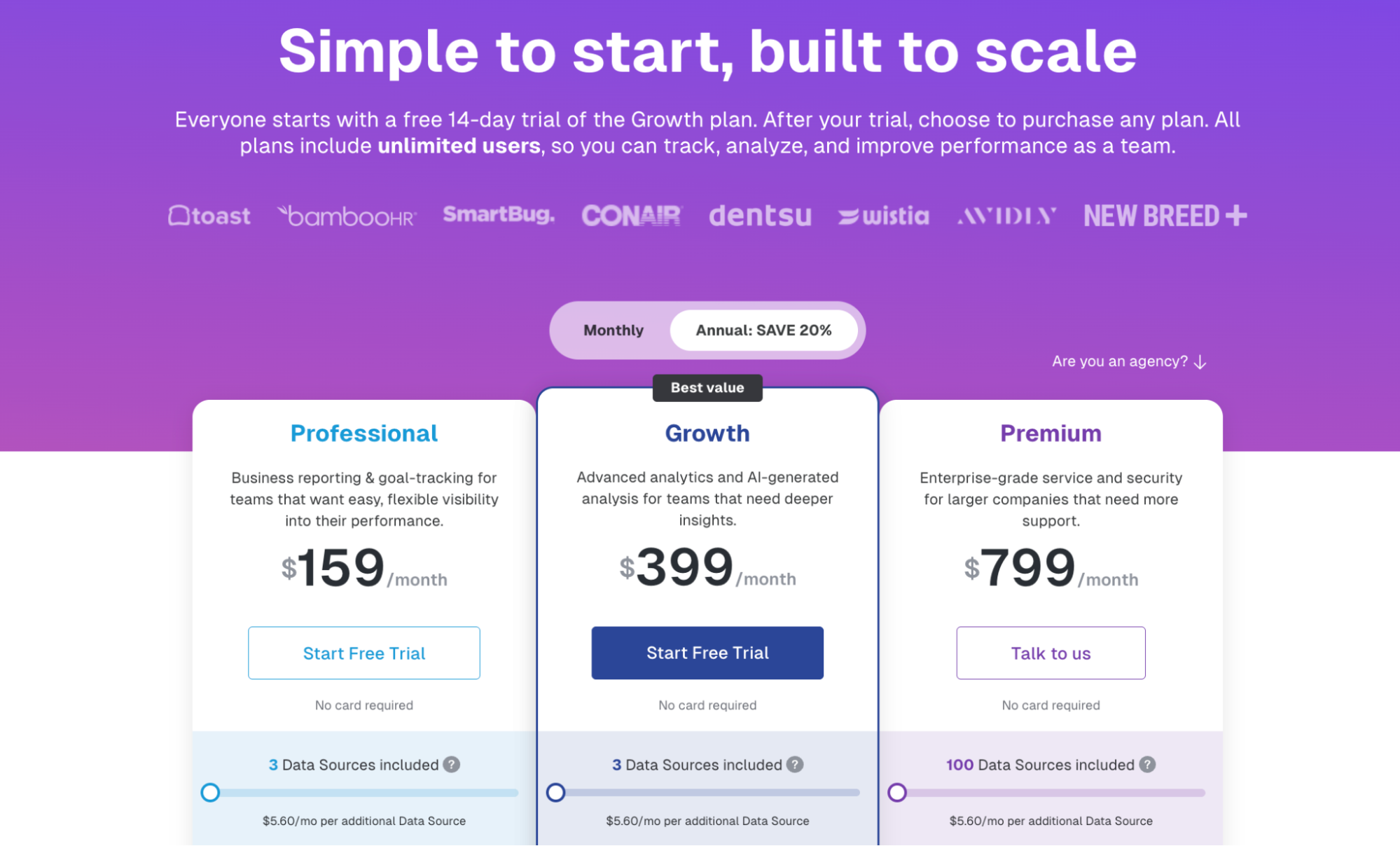
Note: Databox no longer offers a “Free Forever” plan. Instead, all users begin with a 14-day free trial of their Growth plan.
As your needs grow, watch out for potential overages—more data sources or dashboards than your plan allows may push you to the next tier.
What do real users say about Databox?
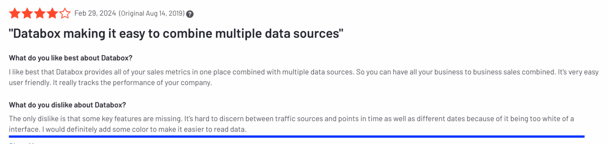
Reviewers rave about Databox's ability to easily combine multiple data sources, and business users find it very user-friendly.
But some also mention missing key features—particularly around distinguishing traffic sources and time points—suggesting the interface could be more intuitive for deeper analysis.
“....it’s hard to discern between traffic sources and points in time as well as different dates because of it being too white of a interface…”
4. Tableau
Best for: Data-savvy teams or larger organizations that need deep analytics and enterprise-level data visualization.
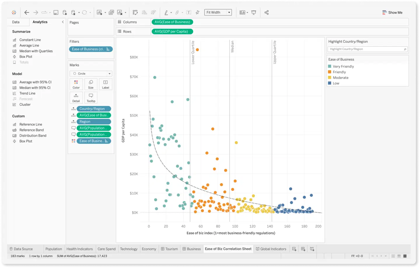 Tableau is often regarded as the gold standard for business intelligence (BI) and data analytics, allowing you to blend multiple data sources, create interactive reports and dashboards, and drill down into granular insights.
But its robust feature set comes with a steep learning curve. And it isn’t particularly designed for agencies managing multiple clients who need quick, templated reports.
Key features:
- Advanced data visualization: Interactive, highly customizable dashboards.
- Deep analytics and calculations: Write complex formulas, combine multiple data sets, and use forecasting tools to predict future trends.
- Scalability: Handles large volumes of data with enterprise-level security.
- Live data connections: Real-time or near real-time updates, if configured properly.
Tableau pros:
- Powerful advanced analytics: Excellent for in-depth exploration, predictive modeling, and custom calculations.
- Highly customizable dashboards: Offers rich visualization options, from heat maps to advanced geospatial analytics.
- Broad and seamless integration: Connects to a wide range of data sources, from SQL databases to cloud services.
Tableau cons:
- Steep learning curve: Non-technical users often need training to use Tableau to its full potential.
- Costly for smaller teams: Licensing fees can add up quickly, especially if multiple team members need access.
- Not agency-focused: While it excels at enterprise analytics, it lacks built-in tools for multi-client management or easy white-labeling.
- Resource-heavy: Large data sets and advanced calculations may require robust hardware or cloud resources.
Tableau pricing:
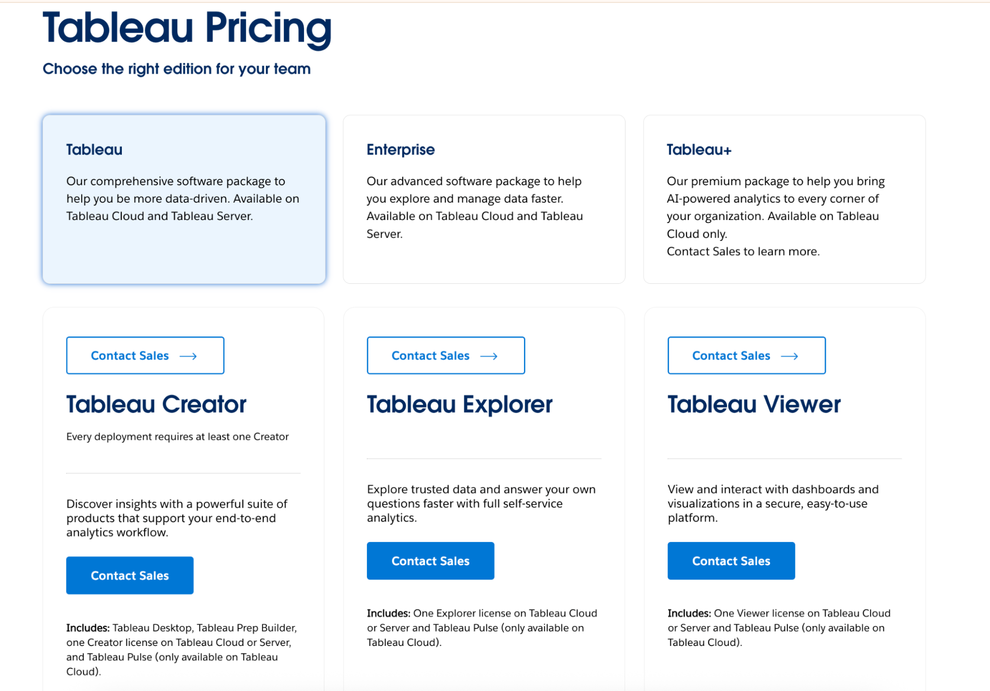
If you’re looking for transparent pricing, Tableau isn’t it. Their entire pricing model has moved behind a “Contact Sales” wall. That means even the basics—like a Creator, Explorer, or Viewer license—don’t have sticker prices listed anymore.
Instead, you’ll see:
- Creator: Required for every deployment. Comes with Tableau Desktop, Prep Builder, a Creator license on Cloud/Server, and Tableau Pulse (Cloud only).
- Explorer: Aimed at self-service analytics.
- Viewer: For read-only access to dashboards and visualizations.
- Enterprise and Tableau+: Higher-end packages layering in governance, security, and AI-powered analytics.
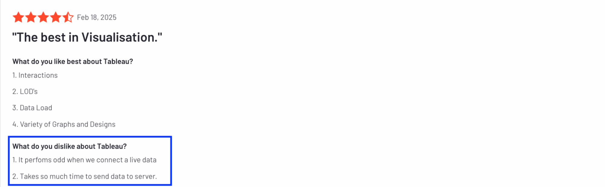
What do real users say about Tableau?
A lot of users—like Srinivasa Reddy B.—praise Tableau’s advanced features like LOD calculations and interactive dashboards.
But they note slow performance and “odd” behavior when connecting live data, resulting in longer load times for the server.
“1. It performs odd when we connect a live data
2. Takes so much time to send data to server.”
5. Looker Studio
Best for: Teams heavily invested in Google-centric data that can handle manual data blending for non-Google sources.
 Looker Studio (formerly Google Data Studio) allows you to create dashboards and reports from Google’s native platforms, mostly for free. However, many agencies find themselves manually blending data in Sheets or relying on third-party connectors like Supermetrics—especially when managing multiple channels (Facebook, TikTok, Pinterest, etc.).
Free can quickly become expensive, too. Frequent complaints center around slow loading times, limited advanced features, and lack of multi-client management tools.
Key features:
- Free for basic use: Create and share reports without a subscription (enterprise tiers available).
- Native Google integrations: Pull data from Google Ads, Analytics, YouTube, and more.
- Simple dashboards: Beginner-friendly for straightforward metrics and visuals.
Looker Studio pros:
- Easy to start: Ideal if your reporting is primarily Google-based and you want a no-cost entry point.
- Basic templates: You can quickly spin up standard reports for top-level KPIs.
- Wide user community: Plenty of how-to guides and community templates to jumpstart your setup.
Looker Studio cons:
- Limited data blending: You’ll often need manual merges in Sheets or paid connectors to handle multi-channel data.
- Slow and unreliable for big data sets: Agencies note frequent loading delays and breaks, which can hamper productivity.
- Minimal multi-client features: Not designed for large agencies juggling dozens of client dashboards; no built-in white-labeling.
- Lack of automated insights: No built-in AI-driven recommendations or automated creative performance reporting—teams must manually build these insights.
- No customer support: Users must learn its features, connectors, and design elements on their own. In theory, there’s an email address for developer assistance, but according to both our experience and G2 reviews, responses can be slow or unhelpful.
BTW, every Whatagraph plan comes with its very own dedicated Customer Success Manager—and our live chat support replies in just 4 minutes.
This is how you know you’ve outgrown Looker Studio.
Looker Studio pricing:
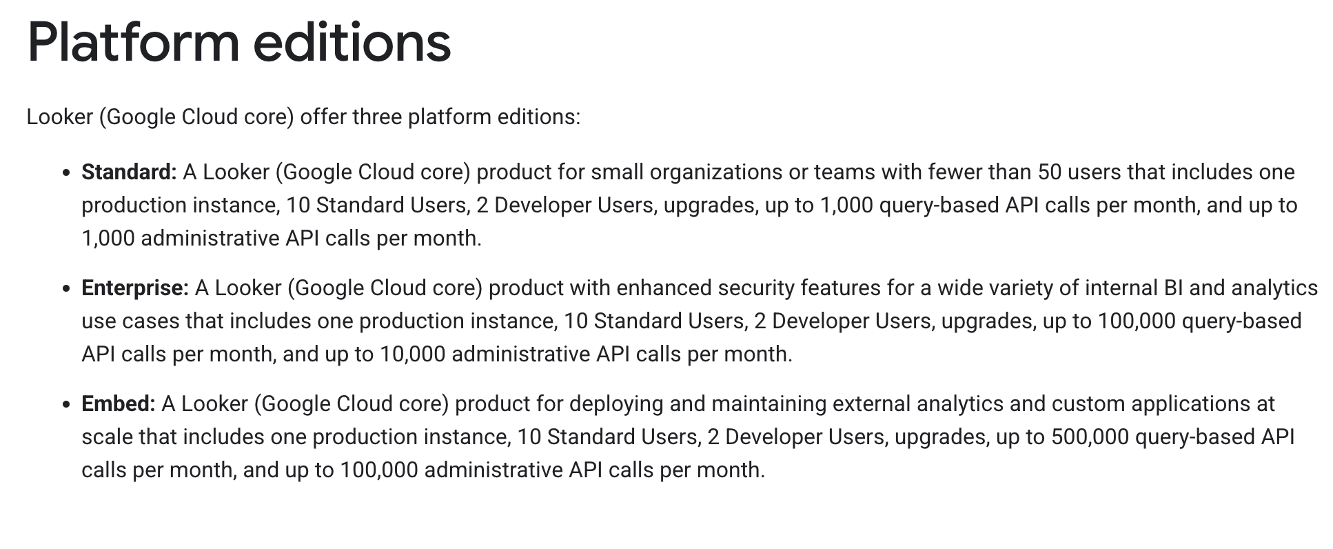
Looker Studio (Google Cloud core) currently offers three platform editions—but doesn’t list public pricing; you’ll need to contact sales for a quote. Here’s a quick rundown:
- Standard: Suited for small teams (<50 users). Includes 1 production instance, 10 standard users, 2 developer users, and up to 1,000 query-based API calls/month.
- Enterprise: Adds advanced security features and higher limits for larger organizations.
- Embed: Built for external analytics at scale, supporting up to 500,000 query-based API calls/month.
 What do real users say about Looker Studio?
Many find it ideal for quickly building a dashboard and connecting with multiple data tools—like BigQuery, Snowflake, or even Google Drive.
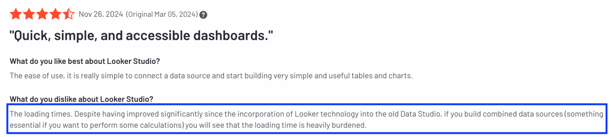
But once you start blending larger or more complex data sets, some reviewers like Raul C. mention that performance can become an issue.
“Despite having improved significantly since the incorporation of Looker technology into the old Data Studio, if you build combined data sources (something essential if you want to perform some calculations) you will see that the loading time is heavily burdened.”
6. Toucan
Best for: Data and IT teams at small to medium companies
If you're building a SaaS platform or a client-facing portal and need to offer reporting to your users, Toucan is a strong alternative to traditional BI tools.
Designed specifically for embedded analytics, Toucan allows product teams to integrate dashboards and reports directly into their application — no heavy setup, no steep learning curve.
Key features:
- No-code dashboard creation for product teams and business users
- Seamless integration with any front-end via Web Component, iFrame or JavaScript SDK
- Built-in multi-tenancy and role-based access control
- Contextual storytelling layer to make data easier to understand
Toucan pros:
- Intuitive UI designed for non-technical users
- Quick to deploy and easy to scale across clients
- Full white-labeling for a native product experience
- Excellent support and onboarding for product teams
Toucan cons:
- Less suited for advanced data scientists looking for SQL-based exploration
- Not ideal for on-premise deployments (cloud-first approach)
- Some learning curve for dashboard logic and templating features
Toucan Pricing:
Entry-level plans start at around €1,000/month, with full feature access including white-label and API integrations.
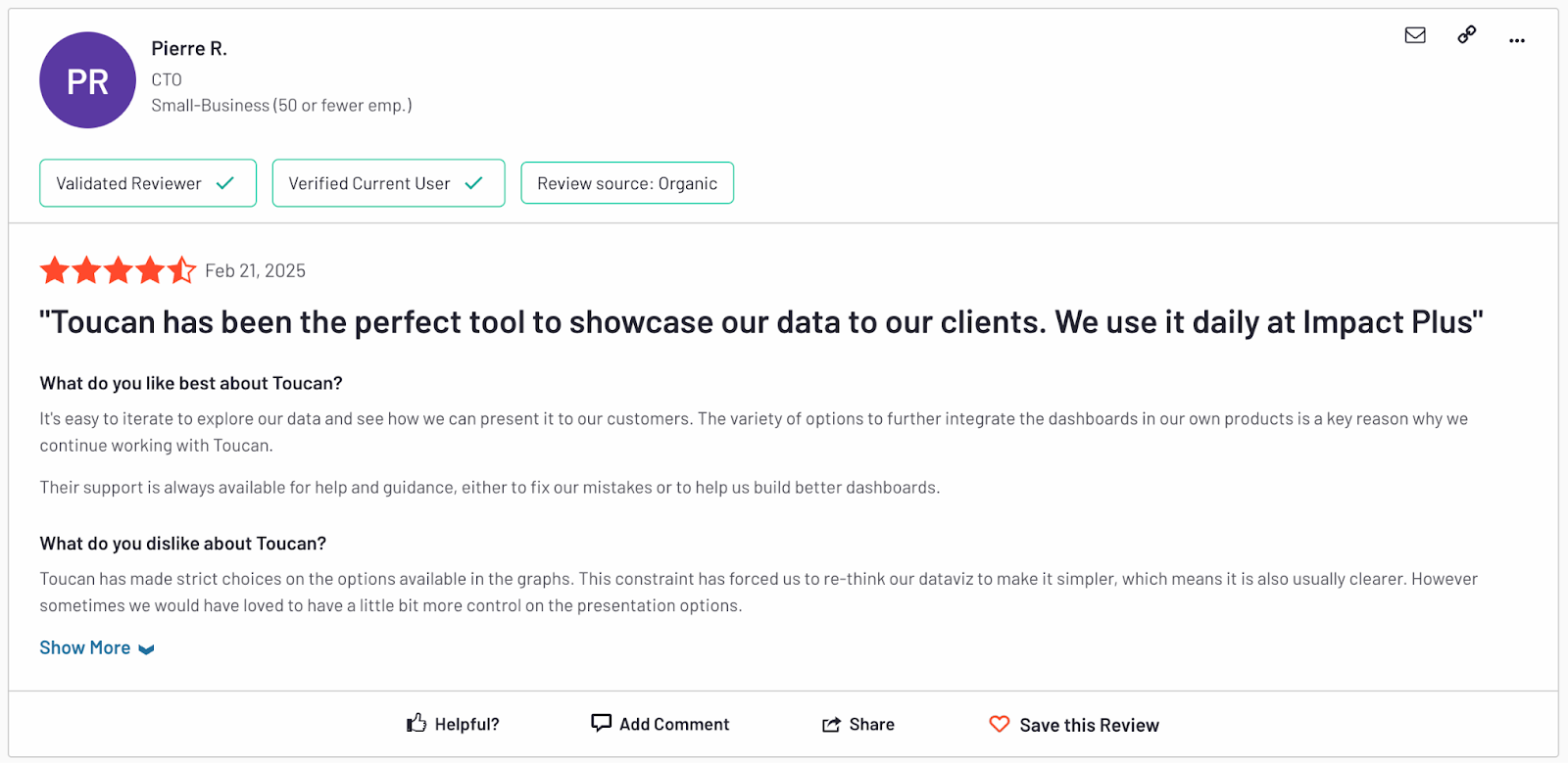
What do real users say about Toucan:
Users love Toucan for its ability to turn complex data into easy-to-digest visual stories — especially for client-facing use cases. It stands out for its simplicity, speed of implementation, and outstanding customer support.
7. AgencyAnalytics
Best for: Smaller agencies looking for a simple, white-labeled reporting platform.
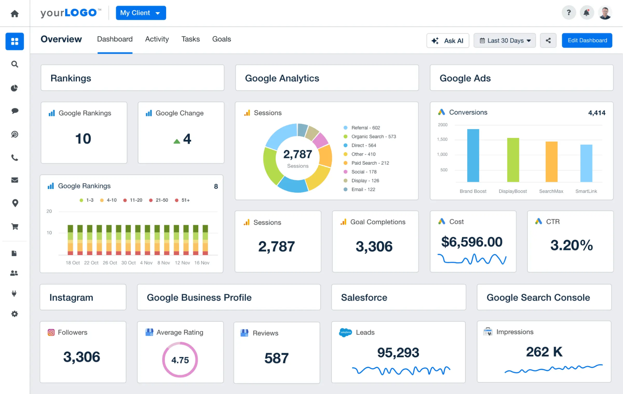 AgencyAnalytics offers a white-labeled dashboard experience covering SEO, PPC, and social metrics. It’s easy to set up, which is great at first. But many agencies quickly find it limiting because they need real-time data, deeper insights, and more automation—things AgencyAnalytics struggles with.
Key features:
- White-labeling: Reports, login, and admin areas can remove the AgencyAnalytics branding entirely.
- Basic integrations: Pull data from Google Ads, Facebook Ads, TikTok, and more (though refresh rates vary).
- Code-based dashboard creation: Developers can programmatically create new dashboards from templates, but maintaining or editing them still requires manual work.
- Scheduled reporting: Automate PDF or email-based reports, albeit with limited template and date range flexibility.
AgencyAnalytics pros:
- Simple to start: Quick setup for basic SEO/PPC reports, minimal learning curve.
- Full white-label: Clients see your brand from login to final report—AgencyAnalytics stays invisible.
- Affordable for smaller teams: The entry-level pricing can be attractive if you’re not dealing with large data volumes or real-time demands.
AgencyAnalytics cons:
- Slow data refresh: Reports can lag 2–3 days, which isn’t ideal for daily or near real-time reporting needs.
- Limited customization and automation: Scheduled reports often stick to the same template; advanced changes require manual adjustments every month.
- Inconsistent integrations: Detailed ad-level data may work in TikTok but not on Facebook, leading to gaps and blame-shifting between platforms.
- Overwhelming manual effort: Some users pull multiple reports daily, double-checking each against the original platform—undermining the promise of automation.
- Unresponsive support: Feature requests and bug fixes can languish indefinitely, with the vendor passing the blame to ad platforms rather than taking ownership.
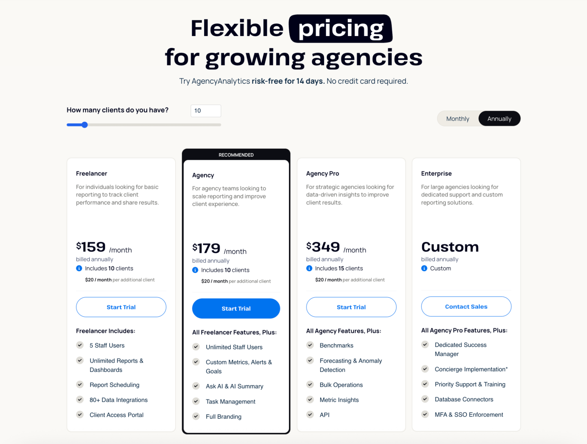
AgencyAnalytics pricing:
AgencyAnalytics offers a 14-day free trial and flexible monthly or annual billing options. Here’s a quick look at their main plans as of March 2025:
- Freelancer ($159/month; 10 clients included): Unlimited reports, scheduling, 80+ integrations, client portal, basic branding. Extra clients: $20/month each.
- Agency ($179/month; 10 clients included): Everything in Freelancer + AI Summary & Ask AI, metric alerts, goal & budget tracking, ad spend markup, full branding. Extra clients: $20/month each.
- Agency Pro $349/month; 15 clients included): Everything in Agency + benchmark comparisons, trend forecasting, anomaly detection, data aggregation, priority support.
- Enterprise (custom pricing): Everything in Agency Pro + concierge implementation, dedicated success manager, database connectors, MFA/SSO, training.
Each plan supports unlimited reports and dashboards, though you’ll pay an extra fee per additional client ($2.17–$1.59/client).
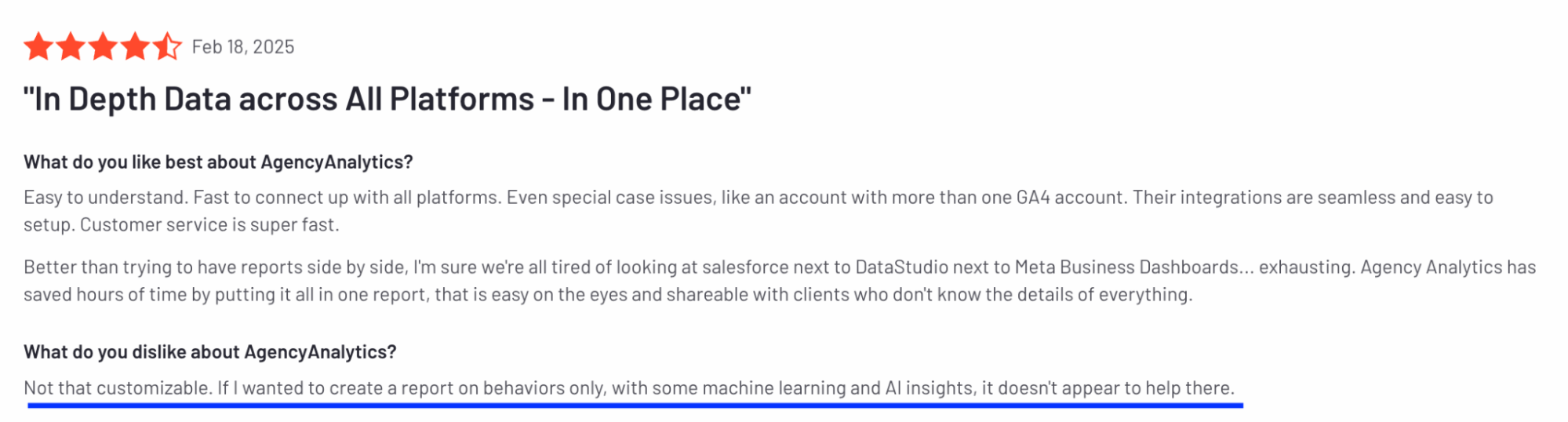
What do real users say about AgencyAnalytics?
A lot of users like Elizabeth R. appreciate how easily AgencyAnalytics gathers data from multiple platforms, but they’re frustrated by its limited options for customizing reports and lack of advanced, AI-powered insights.
“Not that customizable. If I wanted to create a report on behaviors only, with some machine learning and AI insights, it doesn’t appear to help there.”
How to Choose the Right Automated Reporting Tool for Your Agency or Brand
Not every tool is built for the same job. Here are the five questions to ask before you commit.
1. Does it cover all your data sources reliably?
Start here. A tool with 600 integrations means nothing if the three connectors you actually use keep breaking. Check whether the tool manages its own connectors natively or relies on third-party pipes like Supermetrics. And ask what happens to your historical data if a connection goes down.
2. Can it handle your client volume today and in six months?
A tool that works for five clients might fall apart at 25. Look for reusable templates, linked reports you can edit in bulk, and multi-client organisation features. The real test is whether adding a new client takes minutes or hours.
3. How much technical skill does your team actually have?
Be honest about this one. Tools like Tableau are powerful, but they need a dedicated analyst to get real value from them. If your account managers need to build and read reports too, you need something that doesn't require SQL or data engineering to operate day-to-day.
4. What does your client delivery workflow look like?
Think about how reports actually reach clients. Do they need live dashboards they can check any time? Scheduled PDF emails? White-labeled links on your domain? Some tools handle one of these well but not all three. Match the tool to how your clients actually consume reporting.
5. Is the data foundation solid enough to build on?
AI features, custom metrics, and automated insights only work if the underlying data is clean and consistent. Ask whether the tool standardises data automatically, flags anomalies, and keeps definitions consistent across clients. A shaky data layer makes everything built on top of it unreliable.
3 Success Stories of Automated Reporting Tools
These tools are great, but how have marketing agencies and brands actually benefited from automated reporting tools? We highlight three case studies here.
Maatwerk Online: 100 hours saved every month
Maatwerk Online, a Rotterdam-based agency serving 100+ clients, was running reports on a Supermetrics and Looker Studio stack that was slow, unreliable, and producing data-heavy dashboards clients never fully read.
After switching to Whatagraph, they built four reusable templates covering eCommerce, Leadgen, Branding, and B2B. Specialists now build widgets with a plain-language prompt instead of manually configuring everything. Lars uses IQ Chat to answer client questions live in meetings. And ditching Supermetrics saved the team €3,000 to €4,000 a year.
The result: 100+ hours saved per month on reporting, with 100% of Whatagraph costs covered through client report licensing fees.
The hours we're saving with Whatagraph is just pure profit. We now have the time to focus on more strategic things that help both our agency and our clients grow. —Lars Maat, Co-founder, Maatwerk Online
Peak Seven: 63 hours and $9,450 saved per month
Peak Seven was running 25 client reports a month on a Looker Studio, Funnel, and Supermetrics setup that constantly broke.
Data pulled through incorrectly, connections needed re-verifying every week, and each report took up to 4 hours to build. Kim Strickland, Digital Marketing Specialist, was spending more time fixing reports than using them.
After switching to Whatagraph, Kim set up automated, always-live dashboards and a Master template for franchise clients. Swapping data sources replaced rebuilding from scratch. Each report now takes 1.5 hours or less, and the data matches the source platforms every time.
The result: 63 hours saved per month, $9,450 in monthly savings for clients, and reports accurate enough to use in new business pitches.
Whatagraph is now our Bible, both for our clients and internal teams. Our relationships with clients have been amazing, and we've even been able to retain them longer. —Kim Strickland, Digital Marketing Specialist, Peak Seven
Rentable: 1.5 hours saved per report across 5,000+ data sources
Rentable manages 215 reports across 5,000+ Google My Business data sources and thousands of property locations. Their previous tool couldn't keep up as the business scaled, and building a single report with 200+ locations took 2 hours.
After switching to Whatagraph, the team built a library of automated report templates. Onboarding a new customer now means picking a template and swapping the data source. They also rolled out Whatagraph IQ Chat so customers can ask questions directly inside their reports instead of waiting for answers.
The result: report creation time dropped from 2 hours to 20 to 30 minutes, saving 1.5 hours per report across 215 active customers.
Whatagraph lets us pull in all the data we need, fit hundreds of locations in one report, and break it down exactly how our customers want. My teams love it because it saves so much time.” —Danielle Roberts, Director of Implementation & Support, Rentable
If this convinced you to start using an automated reporting tool, we're here for you.
Published on Feb 28 2025
WRITTEN BY
Brinda GulatiBrinda Gulati is a fractional content marketer and freelance writer who specializes in data-driven storytelling and writing easy-to-understand, informative content for humans. She has two degrees in Creative Writing from the University of Warwick, and believes that above all, stories are a deeply human endeavor. She has two dogs, knows thrifting spots, and loves afternoon naps.