PPC Reporting Hub
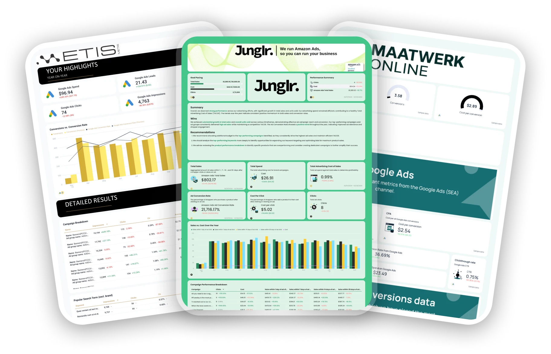
Explore a carefully curated collection of report templates co-created with leading PPC marketers. Pick a template, plug in your data, and start reporting in seconds.

Lars Maat
Co-Founder, Maatwerk Online

Chantelle Bowyer
Founder & CEO, Metis

Martin Sandgaard
Co-Founder, AdsToGo

Elizabeth Greene
Co-Founder, Junglr

Marc Woodland
CEO, Winbox

Alexander Mitrofanov
Senior Paid Media Specialist, Tag Worldwide

Rasmus Madsen
Founder & Google Ads Specialist, RM Marketing

Maryna Barysheva
CEO, LKI Consulting

Jordan Fry
CEO, RevAmp

Lars Maat
Co-Founder, Maatwerk Online

Chantelle Bowyer
Founder & CEO, Metis

Martin Sandgaard
Co-Founder, AdsToGo

Elizabeth Greene
Co-Founder, Junglr

Marc Woodland
CEO, Winbox

Alexander Mitrofanov
Senior Paid Media Specialist, Tag Worldwide

Rasmus Madsen
Founder & Google Ads Specialist, RM Marketing

Maryna Barysheva
CEO, LKI Consulting

Jordan Fry
CEO, RevAmp
Steal These Templates From PPC Experts
Search...

Ready to use these templates?
Create your account, connect your data, and start reporting in seconds.

Frequently Asked Questions
What is a PPC report?
A PPC report gives you a clear view of your pay-per-click campaign performance and how your ads are actually performing. It tracks key metrics such as CTR, CPC, conversion rate, and ROAS to show what’s working and what needs improvement.
Use PPC reports to monitor Google Ads, Facebook Ads, LinkedIn Ads, and other ad campaigns across different channels. A good report helps you spot trends, share results with stakeholders, and make data-driven decisions that improve your PPC campaigns.
You can build one manually in Excel or Google Sheets, but automated tools like Whatagraph make it easier. They pull PPC data from multiple data sources so your marketing teams can track campaign performance, visualize results, and measure how every click supports your business goals.
What should a PPC campaign report template include?
Your PPC reporting template should make it easy to see how your ad spend turns into real results. A well-structured report gives you both a high-level view of performance and detailed insights into every channel.
1. PPC Advertising Overview tab
Start with a Paid Advertising Overview that highlights your total ad spend, impressions, clicks, and conversions across all channels. This view helps your marketing teams and stakeholders understand overall campaign performance at a glance.
You’ll usually see aggregated metrics like CTR, CPC, conversion rate, and ROAS, along with graphs tracking trends over time.
Next, include a channel breakdown with pie charts that compare performance between Google Ads, Facebook Ads, LinkedIn Ads, and TikTok Ads. These visualizations show which platforms deliver the best results and where your budget optimization opportunities are.
Wrap up this tab with a summary and recommendations for next steps to take. With Whatagraph IQ Summary, you don’t need to write this manually.
IQ analyzes your actual campaign data, identifies trends, and automatically writes summaries in 18 languages. You can customize prompts to fit your tone and still edit them for that human touch.
Since the data never leaves Whatagraph, there’s zero risk of data breaches or hallucinated insights like with external AI tools.
This top-level view acts as your marketing report summary, ideal for tracking overall PPC performance and spotting where your ad campaigns are hitting or missing their business goals.
2. Channel-specific Breakdown tabs
Each paid channel deserves its own detailed tab. Let’s use Meta Ads as an example.
1️⃣ Executive summary
Begin with a short overview that sums up the period’s results: total spend, impressions, clicks, cost per click, and click-through rate. Mention which campaigns performed best and highlight any major takeaways or optimization insights.
2️⃣ Performance overview
Add a KPI summary with your key metrics in one place: CPC, CTR, CPM, conversion rate, and return on ad spend. Pair this with a few simple graphs showing trends over time, such as spend vs. impressions or clicks vs. CTR.
3️⃣ Campaign performance
This section dives into PPC campaign data, breaking down KPIs by campaign. Show performance metrics like impressions, total spend, and engagement to reveal which ppc campaigns delivered the best ROI.
4️⃣ Ad performance carousel
Feature a preview of your top-performing ads. This visual section makes it easy to evaluate ad copy, creative formats, and overall ad performance across your different ad groups.
5️⃣ Audience engagement breakdown
Wrap up with an overview of your audience data. Include demographics, impressions by age and gender, and conversion funnel visualizations to see which audience segments are driving the best results.
Repeat this layout for every paid channel you have: Google Ads, LinkedIn Ads, TikTok Ads, and others.
Keeping each one in a separate tab keeps your reporting process clean, organized, and easy to navigate for everyone reviewing your PPC monthly report template.
What KPIs and metrics to track for PPC?
The specific metric will depend on what you agree with your client. However, these ones are the must-have on every PPC report example:
Clicks: The number of times users clicked on your ad. This shows the initial interest your ad is generating.
Impressions: The number of times your ad was displayed, helping you measure visibility.
Click-Through Rate (CTR): The ratio of clicks to impressions. A higher CTR indicates that your ad is relevant to the audience.
Cost Per Click (CPC): The average amount you pay for each click. Lower CPCs often indicate cost-efficient targeting.
Conversion Rate: The percentage of users who completed a desired action (e.g., purchase, form submission) after clicking your ad. It’s a key indicator of your campaign’s success.
Cost Per Acquisition (CPA): The amount spent to acquire one customer or lead. Keeping CPA low is crucial for profitability.
Return on Ad Spend (ROAS): The revenue generated for every dollar spent on ads. It helps you determine the effectiveness of your spending.
How do I share PPC reports in Whatagraph?
Once you’re happy with your PPC report, you can set up automated report generation at regular intervals (week, month, etc.) so clients can get them without your intervention.
You can also share reports via a shareable link.
Whatagraph generates a unique URL that you can send to clients, giving them instant access to the live, up-to-date version of the report.
How to write a campaign report sample?
Start with the basics: include your campaign goals, total spend, impressions, clicks, CTR, CPC, and conversion rate. Then, add a short summary of what worked, what didn’t, and where you plan to optimize next.
A great PPC campaign report template usually combines visuals with insights — use graphs to show trends and include key takeaways for stakeholders so they can make informed decisions quickly. If you’re using a tool like Whatagraph, you can pull real-time data sources like Google Ads, Facebook Ads, and LinkedIn Ads automatically to create a clean, shareable marketing report in minutes.
What are the best PPC report tools?
The best PPC report tools save time, combine multiple data sources, and give you clear visual performance metrics. Popular choices include Whatagraph, Google Data Studio (Looker Studio), Supermetrics, and AgencyAnalytics.
Whatagraph stands out for agencies and in-house marketing teams because it connects with all your ad platforms, automates ppc reporting templates, and creates ready-to-send visual performance reports.
What should you look for in the best PPC reporting tool?
Look for a tool that lets you automate your PPC report templates, connect multiple data sources, and customize visual dashboards easily. Real-time updates, cross-channel integrations, and editable widgets make your reporting process smoother and more accurate.
A strong reporting tool should also track key metrics like ROAS, CPA, and cost per conversion while making it simple to share reports with stakeholders. Bonus points if it supports exports to Google Sheets, Excel, or Looker Studio — flexibility matters when your marketing campaigns scale.