13 Best Dashboard Reporting Tools for Marketers in 2026
There are hundreds of dashboard reporting tools, software, and platforms, but how do you pick the best one for your team?
To make your search easier, we compare the 13 best dashboard creation tools marketers are raving about in 2026.

Jan 02 2026●12 min read
Judging by what marketing experts from agencies and big in-house teams are saying, these are the top things you should be looking for:
✅ Ease of use: You should be able to build, change, and replicate dashboards quickly, without long tutorials or training.
✅ All-in-one: Look for an app that lets you connect, clean, visualize, and share data in one place.
✅ Highly customizable: You can make data blends, custom metrics, and custom source groups, add custom tags, and create customized reports for different clients.
✅ Customer support: Responsive customer success team and in-house engineers that can tackle any issues quickly.
✅ Security and compliance: The dashboard platform should comply with data privacy and safe storing regulations.
13 Best Dashboard Reporting Tools in 2026
Here are the best dashboard reporting tools we’ll review in this article:
- Whatagraph
- Metrics Watch
- Looker Studio
- Funnel.io
- Geckoboard
- Klipfolio
- Domo
- Databox
- Cyfe
- Google Sheets
- Tableau
- Microsoft Power BI
- Grow.com
Already using dashboard and reporting software and want to compare how it stands against the competitors’ features? Here's a table:
| Features |
|

|

|

|

|

|

|

|

|
|

|

|

|
|---|---|---|---|---|---|---|---|---|---|---|---|---|---|
| Ease of use | Easy | Easy | Hard | Medium | Easy | Hard | Medium | Medium | Easy | Medium | Medium | Hard | Medium |
| No. of Out-of-the-box Data Connectors | 55+ | 12 | 21 | 500+ | 90+ | 130+ | 100+ | 100+ | 25 |
|
100+ | 100+ | 75+ |
| Custom API Access |
|
Limited |
|
|
|
|
|
|
|
|
|
|
|
| Data Blending |
|
|
|
|
|
|
|
|
|
|
|
|
|
| Custom Metrics and Dimensions |
|
|
|
|
|
|
|
|
|
|
|
|
|
| Custom Reports and Dashboards |
|
|
|
|
|
|
|
|
|
|
|
|
|
| Campaign Overview and Monitoring |
|
|
|
|
|
|
|
|
|
Limited |
|
|
|
| White-labeling |
|
|
|
|
|
|
|
|
|
|
|
|
|
| Data Update Frequency | Every 30 mins across all integrations and pricing plans | Depends on your plan, hourly or daily | Depends on APIs, from 15 mins to 4 hours | Depends on the data source | Depends on data source, from 1 to 60 minutes | Depends on your pricing plan, from 4 hours to 30 minutes | Default is every 12 hours but you can set custom frequencies | Depends on APIs and your pricing plan, from 1 to 24 hours | Depends on the data source | Manual or via scripts/add-ons | Default is every 12 hours but you can set custom frequencies | Depends on whether the data is imported or connected via DirectQuery/Live Connection, from 8 times a day to 1 second | Custom frequency - from 15 mins to 1 hour |
| Data Segmentation and Filtering |
|
Limited |
|
|
Filters for Google Analytics widget only |
|
|
|
|
|
|
|
|
| Alerts and Notifications |
|
|
|
|
|
|
|
|
|
|
|
|
|
| Multi-Client Management |
|
|
|
|
|
|
? |
|
|
Limited | ? | Limited |
|
| User Management |
|
|
Viewer, Editor, or Owner roles |
|
Admin and View Only roles |
|
Creator, Explorer, or Viewer | Administrator, Editor, User, or Viewer roles | Account owner, Admin, Read only |
|
Creator, Explorer, or Viewer roles | Yes | Admin, Architect, Analyst, Visualizer, Consumer, or View Only roles |
| Automated Report Sharing |
|
|
|
|
|
|
|
|
|
|
|
|
|
| Data Export | PDF, XLS, CSV | PDF, CSV | Google Sheets, CSV, Excel | JSON, CSV |
|
Export dashboards as PDF or image files. Export only individual Klips as CSV | PNG, PDF, CSV | PDF, JPG | PNG, JPEG, PDF, CSV |
|
PNG, PDF, CSV | Excel, CSV, PDF | CSV |
| AI Insights |
|
|
|
|
|
|
|
|
|
|
|
|
|
| Customer Support | Live chat, email, Help Center for all pricing plans | Email support | Help center, community forums | Email, In-app messages, Help center | Live chat, Email, Help Center | Email, Help Center | Tableau community forum, Help Center, Email, Consulting services (for a fee) | Live chat, email, Help Center | Email, Help center | Community forums & help docs | Tableau community forum, Help Center, Email, Consulting services (for a fee) | Community forums, Microsoft Learn documentation, ticket-based support | Live chat, Phone, Email, Help Center |
| Dedicated Customer Success Manager |
|
|
|
|
|
Available as an add-on, $220 USD/hr | ? | Only for the most expensive plan | ? |
|
? | Only on paid support plans |
|
| Data Security and Compliance | ISO 27001, Enterprise SSO, GDPR compliant, AES-256 encryption, Two-factor authentication, AWS hosted servers | HTTPS/TLS, (GDPR) for handling personal data, | ? | ISO 27001 certified, GDPR and CCPA compliant, SOC 2 Type II | AWS hosted servers, HTTPS (128-bit TLS), RBAC, PCI DSS compliant | AWS hosted servers, 2048-bit RSA key access for servers, no passwords, SSL, RBAC | MFA, SSL/TLS encryption, ISO 27001, ISO 27012, ISO 27018, GDPR and CCPA compliant | ISO 27001, GDPR complaint, SSL encryption, passwords stored in virtual vault | AWS hosted servers, OAUTH protocols |
|
MFA, SSL/TLS encryption, ISO 27001, ISO 27012, ISO 27018, GDPR and CCPA compliant | AES-256 encryption, HTTPS/TLS 1.2, Azure Active Directory (AAD) user authentication, ISO/IEC 27001, 27017, 27018, multi-factor authentication (MFA) | SSL encryption, SHA-encrypted passwords, Two-factor authentication, SOC 2 certified, GDPR compliant, DigiCert SSL, OAuth connections |
|
Pricing
(with $$$ being the highest)
|
$ | $ | Free for native connectors | $$ | $ | $$ | $$$ | $ | $ | Free for individual users | $$$ | $$ | $$ |
1. Whatagraph
Most suitable for: Performance marketers at SMB and mid-market companies (11–500 employees) and marketing agencies that want fast, accurate, no-stress reporting
Whatagraph isn’t just a “dashboard reporting tool”.
It’s the easiest marketing intelligence tool you’ll ever use.
Instead of fighting with Looker Studio templates, babysitting connectors, or stitching data together across tools, Whatagraph gives you one place to connect, organize, visualize, and monitor all your marketing data.
Here’s what you get with Whatagraph:
- 55+ fully managed integrations: Your marketing data pipes are handled end-to-end. No broken sources, no third-party connectors, no last-minute dashboard failures.
- Whatagraph IQ: Build and refine dashboards with AI: generate full layouts, add new tabs, create widgets, and ask questions about your performance. IQ always pulls from your actual data, so you get accurate insights without hallucinations.
- Template library: Start from pre-built dashboards for paid media, SEO, social, ecommerce, and more. Swap in your accounts and they’re ready to share with clients or leadership.
- Custom metrics & blends: Standardize naming, blend channels, build your own metrics, and create reusable calculations - all without SQL or data-engineering support.
- Automation & sharing: Schedule dashboards to send on a recurring basis, share a live, password-protected link, or download PDFs.
Because Whatagraph automates the time-consuming dashboard setup and maintenance, teams can finally focus on performance, not production.
Case in point: Maatwerk Online saves 100+ hours every month by automating dashboard creation and insights with Whatagraph.
Lars Maat, co-founder of Maatwerk Online, says:
Whatagraph saves time and energy for our marketing specialists. And the hours we’re saving is just pure profit. We now have the time to focus on more strategic things that help both our agency and our clients grow.
But does Whatagraph check all the boxes we mentioned earlier? Here's a deep-dive.
#1. Easy to use
Most dashboard tools promise “easy,” but you’re still stuck doing manual work, like cleaning data, hunting around for templates, configuring widgets, fixing blends, and so on.
Whatagraph takes a different approach.
With Whatagraph IQ, you don’t need to build dashboards from scratch - you can just tell us what you want, and we’ll build it for you.
Here’s what we mean:
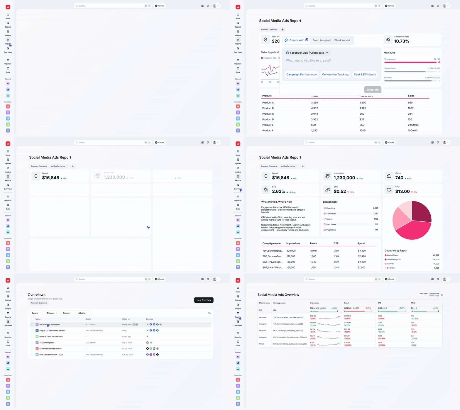
1. IQ Report Creation
Tell IQ what type of dashboard or report you want, and it builds the entire structure - sections, charts, tables, KPIs, filters - in seconds. No blank canvas. No setup. No manual widget hunting.
2. IQ Tab Creation
Want a deep-dive view? Ask IQ to “add a Google Ads tab focused on conversions and CPA” and it instantly produces a complete, correctly filtered tab inside your current dashboard.
Perfect for PPC, SEO, social, or channel-specific monitoring.
3. IQ Widget Creation
Need a chart to add to your dashboard for a last-minute meeting? Ask IQ: “Create a line chart showing daily purchases and ROAS for Meta Ads.”
IQ picks the right visualization, applies correct metrics, and places it where you want it - all without you touching a settings panel.
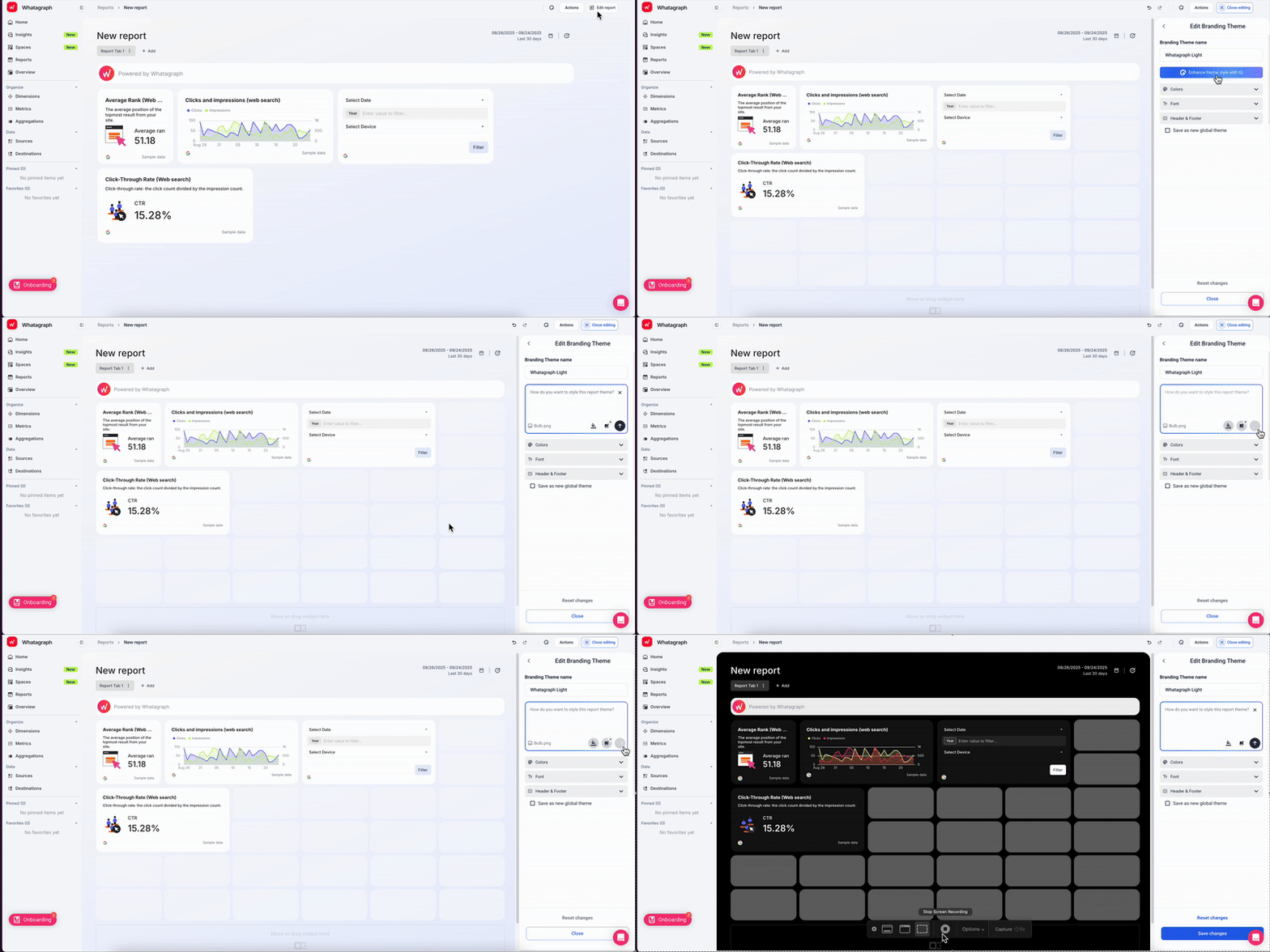
4. IQ Themes
Styling dashboards becomes a one-click task.
Upload a logo or screenshot, and IQ auto-generates a fully branded theme - colors, accents, styling - that you can apply across all dashboards for that client.
5. IQ Summary
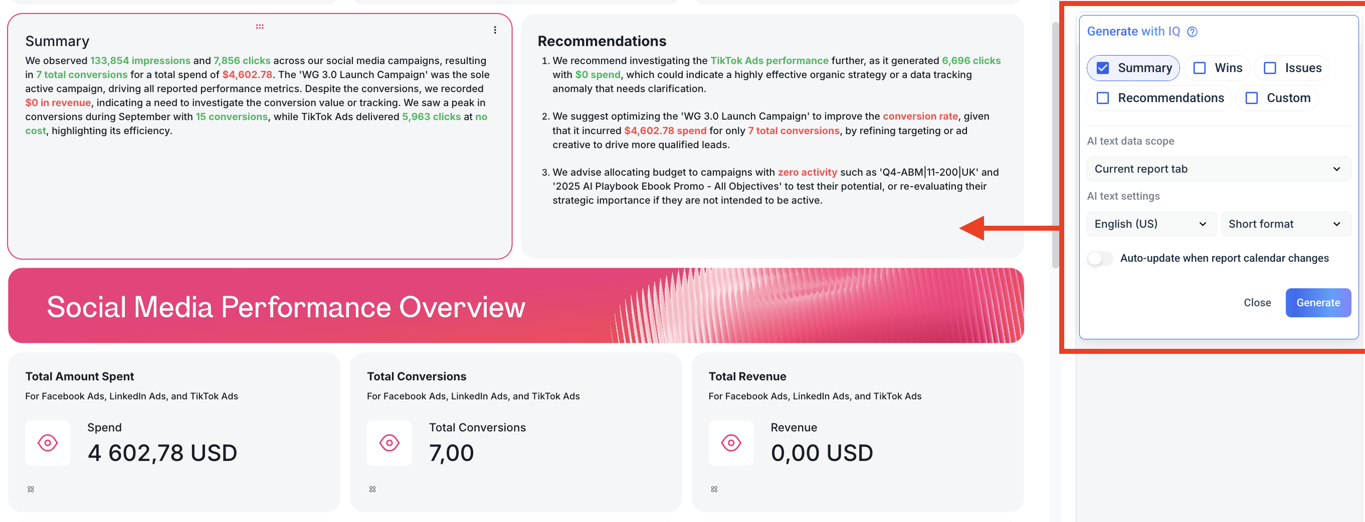
Instead of writing insights manually, IQ summarizes performance in 18 languages and 5 formats:
- Summary
- Recommendations
- Wins
- Issues
- Custom prompt
This is great for stakeholders who want to quickly understand performance without having to dig through numbers and charts.
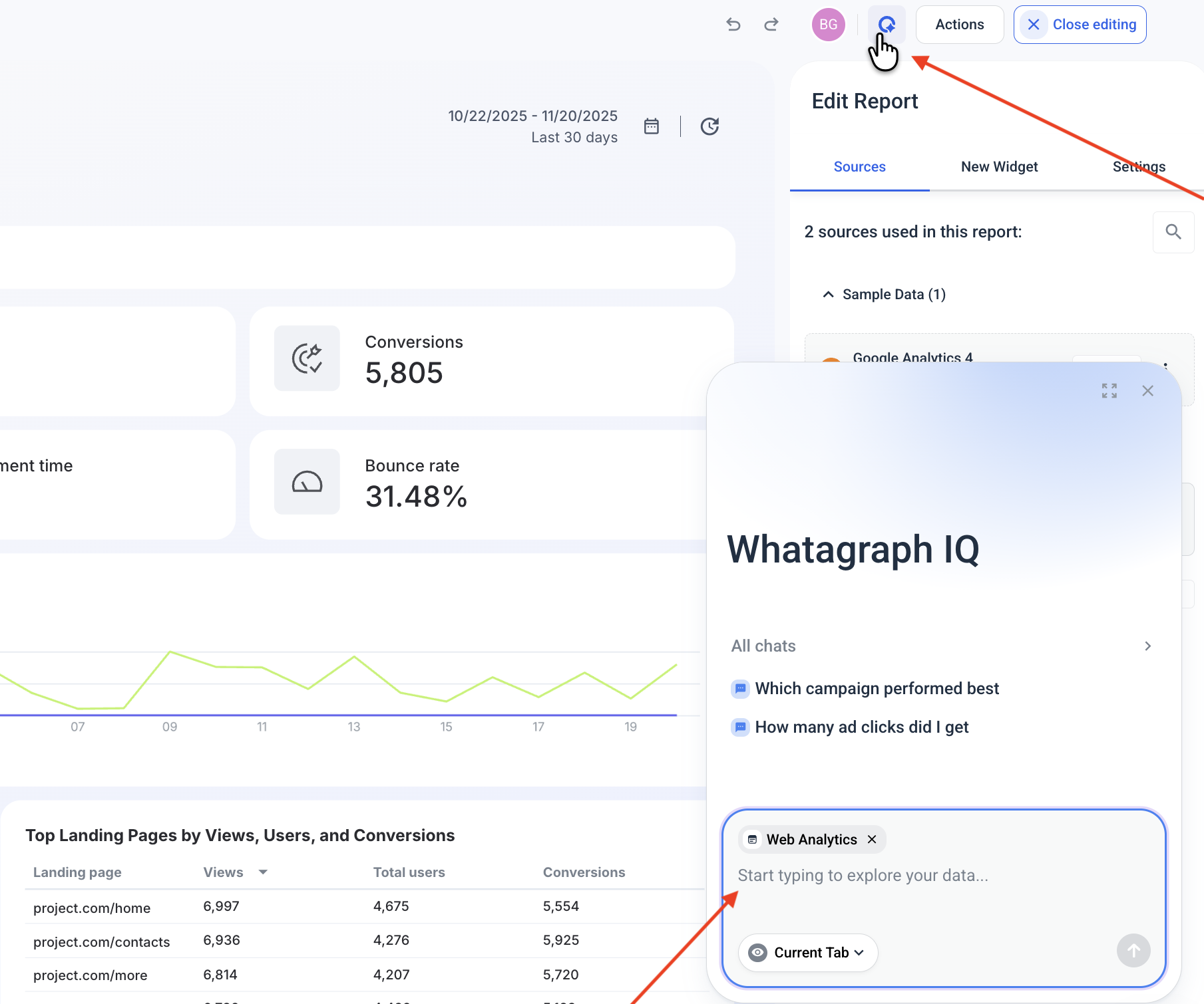
6. IQ Chat
Ask your dashboard a question, literally.
- “Why did ROAS drop this week?”
- “Which campaigns spent the most yesterday?”
IQ analyzes your live data and responds with explanations, trends, and optional charts.
You can turn this on for your clients as well, or leave it just for your internal team.
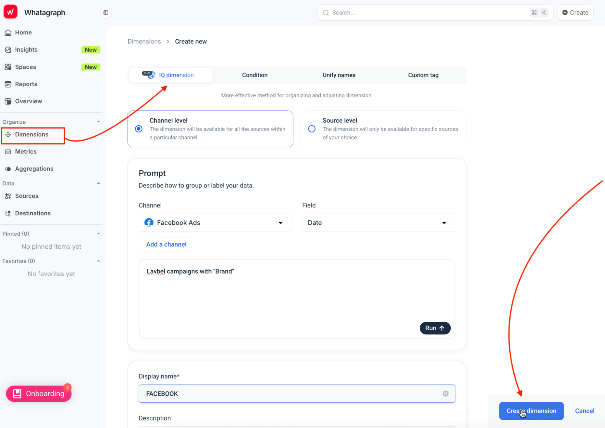
7. IQ Dimensions (IQ+)
Got messy naming conventions or scattered data across accounts?
IQ can automatically group campaigns, unify naming structures, and create new dimensions based on your rules.
Your dashboards stay clean, consistent, and analysis-ready, without manual data prep. (A note: this is only available on the more advanced pricing plans.)
Lars Maat, co-founder of Maatwerk Online, loves how much time and energy the AI report creation saves his team. Hear what he says:
Marketers on LinkedIn are also buzzing about how much they love Whatagraph’s AI reporting tool:

Want to give Whatagraph for a spin? Start free today.
Or want a more personalized walkthrough? Book a demo with our team.
#2. Stable, reliable, all-in-one platform
Unstable dashboard analytics software can backfire on you in multiple ways. For example, a connector can break off and make your dashboard unusable just minutes before the client or leadership meeting.
Connectors from different vendors may have different refresh times, so you may have inaccurate data at any given time.
With Whatagraph, though, you don’t have to worry about that.
Our data integrations are fully-managed, which means they’re more seamless, stable, and reliable. And most importantly - they don’t break.
Our Product engineers regularly update these integrations so there would be less breakages and outages. We also have an emergency alert that will wake up our engineers (even if it’s 3 am where they are) to quickly fix system outages, if there are any.
This is what Tanja Keglić, Performance Marketing Manager at Achtzehn Grad, loves about Whatagraph.
We don’t have any connection issues on Whatagraph at all. We just connected the platforms once, and that was it. Whatagraph is also very, very quick when loading the data.
#3. External and internal dashboards in one place
Whatagraph isn’t just for external dashboards, it gives your team a central hub for internal performance monitoring and fast, AI-powered insights.
1. Insights Space
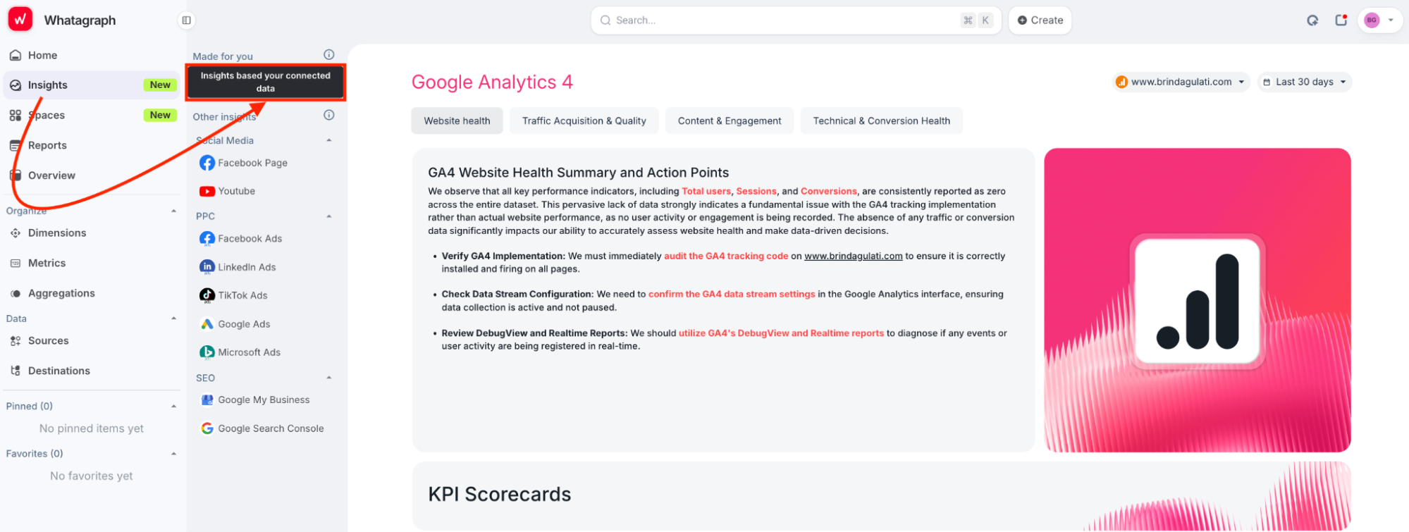
This is a dedicated view where Whatagraph highlights the most important insights across your channels:
- Account health
- Audience/ad set performance
- Creative insights
- Funnel and conversion trends
No digging through platforms, the key takeaways surface instantly.
2. Performance Overviews, Goals & Alerts
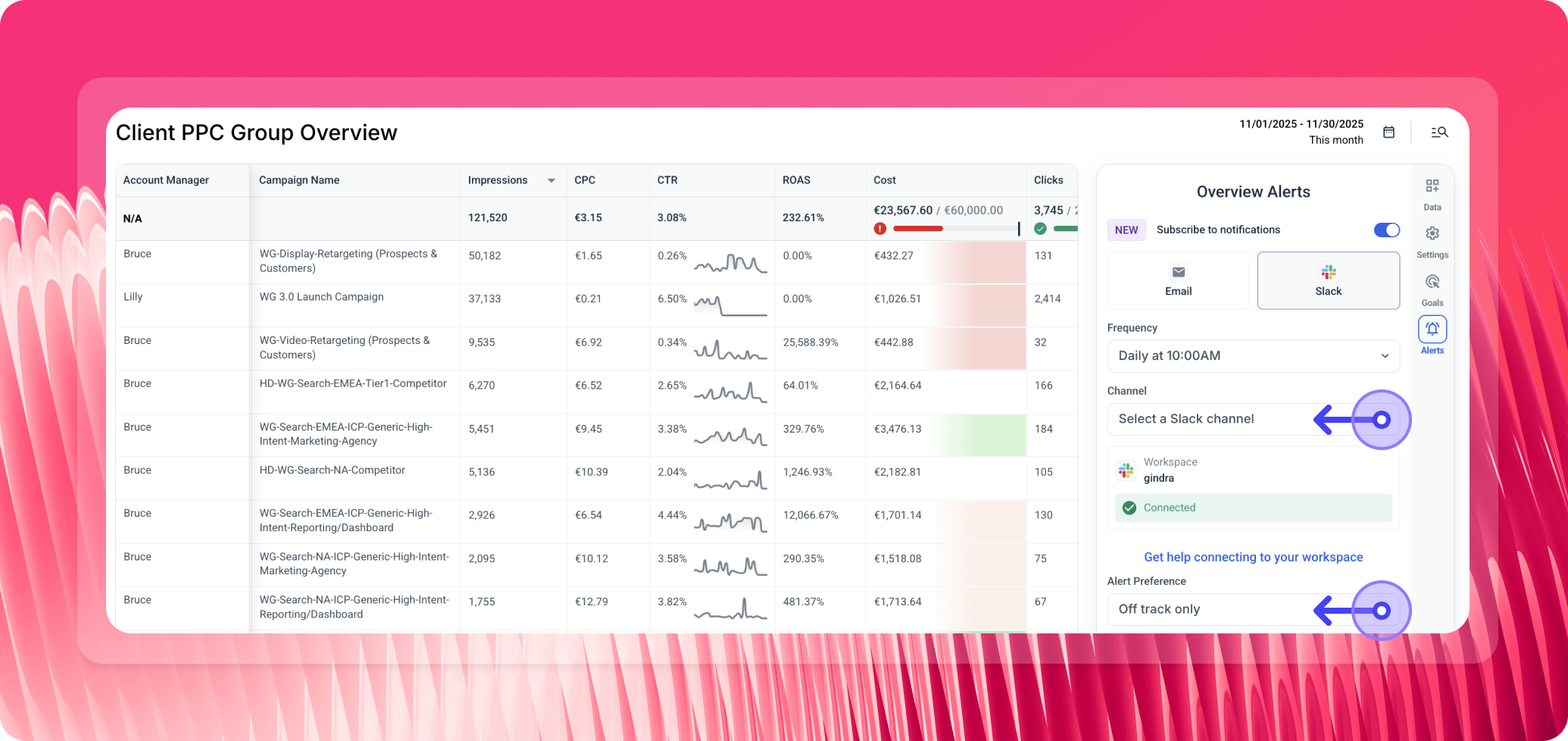
See every campaign and KPI in one place. Filter by client, Account Manager, region, or tags. Set goals and get Slack/email alerts when performance shifts.
Teams like Peak Seven use this as their internal “source of truth,” saving 63 hours/month and keeping everyone aligned.
Here’s what Kim Strickland, Digital Marketing Specialist at Peak Seven, says:
Whatagraph is now our Bible—both for our clients and internal teams.
#4. Fast and friendly customer support
Even with the easiest tool, sometimes you need human help to make sure you’re getting the most out of all the features.
At Whatagraph, you can reach out to us instantly via live chat on our website or email.
Our amazing Customer Support team will get back to you within 34 seconds to 4 minutes, and resolve issues within 5 to 24 hours.
Kim Strickland, Digital Marketing Specialist, at Peak Seven, and one of our most valued customers said:
I've joked about this often—with Whatagraph, we're not paying for a reporting system. We're paying for customer support. There's a level of dedication from the Whatagraph team that you don't often experience anywhere else.
#5. Security and compliance
Your dashboards contain sensitive client and business data, so security can’t be an afterthought.
Whatagraph is built with enterprise-grade safeguards from the ground up:
- ISO 27001 certified
- GDPR compliant
- EU data hosting
- AES-256 encryption for data
- Single Sign-On (SSO)
You stay in full control of your data: what’s connected, what’s stored, and what gets deleted.
And because Whatagraph manages all integrations directly, not through third parties, the risk of exposure or mishandling is drastically reduced.
Bottom line: Your data stays protected, compliant, and always in your control - without any extra work on your end.
Whatagraph Reviews from Real Users
“Apart from all the valuable things the tool has in itself, throughout the years we've chatted with their support for minor issues multiple times, and they were very quick to fix everything of even make improvements based on our feedback. Stellar group of people, these.” (Source)
“The dashboards are clean, easy to build, and perfect for client reporting…I love how I can set up automated reports that look great and are client-ready. No more fiddling with spreadsheets or wasting time building slides.” (Source)
“If I was starting a digital agency today, signing up with Whatagraph would be one of my first moves.” (Source)
Pros
- Easiest reporting setup on the market
- Clean, accurate, unified data
- AI-generated reports, tabs, widgets, and summaries
- Fully branded reports in seconds
- 55+ stable, fully managed integrations
- Unlimited users on every plan
- Best-in-class customer support
- Ideal for multi-client reporting and multi-brand performance monitoring
Cons
- Not a BI tool for deep SQL modeling
- Requires source credits (plans scale with data needs)
- Best value is for teams with recurring reporting workflows
Pricing
Whatagraph’s pricing is designed around one idea: you shouldn’t pay for seats, you should pay for the data you actually use.
Every plan includes unlimited users and unlimited reports, so your whole team can collaborate without worrying about licenses.
Plan | Price | Source Credits | Includes |
| Free | $0 | Limited | Basic reporting, limited credits, forever-free access |
| Start | $229/month (billed annually) | 20 | Essential integrations, pre-made templates, data transformations, full Whatagraph IQ, live chat support |
| Boost | $579/month (billed annually) | 60 | Everything in Start + advanced integrations, custom data transformations, full white-labeling, performance overview dashboards, dedicated Customer Success Manager |
| Max | Custom pricing | 100+ | Everything in Boost + premium integrations, custom data aggregations, Whatagraph IQ+, SSO, tailored onboarding, priority support |
Get started with Whatagraph for free.
2. ThoughtSpot
Most suitable for: Growing businesses and enterprises
ThoughtSpot’s AI-augmented dashboards allow you to gain personalized, real-time insights, helping you curate powerful data stories. And with Spotter, as your AI Analyst, users can ask complex questions about their data and gain instant visualizations. With an intuitive search-driven interface, you can create interactive visualizations that help you see trends, patterns, and insights as they unfold.
Another advantage is that you can drill into your visualizations without any pre-defined drill path, making it fast and easy to explore and analyze your data from any angle, all in real-time.
Key features:
- Real-time, dynamic data visualizations
- Apply filters, drill down, and explore different aspects of your data
- AI-powered search for instant insights
- ‘Change analysis’ and ‘AI Highlights’ to detect unusual trends and patterns
- Automated alerts on key KPIs.
ThoughtSpot’s reviews from real users
“I like the way our team gets the data we need without a data expert. ThoughtSpot’s search function makes it easy to just type in a question and get answers right away. No complex querys and no waiting. It saves us so much time.” (Source)
“ThoughtSpot's AI-driven highlights are a game-changer, providing valuable insights with minimal effort. The platform's user-friendly interface makes it incredibly easy to create detailed dashboards, even for those without a technical background. The real-time insights ensure that our team is always working with the most up-to-date information, which significantly enhances our decision-making process.” (Source)
“ThoughtSpot is the most user-friendly BI platform I've used. As with all BI platforms there's some setup and architecture considerations to consider and roll out, but once in place it's intuitive and far easier to navigate than competitors.” (Source)
Pros and cons
Pros:
- The self-service analytics experience makes data exploration intuitive.
- With automated AI insights, business users can easily identify important trends.
- Real-time data, AI-augmented dashboards for faster decision-making.
Cons:
- Occasional bugs in connectors
- Initial steep learning curve for advanced analytics features
- Underutilized TML
ThoughtSpot Pricing
ThoughtSpot offers flexible pricing models designed to meet the unique needs of different businesses and enterprises. Here’s a quick breakdown of each plan:
- The Essential plan—starts at $62.5/user/month
- The Pro plan—custom pricing
- The Enterprise plan—custom pricing
3. Metrics Watch
Most suitable for: Freelancers, small businesses, and boutique agencies
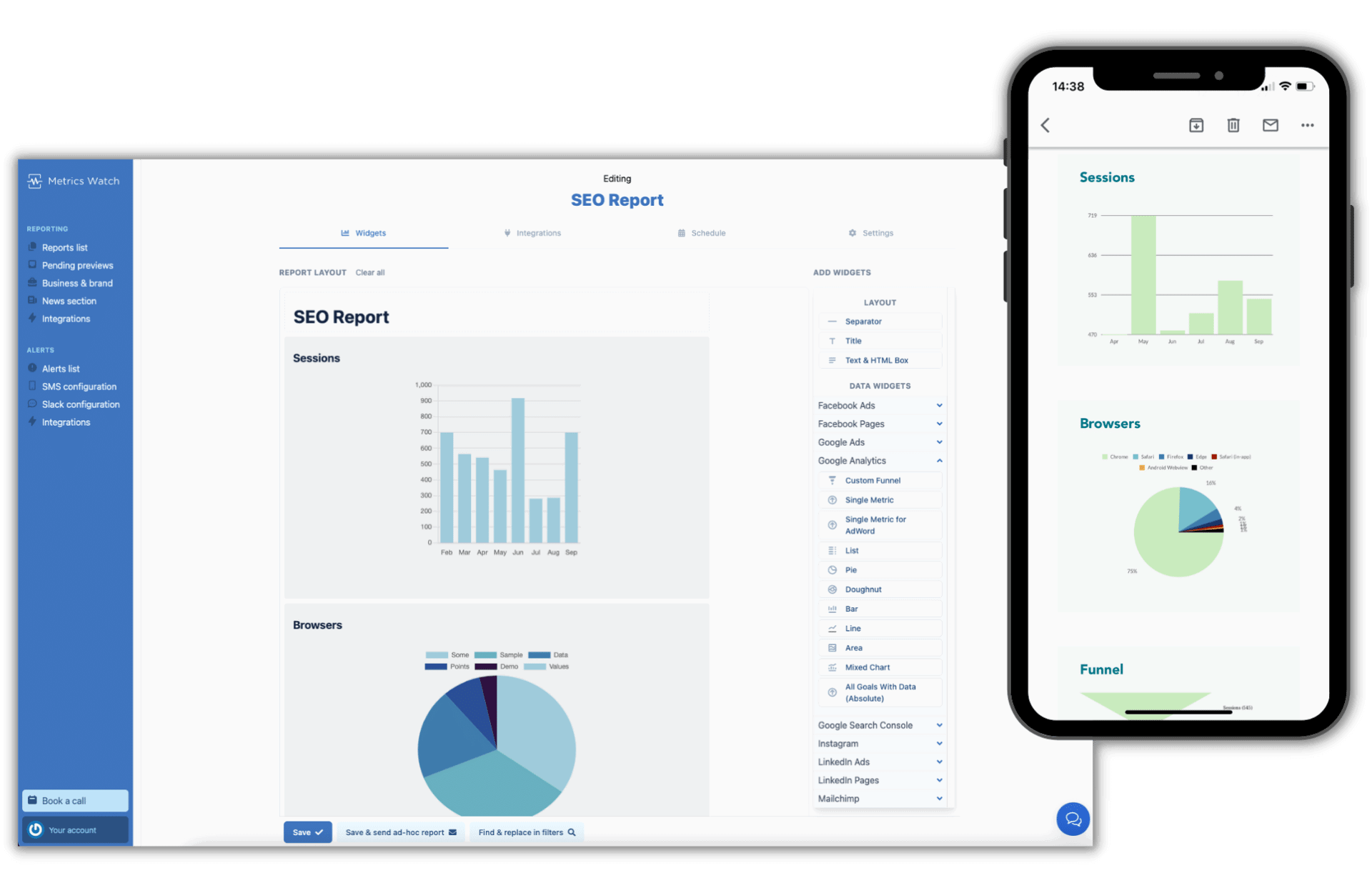
Metrics Watch is an email-based solution for sending marketing reports to team members and clients.
It pulls KPIs from popular marketing platforms like Google Search Console, LinkedIn Ads, and Mailchimp, automatically compiles the data, and sends the report directly to your recipient’s inbox.
This means you don’t need any third-party tools like Looker Studio or even PDFs. You can immediately send emails or automate them to go out on a daily, weekly, or monthly basis.
There’s also the option to preview reports before they are sent.
To make your life easier, Metrics Watch also offers ready-made templates that you can get started with.
You can also white-label these reports by uploading your logo, choosing color schemes, and sending reports from your name and email address.
However, Metrics Watch doesn’t offer advanced data organization features like data blends or custom metrics and dimensions (Whatagraph does). There is a very basic filter to segment your data, but that’s where it ends.
Key Features
- 12 integrations
- Report templates
- White-labeling features
- API batch reporting
- Basic data filters
Metrics Watch Reviews from Real Users
“Metrics Watch helps me automate reporting for a number of clients who need data on everything from Analytics, to Ads, to performance reporting.” (Source)
“As a boutique marketing agency, MetricsWatch has served our needs and simplified our reporting so far. We might need more customization as we expand though.” (Source)
“We’d also like to see blended metrics, for example, ROAS, but for FB Ads + Google Ads.” (Source)
Pros and Cons
Pros:
- Easy to set up and easy to use
- Affordable
- Helpful customer support
Cons
- Limited integrations
- Limited customization options
- No data organization or transformation features
Metrics Watch Pricing
Metrics Watch offers these pricing plans:
- Startup: $29/month for 2 reports
- Pro: $100/month for 25 reports, white labeling, and free migration
- Agency: $300/month for 100 reports, white labeling, free migration, and advanced widgets
4. Looker Studio
Most suitable for: Freelancers and boutique agencies
Google’s free dashboard tool, Looker Studio, is a popular choice among marketers — freelancers, and even startup agencies.
Looker Studio comes with 21 native integrations with Google-based platforms like Google Ads, DV 360, Google Sheets, and Google Analytics. You can also connect to BigQuery, MySQL, and Microsoft SQL servers on Looker.
Once you connect your data sources, you can use Looker’s drag-and-drop dashboard editor to add:
- Charts, line bars, pie charts, geo maps, area and bubble graphs, data tables, pivot tables
- Filters and date range controls
- Links and clickable images
- Custom text and images
- Custom styles and color themes
You can then share the dashboard with your team or client, who can view or edit the dashboard on their end.
The level of details or customizations you can add to your dashboards depends on how well you know the platform.
However, Looker Studio can be slow, clunky, and doesn’t come with customer support (unless you buy the Pro plan).
It also limits you in the number of sources you can blend together.
Plus, to connect non-native sources, you need third-party connectors, which you need to buy separately.
Key Features
- 21 native connectors (free)
- 1000+ “partner” connectors (paid)
- Drag-and-drop report builder
- Data blends
- Custom images and text
- Custom styles and color schemes
- Mobile app
Looker Studio Reviews from Real Users
“I love the way you can present data from multiple sources in one report. I also love the ability to blend different tables and show the information in one chart.” (Source)
“Unfortunately, connectors break quite regularly and reports containing a lot of data can take a lengthy time to load.” (Source)
“Looker studio needs more report downloading options such as Word and PDF.” (Source)
Pros and Cons
Pros:
- Free (up to a point)
- A huge range of data visualization formats and options
- Easy to use for basic reports
Cons:
- Slow loading
- Connection breakages and inaccurate data
- Limited report-sharing options (no Word, Sheets, or PDFs)
Looker Studio Pricing
Looker Studio is free for connections with 21 native integrations, which are mostly Google-based platforms.
5. Funnel.io
Most suitable for: Enterprises with dedicated data scientist teams
Funnel.io is a data pipeline tool that pulls data from different sources, transforms it, and ships it to data warehouses, visualization tools, or spreadsheets.
Funnel has over 500 data connectors with major marketing platforms and CRM systems, such as Hubspot, Salesforce, DV360, and more.
If you don’t see a connector, you can also import your own data using Google Sheets, or request the Funnel team to build one for you.
Now, let’s say hello to the first elephant in the room.
Funnel.io offers dashboards to visualize your key metrics. However, these dashboards are pretty basic and there aren’t a lot of customization or white-labeling options available.
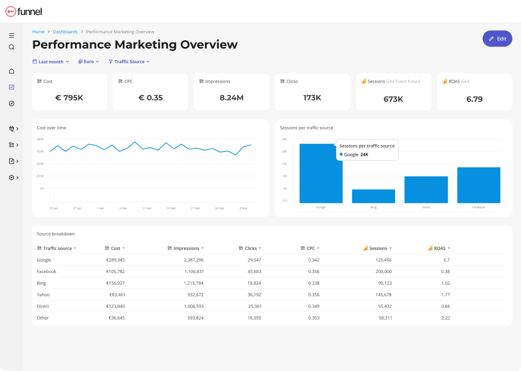
Another thing is that Funnel lets you do only basic data transformation tasks. Any advanced data processing tasks, you need to do manually orusing other data transformation tools.
Key Features
- 500+ integrations
- Custom integrations or Google Sheets data import
- Custom dimensions, metrics, and currency conversions
- “Data Explorer” dashboard for data scientists
- Basic visualization dashboards to view key metrics
- Export to data destinations
Funnel Reviews from Real Users
“Funnel does the work of several people, we now couldn't run our business without it.” (Source)
“What I like most about Funnel is how customizable it is. Within their Data Explorer you can look at the data in any way please and any possible configuration.” (Source)
“Takes some time to wrap your head around, and the set up takes some time. Still some bugs in some connectors that haven't been solved after a few months.” (Source)
Pros and Cons
Pros:
- A wide range of connections with all major marketing platforms
- Low-code data organization interface
- Fast and helpful customer support team
Cons:
- Initial steep learning curve
- Occasional bugs in connectors
- Basic native visualization widgets
Funnel.io Pricing
Funnel.io’s pricing model is based on “flexpoints” which are usage credits to add new data connectors, transform data, and move it to destinations.
It offers three distinct pricing plans: Starter, Business, and Enterprise.
- Starter: $1.2 / flexpoint per month. This plan allows you to connect the first 3-5 sources and use 350 flexpoints* for free. It includes 121 core integrations, 3 Core destinations, and the Data Explorer.
- Business: $1.5 / flexpoint per month. Gives you everything in Starter plus 381 additional Business connectors, 37 Business destinations, data source templates, and unlimited workspaces.
- Enterprise: $2.0 / flexpoint per month. The plan designed for organizations operating at scale includes everything in Business plus 11 Enterprise connectors, 1 additional Enterprise destination (Snowflake), data region choice, and technical account management.
But if you need dozens of data sources and destinations, you can expect to pay anywhere between $1500 to $4000 per month.
6. Geckoboard
Most suitable for: Medium to large businesses in the Customer Service, Sales, and eCommerce sectors
Geckoboard is an online reporting dashboard for Customer Service, Sales, and eCommerce businesses.
You can connect to 90 data sources, design your dashboard, and share the dashboard with your team members or the company leadership.
Geckoboard supports major marketing platforms, as well as CRM, Sales, Finance, and eCommerce tools. Some examples include Shopify, Stripe, Dixa, Intercom, and Pipedrive.
However, some of these integrations (like Safesforce and Zendesk) are only available on pricier “Pro” plans.
Once you connect your data, you can create three main types of dashboards:
- A blank dashboard (similar to Whatagraph’s)
- TV dashboards for internal presentations
- Mobile dashboards
Still, keep in mind that these dashboards are more suitable for businesses, such as “HR dashboards”, “Inventory dashboards” etc., than for client reporting.
Another cool feature about Geckoboard is its “KPI notifications” which sends notifications when KPIs trend up or down via Slack.
However, unlike Whatagraph, you won’t be able to create custom data blends, metrics, and dimensions on Geckoboard. This can be a deal breaker if you’re a large company and you need to organize your scattered data to create easy to read and impactful reports.
Their dashboards are also quite basic and static with very few customization options. You also can’t ship your data to warehouses on Geckoboard.
Key Features
- 90+ integrations with Customer Service, Sales, Finance, and eCommerce channels
- Drag-and-drop dashboard builder
- KPI notifications
- Slack integration
- Automated email reports
- TV dashboards
- Mobile-friendly dashboards
- Dashboard examples for businesses
Geckoboard Reviews from Real Users
“I love how simple it is to use. That you can connect data from so many different sources in an easy way.” (Source)
“Connecting the dashboard with the Tv works like a charm.” (Source)
“Geckoboard could use more features and options for customization. Compared to other tools like Power BI or Tableau, Geckoboard didn't have as many advanced tools for analyzing data or changing how things looked. I wished I could make more complicated charts and do special calculations.” (Source)
Pros and Cons
Pros:
- Easy to use and set up
- A wide variety of integrations
- Great customer service
Cons:
- Can be pricey if you want to add more dashboards
- Limited customization options for dashboards
- No advanced calculations, blends, and custom metrics and dimensions supported
Geckoboard Pricing
Geckoboard’s pricing is based on the number of dashboards and the number of users.
There are three pricing plans:
- Essential: $149/month for 5 dashboards, 3 users, 1 TV share, and core data sources
- Pro: $199/month for 5 dashboards, 10 users, 3 TV shares, and pro data sources
- Scale: $699/month for 30 dashboards, 25 users, 10 TV shares, pro data sources, and a dedicated Support rep
7. Klipfolio
Most suitable for: Large data teams at companies and large agencies
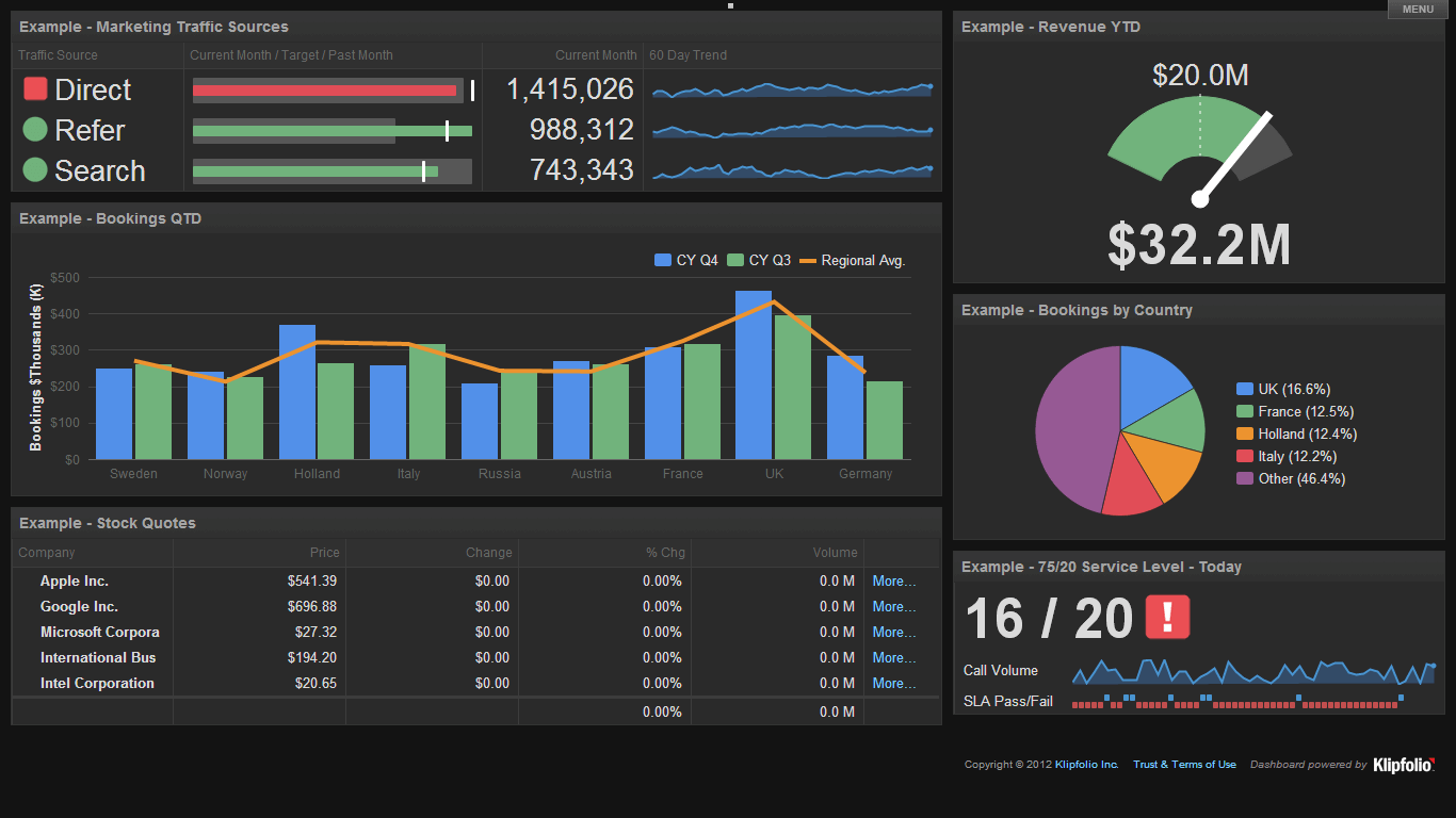
Klipfolio is a data analytics and business intelligence tool in one. It offers two key products:
- PowerMetrics: Suitable for data teams at large companies, this is a data analytics solution to centralize, standardize, and share accurate metrics throughout the organization. Non-data teams can then use these certified metrics for their dashboards and reporting needs.
- Klips: These are your regular data visualization dashboards and reports. Klips integrates with 130+ platforms and you can also use a Rest/URL option for custom integrations.
PowerMetrics is the “data heart” of Klipfolio. With it, you can not only connect all your data sources, but also:
- Create a curated metric catalog for other business teams with access control and governance features
- Enable self-serve analysis and AI insights
- Store data in one place—either in your data warehouse, semantic layer, or in PowerMetrics itself
- Share transformed and unified metrics with anyone in the organization
All this is designed to speed up decision-making and reduce ad hoc requests to data teams—if you have a dedicated data team in the first place.
However, when it comes to creating dashboards, Klipfolio also comes with a steep learning curve requiring CSS skills to customize your dashboard themes.
The number of dashboards you can have depends on your pricing plan.
The third thing we don’t like is that you need to configure Klips in different environment, outside the dashboard.
Whatagraph still remains undefeated in terms of user-friendliness.
Key Features
- 130+ integrations including warehouses, SQL databases, and file-sharing services
- Data blending, unifying, aggregating
- Custom metrics and dimensions
- AI insights
- Custom dashboards and reports
- Export dashboards as PDF or image files. Export only individual clips as CSV
- Scheduled reports
Klipfolio Reviews from Real Users
“Klipfolio has a user-friendly interface. It can be easily connected with databases, Excel sheets, and Google sheets which makes data integration very smooth and easy.” (Source)
“I love the full range of capabilities that are possible when building a Klipfolio dashboard (specifically with their Klips product).” (Source)
“Every time I contact support I get the impression that I am bothering them. I will not be renewing this platform because I do not feel valued as a customer.” (Source)
Pros and Cons
Pros:
- Easy to use and set up
- Powerful data analytics and organization options
- AI insights to help make data-driven decisions
Cons:
- Expensive with important features only available as add-ons or in Enterprise plans
- Limited customization for dashboards and templates
- Unhelpful customer support
Klipfolio Pricing
Klipfolio offers three pricing plans for two of their products: PowerMetrics and Klips.
Here are the plans for PowerMetrics:
- 30-day free trial
- Professional: $300/month for 10 users and unlimited metrics.
- Enterprise: Custom pricing for 10 users, unlimited metrics, and priority support.
It’s also important to note that important features like data warehouse integrations, AI insights, and custom domains are only available as add-ons, unless you purchase the Enterprise plan.
Klips’ pricing is further divided into plans for businesses and for agencies.
Here are the plans for businesses:
- Grow: $190/month for 15 dashboards and 1 hr data refresh rate. No priority support or custom onboarding available.
- Team: $350/month for 30 dashboards and 15 min data refresh rate. No priority support or custom onboarding available.
- Team+: $690/month for 60 dashboards and up to the minute data refresh rate. Includes priority support and custom onboarding
There are also plans for agencies:
- Agency Lite: $190/month for 20 dashboards, 20 clients, and 1 hr data refresh rate. No priority support or custom onboarding available.
- Agency Pro: $420/month for 40 dashboards, 40 clients, and 30-min data refresh rate. No custom onboarding available.
- Agency Premier: $1025/month for 70 dashboards, 70 clients, and 30-min data refresh rate.
Side note: On Whatagraph, you can get unlimited dashboards, unlimited clients, 30-min data refresh rate, priority support, and custom onboarding on ALL our plans. Reach out to us for a pricing plan just for you.
8. Domo
Most suitable for: Data teams and tech-savvy marketing teams
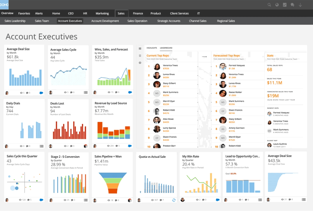
Domo is a cloud-based business intelligence platform that marketers can use to manage data, automate reporting, and deliver fast insights that fuel data-driven decisions.
More skilled users can use Domo to create business apps and dashboards, and integrate real-time data from any source.
The platform is designed to be a one-stop data experience solution for executives across departments, from sales to marketing to engineering and HR.
Such versatility is made possible by over 1,000 data source connectors. Domo has native data visualizations, self-service reporting, and embedded analytics.
However, Domo comes with a steep learning curve, which makes top dashboard customization features available only to true experts.
Also, sharing dashboards and cards with clients can be challenging, as there’s no option to see how the dashboard looks from the end-user perspective.
Domo Reviews from Real Users
“Domo has transformed how we use, interpret, analyze, synthesize, and make the most of our data. It really has been a gamechanger that has made us more data-empowered.” (Source)
“I love that we can bring in data from a variety of sources and have it all tie together.” (Source)
“Domo has a steep learning curve for new users and integrating it with niche third-party tools can be challenging.” (Source)
Key features:
- Data and workflow apps - pre-built, low-code, or full-code
- Drag-and-drop report and dashboard builder
- 1,000 on-premise and cloud connectors
- Data transformation and ETL
- Embedded analytics
- Mobile app
Pros and Cons
Pros:
- Easy-to-use interface
- Real-time data access
- Wide choice of visualizations
- Large number of connectors
- Mobile access
Cons:
- Steep learning curve despite user-friendly user interface
- It might require some SQL knowledge
- Performance issues with large datasets
- Costly additional features
- Limited report scheduling options
- Potential downtime issues due to cloud-based infrastructure
Domo Pricing
Domo pricing is not publicly available, so you’d have to ask their sales team for a quote.
However, the pricing is based on the overall usage of the platform and factors such as data storage, data refresh rates, the number of users, the volume of data queries, etc. Newly registered users get a 30-day trial.
9. Databox
Most suitable for: Boutique agencies and small businesses
Databox is a data reporting and analytics platform for growing businesses.
You can integrate with 100+ software tools, and bring in custom data through Google Sheets or Excel.
Then, you can visualize this data directly on Databox using pre-built metrics and templates.
Databox has a notification system via Slack, email, or app updates, that alerts you when the performance trends up or down on your tracked metrics.
You can also save important benchmark groups to track your metrics over time, or compare them with industry standards.
However, Databox users say the platform is clunky and has an unappealing user interface.
Also, ashboards on Databox are not linked – which means you’ll need to edit them one by one rather than in batch. This can be very time-consuming if you need to tweak dozens of similar reports for clients.
On Whatagraph, you can edit them in one-go, saving you massive time.
Key Features
- 100+ integrations
- Native visualization dashboards and reports
- Dashboard and report templates
- Slack, email, or in-app alerts
- KPI benchmark groups
Databox Reviews from Real Users
“Databox makes it simple to interact with data in ways you never thought possible.” (Source)
“I'm not sure what has happened with the customer support team at Databox but they are fairly unresponsive these days.” (Source)
"After 2 years I left. Templates always break, individual metrics always break, lack of good support." (Source)
Pros and Cons
Pros:
- Easy to use
- Wide variety of integrations
- Interactive data
Cons:
- Slow customer support
- Bugs and lag issues
- Broken metrics and templates
Databox Pricing
Databox offers five different pricing plans as of October 2024:
- Free: Limited to 3 users, data sources, and dashboards. No custom metrics, data calculations, or report automation available.
- Starter: $341/month for 50 data sources, 5 users, and unlimited dashboards.
- Professional: $451/month for 50 data sources, 15 users, and unlimited dashboards. Includes custom metrics and data calculations.
- Growth: $681/month for 50 data sources, and unlimited users and dashboards.
- Premium: $999/month for 100 data sources, and unlimited users and dashboards.
White-labeling and “guided onboarding” is also only available as an add-on on Databox ($250 and $500 per month respectively). In contrast, these are included in all of Whatagraph’s pricing plans.
10. Cyfe
Most suitable for: Boutique SEO agencies
Cyfe is a business dashboard app and reporting platform that helps you easily monitor your business data from one place and make better decisions.
You can pull data from 100+ integrations including social media, email, SEO, and sales and finance tools. You can also bring in custom data via .CSV, Google Sheets, SQL, private URL, or push API.
To build visualizations, you can start from their dashboard templates or pre-built widgets. The platform also comes with “Embedded Analytics” where you can take an entire dashboard or a widget and embed it to emails, webpages, or applications.
For SEO managers, Cyfe offers a built-in keyword ranking tool which allows you to automatically monitor website rankings across Yahoo, Google, and Bing. This is similar to AgencyAnalytics’ Rank Tracker tool.
The unique thing about Cyfe is that it supports 15 languages, including Korean, Turkish, and French.
However, Cyfe does not come with any advanced data calculations or organization features, nor can you transfer data to warehouses or other destinations.
Another big big disadvantage of Cyfe is that there is no centralized data management space. Instead, you need to connect or select a source for each individual widget.
Also, there’s no way to create new templates just to duplicate a report for another client.
Key Features
- 100+ integrations
- A wide library of dashboard templates
- Embedded analytics
- Custom and pre-build widgets
- Built-in keyword tracking tool
Cyfe Reviews from Real Users
“It's very easy to create your dashboard and populate it with widgets from different data sources like social media, email marketing software, CRM, or just custom data in a spreadsheet.” (Source)
“The dashboards were very limited on customization and creating calculated fields.” (Source)
“Support really sucks. This never used to be the case BTW.” (Source)
Pros and Cons
Pros:
- Easy to use and set up
- Wide range of integrations
- Affordable price
Cons:
- Incorrect data on widgets
- Poor customer service
- Limited customization and data transformation features
Cyfe Pricing
Cyfe offers five pricing plans:
- Starter: $19/month for 2 dashboards and 1 user
- Standard: $29/month for 5 dashboards and 2 users
- Pro: $49/month for 10 dashboards and 5 users
- Premier: $89/month for 20 dashboards and unlimited users
- Agency: $150+/month for 100 dashboards, 15 users, 10 clients, and white-labeling features
11. Tableau
Most suitable for: Data teams at large enterprises
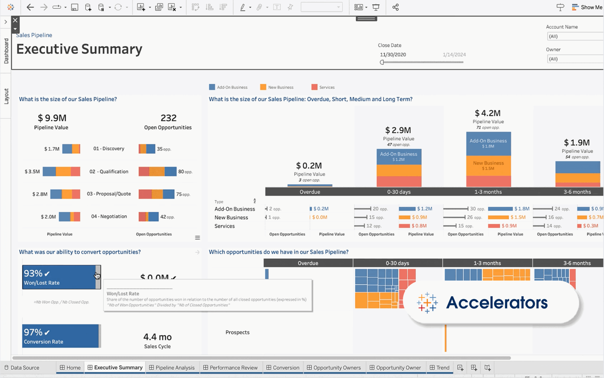
Tableau is an AI-powered business intelligence and marketing analytics tool. It offers business forecasts, analyzes strategies, and allows for data-driven decisions.
You can use the drag-and-drop builder to choose from various chart types, color palettes, and formatting options to create interactive dashboards without extensive technical expertise.
Tableau provides strong analytics capabilities, including support for advanced calculations, statistical functions, and predictive modeling.
Marketers can perform complex data analysis, uncover trends, and identify opportunities for optimization using features such as trend lines, forecasting, and clustering.
Tableau offers comprehensive customer support services, including training, consulting, and technical support, to assist users with implementation and optimization.
Key Features
- 90+ integrations
- Custom metrics and dimensions
- Data blending
- Drag-and-drop dashboard interface
- AI-powered insights
Tableau Reviews from Real Users
“Tableau allows me to create my own structured data from a lot of unstructured data.” (Source)
“Tableau has an uncanny ability to transform complex data into visually stunning and easily understandable representations.” (Source)
“Tableau can be costly, particularly for startups.” (Source)
Pros and Cons
Pros:
- Powerful data analytics and visualization
- Easy to use and implement
- Seamless data integrations
Cons:
- Can be expensive if you need advanced features
- Takes a lot of time to load large datasets
- All the preprocessing of the data (data cleaning) has to be done beforehand. Data cleaning cannot be done in Tableau
Tableau Pricing
Tableau offers three pricing plans:
- Viewer: $35/user/month, billed annually
- Explorer: $70/user/month, billed annually
- Creator: $115/user/month, billed annually
12. Microsoft Power BI
Most suitable for: Business analysts in SMBs and freelancers
Microsoft Power BI is a business intelligence software suite that includes apps, services, and data connectors. It is a cloud-based dashboard tool that you can use you to combine data from multiple sources into a single data set.
You can use Power BI, on the other hand, creates beautiful visualizations, including interactive charts, graphs, maps, and custom visuals from the Power BI community.
Power BI is highly scalable and can handle large volumes of data and complex analytics workloads.
It connects to a range of data sources, including Microsoft products (such as Dynamics 365 and Azure), databases (SQL Server, Oracle, MySQL, etc.), cloud services (Google Analytics, Salesforce, etc.), and many others.
An interesting Power BI feature is natural language querying. You can ask questions about your data in plain language and the tool answers by giving you relevant visualizations and insights.
On the other hand, direct integrations are limited to 59 apps, and most users notice that Power BI works best with other Microsoft platforms such as Microsoft Edge and Office 365.
Although a capable data analysis tool, Power BI has an even steeper learning curve than Looker Studio.
Key Features
- 100+ integrations
- AI-powered insights and “Co-pilot”
- Data transformation and unification
- Native visualization dashboard and reports
- Shareable reports with other Microsoft services, including Teams, PowerPoint, Excel, and Power Platform
Power BI Reviews from Real Users
“For anyone already used to the Microsoft ecosystem, PowerBI delivers a combination of a user-friendly interface and powerful analytics.” (Source)
“Power bi has a eye catchy user interface and tons of customizing options.” (Source)
“The DAX (Data Analysis Expressions) which is used to creating complex calculations in Power Bi need a deep learning curve for the new users.” (Source)
Power BI Pricing
Power BI offers three pricing plans:
- Pro: $10/user/month
- Premium: $20/user/month
- Power BI in Microsoft Fabric: Custom pricing
13. Grow.com
Most suitable for: Data analysts at medium to large enterprises
Grow is a no-code full-stack business intelligence platform that combines ETL, data warehousing, and visualizations on one platform.
You can connect to 75 data sources through native integrations, including popular CRM platforms, marketing analytics tools, databases, and accounting software.
Then, you can prepare and organize your data using either noSQL or SQL transformations. This includes custom calculations, data blends, and advanced data filters.
Also, Grow stores your data automatically on its platform, so you don’t need to ship it to a third-party data warehouse.
You can create three types of dashboards on Grow:
- Dynamic dashboards which display data based on who is logged into the account.
- Dashboard Blueprints which are pre-built, single data source dashboards
- Custom & Sandbox dashboards which show blended data sources and metrics
These dashboards have powerful filtering options based on date, number, or categorical logic.
You can then share them through emails, shareable URLs, Slack, TV mode, or tables of raw and transformed data.
Grow uses APIs to import data seamlessly from data sources, and it continually refreshes the data so your metrics are up-to-date and reliable.
However, Grow is more suitable for internal data storage and monitoring rather than for external reports. Their dashboards are very nitty-gritty which can overwhelm clients or the C-Suite.
Also, we hear regular complaints about lot of manual work needed to overhaul dashboards with the latest functions.
Key Features
- 75 native integrations
- Built-in data storage
- SQL or non-SQL based data transformations
- Customizable dashboards
- Advanced data analytics and predictive modeling
- Real-time data updates
Grow Reviews from Real Users
“As an analyst, I have recently started working on this tool and this is by far the best. It helps me to create powerful data visualisation as well as to gain insight from that data.” (Source)
“The interface could be better and overall user experience creates lag sometimes.” (Source)
“The back end seems quite complex to work so really need an IT expert to do the set up, but once it's working it's great for users.” (Source)
Pros and Cons
Pros:
- Inuitive, easy to use interface
- 24/7 customer support
- No-code data pipelines, storage, and visualizations
Cons:
- Occasional lags
- Expensive
- Slow performance when dealing with large volumes of data
Grow Pricing
Grow doesn’t share their pricing publicly.

WRITTEN BY
Nikola GemesNikola is a content marketer at Whatagraph with extensive writing experience in SaaS and tech niches. With a background in content management apps and composable architectures, it's his job to educate readers about the latest developments in the world of marketing data, data warehousing, headless architectures, and federated content platforms.