Conversion Rate Optimization for Ecommerce
Conversion rate optimization, or CRO for short, is one of the main priorities of any eCommerce business. After all, a well-developed eCommerce website should not just manage to attract visitors — it should also consistently succeed in turning (i.e. converting) them into paying customers.

Feb 24 2023 ● 8 min read
The basics of eCommerce CRO
If your online store’s conversion rate is low, it is necessary to take a step back and evaluate why this is the case.
Overall, a satisfactory shopping experience is what ultimately leads to more conversions. This simply means developing your eCommerce website from the standpoint of your intended customers. This is the reasoning that should kickstart your conversion rate optimization process and eventually lead to increased revenue.
In this article, we will take an in-depth look at conversion rate optimization strategies that will help you develop a great shopping experience and contribute to boosting the profitability of your online business.
What is a conversion rate?
A conversion rate is a metric that is used to measure the percentage of website visitors who perform a desired action. For some types of websites, this can be as broad as filling out a form or signing up for a newsletter. For eCommerce businesses, conversion rates are mainly related to purchases.
In the context of eCommerce, a higher conversion rate is generally one of the main indicators of success, as it points to a large portion of website visitors becoming paying customers. Higher or lower conversion rates also indicate the effectiveness of marketing and sales efforts — any change in conversion rates after a certain campaign can help you improve your ROI and ROAS.
Calculating your conversion rates
To calculate the conversion rate of your eCommerce website, all you need to do is divide the number of visitors who make a purchase by the total number of your website visitors. Then, multiply that number by 100 to express it as a percentage.
For example, if your online store has 100,000 website visitors per month and 1,000 of them make a purchase, your conversion rate amounts to 1%.
What is considered a good conversion rate can vary from one online store to the next; but, generally speaking, you should aim for your conversion rate to be around 2% and higher.
Conversion rate optimization strategies
Conversion rate optimization does not have to be an overly complicated or technical process. By tweaking some elements of the eCommerce website itself and focusing on enhancing your overall offer, the combined effect will be an increased conversion rate.
Let’s go over the below tips in detail.
1. Improve product feed elements
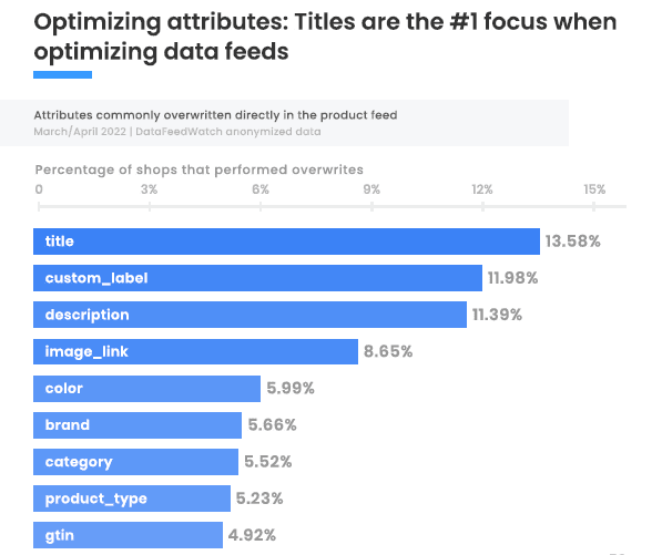
© The Feed Marketing Report | DataFeedWatch
Optimizing product feed elements is crucial for achieving better conversion rates for your eCommerce store. These include:
- Product titles
- Product descriptions
- Custom labels
These elements are used to communicate the key features and benefits of a product to potential customers.
Clear and compelling product titles, descriptions, and labels can help attract and persuade customers to purchase a product, while poor or misleading information can discourage them from making a purchase or using purchase-to-pay automation. Additionally, these elements are often used by search engines and marketplaces to understand and rank products, so optimizing them can also help improve a store’s visibility and search rankings.
The numbers speak for themselves: product titles are the main element that eCommerce shops (13.58% of them, to be exact) focus on during product feed optimization, with 20% of all merchants applying extensive changes to product attributes before submitting them to ad platforms.
Product titles should be clear, concise, and accurately describe the item. They should include important keywords to help with search engine optimization, as appropriate keywords in titles increase the likelihood of the product being ranked higher in SERPs.
Descriptions should provide more detailed information about the product by highlighting its key features and benefits. They should also be written in a way that is easy for customers to understand and nudge them in the direction of buying.
Custom labels are additionally used to point out specific information about a product or to differentiate certain products from others, such as discounted items or bestsellers. In general, custom labels should be used to draw attention to important information and filter products based on specific criteria.
Display user reviews clearly
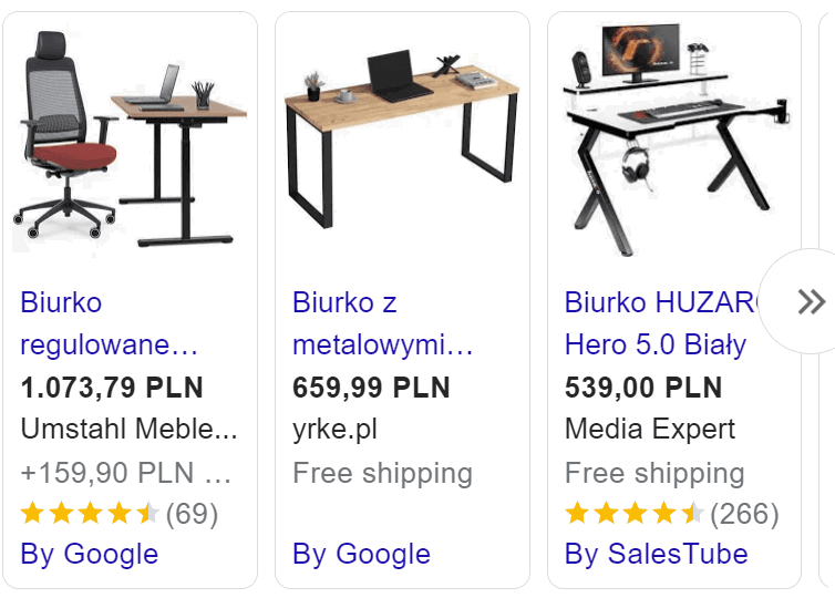
Reviews are one of the most powerful tools that eCommerce merchants have to influence consumer behavior and drive better conversion rates. According to a 2021 report, more than 99.9% of online shoppers consult reviews before making a purchase. Therefore, when customers are in the process of deciding whether or not to make a purchase, they frequently turn to reviews to gather more information about the product by learning about other people’s experiences with it.
Positive reviews can be a major motivator for customers to make a purchase, while negative reviews can be a deterrent. However, displaying all kinds of reviews prominently on your product pages can help to increase your brand credibility, especially if you take care to respond to them — even the negative ones.
It is important to show reviews in a clear and easy-to-read format, with the option to sort by most recent or most helpful. Overall, this can help build trust with customers who are on the fence about buying, which may convince them to make positive buying decisions.
Invest in better UX and UI
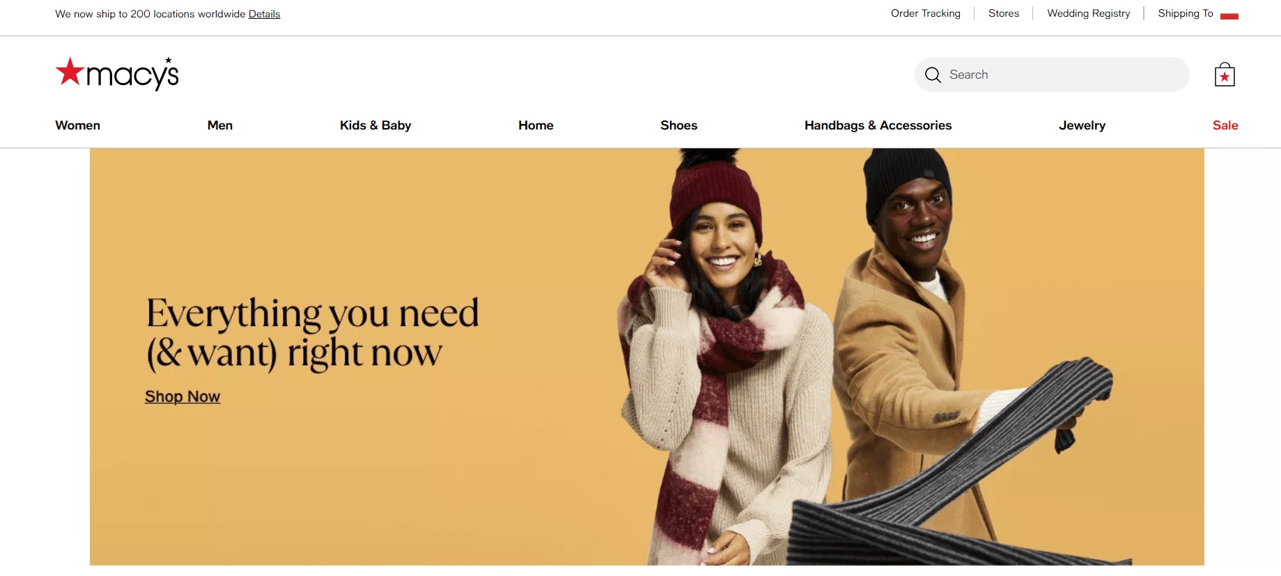
© Macys
A great user experience (UX) and user interface (UI) are essential for achieving higher conversion rates for an eCommerce website. Simply put, a well-designed website not only looks good, but also makes it easy for customers to find what they’re looking for and complete their purchases.
Good UX is all about making your online store easy to navigate and use. This includes:
- having a clear and consistent layout,
- intuitive navigation,
- and fast loading times.
When customers can find what they’re looking for quickly and easily, they are more likely to complete a purchase. On the other hand, if they have to wait over 5 seconds for a page to load, or if they keep running into errors, they are much more likely to click out of the website altogether.
According to a Google report, when a page’s load time increases from 1 to 3 seconds, the probability of a bounce (a user leaving the page immediately) rises by 32%, and it jumps to 90% when the load time goes from 1 to 5 seconds.
On a similar note, a great UI differs to UX in that the former is all about the visual elements of your website, including the color scheme, typography, and imagery. A visually appealing online storefront can help create a positive first impression and make customers more likely to stay and explore your website.
Optimize for mobile devices

© Unsplash
With the increasing number of internet users accessing online shopping websites on their mobile devices, it is more important than ever to ensure that your eCommerce site is optimized for this kind of traffic. For example, in 2021, an estimated 2.14 billion people were using the internet to do their shopping globally, up from 1.66 billion digital buyers in 2016.
Mobile optimization includes a number of important elements, including the following:
- Designing a responsive layout that adjusts to fit the screen size of different devices
- Optimizing images and videos for mobile devices so that they load quickly and don’t consume too much data
- Ensuring that the navigation system is just as responsive and readable on mobile devices as it is on desktop
- Including features like pre-filling customer information during the checkout stage and providing clear and concise error messages
One more factor to consider is mobile-first indexing, which means that search engines will give priority to mobile-optimized pages in their search result pages.
Overall, mobile optimization improves the user experience for a major portion of potential customers and, thus, increases the chances of sales.
Use appropriate software

© Unsplash
Using eCommerce software can be a great way to help boost conversion rates by improving certain processes that make up your current customer journey.
For example, live chat bots can be used to provide customers with quick and convenient assistance during the purchasing journey. They can help answer common customer questions, provide additional product recommendations or tips, and guide customers throughout the checkout process. If a customer runs into an issue that needs to be escalated, the chat bot can alert a live customer care agent and transfer the conversation to them through a VoIP phone system that the chat bot is integrated with.
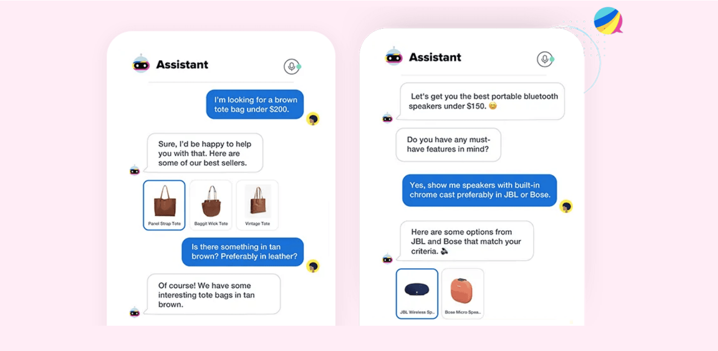
An example of a live chat bot for eCommerce | © Haptik.AI
Heatmaps are another nifty tool that can be used to track customer behavior on the website and identify areas where they may be getting stuck or experiencing any other difficulties. This information can then be used to improve the website’s UX and UI design so as to make it easier for customers to find and purchase exactly what they’re looking for without any hiccups.
Additionally, cart abandonment tools can help to reduce the number of customers who start the checkout process but don’t complete it. These tools can be used to track customers who abandon their shopping carts and send targeted follow-up emails with special offers or incentives to encourage them to finish their purchases.
Improve your checkout process

© Unsplash
Improving the checkout process is another contributing factor to an online store’s conversion rates. If the checkout process is too long, convoluted, faulty, or limited to only a certain number of payment options, you risk losing out on many ready-to-buy customers.
Simplifying the steps customers need to take when making a purchase can greatly increase the chances of successful sales. This can include reducing the number of pages in the checkout stage, making it easy for customers to see the total cost (including taxes and shipping) at all times, and displaying the checkout progress with a visible progress bar.
Offering various payment options can also help improve your shop’s checkout process. According to a 2019 report, 6% of shoppers abandon their carts due to a lack of payment options. By providing customers with multiple ways to pay, you increase the chances that the majority will find a payment method that works for them, and ultimately complete their purchase without a hitch. Think about including numerous payment options like various credit or debit cards, PayPal, and other digital payment gateways.
One more thing to consider is to implement a guest checkout option, which allows customers to make a purchase without creating an account on the website.
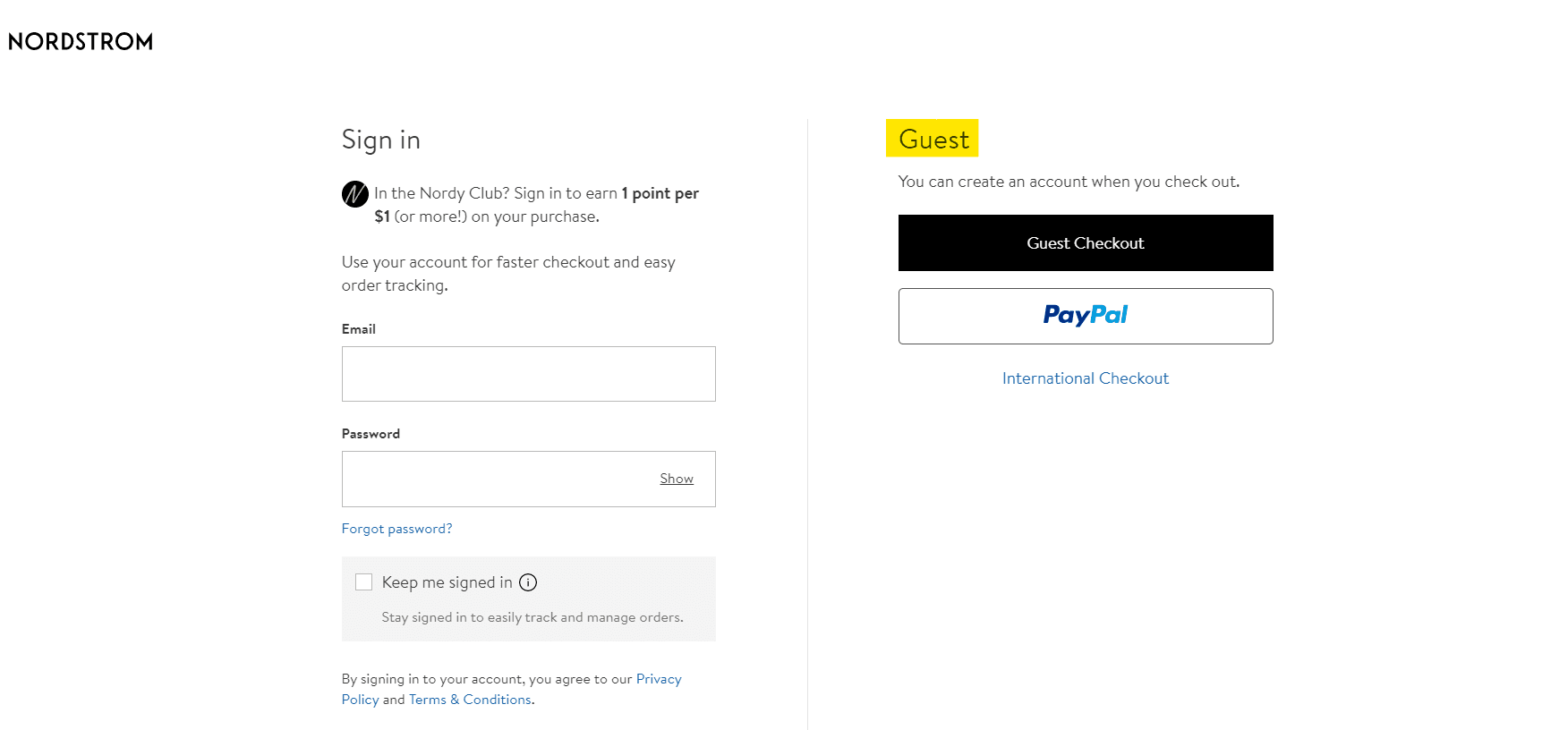
© Nordstrom
They will still need to leave an email in order to receive updates and notifications about their purchase and delivery, but they won’t have to go through the tedious process of creating a password and confirming their account. This greatly reduces the amount of time and effort required to complete a purchase and further incentivizes buyers to do so.
Use (more) high-quality images

© Pexels
A product image is often the first thing a customer sees when browsing an item in an online store, and it can be the deciding factor in whether or not they will end up purchasing it.
High-quality images provide customers with a clear and detailed visual representation of the product, allowing them to make an informed decision about whether the product in question is right for them. High-res photos can also help to establish trust with your customers, as they give off the impression that your eCommerce website is professional and takes the time to present its products in the best possible light.
You should also make sure to include more than just one image per each individual item. Adding images or creating a short commercial video that showcases the item from different angles, or helps customers understand its unique features and benefits, is a great way of motivating them to buy.
Over ¼ of all eCommerce merchants make the decision to provide additional product images in their ads to give buyers the best possible representation of what they will be buying.
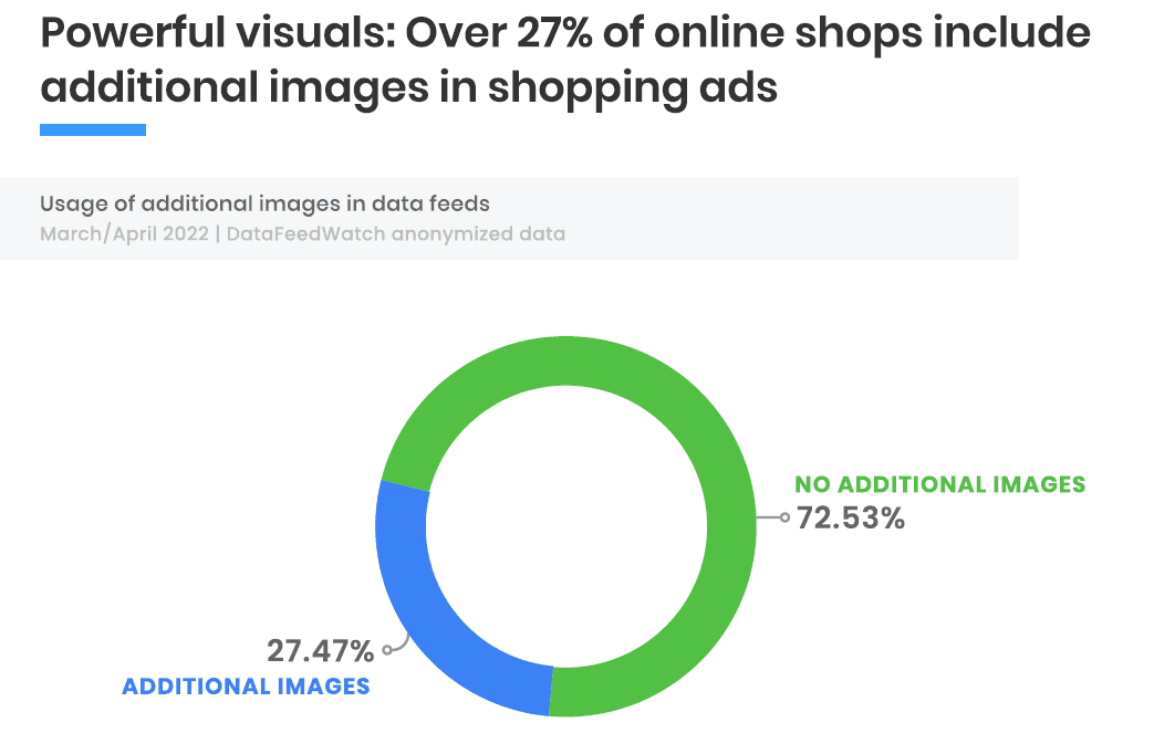
© The Feed Marketing Report | DataFeedWatch
On the other hand, pixelated, tiny, or otherwise low-quality images can give a negative impression of the products and the eCommerce brand, leading to mistrust and lower conversion rates. By failing to do something as simple as helping the customer clearly see the details of the product they’re looking at, you risk losing their interest, no matter how high their original intent was to complete their purchase.
Have a great return policy in place

© Pexels
A clear and easy-to-understand return policy can provide customers with peace of mind when making a purchase, as they can rest assured that they have the option to return the product if they are not satisfied with it for any reason. The numbers speak for themselves: 92% of surveyed consumers stated that they would make another purchase if the product return process is straightforward, while 79% preferred if the shipping of returns was free.
A return policy is there to establish trust between you and your website visitors. It demonstrates that your eCommerce brand values customer satisfaction above all, and that you are willing to go the extra mile to ensure that they are happy with their customer experience even beyond their purchase. This strategy can not only help increase customer loyalty and repeat business, but it can also ultimately lead to higher conversion rates.
Additionally, a return policy that is customer-centric can contribute to reducing the risk of negative reviews. Even if a customer was not happy with the product they received, they would at least be able to commend you on how your company dealt with the returned product and their potential refund.
Offer discounts regularly
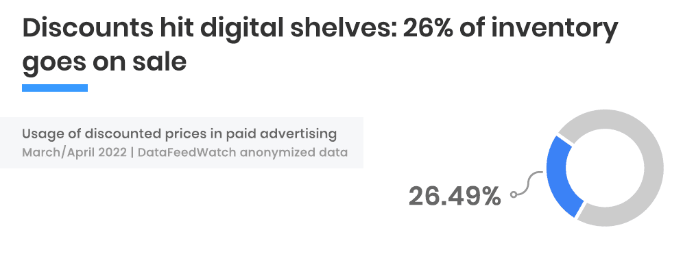
© The Feed Marketing Report | DataFeedWatch
Offering regular discounts can be an effective way of boosting conversion rates for an eCommerce website. Discounts can create a sense of urgency and increase the perceived value of the products you put on sale, thus encouraging more customers to make a purchase.
Another way to use discounts and sales is to reward repeat customers with exclusive deals and promotions. While this has an obvious effect on your conversion rates, it also has the added benefit of fostering a sense of community and nurturing long-term engagement and customer loyalty.
Moreover, discounts can help boost brand awareness and drive traffic to your website by generating buzz and interest among audiences you might not have reached before.
According to the Feed Marketing Report, over 26% of products advertised through paid channels have been on sale as of March 2022. The trend of offering discounts is likely to continue due to the ongoing economic challenges that are mainly related to price surges and inflation.
The above has resulted in shoppers becoming more cautious with their purchases and looking for more affordable options. For businesses that decide to implement a discount strategy, it is important to keep in mind that while discounts can lead to an increase in conversions, it may also result in a decrease in profit margins — so be smart about your special offers.
Conclusion
All in all, by identifying and addressing issues that are preventing visitors from converting, eCommerce businesses can improve the overall user experience and increase the likelihood of conversions.
We hope that you have found the above tips to be helpful and that you will be able to apply them to your own CRO strategy.
Published on Feb 24 2023

WRITTEN BY
Mile ZivkovicMile is the ex-Head of Content at Whatagraph. A marketing heavy with almost a decade of SaaS industry experience, Mile has managed multiple content marketing teams without losing an ounce of his writing passion.