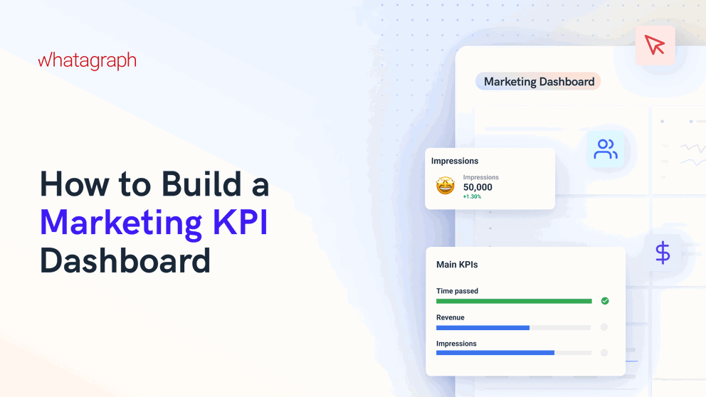
Marketing KPI Dashboard: How to Build One (Examples + Tips)
Struggling to track performance across all your marketing channels?
This guide breaks down how to build a clear, effective marketing KPI dashboard—one that visualizes your most important metrics in real time, surfaces insights fast, and helps you make smarter decisions.

Feb 22 2025●8 min read


If you’re a marketer, you know the pain already:
You've got dozens of tabs open—Google Ads, GA4, LinkedIn Ads, you name it—but no single view of how your marketing campaigns are performing.
You’re manually pulling numbers, double-checking data, jumping between tools... and still struggling to answer the most important question: Is our marketing working?
And when your client or an executive asks that question? You struggle to give an impactful answer.
A well-built marketing KPI dashboard changes that.
It gives you one place to track performance across all your channels, monitor KPIs as they trend up or down, and highlights key insights that help you answer questions—and take the right actions.
In this guide, we’ll walk you through how to build one step-by-step.
You’ll get real-life examples from marketing teams and agencies, expert tips on choosing the right KPIs, and layout ideas to help you build an impactful marketing dashboard.
Marketing KPI Dashboard: Best Practices According to Experts
How are actual marketing experts and agency leaders structuring their marketing KPI dashboards?
We spoke to 6 of them recently and compiled their top tips and tricks in this section. You’ll hear from:
- Robin Dimond, CEO & Founder of Fifth & Cor (marketing innovation agency)
- Keith Kakadia, CEO at Sociallyin (social media marketing agency)
- Jase Rodley, SEO Consultant at Jase Rodley (SEO agency)
- Ivan Vislavskiy, CEO of Comrade (performance marketing agency)
- Elena Novikova, CEO of Lumus Inc. (digital marketing agency)
- Natalia Lavrenenko, UGC Content Creator at Rathly (content marketing agency)
Tip 1: Avoid data overload
A cluttered dashboard is a useless dashboard.
"Overloaded dashboards often look impressive but rarely get used," says Ivan Vislavskiy, CEO of Comrade Digital Marketing Agency.
He structures dashboards by the customer journey—Awareness, Consideration, Conversion, and Retention—to maintain a logical flow and avoid overwhelming clients.
"Show only the most relevant KPIs. If clients want more details, they can drill down into specific metrics,” he advises.
Robin Dimond, CEO & Founder of Fifth & Cor, shares the same sentiment. To make dashboards more digestible for clients, she emphasizes organizing KPIs into clear sections like:
- Awareness
- Engagement
- Conversions
"The selection of KPIs should align with client goals, focusing on the metrics that directly impact their business," she adds.
This means tailoring dashboards to what clients care about most—ROI, audience growth, and campaign effectiveness—while avoiding data overload.
Tip 2: Tell a story, not just show data
Elena Novikova, CEO of Lumus Inc. warns against dashboards that "look impressive but don’t actually help clients."
She believes that simplicity wins and advises keeping dashboards focused on what truly matters: "One screen, three sections: High-level results, channel performance, actionable recommendations."
She explains that the best dashboards answer three key questions for clients:
- Is my marketing working?
- What’s making me money?
- What should I do next?
Presenting data with clear visuals and offering insights instead of just numbers ensures clients spend less time interpreting data and more time making strategic decisions.
Jase Rodley, SEO consultant, agrees. He explains that most clients don’t want to wade through a sea of numbers:
They want to know, “is marketing working?” So we start with high-level KPIs upfront like site health, then organic performance. Then we dive deeper into conversion rates, keyword rankings, etc. Structure it like a funnel — big picture first, details later.
 This way, clients can quickly see what’s working, what needs attention, and how that affects marketing goals.
Tip 3: Focus on the metrics that matter
The temptation to track everything is real, but it often leads to confusion.
Natalia Lavrenenko from Rathly points out that "the best approach is to map KPIs to business outcomes." She suggests focusing on high-impact metrics, such as lead generation for law firms or revenue per visitor for eCommerce stores.
Lavrenenko emphasizes avoiding vanity metrics, which create noise without driving actionable insights.
Rodley agrees: "I choose KPIs based on impact, not noise." He filters out unnecessary metrics by asking:
- Does it affect search visibility?
- Can the client act on it?
- Does it tie back to business goals?
This approach keeps dashboards lean and ensures every metric included serves a clear purpose.
4. Make data actionable with AI-driven insights
Experts agree that AI can enhance marketing reporting by automating insights and providing performance summaries.
"Instead of just showing numbers, we make sure our dashboards answer three key questions: What changed? Why did it happen? What should you do next?" says Novikova.
Incorporating AI helps clients understand performance trends and make informed decisions quickly.
For instance, on Whatagraph, you can ask AI to write out performance summaries based on your data sources and channels—and add these directly to your dashboards.
These summaries are also fully customizable. You can:
- Choose whether you’d like a “short” or a “long” summary
- Choose what kind of content you’d like, such as “Wins”, “Recommendations”, or “Issues”
However, Lavrenenko pointed out an important note:
Clients trust expert analysis, not just machine-generated insights. So, reports still need a human touch.
We totally agree. This is why we made it possible for you to edit the generated summaries before adding it to your dashboards. This way, you’re still adding that “human touch” to your reporting.
Another way AI can help is for internal performance monitoring. Based on your connected data sources and channels, AI can give you the key insights on any topic you’d like to know in seconds.
For example, Whatagraph’s AI chatbot can answer any questions about all your connected data or marketing campaigns in natural language—just like talking to your personal data expert.
5. Customize the dashboard for each client
Every client has unique business objectives, which means a one-size-fits-all dashboard rarely delivers real value.
Customizing your marketing KPI dashboard for each client shows that you understand their specific needs and are focused on their goals.
Keith Kakadia, CEO at Sociallyin, emphasizes the importance of tailoring reports to match the client's strategic priorities:
Clients don’t want data dumps; they want clarity and insights. We align our dashboards with their business goals, whether it’s brand awareness, lead generation, or sales. This helps clients see how our work ties directly to their objectives.
Ronan Hickey, CEO at The Marketing Consultant, suggests using a flexible template approach:
We start with a solid template but customize it for every client. This way, we maintain consistency while adapting to specific KPIs that matter to each business. Our clients appreciate seeing metrics that are relevant to them without unnecessary noise.
Whatagraph makes it really easy for you to do this. For instance, you can create one “Master” marketing dashboard template with the layout and structure you want for a specific type of client or channel.
Then, save it as “Team template” and duplicate it the next time you need to create a similar report for a different client. From there on, you can simply customize:
- The data source — connect to your client’s data source
- Metrics — choose the metrics your client cares most about
- Widgets — choose the widgets that would display the information in the most digestible way for your clients
This is one of the “tricks” Peak Seven digital marketing agency used to cut down 63 hours on reporting AND deliver sleek, customized reports to their clients.
You can get inspiration from one of our marketing dashboard templates here, or talk to us to start using them.
How to Structure a Marketing KPI Dashboard (with Examples)
The key to an effective KPI dashboard marketing is to balance big-picture insights with detailed channel performance. Here's how to do it:
- Start with a high-level performance overview: Share key insights upfront, like overall ROI, total conversions, and campaign performance trends. This helps clients or executives grasp the main takeaways without getting lost in the details.
- Drill down into specific channel metrics: Break down performance by channel—like Google Ads, Meta Ads, TikTok, and others—so stakeholders can see which platforms are driving results.
The best part is on Whatagraph, you can have different “tabs” in ONE report, rather than have one long overwhelming report that takes too long to load. Instead, tabs keep your data organized and easy to skim through.

With that being said, let’s dig into the structure of each type of dashboard.
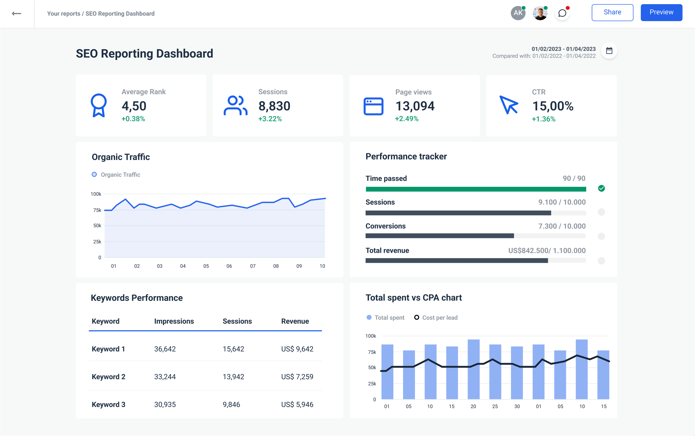
1. Top-level marketing KPI dashboard
A well-structured external marketing KPI dashboard starts with a top-level overview that quickly communicates key insights to clients or C-Suite.
The goal is to provide a snapshot of performance, highlight important changes, and set the stage for deeper analysis in the following sections.
We built an example dashboard here to show you what this looks like:
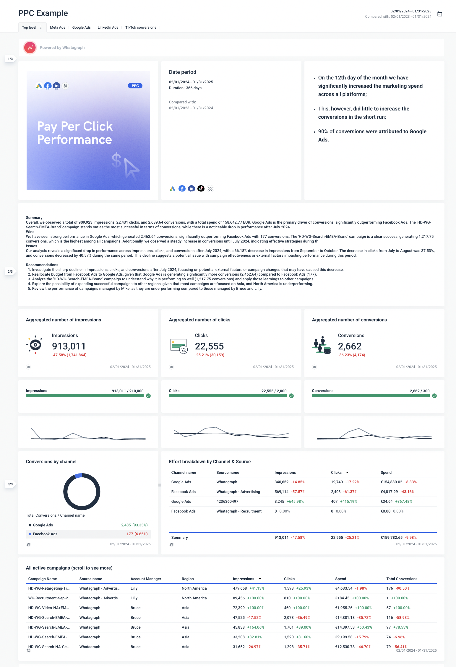
Here's how to create one just like this:
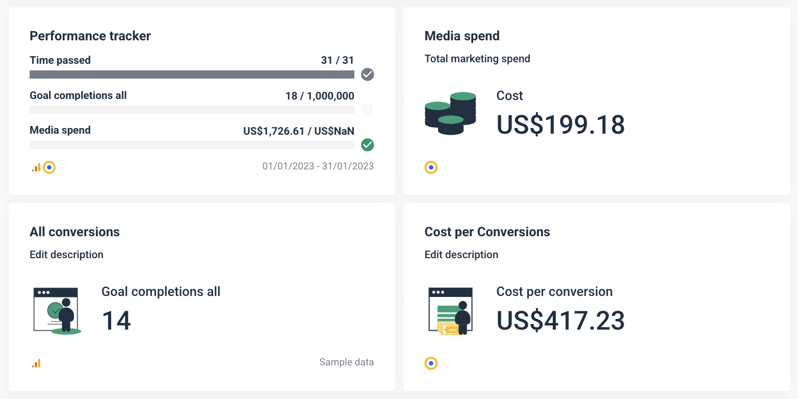
Step 1: Share summary insights and key changes
Clients and stakeholders often don’t have time to dive into granular details. A clear summary at the top of your dashboard offers immediate value by highlighting the most important insights. This not only improves readability but also sets the context for the deeper metrics that follow.
How to structure this in your dashboard:
- Include a summary section: Provide an overview of impressions, clicks, conversions, and spend. On Whatagraph, you can ask our AI to write a short or long summary for you and you can edit it later.
- Highlight key wins: Showcase successful campaigns or standout performance.
- Address issues: Point out significant drops or areas needing improvement.
- Provide recommendations: Suggest next steps to improve performance based on the data.
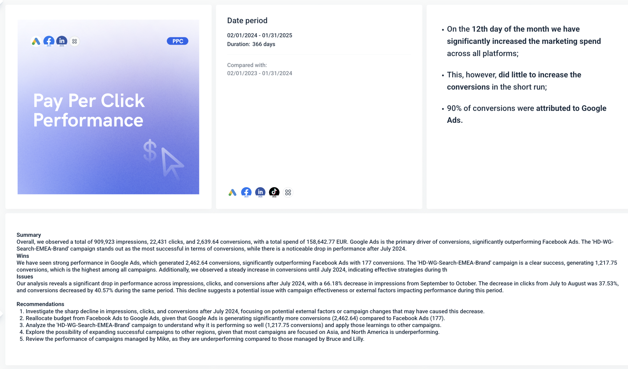
Step 2: Share total KPI numbers clients care about
Clients want to know the big numbers without sifting through complex data. Displaying total impressions, clicks, and conversions as single-metric widgets makes it easy for them to understand overall performance at a glance.
How to structure this in your dashboard:
- Use single-metric widgets: Display key metrics like impressions, clicks, conversions, and total spend.
- Color code the results: Use green for positive performance and red for areas that need attention.
- Provide context: Include comparison data, such as percentage change from the previous period.
Step 3: Show the goals for each KPI and progress
Showing progress against set goals helps align marketing performance with business objectives. It answers the question, "Are we on track to meet our targets?"
How to structure this in your dashboard:
- Set clear goals for each metric: Define targets for impressions, clicks, and conversions.
- Visualize progress: Use progress bars to show how close each metric is to achieving its goal.
- Include threshold indicators: Add checkmarks or alerts to signal when goals are met or if metrics are underperforming.

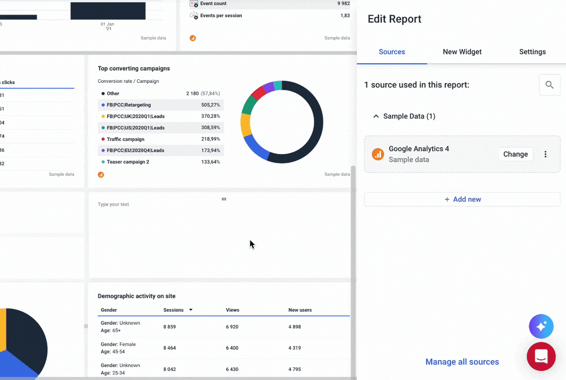
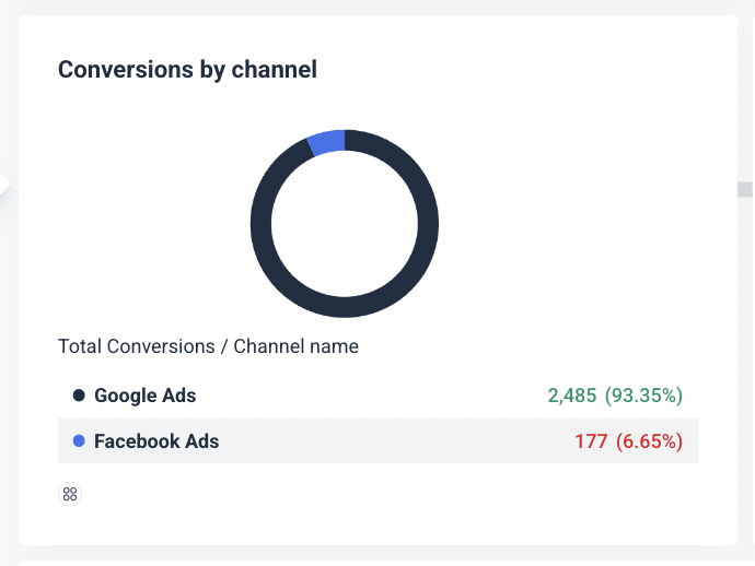
Step 4: Break down each KPI by channel using a pie chart
Not all channels contribute equally to your marketing success. A pie chart helps illustrate which channels drive the most impact, offering quick insights into where marketing budgets and efforts are paying off.
How to structure this in your dashboard:
- Create a pie chart for conversions by channel: Display how much each channel (e.g., Google Ads, Facebook Ads) contributes to total conversions.
- Emphasize the leading channel: Use clear labeling and color coding to highlight top-performing channels.
- Include percentage data: Show both raw numbers and percentages to give a complete picture of channel performance.
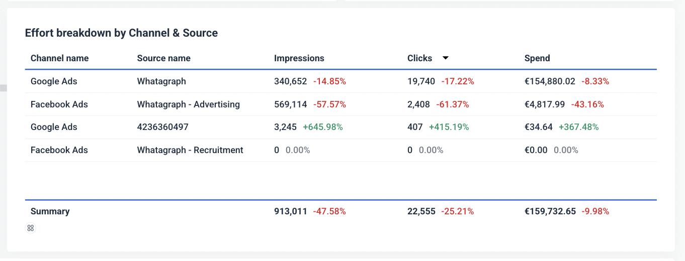
Step 5: Break down KPIs by channel and source using a multi-breakdown widget
To make informed decisions, you need to understand not only which channels perform well but also which specific campaigns or ad sets drive results. This step adds granularity to your analysis.
How to structure this in your dashboard:
- Use a multi-breakdown widget: Display impressions, clicks, and spend by both channel and specific source.
- Highlight high-performing sources: Identify which campaign names or sources contribute the most to key metrics.
- Provide actionable insights: Include commentary or tooltips to explain why certain sources perform better than others.
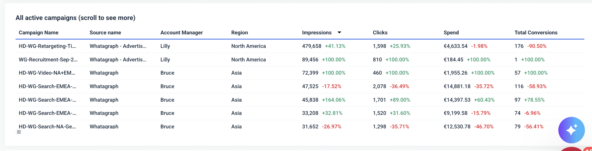
Step 6: Break down all active campaigns by account manager and region
For agencies managing multiple campaigns across different regions and account managers, this step offers a clear view of who is driving results and where. This insight is particularly useful for optimizing resource allocation.
How to structure this in your dashboard:
- List all active campaigns: Include campaign names, sources, and account managers.
- Show performance by region: Display metrics like impressions, clicks, spend, and conversions by region.
- Organize by account manager: This helps pinpoint who is excelling and where additional support might be needed.
 2. Channel-specific marketing performance dashboard
When creating a channel-specific marketing KPI dashboard, such as for Google Ads, it’s crucial to present data in a clear, visually appealing, and actionable way. Each step should guide the viewer from top-level performance metrics down to specific campaign insights.
Here's a step-by-step guide on how to structure this dashboard:
Step 1: Show key KPIs for the specific channel using single-metric widgets
Clients want a quick snapshot of critical metrics like impressions, clicks, and sales made. Presenting these KPIs as single-metric widgets not only keeps the dashboard clean but also makes it easy to absorb key information at a glance.
How to structure this in your dashboard:
- Display core metrics: Include impressions, clicks, and sales.
- Use colorful icons: Add engaging visuals like eye icons for impressions, chat bubbles for engagement, and shopping cart icons for sales.
- Highlight changes: Show percentage changes from the previous period in green (for positive trends) and red (for declines).
 Step 2: Show the goals for each KPI and progress
Setting clear goals for each KPI helps measure performance against benchmarks. It gives clients a clear sense of whether marketing efforts are on track.
How to structure this in your dashboard:
- Set specific goals for each metric: Define targets for impressions, clicks, and sales.
- Visualize progress with bars: Use progress bars to show how close each metric is to reaching its target.
- Add status indicators: Display checkmarks when goals are met, helping clients quickly see successes.

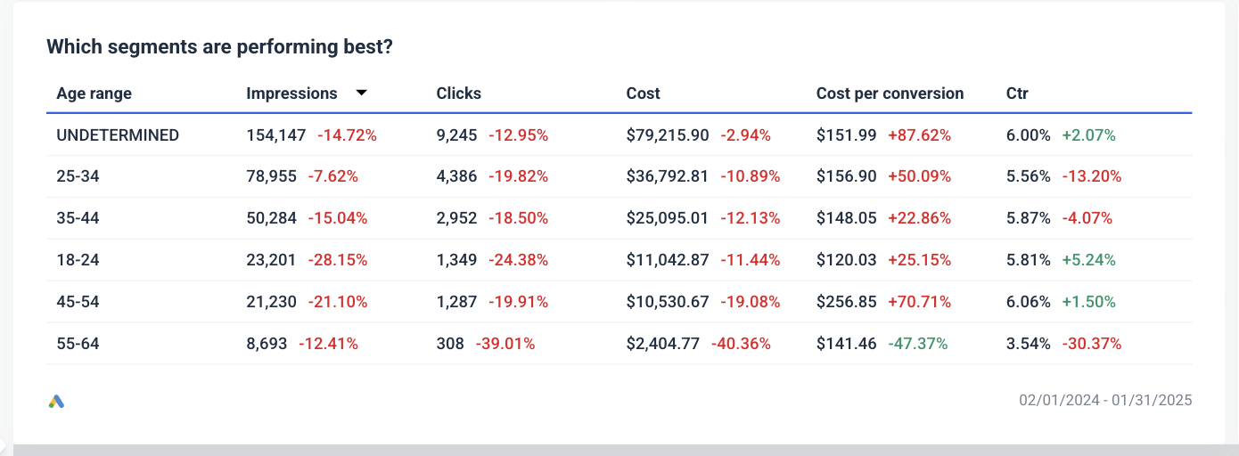
Step 3: Break down best performing ad segments using a multi-breakdown table
A multi-breakdown table provides deeper insights into which demographics or segments are responding best to your ads. This data is invaluable for refining targeting strategies.
How to structure this in your dashboard:
- Segment data by demographics: Include age ranges, clicks, impressions, cost per conversion, and click-through rates (CTR).
- Use conditional formatting: Highlight the best and worst-performing segments with color coding.
- Provide insights: Add tooltips or notes explaining why certain segments outperform others.
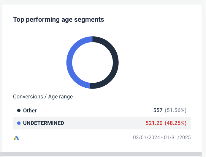
Step 4: Show best performing ad segments at a glance using a pie chart
A pie chart provides a quick, visual representation of which segments contribute the most to conversions. It's ideal for showing proportion-based insights without overwhelming the viewer with raw numbers.
How to structure this in your dashboard:
- Create a pie chart for age segments: Show conversion distribution across age groups.
- Emphasize the leading segment: Use distinct colors to highlight top-performing segments.
- Include percentage values: Display the share of conversions each segment contributes.
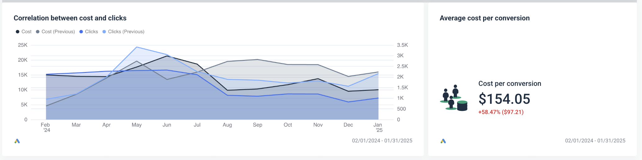
Step 5: Show the correlation between cost and clicks using a line chart
Visualizing the relationship between cost and clicks over time helps identify whether increases in spend are effectively driving engagement. It also highlights trends, anomalies, and potential opportunities for optimization.
How to structure this in your dashboard:
- Plot cost and clicks on a line chart: Use different colors for current and previous periods to make trends easy to spot.
- Display data over time: Include monthly or weekly breakdowns to track performance trends.
- Add annotations: Highlight significant changes or anomalies, such as spikes in costs without a matching increase in clicks.
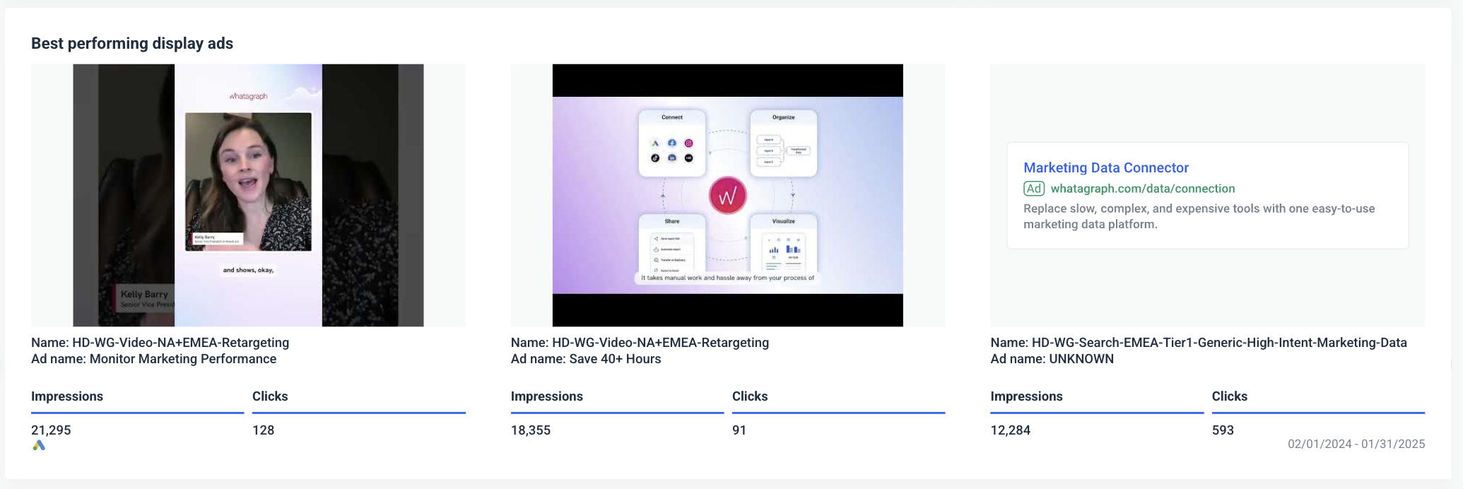
Step 6: Show best performing ads for both display and search campaigns
Clients need to see which ads and campaigns generate the best results. This helps justify ad spend and informs future creative and targeting strategies.
How to structure this in your dashboard:
- Include both display and search ads: Show performance metrics for each ad type separately.
- Highlight key metrics: Display impressions, clicks, and conversions for each ad.
- Add visuals for display ads: Include thumbnails or previews of video and banner ads to make the data more engaging.
- Provide actionable insights: Indicate which ads might benefit from increased budgets or further optimization.
How to Create a Marketing KPI Dashboard [Step-by-Step]
Now that you know how to structure a KPI dashboard, let's look into how to actually create one.
With Whatagraph, this is easy. All you need to do is:
- Connect your data
- Organize your data
- Choose a dashboard template or create one from scratch
- White-label the dashboard
- Share the dashboard
Step 1: Connect all your data
Your first step is to bring in all the data from your sources and channels for all clients.
On Whatagraph, you can automatically bring in data from 55+ marketing channels including:
- Paid advertising: e.g. Google Ads, Meta Ads, TikTok Ads
- Organic social: e.g. Facebook, LinkedIn, Pinterest
- SEO: e.g. SE Ranking, AccuRanker, Ahrefs
- Email marketing: e.g. Constant Contact, Klaviyo, ActiveCampaign
- eCommerce: e.g. Shopify, Magento, WooCommerce
- Analytics: e.g. Matamo, Google Analytics 4, Piwik Pro
The best thing is these integrations are direct and native – meaning the connections are stable and the data on your dashboard is always up to date. This also means you don’t need to use a third-party connector like Funnel or Supermetrics to visualize your data.
Third-party connectors are notorious for breaking constantly or sending late data to your digital marketing KPI dashboard, which results in inaccurate or broken reports. Whereas, with Whatagraph, you’ll get real-time, fresh data on your dashboards.
But more importantly, native integrations mean our Engineers can quickly resolve bugs (if there are any) without having to get a third-party company involved.
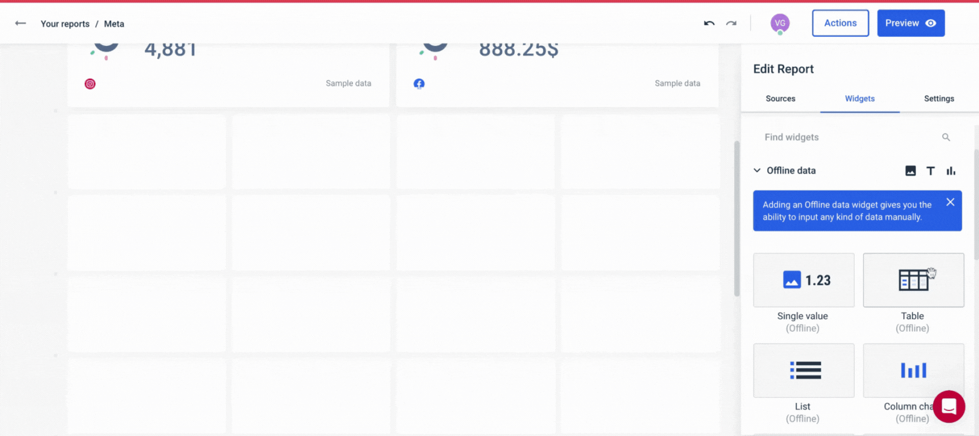
Apart from these integrations, you can connect any other data source you have, including offline data (store visits, TV advertising, etc), in several ways:
- Google BigQuery connection
- Custom API connection
- Google Sheets
- Manual copy/pasting Excel, Google Sheets, or CSV data in Offline Widgets. (see below)
 This way, you get:
✅ A centralized view of all your performance metrics across platforms and tools.
✅ Accurate and relevant data in every report you send.
Step 2: Organize your data
Once your data sources are connected, the next step is to organize your data in a way that is easy to digest for your team and clients.
This means:
- Creating data blends from different sources
- Unifying dimension names
- Standardizing campaign names
- Matching metric names
- Segmenting data by specific demographics or geographics
Here’s an example.
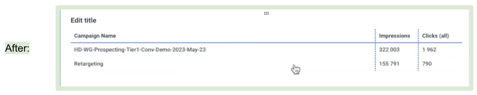
For marketers, it's common to have internal campaign names packed with abbreviations, dates, and jargon—like "RTG_Q1_Tier3_012023."
While these names might make sense to your marketing team, they can confuse clients or C-Suite and make your dashboards hard to understand.
For instance, in this screenshot we can see that the Campaign names are really confusing, yet there is one repeating keyword - 'Retargeting'.
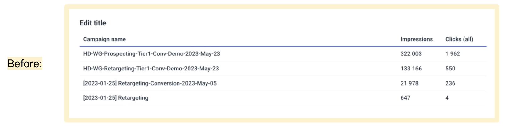 With Whatagraph, you can fix this in seconds. By setting a simple channel-level condition rule, you can automatically rename every campaign containing the keyword "Retargeting" to display as just "Retargeting."
 The result is a standardized, unified marketing analytics dashboard that both your teammates and clients can easily understand. And the benefits of this are:
- Fewer back-and-forth questions about the data on reports
- Less data discrepancies
- More comprehensive view of performance
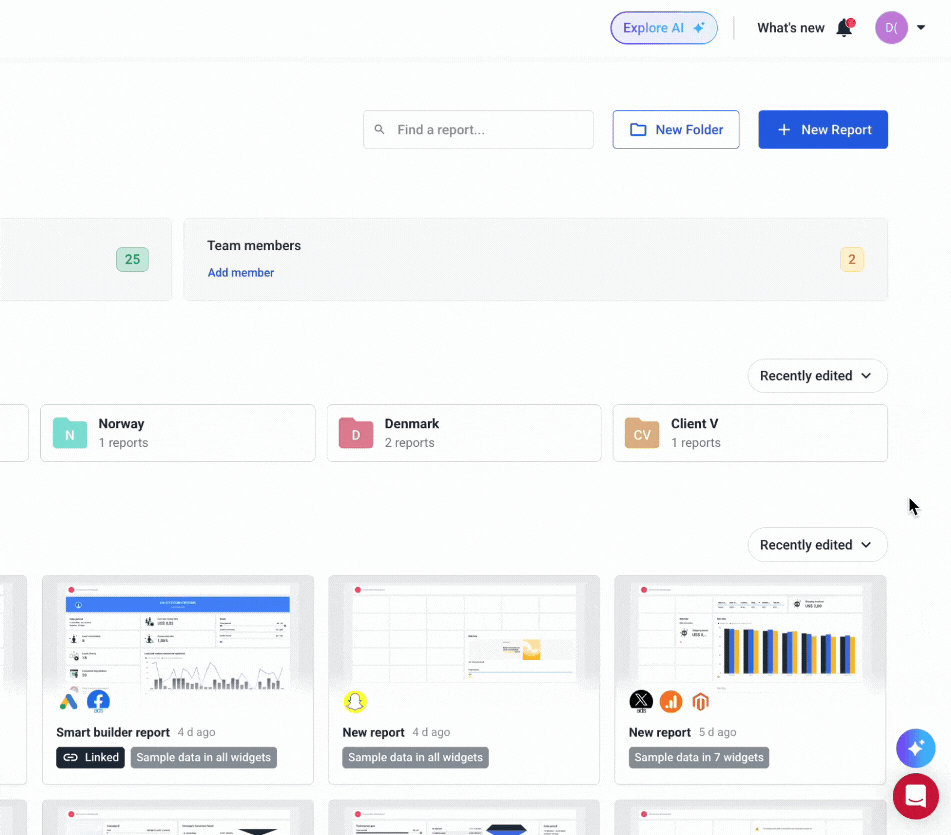
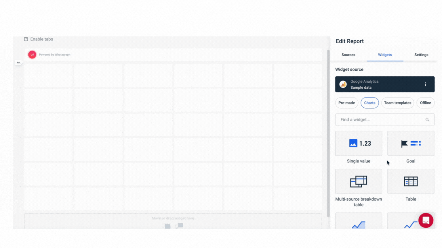
Step 3: Choose a dashboard template or start from scratch
Once you’ve organized your data, you’re now ready to visualize it.
On Whatagraph, you can do so in three key ways:
- Start from a blank page and use our drag-and-drop widgets to add metrics onto the dashboard.
- Use one of our ready-made report templates or dashboard examples.
- Use our Smart Builder to instantly create dashboards for your favorite marketing channels (e.g. Google Analytics 4, Google Ads).
This video breaks it down in detail:
When it comes to adding metrics, you can do so in 5 different ways:
- Build your own metrics
- Pre-made metrics
- Widget templates
- Offline data
- Use Smart Builder
For new users, we always recommend starting from pre-made widgets, which makes life easier and is much faster to build your report. You don’t need to write any codes or work with any spreadsheets — just drag and drop on your dashboard and that’s it.
The widgets are also fully-interactive. You can resize them however you want – horizontally and vertically.
You can also:
✅ Change the orientation of your reports as Landscape or Portrait
✅ Save reports as “templates” and re-use them the next time
✅ Edit linked reports in one go, rather than one by one
✅ Add multiple “Tabs” within a single report to visualize performance from different channels or campaigns
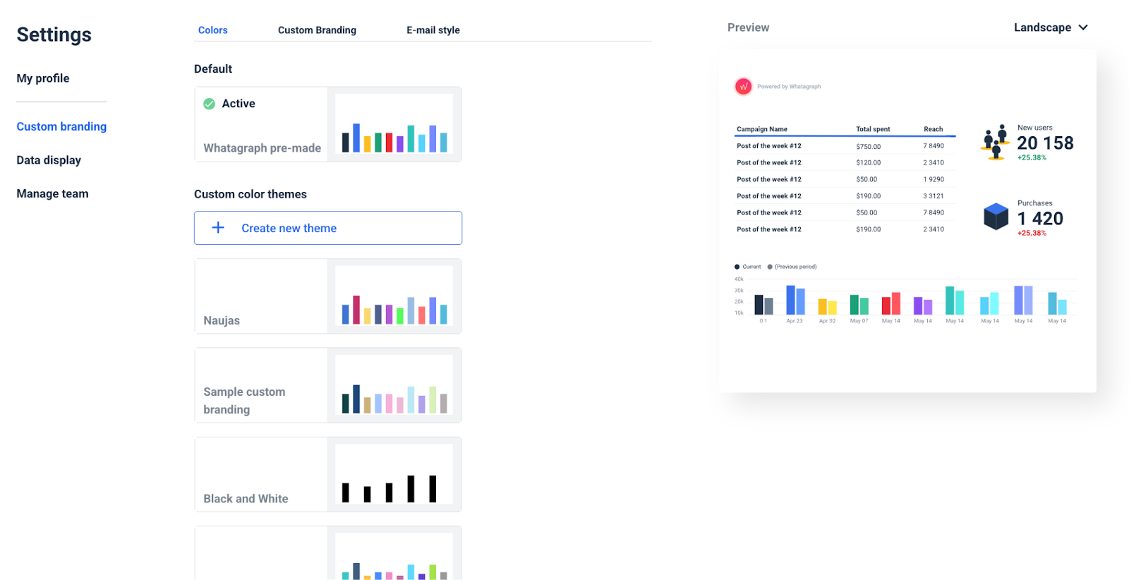
Step 4. White-label the dashboard
All done with the visualization side of things?
You can go a step further and white-label your dashboard with your client’s or company’s branding.
Here’s what you can customize on Whatagraph:
- Logo – Upload your logo or your client’s logo for a fully personalized look.
- Colors – Match your reports to brand guidelines with custom color schemes.
- Headers & footers – Add important notes or branding elements.
- Custom domains – Host and share reports on your own domain.
- Widgets & icons – Adjust widget colors and icons to align with your brand’s aesthetic.
Step 5. Share the dashboard
Finally, it’s time to share the dashboard with your clients or C-Suite.
On Whatagraph, you can do so in three ways:
- Send live links to clients with real-time data—you can password-protect these links or change whether you want readers to change the date ranges
- Share PDFs, Excel spreadsheets, or CSV files
- Set up automated emails that go out daily, weekly, or monthly—in your own branding
5 Marketing Dashboard Examples
Here are more examples of marketing dashboards with different use cases that should get you inspired.
SEO dashboard
Our SEO dashboard template has all the metrics you need to successfully track your clients’ on-page and off-page SEO and content marketing progress. With metrics such as new organic traffic, keyword movements, the conversion rate from organic traffic, new and lost backlinks and many others, this is a comprehensive dashboard that any SEO can use in their work without many changes.
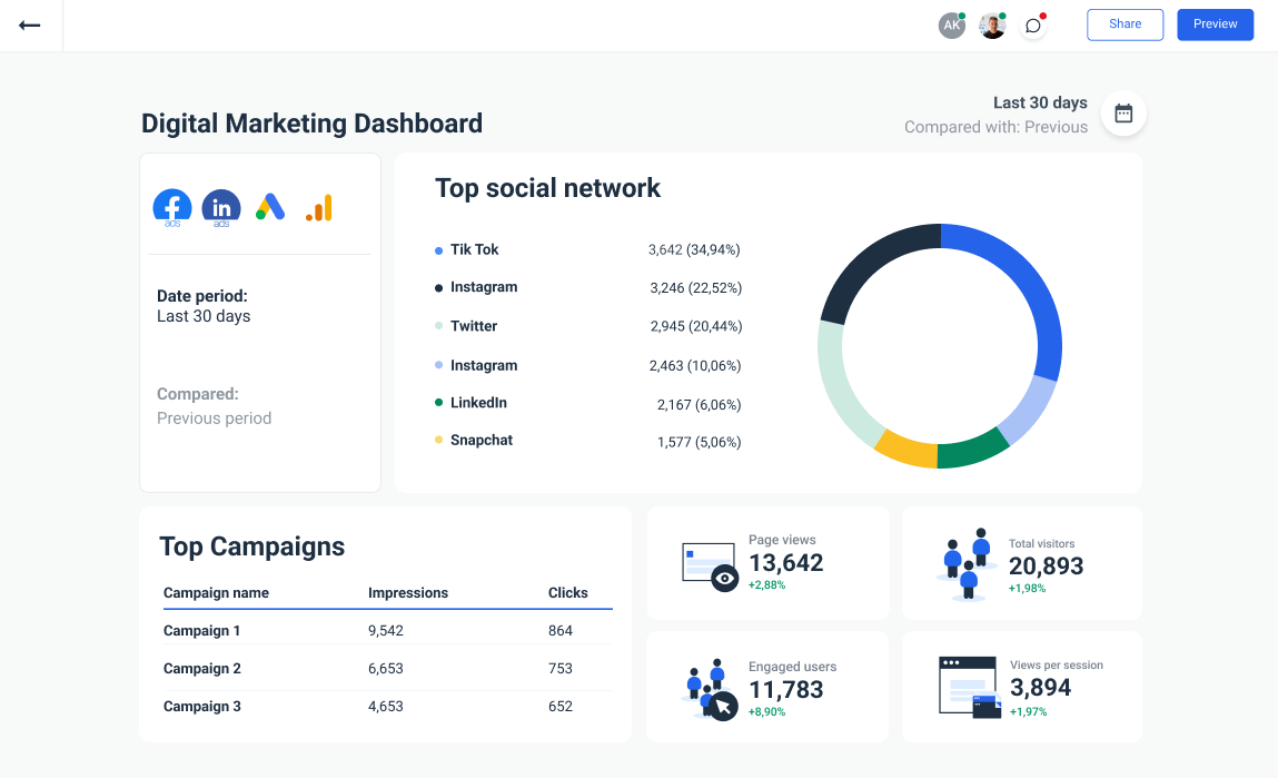
Digital Marketing Dashboard
For clients that need a broader scope of services, a digital marketing dashboard covers a wide range of metrics to track their campaign performance. It includes metrics such as bounce rate, conversion rate, organic search traffic, return on ad spend, overall marketing ROI and others.
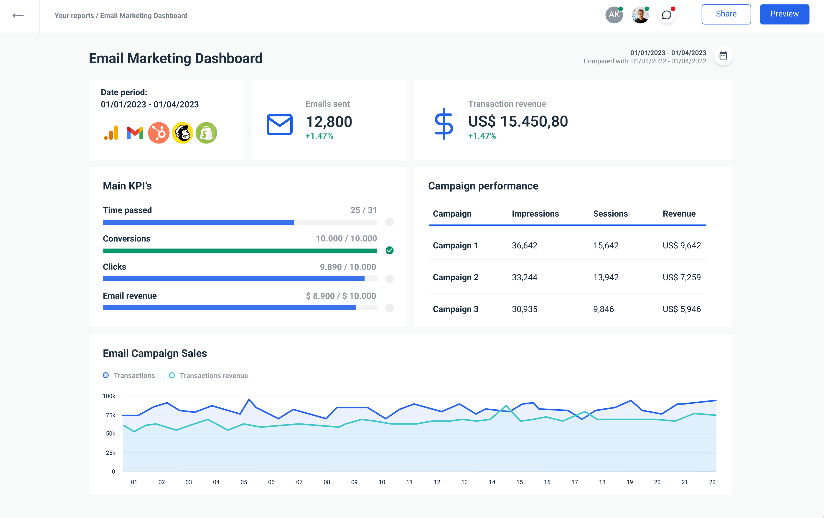
Email Marketing Dashboard
No matter which email marketing service provider you use, the email marketing dashboard is a great addition to your toolset. It has all the right widgets to show email campaign performance, along with the most important email marketing metrics that clients can understand and act on.
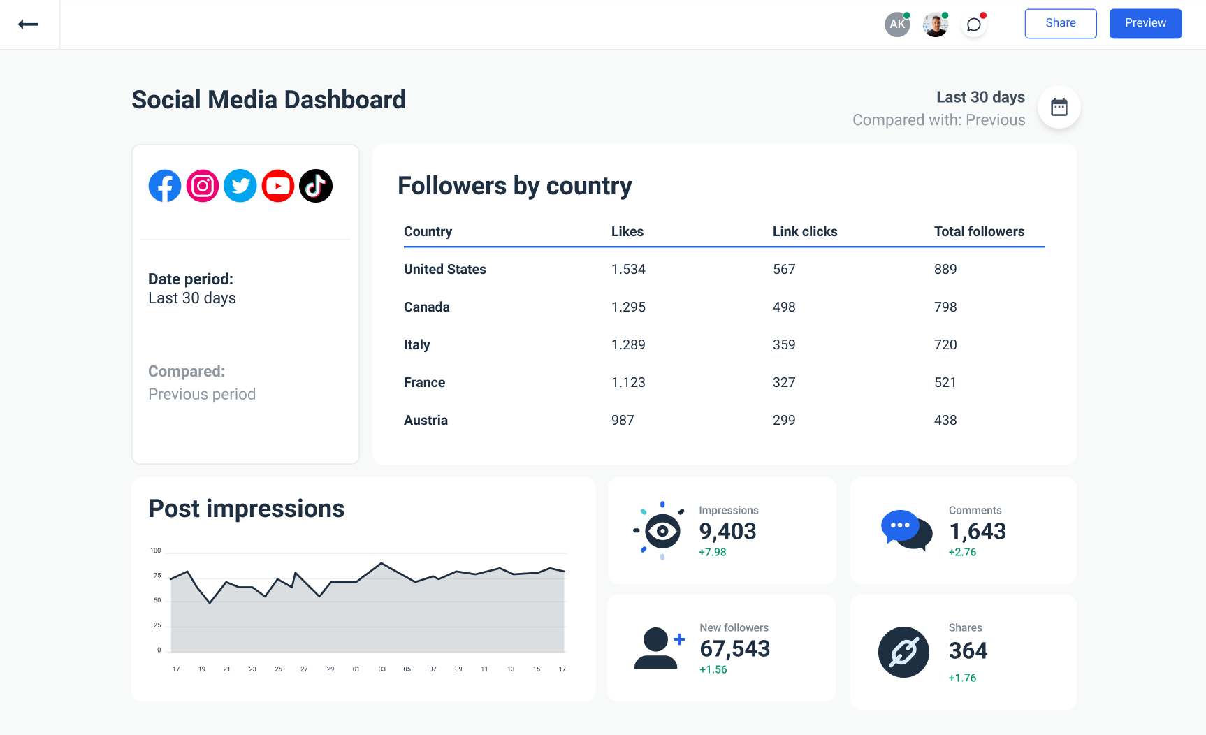
Social Media Dashboard
Get a full overview of a client’s social media marketing performance with this social media dashboard. It covers all the aspects you need for relevant and accurate reporting, including organic and paid social media efforts. With a little bit of tweaking, you can create a social media dashboard your clients will love checking out on their own, without digging into complex Excel spreadsheets.
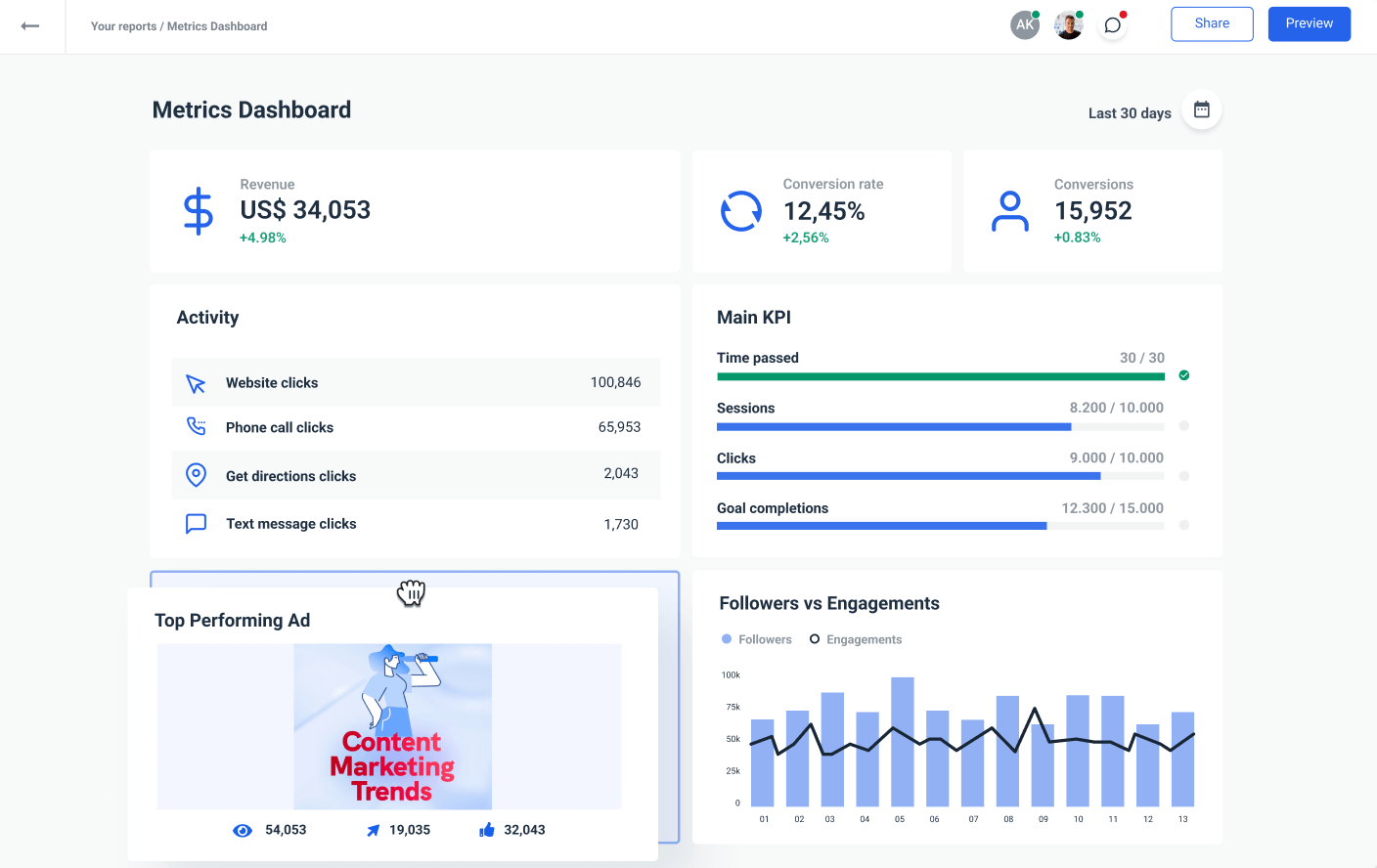
Metrics Dashboard
Businesses need a reliable tool to track their most important metrics and KPIs and report the status to management or stakeholders. This metrics dashboard visualizes your cross-channel marketing efforts in a way your colleagues understand. You can use it to increase accountability, prove ROI, and keep everyone in the loop with your department's results.
Want to build a marketing KPI dashboard that brings all your data together, tracks the right metrics, and actually helps you make better decisions?
Talk to us, and we'll set you right up.
Published on Dec 22 2021
WRITTEN BY
YamonYamon is a Senior Content Marketing Manager at Whatagraph. With an eye for detail and a knack for always considering context, audience, and business goals to guide the narrative, she's on a mission to create genuinely helpful content for marketers. When she’s not working, she’s hiking, meditating, or practicing yoga.