Dashboard Examples
Visualize your data with professional dashboards for Marketing, Sales, Social Media, and more. Pick any pre-made dashboard or create your custom dashboard design with our intuitive drag-and-drop builder. Choose a dashboard, connect your data sources, and you’re all set. Share live dashboards via links for on-demand access.
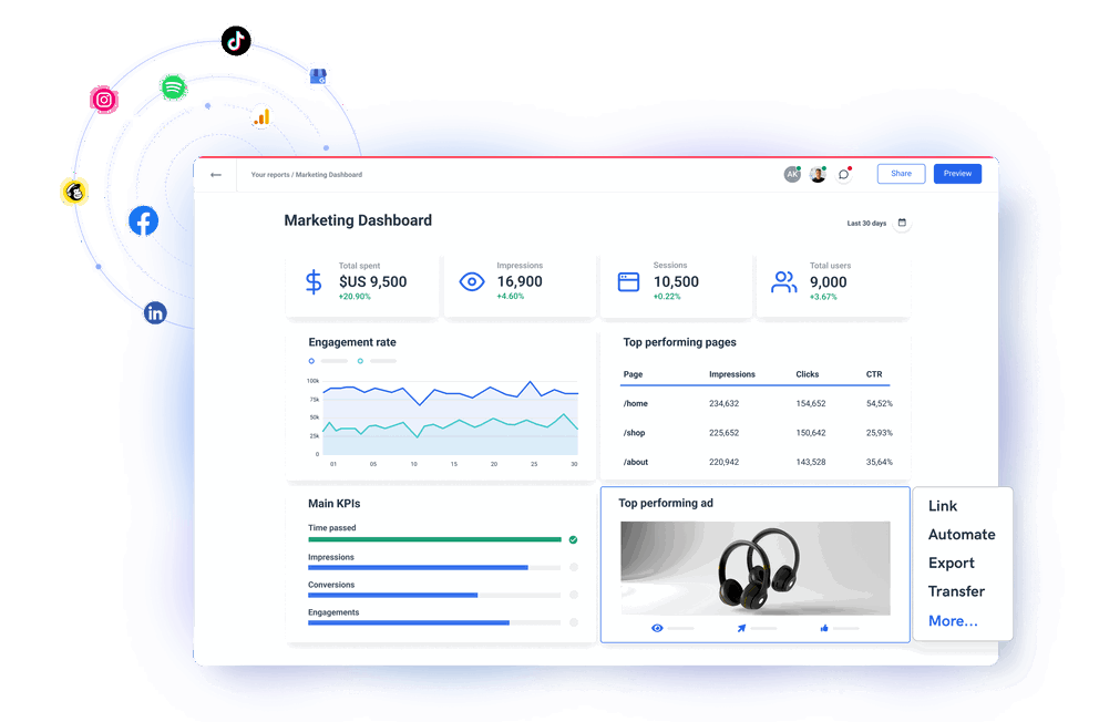


40+ pre-built dashboard examples to choose from
Find a dashboard for you

Amazon Ads Dashboard

Shopify Dashboard

TikTok Ads Dashboard

Klaviyo Dashboard

Call Center Dashboard

Performance Dashboard

Dashboard Builder

Online Dashboard

Real time Dashboard

SaaS Dashboard

Custom Dashboard

White-label Dashboard

CMO Dashboard

Business Dashboard

Startup Dashboard

Agency Dashboard

Customer Dashboard

CEO Dashboard

Sales Performance Dashboard

White-label SEO Dashboard

Monitoring Dashboard

Freelance Dashboard

Small Business Dashboard

Dashboard Creator

Simple Dashboard
Metrics Dashboard

Advertising Dashboard

Digital Marketing Dashboard

Financial Dashboard
TikTok Dashboard
Google Analytics 4 Dashboard
Live Dashboard
Salesforce Dashboard
Data Visualization Dashboard
Website Dashboard
Bing Ads Dashboard
HubSpot Dashboard

Pinterest Ads Dashboard

WooCommerce Dashboard

BigCommerce Dashboard

BigQuery Dashboard

Snapchat Ads Dashboard

Google Display and Video 360 Dashboard

Criteo Dashboard

Spotify Ads Dashboard
Client Dashboard Software

AccuRanker Dashboard

Constant Contact Dashboard
It’s good to be loved! Our clients are not shy about expressing it.
I made a switch from GDS and Sheets for reporting to Whatagraph, and I am saving literal hours each week on performance report creation. Our small firm actually managed to onboard 2 new clients as a result of all the time we saved on managing data and reporting. The customer service is also really helpful and easy to reach.

Capterra verified review by
Mindaugas S., Marketing Consultant
Having active customer support to help fix any issues was a big contributor, but we also really liked the ability to save templates and connect sources to multiple charts/widgets at once without having to edit them individually. And having the grid layout is much easier to stay consistent with than the free form setup that Data Studio has.

Capterra verified review by
Nico T., Media Planner
The system has standard templates that are easy and fast to use. Also you can build your own report with lightning speed. It is very easy to use, has a lot of integration, and let get started very fast.

Capterra verified review by
Rasmus Bernt K., External Senior Management Consultant
We love Whatagraph - we would definitely recommend and our account manager is great! I love how easy this tool is to use, everyone on the team finds it much more user-friendly than other dashboards. Integration was easy, we sent some example reports to the team who duplicated these for us. We literally had to log in and send it to our clients!

Capterra verified review by
Stephanie S., Digital Director
We are showing our clients the work that we're doing for them and this is incredibly important for our clients ROI. They want to see results and having a tool like Whatagraph that can show data from virtually every source we use is hugely important.

Capterra verified review by
John S., SEO Strategist
The tool is easy to use; you do not need to have development resources. Even my junior project managers are capable of making campaign reports in minutes. There are a lot of pre-made templates you can use as well as many pre-made widgets.

Capterra verified review by
Erman E., Marketing Specialist
Really easy to connect data sources within the tool. The library of report templates has been helpful. The customer support team has been responsive to all of our needs. Our team enjoys the simplicity of setting up the reports and how the data is presented.

Capterra verified review by
Brent N., Director of Operations
Easy to create really beautiful graphs and reports which can help other team members to understand the most important takeaways. I especially like the automated report function, so I don't have to check on the same thing repeatedly.

Capterra verified review by
Orsolya S., Online Marketing Manager
Frequently Asked Questions
What are the three types of dashboards?
The three types of dashboards are:
1. Strategic dashboard — focused on long-term strategies and key metrics on an enterprise level. This dashboard displays complex high-level KPIs that C-level executives use to make data-driven decisions. Such an executive dashboard allows managers to identify weaknesses in their strategies while helping stakeholders understand the progress of general company goals.
2. Analytical dashboard — contains vast amounts of data collected over time to answer questions like “How is the business doing?”. Based on in-depth analysis of big data collected throughout past operations, this dashboard can help you reveal patterns and opportunities, shape strategic aims, and compare trends over time. For example – Is the cash flow higher or lower over the year? Has customer satisfaction increased after workflow innovations in the customer support team? Has a particular marketing campaign been successful?
3. Operational dashboard — shows shorter timeframes and operational processes to reveal whether business performance is on track. For example, this type of dashboard is useful when sales teams need to react quickly on different issues related to pipeline conversions, supply chain, queries, etc. Unlike analytical dashboards, operational dashboards can help project managers establish forecasts and business predictions, as well as react to the information immediately.
What is a marketing dashboard?
A marketing dashboard is a visual display of the most relevant metrics and key performance indicators related to one or more marketing objectives. All the top-level data visualizations should be arranged on a single page to make monitoring and decision-making fast and simple.
What are the essential marketing dashboard examples?
The essential marketing dashboard examples every agency should have are the following:
- General digital marketing dashboard
- Social media dashboard
- SEO dashboard
- E-commerce dashboard
- Paid ads dashboard
- Website analytics dashboard
- Email marketing dashboard
A huge benefit of using Whatagraph is the ability to combine any of these functions in one dashboard for a unified view. Just connect the associated data sources and pick the visualizations you need.
What is a KPI dashboard?
A KPI dashboard displays key performance indicators by presenting connected data sets as interactive charts, graphs, and tables for organized analysis and review. This dashboard is used to quantify measures of performance over time for specific strategic objectives.
Can you export data from Whatagraph dashboards?
Yes, you can export data from any Whatagraph dashboard as Excel or CSV files. This functionality allows you to use the prepared data in another business intelligence tool like Tableau. Also, you can export individual widgets as CSV files or download the whole dashboard as a PDF file for static viewing.
Does Whatagraph charge by the number of dashboards?
No, you can create as many dashboards as you want, even with the basic pricing plan. Whatagraph pricing depends on the number of sources you want to connect, and the number of user accounts with access to the platform.
Can you change a pre-made Whatagraph dashboard?
Yes, you can make changes to any pre-made Whatagraph dashboard. These dashboards are created according to the best data analysis practices for the intended role, but they are highly customizable.
You can reorganize the existing visualizations, add new or remove existing widgets, change the metrics and dimensions, apply filters, and create custom calculations. You can also save any widget you create as a template for another dashboard.