Benefits of Data Analytics Dashboards ( + 3 Examples)
Every day, businesses and marketing agencies assess the effectiveness of their efforts. It is critical for them to evaluate the company's performance in order to ensure that they are progressing. When it comes to big data, the right tools and resources must be put in place to help indicate any issues, have machine learning capabilities, and provide meaningful insights. Let us introduce you to your best business-saving solution: the data analytics dashboard.

Dec 10 2021●10 min read


What Is a Data Dashboard?
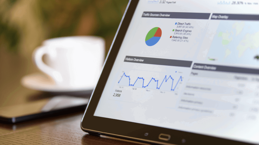
A data dashboard is an analytics tool that visually displays, measures, and analyzes multiple data sources all at once. Common dashboards are typically interactive, provide historical & real-time data, and present all key performance indicators (KPIs) in one centralized location. Data dashboards encourage their use by allowing users to connect and track various APIs, metrics, data sources, and leverage business intelligence to make data-driven decisions.
Benefits of Using Data Analytics Dashboards
Using big data could mean discovering trends and insights, as well as coming up with innovative ideas to improve business. This is why data dashboard software provides valuable data. You can even use data to your advantage and create new analyses and models: for example, utilize real-time big data analytics to offer instant personalized suggestions to each customer. Here are 3 specific areas where business dashboards could help you:
Identify and prevent potential risks
Integrate predictive analytics powered by artificial intelligence into your analytics dashboard. This, in conjunction with data visualizations, will collect and digest information in a way that will provide:
- Geater situational awareness;
- An understanding of how to distribute resources to deal with potential threats.
For example, eCommerce could benefit from big data analytics to identify potential supply shortages due to unexpected demand or changed buyer behavior.
If you're interested in eCommerce analytics, gain some actionable insights from this article.
360° overview of your customers
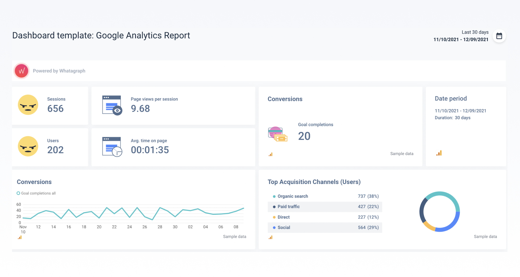
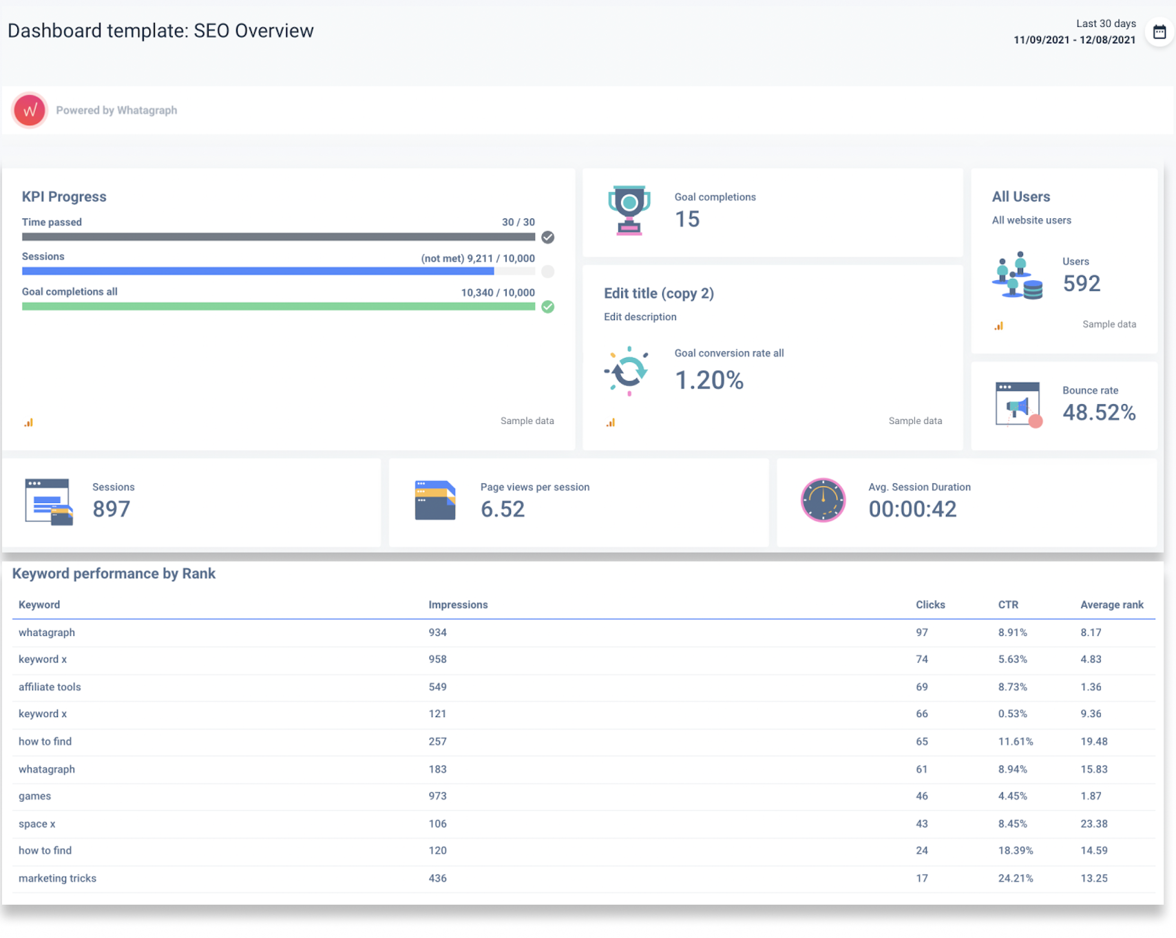
Marketing agencies usually have a task to create solid strategies to increase sales revenue or improve customer retention. Either way, they must understand the audience and users with whom they are dealing. Luckily, data visualization and data dashboards provide them with this opportunity. For example, web behavior data will provide insights into how users interact with your website. Specific KPIs to track:
- Unique website visitors;
- Pages viewed per session;
- Bounce rate;
- Average time on page.
Or consider transactional data. Any sales team would benefit from a dashboard that identifies:
- Purchase returns;
- Time spent on each purchase;
- Gross profit;
- Total sales;
- Cost per acquisition;
- Sales conversion rate.
Building Effective Dashboards
Think about goals
The dashboard's goal is to make informed decisions easier. However, in order to accomplish this, the dashboard must provide data sets as well as interactive charts that dive deep into areas related to the overall goals. In other words, make a goal for your dashboard that is related to the business's goal.
So, if your goal is to increase sales revenue, you should be tracking the above-mentioned transactional data. However, if your goal is to increase Facebook engagement, the dashboard should track KPIs such as likes, impressions, and comments.
Pick a tool that creates dashboards
It is hard to choose between so many dashboard tools. They all have a similar appearance and provide similar features. Either way, there are some key features to look for if you want to save time while keeping up with changing KPIs:
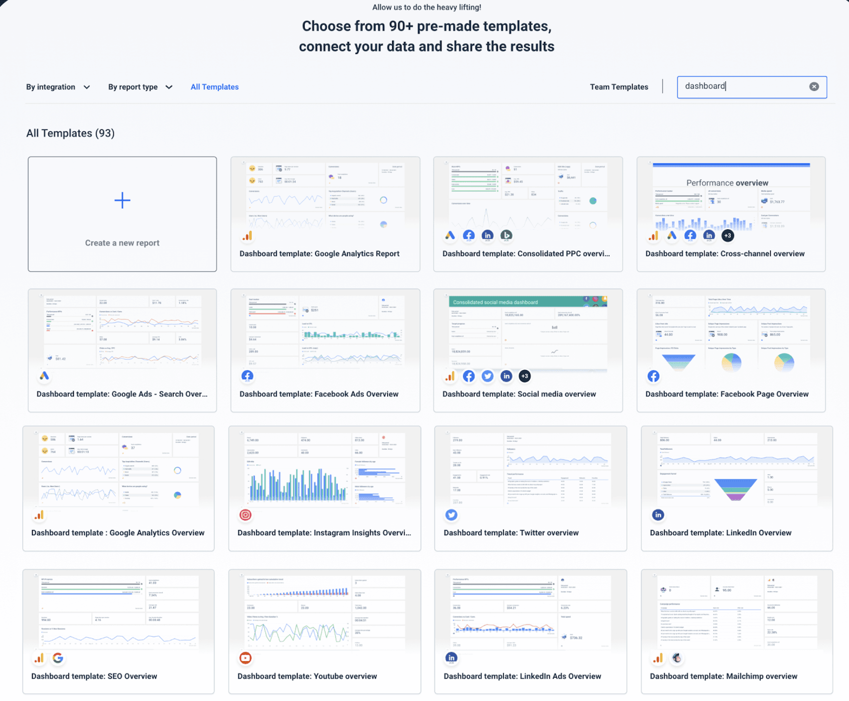
Pre-made templates
This one is a no-brainer. Pre-made templates make dashboard creation easier, reduce workload, increase efficiency, and save time.
Visual hierarchy in the dashboard
Changing the size and positioning of widgets to show hierarchy will help when there are too many KPIs to track. This feature is crucial if the need is to provide answers to critical business questions fast, display data clearly and engagingly.
Interactive dashboard
Think of an interactive dashboard, where data works for you and tells an interesting story. The proper tool will allow you to:
- Easily change labels of the widgets;
- Easily move widgets around;
- To break those rules - include tweets, Gifs, and images to your dashboard. Transform raw data into something unexpected.
- Use already made charts to better display your data and spot any patterns;
- Invite other team members to edit the same dashboard.
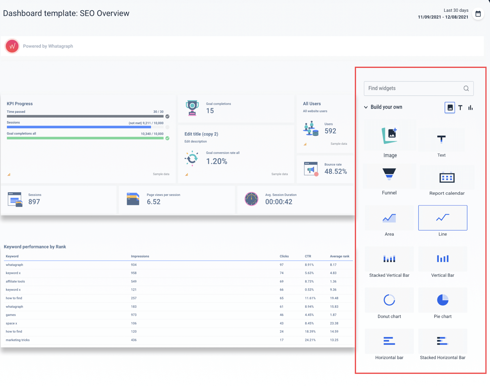
These factors will not only make data collection more interesting, but they will also make any hidden insights more visible. So, when you buy a subscription to a dashboard-creation tool, make sure it includes more than just the basics. You want to be able to stand out from the crowd and enjoy looking at data.
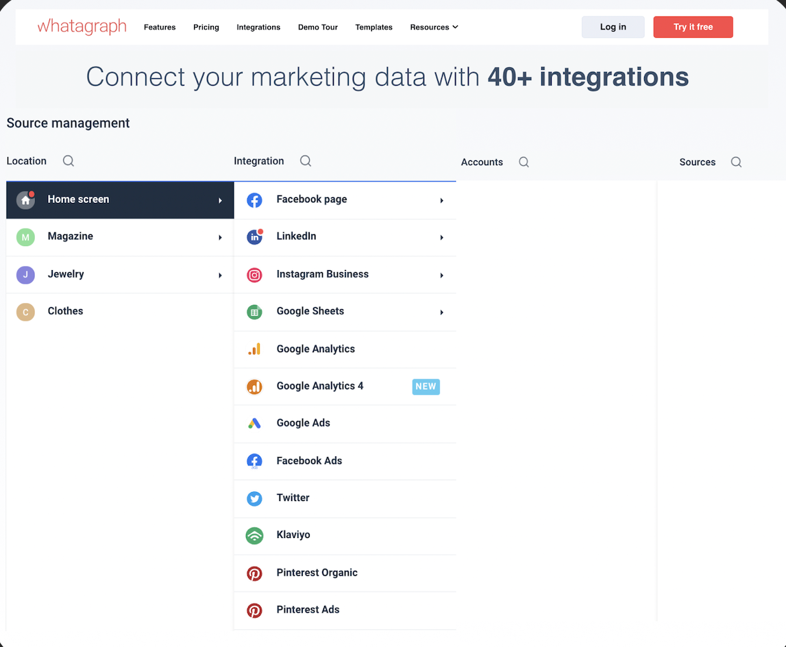
Connecting various data sources
This is one of the most important features. A simple dashboard should allow you to monitor campaigns across different channels in order to make informed decisions and lead the business to success.
Use a dashboard that allows you to pull data from any data source and dig deeper into the performance of your campaigns.
3 Data Analytics Dashboard Examples
Here you will find 3 great examples of different types of dashboards, and how each dashboard can solve at least one problem of yours.
Online dashboard
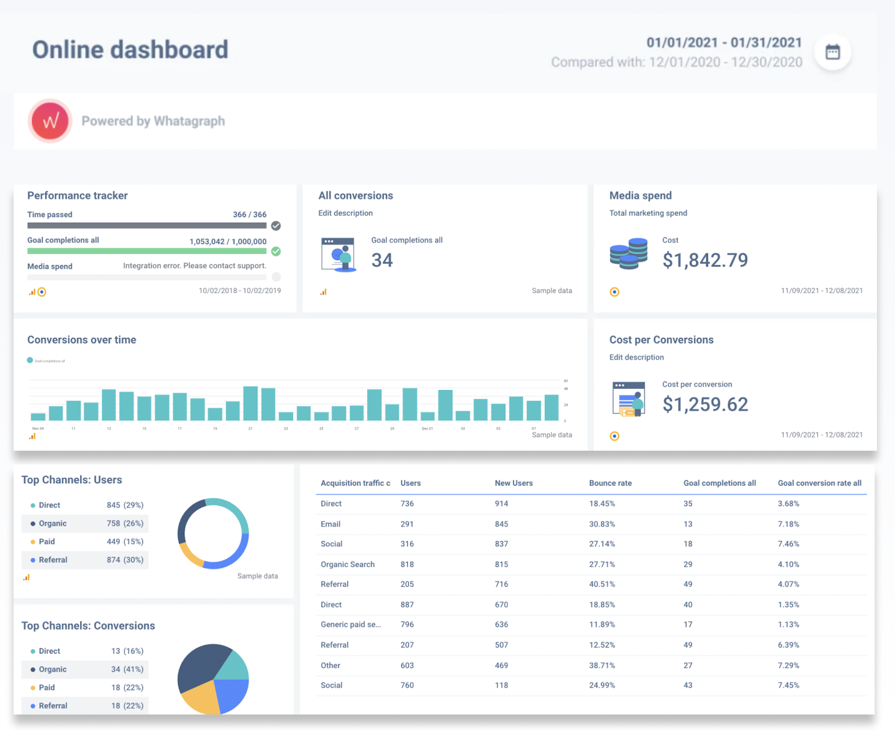
An online business dashboard is a web service that allows users to access business data such as metrics and key performance indicators (KPIs) via a web browser. These dashboards provide real-time data at any time of day, thanks to modern SaaS solutions. An online dashboard easily replaces traditional static reports and provides up-to-date data automatically.
Use this type of dashboard whenever you have an Internet connection and take advantage of the following features of this dashboard:
- Identifying emerging trends and troubleshooting any issues in real-time;
- Analyze all of your KPIs to find actionable insights;
- Save time by implementing business intelligence and eliminating the need to manually update data.
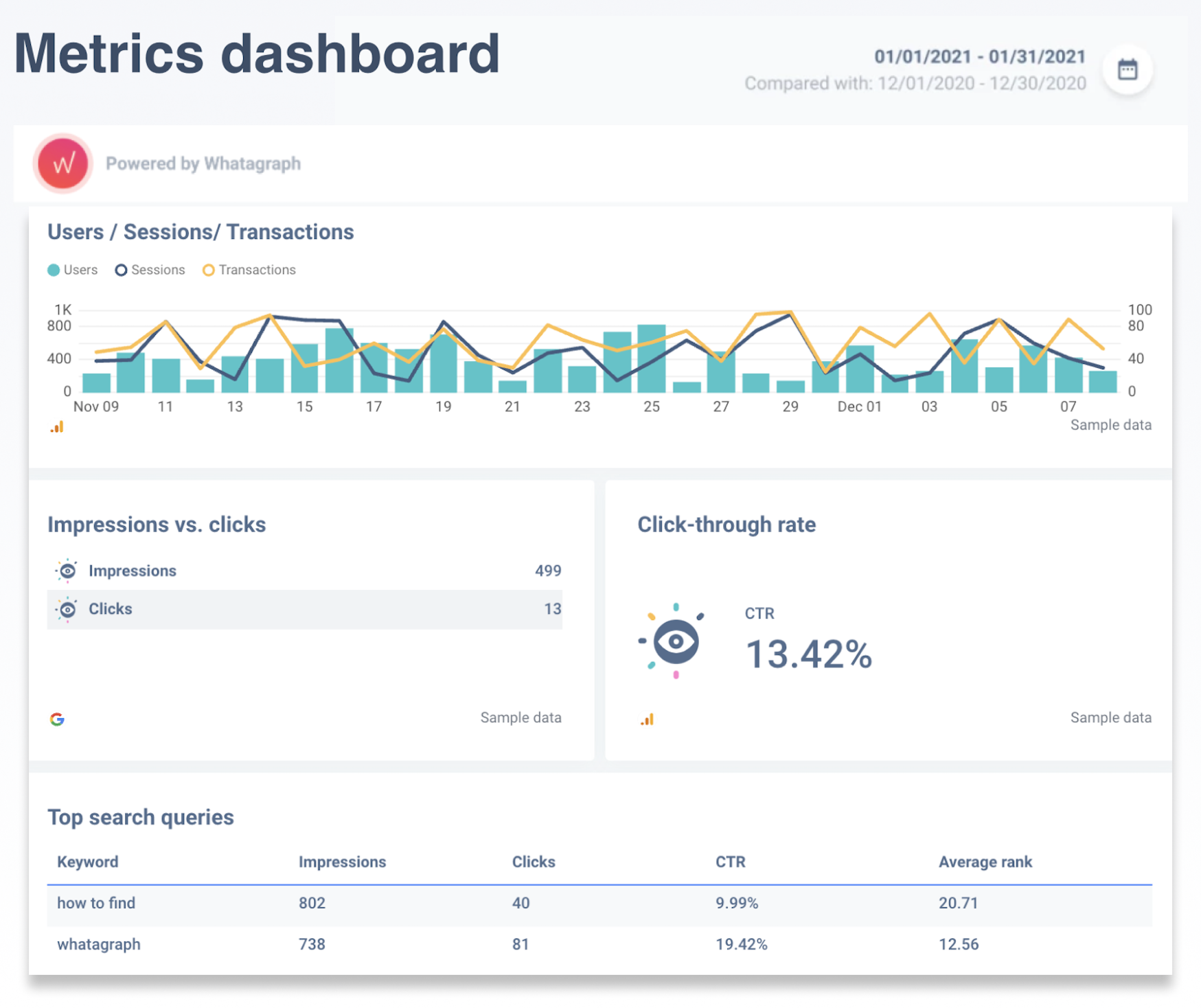
Metrics dashboard
A metrics dashboard is a tool that would be used when analyzing marketing and business initiatives. This dashboard specifically tracks and displays KPIs that are directly connected with the top digital marketing tools.
Use this type of dashboard whenever you need to work on the business marketing strategies or produce the current state of them.
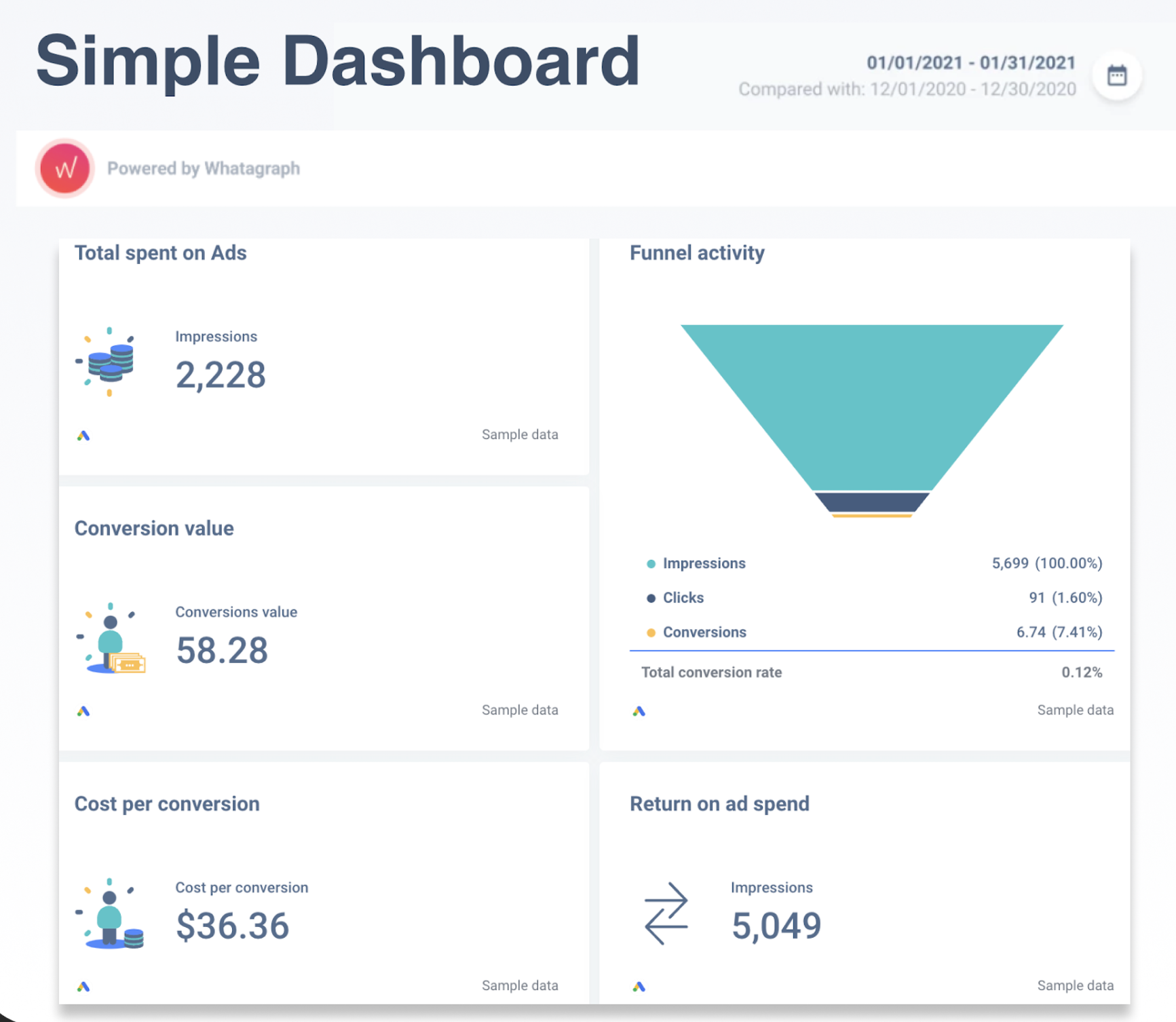
Simple dashboard
A simple dashboard could have as many or as few KPIs as needed. This dashboard is all about minimalism and simplicity. Your aim with a simple dashboard should be giving yourself proper tools and knowledge to make data-driven business decisions the second you look at it.
Good News
Try building any of these dashboards with Whatagraph and get all of the benefits mentioned above for free for 7 days. Please contact us if you require assistance. WE can offer expert advice to assist you in selecting the right metrics for your goals and providing insights into your efforts! Tell us what you want to track, and our analytics team will create your ideal dashboard.
Published on Dec 10 2021
WRITTEN BY
Dominyka VaičiūnaitėDominyka is a copywriter at Whatagraph with a background in product marketing and customer success. Her degree in Mass Communications/Media Studies helps her to use simple words to explain complex ideas. In addition to adding value to our landing pages, you can find her name behind numerous product releases, in-app notifications, and guides in our help center.