Marketing Data Quality Issues and Solutions: A 2026 Guide
Learn what marketing data quality actually means, what bad data costs, and how to fix your numbers at the layer you control.

Aug 27 2026●10 min read


- What does marketing data quality mean?
- What can, and does, poor marketing data quality cost you?
- Why does marketing data break? What are the common data quality issues?
- How do you measure where you stand in terms of marketing data quality?
- How to fix your marketing data quality: A step-by-step guide
- How to roll out a governed data layer across your accounts
- What happens when your numbers have one place to live?
“If your ad platform and your CRM aren't sharing data in real time, you'll end up spending money retargeting people who already bought.” That’s Reilly Renwick, CMO at State of the Wall, describing one expensive version of a marketing data quality problem in CMSWire.
When your tech stack operates in silos, you're operating with what I call data vision loss. As CallRail CMRO Laura Beussman says, fragmented data forces you to make key growth bets with massive “blind spots.”
And by the time those glitches reach the buyer, the damage is already done. Hily cofounder Dmytro Kononov notes they manifest as “irrelevant offers, mistimed messages, duplicate outreach, and inconsistent experiences.”
On paper, these look like three separate operational fires. Often, they’re three symptoms of the same one.
That’s why in business intelligence, we have something called a semantic layer. According to MIT Sloan, this layer sits between your data and whoever, or whatever, is using it, carrying the definitions, relationships, and rules that tell everyone what those numbers mean.
TL;DR:
- Your report can still be wrong even if every platform is right: The quality of marketing data refers to whether the numbers are accurate, full, consistent, timely, valid, unique, and relevant to the decisions you're making.
- There's a bill for bad data: Almost a third of marketers have lost money to dirty data, and AI makes the problem worse.
- In most cases, the numbers get into a fight between systems: A Google Ads account, a CRM, an ecommerce platform, and a Google Analytics account all count, name, attribute, and timestamp things differently. Plus, agencies inherit setups that they didn't construct.
- Find out where the weak spot is by following one number until it gets weird: Take a core metric from platform to analytics to backend, measure the gap, then find anything that's stale, missing, or duplicated.
- You need to stop renegotiating what a number means every time you build a report: Keep track of drifts by rolling naming rules, currencies, and joins into a governed reporting layer.
What does marketing data quality mean?
Ask five data people what counts as good data, and there’s a decent chance you’ll leave with more than five answers.
The disagreement goes back decades. In their influential 1996 paper Beyond Accuracy, Richard Wang and Diane Strong argued that data quality was much bigger than whether a value was technically correct. They identified 15 dimensions across four categories: intrinsic, contextual, representational, and accessibility.
DAMA UK later boiled the practical assessment down to six primary dimensions: accuracy, completeness, consistency, timeliness, validity, and uniqueness.
They're valuable baselines for marketing data quality because they catch different ways that otherwise plausible data can go wrong.
| Dimension | What does it mean? | What does it look like in marketing? | How would you spot it? |
|---|---|---|---|
| Accuracy | Does the data reflect what happened? | Your revenue recorded against the wrong marketing campaign. | Compare it with an authoritative source, such as your transaction records. |
| Completeness | Is everything you need there? | A connector pulls spend and clicks but omits conversion value. | Check expected fields and records against what arrived. |
| Consistency | Does the same thing mean the same thing everywhere? | A conversion is a purchase in one report and a lead in another. | Compare the same metric across reports or systems or bring them together in a unified dashboard. |
| Timeliness | Is the data current enough for the job? | A morning pacing report still doesn't have yesterday's spend. | Compare the reporting cutoff with the latest available data. |
| Validity | Does the data follow the rules it’s supposed to? | A purchase conversion fires on the thank-you page and a product page. | Test the values and events against their defined rules. |
| Uniqueness | Has the same event been counted once? | The same purchase appears on both a platform pixel and GA4. | Look for duplicate IDs or overlapping event records. |
So, are there four pillars, five principles, six dimensions, or something else? Well, there’s no universally agreed count. Wang and Strong had four high-level categories; DAMA UK recommends six primary dimensions; newer DAMA-DMBOK revision work discusses nine.
The question marketers should ask is whether they can show, with evidence, how their data performs.
And mind you, good data doesn’t mean 100% perfect. IBM defines data quality partly by its fitness for purpose, that is, whether the data meets the standard required for the job you’re asking it to do. That means a dataset can be perfectly adequate for a weekly performance report and nowhere near good enough for a budget decision.
What can, and does, poor marketing data quality cost you?
Buckle up, the receipts aren’t pretty.
One in seven marketers told Adobe they’d lost money to poor-quality data in 2025. At agency scale, with a roster instead of one budget, the odds you're one of the seven go up with every account you add.
Across all respondents who reported a loss, the average was $91,000. Among enterprise marketers, it climbed to $232,500 in wasted spend, missed revenue, or rework.
For an agency juggling 20 or 30 accounts, though, bad data looks like budget moved toward the campaign that appeared to have the better ROAS. Or, worse, a client finding the discrepancy first.
That last one is hard to price, because once a client starts checking the dashboard against the native platform every week, you've acquired a second, adversarial reporting system: the client's calculator.
Then there's the cost of making decisions at all. If Meta, Google Ads, GA4, and the backend can't agree on what happened, every budget discussion turns into a squabble over whose number is admissible. Then, teams stop trusting the dashboard and start making calls around it.
And now we've given AI a seat at the table. Gartner's 2026 CMO Spend Survey found that CMOs are already putting 15.3% of marketing budgets into AI, while just 30% report mature AI readiness. Adobe found an even more basic problem, which is that only 44% of organizations say their data quality and accessibility are “adequate” for AI.
An LLM doesn't arbitrate three competing definitions of CAC, so if you connect it straight to unreconciled APIs, it can sum currencies that shouldn't be summed or join fields that don't mean the same thing. McKinsey found 74% of executives now name data inaccuracy as “a highly relevant” AI risk.
All of this tracks, because Demand Science found 32% of revenue growth remains blocked by disconnected systems and unreliable data.
The upgrade, if you can call it that, is that bad data no longer has to sit mutely in a dashboard. Now it can explain itself.
So where, exactly, does the data start going sideways?
Why does marketing data break? What are the common data quality issues?
The Dutch performance agency, YourFellow, was reporting across about 40 clients, with some calculations living in Funnel, others in Looker Studio, and still more flowing through spreadsheets. So, when one number looked funny, finding the culprit meant checking all three.
“If we had issues, we really had to dig into it to see where it came from,” says Online Marketing Consultant Linda van Baal.
That particular headache has company. IAB’s 2026 State of Data says fragmented data environments are now one of the forces making it harder to connect media exposure to actual business outcomes.
1. Your marketing data sources live in silos with no single source of truth
Data silos may sound like a software problem; quite often though, they’re a people problem.
Marketing Week has made this point for years. These silos form because teams have different objectives, systems, budgets, and definitions of success. The data simply inherits those borders.
So Google Ads knows Google Ads. Meta knows Meta. GA4 sees the site. Your CRM knows what happened after the lead arrived. None of them is necessarily incomplete on its own terms, but none has the whole story either.
For example, one of the paid media leads we talked to described manually blending Meta and Google spend with Shopify data, then comparing Triple Whale attribution against Facebook’s native figures and her own blended calculation to “find that source of truth.”
We wrote more about cross-channel analytics here.
2. Your team has different definitions of the same thing
Google’s own documentation lists count settings, attribution settings, conversion delays, lookback windows, and reporting dates among the reasons Google Ads can disagree with another system. Google Ads logs a conversion on the day a user clicked an ad; GA4 logs it on the day the user converted. Now throw in differing attribution windows, timezone offsets, and currency conversions, and your numbers immediately diverge.
Snowflake describes the larger problem as business logic scattered across tools. So a metric gets defined one way in a dashboard, another in a BI model, another in an AI prompt.
3. Your marketing campaign names drift
"As long as I never have to type the words when and then ever again, I will be happy," says Kevin Facer, on the naming-convention lookup tables his team maintains by hand.
Wolfenden ran into the historical version of the same problem. According to our customer research, Jason’s team created a substitute campaign-name dimension so renamed campaigns would still map back to their historical counterparts.
In Whatagraph, Custom Dimensions can do that normalization at the reporting layer. For example, a Condition rule can map Brand_Exact and 01_Brand_Search to a single Brand value at the reporting layer.
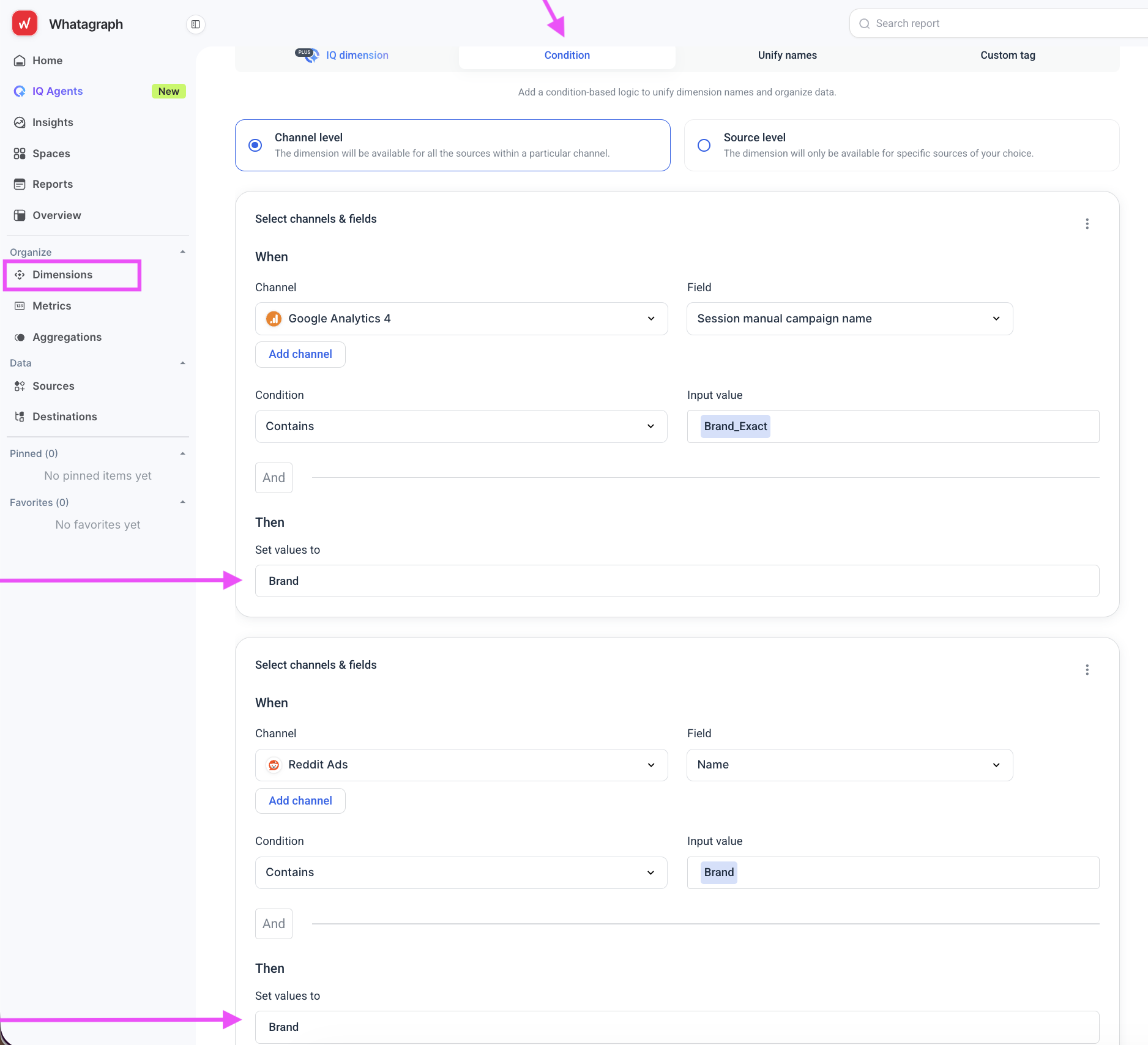
A Unify names rule can map differently named dimensions across Google Ads, Meta, and other channels to one shared field. The original source data stays untouched.
4. Your data simply isn’t there; at least not all of it
Even first-party platform reporting can be incomplete by design. GA4, for example, can sample event-level queries above 10 million events on standard properties, while privacy thresholds can withhold rows from reports, explorations, and API calls.
5. You don’t notice breakage in your datasets
There are times when the report loads, but a source no longer updates properly or a field's missing.
Jake and Matt Wade at Exact Marketing ran into exactly that with Spotify, programmatic, and Pinterest connectors. The anomalies weren’t always caught before they reached the reporting workflow, which left their sales team asking a much bigger question: “I don’t know if I can trust them.”
6. You're looking at the wrong level of detail
A performance lead checking daily conversions by ad set and an executive looking at monthly acquisition cost can both be reading the same dashboard and still come away with different answers.
That’s a granularity mismatch, where one person is looking at the data day by day, another at a monthly rollup. A timezone cutoff or pause in a campaign halfway through the month can make these summaries look further apart.
There's nothing wrong with the underlying data. The versions they're looking at are just different.
7. You don't own the data source
And here’s the agency special.
Most advice on the causes of poor data quality assumes you control the setup. The advice is to standardize the naming convention, fix tracking at ingest, and assign an owner. That’s all well and good, and it’s healthy data hygiene practice.
But as an agency, you likely inherit a pixel somebody else installed or a CRM administered by the client’s sales team. Now multiply that by 20 organizations, each with its own definition of a qualified lead. You can ask for cleaner inputs, but you cannot impose one data constitution on 20 companies that don’t work for you.
That leaves us with one place where the agency still controls what those numbers mean when they come together. That’s the reporting layer.
How do you measure where you stand in terms of marketing data quality?
You don't fix what you haven't measured, so before we put you to work in the next section, run this audit:
- List every source feeding every report: Google Ads, Meta, GA4, CRM, ecommerce platform, spreadsheets, whatever is actually in the chain. Note who owns the tracking setup, too.
- Write down the definition of each core metric: What counts toward CAC? Which conversion action feeds ROAS? Where does that definition live?
- Reconcile one metric across three places: Compare the platform, analytics tool, and backend over the same month. Record the exact size of the gap, but don’t try to close it yet.
- Check freshness: Check the timestamp of every source pipeline to confirm when each platform last successfully synced.
- Check completeness: Look for sampled reports, API limits, missing fields, or integrations that technically connect to a source but don’t bring across everything you need.
- Flag every metric that can produce two reasonable answers: Here, highlight every metric where two account managers could reasonably produce two different numbers. This list becomes your remediation queue.
Then map each finding back to the six data quality metrics from earlier. For example, missing fields are a completeness problem, stale pulls hit timeliness, competing definitions hit consistency and validity, and duplicate conversions hit uniqueness.
Make this part of client onboarding, not six months later when everybody forgets why tracking was set up that way.
Benchmark your AI readiness
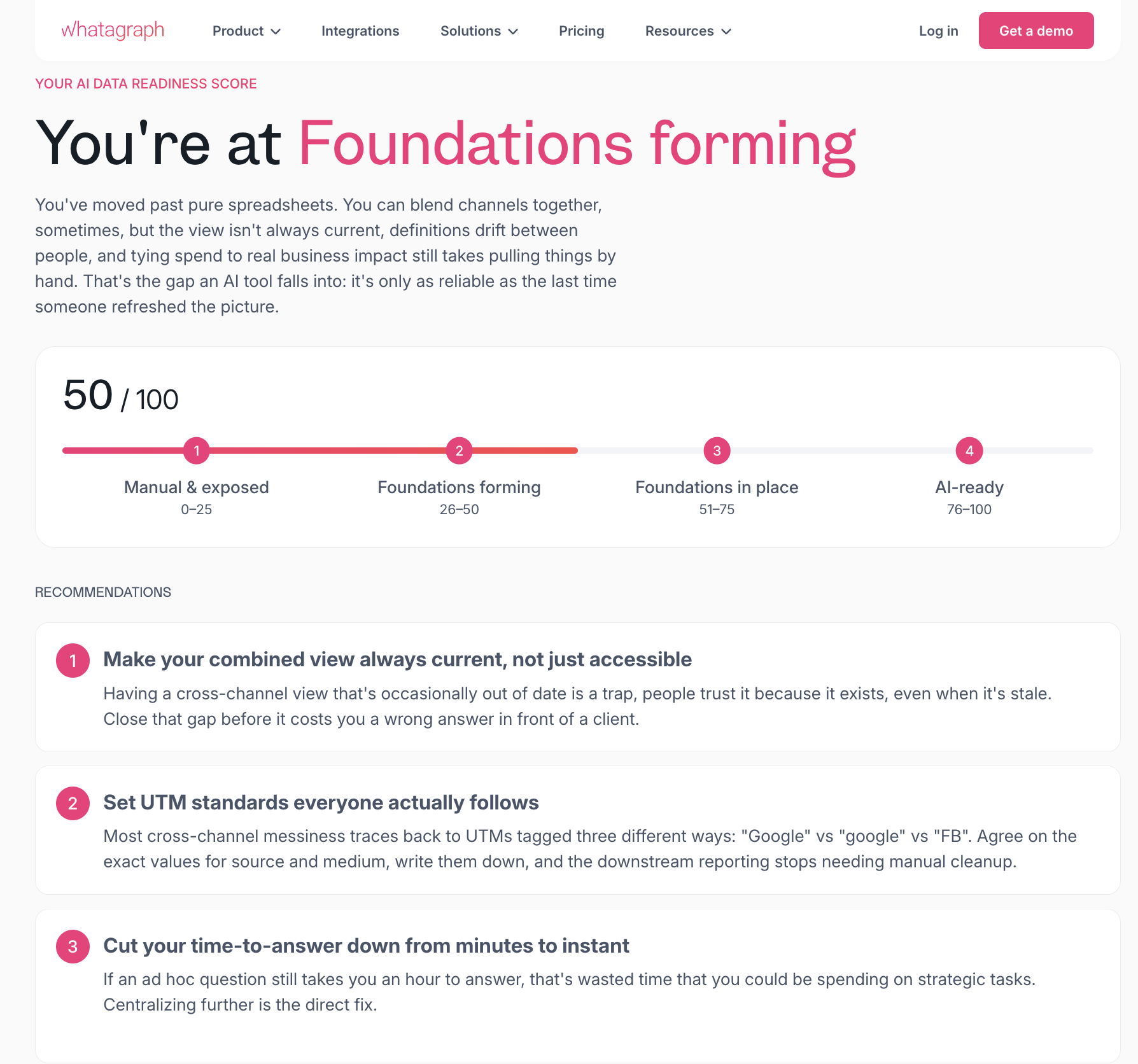
If you want a faster read before running the full audit yourself, Whatagraph's AI Readiness Quiz is built from the same source as the stories throughout this piece. Our methodology comes from direct conversations with heads of paid media, operations, and data leads at agencies and multi-location businesses between January and June 2026.
The quiz scores seven areas: consolidation, structure, definitions, reliability, scale, access, and AI trust.
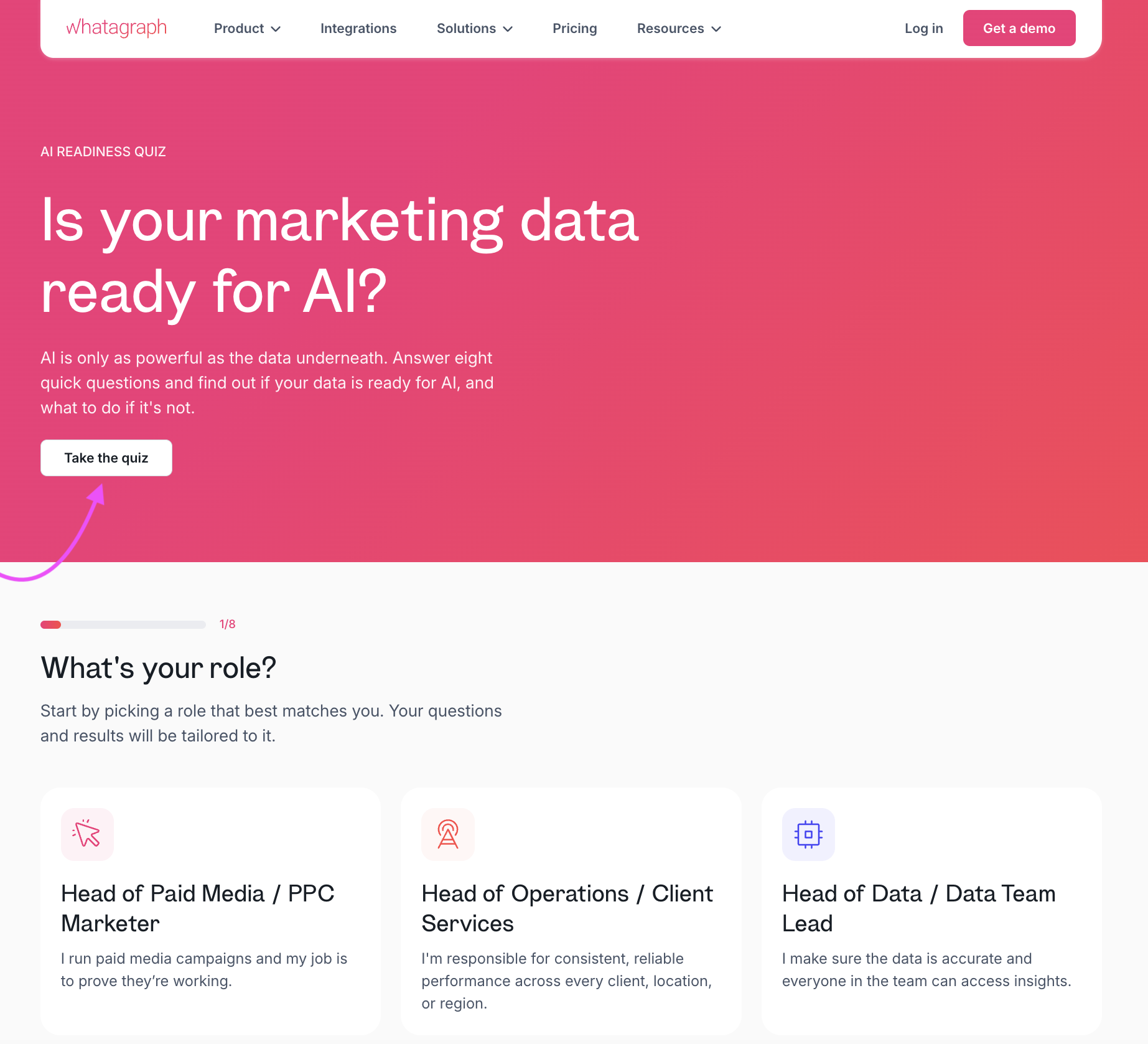 Your responses are calculated and mapped to one of four maturity tiers: Manual & Exposed (0 to 25), Foundations Forming (26 to 50), Foundations in Place (51 to 75), or AI-Ready (76 to 100). You get an immediate, objective snapshot of your data health before you start building your monitoring framework.
How to fix your marketing data quality: A step-by-step guide
You already know why the source-level fixes don't work for you. You don't own the source. So every step below happens somewhere you do have control, at the reporting layer.
Step 1: Consolidate your siloed channel data into one source of truth
First, get every channel landing in the same place.
- Connect your channels: Whatagraph currently has 67 native integrations, spanning paid media, analytics, CRM, ecommerce, email, and more. We build and maintain them ourselves with our in-house engineering team, which eliminates shallow five-field API caps and connector breaks.
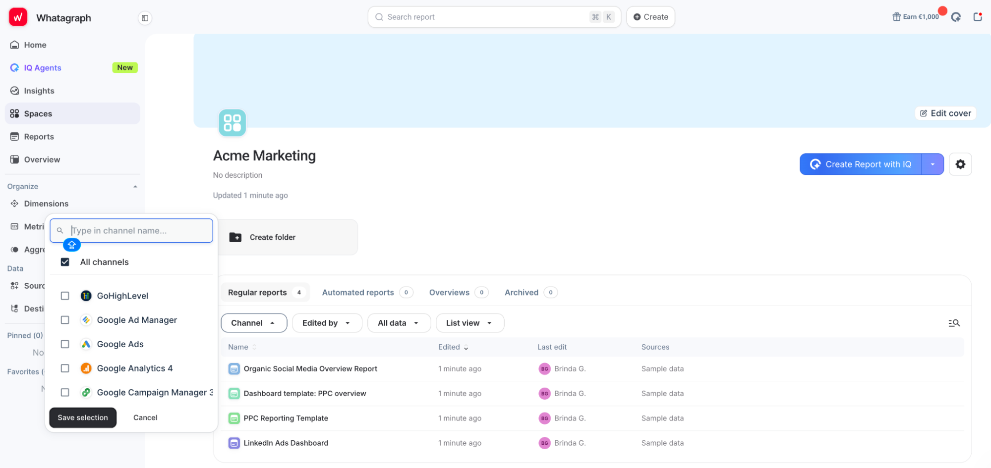
- Tag your sources: Once you’ve connected your data sources, label them by whatever your agency needs to slice by, whether that’s client, region, account manager, or campaign type. Custom Tags can be applied to multiple sources and then used as dimensions or filters.
- Put each client into a Space.Spaces separate sources and reports, so a source assigned to one client’s Space won’t appear as an option inside another client’s reports.
This step gets everything into one place. The next five steps make the numbers in that place
Step 2: Align your currencies
Before you combine spend across markets, check what currency each source is reporting in.
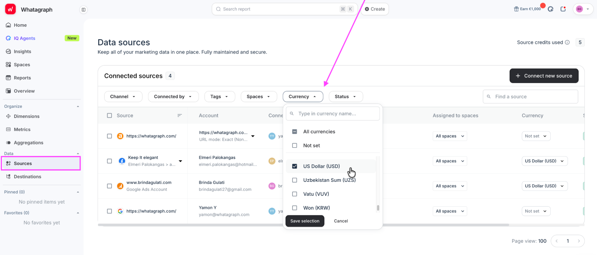
In Whatagraph, go to Data > Sources and use the Currency filter to spot sources set to USD, EUR, another currency, or simply Not set. Set the correct original currency for each source there first. Whatagraph can then convert those values into the currency used in your report.
Step 3: Standardize campaign naming
This is the direct fix for campaign naming drift. Instead of maintaining brittle VLOOKUPs or writing manual regex in spreadsheets, you set up clean conditional logic once at the semantic layer, putting Kevin Facer’s "when and then" rules to work automatically across your entire dataset.
- Click on Dimensions in your data management space and select Create Dimension.
- Set your source field and build conditional rules using simple pattern matching; e.g., if Campaign Name contains "Brand," output "Brand."
- Save and apply the rule globally so all historic and incoming campaign variants map to your clean dimension across every connected report.
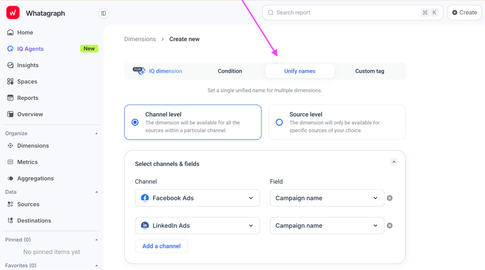
Then use Unify names when different channels use separate fields for the same thing. For example, you can map Facebook Ads Campaign name and LinkedIn Ads Campaign name into one shared dimension, so cross-channel reports don’t treat equivalent fields as separate entities.
Step 4: Define your Custom Metrics
In Metrics, choose Formula, select the metrics you want to use, and write the calculation once. For ROAS, for example, select Revenue as A and Cost as B, then enter A/B.
Whatagraph lets you combine metrics from different channels under one name or build the calculation itself, then set its display name, description, value type, and aggregation method.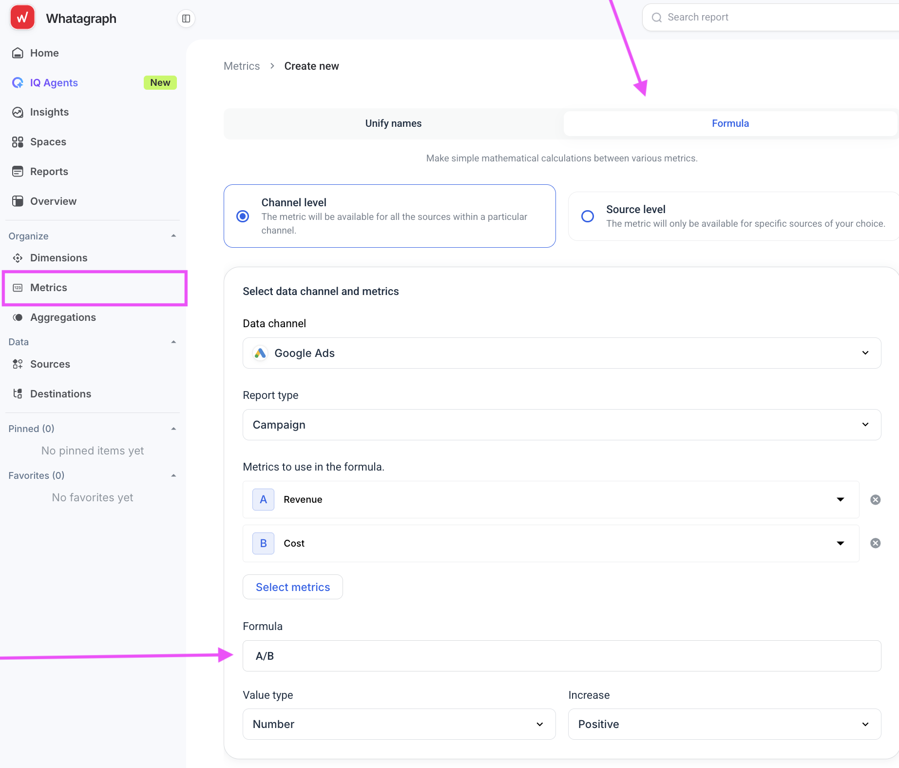
Do the same for CPA, CAC, or any client-specific KPI where metrics like conversion need a precise definition. That logic can then live in the reporting layer so every report can read it the same way.
Step 5: Create Source Groups for accounts you want to report together
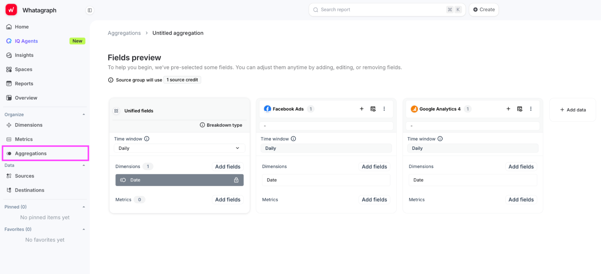
Use Whatagraph’s Source Groups when several accounts or channels need to behave like one reporting source.
In Aggregations, click on Create new and select Blank source group. Add the sources you want to combine. Whatagraph shows the fields available in each source, then lets you unify the dimensions and metrics they have in common. In the example below, Facebook Ads and GA4 are grouped on a daily time window with Date as the shared dimension.
Step 6: Blend data across unlike channels
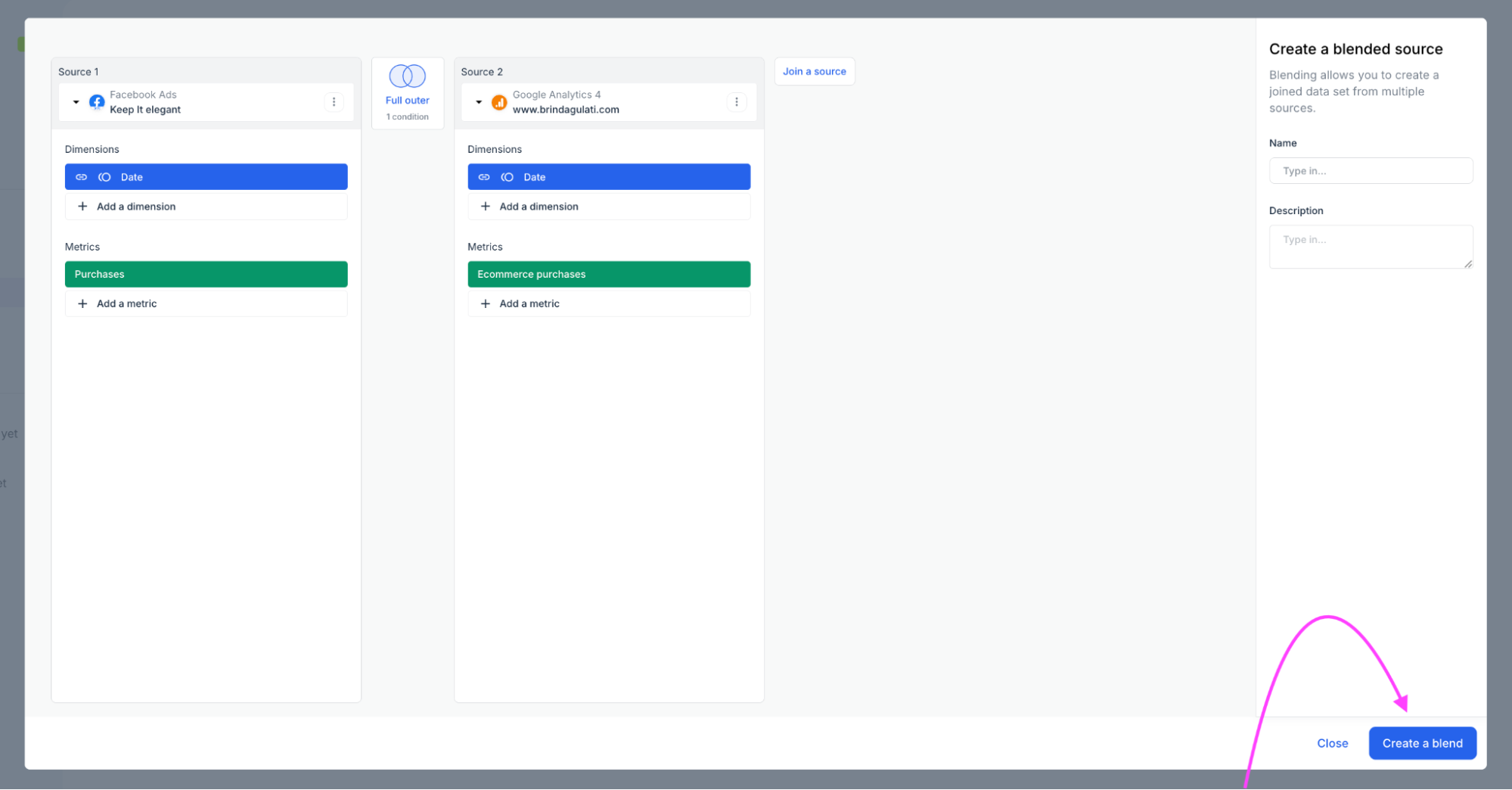
When two sources don’t share the same reporting structure, use a Blend to line them up on something they do have in common. From Aggregations, go to Create new and click on Blended source.
Here, Facebook Ads Purchases and GA4 Ecommerce purchases are joined by Date using a full outer join. That keeps records from both sources even when one side has no matching row.
Now, as you may have guessed, none of this is free. A tool can store your definition of a conversion, but it can’t decide which conversion should count for a particular client. The same goes for campaign mappings and blend logic.
That’s why Steps 3, 4, and 6 all start with a human deciding what the business means. The payoff, however, is that you make that decision once, and the semantic layer lives everywhere your reports read from.
You don't have to work full time to keep that foundation right once it's governed.
Enter: Whatagraph’s IQ Agents
Whatagraph’s IQ Agents are an intelligent automation layer built directly on top of your semantic framework. For marketing data quality in particular, they can watch for the things that are easy to miss at scale, like a broken connection or a campaign suddenly dropping to zero spend.
They handle two critical operational jobs:
- They build: When onboarding a new client, IQ Agents automatically connect sources, assemble source groups, and apply your pre-approved metric definitions from template spaces.
- They watch: IQ Agents continuously monitor every connection, metric, and schema across every client account.
We have human-in-the-loop built in as a default for the AI agents for marketing, so any change to a client-facing dashboard or campaign structure requires team approval before it goes live.
Request early access to IQ Agents.
How to roll out a governed data layer across your accounts
Please don’t pick a Monday morning and migrate a dozen clients at once.
PwC’s guidance on data transformation makes a better case for starting contained: test the model on a limited area, document what works, then scale through repetition of a validated pattern.
For an agency, that translates into four phases.
Phase 1: Put one complex client through the whole process
Pick the client with the most moving parts. Maybe they have several paid channels, multiple conversion actions, inconsistent campaign naming, or more than one currency.
That’s deliberate. PwC warns that test migrations built without the most complex data can look fine until the real structure arrives and reports stop reconciling. Run the full setup on that account first. You’ll be forced to settle the awkward decisions while you’re still dealing with one client.
Phase 2: Turn what survived into the pattern
The definitions, naming rules, source structure, and quality thresholds you settled become your starting point for the next account. The real output at the stage is a repeatable operating pattern.
Phase 3: Build it into onboarding
Enforce the new framework for all incoming accounts during client onboarding: the specific window where you have full authority to interrogate legacy tracking setups.
For existing clients, backfill by priority. Start with the accounts where bad data carries the most commercial or client-trust risk.
Phase 4: Establish operational governance
PwC recommends named data owners, clear decision rights, authoritative sources, measurable quality criteria, and regular readiness checkpoints. Set an owner for each account, rerun the audit periodically, and add data quality monitoring for freshness, missing data, and unusual changes.
In fact, more than two-thirds of organizations surveyed by BARC had formalized observability across data, pipelines, and models.
There’s a clear lane for automation here. In addition to freshness checks, threshold alerts, and deduplication rules, it can convert currencies and detect when a source suddenly stops behaving normally. According to the 2025 State of Enterprise Data Governance, 33% of respondents prioritized embedding governance into workflows, and another 21% prioritized automating enforcement.
But data quality automation still can't decide whether a client considers a demo request to be a conversion or if a completely plausible number is bogus.
That part still, and always has been, human-led.
What happens when your numbers have one place to live?
We talked about YourFellow earlier, when one wonky number meant opening Funnel, Looker Studio, and a spreadsheet before anyone could even decide which system was supposed to be right. That was, technically, the reporting workflow.
Today, the agency has over 190 data sources consolidated in one platform, and report load times have dropped from 15 minutes to 2. More importantly, when a client questions a figure, there’s one place to go looking: Whatagraph.
“...the biggest advantage is that all our data is now in one tool—everyone knows where to find everything because it’s in one place,” says Linda van Baal.
What do your numbers look like when the definitions are in one place? Start a 14-day free trial with Whatagraph and find out.
Published on Aug 28 2026
WRITTEN BY
Brinda GulatiBrinda Gulati is a fractional content marketer and freelance writer who specializes in data-driven storytelling and writing easy-to-understand, informative content for humans. She has two degrees in Creative Writing from the University of Warwick, and believes that above all, stories are a deeply human endeavor. She has two dogs, knows thrifting spots, and loves afternoon naps.