11 Looker Studio Dashboard Examples and Free Templates
If you’ve ever opened Looker Studio and stared at a blank canvas… you know the feeling.
You know what you want to track. You know the metrics that matter.
But actually building the dashboard? That’s where things slow down, fast.

Mar 28 2026●8 min read


- How We Chose These 11 Looker Studio Dashboard Examples
- 1. Cross-Channel PPC Dashboard Example
- 2. Google Ads Dashboard Example for Ecommerce
- 3. Google Ads Dashboard Example for Lead Generation
- 4. Meta Ads Dashboard Example for Ecommerce
- 5. Meta Ads Dashboard Example for Lead Generation
- 6. LinkedIn Ads Dashboard Example
- 7. Amazon Ads Dashboard Example
- 8. TikTok Ads Dashboard Example
- 9. Social Media Dashboard Example
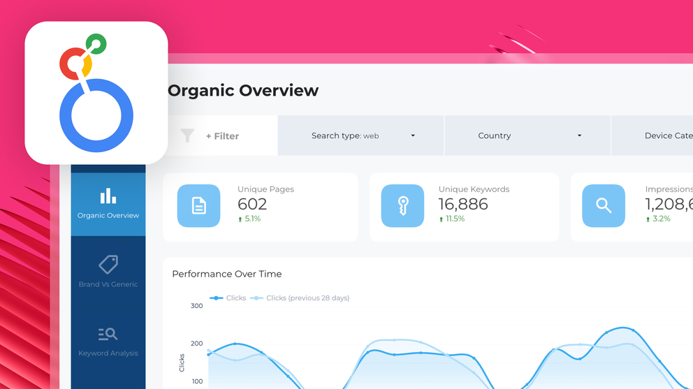
- 10. SEO Dashboard Example
- 11. Email Marketing Dashboard Example
- You've Got the Blueprint, and Whatagraph's Got the Rest
In the past four months alone, r/GoogleDataStudio has seen more than 11 posts with template-specific requests, like this one: “Does anyone have any templates they’d be willing to share?”
That’s exactly why we put together these Looker Studio dashboard examples.
You can use these examples as inspiration, copy the structure, and recreate them in Looker Studio.
But here’s the thing: most marketers don’t actually want to spend hours building dashboards from scratch. And you don’t have to.
With Whatagraph, you can skip the entire setup process.
Just pick a report template, connect your data sources, and your report is instantly populated with the right charts, metrics, and layout. What used to take hours in Looker Studio can be done in minutes. (This is why teams like Maatwerk Online have saved 100 hours a month on reporting after switching to Whatagraph from Looker Studio.)
We’ll also break down real dashboard examples used by performance marketers like Lars Maat and Elizabeth Greene, so you can see exactly how top agencies structure their reports, which metrics they focus on, and how they present results to clients.
If you’re stuck on where to start, this will give you a clear path forward, whether you build it yourself in Looker Studio or skip having to build dashboards from scratch entirely.
How We Chose These 11 Looker Studio Dashboard Examples
When we were looking for the “best” Looker Studio report templates, we kept seeing templates that are old-fashioned, clunky, and with broken widgets.
So we scrapped those and went straight to the source: real dashboards built by real marketers inside Whatagraph. The ones Lars Maat, Elizabeth Greene, and others like them actually use to report to clients.
Then we asked: could you recreate these on Looker Studio? And the answer is yes—technically. (We’ll get into the caveats in a minute.)
Here's what we looked for:
✅ Modern, clean layouts: Sleek, vibrant, professional.
✅ Functional, working widgets: Charts and tables that update and display data correctly.
✅ Goal-focused structure: Clear alignment between business goals and the KPIs on screen.
✅ Easy to customize: Adaptable to different clients without rebuilding everything from scratch every time.
✅ Actionable insights: Performance summaries that tell a story.
By the way, you don't have to recreate any of this on Looker Studio. Every dashboard below has a Whatagraph template equivalent. And if you want to skip templates entirely? Whatagraph's AI will build a fully fleshed report from a single prompt.
See how it works in this video:
Prefer to stay in Looker still? No problem. The 11 examples below are divided into four use cases: paid advertising, SEO, ecommerce, and CRM and email marketing.
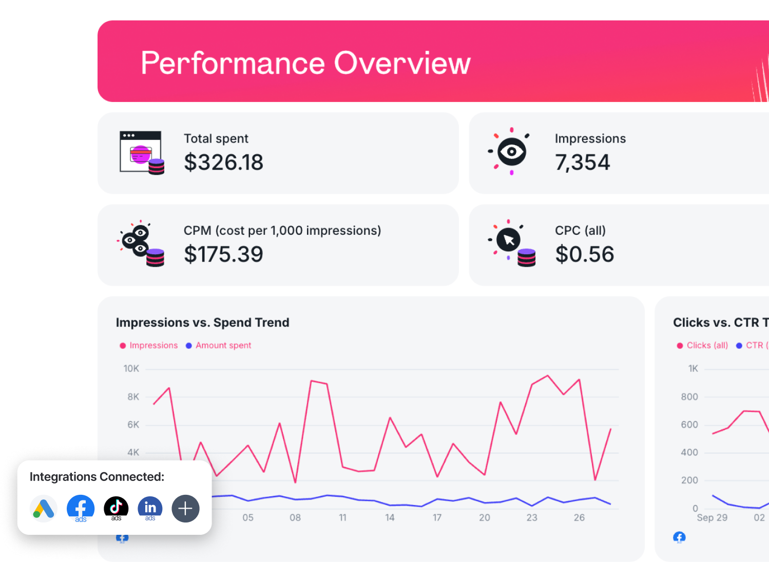
1. Cross-Channel PPC Dashboard Example
Who it's for: PPC managers and agency teams running paid campaigns across multiple platforms simultaneously.
Channels connected: Google Ads, Meta Ads, LinkedIn Ads, TikTok Ads.
Use this example for free with your data
This is the dashboard you build when your client stops caring which platform their conversions came from and starts asking what they got for their total spend.
The PPC report template is broken into tabs—one top-level overview, then a dedicated page for each channel—all inside a single report.
At a glance, you can see conversions, cost, clicks, and impressions tracked against targets, with a visual progress bar for each, so there's no ambiguity about where you stand mid-month.
In fact, this is what Tanja Keglić, Performance Marketing Manager at Achtzehn Grad agency, loves about us. She says:
The biggest reason we chose Whatagraph was because of its holistic approach to reporting. We can blend data from different channels and see in one view what's the performance and what needs to be changed.
The template comes pre-built with tabs for Google Ads, Meta Ads, LinkedIn Ads, and TikTok Ads, but that's just a starting point. Whatagraph connects with 26 paid advertising channels in total, so if your client is also running Amazon Ads, Microsoft Advertising, Pinterest Ads, or Reddit Ads, you can pull those in too!
Metrics to visualize:
- Google Ads:
- Spend
- Impressions
- Clicks
- CTR
- Conversions
- Conversion rate
- CPC
- ROAS
- Meta Ads:
- Spend
- Reach
- Impressions
- Link clicks
- CPM
- CPC
- Conversions
- Cost per conversion.
- LinkedIn Ads:
- Spend
- Impressions
- Clicks
- CTR
- Conversions
- Cost per conversion.
- TikTok Ads:
- Spend
- Impressions
- Clicks
- CTR
- Conversions
- Cost per conversion.
Best practices to structure a cross-channel PPC dashboard
A good cross-channel PPC dashboard tells a client whether they're winning or losing against the goals you set together.
Start by agreeing on targets for spend, conversions, clicks, and impressions at the start of every reporting period.
Not sure what good looks like for your client's channel mix? Whatagraph's free PPC calculator lets you benchmark ROI against industry norms.
Then structure the dashboard around those targets:
- Lead with goals: The goal-tracking panel at the top tells clients immediately whether they're winning. Put this front and centre.
- Keep the overview channel-agnostic: Cross-channel dashboards lose their value the moment you start breaking everything out by platform on page one. Save the granular channel breakdown for dedicated tabs.
- Use a funnel visual for conversion storytelling: A funnel from impressions to conversion rate is the fastest way to show a client where their audience is dropping off, and where the opportunity is hiding.
Want to rebuild this in Looker Studio? You can. But here's what that looks like:
- No goal widget: Looker Studio doesn't have one. To track targets, you'll need to set up a Bullet Chart, manually configure your target ranges, and rebuild it from scratch every time a client changes their goals. Whatagraph has a native goal widget—drag it in, set your target, done.
- A hard cap on blending. Looker Studio lets you blend a maximum of five data sources. For a cross-channel PPC report pulling from Google Ads, Meta, LinkedIn, TikTok, and Shopify, you've already hit your limit before you've added anything else. r Or you can export everything to Google Sheets first, pre-blend it there, then pull it back into Looker Studio. Woof.
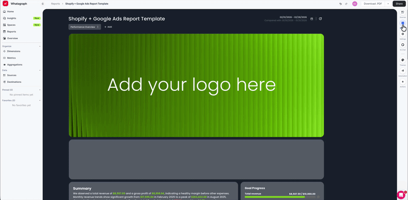
2. Google Ads Dashboard Example for Ecommerce
Who it's for: Ecommerce managers and PPC specialists running Google Ads campaigns who need to report on Shopping, Search, and Performance Max in one place.
Channels connected: Google Ads, Shopify
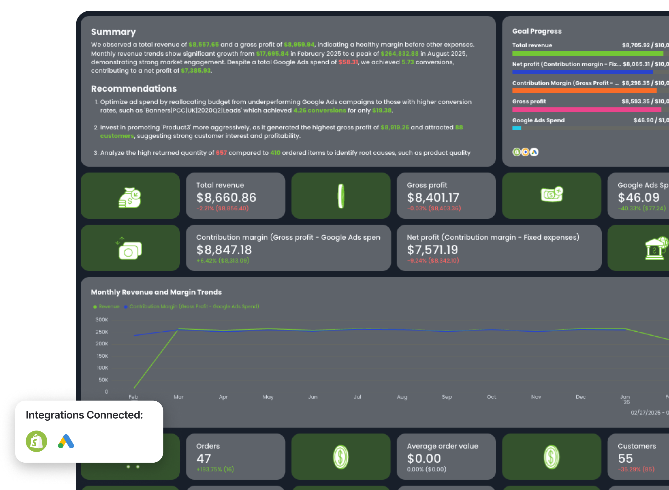
Use this example for free with your data
This dashboard was co-created with Rasmus Madsen, Google Ads Specialist and Founder at RM Marketing. It tracks total revenue, profit on ad spend, and contribution margin, alongside Google Ads metrics like ad spend, so you're showing exactly how much more profit your ads generated for your clients.
Rasmus says:
If you’re only looking at Google Ads metrics like ROAS, you’re missing the full picture. You need to look at POAS and contribution margin. Otherwise you don’t really know if you’re making money with ads or just spending it.
Metrics to visualize:
- Profit on ad spend (POAS)
- Return on ad spend (ROAS)
- Google Ads cost
- Total revenue
- Gross profit
- Contribution margin (Gross profit - Google Ads cost)
- Net profit (Contribution margin - Fixed expenses)
- Orders
- Average order value
- Customers
- Ordered quantity
- Returned quantity
- Refunds
- Clicks
- Average CPC
Best practices:
- Track profit, not just revenue - include COGS, gross profit, and contribution margin
- Prioritize contribution margin as the main performance metric (calculated as Revenue – COGS – Google Ads spend)
- Combine Google Ads data with backend ecommerce data (orders, customers, profit)
- Use lifetime value vs CAC to decide whether to scale ad spend
- Split brand vs non-brand campaigns to isolate incremental performance
- Start with a total business view, then drill down into channel performance
- Add a summary of performance and recommendations for the next month. Get Whatagraph IQ Summary to write the first draft for you - then go in and edit with your business context and brand tone.
Looker Studio can technically do this, but here's what technically costs you in time:
- Shopify isn't a native connector: Looker Studio has no built-in Shopify integration. You're going through a third-party tool, which adds cost and a potential point of failure.
- Contribution margin doesn't calculate itself: Blending Shopify gross profit with Google Ads spend into a single custom metric requires a calculated field in Looker Studio. Doable, but every time the data source updates or a connector breaks, you're back in the configuration screen.
- AI summaries, but only if you pay: Gemini in Looker Studio does exist, with conversational analytics and formula assistance, but it's locked behind a Looker Studio Pro subscription.
3. Google Ads Dashboard Example for Lead Generation
Who it's for: PPC managers running Google Ads lead generation campaigns who need to report on campaign performance and keyword efficiency in a single client-facing report.
Channels connected: Google Ads
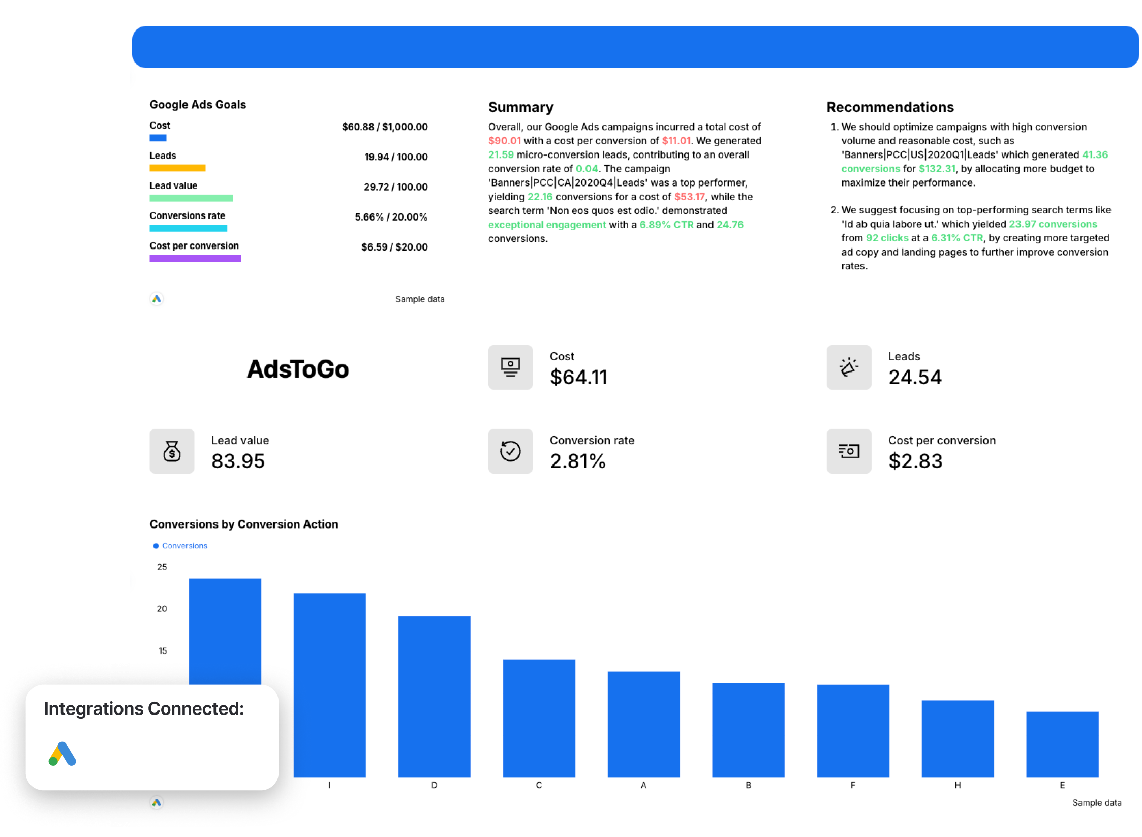
Use this example for free with your data
This dashboard was co-created with Martin Sandgaard, Google Ads Specialist and Co-Founder at AdsToGo to show not only the number of leads generated from Google Ads, but also specific conversion actions (e.g. “Created deals”) and how leads moved through the pipeline stages.
The top of the report opens with a Google Ads Performance Summary alongside a Goal Progress panel tracking Cost, Leads, Lead Value, and Conversions Rate against targets—so the client sees immediately how you're progressing towards goals.
Right next to it, the AI-generated Summary and Recommendations sections surface top-performing campaigns and search terms, flagging underperformers by name, and call out specific search terms and landing pages worth doubling down on.
But the most interesting parts of this dashboard are these two key areas:
- The bar graph breaking down different conversion actions for your reporting period (e.g. last month). You can also add comparisons with the previous period or last year, to see year-over-year trends.
- The funnel chart showing how leads moved through the pipeline stages, and the conversion rate for each stage.
For clients who want to dig deeper, the dashboard includes two granular tables:
- Campaign performance showing campaign names by cost, impressions, clicks, CTR, average CPC, and search impression share.
- Search term performance showing search terms by the same metrics.
But most importantly, Martin advises to pair dashboards with human input. He says:
Reporting with human input is 1000x more valuable than an auto-scheduled report. Context and action plans matter more than the numbers, and most clients don’t open or understand reports without that context.
Metrics to visualize:
- Cost
- Leads
- Lead value
- Conversion rate between pipeline stages
- Cost per lead
- Impressions
- Clicks
- CTR
- Average CPC
- Search impression share
Best practices to structure a Google Ads lead generation dashboard:
- Start with 4 primary KPIs at the top (Cost, Leads, CPL, Conversion Rate) using scorecards
- Structure the report in an A/B flow: numbers → visuals → numbers → visuals to improve readability
- Always filter out micro-conversions to keep lead and CPL data meaningful
- Include conversion action breakdown to show what’s actually driving pipeline (not just total conversions)
- Track conversion rates between pipeline stages (if offline tracking is enabled) to measure lead quality
- Add a campaign-level breakdown (cost, clicks, conversions, leads, Search Impression Share) to identify scaling opportunities
- Include a search terms / keywords view to surface wasted spend and new opportunities
4. Meta Ads Dashboard Example for Ecommerce
Who it's for: Ecommerce managers and PPC specialists running Meta Ads campaigns who need to connect ad performance directly to sales.
Channels connected: Meta Ads—Facebook and Instagram; add Shopify or another ecommerce store source, optionally in Whatagraph, to pull confirmed sales and AOV.
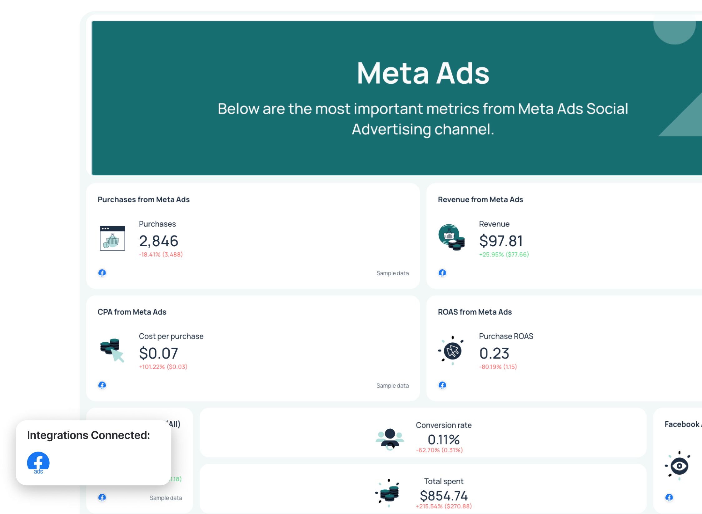
Use this example for free with your data
This dashboard was co-created with Lars Maat, Co-Founder of Maatwerk Online, and this one has a structural choice worth stealing.
The goal panel at the top tracks three numbers Lars cares about above all else: total revenue against target, ecommerce purchases against target, and Facebook Ads ROAS against target. Everything else in the report exists to explain how those three numbers got to where they are.
What makes this template distinct from a standard Meta Ads report is the full ecommerce funnel: impressions to clicks to adds to cart to purchases, with a total conversion rate at the bottom.
Metrics to visualize:
- Meta Ads (Facebook + Instagram):
- Purchases from Meta
- Revenue from Meta
- CPA (cost per purchase)
- Purchase ROAS
- Facebook Ads CPC (all)
- CTR (all)
- Conversion rate
- Total spent
- Adds to cart
- Purchases
- Shopify (optional):
- Confirmed total sales
- Average order value
- Returning vs. new customers
Best practices to structure Meta Ads for ecommerce dashboard:
Facebook Ads reporting has a reputation as a black box with overlapping attribution windows and audience segments that all seem to be claiming the same sale. The dashboard structure, therefore, should make information easier to interrogate.
- Lead with ROAS as a goal metric: Purchase ROAS tracked against a target tells a client immediately whether Meta is pulling its weight in the overall ecommerce mix.
- Track adds to cart as a separate funnel stage: If adds to cart are high, but purchases are low, the problem is on your site, not in your ads. That distinction changes the entire conversation about the next steps.
- Let clients explore the data themselves: Meta's numbers get confusing fast, and clients will always have questions you didn't anticipate. Whatagraph's client-facing filters let them slice the data by campaign, device, or audience segment on their own. Pair that with IQ Chat on shared report links, which lets clients ask plain-language questions directly inside the report.
You can do it in two simple clicks: go to Share and toggle on IQ Chat. That’s it!
On Looker Studio, you do get some filter controls for shared reports, but they're basic dropdowns.
Lars is a super-fan of Whatagraph’s IQ Chat: “Let’s say you’re in a client meeting and they ask a bunch of questions,” he said. “Instead of saying, ‘Let me get back to you,’ you can just ask the AI chatbot and get the numbers right away. That’s really amazing.”
Here’s him raving in his own words:
5. Meta Ads Dashboard Example for Lead Generation
Who it’s for: PPC managers and agency teams running Facebook Ads lead generation campaigns who need to report on off-site conversions, audience engagement, and cost efficiency.
Channels connected: Meta Ads
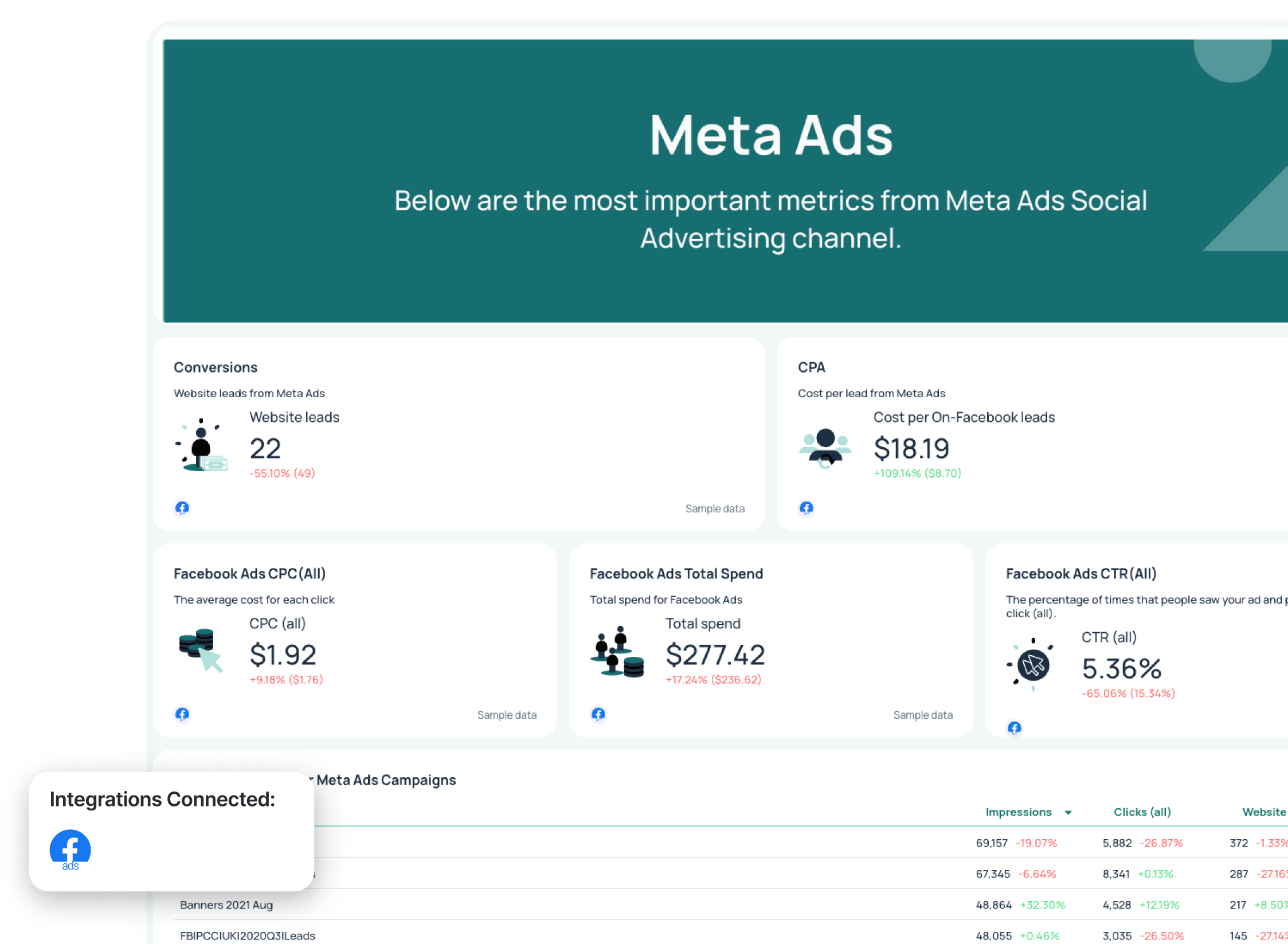
Use this example for free with your data
This is another dashboard co-created with Lars. The template opens with three gauge widgets—website leads, amount spent, ROAS—giving the client an immediate visual read on the month before they've scrolled anywhere.
A branded Maatwerk Online hero section sits above it, already white-labelled and client-ready. Further in, the report tracks conversions and CPA from Meta, Facebook Ads CPC, total spend, and CTR in a clean metric section, followed by a campaign-level table showing which campaigns are generating leads and at what cost per click.
Metrics to visualize:
- Offsite leads generated
- Amount spent
- Impressions, clicks
- CTR, CPC, CPM
- Goal progress
- Campaign performance: spend, impressions, CTR, CPC by campaign
- Audience demographics
- Ad delivery impressions by age and by gender
- Conversion funnel: reach > clicks > total conversion rate
- Period-over-period comparisons for all key metrics
Best practices to structure a Meta Ads lead generation dashboard
Facebook's algorithm will serve the same ad to the same person across multiple campaigns and count it as separate conversions, inflating your lead numbers. The metric that’s most important is cost per qualified lead, and most Facebook Ads dashboards don't surface that distinction at all.
- Separate lead gen metrics from ecommerce metrics from the start: Offsite conversions, CPL, and CTR tell a completely different story from revenue, gross profit, and ROAS.
- Lead with three numbers: Website leads, amount spent, and ROAS as gauge widgets. Gauges give a client an immediate read on where each metric sits relative to the range, without requiring a target to have been set.
- Use a conversion funnel, not only a conversion number: Reach to clicks to total conversion rate visualised as a funnel tells a different story than a single conversion metric.
You can get Facebook Ads data into Looker Studio, but getting it to match what's in Ads Manager is a different project entirely.
Looker Studio has no native Facebook Ads connector, so you're routing through a third-party tool. When you apply filters to unique metrics like reach or offsite conversions, Looker Studio pulls the full dataset and filters post-query. That's not a comfortable number to be defending on a client call.
Whatagraph's Meta Ads connector handles all of it natively.
Read more: Honest Looker Studio Reviews in 2026: Is it Right for You?
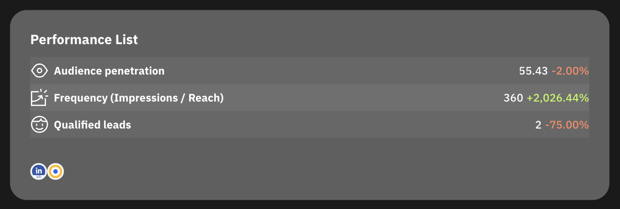
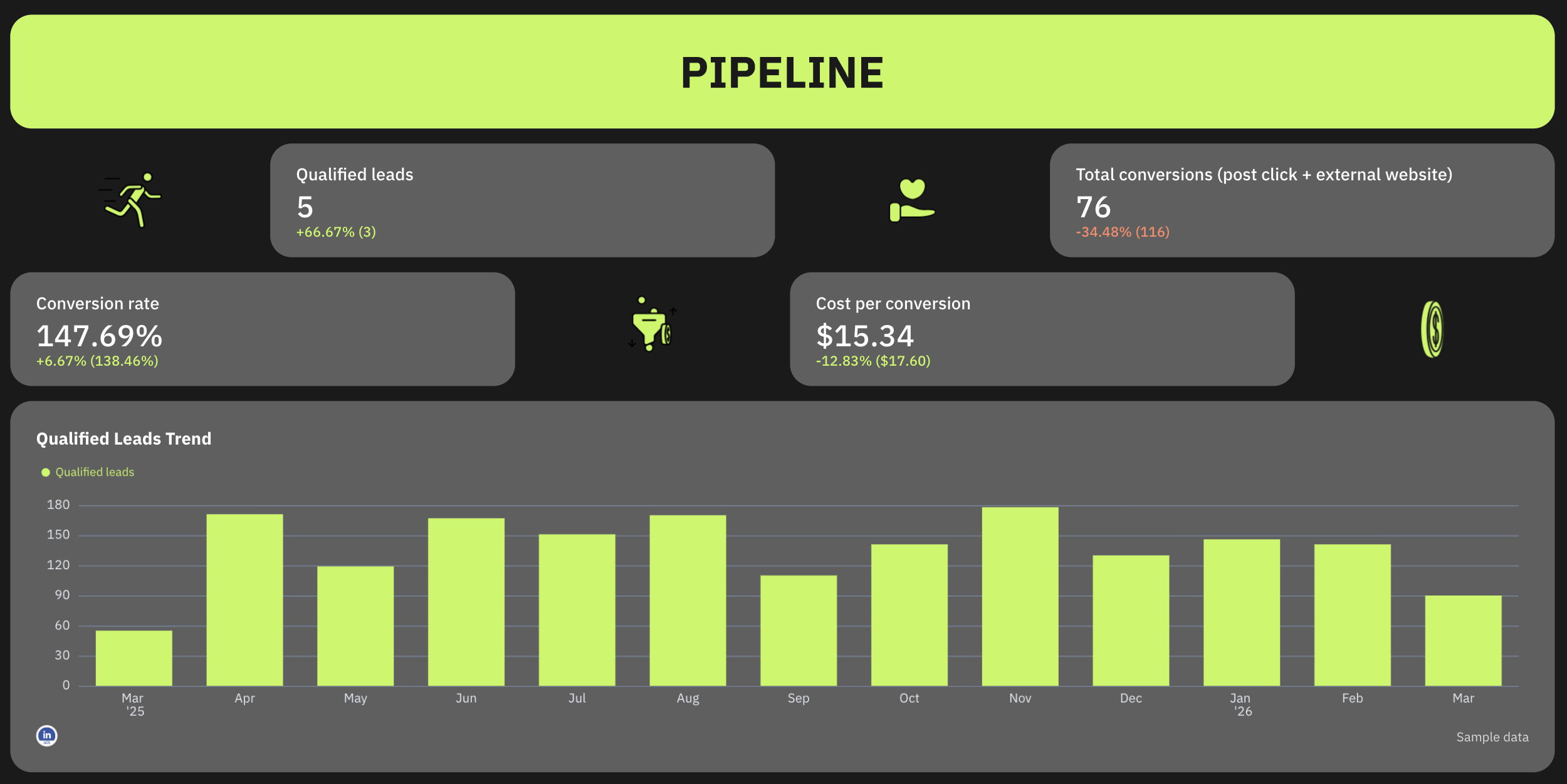
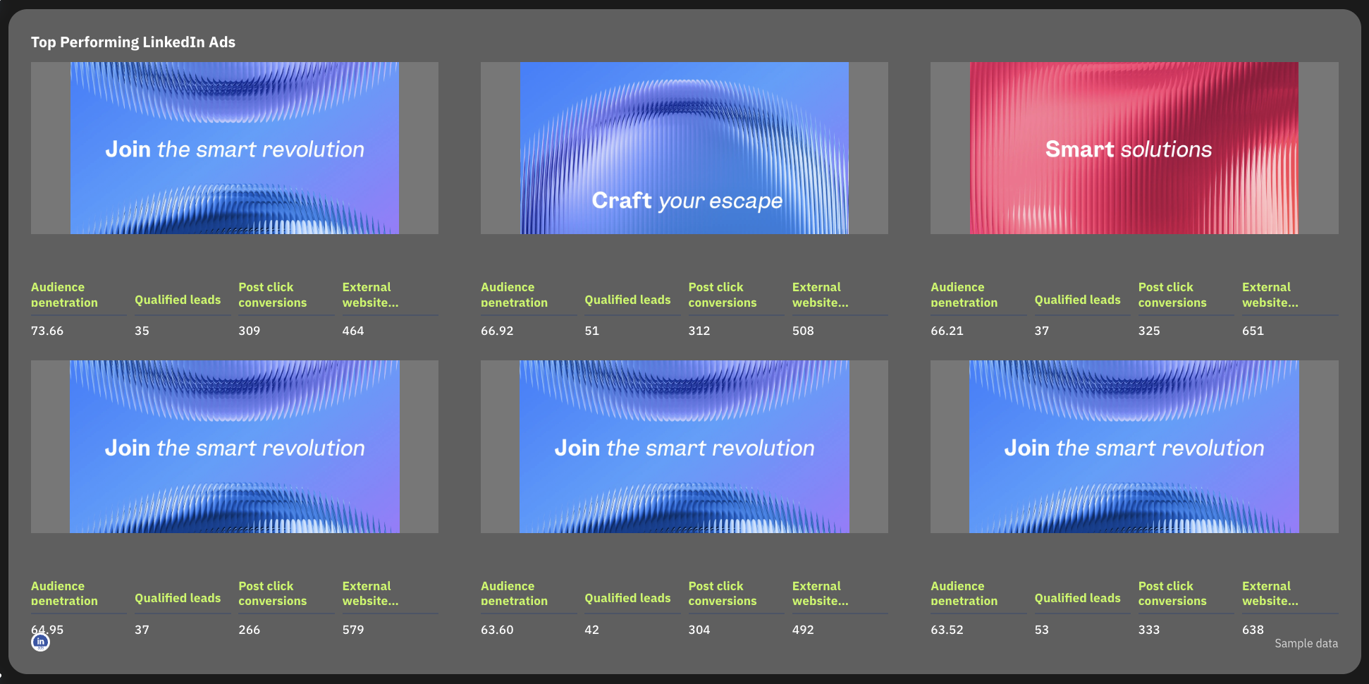
6. LinkedIn Ads Dashboard Example
Who it's for: B2B marketers and agency teams running LinkedIn Ads campaigns who need to report on pipeline contribution and audience penetration.
Channels connected: LinkedIn Ads.
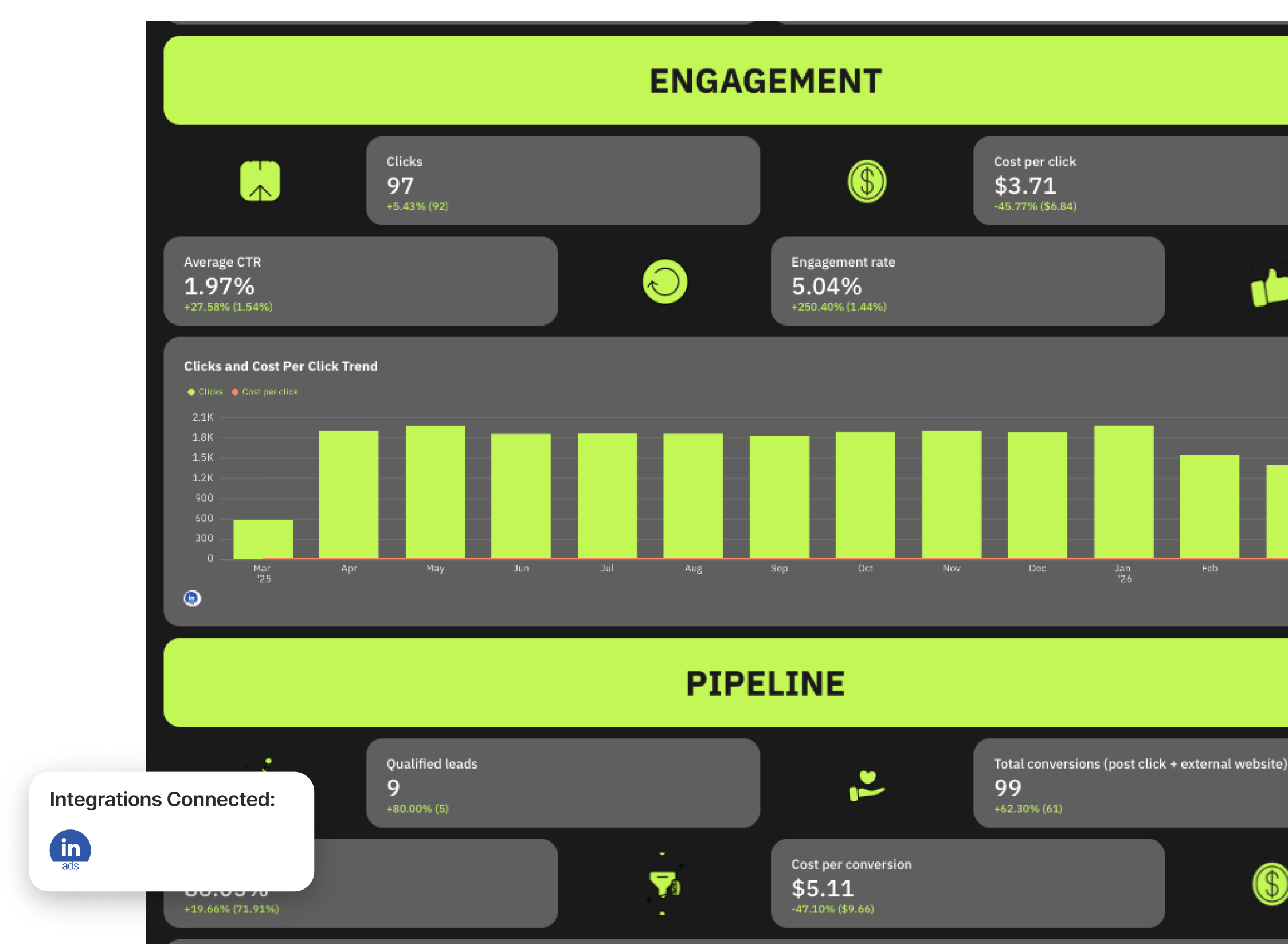
Use this example for free with your data
We got on a call with Marc Woodland, CEO at Winbox, to create this LinkedIn Ads dashboard example.
One of the most profound things he said on the call was this:
The biggest challenge with LinkedIn Ads isn’t the ads—it’s proving it works.
He goes on to explain that's because LinkedIn influences buying journeys in ways traditional attribution models can’t see, meaning marketers often under-credit the channel, even when it’s driving real demand.
To show clients the value they’re driving with LinkedIn Ads, Marc uses this reporting framework:
Reach x Relevance x Engagement = Pipeline Influence
The dashboard example reflects this. It’s divided into four clear stages:
1️⃣ Reach - Are you showing up in front of your buying committee?
Metrics to visualize:
- Impressions
- CPM
- Frequency
- Audience penetration
2️⃣ Relevance: Are they stopping to notice and consume your content?
Metrics to visualize:
- Dwell Time
- Video View Rate
3️⃣ Engagement: Are they interacting in ways that signal intent?
Metrics to visualize:
- CTR
- Clicks
- Engagement Rate
- CPC
4️⃣ Pipeline influenced: Are the ads influencing new deals?
Metrics to visualize:
- Leads
- Conversions
- RAR Report
- Self-Reported attribution
- Manual attribution
Best practices:
- Start the report with a goal pacing widget showing key metrics like Audience penetration, Frequency, and Qualified Leads
- Use a marketing reporting tool + an attribution tool to show the full picture of how LinkedIn Ads influence pipeline
- Use engagement signals (CTR, dwell time, video views) as leading indicators of intent
- Use bar graphs to show the trend of qualified leads from LinkedIn Ads over the past 365 days
- Include a granular table breaking down performance metrics by campaign name
- Use a carousel chart to show the top performing LinkedIn ad creatives
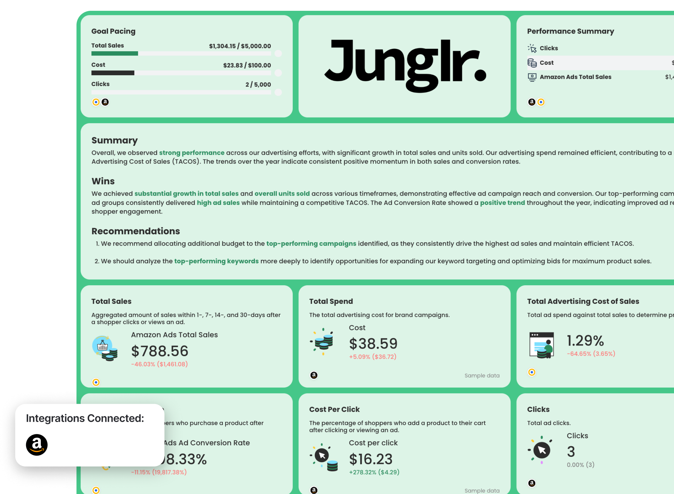
7. Amazon Ads Dashboard Example
Who it’s for: Amazon sellers and Amazon PPC agencies who need to report on advertising performance in the context of total sales.
Channels connected: Amazon Ads
Use this example for free with your data
Amazon Ads reporting exists in its own category. Elizabeth Greene, Co-Founder of Junglr, an agency that helps 7- and 8-figure Amazon brands scale, co-created this template, and her influence is visible in what it tracks and what it doesn't.
She says:
A dashboard with 27 million different metrics is often unhelpful or confusing. What we’ve focused on instead is identifying the few core KPIs that help us quickly spot when something is going wrong in an account - because we want to catch negative trends as early as possible.
The dashboard includes the most important metrics like total sales, total spend, and total advertising cost of sales (TACOS), which is a custom metric calculated as total ad spend divided by total sales revenue (both organic and paid) and multiplied by 100.
You can create a custom metric like this in seconds using a custom formula on Whatagraph like so:
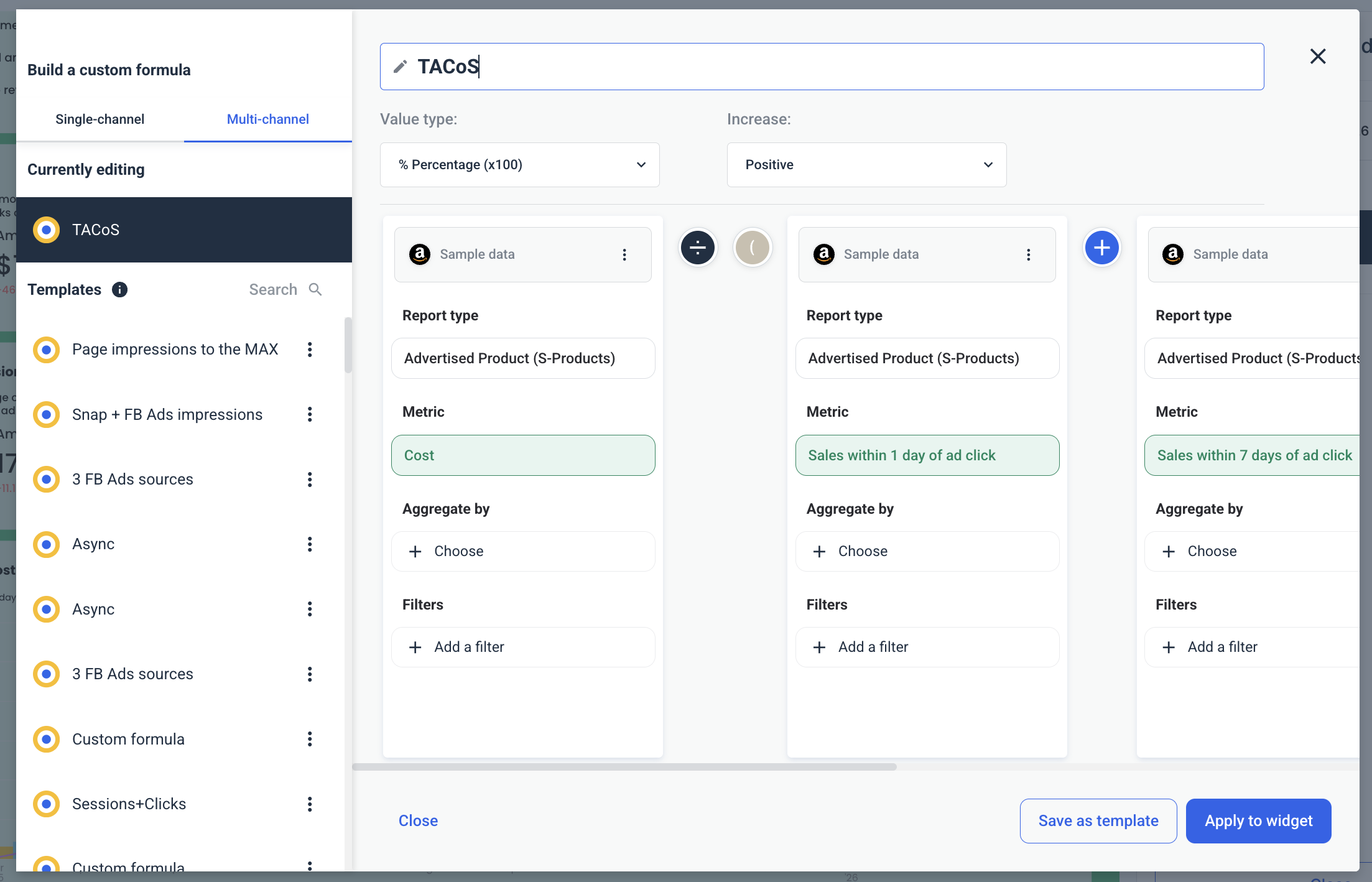
Save this custom formula as a template and re-use it the next time you create an Amazon Ads dashboard.
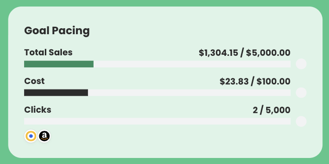
For Elizabeth, goal pacing is a must-have in her Amazon Ads dashboards.
If you don’t know what goals you’re aiming for, it’s impossible to know what to focus on. ‘Growth’ isn’t helpful. Is it 5%? 20%? We require very concrete goals — and we revisit them monthly in our reports. If priorities change, we pivot. But we have to be specific.
The Amazon Ads dashboard we co-created with her includes a goal-pacing widget that tracks total sales, cost, and clicks (or any other metrics) against targets.
Metrics to visualize:
- Sales
- Spend
- Total advertising cost of sales (TACoS)
- Ad conversion rate
- Inventory positions
- Total sessions
- Clicks
- Average fulfillable quantity
Best practices to structure an Amazon Ads dashboard
On every other platform in this list, ads drive traffic somewhere else. On Amazon, ads drive traffic to a product listing, and whether that listing converts is as important as whether the ad is clicked.
The dashboard has to hold both, so:
- Lead with TACOS, not ACoS: ACoS measures ad-attributed sales efficiency. TACOS measures the health of the whole business.
- Include product-level data: Elizabeth's framework puts product-level ad data above campaign-level data, because on Amazon, a product with poor reviews or bad listing copy will underperform regardless of how well the campaign is structured.
- Track keyword performance alongside campaign performance: On Amazon, the keyword is where the battle is won or lost. A campaign-level breakdown without a keyword-level breakdown is missing the true optimization opportunity.
8. TikTok Ads Dashboard Example
Who it's for: Performance marketers and agency teams running TikTok Ads campaigns who need to report on video engagement and conversion performance.
Channels connected: TikTok Ads
Use this example for free with your data
TikTok Ads has a creative shelf life problem that no other platform matches. TikTok itself recommends checking ad performance regularly and refreshing creatives when delivery results show a consistently declining trend.
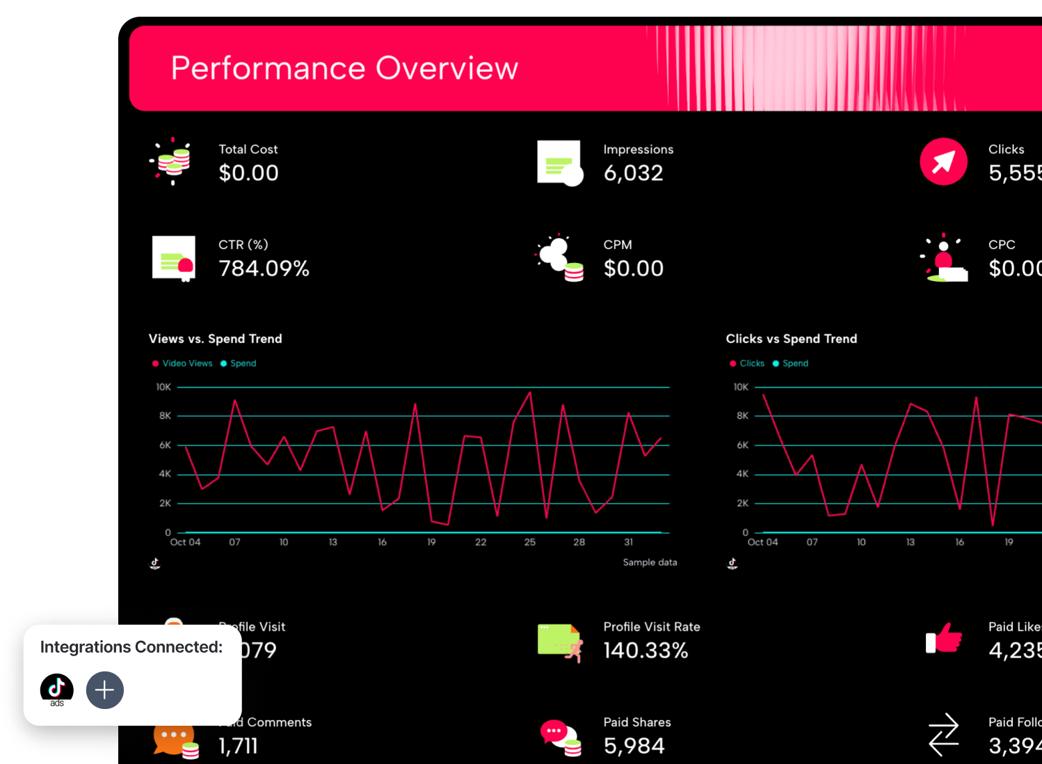
This TikTok Ads report template includes an AI-generated summary that flags which creatives are holding attention and which age groups are converting, the views vs. spend and clicks vs. spend trend lines show whether engagement is organic momentum or paid-for volume, and average watch time sits alongside CTR, so you're never optimizing for the wrong signal.
Metrics to visualize:
- Total cost, impressions, clicks, total conversions
- CTR, CPM, CPC
- Average watch time per view
- Views vs. spend trend
- Clicks vs. spend trend
- Ad creative performance
- Audience demographics
Best practices to structure a TikTok Ads dashboard
Clients on TikTok want to know whether the video held attention and whether it converted. Structure the dashboard to answer those two questions in that order.
- Lead with video engagement before conversion metrics: Average watch time is TikTok's most honest performance signal. A low CTR with a high average watch time means your audience is engaged, but your call to action may be weak.
- Plot views and spend as separate trend lines: The Views vs Spend and Clicks vs Spend charts in this template show whether performance is tracking with budget or moving independently of it.
- Break out the age group performance every month: The AI summary in this template flagged the 45-54 age group as the highest converting segment, which on TikTok is counterintuitive enough that a client might push back on it without the data in front of them. Surface it explicitly, every reporting period.
TikTok Ads has no native connector in Looker Studio; the same old story as LinkedIn and Facebook, you're routing through a third-party paid connector.
Whatagraph's TikTok Ads connector, on the other hand, is natively managed and pulls all of your data in automatically.
9. Social Media Dashboard Example
Who it’s for: Social media managers and agency teams reporting organic performance across platforms to clients.
Channels connected: Instagram, Facebook, YouTube
Use this example for free with your data
The overview for this social media report template opens with follower counts per platform—Instagram, Facebook, YouTube—because for organic social, audience size is the baseline before any other metric.
The AI-generated summary and recommendations follow, surfacing which formats are driving reach, which content themes are landing, and where growth is strongest across platforms.
Deeper in, the top-performing posts table shows post copy alongside unique impressions, comments, reach, clicks, and saves; so the content team and the client can see exactly which messages worked and why.
Metrics to visualize:
- Instagram:
- Follower count
- Reels reach
- Total engagement
- Average engagement per post
- Facebook:
- Unique impressions
- Reactions
- Follower count
- Average engagement per post
- YouTube:
- Follower count
- Subscriber growth
- Net subscriber gain
- Video views
Best practices to structure a social media dashboard
Separate the church and state. The relationship between organic and paid is blurrier than ever, especially on TikTok, so your structure needs to provide the why behind the what.
- Show post copy alongside performance metrics: The top-performing posts table in this template includes the message alongside impressions, reach, clicks, and saves. This is the detail that turns a reporting conversation into a content strategy conversation.
- Break engagement into its parts: Total engagement is a lazy metric. Likes, comments, and shares tell completely different stories. Shares indicate content worth spreading, comments indicate content worth responding to, and likes indicate content that resonated but didn't compel action.
- Make the report look like the client's brand: Good advice for any client-facing report, but for social media clients specifically, it’s ever more important. Social media managers are selling creative credibility, so a report that looks like a generic analytics export undermines the very thing you're being paid to do.
Enter Whatagraph IQ Themes.
Inside the branding panel, hit Enhance theme style with IQ, and you've got three ways in: type a natural-language prompt, pick from a suggested color palette if you already have brand colours locked in, or upload a logo and let IQ pull a palette straight from the image.
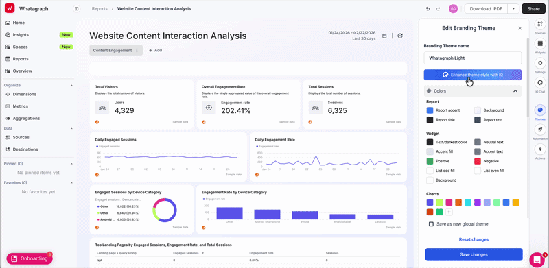
Looker Studio can technically do a lot of customisation. But that's just the thing, it's technical.
You don’t get a central brand kit upload or a one-click way to apply a consistent theme across reports, or even a straightforward way to add a client logo, which is weirdly hard to find for something so basic.
This is how you know you’ve outgrown Looker Studio.
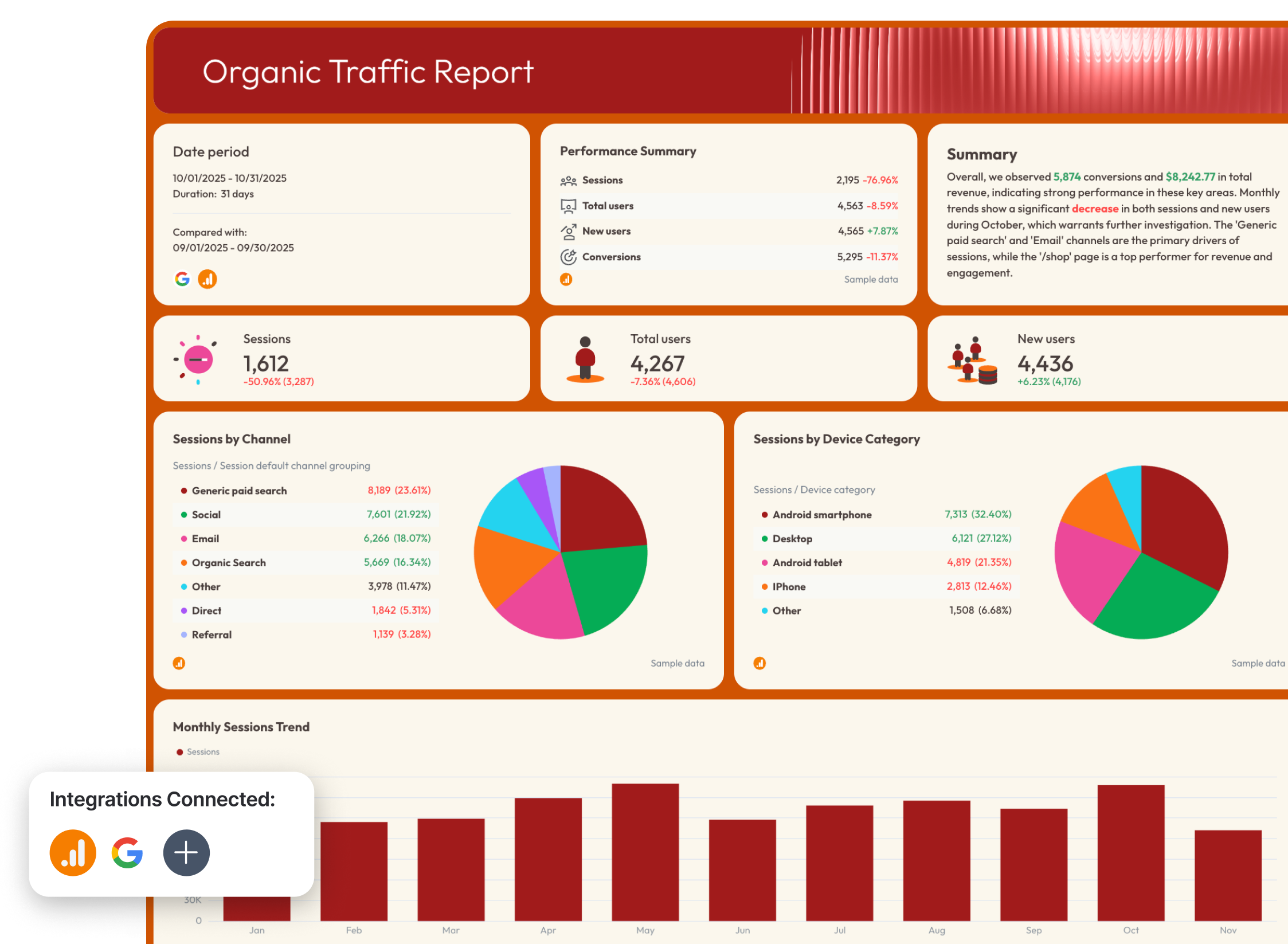
10. SEO Dashboard Example
Who it's for: SEO specialists and agency teams who need to connect organic search performance to business outcomes.
Channels connected: Google Search Console, Google Analytics 4 (GA4)
Use this example for free with your data
This SEO report template is structured across four tabs: Summary, Organic Visibility, Organic Traffic, and Organic Conversions. Each tab answers a different question, in the order a client would ask them.
Total revenue, ecommerce purchases, average purchase revenue, and transactions are the destination the report was always heading toward.
Metrics to visualize:
- GA4:
- Sessions, total users, new users
- Sessions by channel and device
- Conversions, conversion rate
- Total revenue
- Ecommerce purchases
- Average purchase revenue
- Transactions
- Google Search Console:
- Impressions
- Clicks
- Keywords ranking 1-10
- Organic Google search average position
- Organic visibility trends over time
Best practices to structure an SEO dashboard:
SEO clients sit in two camps: the ones who want to see rankings, and the ones who want to see revenue. The best SEO reports serve both in the same document—in that order.
- Structure the report as a funnel: A client who understands that their impressions are up, their clicks are up, but their conversions are flat has a landing page problem, and they'll know it before you have to tell them. A tab structure that mirrors the funnel makes that conversation automatic.
- Track keyword rankings as a goal metric, not a data table. Keywords ranking 1-10 as a single tracked number tells a more useful story than a 500-row keyword ranking table.
- Connect organic traffic to ecommerce revenue: The organic conversions tab in this template blends Search Console and GA4 data to show ecommerce purchases, average purchase revenue, and total transactions alongside conversion rate. Whatagraph's data blending handles the GSC and GA4 connection natively.
Google Search Console and GA4 are both natively supported in Looker Studio, so this is actually the most viable rebuild on the list. The catch is blending them.
Plus, the ecommerce conversion data requires GA4 ecommerce tracking to be correctly configured, which adds a setup dependency that Looker Studio won't flag if it's missing.
Technically possible. Practically…you know the drill by now.
Read more: How to Blend Data in Looker Studio [+ a Faster Way]
11. Email Marketing Dashboard Example
Who it's for: Email marketers and agency teams who need to connect campaign performance to pipeline and revenue.
Channels connected: GA4, HubSpot, Mailchimp, ActiveCampaign.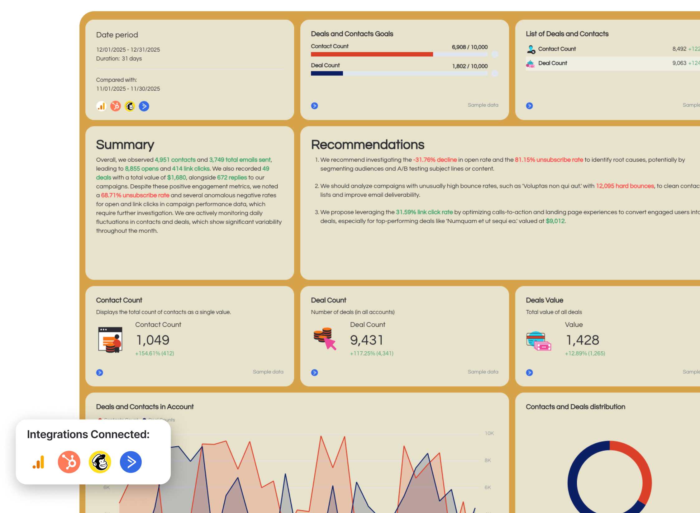
Use this example for free with your data
The two-tab structure in this email marketing report template separates general email marketing from ecommerce email marketing because the metrics that are important for a B2B lead nurture sequence are completely different from the metrics for a promotional campaign to an ecommerce list.
Scroll further down, and the template tracks total emails sent, opens, and open rate, alongside a sent vs. opens trend line that shows the relationship between volume and engagement over time.
The email clicks funnel maps the full journey from send amount through opens to total link clicks, and sent/opened emails as a comparative trend line closes the tab with a clear view of whether engagement is keeping pace with list growth.
Metrics to visualize:
- HubSpot (CRM):
- Contact count
- Deal count
- Deals value
- Mailchimp ActiveCampaign (email):
- Total emails sent
- Open rate
- Link click rate
- Replies
- Unsubscribe rate
- Bounce rate
- Sent vs. opens trend line
- Email Clicks funnel: send amount > opens > total link clicks
- GA4 (ecommerce tab):
- Revenue attributed to email campaigns
- Ecommerce conversions from email traffic
Best practices to structure an email marketing dashboard:
Email reports that stop at open rate are stopping one conversation too early.
- Connect email metrics to CRM pipeline: Contact count and deal count sitting alongside open rate and link click rate turn an email performance report into a revenue report. If the emails are generating contacts but deals aren't following, that's a sales handoff problem.
- Plot sent vs. opens as a trend line: A single month's open rate tells you almost nothing without the context of whether it's improving or declining.
- Use the email clicks funnel to find where the drop-off is: Send amount to opens to total link clicks as a funnel visualization shows exactly where the audience is disengaging.
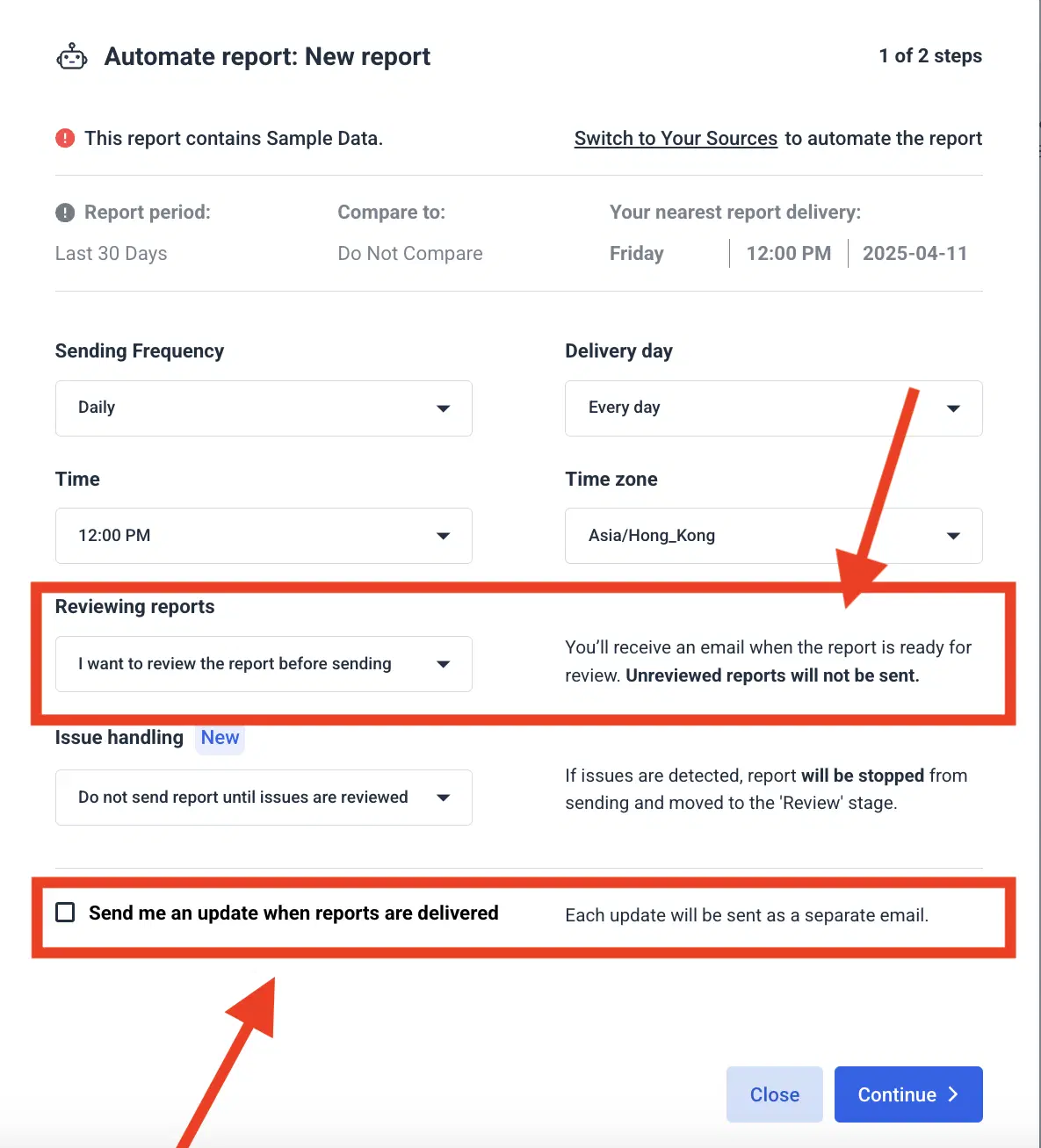
For email marketers, there's a specific satisfaction in having the tool that reports on your email campaigns also deliver those reports via email automatically, scheduled, branded, and attached as a PDF.
On Whatagrah, you set it once, and the report goes out every month—or any other cadence you choose—dutifully.
You've Got the Blueprint, and Whatagraph's Got the Rest
You've seen 11 dashboards' worth of structure, logic, and reporting philosophy from some of the sharpest minds in the game. That's the hard part done.
Now, once again, you've got two options.
- Take these blueprints back to Looker Studio and build them: widget by widget, connector by connector, calculated field by calculated field.
- Or open Whatagraph, connect your data sources, and watch the whole thing populate itself with the magic of automation.
If you already love Looker Studio and don't want to leave it, Whatagraph can feed it clean, organized data automatically. Talk to us to set up your data transfer.
Great dashboards don't build themselves. But with Whatagraph, they get pretty close. Take Whatagrah for a spin today—it’s free forever.
Published on Jul 07 2025
WRITTEN BY
YamonYamon is a Senior Content Marketing Manager at Whatagraph. With an eye for detail and a knack for always considering context, audience, and business goals to guide the narrative, she's on a mission to create genuinely helpful content for marketers. When she’s not working, she’s hiking, meditating, or practicing yoga.