6 Worthy Windsor.ai Alternatives for 2026 (Reviewed)
Windsor.ai is a great marketing reporting tool, but users say it can be difficult to use, clunky, and not very customizable.
To help you find the best Windsor.ai alternative, I did three things:
- Spoke with our customers who previously used Windsor.ai.
- Scoured online reviews and community forums to find the best alternatives.
- Tested each tool.
Full disclosure—one of these tools is ours. But that’s because we genuinely believe Whatagraph reduces the pains of Windsor.ai.
But we’re also not here to bash our competitors. We researched them thoroughly (and even tried them out) so you can really understand what they’re great at and if they’re best for you.
By the end of the article, we hope you’ll find an Windsor.ai alternative that fits your needs—whether it’s us or not.

Nov 30 2025●10 min read


Windsor.ai is well-rated (4.6/5 on G2); but with only 74 total G2 reviews, we’re working from a limited data set.
And when there isn’t much formal feedback to work with, we naturally look elsewhere for signals. In fact, one recent Reddit post described Windsor.ai as a “sketchy service” after a user experienced unexpected renewal billing and difficulty getting a refund.
These aren’t universal experiences. But they do shape buyer confidence, especially when the sample size is small.
And that’s the spark behind this list. Not to drag Windsor (it’s absolutely the right fit for some use cases), but to spotlight six tools that directly address the reporting pain points Windsor.ai hasn’t fully solved; especially for teams who want true automation and fewer manual workarounds.
You’ll also see real examples throughout this guide: teams like Peak Seven that saved 63 hours a month on reporting with Whatagraph.
Let’s get into it.
TL;DR: 6 Best Windsor.ai Alternatives in 2026
Tool | Best For | G2 Rating |
| Marketers who want automated, fast, client-ready reporting. | 4.5/5 ⭐ |
| Data-mature teams that need a strong ELT pipeline and plan to build dashboards in business intelligence (BI) tools. | 4.5/5 ⭐ |
| Enterprise data teams that want fully managed, low-maintenance warehouse pipelines. | 4.2/5 ⭐ |
| Marketers who live in Sheets, Excel, or Looker Studio and need heavy data pulls. | 4.4/5 ⭐ |
| Enterprises with complex data stacks that need flexible transformations and warehouse-first workflows. | 4.4/5 ⭐ |
| Large teams that want customizable marketing pipelines and have complex data needs. | 4.4/5 ⭐ |
Note: Each of these tools has already been tested in-depth in our standalone comparison guides, and we’ll link those full reviews beneath every option so you can make a fully informed decision.
1. Whatagraph
Whatagraph is a ridiculously easy-to-use AI-powered marketing reporting platform that cleans, organizes, presents, and brands all of your marketing data in one workspace.
Here’s how it works:
- Plug into 55+ marketing platforms using native connectors that stay stable and don’t collapse mid-week.
- Clean and organize your data without code to build custom metrics, blend sources, reshape dimensions, or just ask AI to structure the data for you.
- Type what you want (“Build me a monthly paid search report”), and AI generates it— or drag, drop, and tweak using ready-made templates if that’s more your speed.
- Upload a brandbook screenshot or give it a quick prompt; Whatagraph IQ applies the entire visual system automatically and hosts the report on your own domain.
- Ask AI questions about your performance (“Why did ROAS dip on Tuesday?”) and it will surface explanations and write summaries in multiple formats and 18 languages.
- Export as live links, PDFs, spreadsheets, automated email sends; or ship your data straight into BigQuery or Looker Studio for deeper analysis.
Let’s take a closer look at where Whatagraph shines, especially where Windsor.ai struggles.
Feature #1: Ease of use
Windsor.ai complaint: “There is a learning to curve, and its more of a technical tool, than a tool for anybody.”
Whatagraph is a marketing tool for marketers.
With Whatagraph IQ, you can build an entire report with a single prompt. Literally one.
Type what you need, and Whatagraph IQ will:
- Preload every relevant widget,
- Map all the metrics correctly,
- Structure the dashboard automatically; and
- Deliver a ready-to-share report in seconds.
Choose the data source you want to pull from, then either click one of the auto-generated prompts or just type something simple like “web analytics report” and hit Generate Report.
In under 60 seconds (I timed it), you’re holding a fully built report.
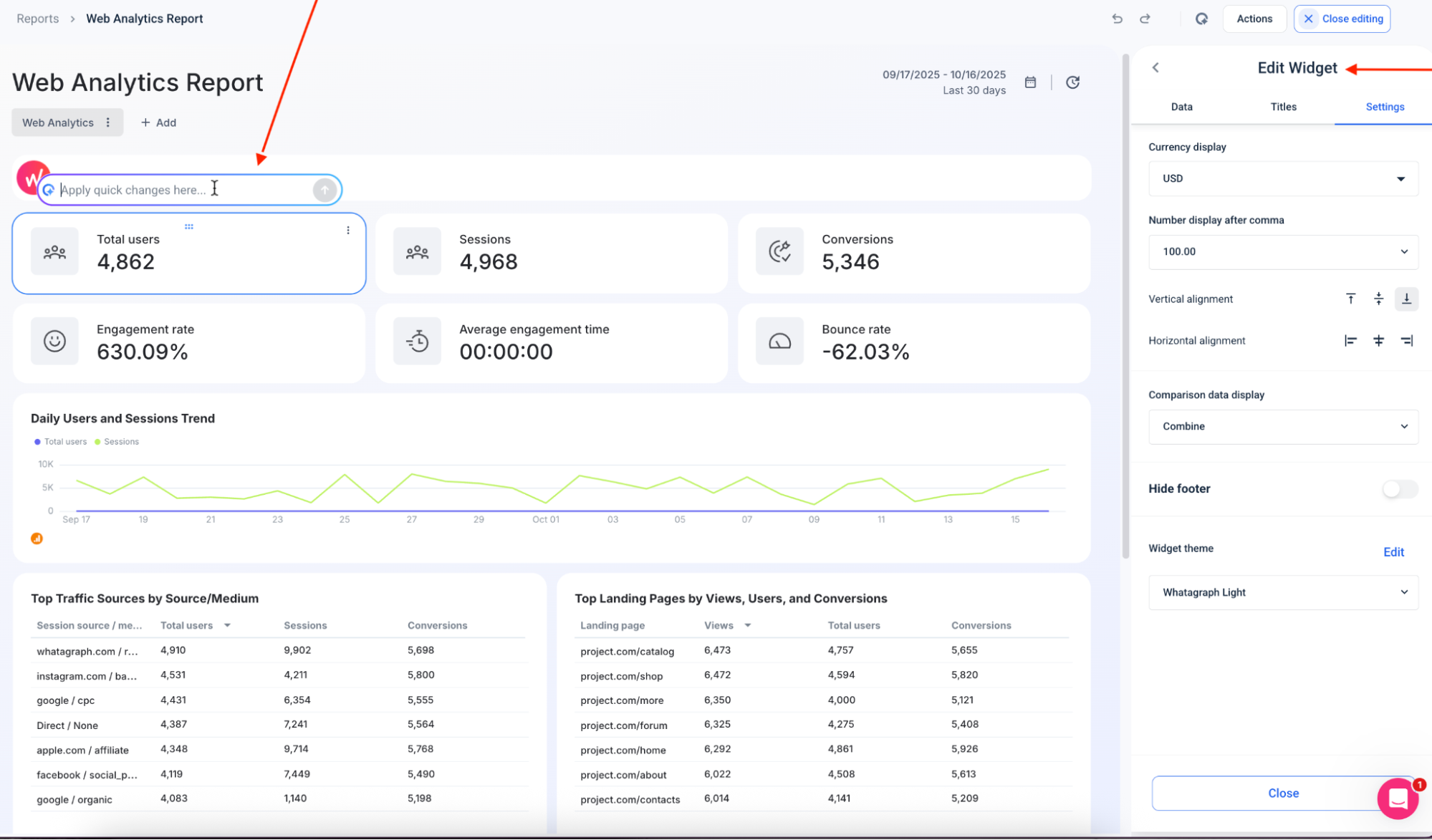
What if you want to tweak or expand your report? Same ease.
Type what you want—“add a ROAS widget,” “show organic traffic by device,” “create a competitor tab”—and Whatagraph will build it for you.
You can even ask AI to spin up separate tabs inside the same report to break things out by channel, market, brand, or campaign type.

And should you want to, you can still get hands-on.
Drag, drop, resize, shuffle widgets around, or add blended metrics like “Total Ad Spend” or “CPC Across All Channels.” You stay in control—Whatagraph just removes the grunt work.
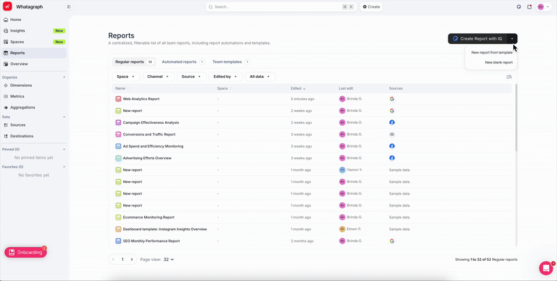
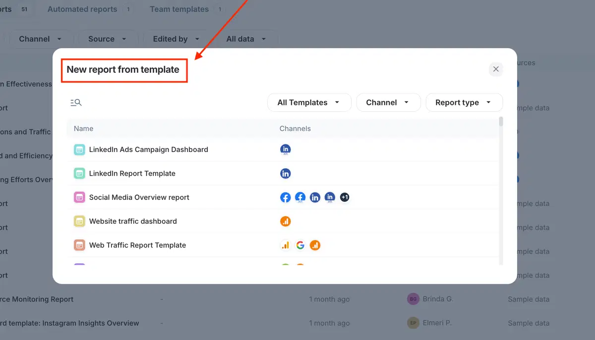
Or, if you prefer starting from something already polished, pick from 80+ ready-made templates so you’re never staring at a blank canvas.
If you used to write performance summaries manually, consider this your emancipation.
Ask AI to generate summaries directly inside your report, grounded in your connected data and written in your preferred style. Choose the format (Summary, Wins, Recommendations, Issues, or Custom Prompt) and the language (18 options), and the insights appear instantly.
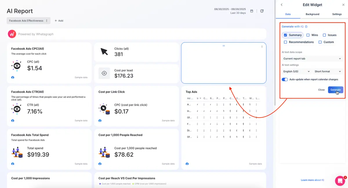
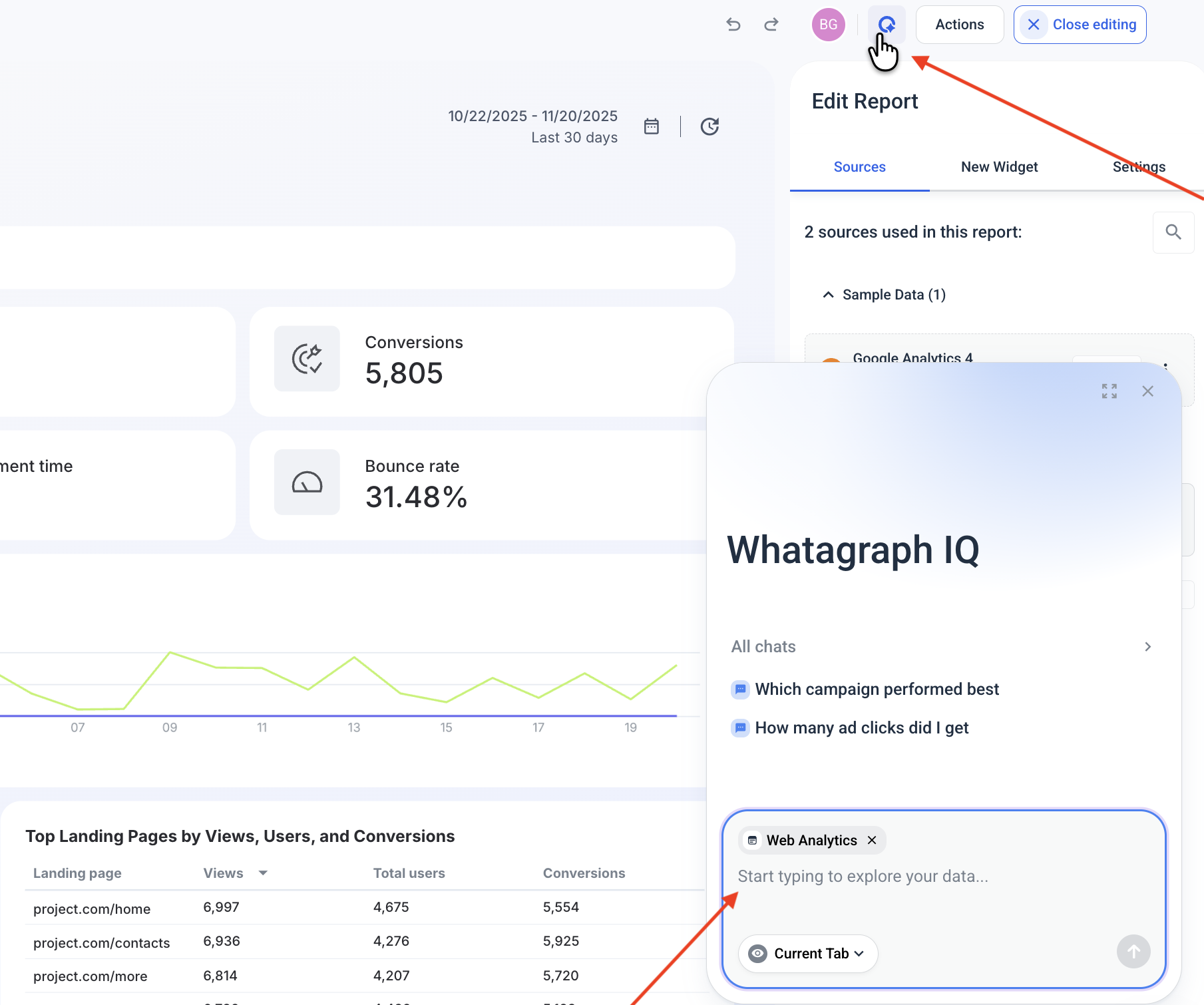
You can also chat with your data right inside the report. Click on the Whatagraph IQ icon in the top right corner, and ask plain language questions to get answers fast.
Maatwerk Online cut 100 hours of reporting work every month after switching to Whatagraph’s AI. Here’s co-founder Lars Maat in his own words:
Whatagraph’s AI saves time and energy for our marketing specialists. And the hours we’re saving is just pure profit. We now have the time to focus on more strategic things that help both our agency and our clients grow.
Feature #2: Data blending
Windsor.ai complaint: “Not able to do lot of blending directly within Windsor, we have to do it in bigquery.”
If you want clean, unified data, you’re often pushed into BigQuery; which is great if you’re a data engineer, but less ideal if you’re, you know…a marketer with deadlines.
Whatagraph keeps all of that inside the platform.
You can:
- Unify dimensions (gender, age, device, audience, etc.) across Meta, Google Ads, TikTok, and more.
- Standardize campaign names so all your “Retargeting” campaigns sit in one clean group, no matter how each platform labels them.
- Group countries into tiers (Tier 1, Tier 2, APAC, EMEA—whatever your structure is).
- Match metric names across channels (e.g., a single “Total Ad Spend” instead of five variations).

And on the higher-tier higher-tier with IQ Dimensions, AI does the blending for you:
- Describe the blend you want, like “Combine ad spend from Meta, TikTok, Facebook Ads, and Google Ads into one Paid Media total,” and IQ builds it instantly.
- Create custom metrics on the fly (cross-channel ROAS, blended CPC, funnel KPIs, etc.) without formulas or troubleshooting.
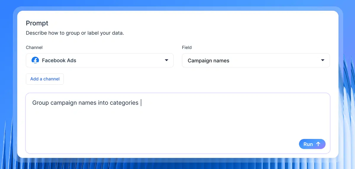
- Standardize messy naming conventions in seconds by just telling IQ, “Group by Campaign Type: Spring Sale,” and it creates a reusable dimension that cleans up your entire dataset.
- Normalize any dimension at scale—objectives, product categories, locations, languages, audience types; IQ makes sense of chaos and cleans inconsistencies automatically.
Feature #3: Reliable (and quick) customer support
Windsor.ai complaint: “Support has been replying quite slow and their return policies are pretty strict. Make sure you set up reminders if you get the anual subscription.”
Whatagraph goes in the opposite direction.
Every plan includes real human support via live chat, and the team answers in under four minutes on average. On the higher-tier Boost and Max plans, you also get a dedicated Customer Success Manager: someone who learns your setup, helps with onboarding, and sticks with you as your reporting evolves.
We approach support at Whatagraph like a partnership, not a limbo of tickets.
Just ask Kim Strickland, Digital Marketing Specialist at Peak Seven:
I've joked about this often—with Whatagraph, we're not paying for a reporting system. We're paying for customer support. There's a level of dedication from the Whatagraph team that you don't often experience anywhere else.
Feature #4: Steady data connectors
Windsor.ai complaint: “I’ve had a couple of issues with specific data connectors, so it’s worth validating the data when setting up a new one.”
Whatagraph’s data integrations are fully managed, as in: our engineers build them, monitor them, maintain them, and fix them the second they sneeze.
Here’s what fully-managed reliability means for you:
- Stable, predictable syncing because our Product Engineers maintain every integration directly; you never have to touch a single API setting.
- Faster fixes, because there’s no third-party middleman slowing down bug resolution.
- After our Google Kubernetes Engine upgrade, even heavy dashboards (tabs, blends, charts, the works) load in under 10 seconds. These updates all but guarantee near real-time syncing.
- Over the last six months, we clocked 99.95% uptime; and if something does go sideways, our emergency alerts wake up our engineers instantly. (Yes, even at 3 AM. Their families are aware and supportive.)
If you want the real verdict on connector stability, talk to the people using it every day. Here’s how Tanja Keglić, Performance Marketing Manager at Achtzehn Grad, describes it:
We don’t have any connection issues on Whatagraph at all. We just connected the platforms once, and that was it. Whatagraph is very, very quick when loading the data.
Feature #5: Customizable dashboards and reports
Windsor.ai complaint: “A bit more caching and dashboard customization would make it perfect.”
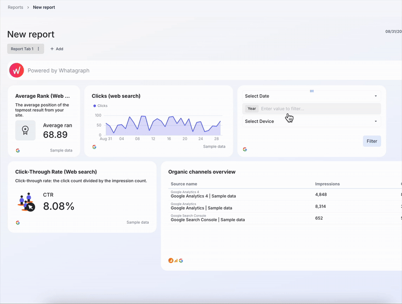
Whatagraph lets you build one dashboard, and that automatically doubles as a client-ready report. White-label it, export as a PDF, share a live link, or set up automated email sends—it all works the way you expect.
But let’s take it up a notch.
The moment your data is connected, fire off a text prompt (or pick one of IQ’s suggested prompts), and Whatagraph IQ generates an entire, branded report in seconds: structure, insights, layouts, everything.
Once the report is built, it’s time to brand it.
Go to Settings > Custom Branding Colors > Enhance theme style with IQ.
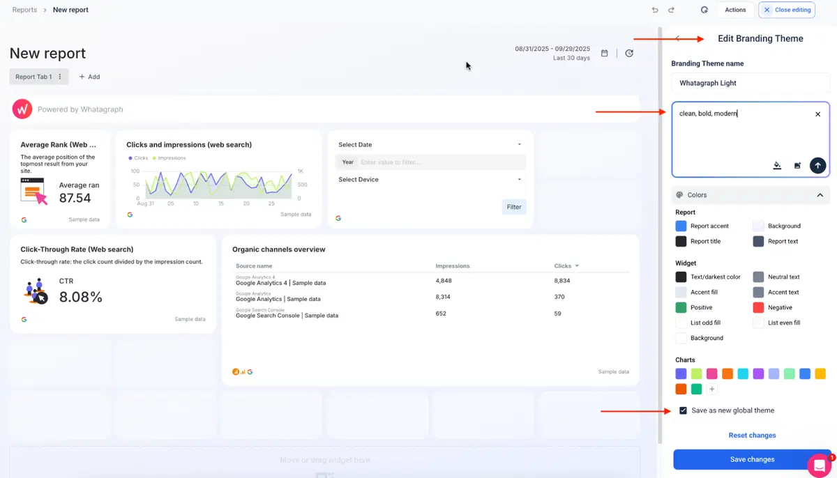 From here, you get two paths:
- Text prompt: “Clean, bold, modern,” “earth tones,” “corporate minimalism,” whatever fits the client.
- Image upload: Drop in a brand screenshot or logo and IQ extracts the color palette automatically.
IQ proposes a full visual theme—colors, fonts, chart palettes—but nothing is locked, mind you.
Tweak every swatch, swap fonts, and adjust accessibility ratios until it’s perfect. Then hit Save as Global Theme so it applies across all future reports.
Don’t want to restyle an entire report? No problem-o. Ask IQ to update widgets one at a time:
- “Show conversions instead of clicks.”
- “Switch this to a line chart.”
- “Compare last 30 days to previous 30.”
The widget rewrites itself instantly, like this:
 Whatagraph also packs tiny workflow upgrades that add up fast:
- Link reports together: Edit the Master once, and your changes sync across all linked reports.
- Fully customizable widgets: Titles, descriptions, colors, currencies, formulas… tweak anything.
- Icon library: Drop icons into widgets for cleaner, more scannable reports.
- Insert or delete rows anywhere: Restructure your dashboard without rebuilding.
Take Whatagrah for a free spin today.
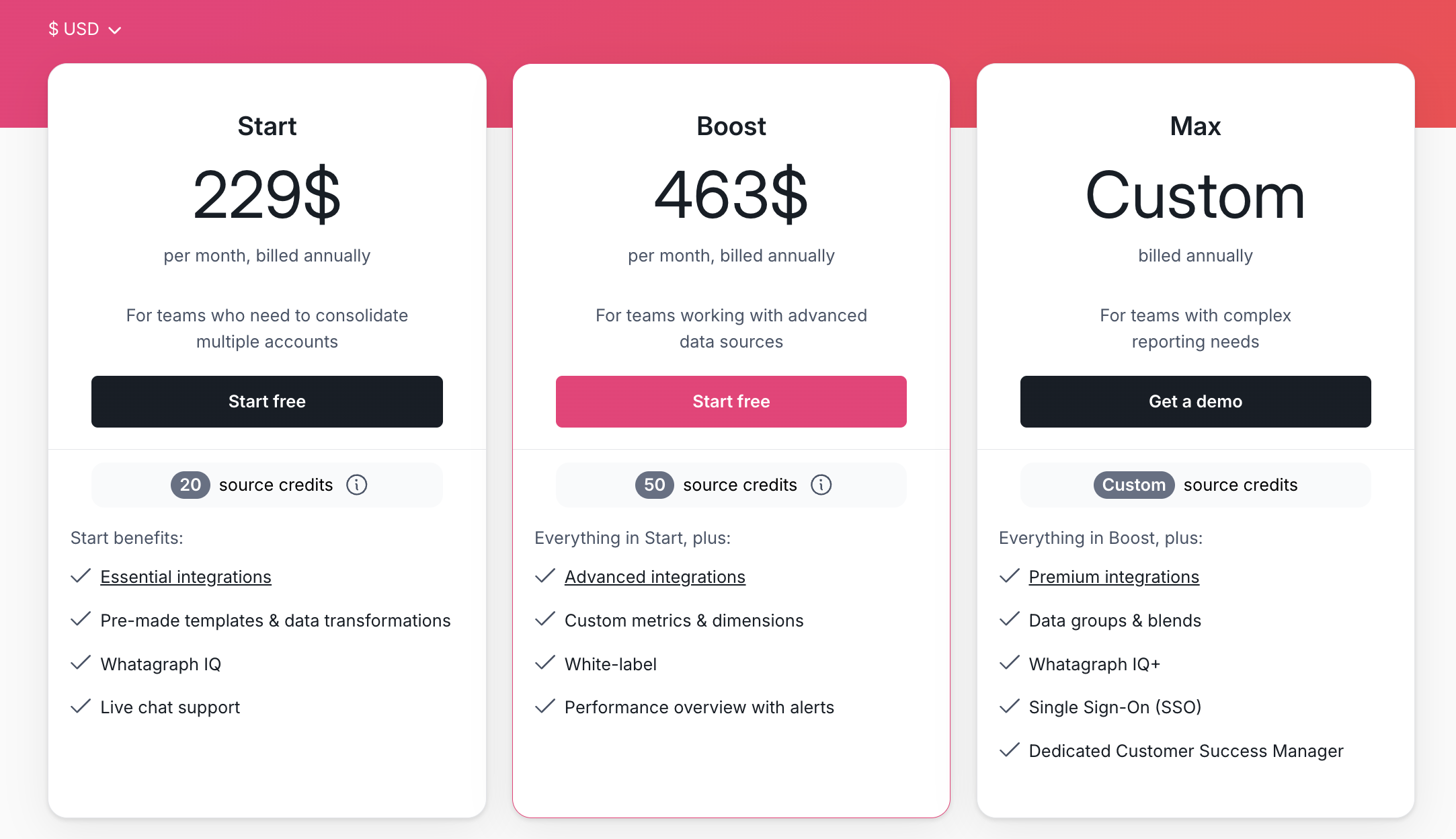
Whatagraph pricing
Whatagraph offers four clear tiers that grow logically with your reporting workload:
- Forever-free – lets you get started at no cost, with 5 source credits, Whatagraph IQ basics, templates, and live chat support.
- Start ($229/mo billed annually) – includes 20 source credits and essential integrations
- Boost ($463/mo billed annually) – jumps up to 50 source credits, adds advanced integrations, custom metrics & dimensions, white-labeling, and performance overview with alerts
- Max (custom pricing) – for enterprise/complex teams, with custom source credits, premium integrations, data groups and blends, Whatagraph IQ+, SSO, and dedicated Customer Success Manager
Plus, Whatagraph’s free plan is actually usable.
As of November 2025, Windsor’s free tier caps you at one account and one data source, which is fine for testing but not remotely enough for anyone doing real reporting.
Windsor’s pricing feedback is one of the most consistent themes across reviews: the jumps between tiers feel steep, and the platform doesn’t offer enough middle-ground options for teams that sit between “tiny” and “full agency.”
Here’s what a recent G2 review pointed out: “I wish the pricing was a little more even. I wish they had a 5 data sources option. As going from $19 per month to $99 is a jump.”
Whatagraph’s pricing model smooths that curve out completely.
Whatagraph pros and cons
✅ Pros | ❌ Cons |
| Whatagraph is your all-in-one AI reporting platform that lets you connect, analyze, visualize, and share marketing data without touching code or dealing with technical overhead. | The free plan is generous, but power users may hit source-credit limits faster than expected. |
| You get fast, beautifully branded reports that anyone on your team can build (even non-technical folks)—thanks to AI prompts, templates, and intuitive editing tools. | Limited if you need complex enterprise data warehousing directly inside the tool (though you can export). |
| Access stable, fully-managed integrations and dashboards that load in seconds; backed by real human support that replies in under four minutes. |
What do real users say about Whatagraph?
We’ve shown you our case studies, but these are the recent, publicly-listed reviews on G2 that make our heart sing:
- “Apart from all the valuable things the tool has in itself, throughout the years we've chatted with their support for minor issues multiple times, and they were very quick to fix everything of even make improvements based on our feedback. Stellar group of people, these.” (Source)
- “The dashboards are clean, easy to build, and perfect for client reporting…I love how I can set up automated reports that look great and are client-ready. No more fiddling with spreadsheets or wasting time building slides.” (Source)
- “If I was starting a digital agency today, signing up with Whatagraph would be one of my first moves.” (Source)
Save hours per month, ditch the spreadsheets, and test-drive AI features that are built by marketers, for marketers. Start free with Whatagraph.
2. Funnel.io
Funnel.io is a popular marketing data pipeline built for teams that want to streamline data from dozens of channels and send it to BI tools, data warehouses, or dashboards. The platform is powerful and well-known for its ETL capabilities, but it’s definitely geared toward technical marketers and teams with data maturity.
Funnel.io is less “build me a report quickly” and more “give me control over the data infrastructure behind my reporting.”

If you want deep transformations and warehouse-first workflows, this is its sweet spot.
Funnel.io key features
- 500+ connectors for marketing channels, advertising, and analytics platforms.
- Automated data collection and normalization using Funnel’s mapping and transformation engine.
- Send data anywhere, including Google Sheets, Looker Studio, BigQuery, Snowflake, Redshift, etc.
- Custom metrics and dimensions for multi-channel data modeling.
- Powerful data preparation tools for aggregating, harmonizing, and validating data at scale.
Funnel.io pros and cons
Based on my hands-on testing, plus what marketers and agencies value most in automated reporting tools, according to our internal data:
✅ Pros | ❌ Cons |
| Extremely strong data extraction and transformation, with 500+ native connectors. | The “two-tool Frankenstein” problem: Funnel handles the data pipeline, but you still need a second tool (Looker Studio, Power BI, Tableau, etc.) to actually build reports. |
| Export clean, modeled data to Sheets, Looker Studio, BigQuery, Snowflake, and more. Great for analytics-heavy teams | Pricing escalates quickly as you add sources and data destinations, with no true reporting features to justify the cost for small businesses. |
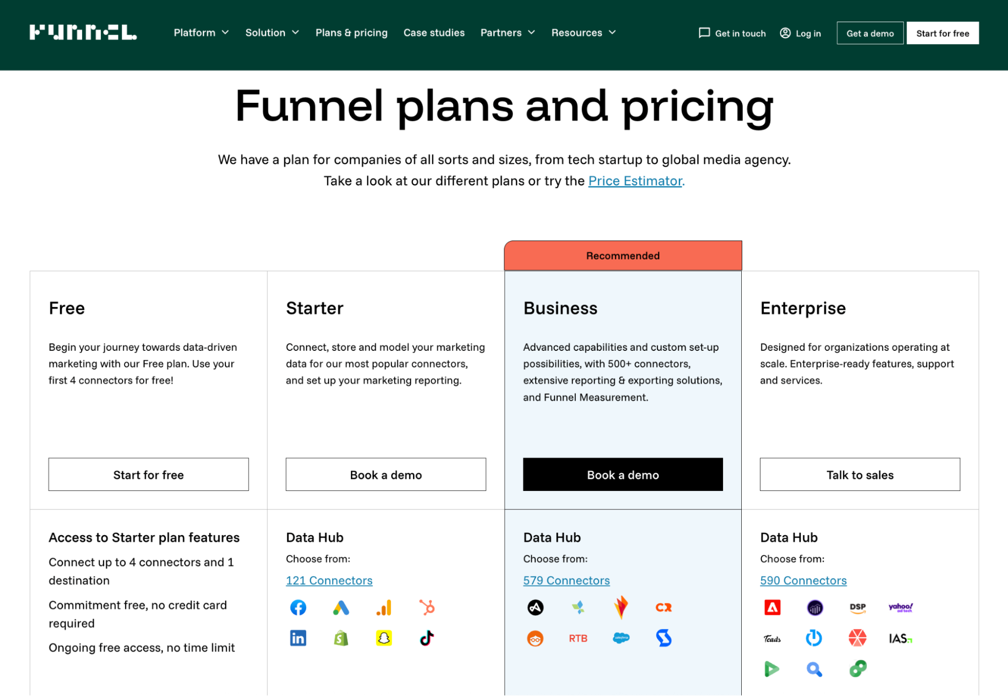
Funnel.io pricing
- Free: Up to 4 connectors + 1 destination.
- Starter: Basic data storage + modeling.
- Business : 500+ connectors, advanced export + measurement.
- Enterprise: Custom setup for large data teams.
Funnel.io uses a flexpoints pricing model: credits you burn based on the connectors you use, the destinations you push data to, and the data volume you move.
One Reddit user famously called flexpoints “the bane of my existence.”
Marketers often feel like they’re getting nickel-and-dimed for simply using the platform the way it’s meant to be used.
What do real users say about Funnel.io?
The recurring theme with Funnel.io is that it’s fantastic for data-savvy teams, but most often
a steeper hill for marketers who want flexible, automated reporting.
Lauren D. on G2 shares that Funnel was “generally easy to integrate with our other already existing software.”
But another verified user highlights the flip side:
“a useful added feature that would help less technical people is to have more guidance/suggestions on how the the data can be cleaned/mapped via funnel.”
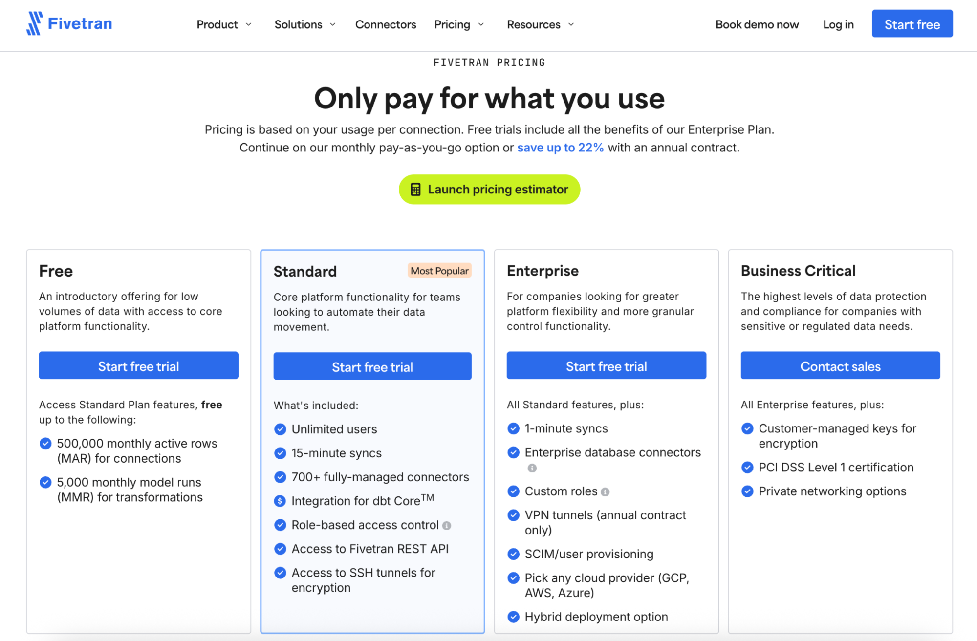
3. Fivetran
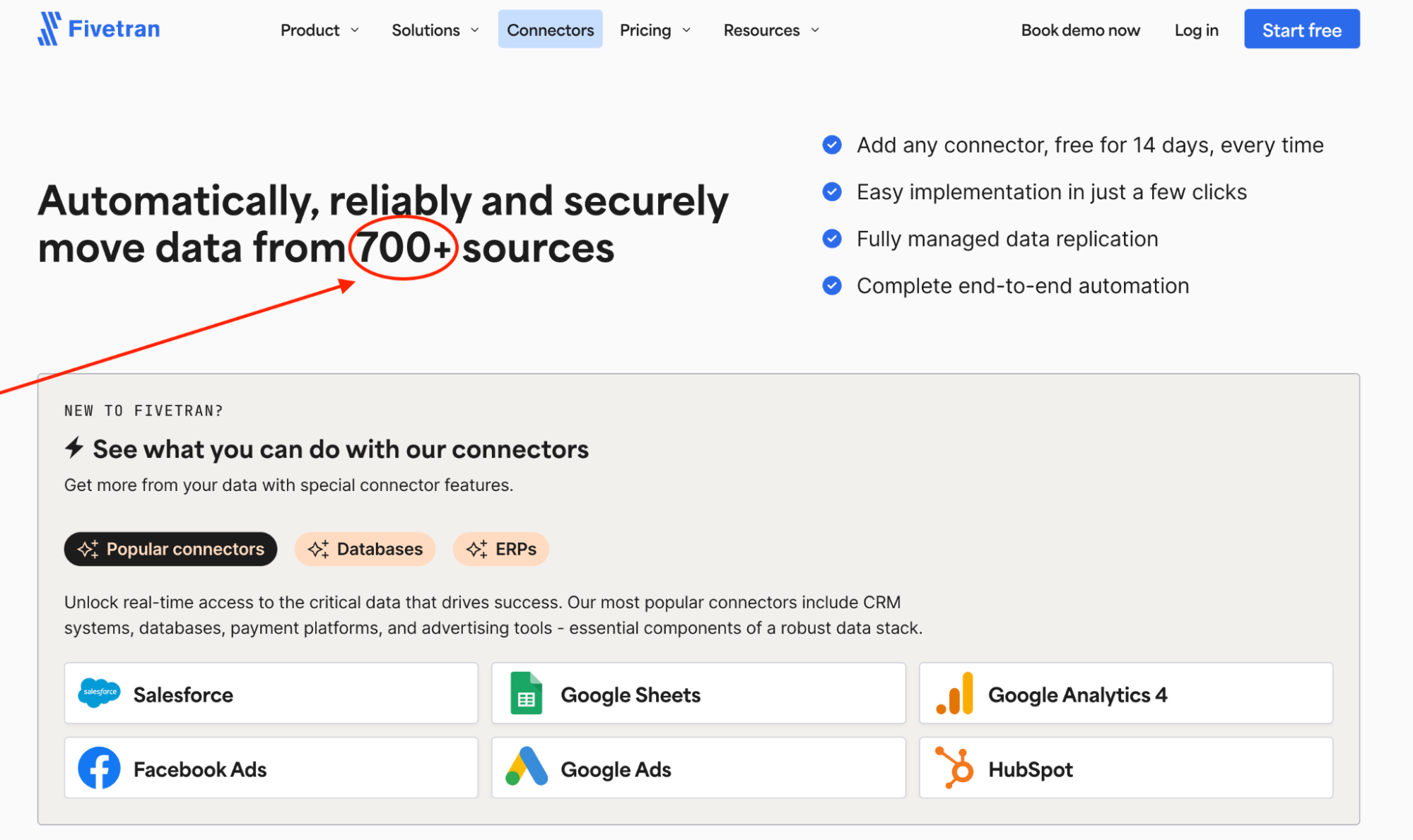
Fivetran is a fully-managed data integration service that pipes data from hundreds of sources straight into your warehouse.
But like Funnel.io, Fivetran is built for data infrastructure, not marketing reporting. And with its newer pricing model, it’s also one of the more expensive options in this list.
If your world revolves around Snowflake, BigQuery, or Redshift, Fivetran is a strong contender.
Fivetran key features
- 700+ connectors across SaaS tools, databases, and cloud platforms.
- Fully managed pipelines with automated schema and ERD updates.
- Incremental syncs so you only move what changed.
- Automatic historical backfills for consistent, complete datasets.
- Native integrations with Snowflake, BigQuery, Redshift, Databricks, Azure.
Fivetran pros and cons
Again, based on my own testing and what marketing teams tell us matters most when evaluating reporting tools:
✅ Pros | ❌ Cons |
| Hundreds of prebuilt connectors across marketing, sales, finance, and ops tools. Meta, HubSpot, Snowflake, Shopify…even those niche edge-case sources you expect to ingest manually. | Pricing is steep—and increasingly opaque. In recent 2025 G2 reviews, 6 out of 17 reviewers (≈35%) list pricing as their top frustration. |
| Readable, well-structured documentation—setup guides that actually make sense for analysts, operations folks, and technical marketers. | Frequent updates sometimes break things; users report schema mismatches, sudden inconsistencies, and outages after rollouts that felt more “alpha build” than enterprise-ready. |
Fivetran pricing
Fivetran uses a usage-based model priced primarily on Monthly Active Rows (MAR), and in 2025, they made a major shift: the pricing structure is now calculated per connection, not per account.
That change alone has made budgeting harder for marketers and agencies.
To get a real feel for the new model, I ran a full test using Fivetran’s pricing estimator inside my workspace. Here’s the setup:
- Source: Instagram Business
- Destination: Snowflake
- MAR: ~270,000 (pretty normal for a couple of active campaigns)
- Transformations: 10,000 model runs/month (first 5,000 free, next 5,000 at $0.01 each)
My estimated monthly cost under the Enterprise plan:
- Connections: $191.75
- Transformations: $50.00
- Total: $241.75 per month
That’s $2,900+ a year for (checks notes) one connector and one destination—for a single client’s data. And that’s assuming the client only uses one platform…which never happens in the real world.
One Reddit user in r/dataengineering said they’re actively searching for Fivetran alternatives because, under the new MAR-per-connection model, they expect to see a “70% cost increase.”
What do real users say about Fivetran?
The public sentiment is fairly split: users love how easy Fivetran is to operate day-to-day, but they’re far less enthusiastic about support consistency and connector reliability.
A verified G2 reviewer praises the onboarding experience:
“I found the UI simple to navigate the very first time I used it without any need for additional help.”
But others describe a different reality, especially when syncs break:
“There have been cases where connectors have stopped working or not syncing and there is no update on the status page or in incident…We had to reactively reach out to support to ask why the syncs were not working.”
4. Supermetrics
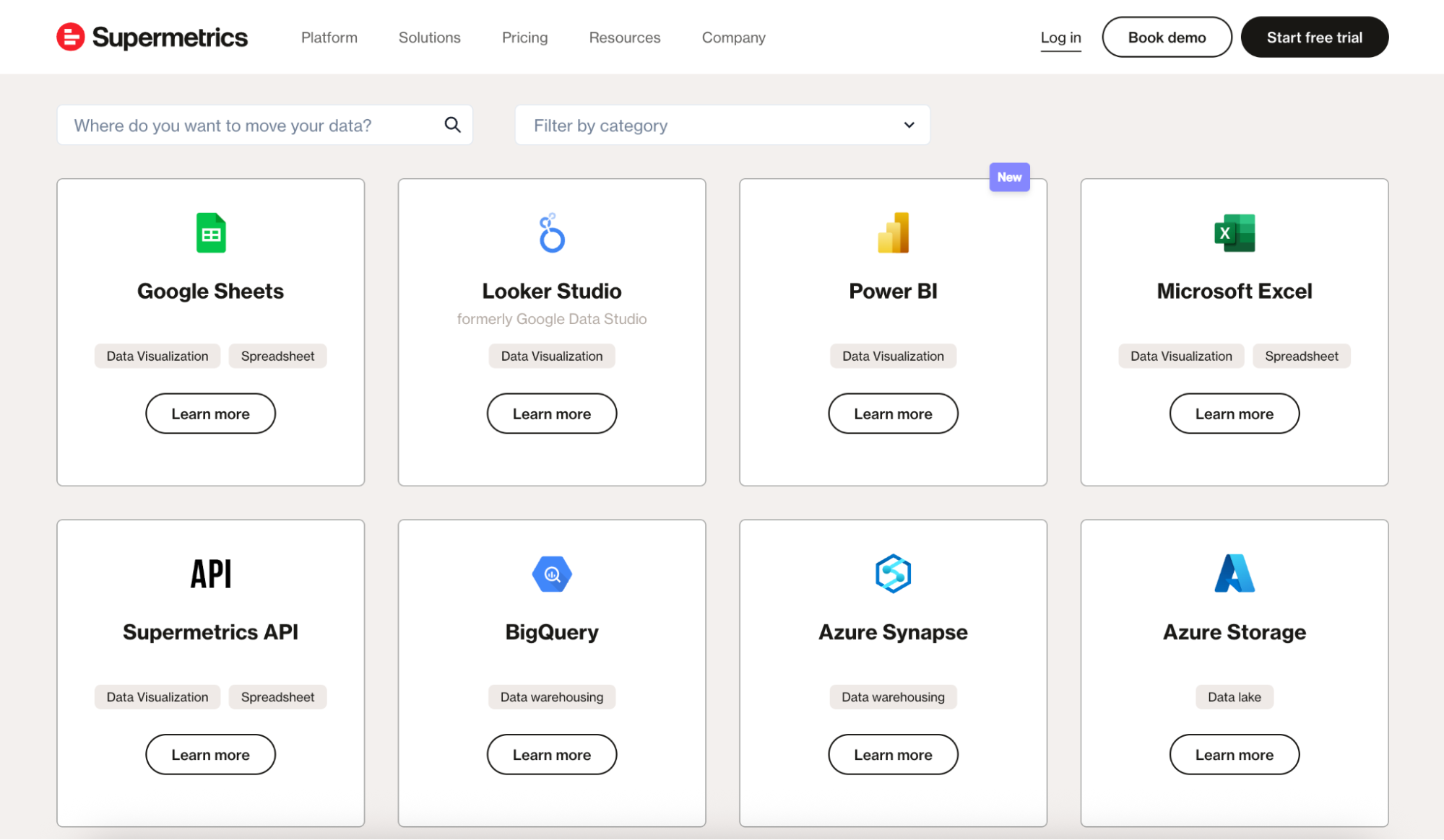
Supermetrics is one of the OG marketing data tools; best known for piping platform data into Google Sheets, Excel, Looker Studio, BigQuery, and a handful of other destinations.
But similar to Funnel.io and Fivetran, Supermetrics is not an all-in-one reporting platform—it’s a data pipe. You still need to build the dashboard, clean the data, and format the report yourself.
If you're a spreadsheet power user or your agency lives inside Looker Studio, Supermetrics can be a smooth fit. But if you want automated, client-ready reporting with AI, you’re going to need another tool on top.
Supermetrics key features
- 100+ marketing analytics connectors.
- Data delivery into Google Sheets, Excel, Looker Studio, BigQuery, Snowflake, and more.
- Query manager for controlling load size and reducing errors.
- Templates for Sheets and Looker Studio (though often basic).
- Transformation features via Supermetrics Functions (limited as of now).
Supermetrics pros and cons
Based on my hands-on testing, public reviews, and what marketers care about in reporting workflows:
✅ Pros | ❌ Cons |
| If your daily stack hops between Google Analytics, Meta, LinkedIn, TikTok, Shopify, HubSpot, and a handful of long-tail tools, Supermetrics almost always has a ready-made connector. | Teams often feel like costs creep up without warning. Adding a connector, changing a plan, or losing access to a feature you used to have can trigger sudden jumps that only show up when something breaks. |
| For marketers who only need to shuttle numbers into Sheets, Excel, Looker Studio, or a warehouse, Supermetrics is solid. | Some sources require multi-step authentication, others use different logic depending on whether you’re pulling into Sheets or Looker Studio. This can make onboarding slow |
Supermetrics pricing
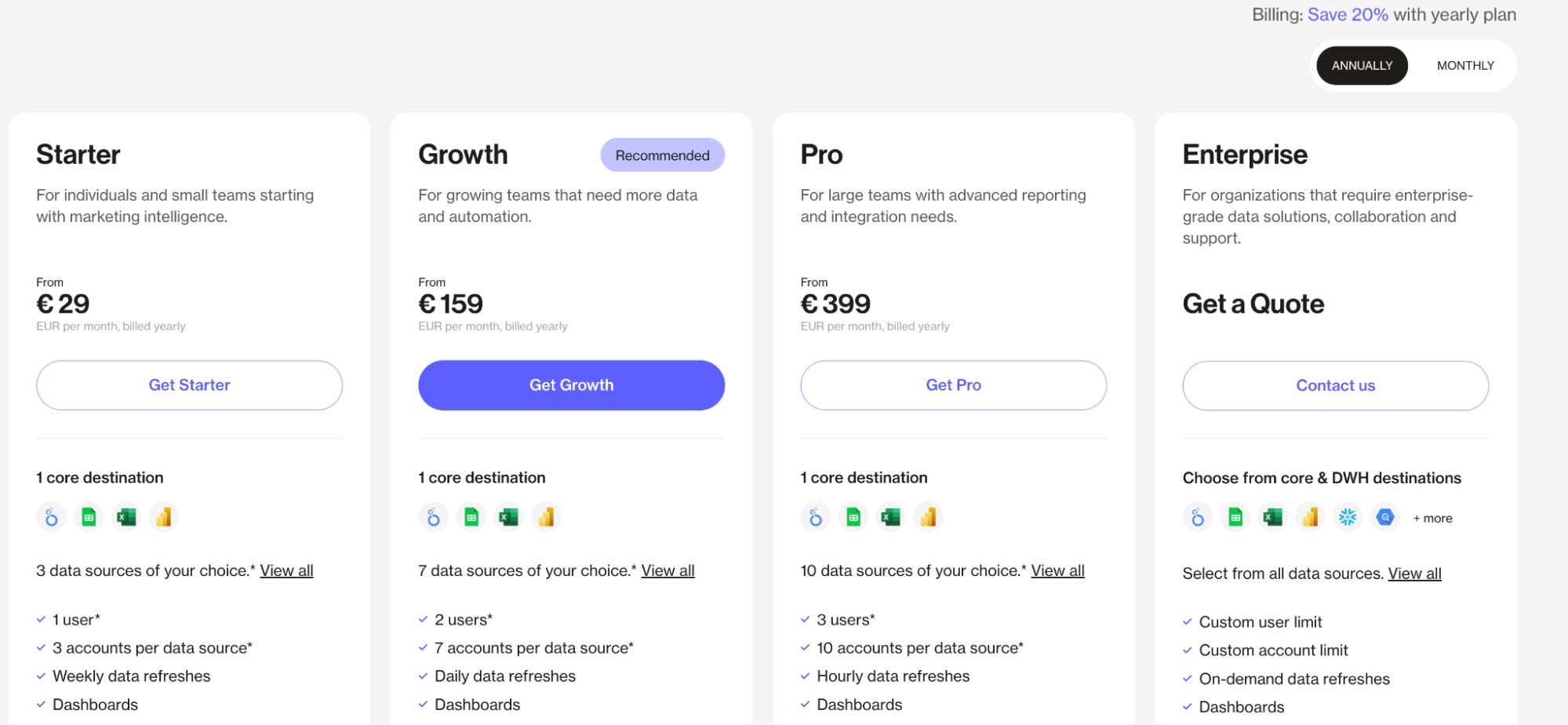
- Starter at €29/month: 1 destination, 3 data sources, weekly refreshes.
- Growth at €159/month: 7 data sources, daily refreshes.
- Pro at €399/month: 10 data sources, hourly refreshes.
- Enterprise: Custom
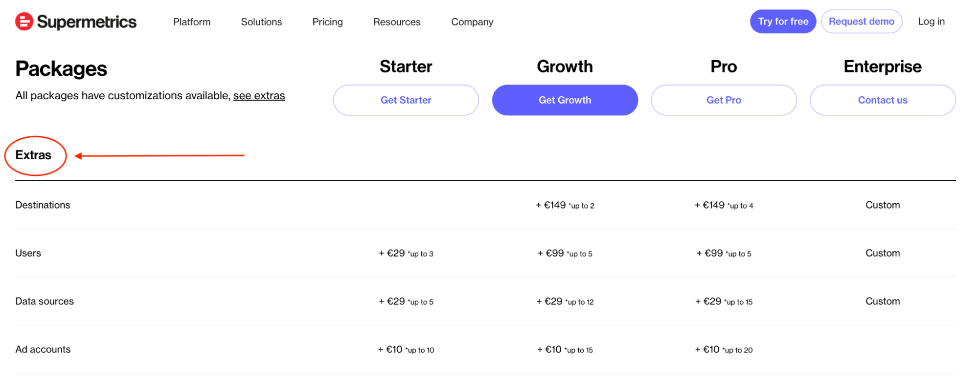
Supermetrics’ pricing feels straightforward at first glance, but you need to know two things:
- Supermetrics is a connector, not a reporting tool: Your subscription covers the pipeline, not the dashboard.
- Pricing is modular, everything is an “add-on”: You pick a base plan, then costs stack quickly as you add data sources, accounts, destinations, refresh frequency, and extra users.
What do real users say about Supermetrics?
Feedback on Supermetrics tends to swing between “lifesaver” and “headache,” depending on how complex the workflow is.
Supermetrics is widely used because it does make it easier to pull marketing data from multiple platforms into Sheets, Excel, or Looker Studio.
The reviews praise it as a “great tool for data-driven marketers” and even a “game-changer” for marketing analysts and businesses that need “automated, accurate, and easily accessible reporting.”
But, the other side of the coin is sheer disappointment. On X, Cory Dobbin says:
“It's crazy to me how expensive Supermetrics is for what is one of the most unreliable tech products I've ever used.”
5. Adverity
Adverity is like an ETL engine that specializes in pulling marketing, ecommerce, and business data from dozens of sources, reshaping it, and delivering it into warehouses or BI tools.
Much like its three predecessors on this list, it’s not an all-in-one reporting platform, so you’ll still need something like Looker Studio, Tableau, Power BI, or a custom dashboard on top.
Adverity key features
- 600+ connectors across marketing, sales, ecommerce, and BI platforms.
- Advanced data transformations (mapping, normalizing, custom formulas).
- Strong warehouse support (Snowflake, BigQuery, Redshift, Databricks).
- Built-in data quality checks and anomaly detection.
- Automated ingestion pipelines with scheduling and version control.
Adverity pros and cons
Adverity doesn’t offer a self-serve trial, so I couldn’t test the product directly. But everything here—and in our thorough deep-dive guide—is based on verified user feedback, public demos, and third-party documentation.
✅ Pros | ❌ Cons |
| Orchestrate fetches, build transformations, and merge datasets with a fair amount of control; several reviewers highlight Adverity’s data-quality tools for catching errors before they hit downstream dashboards. | In the 2025 G2 review set, multiple users mention unstable pipelines, failed extractions, and unexpected crashes that disrupt reporting workflows. |
| If you have data engineers or ops folks who like to fine-tune pipelines, Adverity offers the flexibility to do it. | This isn’t a plug-and-play tool; expect a heavier onboarding period and more configuration time than most marketer-friendly platforms. |
Adverity pricing
Adverity doesn’t offer transparent, tiered plans you can compare; everything runs through a sales conversation.
However, the only public benchmark comes from the Microsoft Azure Marketplace, where Adverity is listed as a $200,000 upfront, 12-month license.
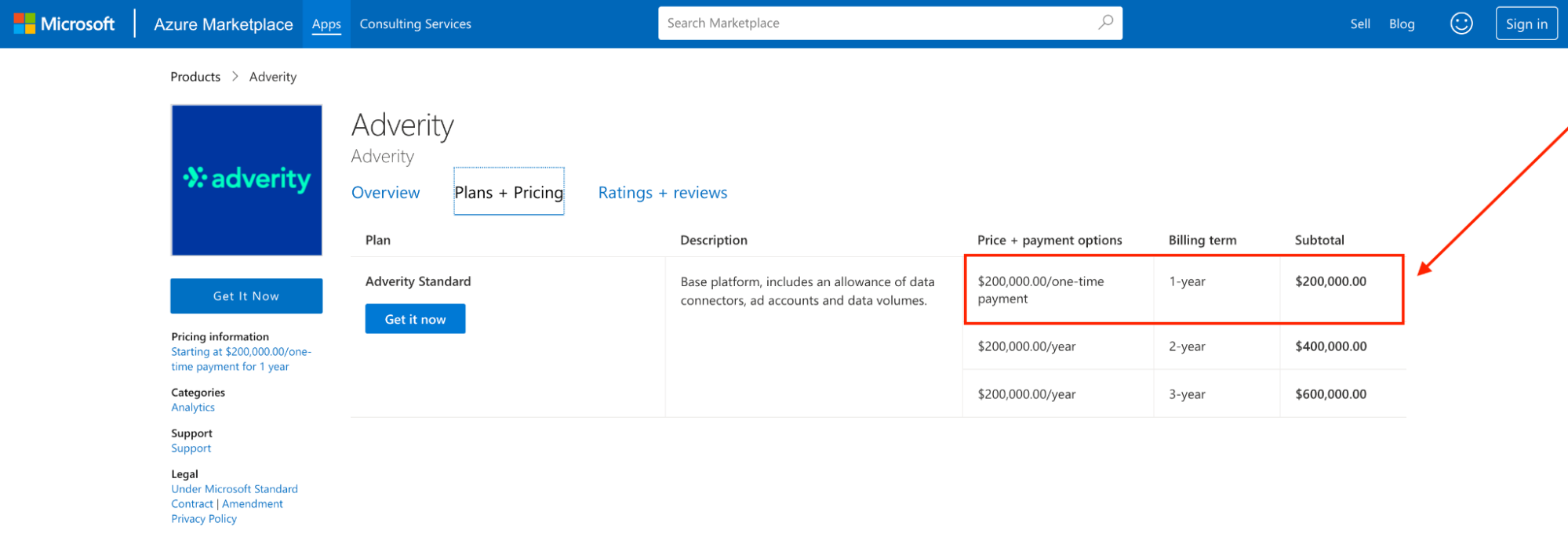
That alone makes it clear: Adverity is priced for enterprises with big data teams and bigger budgets.
What do real users say about Adverity?
Reviewers consistently praise Adverity for how smooth it is to connect and pipe data: especially inside its “Connect” interface, which several users describe as the “best portion” of the entire platform.
Adverity can move data exceptionally well, but it’s not built for quick inspection, debugging, or lightweight analysis. Even five-star reviewers call this out.
Data Analyst Chris B. notes:
“While the visualization tool offers a lot of basic features, it would be nice to have a BI-style tool for internal use as well.”
6. Improvado
Improvado is a marketing-focused ETL platform built to pull data from dozens of sources, standardize it, and deliver it into warehouses or BI tools.
The platform works really well for technical teams, large enterprises, or agencies with a BI stack already in place. Basically, anyone who prioritizes a flexible, customizable data pipeline over an all-in-one reporting solution.
Improvado key features
- 500+ marketing and analytics integrations.
- Pipeline monitoring and built-in data quality controls.
- No-code transformation module for mapping and cleaning datasets.
- Warehouse and BI tool support (BigQuery, Snowflake, Redshift, Looker, Tableau, Power BI).
- Role-based access control; SOC 2 Type II, GDPR, HIPAA compliance.
Improvado pros and cons
Since Improvado doesn’t offer a self-serve trial (no click-around sandbox unless you’re a qualified lead), I pulled this snapshot from verified reviews, user discussions, and a thorough sweep of their official documentation:
✅ Pros | ❌ Cons |
| Improvado isn’t a black box; you can pair native integrations with custom connectors to fill any gaps in your stack. | Noticeably steep learning curve; setup and customization require time, patience, and often a developer. |
| Built for cross-channel complexity; one user mentioned pulling in two email platforms, GA data, and paid + organic social across five channels | Data syncs can be hit-or-miss; unreliable syncs and minimal visibility into what’s running, stuck, or failing. Not ideal when you’re on deadline and need certainty. |
Improvado pricing
Improvado doesn’t publish pricing publicly. There are no tiers you can compare on the website or any self-serve plan to try.
But what we do know from verified G2 reviews is that pricing is structured around three buckets (Growth, Advanced, Enterprise), with many advanced features tied to credit-based add-ons.
Here’s what that looks like:
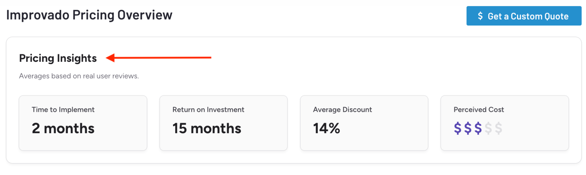
- Implementation time: ~2 months
- ROI timeline: ~15 months
- Average negotiated discount: ~14%
- Perceived cost: $$$ (mid-tier to enterprise)
What do real users say about Improvado?
Across G2, users consistently highlight the support team as one of Improvado’s strongest assets.
Adam O. puts it this way:
“Improvado's customer relationships and willingness to go above and beyond really sets them apart.”
However, several reviewers mention needing a second tool (or heavy customization) to get meaningful analysis.
As one verified reviewer notes:
“Unable to truly gather insights from the dashboards provided.”
Published on Dec 02 2025
WRITTEN BY
Brinda GulatiBrinda Gulati is a fractional content marketer and freelance writer who specializes in data-driven storytelling and writing easy-to-understand, informative content for humans. She has two degrees in Creative Writing from the University of Warwick, and believes that above all, stories are a deeply human endeavor. She has two dogs, knows thrifting spots, and loves afternoon naps.