7 Best Funnel.io Alternatives in 2026: Real Reviews & Features
Funnel.io is a powerful data platform, but its steep learning curve, basic visualizations, and high cost can leave users wanting for more.
In this article, we’ll take you through:
- The shortcomings of Funnel
- The 7 best Funnel.io alternatives
- Features and pricing of each tool
- Real customer reviews of each tool

Jun 23 2026●8 min read


Funnel.io is great for moving your data to spreadsheets, visualization tools, and databases, but it’s far from perfect. Users online say it’s:
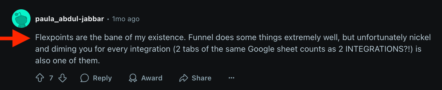
❌ Expensive: Funnel’s pricing is based on “flexpoints” which measure how many connectors and destinations you’ve used.
But the tricky part is—if you need multiple breakdowns or connections from a single connector, you can end up paying 1000s of dollars a month.
Many users say they need to constantly monitor their data sources to avoid overpaying or using up their credits. (This is a huge time-sucking task of its own.)
❌ Not intuitive: Funnel is powerful, but it also comes with a steep learning curve. For the average marketer or non-tech savvy user, setting up the tool and navigating it can be time-consuming and often frustrating.
❌ Limited: Funnel offers basic dashboards with limited customization and white-labeling features. Many users report still having to use third-party visualization tools like Looker Studio which can be slow, clunky, and difficult to use.
---
If you’re experiencing similar challenges with Funnel, we’ve got your back.
In this article, we’ll take you through seven best Funnel.io alternatives and competitors that are easier to use, more cost-effective, and come with more features.
But before we start, let’s briefly overview Funnel.io and its features.
7 Best Funnel.io Alternatives and Competitors in 2026
In a nutshell, here are the 7 best Funnel.io alternatives we'll review in this article:
- Whatagraph
- Coupler.io
- Supermetrics
- Porter Metrics
- Domo
- Adverity
- NinjaCat
Don't want to read through walls of text? Here's a summary table:
| Tool | Best for | Pricing |
| Whatagraph | Agencies scaling reporting on one governed data layer | Free forever; paid from $229/mo |
| Coupler.io | No-code pipelines into spreadsheets, BI tools, and AI | Free; paid from $24/mo |
| Supermetrics | Agencies needing warehouse-first strategy with AI agents | From $44/mo |
| Porter Metrics | SMBs and agencies running on HubSpot, Shopify, Klaviyo | Free; paid from $12.50/account/mo |
| Domo | Enterprise data teams building custom data apps | Custom pricing only |
| Adverity | High-maturity teams needing complex ETL and governance | Custom pricing only |
| NinjaCat | Mid-market to large agencies needing AI agent workflows | From ~$1,500/mo |
Let's dive into each of these.
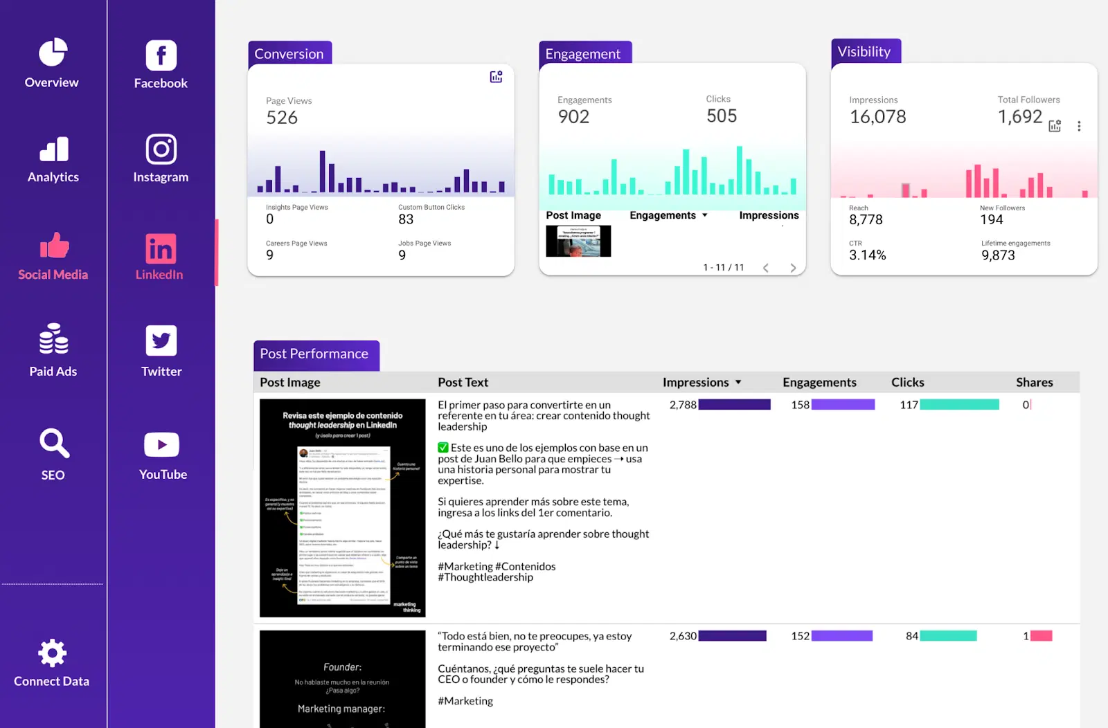
1. Whatagraph
Best for: Marketing agencies and in-house teams that want one governed data foundation instead of a Funnel-plus-Looker-Studio stack
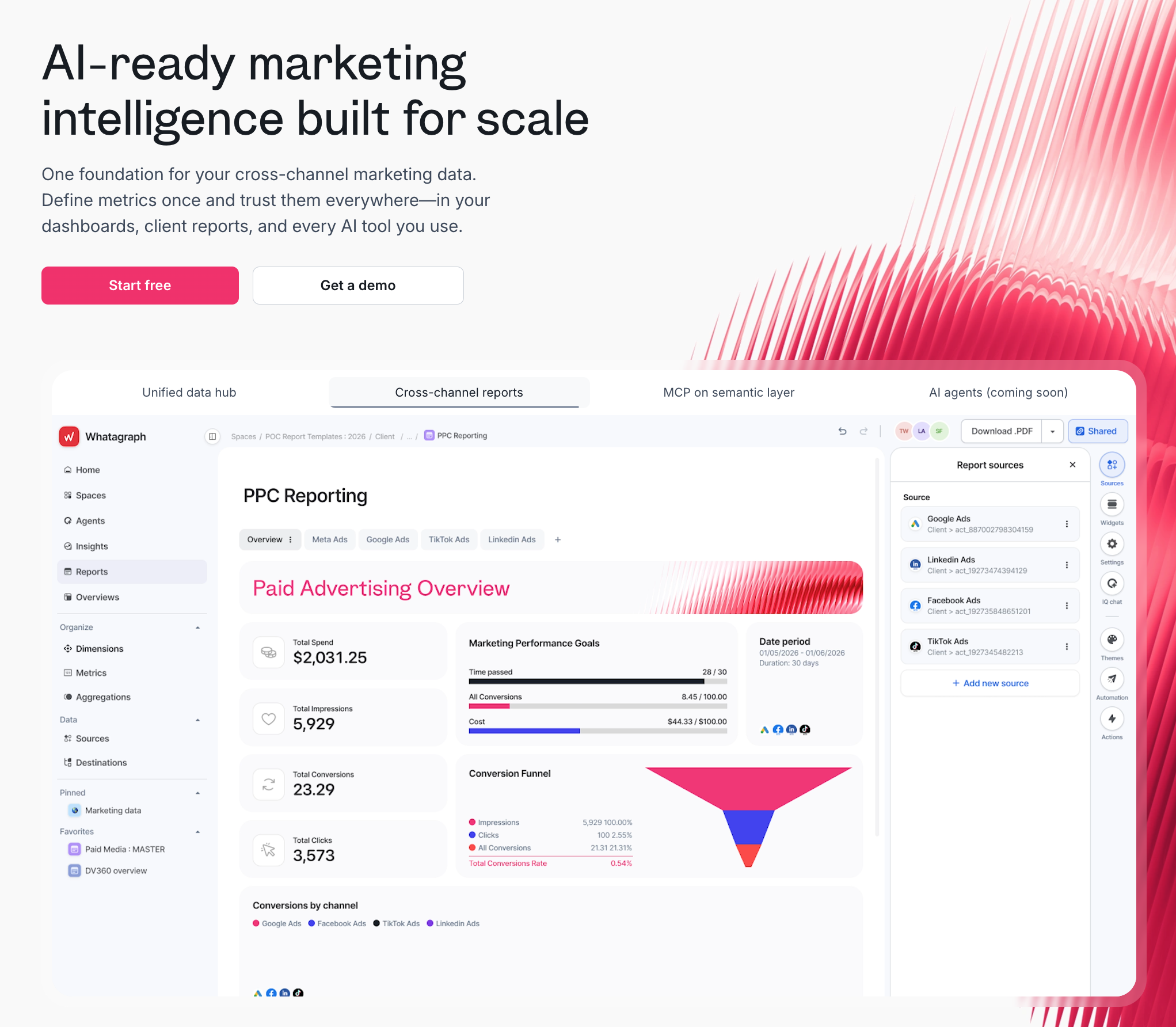
If you're switching from Funnel because the flexpoints model keeps surprising you, or you still need to use a separate tool for building reports (like Looker Studio), Whatagraph is built for that exact gap.
Whatagraph is a marketing intelligence platform with one governed data foundation that powers your client reports, internal dashboards, BigQuery export, and AI assistant, all from the same definitions.
While Funnel just moves and transforms data from your source platform to a visualization tool, Whatagraph takes care of the whole journey - connect, govern, visualize, and share inside one platform, so the hours your team would spend stitching tools together go toward something more strategic.
Here's what that looks like in practice:
1. Connect: 60+ fully managed integrations
Whatagraph connects to 60+ native integrations across paid media, SEO, social, analytics, CRM, ecommerce, and email.
Unlike connector tools that route data through third-party pipelines, Whatagraph manages every integration in-house. When something breaks, the product team fixes it - not a middleware vendor you have no visibility into.
In fact, this is the biggest advantage Linda van Baal, Online Marketing Consultant at YourFellow saw when they switched to Whatagraph. She says:
Whatagraph saves me at least half a day a week and it's so much easier and faster than Funnel and Looker Studio. But the biggest advantage is that all our data is now in one tool—everyone knows where to find everything because it’s in one place.
2. Govern: define your data once and see it everywhere
If you're running campaigns on Google Ads, Meta Ads, LinkedIn Ads, and more, you know how much of a pain it is to standardize metrics and dimensions across all of them.
Every platform has its own naming conventions, its own conversion definitions, its own way of counting a click. By the time that data lands in one report, you're spending more time reconciling numbers than analyzing and acting on them.
Whatagraph's Data Hub let you define what things mean once - then that definition carries through every report, every client, every channel.
Source Groups are a good example of how this works in practice: if a client runs three separate Google Ads accounts across different regions, you group them into one.
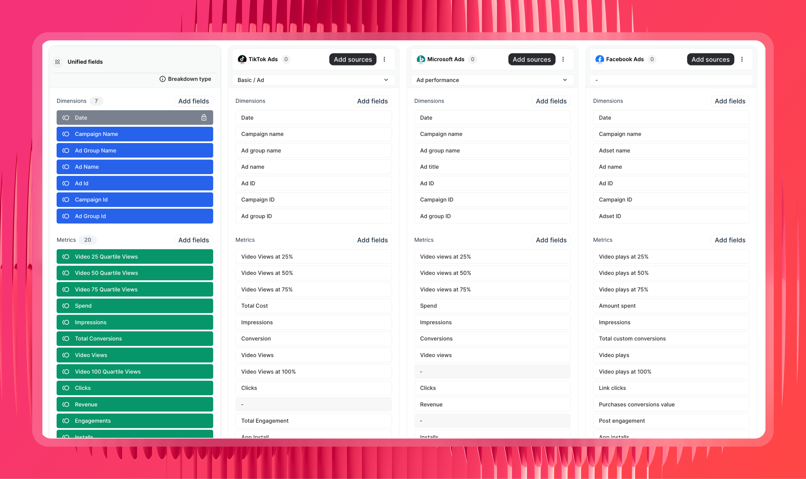
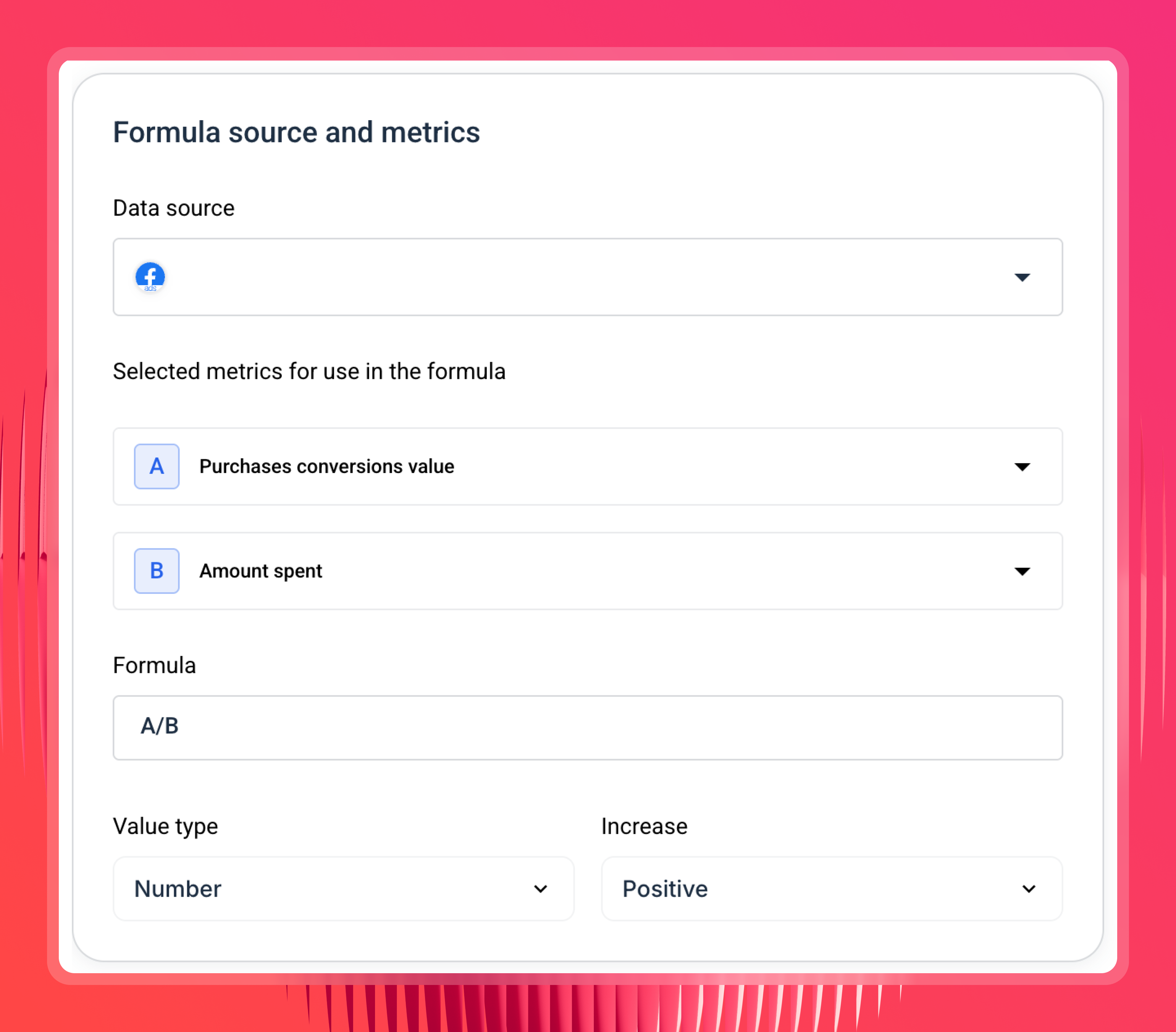
Custom metrics and dimensions let you build cross-channel KPIs and standardise naming across clients. Different clients call the same metric by different names. Whatagraph lets you rename per client so the report always matches their internal language, without rebuilding anything.
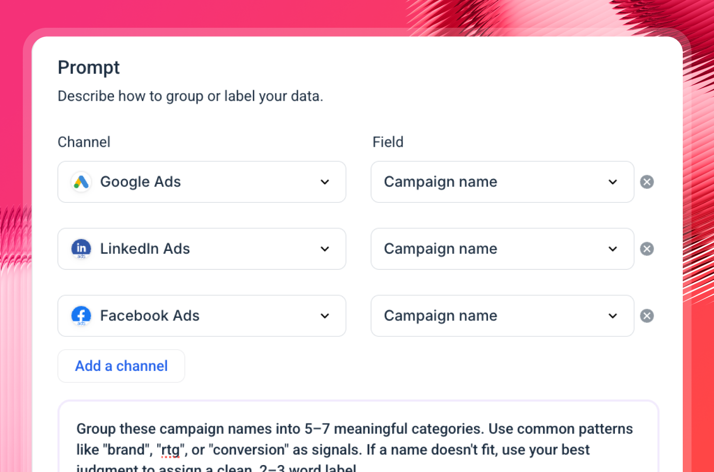
You can also ask Whatagraph IQ, the platform's built-in AI, to create a custom dimension for you. Just choose your channels and dimensions, type in a prompt, and you'll have your custom dimension ready to be used in reports.
3. Report: AI that builds and writes, plus templates that actually scale
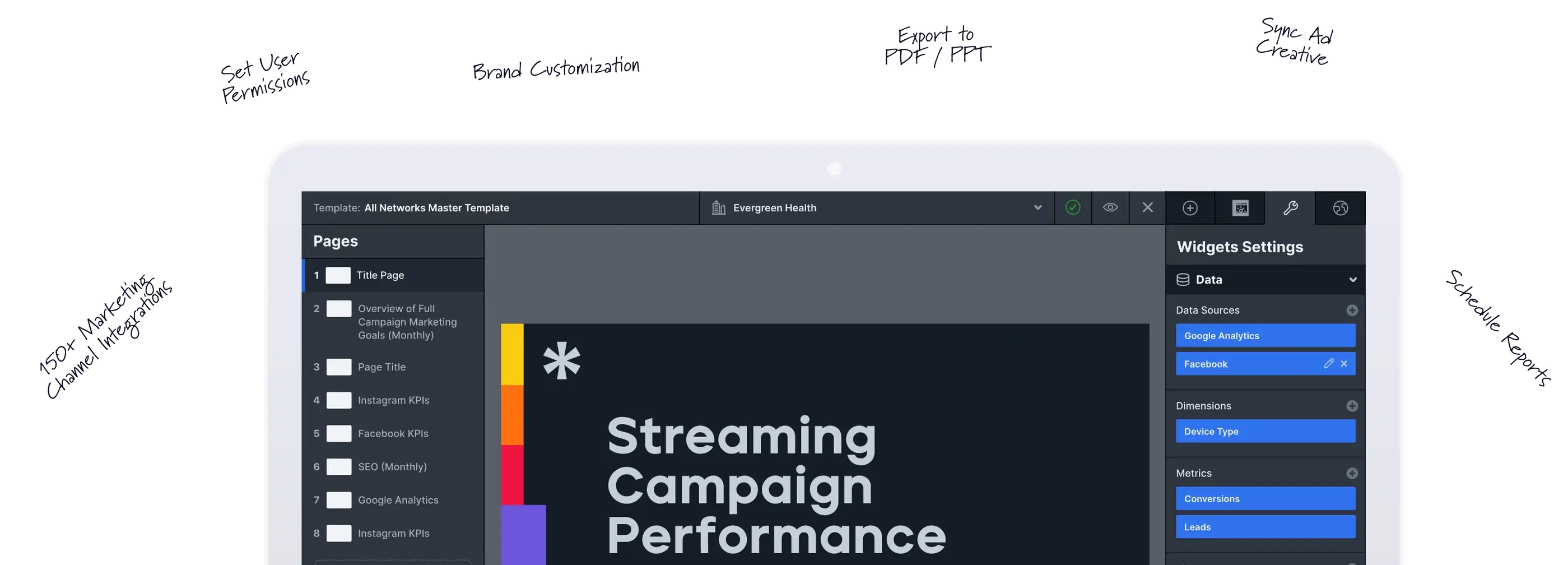
Agencies spend way too much time creating reports from scratch - and this problem compounds with every new client you onboard.
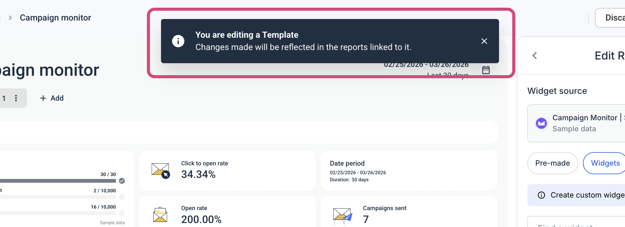
With Whatagraph, you build a report template once - one for lead gen clients, one for eCommerce, one for paid media - and reuse it every time a new client comes in.
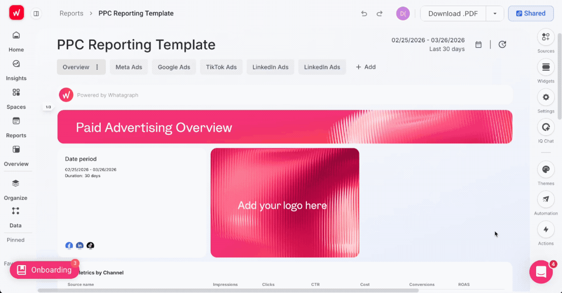
Then you link those reports to one master template. Add a new tab, update a metric, change a widget layout - every linked report updates automatically. You're not opening 40 reports one by one. You make the change once, it goes everywhere.
Maatwerk Online, a 41-person Dutch agency managing over 100 clients, saves more than 100 hours a month with this approach. Co-Founder Lars Maat says templates save more than time - they save the mental load of knowing you have to do it all again.
Whatagraph saves time and energy for our marketing specialists. And the hours we're saving is just pure profit. We now have the time to focus on more strategic things that help both our agency and our clients grow.
On top of that, with Whatagraph IQ, you don't even need to build a report from scratch. You can just choose your channel, type in a prompt, and it automatically creates the report based on your connected data.

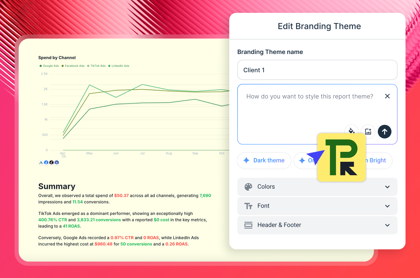
You can also brand the report in your or your client’s branding with AI. Just upload a screenshot of your report or type in a prompt, and Whatagraph applies the colors to the report.
Want to write performance summaries inside the report? Whatagraph IQ does it automatically for you based on your connected data so there are no hallucinations.
4. Monitor: see every client and portfolio at once
Individual client reports tell you how one account is doing. Performance Overviews tell you how all of them are doing, from one place.
Basically, it's a filterable dashboard across your entire client book. You can slice by account manager, client, location, or custom tag - so if you want to see every client a specific account manager owns, or every account in a particular region, it's a filter, not a manual export.
For agency leadership, this is the view that was missing. Instead of opening individual reports to check on accounts, or waiting for account managers to flag something, you can see the whole portfolio, spot what's off-track, and act before it becomes a client conversation.
Goals and alerts sit on top of it. Set a performance target for a client, and Whatagraph notifies you via Slack or email when something goes off-track mid-month - not at the end of it when there's nothing left to do.
5. Query: ask questions about your data via MCP
Whatagraph connects to Claude, ChatGPT, and any MCP-compatible AI tool via Whatagraph MCP. Ask your AI assistant: "Which clients are pacing behind on spend this month?" or "Show me a channel comparison across Google Ads, Meta, and LinkedIn for the last 30 days" - and it answers from your actual Whatagraph data.
Funnel also launched an MCP server in May 2026, and it similarly sits on a governed data layer. The practical difference: Funnel's MCP outputs to your AI tool and stays there. Whatagraph's MCP queries the same foundation your client reports run on - so insights can move from AI chat to client-ready deliverable in the same platform, without switching tools or rebuilding context. Setup takes five minutes, no code required.
6. Share: send reports everywhere your team and clients need it
Once you're done with reports, you can share them as white-labeled live links with a custom domain, set a password, and choose to enable IQ Chat for clients.
IQ Chat lets you and your clients (if enabled) ask questions about your data and performance and get back accurate, fast answers. It's like having Claude built into your reporting system.
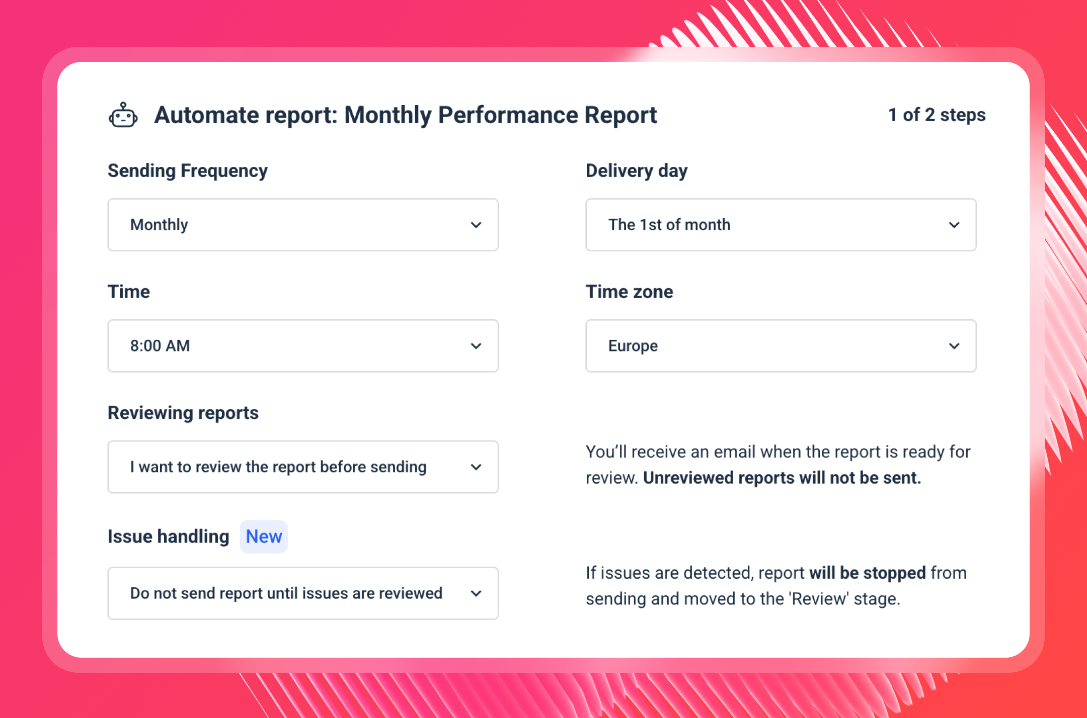
You can also set up automated reports where they go out to specific emails on specific days, times, and cadences. Don't worry you'll still have the option to review the reports before they're sent to clients.
Whatagraph Reviews from Real Users
"The dashboards are clean, easy to build, and perfect for client reporting. It pulls in data from Google Ads, Meta, LinkedIn, and even TikTok without any hassle." (Source)
"I use Whatagraph every month to show my client roster their marketing campaign metrics data. It solves a unified vision of all the campaigns we run with our clients; it's easy to understand and to connect platforms." (Source)
"It's easy to use and intuitive. I enjoy how things aren't hidden in menus, and the AI reporting is very on point." (Source)
Whatagraph's Pricing
Funnel’s pricing is based on flexpoints which count how many data connectors and destinations you use.
The problem with this is if you need several breakdowns or connections for one data source, you can end up paying a lot more than expected.

That’s why many users describe Funnel’s pricing as unpredictable, even the “bane of my existence”.
In fact, based on our customers who used to use Funnel, it's 50-65% more expensive than Whatagraph.
Whatagraph's pricing scales with how much data you actually use rather than how many people are on your team, and every plan includes unlimited users and unlimited reports. Check the pricing page for a full breakdown by plan.
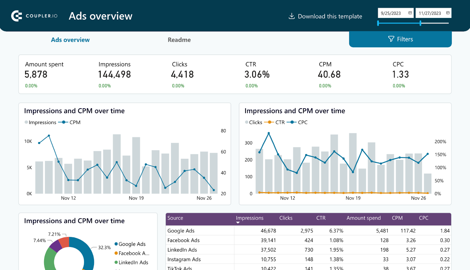
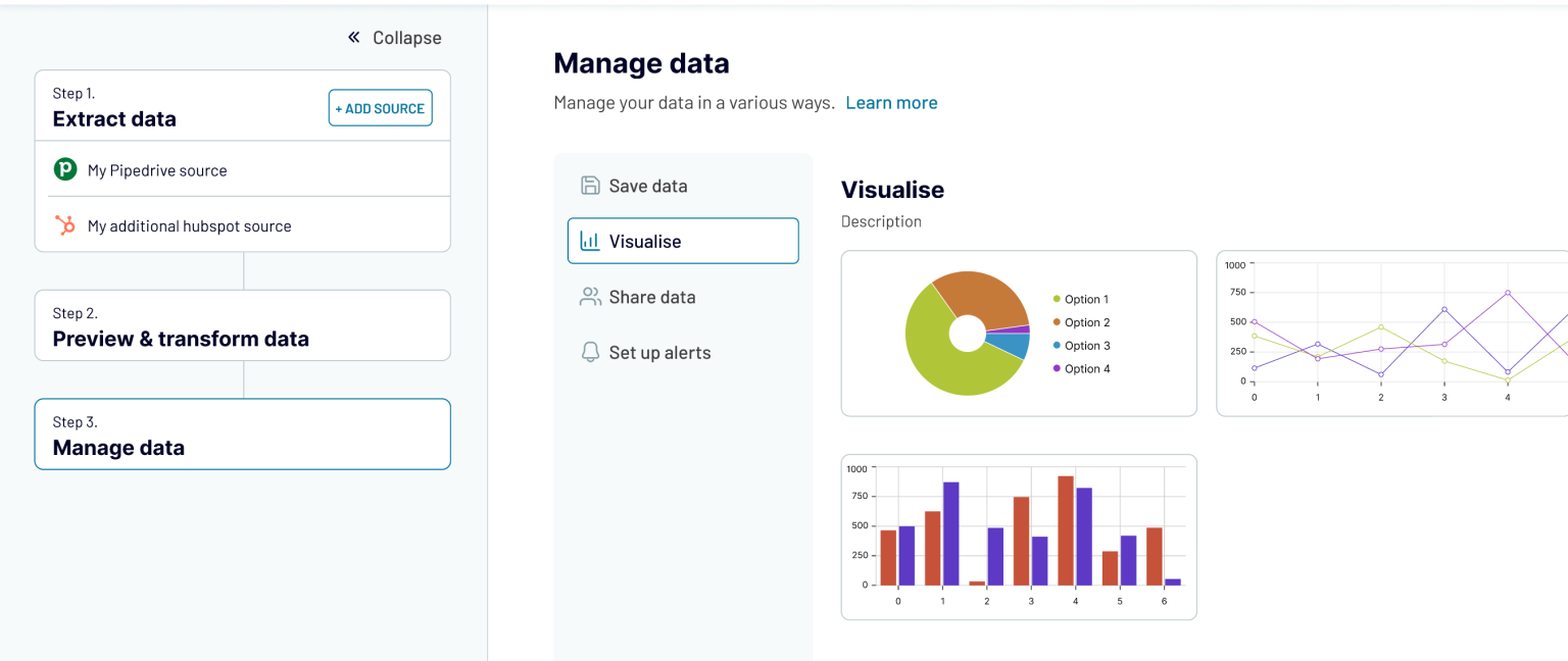
2. Coupler.io
Best for: In-house teams and agencies that need to move massive amounts of data from 400+ sources into spreadsheets, BI tools, or AI environments.
Coupler.io is a no-code data integration and AI analytics platform that automates the extraction, transformation, blending, and scheduling of data so you don’t have to manually export or prepare it.
You can connect to over 400+ business apps—covering not just marketing (Meta, Google Ads, TikTok), but also finance (QuickBooks, Stripe), sales (HubSpot, Salesforce), and project management (Jira, Asana).
What sets Coupler.io apart is its ability to transform, aggregate, and blend data from multiple sources. This means you can customize and optimize your reports to make smarter decisions, faster.
Before your data hits its destination, you can filter, sort, and join different sources. For example, you can blend Shopify sales with Facebook Ad spend to calculate your actual marketing efficiency ratio (MER) in real time.
While it’s ideal for marketers, Coupler.io also brings together sales, financial, project, and other business data in one place—making cross-channel analysis seamless.
In 2026, Coupler.io has leaned further into AI: an AI Agent now runs inside your data flows to analyze results directly, and AI Insights generates a one-click summary of any native Coupler.io dashboard without manual setup.
Coupler.io also added connectivity to Claude and ChatGPT via MCP, so you can query connected data directly from an AI assistant rather than opening a spreadsheet first.
The platform's roots are still in Google Sheets, though, and that shows: data transformations like joins and data aggregations are locked behind the Active plan and above, and the free tier caps you at one marketing data source and manual refresh only.
Coupler.io reviews from Real Users:
"I love the ability I can connect to many data sources with ease." (Source)
"While their prebuilt Power BI dashboards save a ton of time on setup, you still have to do some work to swap out different data sources or just remove some of the presets if you don't want to use the exact combination the dashboard comes with." (Source)
"The customer service is really good, I had an issue and was able to book a call within 24 hours." (Source)
Key features
- 400+ no-code data integrations
- AI Agent for in-flow data analysis
- AI Insights for one-click dashboard summaries
- MCP connectivity for Claude and ChatGPT
- Data refresh scheduling
- Transform module (filter, aggregate, append, join)
- 100+ free dashboard templates
Pricing:
Coupler.io offers a free tier plus multiple paid subscription plans that scale on user seats, data connections, destinations, refresh frequency, and enterprise support.
- Free: 1 data source, 1 destination, manual refresh, 100 rows/run
- Starter ($24/month): 5,000 rows/run, daily refresh, data transformations, AI Insights
- Active ($99/month): 15 accounts, unlimited users, unlimited data volume
- Pro ($199/month): 50 accounts, unlimited destinations, hourly refresh, dedicated account manager
- Agency and Enterprise (custom): custom accounts and destinations, 15-minute refresh, priority support, enterprise SLA5
3. Supermetrics
Best for: Large organizations and agencies with dedicated data science teams or technical analysts who need a warehouse-first strategy.
Supermetrics is a data moving tool that pulls together marketing data from over 150 platforms, like Google Analytics and Facebook Ads, into data warehouses and BI tools like Big Query and Looker Studio.
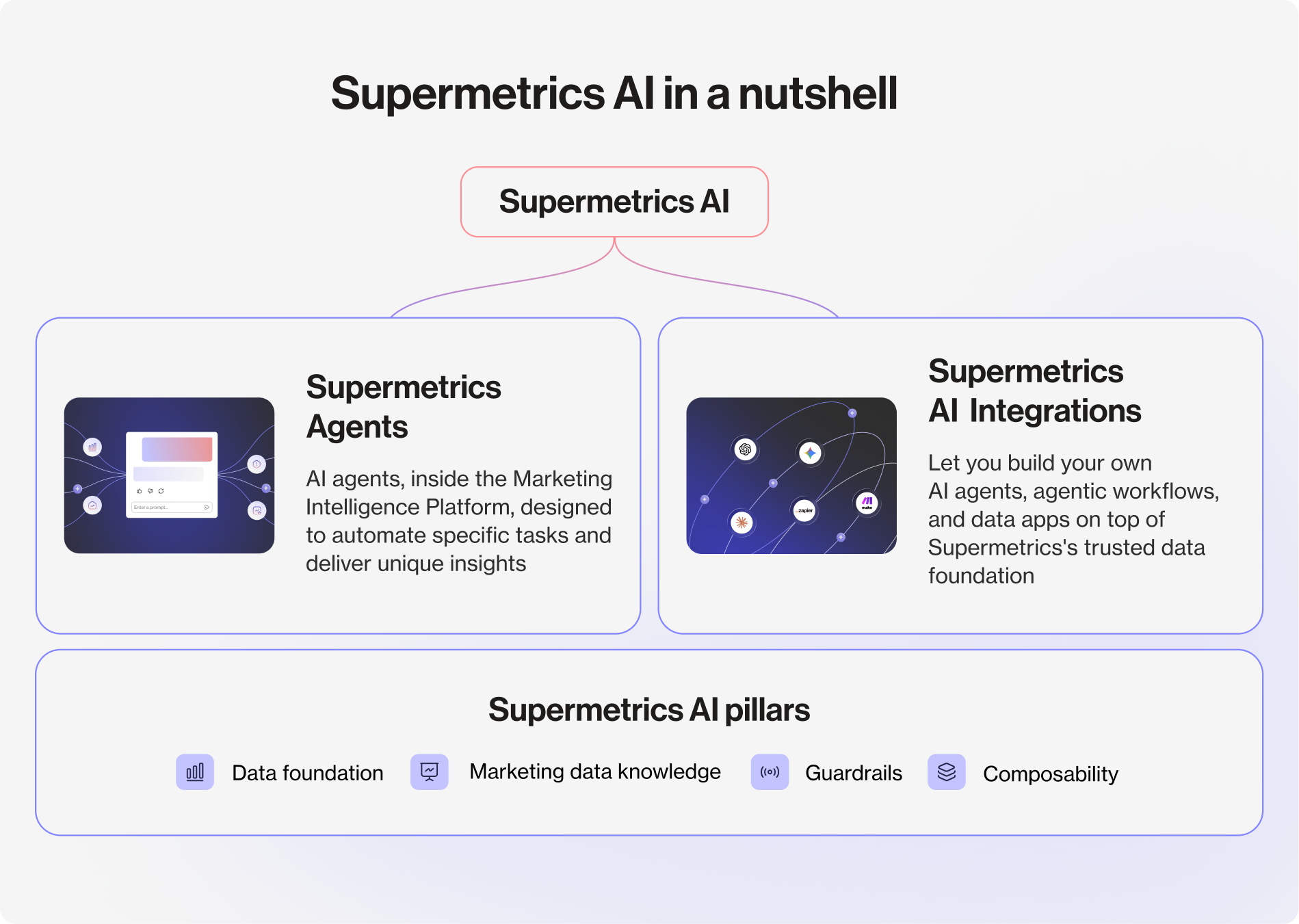
Supermetrics’ rollout of Supermetrics AI adds an accessible layer of natural-language analytics across the platform:
- AI agents include a Dashboard Agent for building reports and an Insights Agent for uncovering performance explanations.
- The Custom Dashboard Builder now allows native visualizations directly in the platform, reducing reliance on external BI tools.
Supermetrics also added support for feeding live metrics directly into Claude, ChatGPT, or Gemini.
The structural limitation hasn't changed though: pricing is destination-based, meaning you pay separately depending on where your data lands (Google Sheets costs differently than Looker Studio), and most connectors beyond your plan's included sources cost extra. Many of the deeper data organization features are also reserved for the highest plan.
Supermetrics Reviews from Real Users
"Supermetrics is super efficient and reliable in data integration, and this makes it possible to connect with major software like Google Ads." (Source)
"Many connectors are locked behind higher-tier plans, which can make the tool expensive very quickly. It often feels like you need to upgrade just to access basic functionality, and the pricing structure doesn't scale well if you only need a few specific integrations." (Source)
"Certain connectors require reconnecting monthly, but they have a really nice UX in their dashboard that makes this fairly easy." (Source)
Key features:
- 150+ data source integrations
- Supermetrics AI: Dashboard Agent and Insights Agent
- Custom Dashboard Builder with native visualizations
- TikTok Shop connector (added January 2026)
- AI assistant integrations (Claude, ChatGPT, Gemini)
- Event tracking and multichannel reporting
Pricing:
As of 2026, Supermetrics has shifted its model slightly to include more AI-driven features, though its core structure remains destination-based.
This means you pay separately for where you send your data (e.g., Google Sheets vs. Looker Studio).
- Starter ($44/month, billed annually): 1 core destination, 3 data sources, 1 user, weekly refresh (Google Sheets only), MCP access (limited)
- Growth ($177/month): 3 users, 7 data sources
- Pro ($399/month): 5 users, 10 data sources
- Enterprise (custom): unlimited sources, data warehousing, SSO
But you also need to consider add-on costs, extra data sources cost roughly $29-39/month each; extra users cost $37-99/month each.
Read more about Supermetrics pricing - find out what you’re really paying for.
4. Porter Metrics
Best for: Small to medium businesses (SMBs) and boutique agencies running on HubSpot, Shopify, and Klaviyo
 If you’re looking for a budget-friendly alternative to Funnel, Porter Metrics is a great choice.
Porter Metrics is a no-code BI tool built for marketing teams at small to medium-sized ecommerce and B2B businesses. It connects your data, blends cross-channel sources into accurate metrics, and ships the result to Looker Studio or Google Sheets using Porter's own report templates.
Porter now supports Google Sheets, BigQuery, Power BI, and even Slack for automated KPI alerts. They’ve also integrated an AI layer into their Query Builder, which allows you to type questions in plain English, and it automatically generates the underlying SQL to pull that data into Looker Studio or Google Sheets.
I went on a call with Juan, Co-Founder of Porter Metrics and he claims their Shopify and Hubspot integrations are “the best in the market”. If you mostly work with these two integrations, Porter Metrics would be a good choice for you.
Essentially, here’s how Porter Metrics works:
- Connect your data and store it without codes or engineers
- Blend your cross-channel data to get an accurate view of key metrics
- Send this data to Looker Studio or Sheets
- Use Porter’s templates to create a Looker Studio report
- Share reports via links, PDF, or scheduled emails
Porter's free plan got more generous in 2026, too, now including MCP access for Claude and ChatGPT and a BigQuery destination, unusual for a free tier.
The company also recently launched Celerio, a separate execution-focused product that lets users run ads, manage SEO, and handle CRM tasks from a chat interface, extending Porter beyond reporting into marketing execution.
Apart from technical details, Porter’s advantage over Funnel is their personalized, warm support led by their very own CEO, Juan. One of their customers said:
“Their customer support is incredible; when we have a problem, they answer immediately and connect with us fast to solve it as soon as possible.”
Porter Metrics Reviews from Real Users
"I like how easy it is to connect Porter with Claude. I can just chat with Claude, use Porter to pull the data, and then have Claude interpret it." (Source)
"The only thing I wish were different is the pricing of the blended data add-on. Their connector and looker template pricing is super transparent. You have to book a call to get the blended data add-on pricing." (Source)
"Sometimes the UX around managing many accounts and properties can feel a bit limited, especially when you're handling multiple clients at scale." (Source)
Key Features
- 20+ data sources and templates
- Data blending and cross-channel reports
- AI Query Builder (plain English to SQL)
- MCP access (Claude and ChatGPT) on all plans, including free
- BigQuery destination on free plan
- Custom tags and filters
- White-labeling (brand colors, logos, text)
Porter Metrics Pricing
As of June 2026, Porter Metrics has streamlined its pricing to a simplified pay-per-account model.
- Free forever: 3 data source accounts, 30-day data history, MCP, BigQuery destination
- Paid plans: $12.50 per connected account per month, billed annually (e.g., 1 Meta Ads account = ~$12.50/month)
- 10 locations count as 1 account, relevant for multi-location operators
- 14-day unlimited trial before downgrading to free-tier limits
5. Domo
Best for: Enterprise data teams and tech-savvy marketing departments building custom data apps
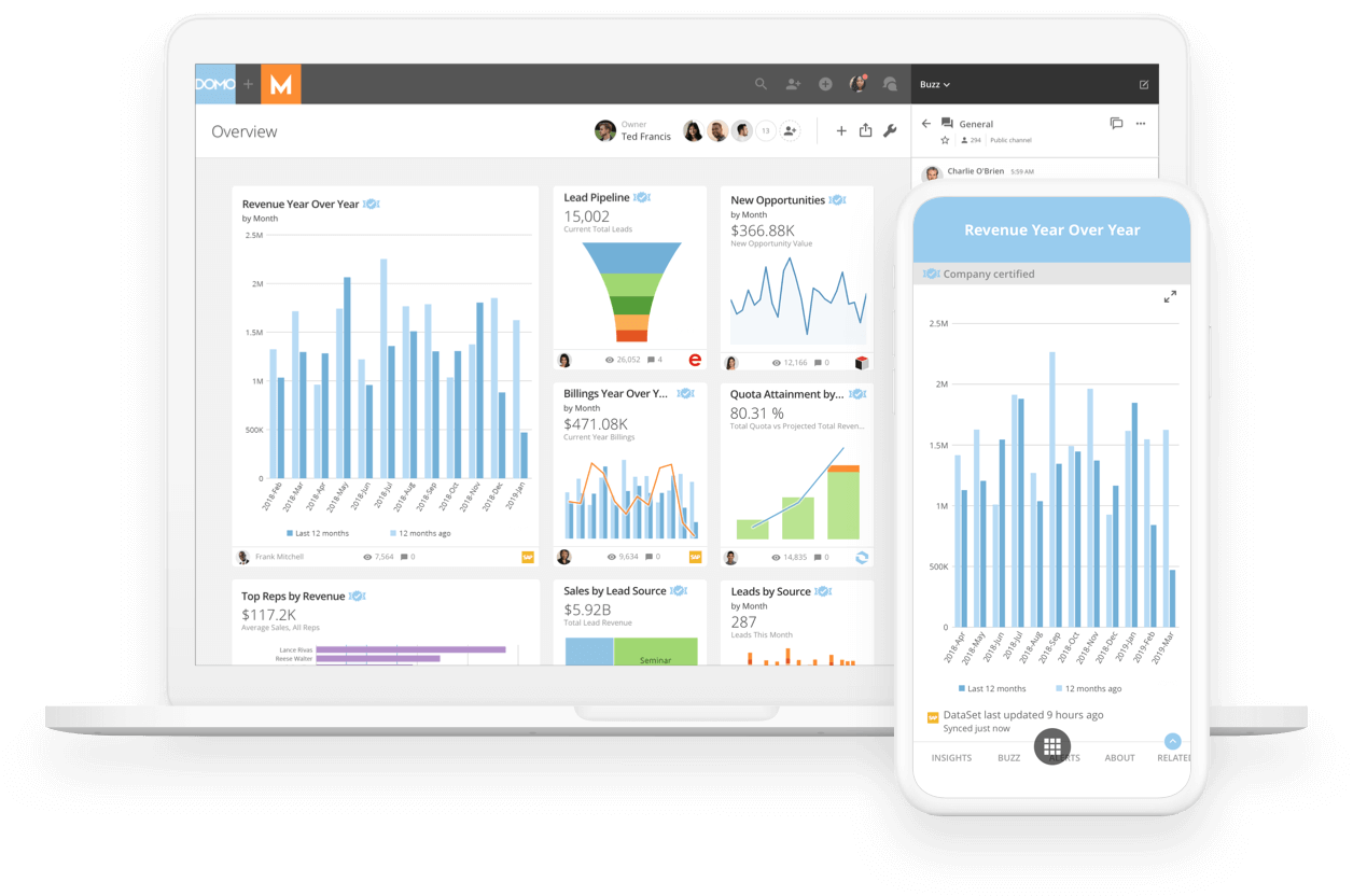
Domo now talks about being an AI and Data Products platform where data integration, visualization, automation, and AI capabilities are part of one stack.
It’s biggest 2026 updates came in March:
1. An official MCP Server that connects Domo's enterprise data and workflows to external AI platforms like Claude and ChatGPT.
2. A new AI Agent Builder and AI Toolkits.
Domo's MCP is positioned as enterprise-grade, backed by its existing semantic layer and governance controls, a more locked-down approach than a lightweight MCP bolt-on. That governance comes at a real cost though: Domo remains one of the more expensive options here, with no public pricing and a steep learning curve once you go beyond basic dashboards.
More skilled users can use Domo to create business apps and dashboards, and build data experiences that integrate real-time data from any source.
Unlike some Funnel competitors, Domo has native data visualizations, self-service reporting, and embedded analytics.
Domo has 1,000+ native connections, it’s safe to say it connects to almost everything, from your standard Facebook Ads to complex on-premise legacy databases and proprietary APIs.
Domo Reviews from Real Users
"One downside of Domo is its relatively high cost compared to other BI tools, which can be a concern for smaller teams." (Source)
"I really like that Domo has all the connectors and that everything is in the browser. It has over 1000 connectors, which is very convenient for connecting to different data sources." (Source)
"While basic dashboards are easy, the advanced features and integrations can take time to master. It can feel intimidating at times." (Source)
Key features:
- 1,000+ on-premise and cloud connectors
- Domo MCP Server (launched March 2026)
- AI Agent Builder and AI Toolkits
- Data and workflow apps (pre-built, low-code, full-code)
- Drag-and-drop report and dashboard builder
- Embedded analytics
Pricing:
Domo doesn't publish pricing publicly.
New users get a 30-day free trial with full access and unlimited users, but there's no permanent free tier afterward.
Pricing is based on usage factors like data storage, refresh rates, and number of users, so you'll need to contact their sales team for a quote.
6. Adverity
Best for: Data analysts, engineers, and high-maturity marketing teams needing complex ETL and governance
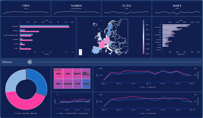
Adverity is an integrated no-code data platform that marketers can use to connect various data sources, cleanse and transform data to get more granular insights, and ensure data quality.
With Adverity, you can transfer data into databases, data lakes, cloud storage, visualization, and BI tools. Adverity helps users automate advanced data integration and governance so marketing teams can focus on managing their data and uncovering valuable insights.
The major 2026 move is Adverity Intelligence, a dedicated AI analytics layer launched in September 2025 and expanded through this year.
Adverity Intelligence has three parts:
1. Data Conversations, where you query your data in plain English without SQL.
2. Notebooks, a collaborative space for turning those answers into shared narratives.
3. Intelligent Agents, which schedule recurring insights or trigger workflows autonomously.
It's all built on MCP, so external AI tools can coordinate with Adverity's agents directly. This is a real shift from a pure ETL tool toward a genuine analytics layer, but like Funnel.io, you still need a separate tool to visualize and share client-facing reports.
If you need one platform to cover and scale the entire marketing reporting use case, you may have to consider other Funnel alternatives.
Adverity Reviews from Real Users
"I would say the UI of Adverity is something that I have gotten familiar with, and it's pretty neat. It's very easy to understand how the data is flowing, from the connector to the warehouse." (Source)
"Available Adverity documentation found on the Adverity site is often not up to date, and there is no date to be seen, so it's hard to find out if something has been updated recently or not." (Source)
"Adverity has dozens of pre-built API connections to various platforms, which makes managing extraction much simpler than using an in-house tool." (Source)
Key features:
- 600+ pre-built connectors
- Adverity Intelligence: Data Conversations, Notebooks, Intelligent Agents
- MCP foundation for external AI coordination
- Built-in data governance
- Data transfer to databases and data lakes
Pricing:
Adverity has a pricing model without numbers. Instead, fully customized quotes are tailored to the needs and requirements of every client.
But on the Microsoft Azure Marketplace, Adverity offers a one‑time purchase model: a $200,000 upfront fee covers a full 12‑month subscription.
We covered everything you need to know about Adverity in our full guide, including whether shelling out $200,000 is worth it or not!
7. NinjaCat
Best for: Mid-market to large marketing agencies and enterprise teams needing unified call tracking, budget pacing, and white-label reporting
NinjaCat is a marketing reporting platform for digital marketing agencies.
It allows users to track the spend and performance of Google Ads, Bing Ads, Facebook Ads, and other PPC tools. You can also connect, clean, and transform marketing data before moving it to destinations like Google Cloud Platform, Amazon S3, or Microsoft Azure.
NinjaCat's 2026 direction is built around AI Agents that execute full workflows, not just give insights:
1. An anomaly detection agent might spot a 40% CPC spike
2. It alerts the paid media team via Slack
3. A second agent diagnoses the root cause, such as a competitor entering your top PPC keywords
4. A third agent generates response options for the team to act on
The bigger structural launch this year is a Snowflake Connected App, letting enterprise customers run NinjaCat's entire AI agent platform natively inside their own Snowflake environment.
Unlike Funnel.io alternatives such as Adverity or Supermetrics, NinjaCat has a native visualization layer for reporting. You can auto-generate reports from pre-made templates for different reporting cases.
NinjaCat Reviews from Real Users
"With all of the features available at NinjaCat, the possibilities are endless. NinjaCat has a lot of connectors that are able to bring in data from countless platforms." (Source)
"Making it easier to connect with various apps and configure the AI agent would help increase adoption." (Source)
"Sometimes NinjaCat can be a bit overwhelming with all of the features and solutions it has, but that is not really a bad thing." (Source)
Key features:
- PPC and SEO reporting
- AI Agents library (chained, autonomous workflows)
- Snowflake Connected App (native, zero-copy)
- White-label options
- White-glove setup and service
Pricing:
NinjaCat doesn’t offer fixed pricing plans, and no information is available on its website. Market data indicates that some contracts typically start at $1,500 per month.
Which Funnel.io alternative is best for you
Depending on your job function and need, the right Funnel.io alternative will look different for you. Here’s a sum up:
✅ If you're a mid-size marketing agency managing multiple clients and channels - and tired of stitching Funnel and Looker Studio together, choose Whatagraph. One governed data foundation covers your connectors, client reports, portfolio dashboards, BigQuery export, and AI queries - without rebuilding context across tools every time.
✅ If you're an in-house team or small agency that needs to move data from 400+ sources into Google Sheets, BI tools, or AI environments, choose Coupler.io. It's the most flexible pipe for non-marketing data (finance, sales, ops) and the free tier is genuinely usable.
✅ If you have a dedicated data team and a warehouse-first strategy, choose Supermetrics. It's built for technical analysts who need controlled, destination-based data delivery at scale - and the new AI agents reduce the manual work on top.
✅ If you’re a freelancer or running a boutique agency or SMB and need a budget-friendly option, choose Porter Metrics. The pay-per-account model keeps costs predictable, and MCP access is available even on the free plan.
✅ If you're an enterprise data team that needs custom data apps, 1,000+ connectors, and governed AI at the infrastructure level, choose Domo. Budget for the learning curve and the custom pricing conversation.
✅ If you're a data engineer or analyst and need complex ETL, governance, and autonomous AI agents across your data pipelines, choose Adverity. Just know you'll still need a separate tool for client-facing reporting.
Published on Jul 10 2024
WRITTEN BY
YamonYamon is a Senior Content Marketing Manager at Whatagraph. With an eye for detail and a knack for always considering context, audience, and business goals to guide the narrative, she's on a mission to create genuinely helpful content for marketers. When she’s not working, she’s hiking, meditating, or practicing yoga.