13 Best Dashboard Reporting Tools for Marketers in 2026
The best dashboard reporting tools in 2026 turn cross-channel data into something you can actually act on - faster decisions, cleaner client reporting, and a foundation that scales without scaling the team behind it.
This list compares the 13 best dashboard reporting tools that marketers and agencies are raving about in 2026.

Jun 22 2026●12 min read


If you’re a marketer, you probably spend more time pulling data together than acting on it.
Your Google Ads numbers live in one tab. Meta in another. LinkedIn somewhere else. GA4 open in the background. By the time you've got a complete picture of last week, half the morning is gone - and you haven't gotten a single insight yet.
For agencies, the problem compounds. Every client needs a report. Every report gets built slightly differently. Templates drift, connectors break, and account managers end up spending Friday afternoons fixing dashboards instead of doing the work clients actually pay for.
A good dashboard reporting tool closes that gap. It pulls your channels into one place, keeps the data consistent, and handles the delivery - so your team spends time on analysis and strategy, not on spreadsheet maintenance.
We've reviewed 13 of the most-used dashboard reporting tools in 2026, covering what each one does well, where it falls short, and which type of team it's actually built for.
What features should I look for in dashboard reporting tools?
Judging by what marketing experts from agencies and big in-house teams are saying, these are the top things you should be looking for:
✅ Cross-channel data connections: Your tool needs to connect to every platform you're actually using - Google Ads, Meta, GA4, LinkedIn, TikTok, and more - and pull that data into one place. Not just technically connect to them, but maintain those connections reliably so they don't break overnight before a client meeting.
✅ Consistent metric definitions: Different platforms use different names for the same thing. A good tool lets you define what a "conversion" or "click" means across all your sources, so your numbers don't contradict each other depending on which tab you're looking at.
✅ Templates you can actually reuse: Building a report from scratch for every new client is exactly the problem you're trying to solve. Look for a tool with a proper template system - one where a single change updates every report that uses that template, not just the one you're editing.
✅ Client-ready output: Whether that's a white-labelled live link, a scheduled PDF, or a branded dashboard, your clients shouldn't have to log into a tool they've never used to see their own data.
✅ Portfolio-level visibility: For agencies managing multiple clients, you need more than individual reports. Look for an overview layer where you can see all accounts at once, spot what's off-track, and filter by client, account manager, or region - without opening 20 separate tabs.
✅ AI that works on your actual data: Plenty of tools now have an AI layer bolted on. What matters is whether it's grounded in your real data or generating generic summaries. Look for AI that can write performance narratives, flag issues, and answer questions from live numbers - not hallucinated ones.
✅ Security and compliance: Your clients' data is sitting in this tool. Make sure it meets the standard your contracts require - GDPR compliance, encrypted data storage, and clear data residency policies.
That said, below are the best dashboard tools reviewed.
13 Best Dashboard Reporting Tools in 2026
Here are the best dashboard reporting tools we’ll review in this article:
| Tool | Key features | Pricing |
| Whatagraph | 60+ managed connectors, AI report builder, governed data layer, MCP | Free forever; paid from $229/mo |
| ThoughtSpot | Spotter AI search, anomaly detection, warehouse-native, no-code drill-down | From $25/user/mo |
| MetricsWatch | Email-only reports, 12 integrations, white-labeling, GA4 anomaly alerts | From $49/mo (Reports), $79/mo (Alerts) |
| Looker Studio | 21 native Google connectors, drag-and-drop builder, Gemini AI (Pro) | Free; Pro at $9/user/project/mo |
| Funnel.io | 500+ connectors, deep ETL, MMM/MTA add-on, warehouse export | From $200/mo (Flexpoints-based) |
| Geckoboard | 90+ integrations, TV dashboards, Slack/Teams alerts, KPI notifications | From $119/mo |
| Klipfolio | 130+ integrations, governed metric catalog, AI insights, MCP (beta) | From $90/mo |
| Domo | 1,000+ connectors, enterprise MCP, AI agent builder, embedded analytics | Custom pricing only |
| Databox | 100+ integrations, Genie AI analyst, MCP on free tier, benchmarks | Free; agency plans from $79/mo |
| Cyfe | 100+ integrations, built-in rank tracker, embedded analytics, 15 languages | From $29/mo |
| Tableau | Advanced analytics, predictive modeling, Tableau Pulse, AI via Tableau Next | From $15/user/mo |
| Microsoft Power BI | 100+ integrations, natural language query, Copilot AI, Microsoft ecosystem | From $14/user/mo |
| Grow.com | 150+ connectors, no-code ETL, built-in warehouse, natural language queries | Custom pricing only |
1. Whatagraph
Most suitable for: Mid-to-large marketing agencies and teams with multiple campaigns across multiple channels and locations
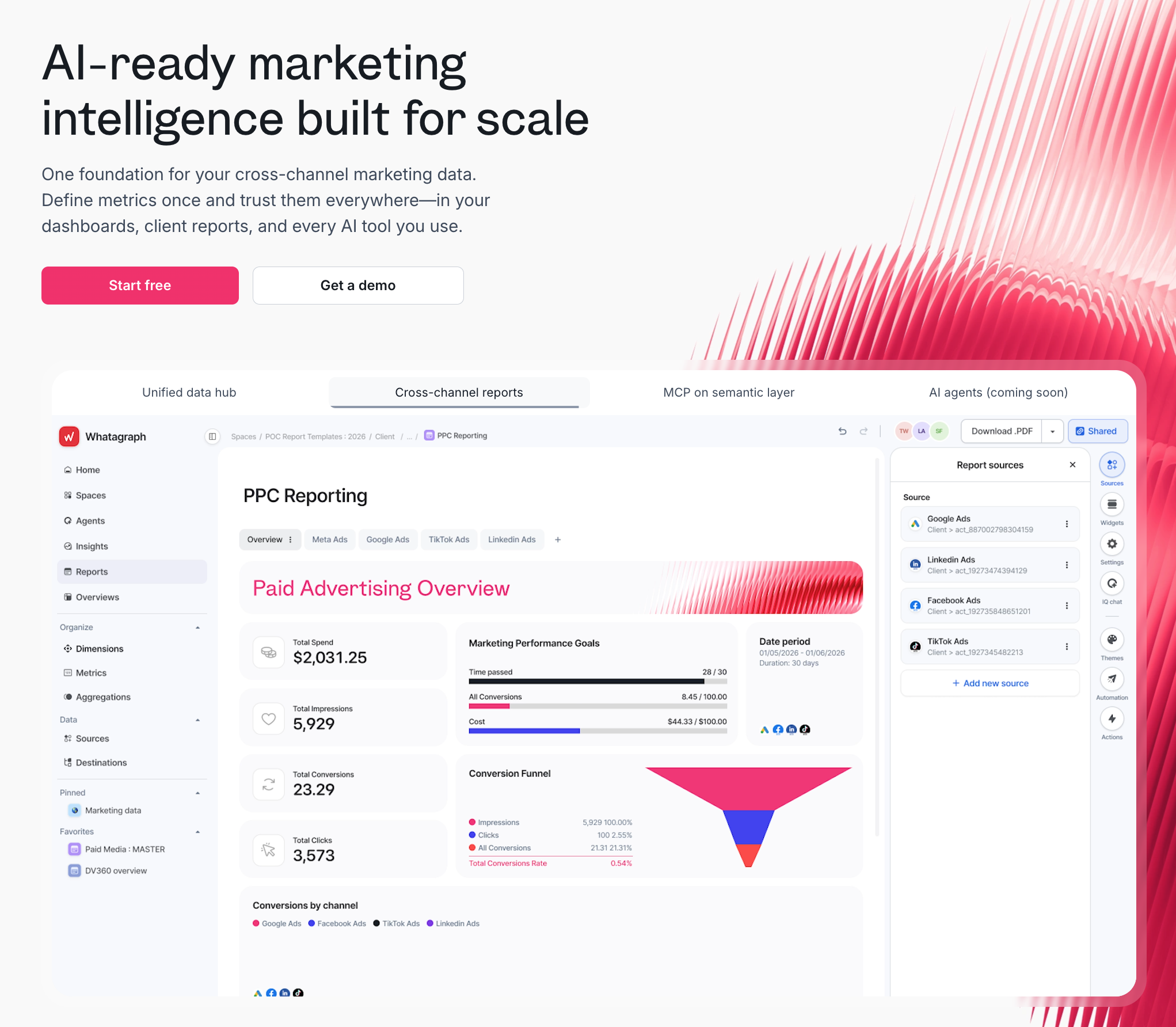
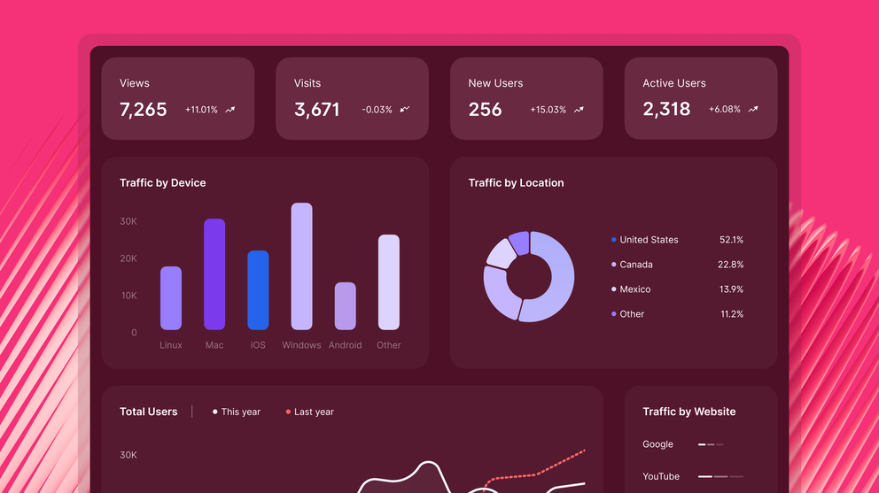
Most dashboard reporting tools solve one part of the problem. They connect your channels, or they visualise the data, or they let you share a report.
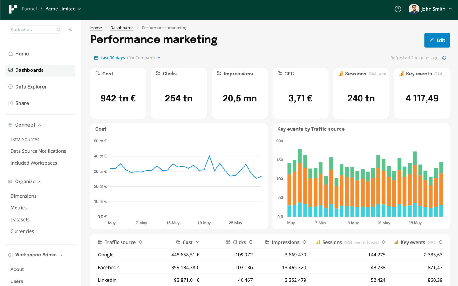
Whatagraph is built different. It’s a marketing intelligence platform that connects your paid channels, organises the data into a governed layer with consistent metric definitions, and lets you build client-ready dashboards and internal performance views from the same source.
It's got all you need in the best dashboard reporting tool:
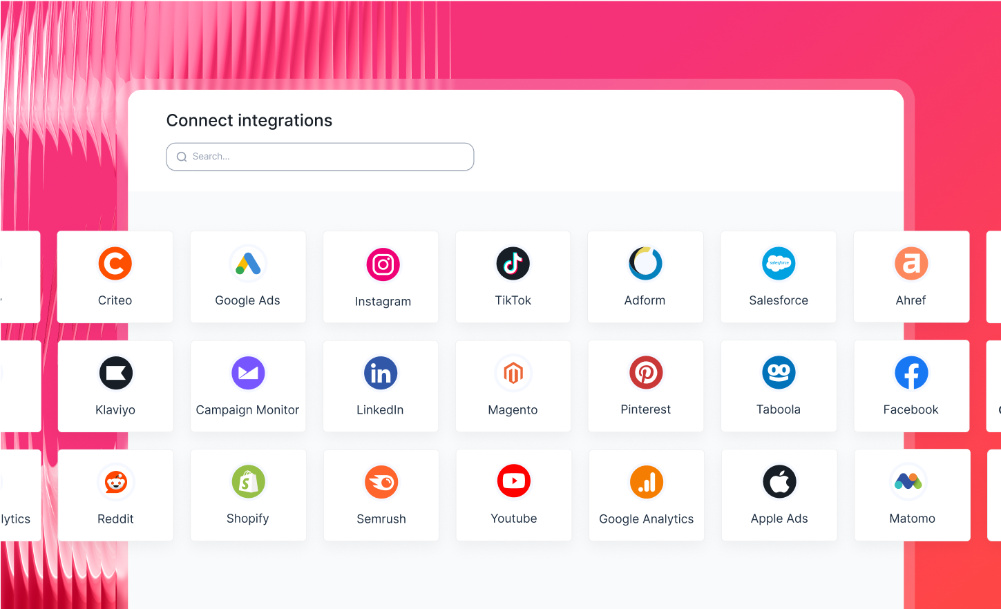
1. Cross-channel data connections
Whatagraph connects to 60+ marketing platforms with fully managed native integrations - Google Ads, Meta, LinkedIn, TikTok, Microsoft Ads, GA4, and more.
The connections are maintained end-to-end by Whatagraph's engineering team. That means no third-party pipeline to babysit, no connector that silently breaks at 11pm the night before a client meeting. Data refreshes every 30 minutes across all plans.
Tanja Keglić, Performance Marketing Manager at Achtzehn Grad, describes what that reliability actually looks like day-to-day:
We don't have any connection issues on Whatagraph at all. We just connected the platforms once, and that was it. Whatagraph is also very, very quick when loading the data.
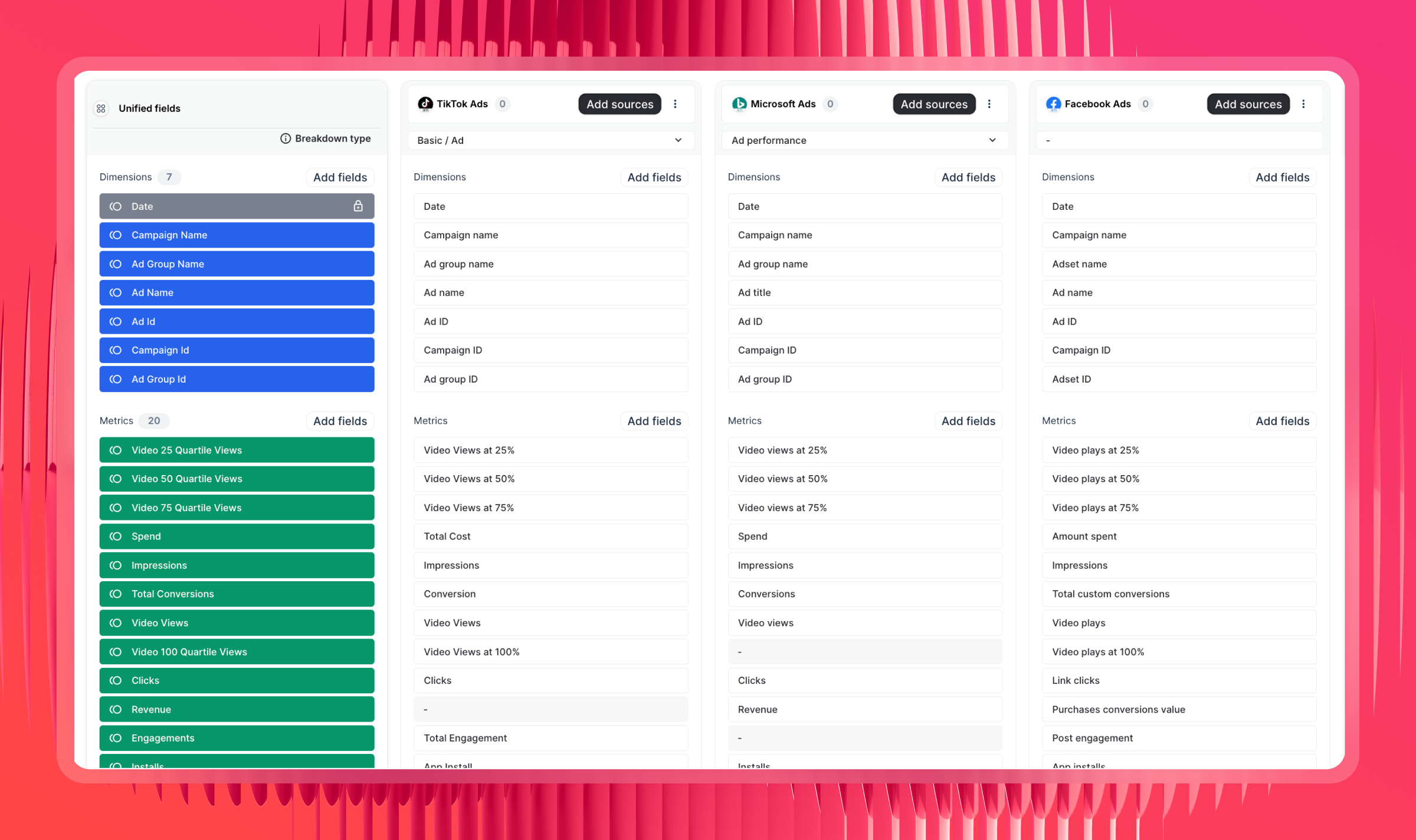
2. Consistent metric definitions across channels
Raw data from different platforms uses different naming conventions, attribution windows, and conversion definitions. Whatagraph's Source Groups, custom metrics, and custom dimensions let you define what things mean once - then that definition carries through every report, every client, every channel.
For example you can combine cost metrics from all your ad platforms into a “Total Ad Spend” metric in seconds - and use this metric in all your reports, dashboards, and AI tools right away without having to re-create again.
Drew Cove, Senior SEO Manager at DigitalParc, uses this for something specific: different clients call the same metric by different names, and Whatagraph lets him rename metrics per client so the report always matches the client's internal language.
We use Whatagraph for all our client's reports. The ability to title metrics differently is important to us because we often report the same metrics to different clients and just need to call them differently because many clients have internal terminology that is very different from one another.
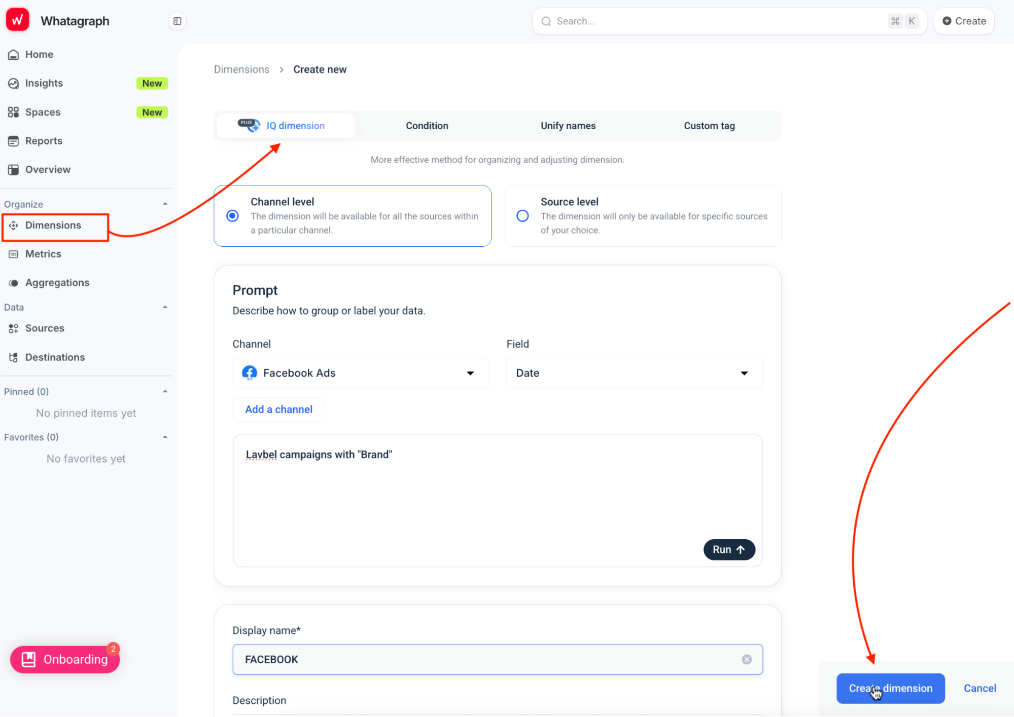
What’s cool is that you can ask Whatagraph IQ to create a custom dimension for you. Just choose the channels and dimensions and type out a prompt, and it’ll build the dimension for you.
3. Re-usable and linkable reports and dashboards
Agencies spend way too much time creating reports and dashboards from scratch - and this problem compounds every new client you onboard.
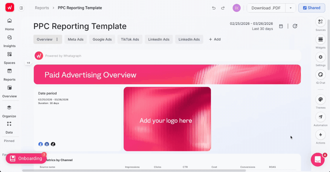
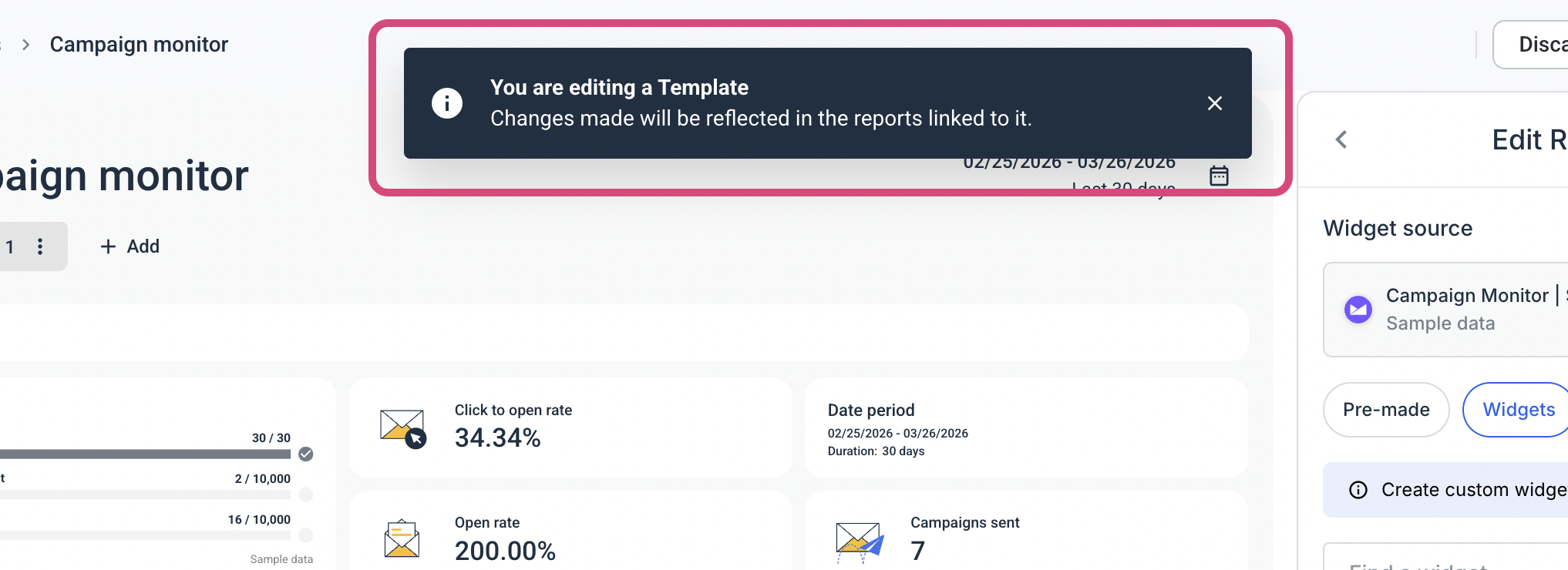
With Whatagraph, you can create report templates - one for lead generation clients and one for eCommerce clients for example - and re-use this template the next time you onboard a new client.
Maatwerk Online agency managing over 100 clients saves up to 100 hours a month with this templated approach - but more than that, it saves your team so much brainspace that they can use for other strategic things.
Lars Maat, Co-Founder, says: “Templates save so much headspace—you don’t have that negative energy of thinking, ‘Ugh, I have to build a report again.”
With Whatagraph IQ, you don’t even need to build a report from scratch. You can just choose your channel, type in a prompt, and it automatically creates the report based on your connected data.
You can also brand the report in your or your client’s branding with AI. Just upload a screenshot of your report or type in a prompt, and Whatagraph applies the colors to the report.
Plus, you can “link” reports to one master report. You can add a new tab, update a metric, change the layout - and all these changes are automatically propagated to all the linked reports.
For agencies that have been rebuilding the same report from scratch for each new client, or manually updating 40 reports every time a platform changes its API, this is where the time actually gets recovered.
Lars says:
Whatagraph saves time and energy for our marketing specialists. And the hours we're saving is just pure profit. We now have the time to focus on more strategic things that help both our agency and our clients grow.
3. Client-ready output
You can share dashboards and reports as white-labeled live links with a custom domain, set a password, and choose to enable IQ chat for clients.
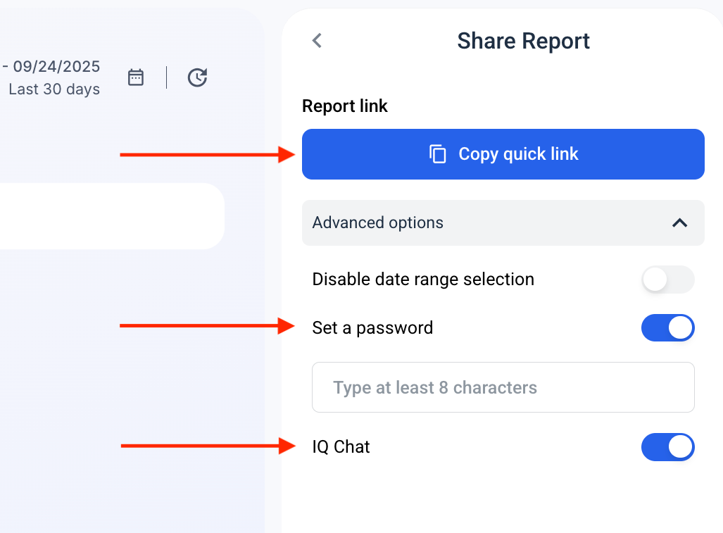
IQ Chat lets you and your clients (when enabled) ask questions about performance and data and get back fast, accurate answers.
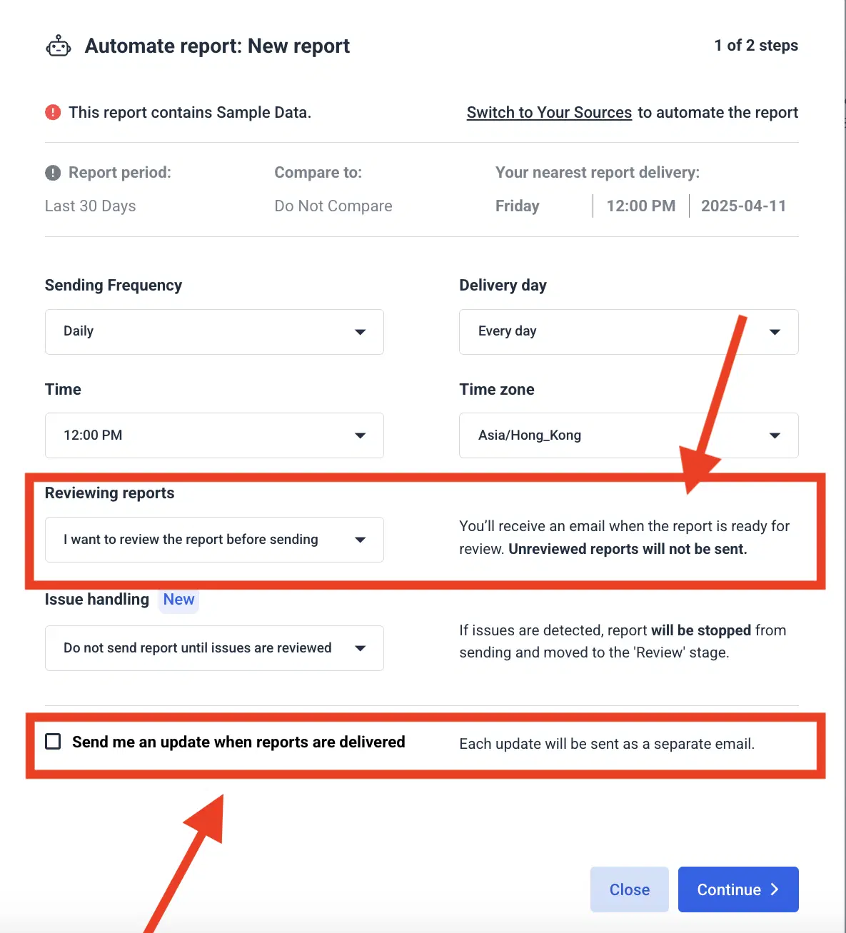
You can also automate reports to go out on specific dates, times, and cadence with custom email domains and text. Don't worry - you still have the option to review the reports before they're sent to clients.
4. Portfolio-level visibility
Performance Overviews give agency teams a single dashboard across all clients - filterable by account manager, region, client tier, or custom tags. You can see which accounts are on track against goals and which aren't without opening individual reports. Goals and alerts notify you via Slack or email when something shifts.
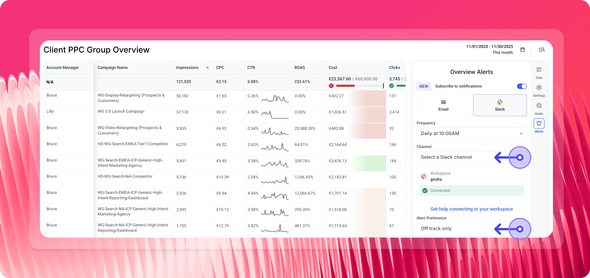
This is consistently one of the features agencies don't expect but immediately see the value in. Most come in asking for better individual client reports. The overview layer - seeing everything at once, with pacing and alerts - is usually the thing that closes the decision.
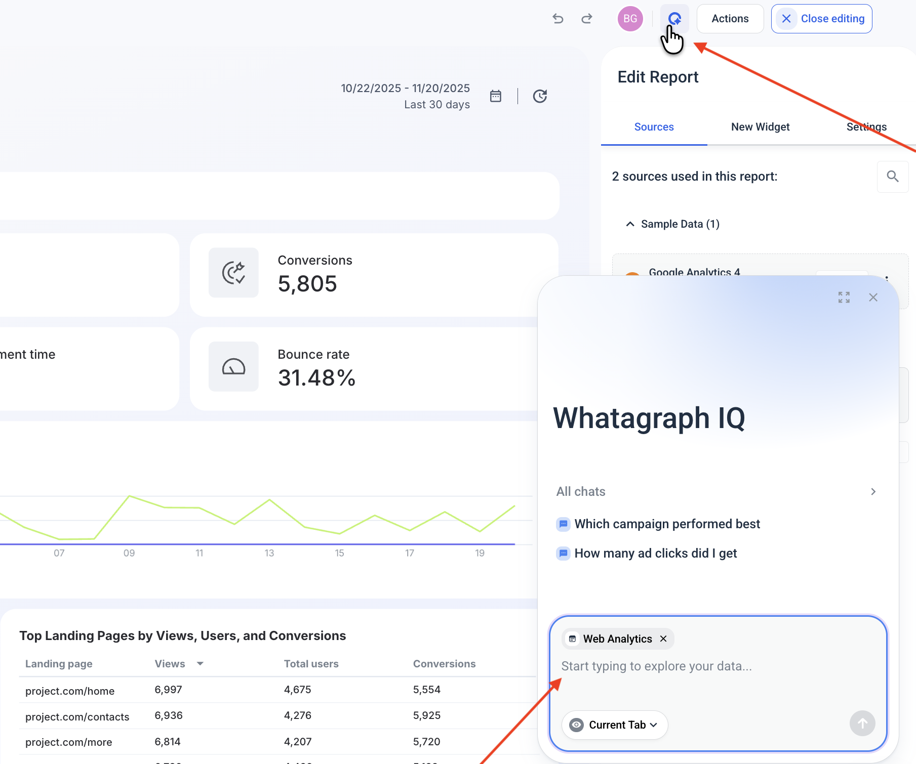
5. AI that works on your actual data
Whatagraph also connects to Claude, ChatGPT, and other MCP-compatible AI tools via Whatagraph MCP. Ask your AI assistant questions about live performance data and it queries the same governed layer your reports use. Setup takes about five minutes, no coding required.

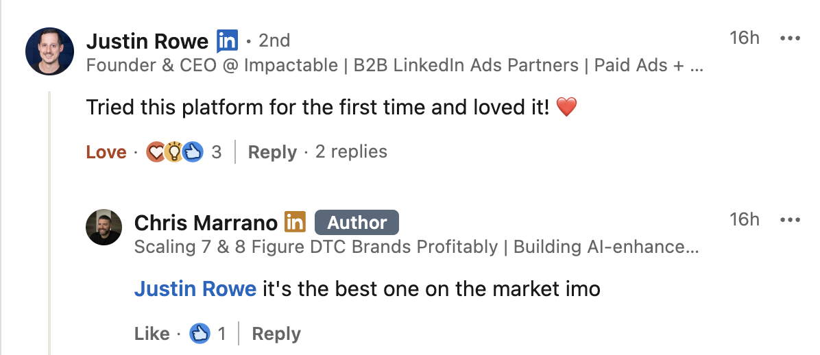
Marketers on LinkedIn are buzzing about how much they love Whatagraph’s AI reporting tool:
6. Security and compliance
Your dashboards contain sensitive client and business data, so security can’t be an afterthought.
Whatagraph is built with enterprise-grade safeguards from the ground up:
- ISO 27001 certified
- GDPR compliant
- EU data hosting
- AES-256 encryption for data
- Single Sign-On (SSO)
You stay in full control of your data: what’s connected, what’s stored, and what gets deleted.
And because Whatagraph manages all integrations directly, not through third parties, the risk of exposure or mishandling is drastically reduced.
Bottom line: Your data stays protected, compliant, and always in your control - without any extra work on your end.
Pros:
- 60+ fully managed integrations with consistent 30-minute data refresh
- Linked templates - one change updates every client report
- Custom metrics, dimensions, and Source Groups for consistent cross-channel definitions
- AI report building, narrative generation, and client-facing IQ Chat
- Portfolio overview with goals, alerts, and account manager filters
- White-labelling with custom domain on Boost and Max
- Unlimited users on all paid plans
- MCP integration for Claude and ChatGPT
Cons:
- Not built for warehouse-native BI or deep SQL modelling
- Source credits scale with data volume - larger agencies should size the plan accordingly
- Best value for teams with recurring, multi-client reporting workflows
Pricing:
Whatagraph's pricing scales with how much data you actually use rather than how many people are on your team - every plan includes unlimited users and unlimited reports. Check the pricing page for a full breakdown by plan.
2. ThoughtSpot
Most suitable for: Growing businesses and enterprises
ThoughtSpot’s AI-augmented dashboards allow you to gain personalized, real-time insights, helping you curate powerful data stories. And with Spotter, as your AI Analyst, users can ask complex questions about their data and gain instant visualizations. With an intuitive search-driven interface, you can create interactive visualizations that help you see trends, patterns, and insights as they unfold.
Another advantage is that you can drill into your visualizations without any pre-defined drill path, making it fast and easy to explore and analyze your data from any angle, all in real-time.
Key features:
- Spotter AI Analyst: natural language queries that return interactive visualizations and explanations, available on Pro plan and above.
- AI-infused interactive dashboards: dynamic KPI dashboards with automated anomaly detection and AI Highlights surfacing unusual trends.
- Search-driven data exploration: drill into any dimension without pre-defined drill paths - explore data from any angle in real time.
- Change analysis: automatically surfaces what changed in your KPIs and why, without manual investigation.
- Automated alerts: notifications when key performance indicators cross thresholds.
- Embedded analytics: ThoughtSpot Embedded for customer-facing analytics products (separate pricing track).
ThoughtSpot Reviews from Real Users:
ThoughtSpot offers strong warehouse integrations for large-scale data analysis, which users really like.
But as one G2 reviewer notes, it "can feel somewhat limited when trying to create highly customized, presentation-ready reports."
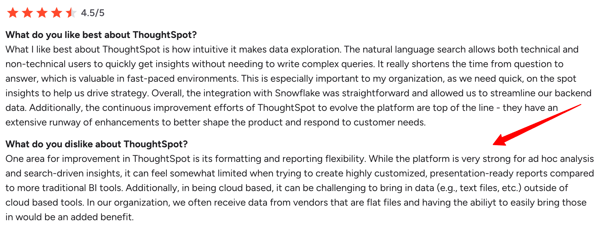
A big part of that gap is the lack of native marketing connectors - Google Ads, Meta, and GA4 data all need to go through a warehouse pipeline first, which adds setup time before any reporting can start.
Pros:
- Spotter AI: natural language querying returns visual answers instantly - no SQL or dashboard-building required.
- Deep data exploration: drill into any dimension without pre-defined paths, useful for complex data analysis.
- Anomaly detection: AI Highlights surface unusual trends automatically, reducing the need for manual monitoring.
- Cloud warehouse native: connects directly to Snowflake, BigQuery, and Redshift for large-scale data analysis.
Cons:
- No native marketing connectors: getting Google Ads, Meta, or GA4 data in requires a separate data pipeline and technical setup.
- Steep learning curve: initial configuration and data modeling require dedicated technical resources.
- Per-query cost model: Spotter AI queries are capped at 25/user/month on the Pro plan - heavy users pay more.
- Not built for client reporting: no white-labeling, linked templates, or multi-client management on standard plans.
Pricing:
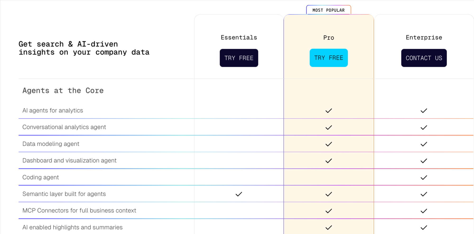
ThoughtSpot offers three pricing plans as of 2026 May, billed annually:
- Essentials ($25/user/month): AI search, interactive dashboards, up to 50 users, 25M rows of data.
- Pro ($50/user/month): Spotter AI Agent (25 queries/user/month), up to 1,000 users, 250M rows of data.
- Enterprise (custom pricing): unlimited users, unlimited data, multi-tenancy, advanced security.
3. Metrics Watch
Most suitable for: Freelancers, small businesses, and boutique agencies
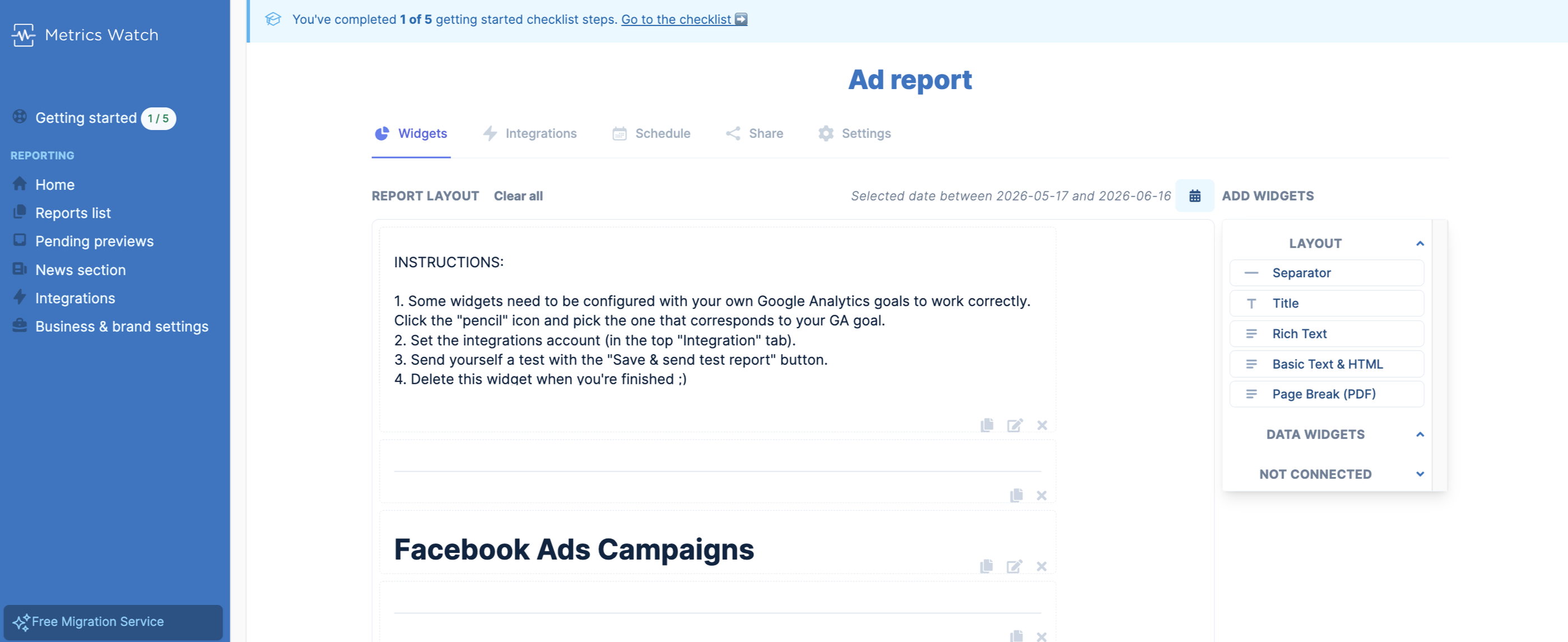
Metrics Watch is an email-based solution for sending marketing reports to team members and clients.
It pulls KPIs from popular marketing platforms like Google Search Console, LinkedIn Ads, and Mailchimp, automatically compiles the data, and sends the report directly to your recipient’s inbox.
This means you don’t need any third-party tools like Looker Studio or even PDFs. You can immediately send emails or automate them to go out on a daily, weekly, or monthly basis.
The platform has split into two distinct products in 2026:
1. Reports, the original email-based reporting tool.
2. Alerts, a newer real-time monitoring product that watches your GA4 data for anomalies and notifies you via email or Slack before a tracking issue costs you a month of bad data.
However, MetricsWatch doesn’t offer advanced data organization features like data blends or custom metrics and dimensions (Whatagraph does). There is a very basic filter to segment your data, but that’s where it ends.
Key Features
- 12 native integrations: including Google Ads, Google Analytics, Facebook Ads, Instagram, LinkedIn Ads, Google Business Profile, Google Search Console, and Mailchimp.
- In-email reporting: dashboards render directly inside the email body - no PDF attachments, no external links to click.
- White-labeling: upload your logo, set a color scheme, and send reports from your own name and email address.
- Real-time Alerts (separate product): custom anomaly detection on GA4 data with remediation context explaining what broke and how to fix it.
- Scheduled delivery: daily, weekly, or monthly automated sends with a preview option before reports go out.
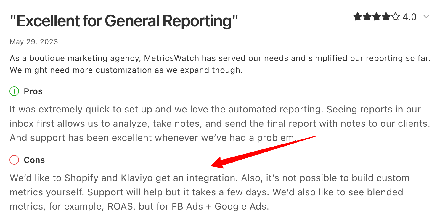
Metrics Watch Reviews from Real Users
Metrics Watch has very few recent reviews - just 3 on Capterra and 1 on G2, most from 2023 - so it's hard to get a current read on the product.
But the most recent reviews point to a problem that still hasn't been addressed: limited integrations.
As Jacob S. puts it, “We'd like to get an integration to Shopify and Klaviyo.”
Pros:
- Zero learning curve for clients: reports appear directly in the inbox - no login, no dashboard to navigate.
- Fast setup: one-click OAuth connections get you reporting in minutes.
- Affordable entry point: the Startup plan covers small client rosters without much overhead.
- Alerts catch tracking issues early: the newer Alerts product flags GA4 anomalies before they skew a month of data.
Cons:
- Limited integrations: 12 connectors is thin compared to most tools on this list - no SE Ranking, Ahrefs, or TikTok Ads.
- No data blending or custom metrics: you can't combine sources into a single blended KPI like ROAS across Meta and Google.
- No dashboards: if your clients want an interactive, explorable view rather than a static email, this isn't built for that.
- Reports and Alerts are billed separately: wanting both means two subscriptions, which adds up faster than a single all-in-one plan.
Pricing
MetricsWatch offers separate pricing for Reports and Alerts as of 2026 May, billed monthly or annually (2 months free on annual):
Reports:
- Startup ($49/mo, or $41/mo annual): up to 2 reports, unlimited data sources, email delivery.
- Pro ($149/mo, or $124/mo annual): up to 25 reports, unlimited data sources, priority support.
- Agency ($399/mo, or $333/mo annual): up to 100 reports, custom integrations, priority support.
Alerts:
- Basic ($79/mo, or $66/mo annual): 3 custom alerts, 15-minute detection, email notifications.
- Starter ($99/mo, or $83/mo annual): 10 custom alerts, 10-minute detection, email and Slack, monthly GA4 reliability report.
- Professional ($299/mo, or $249/mo annual): 30 custom alerts, 5-minute detection, quarterly GA4 audit, onboarding review.
- Enterprise (custom pricing): unlimited alerts, dedicated success manager, SSO, 99.9% SLA.
4. Looker Studio (Data Studio)
Most suitable for: Freelancers and boutique agencies
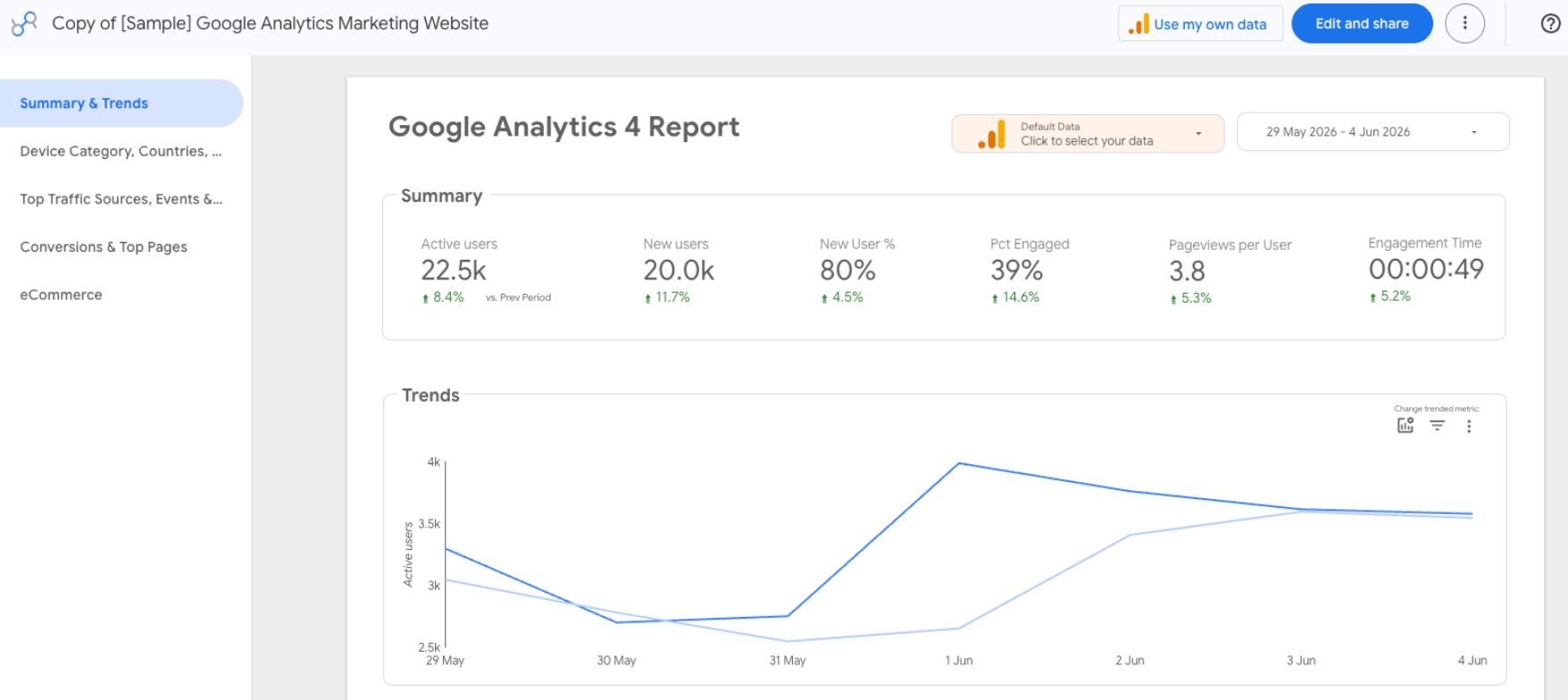
Google’s free dashboard tool, Looker Studio, is a popular choice among marketers — freelancers, and even startup agencies.
Looker Studio comes with 21 native integrations with Google-based platforms like Google Ads, DV 360, Google Sheets, and Google Analytics. You can also connect to BigQuery, MySQL, and Microsoft SQL servers on Looker.
Once you connect your data sources, you can use Looker’s drag-and-drop dashboard editor to add:
- Charts, line bars, pie charts, geo maps, area and bubble graphs, data tables, pivot tables
- Filters and date range controls
- Links and clickable images
- Custom text and images
- Custom styles and color themes
You can then share the dashboard with your team or client, who can view or edit the dashboard on their end.
The level of details or customizations you can add to your dashboards depends on how well you know the platform.
However, Looker Studio can be slow, clunky, and doesn’t come with customer support (unless you buy the Pro plan).
It also limits you in the number of sources you can blend together.
Plus, to connect non-native sources, you need third-party connectors, which you need to buy separately.
Key Features
- 21 native Google connectors: GA4, Google Ads, Search Console, YouTube, Sheets, and more, all free.
- 1,000+ partner connectors (paid): third-party connectors for Meta, LinkedIn, TikTok, and other non-Google platforms.
- Drag-and-drop report builder: charts, geo maps, pivot tables, filters, and custom styling.
- Gemini conversational analytics (Pro): ask natural-language questions and get help building calculated fields.
- Cross data source filtering: one filter can control charts pulling from multiple connected sources, even on the free tier.
Looker Studio Reviews from Real Users
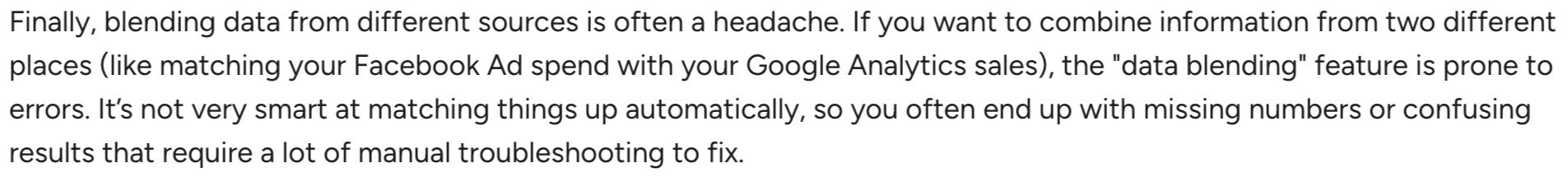
It's hard to beat free, and for a Google-only stack, Looker Studio does exactly what it needs to. Step outside that stack, though, and the cracks show.
One G2 reviewer sums up the cross-platform pain point:
"Blending data from different sources is often a headache. If you want to combine information from two different places (like matching your Facebook Ad spend with your Google Analytics sales), the data blending feature is prone to errors."
Pros:
- Free for Google-stack reporting: the 21 native connectors cover most of what a Google Ads/GA4 agency needs at no cost.
- Fast setup: drag-and-drop builder gets a basic dashboard running quickly.
- Cross-source filtering on the free tier: a meaningful upgrade that used to be Pro-only.
- Large template library: plenty of starting points if you don't want to build from a blank canvas.
Cons:
- Third-party connectors add real cost: $20-350/month per non-Google source adds up fast for multi-platform agencies.
- No white-label or custom domain on the free tier: every report carries Google branding unless you upgrade.
- No linked templates: managing dozens of similar client dashboards means editing each one individually.
- Connector reliability: breakages and slow load times on data-heavy reports are recurring complaints.
Looker Studio Pricing
Looker Studio offers two tiers as of 2026 May:
- Free: unlimited users, 21 native Google connectors, core reporting, and dashboard builder.
- Pro ($9/user/project/month, billed annually): Gemini conversational analytics, scheduled PDF delivery, Google Slides export, mobile app.
Third-party connectors (Meta, LinkedIn, TikTok, etc.) cost an additional $20-350/month each, regardless of tier.
5. Funnel.io
Most suitable for: Enterprises with dedicated data scientist teams
Funnel.io is a data pipeline tool that pulls data from different sources, transforms it, and ships it to data warehouses, visualization tools, or spreadsheets.
Funnel has over 500 data connectors with major marketing platforms and CRM systems, such as Hubspot, Salesforce, DV360, and more.
If you don’t see a connector, you can also import your own data using Google Sheets, or request the Funnel team to build one for you.
Now, let’s say hello to the first elephant in the room.
Funnel.io offers dashboards to visualize your key metrics. However, these dashboards are pretty basic and there aren’t a lot of customization or white-labeling options available.
Everything in Funnel runs on a Flexpoints credit system, where every connector, platform account, dashboard, and warehouse destination consumes credits. Agencies with 10+ connectors routinely get pushed toward the $800/month Business tier once Flexpoints run out.
One Whatagraph customer described Funnel as "two to three times more expensive than Whatagraph" after switching.
Key Features
- 500+ connectors: the deepest connector library on this list, spanning marketing platforms, CRMs, and niche sources.
- Data Explorer: a low-code interface for data teams to blend, transform, and organize raw data before data visualization.
- Funnel Measure (add-on): marketing mix modeling (MMM) and multi-touch attribution (MTA), starting around $2,250/month for $500K-$1M in monthly ad spend.
- Data Chat: conversational AI for data exploration, now with Thinking and Fast response modes.
- Warehouse destinations: BigQuery, Snowflake, Redshift, and Azure - but only on the Business tier and above.
Funnel Reviews from Real Users
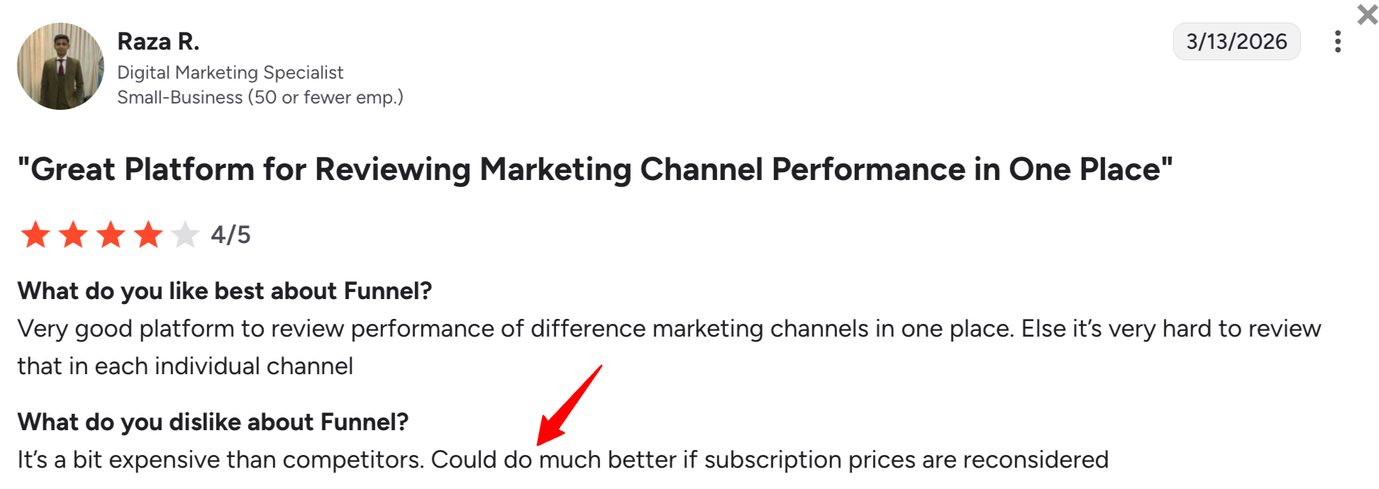
Where Funnel earns its reputation is data transformation - reviewers consistently call out how much control the “Data Explorer” gives technical teams. The recurring complaint is the cost.
As Raza R. said, "It's a bit more expensive than competitors. Could do much better if subscription prices are reconsidered."
Pros:
- Largest connector library available: 500+ sources cover virtually any platform an enterprise might need.
- Powerful data transformation: the Data Explorer gives data teams genuine control over raw data before it's visualized.
- Native MMM/MTA via Funnel Measure: no other tool on this list offers attribution modeling at this depth.
- Fast, responsive support: consistently praised in user reviews for resolving setup issues quickly.
Cons:
- Flexpoints pricing is unpredictable: the $200/month headline rarely reflects real-world cost once connectors, accounts, and dashboards are factored in.
- No free plan: Funnel removed its free tier in December 2025 with no equivalent replacement.
- Warehouse export requires a Business tier: BigQuery and Snowflake connectivity starts at $800/month minimum.
- Steep learning curve: the Flexpoints model and data transformation tools take real time to learn.
Funnel.io Pricing
Funnel.io offers three core plans, all consuming Flexpoints credits for connectors, accounts, dashboards, and destinations:
- Starter ($200/month headline): 121 connectors, Funnel Dashboards, reporting to Looker Studio, Google Sheets, or Excel only. No warehouse export.
- Business ($800/month headline): 579 connectors, advanced Data Hub, 6 reporting destinations (adds Power BI, Tableau, Looker), 26 export destinations including BigQuery and Snowflake.
- Enterprise (custom pricing): 590 connectors, enterprise governance, 27 export destinations, custom data integrations.
Funnel Measure (MMM/MTA add-on, available on Business and Enterprise): starts around $2,250/month for accounts with $500K-$1M in monthly ad spend, scaling with spend tier.
6. Geckoboard
Best for: Operations, sales, and support teams that want live KPIs on a shared screen
Geckoboard is built around a specific use case: getting a handful of key metrics visible on a TV screen or shared dashboard in real time, with minimal setup.
It's a strong fit for that exact use case and a weaker fit for client-facing marketing reporting. There's no custom data blending, no custom metrics or dimensions, and no way to ship data to a warehouse.
Geckoboard connects to 90+ data sources across customer service, sales, finance, and marketing platforms, and its KPI notifications send a Slack or Teams alert the moment a metric crosses a threshold.
Once you connect your data, you can create three main types of dashboards:
- A blank dashboard (similar to Whatagraph’s)
- TV dashboards for internal presentations
- Mobile dashboards
The dashboards are fairly static, with limited customization compared to a true reporting platform.
In 2026, Geckoboard shipped its first new visualization type in years (stacked column charts) and added an official Microsoft Teams integration, rounding out its sharing options to Slack, Teams, and email.
Key Features:
- 90+ integrations: spans customer service, sales, finance, and eCommerce tools like Shopify, Stripe, Intercom, and Pipedrive.
- TV and mobile dashboards: purpose-built for shared screens in an office or warehouse floor.
- KPI notifications: Slack and Teams alerts when a metric trends up or down past a threshold.
- Stacked column charts: new in April 2026, the first new visualization type shipped in years.
- Scheduled snapshots: automated dashboard snapshots posted to Slack, Teams, or email.
Geckoboard Reviews from Real Users
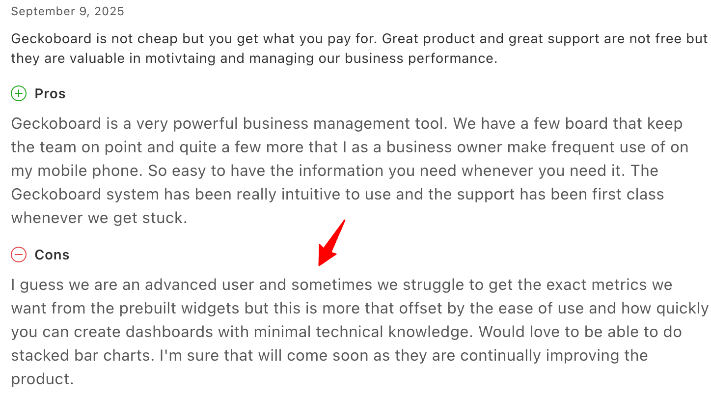
If "fast and simple" is the goal, Geckoboard delivers - reviewers regularly praise how little setup time it takes to get a screen live.
The trade-off shows up once you need something more specific. One Capterra reviewer notes: "Sometimes we struggle to get the exact metrics we want from the prebuilt widgets."
Pros:
- Fast setup for live KPI screens: genuinely the simplest option here if your need is exactly "metrics on a TV."
- Broad integration coverage: 90+ sources span well beyond marketing into sales, support, and finance.
- Reliable alerting: KPI notifications across Slack, Teams, and email cover most team communication setups.
- Strong customer service: consistently praised in reviews for responsiveness.
Cons:
- No custom data blending or metrics: you can't build a calculated KPI like blended ROAS across two ad platforms.
- No white-label or custom domain: not built for agencies sending reports under their own brand.
- Pricing scales by dashboards and editors: add-on costs for extra dashboards, editors, and screens add up quickly past the entry tier.
- No data warehouse export: data stays inside Geckoboard - there's no path to BigQuery or similar.
Geckoboard Pricing
Geckoboard’s pricing is based on the number of dashboards and the number of users.
There are four pricing plans:
- Essentials ($119/month): 3+ dashboards, 1+ editors, unlimited viewers, all 90+ integrations, real-time data, Slack/Teams/email snapshots, mobile access.
- Core ($175/month): 20 dashboards, multiple editors and viewers, up to 3 TV displays.
- Pro ($319/month): 50 dashboards, expanded editor/viewer limits, advanced theming.
- Enterprise (custom pricing): SSO, user management API, audit logs, dedicated support manager, full onboarding.
Extra dashboards, editors, and TV screens beyond plan limits cost $20-24 each per month.
7. Klipfolio
Most suitable for: Large data teams at companies and large agencies
Klipfolio is a data analytics and business intelligence tool in one. It offers two key products:
- PowerMetrics: Suitable for data teams at large companies, this is a data analytics solution to centralize, standardize, and share accurate metrics throughout the organization. Non-data teams can then use these certified metrics for their dashboards and reporting needs.
- Klips: These are your regular data visualization dashboards and reports. Klips integrates with 130+ platforms and you can also use a Rest/URL option for custom integrations.
PowerMetrics is the “data heart” of Klipfolio. With it, you can not only connect all your data sources, but also:
- Create a curated metric catalog for other business teams with access control and governance features
- Enable self-serve analysis and AI insights
- Store data in one place—either in your data warehouse, semantic layer, or in PowerMetrics itself
- Share transformed and unified metrics with anyone in the organization
All this is designed to speed up decision-making and reduce ad hoc requests to data teams—if you have a dedicated data team in the first place.
However, when it comes to creating dashboards, Klipfolio also comes with a steep learning curve requiring CSS skills to customize your dashboard themes.
The number of dashboards you can have depends on your pricing plan.
The third thing we don’t like is that you need to configure Klips in different environment, outside the dashboard.
Whatagraph still remains undefeated in terms of user-friendliness.
Key Features
- 130+ integrations: covers warehouses, SQL databases, file-sharing services, and major marketing platforms.
- PowerMetrics: a governed metric catalog with access control, letting non-technical teams use certified metrics without rebuilding them.
- PowerMetrics MCP Server (Beta): connects Claude, ChatGPT, and other AI tools to the governed metric catalog rather than raw connector data.
- AI Insights with goal tracking: monitor progress against targets and surface at-risk goals automatically.
- Custom viewer permissions: grant specific users the ability to manage viewer seats without full admin access - useful for agencies with self-service client accounts.
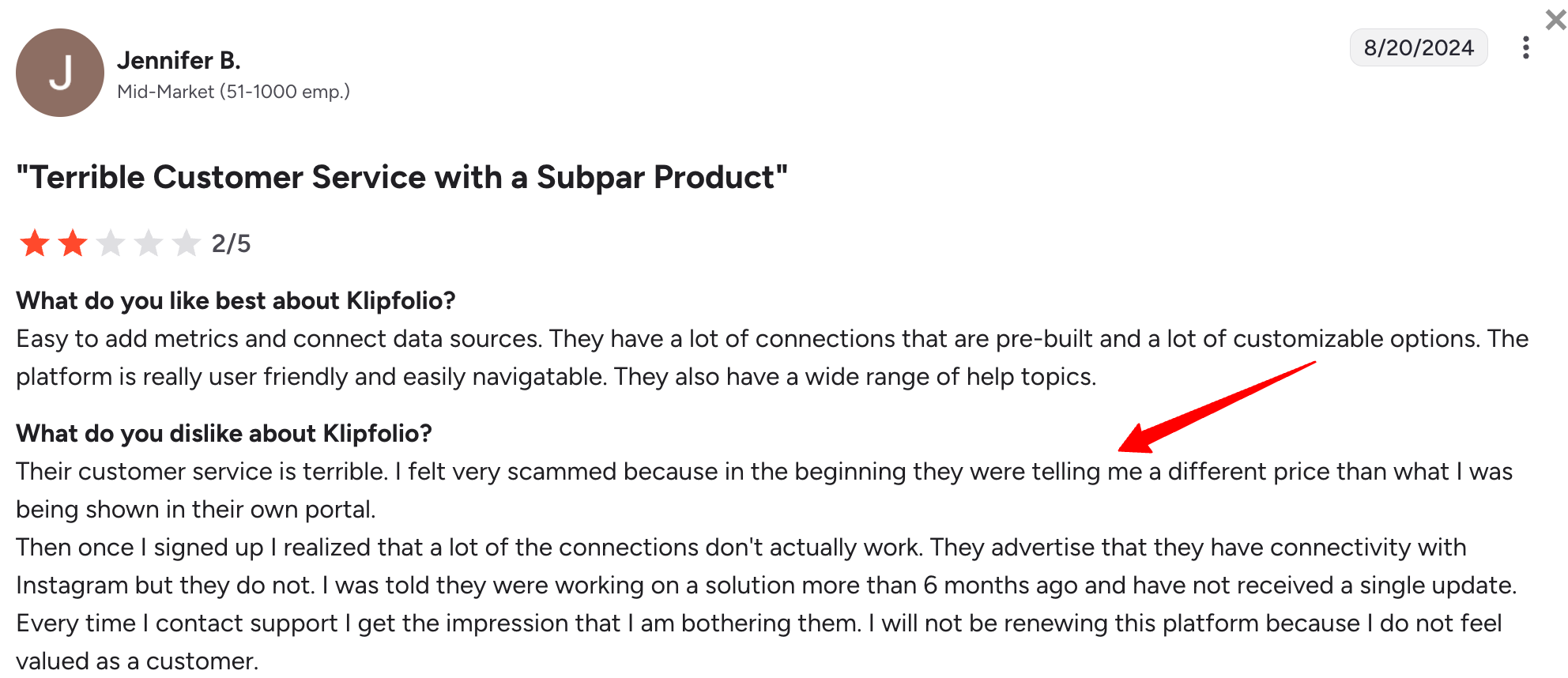
Klipfolio Reviews from Real Users
The integration depth is what keeps users around - 130+ sources with real flexibility in how data gets organized.
That flexibility comes at a cost in setup time, and support hasn't always kept pace.
Jennifer B. summed it up bluntly: "Every time I contact support, I get the impression that I am bothering them."
Pros:
- Governed metrics via PowerMetrics: reduces the risk of different teams calculating the same KPI differently.
- MCP support in beta: connects to a governed metric layer rather than raw API data, closer to how Whatagraph's MCP works.
- Deep integration library: 130+ sources plus REST/URL options for custom connections.
- Strong customer support reputation: repeatedly praised in reviews for responsiveness.
Cons:
- Steep learning curve: CSS knowledge is needed to customize dashboard themes properly.
- Dashboard limits are restrictive: the entry Base tier allows just 3 dashboards, which most teams outgrow immediately.
- Klips and PowerMetrics are separate products: priced and managed independently, which adds complexity if you need both.
- White-labeling is expensive: full branding removal requires either the $420+/month Agency Pro tier or a $299/month add-on.
Pricing:
Klipfolio separates its pricing plans for businesses and agencies.
The business plans are:
- Base ($90/month): 3 dashboards, 130+ integrations, 4-hour refresh, unlimited users.
- Grow ($190/month): 15 dashboards, 1-hour refresh.
- Team ($350/month): 30 dashboards, 15-minute refresh.
- Team+ ($690/month): 60 dashboards, up-to-the-minute refresh, priority support, custom onboarding.
Klipfolio agency plans:
- Agency Lite ($190/month): 20 dashboards, 20 clients, 1-hour refresh.
- Agency Pro ($420/month): 40 dashboards, 40 clients, 30-minute refresh.
- Agency Premier ($1,025/month): 70 dashboards, 70 clients, 30-minute refresh.
Full white-label is included only on Pro and Premier; a $299/month White-Label Bundle add-on is available on lower tiers.
Plus, PowerMetrics is available as a separate product: Professional at $300/month for 10 users and unlimited metrics; Enterprise custom-priced.
8. Domo
Most suitable for: Data teams and tech-savvy marketing teams
Domo is a cloud-based BI platform built to be a single data hub across an entire organization - sales, marketing, finance, HR, and engineering all pulling from the same connected data.
With over 1,000 connectors and support for both pre-built and custom apps, it's genuinely versatile, but that versatility comes with real technical overhead. This makes Domo’s top dashboard customization features available only to true experts.
Also, sharing dashboards and cards with clients can be challenging, as there’s no option to see how the dashboard looks from the end-user perspective.
The most significant recent update is Domo's MCP Server, which connects Domo's enterprise data and workflows to external AI platforms.
Key Features
- 1,000+ connectors: on-premise and cloud connectors spanning virtually every major business function.
- Domo MCP Server: connects enterprise data and workflows to Claude, ChatGPT, and other AI platforms, backed by Domo's governance layer.
- AI Agent Builder and AI Toolkits: build custom AI agents on top of governed Domo data.
- Drag-and-drop app and dashboard builder: pre-built, low-code, or full-code options depending on technical skill.
- Embedded analytics: build customer-facing analytics products on top of Domo data.
Domo Reviews from Real Users
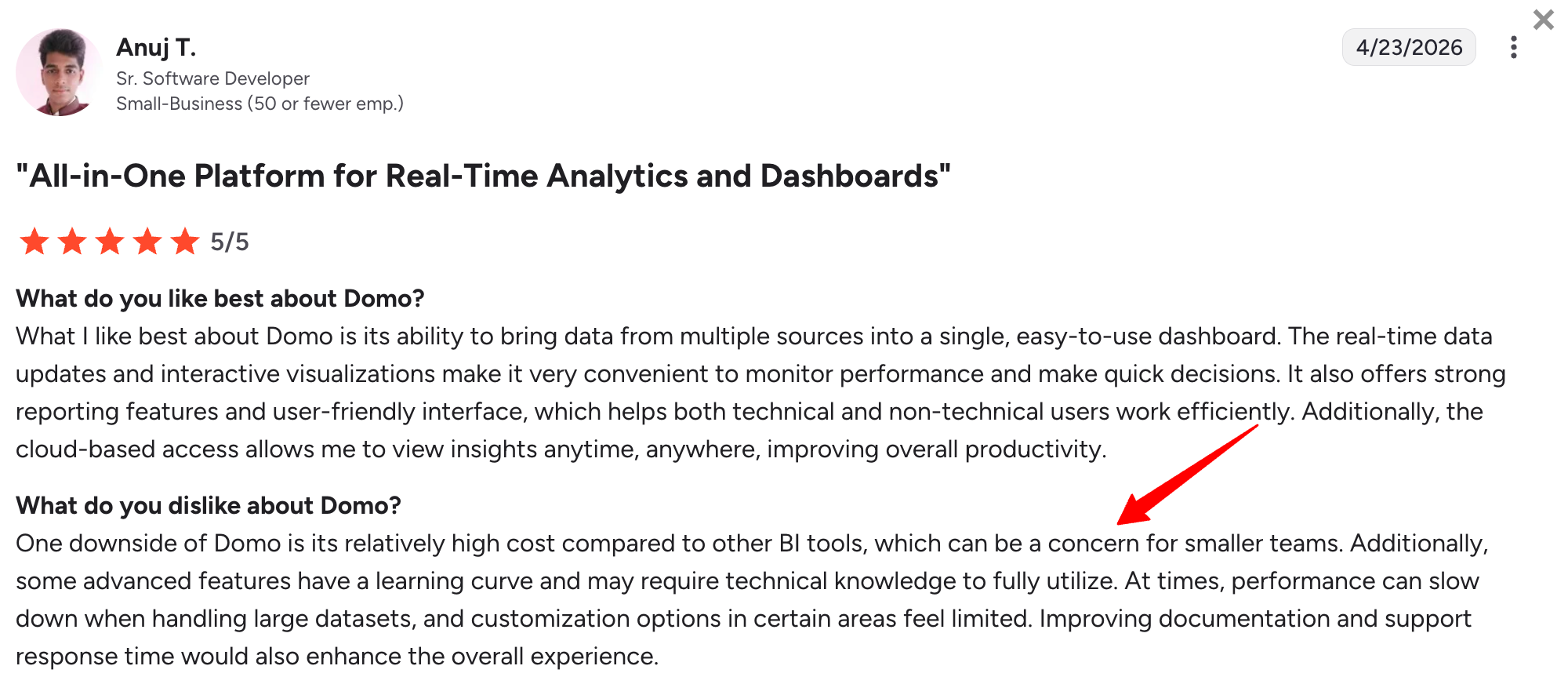
For teams that need to unify data across departments, Domo's breadth is the draw - reviewers point to it as a genuine "data empowerment" shift for their org. Smaller teams feel the cost more.
As Anuj T. put it: "One downside of Domo is its relatively high cost compared to other BI tools, which can be a concern for smaller teams."
Pros:
- Enterprise-grade MCP: Domo's AI connection is backed by governance and semantic layer controls, not a lightweight bolt-on.
- Extremely broad connector coverage: 1,000+ sources cover nearly any data source an enterprise might need.
- Versatile across departments: one platform serving sales, marketing, finance, and ops reduces tool sprawl.
- Real-time data access: dashboards refresh continuously rather than on a fixed schedule.
Cons:
- No public pricing: every deal requires a sales conversation, making it hard to budget without a quote.
- Steep learning curve: despite a clean interface, advanced customization often needs SQL knowledge.
- High cost for smaller teams: even small deployments commonly run $2,000-4,000/month based on third-party deal data.
- Not built for client-facing reporting: no white-labeling or multi-client management designed for agency use.
Domo Pricing
Domo doesn't publish pricing publicly. But based on third-party deal data, small teams typically pay $2,000-4,000/month, with enterprise deployments running well into five and six figures annually.
The pricing is based on the overall usage of the platform and factors such as data storage, data refresh rates, the number of users, the volume of data queries, etc.
Newly registered users get a 30-day trial.
9. Databox
Most suitable for: Boutique agencies and small businesses
Databox is a data reporting and analytics platform for growing businesses.
You can integrate with 100+ software tools, and bring in custom data through Google Sheets or Excel.
Then, you can visualize this data directly on Databox using pre-built metrics and templates.
The most notable addition is “Genie”, Databox’s AI analyst: ask a plain-language business question and get a visual answer with an explanation. MCP access is also included on every plan, including the free tier.
The trade-off is that Databox dashboards aren't linked, so editing dozens of similar client dashboards still means editing them one by one.
On Whatagraph, you can edit them in one go, saving you massive time.
Key Features
- 100+ integrations: plus custom data import via Google Sheets or Excel.
- Genie AI Analyst: plain-language questions return visual answers with explanations, available on Growth plan and above.
- MCP access on all plans, including free: connect Claude or ChatGPT to query your Databox data directly.
- KPI benchmark groups: track metrics against saved benchmarks or industry standards over time.
- Agency pricing track: separate plans with client account management and lower per-source overage costs than the standard Business track.
Databox Reviews from Real Users
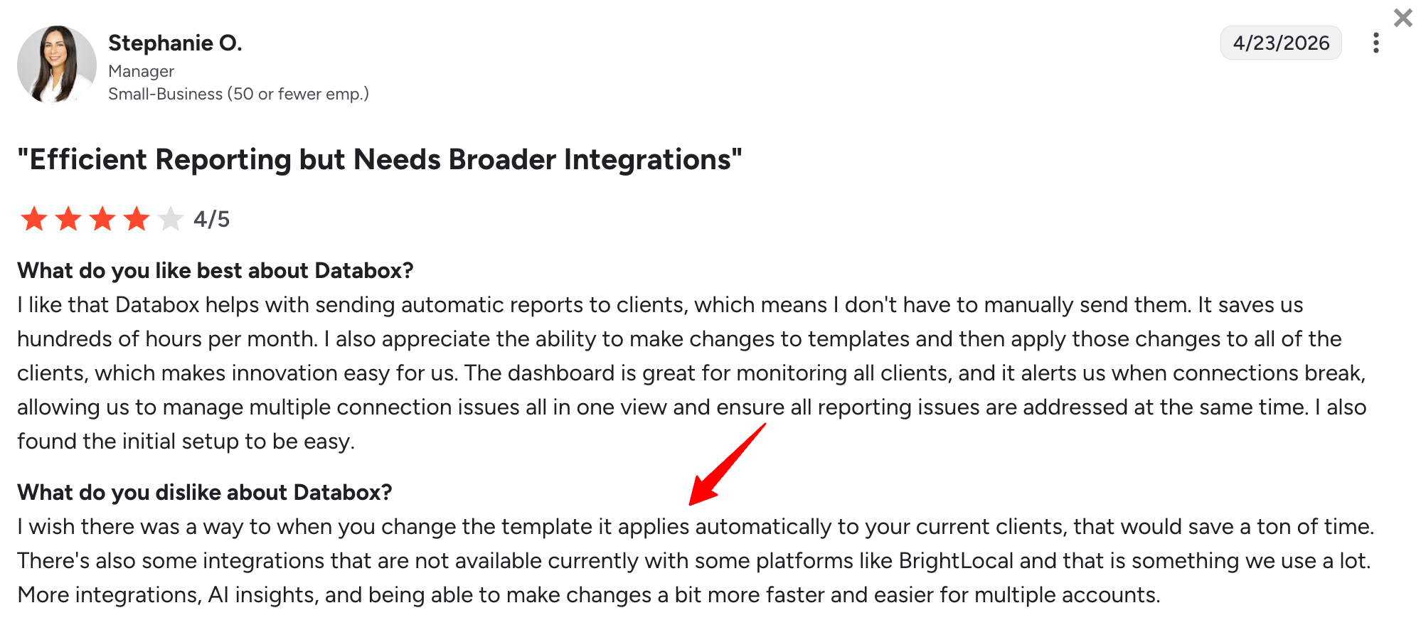
The free tier stands out - reviewers note it's genuinely usable, not just a teaser. What frustrates agency users is the lack of linked templates.
Stephanie O. captured the cost of that gap: "I wish there was a way that when you change the template, it applies automatically to your current clients, that would save a ton of time."
Pros:
- MCP on the free plan: one of the most accessible AI assistant integrations in this category, with no paid tier required.
- Genie AI Analyst: a genuinely useful conversational layer for exploring data without dashboard-building.
- Agency-specific pricing: lower overage rates and client account management are not available on the standard Business plans.
- Usable free tier: enough to evaluate the platform before committing.
Cons:
- No linked templates: dashboards aren't connected, so updating the structure across many client dashboards means editing each individually.
- Limited data sources on lower tiers: only 3 sources included on Agency Starter and Business Starter - additional sources cost extra.
- White-labeling is a paid add-on: $200/month on most plans, only bundled into the $799/month Premium tier.
- AI features gated to higher tiers: Genie AI Analyst requires the Growth plan ($399/month) or above.
Databox Pricing
Databox has a separate agency pricing track from its standard business plans.
Databox Business plans:
- Free: 3 data sources, 1 dashboard, 3 users, 10 custom metrics, daily sync, MCP access.
- Professional ($159/month): more data sources, unlimited dashboards and users, custom metrics.
- Growth ($399/month): adds Genie AI Analyst, AI summaries, forecasting, and advanced filters.
- Premium ($799/month): 100 data sources, white-labeling, and guided onboarding included.
Databox Agency plans:
- Agency Starter ($79/month): 3 data sources, 10 dashboards, 5 client accounts, hourly sync.
White-labeling and “guided onboarding” are also only available as an add-on on Databox ($200 per month for agencies). In contrast, these are included in all of Whatagraph’s paid pricing plans.
10. Cyfe
Most suitable for: Boutique SEO agencies
Cyfe is a business dashboard app and reporting platform that helps you easily monitor your business data from one place and make better decisions.
You can pull data from 100+ integrations including social media, email, SEO, and sales and finance tools. You can also bring in custom data via .CSV, Google Sheets, SQL, private URL, or push API.
To build visualizations, you can start from their dashboard templates or pre-built widgets. The platform also comes with “Embedded Analytics” where you can take an entire dashboard or a widget and embed it to emails, webpages, or applications.
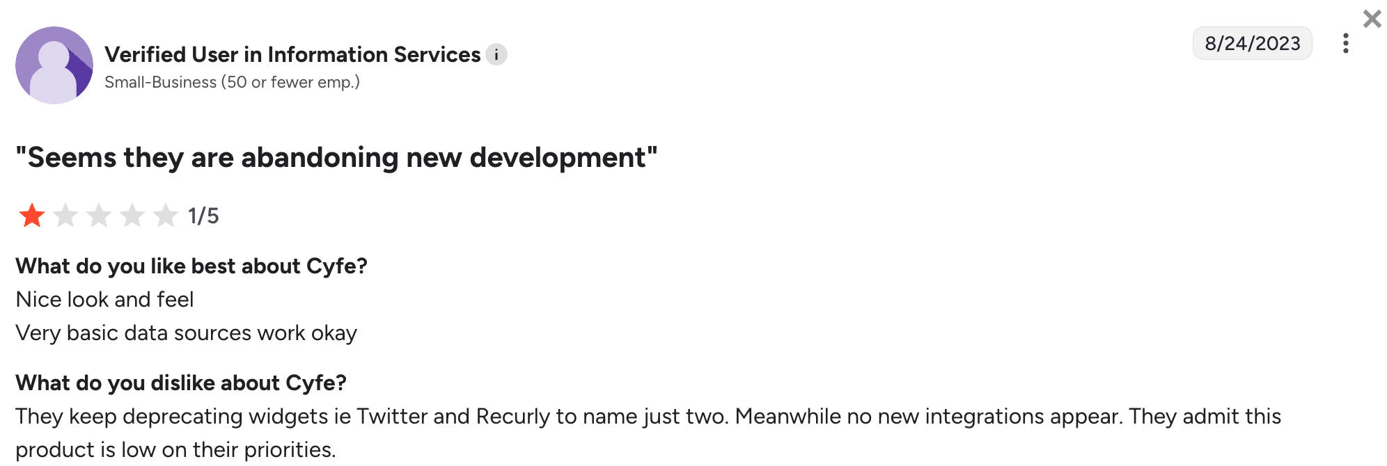
The honest assessment for 2026: Cyfe is in maintenance mode. There have been no meaningful product updates in 2025 or 2026; its G2 profile is unclaimed, and integrations like X (Twitter) and Recurly have been deprecated without replacement. It's not a tool to evaluate based on an active roadmap - it's an affordable, functional tool that does what it does, but isn't keeping pace with the market.
Key Features
- 100+ integrations: including social, email, SEO, sales, and finance tools, plus custom data via CSV, Google Sheets, SQL, or push API.
- Built-in keyword ranking tool: tracks website rankings across Google, Yahoo, and Bing without a separate subscription.
- Embedded analytics: embed a full dashboard or individual widget into emails, webpages, or applications.
- 15-language support: including Korean, Turkish, and French
- TV Mode and public URLs: included on all plans alongside custom logo, themes, and SSL domain support.
Cyfe Reviews from Real Users
At its price point, Cyfe still does the basics well - built-in rank tracking and embedded widgets remain genuinely useful for budget-conscious teams.
But the silence on development is hard to ignore. There hasn't been a new review since 2023, and the most recent one is blunt:
"They keep deprecating widgets, i.e., Twitter (X) and Recurly, to name just two. Meanwhile, no new integrations appear. They admit this product is low on their priorities."
Pros:
- Built-in rank tracking: useful for boutique SEO agencies that don't want a separate Ahrefs or SE Ranking subscription just for rankings.
- Affordable entry point: $29/month is one of the lowest starting prices in this category.
- Wide language support: 15 languages supported, useful for agencies serving non-English-speaking clients.
- Embedded analytics: flexible delivery options beyond a standalone dashboard.
Cons:
- Maintenance mode: no meaningful product development in 2025-2026, and some integrations have been deprecated without replacement.
- No centralized data management: each widget connects to its own source individually rather than pulling from a shared data layer.
- No master templates: there's no way to duplicate a dashboard structure for a new client - each one is built from scratch.
- No advanced data transformation: no custom blends, calculated fields, or warehouse export.
Cyfe Pricing
Cyfe offers five pricing plans as of May 2026:
- Starter ($29/month): 2 dashboards, 1 user.
- Standard ($49/month): 5 dashboards, 2 users.
- Pro ($79/month): 10 dashboards, 5 users.
- Premier ($129/month): 20 dashboards, unlimited users.
- Agency ($200+/month): 100 dashboards, 15 users, 10 clients, white-labeling features.
11. Tableau
Most suitable for: Data teams at large enterprises
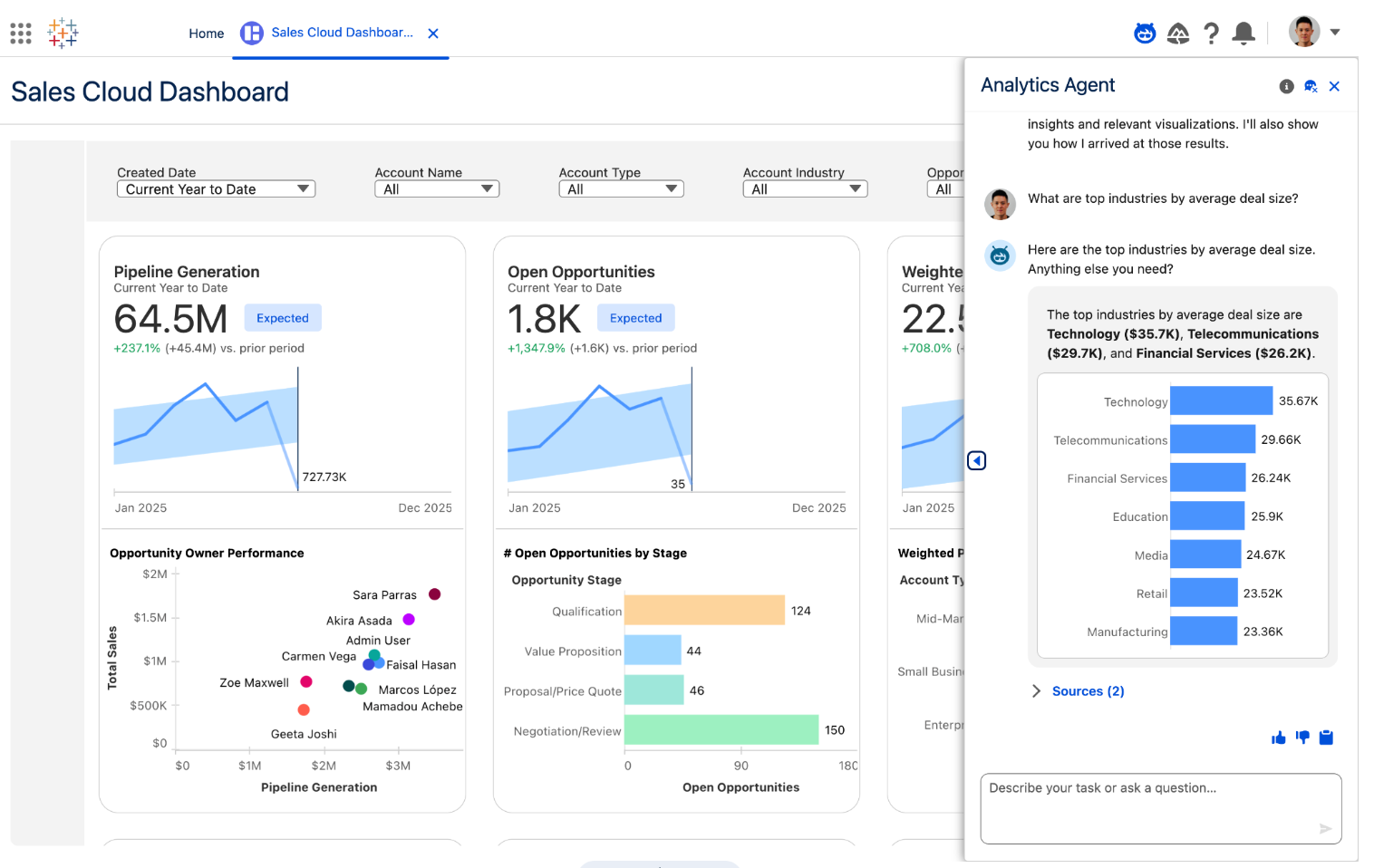
Tableau is an AI-powered business intelligence and marketing analytics tool. It offers business forecasts, analyzes strategies, and allows for data-driven decisions.
You can use the drag-and-drop builder to choose from various chart types, color palettes, and formatting options to create interactive dashboards without extensive technical expertise.
Marketers can perform complex data analysis, uncover trends, and identify opportunities for optimization using features such as trend lines, forecasting, and clustering.
Tableau offers an AI layer, but only through Tableau Next, a separate bundle add-on. A more accessible addition is Tableau Pulse's "Pace to Goal" insight, which calculates whether you're on track to hit a target by the end of a period - useful for budget pacing.
Key Features
- 90+ integrations: spanning databases, cloud platforms, and major marketing sources.
- Drag-and-drop dashboard interface: a wide range of chart types without requiring code.
- Advanced statistical analysis: trend lines, forecasting, clustering, and predictive modeling built in.
- Tableau Pulse: proactive KPI digests sent to Slack, Teams, or email, now with Pace to Goal insight.
- Tableau Concierge (Tableau Next only): conversational AI for building calculations and visualizations - requires the separate Tableau+ bundle.
Tableau Reviews from Real Users
Reviewers consistently rank Tableau among the most capable tools for genuine statistical analysis - this isn't a basic dashboard builder, and it shows.
The cost of that depth is speed - Tableau is known to perform slowly with larger datasets.
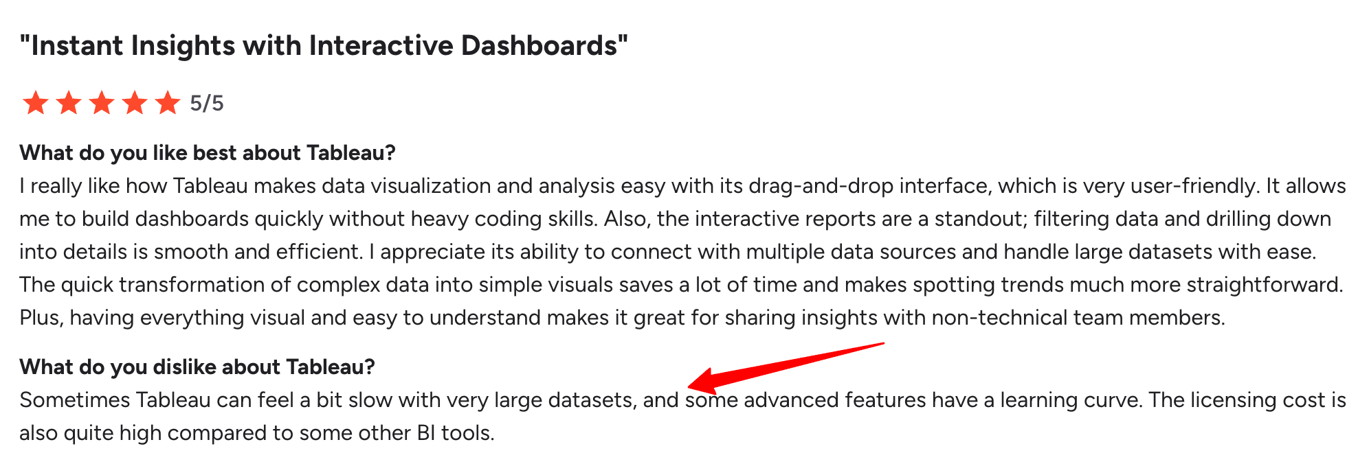
One G2 reviewer notes: "Sometimes Tableau can feel a bit slow with very large datasets, and some advanced features have a learning curve."
Pros:
- Genuinely powerful analytics: statistical and predictive capabilities go well beyond standard dashboarding tools.
- Strong customer support: training, consulting, and technical support are included to help with implementation.
- Pulse digests reduce dashboard-checking: proactive KPI alerts via Slack or Teams mean less manual monitoring.
- Mature, well-documented platform: extensive community and Microsoft-style ecosystem of resources.
Cons:
- Expensive at scale: per-user pricing across Creator, Explorer, and Viewer tiers adds up quickly for larger teams.
- AI features require a separate bundle: Concierge isn't included in standard Tableau Cloud or Server pricing.
- Data cleaning happens outside Tableau: preprocessing must be done beforehand - Tableau doesn't handle data cleaning natively.
- Slow with large datasets: load times increase noticeably as data volume grows.
Tableau Pricing
Tableau offers three pricing plans:
- Viewer ($15/user/month): view and interact with published dashboards only.
- Explorer ($42/user/month): edit dashboards and limited data source creation.
- Creator ($75/user/month): full authoring, Tableau Desktop, and Prep Builder - at least one Creator license is required per deployment.
Tableau Cloud Enterprise Edition adds governance and advanced management features at roughly double the Standard rate: Viewer $35, Explorer $70, Creator $115/user/month.
12. Microsoft Power BI
Most suitable for: Business analysts in SMBs and freelancers
Microsoft Power BI is a business intelligence software suite that includes apps, services, and data connectors. It is a cloud-based dashboard tool that you can use to combine data from multiple sources into a single data set.
It connects to a range of data sources, including Microsoft products (such as Dynamics 365 and Azure), databases (SQL Server, Oracle, MySQL, etc.), cloud services (Google Analytics, Salesforce, etc.), and many others.
It's a genuinely capable analytics tool, but it's built for data analysts working inside the Microsoft ecosystem, not for marketers who want a fast, branded client report.
An interesting Power BI feature is natural language querying. You can ask questions about your data in plain language and the tool answers by giving you relevant visualizations and insights.
The catch is that the AI layer, Copilot, isn't included in the base Pro license - it requires either a Premium Per User license or Fabric capacity, both of which cost meaningfully more.
Although a capable data analysis tool, Power BI has an even steeper learning curve than Looker Studio.
Key Features
- 100+ integrations: spans Microsoft products, databases, and major marketing and CRM platforms, eg, HubSpot.
- Power BI Copilot: natural language querying, DAX formula generation, and AI-written narrative summaries - available only on Premium Per User or Fabric capacity, not on base Pro.
Power BI's narrative summaries aim to solve exactly the problem Janet Mesh, CEO and Co-Founder at Aimtal, flags as one of the most common reporting mistakes:
"One of the biggest mistakes that marketers make when creating reports is just adding screenshots of performance charts without any context or analysis."
- Native visualization dashboards: a wide range of interactive chart types, plus custom visuals from the Power BI community.
- Microsoft ecosystem integration: share reports directly into Teams, PowerPoint, Excel, and the Power Platform.
- Scalable data handling: built to manage large data volumes and complex analytics workloads as you grow.
Microsoft Power BI Reviews from Real Users
For teams already in the Microsoft ecosystem, reviewers describe Power BI as close to a no-brainer - the native Teams and Excel integration genuinely saves time.
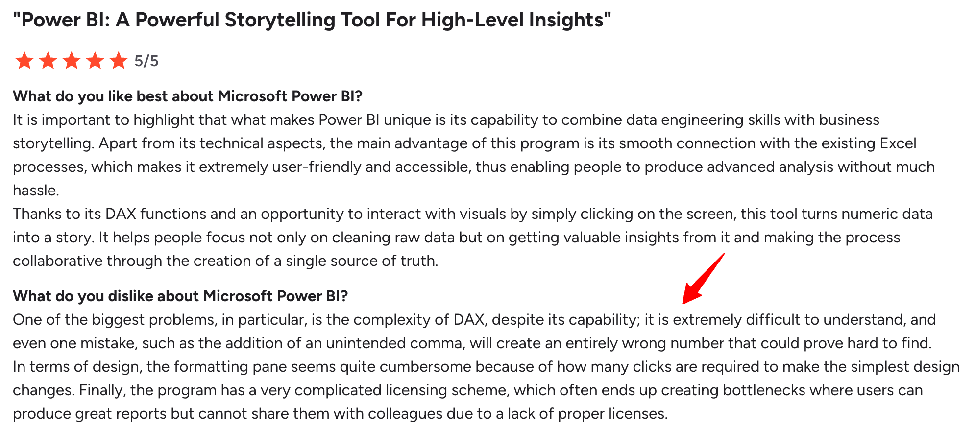
DAX (Data Analysis Expressions) is where things get hard.
As Mohit C. warned: “It is extremely difficult to understand, and even one mistake, such as the addition of an unintended comma, will create an entirely wrong number that could prove hard to find.”
Pros:
- Deep Microsoft integration: if your team already lives in Teams, Excel, and Office 365, Power BI slots in natively.
- Powerful analytics: handles complex calculations, large datasets, and advanced data modeling well beyond basic dashboarding.
- Natural language querying: ask questions in plain English and get back a relevant chart (Copilot tiers only).
- Wide data source support: connects to databases, cloud services, and major platforms outside the Microsoft stack, too.
Cons:
- Steep learning curve: DAX (Data Analysis Expressions) is required for most custom calculations and takes real time to learn.
- Copilot costs extra: the AI features most marketers actually want require upgrading from Pro to PPU or Fabric capacity.
- Not built for client-facing reporting: no white-labeling, linked templates, or multi-client management out of the box.
- Pricing increased in 2025: Pro and PPU both went up significantly, making the "cheap BI tool" reputation less true than it used to be.
Power BI Pricing
Microsoft raised Power BI pricing in April 2025, and those rates remain in effect as of 2026 May, billed annually:
- Pro ($14/user/month): workspace collaboration, scheduled refreshes (up to 8/day), report distribution, mobile access.
- Premium Per User ($24/user/month): everything in Pro plus Power BI Copilot, larger model sizes, 48 refreshes/day, paginated reports.
- Fabric capacity (from ~$263/month for F2, scaling to F64+ at ~$5,000/month): capacity-based pricing where report viewers no longer need individual licenses at F64 and above.
13. Grow.com
Most suitable for: Data analysts at medium to large enterprises
Grow BI - now part of Epicor's broader product portfolio - is a no-code full-stack business intelligence platform that combines ETL, data warehousing, and visualizations on one platform.
You can connect to 150+ data sources and prepare your data using SQL or no-code transformations, with everything stored automatically on Grow's own infrastructure rather than requiring a separate warehouse.
Epicor has split "Grow" into multiple distinct products:
1. Grow AI is a separate machine-learning product focused on manufacturing and supply chain use cases.
2. Grow BI is the dashboard and visualization platform discussed here
Natural language data interaction was added to Grow BI, letting non-technical users ask data questions in plain language and get narrative explanations - though this still requires Epicor's sales team to access, since there are no self-serve plans.
Then, you can prepare and organize your data using either NoSQL or SQL transformations. This includes custom calculations, data blends, and advanced data filters.
You can create three types of dashboards on Grow:
- Dynamic dashboards that display data based on who is logged into the account.
- Dashboard Blueprints, which are pre-built, single data source dashboards
- Custom & Sandbox dashboards which show blended data sources and metrics
You can then share them through emails, shareable URLs, Slack, TV mode, or tables of raw and transformed data.
Key Features
- 150+ native integrations: spanning CRM, marketing analytics, databases, and accounting software.
- Built-in data storage: Grow stores data automatically, removing the need for a separate warehouse.
- SQL or no-code transformations: custom calculations, blends, and advanced filters are available either way.
- Natural language data interaction: ask questions in plain language and receive narrative explanations (2026 addition).
- Three dashboard types: Dynamic (logged-in-user-based), Blueprints (pre-built single-source), and Custom/Sandbox (blended sources).
Grow Reviews from Real Users
Grow's no-code approach to ETL and warehousing genuinely appeals to teams without a dedicated data engineer - reviewers point to that as the main reason they chose it.
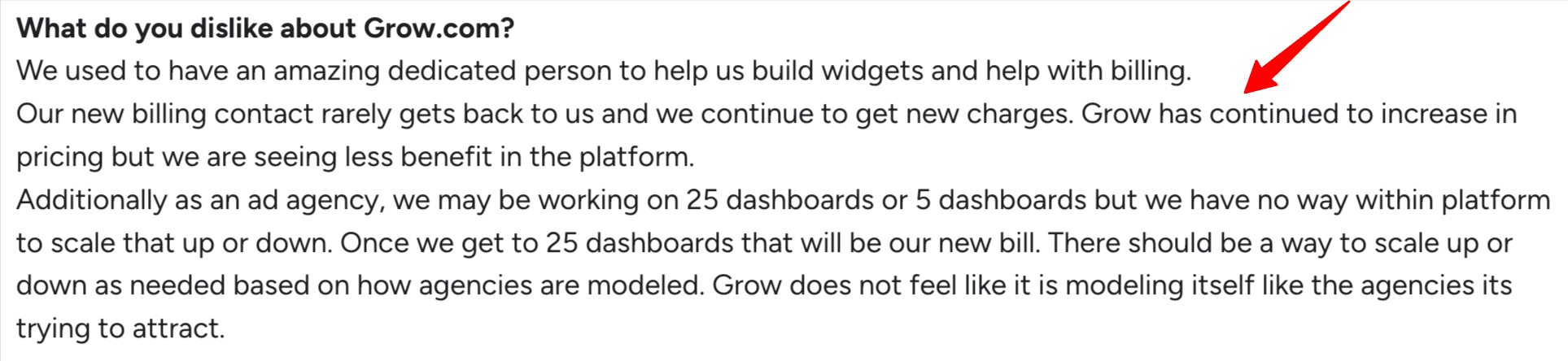
The frustration is that the value hasn't kept pace with the price.
One G2 reviewer put it plainly: "Grow has continued to increase in pricing, but we are seeing less benefit in the platform."
Pros:
- No-code full stack: ETL, storage, and visualization in one platform without separate tooling.
- Natural language queries: reduces dependence on a dedicated data team for basic questions.
- 150+ connectors: broad coverage across CRM, marketing, and finance tools.
- Flexible sharing: email, shareable URLs, Slack, TV mode, or raw data tables.
Cons:
- No self-serve pricing: every quote goes through Epicor's sales team - no way to compare cost without a sales call.
- Built for internal use, not client reporting: dashboards can get dense and technical, which can overwhelm clients or C-suite viewers.
- Manual upkeep required: regular complaints about manual work needed to keep dashboards current with new functions.
- Brand confusion risk: "Grow" now spans several distinct Epicor products (Grow BI, Grow AI, Grow Data Platform) - worth confirming you're evaluating the right one.
Grow Pricing
Grow BI doesn't publish self-serve pricing - all plans are custom quotes through Epicor's sales team, based on your data volume, user count, and feature needs.
Published on Nov 26 2024
WRITTEN BY
Nikola GemesNikola is a content marketer at Whatagraph with extensive writing experience in SaaS and tech niches. With a background in content management apps and composable architectures, it's his job to educate readers about the latest developments in the world of marketing data, data warehousing, headless architectures, and federated content platforms.