KPI Dashboard Software: Top 7 to Track Metrics in 2026
Running a business without a plan or strategy has never been a good idea, and in the data-driven market of today, it’s a quick route to going underwater. Making data-driven business decisions has recently become impossible without key performance indicator (KPI) dashboards that allow managers to track a company’s performance in real-time.

Jul 31 2023●5 min read


The dashboard platforms we’ve included in the review have their specifics which makes them suited for different roles, but they have one thing in common — they give you a comprehensive overview of your organization’s success.
What is KPI dashboard software?
A KPI dashboard software is a digital tool that provides you with a bird’s eye view of your company’s performance, health, and expected growth by:
- Collecting the key metrics from the business platforms you use and
- Displaying the data in a visually appealing way that makes it easy to understand performance indicators.
By monitoring metrics, you can identify trends and opportunities for improvement and measure your strategies’ success.
Business KPIs are quantifiable metrics that allow enterprises to track their progress toward specific goals. Some of the best KPIs to track include:
- Revenue growth
- Website bounce rate
- Customer satisfaction
- Revenue per customer
- Conversion rate
- Profit margin
Historically, tracking and reporting metrics depended on manual inputs, but now you can use KPI dashboard software to automatically extract relevant metrics from your business data sources and visualize them as meaningful insights.
But enough of the theory. Let’s see how the best KPI dashboard software solutions perform in practice.
Top 7 KPI Dashboard Software
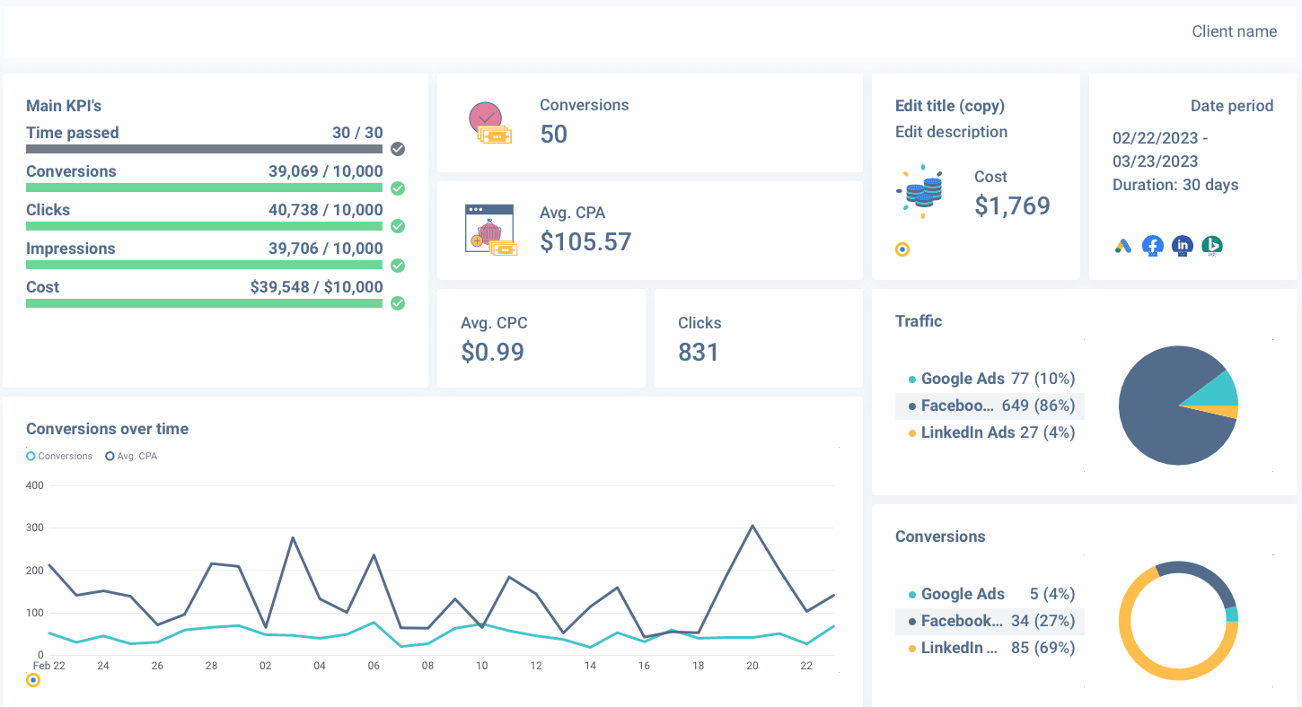
1. Whatagraph
Whatagraph is a marketing data platform for connecting, visualizing, and sharing marketing data that helps businesses pull data from over 45 sources to create engaging interactive dashboards.
What’s in the box?
- No-code user environment
- Native integrations with popular marketing platforms
- Drag-and-drop dashboard builder
- Beautiful pre-built dashboard templates
- Add, remove, or rearrange visualization widgets
- Personalize each dashboard you create with custom color and branding
- White-labeling feature — make every dashboard your own
- Automate scheduled sharing
- Easy data transfers to Google BigQuery
Pricing plan:
Whatagraph offers three pricing plans that are based on the number of users and data sources you want to connect. Transfers to a data warehouse are available at a flexible price, either as an addition to one of the pricing plans or as a standalone feature.
Who is Whatagraph for?
As an all-in-one data, visualization, and analytics platform, Whatagraph is an excellent dashboarding choice for small businesses whose staff don’t have the technical skills to connect sources and set up data transfers manually. Marketing agencies that serve multiple clients, each with diverse channels, and all enterprises who look to use data to make better decisions.
How about you try Whatagraph for 7 days for free?
Book a personalized walkthrough to learn more about its features or request a free trial today.
2. Klipfolio
Klipfolio is your ticket out of boring Excel spreadsheets that offer a dynamic platform for tracking KPIs and validating your business decisions. This platform has a ton of 4+ star reviews on reputable websites like Capterra, G2, and TrustRadius, which speaks to its reliability as a KPI dashboard software.
What’s in the box?
- Ready-made metrics according to the type of your business
- Data modeler for importing, customizing, segmenting, and filtering data
- PowerMetrics function for exploring historical trends
- Download dashboards as PDF reports
- Set recurring business goals and threshold alerts for each KPI you track
Pricing model:
This reporting software comes in four pricing plans based on the number of users, data services, dimensions, and date range window.
Who is Klipfolio for?
Klipfolio has a free plan perfect for small businesses that need to track a handful of KPIs and need no more than two user accounts. However, if you are looking for something with pre-made templates, widgets, and easily customizable layouts, Whatagraph might be your option.
3. InetSoft
InetSoft is a data analytics and business intelligence tool that offers KPI tracking and dashboards for various industries. It has revolutionized how organizations like WHO and NASA transform data sets into actionable intelligence.
What’s in the box?
- Data Mashup for rapid conversion of data blocks into custom dashboards
- Iterative mashup and visualization tool for building KPI dashboards
- Seamless and easy-to-use self-service dashboards
Pricing model:
InetSoft has four pricing plans starting with a free online account for reporting on uploaded Excel and CSV files.
Who is InetSoft for?
InetSoft has no focus on a single industry and can be used to meet needs across different markets like HR, SaaS, technology, banking, etc.
4. Mode
If you’re looking for a collaborative data platform that allows data analysts to combine SQL, Python, R, and visual analytics into a single platform, look no further than Mode. With a diverse user base, Mode gives your team members a powerful set of tools for growing your business with data-derived insights.
What’s in the box?
- Build charts in native formats and visualize SQL results
- Notebook feature for combined SQL, R, and Python analysis in the same app
- Helix data engine for navigating through data-heavy visualizations
- Visual Explorer for converting data into tables, graphs, and interactive charts
- Collaborative features for managing user access across the organization
Pricing model:
Mode has three pricing plans, but neither prices nor actual features you get for individual plans show on the website. The pricing is available only after you schedule a 30-minute demo.
Who is Mode for?
Both small and large companies can benefit from Mode’s collaborative function as it helps share insights across the organization. Due to its cross-application analysis, Mode is handy to teams that need to drill down for insights in siloed SQL and Python databases.
5. Datapad
Datapad is a great KPI reporting tool for users who want to track their business metrics on mobile devices. The KPIs that you’re tracking aren’t performing as expected? Datapad mobile app sends you a notification so you can fix the problem immediately.
What’s in the box?
- Data imports from multiple integrations, including Google Analytics, Shopify, Airtable, etc.
- Enter data manually, if needed
- Set goals for each KPI you track
- Chat with your team members in the dashboard’s comment section
Pricing model:
Datapad is still in its beta phase, so it’s available for free to anyone who is willing to give user feedback so they can build an even greater product.
Who is Datapad for?
Datapad is developed for business founders and managers who need a user-friendly business KPI dashboard on the go. Unfortunately, Datapad lacks many of the functionalities of more powerful data management software, so it might not be an ideal choice for everyone.
6. Tableau
Tableau is a dashboarding software that allows teams to analyze business data to solve problems and bottlenecks as well as help in decision-making. With more than 1,400 clients worldwide, Tableau has changed how many businesses use their data, especially after the pandemic.
What’s in the box?
- Tableau Cloud for tracking prominent KPIs
- Tableau Desktop for easy access, data visualization, and analysis through a drag-and-drop interface.
- Custom metrics builder
- AI-driven predictive modeling
- Governed self-service analytics for exploring data in a risk-free zone
- Tableau Prep for faster data preparation
- Tableau Data Management for connecting data to customizable dashboards in minutes
Pricing model:
Three pricing plans are dubbed Viewer, Explorer, and Creator. Every Tableau deployment requires at least one Creator account.
Who is Tableau for?
Tableau is a powerful data analytics and visualization platform that provides various options for organizations with complex data challenges. Data scientists and marketing agencies often use it for big data analytics. However, mastering Tableau requires a bit of a learning curve, which can prove challenging for less number-savvy marketers.
7. Zoho Analytics
Zoho Analytics allows businesses to prepare and analyze data to deliver deep insights or measure the impact of their campaigns. With more than 2 million users, Zoho is among the most popular self-service business dashboard platforms.
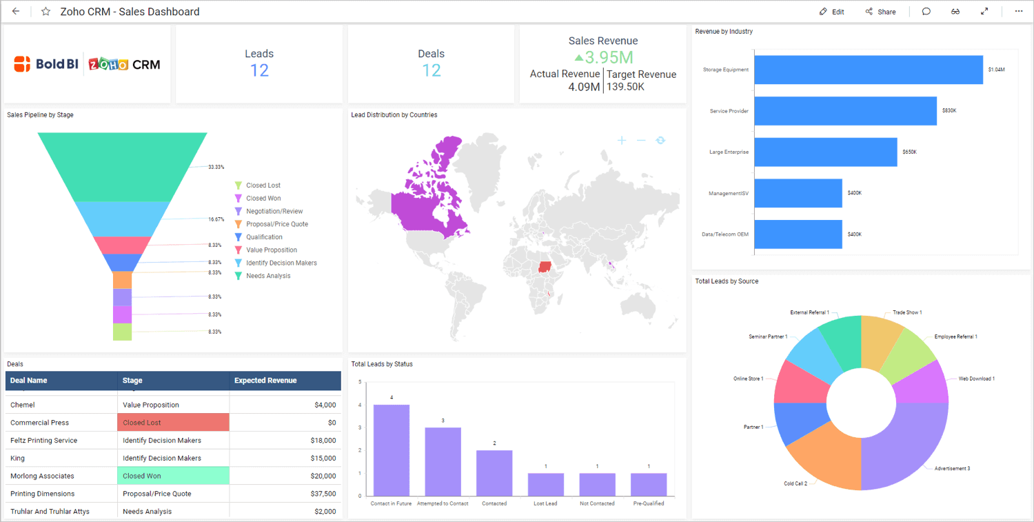
What’s in the box?
- Analyze data from over 250 sources
- Zoho DataPrep for self-service data preparation and data recycling
- Built-in dynamic visualization tool
- AI-powered data analysis
- Zoho Security protocol for complete data safety
Pricing model:
Zoho Analytics has four cloud-based pricing plans based on the number of users and data rows, as well as analytical capabilities and customizations.
Who is Zoho Analytics for?
With its wide space of pricing plans, from Basic to Enterprise, Zoho Analytics is a good choice for either small or medium-sized businesses. Small businesses can benefit from an affordable low-tier package, while enterprises can fit upper-pricing tiers that include the top level of service.
Conclusion
Using a KPI dashboard tool to track both business and individual KPIs is a great way to quickly see if your business is meeting its strategic goals and objectives and instantly identify areas where business performance can improve.
Looking at what each of these KPI dashboard software solutions offers is one thing, and using one another. So before you take your pick, we recommend you make the most out of the trial period and see what it feels like to use the platform.
You can start with Whatagraph.
Thanks to the quick setup workflow and the drag-and-drop dashboard builder, Whatagraph is unbelievably easy to learn. Connect your sources once, and the dashboard automatically refreshes with the latest data.
No time to build a dashboard from scratch?
Whatagraph has you covered with a library of professionally-designed dashboard examples for you to use.
Try Whatagraph for free today and see how our dashboards can help your business reach its full potential.
Published on Jun 05 2023
WRITTEN BY
Nikola GemesNikola is a content marketer at Whatagraph with extensive writing experience in SaaS and tech niches. With a background in content management apps and composable architectures, it's his job to educate readers about the latest developments in the world of marketing data, data warehousing, headless architectures, and federated content platforms.