10 PPC Report Templates Co-Created with Marketers
You’ve optimized bids, tested creatives, adjusted targeting, and monitored CTR, CPC, and ROAS all month long.
And then comes the final boss: building the PPC report.

Feb 19 2026●7 min read


Where do you start?
Which metrics are vain (cue “You're so vain” by Carly Simon) and which do your clients actually care about?
How do you show aggregated values across different PPC channels?
What's the best structure to present your PPC metrics?
You don't have to figure these out alone - we've got you.
In this guide, you'll find 10 paid search reporting examples re-created from REAL PPC reports created by marketers on Whatagraph.
Each PPC report example shows:
- Which performance metrics to track
- How to structure your dashboards
- How to present campaign performance clearly
- And how to automate monthly PPC reports without relying on spreadsheets or Looker Studio
Jump straight to the PPC report examples. Or stick around for insights from top marketers.
What Should a PPC Report Include? 5 KEY Things
Based on thousands of PPC reports created by marketers on Whatagraph over the past 10 years, here are the five key aspects to include in yours.
1. A Clear Executive Summary
Stakeholders don't want to scroll through pages of reports. They want to know right away:
- Are we on track?
- Are we profitable?
- Are we growing?
This is why every PPC performance report should include a short summary: 3–5 sentences highlighting performance trends and key takeaways.
However, writing these insights out manually across dozens of reports can be tedious and time-consuming.
In fact, that’s exactly how Cris Coussons, Founder of Visionary Marketing and Digital Marketing Expert, felt.
If I could automate one part of reporting, it would be custom annotations within Looker Studio. Right now, we still manually add insights and recommendations alongside charts, but having an automated way to flag performance shifts and suggest optimizations in real-time would make reporting even smoother.
Unlike Looker Studio, on Whatagraph you can get Whatagraph IQ to write out the first version of performance summaries for you based on your connected data on the report. You can then fully tweak it with your business context or tone.
Choose from 5 different content types – Summary, Recommendations, Wins, Issues, or custom prompt, and from 18 different languages.
See how it works here:
AI features like these are why agencies like Maatwerk Online are saving 100 hours a month on reporting. Lars Maat, Founder, says:
Whatagraph’s AI saves time and energy for our marketing specialists—and the hours we’re saving is just pure profit. We now have the time to focus on more strategic things that help both our agency and our clients grow.
2. Goal Pacing
Before campaigns launch, agree on concrete goals with your clients or stakeholders. Then start every campaign performance report by showing how you’re pacing toward those goals.
For example:
- 20% revenue increase
- 4x ROAS
- 1,000 new leads
- 15% higher conversion rate
In fact, goal pacing is Patrick Cumming’s, Director of Marketing at KlientBoost, favorite graph.
The main graph I use is goal-pacing. It tracks where we're at for our KPI on each metric vs where we should be over time. That way I can tell if we're on track or off-track to hit our KPI goal for the quarter.
Your PPC report should clearly show:
- Target vs. actual
- Are we ahead, behind, or on track?
- How performance is trending month over month
On Whatagraph, you can drag and drop a goal widget into your dashboard and instantly visualize pacing toward ROAS, revenue, leads, or conversion rate targets, without spreadsheets or manual calculations.
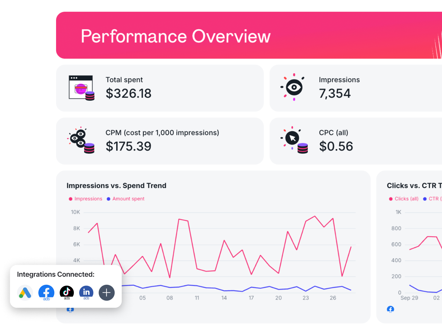
3. Top-Line KPIs
Then, show a high-level performance snapshot. This should include:
- Total ad spend across all your PPC channels (you can create a custom metric like this on Whatagraph in seconds)
- Total conversions or purchases
- Cost per acquisition (CPA) or cost per purchase
- Return on ad spend (ROAS)
- Conversion rate
- Progress vs campaign goals
Amy Hebdon, Google Ads Conversion Expert and Founder at Paid Search Magic, says:
I generally move from high-level performance > trends > supporting detail, rather than leading with granular tables. Lead with the KPIs and metrics important to your stakeholders, and clear the clutter for everything else.
4. Granular Performance Breakdown
After the executive view, report on each channel’s key metrics in separate tabs. Include:
- Spend by channel
- Conversions by channel
- ROAS by channel
- Other key metrics that you mutually agreed upon with your clients or stakeholders for each channel
For example:
- Audience Penetration, Qualified Leads, Engagement Rate for LinkedIn Ads
- Leads, Spend, Conversion rate for Google Ads
- …etc.
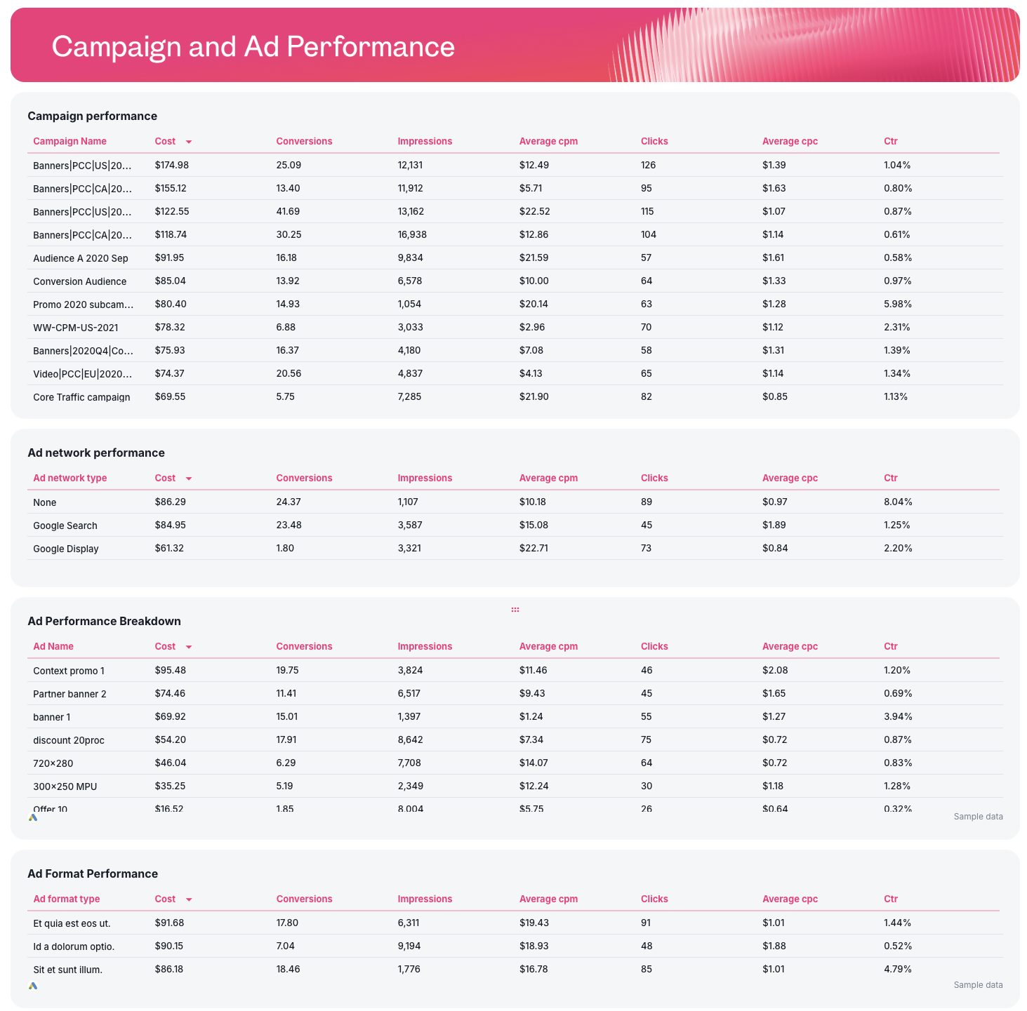
In each tab for each channel, break down campaign, keyword, and ad performance in granular tables like so:
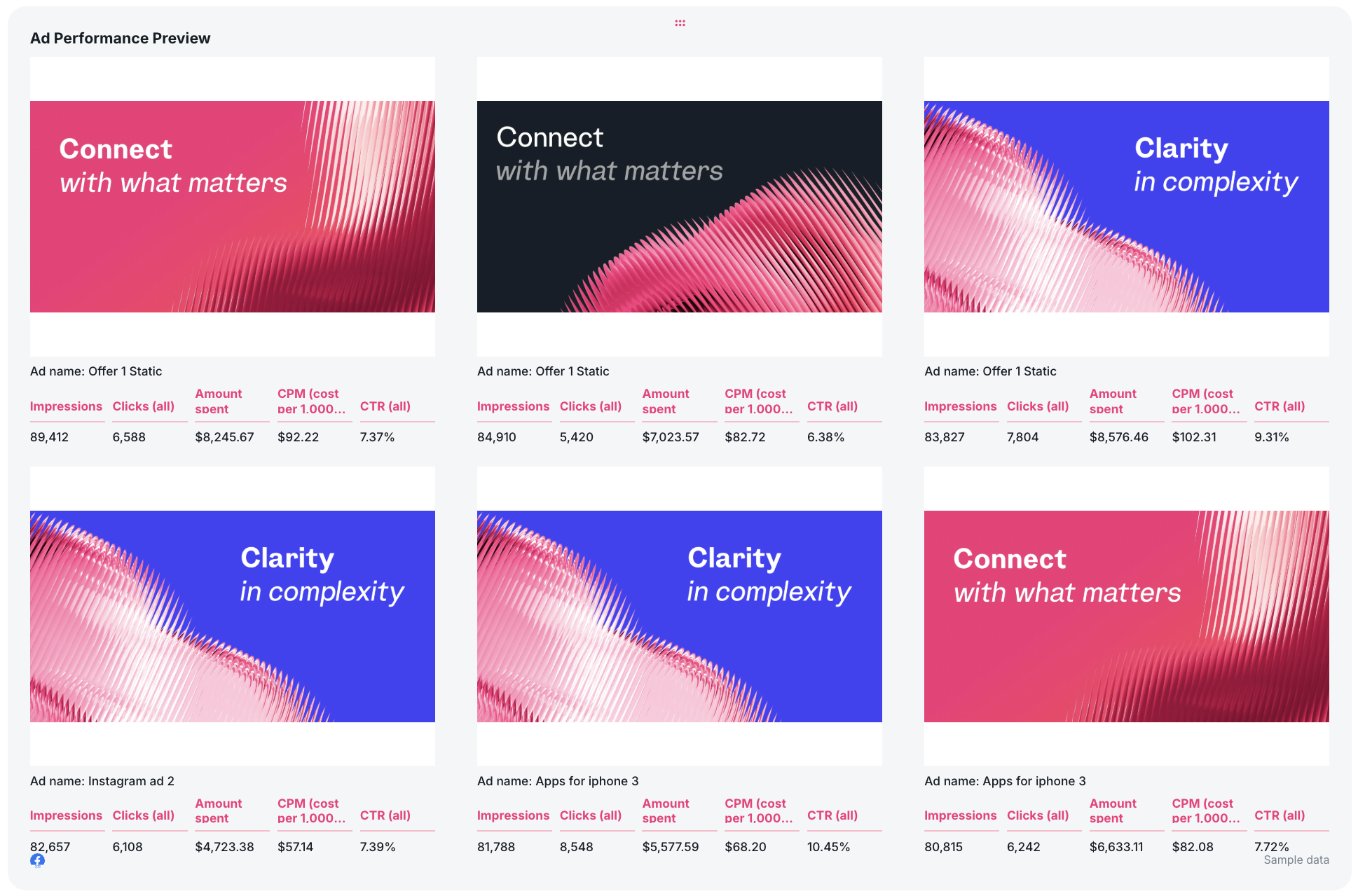
Then, show the top-performing ads based on the key metrics that matter most to your clients or stakeholders using a carousel-style widget. This makes everything more transparent and visually aesthetic, and helps you make decisions faster.
 For platforms like Facebook Ads, LinkedIn Ads, and TikTok, you can also include audience breakdowns like:
- Performance by age and gender
- Performance by job title or seniority (for B2B)
- Geographic performance
- Audience penetration
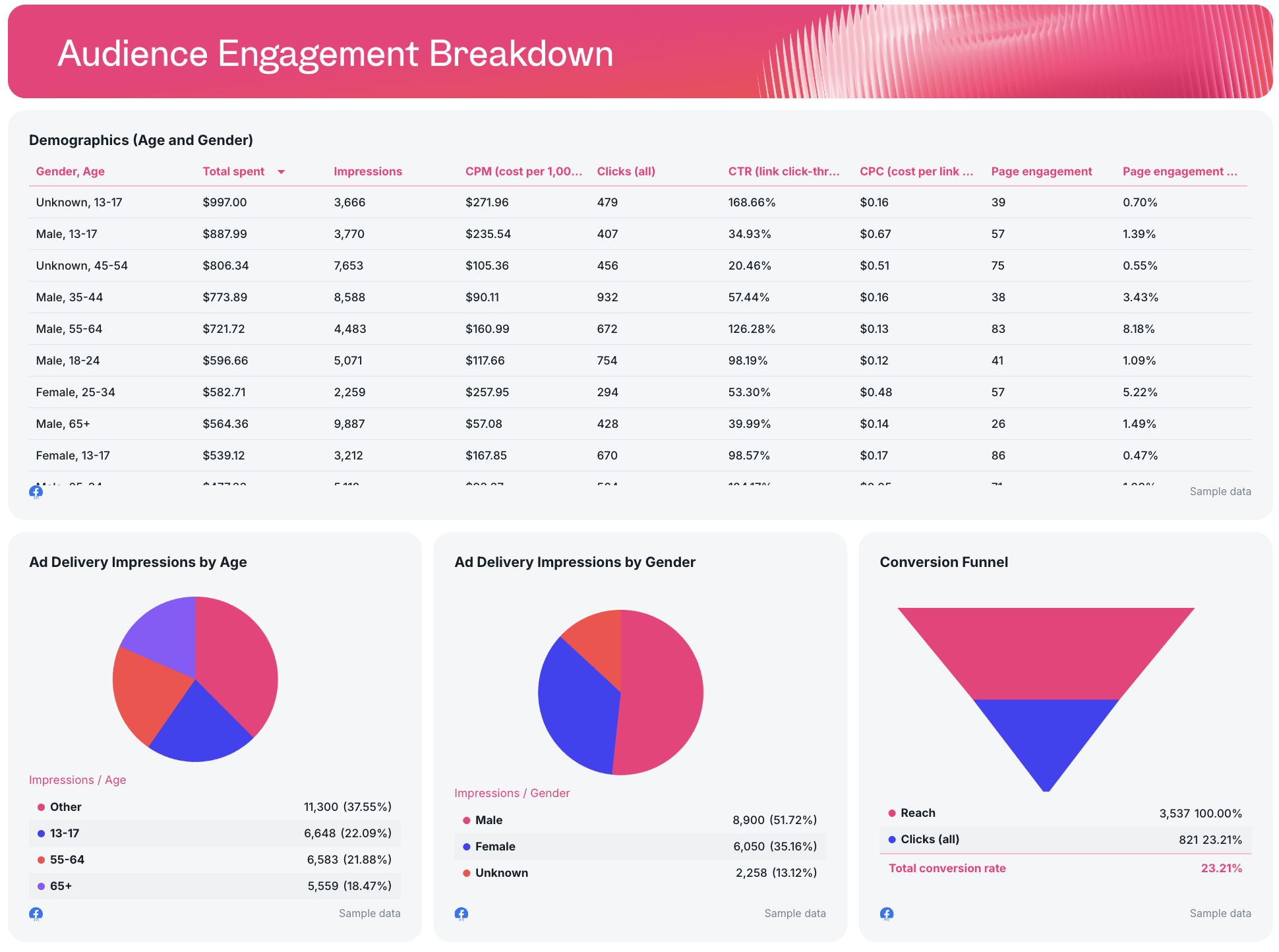
These insights help stakeholders see if your ideal target audience is engaging with you, not just how many clicks you got.
5. Actionable Insights & Next Steps
Most PPC report skip this part, but we'd argue it's probably the most important part of an effective report.
At the end of the report, add a short section in bullet points on what actions you're going to take the next month. This keeps everyone aligned and makes clients feel you know what you're doing.
Include:
- Budget reallocation recommendations
- Underperforming campaigns to pause
- High-ROAS campaigns to scale
- Creative testing suggestions
- Targeting refinements
And when stakeholders finish reading the report, they should know:
- What happened
- Why it happened
- What you’re doing next
Amy puts it beautifully:
Reports should be designed intentionally for the stakeholders, and should include invisible CTAs for what the reader should think, feel or do next based on the data.
10 Free PPC Report Templates and Examples
Jump to each PPC report template
- Cross-channel PPC report
- Google Ads report
- Facebook Ads report
- LinkedIn Ads report
- TikTok Ads report
- Real-estate PPC report
- eCommerce PPC report
1. Cross-Channel PPC Report Example and Sample PPC Report
 Use this template for free with your data
Who it’s for: Agencies managing multiple PPC campaigns across Google Ads, LinkedIn Ads, Meta Ads, and TikTok and in-house marketing teams reporting to stakeholders
Channels connected: Google Ads, Facebook Ads, TikTok Ads, LinkedIn Ads
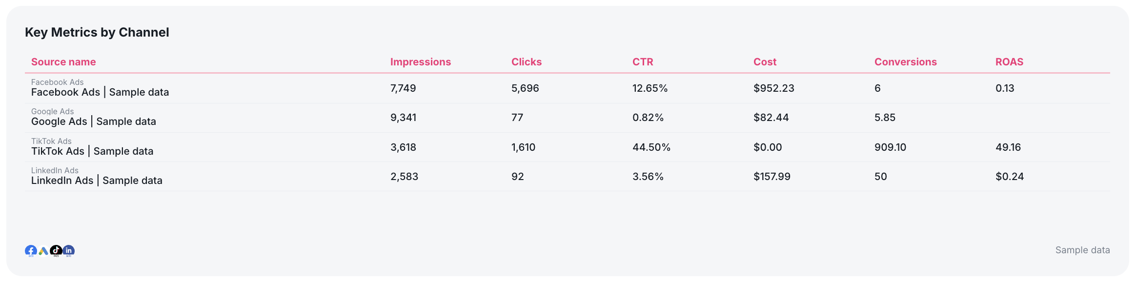
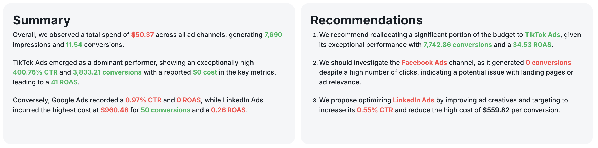
This ultimate cross-channel PPC dashboard example is the perfect example of how you should visualize your PPC reporting. It includes a single, high-level view of key metrics across all your ad platforms in one place. It’s built to connect campaign performance directly to business goals, so you can prove ROAS and optimize budget allocation without relying on spreadsheets.
See this PPC performance report example live:
Metrics to visualize in a PPC ad performance report (broken down by channel):
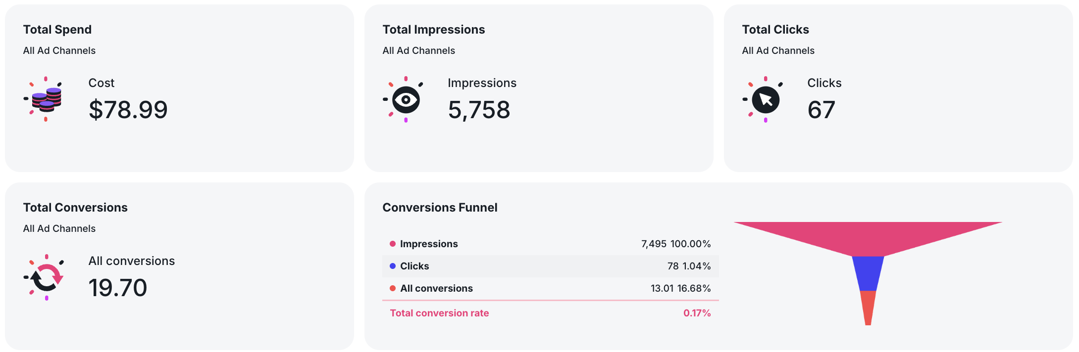
Cross-Channel (Overall Performance)
- Total Spend
- Total Impressions
- Total Clicks
- Total Conversions
- Conversion Rate
- Return on Ad Spend (ROAS)
- Cost per Acquisition (CPA)
- Conversion Funnel (Impressions → Clicks → Conversions)
- Daily Conversions Trend
- Marketing Performance Goals (Spend vs Budget, Conversions vs Target)
Google Ads
- Campaign performance by campaign name
- Click-through rate (CTR)
- Cost per click (CPC)
- Cost per conversion
- Quality score (if available)
- Search term performance
- Landing page conversion rate
- Keyword performance breakdown
Meta Ads (Facebook Ads)
- Ad performance by campaign and ad group
- CTR and CPC
- CPM (cost per 1,000 impressions)
- Demographics (age and gender)
- Ad placement performance
- Creative-level performance
- Page engagement metrics
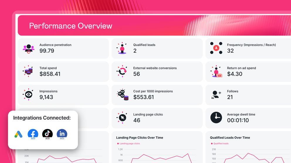
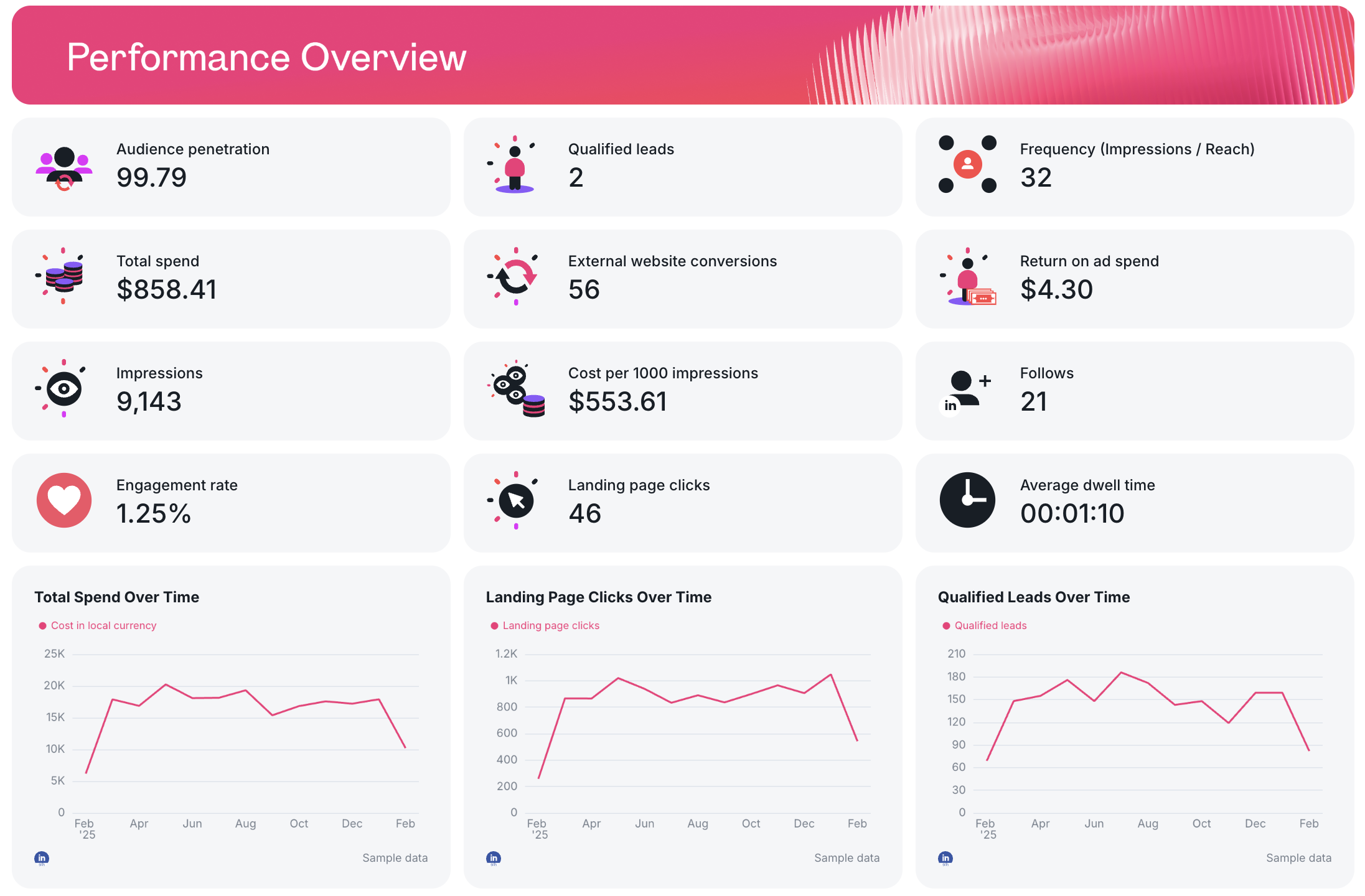
LinkedIn Ads
- Audience penetration
- Frequency (Impressions / Leads)
- Qualified leads
- Cost per lead
- Landing page clicks
- CPM
- Conversion rate
- Follows and engagement
- Audience engagement by job title, seniority, and country
TikTok Ads
- Video views and completion rates
- Engagement metrics
- Reach and cost per 1,000 people reached
- Conversion rate
- Real-time results vs spend
- Campaign performance by age and gender
Best practices:
✅ Start with high-level performance indicators before diving into granular campaign data in your PPC dashboards
✅ Highlight ROAS, CPA, and conversion rate clearly so stakeholders can connect PPC performance to business goals.
✅ Include a table summarizing the key metrics for each ad platform in one place.
✅ Report on different channels in different tabs / pages to not overwhelm readers.
✅ Show top performing ad creatives using a Carousel-style widget so you can see exactly which ad creatives are performing well, and why.
✅ Add recommendations and performance summaries based on your data with Whatagraph IQ.
✅ Review daily trends to catch performance spikes, tracking issues, or budget pacing problems before it’s too late.
✅ Automate your report to go out on a specific date, time, and frequency so you don’t have to worry about late reports. Or share password-protected live report links with stakeholders directly whenever needed.
✅ Add a carousel chart showing the top performing ad creatives for each channel in your campaign reporting template
✅ Add a recommendations section at the bottom of each tab with clear optimization actions
2. Three Google Ads Report Templates & Examples
Who it’s for: PPC specialists and marketing teams running Google Ads campaigns who need granular performance insights beyond high-level dashboards.
Channels connected: Google Ads, Shopify, Google Analytics 4
We’ve co-created multiple Google Ad reports with top performance marketers in this PPC Reporting Hub and we’ll highlight three of them in this section.
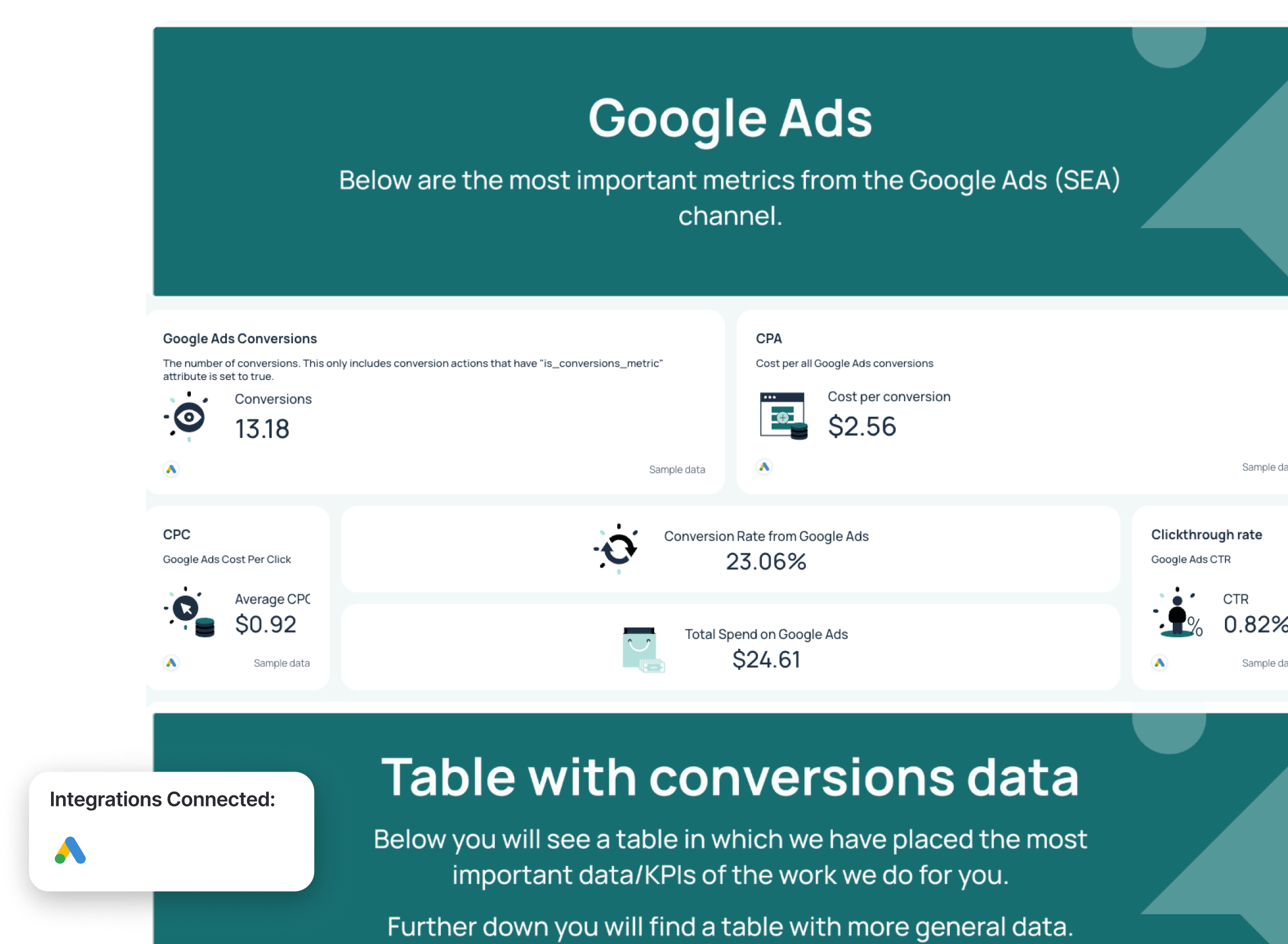
#1: Google Ads Report Sample for Lead Generation
Use this template for free with your data
This Google Ads dashboard example was co-created with Lars Maat, Co-Founder at Maatwerk Online.
It shows deep, granular Google Ads reporting, from campaign performance and ad creatives to keyword and landing page breakdowns. It helps you move from surface-level metrics to actionable insights that directly improve conversion rate, cost per acquisition, and return on ad spend.
Metrics to visualize in a Google Ads reporting dashboard:
- Total spend (Cost)
- Conversions
- Conversion rate
- Cost per conversion
- Impressions
- Clicks
- CPC
- CTR
- Search impression share
Lars said, “I like to look at search impression share—it’s an underestimated metric that tells you right away whether to increase bids or budgets.”
Best practices:
✅ Use gauge widget for goal pacing for the most important metrics
✅ Add a short written summary with actionable insights, stakeholders shouldn’t have to interpret raw campaign data on their own.
✅ Move onto high-level KPIs before diving into conversion-focused table
✅ Break down search impression share and bids per Google Ads campaign to spot scaling opportunities
✅ Use a conversion funnel to quickly identify drop-offs between impressions, clicks, and conversions.
#2: Google Ads & Shopify Ads Report Example
Use this template for free with your data
E-commerce teams and agencies will find this Google Ads report example co-created with Rasmus Madsen, Google Ads specialist, particularly useful.
It shows not just how much returns you’re getting from your ad spend, but also exactly how much more profit you’re generating because of Google Ads campaigns.
Metrics to visualize:
- Profit on ad spend (POAS)
- Return on ad spend (ROAS)
- Google Ads cost
- Total revenue
- Gross profit
- Contribution margin (Gross profit - Google Ads cost)
- Net profit (Contribution margin - Fixed expenses)
Rasmus says “If you’re only looking at Google Ads metrics like ROAS, you’re missing the full picture. You need to look at POAS and contribution margin. Otherwise you don’t really know if you’re making money with ads or just spending it.”
Best practices:
✅ Track profit, not just revenue - include COGS, gross profit, and contribution margin
✅ Prioritize contribution margin as the main performance metric (calculated as Revenue – COGS – Google Ads spend)
✅ Combine Google Ads data with backend ecommerce data (orders, customers, profit)
✅ Analyze new vs returning customers to understand lifetime impact
✅ Use lifetime value vs CAC to decide whether to scale ad spend
✅ Split brand vs non-brand campaigns to isolate incremental performance
✅ Start with a total business view, then drill down into channel performance
✅ Keep reporting simple and easy to consume so clients can quickly understand performance
#3: Google Ads Report Sample for Performance Max Campaigns
Use this template for free with your data
Performance Max is a blackbox, and this report template co-created with Ameet Khabra, Founder at Hop Skip Media, aims to shine a bright light into it.
The entire report template is built around this key question:
Did the account generate qualified leads, at an acceptable cost, and can we trust the numbers?
According to Ameet, these three things—results, efficiency, and data integrity—are what lead generation clients actually care about.
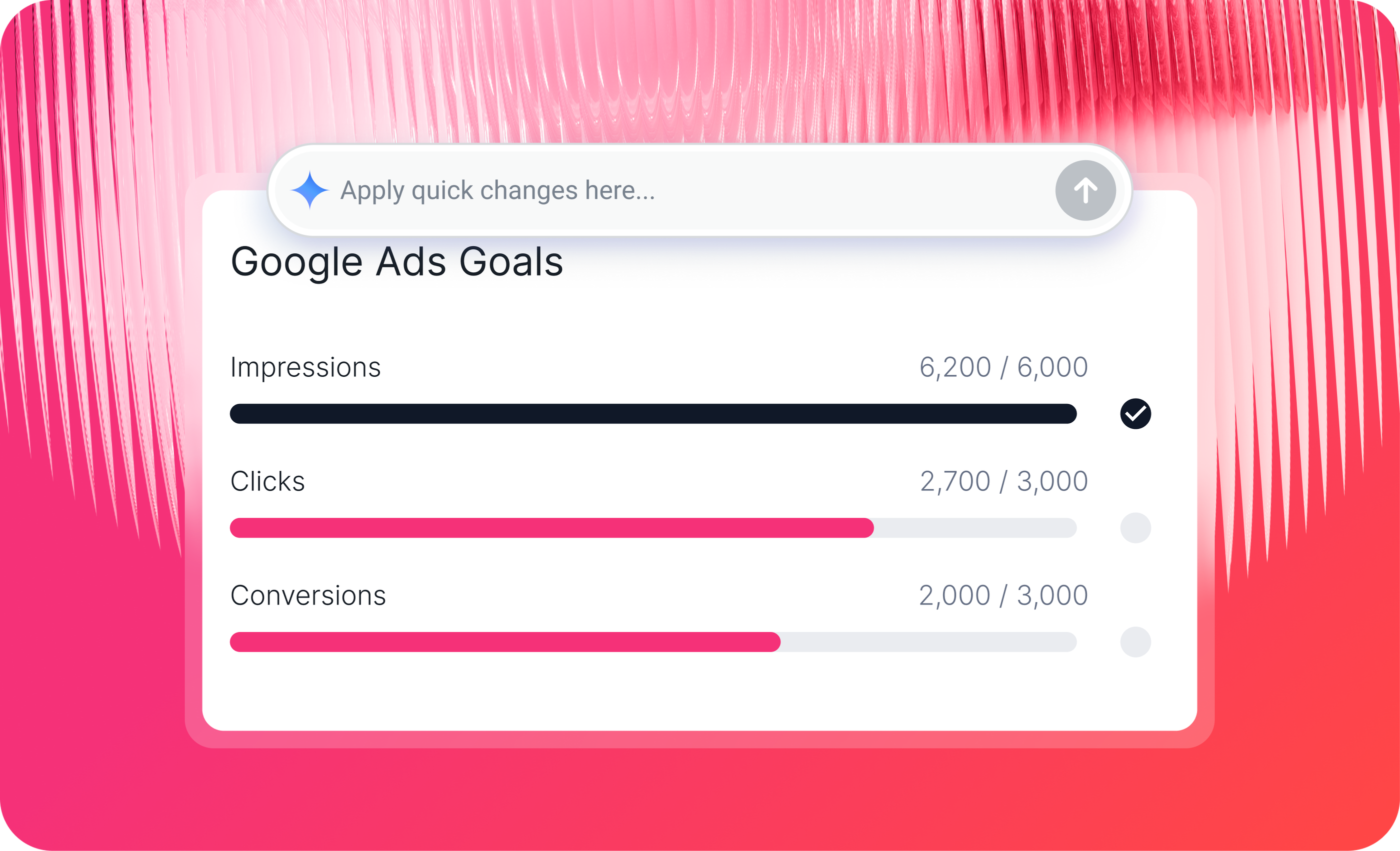
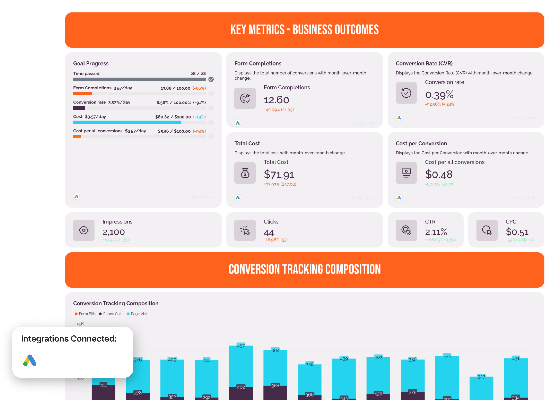
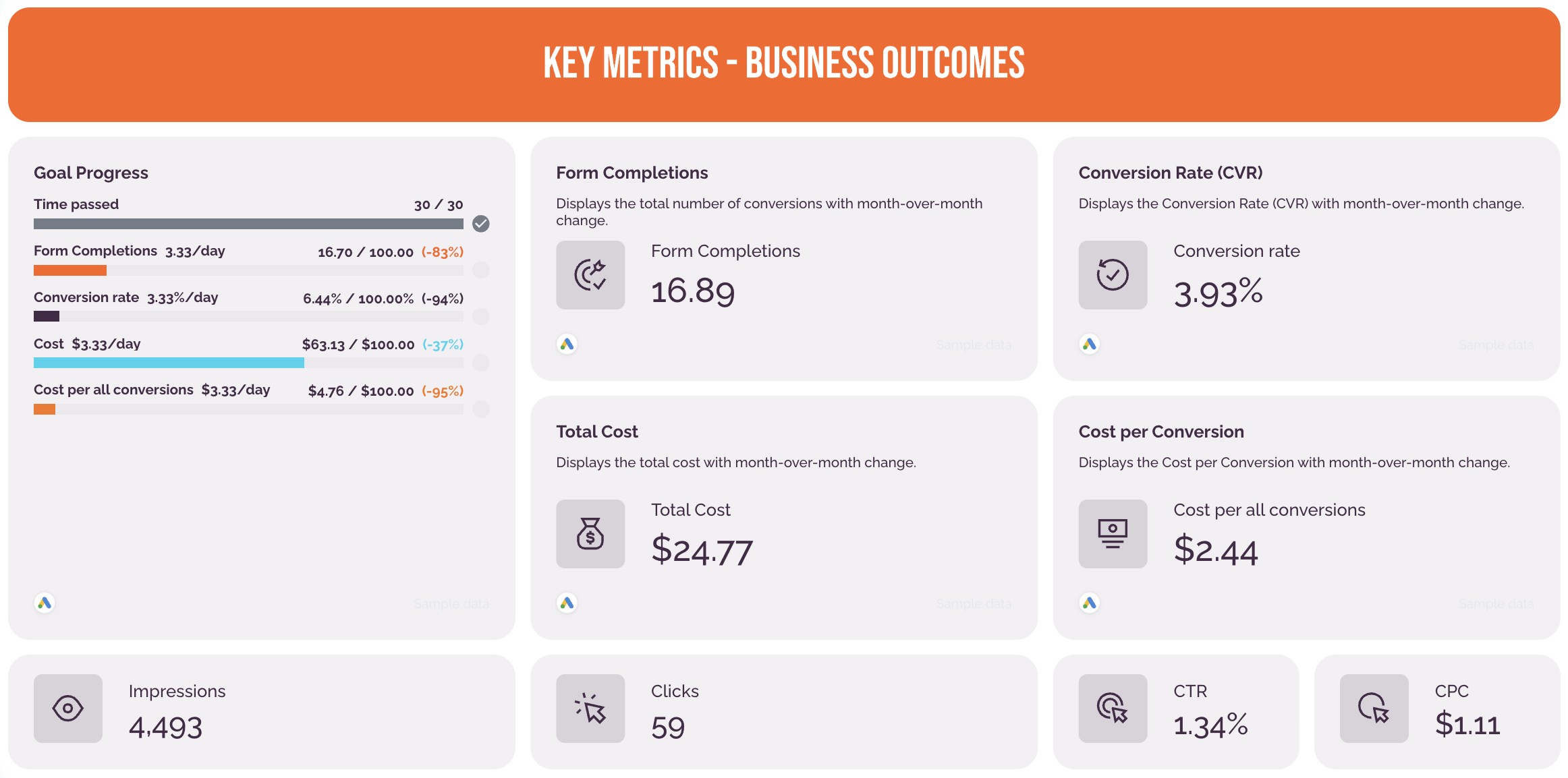
This report example in particular comes with two tabs - one for standard Google Ads campaigns and one for Performance Max campaigns. The standard Google Ads tab includes:
- A goal pacing widget: showing how close you are to reaching goals and how much of the budget you’ve spent and what’s left
- Key metrics: conversions, cost per conversion, total cost, conversion rate, impressions, clicks, CTR, and CPC
- Conversion tracking composition: a stacked bar chart showing which conversion actions (e.g. form fills, phone calls, page visits) made up the total conversion count each month, over the last 13 months
- Performance by campaign: horizontal bar chart showing Conversions and Conversion Rate (CVR) per campaign, sorted by highest to lowest volume
- Keywords & search terms: granular top 10 table showing: Search Term, Conversions, Clicks, Click-through Rate, Cost per Conversion
- Key metrics by week: line chart showing key metrics plotted week by week with space for analyst annotations
- Audience insights: pie charts showing Conversions, Conversion Rate, and Cost per Conversion segmented by: Gender, Age Group, Location, and Placement (where the ad appeared)
- Overview & next steps: three written sections showing Key Insights, Optimisations Implemented, Next Steps & Recommendations.
 The Performance Max tab takes a closer look at how Google’s automated campaign type is spending the budget. It’s got:
- A stacked bar chart showing which channels (Search, Display, YouTube, etc.) Performance Max is using each month.
- A granular table breaking down performance metrics by ad asset group
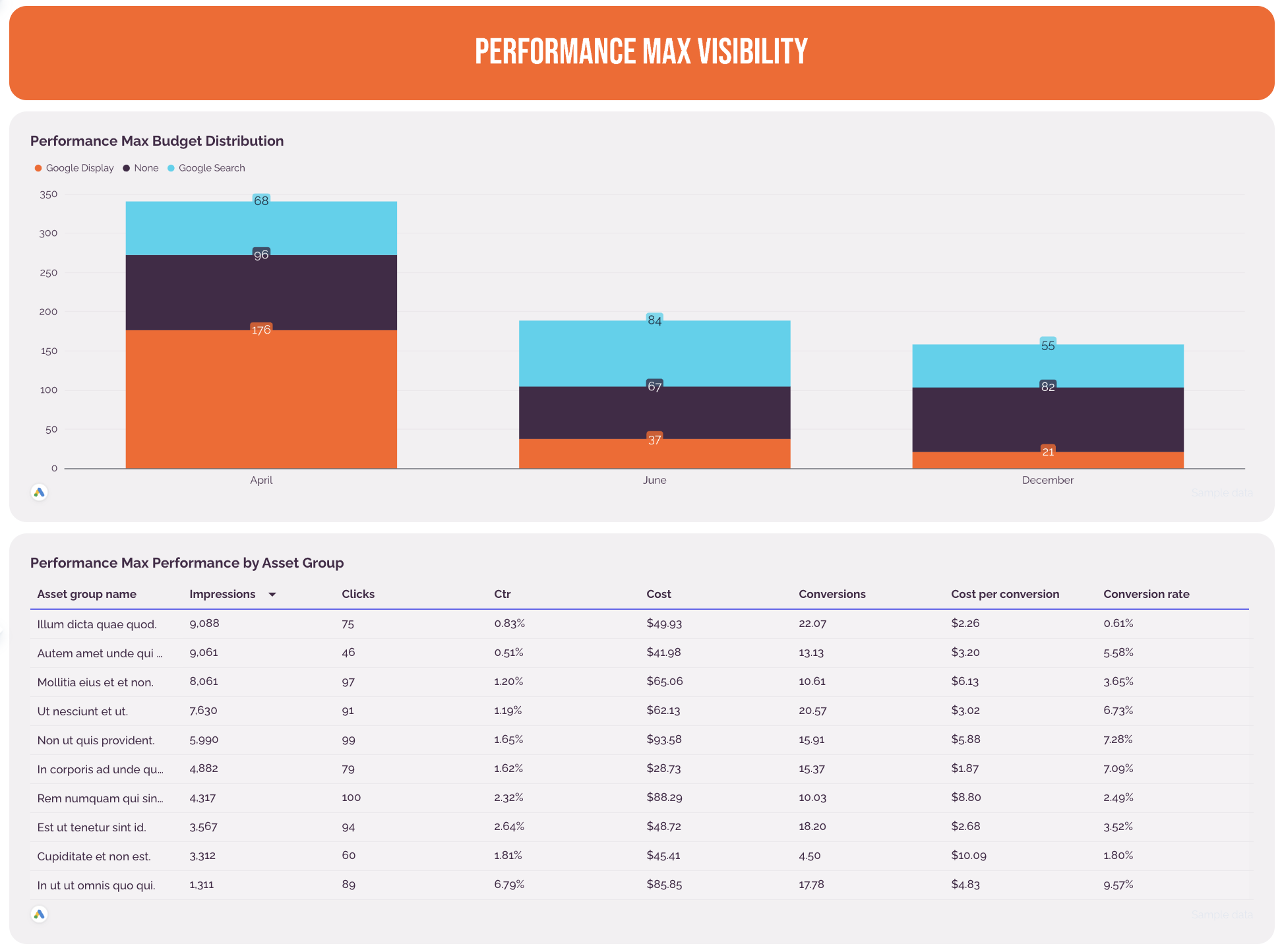
Metrics to visualize:
- Conversions (e.g. form completions)
- Conversion rate
- Total cost
- Cost per conversion
- Impressions
- Clicks
- CTR
- CPC
Best practices:
✅ Show results first - start your report with lead volume and cost per lead, not clicks and impressions
✅ Break down different conversion actions (e.g. form fills, phone calls, page visits) that made up the total conversion count each month, over the last 13 months
✅ Add a horizontal bar chart showing Conversions and Conversion Rate (CVR) per campaign, sorted by highest to lowest volume.
✅ Create a separate tab in your report to show Performance Max metrics for campaigns where PMax is active
✅ Include audience insights - segment conversions by gender, age group, location, and placement (where the ad appeared).
✅ Close the report with a clear next step - a plain-language summary of what happened, what was done about it, and what should happen next
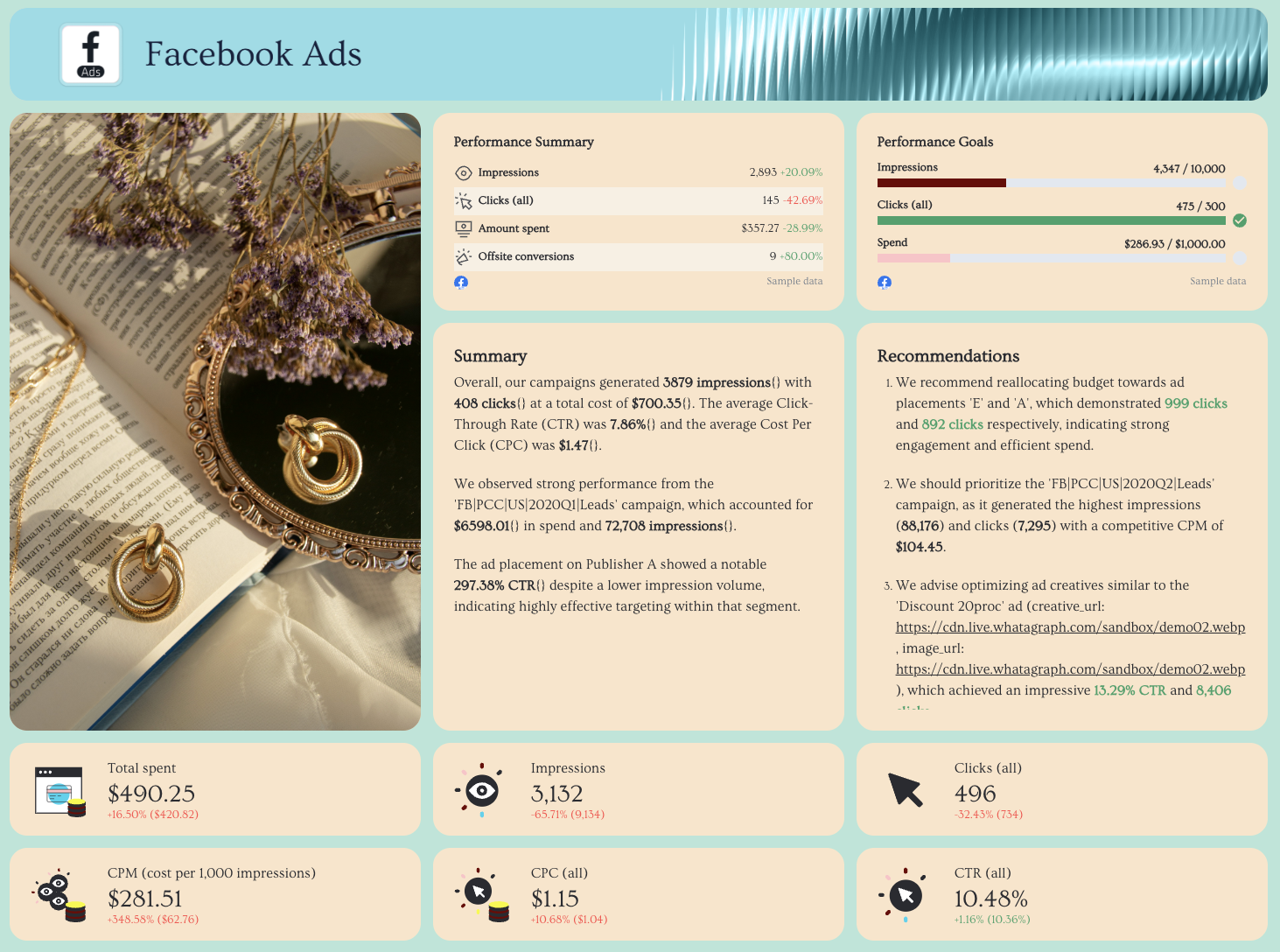
3. Two Facebook Ads Report Templates and Examples
Who it’s for: Paid media managers, social media teams, and agencies running Meta Ads campaigns who need clear visibility into ad performance, audience engagement, and creative effectiveness.
Channels connected: Facebook Ads (Meta Ads) + optional GA4 for offsite conversions and landing page tracking.
Here too, we’ll be featuring two different Facebook Ads dashboard examples co-created with top performance marketers, starting with this one from Lars Maat.
#1: Facebook Ads Report Sample for Lead Generation Campaigns
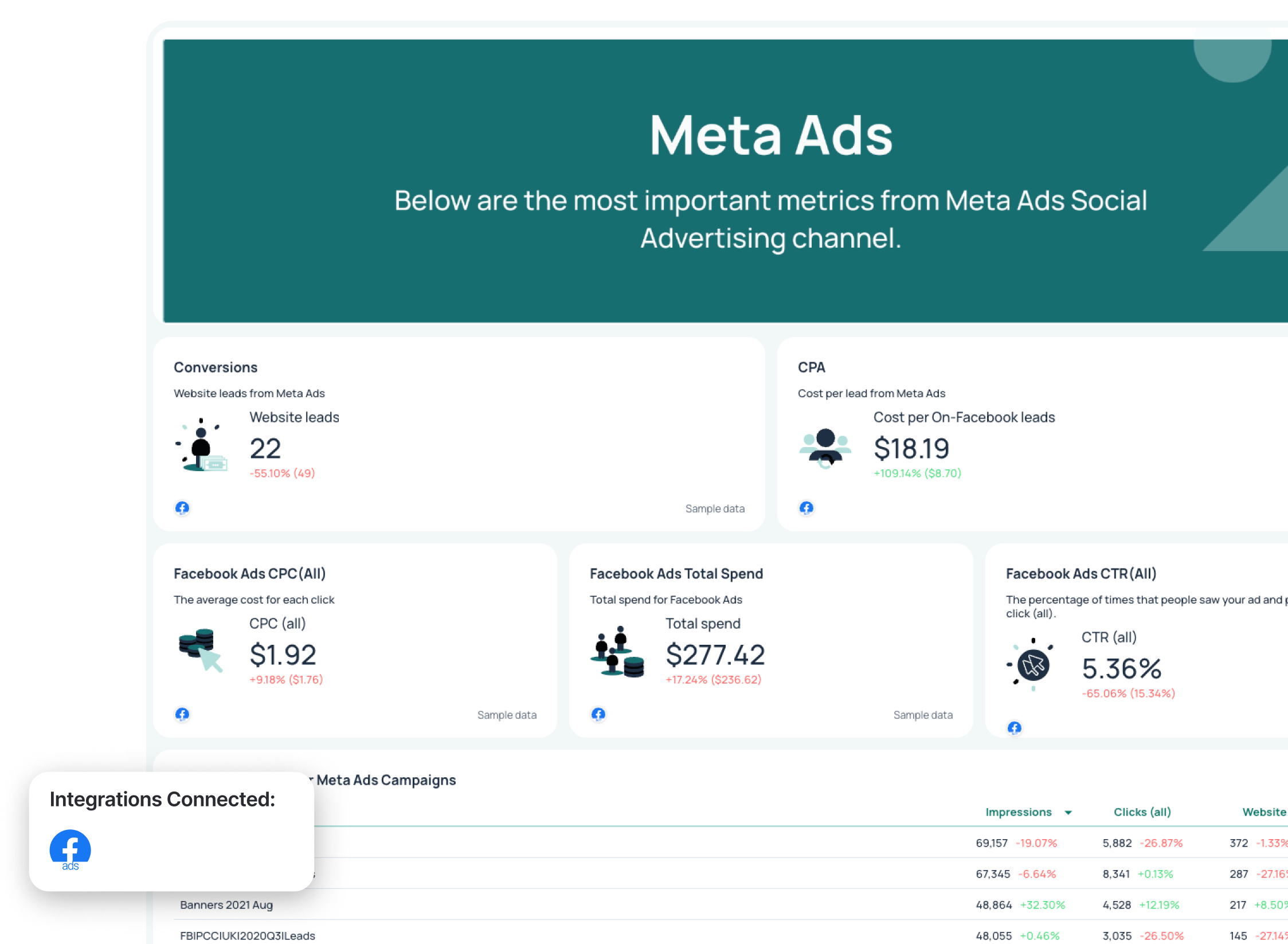
Use this template for free with your data
This Facebook Ads dashboard example shows how to structure social media campaign data into a clear performance narrative. Instead of just listing impressions and clicks, it connects leads, campaign performance, and conversion funnel data, making it easier to optimize targeting, creatives, and budget allocation.
Metrics to visualize in your Facebook Ads reporting dashboard:
- Website leads
- Amount spent
- ROAS
- Cost per lead
- Impressions
- Clicks
- CTR
- CPC
Lars said:
In Meta Ads, we don’t focus on the number of leads. Instead, we look at how many new clients actually come from those leads. You might have one campaign with 100 leads at €10 CPL and another with 10 leads at €80 CPL—on paper, you’d kill the second one. But what if that second campaign brings in 9 clients, while the first only brings in one? That’s why offline conversion tracking in Meta Lead Gen campaigns is so important.
Best practices:
✅ Use gauge widgets to show how you’re pacing towards goal and how much of the budget you’ve spent (and what’s left).
✅ Start with high-level ad performance metrics before diving into demographic breakdowns.
✅ Break down performance by campaign and ad to identify underperforming creatives.
✅ Use demographic data (age and gender) to refine audience targeting and improve conversion rate.
✅ Include offsite conversions and funnel data to connect Facebook Ads performance to business goals.
✅ Add a short summary with recommendations so stakeholders clearly understand what to optimize next.
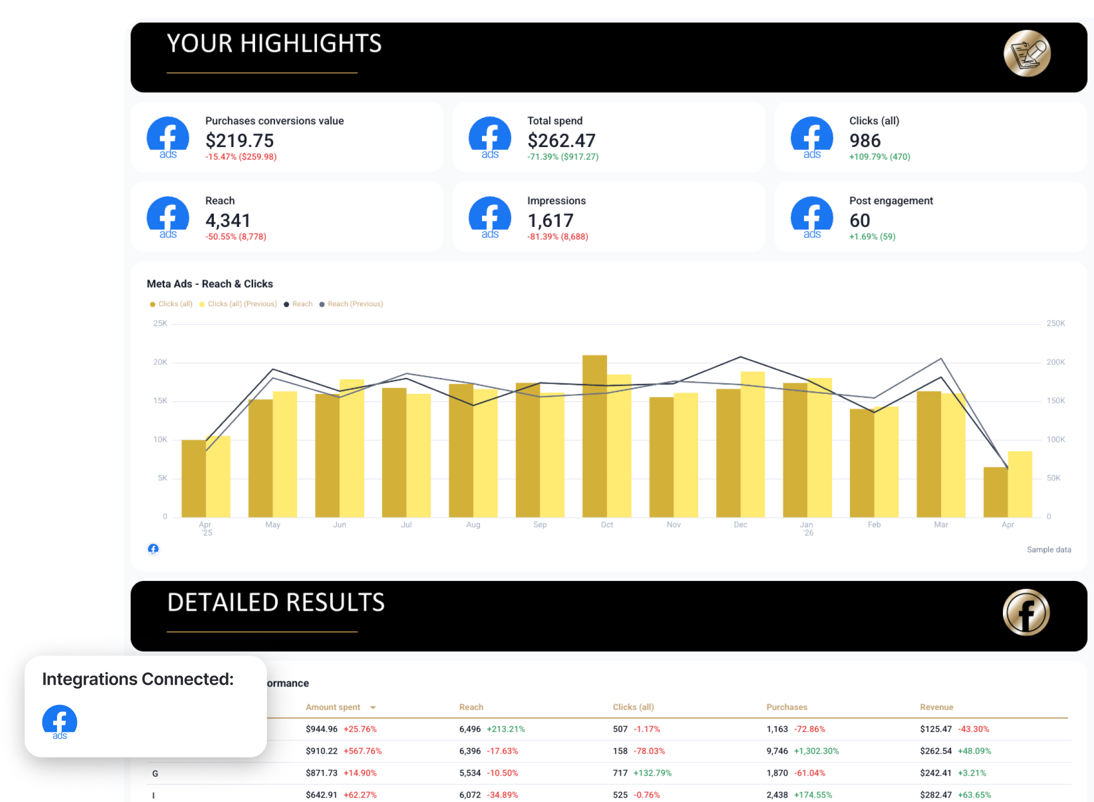
#2: Meta Ads Report Sample for E-Commerce Campaigns
Use this template for free with your data
This Meta Ads report example was co-created with Chantelle Bowyer, CEO at Metis Marketing. It's the exact report structure that the agency has been using for 16 years and have been constantly tweaking based on client feedback.
It shows a holistic view of paid media efforts across multiple channels—Meta Ads, Google Ads, and Microsoft Ads, and how they contribute to more sales and revenue.
Metrics to visualize:
- Purchases
- Purchases conversion value
- Total spend
- Revenue
- Frequency
- Clicks
- Reach
- Impressions
- Post engagement
- Messaging conversions started
Best practices:
✅ Start your report with an “Insights” tab listing out performance summary, wins, and recommendations for next month
✅ Report on the important numbers and ensure they’re accurate. Chantelle says:
“Sometimes these numbers aren’t in our clients paid media platforms, for example sales conversions that happen offline could be in a clients CRM. It’s important that all of these are analyses and reported on.”
✅ Use 7-day attribution window
✅ Create two report tabs for Meta Ads - one comparing last month vs. year-over-year, and another comparing this month to date vs. year-over-year
✅ Break down perfromance by platform (Facebook vs. Instagram) and by campaign
✅ Use a carousel chart to show the 6 top performing ad creatives and key metrics for each
✅ Turn the numbers into words, and the words into actionable insights. Chantelle advises:
“Ask yourself ‘What do these numbers mean? And how can I use this to make better decisions and guide optimizations?’. Insights are not only there to make paid media decisions, they can also help you client with business decisions.”
4. LinkedIn Ads Report Example and LinkedIn Ads Report Sample
Use this template for free with your data
Who it’s for: B2B marketing teams, lead generation specialists, and agencies running LinkedIn Ads campaigns focused on sales qualified leads and pipeline growth.
Channels connected: LinkedIn Ads + CRM (for sales qualified leads tracking) + optional GA4 for post-click validation.
We got on a call with Marc Woodland, CEO at Winbox, to create this LinkedIn Ads report example. One of the most profound things he said on the call was this:
The biggest challenge with LinkedIn Ads isn’t the ads—it’s proving it works.
He goes on to explain that's because LinkedIn influences buying journeys in ways traditional attribution models can’t see, meaning marketers often under-credit the channel, even when it’s driving real demand.
To show clients the value they’re driving with LinkedIn Ads, Marc uses this reporting framework:
Reach x Relevance x Engagement = Pipeline Influence
The LinkedIn Ads reporting dashboard reflects this. It’s divided into four clear stages:
1️⃣ Reach - Are you showing up in front of your buying committee?
2️⃣ Relevance: Are they stopping to notice and consume your content?
3️⃣ Engagement: Are they interacting in ways that signal intent?
4️⃣ Pipeline influenced: Are the ads influencing new deals?
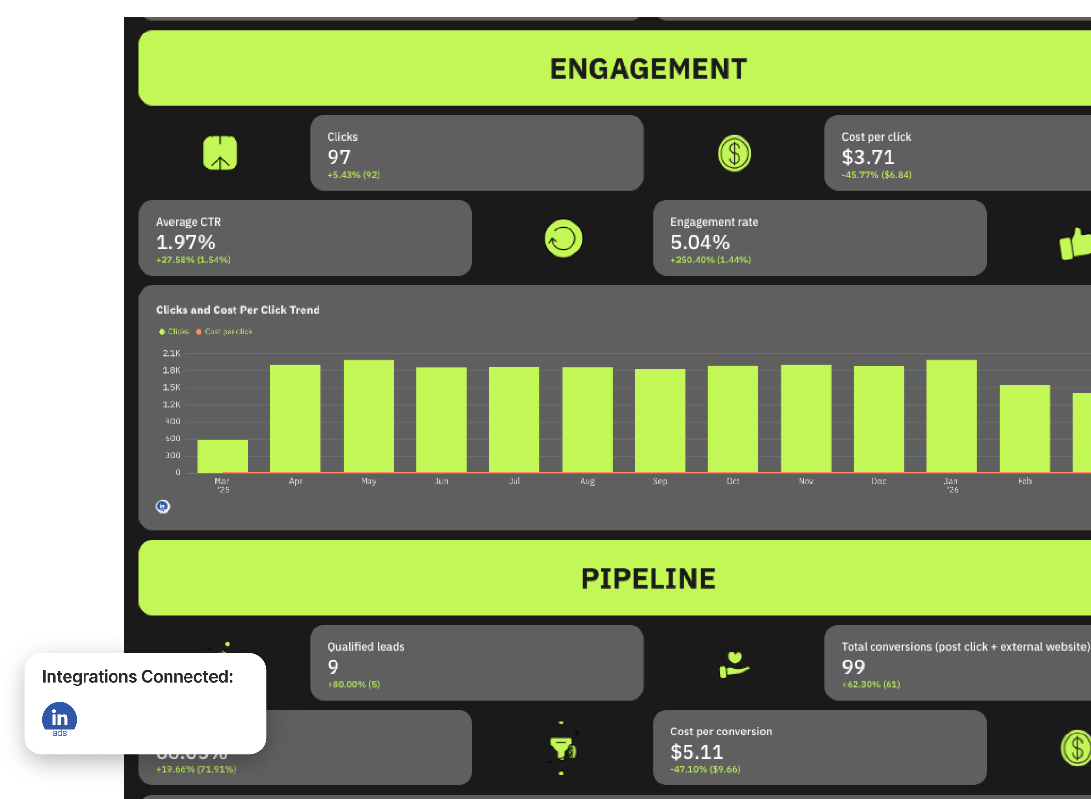
Metrics to visualize on your LinkedIn Ads dashboard:
- Qualified leads
- Total conversions
- Conversion rate
- Cost per conversion
- Frequency
- Audience penetration
- Reach
- Impressions
- Clicks
- Cost per 1,000 impressions
- Average CTR
- Cost per click
- Engagement rate
- Average dwell time
- Video view rate
Best practices:
✅ Track audience penetration to measure how effectively you’re reaching your ideal customer profile.
✅ Focus reporting on sales qualified leads and conversions, not just clicks.
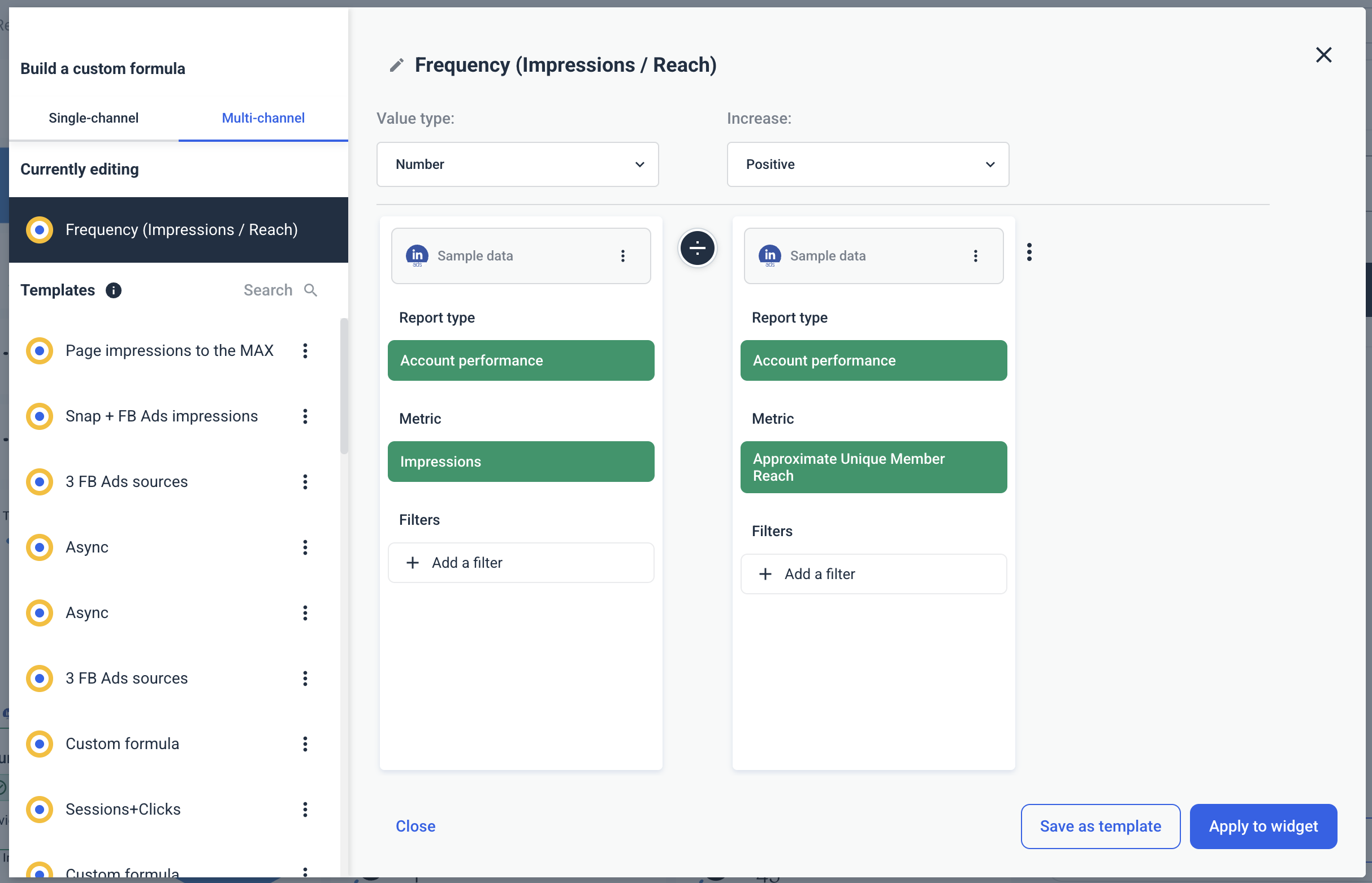
✅ LinkedIn doesn’t report on Frequency, but it’s important to visualize and track this metric to prevent ad fatigue and shows whether your ads campaigns are overexposing the same audience segment. You can easily create a custom frequency metric (Impressions ÷ Reach) on Whatagraph in seconds without any coding or technical knowledge.
✅ Use a reporting tool + an attribution tool to show the full picture of how LinkedIn Ads influence pipeline
✅ Use bar graphs to show the trend of qualified leads from LinkedIn Ads over the past 365 days
✅ Include a granular table breaking down performance metrics by campaign name
✅ Use a carousel chart to show the top performing LinkedIn ad creatives
5. TikTok Ads Report Example and TikTok Ads Sample Report
Use this template for free with your data
Who it’s for: Performance marketers, social media teams, and agencies running TikTok ads campaigns who want deeper visibility into video engagement, demographic performance, and conversion results.
Channels connected: TikTok Ads (with optional GA4 or CRM integration for conversion validation).
This TikTok Ads reporting example shows how to structure video-first campaign performance into a clear, optimization-focused dashboard.
Instead of just tracking impressions and clicks, it combines engagement metrics, video view breakdowns, audience demographics, and conversion data, helping you understand not just who clicked, but who actually watched, engaged, and converted.
See this TikTok Ads example live:
Metrics to visualize in your TikTok Ads reporting dashboard:
High-Level Performance
- Total cost
- Impressions
- Clicks
- Total conversions
- CTR (%)
- CPM
- CPC
- Performance goals (impressions vs target, clicks vs goal, conversions vs goal)
Trend Analysis
- Views vs spend trend
- Clicks vs spend trend
- Results vs cost trend
- Real-time results vs spend
Engagement Metrics
- Paid likes
- Paid comments
- Paid shares
- Paid follows
- Profile visits
- Total engagement trend
- Profile visit rate
Reach & Result Metrics
- Reach
- Cost per 1,000 people reached
- Result
- Cost per result
- Result rate (%)
- Real-time result rate (%)
Campaign Performance Breakdown
- Campaign name
- Total cost
- Result
- Conversion
- Impressions
- CPM
- Clicks
- CPC
- CTR
Ad & Creative Performance
- Ad name
- Total cost
- Results
- Conversions
- Impressions
- CPM
- Ad type performance metrics
Video Performance Metrics
- Video views
- Average watch time per video view
- 2-second video views
- 6-second video views
- Video views at 25%, 50%, 75%, 100%
Demographics & Audience Breakdown
- Performance by age and gender
- Conversions by age group
- Conversions by gender
- Clicks by age group
- Clicks by gender
Best practices:
✅ Don’t just report on impressions and clicks alone, analyze video watch time and completion rates to understand real engagement.
✅ Compare CTR, CPC, and cost per result together to evaluate true campaign efficiency.
✅ Use demographic breakdowns to optimize targeting toward high-converting age groups.
✅ Review video view percentages (25%, 50%, 75%, 100%) to identify drop-off points in your creatives.
✅ Monitor result rate and cost per result to connect TikTok performance to business goals.
✅ Highlight any tracking anomalies (like $0 cost data gaps) before drawing conclusions about ROI.
✅ Include a short summary and recommendations so stakeholders clearly understand what to optimize next.
6. Real Estate PPC Report Example
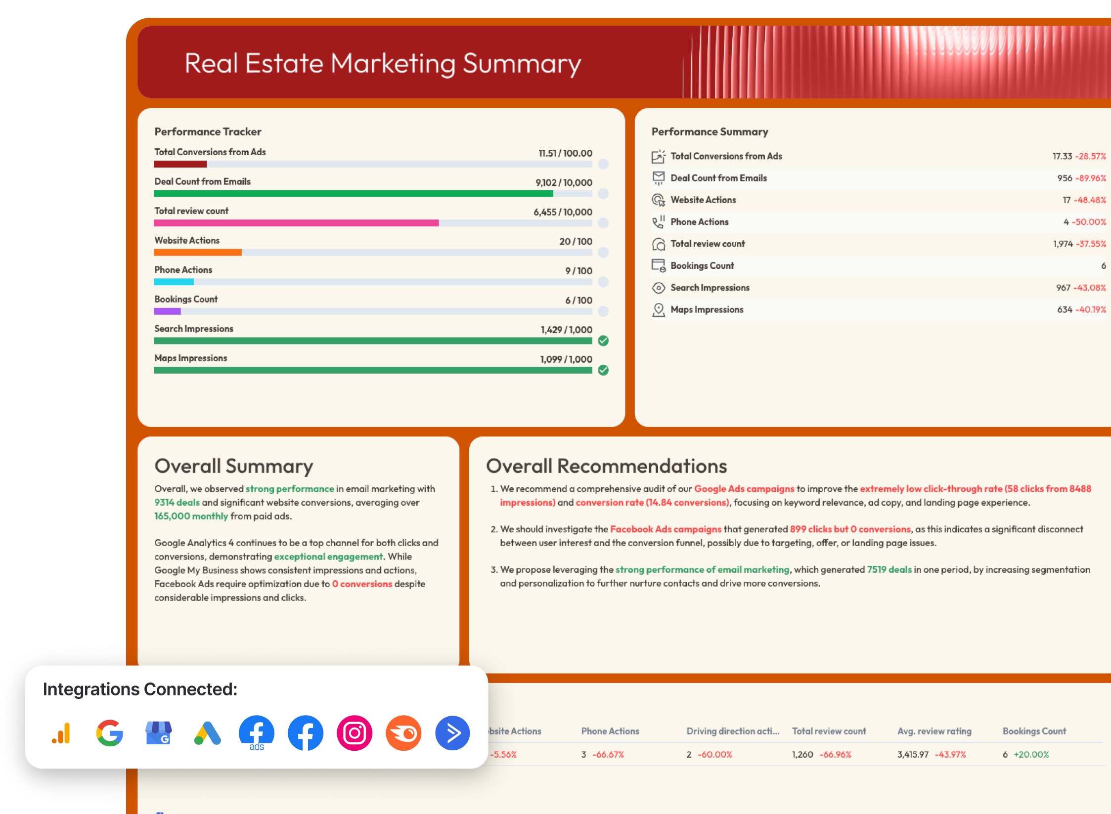
Use this template for free with your data
Who it’s for: Real estate marketing teams, brokerages, and agencies running Google Ads and Facebook Ads to generate property inquiries, phone calls, and lead form submissions.
Channels connected: Google Ads, Facebook Ads (Meta Ads),
This real estate PPC reporting example includes paid channels — Google Ads and Facebook Ads — and shows how to connect ad spend to website actions, lead generation forms, and overall deal volume. Instead of just tracking impressions and clicks, it ties PPC performance to tangible outcomes like property inquiries and conversions.
See this real estate PPC report example live:
Metrics to visualize:
High-Level PPC Performance
- Total ad spend (Google Ads vs Facebook Ads)
- Website conversions
- Lead generation forms
- Total conversions from ads
- Cost per conversion
- Conversion rate
- Clicks
- Impressions
Google Ads (Paid Search for Listings & Buyer Intent)
- Cost
- Impressions
- Clicks
- Average CPC (cost per click)
- CTR (click-through rate)
- Conversions
- Conversion funnel (Impressions → Clicks → Conversions)
- Conversions trend over time
- Campaign performance (by campaign name)
- Ad network performance (Search vs Display)
- Ad creative performance
- Keyword performance breakdown
- Landing page performance (/home, /shop, /contact pages)
Facebook Ads (Lead Generation & Awareness)
- Total spent
- Impressions
- Clicks (all)
- CPC
- CTR
- CPM (cost per 1,000 impressions)
- Offsite conversions
- Conversion funnel (Reach → Clicks → Conversion rate)
- Campaign performance (by campaign objective)
- Ad performance by creative
- Demographics (age and gender)
- Ad placement performance
- Page engagement
Ad Spend vs Conversions (Cross-Channel View)
- Google Ads spend vs conversions
- Meta Ads spend vs conversions
- Lead form submissions
- Website conversion volume
- Trend comparison over time
Best practices:
✅ Separate Google Ads (high-intent paid search) from Facebook Ads (demand generation) to clarify each channel’s role in the buyer journey.
✅ Always connect ad performance to real estate-specific outcomes like lead forms, phone calls, and website actions, not just impressions and clicks.
✅ Use a conversion funnel to identify where potential buyers drop off (clicks but no inquiry usually signals landing page friction).
✅ Compare monthly ad spend against website conversions and lead gen forms to evaluate ROI and optimize budget allocation.
✅ Break down performance by campaign and creative to identify which property listings or offers generate the most engagement.
✅ Highlight underperforming campaigns clearly — especially those with high clicks but low conversions — and include recommendations directly in the report.
7. eCommerce PPC Report Example
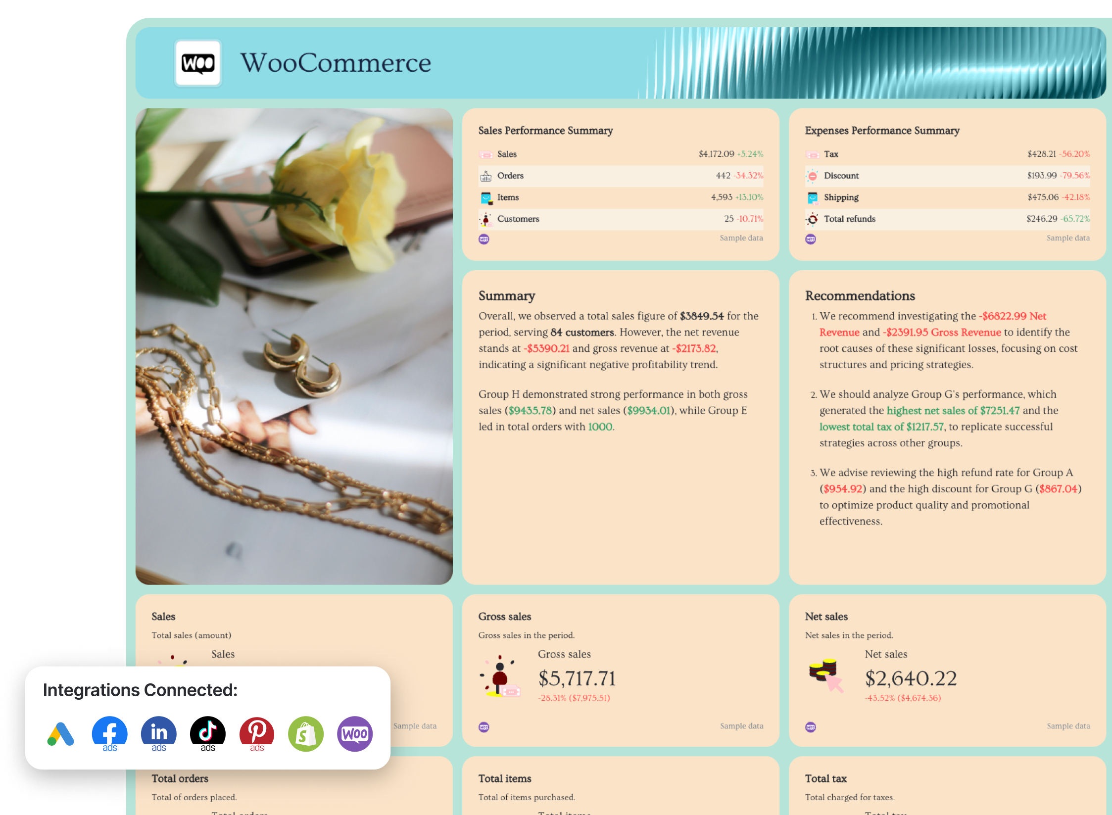 Use this template for free with your data
Who it’s for: Ecommerce brands, DTC companies, and performance marketing teams that need to connect paid media spend directly to revenue, purchases, and return on ad spend (ROAS).
Channels connected: Google Ads, Facebook Ads, LinkedIn Ads, TikTok Ads, Pinterest Ads (plus ecommerce platform data like Shopify or WooCommerce for revenue validation).
This ecommerce PPC report dashboard is built to answer the only question that really matters in online retail: “Are our ads driving profitable sales?”
Instead of stopping at clicks and impressions, it connects campaign data to purchase value, ROAS, cost per purchase, and full revenue performance across every paid channel.
See this eCommerce PPC report example live:
Metrics to visualize (broken down by channel):
Cross-channel ecommerce view
- Conversions by channel
- Spend by channel
- ROAS by channel
- Key metrics by channel (Impressions, Clicks, CTR, Cost, Conversions, ROAS)
- Automated summary
- Actionable recommendations
Google Ads
- Total cost (spend)
- Impressions and clicks
- CTR and average CPC
- Conversions
- Conversion rate
- Cost per conversion
- Conversion funnel (Impressions → Clicks → Conversions)
- Campaign-level performance (cost, conversions, CTR, CPC)
- Keyword performance breakdown
- Landing page performance (/shop, /home, etc.)
Facebook Ads
- Total spend
- Website purchases
- Website purchase value
- ROAS
- Cost per purchase
- CTR and CPM
- Conversion funnel (Reach → Clicks → Conversions)
- Ad creative performance (impressions, clicks, conversions per ad)
- Demographics (age, gender)
- Impressions vs. spend trend
- Clicks vs. CTR trend
TikTok Ads
- Total purchase value
- Purchase ROAS
- Conversions
- Conversion rate
- Cost per purchase
- Results and cost per result
- Reach
- Video views (25%, 50%, 75%, 100%)
- Video average watch time
- Paid engagement metrics (likes, comments, shares, follows)
- Conversions vs. spend trend
- Total purchase value vs. spend trend
LinkedIn Ads
- Spend
- External website conversions
- Post-click conversions
- Conversion rate
- Cost per conversion
- ROAS
- Engagement by seniority
- Engagement by job title
- Engagement by country
- Engagement by job function
Pinterest Ads
- Paid impressions
- Paid Pin clicks
- Conversions
- Web order value
- In-app ROAS (Checkout)
- Web ROAS (Checkout)
- Earned vs. paid engagements
- Top-performing ads by conversions
- Web conversions and order value over time
Best practices:
✅ Start with an “Overview” summary page where you visualize key metrics and goal trends for all your eCommerce channels (e.g. Google Ads, Shopify, Pinterest Ads) in one place
 ✅ Add custom images of your products and style the report in your (or your client’s) brand colors and font
✅ Visualize spend vs. revenue trends to show true profitability over time.
✅ Include landing page performance for Google Ads to identify conversion bottlenecks.
✅ Break down creative performance (especially for Facebook and TikTok) to prevent ad fatigue.
✅ Highlight demographic segments that drive the highest purchase value.
✅ Surface tracking gaps immediately (e.g., $0 ROAS across campaigns) so stakeholders trust the data.
✅ Add a short summary and recommendation section that translates performance metrics into clear next steps.
How to Build a PPC Report on Whatagraph?
Building a PPC report is as easy as 1-2-3. Here’s how to do it step by step.
1. Create a free Whatagraph account
Start by signing up for a free account. There’s no credit card required and no expiration date, so you can explore the platform and test your PPC reporting setup without pressure.
2. Connect your data sources
Connect your ad platforms like Google Ads, Meta Ads, LinkedIn Ads, TikTok, Pinterest, and GA4. Whatagraph pulls campaign data automatically, so you don’t have to export CSVs or copy numbers into spreadsheets.
3. Use a pre-made PPC report template
Choose from pre-built report templates for cross-channel PPC, ecommerce, lead generation, Google Ads deep dives, and more.
Instead of building from scratch, you start with a structured layout that already includes the right KPIs, charts, and visualizations. You can customize it into a fully custom PPC report tailored to your client or stakeholders.
4. Style the report in your brand (or your client’s)
Upload a brand guide or logo, and Whatagraph IQ will automatically apply the right fonts, colors, and styling across the report.
This is especially useful for agencies delivering PPC reporting for clients who expect fully white-labeled, professional reports.
5. Automate delivery or share live dashboards
Once your report is ready, automate it.
On Whatagraph, you can:
- Schedule it to go out on a specific day and time
- Set frequency (weekly, monthly, quarterly)
- Send PDF reports automatically
- Share password-protected live links instantly
Published on Feb 19 2026
WRITTEN BY
YamonYamon is a Senior Content Marketing Manager at Whatagraph. With an eye for detail and a knack for always considering context, audience, and business goals to guide the narrative, she's on a mission to create genuinely helpful content for marketers. When she’s not working, she’s hiking, meditating, or practicing yoga.