11 Best DashThis Alternatives in 2026 [FULL Comparison Table]
DashThis is a great reporting tool for freelancers and small agencies—but it quickly becomes limiting as your business grows.
To help you find the best DashThis alternative, we scoured online reviews and talked to marketers, and came up with this list of 11 tools.
In this article, we’ll take you through:
- The shortcomings of DashThis
- 11 best DashThis alternatives
- Key features and pricing of each tool

Mar 30 2026●10 min read


The biggest complaint we hear about DashThis from ex-users and online reviews is that it’s very limited. Here are a few ways how:
❌ Limited integrations: DashThis only offers 30+ native integrations, which doesn’t include important channels like Salesforce, Shopify, and Google DV360. You can upload your own data via CSV files or Google Sheets, but this creates more work and takes longer time to implement.
❌ No advanced data transformations: DashThis's custom widget editor lets you choose metrics, dimensions, and filters within a single source, but that's where it stops. You can't blend data across multiple sources, create calculated cross-channel metrics, or organize your data sources with custom tags.
❌ Limited visualizations: DashThis offers 9 widget chart types and 50+ preset dashboard templates; not nothing, but considerably less flexibility than most modern reporting tools. The real limitation is how locked-in the layout is. You're working within a fairly rigid structure, and moving widgets around or building truly custom dashboards run into friction.
❌ Basic AI compared to competitors: DashThis now offers AI Insights; it's live and available on all plans. But it's a one-click summary tool: it analyzes your dashboard and surfaces wins, issues, and recommendations.
❌ No data transfers: DashThis is purely a visualization tool—you won’t be able to ship your data to data warehouses or spreadsheets.
___
If you’ve outgrown DashThis, we’re here to help.
In this article, we’ll take you through 11 best DashThis alternatives that come with a wider selection of integrations, advanced analytics, and customization options.
11 Best DashThis Alternatives and Competitors in 2026
In a nutshell, here are the 11 best DashThis alternatives and competitors we’ll review in this article:
- Whatagraph
- Geckoboard
- Klipfolio
- NinjaCat
- Looker Studio
- Databox
- Funnel
- Supermetrics
- Adverity
- Improvado
- FiveTran
Don’t want to read through walls of text? Here’s a summary table:
| Features |
|

|

|

|

|

|
|

|

|

|

|
|---|---|---|---|---|---|---|---|---|---|---|---|
| Ease of Use | Easy | Easy | Hard | Medium | Hard | Medium | Medium | Hard | Medium | Medium | Medium |
| No. of out-of-the-box Data Connectors | 55+ | 90+ | 130+ | 150+ | 21 | 100+ | 500+ | 150+ | 600+ | 500+ | 400+ |
| Custom API Access |
|
|
|
|
|
|
|
|
|
|
|
| Data Blending |
|
|
|
|
|
|
|
|
|
|
|
| Custom Metrics and Dimensions |
|
|
|
|
|
|
|
|
|
|
|
| Custom Reports and Dashboards |
|
|
|
|
|
|
|
|
|
|
|
| Campaign Overview and Monitoring |
|
|
|
|
|
|
|
|
|
|
|
| White-labeling |
|
|
|
|
|
|
|
|
|
|
|
| Data Update Frequency | Every 30 mins across all integrations and pricing plans | Depends on data source, from 1 to 60 minutes | Depends on your pricing plan, from 4 hours to 30 minutes | Every day or manual data refresh | Depends on APIs, from 15 mins to 4 hours | Depends on APIs and your pricing plan, from 1 to 24 hours | Depends on the data source | Depends on the data source--mostly 1 to 3 days | Default is once every day but you can schedule "fetches" to be more frequent | Depends on the pricing plan--twice daily, four times daily, or custom | Depends on the pricing plan and data source, from 15 mins max to 1 min max. Default is 6 hours. |
| Data Segmentation and Filtering |
|
|
|
|
|
|
|
|
|
|
|
| Alerts and Notifications |
|
|
|
|
|
|
|
|
|
|
|
| Multi-Client Management |
|
|
|
|
|
|
|
|
|
|
|
| User Management | Admin, Manager, or Editor roles | Admin and View Only roles | Account Administrator, Klip Viewer, Klip Editor | System Admin, Standard User, Restricted Partner, Dashboard User, Account Executive, and more | Viewer, Editor, or Owner roles | Administrator, Editor, User, or Viewer roles |
|
|
Workspace admin, Dashboards, Explore, Manage, Shared dashboard viewer + custom roles | Viewer, Editor, Workspace admin, Data manager, Data load manager, Data analyst | Account administrator, analyst, billing, reviewer + custom roles |
| Automated Report Sharing |
|
|
|
|
|
|
|
|
|
|
|
| Data Export | PDF, XLS, CSV |
|
Export dashboards as PDF or image files. Export only individual Klips as CSV | Email, PDF | Google Sheets, CSV, Excel (only chart level) | PDF, JPG | JSON, CSV | Google Sheets, Excel, Monday, PowerBI, SupermetricsAPI | PNG, JPG, PDF, ZIP, PPTX, XLSX | JSON | |
| AI Insights |
|
|
|
|
|
|
|
|
|
|
|
| Customer Support | Live chat, email, Help Center for all pricing plans | Live chat, Email, Help Center | Email, Help Center | Live chat, Email, Help center, Academy | Help center, community forums | Live chat, email, Help Center | Email, In-app messages, Help center | Ticket-based support, Help Center | 24-hr Help desk, Help center, video guides | Service desks to raise requests, Help center, Email | 24/7 email support, Support portal, Help center |
| Dedicated Customer Success Manager |
|
|
|
|
|
|
|
|
|
|
|
| Data Security and Compliance | ISO 27001, Enterprise SSO, GDPR compliant, AES-256 encryption, Two-factor authentication, AWS hosted servers | AWS hosted servers, HTTPS (128-bit TLS), RBAC, PCI DSS compliant | AWS hosted servers, 2048-bit RSA key access for servers, no passwords, SSL, RBAC | GDPR complaint, DDOS protection, data encryption, MFA, RBAC | ? | ISO 27001, GDPR complaint, SSL encryption, passwords stored in virtual vault | ISO 27001 certified, GDPR and CCPA compliant, SOC 2 Type II | SOC 2 Type II, GDPR, and CCPA compliant, PCI-DSS, ISO27001, SSL encryption | Two-factor authentication, SSO, ISO-27001 certified, SOC 2 Type 2 audited, Fully protected API connections using SSL/TLS protocols, GDPR compliant | SOC 2 Type II, HIPAA compliant, GDPR and CCPA compliant, SSO | SOC 1 & SOC 2, GDPR compliant, HIPAA BAA, ISO 27001, PCI DSS LEVEL 1, HITRUST, SSO |
|
Pricing
(with $$$ being the highest)
|
$ | $ | $$ | $$ | Free for native connectors | $ | $$ | $$ | $$ | $$ | $$ |
Let’s dive into each of these tools.
1. Whatagraph
Most suitable for: Marketing agencies and in-house teams that manage multiple clients or brands, need cross-channel performance reporting, and want to save hours with AI automation
Whatagraph is the easiest AI-powered marketing intelligence platform that turns complex marketing data into clear insights, instantly.
Marketers use Whatagraph to connect all their channels, centralize reporting, and share impactful results—without needing technical expertise.
In a nutshell, here’s how Whatagraph works:
- Connect to 62 marketing platforms automatically via native, stable connectors that don’t break.
- Easily organize your data—create custom blends, metrics, and dimensions using no-code workflows or AI.
- Ask AI to create reports by just telling it what you want it to build. Or use drag-and-drop widgets or ready-made templates to build one from scratch.
- Customize reports by just uploading a screenshot of your (or your client’s) brandbook or putting in a prompt. Host and share reports on your own domain.
- Get actionable insights instantly by just asking AI any questions about your connected data. Get it to write performance summaries directly in your reports in four different formats and 18 languages.
- Share reports as live links, PDFs, Excel spreadsheets, or automated emails. Transfer your data to BigQuery data warehouse or Looker Studio.
But how does Whatagraph compare against DashThis exactly? Let’s take a look:
DashThis vs. Whatagraph: Head-to-Head Comparison
Our Product team did extensive research on how Whatagraph compares against DashThis and you can find the full breakdown here.
In a nutshell, here are five key ways Whatagraph outperforms DashThis:
#1. More integrations with your favorite channels
While DashThis offers 30+ native integrations, Whatagraph offers 62, including:
- Analytics: Google Analytics 4, Matomo, Piwik Pro
- PPC: Google Ads, LinkedIn Ads, Facebook Ads
- Social Media: Facebook, Instagram, LinkedIn
- SEO: Ahrefs, Google Search Console, Accuranker
- eCommerce: Shopify, WooCommerce, BigCommerce
- Email Marketing: ActiveCampaign, Klaviyo, Mailchimp
Explore all integrations here.
We’re also constantly adding new integrations—please reach out to us to see if we have one you need.
Being able to integrate with more marketing channels on Whatagraph means:
✅ You spend less time buried in CSV files and spreadsheets.
✅ You get a true, comprehensive picture of your overall marketing performance on one platform.
✅ There are less chances of human errors like data inconsistencies, duplicates, and missing records.
You can also easily bring in your own data via Custom APIs, Google Sheets, or BigQuery.
In comparison, DashThis offers custom integrations only via CSV File and Google Sheets. However, compared to APIs, CSV files are:
- Time consuming—you’ll need to manually download CSV records from your source platform and manually upload them
- Static—CSV files don’t refresh automatically
- Prone to errors
Plus, the integrations we provide at Whatagraph are fully-managed. This means they’re more seamless, stable, and accurate. And our Product engineers regularly maintain these integrations so you don’t have to.
If there are bugs, our Product team can resolve them quickly without having a third-party company involved.
Our users love how seamless and stable connections are on Whatagraph. Here’s what Tanja Keglić, Performance Marketing Manager at Achtzehn Grad, says:
We don’t have any connection issues on Whatagraph at all. We just connected the platforms once, and that was it. Whatagraph is also very quick when loading the data.
#2. Powerful AI to save you time and energy
At Whatagraph, we’ve launched a full suite of AI features—Whatagraph IQ— to create, style, and analyze reports in seconds. Here’s what we mean:
- Report creation in seconds: Just type what you need, and IQ builds a complete, multi-tab report for you. You can even ask it to add new tabs or create specific widgets on the fly.
- Instant branding: Upload a logo or image, and IQ generates a matching theme with fonts, HEX colors, and icons. Every report looks professional and on-brand without extra design work.
- Automated insights: Whatagraph IQ writes clear, plain-English performance summaries for each report—perfect for client presentations and internal reviews. Instead of manually typing explanations, you get client-ready insights instantly.
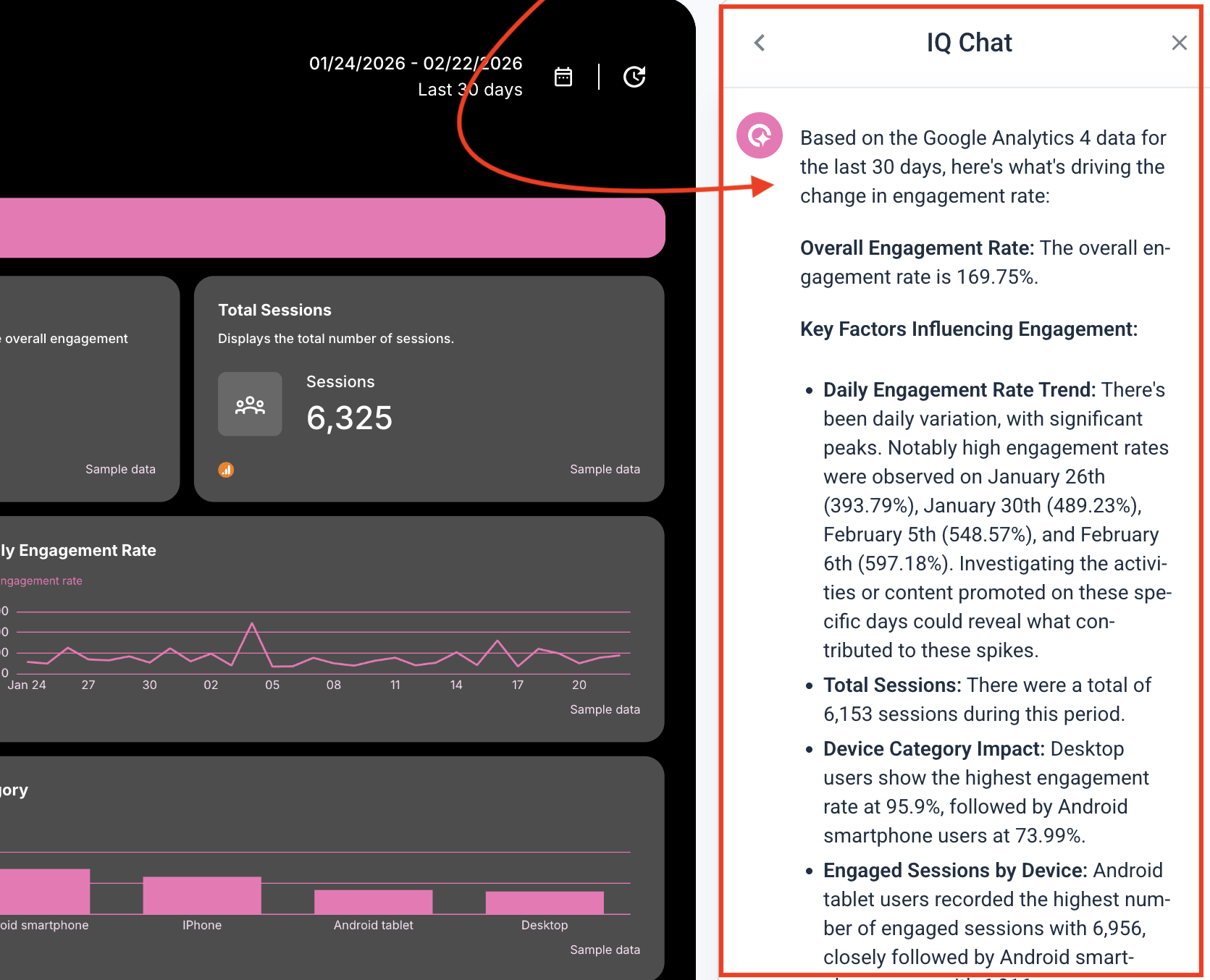
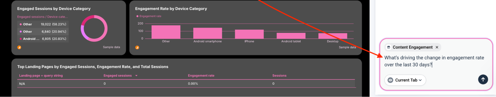
- Ad-hoc answers: With IQ Chat, you (and your clients) can ask questions like “Which campaign had the best ROI last month?” or “Where did our CPA spike?” and get instant answers based on your data.
Get started with Whatagraph for free.
Thanks to these AI features, agencies like Maatwerk Online are saving 100 hours per month on reporting. Lars Maat, Co-founder of Maatwerk Online, says:
Whatagraph’s AI saves time and energy for our marketing specialists. And the hours we’re saving is just pure profit. We now have the time to focus on more strategic things that help both our agency and our clients grow.
#3. Easy data organization without codes
DashThis comes with a basic “Merge” widget where you can combine metrics from different sources to create a new one (e.g. Facebook Ads Cost + Google Ads Cost = Total Ad Cost).
This works for small agencies or solo businesses, but quickly becomes chaotic if you have 100s of data sources.
That’s where Whatagraph comes in.
Whatagraph has a dedicated data organization section in the left navigation with three tools: Dimensions, Metrics, and Aggregations. Together they let you:
- Rename and unify naming conventions across all sources, so "Device" in Google Ads and "Device Platform" in Facebook Ads become one consistent label across every report.
- Group data from multiple campaigns or countries into regions and tiers.
- Aggregate results from multiple websites or social media pages into a single view.
- Blend any number of sources together; Facebook Ads and Google Ads side by side, or combined into a single total metric.
- Build custom calculations without formulas or coding; ROAS across multiple platforms, total spend with an agency markup applied.
- Save every custom rule, metric, and dimension as a template to reuse across reports.
None of it requires technical knowledge, and everything is accessible directly from the report-building space.
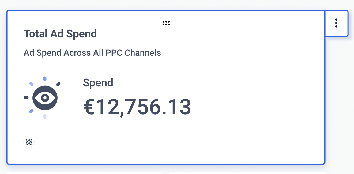
For instance, say you want to show the ‘Total Ad Spend” across multiple PPC channels. All you need to do is create a custom metric like so:
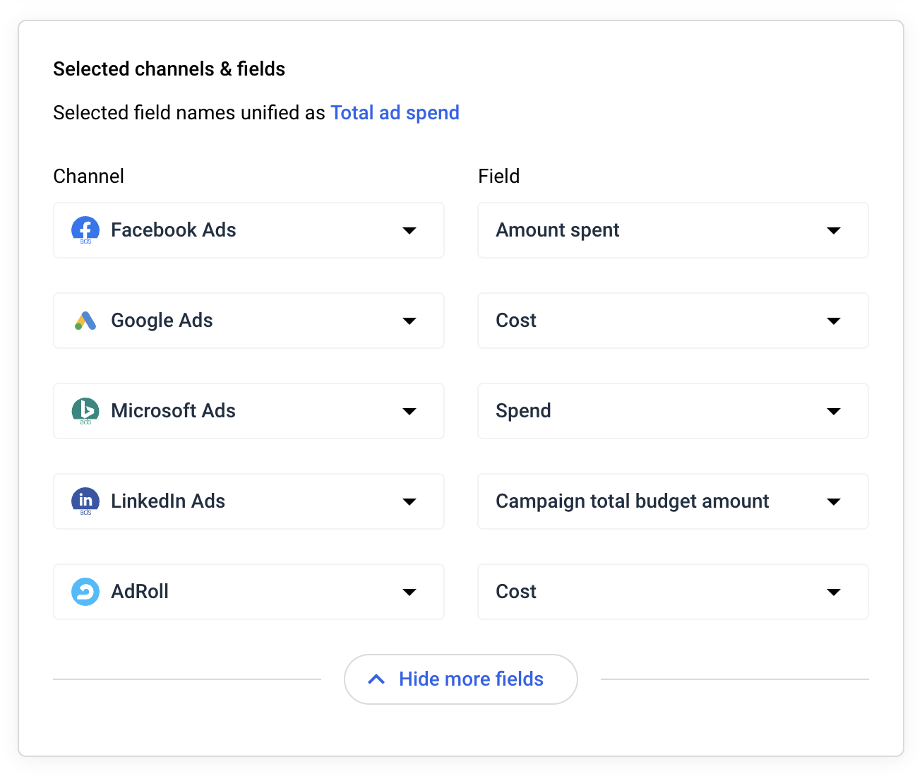
Then, you’ll get an aggregated metric of “Total Ad Spend” to add to your reports.
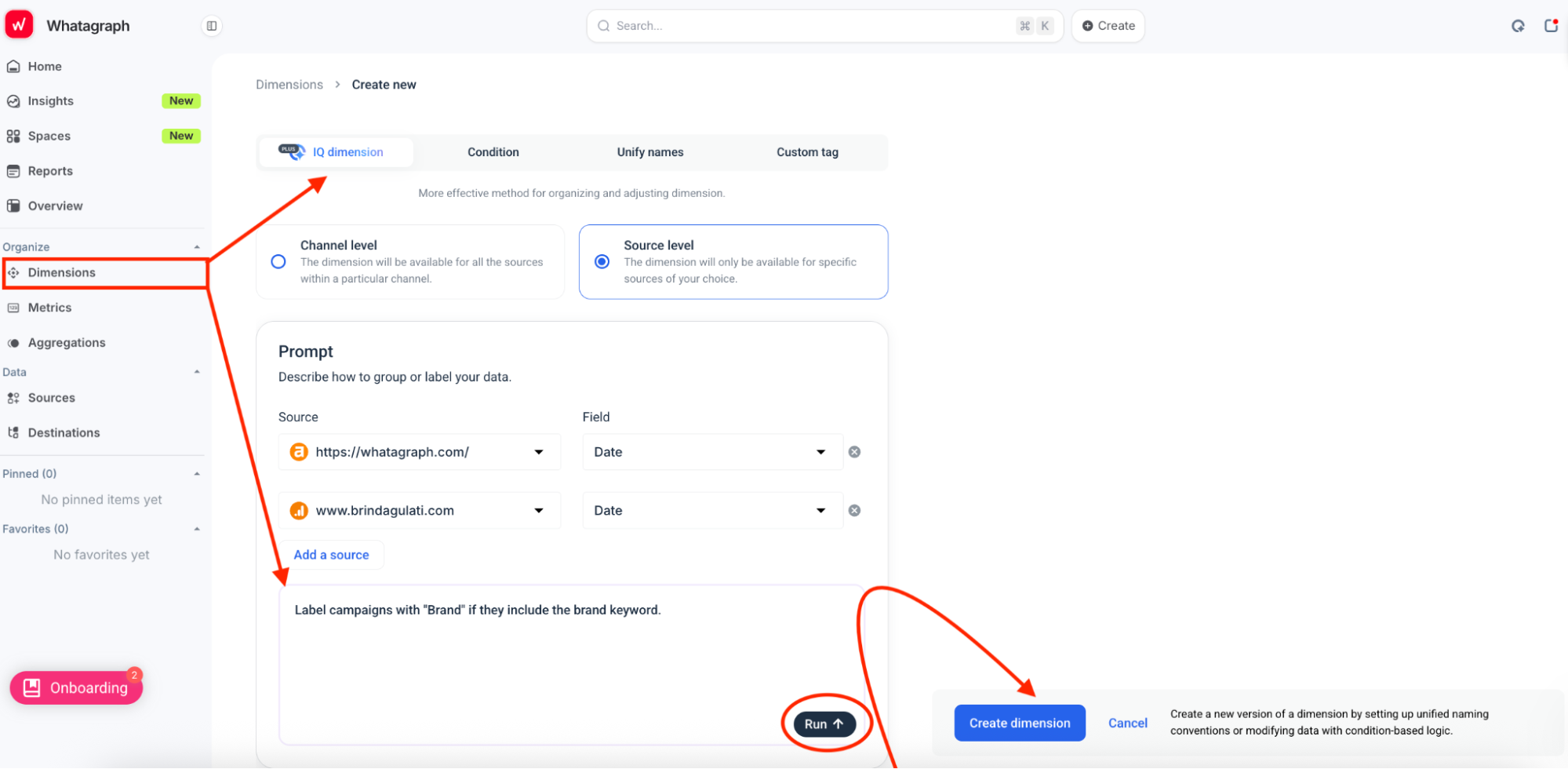
That's not all. On more advanced plans, you’ll get IQ Dimensions, where you can just ask AI to:
- Create custom blends automatically. Just describe what you need—like “combine all spend from Meta, TikTok, and Google Ads into one unified Paid Media metric”—and IQ builds the blend for you.
- Build custom metrics on the fly. Want ROAS across channels? Or a funnel KPI like Add-to-Cart conversions? IQ can generate them instantly, without formulas or coding.
- Standardize messy data with IQ Dimensions. For example, if you’ve got campaign names like “FB_US_SpringSale_23” and “MetaUSA_Spring23,” you can tell IQ: “Group by Campaign Type: Spring Sale”. IQ creates a brand-new dimension that neatly categorizes everything, and you can reuse it across reports.
- Normalize any dimension at scale. Group campaigns by objective, products by category, or reviews by language—whatever fits your reporting needs. IQ makes sense of inconsistent data and saves hours of manual clean-up.
Powerful data organization on Whatagraph means:
✅ Your reports are easier to read, neat, and tidy.
✅ Your clients clearly see the value you’re delivering rather than being stuck interpreting data.
✅ You can analyze and compare performance any way you want, and use these insights to deliver better results for clients.
#4. Dynamic, fully white-labeled reports in seconds
DashThis does offer white-label options, but several meaningful restrictions apply before you get there.
❌ White labeling is locked behind a plan threshold: Custom domain, custom sender email, and removal of "Powered by DashThis" branding are only available on plans with 10+ dashboards. Smaller plans show DashThis branding to your clients by default.
❌ One custom domain per account: If you need different branded domains for different clients, you'd have to create a separate DashThis account for each one. For agencies managing multiple clients, that's a significant operational headache.
❌ 50 widget cap per dashboard: DashThis imposes a hard limit of 50 widgets per dashboard, which can become a real constraint when building comprehensive, multi-channel client reports.
In comparison, Whatagraph’s dashboards and reports are highly dynamic and customizable.
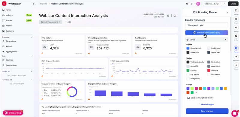
For instance, Whatagraph IQ, you can just create a report with fully branded themes in seconds. Here’s how that works:
- Upload a logo or brand image, and Whatagraph builds a matching palette with fonts, HEX codes, and chart colors
- Or describe the style you want in plain language, and Whatagraph produces a ready-to-use theme
- Fine-tune the colors and fonts manually
- Save each theme as a “Global theme” so you (and your team) can re-use it across all reports
This means you deliver reports that look professionally designed, tailored to each client or brand, and consistent across campaigns.
Here’s an example of an e-commerce report template:
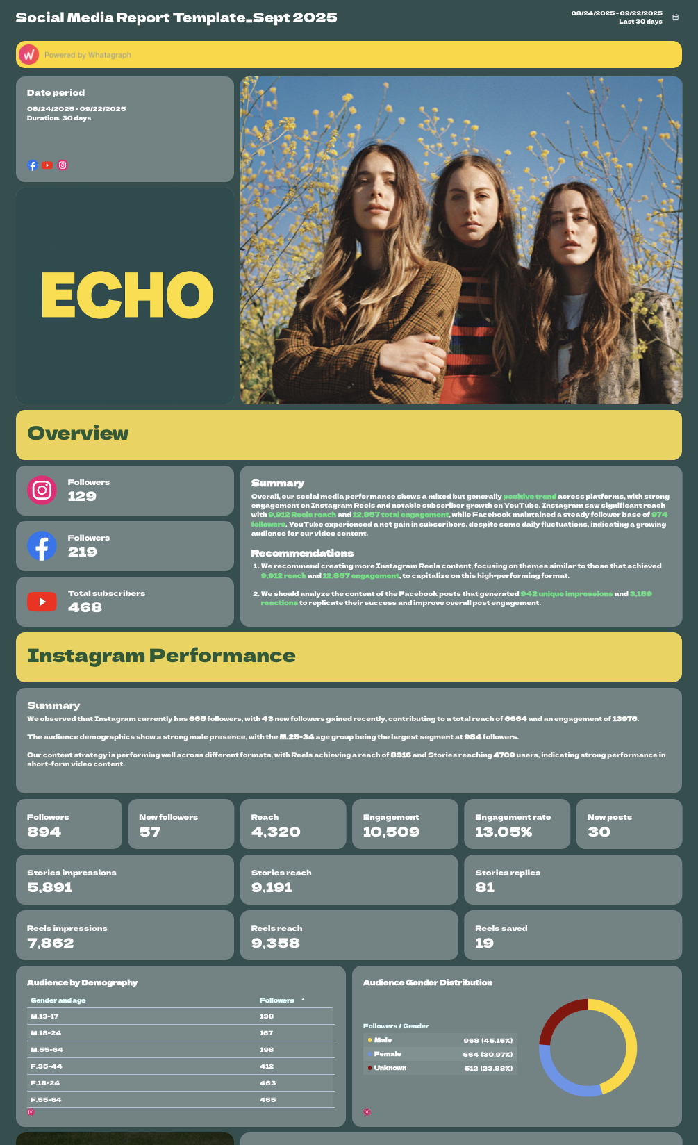
And here’s an example of a social media report template:
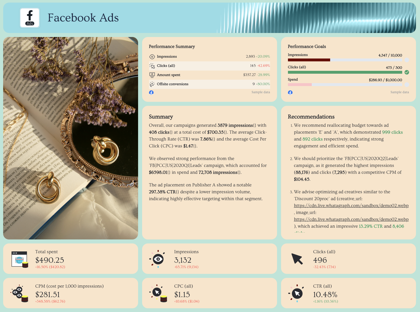
And here’s an example of a paid-per-click report template:
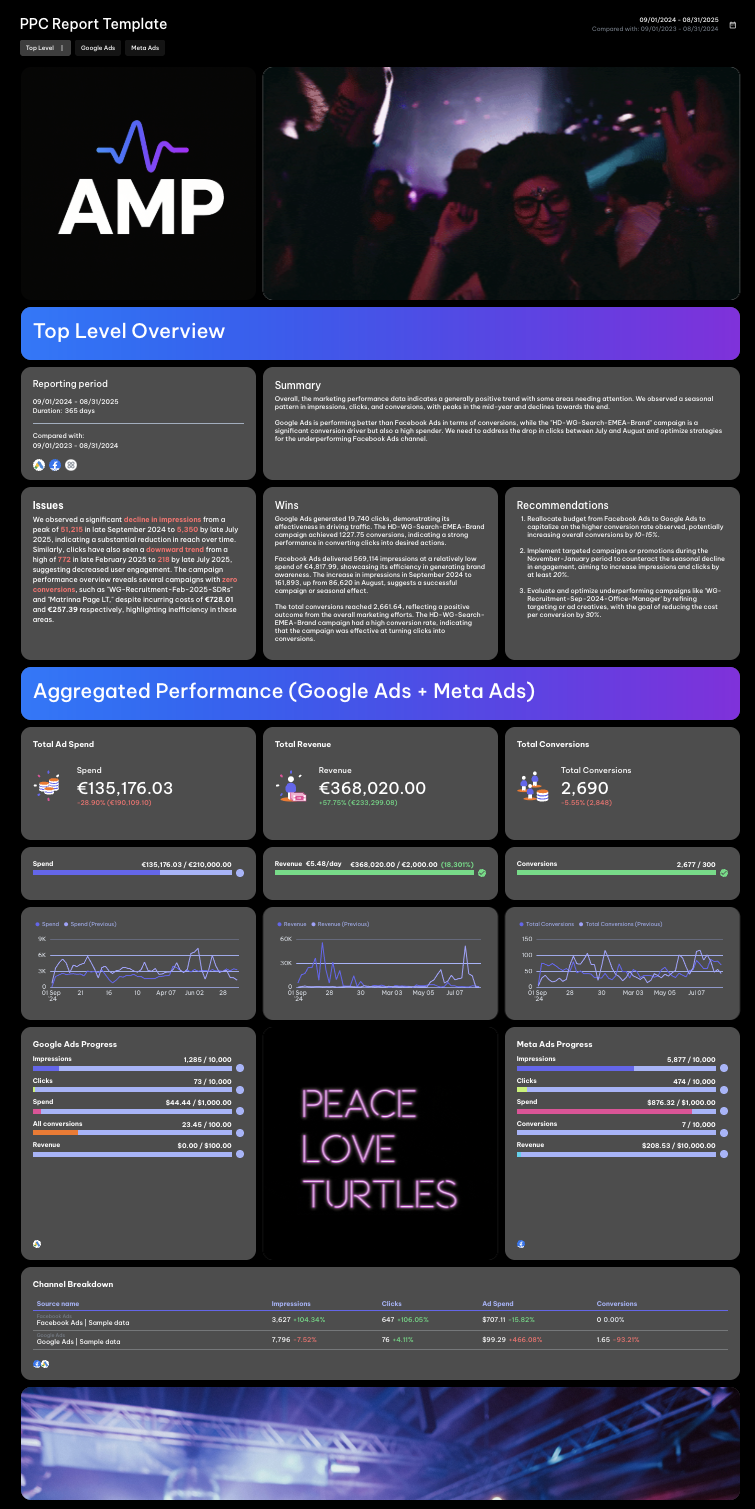
Start building your report for free with Whatagraph.
Whatagraph also comes with thoughtful design features that make your user experience smooth as butter. You can:
✅ Change the orientation of your reports as Landscape or Portrait
✅ Adjust the width and height of your charts and graphs right on the dashboard
✅ Save reports as “templates” and re-use them the next time
✅ Edit linked reports in one go, rather than one by one
✅ Add multiple “Tabs” within a single report to visualize performance from different channels or campaigns
Our customers love how simple and easy Whatagraph is to use. André Cardoso, Project and Performance Marketing Manager at Wise Pirates, says:
Whatagraph is really simple to use, intuitive, and perfect for marketing teams with limited technical knowledge.
When the time comes for sharing these reports, you can either:
- Set up automated emails to specific people at specific times, days, and cadence. Customize the email subject lines and copy.
- Send instant live links to anyone.
- Download PDFs or CSVs.
- Transfer your data to BigQuery.
#5. Straightforward pricing with more value
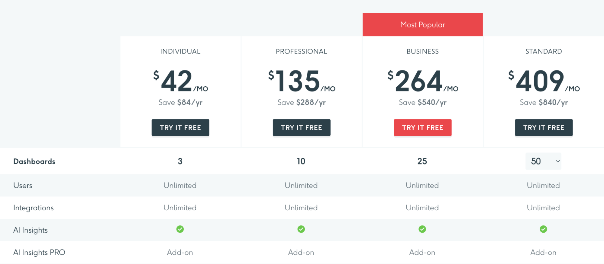
As of April 2026, DashThis pricing starts at $42/month (billed annually) for the Individual plan, but you're limited to just 3 dashboards. To scale, you'll need the Professional plan at $135/month for 10 dashboards, or the Business plan at $264/month for 25 dashboards.
Every step up costs more, and you're still capped on how many dashboards you can create.
Whatagraph takes a different approach. Pricing is based on source credits, which you use to connect and blend data. But no matter the plan, you always get:
- Unlimited dashboards
- Unlimited users
- Powerful AI features (Whatagraph IQ) baked in from day one
And while Whatagraph can be more expensive than DashThis, here’s where the value is significantly higher:
✅ Forever Free plan to test reporting with no time limits
✅ Unlimited dashboards and users on every paid plan
✅ Whatagraph IQ: AI report creation, insights, themes, chat, and summaries
✅ Advanced data blending + custom metrics without code
✅ Fully white-labeled, branded reports in seconds with IQ Themes
✅ 30-min data refresh on every plan
✅ Direct exports to warehouses (e.g. BigQuery) and BI tools (e.g. Looker Studio)
✅ Responsive live chat with <4 min reply time
Key Features
- 60+ stable native integrations across paid ads, social, SEO, email, and more
- Custom integrations via API, Google Sheets, or BigQuery
- Whatagraph IQ – AI-powered reporting tools
- Versatile drag-and-drop widgets for reports and dashboards
- Custom metrics, dimensions, and data blends
- Performance monitoring overview
- Library of pre-made dashboard and report templates
- Insights – automatic audits of connected data, anomaly detection, and recommendations
- Spaces – organize reports with descriptions, colors, and better team alignment
- Custom branding and white labeling
- Automated report sharing via email or live dashboard links
- Exports: PDF, Excel, CSV, or transfer directly to BigQuery/Looker Studio
Whatagraph Reviews from Real Users
“To me, Whatagraph is like the Tesla or Mercedes of digital analytics tools, their clean and simple way to present complex marketing data. I highly recommend it to anyone working with marketing analytics who values efficiency and clarity in their reporting.” (Source)
“Whatagraph has a simple user interface that is easy to navigate even for those who don't have analytical skills.” (Source)
“What I like best about Whatagraph is having the ability to create reports fast and easy. No more spreadsheets to do reports, they have a great variety of templates.” (Source)
Pros and Cons
Pros:
- All-in-one marketing performance monitoring and reporting solution
- Easy to use by anyone on your team
- Fast campaign performance and insights
- Stunning visual reports
- Makes results easy to interpret
- Excellent live chat customer support
Cons:
- Just one data warehouse destination (BigQuery) is available so far
- The integrations may be slightly limiting for a big enterprise team, but we’re always adding new ones!
Whatagraph Pricing
Whatagraph’s pricing is transparent and flexible, with plans based on source credits (how many platforms you connect and how much data you move) and the level of customization you need.
Here’s the breakdown:
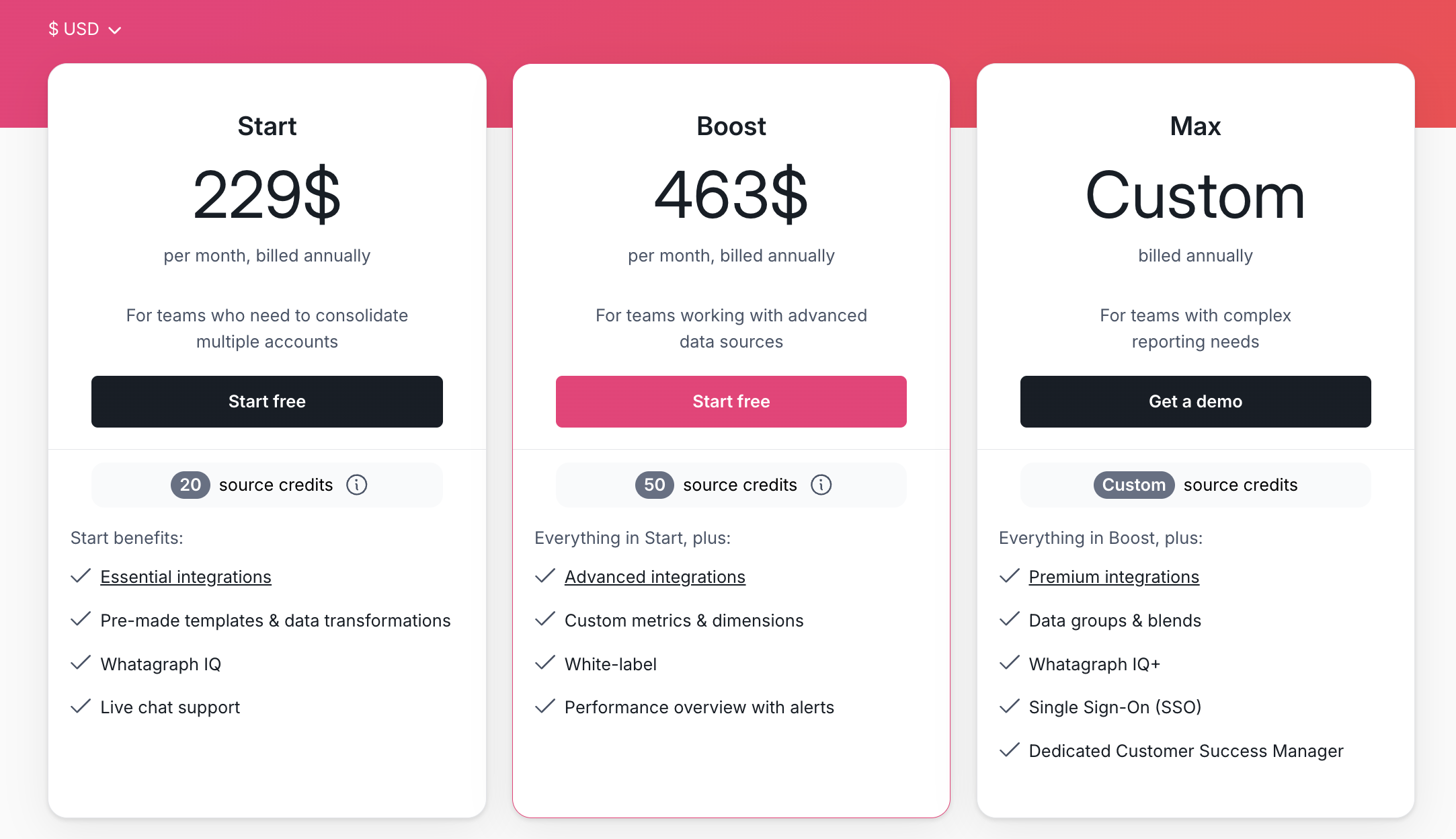
- Forever-free – lets you get started at no cost, with 5 source credits, Whatagraph IQ basics, templates, and live chat support.
- Start ($229/mo billed annually) – includes 20 source credits and essential integrations
- Boost ($463/mo billed annually) – jumps up to 50 source credits, adds advanced integrations, custom metrics & dimensions, white-labeling, and performance overview with alerts
- Max (custom pricing) – for enterprise/complex teams, with custom source credits, premium integrations, data groups and blends, Whatagraph IQ+, SSO, and dedicated Customer Success Manager
2. Geckoboard
Most suitable for: Customer service, sales, and ecommerce teams that need live internal dashboards.
Geckoboard is a real-time dashboard tool built primarily for internal team visibility; think live wallboards for support agents, sales floors, and ecommerce operations teams rather than client-facing reporting.
Geckoboard’s main advantage over DashThis is its wider variety of data sources—with 90+ native integrations, you can connect to a wide range of tools across customer service, sales, finance, and ecommerce, including Salesforce, Zendesk, HubSpot, Shopify, Stripe, Pipedrive, Dixa, and Intercom.
Once your data is connected, you can build and share dashboards in several formats:
- TV dashboards for live office wallboards.
- Mobile-friendly dashboards accessible from any browser.
- Shareable dashboards via link.
- Snapshots and reports are sent automatically via Slack, Microsoft Teams, or email.
In January 2026, they added the ability to schedule multiple snapshots per dashboard; useful for teams across time zones.
A standout feature is KPI notifications: real-time alerts sent to Slack or Microsoft Teams when a metric hits a threshold you set. Worth noting, though, that this is a Pro plan feature.
However, unlike Whatagraph, you won’t be able to create custom data blends, metrics, and dimensions on Geckoboard. This can be a deal-breaker if you’re a large company and need to organize your scattered data to create easy-to-read, impactful reports.
Their dashboards are also quite basic and static, with very few customization options. You also can’t ship your data to warehouses on Geckoboard.
Key Features
- 90+ integrations with Customer Service, Sales, Finance, and eCommerce channels
- Drag-and-drop dashboard builder
- KPI notifications
- Slack integration
- Automated email reports
- TV dashboards
- Mobile-friendly dashboards
- Dashboard examples for businesses
Geckoboard Reviews from Real Users
“Really positive and helped the business considerably with realtime live tracking.” (Source)
“I wish there more visualization options like pie charts or thermometer goal graphs. I also wish you could fit more data on one dashboard without it getting cut off.” (Source)
“After using the platform for an extended period, I had to reconfigure or completely rebuild several integrations because some of them were no longer supported.” (Source)
Pros and Cons
Pros:
- Easy to use and set up
- A wide variety of integrations
- Great customer service
Cons:
- Can be pricey if you want to add more dashboards
- Limited customization options for dashboards
- No advanced calculations, blends, and custom metrics and dimensions supported
Geckoboard Pricing
Similar to DashThis, Geckoboard’s pricing is based on the number of dashboards. These are the current plans as of April 2026 (billed annually):
- Essential ($60/month): 1 dashboard, 1 editor, 10 viewers, 1 TV display. Sharing via link only.
- Core ($175/month): 20 dashboards, Slack/Teams/email snapshot delivery, custom logo, and theming.
- Pro ($319/month): 50 dashboards, interactive view, custom field metrics, audit log.
- Enterprise (custom): SSO, user management API, dedicated support rep.
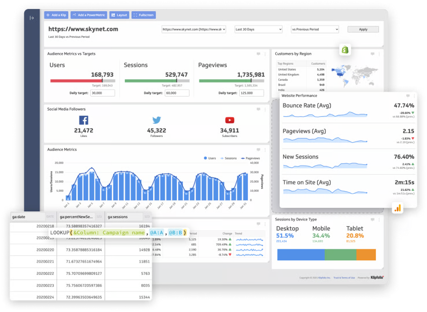
3. Klipfolio
Most suitable for: SMBs that need highly customizable dashboards, and data teams at larger organizations that need a centralized, governed metrics layer.
Klipfolio offers two distinct products that serve very different needs:
- Klips is Klipfolio's dashboard and reporting product for small and mid-sized businesses: With 130+ integrations, it's one of the more technically flexible dashboarding tools on the market. You can pull data stored on-premise or in the cloud, upload spreadsheets, write custom SQL queries, and use Excel-like formulas to transform and calculate your data. There are 30+ visualization types and real-time data refresh.
- PowerMetrics is a separate, more advanced product aimed at data teams at larger organizations: PowerMetrics has been evolving quickly; it now includes AI-assisted analytics, a Knowledge Graph, SQL access, an MCP Server, and semantic layer integrations with Cube and dbt.
Klipfolio is way more robust than DashThis. For instance, with Klips, you can:
- Pull data that's stored on premise or in the cloud, upload spreadsheets, or write custom queries
- Use Excel-like formulas and functions to transform your data, perform calculations, and more
- Get real-time data refresh on your dashboards
The core limitation of Klipfolio, particularly Klips, is complexity.
Building custom connections requires SQL queries, REST API configuration, and familiarity with Klipfolio's proprietary formula syntax. Each visualization needs to be built individually before being added to a dashboard, which can take anywhere from 10 minutes to an hour per widget.
Key Features
- 130+ integrations including warehouses, SQL databases, and file-sharing services
- Data blending, unifying, aggregating
- Custom metrics and dimensions
- AI insights
- Custom dashboards and reports
- Export dashboards as PDF or image files. Export only individual clips as CSV
- Scheduled reports
Klipfolio Reviews from Real Users
“Klipfolio has a user-friendly interface. It can be easily connected with databases, Excel sheets, and Google sheets which makes data integration very smooth and easy.” (Source)
“I love the full range of capabilities that are possible when building a Klipfolio dashboard (specifically with their Klips product).” (Source)
“Every time I contact support I get the impression that I am bothering them. I will not be renewing this platform because I do not feel valued as a customer.” (Source)
Pros:
- Powerful data analytics and organization options
- AI insights to help make data-driven decisions
- Highly customizable
Cons:
- Can be difficult to set up and use
- Expensive with important features only available as add-ons or in Enterprise plans
- Unhelpful customer support
Klipfolio Pricing
Klipfolio's pricing is based on the number of dashboards, with add-ons that can significantly raise your overall costs:
- Base at $120/month: 3 dashboards, unlimited users, 4-hour data refresh, 130+ integrations.
- Grow at $190/month: 10 dashboards, 1-hour data refresh, PDF reports.
- Team at $310/month: 20 dashboards, 15-minute data refresh, SSO included.
- Team+ at $600/month: 40 dashboards, up-to-the-minute refresh, priority support, and custom onboarding.
And these add-ons can significantly raise your overall costs on top of that:
- Extra dashboards: $8/month (billed annually)
- Warm-up data refresh: $39/month (billed annually)
- Near-real-time data refresh queue: $139/month (billed annually)
- Custom domain: $69/month (billed annually)
- Full white-label bundle (custom domain + custom theme + branding): $299/month (billed annually)
4. NinjaCat
Most suitable for: Large marketing agencies and enterprise brands managing high-volume, multi-client marketing data at scale.
NinjaCat now positions itself and as an end-to-end marketing data platform built on Snowflake, covering data ingestion, transformation, storage, reporting, and AI-powered automation in one environment.
The platform has four main pillars:
- Data Cloud: NinjaCat's native data warehouse, built on Snowflake. You connect 100+ pre-built marketing connectors, normalize the data with no-code transformations and custom calculations, and store it in a managed Snowflake environment.
- Data Ship: Enterprise ETL that ships your marketing data to external destinations like Snowflake, BigQuery, Amazon S3, Redshift, Databricks, Tableau, Looker Studio, and other BI tools.
- Reporting: A report builder that lets you create dashboards and client-facing reports. The canvas-style interface is flexible but has a steeper learning curve than tools like Whatagraph—it's more familiar to users with a design or technical background than to everyday marketers.
- AI Agents: Pre-built agents handle tasks like negative keyword discovery, search-term mining, spend pacing, ad copy QA, rank tracking, and cross-account benchmarking.
In February 2026, NinjaCat acquired Shape.io, a PPC budget management platform, adding ad spend pacing and budget monitoring capabilities to the platform.
NinjaCat's strength is scale; it's built for agencies and brands managing hundreds of clients and billions of rows of data. The trade-off is complexity and cost.
Key Features
- 100+ pre-built marketing data connectors plus AI Connectors and MCP Servers
- Native Snowflake-powered Data Cloud
- Data Ship to external warehouses and BI tools
- No-code data transformations and custom calculations
- AI Agents for automated analysis, spend monitoring, and reporting
- AI Insights Generator for narrative report summaries
- Canvas-based report builder
NinjaCat Reviews from Real Users
“Ninjacat has a lot of connectors that are able to bring in data from countless platforms.” (Source)
“The technology is sophisticated and can do a lot. Because of that, things can break down from time to time.” (Source)
“They discontinued portions of the software that we contracted for, but never discounted the price. After several years of issues, we have notified them of cancellation and requested the final quarter be waived due to the massive issues and software components they shelved, but they insist on holding us through the contract.” (Source)
Pros:
- Automated client reporting
- One platform for integration and visualization
- Multiple choice of destinations
- Custom branded reports
Cons:
- Separate workspaces to organize and visualize data
- Complex visualization builder
- Performance issues with reports
- No autosave in case of a crash
NinjaCat Pricing
NinjaCat doesn’t offer fixed pricing plans, and no information is available on its website. Most agencies start at $1,500 per month, according to third parties.
5. Looker Studio
Most suitable for: Freelancers and solo marketers working primarily in the Google ecosystem.
Looker Studio is Google's free-at-first reporting tool and one of the most widely used dashboarding platforms among marketers, largely because the price seems right.
Looker Studio comes with 21 native integrations with Google-based platforms like Google Ads, DV 360, Google Sheets, and Google Analytics. You can also connect to BigQuery, MySQL, and Microsoft SQL servers on Looker.
For anything outside the Google ecosystem, you'll need a paid third-party connector from the 1,000+ partner connector gallery.
Data blends are available, letting you combine and visualize data from multiple sources in a single chart, but capped at 5 sources per blend. In comparison, there are no limits to blends on Whatagraph
Conversational Analytics is now available for Looker Studio Pro subscribers, allowing natural language queries against your data. For new Pro subscriptions created after June 3, 2025, Gemini is enabled by default.
Looker Studio’s key advantage against DashThis is that it’s free—but only for Google-based platforms.
However, Looker Studio can be slow and clunky, with many users complaining of connection breakages, slow load times, and inaccurate data.
Key features:
- 21 native Google connectors (free)
- 1,000+ partner connectors (paid, third-party)
- Drag-and-drop report builder
- Data blends (up to 5 sources)
- Gemini AI Conversational Analytics (Looker Studio Pro only)
- Responsive layout option
- Query result variables
- Custom styles and color themes
- Scheduled email delivery
Looker Studio Reviews from Real Users
“It’s simple enough to create something useful quickly, but powerful enough to customise and drill into the details when needed.” (Source)
“Sometimes it gets really slow and lags when multiple data sources are connected.” (Source)
“Looker Studio is weak when it comes to integrating data from third-party tools outside the Google ecosystem, such as Bing or Yandex.” (Source)
Pros:
- Free (to an extent)
- A huge range of data visualization formats and options
- Easy to use for basic reports
Cons:
- Slow loading
- Connection breakages and inaccurate data
- Limited report sharing options (no Word, Sheets, or PDFs)
Looker Studio Pricing
While the base platform is free, your real monthly bill depends on how much non-Google data you need.
- Free version: Unlimited reports, all 21 Google connectors included, drag-and-drop builder, and real-time sharing. As of 2025, free accounts are now subject to quotas on scheduled email delivery; daily and monthly caps apply.
- Looker Studio Pro at $9 per user, per Google Cloud project, per month: Adds organizational content ownership, Team Workspaces, Gemini AI, and access to Google Cloud technical support.
6. Databox
Most suitable for: Growing SMBs and boutique agencies that want a self-serve BI platform without needing a data team.
Databox is now positioning itself as a full self-serve BI platform following a major Advanced Analytics release in May 2025.
You can connect 130+ native integrations covering marketing, sales, CRM, finance, and ops tools, bring in custom data via Google Sheets or Excel, or use their API. Via a partnership with Dataddo, you can also sync structured data from 350+ additional tools, including Monday.com, Amazon Advertising, Asana, NetSuite, and more.
Databox added Datasets: a data prep layer where you can merge, filter, and calculate columns from multiple sources before turning them into metrics. There's also a no-code SQL builder, multidimensional metrics, and click-to-row drill-downs. This meaningfully changes what Databox can do for teams that previously needed separate ETL tools.
The core alerting advantage over DashThis remains: Databox sends Slack, email, or in-app notifications when metrics trend up or down; now enhanced with anomaly detection on higher plans.
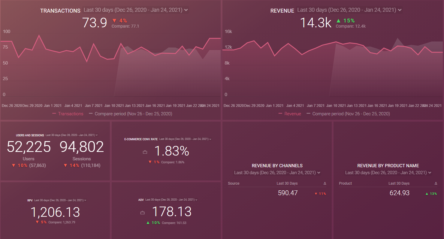
However, Databox users online say the platform is clunky and has an unappealing user interface. For instance, in the screenshot below, you’ll see that your data is visualized in a “box” format and the metrics look “squished” together and hard to read.
 Databox’s reports are also not linked – which means you’ll need to edit them one by one rather than in batch. This can be very time-consuming if you have dozens of similar reports for clients and you need to tweak them.
Key Features
- 100+ integrations
- Native visualization dashboards and reports
- Dashboard and report templates
- Slack, email, or in-app alerts
- KPI benchmark groups
Databox Reviews from Real Users
“The simplicity to creating valuable data and reporting visualisations that make your clients eyes light up on every call.” (Source)
“While it has the major business integrations and connections, it needs more connections to work in certain industries.” (Source)
"After 2 years of trying, we were never able to fully launch Databox with our clients because there is always another issue with Databox." (Source)
Pros:
- Easy to use
- Wide variety of integrations
- Interactive data
Cons:
- Slow customer support
- Bugs and lag issues
- Broken metrics and templates
Databox Pricing
As of April 2026, Databox offers a free tier and three paid plans, all billed based on the number of data sources you connect, with unlimited users on every paid plan.
- Free at $0/month: 3 data sources, 3 users, 1 dashboard, daily data sync.
- Pro at $159/month: 3 data sources included ($5.60/month per additional source), unlimited users, unlimited dashboards, hourly sync, automated reports, goals, and AI Analyst.
- Growth at $399/month: Everything in Pro, plus Datasets for data prep, data merging, AI performance summaries, anomaly detection, forecast modeling, drill-down to row-level data, and database/warehouse connections.
- Premium at $799/month: Everything in Growth, plus 50 data sources included, white-labeling, OKRs, advanced security, 15-minute sync (for 5 sources), a dedicated reporting specialist (2h/month), and priority support bundled in.
7. Funnel
Most suitable for: Marketing agencies, enterprise marketing teams, and data analysts who need a scalable marketing intelligence platform.
Funnel.io is now a full marketing intelligence platform built around four pillars: Integrate, Measure, Report, and Activate.
- Integrate: Funnel connects to 600+ data sources, and if a connector doesn't exist natively, you can import data via Google Sheets or request a custom build.
- Measure: This is a significant addition. Funnel now offers AI-powered Marketing Mix Modeling (MMM) and Multi-Touch Attribution (MTA), letting teams go beyond last-click reporting to understand true campaign impact across channels.
- Report: You can build dashboards from scratch with drag-and-drop, use pre-built templates, or ship data to external destinations. Critically, Funnel Portals now allow you to share dashboards directly with clients; each client gets a secure, customized dashboard view.
- Activate: A newer pillar focused on using marketing data to trigger actions and improve campaign effectiveness.
Funnel's core strength remains the depth and reliability of its data infrastructure, processing $80 billion in ad spend annually across 500,000+ active data sources.
The trade-off is cost and complexity: pricing is enterprise-level, demo-only, and usage-based on "Flexpoints," which can scale unpredictably with data volume.
Key features:
- 600+ data connectors
- Custom dimensions, metrics, and currency conversions
- Marketing Mix Modeling and Multi-Touch Attribution
- Funnel Dashboards with drag-and-drop builder and templates
- Funnel Portals for client-facing shared dashboards
- Funnel AI/Data Chat for natural language data queries
- Data Activation
- Export to BI tools, spreadsheets, and warehouses
Funnel Reviews from Real Users
“Been using it for close to 8 years, I love that it's user friendly and is able to easily pull data from all our major platforms.” (Source)
“It’s a bit expensive than competitors. Could do much better if subscription prices are reconsidered.” (Source)
“At the core, they are just an ETL tool, so you can’t do much beyond that. They charge fees even for basic connectors like Power BI. Their new models are expensive, and they also require a 30-day notice for cancellations.” (Source)
Pros:
- A wide range of connections with all major marketing platforms
- Low-code data organization interface
- Fast and helpful customer support team
Cons:
- Initial steep learning curve
- Occasional bugs in connectors
- Basic native visualization widgets
Funnel.io Pricing
Funnel.io's pricing has two components: your plan tier and your flexpoint capacity. Flexpoints are usage credits that measure the capacity of your subscription. You can add more flexpoints to any plan as your usage scales.
There are three plans, all billed annually:
- Starter from $200/month: 121 connectors, up to 5 users, 1 workspace, Funnel Dashboards, Looker Studio, and Google Sheets reporting, daily export frequency.
- Business from $800/month: 579 connectors, unlimited users and workspaces, Power BI and Tableau added as reporting options, 26 export destinations including BigQuery, AWS, and Azure. Custom connectors and destinations available on request.
- Enterprise (custom pricing): 590 connectors, adds Snowflake as a destination, SAML/OIDC/SCIM SSO, audit log, EU data center option, Enterprise SLA, and auto-connect for manager accounts.
8. Supermetrics
Most suitable for: Enterprise marketing teams, data analysts, and agencies that need a scalable marketing data pipeline with growing analytics and activation capabilities.
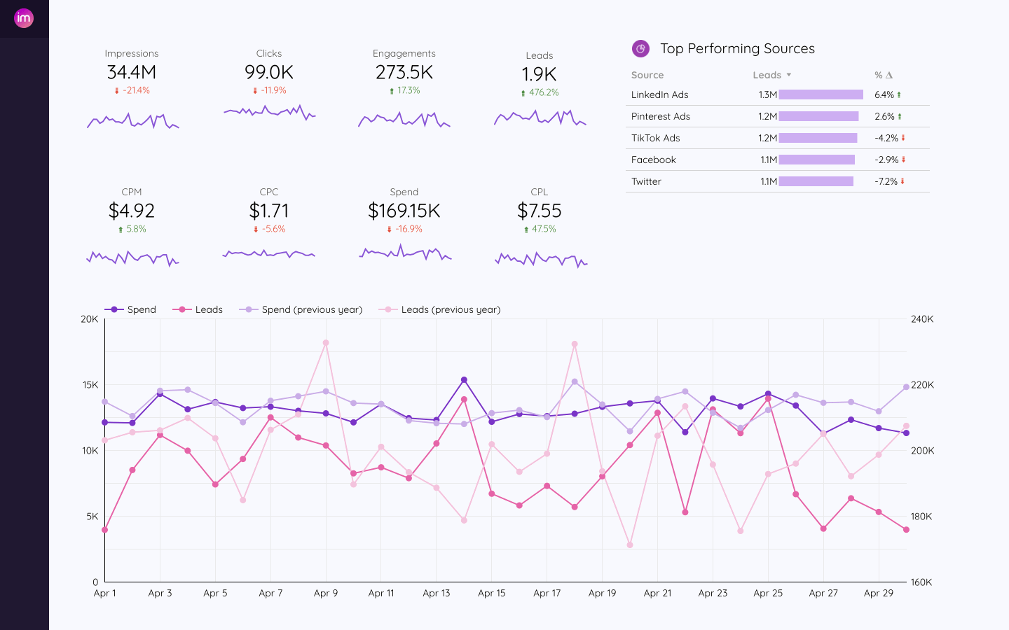
Supermetrics now calls itself a Marketing Intelligence Platform rather than just a data moving tool. The core capability remains powerful data integration, but it's expanded into visualization, AI analysis, and data activation.
Compared to DashThis, Supermetrics is a powerful data analytics platform.
Supermetrics connects to 100+ marketing data sources: Google Analytics, Facebook Ads, LinkedIn, and hundreds more; and handles automated normalization, Custom Fields for defining how data appears, and data blending to combine sources into unified views. For sources not natively supported, the new Connector Builder, launched in December 2025, lets technically comfortable users build custom connectors via JSON configuration.
In March 2026, Supermetrics launched native integrations with ChatGPT and Claude, allowing you to query your marketing data in natural language directly inside both AI tools, powered by an MCP Server.
However, the drawback is that you’ll need to have a technical background or a dedicated data scientist to use data mapping and transformations.
In contrast, on Whatagraph, you can organize your data any way you want and create custom blends, metrics, and dimensions in seconds using simple workflows.
Key features:
- 100+ integrations with marketing platforms
- Automated normalization, Custom Fields, and data blending
- Custom Dashboard Builder; native, launched January 2026
- Supermetrics AI: Insights Agent, ChatGPT, and Claude integrations, MCP Server
- Data Activation via Relay42
- Connector Builder for custom integrations
- Conversion events uploader online and offline sources
- Data transfers to BI tools, warehouses, and spreadsheets
Supermetrics Reviews from Real Users
“I like that Supermetrics is very easy to use and also quite flexible.” (Source)
“The help and training docs on the website aren't very good - I found better and quicker support using AI.” (Source)
“I really believe that the pricing can come down a bit, especially for individual users like me.” (Source)
Pros:
- Simple and easy to use
- Automated no-code data transfers
- Easy historical data retrieval
Cons:
- Loading data to multiple destinations is not available with a single pricing plan
- Adding more data sources requires buying more connectors
- Looker Studio connector can get slow when connected to multiple ad accounts
Supermetrics Pricing
Supermetrics pricing is structured around four tiers: Starter, Growth, Pro, and Enterprise, each bundling a set number of data sources, accounts per source, users, and destinations. Unlike the old model, where you paid per destination separately, plans now include access to multiple destinations.
Prices start from €29/month (billed annually) for entry-level plans, but the actual cost depends on the number of data sources, connected accounts, and users. Add-ons are available on all plans for extra data sources, accounts, or users. Enterprise pricing is custom and requires contacting sales.
9. Adverity
Most suitable for: Data teams in agencies or brands managing high-volume, multi-source marketing data.
Adverity is an integrated marketing data platform for connecting, transforming, and activating data.
Adverity offers 600+ pre-built connectors covering marketing platforms, databases, and data lakes. You can also upload custom data via spreadsheets, Excel, .json, or .xml files. A new Connector Builder is available for building custom integrations. Adverity also now supports an MCP server.
Adverity's transformation engine cleans, normalizes, and unifies data with built-in data governance. A Transformation Copilot (AI-powered) lets you describe what transformation you need in plain language, and the platform generates the code and step-by-step instructions. Adverity can also now orchestrate dbt model runs directly from within the platform.
Adverity Intelligence is a full AI analytics layer, including Data Conversations, Notebooks, and Intelligent Agents, including an MMM Agent for Google Meridian that automates data preparation for marketing mix modeling.
Adverity remains an enterprise-grade platform; pricing is custom and demo-only, and the technical depth of its transformation and governance features still assumes a data-savvy team.
Key features:
- 600+ pre-built connectors
- Custom integrations via spreadsheets, Excel, .json, .xml, and Connector Builder
- AI-powered Transformation Copilot and data transformation engine
- Built-in data governance and Data Quality Suite
- Data Conversations; conversational AI for real-time data queries and visualizations
- Notebooks for collaborative insight-sharing
- Intelligent Agents, including the MMM Agent for Google Meridian
- Adverity MCP for connecting to external AI platforms
Adverity Reviews from Real Users
“It is easy to integrate, understand the system, workflow, creating pipelines and the data can be transferred to different destinations like S3, Snowflake etc..” (Source)
“Some custom conversions from Google Ads have started to show inconsistencies regarding the platform's values, which is a bit concerning.” (Source)
“Some of the advanced features require a bit of technical knowledge, and for custom reporting we occasionally need help from the support team, which can be a drawback.” (Source)
Pros:
- No-code ETL transfers
- Predefined data transformation
- A large number of sources and destinations
Cons:
- Difficulty to use and set up
- Basic dashboards and reports
- Even the basic pricing may be too expensive
Adverity Pricing
Adverity's pricing is fully custom; there are no published plan tiers or public figures. All quotes are tailored to each client's requirements and scale.
On the Microsoft Azure Marketplace, Adverity offers a one-time purchase model: $200,000 covers a 12-month subscription.
We covered everything you need to know about Adverity in our full guide, including whether shelling out $200,000 is worth it or not!
10. Improvado
Most suitable for: Marketing teams and data teams at mid-market and enterprise companies who want AI-driven campaign automation.
Improvado connects to 1,000+ data sources, including marketing platforms, MarTech tools, and CRMs; up from 500+ in previous iterations. It handles automated data harmonization, normalization, and transformation, with a no-code setup. Data can be pushed to BI tools, data warehouses, and spreadsheets, or kept in fully-managed storage.
Improvado's current platform centers on an AI Agent that operates across the full marketing workflow:
- Analysis: Ask any question about your data and get instant answers.
- Creative generation: Multi-format banners, video, and carousel assets across platforms.
- A/B testing: The agent designs experiments, deploys across Google Ads, Meta, LinkedIn, and TikTok, monitors statistical significance, picks winners, and starts the next experiment automatically.
- Campaign governance: 250+ pre-built rules for budget compliance, CPA limits, spend pacing, naming conventions, and performance thresholds; validated before campaigns go live and monitored after.
- Improvado MCP: Connects your ad platform data to Claude, ChatGPT, Cursor, and any MCP-compatible AI tool.
But it can take months to implement Improvado. This makes it a more suitable tool for enterprises that need a powerful data analytics platform, but it may be overkill for marketing agencies and small businesses.
Key Features
- 1,000+ integrations with marketing platforms, CRMs, and MarTech tools
- Fully-managed data storage
- Unlimited data destinations
- Pre-built dashboards
- AI Agent for analysis, creative generation, A/B testing, and campaign optimization
- Campaign governance with 250+ pre-built rules and pre-flight validation
- Improvado MCP for AI tool integration
- Marketing Mix Modeling
- AI-driven data transformations
Improvado Reviews from Real Users
“The tool is only as good as your data if you have bad data then the reports won't be helpful. There is a heavy technology lift to get this tool going.” (Source)
“We mostly used the Extract & Load features, and they were super easy to set up new data connections and monitor the quality.” (Source)
“It requires technical experience. I wouldn't say this is a tool marketers or beginners can use. You'll need a developer depending on what you are looking to do.” (Source)
Pros:
- Powerful data analytics
- AI-powered insights
- Helpful customer support
Cons:
- Can be expensive for small businesses and agencies
- Long implementation time
- Steep learning curve
Improvado Pricing
Improvado doesn't publish fixed pricing; all quotes are custom and outcome-based, tailored to each customer's data stack and goals.
That said, on G2, aggregated public data tells us that:
- Time to implement: ~2 months
- Average ROI timeline: 15 months
- Perceived cost: $$$ (mid-tier)
11. FiveTran
Most suitable for: Data and analytics teams at mid-market and enterprise companies who need a reliable, fully managed data movement platform.
Fivetran is an automated data movement platform that extracts data from sources, loads it into data warehouses or data lakes, and keeps it synchronized: following an ELT (Extract, Load, Transform) pattern where transformation happens inside the destination.
Fivetran supports 600-700+ connectors, depending on your plan, covering SaaS applications, databases, files, and event streams. Fivetran handles all API maintenance, schema changes, and connector updates on your behalf.
Automatic schema evolution remains a standout feature: when a source adds or removes fields, Fivetran detects the change and adapts the pipeline automatically, without manual intervention. This keeps data consistent and up-to-date even as source structures evolve.
Key Features
- 600-700+ managed connectors
- Automatic schema evolution and migrations
- Fully managed pipelines with 24/7 monitoring
- Normalized schemas from denormalized APIs
- dbt Core and dbt Cloud integration for transformations
- Activations (reverse ETL, February 2026)
- Hybrid Deployment (Enterprise plan)
- Python Connector SDK for custom integrations
FiveTran Reviews from Real Users
“We have occasionally seen unexpected full reloads, which can be disruptive for high volume tables. MAR (Monthly Active Rows) pricing also lacks transparency and can quickly escalate for frequently updated datasets. In some cases, the fully managed nature of the platform limits deeper customisation.” (Source)
“The reliability of Fivetran exceeds community-driven solutions, it's a more full-managed service experience.” (Source)
“I find Fivetran's pricing to be quite expensive. If the cost could be reduced or there were more flexible pricing options available, it would be more accessible to a larger group of users.” (Source)
Pros:
- No-code marketing analytics platform
- Automated data transformation
- Data governance and security features
Cons:
- Time-consuming logging process
- Lacks enterprise-oriented data management features
- Limited support for historical data ingestion
Fivetran Pricing
Fivetran offers four plans: Free, Standard, Enterprise, and Business Critical, all using usage-based pricing measured in Monthly Active Rows (MAR) per connection.
The Free plan gives you access to all Standard plan features with a cap of 500,000 MAR per month for connections and 5,000 monthly model runs for transformations.
The paid plans differ by sync frequency, connector access, and security features rather than user count.
Published on Oct 21 2024
WRITTEN BY
YamonYamon is a Senior Content Marketing Manager at Whatagraph. With an eye for detail and a knack for always considering context, audience, and business goals to guide the narrative, she's on a mission to create genuinely helpful content for marketers. When she’s not working, she’s hiking, meditating, or practicing yoga.