13 Best Geckoboard Alternatives in 2026 [Tested by Us]
Geckoboard is a great business dashboard tool, but it can be limiting for marketing agencies working with dozens of clients and channels.
To help you find the best Geckoboard alternative, I did three things:
- Spoke with our customers who previously used Geckoboard.
- Scoured online reviews and community forums to find the best alternatives.
- Tried and tested the tools.
Full disclosure—one of these tools is ours. But that’s because we genuinely believe Whatagraph can help you overcome the limitations of Geckoboard.
But we’re also not here to bash our competitors. We researched them thoroughly (and even tried them out) so you can really understand what they’re great at and if they’re best for you.
By the end of the article, we hope you’ll find a Geckoboard alternative that fits your needs—whether it’s us or not.

Jun 22 2026●10 min read


- What features should I look for in a Geckoboard alternative?
- 13 Best Geckoboard Alternatives and Competitors in 2026
- 1. Whatagraph
- 2. Databox
- 3. Klipfolio
- 4. Grow.com
- 5. Tableau
- 6. Looker Studio (a.k.a. Google Data Studio)
- 7. DashThis
- 8. Cyfe
- 9. AgencyAnalytics
- 10. Swydo
- 11. NinjaCat
- 12. Funnel.io
- 13. Supermetrics
- Which Geckoboard alternative is best for you?
The biggest complaint we hear from ex-Geckoboard users is that it’s limited. Here are a few ways how:
❌ No data blending: Geckoboard doesn’t allow combining data from different datasets or widgets. To compare metrics, you can only place them side by side on your dashboard.
❌ No custom metrics or dimensions: There's no formula builder or calculated field functionality in Geckoboard. You're limited to the pre-built metrics available through each native integration, which makes it difficult to surface the blended or custom figures most marketing reports rely on.
❌ Limited white-labeling: Geckoboard lets you apply your logo and customize dashboard colors, but that's where branding control ends. You can't use a custom domain, and there's no option to remove Geckoboard's branding from shared dashboards.
❌ No AI insights: You can't talk with your data as you can in other data and reporting tools platforms. Also, you need to summarize each report manually to unearth actionable insights and next steps.
❌ Limited customization depth: While Geckoboard does offer a drag-and-drop dashboard builder, layout flexibility is constrained compared to more advanced reporting tools. You can't resize columns within tables, apply custom color schemes to individual widgets, or configure visualizations beyond what each widget type allows out of the box.
❌ No data transfers: Geckoboard is built strictly for visualization. You can't push data out to third-party platforms like BigQuery, Looker Studio, or Google Sheets; the only export option is a CSV download from Interactive View, and only for certain widget types.
—
If you’ve outgrown Geckoboard, we’ve got your back.
In this article, we’ll take you through 13 best Geckoboard alternatives that come with advanced data analytics, fully-customizable dashboards, and white-labeling options.
What features should I look for in a Geckoboard alternative?
Geckoboard is great at putting KPIs on a screen, but most teams outgrow it the moment they need to actually understand the numbers rather than just glance at them.
Here's what actually matters in a genuine alternative:
1. Real data blending, not side-by-side widgets
Geckoboard doesn't support combining data from different sources in a single widget.
The CMO Survey's Spring 2024 report found that over 60% of companies now rely on more than 20 martech tools, and without genuine data blending, you're stuck eyeballing two separate widgets to estimate a blended metric like ROAS across Google and Meta.
Look for a platform where you can build a custom metric across sources natively, without leaving your dashboard or learning SQL.
2. A real metric layer, not a wall of numbers
Geckoboard's widget-by-widget setup makes a real metric layer hard to enforce. There's no governed definition for what a KPI actually means across your dashboards, so the same metric can get pulled, filtered, or labeled differently depending on which widget you're looking at.
Without custom metrics or a centralized data model, every dashboard ends up as a pile of disconnected numbers rather than a clear read on performance.
Elizabeth Greene, Co-Founder of Junglr, sums up why that matters:
A dashboard with 27 million different metrics is often unhelpful or confusing. What we've focused on instead is identifying the few core KPIs that help us quickly spot when something is going wrong in an account.
3. White-labeling that goes beyond a logo
Geckoboard lets you upload a logo and tweak colors from the Core plan upward, but that's the extent of it; there's no custom domain and no way to remove Geckoboard branding entirely.
If client-facing reporting is part of your workflow, look for full branding control, not just a color picker.
4. AI that explains anomalies, not just displays metrics
Geckoboard has no AI insights layer at all, so every interpretation and every "why did this change" is manual.
Supermetrics' 2025 report found that marketers are using 230% more data compared to 2020, and at the same time, 56% say they don't have time to thoroughly analyze it.
That gap is exactly what plain-language summaries and automated anomaly detection are meant to close. Look for AI that flags what changed and explains why, grounded in your real connected data, rather than a static KPI screen that leaves the interpretation entirely up to you.
5. A path for your data beyond the dashboard
Geckoboard is visualization-only. There's no way to push data out to a warehouse like BigQuery or Snowflake, and the only export option is a CSV download, and only for certain widget types.
If your reporting needs grow, you'll want a tool that can both visualize data and ship it downstream.
6. Customization that doesn't require starting from scratch
Adding a widget in Geckoboard means repeating the same multi-step setup every time: pick a source, choose a metric, configure the visualization, repeat.
Look for a tool with templates, linked dashboards, or AI-assisted building so you're not manually reconfiguring the same layout for every new client or campaign.
Here are 13 Geckoboard alternatives that hold up against these criteria.
13 Best Geckoboard Alternatives and Competitors in 2026
Here are the best Geckoboard alternatives we’ll review:
| Tool | Best for | Pricing |
| Whatagraph | Marketing agencies needing custom metrics, AI & MCP reporting, and white-labeling | Free forever; paid from $229/mo |
| Databox | In-house teams wanting AI-powered KPI dashboards across 130+ tools | From $79/mo (agency); $159/mo (business) |
| Klipfolio | SMBs needing a dashboard tool plus a centralized metric layer | From $120/mo |
| Grow.com | Data analysts at medium to large enterprises | Custom pricing only |
| Tableau | Enterprise data teams needing deep, self-serve data exploration | From $15/user/mo |
| Data Studio (formerly Looker Studio) | Freelancers and teams living in Google's ecosystem | Free; Pro at $9/user/project/mo |
| DashThis | Small agencies needing clean, client-ready dashboards fast | From $44/mo |
| Cyfe | Boutique SEO agencies wanting an affordable all-in-one monitor | From $29/mo |
| AgencyAnalytics | SEO and content agencies needing built-in rank tracking | From $25/client/mo |
| Swydo | Small PPC agencies needing automated client reporting | From $69/mo |
| NinjaCat | Mid-to-large agencies needing an end-to-end data platform | Custom pricing only |
| Funnel.io | Enterprise teams with dedicated data or analytics functions | From $200/mo (Flexpoints-based) |
| Supermetrics | Enterprise teams needing a scalable pipeline into existing BI | From $44/mo |
Let’s dive into each of these tools.
1. Whatagraph
Most suitable for: Mid-size marketing agencies and multi-location businesses that want to bring all cross-channel marketing data into one place and have a governed data layer behind their dashboards, reports, and AI tools
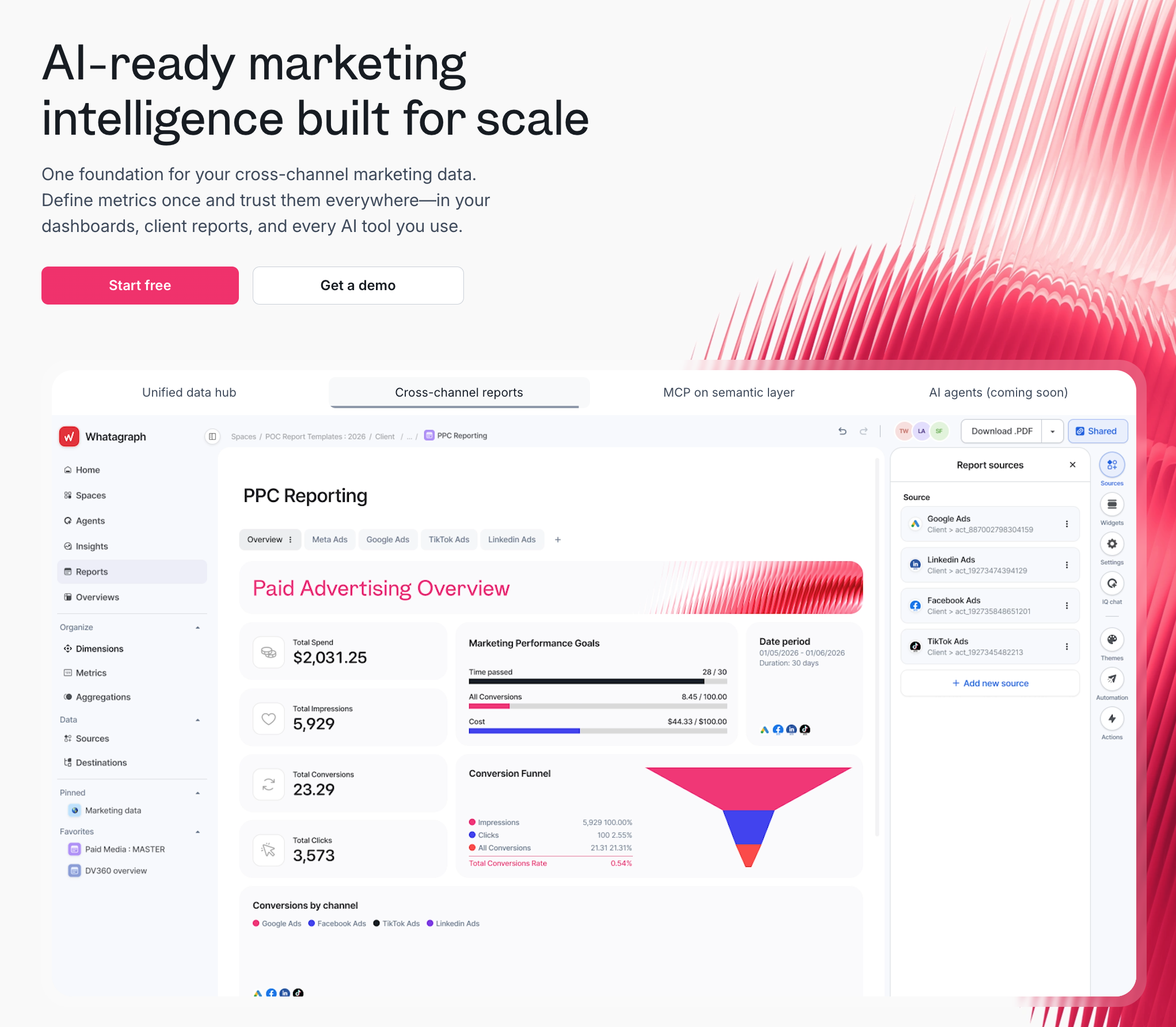
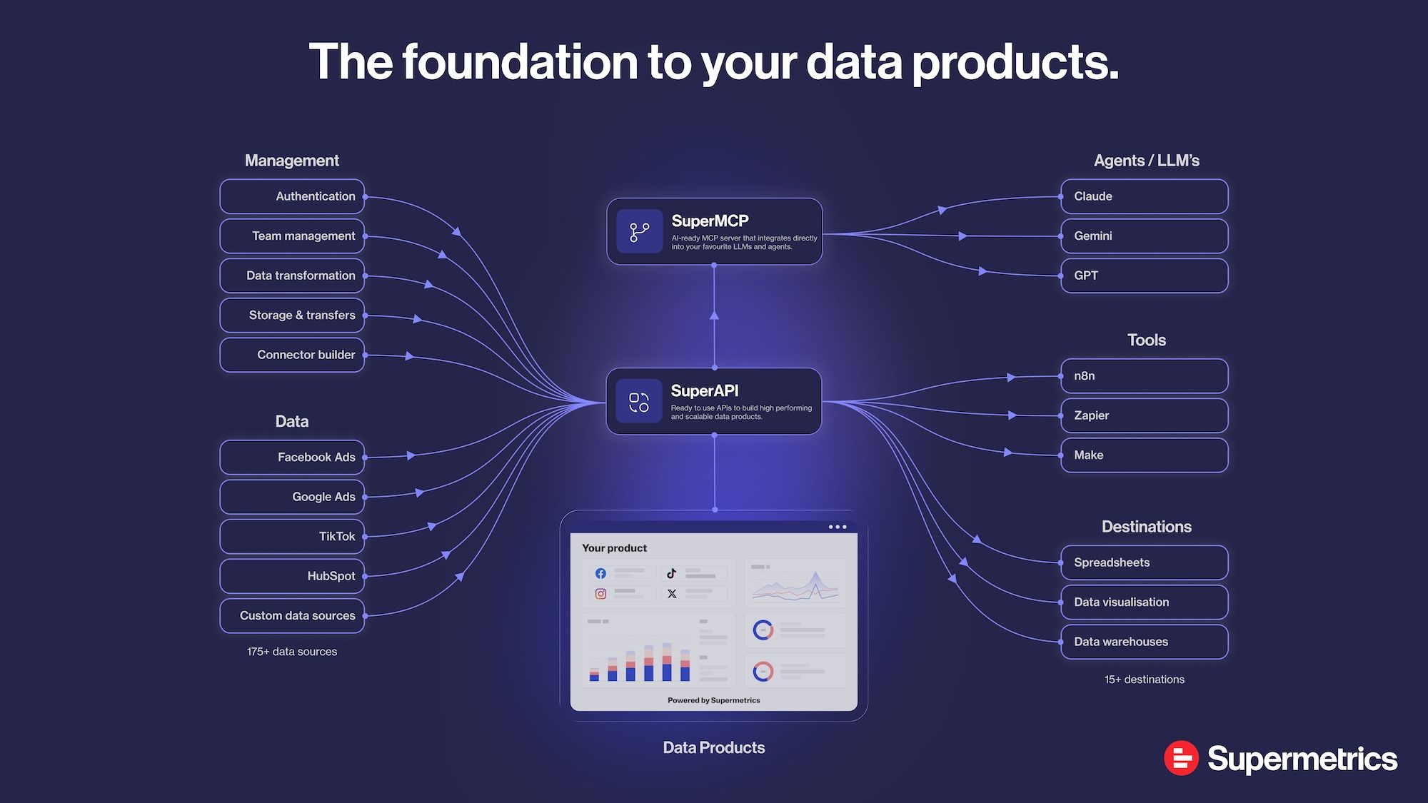
Whatagraph is a marketing intelligence platform built around a single governed data foundation.
You bring all your cross-channel marketing data into one place using native connectors that don't break, standardize and normalize this data, create and share white-labeled reports, and analyze the data with your favorite AI tools like Claude.
Here's what that looks like in practice:
1. Connect: 60+ fully managed integrations
Whatagraph connects to 60+ native integrations across paid media, SEO, social, analytics, CRM, ecommerce, and email.
Unlike connector tools that route data through third-party pipelines, Whatagraph manages every integration in-house. When something breaks, the product team fixes it - not a middleware vendor you have no visibility into.
In fact, this is the biggest advantage Linda van Baal, Online Marketing Consultant at YourFellow saw when they switched to Whatagraph. She says:
Whatagraph saves me at least half a day a week and it's so much easier and faster than Funnel and Looker Studio. But the biggest advantage is that all our data is now in one tool—everyone knows where to find everything because it’s in one place.
2. Govern: define your data once and see it everywhere
If you're running campaigns on Google Ads, Meta Ads, LinkedIn Ads, and more, you know how much of a pain it is to standardize metrics and dimensions across all of them.
Every platform has its own naming conventions, its own conversion definitions, its own way of counting a click. By the time that data lands in one report, you're spending more time reconciling numbers than analyzing and acting on them.
Whatagraph's Data Hub let you define what things mean once - then that definition carries through every report, every client, every channel.
Source Groups are a good example of how this works in practice: if a client runs three separate Google Ads accounts across different regions, you group them into one.
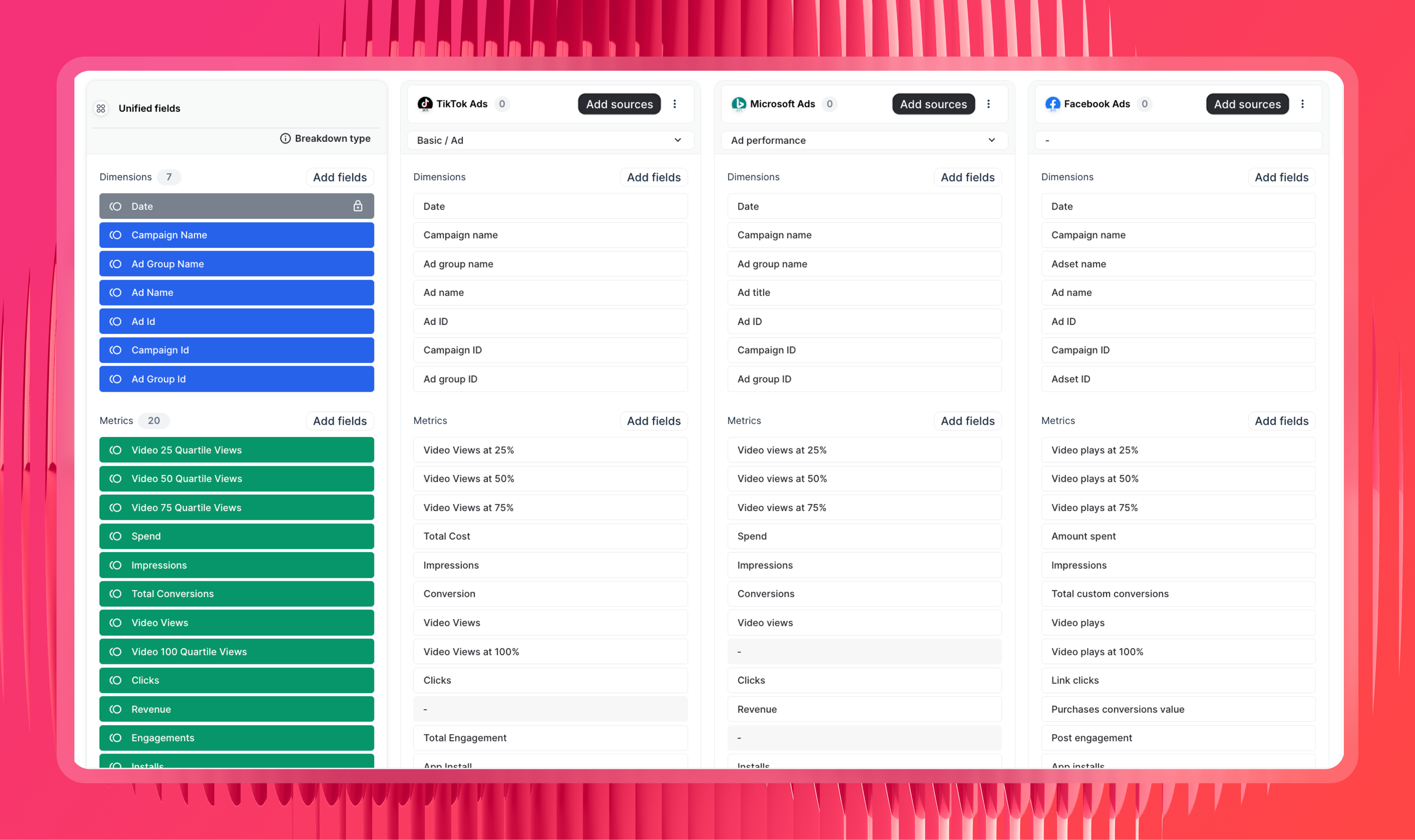
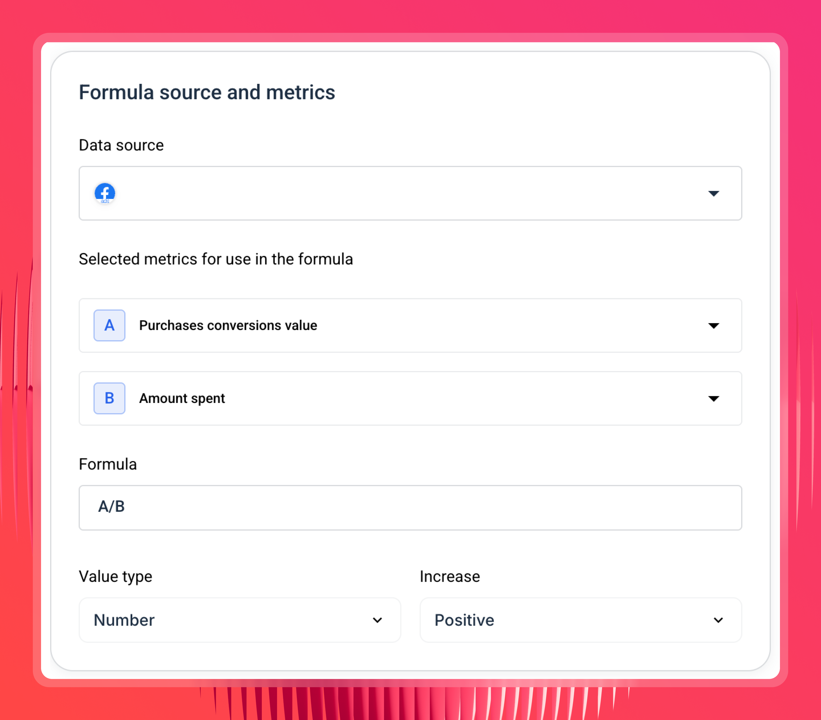
Custom metrics and dimensions let you build cross-channel KPIs and standardise naming across clients. Different clients call the same metric by different names. Whatagraph lets you rename per client so the report always matches their internal language, without rebuilding anything.
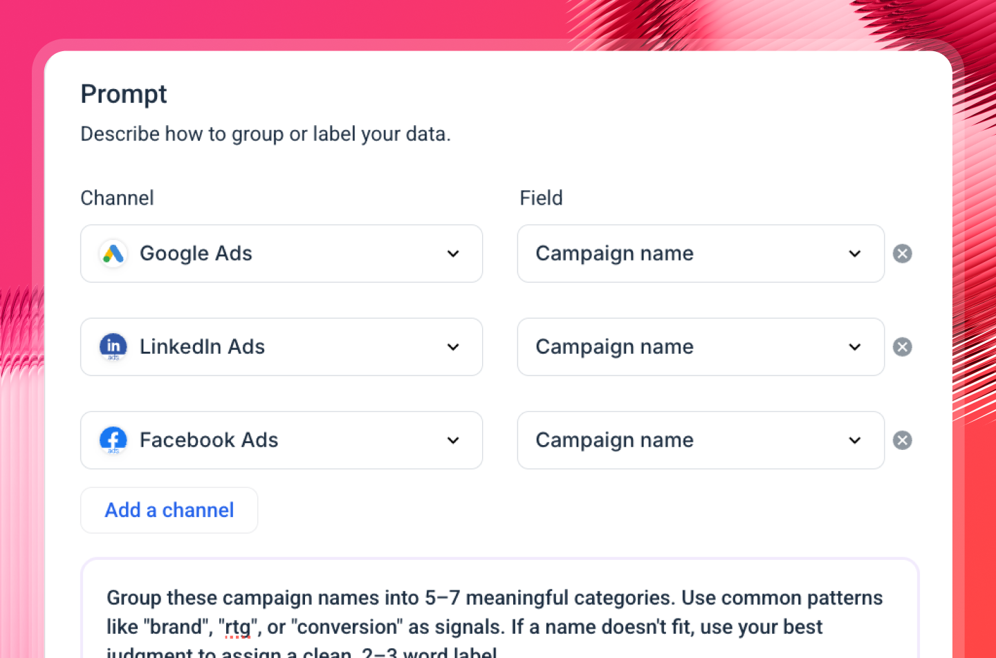
You can also ask Whatagraph IQ, the platform's built-in AI, to create a custom dimension for you. Just choose your channels and dimensions, type in a prompt, and you'll have your custom dimension ready to be used in reports.
3. Report: AI that builds and writes, plus templates that actually scale
Agencies spend way too much time creating reports from scratch - and this problem compounds with every new client you onboard.
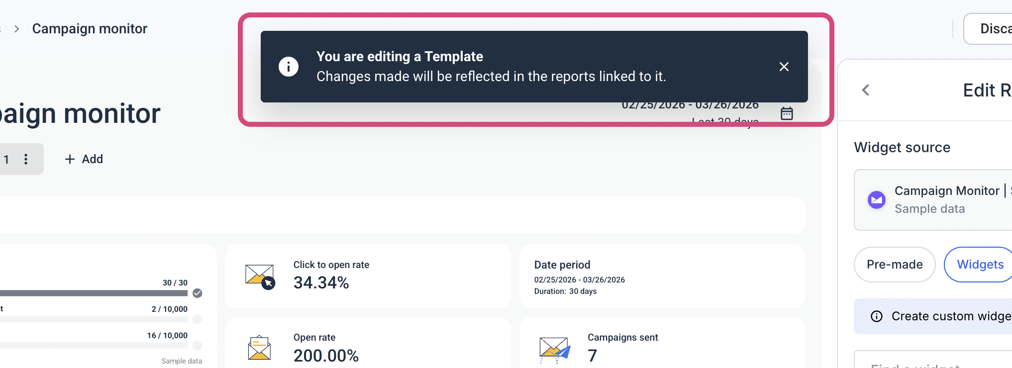
With Whatagraph, you build a report template once - one for lead gen clients, one for eCommerce, one for paid media - and reuse it every time a new client comes in.
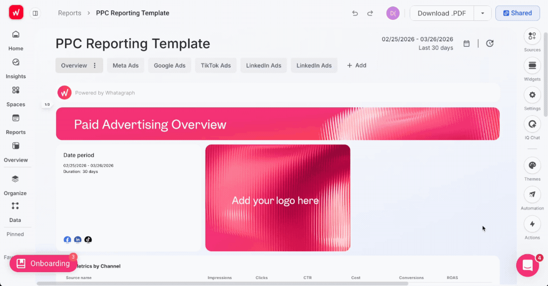
Then you link those reports to one master template. Add a new tab, update a metric, change a widget layout - every linked report updates automatically. You're not opening 40 reports one by one. You make the change once, it goes everywhere.
Maatwerk Online, a 41-person Dutch agency managing over 100 clients, saves more than 100 hours a month with this approach. Co-Founder Lars Maat says templates save more than time - they save the mental load of knowing you have to do it all again.
Whatagraph saves time and energy for our marketing specialists. And the hours we're saving is just pure profit. We now have the time to focus on more strategic things that help both our agency and our clients grow.
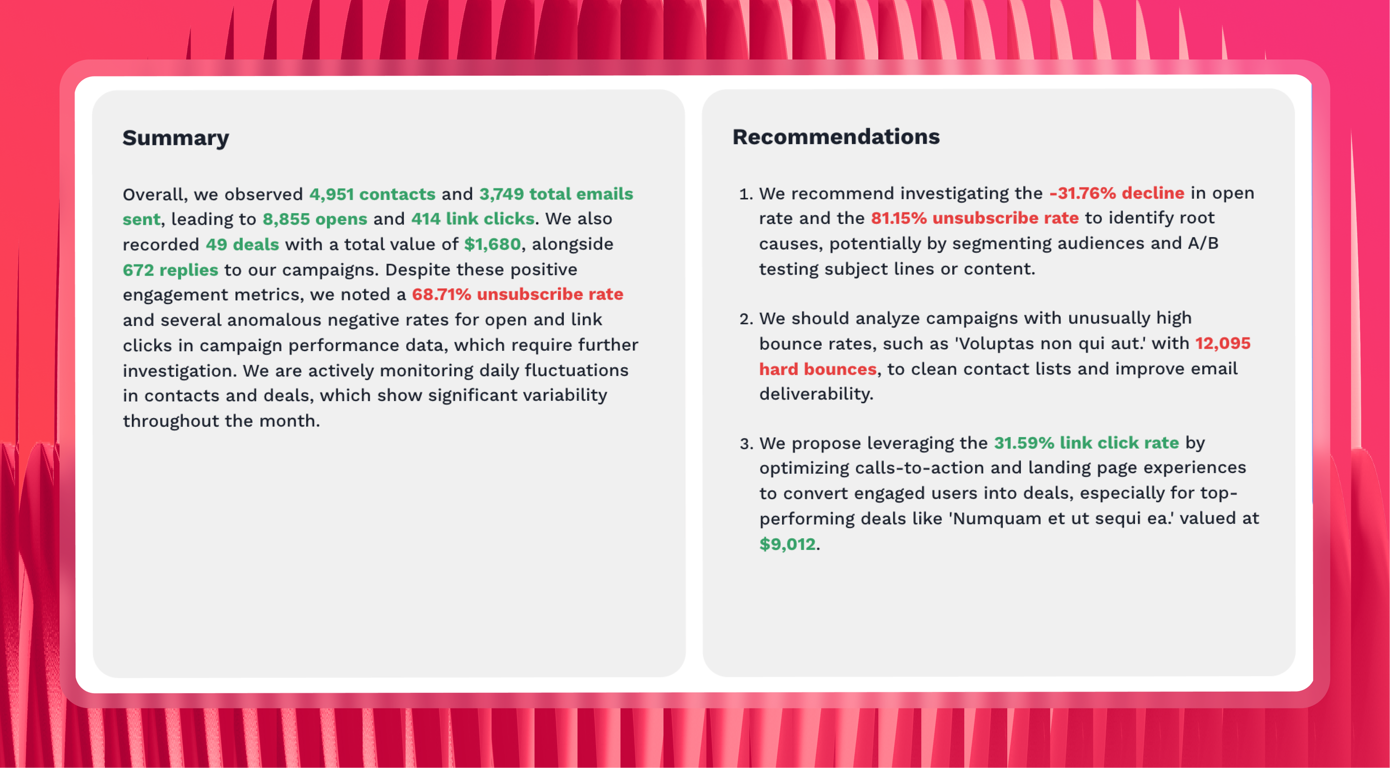
On top of that, with Whatagraph IQ, you don't even need to build a report from scratch. You can just choose your channel, type in a prompt, and it automatically creates the report based on your connected data.

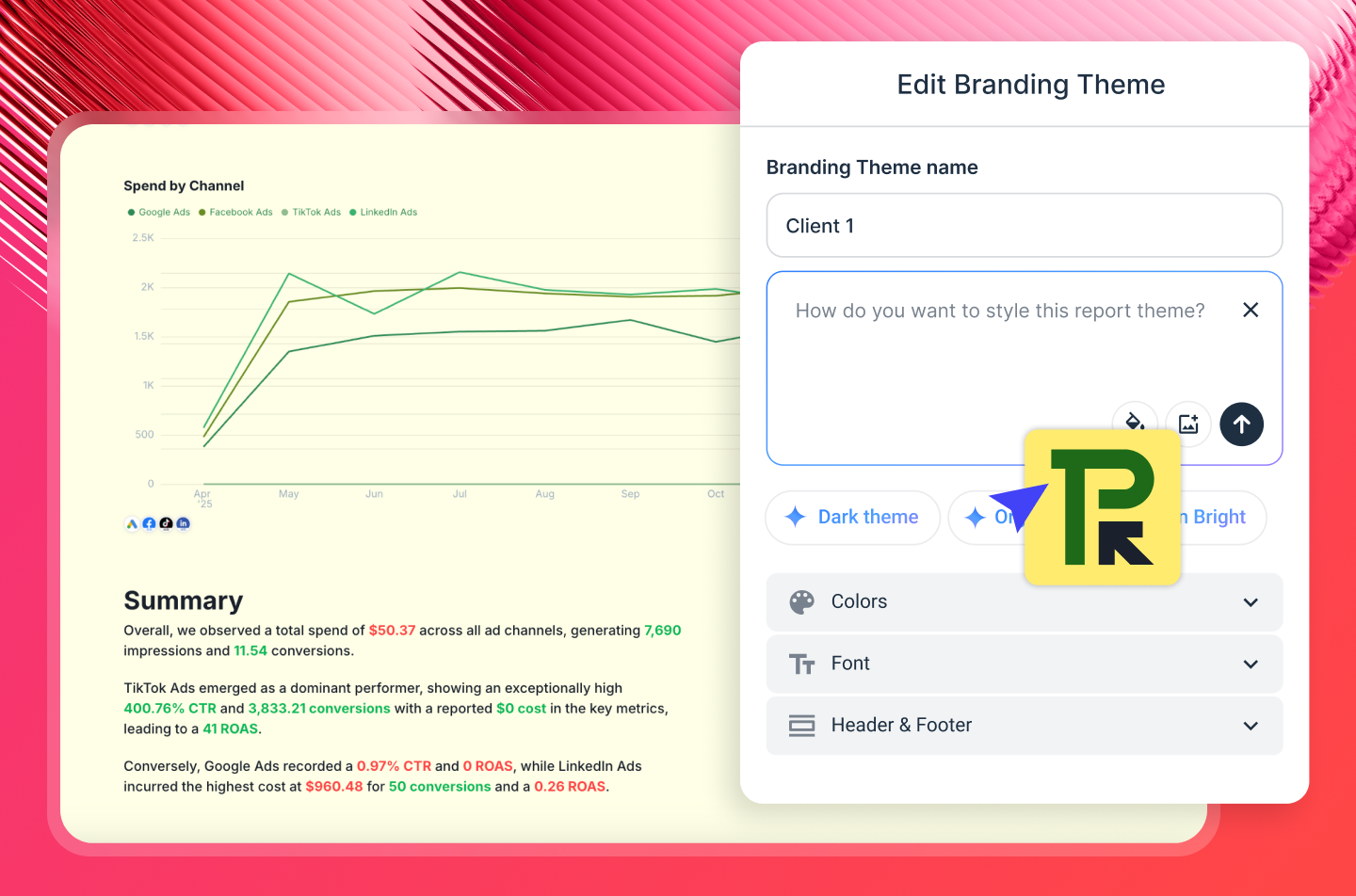
You can also brand the report in your or your client’s branding with AI. Just upload a screenshot of your report or type in a prompt, and Whatagraph applies the colors to the report.
Want to write performance summaries inside the report? Whatagraph IQ does it automatically for you based on your connected data so there are no hallucinations.
4. Monitor: see every client and portfolio at once
Individual client reports tell you how one account is doing. Performance Overviews tell you how all of them are doing, from one place.
Basically, it's a filterable dashboard across your entire client book. You can slice by account manager, client, location, or custom tag - so if you want to see every client a specific account manager owns, or every account in a particular region, it's a filter, not a manual export.
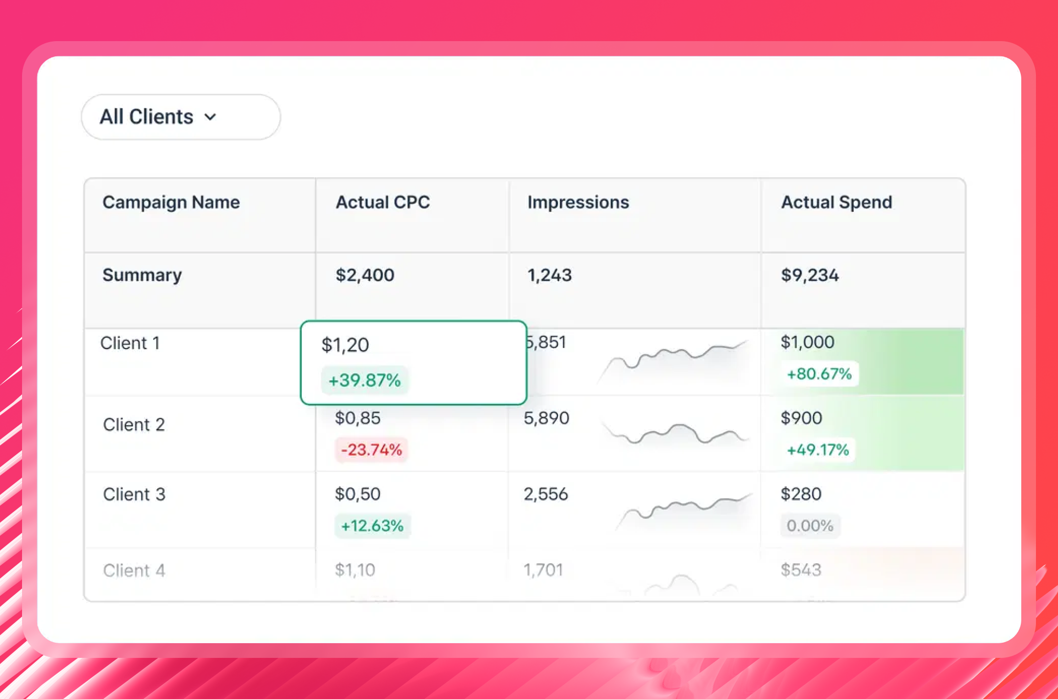
For agency leadership, this is the view that was missing. Instead of opening individual reports to check on accounts, or waiting for account managers to flag something, you can see the whole portfolio, spot what's off-track, and act before it becomes a client conversation.
Goals and alerts sit on top of it. Set a performance target for a client, and Whatagraph notifies you via Slack or email when something goes off-track mid-month - not at the end of it when there's nothing left to do.
5. Query: ask questions about your data via MCP
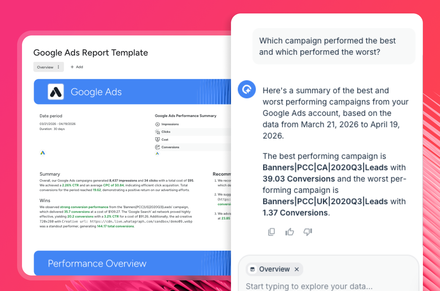
Whatagraph connects to Claude, ChatGPT, and any MCP-compatible AI tool via Whatagraph MCP. Ask your AI assistant: "Which clients are pacing behind on spend this month?" or "Show me a channel comparison across Google Ads, Meta, and LinkedIn for the last 30 days" - and it answers from your actual Whatagraph data.
Funnel also launched an MCP server in May 2026, and it similarly sits on a governed data layer. The practical difference: Funnel's MCP outputs to your AI tool and stays there. Whatagraph's MCP queries the same foundation your client reports run on - so insights can move from AI chat to client-ready deliverable in the same platform, without switching tools or rebuilding context. Setup takes five minutes, no code required.
6. Share: send reports everywhere your team and clients need it
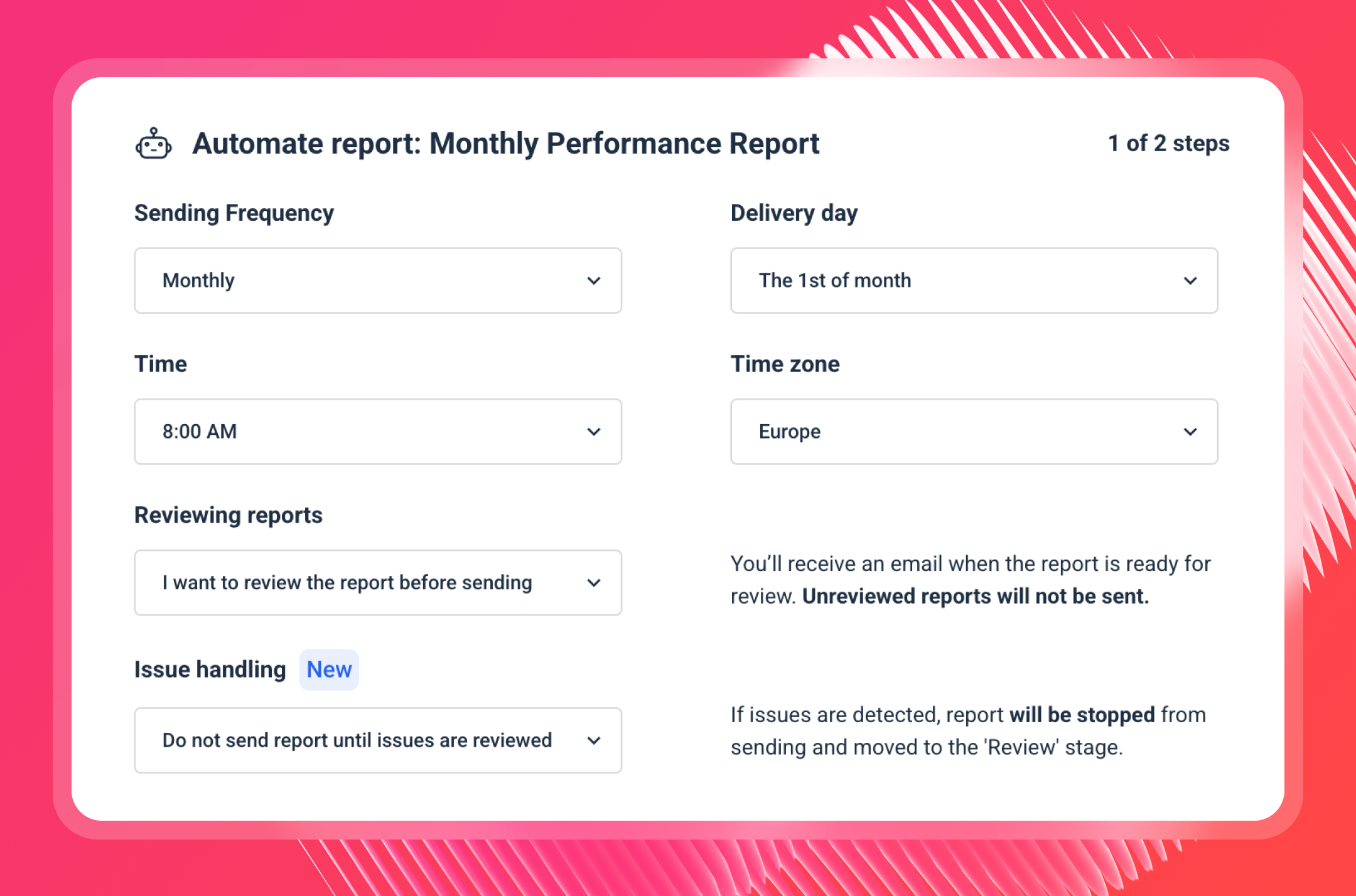
Once you're done with reports, you can share them as white-labeled live links with a custom domain, set a password, and choose to enable IQ Chat for clients.
IQ Chat lets you and your clients (if enabled) ask questions about your data and performance and get back accurate, fast answers. It's like having Claude built into your reporting system.
You can also set up automated reports where they go out to specific emails on specific days, times, and cadences. Don't worry you'll still have the option to review the reports before they're sent to clients.
Get started with Whatagraph for free.
Key Features
- 60+ stable native integrations across paid ads, social, SEO, email, and more
- Custom integrations via API, Google Sheets, or BigQuery
- Whatagraph IQ – AI-powered reporting tools
- Whatagraph MCP connector to Claude, ChatGPT and other AI tools
- Versatile drag-and-drop widgets for reports and dashboards
- Custom metrics, dimensions, and data blends
- Performance monitoring overview
- Library of pre-made dashboard and report templates
- Insights – automatic audits of connected data, anomaly detection, and recommendations
- Spaces – organize reports with descriptions, colors, and better team alignment
- Custom branding and white labeling
- Automated report sharing via email or live dashboard links
- Exports: PDF, Excel, CSV, or transfer directly to BigQuery/Looker Studio
Whatagraph Reviews from Real Users
“To me, Whatagraph is like the Tesla or Mercedes of digital analytics tools, their clean and simple way to present complex marketing data. I highly recommend it to anyone working with marketing analytics who values efficiency and clarity in their reporting.” (Source)
“Whatagraph has a simple user interface that is easy to navigate even for those who don't have analytical skills.” (Source)
“What I like best about Whatagraph is having the ability to create reports fast and easy. No more spreadsheets to do reports, they have a great variety of templates.” (Source)
Pros and Cons
Pros:
- All-in-one marketing performance monitoring and reporting solution
- Easy to use by anyone on your team
- Fast campaign performance and insights
- Stunning visual reports
- Makes results easy to interpret
- Excellent live chat customer support
Cons:
- Only one data warehouse destination available
- Some large enterprises may find the integration list limiting, but we’re always adding new ones!
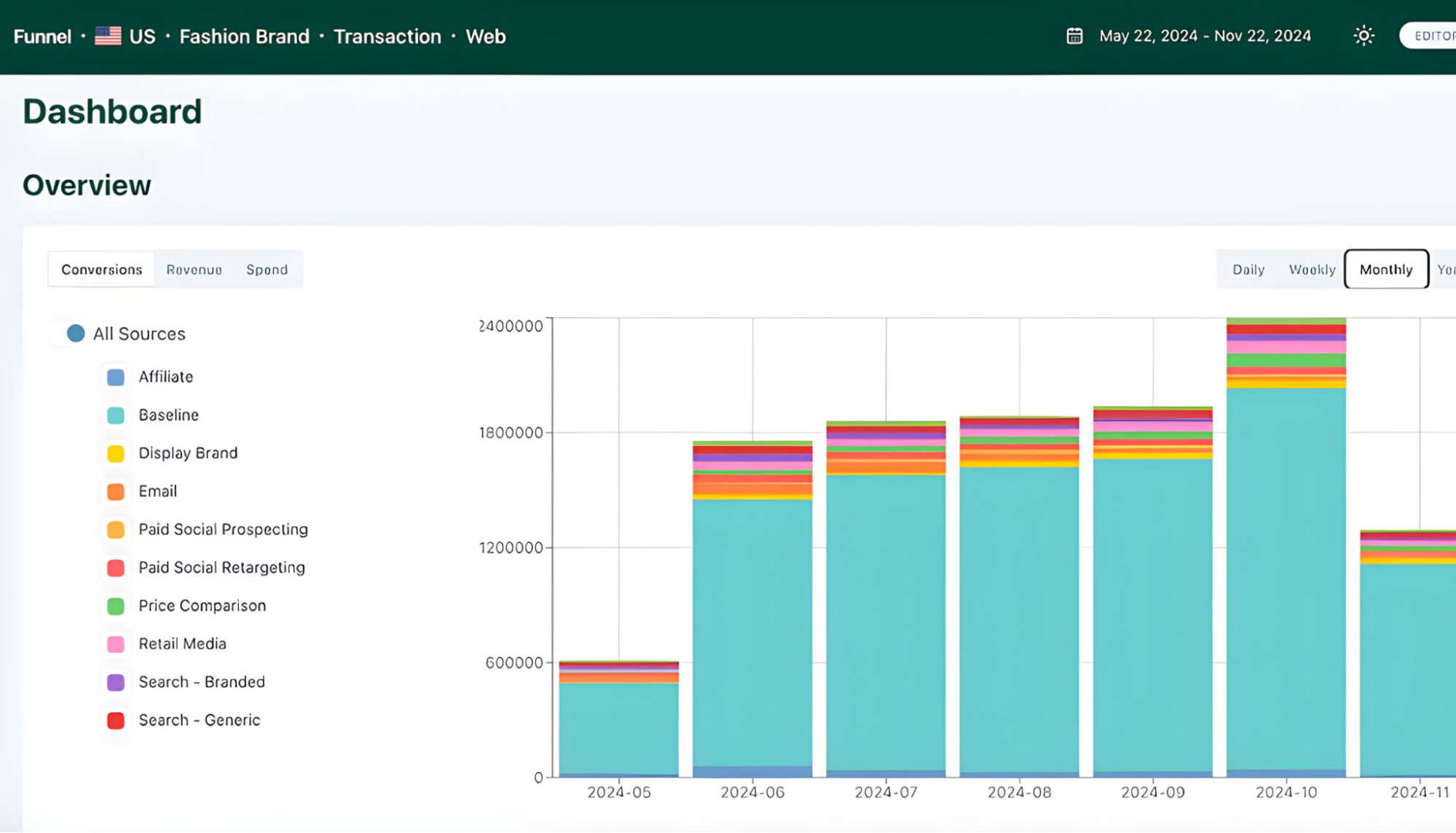
2. Databox
Most suitable for: In-house marketing and ops teams that want a centralized KPI dashboard with AI-powered analysis across 130+ tools.
Databox is a data reporting and analytics platform for growing businesses. You can integrate with 130+ software tools, and bring in custom data through Google Sheets, Excel, or direct database connections.
I thought it was very cool that once you log in to Databox, you’ll see an overview of your key metrics and AI performance summaries:
Databox also sends alerts through Slack, email, or in-app notifications when performance trends up or down on your tracked metrics. On Geckoboard, metric-based notifications are only available on the Pro plan.
But things get complicated when you start to build. You'll need to manually configure three separate components:
- Metrics: Individual metric widgets
- Databoards: Live data dashboards, mostly for internal teams
- Reports: PowerPoint slide-style reports, mostly for clients or C-Suite
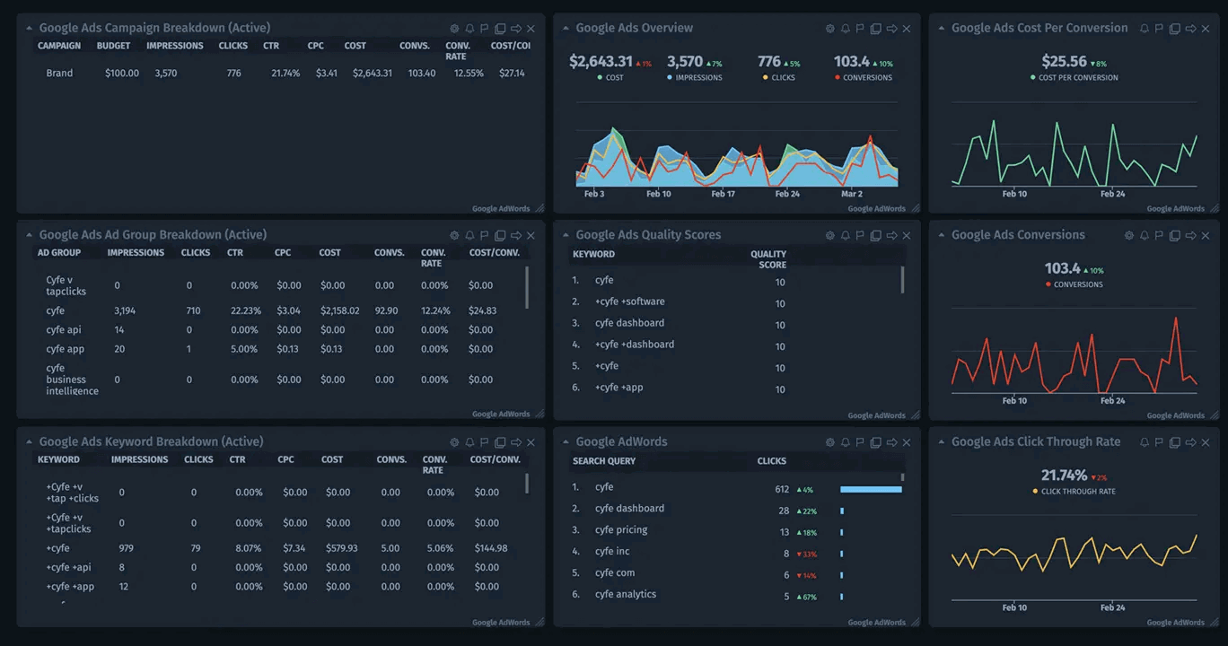
For instance, within a Databoard, you’ll need to manually customize each widget, e.g. a line chart.
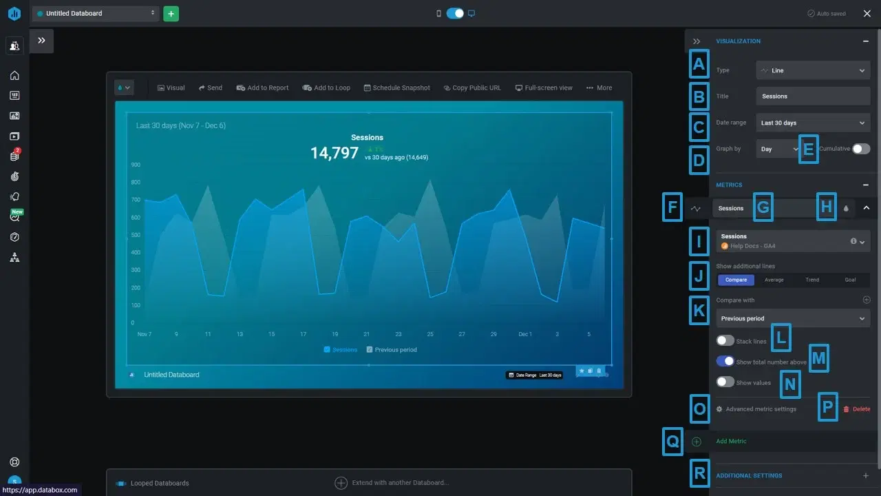
Within a Databoard, each widget requires its own manual configuration.
And if you want client-facing reports, you'll need to build a separate slide presentation and configure the design from scratch all over again. Databox's reports are also not linked, which means edits have to be made one by one rather than in batches.
One feature that historically set Databox apart was Benchmark Groups: invite-only groups where users could anonymously compare performance metrics against similar companies.
However, Databox has confirmed that both Benchmarks and Benchmark Groups will be deprecated on April 6, 2026, after which the functionality will be removed entirely from the platform. Databox is replacing it with their AI-powered Genie Analyst and a new Datasets infrastructure.
Key features:
- 130+ integrations
- Genie AI Analyst for conversational, plain-language Q&A
- Native visualization dashboards and reports
- A datasets infrastructure for merging and drilling into raw data
- Slack, email, or in-app alerts
- Goals and forecasting
Databox Reviews from Real Users
"The dashboard is great for monitoring all clients, and it alerts us when connections break, allowing us to manage multiple connection issues all in one view and ensure all reporting issues are addressed at the same time." (Source)
"While it has the major business integrations and connections, it needs more connections to work in certain industries." (Source)
"The AI summary feature is particularly impressive." (Source)
Databox Pricing
Databox sunset its Free Plan on July 1, 2025. Pricing is based on the number of data sources, with unlimited users across all plans. Extra data sources beyond what's included cost approximately $5.60/month each on annual billing.
- Starter at $79/month (billed annually, agency accounts only): Hourly sync, client accounts, unlimited users, unlimited custom metrics, dashboards, and scheduled sharing. Designed for small agencies needing client-ready dashboards.
- Professional at $159/month (billed annually): 3 data sources included, unlimited dashboards, unlimited users, hourly sync, automated reports, and goal tracking.
- Growth at $399/month (billed annually): Everything in Professional, plus Datasets and Merged Datasets, AI performance summaries, anomaly detection, row-level data drilldown, and database/warehouse connections.
- Premium at $799/month (billed annually): Everything in Growth, plus 100 data sources included, forecast modeling, OKRs, a dedicated reporting specialist, priority support, and advanced security management.
3. Klipfolio
Most suitable for: SMBs and growing companies that need both a dashboard tool and a centralized metric layer for internal data teams.
Klipfolio is a data analytics and business intelligence platform that ships as two distinct products:
- PowerMetrics: A metric-centric analytics platform built for data teams at SMBs. Non-data teams can use these certified metrics for their own dashboards without ever touching the underlying data.
- Klips: A traditional dashboard and reporting product that connects to hundreds of cloud applications, plus SQL databases, spreadsheets, and a REST/URL connector for custom integrations.
Klipfolio’s key advantage over Geckoboard lies in PowerMetrics. With it, you can not only connect all your data sources, but also:
- Create a curated metric catalog for other business teams with access control and governance features
- Enable self-serve analysis and AI insights
- Store data in one place—either in your data warehouse, semantic layer, or in PowerMetrics itself
- Share transformed and unified metrics with anyone in the organization
All this is designed to speed up decision-making and reduce ad hoc requests to data teams—if you have a dedicated data team in the first place.
Again, as we mentioned earlier, Geckoboard doesn’t come with this kind of granular data organization features.
PowerMetrics also rolled out an MCP Server in beta, connecting Claude or ChatGPT directly to the governed metric catalog rather than raw connector data, closer to a true governed approach than most competitors on this list.
Getting started with Klipfolio was easy. I created a Trial account and got access to my first dashboard.
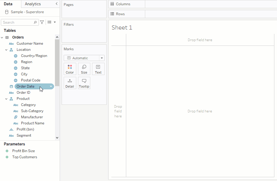
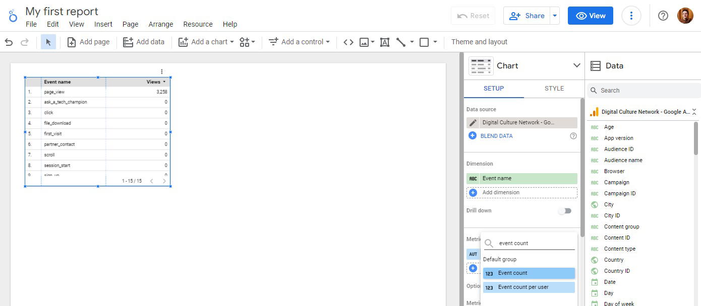
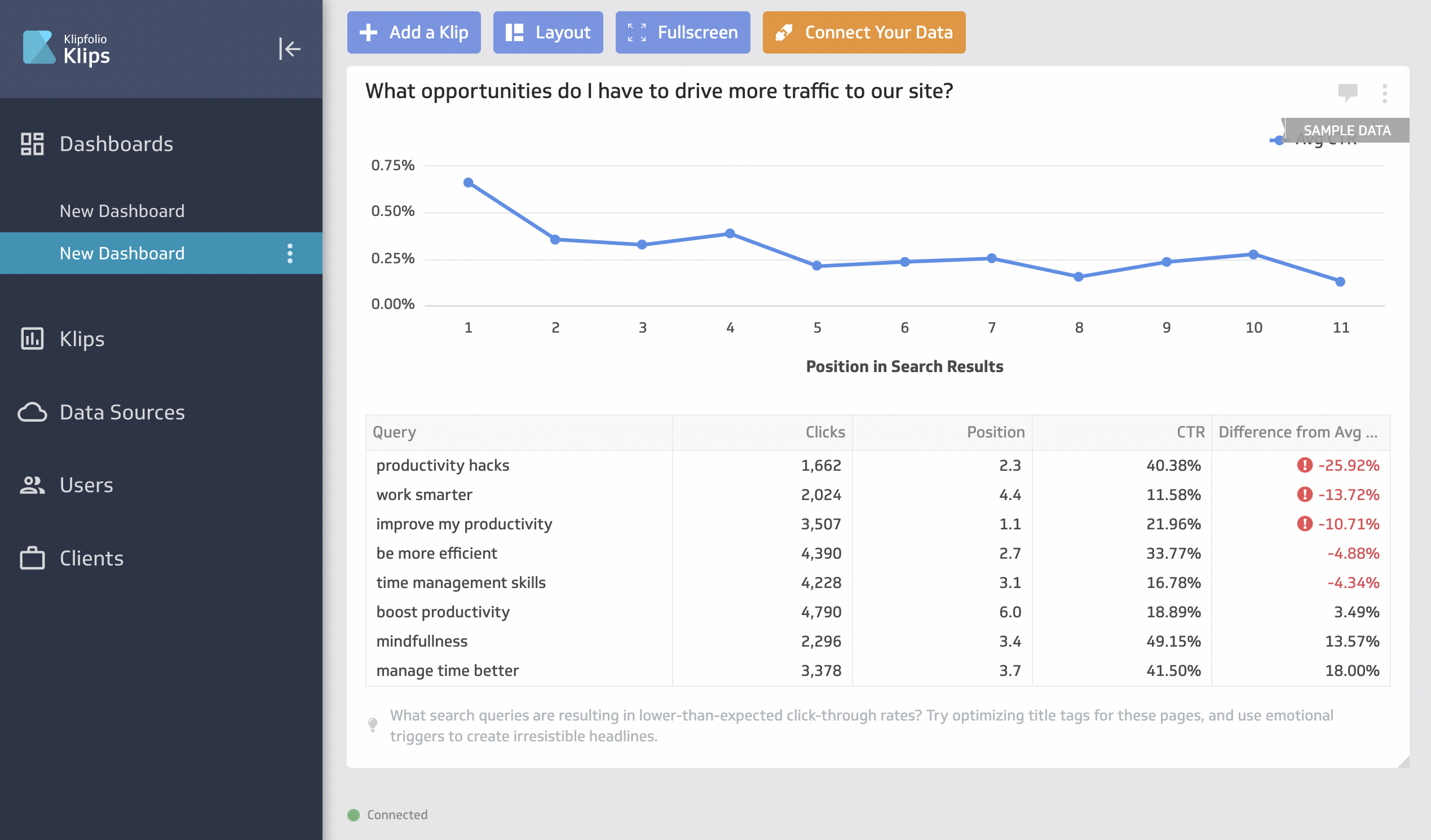 But this is where things got complicated. To visualize your data, you’ll first need to create a “Klip”, which is in a different tab from the dashboard.
There are some pre-made Klips like the below screenshot, but for the most part, you’ll need to build a custom one.
 The interface to create a custom Klip can be confusing and clunky (although there is an interactive tour), and it can take you anywhere from 5 to 30 minutes to build one depending on how complex you want it to be.
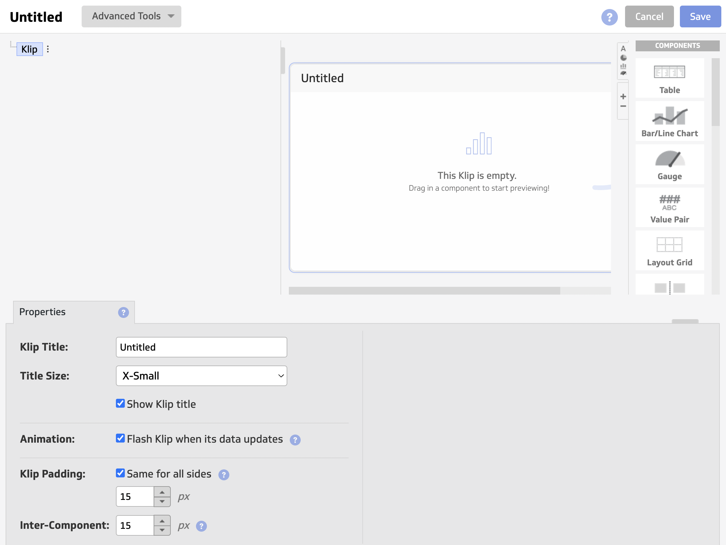 Once you’re done, then you can add this custom Klip onto your dashboard.
On Whatagraph, you can create custom widgets natively within your dashboard in seconds. You don’t need to go back and forth from one tab to another—you can simply drag and drop the widgets onto your dashboard.
Key Features
- 130+ integrations, including warehouses, SQL databases, and file-sharing services
- PowerMetrics governed metric catalog
- PowerMetrics MCP Server (Beta)
- AI Insights with goal tracking and anomaly detection
- Custom metrics, dimensions, and data blending
- Scheduled reports with PDF and CSV export
Klipfolio Reviews from Real Users
"It was not very user-friendly, considering you need to code just to create widgets and visualizations." (Source)
"Seeing all of the pertinent data at a glance is really helpful." (Source)
"If something breaks or you need help, the support, docs, and community jump in fast, basically you almost never feel stuck." (Source)
Pricing
- Base ($120/month, billed annually): 3 dashboards, 130+ integrations, 4-hour data refresh, unlimited users
- Grow ($190/month): 10 dashboards, 1-hour refresh, PDF, and scheduled reports
- Team ($310/month): 20 dashboards, 15-minute refresh, SSO
- Team+ ($600/month): 40 dashboards, up-to-the-minute refresh, custom onboarding, priority support
The dashboard limits are hard caps; going over means paying for add-ons:
- Extra dashboards: $8/month each
- Warm-up refresh: $39/month
- Near-real-time refresh queue: $139/month
- Custom domain: $69/month
- White-label bundle (branding + custom theme + custom domain): $299/month
4. Grow.com
Most suitable for: Data analysts at medium to large enterprises
Grow is a no-code, self-serve business intelligence platform that combines ETL, data warehousing, and visualization in a single platform.
You can connect to 100+ data sources through native integrations, including CRM platforms, marketing analytics tools, databases, and accounting software. A Custom REST API connector covers anything not in the native library, at no extra cost.
Once connected, you can prepare and cleanse your data using no-code transforms or custom PostgreSQL, covering custom calculations, data blends, and advanced filters. Grow also stores your data automatically on its own platform, so there's no need to ship it to a third-party warehouse.
You can create three types of dashboards:
- Dynamic dashboards: Display data based on who’s logged in.
- Dashboard Blueprints: Pre-built, single data source dashboards
- Custom and sandbox dashboards: For blended data sources and metrics.
A newer addition is natural language data interaction, letting non-technical marketing managers ask questions about their data in plain language and get a narrative explanation back, reducing dependence on a dedicated data team for basic queries.
That said, Grow is built for internal data monitoring rather than external client reporting. The dashboards tend to skew either too granular for clients and C-Suite audiences, or too plain to work as polished deliverables.
Key Features
- 150+ integrations
- Built-in data storage
- No-code and SQL-based data transformations
- Natural language data interaction
- Customizable dashboards
- Real-time data updates
Grow Reviews from Real Users
"I think it's the easiest business intelligence platform to use." (Source)
"This is a very helpful reporting tool, and I really appreciate the scheduled email feature." (Source)
"Our new billing contact rarely gets back to us, and we continue to get new charges. Grow has continued to increase in pricing, but we are seeing less benefit in the platform." (Source)
Grow Pricing
Grow doesn't share pricing publicly; you'll need to contact their team directly for a quote. Based on user reviews on G2 and Capterra, the platform is consistently described as expensive relative to alternatives.
5. Tableau
Most suitable for: Enterprise data teams and analysts at large organizations who need deep, self-serve data exploration
If you're ready to invest in an enterprise-level business intelligence solution, Tableau is a serious step up from Geckoboard, both in capability and cost.
Where Geckoboard displays metrics, Tableau lets you interrogate them. You can perform complex data analysis, uncover trends, and identify optimization opportunities using features like trend lines, forecasting, and clustering.
Despite the depth, it stays accessible through a drag-and-drop interface and visual query builder, so analysts can generate and share insights without writing SQL.
Tableau's AI layer, Tableau Agent, and Tableau Pulse surface patterns and performance signals across your connected data automatically, flagging things you might not think to look for. These features are available on the Tableau+ Bundle, which also includes agentic analytics capabilities through Tableau Next.
For support, Tableau offers an active community forum alongside paid Success Plans that include personalized training, expert guidance, and expedited support.
In terms of pricing, this might be a bit of a jump from Geckoboard—but you’ll also get more powerful data exploration features like advanced calculations, statistical functions, and predictive modeling.
You can perform complex data analysis, uncover trends, and identify opportunities for optimization using features such as trend lines, forecasting, and clustering.
Key Features
- 90+ integrations
- Tableau Pulse with Pace to Goal insight
- Tableau Agent / Concierge (Tableau Next only)
- Custom metrics and dimensions
- Data blending
- Drag-and-drop dashboard interface
Tableau Reviews from Real Users
"I also like its ability to connect with various data sources and quickly prototype analytics without extensive backend work." (Source)
"One of the things I like most about Tableau is how intuitive and visual it makes data analysis." (Source)
"It's a very powerful tool, and works reliably and seamlessly, but sometimes dashboards take a bit long to load, especially when connected to live big datasets." (Source)
Tableau Pricing
Tableau uses per-user, per-month licensing, billed annually, across three role types: Viewer, Explorer, and Creator. Every deployment requires at least one Creator license.
- Tableau (Standard): Viewer $15/user/month, Explorer $42/user/month, Creator $75/user/month
- Enterprise Edition: starts at $35/$70/$115 respectively, adding Data Management, Advanced Management, and eLearning
- Tableau+ Bundle: custom-priced through sales, includes Tableau Agent, Pulse premium features, and agentic analytics through Tableau Next
Total costs scale with team size, so a mid-to-large deployment can run well into four figures per month.
6. Looker Studio (a.k.a. Google Data Studio)
Most suitable for: Freelancers, in-house marketers, and small teams whose data lives almost entirely within Google's ecosystem
Looker Studio is a free reporting and data visualization tool built by Google that connects to Google's own platforms natively and for free, including Google Ads, GA4, Search Console, Display & Video 360, BigQuery, Google Sheets, and more, plus MySQL and PostgreSQL databases.
Beyond Google's own connectors, the connector gallery gives access to 1,000+ datasets through community and partner connectors.
The biggest advantage of Looker Studio over Geckoboard is that its highly customizable. Once your data sources are connected, you can use Looker’s drag-and-drop report editor to add:
- Charts, line bars, pie charts, geo maps, area and bubble graphs, data tables, pivot tables
- Filters and date range controls
- Links and clickable images
- Custom text and images
- Custom styles and color themes
You can then invite teams or clients to view or edit your reports, or send them links in scheduled emails.
The free tier is genuinely free; there's no catch for Google-source data. Looker Studio Pro is the paid enterprise version, adding team workspaces, organizational asset management, and Gemini AI features.
The limitations show up fast when you move beyond Google. To connect non-Google platforms—Meta Ads, LinkedIn, HubSpot, and so on—you'll need a paid third-party connector like Supermetrics or Funnel to pipe the data in first.
Looker Studio reports can be time-consuming and difficult to build. You’ll need to manually customize each widget, graph, chart, and image. For instance, this is what a report “canvas” looks like as you start building one—I don’t know about you, but this immediately overwhelmed me as a non-tech-savvy person.
But again, it’s a solid choice if you just need to visualize your data from a Google-based platform, but I wouldn’t recommend it if you need to connect to other channels.
Google reverted its 2022 rebrand in April 2026, renaming Looker Studio back to Data Studio, so you'll see both names depending on where you look.
 Source: Digital Culture Network
Key Features
- Free native connectors for all major Google platforms
- 1,000+ datasets via the connector gallery
- Gemini conversational analytics (Pro)
- Fully customizable drag-and-drop report editor
- Scheduled email delivery and shareable links
- Pro tier for enterprise teams
Looker Studio Reviews from Real Users
"It's still free, easy to deploy, and works well with Google Sheets, Ads, GA4, and BigQuery." (Source)
"I use it for marketing reporting, and it's difficult but is free and works. Still a good tool." (Source)
"Blending data from different sources is often a headache." (Source)
Looker Studio Pricing
While the platform itself is free, your total bill can climb quickly once you add non-Google data.
- Free: unlimited reports and dashboards, all Google-built connectors included, no charge for creators or viewers
- Pro ($9/user/project/month): organizational asset ownership, Team Workspaces, Gemini AI features, Google Cloud Customer Care support
7. DashThis
Most suitable for: Freelancers and small marketing agencies that need clean, client-ready dashboards without a steep learning curve
DashThis is a straightforward marketing reporting tool that connects to 34+ marketing platforms, including Google Ads, GA4, Facebook Ads, LinkedIn, TikTok, and more. If you need a platform that isn't natively supported, you can import your own data via CSV file or Google Sheets, with automatic refreshes once set up.
To create a dashboard, you can start from scratch or choose from a library of templates. DashThis supports three types of dashboards:
- Periodic dashboards: Based on specific time periods and cadences: daily, weekly, monthly, semi-annually, or annually.
- Campaign dashboards: Isolate and highlight a specific campaign for a custom date range.
- Rolling dashboards: Show metric trends across three different date ranges.
 Every plan includes access to DashThis product specialists, this isn't gated to higher tiers. DashThis also recently launched AI Insights, which analyzes dashboard performance and surfaces wins, issues, and opportunities automatically.
For cross-source data, DashThis has a Merge widget that lets you combine metrics from different sources into a single widget; useful for basic aggregation, though it stops well short of true data blending or the kind of custom formula building you'd get in Whatagraph.
In March 2026, DashThis also changed its pricing model, so plans now reflect both dashboard count and the number of data sources connected, so an agency with 10 clients each running Google Ads, Meta, and GA4 is already connecting 30 sources before adding anything else.
Also, DashThis is built for reporting, not deep data analysis, and there's no advanced dimension-building beyond Calculated Widgets.
Key features:
- 34+ native integrations
- Calculated Widgets for blended, cross-platform metrics
- AI Insights (free tier) and AI Insights Pro add-on
- White-labeling: custom domain, logo removal, color schemes, custom email
- Three dashboard types with automatic data refresh
- Product specialists are included on all plans
DashThis Reviews from Real Users
"I really love how easy it was to set up an online dashboard with our own custom URL on DashThis." (Source)
"We are unable to apply advanced filters by conversion names in Google Ads, and are unable to embed Looker Studio reports, which are at times more advanced in terms of filters." (Source)
"I wish it had MORE integrations with other platforms, e.g., a Jotform form submission counter widget." (Source)
DashThis Pricing
All plans include AI Insights Free. AI Insights Pro is available as an add-on at $19/month.
- Individual ($44/month, billed annually): 3 dashboards, 15 sources, unlimited users, all integrations included
- Professional ($139/month): 10 dashboards, 40 sources, custom domain, custom email
- Business ($279/month): 25 dashboards, 100 sources, dedicated customer success specialist
- Standard ($429/month): 50 dashboards, 200 sources, priority support, 1-on-1 screen-sharing sessions
Note: As of March 30, 2026, DashThis is updating to source-based pricing, meaning plans now reflect both the number of data sources connected and dashboard count.
8. Cyfe
Most suitable for: Boutique SEO agencies and small businesses that need an affordable, all-in-one monitoring dashboard with built-in keyword tracking and embedded analytics
Cyfe is a business dashboard and reporting platform that pulls data from 100+ integrations covering social media, email, SEO, sales, and finance tools. For anything outside the native library, you can bring in custom data via Google Sheets, CSV, SQL, Private URL, or Push API—which also connects to Zapier's 1,500+ app ecosystem.
One cool thing about Cyfe is that they offer a very extensive library of chart widgets, such as multi-chart, cohort, and Gantt, to help make sense of your data.
The platform also comes with “Embedded Analytics,” where you can take an entire dashboard or a widget and embed it into emails, webpages, or applications.
For SEO managers, Cyfe offers a built-in keyword ranking tool that allows you to automatically monitor website rankings across Yahoo, Google, and Bing.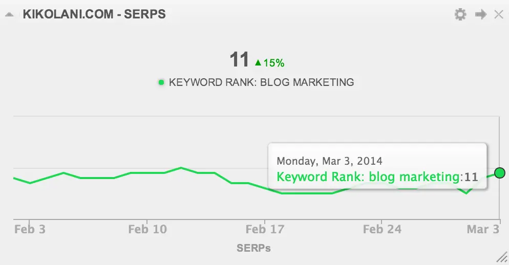
However, the honest truth is, Cyfe is in maintenance mode. There have been no meaningful product updates in 2025 or 2026; its G2 profile is unclaimed, and integrations like X (Twitter) and Recurly have been deprecated without replacement.
It's not a tool to evaluate based on an active roadmap; it's an affordable, functional tool that does what it does, but isn't keeping pace with the market. It also doesn't come with any advanced data calculations or organization features, nor can you transfer data to warehouses or other destinations.
Key features:
- 100+ integrations
- Custom data via CSV, Google Sheets, SQL, and Push API
- Embedded analytics
- Built-in SEO keyword ranking tracker
- 15-language support
- White-label options on all paid plans
Cyfe Reviews from Real Users
"Its capabilities for visualizing our leads are superb, and it's easy to understand them at a glance." (Source)
"No customer service. Email in and pray for an answer (prayers left unanswered)." (Source)
"They keep deprecating widgets, i.e., Twitter and Recurly, to name just two. Meanwhile, no new integrations appear. They admit this product is low on their priorities." (Source)
Cyfe Pricing
All plans include unlimited history, TV Mode, embedded analytics, custom SSL domain, custom logo and themes, and unlimited data exports.
- Starter ($29/month): 1 user, 2 dashboards
- Standard ($39/month): 2 users, 5 dashboards
- Pro ($65/month): 5 users, 10 dashboards
- Premier ($119/month): unlimited users, 20 dashboards, +$5 per additional dashboard
- Agency ($190+/month): 15 users, 100 dashboards, 10 clients, +$19 per additional client, 100% white-label
9. AgencyAnalytics
Most suitable for: SEO and content marketing agencies that want an all-in-one client reporting platform with built-in rank tracking.
AgencyAnalytics is a close Geckoboard marketing alternative built specifically for agencies. It connects to 85+ data sources, pulling everything into a single client dashboard.
For SEO agencies in particular, the built-in Rank Tracker and Backlink Monitor let you track daily keyword rankings and monitor link profiles without leaving the platform.
AgencyAnalytics simplified its pricing significantly in 2026, moving to a flat $25 per client per month Core plan that now includes everything.
Another 2026 addition called “Views” lets you build cross-channel reporting tables for each client by describing what you want and letting AI build it automatically, though it's worth noting these are built per report rather than defined once and reused everywhere, the way a governed data layer works.
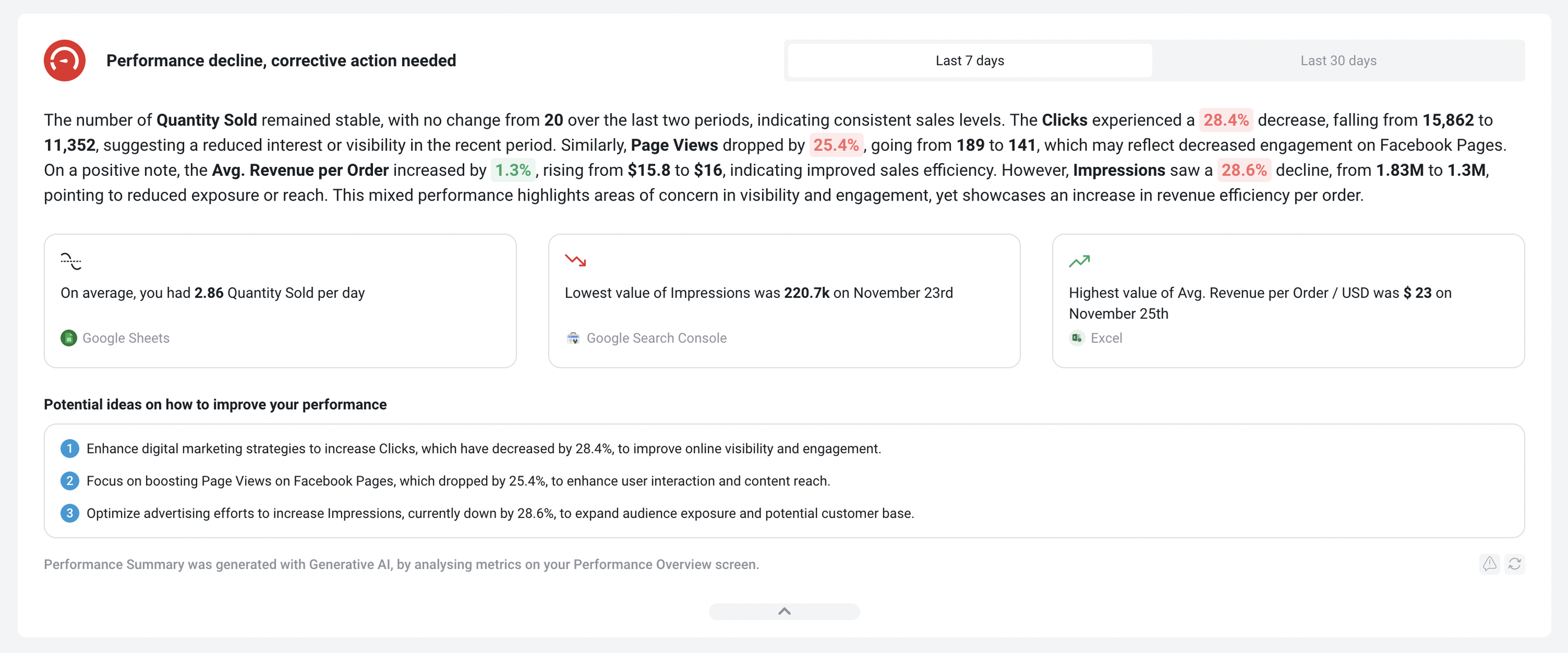
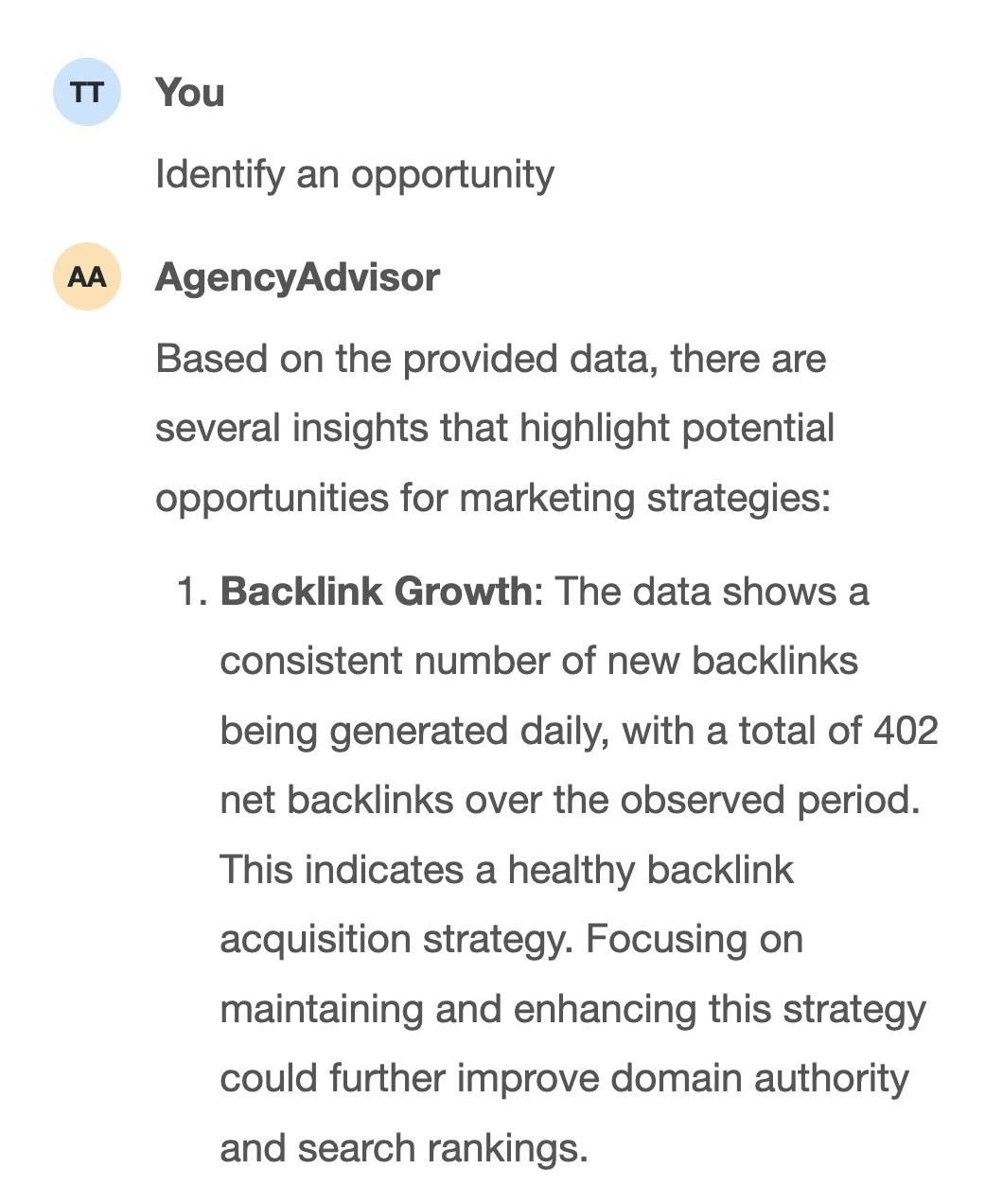
![]() AgencyAnalytics’ key advantage over Geckoboard is their AI insights. You can ask AI to write you performance summaries (although readability is not that great).
AgencyAnalytics’ key advantage over Geckoboard is their AI insights. You can ask AI to write you performance summaries (although readability is not that great).
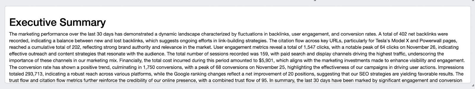
Or you can also ask AI to identify an opportunity, highlight an issue, or celebrate a win.
 However, users say the platform can be unstable with sources disconnecting frequently due to “service bandwidth” issues. AgencyAnalytics also doesn’t come with advanced data calculations, and their dashboards are rigid and limited.
Key features:
- 85+ integrations
- Built-in Rank Tracker and Backlink Monitor
- Views: AI-built cross-channel reporting tables (per report)
- MCP access for Claude and ChatGPT, included on Core
- White-labeling across dashboards, reports, and mobile app
- Client and staff management with granular permissions
AgencyAnalytics Reviews from Real Users
"The integrations across multiple applications are the simplest approach I like." (Source)
"I can't comment much from a pricing or ROI perspective as we use this across the agency, but I can say it isn't the cheapest of all." (Source)
"It feels a bit behind on AI updates." (Source)
AgencyAnalytics Pricing
AgencyAnalytics uses client-based pricing, so your monthly cost scales with the number of clients you're managing.
- Core: $25/client/month (monthly): Includes unlimited data sources, reports, dashboards, and users, AI insights, white-label branding, MCP access, and 85+ integrations
- Rank Tracker add-on: $50/month per 500 keywords (weekly, Google and Bing, mobile and local)
- Database connectors: custom pricing (MySQL, BigQuery, Amazon Redshift)
Read our full guide to AgencyAnalytics pricing.
10. Swydo
Most suitable for: Small PPC and digital marketing agencies that need automated client reporting.
Swydo is an automated monitoring and reporting platform for marketers. Here are three key aspects of the platform:
- Data collection: Integrate with 32+ platforms and combine your data into one comprehensive report. These integrations include popular channels like Google Ads, Facebook Ads, and Google Sheets.
- Reporting: Create reports easily using templates and their library of metrics and pre-set widgets. Or, add your own customized widgets. Share custom reports as PDF, dashboards, or live presentation.
- Monitoring: Monitor client or stakeholders’ KPIs to quickly identify and address issues and opportunities. Sywdo comes with KPI boards, clients KPI overviews, and alert notifications.
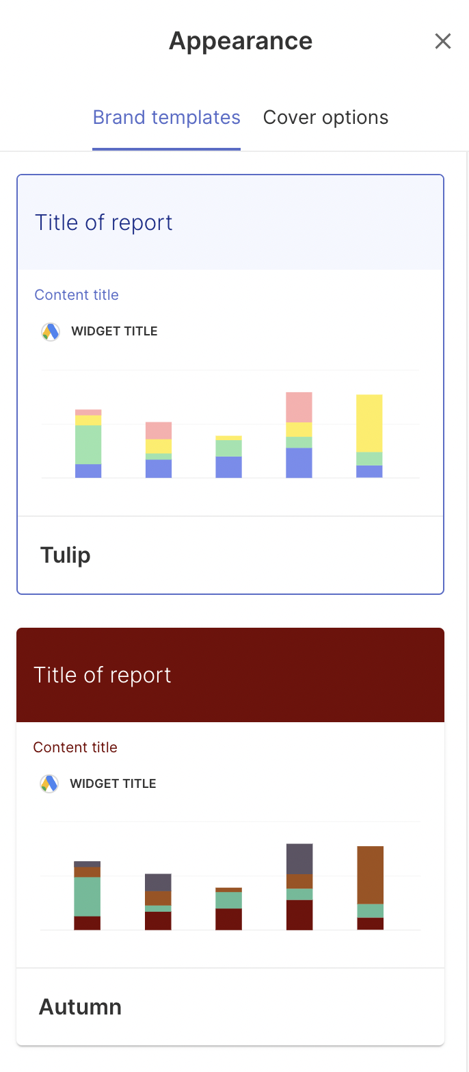
Swydo’s key advantage over Geckoboard is how customizable its dashboards are. For one, you can create “Brand templates” which are custom color schemes for your brand.
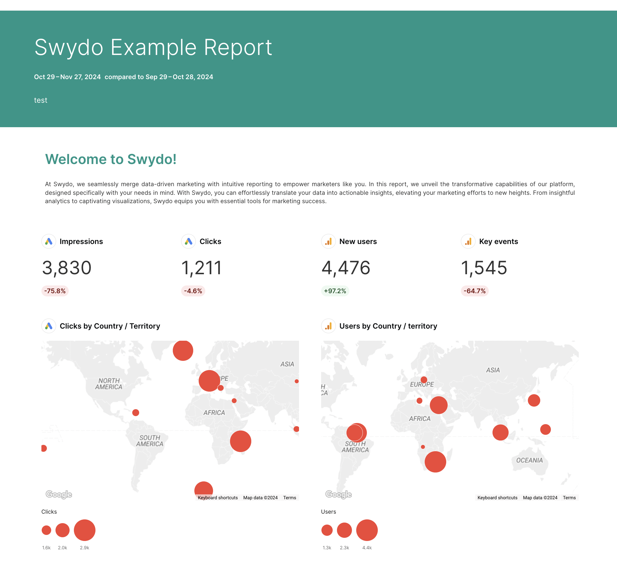
You can also pick and choose what you want to show on the report cover, such as:
- Author
- Client logo and name
- Date range
- Subtitle and title
- Team logo and name
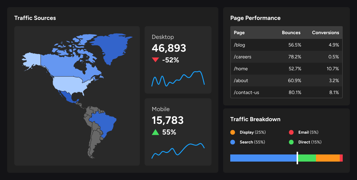
The result is a colorful marketing report like this:
 The next feature I like about Swydo is their Monitoring tab. You can see an overview of key metrics for each client and whether they’re trending up or down. This is similar to Whatagraph’s Overview.
 However, Swydo can also be very limiting. Apart from a basic “Custom metric” builder, you can’t blend data sources or create custom dimensions on Swydo. This can lead to messy reports with inaccurate data and inconsistent dimensions.
Swydo is also purely a reporting tool—you won’t be able to ship your data to data warehouses or business intelligence platforms.
Key Features
- 34+ native integrations
- Combined Data Sources (merge up to 5 ad platforms into one widget)
- Brand templates and custom report covers
- KPI Monitoring dashboard with Slack and email alerts
- Custom metric builder
- Report sharing via PDF, live dashboard, or presentation
Swydo Reviews from Real Users
"I like the ease of combining multiple channels and sources into a structured format with Swydo." (Source)
"Not really a complaint, but it is your responsibility as an agency to be looking towards the next billing cycle and ensuring that you have your connectors and integrations cleansed." (Source)
"It's not set up for complex reports, and their Shopify integration is deprecated even though it's still advertised as a connection on their website." (Source)
Swydo Pricing
Pricing is based on the number of active data sources in your account.
The base plan starts at $69/month and includes 10 data sources, unlimited clients, unlimited users, and all features.
Additional data sources are charged on a sliding scale:
- $4.50 each per month for sources 11-100
- $3.00 each for sources 101-500
- $2.00 each for sources 501+
For example, 100 data sources would run around $474/month.
11. NinjaCat
Most suitable for: Mid-to-large marketing agencies and enterprise brands that need an end-to-end data platform.
 Similar to Whatagraph and Grow, NinjaCat is an end-to-end platform for connecting to your data sources, cleaning the data, visualizing it, and shipping it to destinations.
You can integrate with 150+ pre-built connectors, ranging from CRM, search advertising, web analytics, and project management tools, with governed data piped directly to BI destinations like Tableau, Looker Studio, and Sisense.
Graphic designers are familiar with NinjaCat’s layout, as it looks a lot like a popular design tool - Figma. However, if you’re a marketer without a design background, this can be quite confusing and overwhelming.
 NinjaCat’s biggest 2026 shift is its expanded AI Agents library: chained, autonomous agents that don't just surface insights but execute full workflows.
A typical chain looks like this:
1. An anomaly detection agent spots a 40% CPC spike
2. It alerts the paid media team via Slack,
3. A second agent diagnoses the root cause
4. A third agent generates response options.
NinjaCat also launched a Snowflake Connected App, letting enterprise customers run its entire AI agent platform natively inside their own Snowflake environment using a zero-copy architecture. That's a meaningful differentiator for enterprise teams already standardized on Snowflake who don't want their data leaving that environment.
Key Features
- 150+ native connectors plus AI Connectors and Custom Connectors
- AI Agents library: chained, autonomous workflows
- Snowflake Connected App (zero-copy architecture)
- No-code and chat-driven ETL and data transformation
- Data export to BigQuery, Databricks, Redshift, and Amazon S3
- White-label reporting and white-glove setup
NinjaCat Reviews from Real Users
"It is an all-in-one solution for analytics, KPI monitoring, reporting, and call tracking." (Source)
"Making it easier to connect with various apps and configure the AI agent would help increase adoption." (Source)
"The technology is sophisticated and can do a lot. Because of that, things can break down from time to time." (Source)
Pricing
NinjaCat doesn't publish pricing publicly.
Market data indicates enterprise contracts typically start around $1,500/month, scaled to data sources, reporting volume, and AI Agent seats.
12. Funnel.io
Most suitable for: Enterprise marketing teams and large agencies with dedicated data or analytics functions who need a solid data pipeline
Funnel is a marketing intelligence and data pipeline platform that pulls data from your sources, transforms and harmonizes it, and ships it to wherever your team needs it
Funnel offers 600+ data connectors covering major marketing platforms, CRM systems, and analytics tools, including HubSpot, Salesforce, DV360, and more. If a connector doesn't exist, you can import data via Google Sheets or request a custom build from the Funnel team.
A full navigation redesign rolled out in early 2026, splitting the platform into two distinct modes:
1. A data hub for all ingestion tools
2. A report hub for all visualization tools, reinforcing Funnel's positioning as an ETL-first platform rather than a reporting one.
Funnel does offer basic visualization dashboards and a Data Chat AI conversational interface, but the company is transparent that these aren't the core product.
The real differentiator is Marketing Measurement, an attribution and media mix tool that uses AI to recommend where to increase or decrease spend based on marginal CPA and ROAS, with what-if scenario modeling to test budget changes before committing.
Funnel removed its free plan entirely in December 2025, with no like-for-like replacement, so there's no way to evaluate the platform without booking a demo first.
The platform is genuinely powerful but not easy; it's built for teams with analytical capability, not marketers who need something up and running in an afternoon.
Key features:
- 600+ data connectors
- Data hub and Report hub navigation split (2026)
- No-code data transformation, custom dimensions, metrics, and currency conversions
- Data Explorer for analysts
- Basic visualization dashboards and AI Data Chat (beta)
- Marketing Measurement with AI-powered spend recommendations and what-if modeling
Funnel Reviews from Real Users
"There are numerous connectors available, such as Amazon, Apple, Meta, Google Ads, Analytics, and Search Console, truly more options than I expected." (Source)
"There is a bit of a learning curve when you first start configuring data sources and field mappings, especially if you have a complex setup." (Source)
"Some visuals and data transformations could be improved, but I understand there's a roadmap for more visual functionality in the future." (Source)
Pricing
Funnel uses a two-component pricing model: plan tier plus flexpoints, which measure usage capacity across connectors, platform accounts, dashboards, and destinations.
The headline prices below are starting points only, since every connector, account, dashboard, and destination consumes Flexpoints credits, and agencies with 10+ connectors are routinely pushed toward the next tier.
- Starter (from $200/month): 121 connectors, 5 users, 1 workspace, Funnel Dashboards and Looker Studio reporting, Google Sheets export, daily sync, no warehouse exports
- Business (from $800/month): 579 connectors, unlimited users and workspaces, full reporting suite including Power BI and Tableau, data warehouse exports
- Enterprise (custom pricing): 590 connectors, Snowflake export, enterprise SSO, audit log, EU data center option
We break down when and if the platform is worth the investment in our honest Funnel.io review.
13. Supermetrics
Most suitable for: Enterprise marketing and analytics teams that need a scalable data pipeline to move, normalize, and transform marketing data into their existing BI infrastructure.
Supermetrics is a marketing intelligence platform that pulls data from 100+ platforms and moves it to data warehouses, BI tools, and spreadsheets.
On the data quality side, Supermetrics handles automated normalization, custom fields, data blending templates, and enrichment rules to keep your data consistent across sources. A Connector Builder, currently available as an add-on, lets technically proficient teams create custom integrations using a low-code JSON configuration.
Supermetrics now offers its own native dashboards with cross-source data blending in single widgets and widget-level filtering, plus an Insights Agent. The agent helps to turn fragmented marketing data into plain-language analysis, positioning Supermetrics AI closer to an explainer layer than a raw data puller.
MCP server is also now available, enabling AI tools like ChatGPT and Claude to query your live marketing data directly.
But Supermetrics is still primarily built for data and technical teams. Data mapping, transformation, and connector configuration require comfort with technical concepts. For marketers who want to blend and organize data without technical support, the workflow is steeper than most alternatives on this list.
Key features:
- 100+ data source connectors
- Supermetrics AI: Insights Agent for plain-language analysis
- Native dashboards with cross-source blending
- MCP server for AI tool integration (ChatGPT, Claude, Gemini)
- TikTok Shop connector (added January 2026)
- Data Activation for pushing insights to ad platforms
Supermetrics Reviews from Real Users
"One thing I didn't like was that authentication often has to be done multiple times, which can interrupt workflows and slow down automation." (Source)
"The cost for Supermetrics keeps increasing, and some individuals or firms can't afford the app." (Source)
"I consider Supermetrics a premium tool with the functionality and connectors needed for a company doing substantial business." (Source)
Supermetrics Pricing
Additional users, data sources, and accounts can be purchased as add-ons on any plan. Exact add-on pricing is available on request.
- Starter ($44/month, billed annually): 1 core destination, 3 data sources, 1 user, 3 accounts per data source, weekly refresh (Google Sheets only), MCP access (limited)
- Growth ($177/month): 2 users, 6 data sources, 7 accounts per data source, daily refresh
- Enterprise (custom pricing): 1+ destinations including data warehouses, custom users and data sources, on-demand refresh, full data transformations, dedicated Customer Success Manager
Read more about Supermetrics pricing, and find out what you’re truly paying for.
Which Geckoboard alternative is best for you?
Depending on your team size and use case, the right alternative will look different. Here's a quick breakdown:
✅ If you're a mid-size marketing agency managing multiple clients and channels - and you need custom metrics, white-labeled reports, and AI that works with your actual data - choose Whatagraph. One governed data foundation covers your connectors, client reports, Performance Overviews, BigQuery export, and AI queries, without rebuilding context every time you switch tools.
✅ If you're a small agency or freelancer that needs clean, client-ready dashboards without a steep learning curve, choose DashThis, AgencyAnalytics, or Swydo. AgencyAnalytics is the best pick if rank tracking is core to your work. DashThis and Swydo are the fastest paths from data to a polished client report.
✅ If you're an in-house team that needs a centralized KPI dashboard across sales, marketing, and ops, choose Databox or Klipfolio. Databox is easier to get started with. Klipfolio's PowerMetrics is the better fit if you have a data team and want a governed metric catalog for self-serve analytics.
✅ If you're a freelancer or small in-house team that lives in Google's ecosystem, choose Data Studio. It's free, flexible, and genuinely good - until you need to connect anything outside of Google.
✅ If you're an enterprise data team that needs deep exploration, statistical modeling, or a serious data pipeline, choose Tableau, Funnel.io, or Supermetrics. Tableau is best for analysts who need to interrogate data. Funnel and Supermetrics are the right fit if moving and normalizing data into a BI infrastructure is the primary goal.
Published on Nov 29 2024
WRITTEN BY
YamonYamon is a Senior Content Marketing Manager at Whatagraph. With an eye for detail and a knack for always considering context, audience, and business goals to guide the narrative, she's on a mission to create genuinely helpful content for marketers. When she’s not working, she’s hiking, meditating, or practicing yoga.