Top 9 Google Analytics Reports for Agencies
Google Analytics provides its users with excellent pre-configured reports, allowing them to make more informed, creative, and unique decisions. However, simplicity and clear data visualization are the top priorities when creating client reports. Pure Google Analytics reports are overly technical, making it easy for clients to get lost in the numbers. This article will provide the only alternative to Google Analytics reporting, and the top 7 Google Analytics reports for marketers and agencies.

Feb 25 2021●10 min read


- What Is a Google Analytics (GA) Report?
- Why Should Marketers Use Google Analytics Reports?
- Here are Our Top 9 GA Reports:
- 1. Browser Report
- 2. Efficiency Analysis Report
- 3. Customer Behavior Report
- 4. Site Speed Report
- 5. Keyword Performance report
- 6. Content Efficiency Report
- 7. Social Media Report
- 8. User Acquisition Report
- 9. Mobile Performance Report
- Use Whatagraph to Create Google Analytics Reports
- Final Thoughts
Creating Google Analytics 4 reports directly within Google Data Studio is fantastic. However, there is always something more efficient and productive in the market. Here are the top 7 Google Analytics reports from which your clients will benefit the most
But first…
What Is a Google Analytics (GA) Report?
A Google Analytics report is a summary of website data that shows how visitors interact with your site. It tracks metrics like page views, traffic sources, and user behavior. This helps you understand your audience so you can improve the site performance and your marketing efforts.
If you connect your Google Analytics 4 with Whatagraph, you can monitor all marketing campaigns and get accurate data in a single report or real-time dashboard.
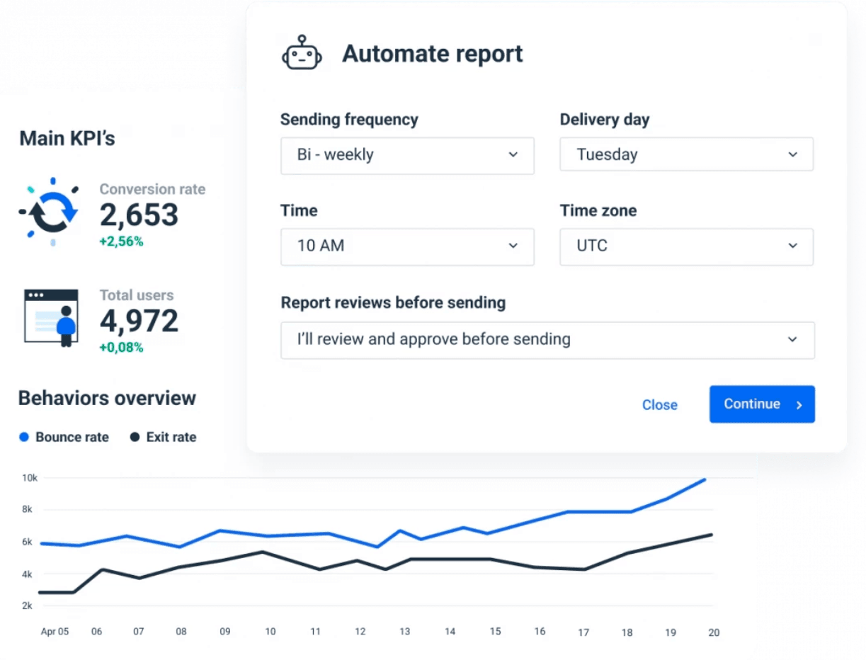
Our Google Analytics reports are customizable and automated.
This means that you can include and examine data that you want to see without any irrelevant distractions; and Select the needed frequency and time period you want to report and send that perfect customized report to your clients;
It’s the most accurate way of tracking important GA metrics. Here is a short list of the digital marketing metrics you can monitor with Whatagraph:
- Impressions;
- Clicks;
- Goal completion;
- Sessions;
- Users;
- CPC;
- Conversion;
- Engagement rate
- And many others.
Why Should Marketers Use Google Analytics Reports?
Google Analytics reports have valuable information about your client’s customer behavior habits and monitor your marketing strategy’s performance. Also, GA reports present to your clients how their investments are paying off. Because of that GA report is an important tool to have.
If you want to find out which content and keywords generate the most traffic, or if you want to find out which products sell the best or which Google Ads receive the most clicks, this report will tell you that and more.
The Google Analytics report holds a lot of data and can provide insights into a client’s audience, customer acquisition or real-time behavior report. Analyzing this data allows you to optimize certain campaigns and reallocate money where needed.
You can also create a report with all these KPIs and send it to your clients. Whatagraph’s clients, for example, do it more efficiently and easily - they automate client reports.
You can too. All you need to do is create a Whatagraph account.
Here are Our Top 9 GA Reports:
1. Browser Report
The browser report provides insightful information about your client's customer profile. This report focuses on the search engine users and the devices they choose to land on your client's website. Browser reports are essentially useful data showing conversion by browser and divide such reports by device, like desktop, mobile, tablet, and so on.
When to create a browser report for your client?
If your client runs an eCommerce business, sells products on the website, or provides a digital service, you should be delivering them browser reports.
Benefits
Clients and marketing agencies can benefit from knowing which devices people use to access their websites. Browser reports analyze website usage and provide valuable data that can be used to prioritize marketing efforts.
In addition, when comparing devices, consider mobile usage. If many people use their phones, make your website mobile-friendly. Mobile is now so significant that Google penalizes sites on the internet that are not mobile-friendly.
With Whatagraph, anyone can easily create this report. An easy-to-use comparison feature will not only assist in determining which devices and browsers to optimize but will also allow comparison of their performance. Here are some of the metrics you should be monitoring and delivering for your client:
- Devices;
- Source/medium;
- Revenue;
- Unique purchases;
- Conversions by device;
- Conversions by the browser.
2. Efficiency Analysis Report
Efficiency Analysis Report report is excellent for organizing significant metrics, revealing each traffic conversion funnel performance efficiency for your website for a certain date range.
Benefits
This report provides a more detailed picture of the overall marketing funnel. It enables the improvement of lead tracking methods by providing accurate data of:
- The number of unique users;
- Total sessions;
- Attribution;
- The average goal conversion rate;
- Goal value per person;
- A number of new users.
3. Customer Behavior Report
Customer behavior refers to purchasing habits, patterns, and trends. This report, however, does not center on a shopper. Rather, it evaluates how they act on your website/in your store.
Why should you create customer behavior reports?
- Customer behavior analysis will provide you with valuable data for content personalization and optimization;
- It will also provide data needed to predict a customer's overall value;
- And, finally, it will provide you with an overview of all your customers. Marketers use these overviews to identify good and bad user experiences to reduce customer churn.
Client behavior reports offer unique insight into customer demographics and engagement statistics. To access these insights, you need to track certain important metrics:
- Web traffic;
- Media channels;
- Customer acquisitions costs;
- Referral rate;
- Engagement (likes, shares, comments);
- Customer lifetime value (how much a client spends with you over the course of them being a customer);
- Customer retention (how many customers return to purchase something more);
- Average order value (how much customers spend per order on average);
- Sales (how many sales you've generated).
4. Site Speed Report
The Site speed report reveals web pages with issues requiring urgent attention. It also lets to investigate how fast the websites are loading in the visitor's browser.
Benefits of a site speed report
Helps users to identify:
- Long-loading pages;
- Pages with high bounce rates;
- Pages that need UX experience improvement.
Essentials of site speed report
To fully benefit from the fruits of this report, marketers first need to analyze their client's page URL. Use Google's tool to test their site. It will provide information on which pages are loading quickly and slowly. More so, marketers will find out which landing pages have a poor loading speed.
Furthermore, the page report will provide information on different devices and any problems that occur on any of them. Sometimes, different mobile operating systems have different loading speeds.
Lastly, consider browsers. This report will show you which browsers cause slow loading times and which ones need extra optimization.
Consider these metrics:
- Single session duration;
- Page load time;
- Average server response time. The time it takes for the server to react, including the time it takes for the response to reach the user's browser;
- Average redirection time. The time it takes for a website to redirect from one URL to another.
- Bounce rate.
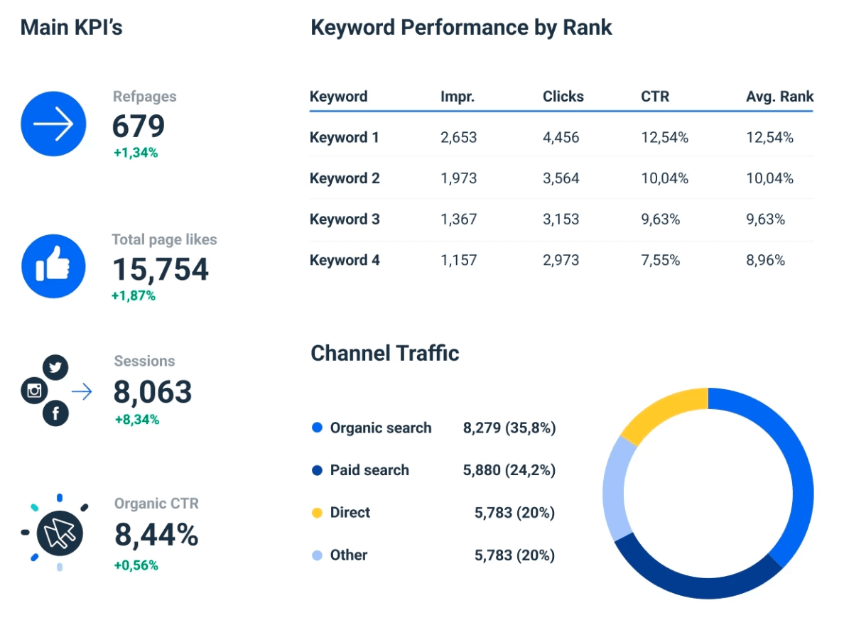
5. Keyword Performance report
The keyword analysis report will show which SEO keywords are bringing in the most leads, traffic, and customers. Connect your client's Google Search Console and Google Analytics accounts with Whatagraph and easily start tracking keyword performance and growth. Monitor engagement metrics and goal completions to improve your client's digital content marketing.
Keyword analysis will answer the most popular client questions:
- What keywords are being targeted?
- Which site content brings in the most traffic?
- Are the right keywords directing readers to the correct pages?
Running an SEO campaign for clients means spending a lot of time discussing keywords and analyzing what works and doesn't. Here are the metrics to help you with your analysis:
- Goal conversion time;
- Goal completions;
- Unique visitors;
- Organic keywords;
- Unique pageviews;
- Organic search;
- Bounce rate.
6. Content Efficiency Report
The content efficiency custom report reveals metrics that help users know their best-performing pages and pages that need attention, such as page optimization. Websites that create loads of content would mainly find this custom report useful.
Technically, as a marketer highlighting google analytics data for your clients, you will find valuable insights and natural answers to critical questions:
- What is my client's most engaging content?
- What kind of content, whether pictures, videos, texts, reviews, demos, etc., do their website visitors value the most?
- What content drives your clients more towards achieving their goals?
- What topic piques the interest of visitors the most?
7. Social Media Report
Google Analytics, powered by Whatagraph, can provide marketing agencies with the most easy-to-understand social media reports. These reports will reveal:
- Which social media marketing channels have the highest number of referral traffic;
- What's the ROI of your social media marketing campaigns;
- Which content receives the most engagement;
- The number of sales conversions you have generated from social media.
This report will clearly show your clients if their investments are paying off whilst also providing enough data to marketing agencies to create a traffic-driving machine.
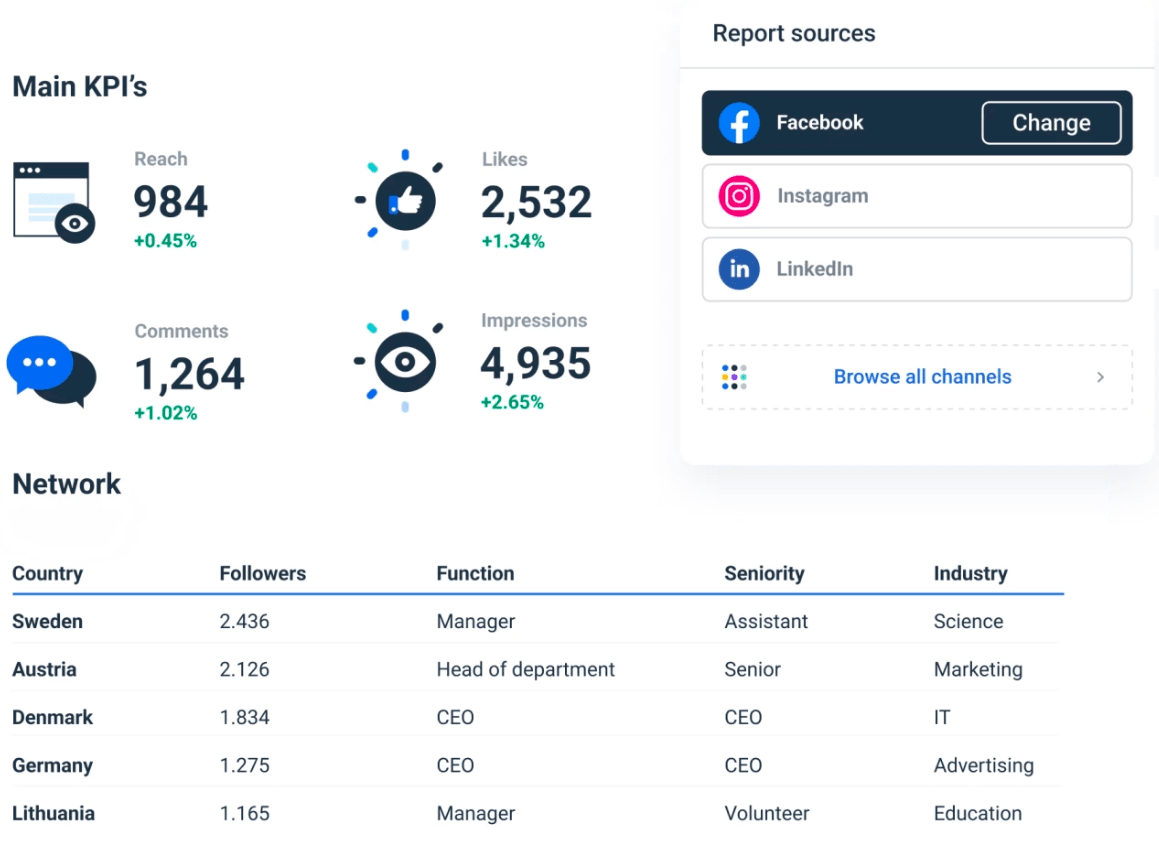
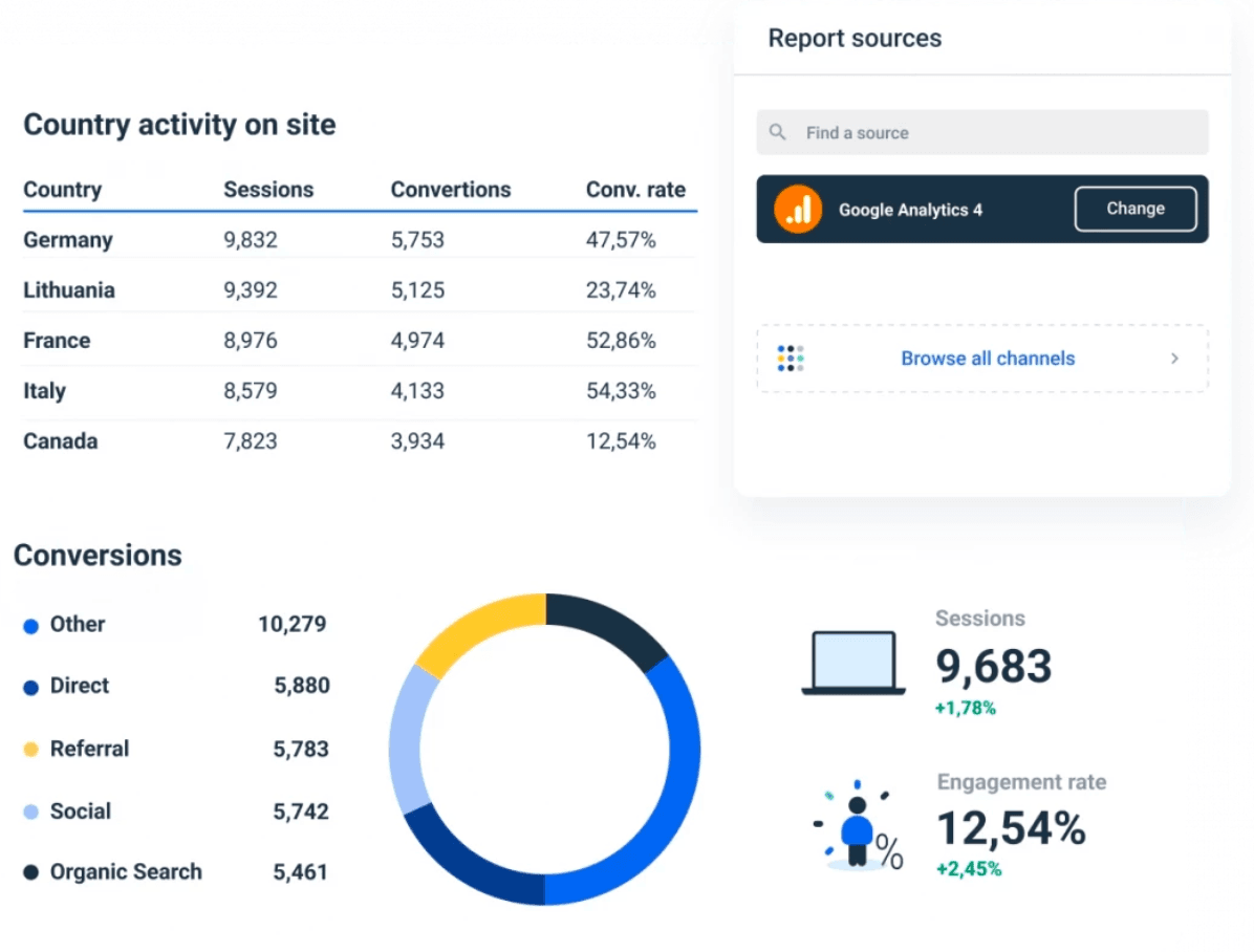
8. User Acquisition Report
The user acquisition report gives marketers data about customer behaviour habits on the client’s site. Specifically:
- The traffic source;
- Landing pages most people land;
- Actions people take within the website;
- Marketing initiatives that generated the most traffic.
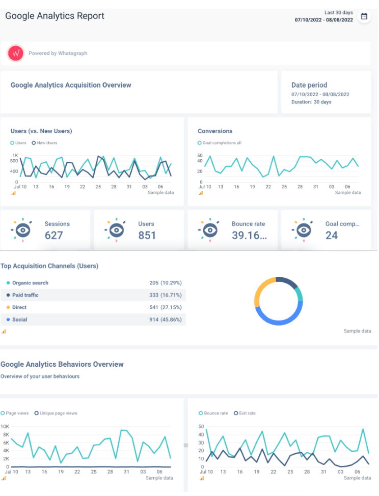
Whatagraph’s acquisition overview looks like this in our marketing reports:
9. Mobile Performance Report
Mobile performance data allows marketing agencies to evaluate and optimize their client’s site performance for mobile. This report is especially useful for those clients who are highly dependent on mobile efficiency that simply need to have greatly optimized mobile performance.
Our performance report tracks:
- Users;
- Sessions;
- Bounce rate;
- Avg session duration, etc.
Use Whatagraph to Create Google Analytics Reports
Undoubtedly, Google offers loads of data. However, we can easily get overwhelmed with too much web analytics data. Thankfully, nowadays, high-quality SaaS marketing solutions allow you to view your client's most important data at a glance. The top-performing tool Whatagraph creates Google Analytics Reports and automatically collects updates:
- Website organic traffic information;
- Audience information;
- User behaviors;
- Number of sessions;
- Conversion insights;
- PPC and Google Ads performance.
Maximize your website's performance with Whatagraph's reporting tool. It helps to collect KPIs in a single location and convert them into actionable insights. It is the go-to reporting tool to create stunning visual standard reports on content quality, website performance, audience data, etc., for your client!
Whatagraph offers some pre-made Google Analytics dashboard templates for marketing agencies. If you need to learn about your current marketing KPIs and efforts and how they perform, there is a dashboard template: Google Analytics Overview. All your performance data and KPIs will be gathered in one place, whether it's website traffic overview audience, acquisition, behavior, and conversions insights.
You can also find the GA4 eCommerce dashboard. This dashboard focuses on device-specific key performance indicators. However, rather than transactional data, it focuses on generating engagement metrics for tablet, desktop, and mobile devices.
It includes the following metrics:
- Engagement by device;
- Visits by device;
- Most active day of the week by the device;
- Most popular landing pages;
- Bounce rate.
Whatagraph also offers GA4 report templates. One of the most popular Google Analytics Acquisition Overview.
The Acquisition report compiles data to assist you in gaining a better understanding of how people find your website or app. Other reports of this kind include Google Analytics Behavior and Audience Overview.
Also, creating Google Analytics reports with Whatagraph helps you overcome many GA4 limits, such as reaching the API quota, which prevents you from fetching more data without upgrading to the paid 360 property.
Final Thoughts
This guide explores the top Google Analytics reports for clients that you can choose from and the best Google Analytics reporting tool to that effect. Nonetheless, the most crucial component of it all is your client. Ensure that you and your customers are constantly on the same page and that they understand where their money is going. These reports are just a proof to them that you are working hard to improve their firm.
If you’re looking for one tool to create amazing Google Analytics reports, try Whatagraph. You’ll save time, automate your reports and impress your clients. Sign up today to get started!
Published on Feb 25 2021
WRITTEN BY
Dominyka VaičiūnaitėDominyka is a copywriter at Whatagraph with a background in product marketing and customer success. Her degree in Mass Communications/Media Studies helps her to use simple words to explain complex ideas. In addition to adding value to our landing pages, you can find her name behind numerous product releases, in-app notifications, and guides in our help center.