6 Best Supermetrics Templates to Grab for Marketers
Looking for ready-made Supermetrics templates to speed up your marketing reporting?
In this guide, we’ll break down how Supermetrics templates work, where to find them, and what to watch out for – with examples across tools like Looker Studio, Google Sheets, Excel, and Power BI.
We’ll also compare them with Whatagraph templates to help you choose the right option for your workflow.

Jun 23 2025●7 min read


What are Supermetrics templates?
Supermetrics templates are pre-built marketing reports that you can use straight away to visualize your marketing data.
Report templates are a great way for you to beat the blank-page syndrome and get inspiration for customized reports that work for you.
As of June 2025, there are 99 Supermetrics marketing report templates in total, categorized by five different destinations:
- Looker Studio (57)
- Google Sheets (37)
- Power BI (3)
- Microsoft Excel (1)
- BigQuery (1)
Each template pulls data from source platforms like Google Ads, Meta, Shopify, or GA4 and visualizes in pre-made charts and widgets.
But…there’s a caveat.
What is the main problem with Supermetrics templates?
The main problem with Supermetrics templates is that you can’t actually create reports inside of Supermetrics.
You’d need to jump through three different hoops for this:
- Use Supermetrics connectors to connect the data from a source platform (e.g. Google Ads)
- Use some kind of spreadsheet or BigQuery to clean and transform the data (or you can also use Supermetrics for this) and send it to a reporting tool
- Use the reporting tool to actually create reports and share them with others
This means your reporting flow would look like this:
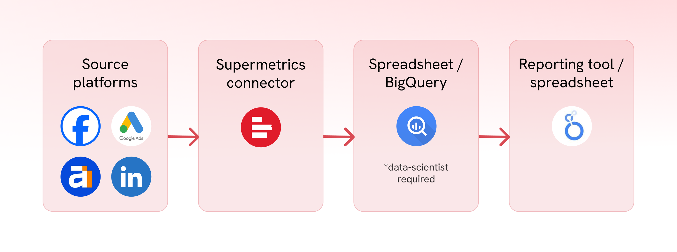
This seems fine in theory – except that Supermetrics connectors are notorious for breaking frequently.
When connectors break, the data from the source platform doesn’t get properly transferred to your end destination – it’ll either be late or inaccurate. And if you’re a marketing agency that relies on the accuracy of the reports to build trust with clients, this can be extremely frustrating.
Here’s an Instagram reel that perfectly captures how it feels like:
In fact, one of our customers at Whatagraph, Tanja Keglić, Performance Marketing Manager at Achtzehn Grad agency, experienced this firsthand.
She was using Supermetrics to bring the data from source platforms to Looker Studio, but the connectors frequently broke, and data sources didn’t load properly. And she had to either waste time manually reconnecting or contacting Support for help. She told us:
It’s such a pain to reconnect a lot of data sources and accounts—and it takes so much time, which you don’t have when you want a quick report.
But this problem was solved when she switched to Whatagraph – an all-in-one marketing intelligence platform.
She could bring data from over 55+ marketing platforms, clean and transform it with no-code workflows, and then visualize it directly using pre-made report templates. No need to patch together three different tools or switch from one tab to another.
In terms of the stability of the connections, Tanja said:
We don’t have any connection issues on Whatagraph at all. We just connected the platforms once, and that was it.
Read the full case study here.
In short: If you’re looking for stable and accurate report templates without having to switch tabs, Whatagraph offers a smoother experience out of the box.
We covered the key benefits and issues with Supermetrics in this Supermetrics review article.
–
That being said, if you’re sticking with Supermetrics, we’ll show you the most popular Supermetrics templates for each destination:
- Looker Studio
- Google Sheets
- Power BI
- Microsoft Excel
- BigQuery
We’ll also highlight what each tool is best for, where the templates help, and where they still fall short – especially if you're trying to build polished, client-ready reports.
2 Best Supermetrics Looker Studio Templates
For Looker Studio, we’ll look at two popular ones:
- Google Analytics 4
- Instagram Insights
1. Google Analytics 4 Report Template for Looker Studio
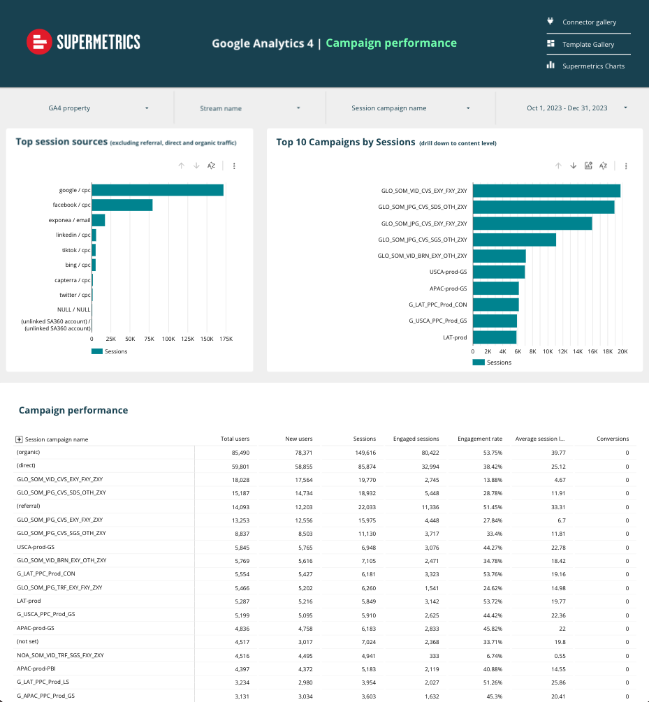 The Supermetrics GA4 template for Looker Studio gives you a clean, high-level overview of web performance. It’s split into multiple pages: Overview, Channel Performance, Page Performance, and Campaign Performance.
Each section is packed with standard GA4 metrics like:
- Sessions and engagement rates
- Top countries, devices, and landing pages
- Campaign performance by source and medium
The layout is functional, and for anyone already familiar with Looker Studio, it’s a fast way to plug in GA4 data without starting from scratch.
But there are a few caveats:
- Everything is still manual. Even though there’s a template available, you’d still need to manually set it up inside of Looker Studio and tweak layouts, adjust filters, or apply custom branding for a client.
- You’ll need to manage the data connection separately. If the GA4 connector breaks (which happens more often than you’d like), your charts stop loading, and fixing it isn’t always straightforward.
- There’s no summary or written explanation. You get a lot of numbers, but no interpretation. It’s on you to analyze and explain what the data means.
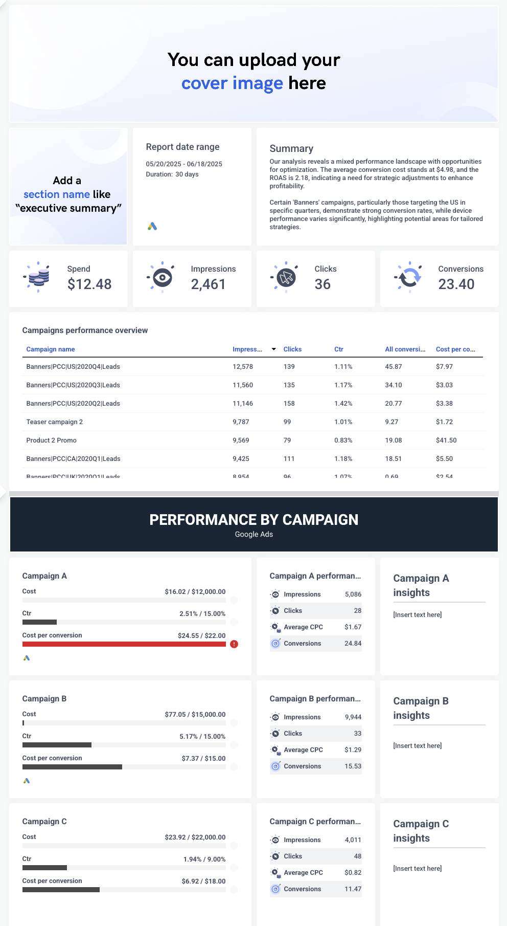
In contrast, on Whatagraph, you don’t even need to have a report template – you can just ask AI to build the entire report for you.
You can simply create a blank report and ask AI to:
- Generate any kind of widgets, charts, KPIs you want to see
- Change and edit these widgets, charts, and KPIs
- Write you fully-editable performance summaries in 18 different languages, and in short or long format
Here’s what that looks in practice:
Gone are the days of manually building charts one by one — or relying on clunky templates just to get started.
With Whatagraph, you can generate full reports from scratch with just a few prompts. It’s faster, easier, and actually fun. ✨
We don’t want to be cheesy, but this is the future of reporting.
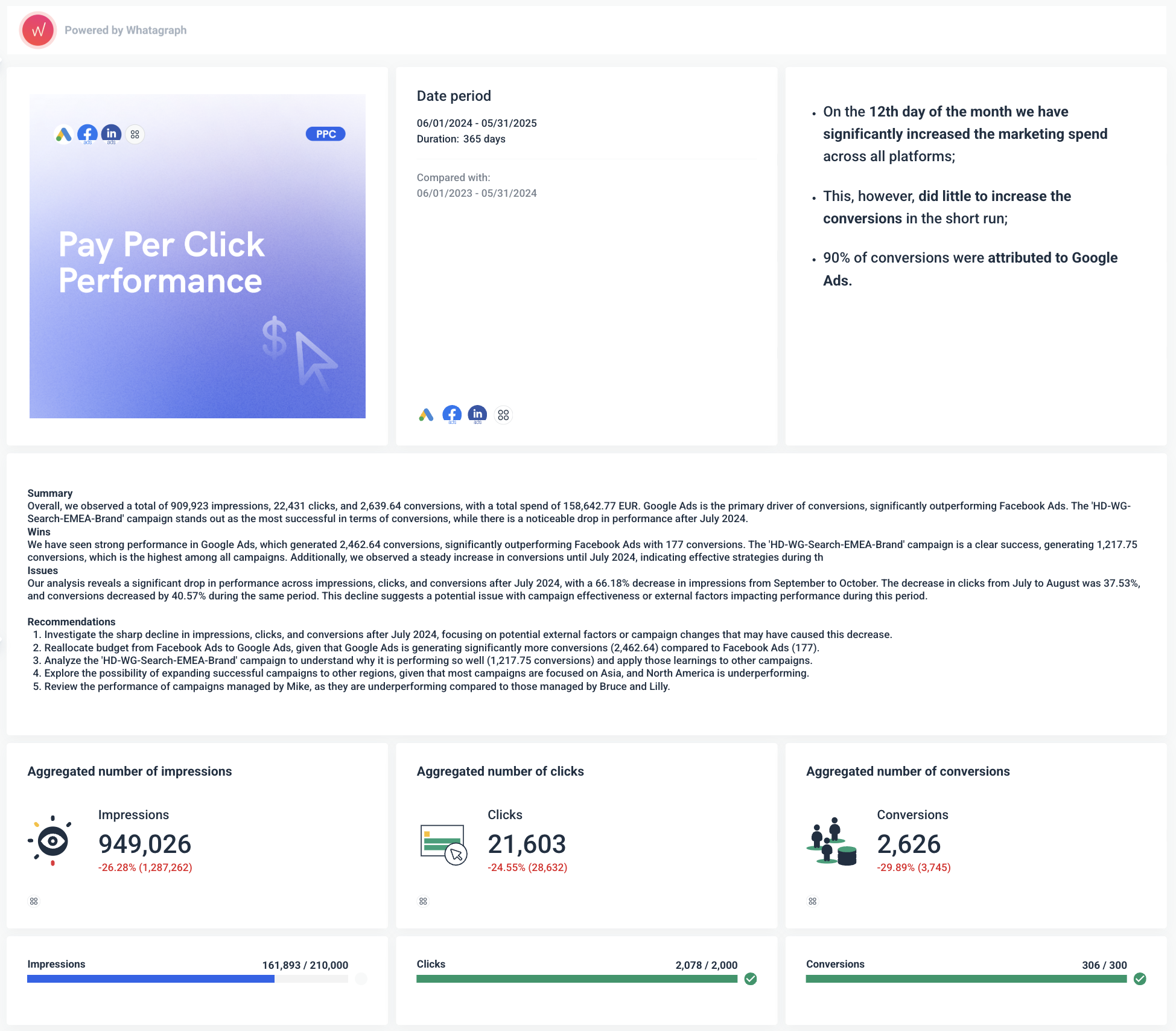
But still want some kind of template? You can check out our GA4 report template.
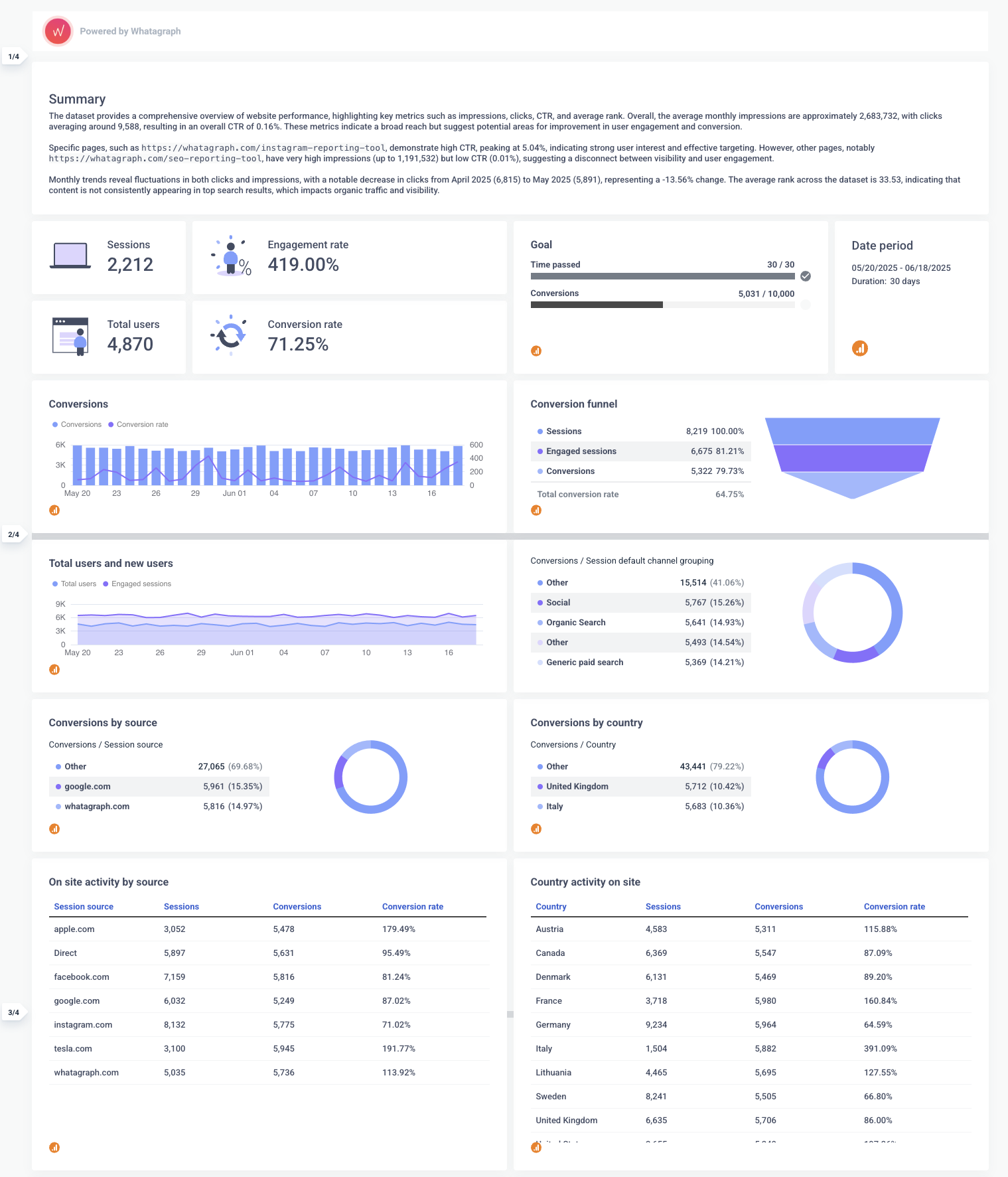 With this template, you get:
✅ Performance summary at the top: Every Whatagraph GA4 report starts with a short summary of key trends. This can be written automatically by AI or manually by your team. So instead of just showing the numbers, the report explains what they mean.
✅ Fully brandable layout: You can customize the color palette, fonts, logos, and even the report domain — whether you're creating a report for your own company or for a client. Supermetrics (paired with Looker Studio) can’t do that natively.
✅ Interactive and filterable charts: Want to filter by country, campaign, or channel group? That’s built in. You don’t need to create filters or set up interactions manually, you can just ask AI.
✅ All-in-one platform: Unlike the Supermetrics + Looker Studio combo, Whatagraph handles everything in one place – data connection, cleaning, transformation, and visualization. That means fewer things to break, and fewer tabs to switch between.
2. Supermetrics Instagram Insights Reporting Template for Looker Studio
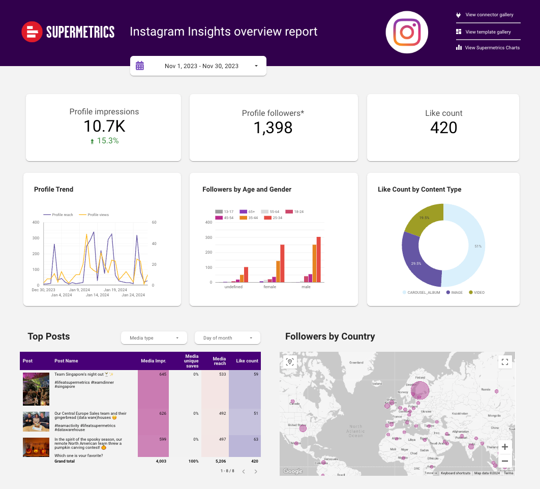 The Instagram Insights template by Supermetrics gives a decent snapshot of your page performance. It covers:
- Total profile impressions, followers, and like count
- Trends over time (profile reach vs. views)
- Follower breakdown by age, gender, and country
- Top-performing posts
- Like count by content type
It’s visually clean and presents your data in a digestible way, especially if you're just looking to surface basic Instagram metrics.
But again, there are familiar drawbacks:
- No summaries or written context: If you want to explain dips in engagement or shifts in audience demographics, you’ll need to do it manually — either in another tool or with added text boxes.
- Manual setup and customization: Branding it with your colors or logos? Adding filters? Changing the chart style? That’s all on you inside Looker Studio.
- Connector reliability: Like all Supermetrics reports, if the connector breaks, your entire dashboard can go blank. And reconnecting Instagram Insights data is notoriously finicky.
With Whatagraph’s Instagram analytics report, you get more than just metrics. You get an actual story, written out for you.
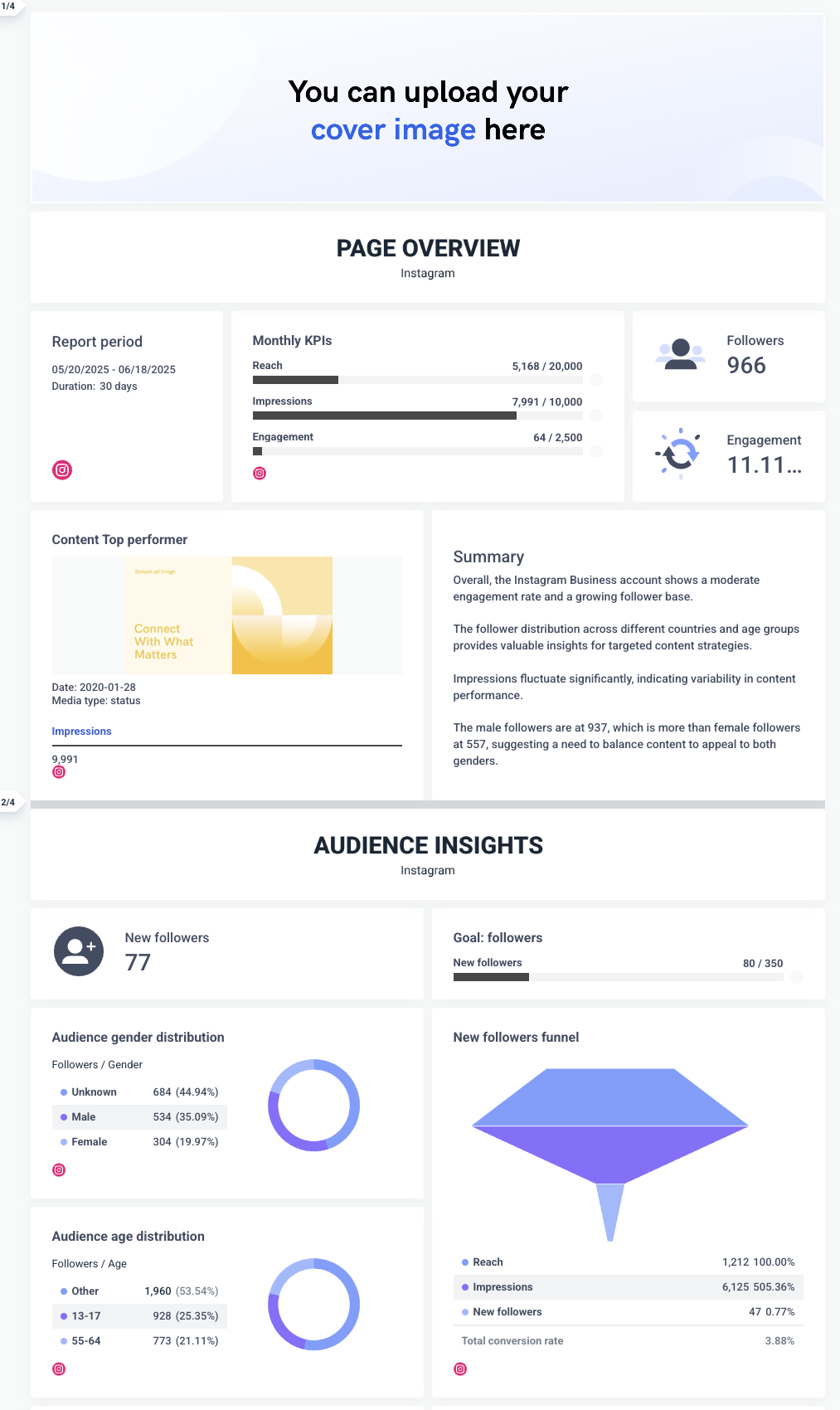 Here’s what stands out:
✅ AI-written performance summaries: Every Whatagraph Instagram report includes a written overview of performance trends. AI highlights what’s going well, where engagement dropped, and which content worked best – so you don’t have to write it from scratch. (And if you want to adjust the tone or focus, you can ask AI to reword it or edit it yourself.)
✅ Instant editing with AI: If you want to tweak a chart, rephrase a summary, or adjust a layout – just ask. No need to edit manually or search for the right widget.
✅ Full customization: You can upload header and footer images, create custom color themes, choose any icons you want for each widget, and more – the customization options are endless.
If you’re reporting on Instagram regularly, and especially if you're doing it for clients, Whatagraph turns hours of manual work into a few minutes of clear, automated insights.
2 Best Supermetrics Dashboard Templates for Google Sheets
Next up is Google Sheets. We’re going to highlight two templates:
- Google Ads report template
- LinkedIn Ads report template
1. Supermetrics Google Ads Report Template for Google Sheets
This Google Sheets template provides a multi-tab breakdown of Google Ads performance in 5 different tabs. Here's how each tab is structured:
Tab 1: AdWords Monthly Comparisons
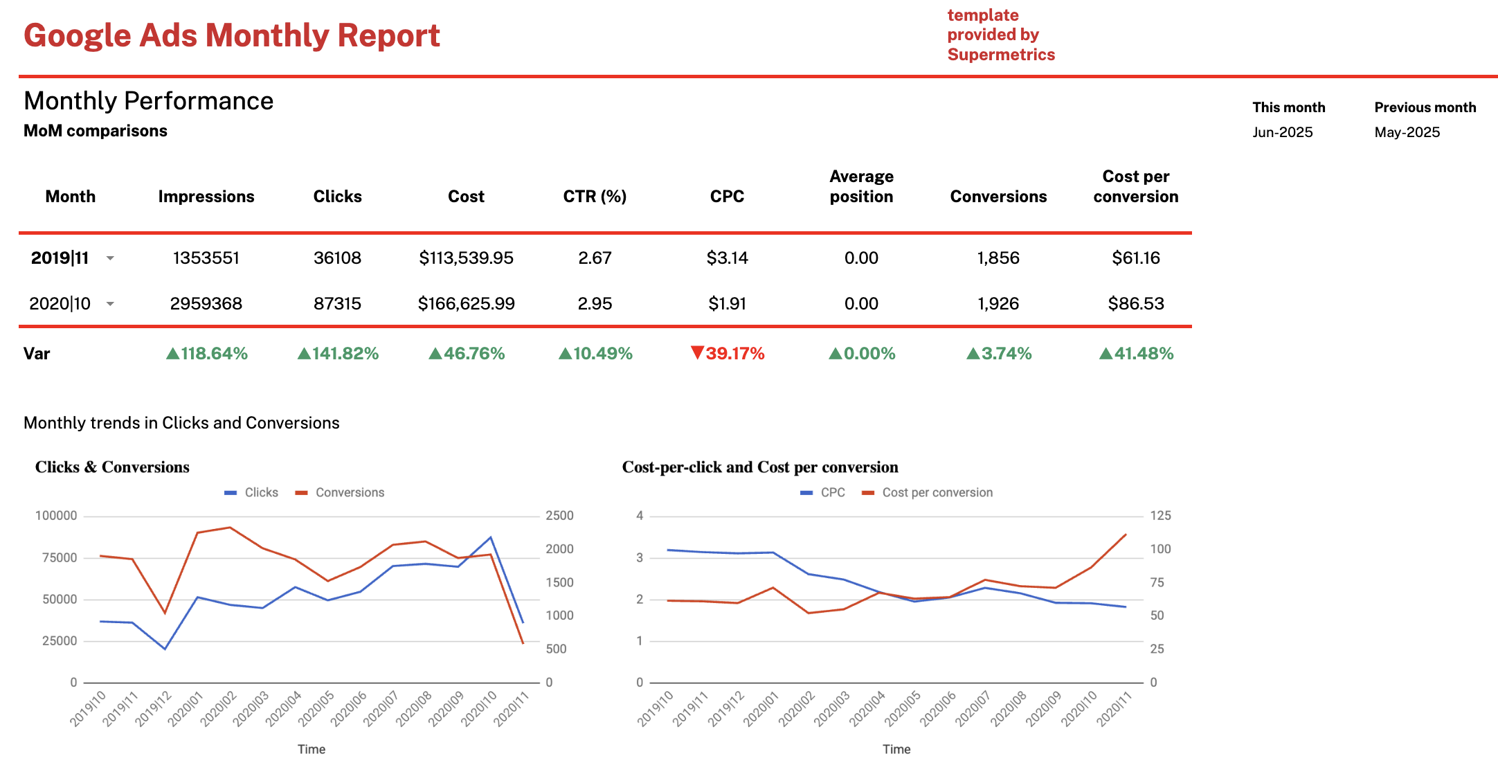
This is the summary page that compares current vs. previous month performance. You get:
- Core metrics (impressions, clicks, cost, CTR, CPC, conversions)
- Month-over-month percentage changes
- Trend line charts for:
- Clicks vs. Conversions
- CPC vs. Cost per Conversion
It's a solid high-level view, but visual customization is limited and insights have to be interpreted manually.
Tab 2: Breakdown by Device and Campaign Type
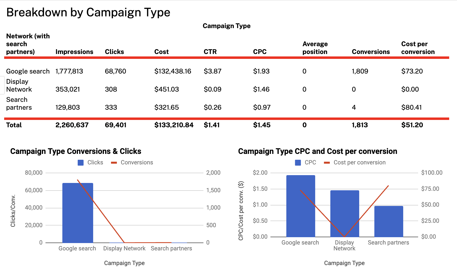
This tab drills down performance by:
- Device type (e.g. computers, mobile, tablet, TV screens)
- Campaign type (e.g. Google Search, Display Network, Search Partners)
It includes:
- Impressions, clicks, cost, CTR, CPC, average position, conversions, cost per conversion
- Two charts:
- Clicks & Conversions by device/campaign
- CPC & Cost per Conversion
This tab is useful for identifying what’s driving performance — but again, you’ll need to analyze the data yourself.
Tab 3: Breakdown by Device Type
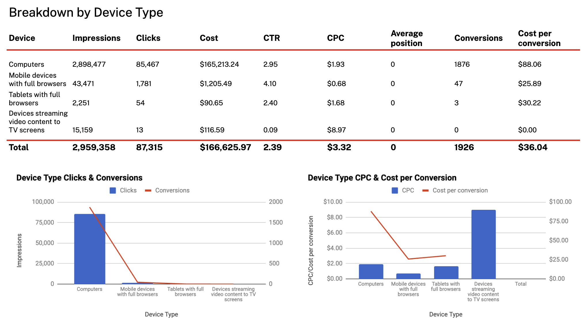
A more focused view of performance split purely by device. Same structure as above but zeroes in on devices only.
Charts included:
- Clicks vs. Conversions per device
- CPC vs. Cost per Conversion per device
No written analysis, you’re expected to interpret what’s going on yourself.
Tab 4: Breakdown by Campaign Name
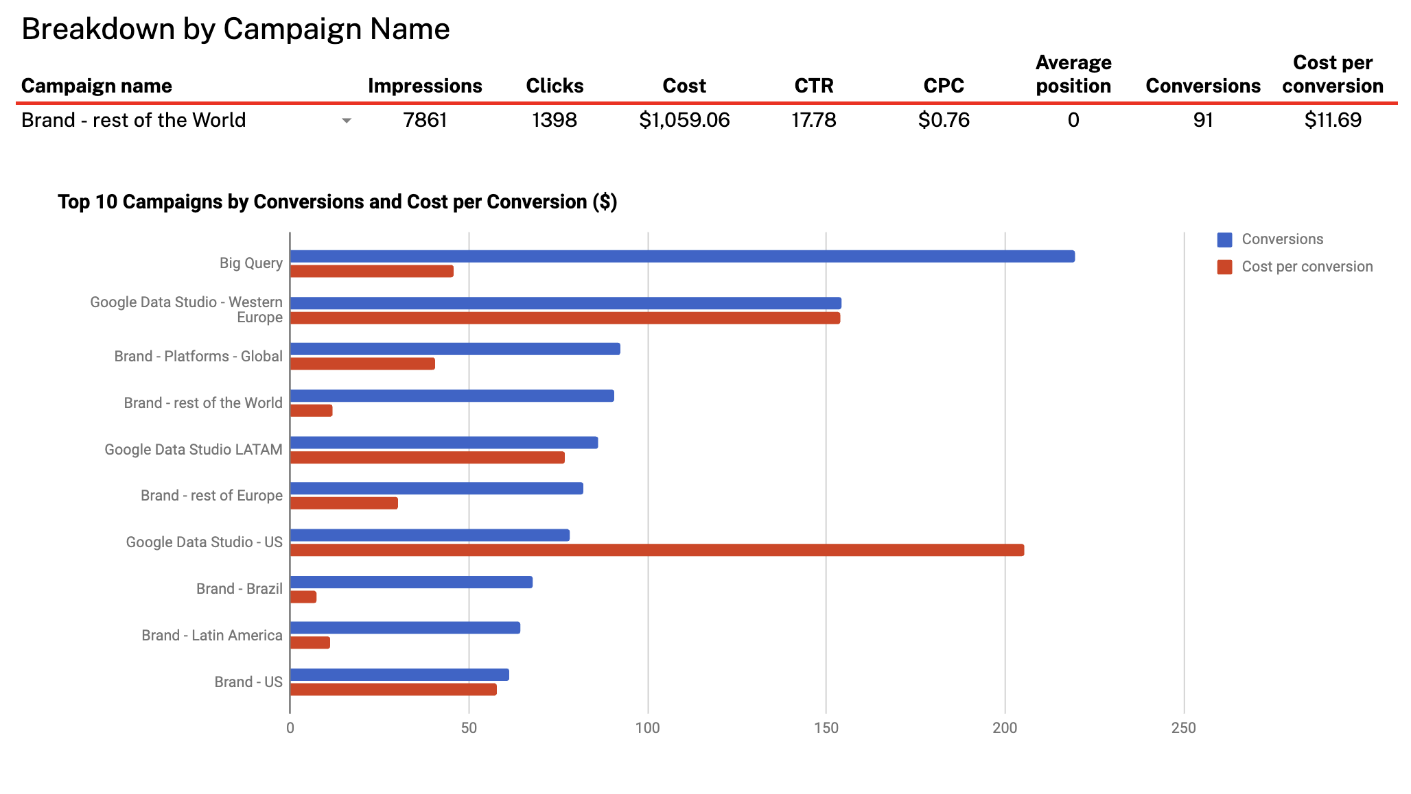
This tab shows top campaigns ranked by:
- Impressions, clicks, cost, CTR, CPC, conversions, cost per conversion
It includes a chart comparing:
- Top 10 campaigns by conversions and cost per conversion
It’s a good look into which campaigns are most efficient – but the table can get dense fast, and there’s no built-in guidance on what to focus on.
Tab 5: Breakdown by Country
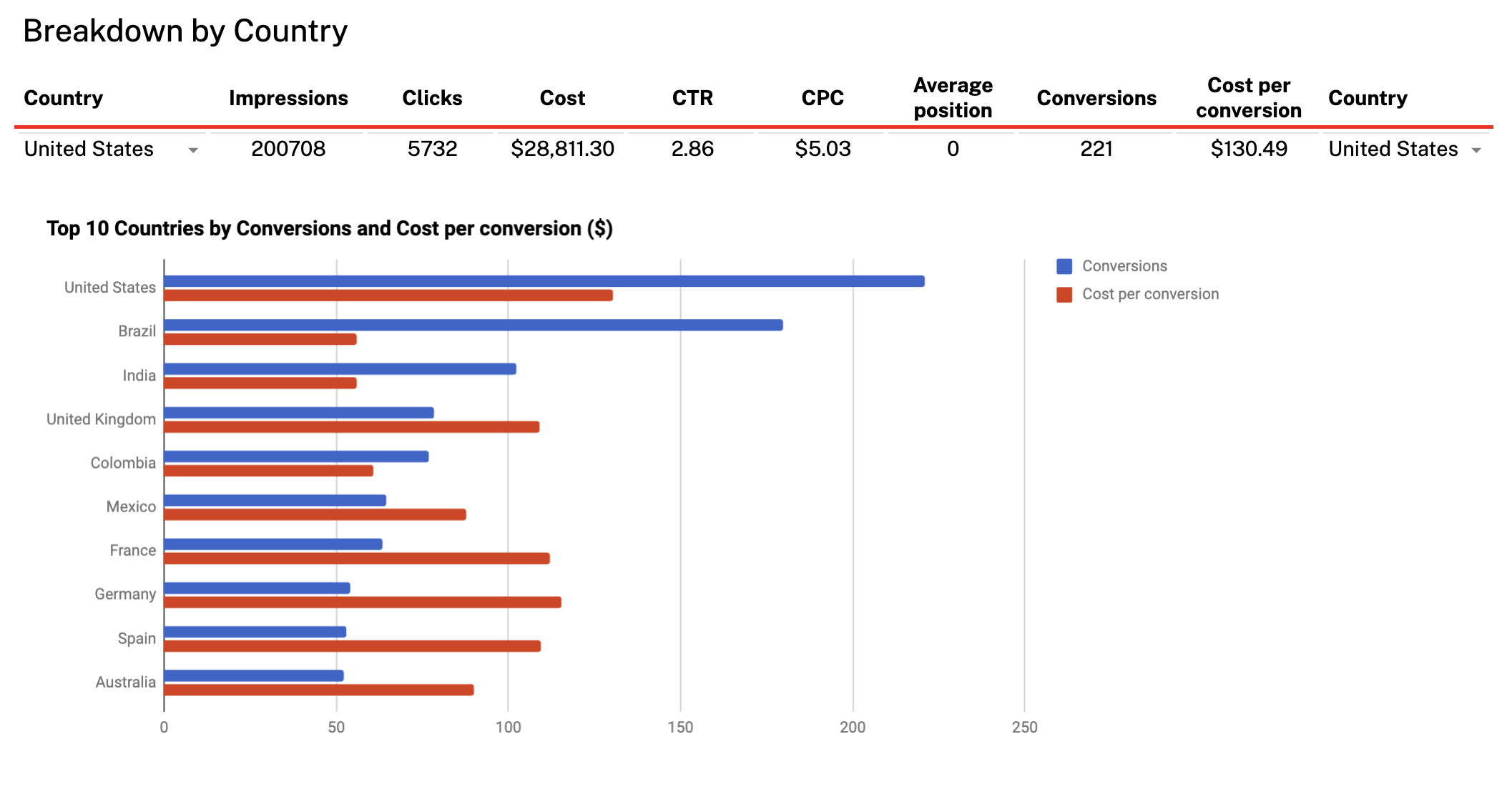
This tab shows how your Google Ads campaigns are performing by geographic location. For each country, it breaks down:
- Impressions
- Clicks
- Cost
- CTR (%)
- CPC
- Conversions
- Cost per conversion
You also get a bar chart that compares the top 10 countries by conversions and cost per conversion.
Overall, the Supermetrics Google Sheets template gives you strong raw performance data, but you’ll need to write your own insights, summarize trends manually, and know where to look to find answers. It’s best suited for analysts comfortable in Sheets who prefer to do their own digging.
—
But compared to the clunky, spreadsheet-style Supermetrics template, Whatagraph’s Google Ads report is stunning, easy to read, and looks professional for clients or C-Suite.
In fact, this is what Stef Oosterik, Quality Manager at Dtch. Digitals agency, loves about Whatagraph.
The agency was previously using a static reporting tool that made it difficult for clients to read and understand what the report meant and what impact the agency was driving. This could potentially lead to churn issues.
Stef explained:
Clients get bored if the reports are just a bunch of numbers. And they’re more likely to move to other agencies if they think the results aren’t good.
But once they switched to Whatagraph, the agency reduced churn by 50% thanks to stunning and professional reports.
Thanks to Whatagraph’s attractive visuals, clients can see the professionality behind our agency. Whatagraph not only helps us get clients on board, but also to keep our clients within the agency. Our churn rate is very, very low.
Read the full case study here.
2. Supermetrics LinkedIn Ads Report Template for Google Sheets
This LinkedIn Ads template for Google Sheets is split across four main tabs, each focused on a different aspect of your campaign performance:
1. Performance Overview
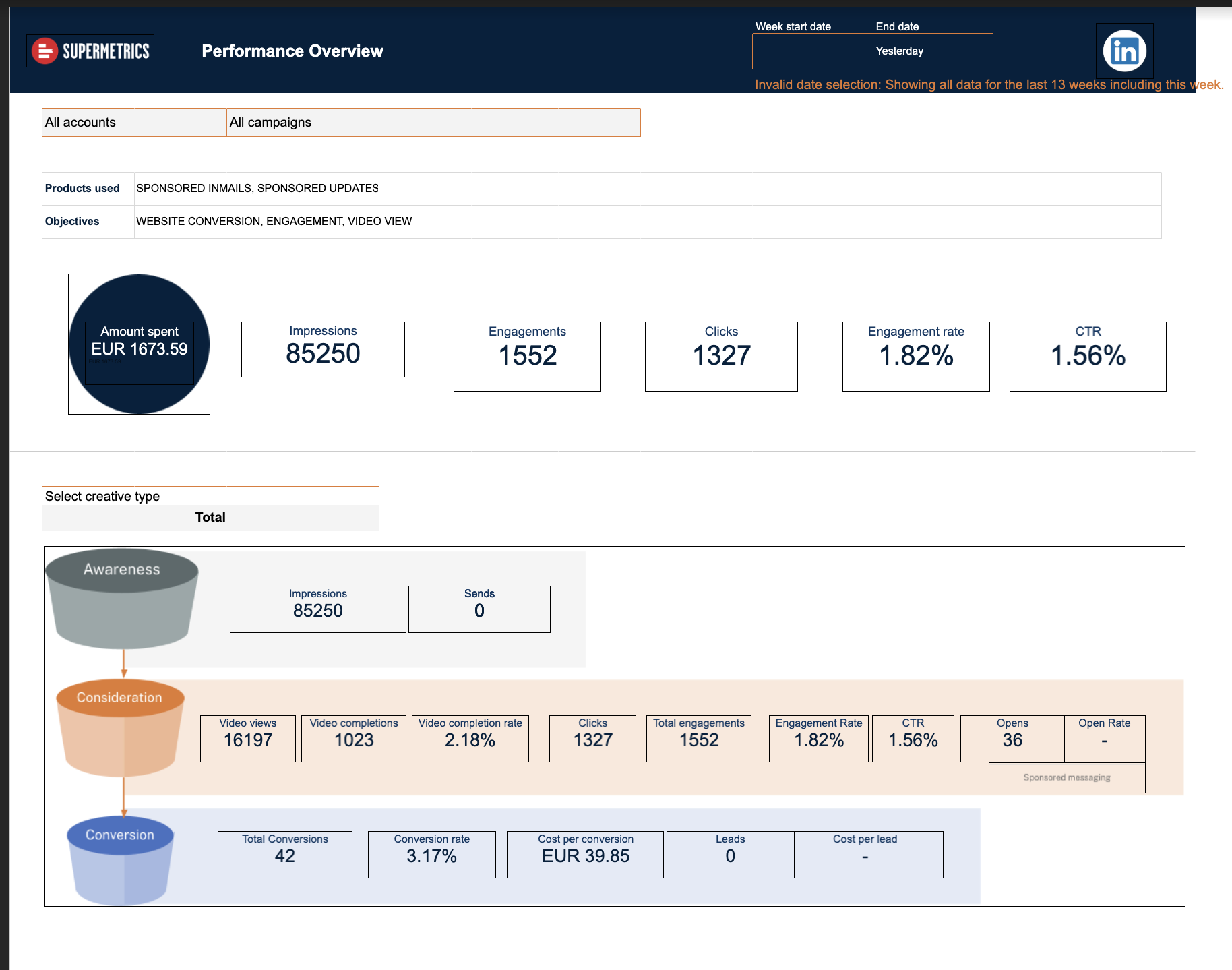 This tab gives a high-level summary of how your LinkedIn Ads are performing overall. It includes quick comparisons between top-performing and low-performing campaigns and creatives, based on CTR.
There’s also a 13-week timeline showing changes in impressions, clicks, and engagement over time. However, the charts are basic and clunky to customize.
2. Campaign Performance
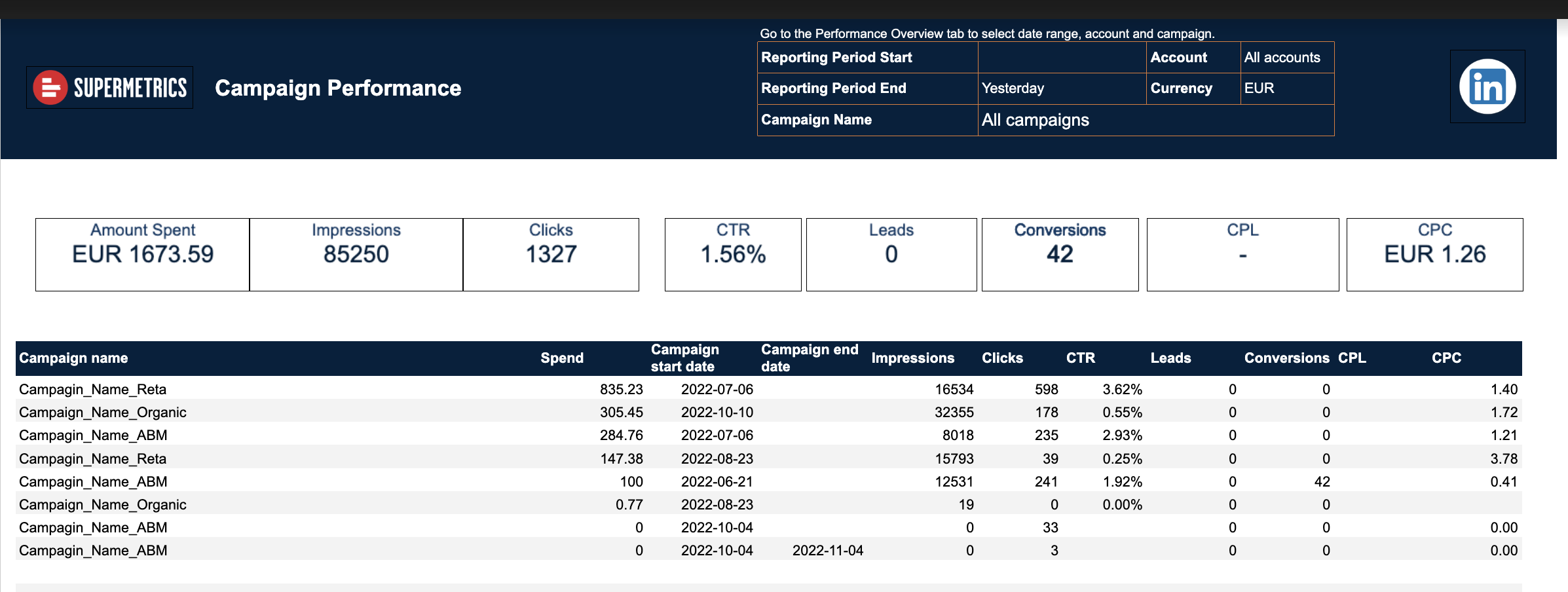 This tab dives into individual campaign results. It lists standard metrics like impressions, clicks, spend, CTR, conversions, CPC, and CPL in a sortable table.
While it’s helpful for tracking performance across multiple campaigns, it’s still quite manual. You’ll need to interpret the data yourself, and there are no built-in summaries or filters.
3. Creative Details
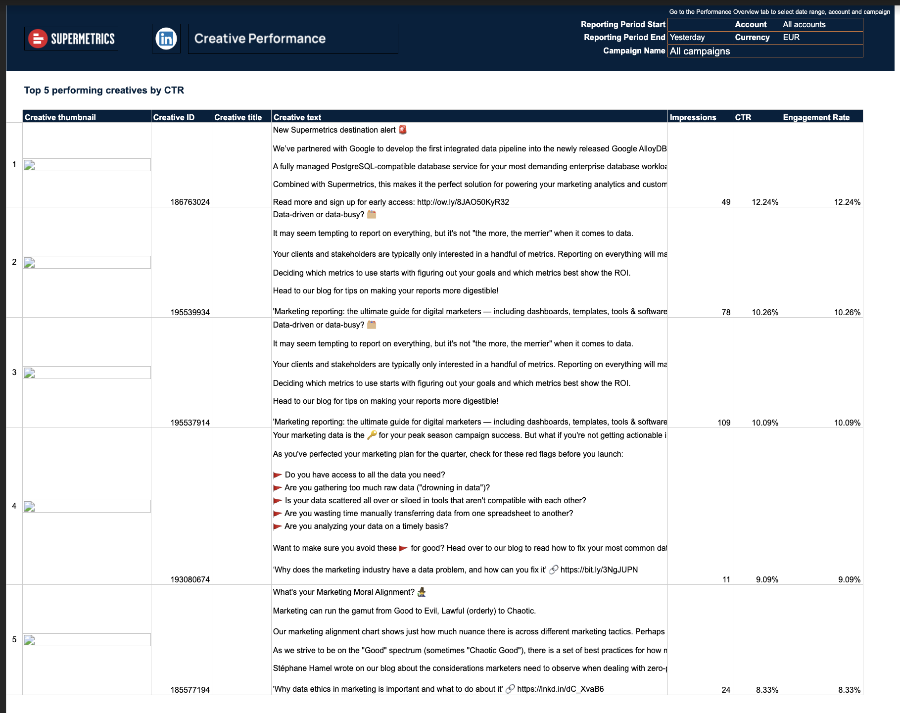 Here, you get a closer look at how specific ad creatives are performing. The table includes headlines, descriptions, engagement metrics, and thumbnails of each creative.
It highlights the best and worst performing ads by CTR and engagement rate, which is helpful – but again, it’s static and looks like a raw data dump rather than a professional report.
4. Demographics
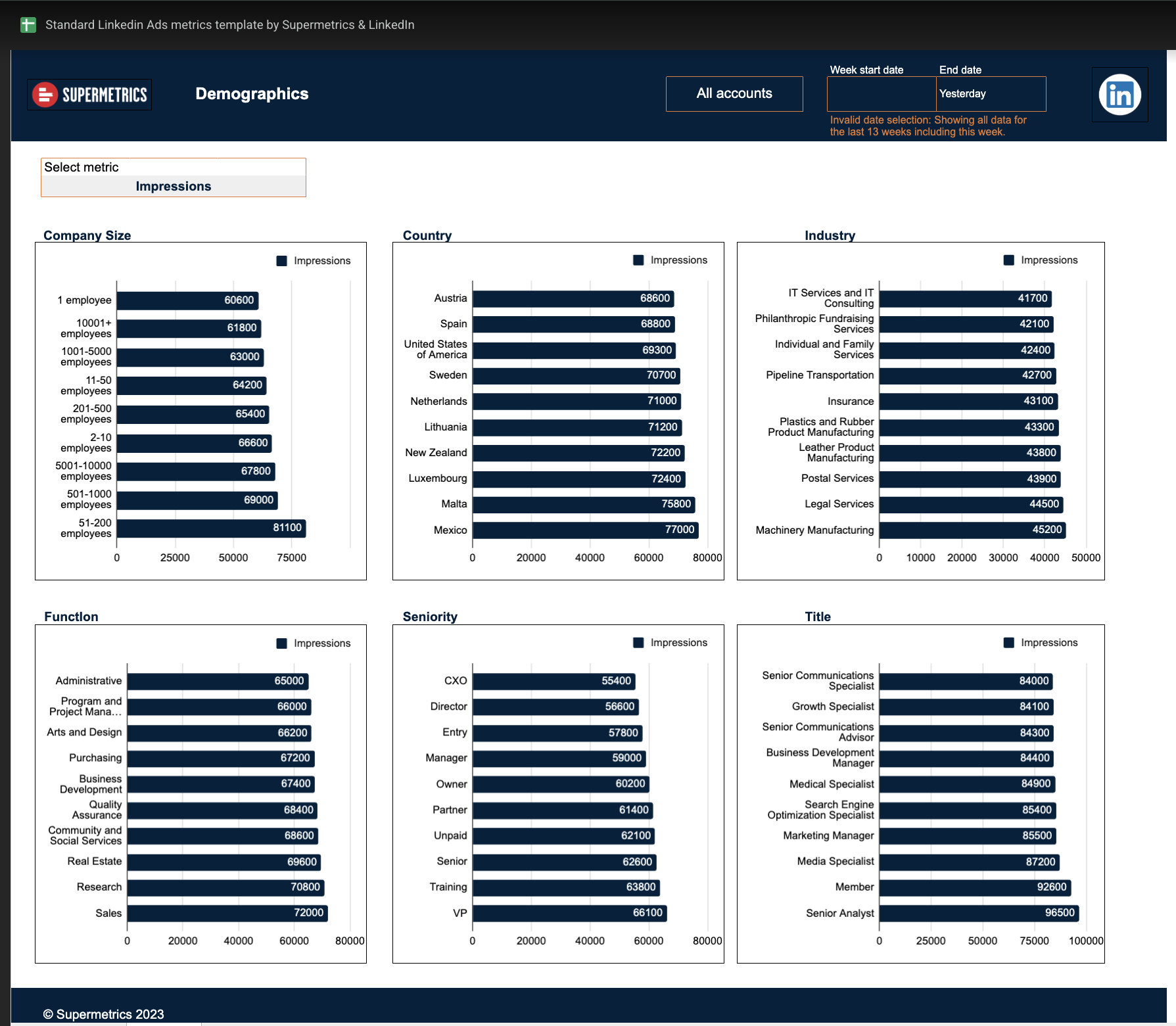 This final tab shows a breakdown of audience reach and impressions by demographic dimensions, including company size, industry, seniority, job title, and country.
It’s useful for understanding who you’re reaching, but there are no visualizations or summaries – just rows of numbers that require manual interpretation.
—
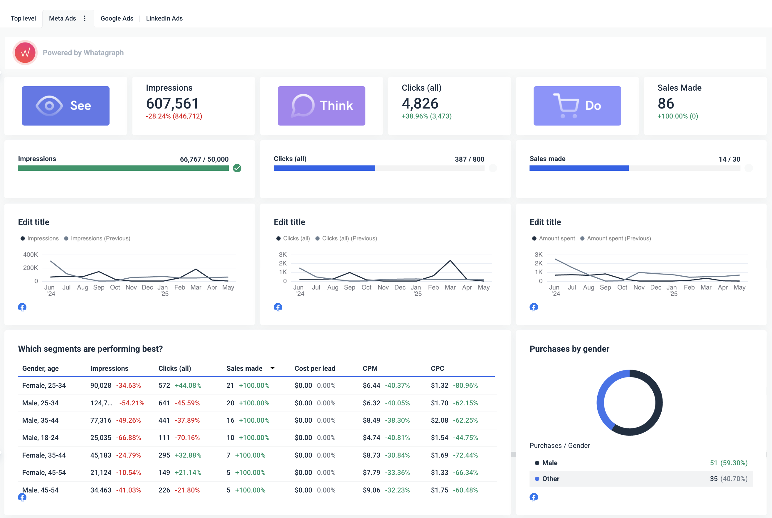
The LinkedIn Ads report template in Whatagraph takes the same data points as the Supermetrics version — and turns them into a sleek, fully visualized dashboard that’s easier to understand and far more professional to present.
Here’s what makes it better:
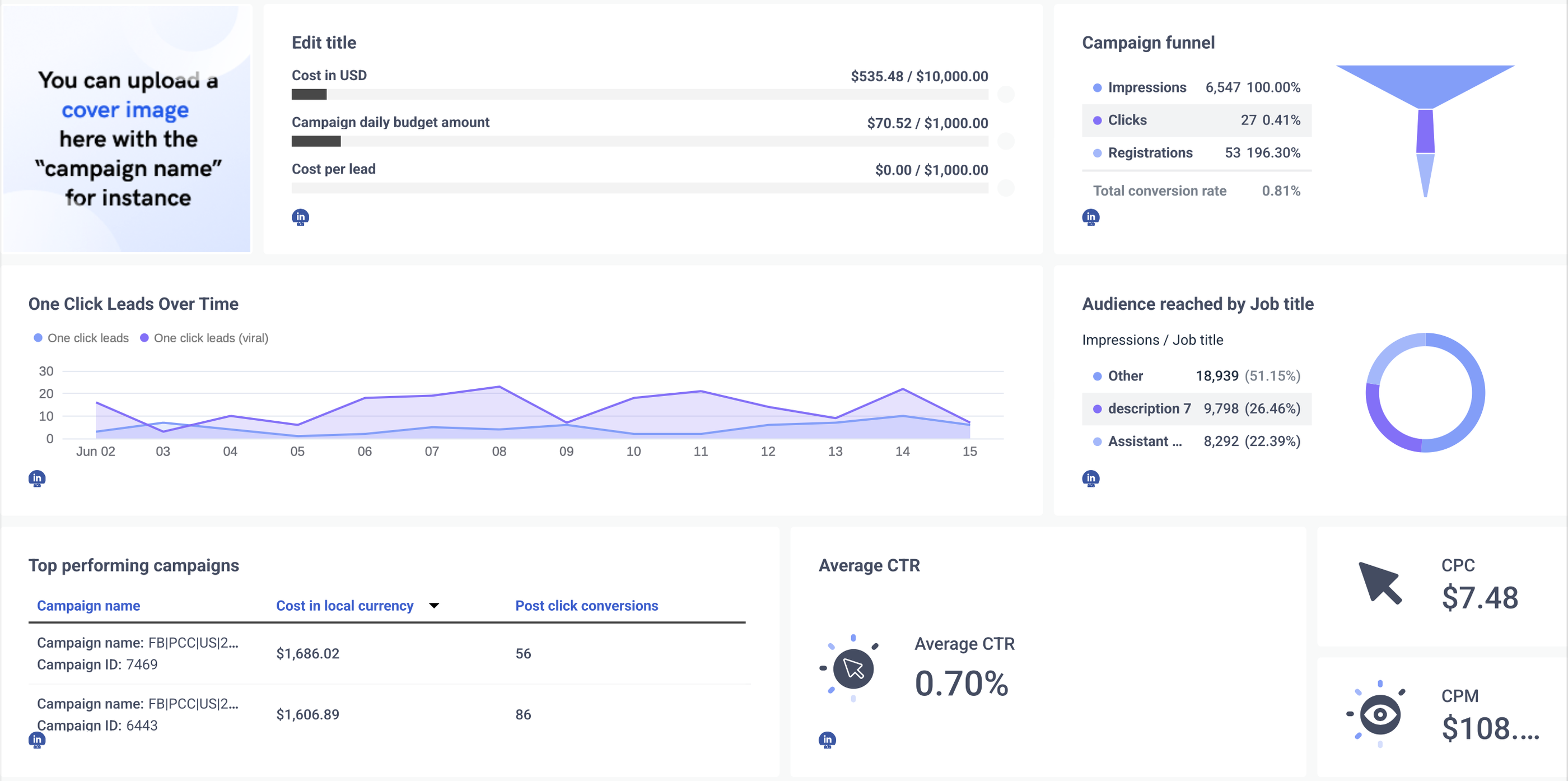
✅ Funnel-based structure that shows actual impact:
The Whatagraph template is built around a campaign funnel – showing how impressions led to clicks, registrations, and total conversions. Instead of just listing numbers, it connects them into a narrative that makes sense at a glance.
✅ Performance summaries and visual storytelling:
At the top of the report, you’ll find a clear snapshot of key KPIs: CTR, CPC, CPM, daily budget, cost per lead – all tied back to goals.
You don’t have to explain these numbers manually. AI can even generate short summaries of campaign performance and trends for you, based on the data in your report.
✅ Audience insights that make sense:
Audience breakdowns by job title are visualized using charts, not just tables. So you can instantly see who your campaigns are reaching and how they’re engaging – without scanning rows of spreadsheet data.
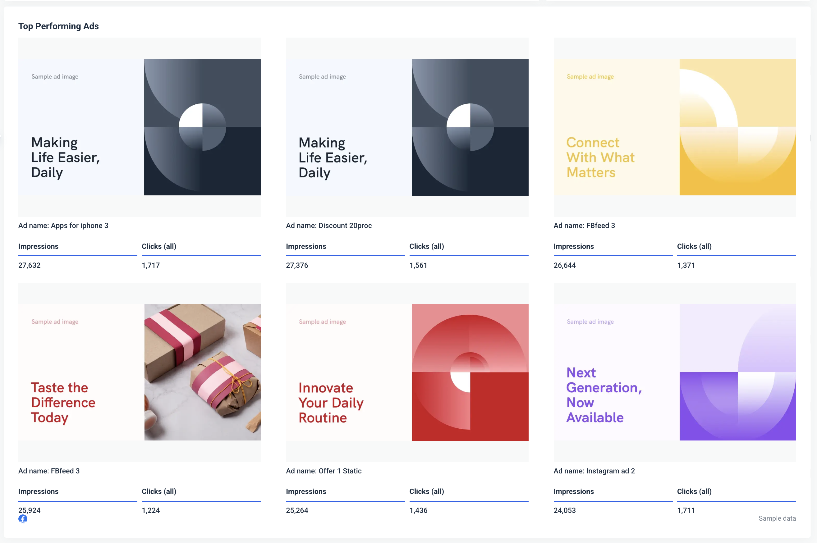
✅ Top-performing creatives and campaigns:
Instead of digging through static cells, Whatagraph automatically highlights your best campaigns and posts, including:
- Campaign names and IDs
- Spend and conversions
- Impressions, clicks, and conversion performance by post
It’s easy to spot what’s working, and just as easy to share it with a client or stakeholder.
✅ Designed for reporting, not analysis
While the Supermetrics sheet feels like a raw data dump, the Whatagraph template is designed to be shared. It’s branded, visual, and structured to tell a story – without needing extra formatting or explanations. It looks polished right out of the box.
1 Best Supermetrics Reporting Template for Power BI
Supermetrics offers 3 templates for Power BI – Google Analytics 4, LinkedIn Ads, and Facebook Ads. Since we've already covered the first two for Looker Studio and Google Sheets, we'll cover Facebook Ads here.
Supermetrics Facebook Ads Template for Power BI
This Power BI Facebook Ads report template gives you a multi-page overview of Facebook Ads performance. Each page focuses on a specific area of your campaigns, helping you analyze results across spend, engagement, conversions, and video performance.
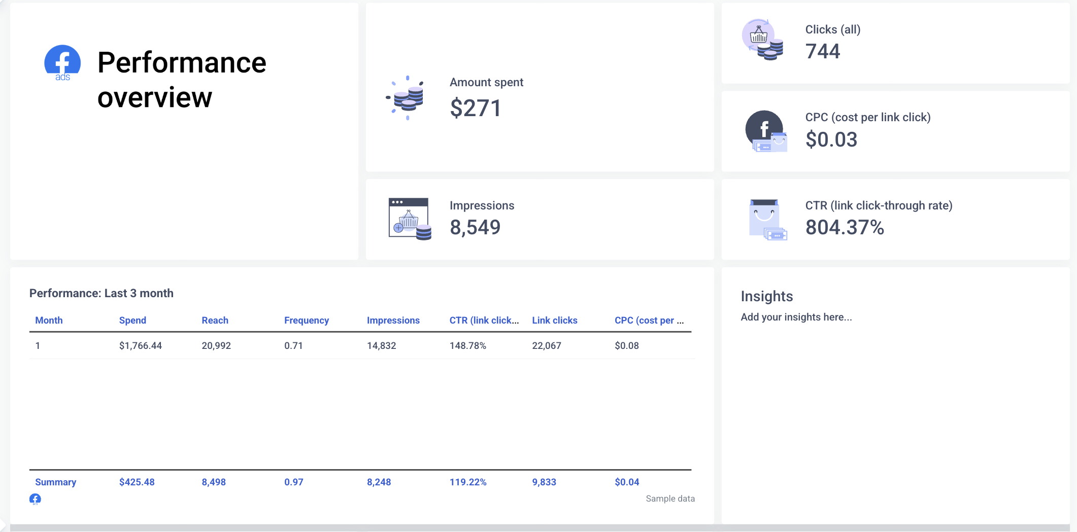
1. Overview
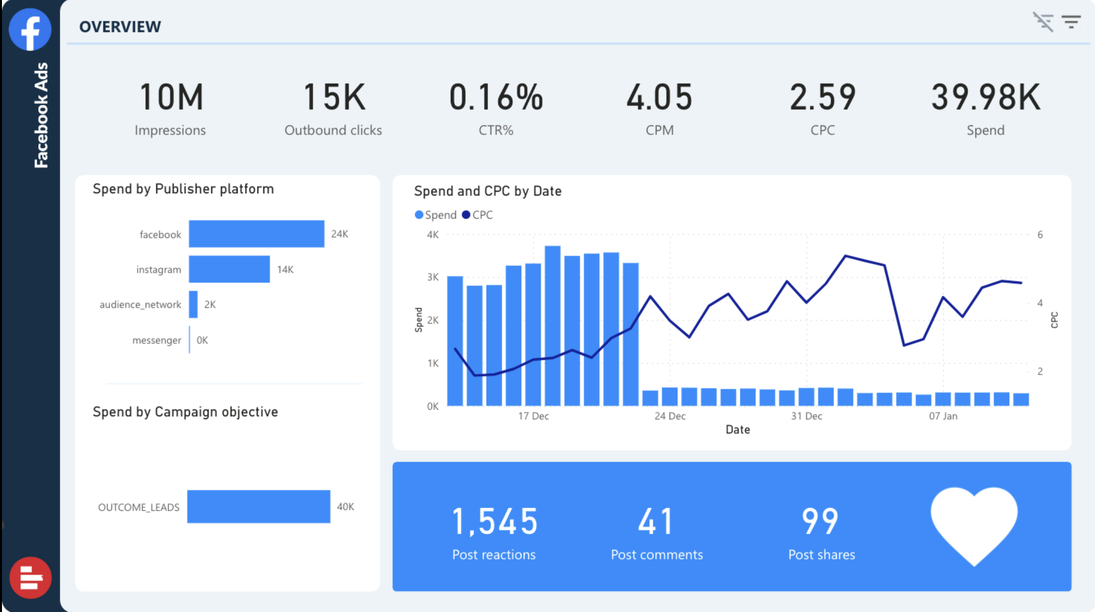
The overview page summarizes key account-level metrics:
- Impressions, outbound clicks, CTR, CPC, CPM, and total spend
- Visual breakdowns of:
- Spend by publisher platform (e.g. Facebook, Instagram)
- Spend by campaign objective
- Spend and CPC trends over time
- Engagement metrics: post reactions, comments, and shares
It’s a decent snapshot for a quick health check, though the layout feels very data-dense and could overwhelm clients unfamiliar with Power BI dashboards.
2. Conversions
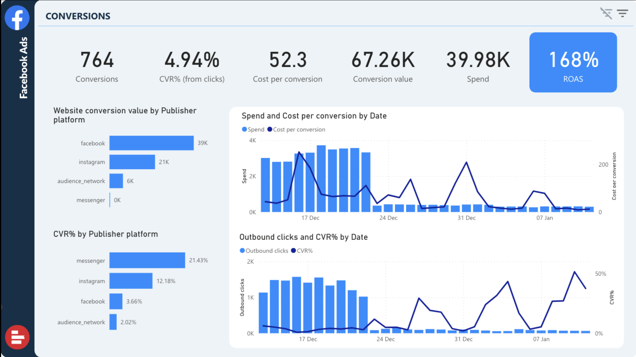
This page focuses entirely on conversion performance. It includes:
- Total conversions, cost per conversion, ROAS, CVR%, and total conversion value
- Visual comparisons of:
- Spend vs. cost per conversion over time
- Outbound clicks vs. CVR%
- Website conversion value by publisher platform
Useful for understanding ROI – but again, no written interpretation or summary of results is provided.
3. Campaigns
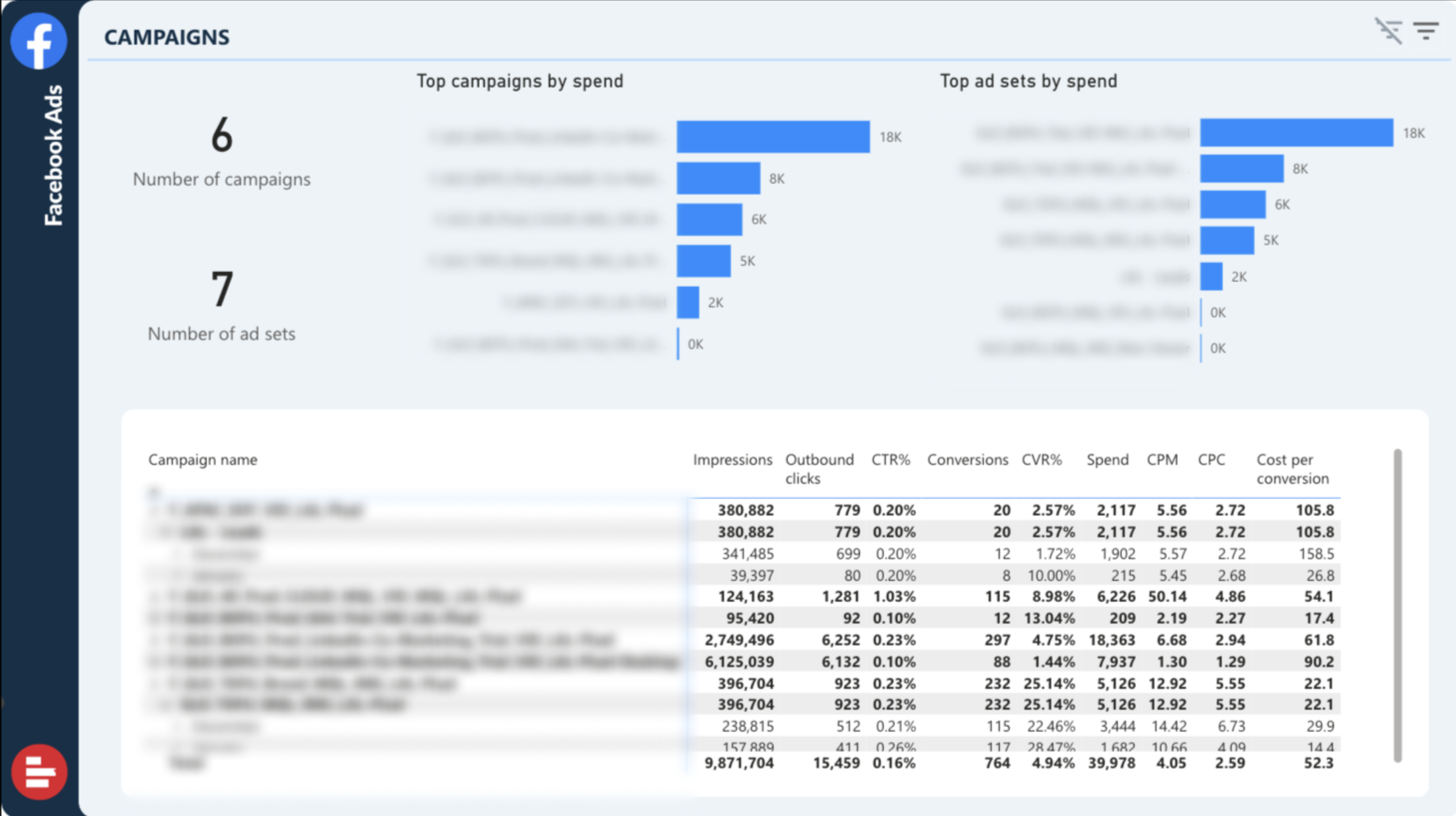
This page shows how your campaigns and ad sets are performing. You’ll find:
- Number of campaigns and ad sets
- Top campaigns and ad sets ranked by spend
- A table with detailed metrics (impressions, clicks, conversions, CVR%, CPC, spend, cost per conversion)
Great for performance comparisons, but doesn’t highlight underperforming campaigns or flag optimization opportunities.
4. Video Performance
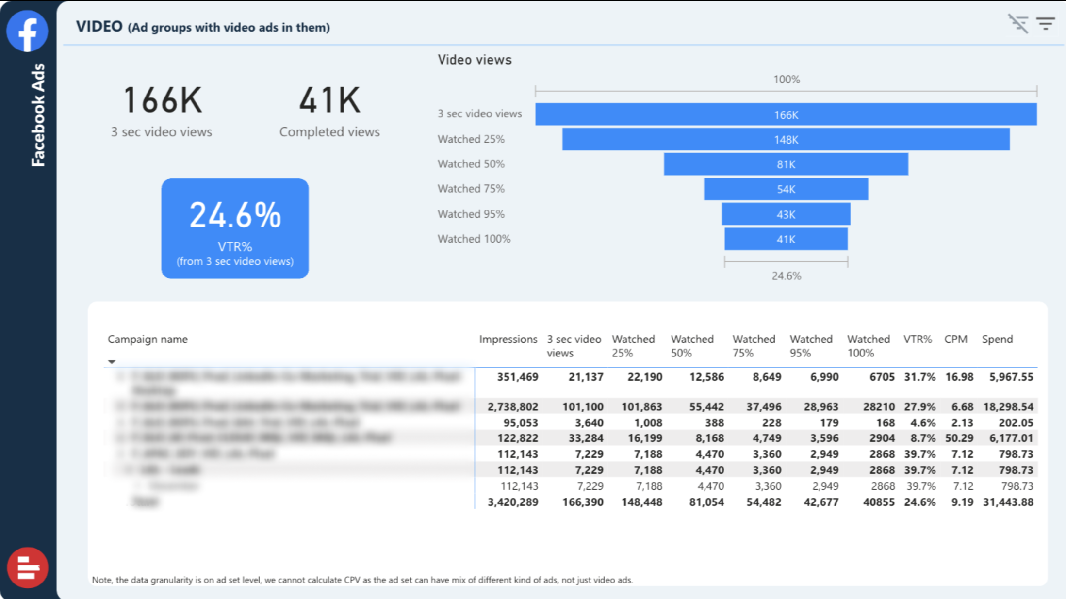
If your campaigns include video creatives, this page breaks down:
- Total 3-second video views vs. 100% completed views
- View-through rate (VTR%)
- Funnel chart showing drop-off at each video milestone (25%, 50%, 75%, etc.)
- Campaign-level table of video performance metrics
It’s a solid setup for video-heavy accounts, but still requires manual interpretation and performance explanation.
—
The Power BI template by Supermetrics gives you a decent overview of Facebook Ads data, but it still assumes you’re a data analyst.
Whatagraph, on the other hand, delivers a report that looks great, reads clearly, and communicates performance without needing extra explanation.
Here’s what stands out about our Facebook Ads report template:
✅ Built-in summaries and insights:
Right from the top, Whatagraph gives you an overview of impressions, link clicks, CTR, CPC, and spend. But it goes beyond numbers — with editable insight boxes where your team (or AI) can summarize what’s working and why.
No more writing follow-up emails explaining results. The report can explain itself.
✅ Campaign and ad set performance, visualized cleanly:
You can drill down by campaign, ad set, or ad creative, but without the cluttered look of Power BI tables. Metrics like frequency, cost per link click, CTR, and link clicks are displayed in simple charts that are easy to interpret, even for non-technical stakeholders.
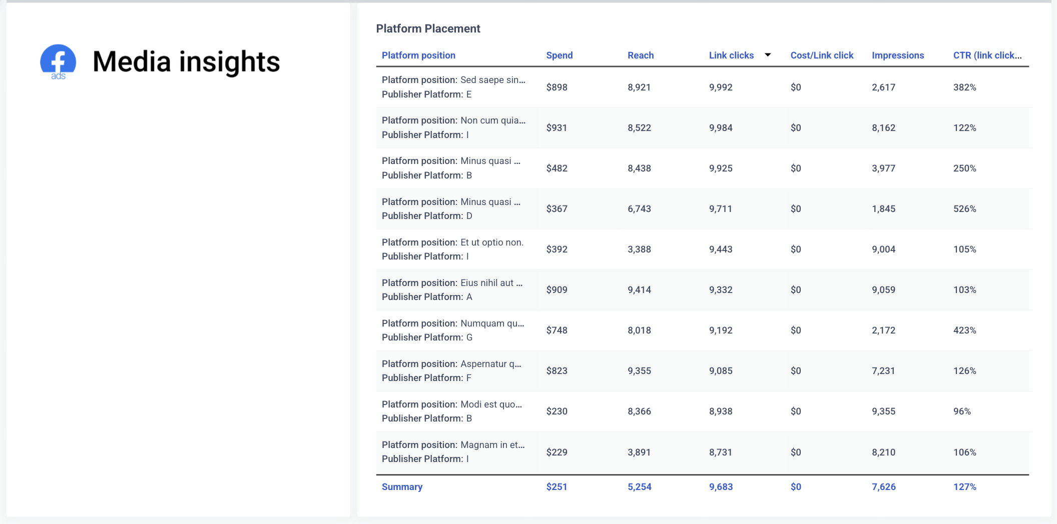
✅ Device, demographic, and placement breakdowns
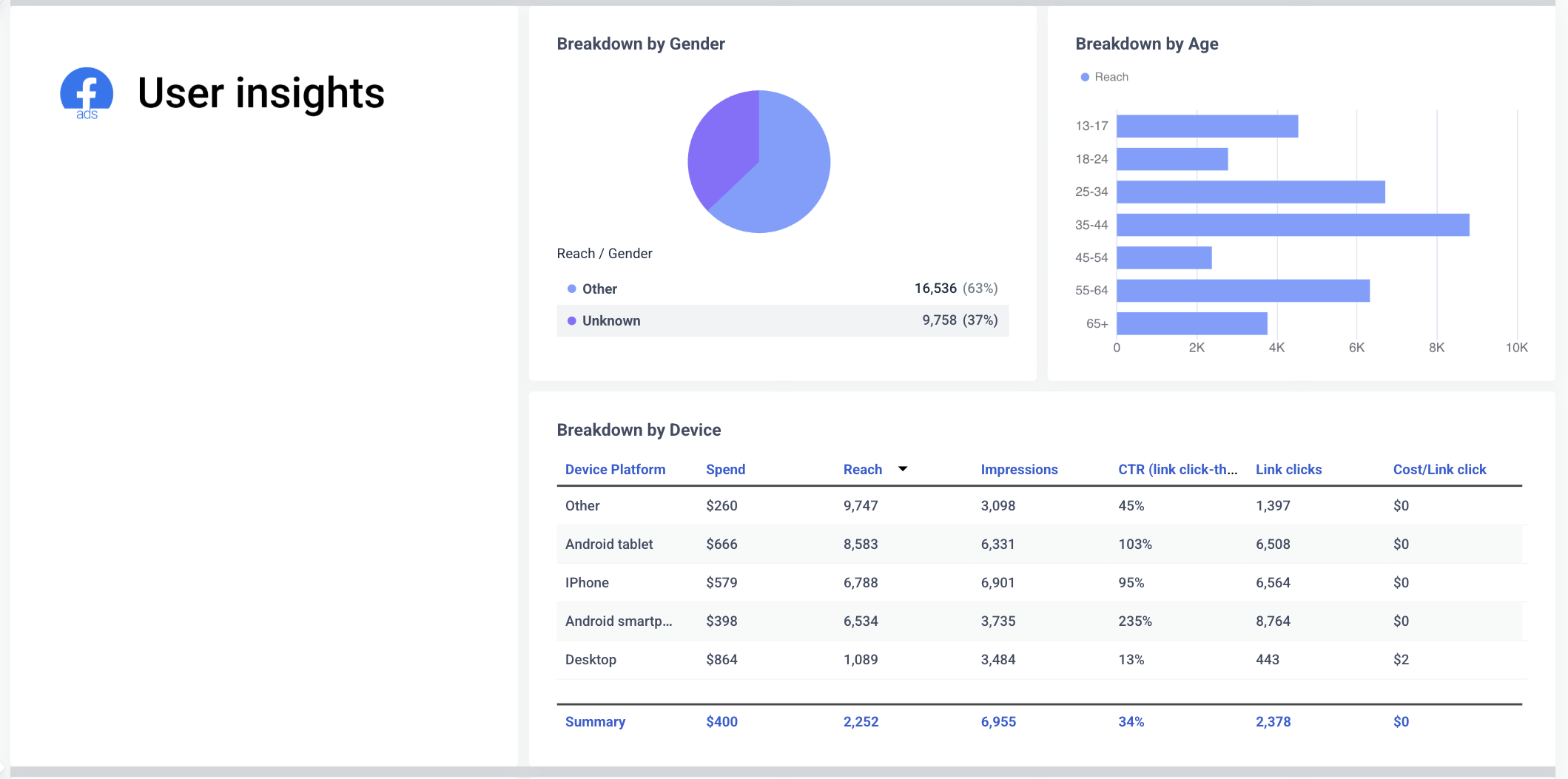
Whatagraph includes detailed breakdowns by:
- Age and gender
- Device type
- Platform placement (e.g. Facebook feed, Instagram Stories, Audience Network)
Each view includes clear visuals and summaries, not just raw tables like in Power BI.
✅ Video and creative performance made digestible
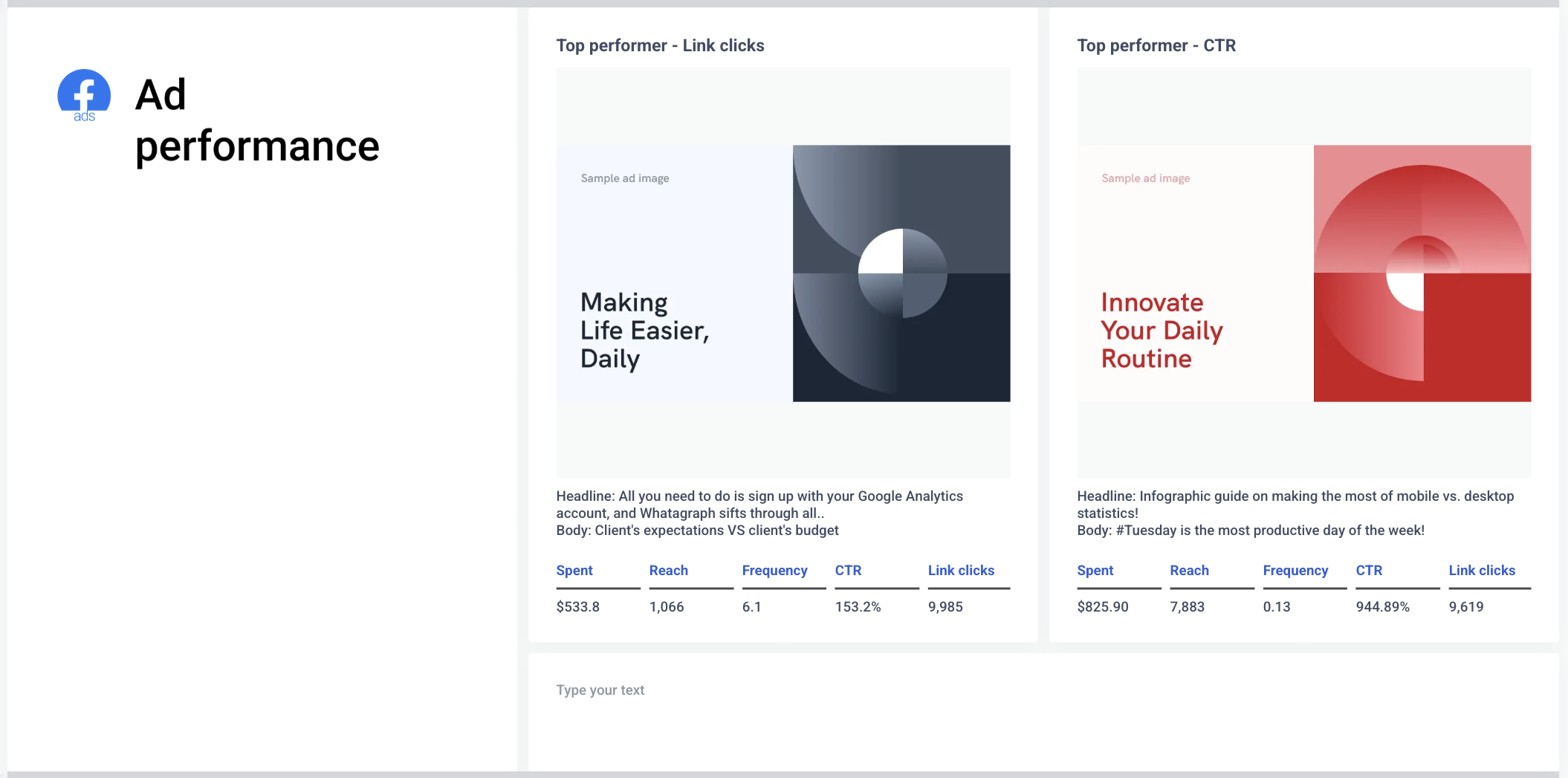
Instead of dense funnel visuals, Whatagraph shows top-performing ads (by CTR or link clicks) with full context:
- Creative headlines and copy
- Spend and link click stats
- CTRs that are actually readable (e.g. 383% vs. buried in a chart)
This makes it easy to show clients what’s working, and reuse high-performers in future campaigns.
If you want to give clients a Facebook Ads report they’ll actually read and understand, Whatagraph delivers it without needing workarounds or data translation.
1 Best Supermetrics Template for Excel & BigQuery
Supermetrics offers one template each for Excel and BigQuery, and they are both for the same use case – PPC reporting. You can find them here:
For this article, we’ll break down the PPC reporting template for Excel.
Supermetrics Paid Per Click (PPC) Reporting Template for Excel
This Supermetrics Excel template is designed to combine PPC data from platforms like Google Ads, Facebook Ads, LinkedIn Ads, Microsoft Ads, and Twitter (X).
But while the intention is to simplify cross-channel reporting, the execution is anything but smooth.
1. Manual setup required, and easy to mess up
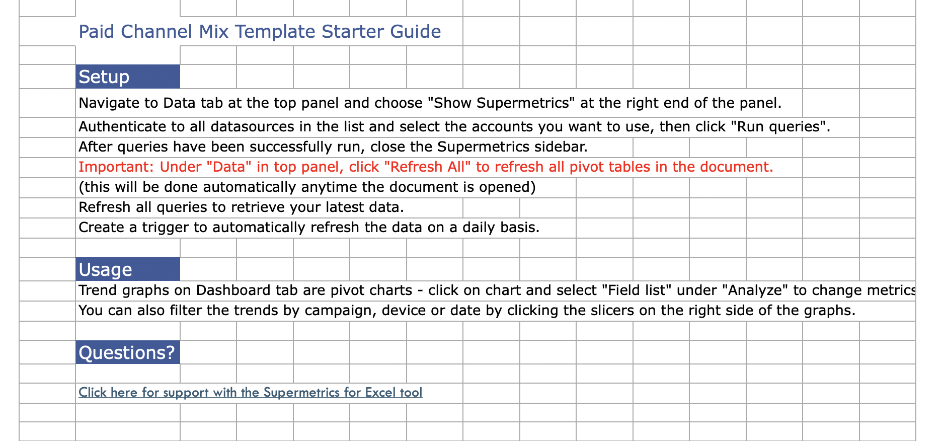
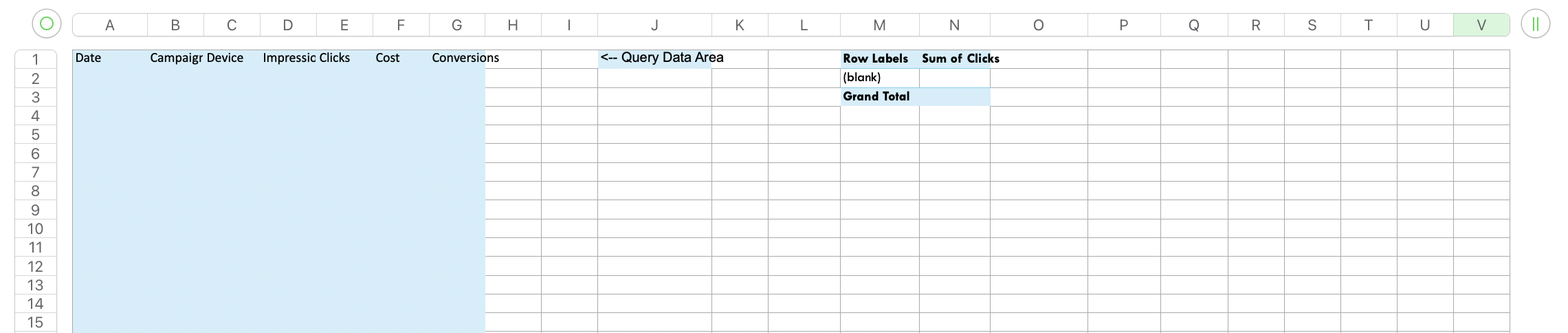
The first tab, Instructions, walks you through a step-by-step process to configure your queries and fill in the data sheets. You’re expected to:
- Use Supermetrics to set up each query per platform
- Route data into each separate tab (Google Ads, Facebook Ads, etc.)
- Ensure column headers match exactly
- Refresh the queries manually to keep the dashboard up to date
One mistake — a renamed column, a broken query, or a missing data point — and the whole dashboard can break. And when that happens, there’s no built-in support or diagnostics to tell you what went wrong.
2. The dashboard is basic and clunky
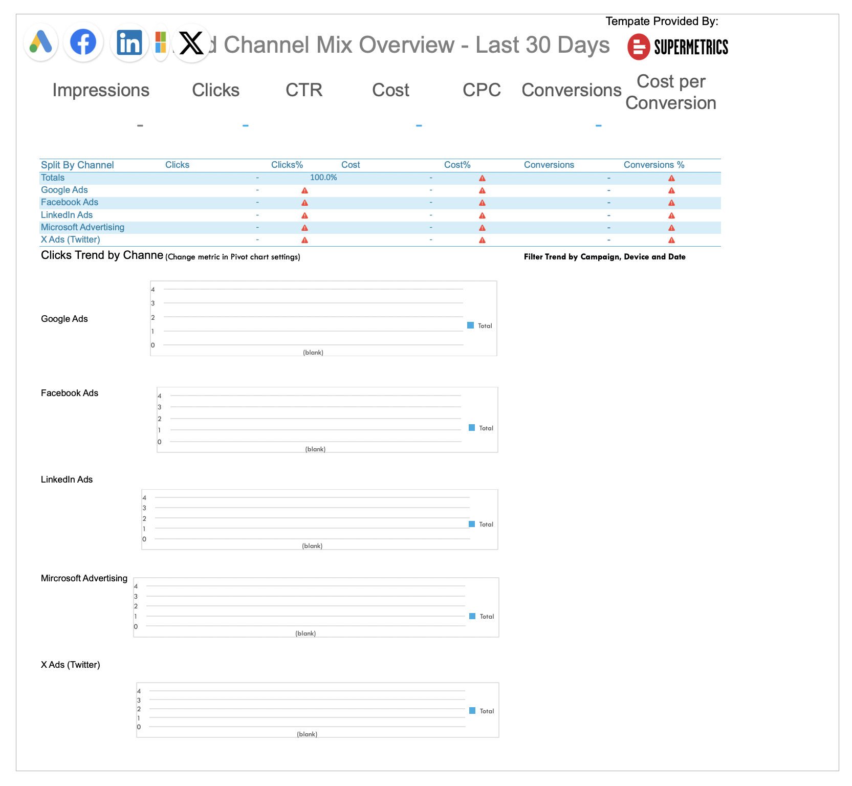
The Dashboard tab tries to summarize high-level performance (impressions, clicks, CTR, CPC, conversions), but it’s not much more than a spreadsheet with colored cells and a few outdated-looking charts.
Charts are embedded manually, hard to customize, and definitely not client-ready. The formatting looks like something from 2010 – not a polished, branded report you'd feel confident sharing with a client.
3. Platform data is split across too many tabs
Each platform (Google Ads, Facebook Ads, LinkedIn Ads, etc.) gets its own tab, meaning:
- Data isn’t unified unless you manually consolidate it
- There’s no easy way to view performance holistically
- You constantly have to jump between tabs to find answers
This setup creates friction and slows you down – especially when working across multiple accounts or clients.
4. When things break, you’re on your own
There’s no built-in error handling or alerting when data doesn’t load.
If a Supermetrics query fails or a column changes, you won’t know until you notice something’s off in the dashboard, and even then, figuring out what went wrong requires digging through formulas and queries.
Whatagraph PPC Report Template
Unlike the Supermetrics Excel version, which feels cluttered, hard to format, and overly manual, the Whatagraph PPC report template is structured to be both visually impressive and easy to use, even for non-technical users.
1. Starts with a Performance Overview
 The first tab gives you a clean, professional snapshot of all key PPC metrics across platforms – impressions, clicks, conversions, CPC, and spend.
You can create these aggregated values using simple, no-code workflows inside of your report – no need to bounce between different spreadsheets or dashboards or dabble with SQL or coding.
And best of all, you can save these metrics and formulas as templates for future reports.
Also, see the summary and recommendations section?
You can get AI to write it out for you in any language you want from 18 languages available – and edit them however you want after. AI is supposed to be a starting point, but you call the shots.
2. Channel-Level Tabs for Deep Dive
 Each platform has its own section – Meta Ads, Google Ads, LinkedIn Ads etc. – with detailed campaign breakdowns, KPIs, so you can do a deeper-dive.
You even get to see top-performing ad creatives with detailed metrics for each ad.
The best thing? Once you’ve customized a PPC report for a particular client, you can save it as a template and re-use it to create another report for another client. No need to rebuild or reconfigure every time.
But what about when you have to edit the reports?
With Supermetrics’ Excel or Google Data Studio report templates, you’d have to edit each report individually. This is fine if you only have one – but if you have dozens, it can quickly snowball into hours of work.
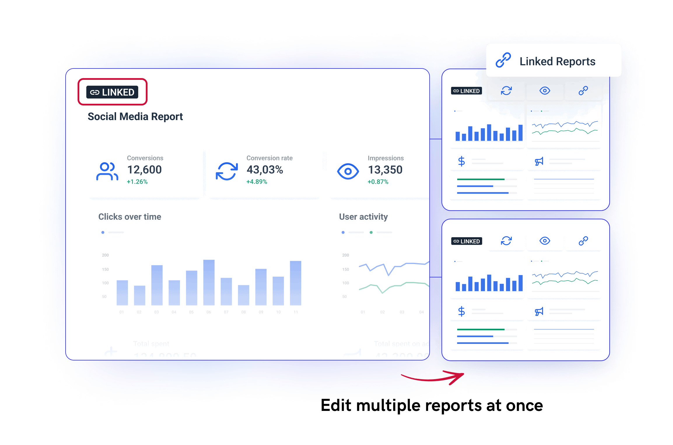
On Whatagraph, we have something called “Linked templates” that lets you edit linked reports in bulk rather than one by one.
Basically, you have a “Master” template that you can link as many reports you like to. When it’s time to edit – say you want to change the metric inside a widget or a widget icon – you can simply edit that Master template, and the changes will sync automatically across all the linked reports.
How do Supermetrics reporting templates work?
Supermetrics templates aren’t standalone dashboards or plug-and-play reports. Instead, they’re a starting point — a pre-formatted file (usually a Google Sheet, Looker Studio dashboard, Excel file, or Power BI workspace) that needs to be paired with a Supermetrics connector.
Here’s what the setup usually looks like:
1. Choose your template
You start by browsing the Supermetrics template gallery and picking one that matches your reporting goal — e.g. a Facebook Ads report in Looker Studio.
2. Connect your data sources via Supermetrics
Once the template is opened, you’ll be prompted to authorize Supermetrics and connect to the right data source (e.g. Google Ads, GA4, Facebook Ads).
If you don’t have an active Supermetrics license or the right connector plan, this step won’t work.
3. Map the right accounts or campaigns
You then select which accounts, properties, or campaigns to pull into the report. The template is just a shell – no data is included – so everything depends on how you configure the data source.
4. Customize filters and date ranges
Most templates come with a few pre-set filters, like time period or campaign name. You’ll need to adjust them to reflect your actual reporting needs.
5. Tweak charts, fix layout issues, and apply branding
Supermetrics doesn’t format or brand the reports — that’s up to the destination tool. You’ll need to:
- Adjust the layout to fit your KPIs
- Add your company logo, colors, and fonts (if supported)
- Clean up any broken charts or error messages
6. Refresh data regularly
The templates don’t auto-update unless you’ve set up scheduled refreshes. Even then, data breaks are common, especially if:
- APIs change
- Your ad account is disconnected
- Your Supermetrics license expires or downgrades
TL;DR:
Supermetrics templates are helpful starting points, but they’re not turnkey reporting solutions. You still need to:
- Configure connectors
- Troubleshoot data loads
- Format the visuals yourself
- And double-check that everything stays up to date
This is exactly why many marketers switch to Supermetrics alternatives like Whatagraph – where data connection, visualization, and insights all happen in one place.
Published on Mar 08 2023
WRITTEN BY
YamonYamon is a Senior Content Marketing Manager at Whatagraph. With an eye for detail and a knack for always considering context, audience, and business goals to guide the narrative, she's on a mission to create genuinely helpful content for marketers. When she’s not working, she’s hiking, meditating, or practicing yoga.