9 Best Client Reporting Tools Marketing Agencies Love in 2025
Looking for a client reporting tool to create stunning reports in less time?
I’ve got you covered.
In this article, I’ll review 9 best tools in the market—including the features, pros and cons, and pricing of each.

Apr 01 2025●10 min read

Reports are key to building trust with your clients, and keeping them at your agency.
But here’s the catch: your reports need to be accurate, comprehensive, and engaging for clients to actually read them and understand the value of your agency.
Manually creating a report like this can take hours, but a client reporting tool can make it easier and faster.
But not every tool is created equal.
Over the past 6 months, I’ve talked to agency leaders and marketing specialists to find out what really matters in a client reporting platform. Here’s what they said:
✅ Reliable direct integrations: Your tool should connect directly to the platforms you use (like Google Ads, Meta, GA4). Native integrations are faster, more stable, and don’t require extra setup or maintenance.
✅ Comprehensive data organization: You should be able to blend data from multiple sources, standardize naming, and build custom formulas, without writing a single line of code.
✅ Fully customizable reports: This is key to creating reports that clients can easily understand. Look for a tool that lets you fully brand and tailor your reports…layouts, metrics, icons, colors, and all.
✅ AI-fueled analytics: Good tools help you explain results fast. AI summaries and chatbots can speed up performance reviews and help you answer client questions in real-time.
✅ Amazing customer support: Onboarding a new tool can be overwhelming. It’s important to make sure you can reach out to an actual human who can help you with any questions you have. The faster the customer support, the better.
So, with all that in mind, here are the 9 best client reporting tools agencies swear by in 2025.
9 Best Client Reporting Tools for Marketing Agencies in 2025
Here is our list of the best client reporting software based on their distinctive features, pros and cons, and pricing:
- Whatagraph
- Looker Studio
- AgencyAnalytics
- TapClicks
- Klipfolio
- Microsoft Power BI
- Domo
- Cyfe
- NinjaCat
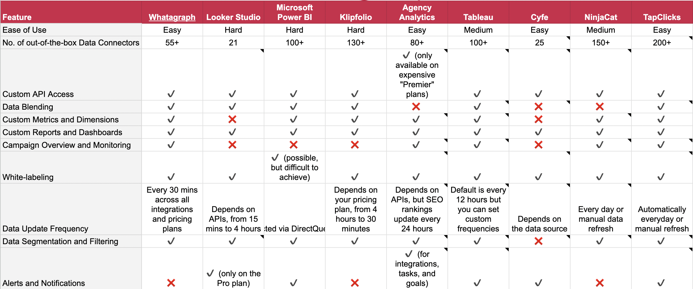
Have a list of features you’re looking for? Compare them in this spreadsheet (you can copy it for your internal use):
→ Client Reporting Tools – Feature Checklist
Here’s a sneak peek:
We’re starting off with our own, Whatagraph, because we built it specifically for agencies like yourself, and covers all your needs. Let’s look at how.
1. Whatagraph
Best for: medium to large agencies that want a holistic, easy to use, and fully customizable client reporting tool
Whatagraph is a holistic client reporting tool that makes it ridiculously easy to collect, analyze, and report on your marketing data.
From the get-go, Whatagraph is designed to be easy on the brain. Anyone on your team—whether that’s an Account Manager or a data analyst—can start analyzing data and building reports right away.
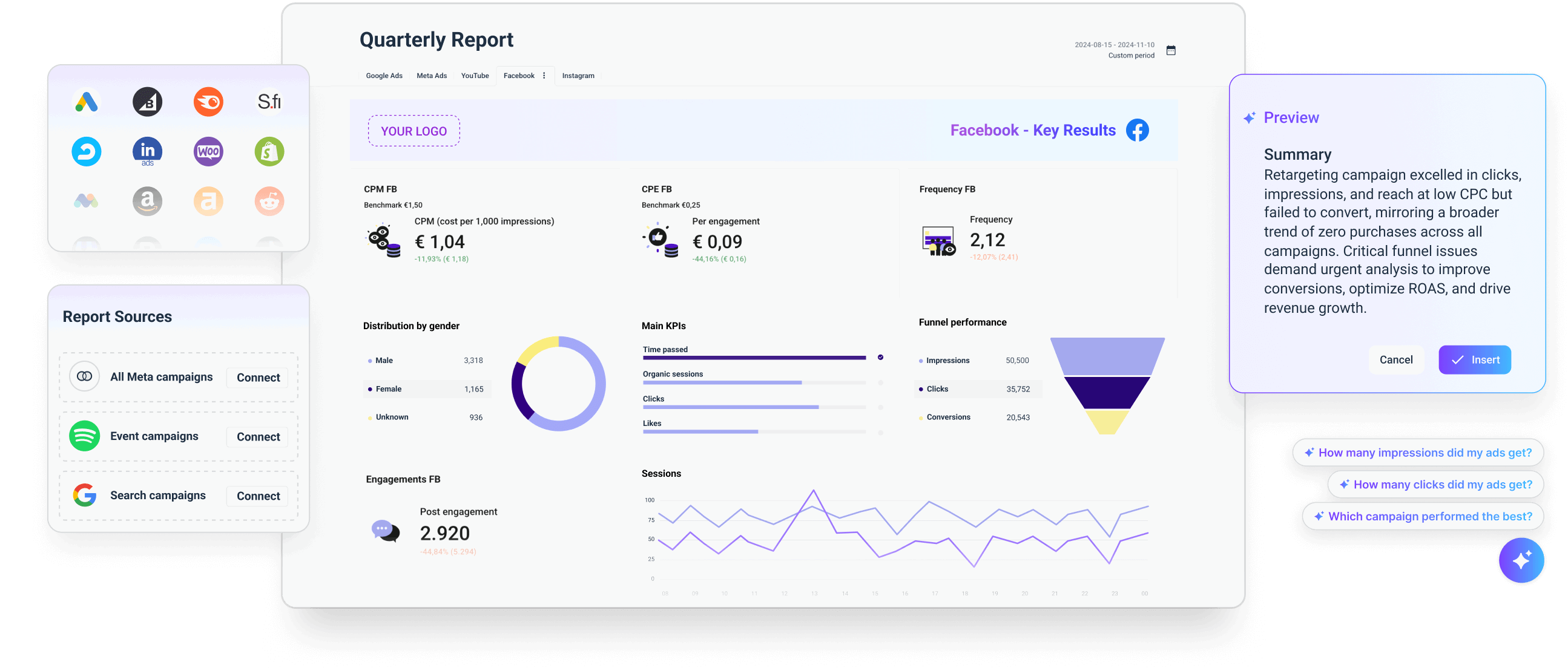
In a nutshell, here’s what you can do on Whatagraph:
- Connect to 55+ marketing channels in a few clicks. Your data flows directly to your reports. No extra connectors required.
- Clean your data before visualizing it. Create unlimited data blends, custom metrics and dimensions, and custom formulas—without writing a single line of code.
- Visualize your data using ready-made templates or drag-and-drop widgets. Fully white-label your reports with custom logos, colors, and even email domains.
- Monitor your marketing performance through an internal monitoring dashboard. Analyze data by client, campaign, Account Manager, or whatever makes sense for your business.
- Ask our AI chatbot anything about your marketing performance. Get succinct summaries and add them directly to your reports (or edit them to fit your brand voice).
- Share reports via live links, PDFs, Excel, or automated emails. You can also transfer your data to BigQuery and Looker Studio through Whatagraph.
 All of this on one platform means:
- Your data is safe and secure in one place.
- Your reports are accurate, holistic, and easy for clients to understand.
- Your team can easily monitor performance and optimize campaigns quickly.
Don’t take our word for it though. Hear it straight from one of our customers:
 But does Whatagraph check all the boxes you’re looking for? Let’s take a look:
1. Stable, direct integrations
On Whatagraph, you can bring data from 55+ marketing platforms into one place. We also add new integrations every quarter, so even if you don’t see one you need right now, it might be released before you know it.
You don't need to have SQL or coding skills to set these integrations up either. All you need to do is:
- Choose a channel from a menu bar.
- Connect your account.
- Connect your data source.
Assign these data sources to specific folders, Account Managers, location, or anything else that makes sense for your business.
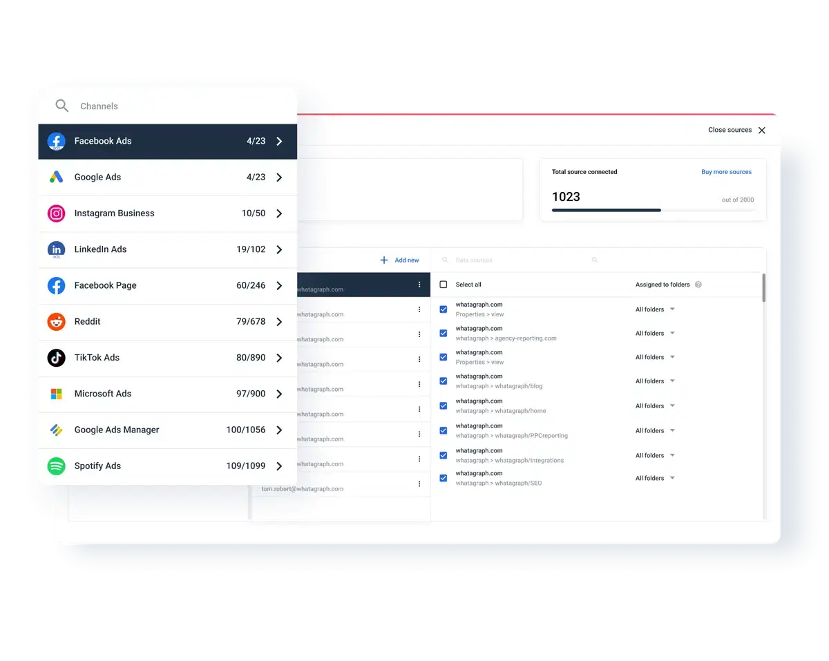 All these integrations are also direct, meaning you don’t need any third-party tools to connect to sources.
Direct integrations are more stable, and if there are bugs, they get resolved faster without having to get a third-party company involved.
Tanja Keglić, Performance Marketing Manager at Achtzehn Grad, said this about us:
We don’t have any connection issues on Whatagraph at all. We just connected the platforms once, and that was it. It’s very, very quick when loading the data on reports.
2. Comprehensive data organization
Before you visualize your data, it’s important to clean and organize it so your reports are holistic and easy to read.
On Whatagraph, you can:
- Blend data from multiple platforms for a single, holistic view of performance
- Standardize metric names, campaign names across all channels into one, clear format
- Calculate any new metrics you want based on client’s or agency’s needs
You don’t need to do any coding or even go out of your reports to organize your data too. You can simply do all this inside of your report environment.
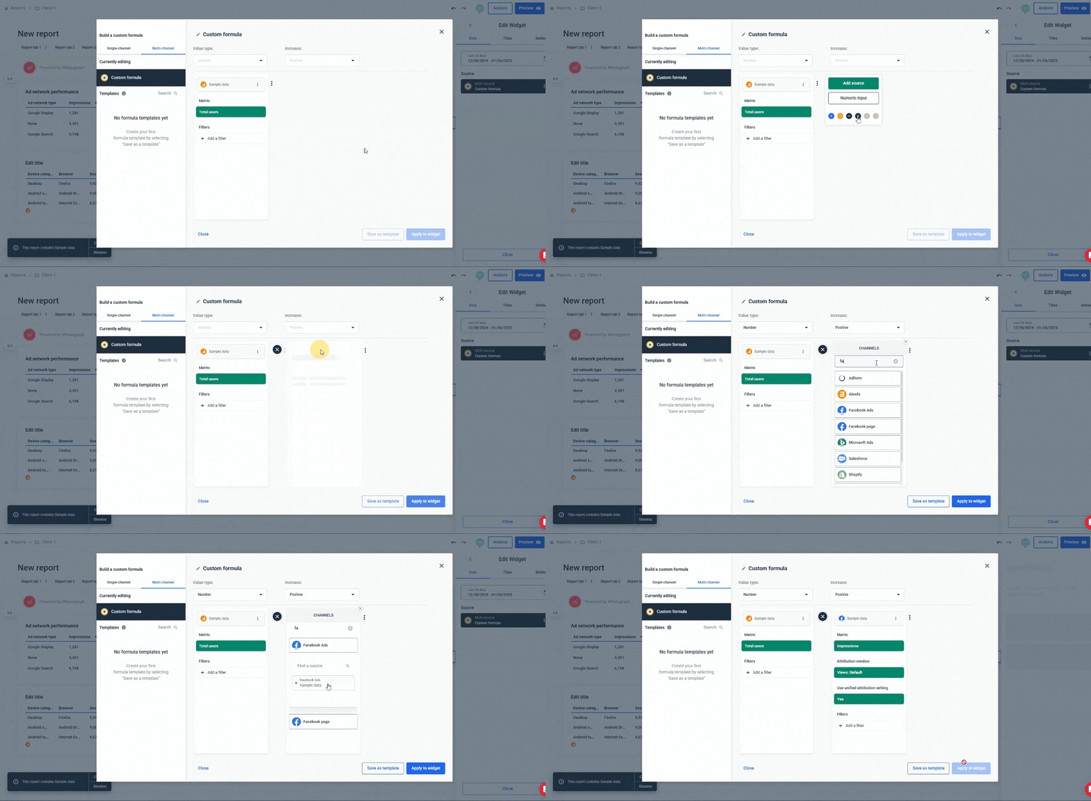
For instance, say you want to see the total metrics from all your PPC channels. You can easily create a blended source group like so:
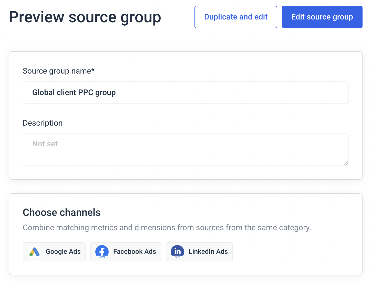 Then, in your reports, you can visualize the total number of key metrics, like “Impressions”:

This means clients see a holistic view of marketing performance in one report, rather than having to jump between different reports or spreadsheets.
This is exactly what Stef Oosterik, Quality Manager at Dtch. Digitals loves about us. He said:
Clients can see the total results in one place, without jumping between different sheets or reports. This avoids confusion, especially for those who might not fully understand online marketing.
3. Fully customizable dashboards and reports
Here’s the harsh truth—clients get bored if the reports are just a bunch of numbers. And they’re more likely to move to other agencies if they don’t understand the results you’re bringing for them.
This is why it’s so important to design your reports so they’re engaging and easy to understand, and that's where Whatagraph comes in.
Whatagraph’s reports are fully-customizable—and when we say “fully”, we mean it.
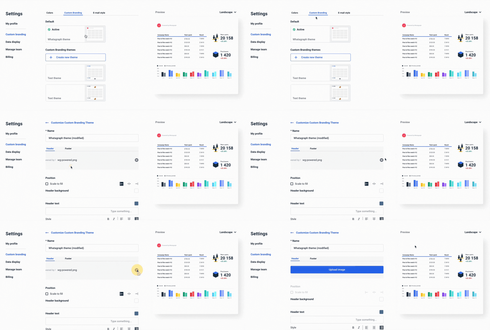
For one, you can white-label your reports at three different levels:
- Global level (for all reports)
- Report level (for a specific report)
- Widget level (for a specific widget in a report)
And when we say “white-label”, we mean:
- Uploading your logo or your client’s logo
- Adding header or footer texts
- Choosing from pre-made color schemes – or setting your own
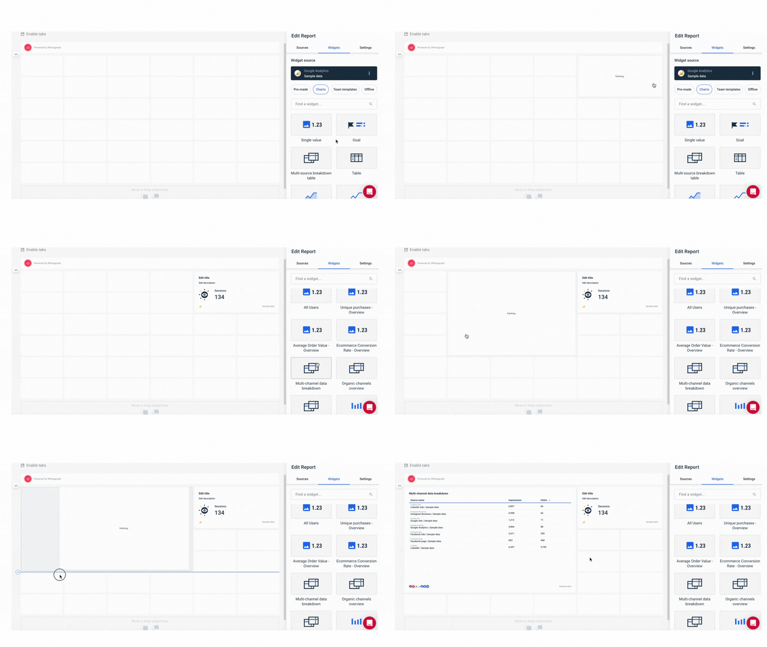
In the report itself, you can:
- Change the orientation (landscape vs. portrait)
- Apply custom branding (logo, colors, and header and footer texts)
- Insert or delete rows anywhere
- Drag-and-drop pre-made widgets
Take a look at some marketing report examples here.
That’s not all. For each widget in the report, you can:
- Write custom titles and descriptions
- Change the currency display
- Hide or show footers
- Choose custom colors
- Choose icons from an icon library
![]()
Drew Cove, Senior SEO Manager at DigitalParc, loves this about us. He said:
We use Whatagraph for all our client’s reports. The ability to title metrics differently is important to us because we often report the same metrics to different clients and just need to call them differently because many clients have internal terminology that is very different from one another.
All this customization means:
✅ You can truly make your report your own.
✅ Your reports are engaging and easy to read with lots of stunning visuals.
✅ Your clients don’t get bored and can understand marketing results easily.
In fact, Stef said:
The look and feel of the reports is way more professional compared to before. Clients are more satisfied with the reports and they tell us this is the way forward for us.
When the time comes to share your reports, you can choose to either schedule automated reporting emails, share live links, or share PDFs, Excel, or CSVs.
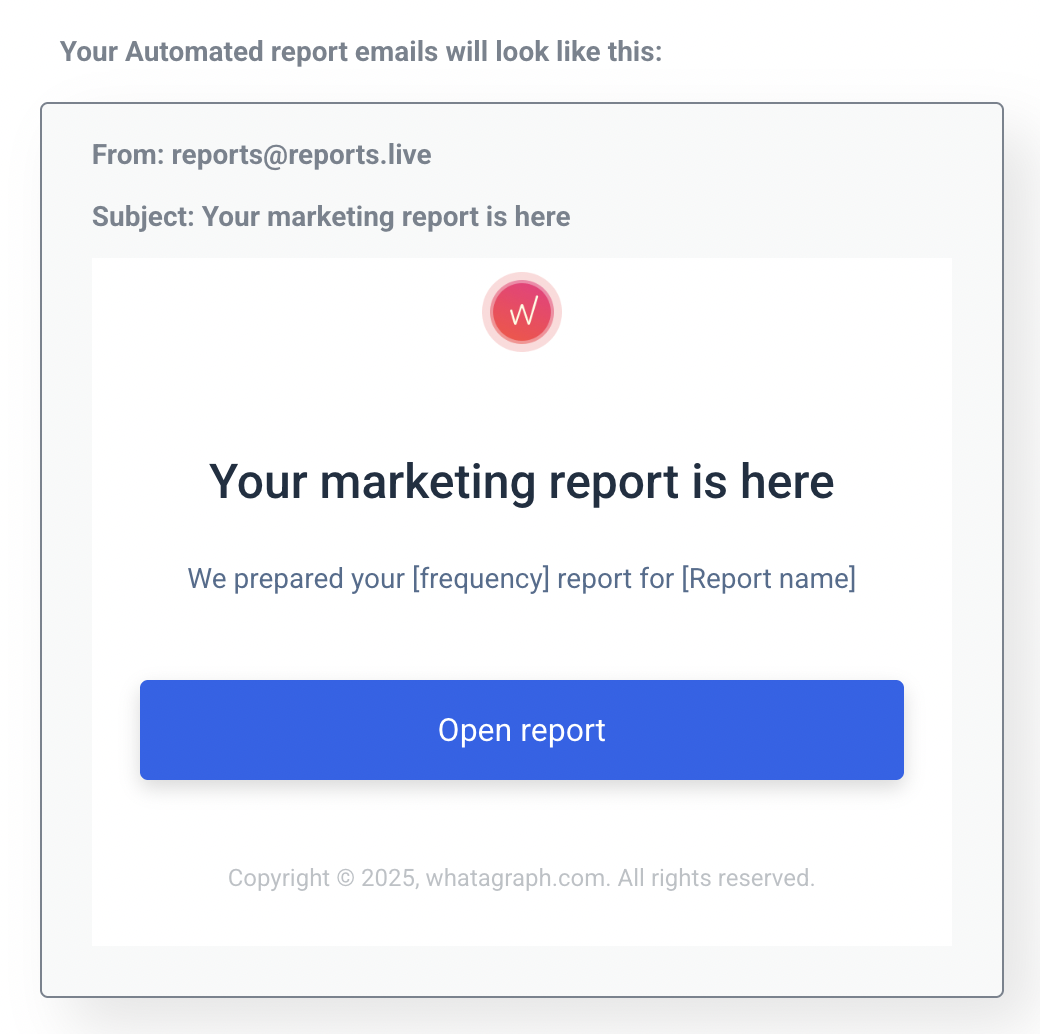
If you opt for the automated email, you can fully customize it by:
- Uploading your agency’s logo
- Adding heading, body, footer, and button texts + colors
- Adding your own sender name and reply name
- Creating your own email domain
- Writing subject lines
4. AI-fueled summaries and analytics
Most of the time, clients want to see a summary of performance on their reports like:
- What happened last month?
- How much money did we spend?
- What's the ROI?
- What are the key trends?
- How are we moving forward?
But the problem is—it can take a while to dig out all this information and write these summaries if you’re manually doing them.
And if you have 5+ clients, it becomes a huge task to just write out these performance summaries over and over again.
Whatagraph solves this problem with two AI features:
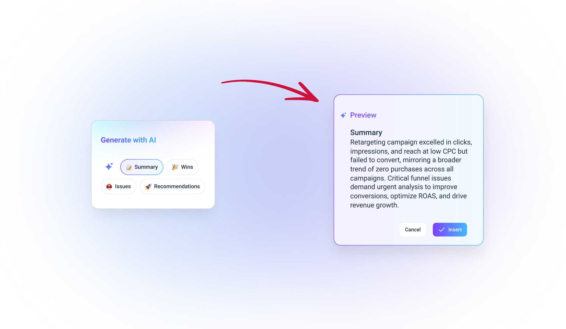
- AI summaries for reports: Instead of writing summaries yourself, you can generate AI report summaries and add them to your reports using our Text widget. You can also edit them and write your own thoughts for that human touch. ✨
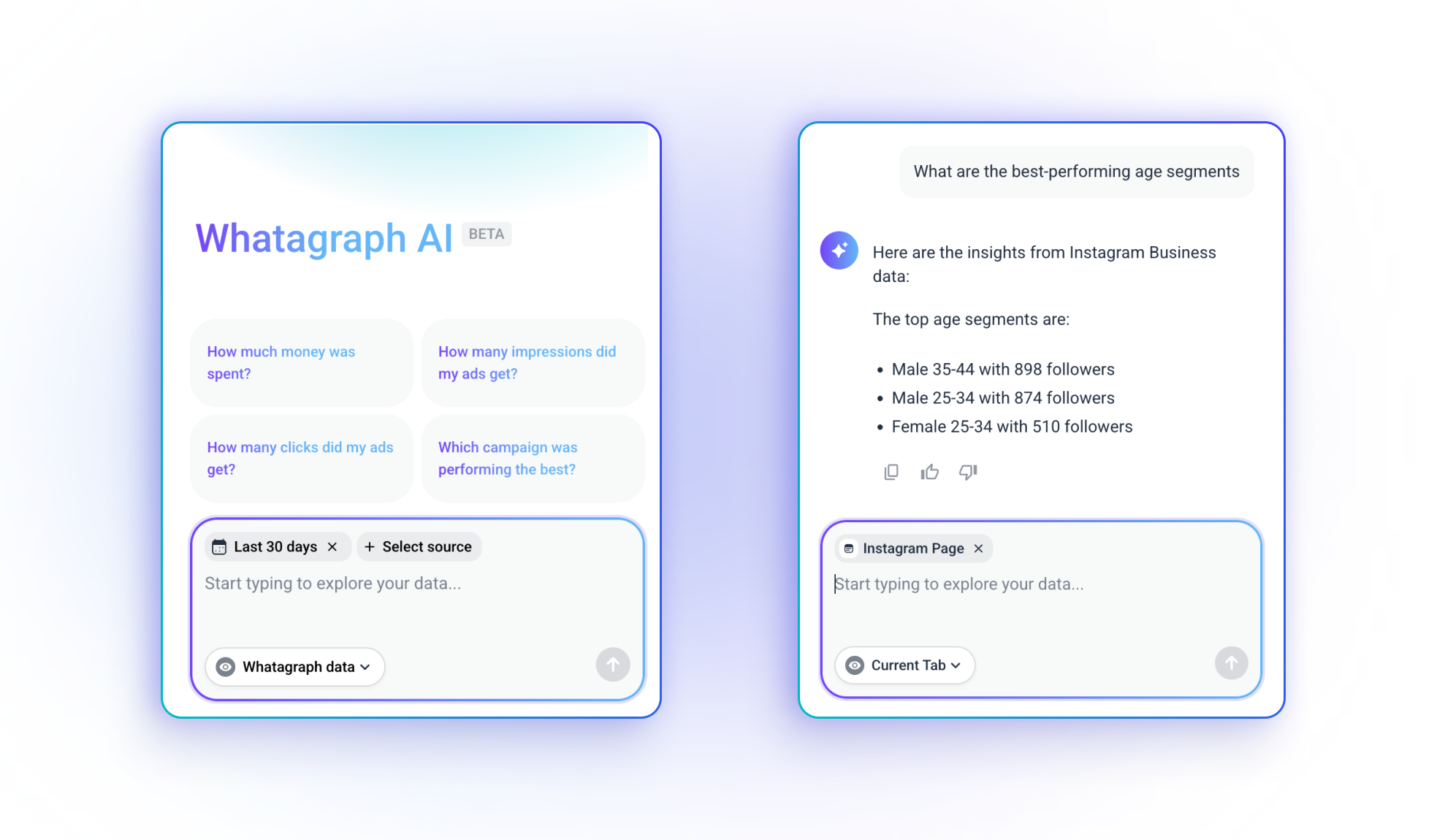
- AI data chatbot: This is your personal data analyst. You can ask our AI chatbot anything about your marketing performance (e.g. How much did we spend on Google Ads last month?”) and it’ll give you succinct summaries. Great for answering ad-hoc client’s questions.
5. Amazing customer support
At Whatagraph, we believe Customer Success is a must-have, not an add-on.
Once you start your journey with us, you’ll be assigned a dedicated Customer Success Manager, and have access to our in-app live-chat that responds to messages within 1 minute.
Your dedicated Customer Success Manager will guide you through:
- Migrating your data from your current tool (if you have one)
- Setting up data connections
- Organizing your campaigns and data
- Automating reports
- Anything else that ensures your success with the product
In fact, customer support is the biggest aspect customers love about us. Just take a look at what Kim Strickland, Digital Marketing Specialist at Peak Seven agency, said:
I've joked about this often—with Whatagraph, we're not paying for a reporting system. We're paying for customer support. There's a level of dedication from the Whatagraph team that you don't often experience anywhere else.
Pros:
- All-in-one marketing analytics solution
- Easy to use by anyone on your team
- Engaging visual reports
- Fast campaign performance and insights
- Results easy to interpret
- Excellent live chat customer support that responds within 1 minute
Cons:
- No freemium plan
- No alerts and notifications (yet)
Pricing:
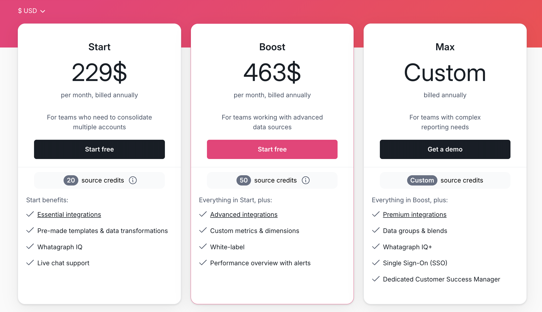
Whatagraph offers four pricing plans:
- Forever-free – lets you get started at no cost, with 5 source credits, Whatagraph IQ basics, templates, and live chat support.
- Start ($229/mo billed annually) – includes 20 source credits and essential integrations
- Boost ($463/mo billed annually) – jumps up to 50 source credits, adds advanced integrations, custom metrics & dimensions, white-labeling, and performance overview with alerts
- Max (custom pricing) – for enterprise/complex teams, with custom source credits, premium integrations, data groups and blends, Whatagraph IQ+, SSO, and dedicated Customer Success Manager
Whatagraph reviews from real users
“Amazing reporting tool to showcase channel performance and to create blended performance reports for yourself or for clients.” (Source)
“We used to have to make our reports by either screenshotting lots of different platforms (which looked awful), or by manually taking all the data and then inputting it into our own reports. This was very time consuming and subject to human error.
Whatagraph has removed that problem and by automating our reporting, has saved our team a lot of time. Also their customer support is excellent.” (Source)
“Whatagraph has a simple user interface that is easy to navigate even for those who don't have analytical skills.” (Source)
2. Looker Studio
Best for: boutique agencies that only needs connections with Google platforms
Looker Studio (previously known as Google Data Studio) is one of the most popular automated reporting tools. And on paper, it really looks good. It’s free, it allows you to collect data from hundreds of different sources and turns it into insightful reports.
Its biggest selling point is that it has excellent data integration with Google’s marketing platform. If your agency relies heavily on Google Analytics, Google Search Console, Google Ads, or YouTube, connecting data and creating reports will be super easy. You can then customize those reports and share them with clients.
However, things don’t go so smoothly when you try to import data sources outside Google’s ecosystem, such as LinkedIn or HubSpot. To connect this data, you need to purchase third-party connectors, which have proven multiple times not to be as reliable as Google’s native ones, leading to slow performance and instability.
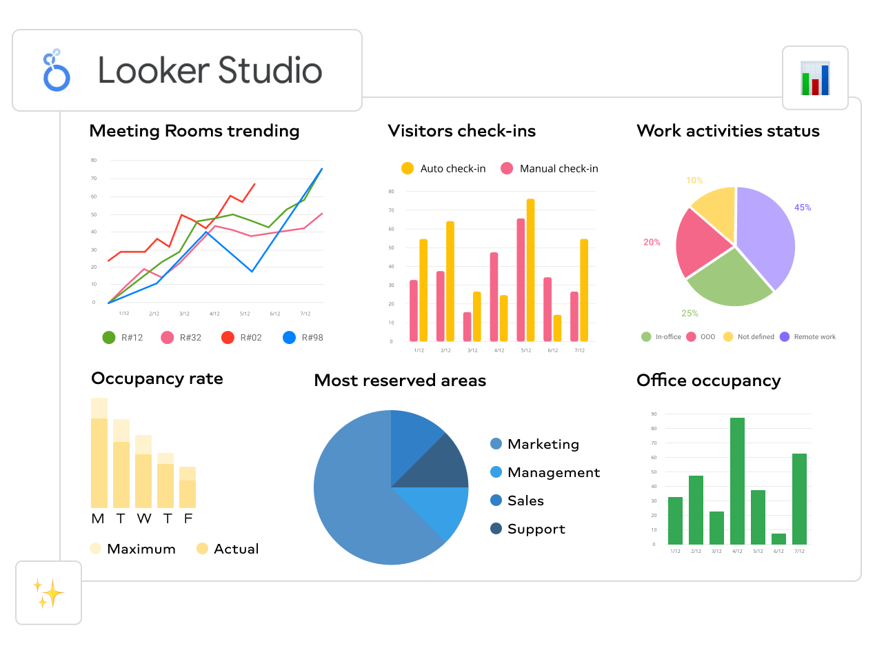
Another disadvantage is that Looker Studio reports lack real-time updates. Its core sources, which are mostly Google apps, refresh every 15 minutes, which may or may not be an issue for you. A much bigger issue is that although free with Google’s sources, this reporting tool can cost you more than you planned when you start connecting outside sources via third-party connectors.
This can be a problem for many agencies that feel they have outgrown Looker Studio when they try to scale their business by signing on more clients and using an increasing number of data sources.
Key features:
- Big collection of pre-built report templates
- More than 650 connectors built by third-parties
- Large variety of graphs and other visualization types, including Gantt charts, gauges, and waterfalls
- Embed dashboards on any site using shortcode
Pros:
- Wide customization options
- Large number of connectors
- Free with most Google sources
- Interactive reports
Cons:
- Can get slow with more data sources
- Limited blending capabilities
- Report performance depends on the performance of individual data connectors
- No way to save custom visualizations
- Steep learning curve
Pricing:
Looker Studio is free if you use data from the supported Google products. If you want to include data sources outside the Google platform, you need to pay a monthly subscription and purchase third-party connectors for those data sources.
There’s also the paid version called Looker Studio Pro. This is a premium version that has additional features like team access, connection to Google Cloud projects, and better support. The price is tailored to every customer based on their specific needs.
Looker Studio reviews from real users
“I love the way you can present data from multiple sources in one report. I also love the ability to blend different tables and show the information in one chart.” (Source)
“Unfortunately, connectors break quite regularly and reports containing a lot of data can take a lengthy time to load.” (Source)
“Looker studio needs more report downloading options such as Word and PDF.” (Source)
3. Microsoft Power BI
Best for: large agencies with a dedicated data team
Microsoft Power BI is an interactive data visualization platform developed to help businesses aggregate, organize, and analyze data. You can use it to create a variety of data-rich yet engaging dashboards and reports using data from a wide choice of marketing channels.
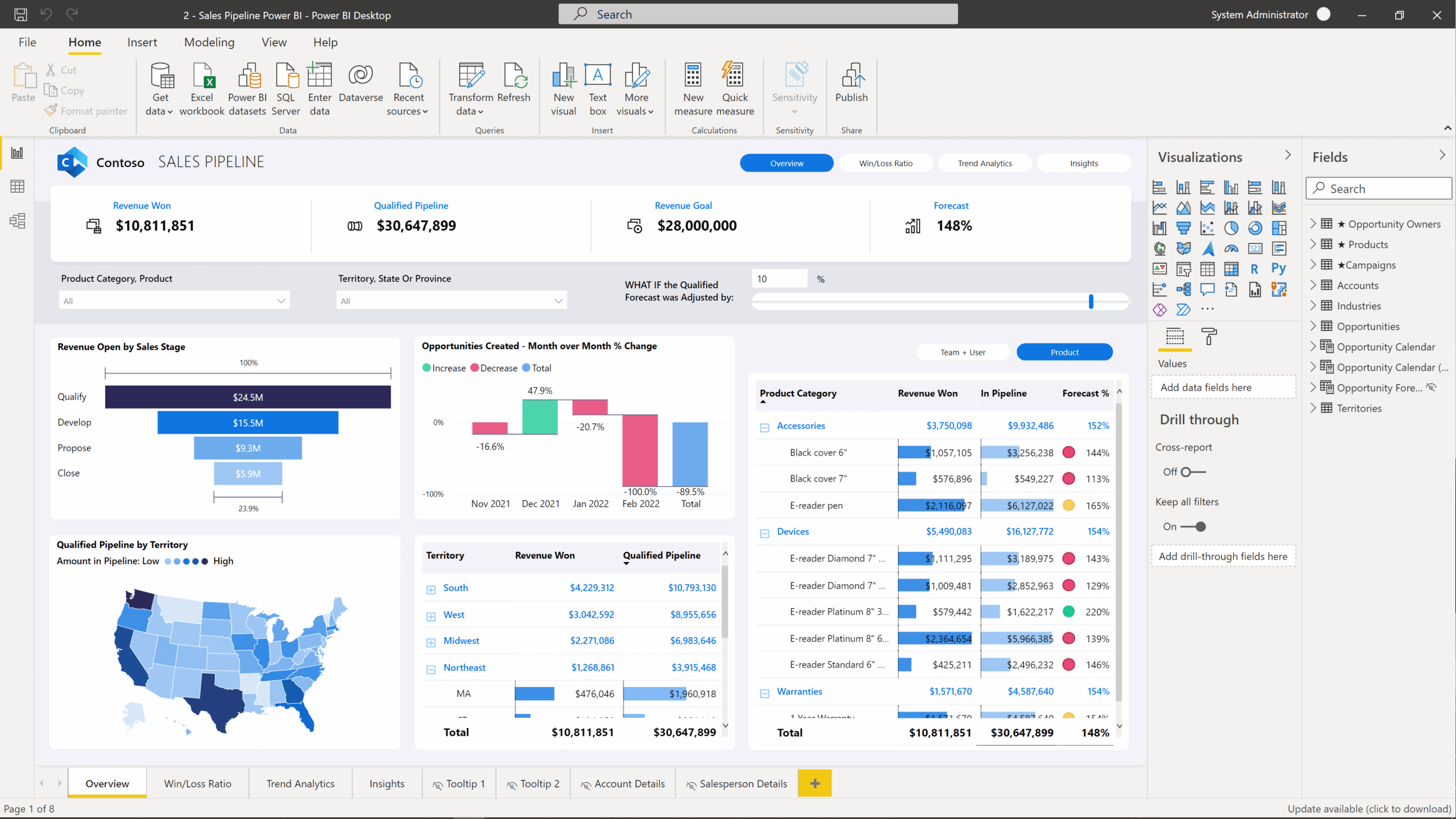
This comprehensive automated reporting tool helps marketers arrange client data from scattered sources and make it understandable for the end readers.
Similarly to other client reporting solutions (check Domo and Klipfolio descriptions below), Power BI puts focus on self-service. This means that decision-makers and end users are encouraged to access and manipulate information without ticketing data analysts every time.
Key features:
- Natural language Q&A box
- A wide choice of visualization types
- Flexible visualization tiles
- Native integration with major databases
- Office 356 App launcher
Pros:
- Wide choice of data connections
- Competitively priced business intelligence solution
- Scheduled data refresh for live reports
- Near endless customization possibilities
Cons:
- Steep learning curve for BI setup and edits
- Dependent on Microsoft environment
- Making changes yourself is difficult
- No support for mobile devices
Pricing
As of April 1, 2025, Microsoft Power BI pricing plans are as follow:
- Power BI Pro: $14 per user per month (previously $10) – does not include AI
- Power BI Premium Per User (PPU): $24 per user per month (previously $20)
If you want additional features like white-labeling and automatic monitoring, you’ll need to contact their sales team for a custom quote.
Power BI reviews from real users
“For anyone already used to the Microsoft ecosystem, PowerBI delivers a combination of a user-friendly interface and powerful analytics.” (Source)
“Power bi has a eye catchy user interface and tons of customizing options.” (Source)
“The DAX (Data Analysis Expressions) which is used to creating complex calculations in Power Bi need a deep learning curve for the new users.” (Source)
4. Klipfolio
Best for: data engineers or analysts at agencies
Klipfolio is a data analytics and reporting platform that comes with a huge library of report templates that you can connect to multiple client data sources. We included Klipfolio in this list because it allows you to track your clients’ data history, which helps with identifying trends and monitoring performance metrics over time with no trouble.
Also, Klipfolio allows more technically oriented agency users to gain deeper insights through complex formulas, data modeling, and machine learning functionalities.
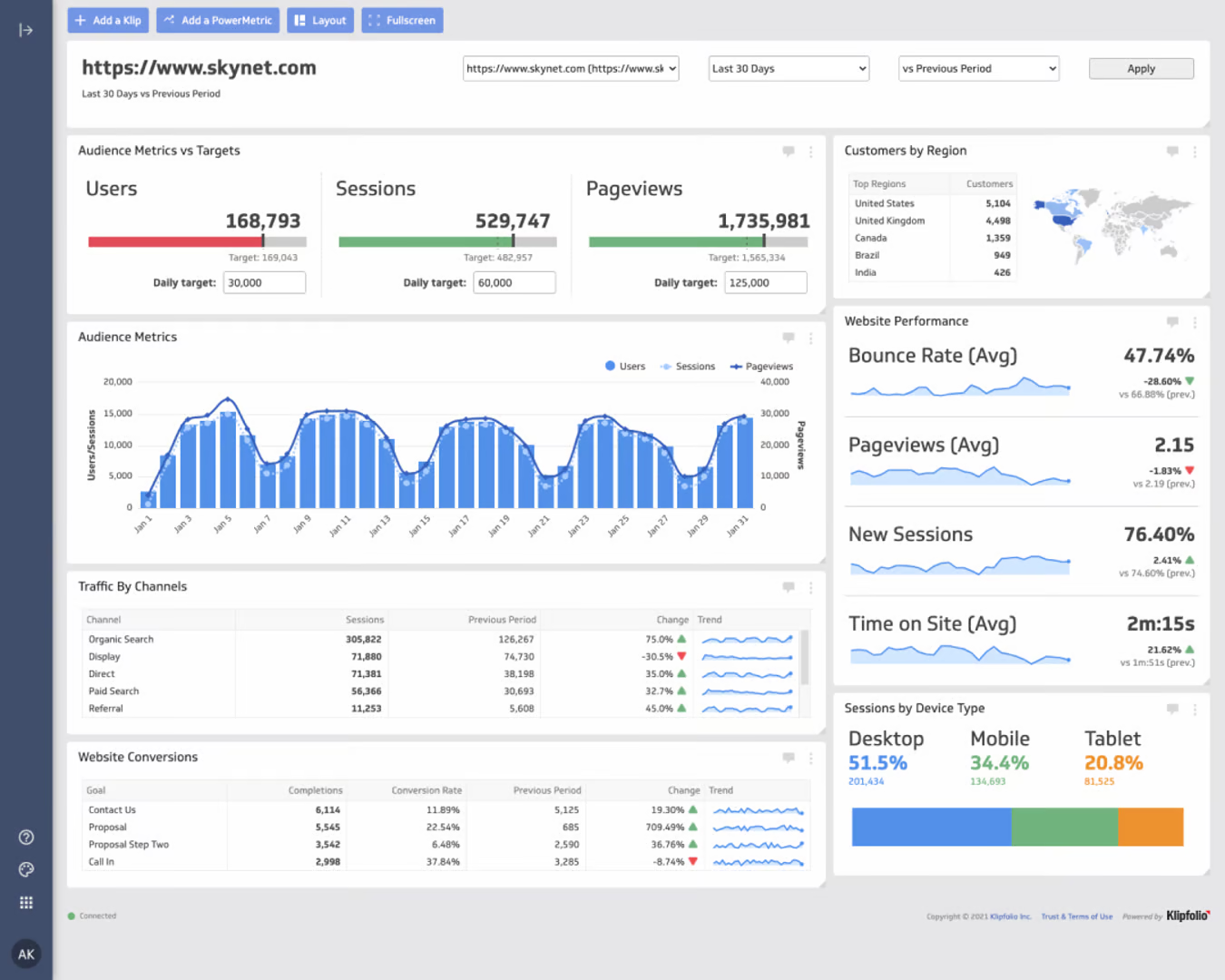
Like Power BI, this client reporting solution leans heavily towards metric explorations and self-service reporting.
You can connect scattered data sources into a centralized hub, which other team members can use to access shared, updated information necessary for decision-making. This data sharing among team members is made easier by the ability to add users to an account, organize them into groups, and assign them specific user permissions.
Using a complementary analytics tool called Powermetrics, designed for large agencies, you can effortlessly segment and visualize their client data using different filters and visualization types.
However before you consider Klipfolio as your solution to digital client reporting, keep in mind that both the data refresh rate and historical data limits depend on the pricing plan you get.
The same applies to the number of reports you can have at any given time — it is tied to your package. While simpler Klips are easy to create, building anything more customized might take you a lot of time, especially since only a handful of pre-made templates are available.
Key features:
- Customized dashboard builder
- Report sharing and collaboration
- Predictive modeling
- Live connection to external data
- Data presentation and storage
- Interactive dashboard visualizations on mobile
- My SQL server
Pros:
- Easy to create complex dashboards
- No-code integrations
- Good user support and documentation
- Large choice of dashboard templates
- Custom metrics and calculated fields
Cons:
- Steep learning curve
- Limitations in uploaded file size
- Klips can be confusing for people with no coding skills
- Every Klip is configured in a separate environment
- Number of dashboards depends on pricing plan
Pricing
As of April 2025, Klipfolio offers four pricing plans for agencies:
- Starter: $110/month for 5 dashboards and clients, and 4 hr data refresh rate. Essential features like “scheduled reports”, “custom domain”, and “custom theme” are not included.
- Lite: $210/month for 15 dashboards and clients, and 1 hr data refresh rate. Features like “priority support”, “custom domain”, and “custom theme” are not included.
- Pro: $420/month for 30 dashboards and clients, and 30 min data refresh rate. Features like “custom onboarding” and “custom theme” are not included.
- Premier: $1,025/month for 80 dashboards and clients, and 30 min data refresh rate.
Klipfolio reviews from real users
“Klipfolio has a user-friendly interface. It can be easily connected with databases, Excel sheets, and Google sheets which makes data integration very smooth and easy.” (Source)
“I love the full range of capabilities that are possible when building a Klipfolio dashboard (specifically with their Klips product).” (Source)
“Every time I contact support I get the impression that I am bothering them. I will not be renewing this platform because I do not feel valued as a customer.” (Source)
5. AgencyAnalytics
Best for: SEO and content marketing agencies
AgencyAnalytics is a client reporting tool designed specifically for marketing agencies looking to automate their reporting process. The tool lets you connect your clients’ analytics or marketing platforms and create custom reports that help them make informed decisions.
AgencyAnalytics comes with SEO auditing tools that can scan your client’s sites automatically and raise alerts in case of any issues.
The tool has an user-friendly interface that makes it easy for users to create custom reports for different scenarios. You can also customize colors and charts for improved branding and communication.
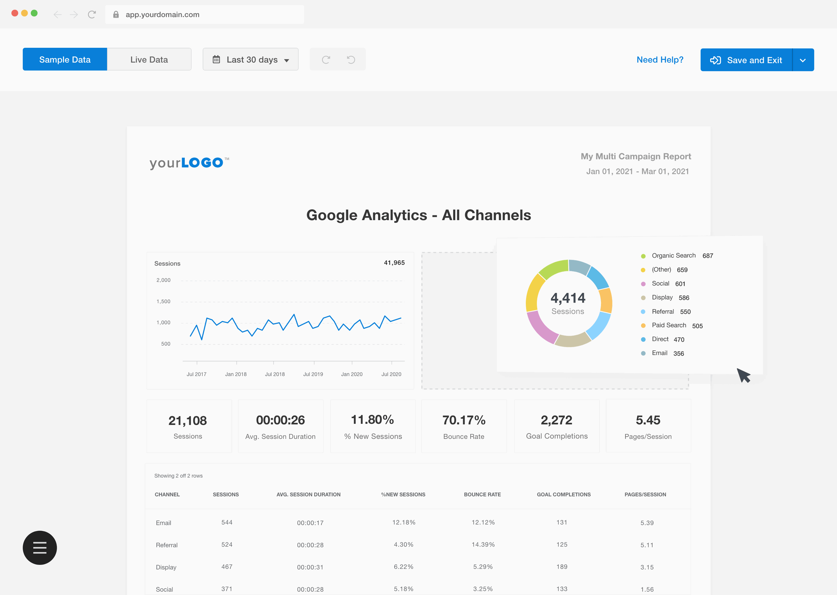
On the other hand, if you regularly need to organize data, you may have to look for another tool. Actions like blending, aggregating data from multiple sources, or unifying names of metrics and dimensions so they are more in line with the client’s internal communication are not available with AgencyAnalytics.
Key features:
- White-label reporting
- Integrates with 80+ different data sources
- Cross-campaign data
Pros:
- Intuitive user interface
- Responsive customer service
- Live reports
Cons:
- Expensive for startup agencies
- Limited widget customization
- Steep learning curve
- No bulk report edit
- Reports older than 60 days get deleted
Pricing:
As of April 2025, AgencyAnalytics offers three pricing plans:
- Freelancer: $79/month for 5 clients
- Agency: $239/month for 10 clients
- Agency Pro: $479/month for 15 clients
Optional Add-ons:
- Rank tracker: $50/month per 500 keywords
- Database connectors like MySQL and Google BigQuery: custom quote
- “Concierge Implementation”: custom quote
AgencyAnalytics reviews from real users
“AgencyAnalytics helps me create quick, automated, and clean reports for our clients which saves me a ton of time.” (Source)
“It can sometimes be a little buggy and take time to load. Adding new integrations can sometimes be challenging because of this.” (Source)
“I would like the capability of merging data from different platforms in graphs and metrics (e.g. using data from Google Ads with GA4) in the same section. I also don't like that some platforms aren't yet available (e.g. Reddit).” (Source)
6. Tableau
Best for: large agencies with a dedicated data engineer
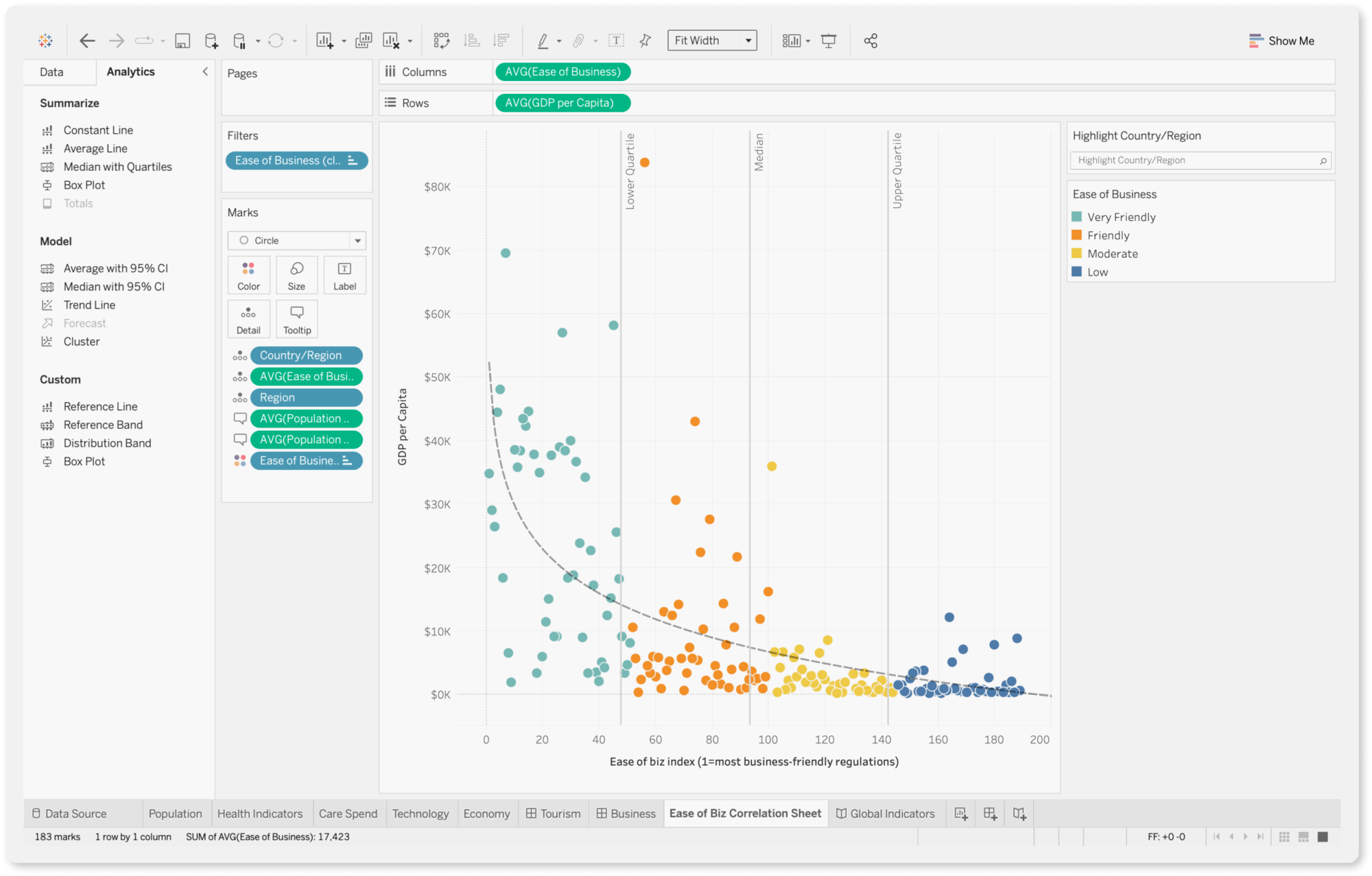
Tableau is a business intelligence platform that agencies can use to manage data, automate reporting, and deliver actionable insights to their clients.
You can perform complex data analysis, uncover trends, and identify opportunities for optimization using features such as trend lines, forecasting, and clustering.
Despite these advanced features, Tableau is still (relatively) easy to use with a drag-and-drop interface and visual query builder. You can generate insights quickly and share them with stakeholders through reports.
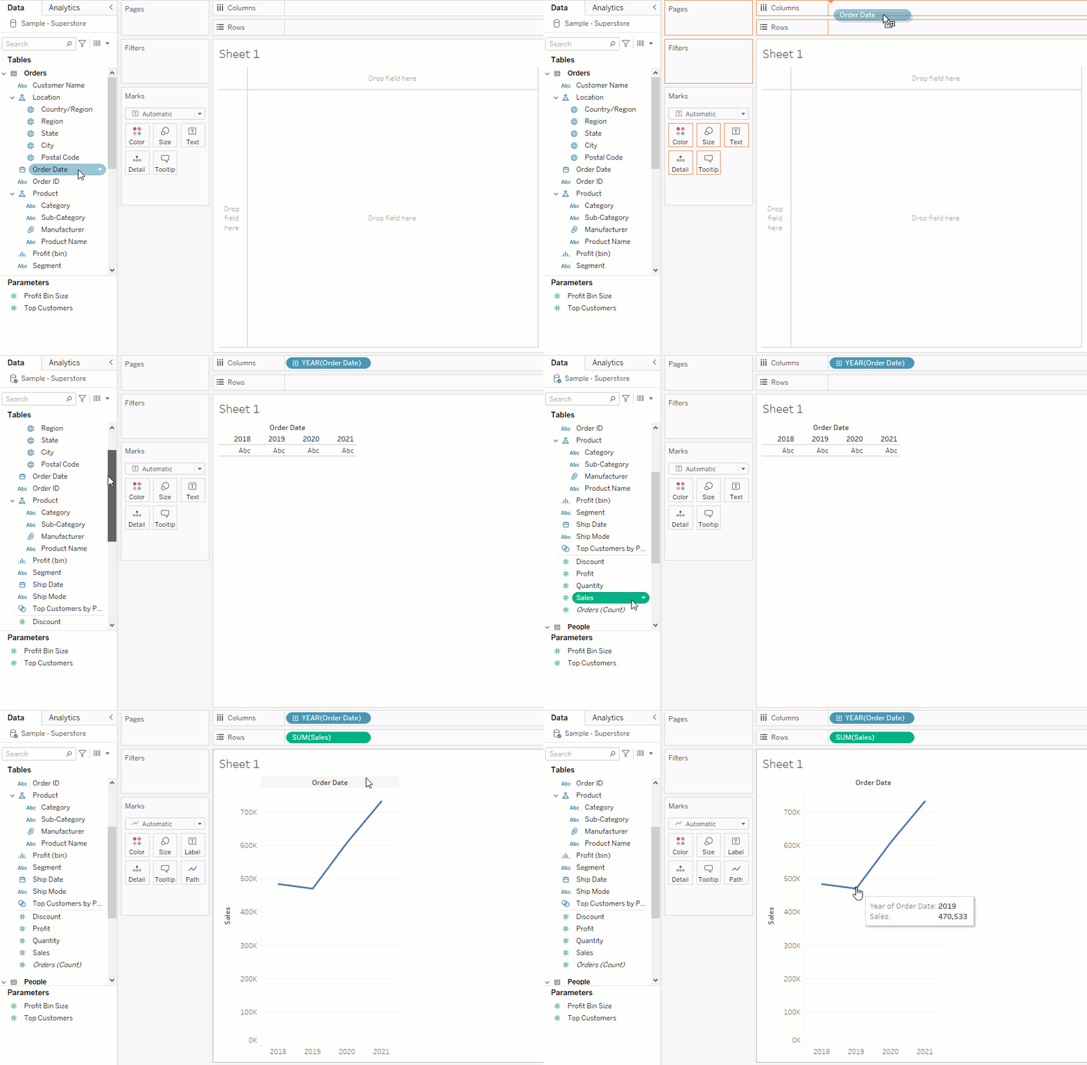
If you need help, you can go to Tableau community forums and ask your questions. A current Tableau user or a moderator will answer you. You can also purchase “Success Plans” that come with personalized training and support.
The best thing about Tableau is “Einstein”, which analyzes your data from all your sources and channels, and points out patterns or insights you might miss on your own.
For example, it can show you which types of ads are attracting the most customers or predict which customers are likely to make a purchase. This helps you make better decisions because you’re basing them on real data, not just guesses.
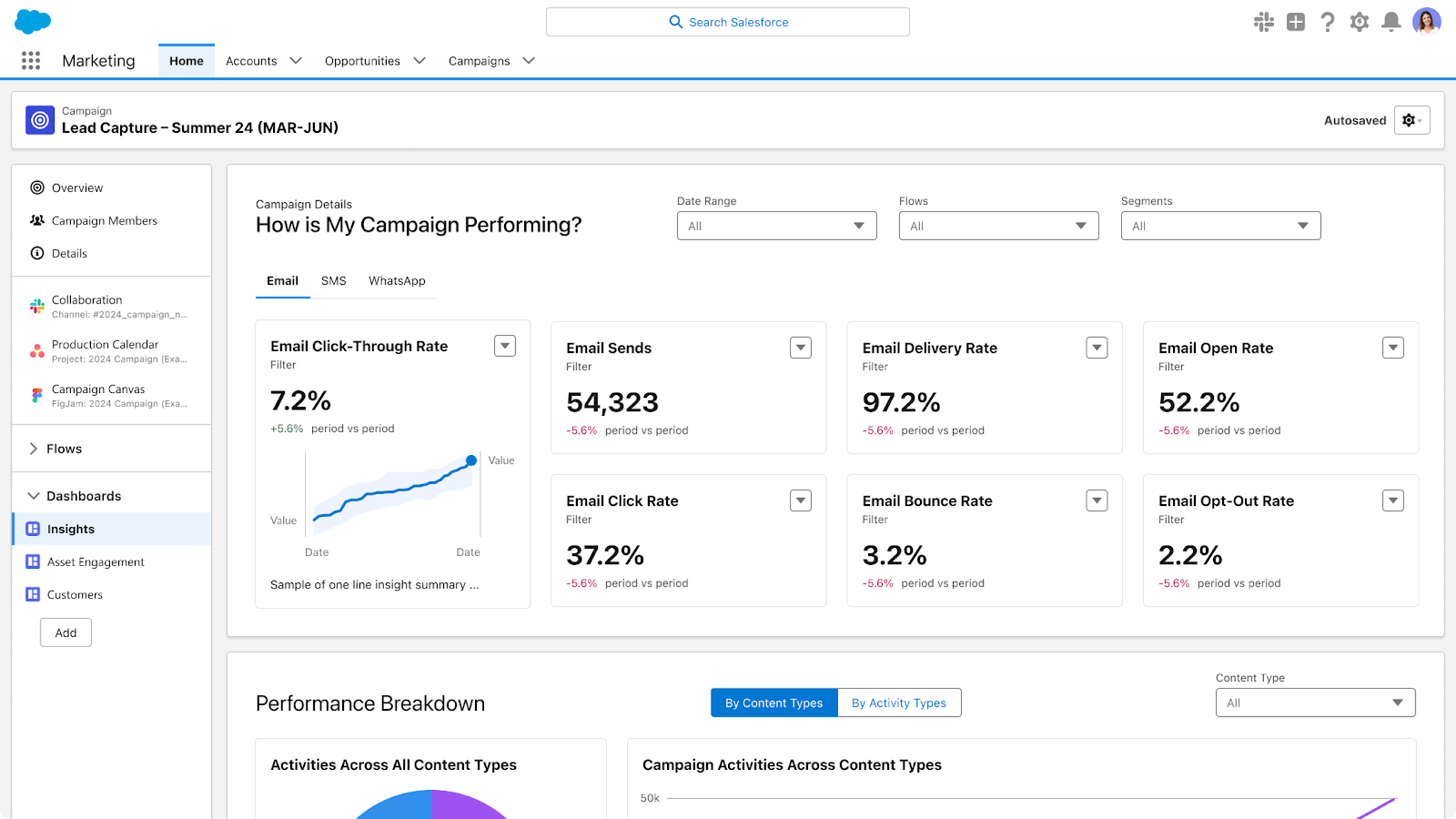
Key features:
- 90+ integrations
- Custom metrics and dimensions
- Data blending
- Drag-and-drop dashboard interface
- AI-powered insights
Pros:
- Visualization version control
- Huge library of templates
- Interactive fiscal calendar
- Marketing data management
- Custom SQL queries
- AI and machine learning functionalities
Cons:
- Setting up data automation requires some Python programming
- The cloud version lacks some visualization and formatting settings that are available on the desktop version
- Limited programming options for predictive functions
- Steep learning curve
Pricing
As of April 2025, Tableau offers three pricing packages:
Package 1: Tableau
- Tableau Creator: $75 / user / month
- Tableau Explorer: $42 / user / month
- Tableau Viewer: $15 / user /month
Package 2: Enterprise
- Enterprise Creator: $115 / user / month
- Enterprise Explorer: $70 / user / month
- Enterprise Viewer: $35 / user / month
Package 3: Tableau+
- Custom quote only
Tableau reviews from real users
“Tableau allows me to create my own structured data from a lot of unstructured data.” (Source)
Tableau has an uncanny ability to transform complex data into visually stunning and easily understandable representations.” (Source)
“Tableau can be costly, particularly for startups.” (Source)
7. Cyfe
Best for: boutique SEO and PPC agencies
Cyfe is a client reporting platform that allows marketers to connect data from multiple marketing data sources and blend it into real-time metrics live reports.
As an all-in-one platform, it can sync social media, web analytics, paid advertising, and SEO ranking data together to provide an overview of your entire client marketing strategy. Cyfe has pre-built report templates for Facebook Ads, Google Ads, web analytics, etc.
You can export reports from Cyfe in different formats, including JPEG, PNG, CSV, and PDF, which makes sharing insights with clients easier.
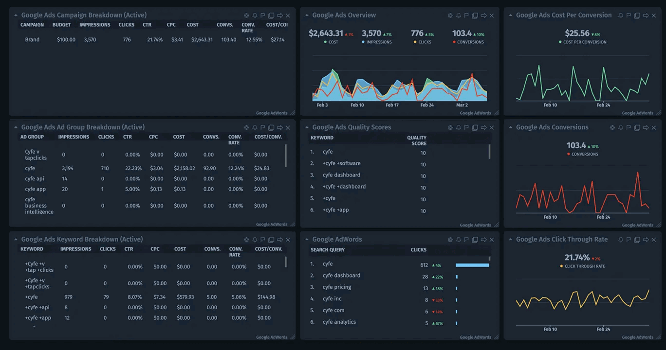
A big disadvantage of Cyfe is that there is no centralized data management space. Instead, you need to connect or select a source for each individual widget. Also, there’s no way to create new templates just to duplicate a report for another client.
Key features:
- White-labeled reports
- Live connection to external data
- Email and SMS alerts for goal thresholds
- Brand mention monitoring
- Publish to web
Pros:
- Plenty of customization options
- Wide choice of plugins
Cons:
- No way to show multiple metrics in one widget
- The interface is sometimes confusing
- Limited choice of widgets
- No bulk dashboard edits
- Data sources are managed through individual widgets only, not from a central hub
Pricing:
As of April 2025, Cyfe offers four pricing plans:
- Starter: $19/month – 2 dashboards, 1 user
- Standard: $29/month – 5 dashboards, 2 users
- Pro: $49/month – 10 dashboards, 5 users
- Premier: $89/month – 20 dashboards, unlimited users
Cyfe Reviews from Real Users
“It's very easy to create your dashboard and populate it with widgets from different data sources like social media, email marketing software, CRM, or just custom data in a spreadsheet.” (Source)
“The dashboards were very limited on customization and creating calculated fields.” (Source)
“Support really sucks. This never used to be the case BTW.” (Source)
8. NinjaCat
Best for: large agencies with dedicated client success teams
NinjaCat is a reporting platform for digital marketing agencies to monitor campaigns and deliver client reports demonstrating return on marketing investments. You can use NinjaCat to connect, clean, and transform marketing data and move it to any of the available destinations, including Google Cloud Platform, Amazon S3, and Microsoft Azure.
NinjaCat has a decent native visualization layer for reporting. You can auto-generate client reports from pre-made templates for different reporting cases.
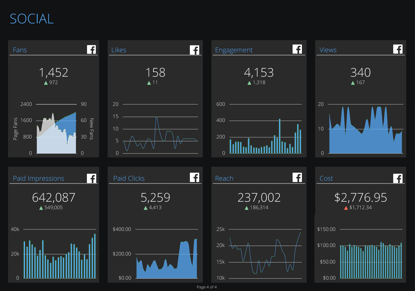 The problem is, however, that the visualization layer and data cloud are two separate environments, so whenever you make adjustments to data, you need to reload the visualization layer to see the change taking effect.
Instead of having one place to create, edit, and share reports with NinjaCat, you must separately build templates, dashboard profiles, and reports, merge things, and assign them to clients.
Key features:
- PPC and SEO reporting
- Easy ad spend and campaign performance monitoring
- White-label options
- White-glove setup and service
Pros:
- Automated client reporting
- One platform for integration and visualization
- Multiple choice of destinations
- Custom branded reports
Cons:
- Separate workspaces to organize and visualize data
- Complex visualization builder
- Performance issues with reports
- No autosave in case of a crash
Pricing:
NinjaCat doesn’t offer fixed pricing plans, and no information is available on its website. The pricing is determined by the user's needs during the demo call with its account executives.
NinjaCat reviews from real users
“I love how it pulls in our data across several different platforms into one cohesive report.” (Source)
“The support the NinjaCat provides is exceptional.” (Source)
“I found a lot of the functionality on Ninjacat to be really clunky, unfortunately things take a LONG time to process if you're adding more than one filter to a table.” (Source)
9. TapClicks
Best for: agencies that mostly with eCommerce and franchise clients
TapClicks is a unified software suite that centralizes data from different channels and provides capable client reporting and analytics. As an all-in-one marketing operations platform, TapClicks allows you to automatically generate client reports for multiple marketing channels including organic and paid search, social, display, and even TV advertising.
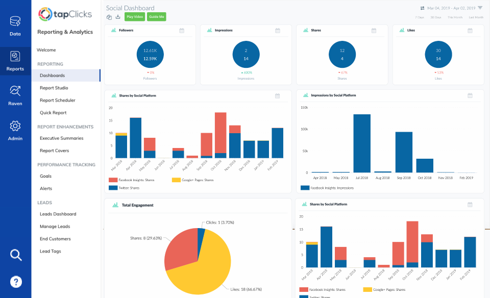 On a separate note, if your current client reporting solution has multiple time-saving features, you won’t be thrilled to hear that TapClicks doesn't allow you to edit multiple reports at once.
Key features:
- Centralized data integration
- Wide choice of marketing data connectors
- Secure data handling
- Real-time client reporting
Pros:
- Custom template builder
- White-label reports
- Large number of report widgets
Cons:
- Steep learning curve
- No bulk report edit
- No cross-channel reporting
Pricing:
TapClicks’ pricing can be confusing as you’ll need to build your own packages.
You start by choosing your data package:
- TapDataLite: $99/month for 64 connectors
- TapData+: $349/month for 250+ connectors
- TapData Max: $649/month for 250+ connectors and API access
Then, you choose your data destination:
- TapReports: $199/month
- TapAnalytics: $899/month
- TapInsights: $1399/month
- Third-party destinations: Custom pricing
All packages come with 10 clients and unlimited users.
Based on these pricing plans, the total cost of TapClicks can come down to 1000s of dollars a month if you want a complete data stack.
TapClicks reviews from real users
“What I like best about TapClicks is that it simplifies marketing data by pulling everything into one easy-to-use dashboard.” (Source)
“I dislike TapClicks because the initial setup can be a bit overwhelming, and sometimes the data syncing isn't as smooth as I'd like.” (Source)
“After months of calls and time invested, we still had inaccuracies in the data.” (Source)

WRITTEN BY
YamonYamon is a Senior Content Marketing Manager at Whatagraph. Previously a Head of Content at a marketing agency, she has led content programs for 5+ B2B SaaS companies in the span of three years. With an eye for detail and a knack for always considering context, audience, and business goals to guide the narrative, she's on a mission to create genuinely helpful content for marketers. When she’s not working, she’s hiking, meditating, or practicing yoga.