9 Best Cyfe Alternatives in 2026 [Tested by Us]
Cyfe is a great SEO and marketing reporting tool, but it can be limiting as your business grows. Plus, users say their customer support is “non-existent”.
To help you find the best Cyfe alternative, I did three things:
- Spoke with our customers who previously used Cyfe.
- Scoured online reviews and community forums to find the best alternatives.
- Tried and tested all the tools.
Full disclosure—one of these tools is ours. But that’s because we genuinely believe Whatagraph reduces the pains of Cyfe.
But we’re also not here to bash our competitors. We researched them thoroughly (and even tried them out) so you can really understand what they’re great at and if they’re best for you.
By the end of the article, we hope you’ll find a Cyfe alternative that fits your needs—whether it’s us or not.

Jan 11 2026●10 min read
Here are the biggest pains we’ve heard about Cyfe from ex-users and online reviews:
❌ Limited native integrations: As of November 2024, Cyfe supports only 25 native connectors, missing key platforms like Google Display & Video 360, Shopify, and Constant Contact. You can build your own connections using CSV, sheets, API, or Zapier, but this creates more work and can be time-consuming.
❌ Clunky interface: Creating dashboards on Cyfe takes multiple clicks and manual effort. For example, to create widgets, you’ll need to choose the widget you want from a long list and configure settings manually. You also can’t save widgets or reports as templates, meaning you’ll need to start from scratch every time.
❌ No advanced data transformation available: Cyfe does offer a “Mashup” widget where you can combine multiple data sources together. But you can’t rename or unify data at scale, blend cross-channel data, or create custom tiers and totals.
❌ Lack of AI insights: You can't talk with your data as you can in other data and reporting tools platforms. Also, you need to summarize each report manually to unearth actionable insights and next steps.
❌ Poor customer support: Cyfe offers email-only support, which users often describe as slow and unresponsive.
❌ No data transfers: Cyfe is purely a visualization tool—there’s no way to export data to warehouses or business intelligence tools.
—
If you’re frustrated with Cyfe, we’ve got your back.
In this article, we’ll take you through 9 best Cyfe alternatives that come with more integrations, user-friendly interfaces, and excellent customer support.
9 Best Cyfe Alternatives and Competitors in 2026
In a nutshell, here are the 9 best Cyfe alternatives we’ll review in this article:
- Whatagraph
- Databox
- Swydo
- Klipfolio
- Grow.com
- Looker Studio
- Geckoboard
- DashThis
- AgencyAnalytics
Have a set of features you’re looking for in an alternative? Compare them in this table:
| Features |
|

|

|

|

|

|

|

|

|
|---|---|---|---|---|---|---|---|---|---|
| Ease of use | Easy | Medium | Easy | Hard | Medium | Hard | Easy | Easy | Easy |
| No. of Out-of-the-box Data Connectors | 55+ | 100+ | 32 | 130+ | 75+ | 21 | 90+ | 34+ | 80+ |
| Custom API Access |
|
|
|
|
|
|
|
|
|
| Data Blending |
|
|
|
|
|
|
|
|
|
| Custom Metrics and Dimensions |
|
|
|
|
|
|
|
|
|
| Custom Reports and Dashboards |
|
|
|
|
|
|
|
|
|
| Campaign Overview and Monitoring |
|
|
|
|
|
|
|
|
|
| White-labeling |
|
|
|
|
|
|
|
|
|
| Data Update Frequency | Every 30 mins across all integrations and pricing plans | Depends on APIs and your pricing plan, from 1 to 24 hours | ? | Depends on your pricing plan, from 4 hours to 30 minutes | Custom frequency - from 15 mins to 1 hour | Depends on APIs, from 15 mins to 4 hours | Depends on data source, from 1 to 60 minutes | Once a day or on-demand update | Depends on APIs, but SEO rankings update every 24 hours |
| Data Segmentation and Filtering |
|
|
|
|
|
|
|
Only for select data sources |
|
| Alerts and Notifications |
|
|
|
|
|
|
|
|
|
| Multi-Client Management |
|
|
|
|
|
|
|
|
|
| User Management | Admin, Manager, or Editor roles | Administrator, Editor, User, or Viewer roles | Admin, Editor, or Contributor roles | Account Administrator, Klip Viewer, Klip Editor | Admin, Architect, Analyst, Visualizer, Consumer, or View Only roles | Viewer, Editor, or Owner roles | Admin and View Only roles | Every user of the same account are considered "Admins" | Staff User or Client User |
| Automated Report Sharing |
|
|
|
|
|
|
|
|
|
| Data Export | PDF, XLS, CSV | PDF, JPG | PDF (only for reports) | Export dashboards as PDF or image files. Export only individual Klips as CSV | CSV | Google Sheets, CSV, Excel (only chart level) |
|
PDF only | PDF, CSV |
| AI Insights |
|
|
|
|
|
|
|
|
|
| Customer Support | Live chat, email, Help Center for all pricing plans | Live chat, email, Help Center | Live chat, Email, Help center | Email, Help Center | Live chat, Phone, Email, Help Center | Help center, community forums | Live chat, Email, Help Center | Email, Help Center for all pricing plans | Live chat, Email, Help center |
| Dedicated Customer Success Manager |
|
|
? |
|
|
|
|
|
|
| Data Security and Compliance | ISO 27001, Enterprise SSO, GDPR compliant, AES-256 encryption, Two-factor authentication, AWS hosted servers | ISO 27001, GDPR complaint, SSL encryption, passwords stored in virtual vault | ? | AWS hosted servers, 2048-bit RSA key access for servers, no passwords, SSL, RBAC | SSL encryption, SHA-encrypted passwords, Two-factor authentication, SOC 2 certified, GDPR compliant, DigiCert SSL, OAuth connections | ? | AWS hosted servers, HTTPS (128-bit TLS), RBAC, PCI DSS compliant | Encrypted URLs, Password protection, Restrict IP addresses, GDPR compliant | MFA, Enterprise SSO |
|
Pricing
(with $$$ being the highest)
|
$ | $ | $ | $$ | $$ | Free for native connectors | $ | $ | $ |
Let’s dive into each of these tools.
1. Whatagraph
Most suitable for: Medium to large marketing agencies with 10+ employees
If you’re looking for a platform with more customization and data transformation features, Whatagraph is for you.
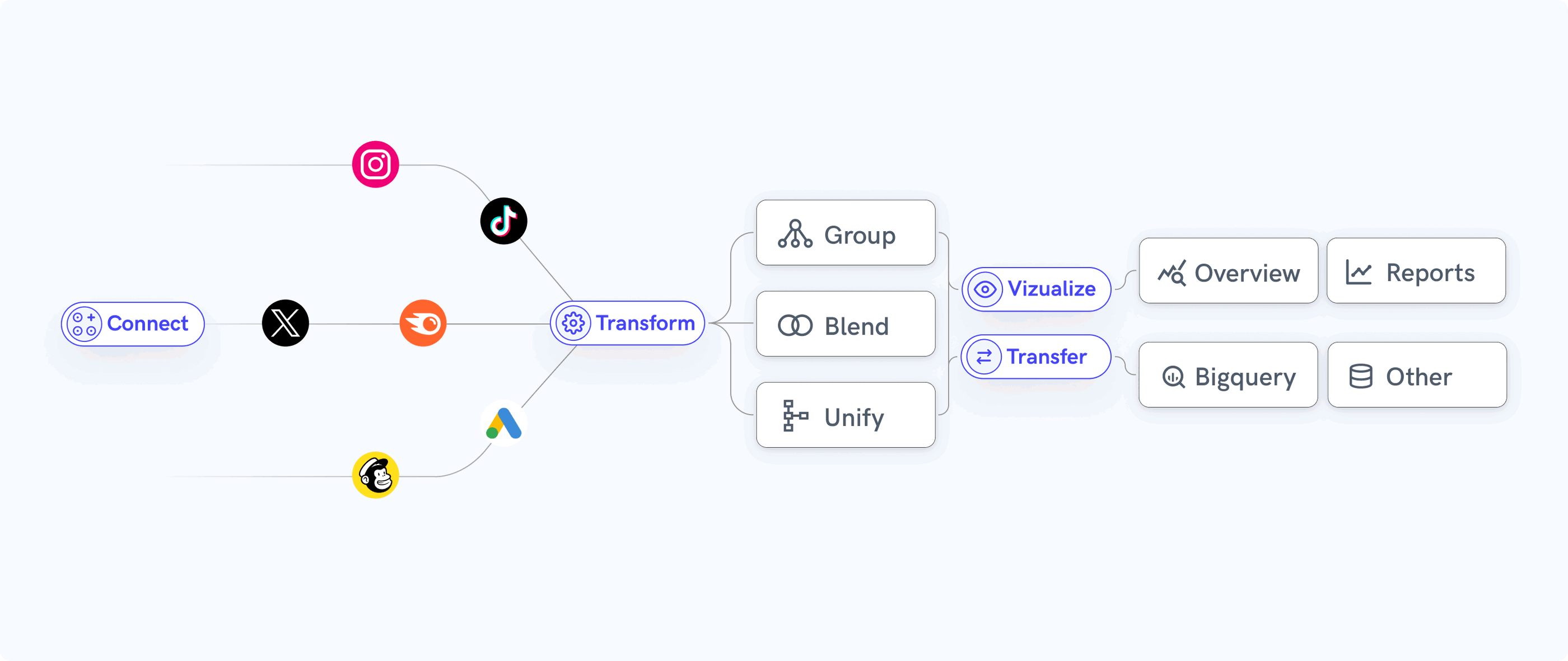
Whatagraph is an all-in-one data platform that makes it easy to connect, organize, visualize, and share your data in one place.
In a nutshell, here’s how it works:
- Connect to your data sources and channels in a few clicks. Your data will flow in automatically.
- Organize and unify your data to be analysis-ready. Create data blends, custom metrics, and dimensions—without writing a single line of code.
- Visualize your data using drag-and-drop widgets or ready-made templates. Create white-labeled reports with custom logos, domains, and color schemes.
- Analyze your data by client, campaign, Account Manager, or more. Spot trends, compare performance, and get actionable insights for your agency and your clients.
- Share reports as live links, PDFs, Excel spreadsheets, or automated emails. You can also transfer your data to BigQuery and Looker Studio through Whatagraph.
Plus, all our pricing plans come with:
- A dedicated Customer Success Manager
- Live chat support with >1 min first response time
But how does Whatagraph compare against Cyfe exactly? Let’s take a look:
Cyfe vs. Whatagraph: Head-to-Head Comparison
Our Product team did extensive research on how Whatagraph compares against Cyfe and you can find the full breakdown here.
In a nutshell, here are six key ways Whatagraph outperforms Cyfe:
1. Native, stable, and reliable integrations with all your favorite platforms
 Cyfe claims they offer 100+ integrations, but in reality, only 25 of them are native. For the rest, you’ll need to manually build your own connections via CSV, sheets, API, or Zapier.
There are three key disadvantages of this:
- It’s more time-consuming to set up integrations.
- Connections can be unstable.
- The data on your dashboards can be late or inaccurate.
Not to mention, if you’re using Sheets or CSV to upload your data, you’ll still need to manually download the data from your source platform, clean it, and upload that data onto Cyfe every week or month.
Another disadvantage of Cyfe is also that sources are connected or selected on the widget level. There is no dedicated workspace to manage and control your connections.
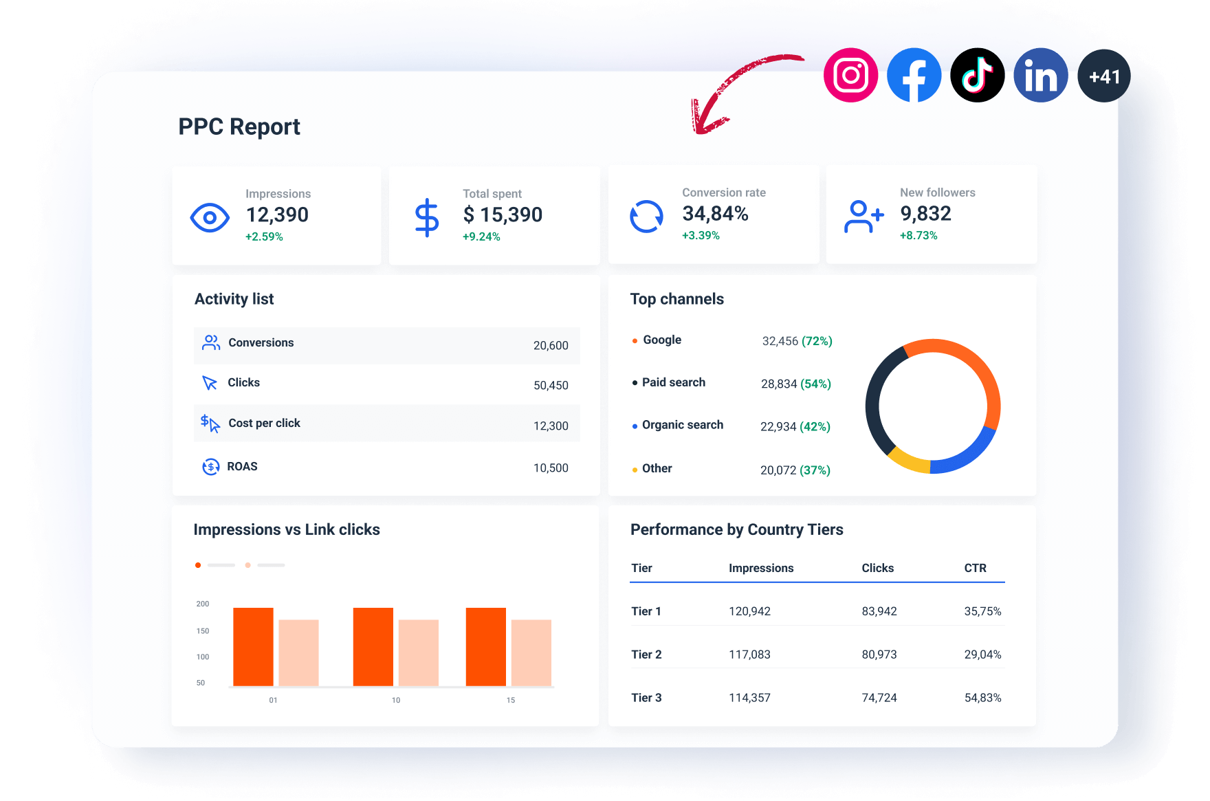
In contrast, Whatagraph offers 55+ native, out-of-the-box integrations with popular and niche platforms. Some examples include:
- Analytics: Google Analytics 4, Matomo, Piwik Pro
- PPC: Google Ads, LinkedIn Ads, Facebook Ads
- Social Media: Facebook, Instagram, LinkedIn
- SEO: Ahrefs, Google Search Console, Accuranker
- eCommerce: Shopify, WooCommerce, BigCommerce
- Email Marketing: ActiveCampaign, Klaviyo, Mailchimp
Being able to integrate with more marketing channels on Whatagraph means:
✅ You spend less time buried in CSV files and spreadsheets.
✅ You get a true, comprehensive picture of your overall marketing performance on one platform.
✅ There are less chances of human errors like data inconsistencies, duplicates, and missing records.
If you’d like to bring in your own data, you can easily do so via Custom API, Google Sheets, or BigQuery.
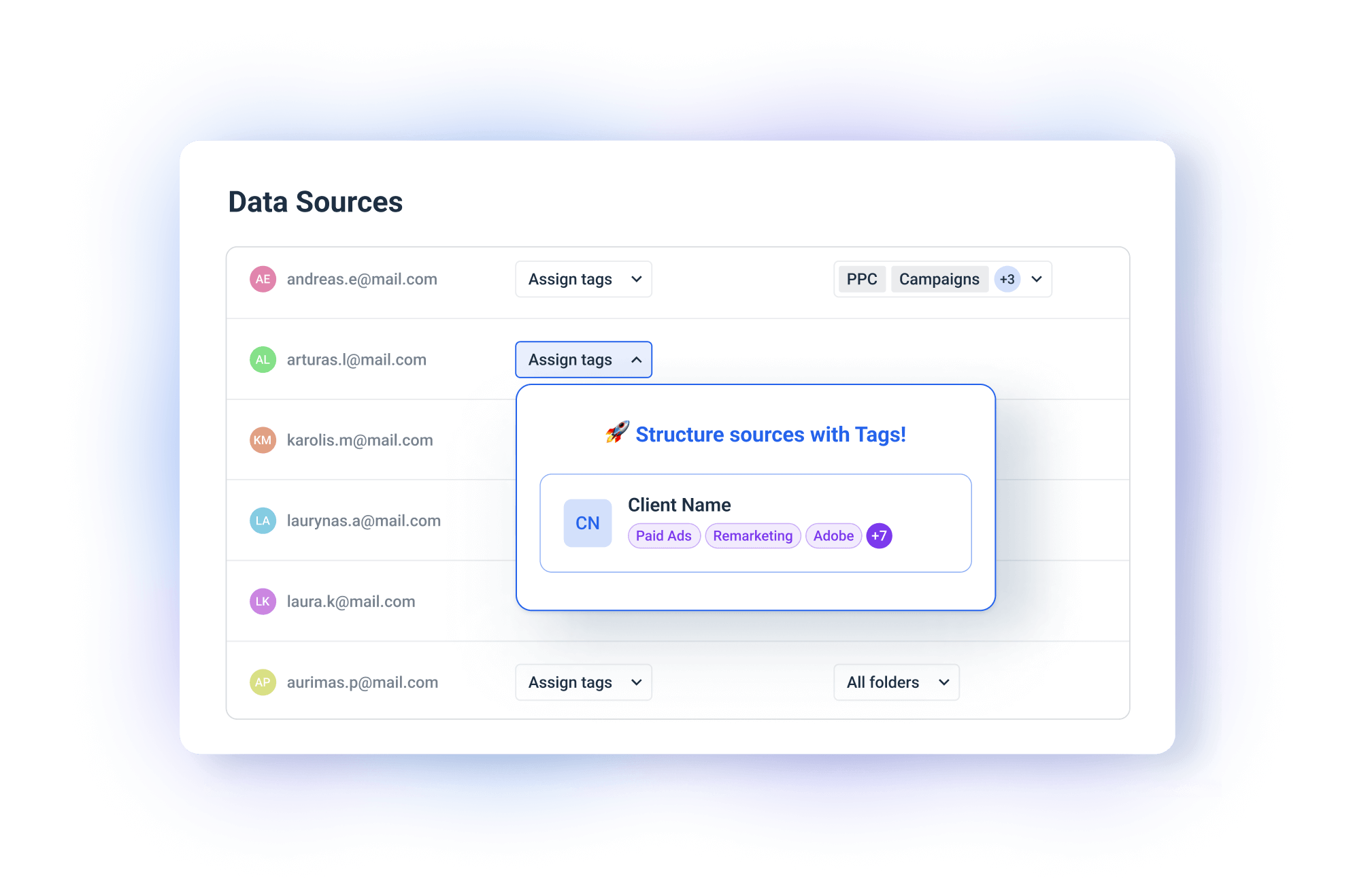
Plus, we offer a dedicated space to manage your data connections in one place. You can:
- Filter by channel or team members who added the connection
- Add custom tags to each channel or source (e.g. by region, Account Manager, brand)
- Assign each channel or source into a dedicated folder (e.g. Client A)
 But it’s not just about how many integrations there are, but also how stable they are.
Whatagraph’s integrations are built in-house by our data engineers which means they’re more stable, seamless, and reliable.
If there are bugs, our engineers can resolve them fast, without having to get a third-party company involved.
Speaking of stability, according to internal data from the past 6 months, Whatagraph has an average uptime of 99.95%. This means system outages are very (very) rare.
We also have an emergency alert that will wake up all our engineers (even if it’s 3 am where they are) to fix platform outages.
In terms of speed, you can work with 10 sources and 100 widgets at the same time on Whatagraph without slowing down the platform.
Plus, the data on your dashboard refreshes every 30 minutes across all your sources, reports, and blends, meaning there is no inconsistent data on reports.
On Cyfe, the data refresh rate depends on each data source. This can create inconsistencies and delays on the data shown on your reports.
Our users love how seamless, stable, and simple the data connection process is. Here’s what one of them said on G2.com:
 2. Powerful (but easy) data transformation
Apart from a basic “Mashup” widget where you can combine data from different sources, there’s not much else you can do on Cyfe.
This works for small agencies or solo businesses, but quickly becomes chaotic if you have 100s of data sources.
Managing this scale requires better data organization to keep reports neat and appealing, avoiding a mess of disparate names and dimensions.
That’s where Whatagraph comes in.
In Whatagraph, however, we have an entire dedicated space for data organization, aptly called “Organize”. You can:
- Blend metrics and dimensions from different channels into unified metrics
- Create custom formulas
- Unify names
- Group data sources and metrics by campaigns or regions
- Save new metrics and formulas as templates to re-use the next time
…all through simple workflows that only take seconds to set up.
For instance, say you want to show the ‘Total Ad Spend” across multiple PPC channels. All you need to do is create a custom metric like so:
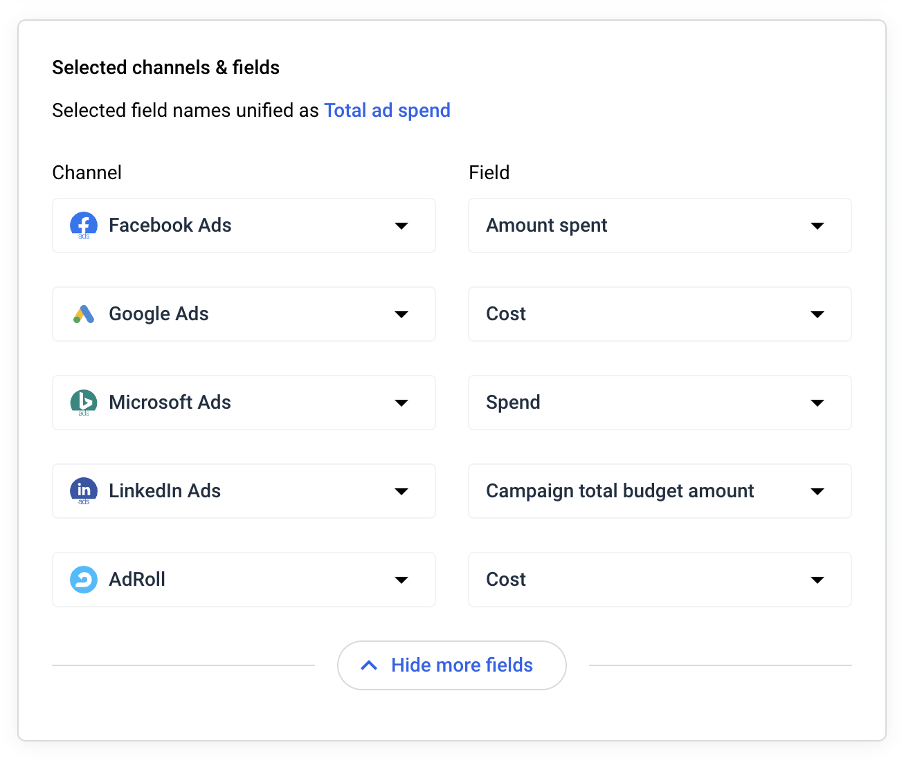 Then, you’ll get an aggregate metric of “Total Ad Spend” to add to your reports.
You can also combine data from completely different sources and channels. Say you want to blend data from Facebook Ads and Google Analytics 4. All you need to do is:
- Choose the data sources.
- Choose the dimensions and metrics you wish to use inside the blend.
- Select a join type.
- Give it a name and description.
And you can use the new blended source inside your reports right away.
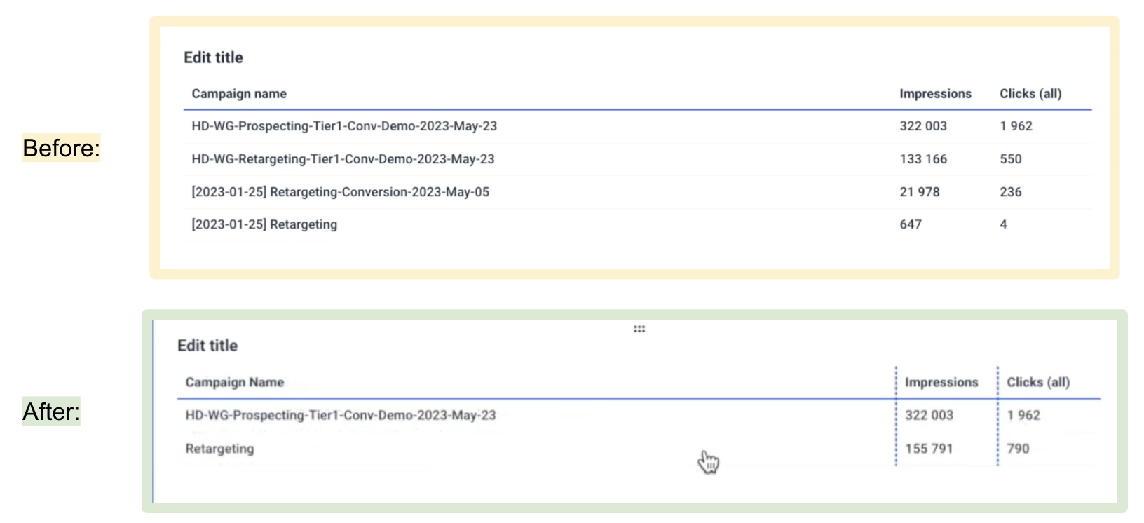
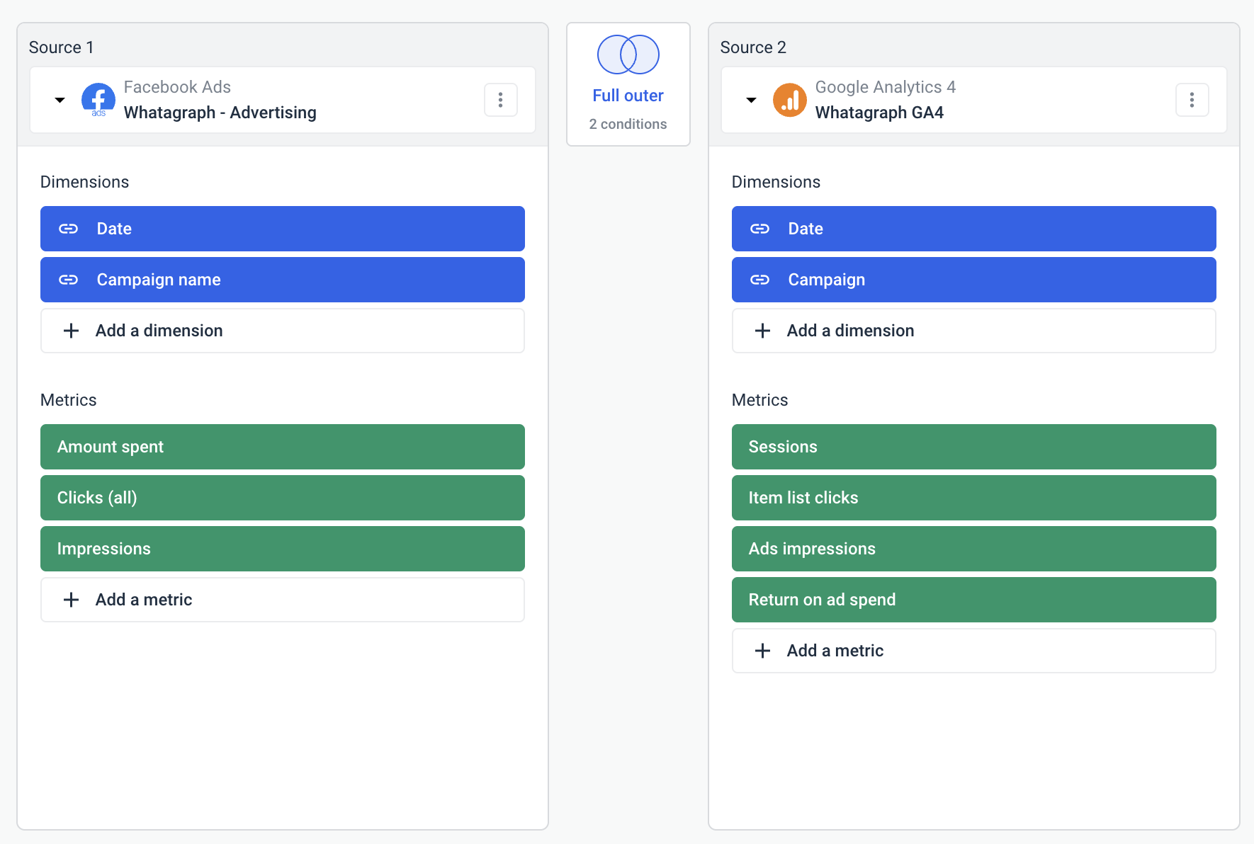 Have so many different confusing campaign names? You can standardize them into one key theme and keep your tables easy to digest.
For instance, in the example below, 3 out of 4 campaigns have the same recurring theme: “Retargeting”. You can group them all into one key “Retargeting” campaign.
 You can explore more use cases here.
The best part is you can create all these custom metrics and dimensions natively inside of your report. No need to waste time going back and forth from one workspace to another.
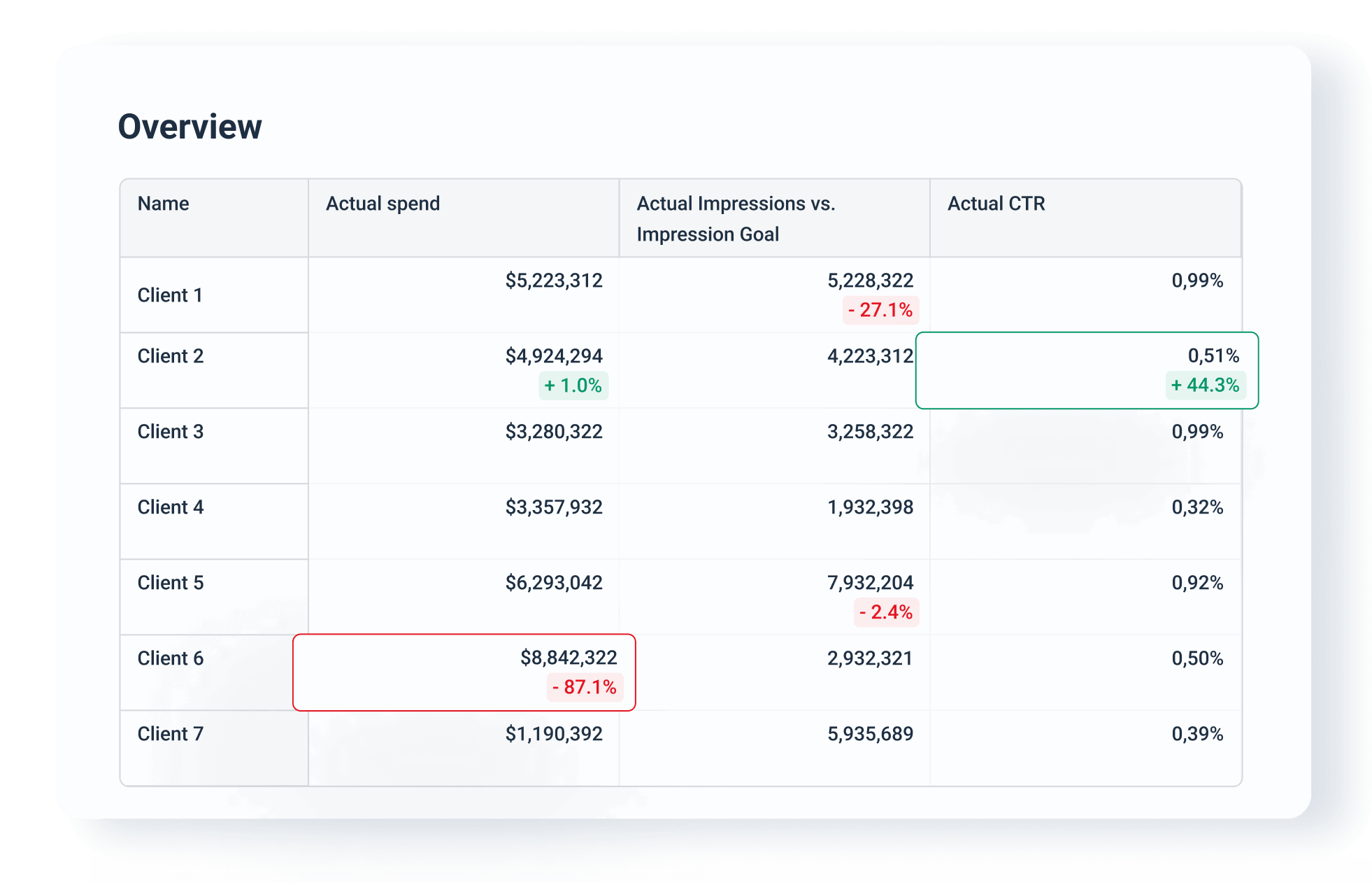
We also recently launched Performance Monitoring, which includes a set of features that make it even faster and easier to get actionable insights from your scattered data.
You can:
- Group 100s of scattered data sources from the same category into unified Source Groups in seconds
- Add custom tags to your data sources and filter it by client, business type, location, Account Manager, or more
- Monitor your key metrics from all campaigns and clients in one space
 Powerful and easy data organization on Whatagraph means:
✅ Your reports are easier to read, neat, and tidy.
✅ Your clients see accurate metrics rather than over or under-reported ones.
✅ You can analyze and compare performance any way you want, and use these insights to deliver better results for clients.
3. Easier and faster to build visualizations
Once you’ve organized your data, it’s time to visualize it.
Cyfe does offer pre-made dashboard templates that you can use to quickly get started. However, there are no pre-made widgets available. You’ll need to:
- Choose which widgets you want to add from a list of widgets.
- Configure each widget manually. This includes configuring the account, widget title, campaign, metric, segment, goals, and filters individually.
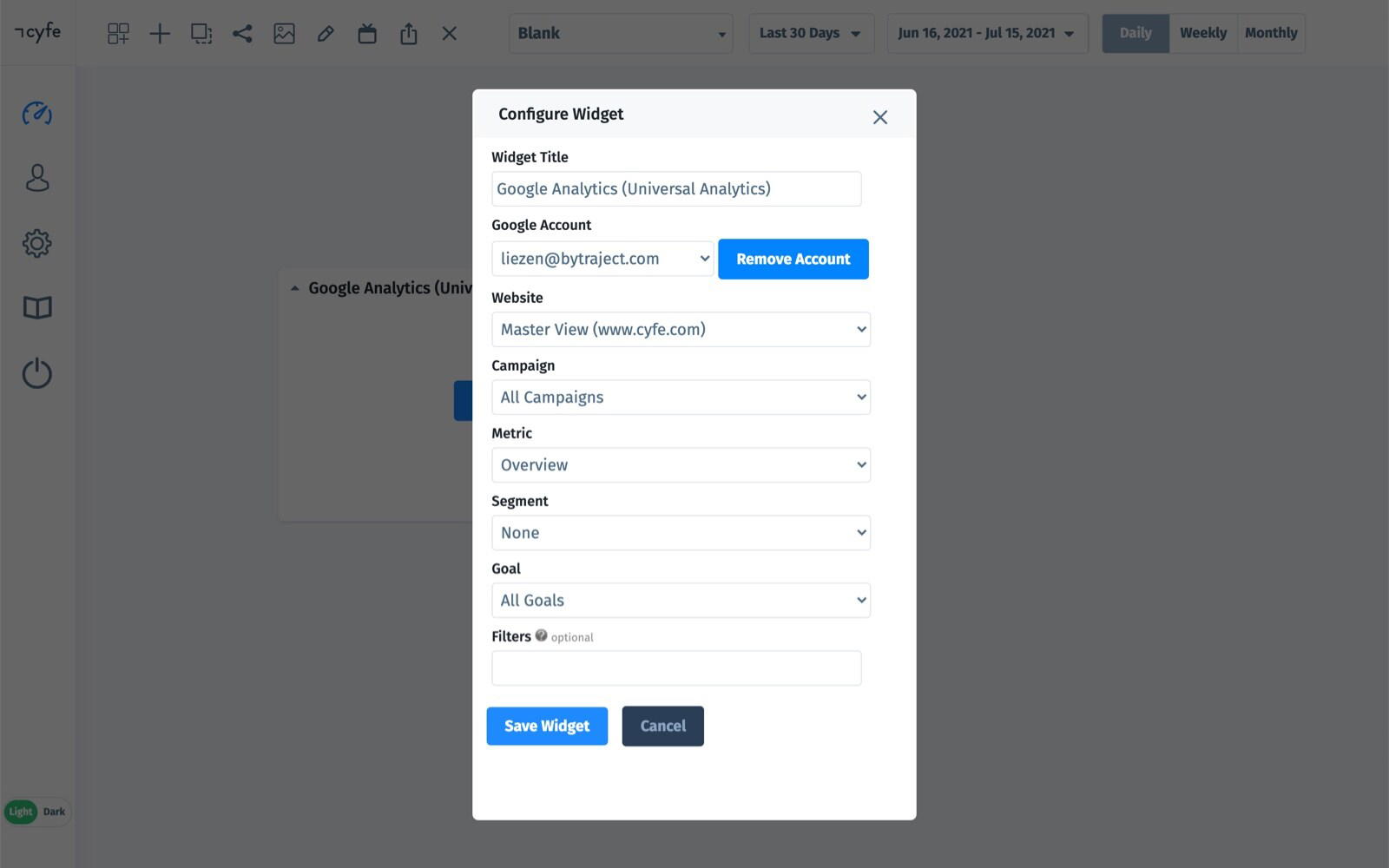
And this is just for one widget. For every new widget you want to add to your dashboard, you’ll need to repeat this process. This creates unnecessary work and can eat up your valuable time.
In Whatagraph, you can build your first dashboard in just 30 minutes. There are three options to get started:
- Start from a blank page and use our drag-and-drop widgets to add metrics onto the dashboard.
- Use one of our ready-made report templates or dashboard examples.
- Use our Smart Builder to instantly create dashboards for your favorite marketing channels (e.g. Google Analytics 4, Google Ads).
This video breaks it down in detail:
A good thing to note also is that in Whatagraph, you create ONE dashboard and that doubles down as a report (we’ll be using the two terms interchangeably throughout this article)..
When it comes to adding metrics, you can do so in 4 different ways:
- Build your own metrics
- Drag-and-drop pre-made metrics
- Widget templates
- Offline data
For new users, we always recommend starting from pre-made widgets, which makes life easier and is much faster. You don’t need to write any codes or work with any spreadsheets — just drag and drop on your dashboard and that’s it.
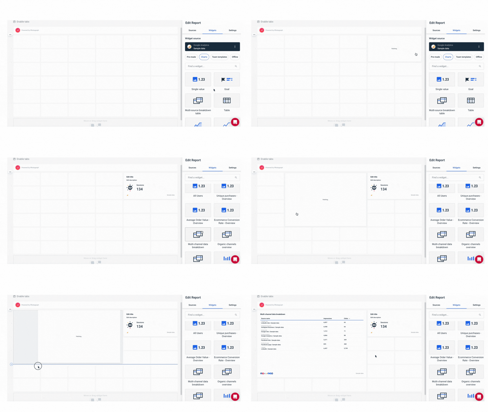
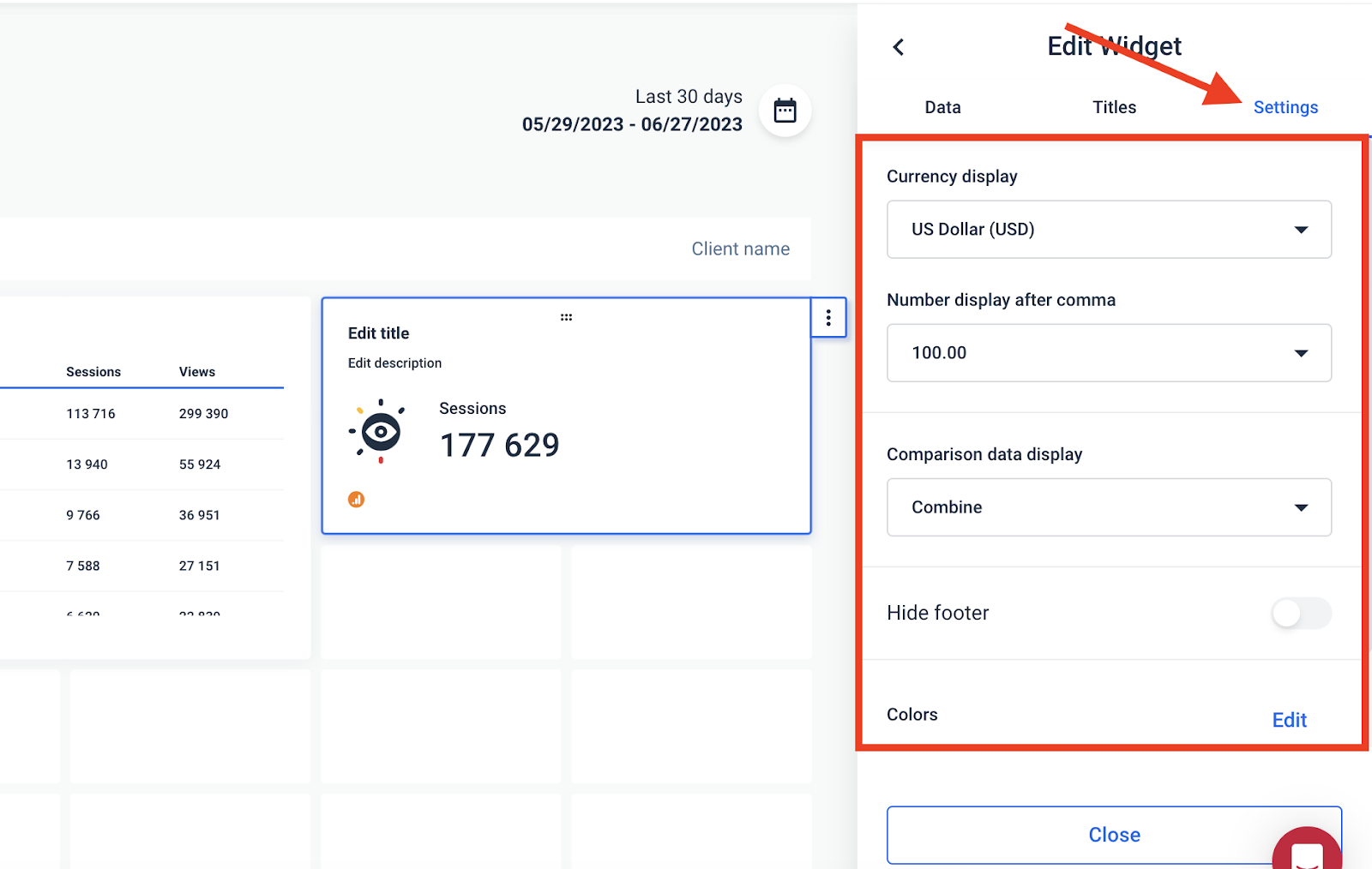
But just because they’re pre-made, doesn’t mean they’re not customizable. You can still:
- Adjust or rename the metric
- Change or remove icons
- Apply custom formulas (e.g. data blends)
- Change date ranges and currencies
- Add or hide footers
- Customize the colors of each widget
If that’s not enough, you can also create custom widgets and save them as “templates” to re-use them the next time. These widgets are also fully-responsive. You can resize them however you want—horizontally and vertically.
Want to make your widgets “pop” more? You can add any icons you’d like from our icon library:
![]() Another feature that ex-Cyfe users love about Whatagraph is our linked templates.
Another feature that ex-Cyfe users love about Whatagraph is our linked templates.
Say you’ve created one report in the style and layout you like. You can save that as a “Master template” and use it the next time for similar clients.
And if you need to tweak something in that report, you can just edit the “Master template” and the changes will sync automatically across all your reports.
Whatagraph also comes with thoughtful design features that make your user experience smooth as butter. You can:
✅ Add different “tabs” to one report to show performance for each channel or campaign
✅ Insert or delete rows anywhere on your report
✅ Change your report orientation as Portrait or Landscape
We covered a lot of customization options but these are just the tip of the iceberg of what you can do with Whatagraph. If you’d like to learn more, book a call with us and we’ll show you exactly how we can help.
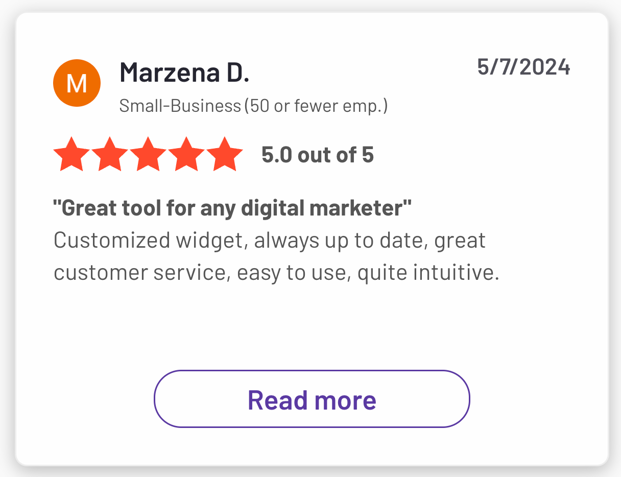
Thanks to this simple and intuitive interface, “Ease of use” is our biggest pro on G2.com, and one user raved:
4. AI chatbot and summaries
Cyfe doesn't come with AI insights. This means you need to spend extra time to sum up the data, identify trends, potential issues, etc.
Busy clients will often go straight for the insights section, sometimes ignoring the rest of the report.
A problem is that digging out valuable insights from the pile of data takes a lot of time.
Whatagraph solves this problem with two innovative AI features that save you time.
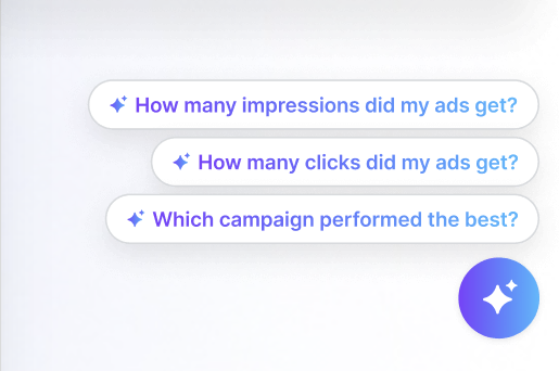
AI data chatbot: You can ask our AI chatbot questions about all your connected data or campaigns in natural language—just like talking to your personal data expert.
For example, “What was the total ad spend from Google Ads and LinkedIn Ads in January last year”?
AI summaries for reports: Instead of writing summaries yourself, you can generate AI report summaries and add them to your reports using our Text widget.

If needed, you can also edit the AI summary to add more granular insights or personal comments.
5. Fast and friendly customer support
Using a marketing analytics tool can be daunting, especially if it’s your first time.
There are times you just need some (or a lot) of help from a product expert to get the platform up and running the way you want it to.
Cyfe does offer email-based support but users say it can be slow and unresponsive.

In contrast, Whatagraph is praised for our responsive and helpful customer support. Whenever you have a question, you can reach out to us via live chat and we’ll respond to you within 1 minute.
We also have a track-record of resolving issues within 1 to 24 hours.
All our pricing plans come with live chat and email support, plus a dedicated Customer Success Manager just for you.
Your CSM will help you with:
- Migrating data from your current platform
- Connecting to channels and data sources
- Organizing your data
- Creating reports
- Anything else you need
Kim Strickland, Digital Marketing Specialist at Peak Seven, and one of our most valued customers say:
“I've joked about this often—with Whatagraph, we're not just paying for a reporting system. We're paying for customer support. There's a level of dedication from the Whatagraph team that you don't often experience anywhere else.”
6. Share your data and reports any way you want
While Cyfe is purely a data visualization tool, Whatagraph is a data pipeline and visualization tool in one.
To share your reports, you can either:
- Set up automated emails to specific people at specific times, days, and cadence. Customize the email subject lines and copy.
- Send instant live links to anyone.
You can also export the data on your reports as Excel or CSV files.
Want to transfer your data to an external platform?
In Whatagraph, you can set up automatic data transfers to:
- Looker Studio
- BigQuery
- Google Sheets
Previously, data transfers can be complicated, involving extra tools and codes to build data flows.
But on Whatagraph, all you need to do is pick metrics and dimensions you want to transfer, preview your future table, and start an automated transfer. Whatagraph takes care of the technical stuff.
Convinced Whatagraph is the right Cyfe alternative for you? Book a call and tell us exactly how we can help.
Key Features
- 55+ native integrations
- Custom integrations through Custom API, Google Sheets, or BigQuery
- Versatile drag-and-drop widgets for reports and dashboards
- Custom metrics, dimensions, and data blends
- Currency conversions
- Library of pre-made dashboard and report templates
- Export to Excel and CSV
- Custom branding and white-label features
- Automated report sharing via email
- Links to live dashboards
- No-code data transfer to BigQuery and Looker Studio
Whatagraph Reviews from Real Users
“To me, Whatagraph is like the Tesla or Mercedes of digital analytics tools, their clean and simple way to present complex marketing data. I highly recommend it to anyone working with marketing analytics who values efficiency and clarity in their reporting.” (Source)
“Whatagraph has a simple user interface that is easy to navigate even for those who don't have analytical skills.” (Source)
“What I like best about Whatagraph is having the ability to create reports fast and easy. No more spreadsheets to do reports, they have a great variety of templates.” (Source)
Pros and Cons
Pros:
- All-in-one marketing performance monitoring and reporting solution
- Easy to use by anyone on your team
- Fast campaign performance and insights
- Stunning visual reports
- Makes results easy to interpret
- Excellent live chat customer support
Cons:
- No freemium plan
- Can be expensive for small agencies (under 10 employees) and freelancers
Whatagraph Pricing
Whatagraph offers three pricing plans based on the amount of “source credits” and access to customization and data organization capabilities.
You can use source credits to connect data sources, send data from a source to a warehouse, and blend cross-channel data together.
All our plans include:
✅ Integrations with 55+ platforms
✅ Custom APIs
✅ Unlimited dashboards and reports
✅ Unlimited data blends, custom metrics, and dimensions
✅ Data transfers to Looker Studio, BigQuery, and Google Sheets
✅ Full white-labeling features
✅ A dedicated Customer Success Manager
✅ Fast customer support through live chat and email
Reach out to us for a custom pricing plan, just for you.
2. Databox
Most suitable for: Boutique agencies and small businesses
Databox is a data reporting and analytics platform for growing businesses.
You can integrate with 100+ software tools, and bring in custom data through Google Sheets or Excel. Then, you can visualize this data directly on Databox using pre-built metrics and templates.
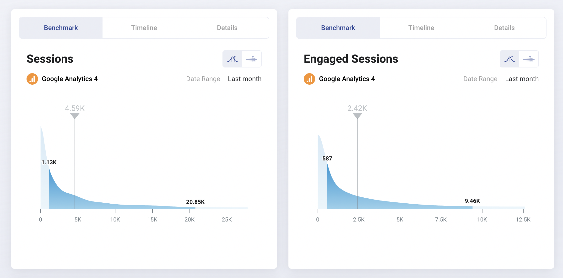
A unique feature that Databox offers that Cyfe doesn’t is the Benchmark Groups.
You can join “Invite only” groups where users report on key performance metrics across different channels. This way you can benchmark against whether you’re on the right track with your own campaigns.
 Databox also sends alerts through Slack, email, or app updates when performance trends up or down on your tracked metrics. On Cyfe, this is possible through email or SMS notifications.
Once you login to Databox, you’ll see an overview of your key metrics and AI performance summaries:
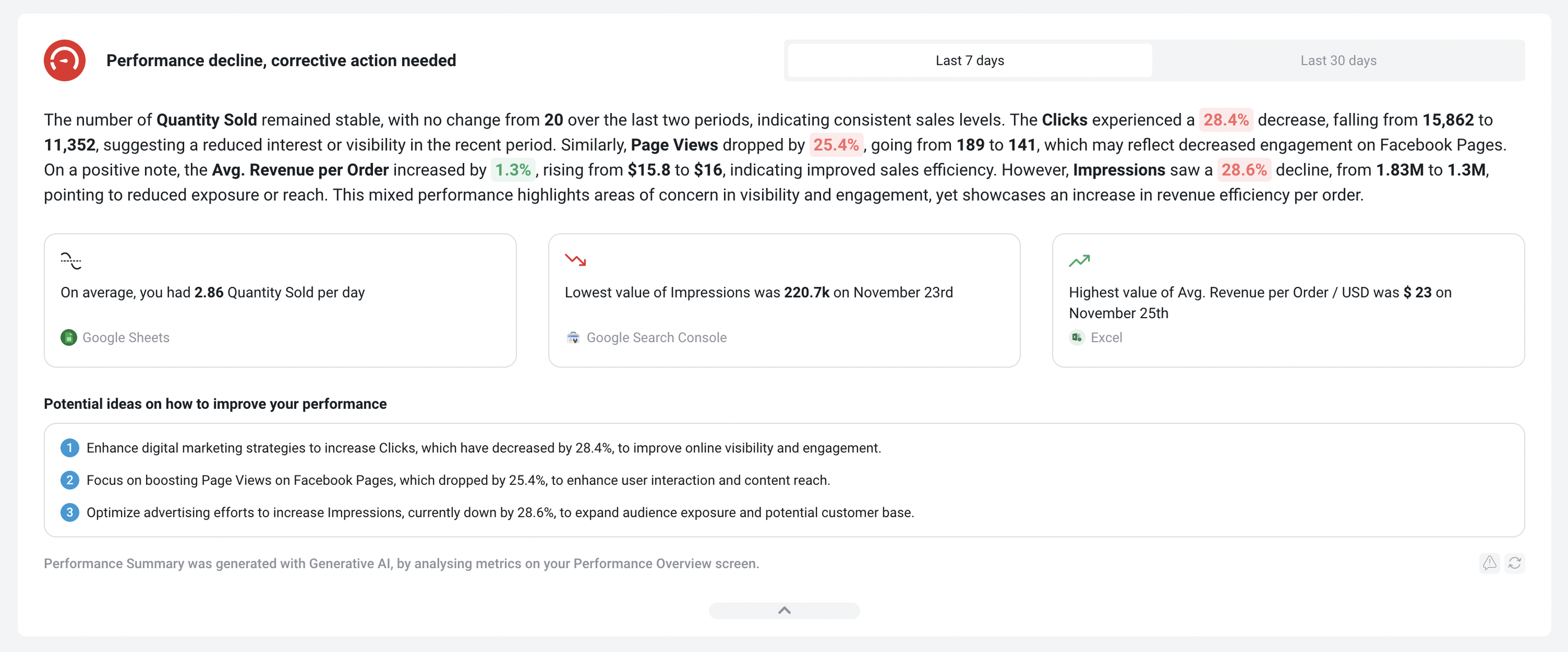 This helps you understand performance at a glance.
But things get complicated when you actually start to build your own dashboard. You’ll need to manually configure three separate components:
- Metrics: individual metric widgets
- Databoards: live data dashboards (mostly for internal teams)
- Reports: PowerPoint slides style reports (mostly for clients/C-Suite)
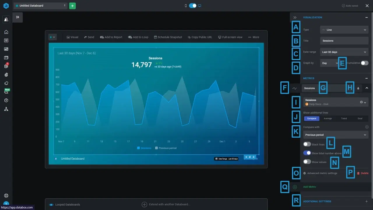
For instance, within a Databoard, you’ll need to manually customize each widget, e.g. a line chart.
And if you want reports, you’ll need to create a separate “Slide presentation” and manually configure the design all over again.
Databox’s reports are also not linked, which means you’ll need to edit them one by one rather than in batch.
All of these can eat up hours of your time. Databox users online also say their integrations break often and there are frequent data outages.
Key Features
- 100+ integrations
- Native visualization dashboards and reports
- Dashboard and report templates
- Slack, email, or in-app alerts
- KPI benchmark groups
Databox Reviews from Real Users
“Databox makes it simple to interact with data in ways you never thought possible.” (Source)
“I'm not sure what has happened with the customer support team at Databox but they are fairly unresponsive these days.” (Source)
"After 2 years I left. Templates always break, individual metrics always break, lack of good support." (Source)
Pros and Cons
Pros:
- Easy to use
- Wide variety of integrations
- Interactive data
Cons:
- Slow customer support
- Bugs and lag issues
- Broken metrics and templates
Databox Pricing
Databox offers five different pricing plans as of October 2024:
- Free: Limited to 3 users, data sources, and dashboards. No custom metrics, data calculations, or report automation available.
- Starter: $341/month for 50 data sources, 5 users, and unlimited dashboards.
- Professional: $451/month for 50 data sources, 15 users, and unlimited dashboards. Includes custom metrics and data calculations.
- Growth: $681/month for 50 data sources, and unlimited users and dashboards.
- Premium: $999/month for 100 data sources, and unlimited users and dashboards.
White-labeling and “guided onboarding” is also only available as an add-on on Databox ($250 and $500 per month respectively). In contrast, these are included in all of Whatagraph’s pricing plans.
3. Swydo
Most suitable for: Small PPC or digital marketing agencies
Swydo is an automated monitoring and reporting platform for marketers. Here are three key aspects of the platform:
- Data collection: Integrate with 32+ platforms and combine your data into one comprehensive report. These integrations include popular channels like Google Ads, Facebook Ads, and Google Sheets.
- Reporting: Create reports easily using templates and their library of metrics and pre-set widgets. Or, add your own customized widgets. Share custom reports as PDF, dashboards, or live presentation.
- Monitoring: Monitor client or stakeholders’ KPIs to quickly identify and address issues and opportunities. Sywdo comes with KPI boards, clients KPI overviews, and alert notifications.
I was able to get started with Swydo in just three steps:
- Pick a template or start from a blank page.
- Create a client folder and save the template underneath it.
- Connect to your data source.
While Cyfe only offers 4 dashboard templates, Swydo offers a wide variety.
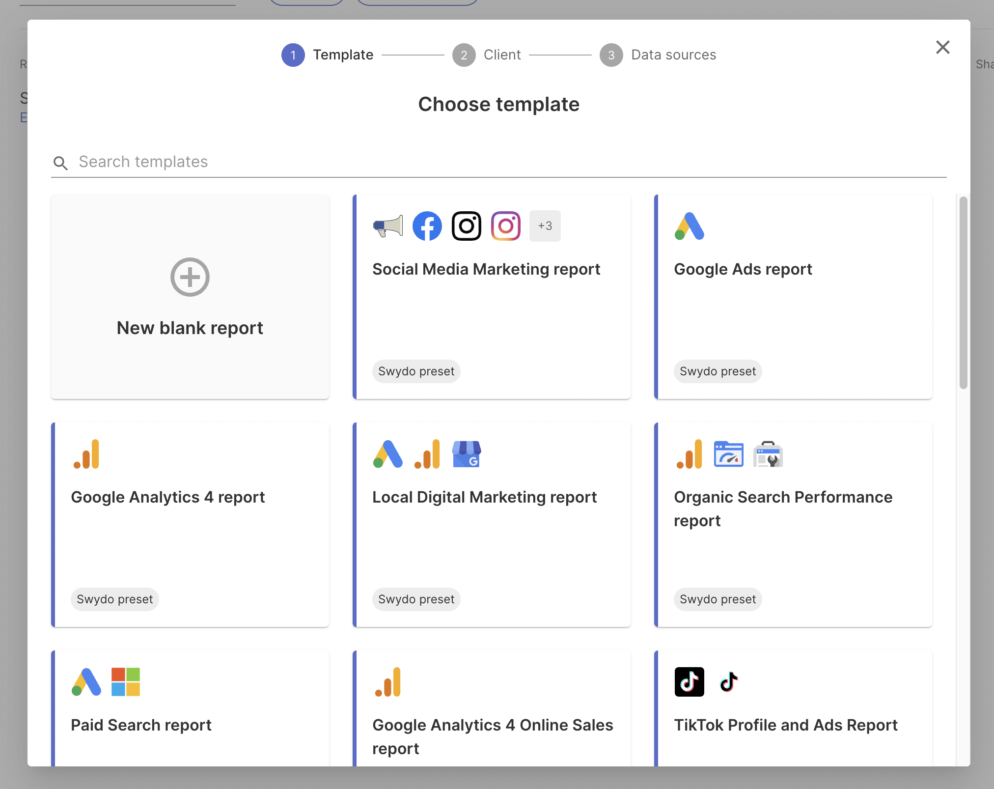
Similar to Whatagraph’s linked template, you can link reports together on Swydo too.
Swydo’s reports themselves are quite different from normal reports you see. They remind me more of a page-less Google document where there are no borders and you can scroll endlessly. I personally liked it but it might not be for everyone.
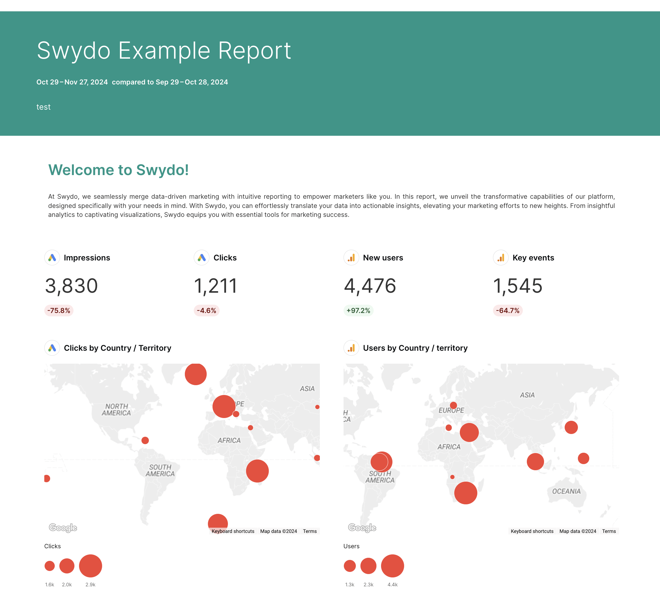
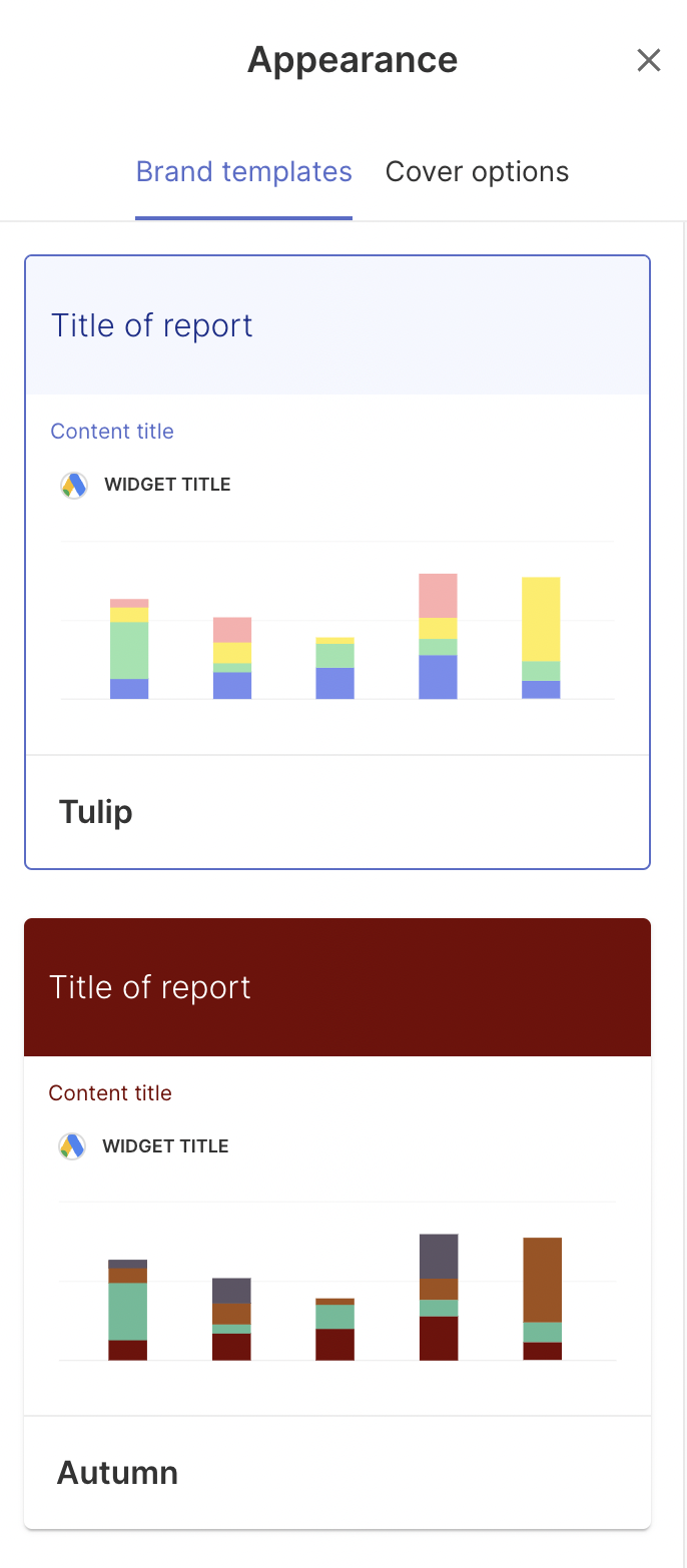
My favorite thing about Swydo is how customizable their dashboards are and how fun they look. For example, you can create “Brand templates” which are custom color schemes for your brand.
You can also pick and choose what you want to show on the report cover, such as:
- Author
- Client logo and name
- Date range
- Subtitle and title
- Team logo and name
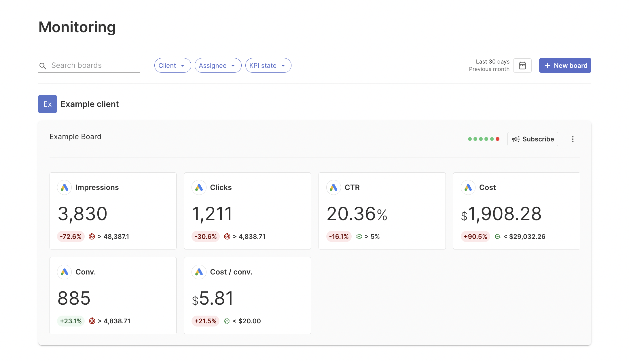
The next feature I like about Swydo is their Monitoring tab. You can see an overview of key metrics for each client and whether they’re trending up or down. This is similar to Whatagraph’s Overview. This is not available on Cyfe.
 However, Swydo can be very limiting when it comes to data organization.
Apart from a basic “Custom metric” builder, you can’t blend data sources or create custom dimensions on Swydo. This can lead to messy reports with inaccurate data and inconsistent dimensions.
Key Features
- 32+ native integrations
- Custom Google Sheets integration
- Custom metric builder
- KPI Monitoring dashboard
- Data filters and markups
- Alerts when KPIs trend up or down
Swydo Reviews from Real Users
“I love that you can customize it as you want, and for social media, you have the little images of the posts next to the results.” (Source)
“Easy to use. The ability to use pre-set templates for each of our products is perfect. Their customer service is also fantastic.” (Source)
“You don't have as much control over how the widgets are displayed on the page. Limited theme and branding capabilities.” (Source)
Pros and Cons
Pros:
- Easy to use and set up
- A wide range of reporting templates for quick-start
- Responsive customer support
Cons:
- Limited data integrations
- Unstable data connections
- No advanced data transformations available
Swydo Pricing
Swydo’s pricing is based on the number of data sources. As of November 2024, the pricing looks like this:
- First 10 data sources: included in initial monthly base fee $49
- 11 - 100 data sources: $3.50 per data source
- 101 - 500 data sources: $2.50 per data source
- 501+ data sources: $1.50 per data source
For example, if you need 100 data sources, expect to pay around $364/month. It’s unclear, however, whether this pricing includes Customer Support and a Customer Success Manager, or if these are extra.
4. Klipfolio
Most suitable for: Large data teams at companies and large agencies
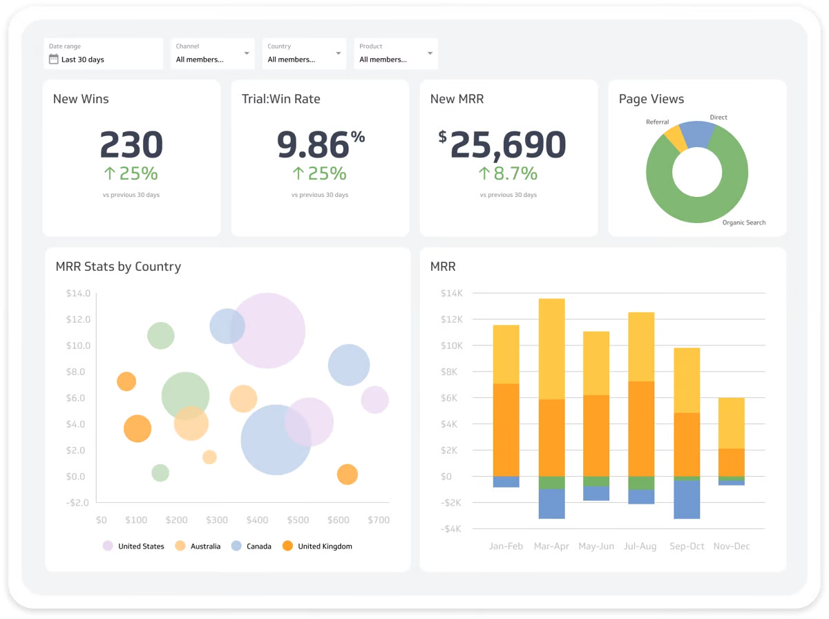 Klipfolio is a data analytics and a business intelligence tool in one. It offers two key products:
- PowerMetrics: Suitable for data teams at large companies, this is a data analytics solution to centralize, standardize, and share accurate metrics throughout the organization. Non-data teams can then use these certified metrics for their dashboards and reporting needs.
- Klips: These are your regular data visualization dashboards and reports. Klips integrates with 130+ platforms and you can also use a Rest/URL option for custom integrations.
Klipfolio’s key advantage over Cyfe lies in PowerMetrics. With it, you can not only connect all your data sources, but also:
- Create a curated metric catalog for other business teams with access control and governance features
- Enable self-serve analysis and AI insights
- Store data in one place—either in your data warehouse, semantic layer, or in PowerMetrics itself
- Share transformed and unified metrics with anyone in the organization
All this is designed to speed up decision-making and reduce ad hoc requests to data teams—if you have a dedicated data team in the first place.
Again, as we mentioned earlier, Geckoboard doesn’t come with this kind of granular data organization features.
Getting started with Klipfolio was easy. I created a Trial account and got access to my first dashboard.
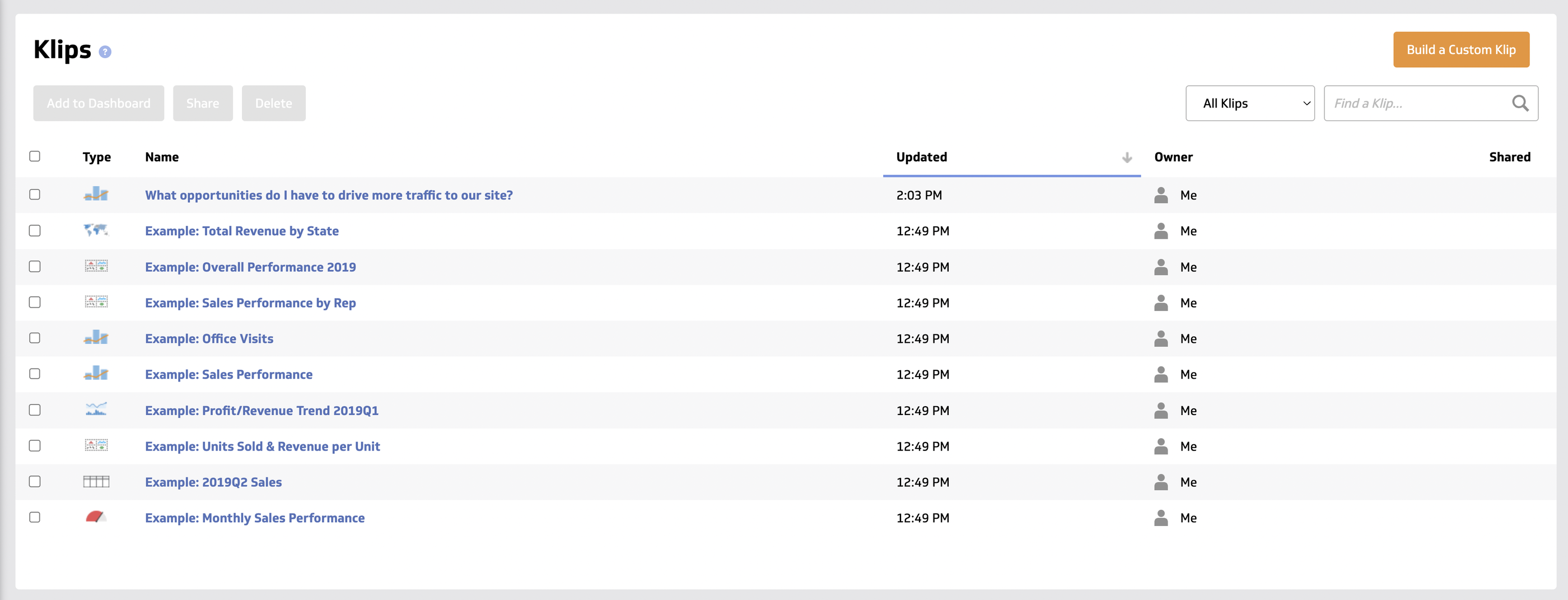
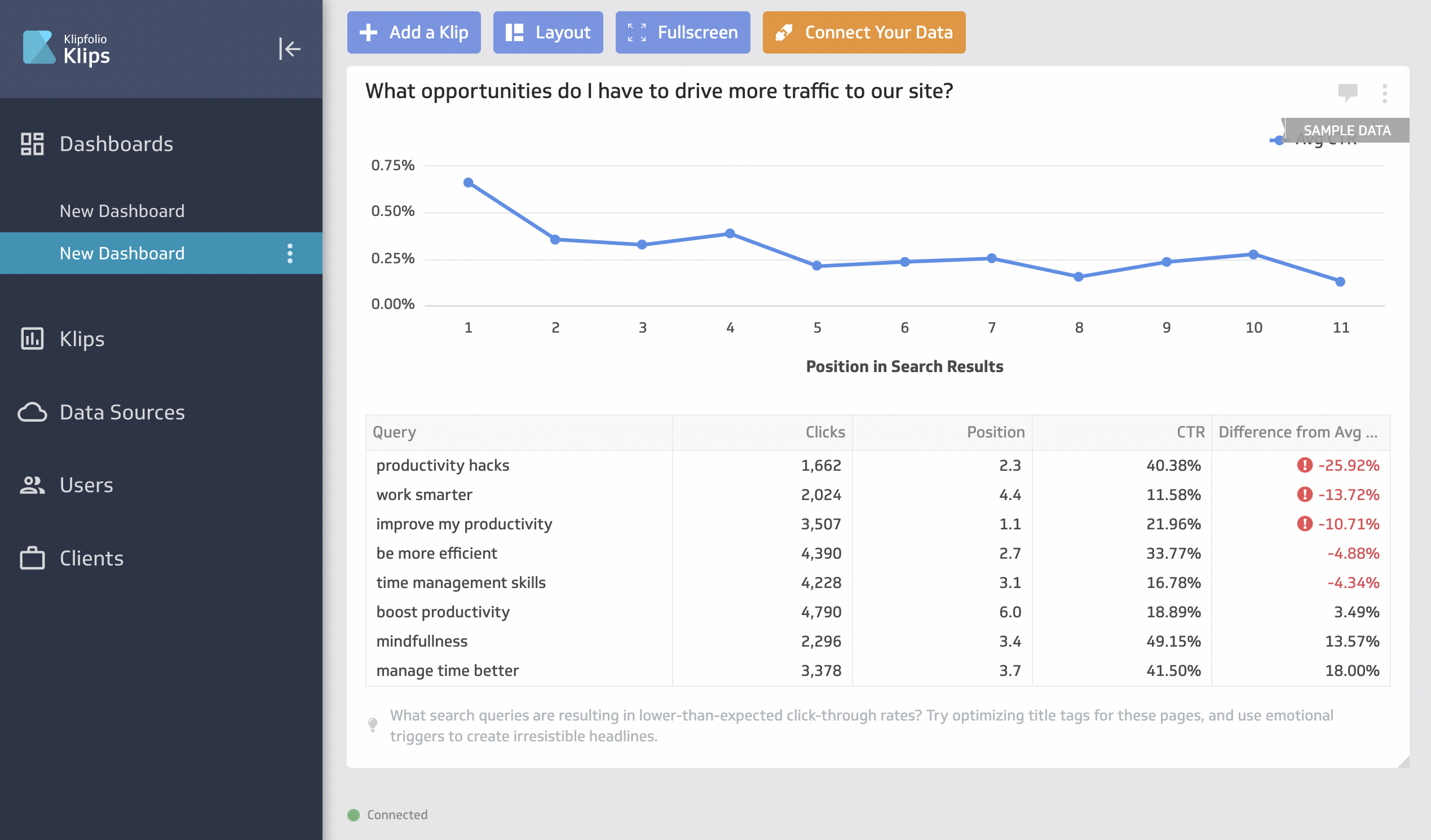 But this is where things got complicated. To visualize your data, you’ll first need to create a “Klip”, which is in a different tab from the dashboard.
There are some pre-made Klips like the below screenshot, but for the most part, you’ll need to build a custom one.
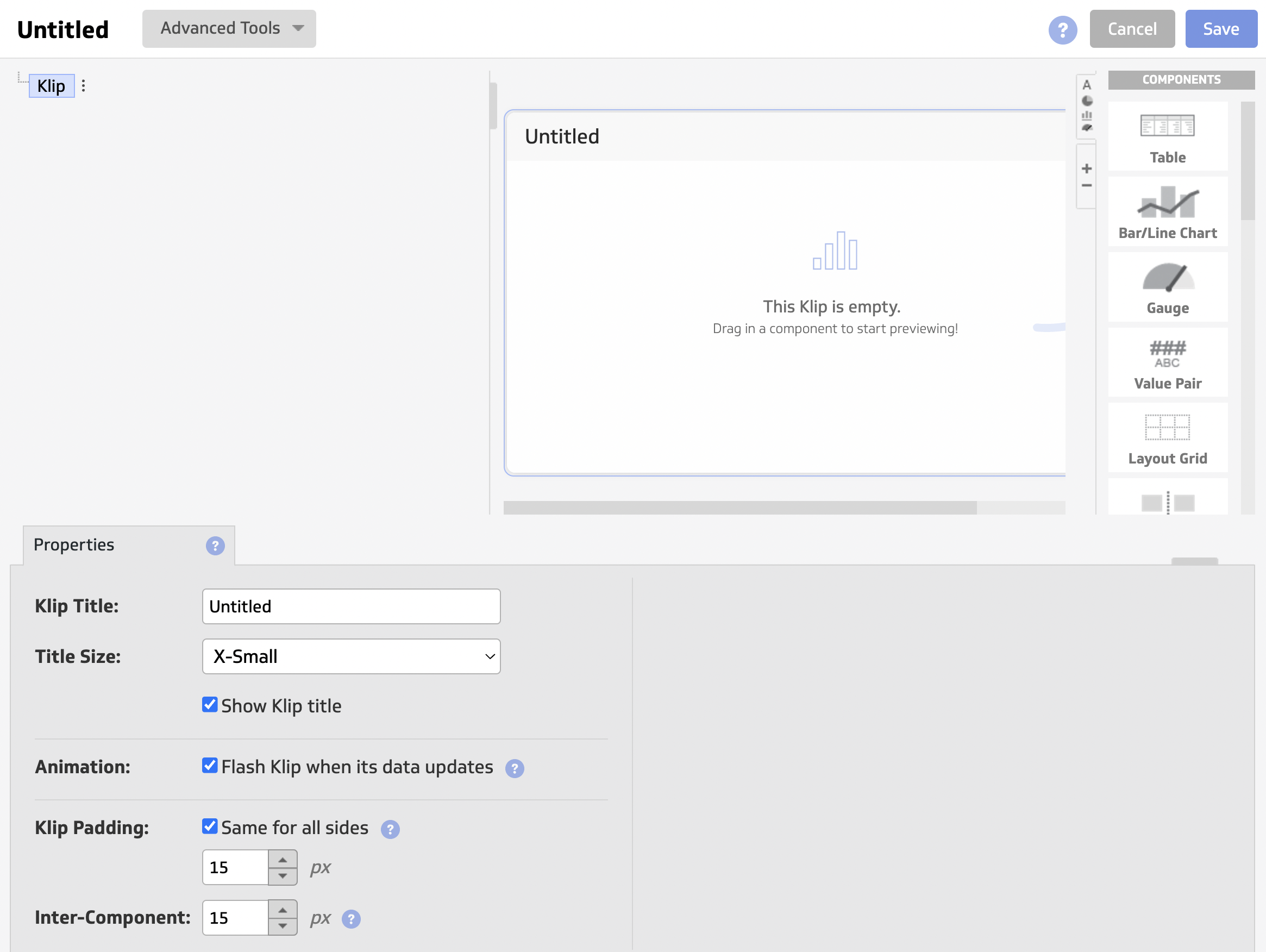
The interface to create a custom Klip can be confusing and clunky (although there is an interactive tour). It can take you anywhere from 5 to 30 minutes to build a Klip depending on how complex you want it to be.
Once you’re done, then you can add this custom Klip onto your dashboard.
On Whatagraph, you can create custom widgets natively within your dashboard in seconds. You don’t need to go back and forth from one tab to another—you can simply drag and drop the widgets onto your dashboard.
Key Features
- 130+ integrations including warehouses, SQL databases, and file-sharing services
- Data blending, unifying, aggregating
- Custom metrics and dimensions
- AI insights
- Custom dashboards and reports
- Export dashboards as PDF or image files. Export only individual clips as CSV
- Scheduled reports
Klipfolio Reviews from Real Users
“I love the full range of capabilities that are possible when building a Klipfolio dashboard (specifically with their Klips product).” (Source)
“Learning curve is a bit steep and it's still a bit of a black box.” (Source)
“Every time I contact support I get the impression that I am bothering them. I will not be renewing this platform because I do not feel valued as a customer.” (Source)
Pros and Cons
Pros:
- Easy to use and set up
- Powerful data analytics and organization options
- AI insights to help make data-driven decisions
Cons:
- Expensive with important features only available as add-ons or in Enterprise plans
- Limited customization for dashboards and templates
- Unhelpful customer support
Pricing
Klipfolio offers three pricing plans for two of their products: PowerMetrics and Klips.
As of October 2024, here are the plans for PowerMetrics:
- 30-day free trial
- Professional: $300/month for 10 users and unlimited metrics.
- Enterprise: Custom pricing for 10 users, unlimited metrics, and priority support.
It’s also important to note that important features like data warehouse integrations, AI insights, and custom domains are only available as add-ons, unless you purchase the Enterprise plan.
Klips’ pricing is further divided into plans for businesses and for agencies.
As of October 2024, here are the plans for businesses:
- Grow: $190/month for 15 dashboards and 1 hr data refresh rate. No priority support or custom onboarding available.
- Team: $350/month for 30 dashboards and 15 min data refresh rate. No priority support or custom onboarding available.
- Team+: $690/month for 60 dashboards and up to the minute data refresh rate. Includes priority support and custom onboarding.
As of October 2024, here are the plans for agencies:
- Agency Lite: $190/month for 20 dashboards, 20 clients, and 1 hr data refresh rate. No priority support or custom onboarding available.
- Agency Pro: $420/month for 40 dashboards, 40 clients, and 30-min data refresh rate. No custom onboarding available.
- Agency Premier: $1025/month for 70 dashboards, 70 clients, and 30-min data refresh rate.
Side note: On Whatagraph, you can get unlimited dashboards, unlimited clients, 30-min data refresh rate, priority support, and custom onboarding on ALL our plans. Reach out to us for a pricing plan just for you.
5. Grow.com
Most suitable for: Data analysts at medium to large enterprises
Grow is a no-code, self-service business intelligence software that combines ETL, data warehousing, and visualizations on one platform.
You can connect to 75 data sources through native integrations, including popular CRM platforms, marketing analytics tools, databases, and accounting software.
Then, you can prepare and cleanse your data using either noSQL or SQL transformations. This includes custom calculations, data blends, and advanced data filters.
Plus, Grow stores your data automatically on its platform so you don’t need to ship it to a third-party data warehouse.
You can create three types of dashboards on Grow:
- Dynamic dashboards which display data based on who is logged into the account.
- Dashboard Blueprints which are pre-built, single data source dashboards
- Custom & Sandbox dashboards which shows blended data sources and metrics
These dashboards also come with powerful filtering options based on date, number, or categorical logic.
You can then share them through emails, shareable URLs, Slack, TV-mode, or tables of raw and transformed data.
Grow’s main advantage over Cyfe is their 24/7 customer support through live chat, email, or phone.
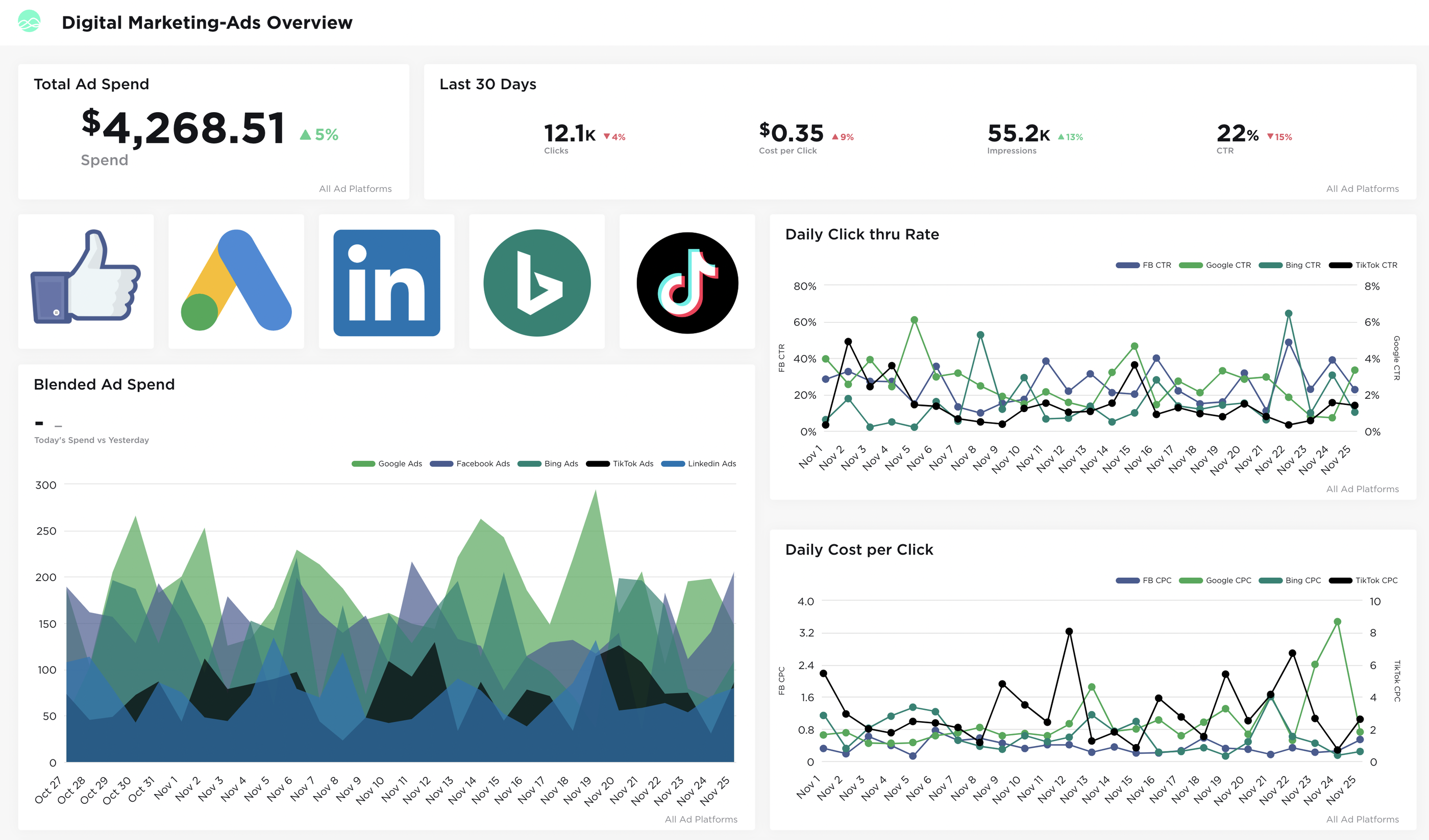
However, Grow is more suitable for internal data storage and monitoring rather than for external reports. Their dashboards are either:
- Very nitty-gritty that it’ll overwhelm clients or the C-Suite, or
- Basic-looking that it’s not visually appealing for clients
Key Features
- 75 native integrations
- Built-in data storage
- SQL or non-SQL based data transformations
- Customizable dashboards
- Advanced data analytics and predictive modeling
- Real-time data updates
Grow Reviews from Real Users
“As an analyst, I have recently started working on this tool and this is by far the best. It helps me to create powerful data visualisation as well as to gain insight from that data.” (Source)
“The interface could be better and overall user experience creates lag sometimes.” (Source)
“The back end seems quite complex to work so really need an IT expert to do the set up, but once it's working it's great for users.” (Source)
Pros and Cons
Pros:
- Intuitive, easy to use interface
- 24/7 customer support
- No-code data pipelines, storage, and visualizations
Cons:
- Occasional lags
- Expensive
- Slow performance when dealing with large volumes of data
Grow Pricing
Grow doesn’t share their pricing publicly.
6. Geckoboard
Most suitable for: Medium to large businesses in the Customer Service, Sales, and eCommerce sectors
Geckoboard is an affordable and easy to use business dashboard software for eCommerce, Sales, and Customer Service businesses.
I wouldn’t say it’s suitable for agencies, however, as their dashboards are mostly built for Inventory and Operations management.
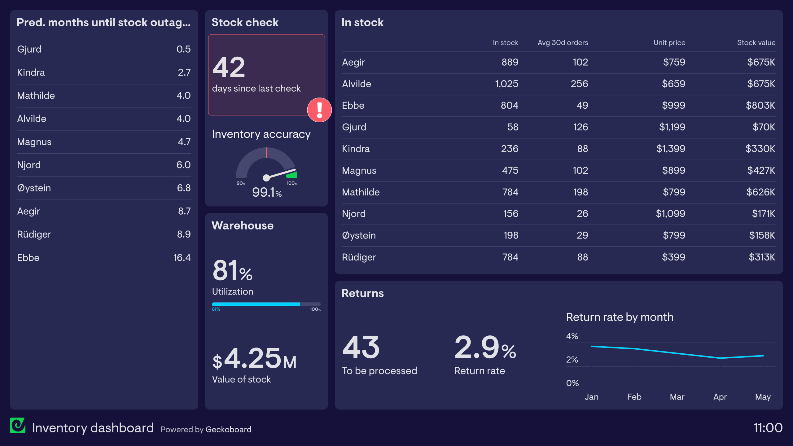
With Geckoboard, you can connect to 90 data sources, design your dashboard, and share the dashboard with your team members or the C-Suite.
Once your data is connected, you can create three main types of dashboards:
- A blank dashboard
- TV dashboards for internal presentations
- Mobile dashboards
- Snapshots and reports
Then, you can send snapshots of these dashboards via Slack and email to stakeholders on a regular basis.
To create a dashboard, you just need to connect your data sources and choose the widgets you’d like to visualize.
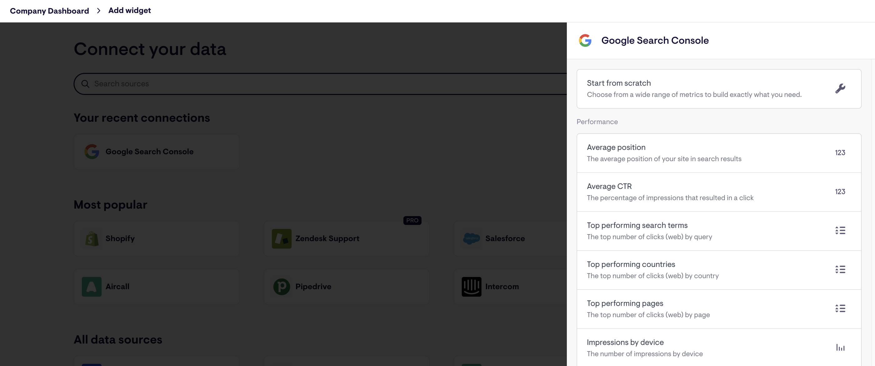
But one downside is that you can’t drag-and-drop widgets onto your dashboards. You’ll need to:
- Click on “Add widget”
- Connect your data source
- Choose the metric you want to visualize
- Customize that widget
Then, repeat this process again for every metric you want to create. This creates unnecessary back and forth between the dashboard and the widget builder, and can be time-consuming.
However, Geckoboard’s main limitation is their white-labeling features. You can only upload your logo and choose a color scheme (only available on the “Pro” plans). You won’t be able to add custom text or create custom domains.
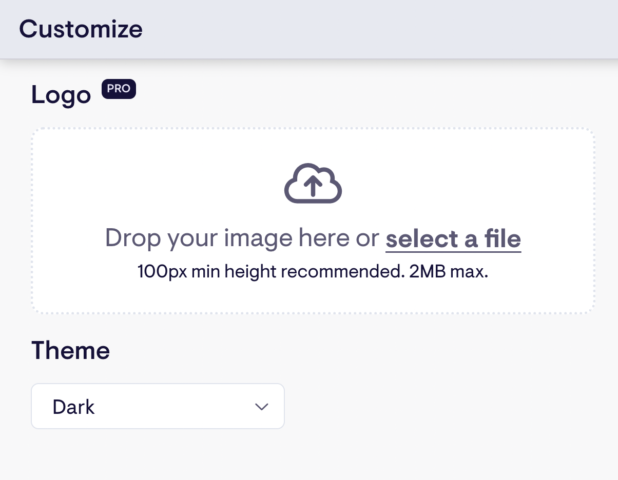
Key Features
- 90+ integrations with Customer Service, Sales, Finance, and eCommerce channels
- Drag-and-drop dashboard builder
- KPI notifications
- Slack integration
- Automated email reports
- TV dashboards
- Mobile-friendly dashboards
- Dashboard examples for businesses
Geckoboard Reviews from Real Users
“I love how simple it is to use. That you can connect data from so many different sources in an easy way.” (Source)
“Connecting the dashboard with the Tv works like a charm.” (Source)
“Geckoboard could use more features and options for customization. Compared to other tools like Power BI or Tableau, Geckoboard didn't have as many advanced tools for analyzing data or changing how things looked. I wished I could make more complicated charts and do special calculations.” (Source)
Pros and Cons
Pros:
- Easy to use and set up
- A wide variety of integrations
- Great customer service
Cons:
- Can be pricey if you want to add more dashboards
- Limited customization options for dashboards
- No advanced calculations, blends, and custom metrics and dimensions supported
Geckoboard Pricing
Geckoboard’s pricing is based on the number of dashboards. But unlike DashThis (which includes unlimited users), Geckoboard has limitations on the number of users.
As of October 2024, Geckoboard offers three pricing plans:
- Essential: $149/month for 5 dashboards, 3 users, 1 TV share, and core data sources
- Pro: $199/month for 5 dashboards, 10 users, 3 TV shares, and pro data sources
- Scale: $699/month for 30 dashboards, 25 users, 10 TV shares, pro data sources, and dedicated Support rep
7. Looker Studio (a.k.a. Google Data Studio)
Most suitable for: Freelancers and boutique agencies
Only need integrations with Google platforms? Looker Studio is a great choice.
Looker Studio is a (sort of) free client reporting tool that comes with 21 native integrations with Google-based platforms like Google Ads, DV 360, Google Sheets, and Google Analytics.
You can also connect to BigQuery, MySQL, and Microsoft SQL servers on Looker.
The biggest advantage of Looker Studio over Cyfe is that it's highly customizable. Once your data sources are connected, you can use Looker’s drag-and-drop report editor to add:
- Charts, line bars, pie charts, geo maps, area and bubble graphs, data tables, pivot tables
- Filters and date range controls
- Links and clickable images
- Custom text and images
- Custom styles and color themes
You can then invite teams or clients to view or edit your reports, or send them links in scheduled emails.
Unlike Cyfe, you can blend data from different channels on Looker Studio, although it's limited to 5 data sources per blend.
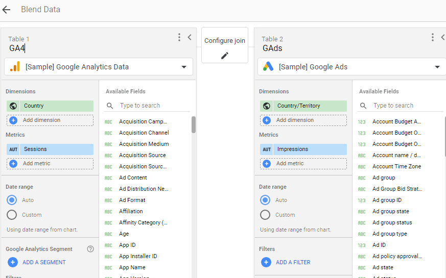
However, keep in mind that Looker Studio is only free for Google-based tools (e.g. Google Analytics 4, Google Ads).
For non-Google data, you’ll need to use a data pipeline tool like Funnel or Supermetrics to push it into Looker. And users say connections would always break and the data would be constantly late or inaccurate on reports.
Looker Studio reports can be time-consuming and difficult to build. You’ll need to manually customize each widget, graph, chart, and images. For instance, this is what a report “canvas” looks like as you start building one—I don’t know about you but this immediately overwhelmed me as a non-tech savvy person.
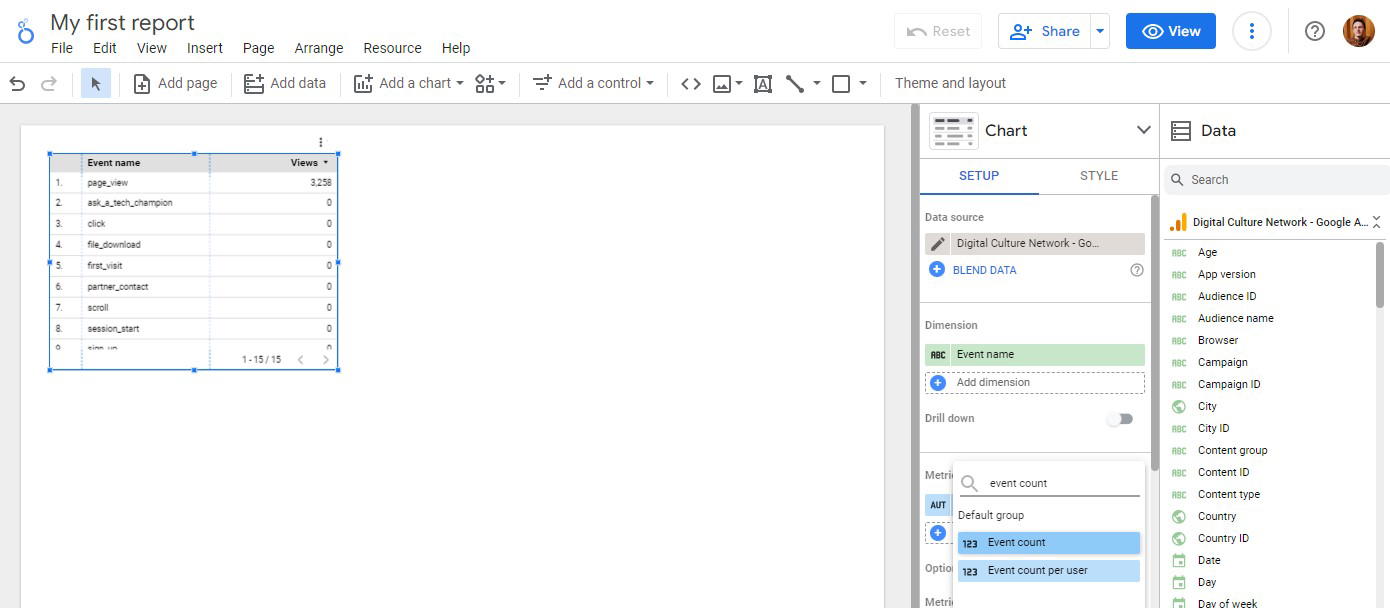 Source: Digital Culture Network
But again, it’s a solid choice if you just need to visualize your data from Google-based platform, but I wouldn’t recommend it if you need to connect to other channels.
Key Features
- 21 native connectors (free)
- 1000+ “partner” connectors (paid)
- Drag-and-drop report builder
- Data blends
- Custom images and text
- Custom styles and color schemes
- Mobile app
Looker Studio Reviews from Real Users
“I love the way you can present data from multiple sources in one report. I also love the ability to blend different tables and show the information in one chart.” (Source)
“Unfortunately, connectors break quite regularly and reports containing a lot of data can take a lengthy time to load.” (Source)
“Looker studio needs more report downloading options such as Word and PDF.” (Source)
Pros and Cons
Pros:
- Free (to an extent)
- A huge range of data visualization formats and options
- Easy to use for basic reports
Cons:
- Slow loading
- Connection breakages and inaccurate data
- Limited report sharing options (no Word, Sheets, or PDFs)
Looker Studio Pricing
Looker Studio is free for connections with 21 native integrations, which are mostly Google-based platforms.
8. DashThis
Most suitable for: Small businesses and freelancers
DashThis is a simple marketing reporting tool that connects to 34+ marketing platforms and visualizes KPIs on dashboards.
If you don’t see a built-in integration you need, you can also upload your own data using a nifty CSV file or a Google sheet.
To create a dashboard, you can either start from scratch or pick a dashboard template.
 There are three key types of dashboards you can build:
- Periodic dashboards: These are dashboards based on specific time periods and cadence, like daily, weekly, monthly, semi-annually, and annually.
- Campaign dashboards: These dashboards are used to isolate and highlight a specific campaign for a custom date range.
- Rolling dashboards: These dashboards show trends of metrics for three different date ranges.
On the more pricier plans, you’ll get a dedicated product specialist assigned to you who will help you set up your dashboards.
However, DashThis is more suitable as a reporting tool rather than a data analytics platform. There are very few options to customize or organize your data on DashThis.
You can only “merge” widgets together in DashThis; you can’t blend data sources to the full extent or create advanced metrics and dimensions. On Whatagraph, you can easily organize your data any way you’d like using simple workflows.
Key Features
- 30+ integrations
- Custom data upload via CSV file or Google sheets
- Interactive dashboards
- Automatic data refreshes
- Upload client or band logos
- Create custom widgets, domains, color schemes, and email addresses
- Library of report templates
- Report sharing via email, URL, or PDF
DashThis Reviews from Real Users
“DashThis is super user friendly. I am someone who doesn't know too much about Data Dashboards, but this platform was super easy to use.” (Source)
“There are some limitations to what you can bring in and they don't yet offer custom calculations.” (Source)
“It is a little annoying to move things around in a dashboard. You have to move each individual widget to a new section rather than moving an entire section in a dashboard.” (Source)
Pros and Cons
Pros:
- Easy to use and set up
- Many templates and dashboard examples available
- Relatively inexpensive
Cons:
- Limited data organization and customization features
- Limited data integrations
- Basic-looking reports
DashThis Pricing
As of October 2024, DashThis offers four pricing plans:
- Individual: $49/mo or $42/mo, paid yearly. Includes 3 dashboards. No white-labeling features, personalized onboarding, or priority support.
- Professional: $149/mo or $127/mo, paid yearly. Includes 10 dashboards. No personalized onboarding or priority support.
- Business: $289/mo or $246/mo, paid yearly. Includes 25 dashboards, white-labeling, personalized onboarding, and priority support.
- Standard: $449/mo or $382/mo, paid yearly. Includes 50 dashboards, white-labeling, personalized onboarding, and priority support.
9. AgencyAnalytics
Most suitable for: SEO and content marketing agencies
AgencyAnalytics is a close Cyfe alternative and a great marketing and SEO reporting tool.
You can connect to 80+ data sources, including major SEO platforms like Ahrefs, Backlink Monitor, and Semrush, as well as social channels like Facebook, Instagram, and LinkedIn.
It comes with a suite of SEO tools like Rank Tracker, Site Auditor, and Backlink Manager, making it easy to monitor and report on your SEO performance. You can track rankings daily, monitor backlinks, and keep up with the competition.
![]() You can also manage clients and staff on the platform through granular user access and permissions.
You can also manage clients and staff on the platform through granular user access and permissions.
AgencyAnalytics’ key advantage over Geckoboard is their AI insights. You can ask AI to write you performance summaries (although readability is not that great).
 Or you can also ask AI to identify an opportunity, highlight an issue, or celebrate a win.
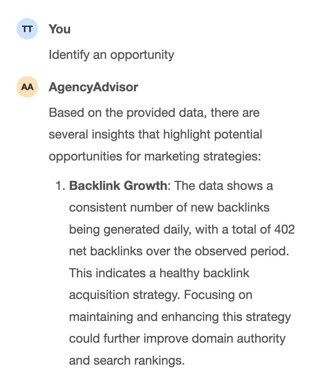 However, users say the platform can be unstable with sources disconnecting frequently due to “service bandwidth” issues. AgencyAnalytics also doesn’t come with advanced data calculations and their dashboards are rigid and limited.
Key Features
- 80+ integrations
- Ready-made report templates
- White-labeling
- Client and staff management
- SEO tools
- AI insights
AgencyAnalytics Reviews from Real Users
“AgencyAnalytics helps me create quick, automated, and clean reports for our clients which saves me a ton of time.” (Source)
“It can sometimes be a little buggy and take time to load. Adding new integrations can sometimes be challenging because of this.” (Source)
“I would like the capability of merging data from different platforms in graphs and metrics (e.g. using data from Google Ads with GA4) in the same section. I also don't like that some platforms aren't yet available (e.g. Reddit).” (Source)
Pros and Cons
Pros:
- Easy to set up and use
- A wide library of ready-made report templates
- Cost-effective
Cons:
- Buggy
- Lack of advanced data calculations and organization features
- Limited integrations
AgencyAnalytics Pricing
As of October 2024, AgencyAnalytics offers three plans:
- Freelancer: $79/month for 5 client campaigns
- Agency: $179/month for 10 client campaigns
- Custom: For established agencies with 50+ clients

WRITTEN BY
YamonYamon is a Senior Content Marketing Manager at Whatagraph. Previously a Head of Content at a marketing agency, she has led content programs for 5+ B2B SaaS companies in the span of three years. With an eye for detail and a knack for always considering context, audience, and business goals to guide the narrative, she's on a mission to create genuinely helpful content for marketers. When she’s not working, she’s hiking, meditating, or practicing yoga.